
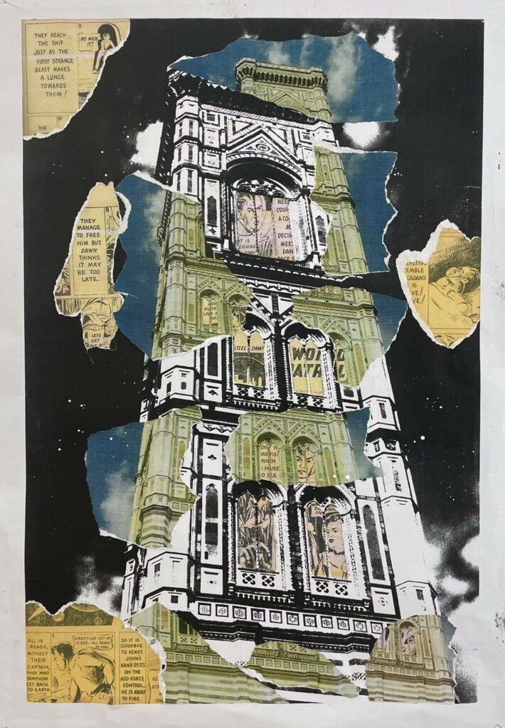
This piece is probably my favourite out of all of ones I created for this brief. Linking back to the architecture theme, I decided to push my limits with a much bigger piece. The size of this piece is an A2 that I collaged and ripped back into.
I used the large photocopier from the printing room to blow up this image. I darkened the settings to have a mainly black and white image but still be readable enough. I took the original photo, scanned it, printed it in colour and upsized it to be slightly smaller than the black and white.
Tying in the ripping and gluing technique, I ripped the coloured photo and glued the sections to where they correlate. This gives the image an offset yet natural look to it.
I found some old comic books from the 1940’s which I thought would give the piece a vintage look. I poked some holes in various spots on the piece and ripped out the sections that I wanted to be seen from the front. I then scanned the images and cut out sections that held the most imagery because I thought this piece as a whole could tie the old and present together. I put the comic book images in place and glued them down.
I experimented with this piece and tried using paragraphs from the comic books, instead of the pictures but found out that I liked the look of the images much more.
This piece was inspired by one of my favourite artists, Terry Urban. Urban likes to play around with the composition of his large pieces and I tried to replicate that but in my own style.