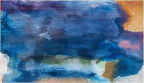
So far, I have been all over the place trying so many different ideas. This was good for the time being, but I need to narrow down my ideas; the work of Helen Frankenthaler is fascinating to me. She was inspired by Jackson Pollock and the ‘happened’ quality of his work. She said, “technique determines aesthetic, as much as one’s aesthetic determines a new medium” her work has freedom and fluidity to it; that is what I am most drawn to. I think I can take the technique of Helen Frankenthaler work and use the movement from the original photo and combine the two of them; the original photo I am talking about has two people running down a pathway. I am so fond of this image because of the freedom and movement that the figures have. In last week’s work, I have been focusing too much on the aspects of the photo, e.g., the diagonal and horizontal lines. I need to look at the movement rather than the photo. Another way I could leave the ‘lines’ alone would be to cut my paper into the shapes that are seen; so that the construction of the paper becomes the construction of the context for the gesture and movement.
My workspace and materials during lockdown
-decent sized desk, as well as access to my dad’s workshop/shed
-range of acrylic paints and limited colours of house paints and brushes of different sizes
-paper of varying sizes and thicknesses (black and white)
-a few canvases, one over two meters long (with a few holes in it)
-range of pens, pencils, markers, crayons
-Indian ink
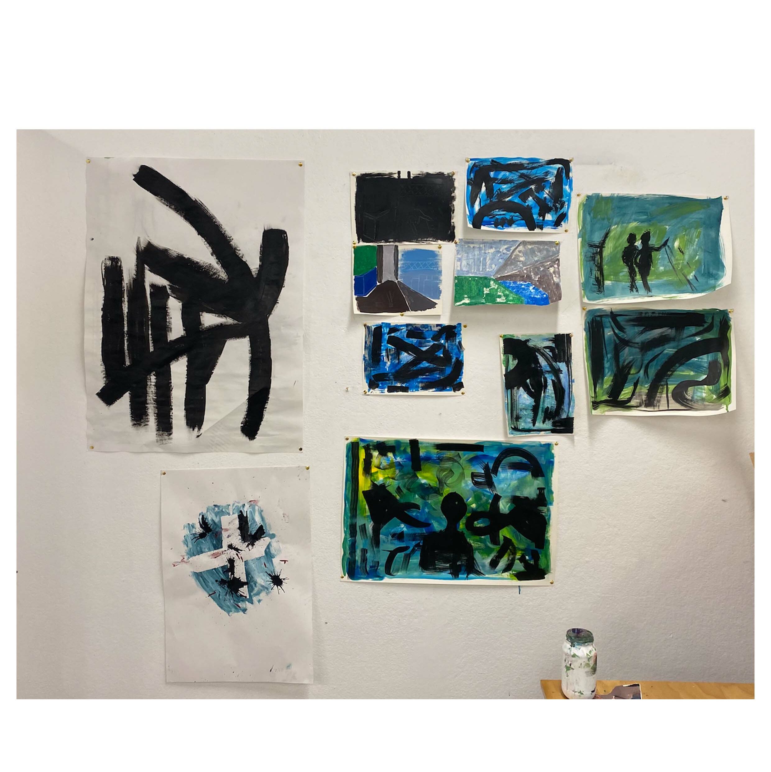
Work I made on the last day of studio, before lockdown