
This week we are expanding pushing on ideas we have generated last week. Working forward with concepts from the pervious work we were to get a flowing momentum of art creating in this cycle. I found struggle with keeping the core focus on the process of medium application and mark making and consistently caught myself drifting my focus to the aesthetics of the piece I was working on. I came out of this week much more confident with how I would continue with this brief as this week challenged my usual thought process when making these works. It was something I quite enjoyed and brought me back to the ease and content fullness of art creating.
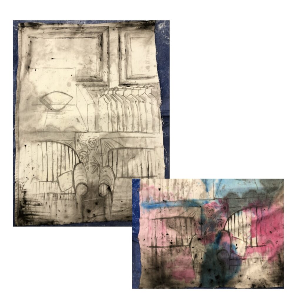
With the above experimentation I want to play with the concept look of watercolour paints but with a curtain as my canvas. The making of the black base layout came from lightly sketching with watered down black paint and then dipping the edges of the curtain into a tub of watered down black paint, this allowed me to create a depth within the black layout. Once the edges were soaked I created the further depth by pushing and pulling the water around the curtain, soaking it into more areas. Once the black had dried I repeated the process of pushing and pulling paint water around with coloured paint, instead of dipping the curtain this time I poured the watered down paint onto an area and proceeded to push and pull paint water again. I loved the outcome I definitely achieved the look of a water colour piece through the processes I used.
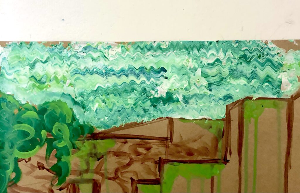
Using my technique from a previous piece of work where I made squiggly lines out of paint I gave this a go again though as a textured more conceptual sky. I liked the look, I will be continuing to use this technique though out my experimentations as it adds for a hybrid of controlled yet randomised paint application.
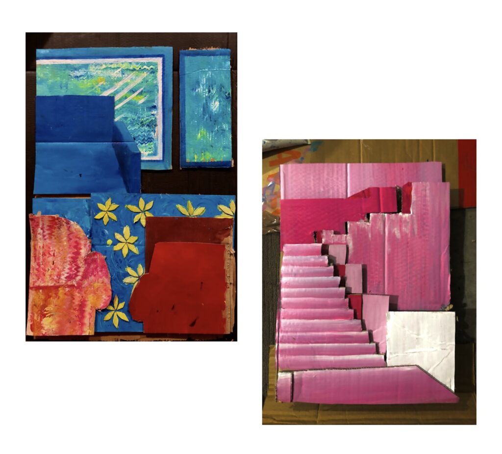
As we adjusted into lockdown the tools I had available were very limited though what I will say is that there is an abundance of cardboard! Rattling my brain I wanted to push my concept further, pondering with how I could use the cardboard to its fullest potential with me. I started this experimentation with the image on the left above. I decided I wanted to make each foreground really dramatic, through cutting out and piecing together the different areas from the reference I was using. Using my technique for the squiggly lines I applied this to one of the couches and the windows. I admire how this tuned out though I felt as if the red and blue didn’t fit right together, appeared as if it was almost clashing I feel as if a change of colour palette would make a significant difference.
The image on the right is my further experimentation of this concept. I find having the foregrounds seperate and layering these creates a nice look such as a pop up book or something similar. I used a different reference image for this new experimentation as I felt it would be best suited to the technique I was using and would achieve the result I’m after. Using a monotone colour palette this time instead of using colours from the reference imaged helped to create a nice refreshing piece, I feel as if it flows and pushes with the concept of dramatic foregrounds I would love to experiment on this further and see where I could take it.