
When going into lockdown, I noticed that my works shrank in size. Limited by the space to create at home, I was making no bigger than A4. I wanted to challenge myself to work larger before the end of the brief. I used an old stretched canvas slightly smaller than A2 for this. From my earlier pieces I have learnt that I work better with an under painting instead of onto a plain empty canvas, so I intended to approach this in layers.
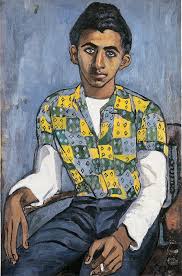
I loved the texture of my foil monoprint so started by priming with white then laying this texture over the entire surface. Then I did the same with green in more concentrated areas. I chose these colours because they stood out to me from my earlier works. I also layered on a thin watercolour colour-block technique using the shirt pattern from the Pulp Fiction reference as inspiration.
Under painting Images
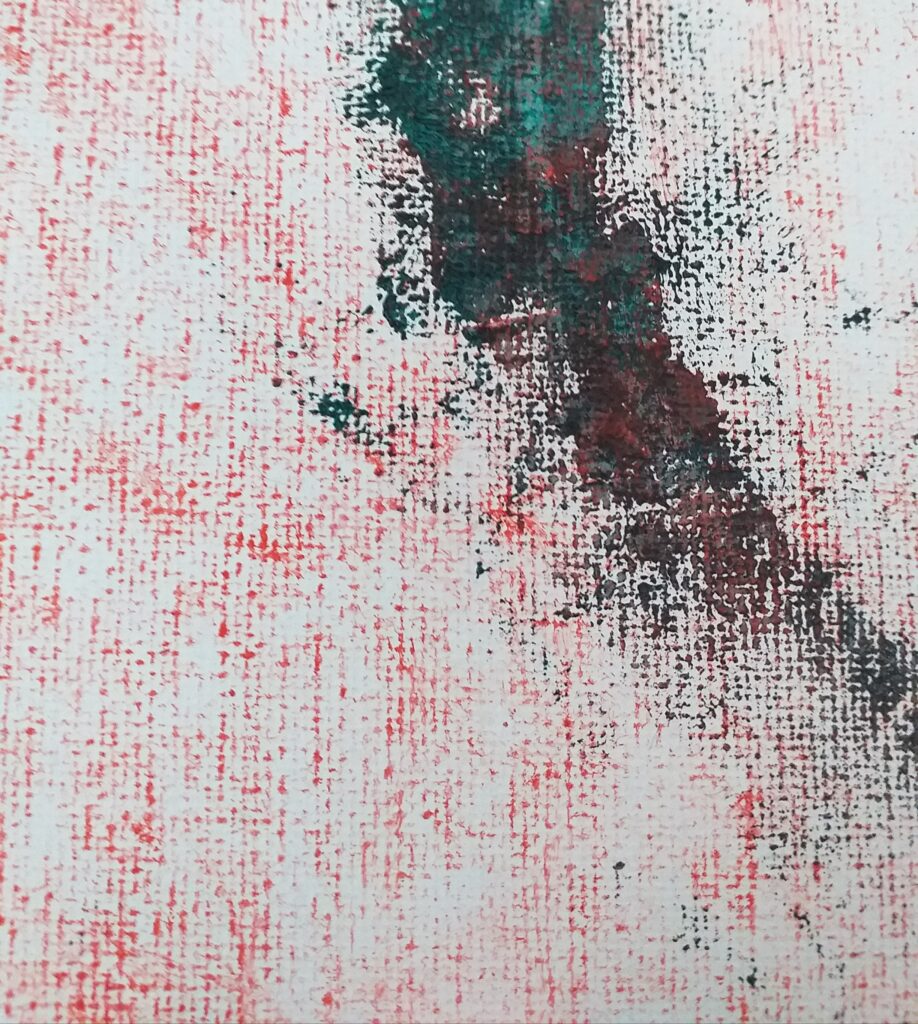
I was very interested by the marks of my printing, as the weave of the canvas was highlighted. This created an almost pixelated appearance. This red was a very easy and flowing way to print, so when I moved to the green I stumbled a little as it was a much more controlled application. I accidentally applied my oil paint too thick for this green print. The shapes weren’t as defined as I intended.
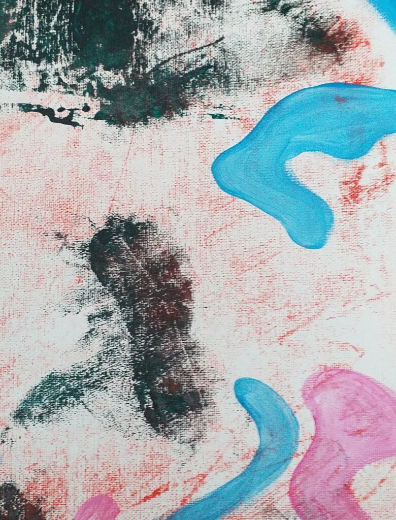
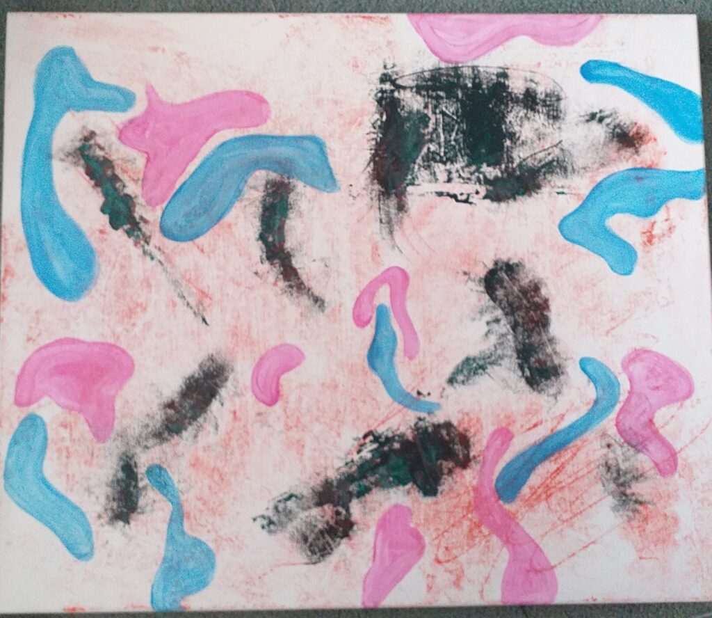
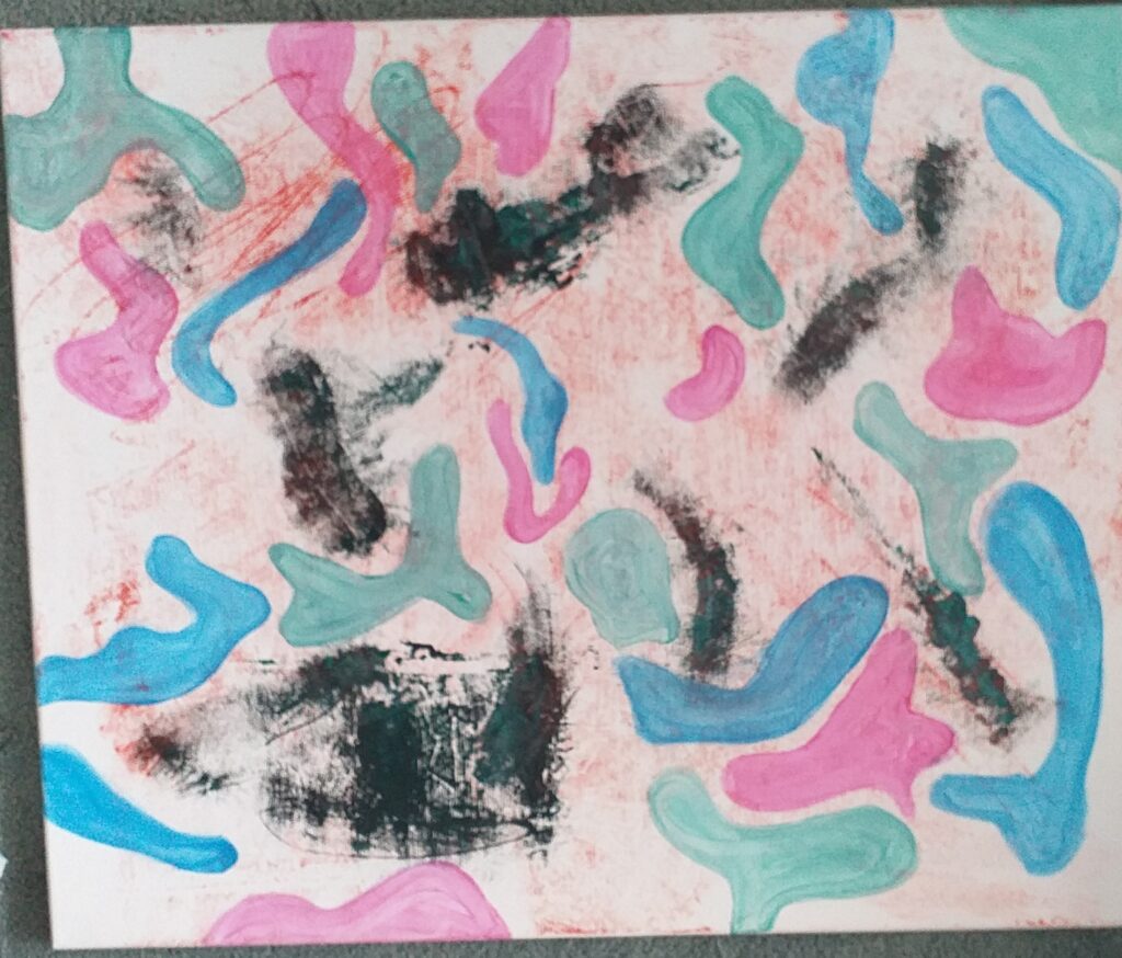
The addition of the colour blocks elevated the work in my opinion. The underpainting turned from a smattering of colour to a more controlled outcome, while still maintaining the flow I’d achieved with the first part of my print. With my underpainting complete I had to contemplate my next layers.
While lost for direction with this piece, I spoke to Luca for help. He suggested I take a look at Alice Neel’s work. This inspired me in the next stage of this painting.
Alice Neel Reference Images
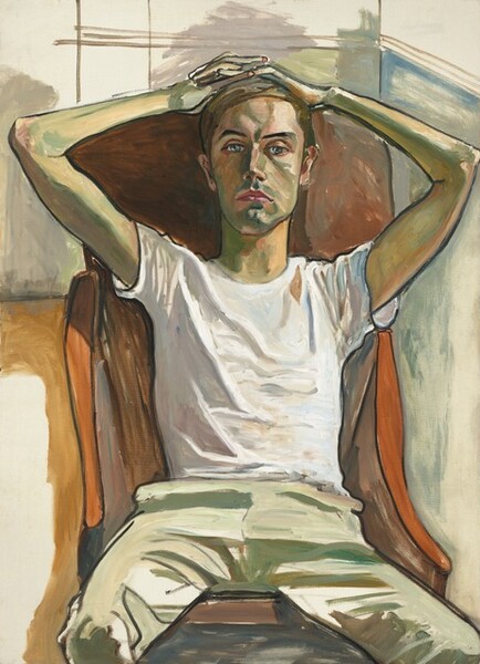
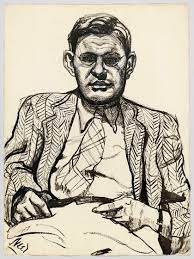
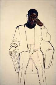
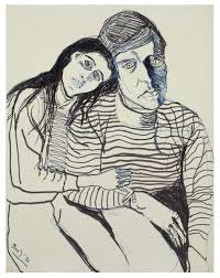
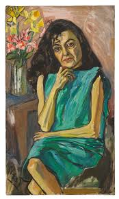
The sketch works really stood out to me. The impact of the painting vs simple line work has an exciting visual language and this is what I chose to pursue.
With charcoal I laid in a linework of the two major portraits I’d been working with – Pulp Fiction and The Girl With a Pearl Earring (flipped to face the opposite direction).
Linework
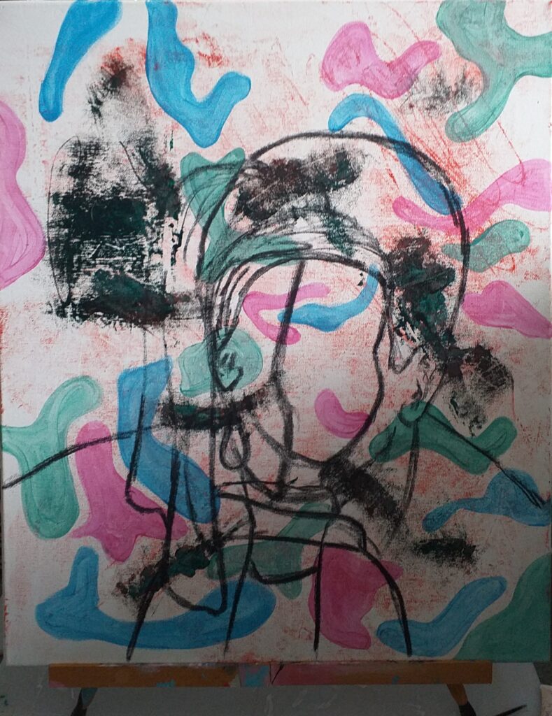
With the charcoal linework down, I was ready to paint into it. I was challenged to work lightly as I wanted the paint to remain transparent and textural enough to see lower layers and create a figurative work. This is where I steer away from Neel’s style as I am not trying to create realism.
Finished Piece
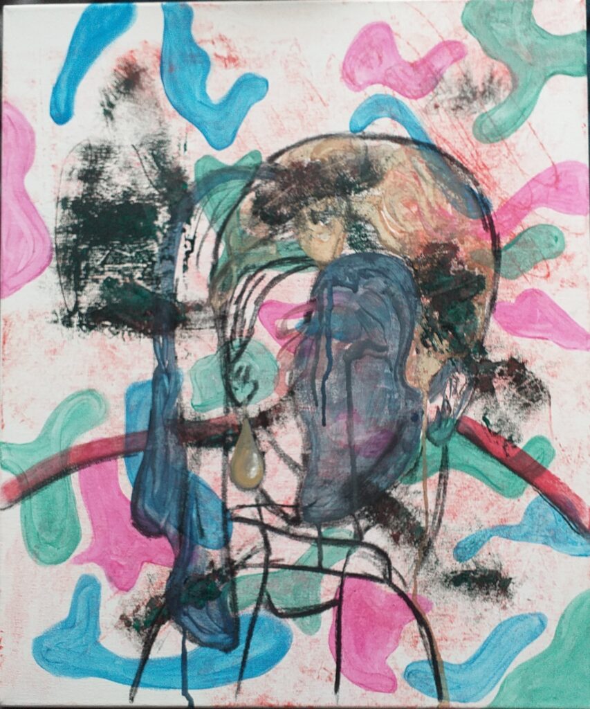
Details
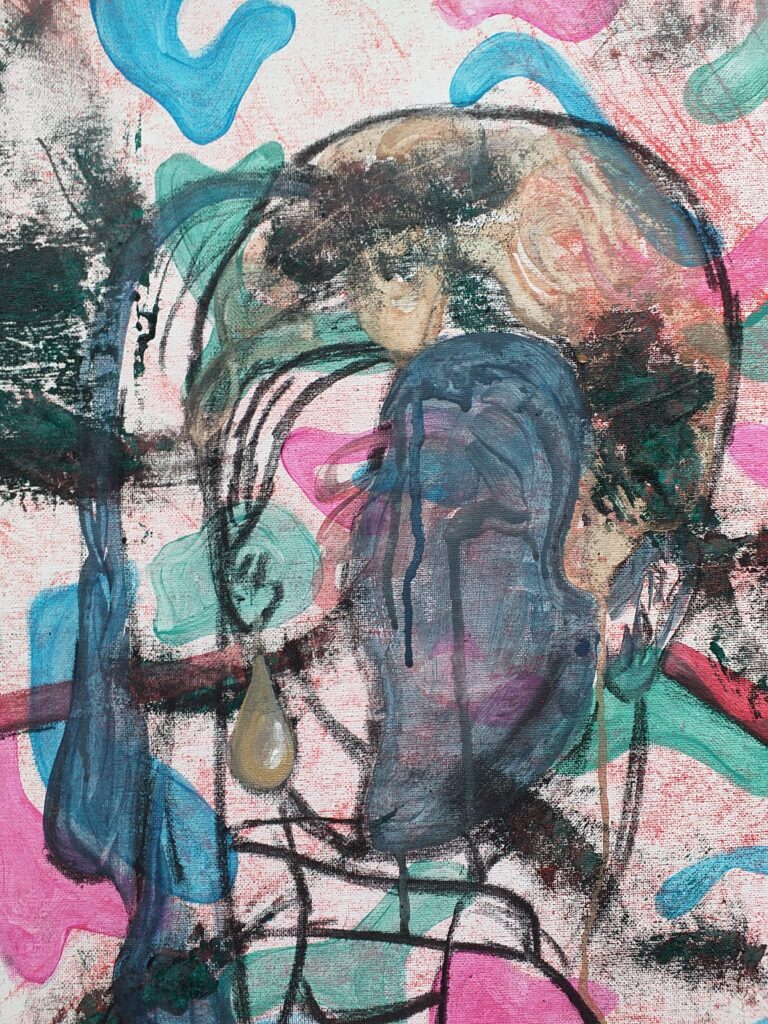
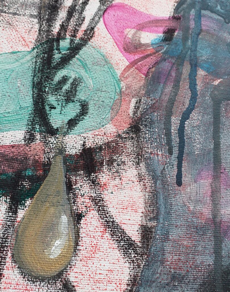
I’m so happy with how this piece turned out. The limited use of acrylic and simplistic suggestions of form from the charcoal lines really conveys a figurative re imagining of these references. If I were to take this piece further I’d layering a washy reductive mono print but I was worried this would make the piece too busy and the washy watered down acrylic may have washed away some of the charcoal.