
After my research into Kevork Mourad’s techniques, I gathered materials to experiment with reductive mono printing. I didn’t have any printing ink or retardant so I had to experiment with the paints I had already available to me. I struggled to find the right consistency.
My first experiment was with acrylic and water, but the result was very washy. I really liked this result but hoped for more detail. I used the same plate again to do a ghost print as the surface ink had been reduced. This print ironically very much looked like a ghost captured on a night vision camera. I really liked this result too but again, wanted more detail.
The next experiment was with a cheap acrylic which was runnier than most paints I use. The runny consistency was great for detail but the lack of any thinner meant the plate dried too quick. The print looked very different from the plate, with pigment coming out as very thick or not at all. This meant I lost all of my mid-tones. I feel I definitely would need some ink or paint thinner to achieve what I was hoping for.
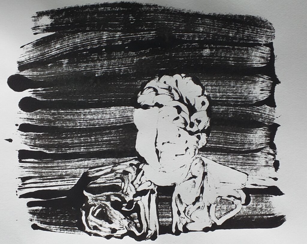
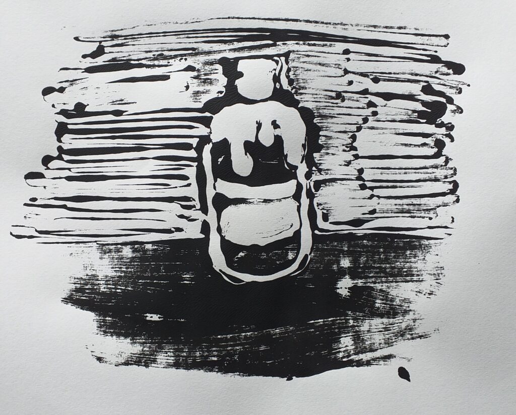
Changing tack, I looked to mono printing using a crisp packet. I cleaned it and cut the edges so it would lay flat, then spread oil paint over the surface. First I did a plain print of the crisp packet texture onto paper.
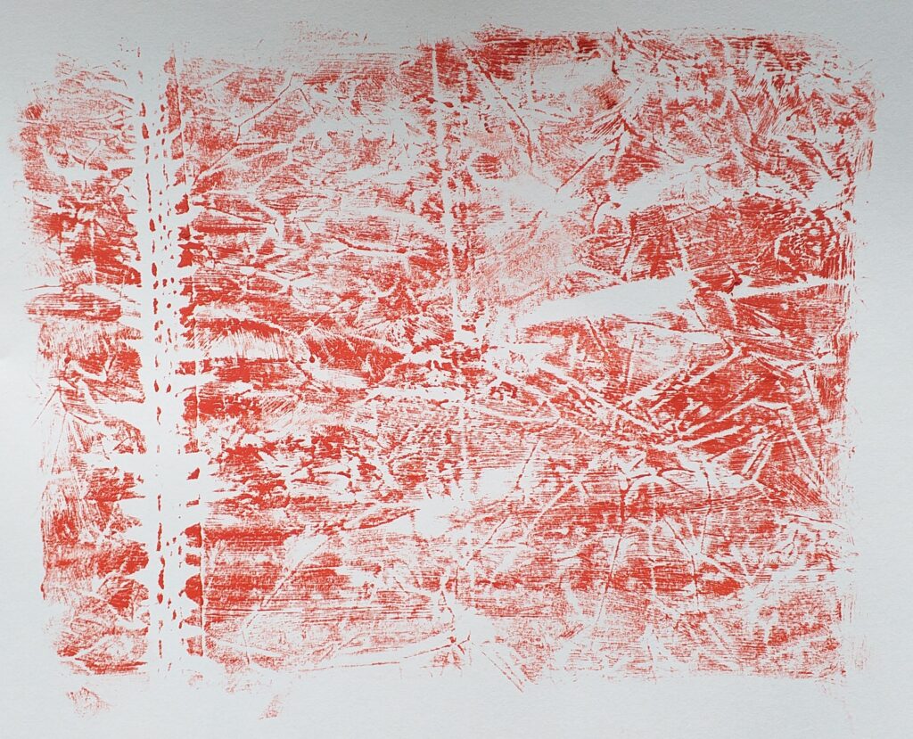
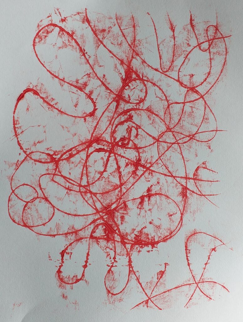
The crushed texture of the packet meant some areas printed bolder and others didn’t lay any ink down, making for quite an interesting pattern. Inspired by Cy Twombly, I had a go at printing scribbles with this methods and had this exciting result.
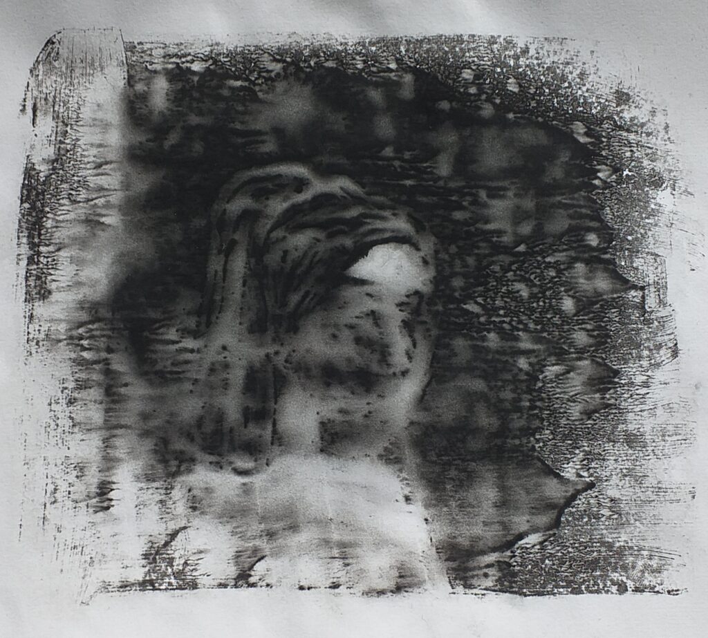
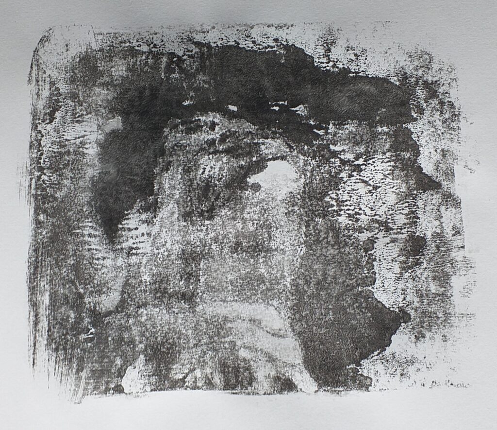
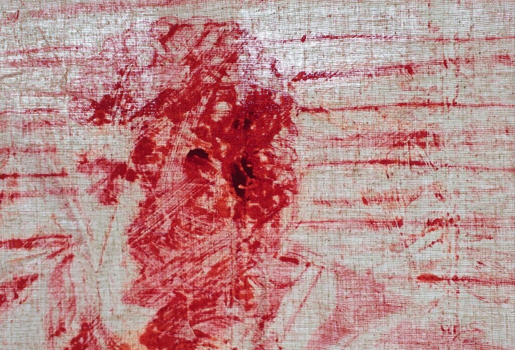
Having made some marks with this method, I thought I understood the pressure difference well enough to make a more figurative print. I did not. The portrait from Pulp Fiction came through more like a blob. I had pushed far too hard to create shadow and lost a lot of the detail I was trying to convey. I also did this experiment on fabric which had its own folds and creases. This meant my canvas picked up more or missed the paint while printing, making this an even more challenging work.
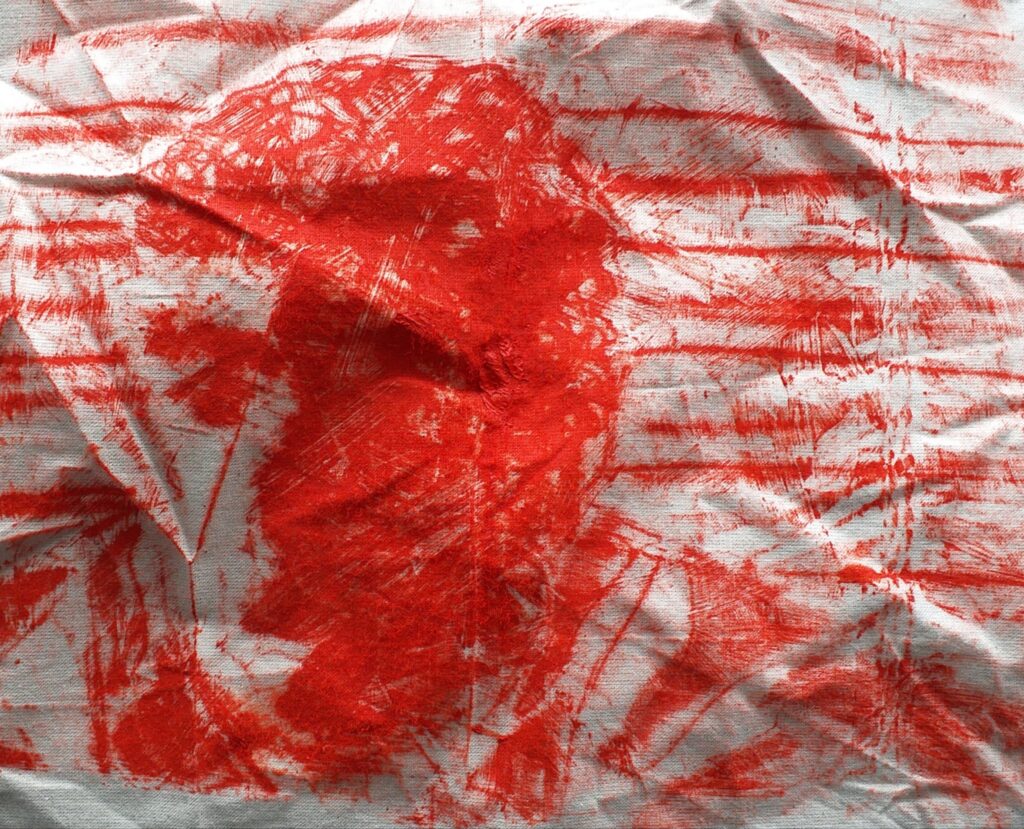
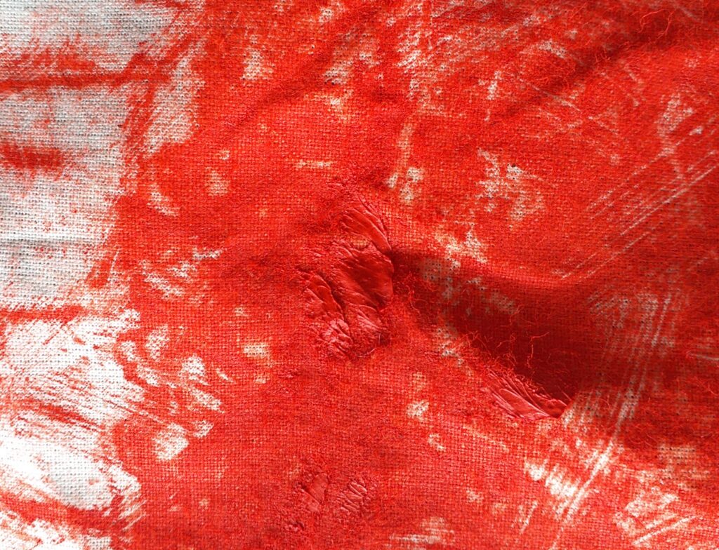
Upon closer inspection, I could see blobs of oil paint on the surface. These occurred where I’d pushed too hard and applied the paint too thick. I held the piece up to the light to see if I could identify any details. I found some detail that was hidden in the shadow but more than anything, the light showed me where the thick vs the thin areas of the paint were laid.
Through this printmaking experimentation, I learnt a lot. While limited with my resources, I can still manage some printmaking techniques. This experiment has taught me to work on flat surfaces for the best results with these prints, and I will move to a stretched canvas for my next piece. I also have developed an eye for how best to lay the oil paint – sparingly and evenly.
I really like the various printing results and am excited to combine some of them in my next step. The texture of the crisp packaging helps me to develop a background so my next piece will be less daunting to work onto and these printing techniques mean I can create repetitive patterns too.