
Process Into Image Paint Brief.
Week 2: PROCESS LED INQUIRY: Drawing from a Photo without People.
Drawing Processes:
* Select a second image or item to draw.
* Analyse the image’s visual properties (figural and abstract).
* Generate multiple drawings.
* Process this image by reducing, confusing, or altering using a range of methods (i.e. charcoal, graphite, provisional paint studies, gouache, or watercolour sketches, alterations using the photocopier, overhead projector, photoshop and other digital imaging software).
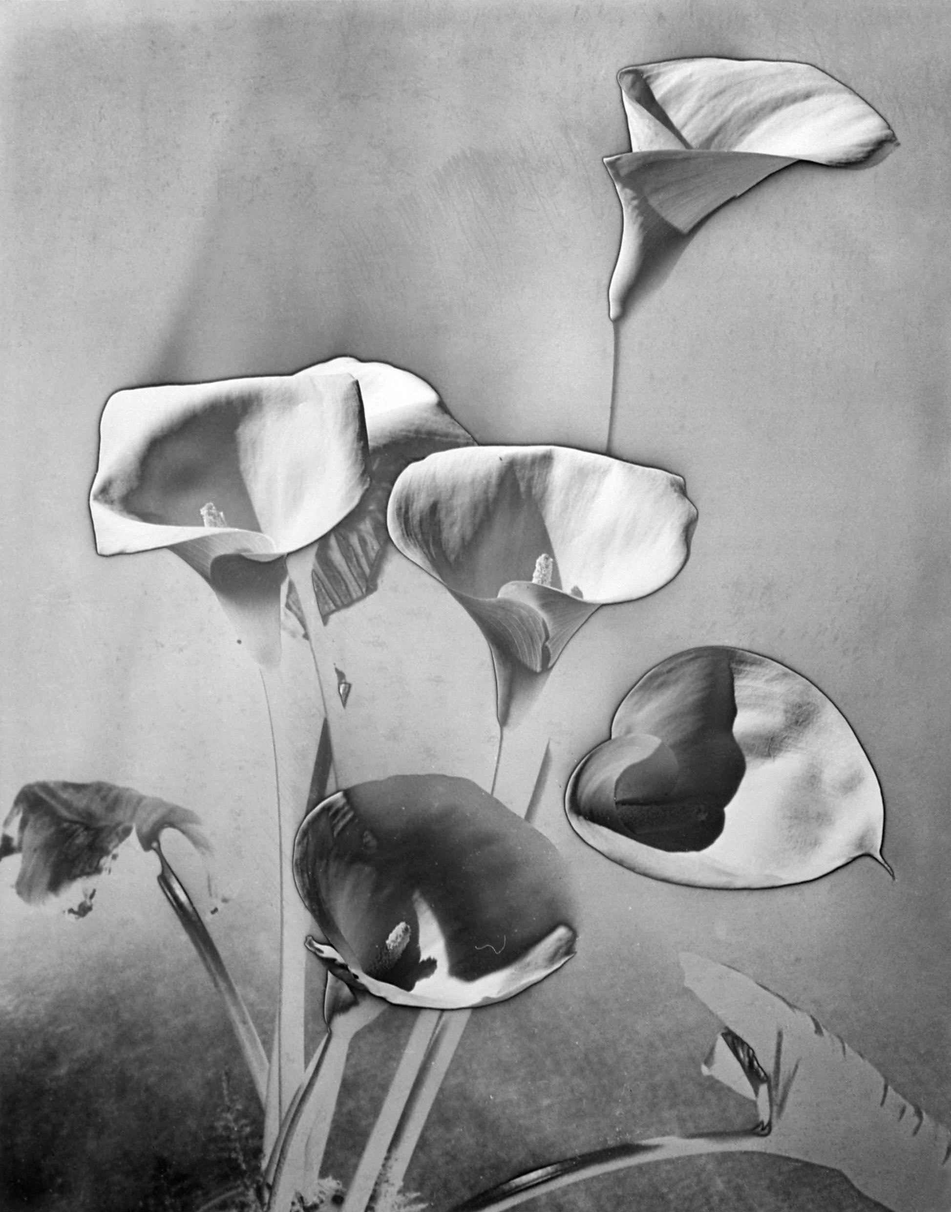
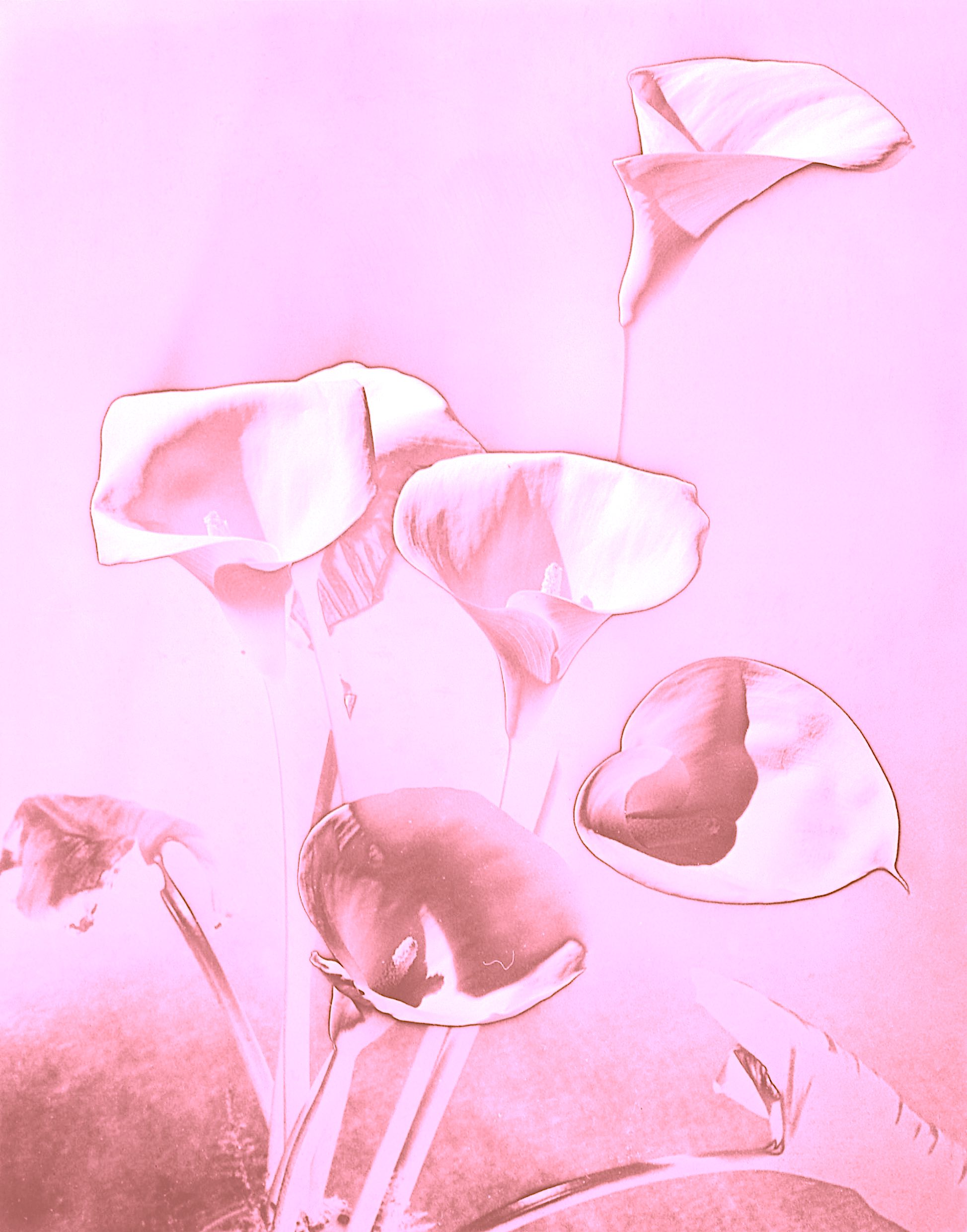
2. PHOTO without people: ‘Les Arums’ – (The Arum Lilies) Still Life Photograph By Man Ray. ‘Les Arums’ c. 1930. Gelatin Silver print (Estate print). 30 X 24 cm. © Man Ray Trust – ADAGP / courtesy MONDO GALERIA | TARQ. Accessed September 28, 2021. https://thewire.in/culture/man-ray-photograph-exhibition.
“It has never been my object to record my dreams, just the determination to realize them.” (1945) Man Ray.
Born Emmanuel Radnitzky, Man Ray (1890-1976) is an inspirational artist to me, creating some extraordinary art in the 20th century. He worked across historical art movements (e.g., Dadaism, Surrealism and Cubism) and explored many mediums such as photography, painting, collage, drawing, sculpture and film.
Man Ray made many photograms, which he called Rayographs (photographs without the aid of a camera). The key elements of his photographic style included working with different media to create Object art and Rayographs. By exposing the light to arranged objects onto the photographic paper, and repeating this process up to three times, he gained compelling works that appear like x-rays and reveal an unusual light. Man Ray experimented and explored the effects of tonal reversal in solarization, where a thin black line may show a distinction between the reversed photographed areas compared to the non-reversed parts of the image.
In my search for a photograph with no people I discovered many interesting photographs by Man Ray, such as an egg and Bird of Paradise plant still life, sculptural and architectural formations, and some lovely flowers such as a magnolia.
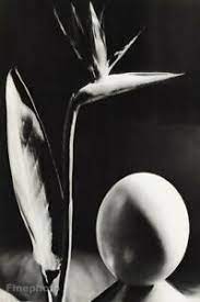
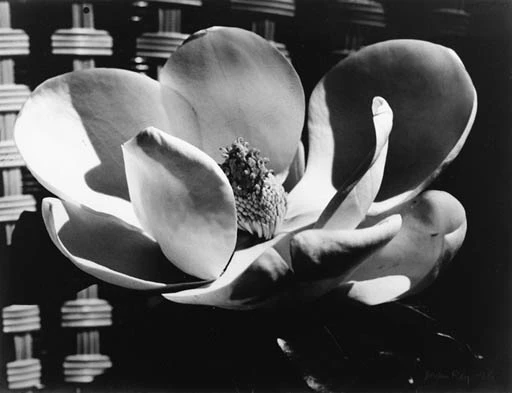
Sources: https://www.ebay.com/itm/1930-75-Vintage-MAN-RAY-Bird-of-Paradise-Flower-Egg-Still-Life-Photo-Art-12×16-/193629388496?_ul=IN https://www.metmuseum.org/art/collection/search/265487. https://www.mutualart.com/Artwork/Magnolia-Blossom/626D2F1797668092 https://www.nyfa.edu/student-resources/surrealist-photography/
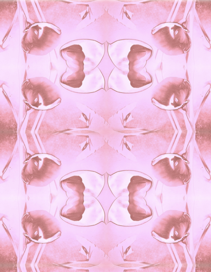
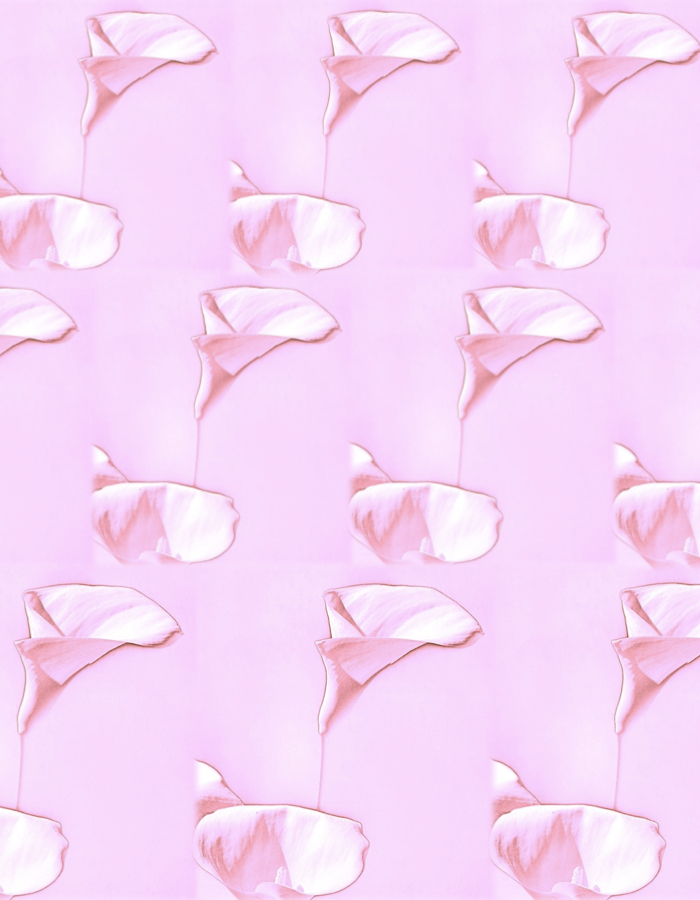
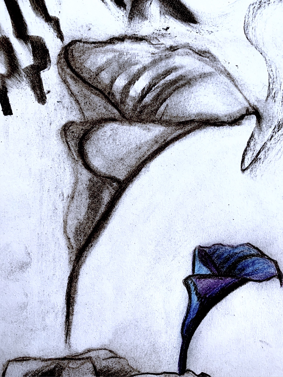
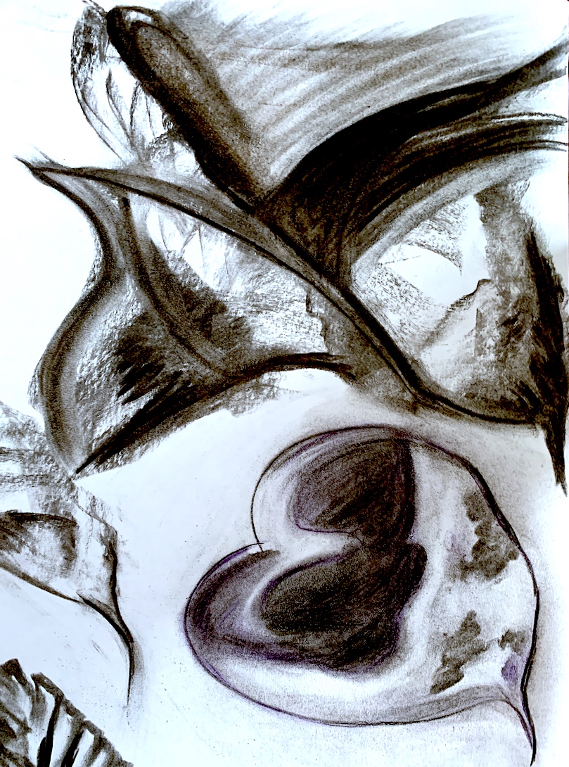
Yet, I chose ‘Les Arums’ (The Arums) because I like lilies, and I like the strange, mysterious silvery-tinted tone covering the black and white work. As I drew my first sketch (Figure 9), I noticed the solarization effect of the thin dark shadowy outline surrounding each flower petal edge. Some flower heads have no connecting stem, and one appears to float, and is not attached. I wonder if Man Ray had knowledge of the fact that every part of the Arum lily (Zantedeschia genus) is poisonous. Whereas, the Calla lilies (Calla genus) growing in my garden and the Arum’s colourful smaller version and same plant family, are not.
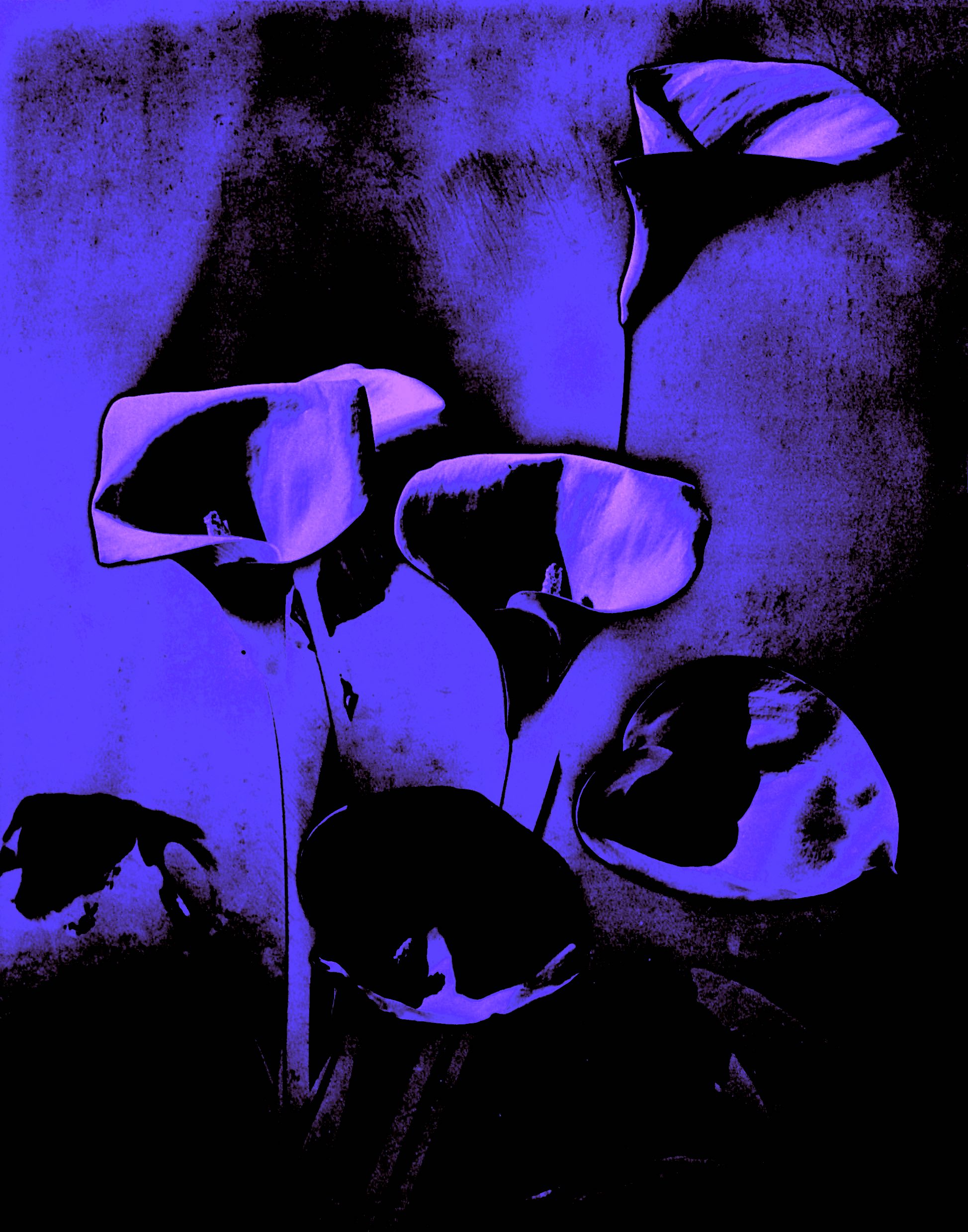
I am inspired by flowers, and I began this process again with digital manipulation. The reason is, it is a helpful way to get to know the selected work and Man Ray’s photographic composition. His flowers seem to be very close to the viewer, forced up against the foreground. There is little background space, perhaps a sheet or wall close behind, therefore the flowers were set and arranged in a small space. The plant’s pot base (or a vase?) that the stems propell out of, is not seen in the picture plane.
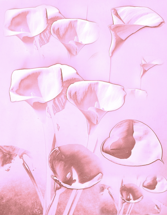
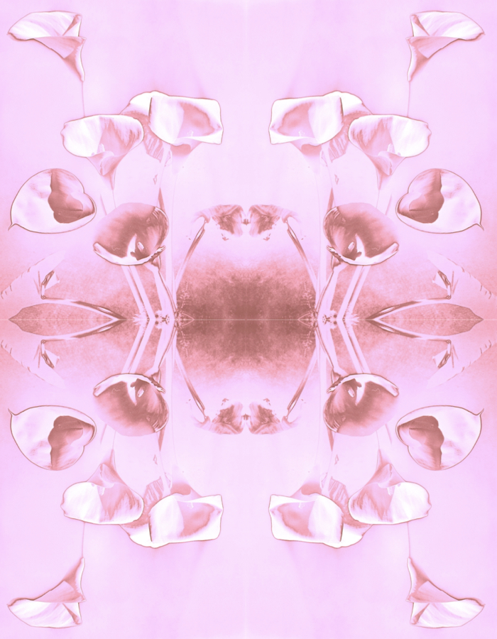
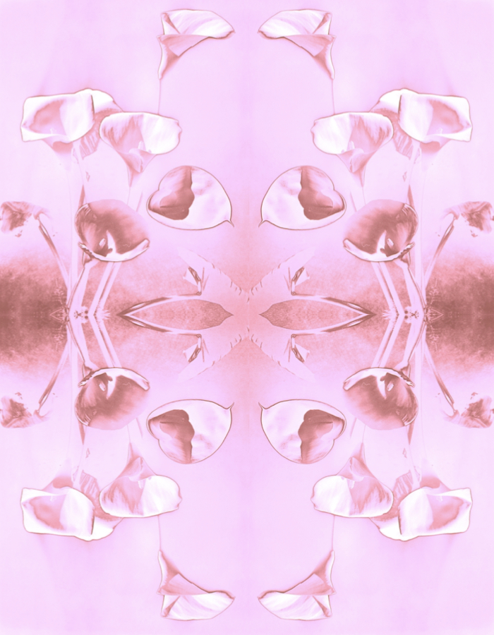
Below are my images that are inspired by the above photograph, and I altered the colour, shapes and forms. I changed my picture plane space, making some float, and repeat across the surface area like a digital quilt. I chose a soft colour, and a series of pale pink patterned works emerged. Some remind me of wallpaper patterns and textile designs.
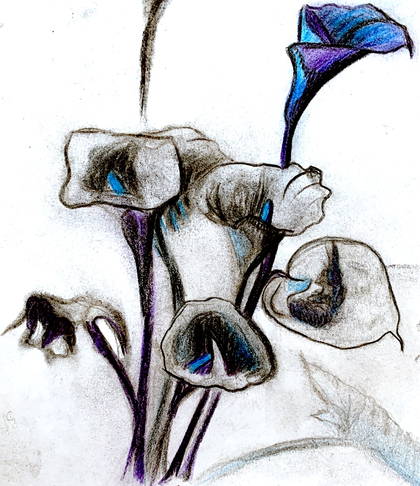
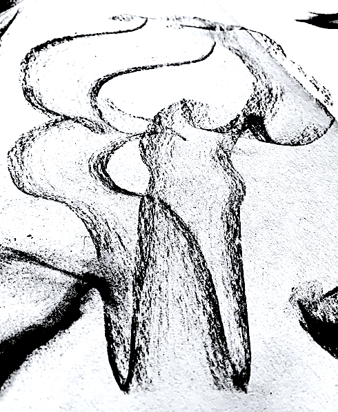
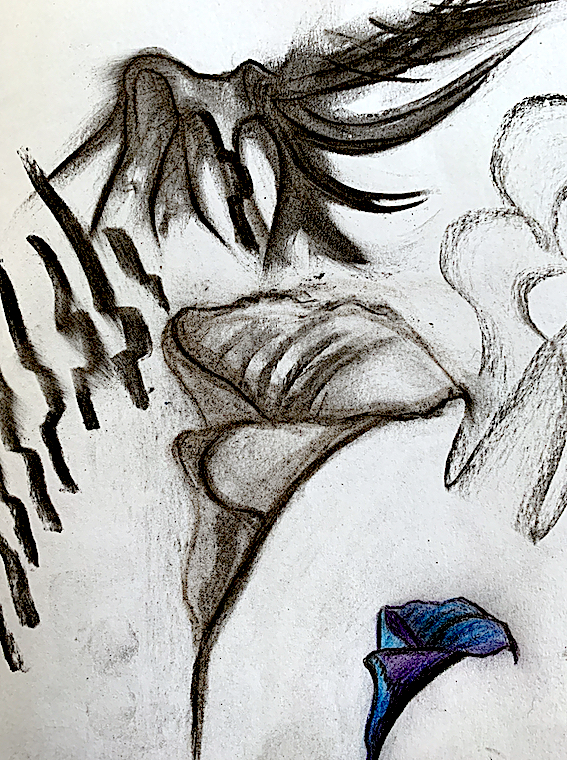
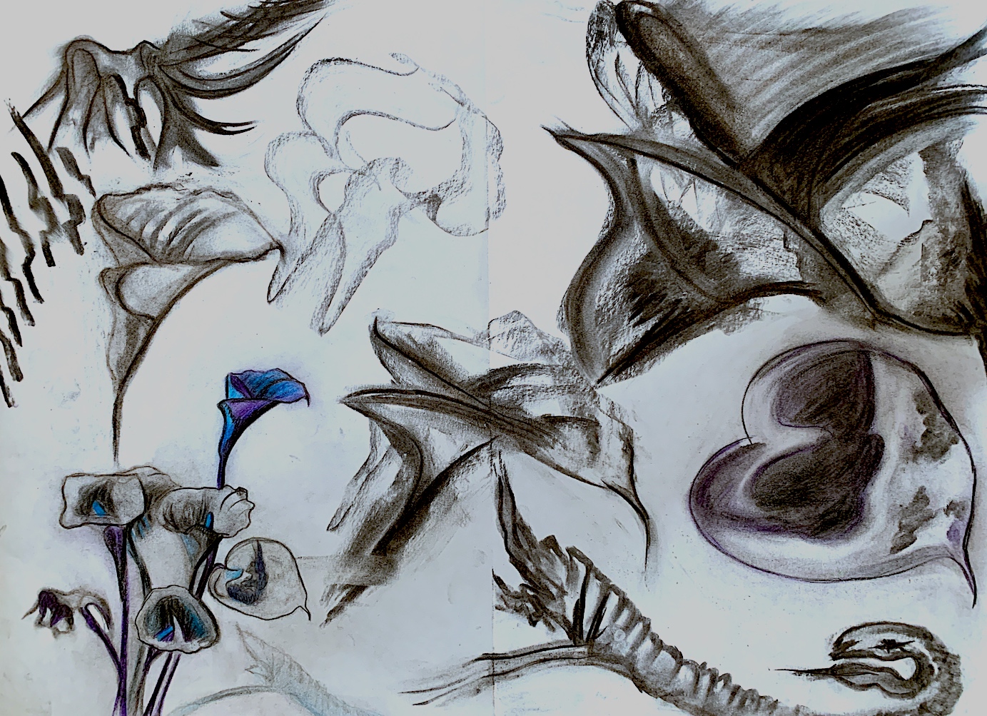
As I found the black charcoal helpful to free up my hand movement on the first selected artwork, I utilised it again. Yet, this time I introduced colour to my drawing sketches via new materials of colour pencils and pastels. The charcoal skidded over the waxy coloured pencil though, and it was difficult to mix and merge the two together smoothly. I gained lots of black charcoal dirty fingers in an effort to blend.
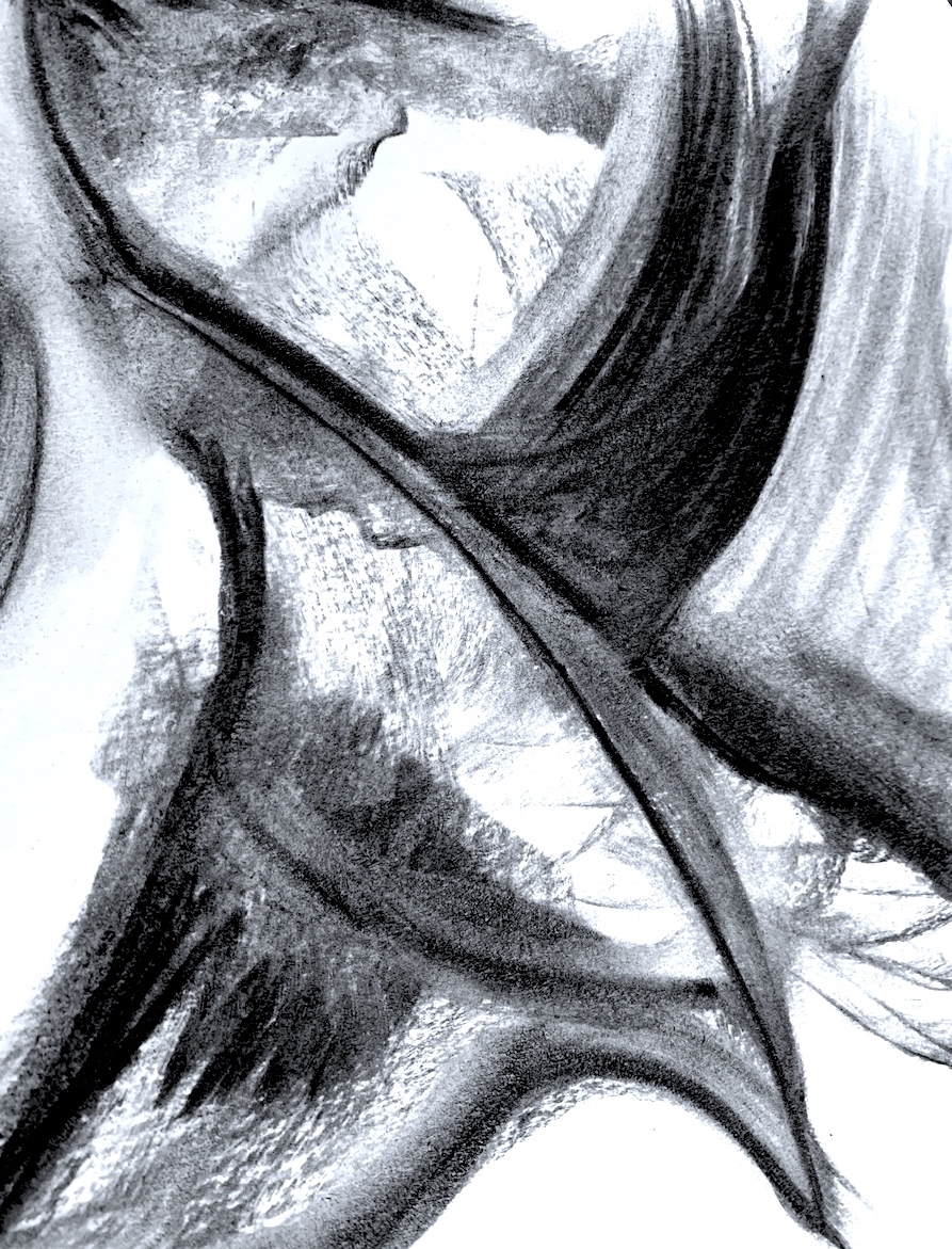
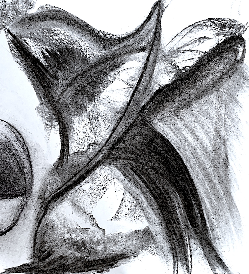
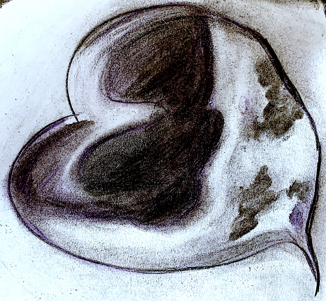
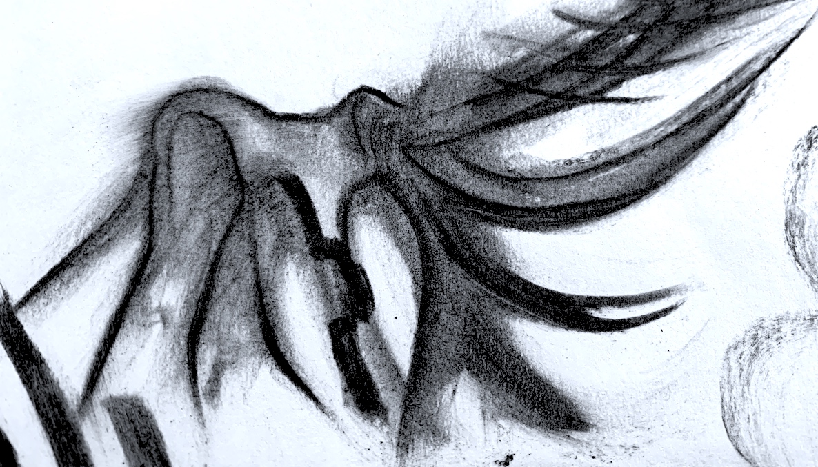
Below are three angles of my fastest sketch, it took 1 second! My hand just raced around the spot in a curving figure of eight type movement, and I was happy with the outcome! Amazing, as I never seem to be satisfied with anything I do. Visually, Figure 11 reminds me of a tooth (with roots) from one angle, because I positioned my body low to photographed it. The other two images (Figures 12 and 13) appear to be lounging, like a figure lying down or reclining.
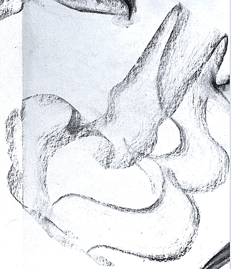
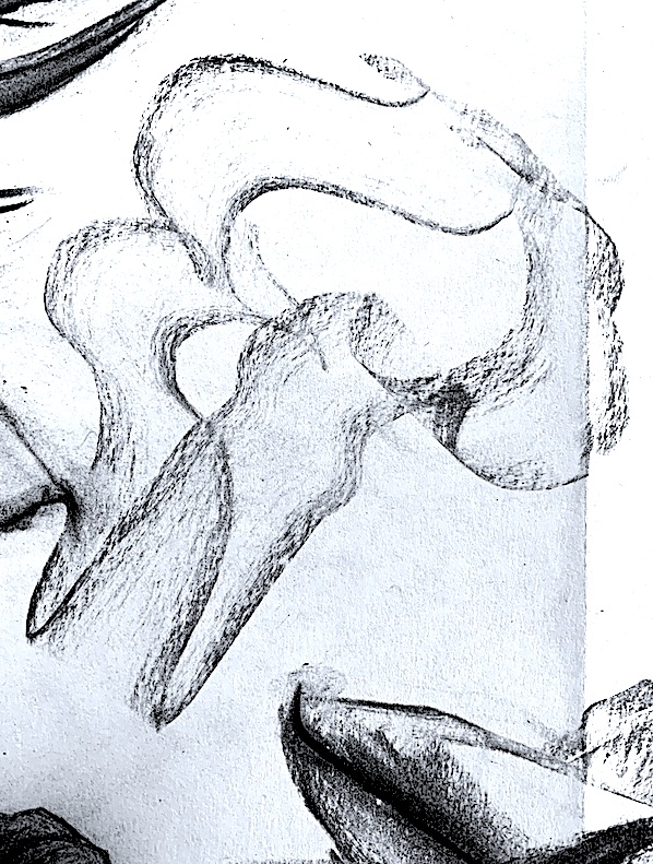
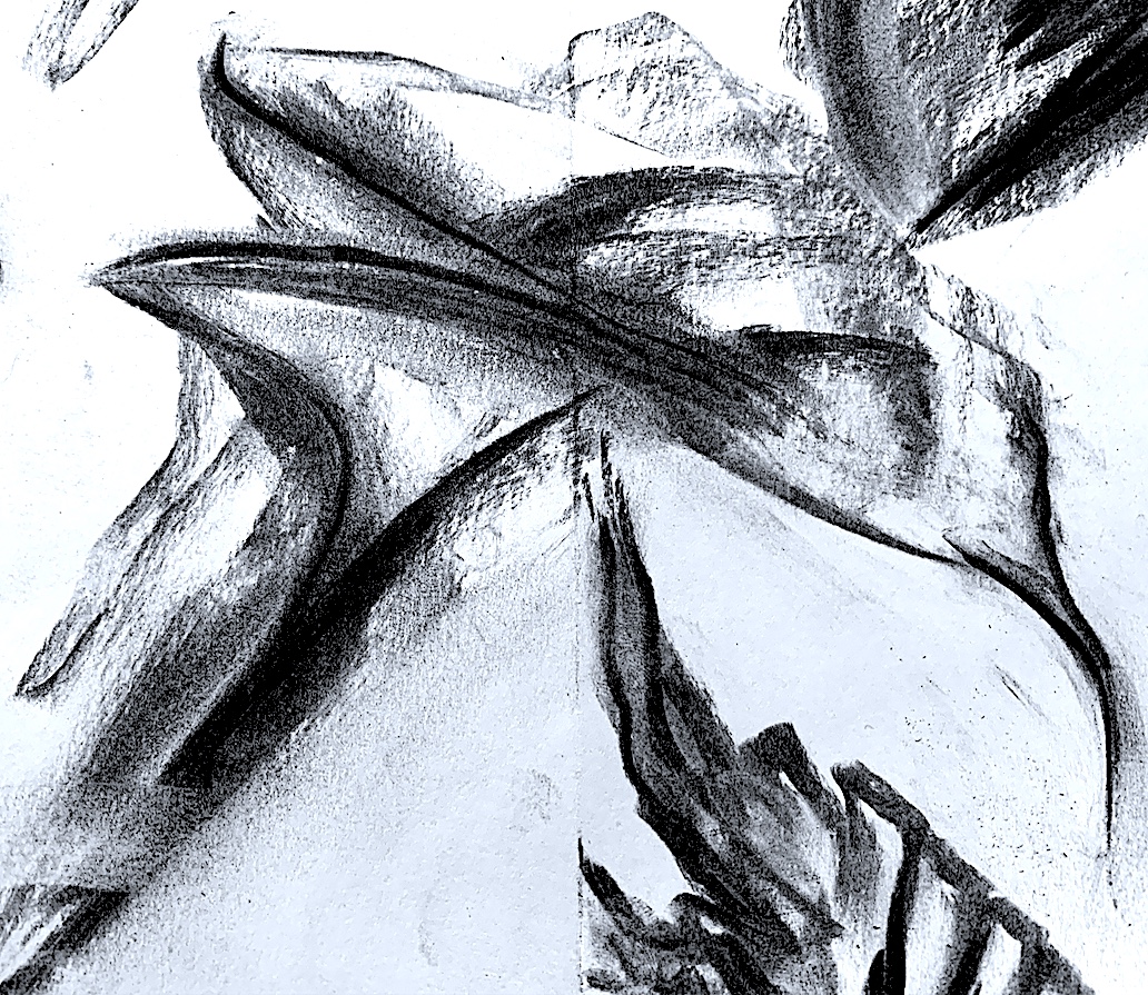
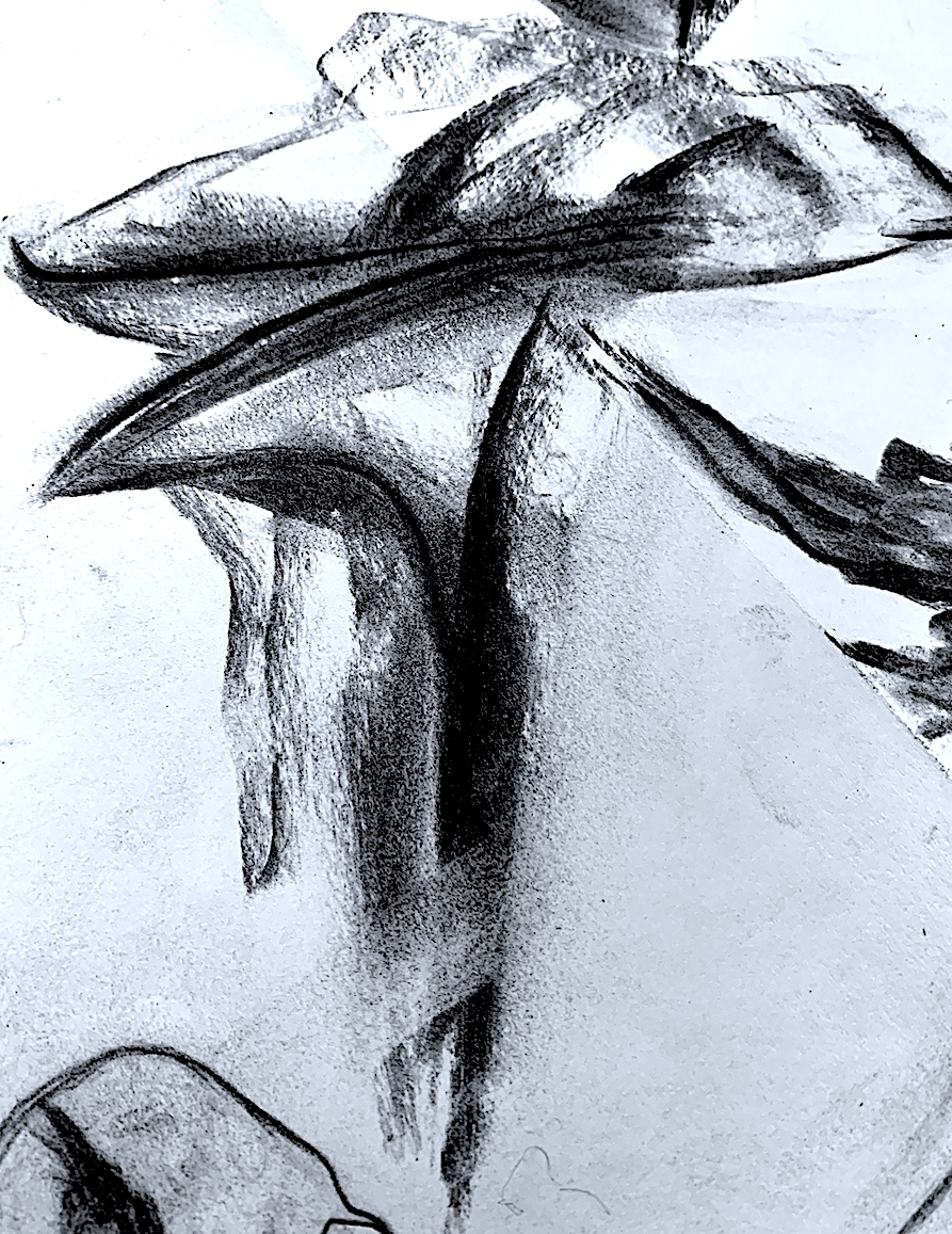
I really like this strange lily, (Figures 16, 17 and 18) at different angles. I could not decide what angle it looks best at, perhaps Figure 17 is my preferred way it should be viewed from. As I drew quickly, it became larger and darker, with more definition, some surface areas portray light-filled patterns of soft charcoal marks, and others have complicated tonal areas with exaggerated feathery protrusions.
It was recommended to try a neutral toned paper as a base, so after finding some (crinkly) brown paper, I created two abstract linear pastels (Figures 25, 26 below) keeping the soft colour look. My inspiration came from my Pale Pink Digital series above, plus the line work in the above Figure 24.
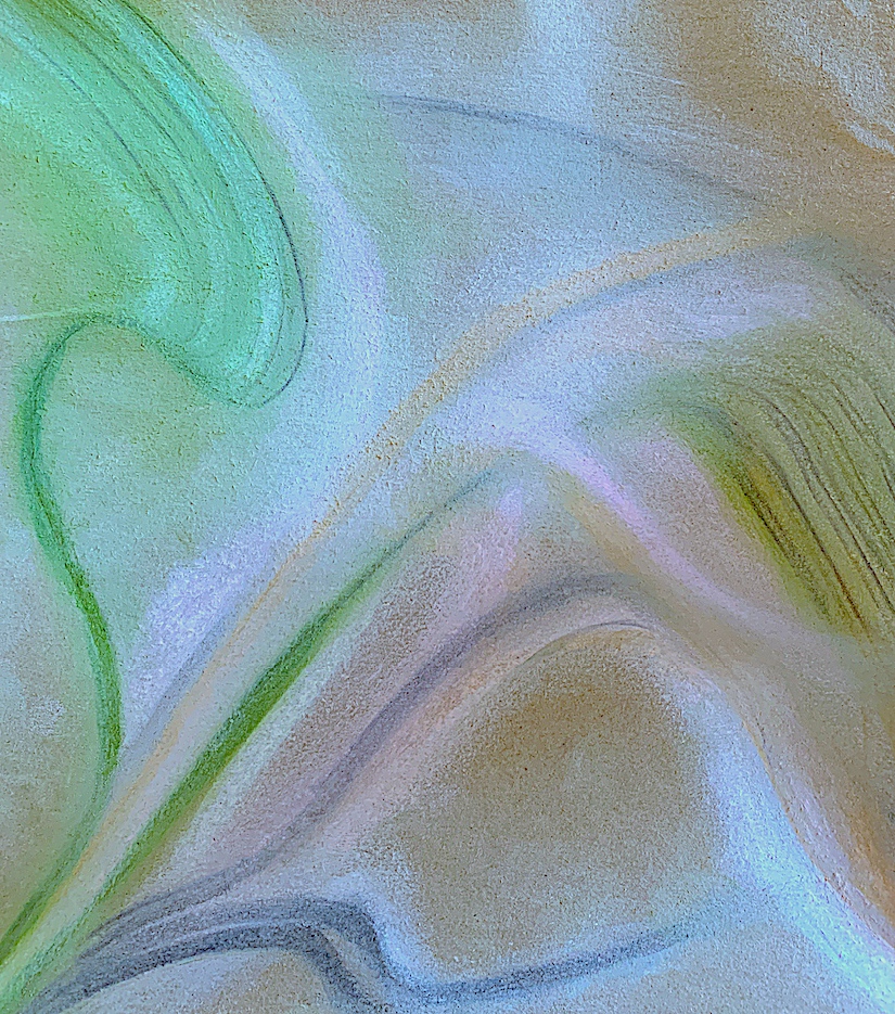
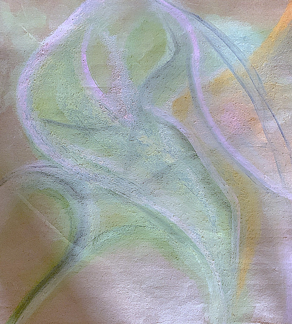
I am quite pleased with these colour sketches, as I tried to just focus on the element of LINE and the element of COLOUR. Interconnecting lines were smudged, blended and layered over each other in cool tones of blue and green. Hints of warm yellow and pink tones were mixed with a cream pastel, rising and crossing over, in and out. I could not resist adding a touch of charcoal, but blending it softly to create shadow lines of grey.
Seeing some of my lines not accurately even or balanced is sort of okay, because time was more important, I was determined to make these sketches quickly. I am pleased how the rough brown paper (with no pastel marks) breaks up the colour scheme. This reminds me how some contemporary artists today leave certain spaces in their composition free and empty of paint. This creates a positive and negative space juxtaposition where painted colours sit on the surface area next to bare, fawn-coloured Belgian linen.