Although we have to finish off our first year in lockdown, got to say I really enjoyed this painting/printing brief in lockdown because it gave me more confidence on how to be responsible for my own learning, because at first, I was lost with what to do and didn’t have the motivation on doing anything, but with the help and support from lecturers I was able to make a start and finally upload works on the blog. After researching some artists that were on the slide talk, I started to understand some of the things that were required for the brief and the different ways that these artists make marks. I started to think of how I could make art pieces, so I stuck to three artists that I was interested in for this brief, Amy Sillman, Joan Mitchell and Gerhard Richter.
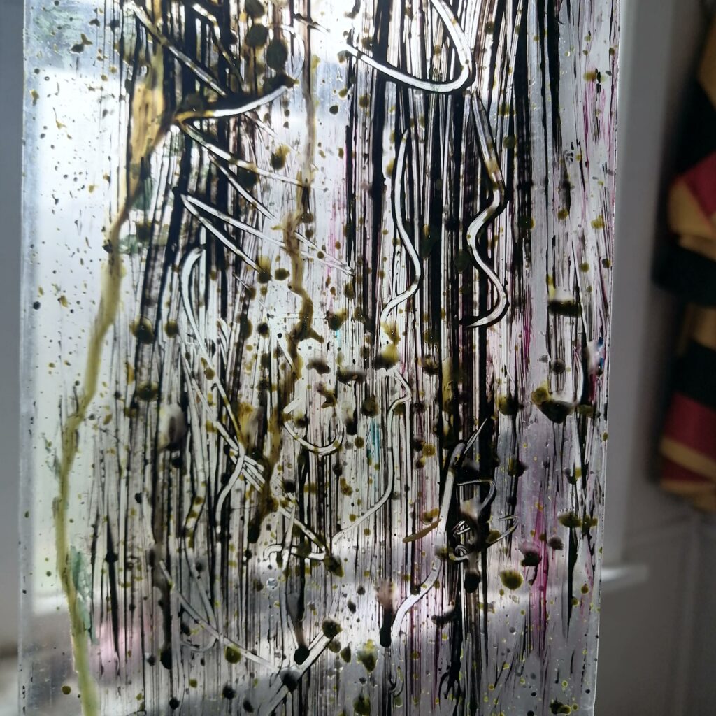
These were my two favourite pieces for the brief and it is because of the black colour that stands out of the painting. At first I dragged the paint on the surface and keep doing it until I was satisfied and these were ideas that I got from Gerhard Richter of how he uses a squeegee to drag paint, instead I have used a piece of cardboard, then I apply the black paint in works of Amy Sillman which were influenced by works of Joan Mitchell. Combining the two artists technique to create these two pieces which look similar to each other.
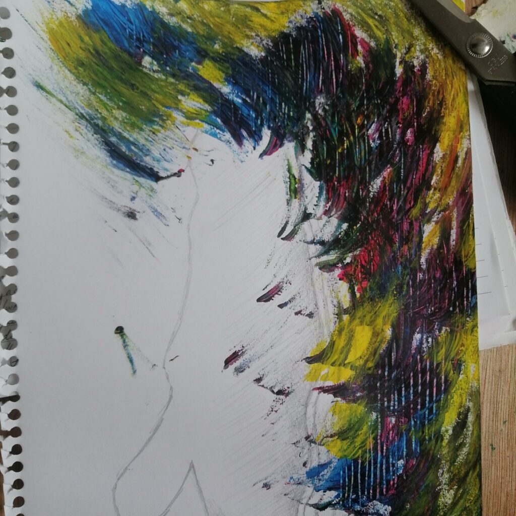
I really love this reggae colour thing and I wanted to keep producing works like the previous one. In this piece, I used brown paper and paint. In works of Amy Sillman, I was really interested in this black that comes in the foreground of the whole work and Gerhard Richter with the paint being dragged across the surface. Combining the two artist together to create one of my pieces for the brief. I really love this image and I thought it looks great, simple but it has this strong contrast between this dark painting in black and the three colours in the background.
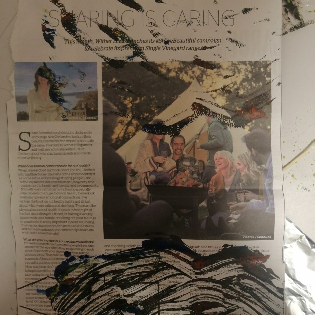
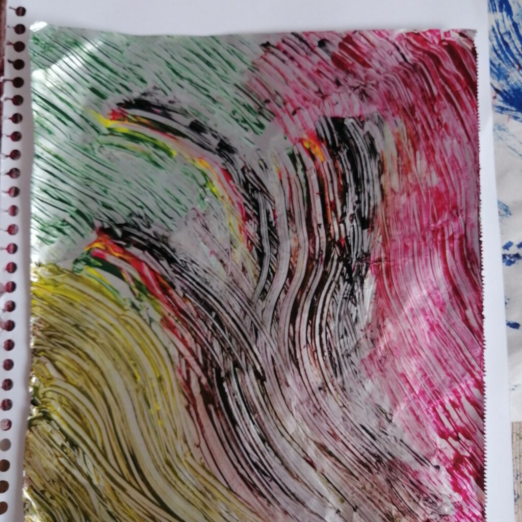
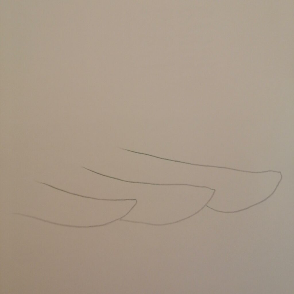
This piece, I used a drawing from week 2, using foil and dragging paint on it until I print it on a piece of newspaper.
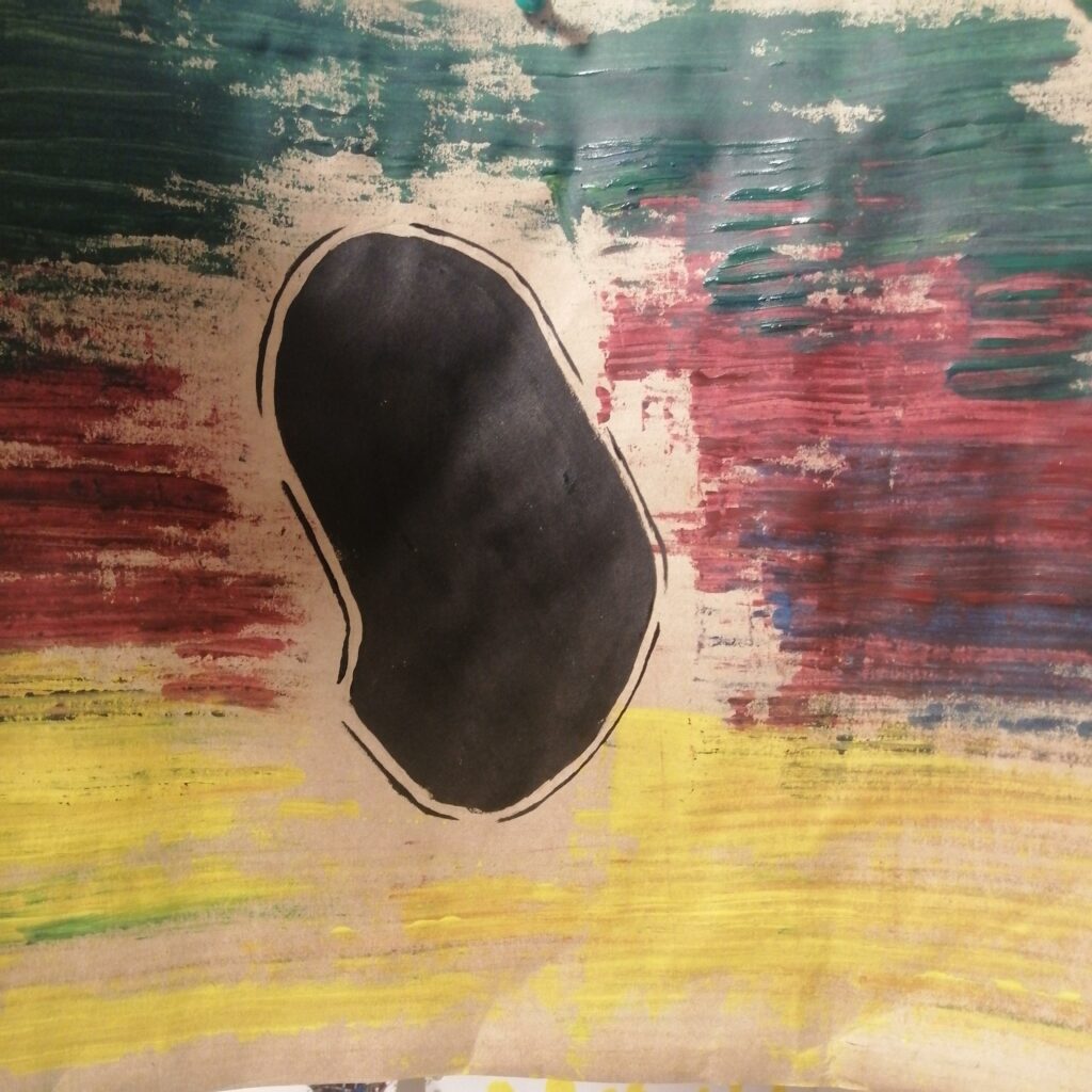
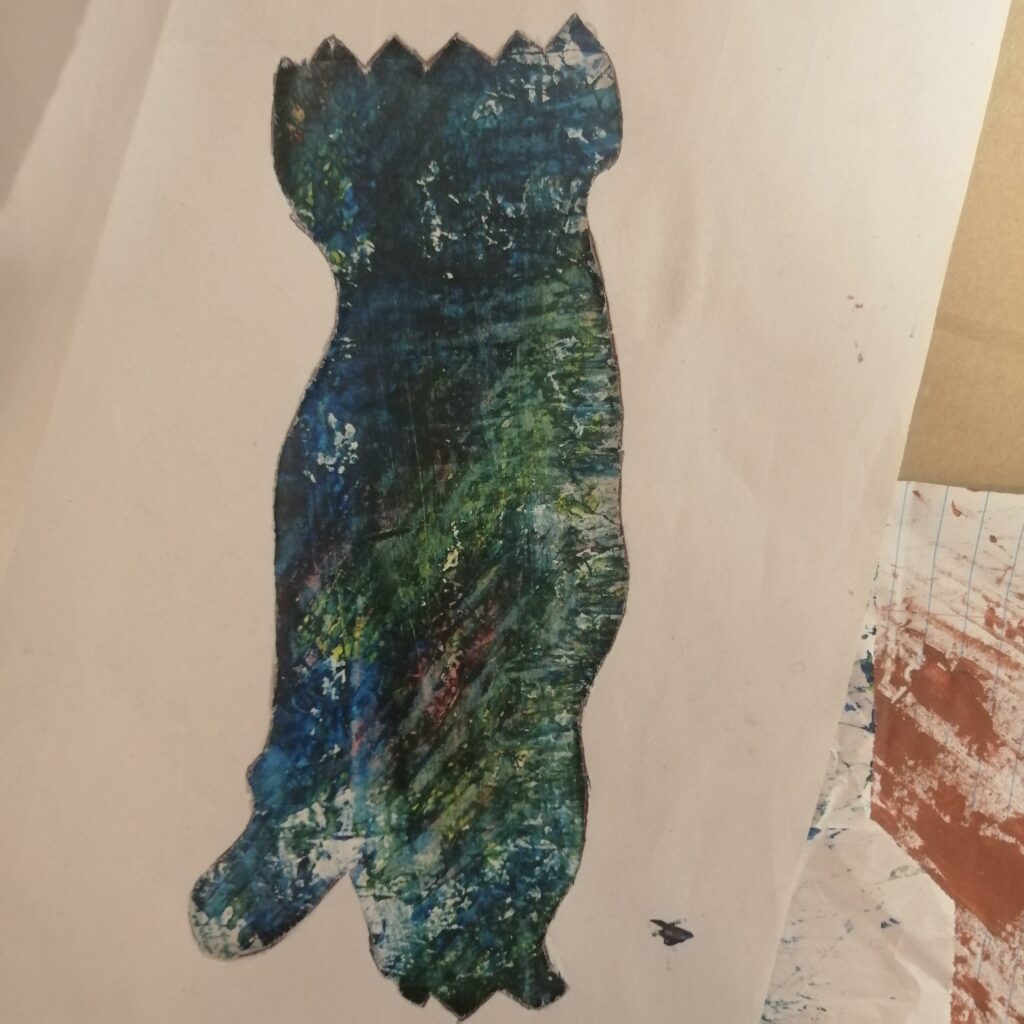
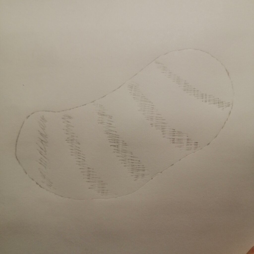
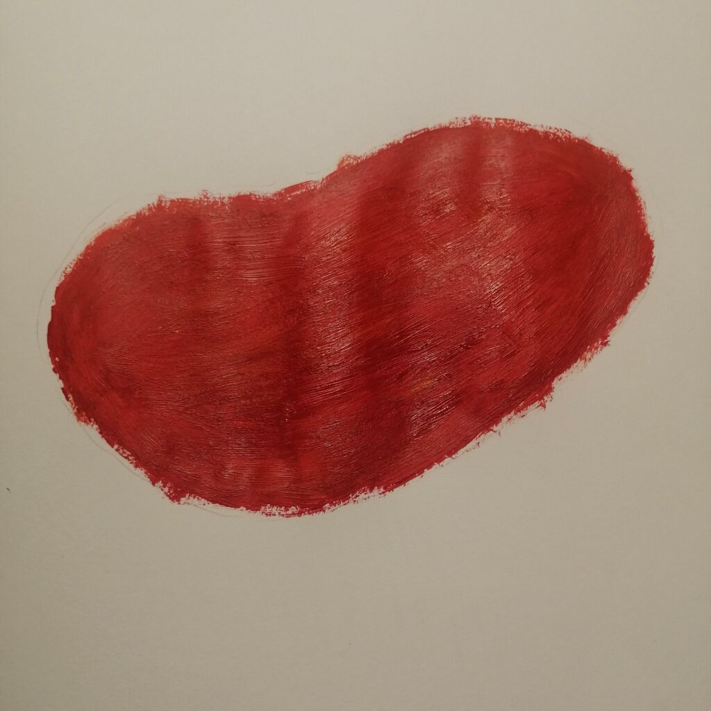
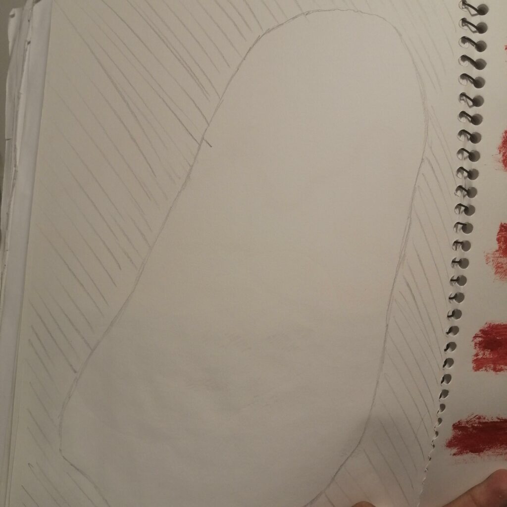
With the first work of how the different colours are in the background, I decided to paint the background black and a drawing from week 2.
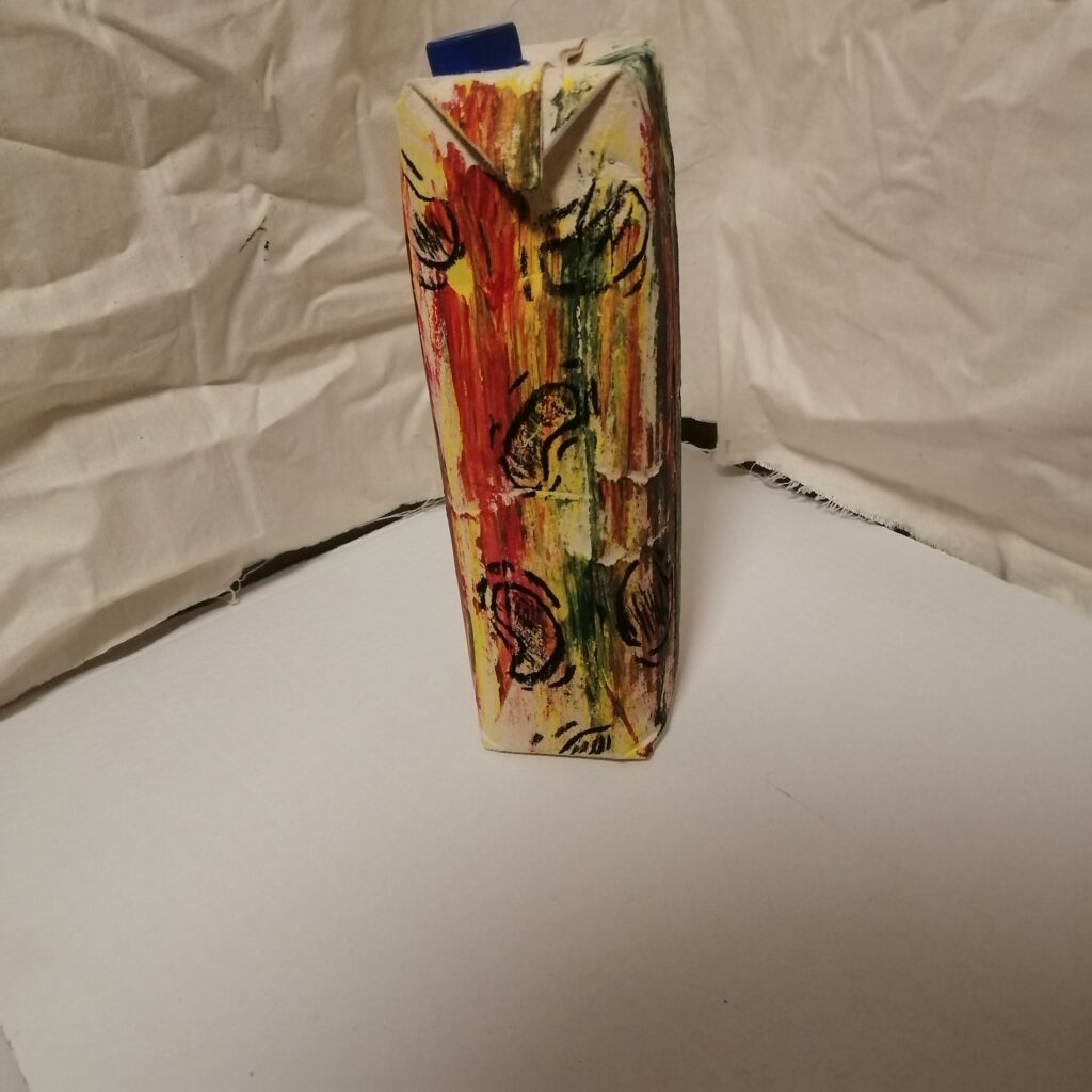
Using a juice box of fresh up to experiment mark making, I painted the juice box until drawing on it with black pastel.
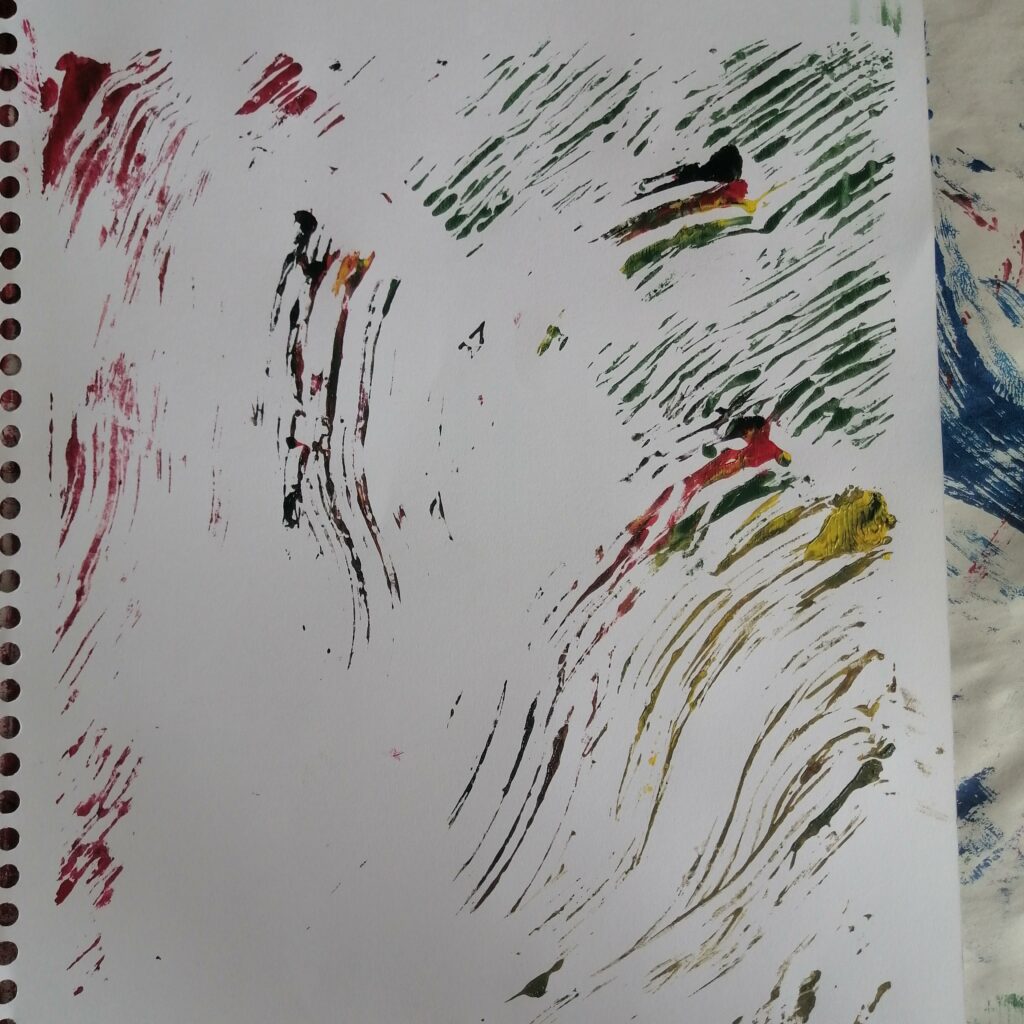
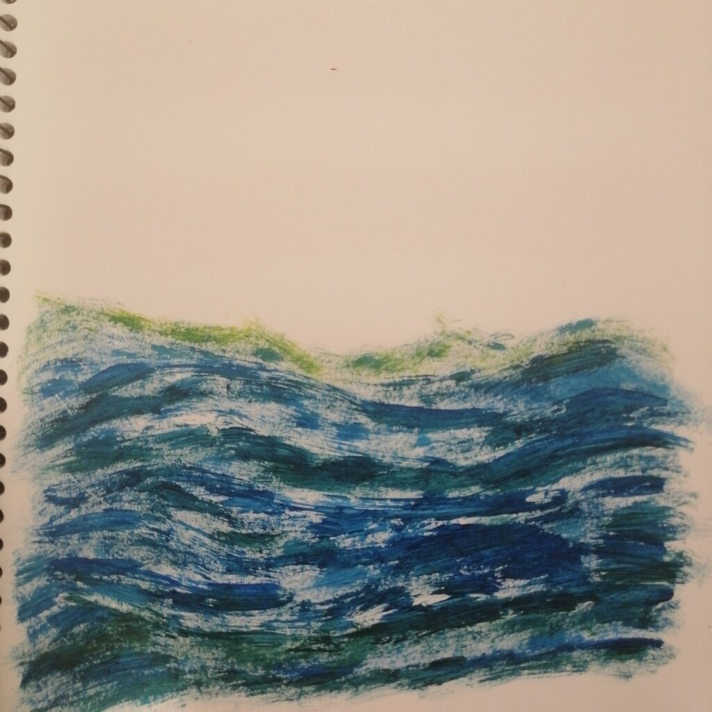
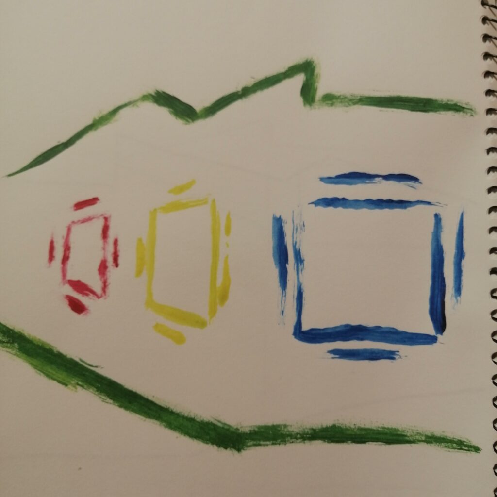
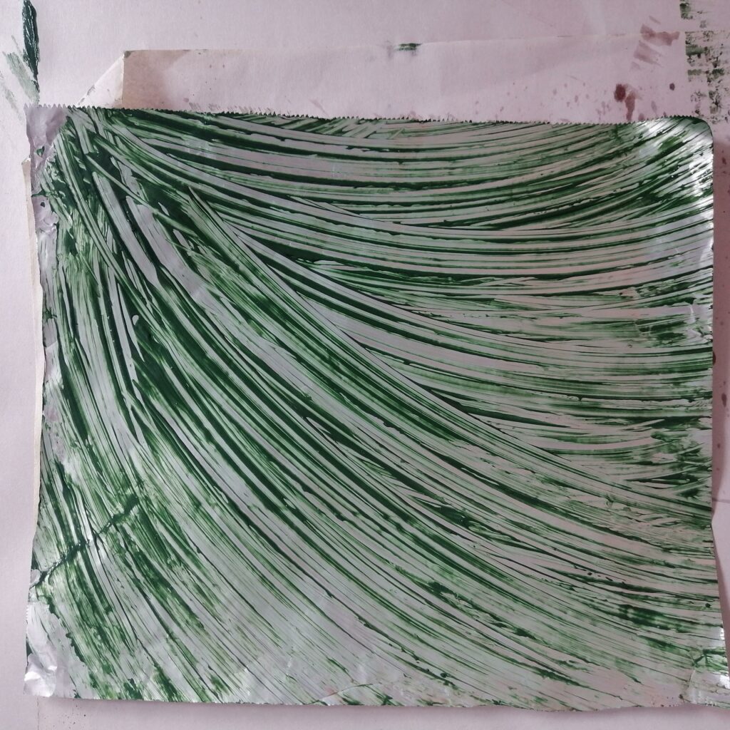
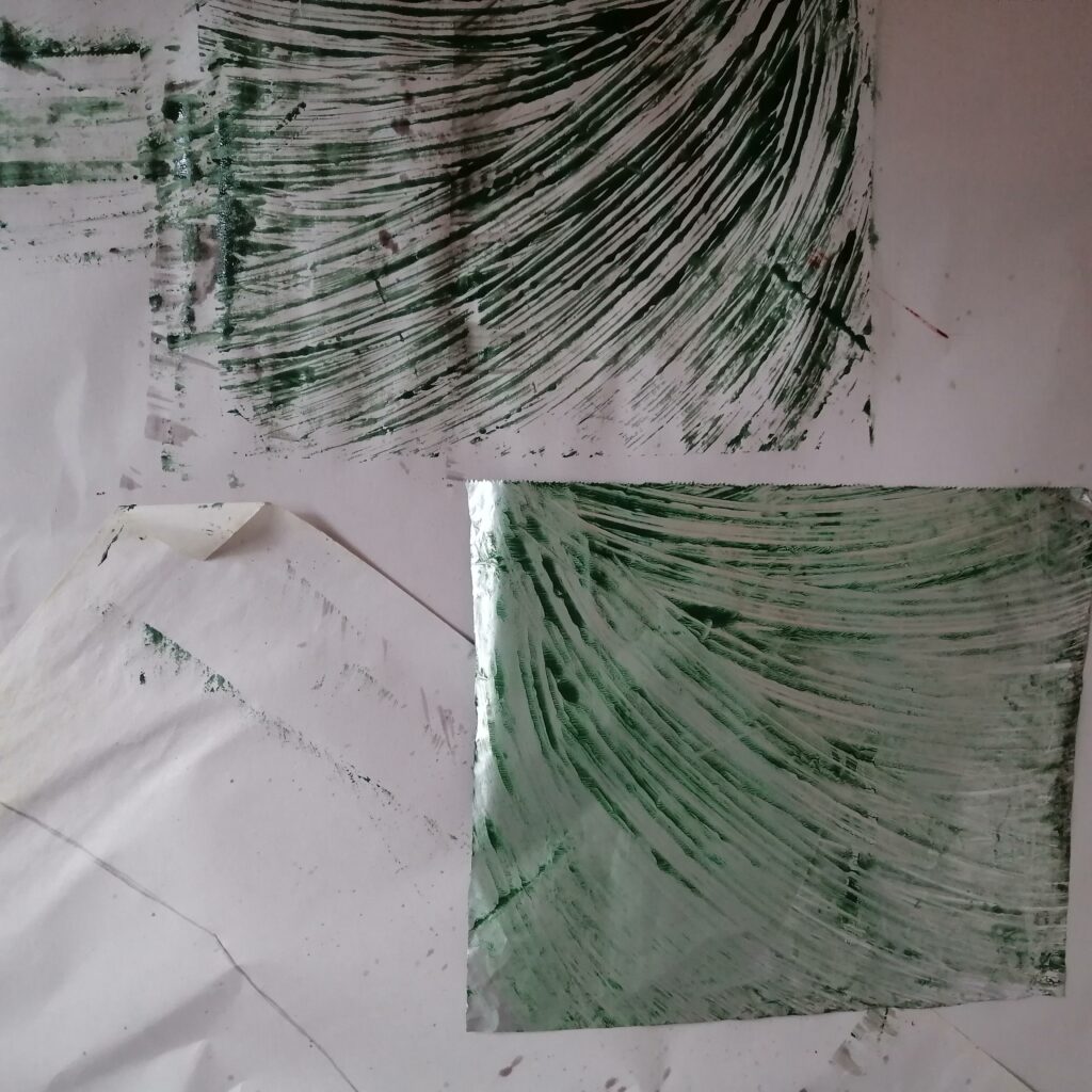
Just did another experimentation with foil and printed it on paper, this time I used different colours and divided them into sections. Using reggae colours(red, green, yellow, black) and having these slopes of paint sort of going into one direction. As I print it on paper, I really loved how it turned out, almost looking like the lines in The Starry Night by Vincent Van Gogh.
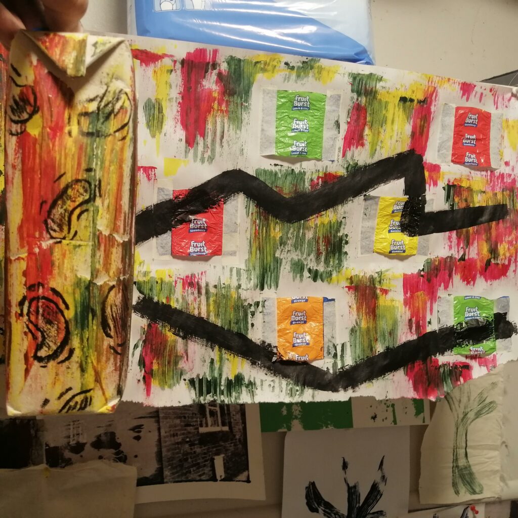
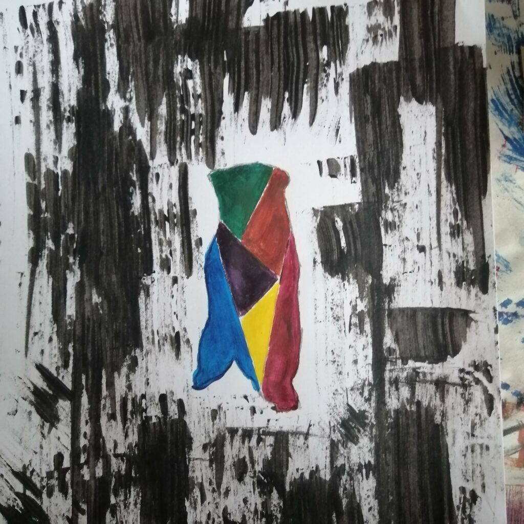
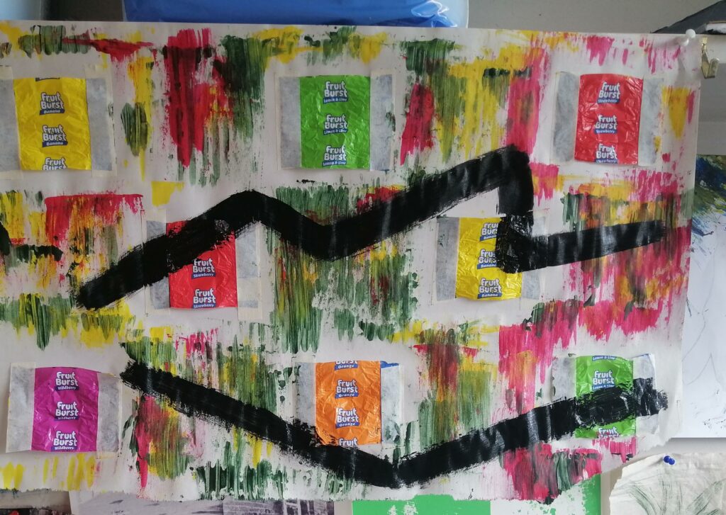
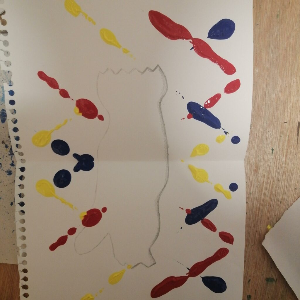
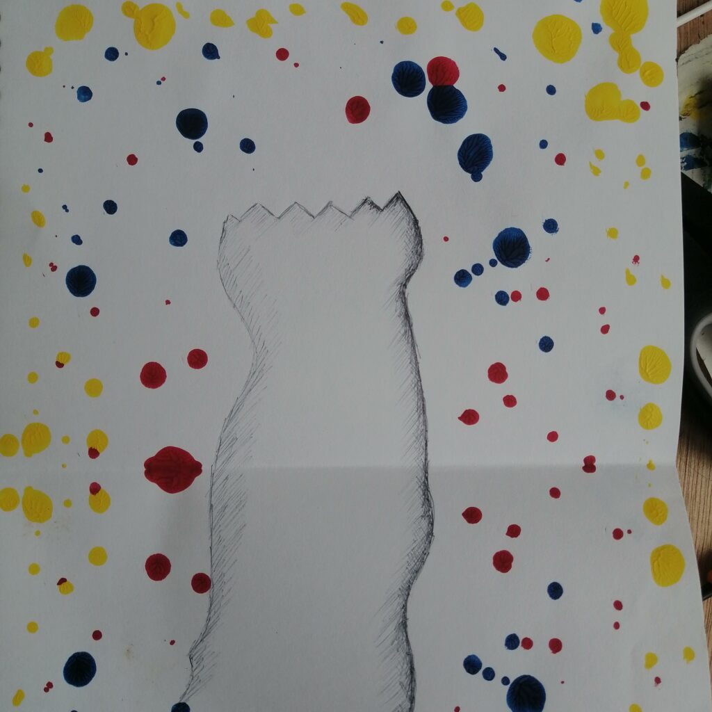
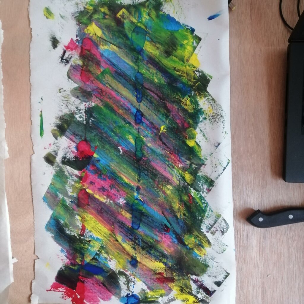
With this piece I decided to use the three colours in the background and had a drawing in black paint. At first while I was making this piece, it wasn’t something I expected and I really loved it and consider it as one of my favourite works in this brief. Randomly added the wrappers of the fruit burst lollies in the background because I thought of the different colour wrappers and reusing them in my artwork.
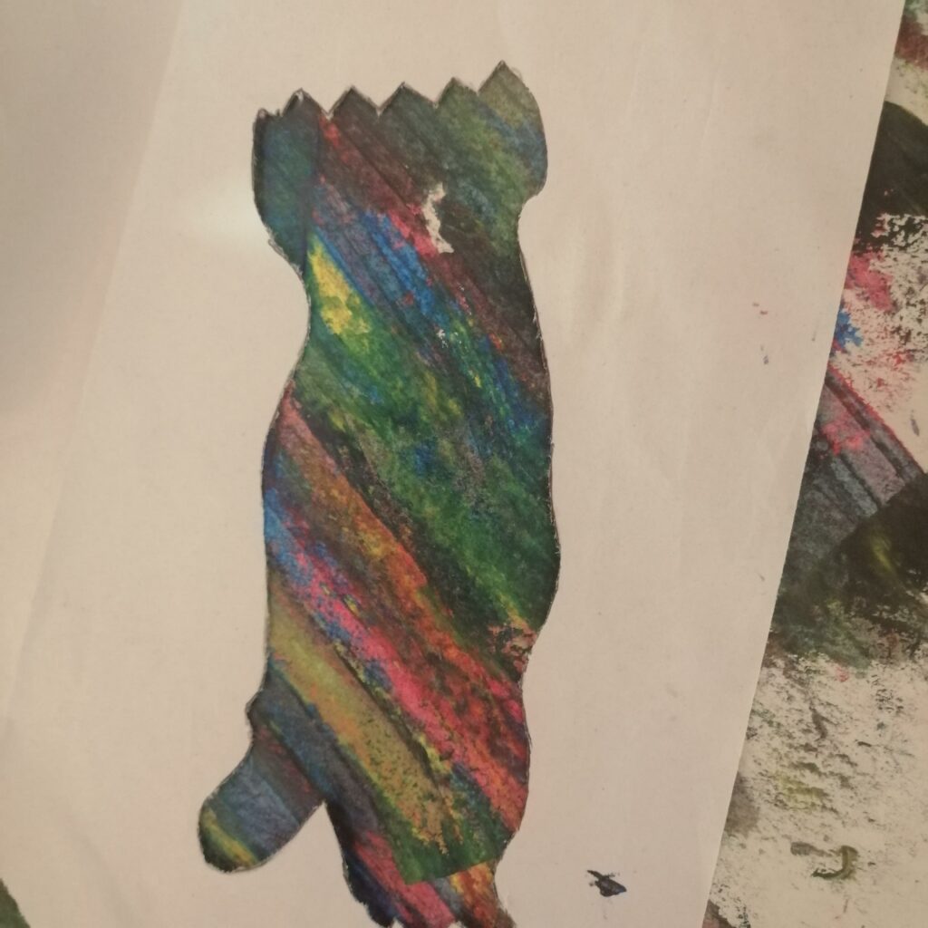
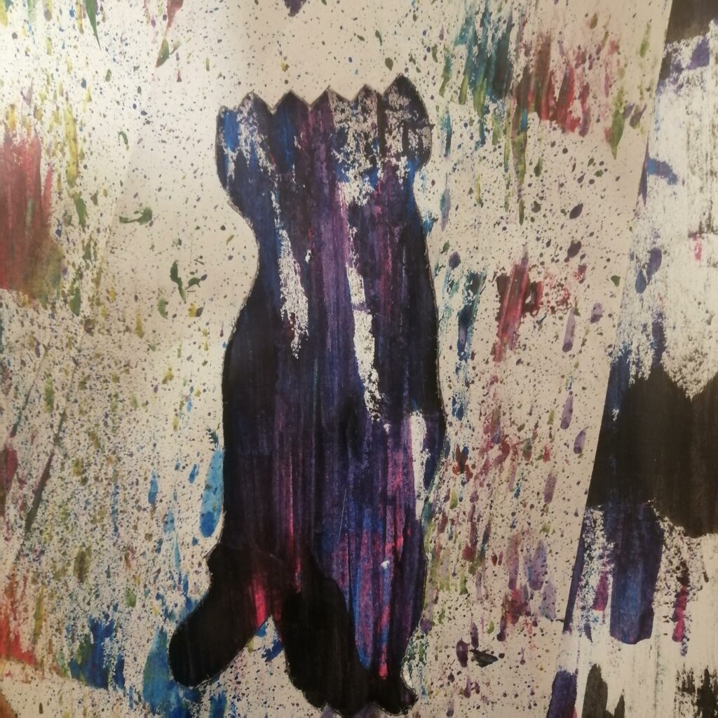
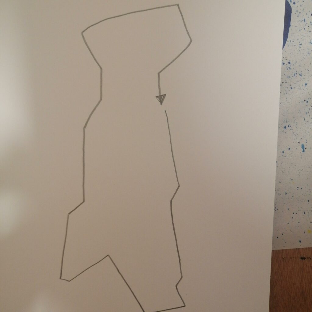
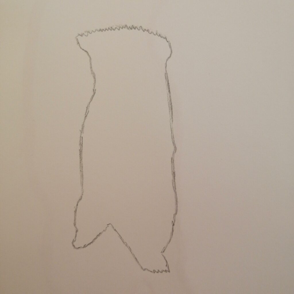
Just experimenting on the marks made in week 1 and a drawing from week 2, into producing something different. Just making stencils of the drawings and using the marks or “verbs” as the background. I really enjoyed this task, looking at what some of my classmates works had gave me some ideas into making some artwork.
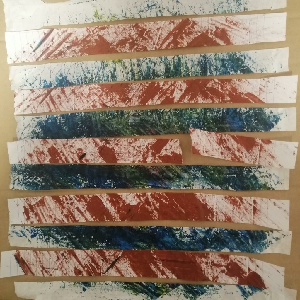
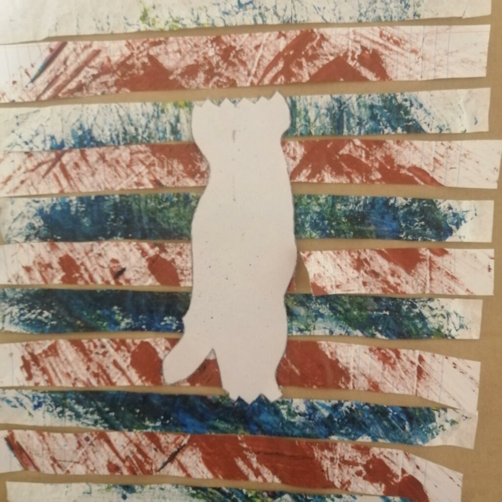
In these pieces below, I decided to make marks on two separate papers , it’s obvious they have been cut into strips of paper and then arranged onto a cardboard and I love this artwork as it has this pattern with two different colours. I had thoughts on Silvia Bachli as she makes a lot of drawings and arrange them afterwards, so I was still thinking of ideas until I cut two separate artworks and combined them into one.
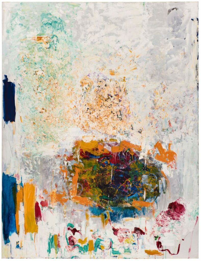
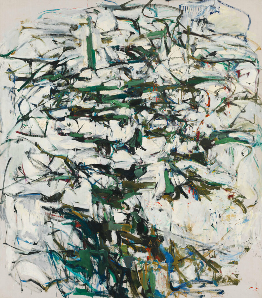
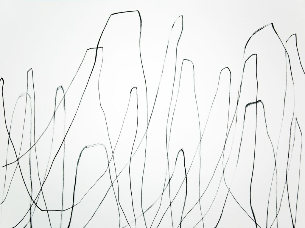
Joan Mitchell, a famous painter/printmaker, born in Chicago, moved to New York where she became known for working around post war art movement. She was leading American abstract expressionist and some of her works are layers of paint and brush strokes and marks made, with her themes or inspiration of nature like her work Sunflowers in 1991 with different colours in the artwork. While she was in New York, she worked and spent time with painters/poets and it was when she developed these abstract expressionism paintings and a different style. In 1955, Mitchell moved to France, and from living in the city she moved to a small town called Vetheuil near Paris, she had more space paint and was surrounded by nature with a lot of trees, flowers. She had so many dogs and they were special to her, and some of their names are often found in the titles of her artworks. Mitchell painted her whole life, made some drawings, had some works with pastel and watercolours, and also a lot of other printmaking works.
Sunflower, 1991Hemlock, 1956
In this artwork, Mitchell has made brush strokes with the greens and blues creating a rhythm with these colours flashing through the artwork almost referring to a tree, with the title from a poem called Domination of Black by Wallace Steven ‘heavy hemlocks’. But also the white that is exposed in the foreground and background and all of this which is conjuring by light, sound, and movement. A lot of Mitchell’s works were all around nature and landscape and it’s evident by titles of her works such as Sunflowers, No Rain, Hemlock, City Landscape, and many more.
Gerhard Richter
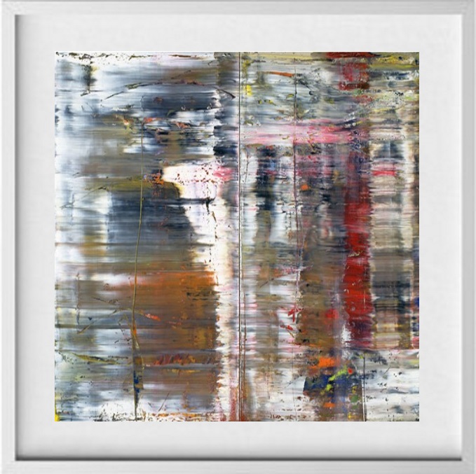
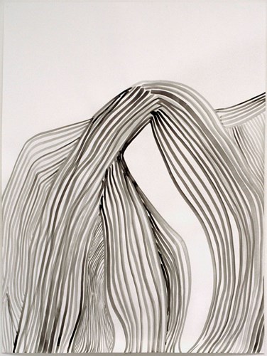
A well known German visual artist who is famous to emerge from post-war Germany. Gerhard Richter is known for wide influential paintings and creativity, he has explored art through paintings and photography, making work that incorporate with visual effect of photography and found images. Richter studied at the Fine Arts Academy in Dusseldorf, Germany. He has made glass panels and stained glass windows. Layering and erasing are critical to his art practice. Some of his works have been sold for tens of millions of dollars and it was 1962 that Richter had started painting.
Abstract Painting (726)
The scraping and streaking of paint in Abstract Painting(726) produces a reminiscent of photographic blur. It shows his use of photographic imagery. In his work he adds paint, he presses, he squeezed, and scrapped across the surface, then using a squeegee and dragging it across the canvas. When he moved to Dusseldorf, he began making paintings from photographic imagery.
Silvia Bachli
Silvia Bachli, a swiss artist and photographer. In her drawings, she explores the very edges of the world, trying to understand how everything works and establish. She focuses more on detail of the drawing rather than big parts of it, focusing on fragments or the reflection of the image. Bachli works with sheets of white paper, India ink, charcoal, oil pastel, and gouache.
Most of her drawings are either zoomed in or cut off. She works on each piece one by one, then sorts them out or arrange then before displaying it. It is time consuming as it takes a year to make 1 or 2 installations.
Amy Sillman
Amy Sillman is an American painter and her art practices involve cartoon, drawings, iphone video, and collage. Sillman layers and erases bold brushstrokes, she combines precise references to the body, and fills it with a sense of humour. She reinterprets works of Abstract expressionists like Lee Kresner, Jackson Pollock, and Joan Mitchell. Sillman uses silkscreen, ink, chalk, gouache, acrylic, linen, and paper.
Twice removed, Amy Sillmanexhibition
Sillman is known for her paintings, but she also has drawings, animated films, and collage. She has exhibited in New York, Berlin, Paris, London, Hong Kong, and Los Angeles. Her works belong to collections of Art Institute of Chicago, Whitney Museum of American Art, Brooklyn Museum, the Museum of Modern Art, Morderna Museet, and Saatchi Gallery.
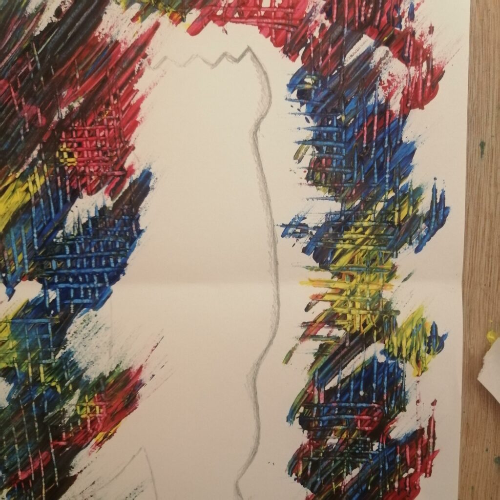
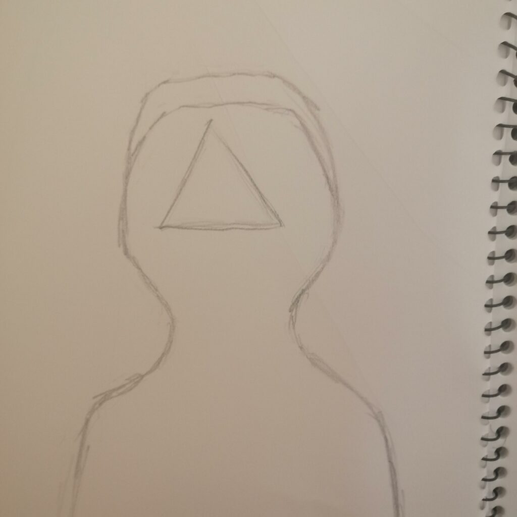
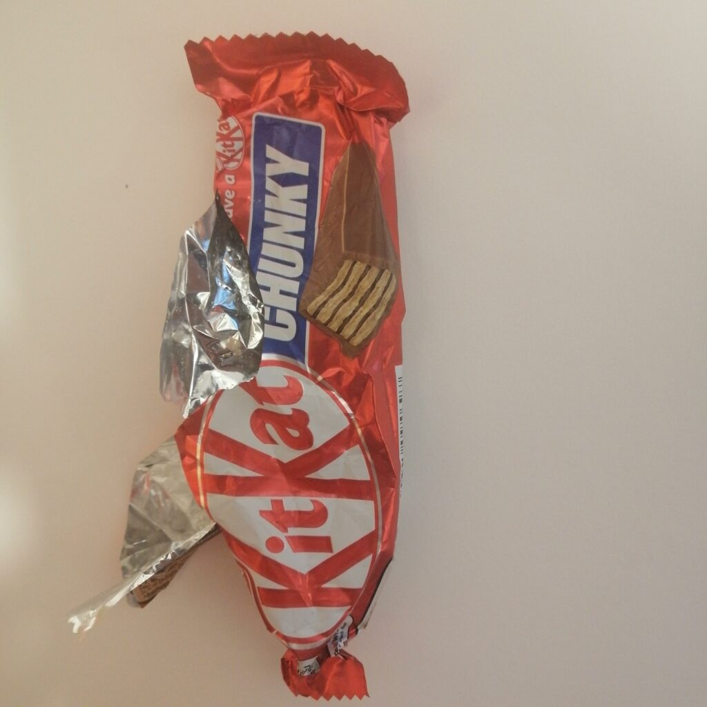
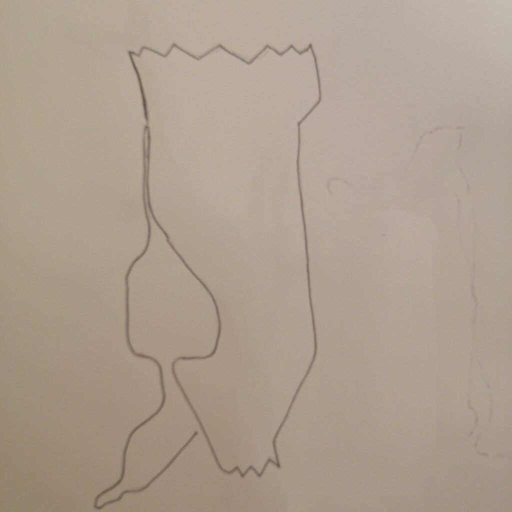
For the third week of the brief, we are asked to make combinations of marks/gestures from week 1 and drawings in week 2 and do it over and over again. So what I decided to do was combine a drawing I was interested in and it was the piece of plastic(kit kat) and added the marks/painting with verbs and applied it to the drawing. I kept tracing the same image and introducing all the marks and gestures I did in week 1, either adding it in the background of the image or going over it. In the first image below using the drawing of the piece of plastic, I used the dragging method to get the paint going in one direction as the first few works I did. I then used the tip of the scissors and take away some of that paint and just draw random lines. I really enjoyed this artwork because you think the paint is dragged diagonally, but, it also has lines going down and across. It also has some parts where the paint hasn’t been touched, although sometimes it’s good to have the whole thing covered in paint, maybe leaving some spots untouched can make it look interesting in a way.
The artwork on the right was what it looked like before with adding paint and folding the paper and I thought it looked too simple.
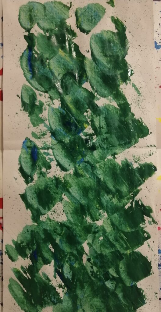
In the second artwork, applying the same dragging technique for the work above and different colours, instead taking a different approach by using a piece of cardboard and swirling the paint covering parts of the image which gives it a different affect. Then again adding some random lines to see what it looks like, and what I really enjoy about this artwork is this swirling pattern almost like The Starry Night by Vincent Van Gogh and the yellows that highlight parts of the work. I could’ve used one colour to see what it would look like or add water and let it drip but yeah I enjoyed making this piece.
Using a different method and same drawing, so I added paint on to the paper and fold it once. The result came out pretty neat with the spots of paint and looked real simple, I think folding it twice or three times would’ve gave it a different outcome with the paint mixing while it’s been fold. Overall happy with the result of the three artworks I made and just adding onto it and making it over and over again to create new artworks or using small parts of an artwork to create another one.
Making further works from my previous works I have decided to use a brush and add paint directly on to one side of the tissue paper, and I have also decided to flick the bristles of the brush with paint mixed with water on to create a different affect until folding the paper. What I enjoyed about this artwork was the different colour spots of paint on it as it looked like footprint and on the bottom of the work it looked like the galaxy with the small dots.
This second piece using the same idea from last time with dragging paint across the paper but this time I mixed the colours. I also flicked the bristles of the brush mixed with paint and water. I found dragging of the paint across the paper interesting it almost looked like scales of the fish and also going in the same direction similar to the previous work. I’m really enjoying this idea of making marks with led processes as you have the freedom to decide what to do with paint and paper not thinking too much about the outcome but just working on it until you’re satisfied with it.
We are introduced to our new brief and it involves making marks through action led processes. We were told to choose verbs to create artwork and I was keen on this task as it allowed us to do whatever we wanted with wet or dry media that we had.
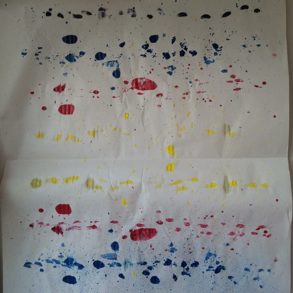
I chose paint as media for making artwork so I decided to spread the three acrylic colour paints that I had which was cool red, yellow, and blue on to tissue paper. Then I rolled it up and left it for a few minutes.
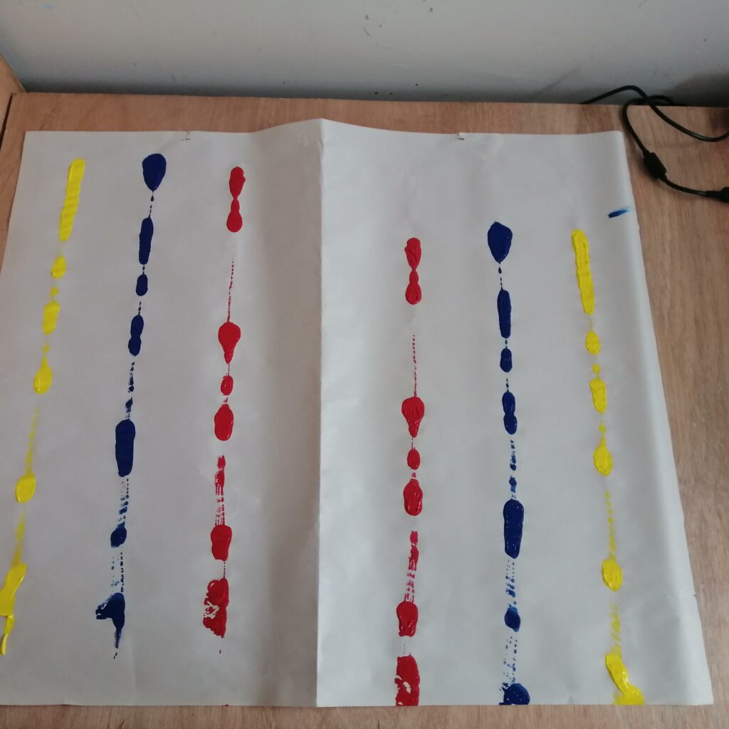
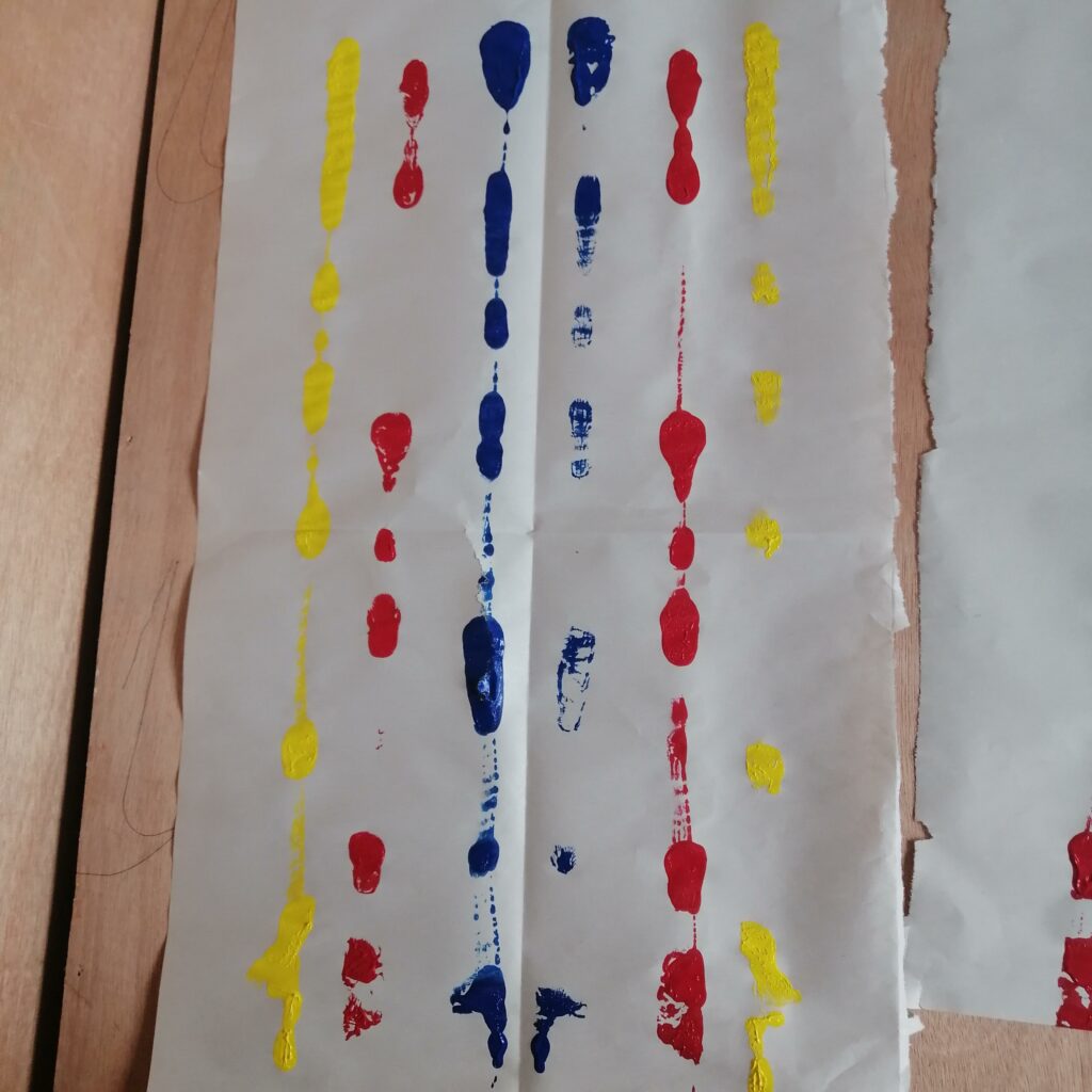
Opened it up and it has both the back and front with paint on it so I ripped them apart, and I’m left with two artworks that look the same. With one of them I fold it twice and the other I used a piece of plastic and dragged it across the paper.
The artwork of how I fold the tissue paper twice was the one I was really satisfied with because it looked like a pattern and almost similar to Silvia Bachli a Switzerland artist’s artworks with the use of lines. However I also enjoyed the work where I used a piece of plastic and dragged it across the paper due to the outcome and some of the marks made on it, I thought of the artist from the lecture slideshow named Gerhard Ritcher a German visual artist. Ritcher uses a squeegee and drags it across the canvas different to what I have done in terms of size but very similar.
Artwork with paint on each side after being wrapped
Folded twice artwork
Dragged with piece of plastic artwork
Also experimented with a bit of foil and applied the dragging technique using the piece of cardboard, I then decided to print it on to a piece of paper to see what it would look like. I enjoyed applying the dragging technique onto the foil as it created a different outcome, it was also changing up the way I dragged the paint across the surface creating these lines which look brush strokes.
Cardboard, plastic, and fabric were other materials I did some experimentation on