
This video is one I created to show the way the ‘branches’ on the dots spread from my favourite experiments from week 3. I found it interesting after the first piece I created, so I recreated it to document the way it happened.
Process into Image Week Three

Smudge/lift/squeeze 
Flood 
Lift/scrape 
Wipe/dot
In week three I pretty much ran out of materials to create with. I focused on using the same techniques from week 1 but in different ways, and seeing how I could use two different methods together.

For this image, I used a strip of bubble wrap and applied a thick layer of red paint to one side and pressed it onto the paper to create a print. Then on the other side, I painted it blue and pressed it over the top. I wanted to see if the different sides of the bubble wrap would have any effect on the pattern, but It didn’t.

For this one, I took the same carve method I used in week one, but then I smeared the paint as much as I could with my finger. Since there was only a very small amount of paint and no water, it didn’t spread much as it did in other works.

1 
2
I enjoyed that when I was scraping the paint off with a ruler, it left the colour on the page but with far less texture. I purposefully left gaps in 2 so you could see the texture and also where it had been removed. With number 1, I purposefully scraped the paint into each other to see how they would mix as I removed it from the paper. It created a very interesting streaky pattern as the paint was pulled down the paper.

Drip/Shake 
Flood
For the dripping piece, I used the same water droplet technique from week one, but then I shook the paper from side to side to see how the water would flow. After letting it dry, I liked the way that the pigment had settled around the edges of the shapes, more than in the middle. It was also interesting to see the pattern of how the water spread across the paper as I shook it since none of the shapes are the same.

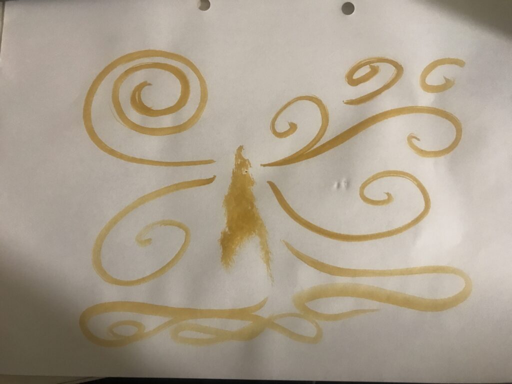
This was my favourite result from my experimenting. I brushed a small amount of water over the paper and used a paint marker to create dots. I wasn’t expecting the paint to spread in the way it did. I found it especially interesting how that it spread the most in areas where the water had pooled more, and then you can see the clear cutoff like where the water had not spread. I also found it interesting how the “branches” from each dot seemed to spread away from each other in some ways, and many of the branches seemed not to want to touch.
Week 2 Process into Image
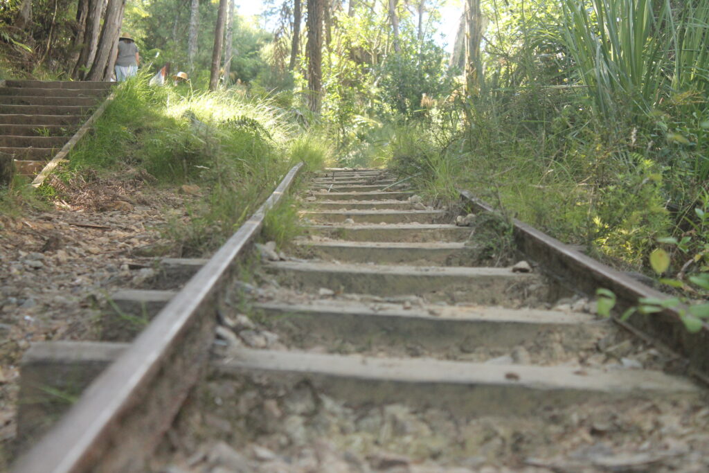
Karangahake Gorge 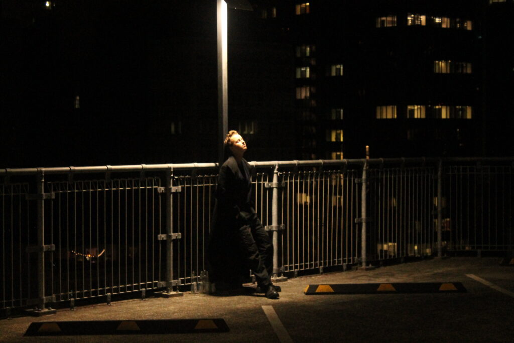
Auckland CBD 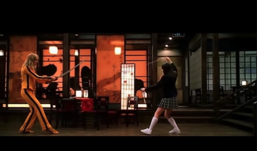
Kill Bill Vol 1 Screenshot
Being in lockdown in my uni dorm, I didn’t have access to as many of the materials I would have if we weren’t in lockdown, and I had to sort of ‘ration’ the supplies I did have so I didn’t run out.
In terms of modifying and ‘confusing’ the images, I used some of my own photos, as well as a screenshot from one of my favourite movies.
1 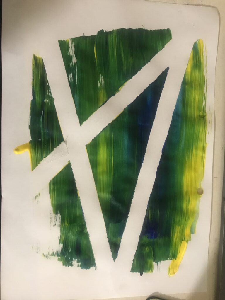
2 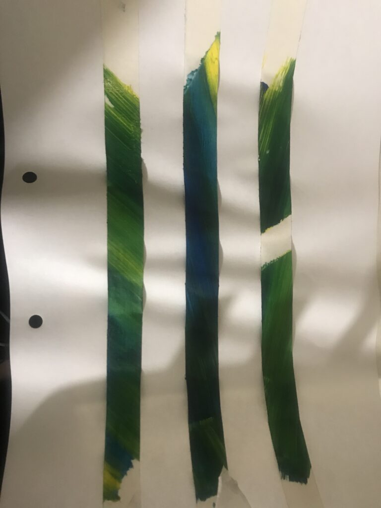
2a
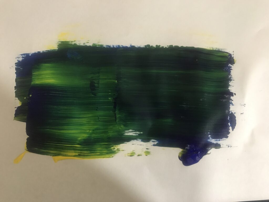
For most of these works, I put a piece of thin paper over my computer screen and created works based on what I could see through it. For the first one, I squeezed a line of different coloured paint down where the two characters were standing, then took a dry brush and swiped backwards and forwards until the colours had mostly mixed. It was partly an experiment to see which colour would overtake the other if I used the same amount of each colour. As you can see, the work is very dark green with lots of blue tones, since the blue covered up most of the yellow. The second work is similar, but I placed down some tape before I spread the paint, which was a technique I used during the palimpsest brief While peeling off the tape, I noticed that the angle of the brushstrokes was different on each piece since I had placed them in different directions every time. While placing them on a sheet of paper to photograph, I noticed that the difference in lengths of the tape caused the paper to buckle in an interesting way.
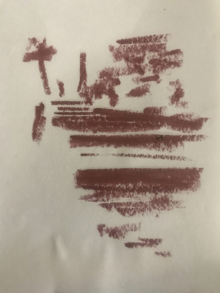
Lipstick 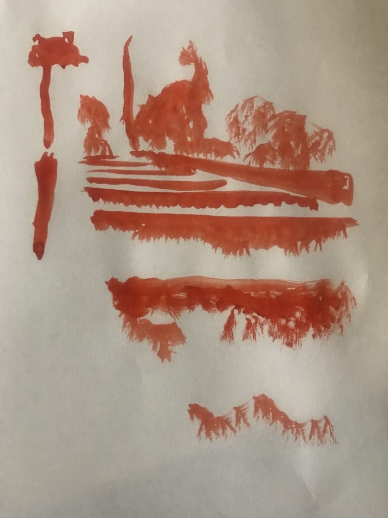
Acrylic
The second image I used was a photo from Karangahake Gorge on my holiday earlier in the year. It was a photo of old minecart tracks taken from a very low angle as it went uphill. With this one, I tried using different mediums and blocking out where the main shadows were in the image, to see how the different substances would work. The orange one on the right is simply acrylic paint, while the more pinkish one on the left is a lipstick I don’t wear very often. The lipstick looks very much like a crayon in the way it made marks on the paper, and I like the texture it creates.
Acrylic 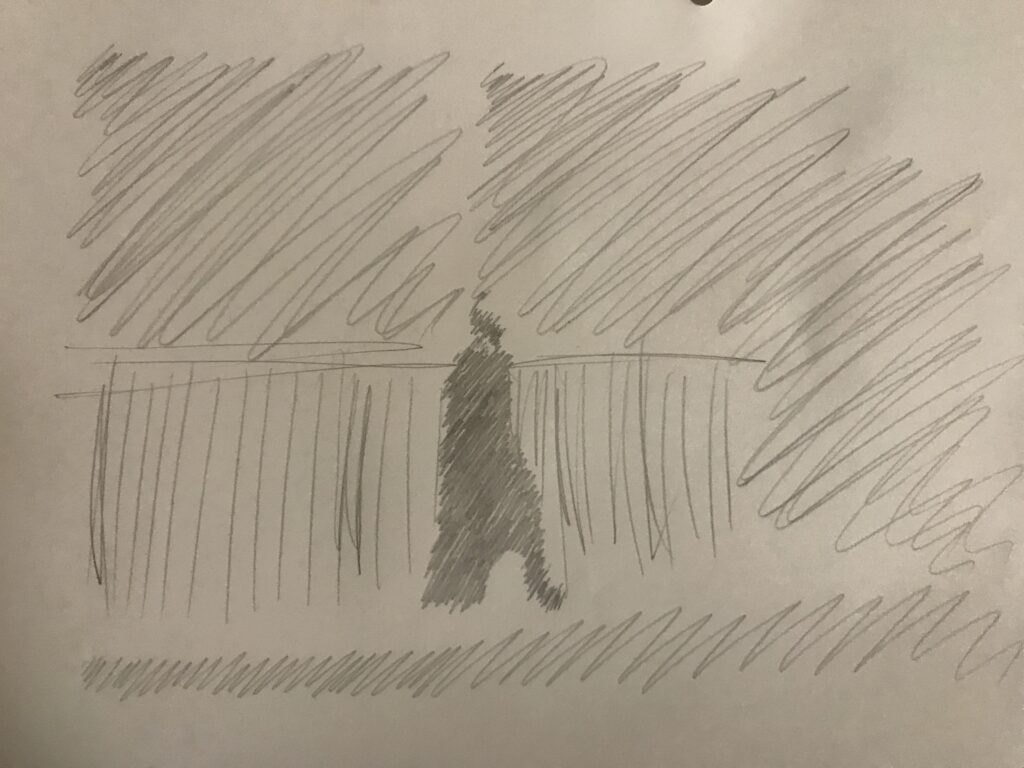
Graphite 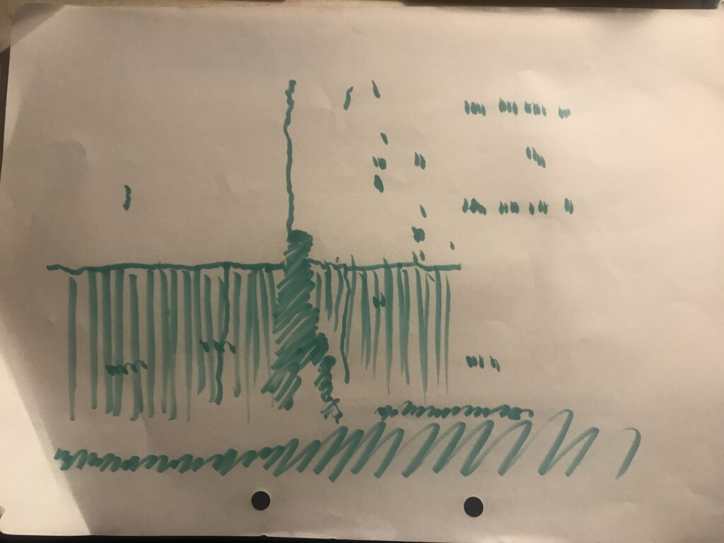
Brush Marker
The third image I used was another one I had taken of my friend during a shoot. I loved how dramatic the lighting was, which illuminated the lone figure against a mostly dark background. I wanted to explore that feeling of the solitary figure in these works, so I played with blocking out the main features of the image with different mediums. With the graphite pencil, I tried to keep my wrist loose and not focus too much on the details, so it turned out very rough. The same happened with the brush marker, except I was trying to focus on where the light was hitting and then drawing in those shapes. The seemingly random spots on that image are from where I drew over the lit windows in the apartment building behind my friend.
Artist Model – Lee Ufan


Lee Ufan’s works can be very simple in execution. His use of repetitive strokes creates a very visually striking pattern, with each marking being almost identical in nature. Ufan uses a lot of gradients, either from blending two colours or from letting the paint naturally transfer from his tools to the canvas over the length of his brushstroke. I enjoy the simple nature of his works and the clean repeated lines on some of his works are very pleasant to the eye.

In this image I like how the two hues fade together in a very natural way, and that you can see the colder blue tones carrying across into the warmer red and orange tones and vice versa. It almost gives me the impression that the two blocks of colour have crashed into each other and there are pieces flying everywhere as a result of the impact.
Artist Model – Sam Gilliam


Sam Gilliam’s works are very bright and full of colour. I love the way he creates pieces with sometimes no discernable pattern or bigger picture that look beautiful when they pop against the white walls of a studio or gallery. His works often contain layers and layers of bright colours and interesting textures. Part of me wants to run my fingers across them and see if they feel as interesting as they look.
Gilliam’s works that consist of draped canvas also fascinate me. Most canvases are stretched between wooden frames but Gilliam utilises the folds in the way the fabric drapes to create added depth in his works.

Artist Model – Andrew Barber


In terms of my art-making practise, I’ve never really enjoyed painting. I’ve been drawn towards more digital mediums for a while now, so with painting, I usually try to keep things very abstract, since I don’t particularly have the skills to create anything realistic. Barber’s work is often very simple, and even when it is depicting a landscape like in Magnificent Matakana (right), there’s hardly any details or anything that most landscape paintings would have. However, it still manages to portray the scene in a clear way, which is why I like it.
Process into Image week 1


While documenting these works I wished I’d photographed the processes for creating them. My favourites were carve, smear, and drip/run. For drip, I very gently put droplets of water on the paper so that they’d retain their shape, then put a very small amount of paint on a brush and put it in. As I did, the pigment swirled around inside the droplet before it mixed with the water and became a solid colour. With carve, I took a pocket knife and smeared some paint down the edge of the blade, then ran it down the paper several times, angling the blade differently every time to smear the paint in different ways.
I didn’t have access to many types of materials and I didn’t have the spare cash to order any, so I am disappointed in how limited my works are, but I am pleased with what I created despite that limitation.
Summary
The concept of labour is deeply rooted into our world. If you think hard enough about it, you can find labour in everything. If you’re not having a good day then it can be an emotional labour to try and be positive and help people around you. Many people don’t think about the labour that other people do for them simply because they don’t see it happening. I found it very interesting to explore things that I personally wouldn’t have considered to be a labour before, just simple things like opening a door or going up a flight of stairs. It’s also something to think about how something could be a labour to other people, even if it doesn’t affect you. Like how people with certain disabilities can’t perform the same tasks that a fully able-bodied person can.It’s weird to think about how most of our society is based around labour. It takes labour to build the homes and roads that we drive on. It takes labour to produce the food we eat. It takes labour to deal with other people sometimes, especially if they’re being nasty for no reason at all. The labour brief was definitely interesting as it made me think about things in a way that I hadn’t before.
Animation 2
My second animation was one of me putting on my left shoe and standing up. It ties in with the idea of presenting ourselves in a certain way and the labour that comes with it. Shoes are a very important thing in terms of this, since not only do they have to be suitable to the environment you’re going to be in, you want them to be comfortable and able to support your feet properly.
Lockdown Photos 1/2

While walking around during lockdown and working around the labour brief, I was thinking about what sort of places entail ‘labour’. I was thinking about many of the buildings in the city that you walk between, and how many of them are a place of labour for hundreds of people. The skyscrapers with dozens of floors, filled with people, all working. It’s all just labour. But then I thought about how many of the apartment buildings are very similar, with the same boxy shapes, perfectly regular windows and the same design repeated over and over as it reaches the sky. In that sense, there’s no difference between labour and leisure.