Verisimilitude; Week One “Real Space Interventions”

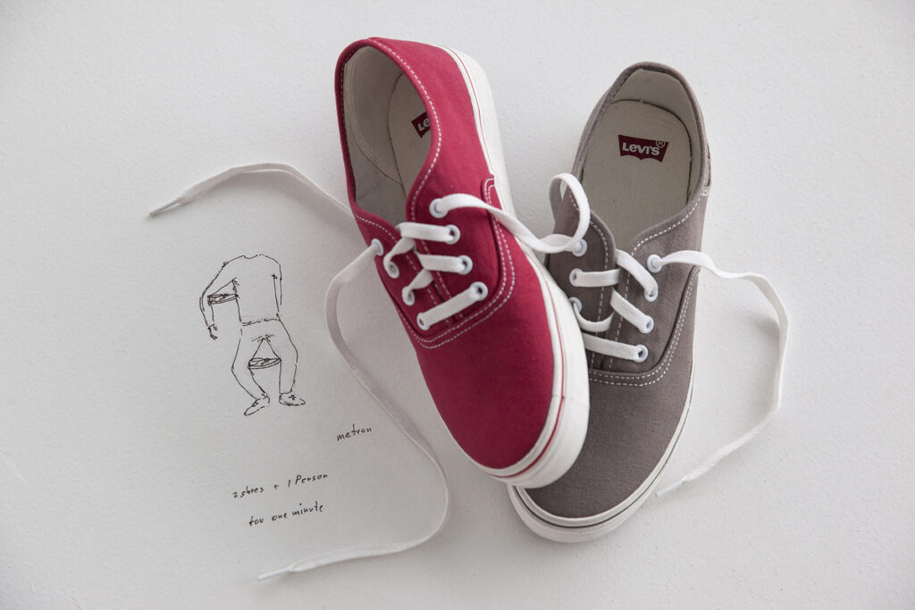
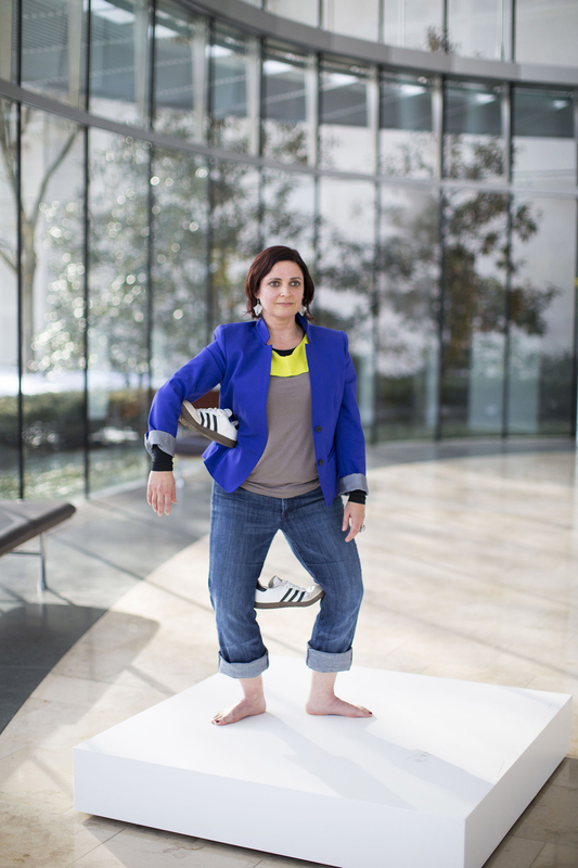
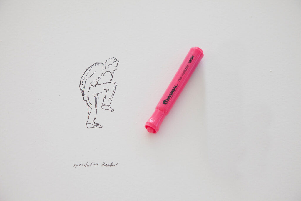
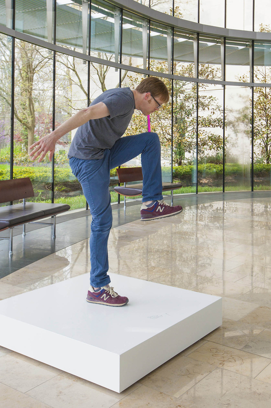
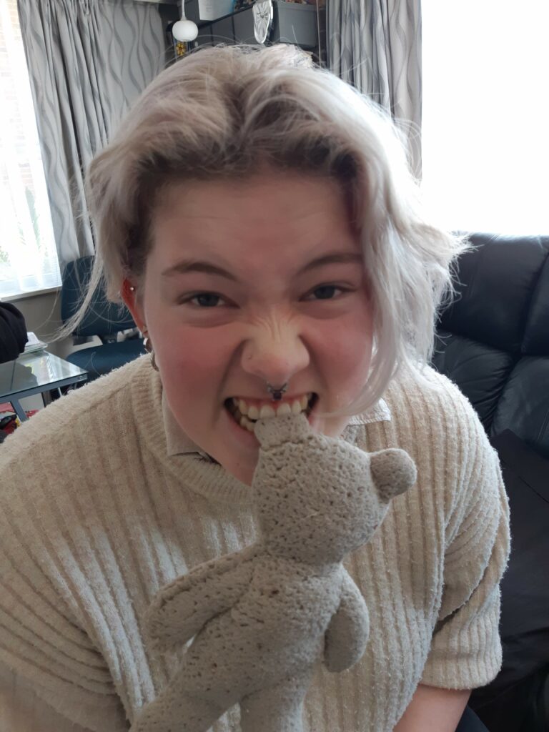
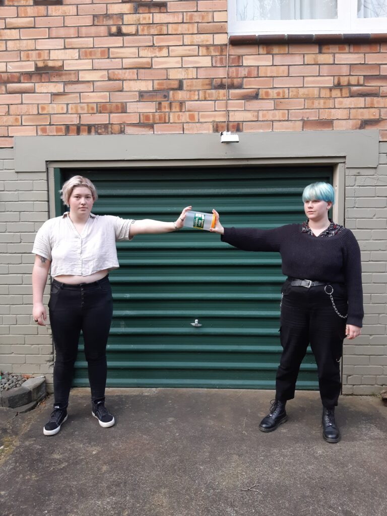
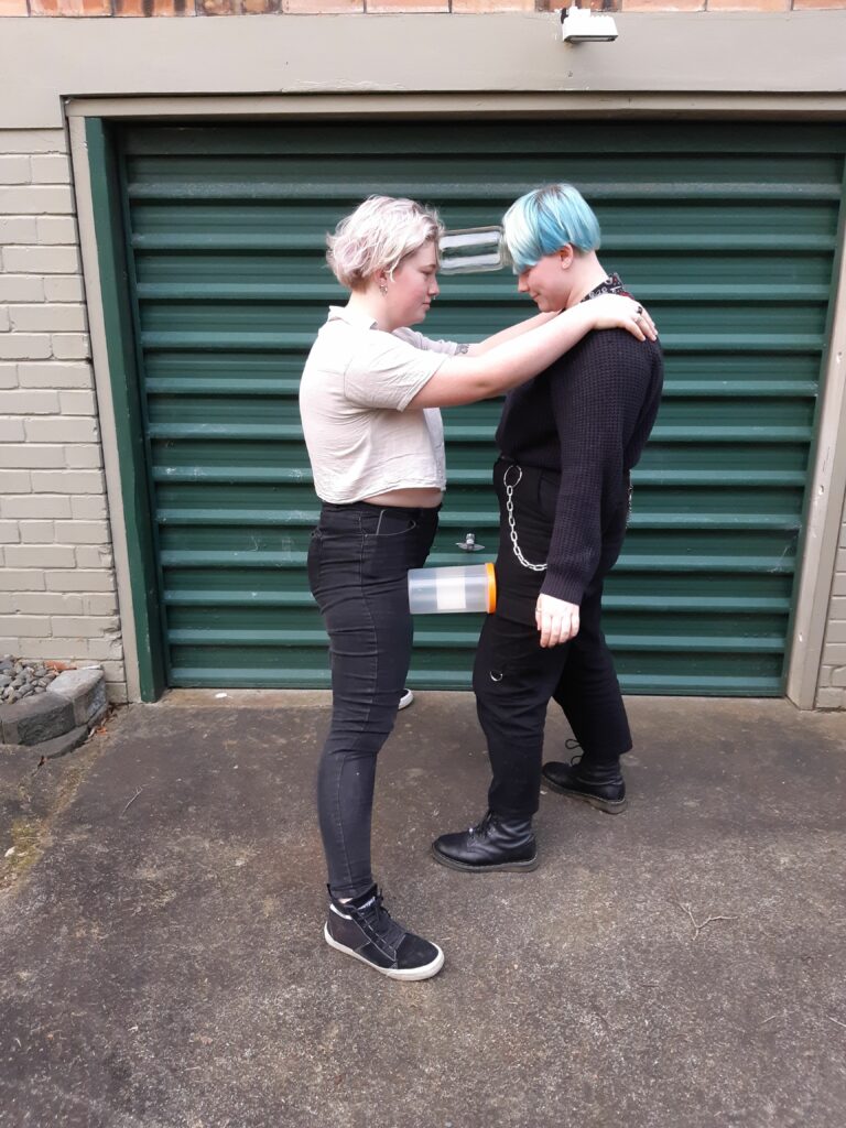
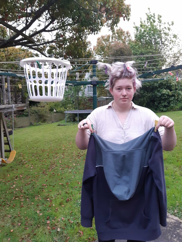
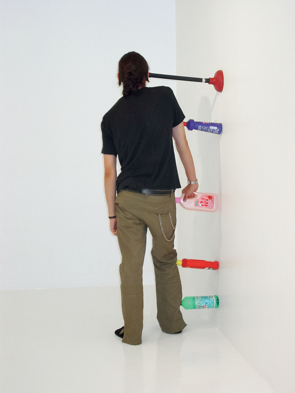
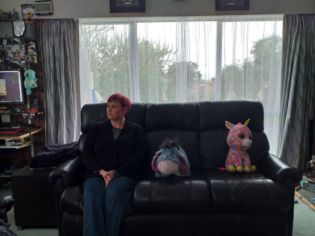
Today’s task was to ‘intervene’ with a space whether through altering, reconfiguring or exchanging things in the space. The final result needs to change the relationship between body and space.

In my first experiments I realise I didn’t do that. I was still in the mindset of yesterdays assignment and found myself focusing on the relationship of objects with the space rather than body and space. I had not thought enough about our new task and dived in before I’d considered it properly.


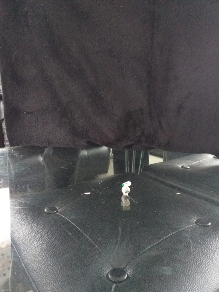
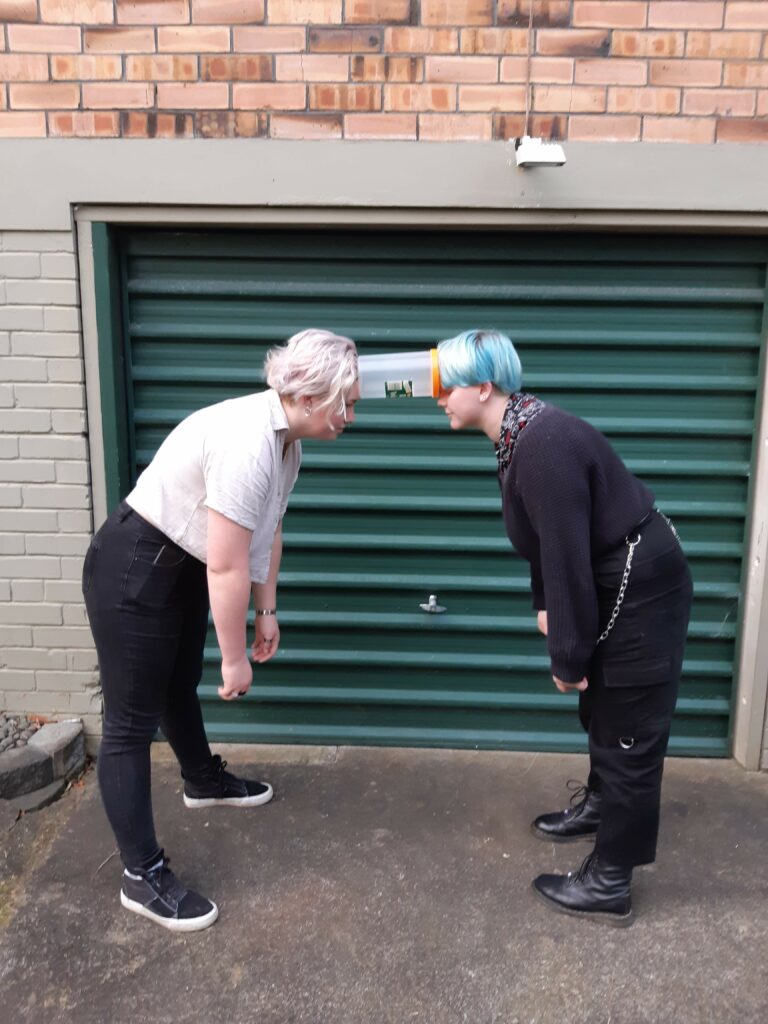
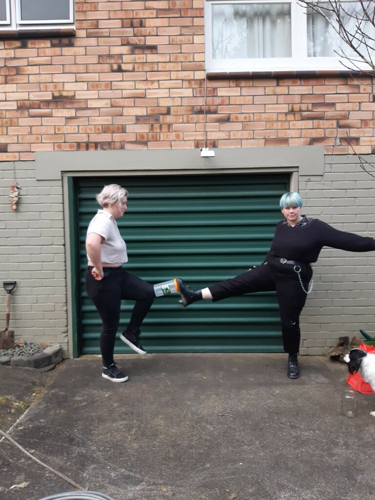
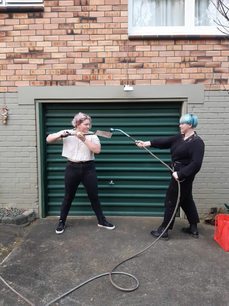
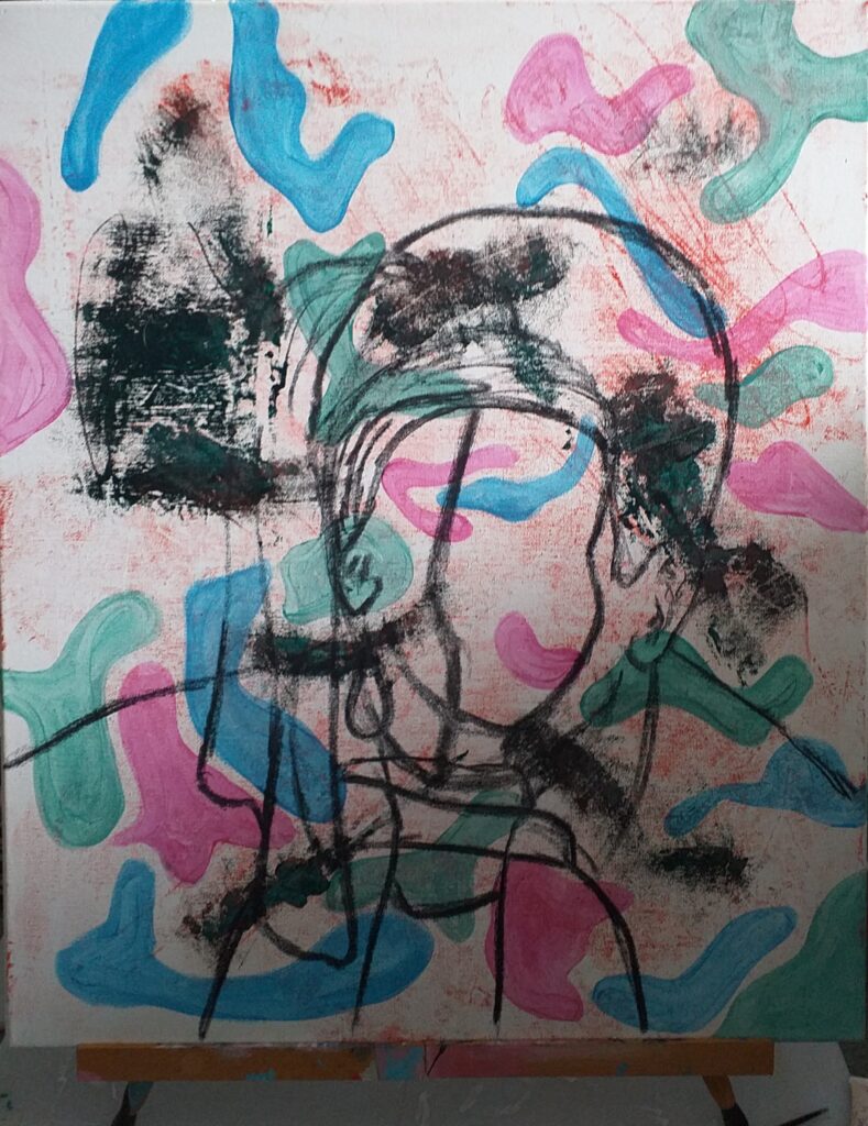
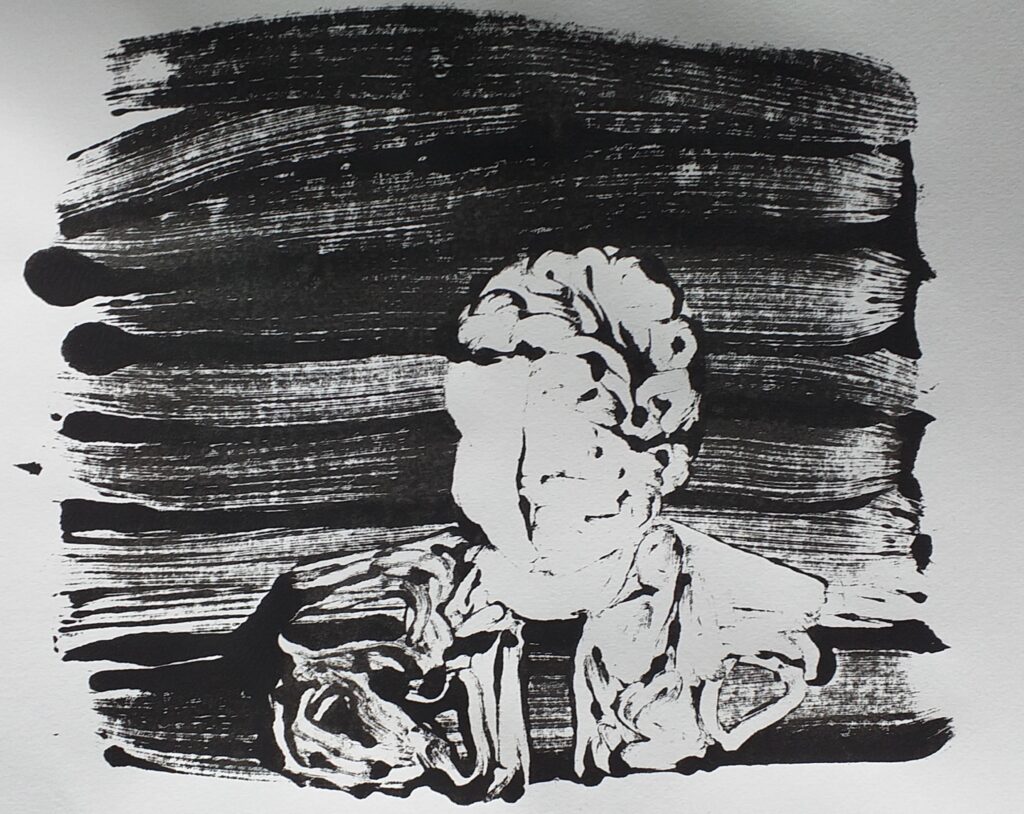
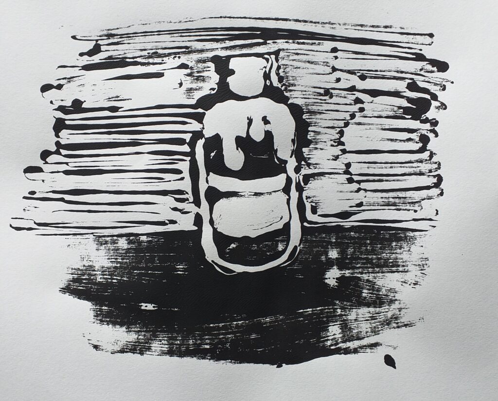
The result was still very interesting and bizarre, and lead into my next experiment which was more about space and body.


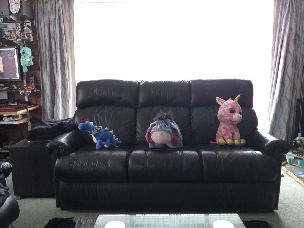
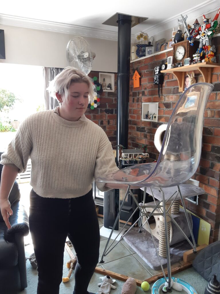
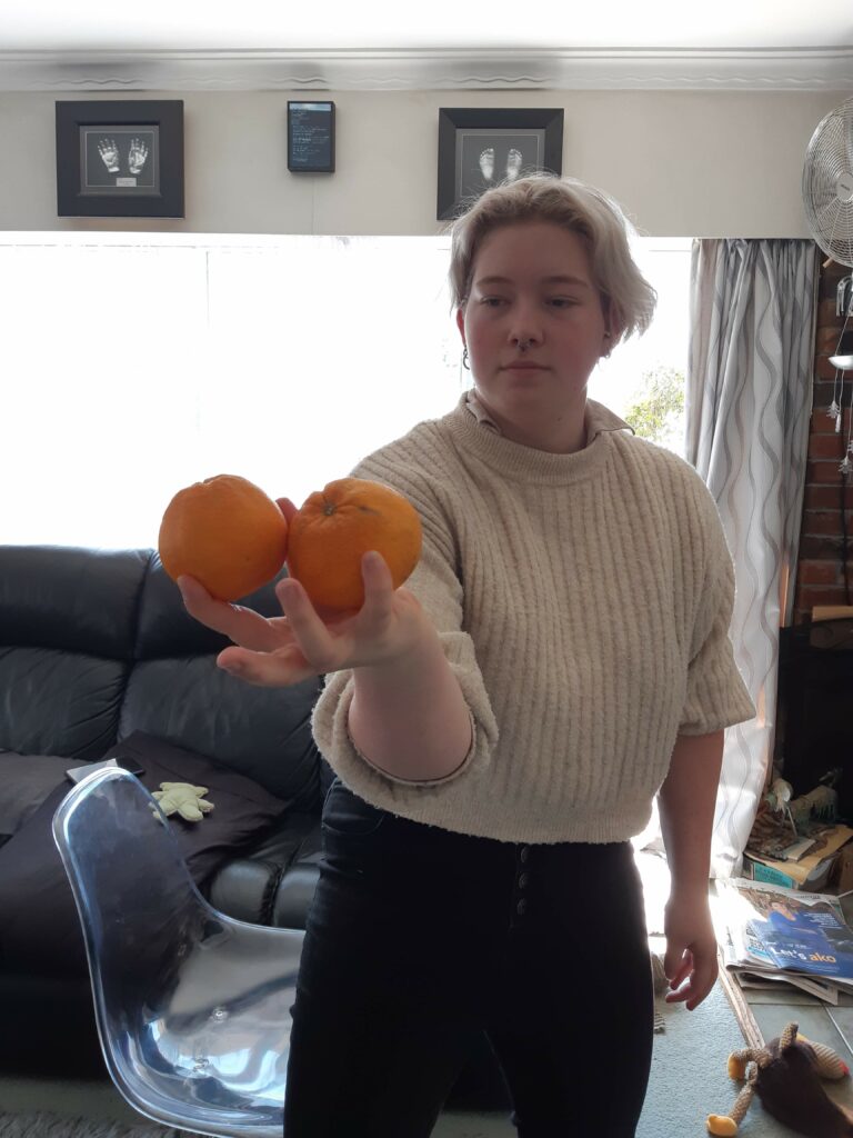
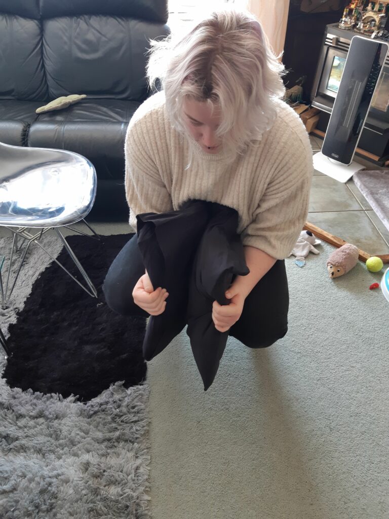
I still felt like I wasn’t quite where I wanted to be with this experiment. Considering the interventions I could make within the limits of the space was time consuming. I really struggled with actualising my ideas as many of them were too big or impractical.
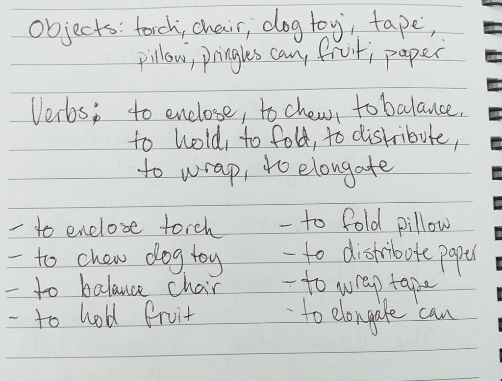
For example;

  • I would have loved to take all of the fish out of the fish tank and replace it with myself or another animal. Obviously this was impractical for a domestic setting as I didn’t want to harm the fish or make a watery mess.
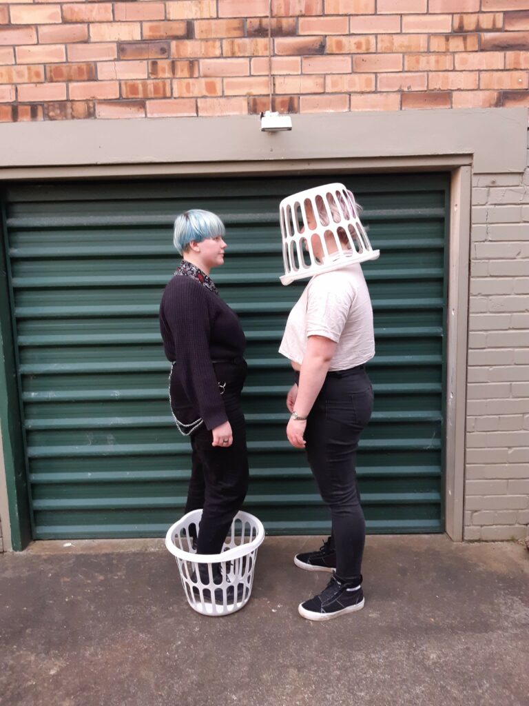
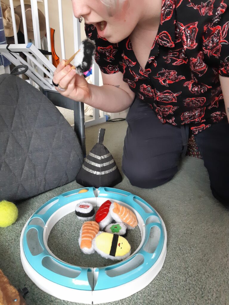
  • Creating a small scale room in full and interacting with the miniature. In my experience of making miniatures, this would have taken a few days to execute.
  • Installing indoor furniture in the place of outdoor furniture ie, deck chairs and vice versa. This couldn’t be done as the moving of heavy furniture would have disrupted others working and been problematic with the rain showers throughout the day.
  • Replacing a full size umbrella with a cocktail size umbrella while standing in the rain. I couldn’t do this as we didn’t have any cocktail umbrellas on hand and it would have taken too long to get them ordered in.

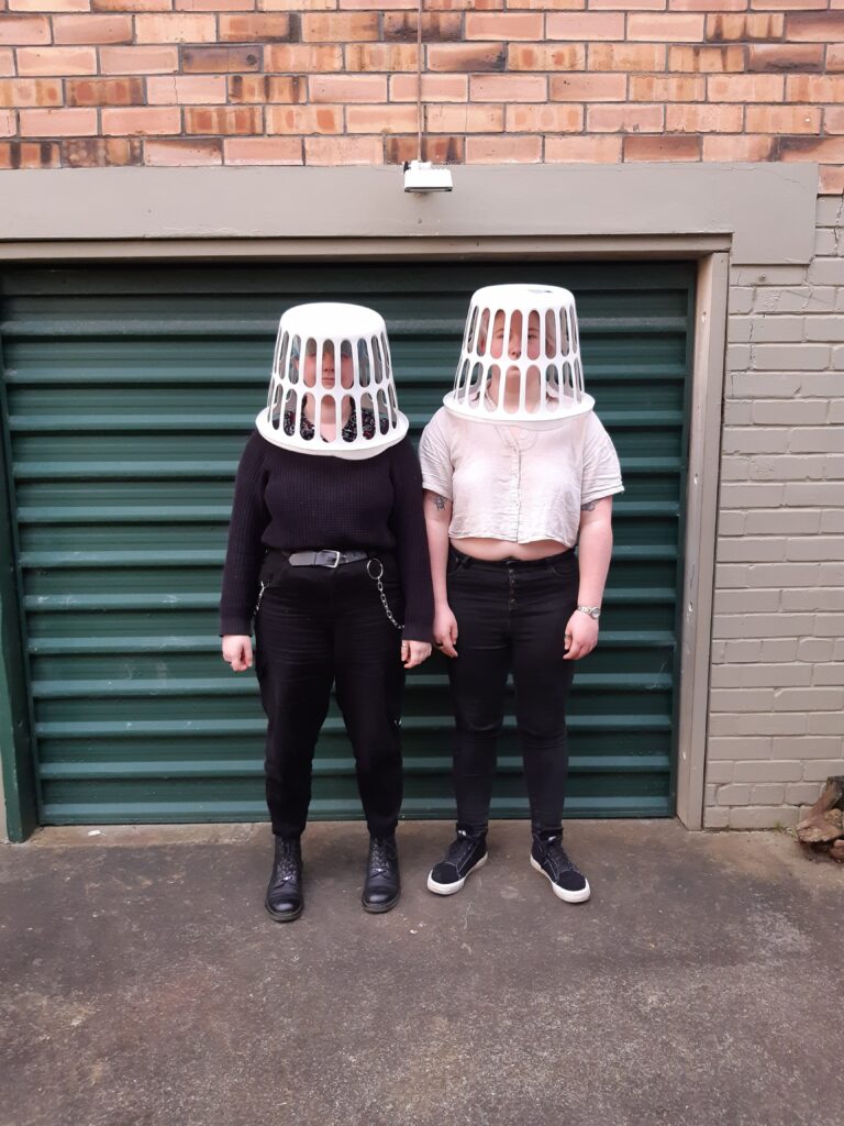
With more time and resources, I would have loved to bring these to fruition. I’m excited to see how everyone else has experimented despite the challenges. Although I’m unsatisfied with the final result, I really enjoyed the thinking process and the challenge of this brief.

Verisimilitude; Week 1 “One-Minute Sculptures”

In our first lesson we were introduced to the idea of Verisimilitude. This is about representation and resemblance, creating discussion around realness and the appearance of truth in art practice.

Artist Research

We looked at Erwin Wurm who creates sculptures that involve participation. He draws out an instruction of how to interact with objects to create a sculpture which is held for the length of one minute. As the actualisation of the work is fleeting, the only lasting proof of the sculptures ever being realised is in photographs.


Erwin Wurm, One Minute Sculptures, https://www.erwinwurm.at/artworks/one-minute-sculptures.html, Date of Access: 21st September 2021.

Initial Experiment

Using this concept of body and object interdependence, I did a speed run with a handful of ideas I had using a verb list.

These quick experiments were done within an hour for a feedback session where I took the following comments away

  • Consider your background – a plain background avoids detracting from your sculpture/movement
  • Decide on your interaction – does the object depend on the interaction to be in this position/state and vice versa
  • What is the setting? – when commentating on the real and representational, what placement of the sculpture can add to this. Does it ‘fit’ the setting?
  • Harness your advantages – while bubbling with Em, I can create some one minutes with two people

Development

Following this, Em and I tried out some new ways to hold or interact with objects in unusual ways and places.

These experiments resulted in some bizarre images. I really liked the interaction of an object with multiple people and wondered if reversing this would be just as interesting – one person interacting with multiple objects. This is where the washing line came in.

The result was certainly surreal and entertaining for my photographer. I was really happy with my experiments and have many more ideas I’d like to explore. A major one is if we continue this ‘one minute sculpture’ idea, I’d like to sketch up instructions and let everyone in my bubble interpret it in their own way. This is inspired by one of Wurm’s works:


I feel like I could expand my images from objects to scenes by setting up an area with surreal additions to the background related to the object(s) being interacted with. This was challenging for me as I am locked down in my partner’s family home and there are few spots without clutter or decorations. I hope if we get the opportunity to experiment with on minute sculptures again that I can use this clutter and challenging space to my advantage.

Process Into Image; Exhibition/Summary

Chosen Works

This early piece still remains one of my favourites. I loved experimenting in this work and learnt so much about my style and approach to this brief through creating this piece. I also learnt the valuable lesson of how to avoid overworking from Becks and Amber while creating this one.

This series was another favourite and major learning point for me too. I realised that I worked much more confidently with an under painting and that layers were my best friend (especially when working with a new surface). My only regret is keeping the size so small (A6 postcard) when I could have used a photocopier to blow the image up to A4. This is because I lost much of the detail. Despite this, I still see it as a major success in my colour blocking experiments and an important step for my following works.

This monoprint and its ghost print were very special to me because I challenged myself very thoroughly. I knew I didn’t have the ideal materials or space for this work but still persevered to make prints. Printmaking is my passion and lino cutting is what lead me into art school, so I was disappointed these didn’t turn out perfectly at the time. Looking back at them now, and with feedback from tutors, I see that these images are really quite beautiful. They certainly aren’t the quality I could achieve in the print lab but I’m really proud of them given the circumstances.

This piece is also a favourite as it brings together some of my well loved methods from this brief. The colour blocking, charcoal and the washy drippy acrylic all work together to almost encapsulate all of my experimenting during this brief. I do think this work is a little on the busy side, slightly betraying the simple figurative look I’d been trying for in earlier works. Despite this I still think it is a very interesting work and I’m very proud of it.

Final Summary

Reflecting on my work, I’m really proud of how I’ve engaged with the brief. I found my generation of work slower than when in studio as I find the studio environment very inspiring, but with the challenge of lockdown and limited materials/space, I believe I’ve generated a fair amount of work.

My process has been very experimental. I’ve tried interacting with a range of materials in a range of ways to establish a broad mark making vocabulary. I believe most work has been intuitive, especially from week 3 onward when I started to let go of the idea of a ‘final result’ and focused more on the process of creating.

I’ve learnt a lot about how I like to paint and the ways that work best for me. I’ve enjoyed how playful and experimental this brief has been and exploring the range of possibilities from a select few references. I’m looking forward to taking these skills and new artist models with me in my art practice.

Process Into Image; Week Seven “Working at a larger scale”

When going into lockdown, I noticed that my works shrank in size. Limited by the space to create at home, I was making no bigger than A4. I wanted to challenge myself to work larger before the end of the brief. I used an old stretched canvas slightly smaller than A2 for this. From my earlier pieces I have learnt that I work better with an under painting instead of onto a plain empty canvas, so I intended to approach this in layers.

I loved the texture of my foil monoprint so started by priming with white then laying this texture over the entire surface. Then I did the same with green in more concentrated areas. I chose these colours because they stood out to me from my earlier works. I also layered on a thin watercolour colour-block technique using the shirt pattern from the Pulp Fiction reference as inspiration.

Under painting Images

I was very interested by the marks of my printing, as the weave of the canvas was highlighted. This created an almost pixelated appearance. This red was a very easy and flowing way to print, so when I moved to the green I stumbled a little as it was a much more controlled application. I accidentally applied my oil paint too thick for this green print. The shapes weren’t as defined as I intended.

The addition of the colour blocks elevated the work in my opinion. The underpainting turned from a smattering of colour to a more controlled outcome, while still maintaining the flow I’d achieved with the first part of my print. With my underpainting complete I had to contemplate my next layers.

While lost for direction with this piece, I spoke to Luca for help. He suggested I take a look at Alice Neel’s work. This inspired me in the next stage of this painting.

Alice Neel Reference Images

The sketch works really stood out to me. The impact of the painting vs simple line work has an exciting visual language and this is what I chose to pursue.

With charcoal I laid in a linework of the two major portraits I’d been working with – Pulp Fiction and The Girl With a Pearl Earring (flipped to face the opposite direction).

Linework

With the charcoal linework down, I was ready to paint into it. I was challenged to work lightly as I wanted the paint to remain transparent and textural enough to see lower layers and create a figurative work. This is where I steer away from Neel’s style as I am not trying to create realism.

Finished Piece

Details

I’m so happy with how this piece turned out. The limited use of acrylic and simplistic suggestions of form from the charcoal lines really conveys a figurative re imagining of these references. If I were to take this piece further I’d layering a washy reductive mono print but I was worried this would make the piece too busy and the washy watered down acrylic may have washed away some of the charcoal.

Process Into Image; Week Six “Printmaking From Home”

After my research into Kevork Mourad’s techniques, I gathered materials to experiment with reductive mono printing. I didn’t have any printing ink or retardant so I had to experiment with the paints I had already available to me. I struggled to find the right consistency.

Print of Girl With a Pearl Earring
Ghost print of Girl With a Pearl Earring

My first experiment was with acrylic and water, but the result was very washy. I really liked this result but hoped for more detail. I used the same plate again to do a ghost print as the surface ink had been reduced. This print ironically very much looked like a ghost captured on a night vision camera. I really liked this result too but again, wanted more detail.

Observational Print using earlier week’s paint techniques
Observational Print

The next experiment was with a cheap acrylic which was runnier than most paints I use. The runny consistency was great for detail but the lack of any thinner meant the plate dried too quick. The print looked very different from the plate, with pigment coming out as very thick or not at all. This meant I lost all of my mid-tones. I feel I definitely would need some ink or paint thinner to achieve what I was hoping for.

Changing tack, I looked to mono printing using a crisp packet. I cleaned it and cut the edges so it would lay flat, then spread oil paint over the surface. First I did a plain print of the crisp packet texture onto paper.

The crushed texture of the packet meant some areas printed bolder and others didn’t lay any ink down, making for quite an interesting pattern. Inspired by Cy Twombly, I had a go at printing scribbles with this methods and had this exciting result.

Having made some marks with this method, I thought I understood the pressure difference well enough to make a more figurative print. I did not. The portrait from Pulp Fiction came through more like a blob. I had pushed far too hard to create shadow and lost a lot of the detail I was trying to convey. I also did this experiment on fabric which had its own folds and creases. This meant my canvas picked up more or missed the paint while printing, making this an even more challenging work.

Upon closer inspection, I could see blobs of oil paint on the surface. These occurred where I’d pushed too hard and applied the paint too thick. I held the piece up to the light to see if I could identify any details. I found some detail that was hidden in the shadow but more than anything, the light showed me where the thick vs the thin areas of the paint were laid.

Through this printmaking experimentation, I learnt a lot. While limited with my resources, I can still manage some printmaking techniques. This experiment has taught me to work on flat surfaces for the best results with these prints, and I will move to a stretched canvas for my next piece. I also have developed an eye for how best to lay the oil paint – sparingly and evenly.

I really like the various printing results and am excited to combine some of them in my next step. The texture of the crisp packaging helps me to develop a background so my next piece will be less daunting to work onto and these printing techniques mean I can create repetitive patterns too.

Process Into Image; Research 3

Over the semester break, I hoped to try some printmaking at home. I had a meeting with Luca during the final week of the semester seeking guidance to print at home. He sent me a wealth of resources and I quickly realised mono-printing would be the most suitable technique with my equipment at home.

Kevork Mourad

Syrian-Armenian artist Kevork Mourad is a reductive mono print artist who makes some impressive large scale works. I was drawn to his printing because it is so detailed, something I didn’t realise could be achieved with a mono print technique.

Mourad shared his technique in a Youtube video, which gives insight into how simply some of the results can be achieved. He explains that he uses “spontaneous and free strokes, and the result should be almost like a handwritten letter signature”. I found this interesting as I have been trying to produce work with quick and simple fluid movements, I’m excited to pick up some of his techniques.

His work is founded in memory and biblical references. I find the sculptural depictions interesting and I may experiment with this look alongside my reference works/images.

Arts Transcending Borders, “Artist Kevork Mourad demonstrates his monotype printing technique”, March 5th 2021, video, https://www.youtube.com/watch?v=VGaTUsZTOus

Process Into Image; Week Five “Using new substrates”

Generating works in lockdown has been challenging due to limited space and resources. After week five’s presentation (online) I was inspired to look into other substrates I could paint on in the same way as Liz Maw. I found a collection of Henri Matisse print postcards and decided to incorporate previous works onto the pre-made substrates.

Package of prints on postcards
Selected prints to paint onto

My painting style is very unlike Liz Maw, I prefer to use acrylic and I dislike hyper realism. Instead I’ve chosen to paint in the same colour block style as my previous works. Much like Liz Maw, I’ve rotated some of the works before painting onto them.

Pulp Fiction Figure onto ‘Woman In Blue’
‘Girl With a Peal Earring’ onto ‘The Sorrows of the King’
Colour block additions into frames of ‘The Red Studio’

The downside of working onto the postcards is having to work in layers as the shiny surface doesn’t hold the paint well.

I found this to be an interesting experiment but I don’t intend to continue working on these postcards in future. I did find it less daunting to work onto a surface with a pattern rather than a blank canvas, so I am excited to try out printing a pattern then painting onto it.

Process Into Image; Research 2

Following this week’s online lesson, I began researching alternative canvases. Liz Maw’s work stood out to me during the presentation therefore I decided to look into her practice further.

Liz Maw

New Zealand artist Liz Maw is a painter who works in oils primarily onto prints of other artist’s work. I’m curious about her work because of how obscure and abstract her additions to the works are.

All of these works are on pre-printed substrates. State Highway 1 Medusa is painted in oil onto an ink jet print, 2012. history painting is oil on a found painting, 2012. English Artist from a Magazine is oil on a found canvas and found mask, 2014.

In this biographical article, “Liz Maw”, Maw’s style is described as ‘celebrating and questioning distinctions between high and low art’ through her emulation of European old masters. With a catholic background, many of her hyper realistic works are challenging the iconography of religious paintings by shifting the focus to contemporary celebrities and people she admires.

Sexual Politics Now, ‘Artist Bios: Liz Maw‘, Accessed 9 September 2021, http://www.sexualpoliticsnow.org.nz/exhib_biog/liz-maw/

Process Into Image; Week 4 “Exploring printmaking vocabulary”

I’ve been exploring many painting and drawing techniques over the course of this brief but barely experimented with any printmaking opportunities.

This week I wanted to use my charcoal line work to create new pieces. I decided on a line drawing of The Girl With a Pearl Earring to create from.

I was very lucky to have Sarah willing to teach me screen printing techniques as she has been doing a lot of screen prints for her minor. Taking this design, I prepped a screen with Sarah’s help, then did a series of prints on fabric. I experimented with centering the print as well as printing at odd angles or overlapping my prints. NOTE: I will attach images of these when we are out of lockdown and I can take photos of the finished prints.

My plans were to try create a series of prints similar to Andy Warhol’s Marilyn Monroe pop art works. I hope to layer multiple colours of this line work onto one piece for an abstract bright look once we can get back into studios.

Andy Warhol ‘The Marilyn Diptych’, Acrylic Paint on Canvas (screenprinted), 1962

I was really excited to experiment with this medium so it was disappointing to be put into lockdown just as this experimentation began. I hope to explore other forms of printmaking I may be able to do at home and will chat with Luca about how I could do this.

Process Into Image; Week Three (Pt.3) “Patterned Underpainting”

Having made a work I’m very happy with, I wanted to develop my next piece from it. Using only a portion of the previous piece as reference, I created a portraiture work.

Chosen part of reference

Something that stood out to me in this work was the unusual pattern on the shirt. I like the familiar colourblock style of the crayon pattern and want to make this an underlying pattern of a portrait.

Shadow of face layered with coloured shapes of shirt pattern

The simplicity of these forms are successful and I plan to continue simple forms in further works. One downside to this work is that the gouache is darker than I intended and has turned the focus from a portraiture to the pattern which was meant to be a background.

I’m considering layering in detail in acrylic to amended this, or may leave it as is, to avoid overworking.

This piece is a good learning opportunity for further layering experiments,