Process Into Image; Week Three (Pt. 2) “Getting Layering Right”

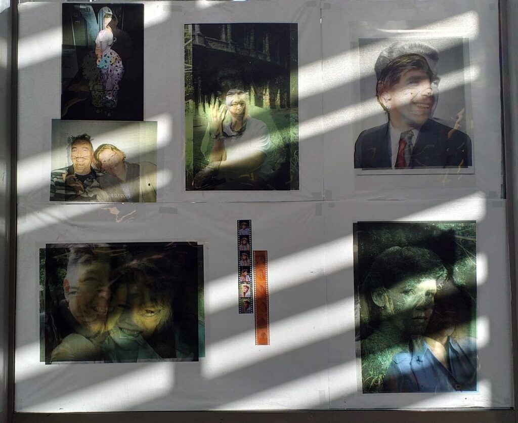
After my first experiments, I realised that I needed to focus in on one part of each reference rather than trying to tackle the entire work. To do this, I blurred my eyes and assessed what stood out to me most. Colours, shapes, highlights etc. I landed on the screengrab from Pulp Fiction.

The colour block experiment I made in the previous week (upper)

I really liked my colour-blocking experiment from last week using this reference, so I utilised this experiment to develop a new larger work. I like simplicity of colour blocking and the depth that can be achieved with this reference.

Charcoal and acrylic are my first steps in fleshing out this A2 painting. Main focus is on the male figure. I begin to fill in with washy poster paints, focusing on shadows and highlights, and achieving texture with similar methods to Wilhem Sasnel and Elizabeth Peyton.

I tried my best not to over-work this piece, keeping my gestures quick and stepping away/revisiting often. I’ve used poster paints, acrylic, charcoal and crayon in this work. I spoke with Becks while working on this piece, and they explained I could just black out or cover parts of the work I didn’t like and was worried about over-doing. This created a new technique for me, where I simply use charcoal to block out a section of the work I’m struggling with.

Moving forward, I’d like to focus in even more. Although the focus is clearly on the right hand figure, I’ve still very much been trying to tackle the entire reference. I think I can simplify and colour block more too. I really love the layers built up in this work and am excited to pursue this technique.

Process Into Image; Week Three (Pt. 1) “Combining vocabulary with interpretation”

Week three focuses on how we can use our mark making vocabulary to develop works from references. I found myself drawn to only a handful of my previous reference images – The Girl With a Pearl Earring, The Redwoods Forest and the Pulp Fiction Scene.

My initial experiments for this week had a focus on fast and figurative. I wanted to get into the flow of producing work with the methods from my vocabulary. To do so, I took a variety of techniques and found ways to make them more efficient. In doing this, I ignored most details and went for a figurative approach of highlights and shadows.

Light vs Shadow

Washy acrylic painting of Girl With A Pearl Earring focusing on highlights/tone

Fast Mark Making

A new technique of dipping scrunched paper in watercolour and rolling it across the canvas
This got turned into an image of the trees with very quick mark-making movements
The paper I used to roll over the watercolour unraveled
Developed into a piece through addition of excess paint from other works

Patterns

A simplified pattern from my scarf using charcoal and watered-down paint

Layers of Transparency

Splashing, dripping and flooding the paper to create layers of transparency
A simplified view of the Girl With A Pearl Earring’s headscarf using crayon, black watered-down acrylic and quick movements over flooded paper

Reflection

Immediately, I could see some downfalls from this way of creating. This fast-paced mode of producing work was exciting but I was unhappy with the results. These methods did not convey the focus of my pieces around transparency and layering. Furthermore, with so much of the detail lost, it felt especially disappointing.

I hope to create work this week that incorporates the use of layering through many different mediums, and to create with more detail while still being figurative. I really liked the washy approach to the paint and I am excited to see how else this medium can be utilized.

Process Into Image; Research

Rita Ackermann

Hungarian-American artist who creates works with a lot of movement. I am interested in her methods because I like how transparent the result is. It doesn’t hide the way it has been created in favour of perfection.

In article “Rita Ackermann on her Mama Paintings”, it is explained that Ackermann’s work is a ‘persisting interrogation of line, colour and form’. Her works are ‘studies’, taking forms from other artists and smattering them in amongst bright colours and movements. She explains her process, “I like to look at books and images of old paintings—some get stuck and digested into the threshold of visual materials to become colors or figures in the paintings”. This process is very relevant to the work we are challenged to create next. We will work from a reference to dismantle, study and reform it. This process is relevant even if some of our references are our own work.

Hauser & Wirth, ‘Rita Ackermann on her Mama Paintings’, 2020, https://www.hauserwirth.com/ursula/29946-rita-ackermann-mama-paintings

Cy Twombly

American artist Edwin Parker Twombly Jr. is a sculpter, photographer and painter. His painting works are very minimalist and focused entirely on the markmaking vocabulary. I am intrested in the simplicity of this work and his ability to convey form and movement with scribbles.

In this biographical article, “Cy Twombly”, Twombly’s painting style is described as ‘a gestural vocabulary’, which I find very relevant to our building of a markmaking vocabulary. His work to me is a series of experiments, fueled by curiousity about how each movement can be translated visually onto a canvas.

Gagosian, ‘Cy Twombly’, Accessed 20 August, 2021, https://gagosian.com/artists/cy-twombly/

Process Into Image; Week Two “Figurative interpretations”

In this week we selected a range of images/objects to work with. Each of these six objects would be interpreted in 5 different ways, resulting in thirty artworks.

  1. Image with people – a photo of friends at the Van Gogh Exhibition, Auckland
  2. Image without people – a photo of the redwood forest treetops, Rotorua
  3. A painting from before 1900 – ‘Girl with a pearl earring’ – Johannes Vermeer 1665
  4. Screengrab from a movie – diner scene from ‘Pulp Fiction’
  5. A piece of fabric with a pattern – red and black checkered scarf
  6. A piece of rubbish – clothing tag
Picture of Friends
Redwoods forest Picture
Girl With A Pearl Earring
Screengrab from Pulp Fiction
Clothing Tag from Dangerfield
Patterned Scarf

When I first began to generate my works, I struggled to move from one to the next. This is because of my perfectionism making me return to the same generated piece over and over. To try and combat this, I decided to write down all the ways I could generate an interpretive work from the references. I settled on the five below, and found I could knock out the work very quickly. I could focus on one interpretation style and generate from all of the references at once very successfully.

Ways of interpretation:

  1. Colour Blocking – dividing up the different tones and containing them to certain areas of the image
  2. One line drawing – drawing the image without lifting my drawing tool
  3. Highlight vs Shadow two tone drawing – dividing the image into a light tone and a dark tone
  4. One aspect – selecting one part of the image to focus on
  5. Other interpretation – experimenting with a new medium
Wall of generated works

Note: Current image yet to be replaced because of lockdown. I will update with an image of all 30 generated works when able to access uni post-lockdown.

This generation process was very exciting for me and I loved creating some interesting work from the original references. I found this generation method very efficient and enjoyable, however I did notice I tend to stick with my ‘comfortable’ mediums (pen, charcoal, pencil). Paints and pastels may be my next step here to expand the range of experiments.

Process Into Image; Week One (Pt. 2) “Mark Making rather than Art Making”

Taking a new approach to this mark making task – I want to really explore how we see ‘marks’ and what they suggest.

Using a dictionary helped me do this. A ‘mark’ is defined as;

  1. A small area on a surface having a different colour from its surroundings, typically one caused by damage or dirt
  2. A line, figure or symbol made as an indication or record of something
  3. Make a visible impression or stain on
  4. Write a word or symbol on (an object) in order to give information

Thinking Outside of the Box

I stumbled upon the idea of a doormat while reading these definitions as ‘damage’, ‘dirt’ and ‘stain’ stood out to me in these definitions. I was looking around at the studio floor and the shoe prints leading out into the lobby from plaster dust and general muck. Could I capture the marks made by our shoes? I set up a piece of calico at the door and quickly dyed the words “Home Sweet Home” onto it, to reinforce the idea of a doormat. Instructions were put next to it too, to reassure the many people passing through that they were meant to step on it.

I think of our studios as a second home, and wanted to capture that idea in this mark making method too

I think this was a successful exploration as it helped me separate mark vs art making and felt very bodily involved as it needed participation. I observed that those who were more vigorous wiping their shoes actually damaged the canvas, adding unintentional details with their purposeful ones.

What other ways can unintentional marks be captured? Looking down I noticed marks on my shoes. I chose to wear the same pair of white shoes for the rest of the week during this mark-making experiment for this reason. This captured the spills and sprays of pigment from the work onto the artist, making my shoes a substrate of their own.

The artist’s shoes, featuring rubber duck socks.

If I had more time for this part of the brief, I would have looked experimented with resists or using materials that limit/contain the pigment. Cooking oil, dish washing liquid and wax are all things I’m curious to use. If we weren’t indoors, I would also try out mark making in even more unconventional ways. Using a candle or a lighter and capturing smoke on the canvas as brown/black pigment could be an interesting method. Maybe I can experiment with these methods later in the brief.

Process Into Image; Week One (Pt. 1) “Markmaking Vocab”

The task for week one was to develop a mark making vocabulary. This means to experiment with ways to apply pigment to the canvas. I tried a massive variety of techniques and labelled each one, this meant I’d be able to remember what I’d done when I wanted to create a similar mark again.

Building Up a Variety of Methods

There were so many ways to change the consistency of the paint. Watering it down or adding cornstarch to make it thick would therefore change the ‘language’ of the mark, as much as the method. We took a group visit to Daiso, a store with a variety of products for cheap. Here I bought a squeegee, a sieve, a laundry bag, and various other tools to make these marks. We all brought in paints and thinners/thickeners to share and experiment with, as well as other tools.

A piece of paper on the floor also captures unintentional marks that drip off the canvas.

Reflecting on this group of marks, I find my favourites to be those with the most obvious textural patterns. I’m excited to explore scraping and brush marks more as these had the most interesting results. I also think they open up a variety of opportunities to make the marks in unusual ways. I want to try rotating the brush against the canvas or try out scraping upwards rather than down.

Now that I had this range of mark making methods, I decided to experiment with transparency through layering. This taught me lots about how the different consistencies interacted with one another on a more absorbent surface.

Large piece of canvas used to test how much pigment is absorbed at different consistencies and their transparency

I really like the results of this experiment. It inspires me to create works using layers and create them on the wall because I love the drip effect.

I can see where my short falls are in this experiment – I was wanting to finish with something that looked good and could be seen as ‘art’, rather than just experimenting with the textures as we were supposed to. Amber could see this too and recommended I try to hone in on the concept of ‘mark making’ rather than ‘art making’. This is hard for me in such a creative art-making space but I’m excited to challenge myself to think more abstractly about these processes.

I can also see my successes here – I’ve been able to embody the movement and by using my body, the marks look more fluid or moving. I hope to try create more with full-body movement.

Art Machines Pt 2

This week we added the bass pedal and tied it onto the sieve which we attached to the ceiling. We tried initially with the pedal facing the machine but this provided very little swing. Turning the pedal around shook the machine much more thoroughly.

When testing the machine, we discovered that the dust spread a lot more than anticipated. We were surrounded with a cloud of dust, and while safe to inhale, it was uncomfortable. We decided to purchase a clear poncho to cover the machine, wanting to still be able to see the dust fall.

We laid out white shirts to stain with the powder, and twisted/folded them to create interesting tie dye – like patterns.

Final Set Up – Machine, Display of Products, Shelf of Instructions, Powder and Spray Bottle (water to set powder in place)

Overall I’m proud of the machine we have created. The results are impressive and interesting, but non-permanent. If I were to make any changes, it would be to purchase dye powder and permanently dye the fabric. I would also consider a sound element, as the swinging makes a screechy sound and it would be nice to cover this up with the bass pedal hitting a tamborine etc, tying it all together.

Art Machines Pt 1

For this group project we were challenged to create a machine that creates an art product or performs in a certain way. With William, Della and Maia we brainstormed a variety of options.

Research

In our research we noticed a pattern of circular forms resulting from art machines.

We tried brain storming other ways to create marks and initially designed a water balloon machine that would roll balloons full of paint onto needles, popping it and creating a paint splatter. Unfortunately when testing this the next day, we discovered that the balloons couldn’t be popped without more force, requiring human intervention.

Next we thought a wishing well type of movement may increase the force of the balloon and pop it. We even thought of using crushed charcoal to coat the balloons so they would make marks as they rolled around the well, however discovered the cost of wishing wells was ridiculous and making one would not be viable in the 9 days we had.

Intead we looked to holi powder, a coloured powder used for holi festivals or colour runs. We thought this could be somehow scattered onto a white canvas somehow to create a colourful pattern and our sieve idea was created.

Some sketching ideation during our brainstorm

Building

Using materials we already owned, we designed a double sieve system where the coloured powder would drop through small holes in fabric or plastic onto the canvas.

I had access to barrell rings – metal bands used to secure the wood of barrells in the 1840s, and my group members had access to coloured powder and rope.

By the end of the first week we had our structure finished and attached taught drum-skin like plastic accross the barrell rings to act as sieves.

Thinking ahead to next week we will poke holes in the plastic to act as sieve holes and add a drum bass pedal to tug and shake the machine so the powder will sift through.

RECOVERING Wk 4

The final step in this journey is taking what I have discovered/uncovered so far to develop my own work.

Final Exhibition Display

Using a disposable camera, I retook the imnages I selected, trying to match the pose and frame closely. Due to the nature of disposables having a disconnected viewfinder, this was tough to achieve but the results were fairly accurate. I’ve printed the new images on transparent film too. Then I’ve layered the original and new so both images can be seen with light behind it. I’ve affixed the top image by only one edge too so that the top image can be pulled back to reveal the one below.

I’m really happy with the double-exposure effect created by the layers. I had intended to experiment with a double exposure method, but decided against it as I only had one chance with the film camera.

Viewing the Exhibition

Each photo set tells it’s own story of change, evolution and legacy.

I’ve noticed something about this particular exhibition space that makes it unique – the sunlight and shadows. I chose the window because the sun moves throughout the day behind it. Different parts of the images are highlighted over time, embodying my focus of change.

I’ve decided to group all my images together within one pane of the window. I feel this closeness represents my family well, as well as mimicking Baker’s family album type display.

NOTE: If you are visiting this exhibition, please feel free to turn the page back to view the photo behind, much like you would with a book. I am inviting you to read the story of my family.

UNCOVERING Wk 3

Now that I have found a selection of photos, I want to learn more about them. Uncover the background and meaning of them to assist in how I will ‘recover’.

My selected images

Something interesting about these photos is the difference bwtween photography quality/methods between generations. My opa and parents were photographed on film, while the images of myself as a child were taken on a basic digital camera. I’ve decided to turn all of these black and white so they reflect a similar ‘before’ state. I’ve also chosen to then print them onto transparent film to create the effect of the original developed roll.

My images printed onto transparent film

Printing onto transparent film has it’s challenges however. The background and method of attachment is visable, meaning I need to find solutions. I’ve put up tissue paper so the background of the outside is blocked, while still letting light through so the film effect can still be seen.