Process Into Image: Final Summary

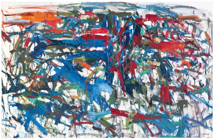
Over the past 4 weeks, we have been working on the Process Into Image brief by exploring different ways to create artworks while also in a lockdown situation. This brief has challenged me and my creative skills throughout the process in ways that meant I had to be flexible and open to trying new ways of doing things. Being able to paint, draw, sketch, and use miscellaneous objects I found laying around to create works and techniques I could later combine in the final 2 weeks of the brief was a challenge for me as I had to let go of any control I wanted to have over the image. I thoroughly enjoyed using such a range of different media throughout this process and really enjoyed the way this brief challenged me and my creative skills, without being too strenuous.

These are the final 2 artworks I chose that I believe reflect my learning over the past 4 weeks the best. The work on the left I titled “A Different Terrace Cafe”
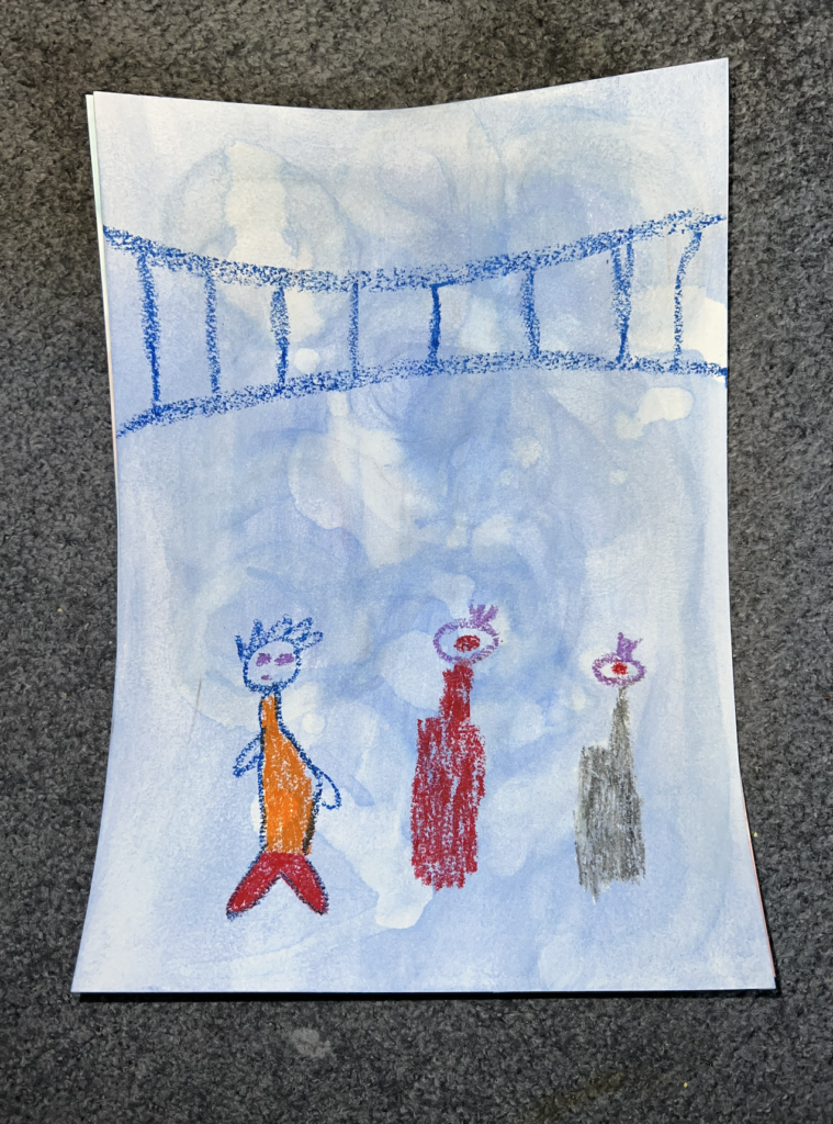
 after using Van Gogh’s Terrace Cafe as a reference image. I think this work embodies the learning I had over the past 2 weeks well as it combines the verb painting techniques from week one with the background exhibiting a “spill” or “pour technique”. I combined this background with a watercolour painting on top, inspired by the one I did from week 2 with the reference image of a painting from before 1900.

The work on the right I titled “Birds Nest”, as it not only kind of resembles one but I feel as though the overlapping of colours and techniques creates a chaotic, messy feel, kind of like a birds nest. I combined the imagery from the piece of fabric reference photo with one of the verb paintings I did in the first week. I believe this image is a good combination of the learning I did over the past 4 weeks as it shows different techniques I tried throughout the different stages and different ways of trying to combine them also.

Overall, I’m happy with the work I have produced throughout this brief, and have thoroughly enjoyed creating such a plethora of paintings, drawings and so many different techniques. I believe the final 2 works are among some of the most successful ones I produced throughout the final 2 weeks and am happy to be presenting them in this final stage. This brief has been one of my favourites this year and I have really enjoyed each week as It came. I’m very proud of myself and the work I was able to produce, as well as for completing my first year of University!

Week 4 Working

Today I did some more additions to the paintings of the week. I did my work on an alternative substrate using a hessian tote bag I got from Chemist Warehouse that I was not going to use. I initially wanted to do the pouring technique for the base layer of the image but I quickly found out that the bag repelled water so it began to pool on the surface. I found this quite interesting so I wanted to include it in the images below. I figured out a way to get the acrylic paint to absorb into the surface of the bag so it would dry and I could draw on top of it. I decided to draw on the bag with pastels as they gave the most payoff when drawing on the bag itself.

I also did some more combining painting/drawings to increase my choices for the final hand in. For the one on the left, I used acrylic on a piece of fake Lego to make stamping marks and then used pastels to draw the netting shape seen in the fabric reference image from week 2.

Artist Research – Rita Ackermann

Rita Ackermann, born on 19th April 1968 in Budapest, Hungary, is a Hungarian-American artist currently living and working in New York City. Ackermann’s paintings, drawings, and collages combine neo-expressionism with figure drawing, deploying ballpoint ink and spray paint on top of oil and acrylic to create congested and luridly coloured surfaces. She has explained that she creates her paintings through dance: “Sometimes I like when the gestures disappear—the brushstrokes and gestures disappear—and it’s more just well-conducted chaos of stains.” Ackermann and her work have exhibited in collaboration with a number of other artists in a number of countries and galleries, exploring the ideas of abstract, bodily works addressing issues of anthropomorphism and femininity.

Rita Ackermann is a good artist to look at in regards to the Process Into Image brief. Her use of layering and multimedia is something that is very much related to what I want to do and display within my work throughout this brief. Her use of different materials is something that I have looked at repeatedly while creating for this brief, and I am currently trying to employ her layering techniques throughout the 3rd and 4th weeks of this brief. Overall, Rita Ackermann has been a big inspiration for my work throughout this brief, and I am sure she will remain that way until the end of it.

Artist Research – Silvia Bachli

Born on the 16th March 1956 in Baden, Switzerland, Silvia Bachli is a well-renowned artist within the contemporary art world. Bachli trained at the École d’arts appliqués in Basel during the second half of the 1970’s, then at the École supérieure d’art visuel in Geneva. She has developed her works and drawing practice on white paper of various sizes, qualities and tones using mediums such as Indian ink, charcoal, gouache or pastels. Bachli begins her paintings using the body and its movements as a way for her work to be considered a part of everything in the realm of feeling. The work she produces tells stories that don’t necessarily have a beginning and an end, but more so tells the story of a moment in time.

Silvia Bachli is an amazing artist to look at for the Process Into Image brief. Her simple but powerful mark-making serve as a great inspiration throughout all of the weeks of the brief. Her careful use of colours and strokes is an aspect I want to carry over into my work. Her simplistic but effective methods are a good indication as to how we can create complete pieces of work without having to be incredibly good at drawing or painting. The way she applies her marks and strokes are something I have tried to adopt throughout this brief and within my mark making. Overall, Silvia Bachli is a great artist to be looking at throughout this whole brief, especially in weeks 1, 3 and 4.

Thursday’s Final Image Combinations

Today, I once again continued on with combining imagery from the past 2 weeks of the brief. I wanted to try out watercolour again as I am really enjoying the technique and looseness it gives me when creating the pieces. The image on the right is watercolour on top of an acrylic paint pour. It was inspired by my reference image of a painting from before the 1900s. The image on the left is pastels on top of smeared acrylic paint. I chose this background for this image as I thought it slightly resembled water, which was good as the reference I used was slightly resembling a boat.

Wednesday’s Image Combinations

Today, I continued to combine my images from the past two weeks. For the below images I used a brushing technique and a pouring technique for the backgrounds. For the imagery on top, I used pastels for the yellow marks and watercolour paints for the flower and surrounding foliage.

Artist Research – Joan Mitchell

Joan Mitchell was an American Multi-practice artist who specialised in areas such as painting, printmaking, pastel and pretty much anything that was made on paper. Mitchell was associated with the abstract expressionist movement despite having lived in France for a good portion of her career. Mitchell was one of the first female painters to gain critical and public acclaim for her works, and her artwork can now be seen in major museums around the globe. Her abstract way of working was heightened following her gaining a $2000 travel fellowship, allowing her to study in Paris and Provence in 1948-49. This abstract state of work would then follow her through the remainder of her artistic career. “Memories and the feelings she associated with remembered landscapes provided the primary source material for her work”

Joan Mithell’s work is good to look at during the Process into Image brief as her use of abstraction is a good inspiration for creating paintings throughout all of the weeks of the brief. Her careful use of colours makes her work pop on her canvases which is something I aim to do with the work I produce throughout this brief. I also want to use her style of abstraction to create paintings from meaningful marks.

Artist Research – Judy Darragh

Judy Darragh is a New Zealand artist who uses objects she finds to assemble creative sculptures. She is renowned for these bright coloured sculptures, using materials such as recycled items, industrial materials, collage, photography, video, and poster art. The materials often include bottles, glassware and plastic to corks, feathers, tikis, beads, paint, flowers, paua and cake tins. Darragh emerged as an artist in the 80’s, her work touches on material consumerism, as well as displaying a fondness for everyday objects. Within her structures, she uncovers the relationship between objects and their surroundings, however, the making of the structures are equally as important as the assemblages themselves as she creates new from old with a new and improved significance.

Judy Darragh’s work relates to the Process from Image brief as her use of alternative substrates serves as inspiration for the 4th week of the brief. Her colourful, compelling works make for interesting installations with meaningful messages behind them. I can take inspiration from Darragh’s work during week 4 as I can try to use recycled and found objects to create work on as a way to repurpose something old and give it a new significance.

Combining Images

Today I started combining techniques from the past 2 weeks. I started by making some backgrounds using blue acrylic paint for both. For the one on the left, I used a smearing technique with a rag and the paint to cover the whole paper. I then tried to use water to smear and smudge the paint to make lighter marks, however, this didn’t work as well as I had hoped. Instead, I used nail polish remover to remove parts of the paint and create marks through it, which worked better. I then used pastels to create the figures from one of the childhood drawings that I took inspiration from last week.

For the image on the right, I used an empty can to create circular shapes all over the paper, smearing some of the paint in the process. I then used watercolour paints to add a wash of colour to the background, also inspired by the childhood drawing I took inspiration from last week.