SUMMARY OF LEARNING – REFLECTION
Overall Reflection
I am excited and passionate about all forms of artistic practice, and completing this Process Into Image brief has been a highlight of my first year at art school. Richard Serra’s verb list was an accessible way to begin each experiment, and a great reminder of how to take the next step to develop my work. I constantly reconnected back to these action words when making decisions, providing me with a personal autonomy.
I have interpreted the Provisional Painting brief appropriately, aiming to make swift marks using and combining selected verbs and images, and trying not to worry too much about the end product. I understand the finished product of a Provisional painting may not look finished, and reveals preliminary workings, like pencil marks on show. The construction of the painting is not simply a deconstruction of shapes or objects.
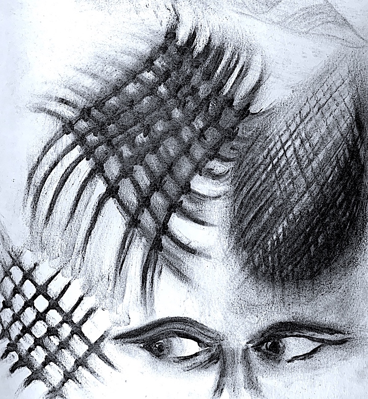
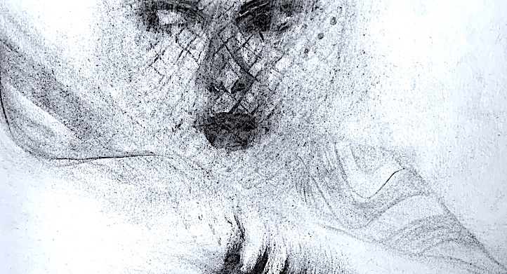
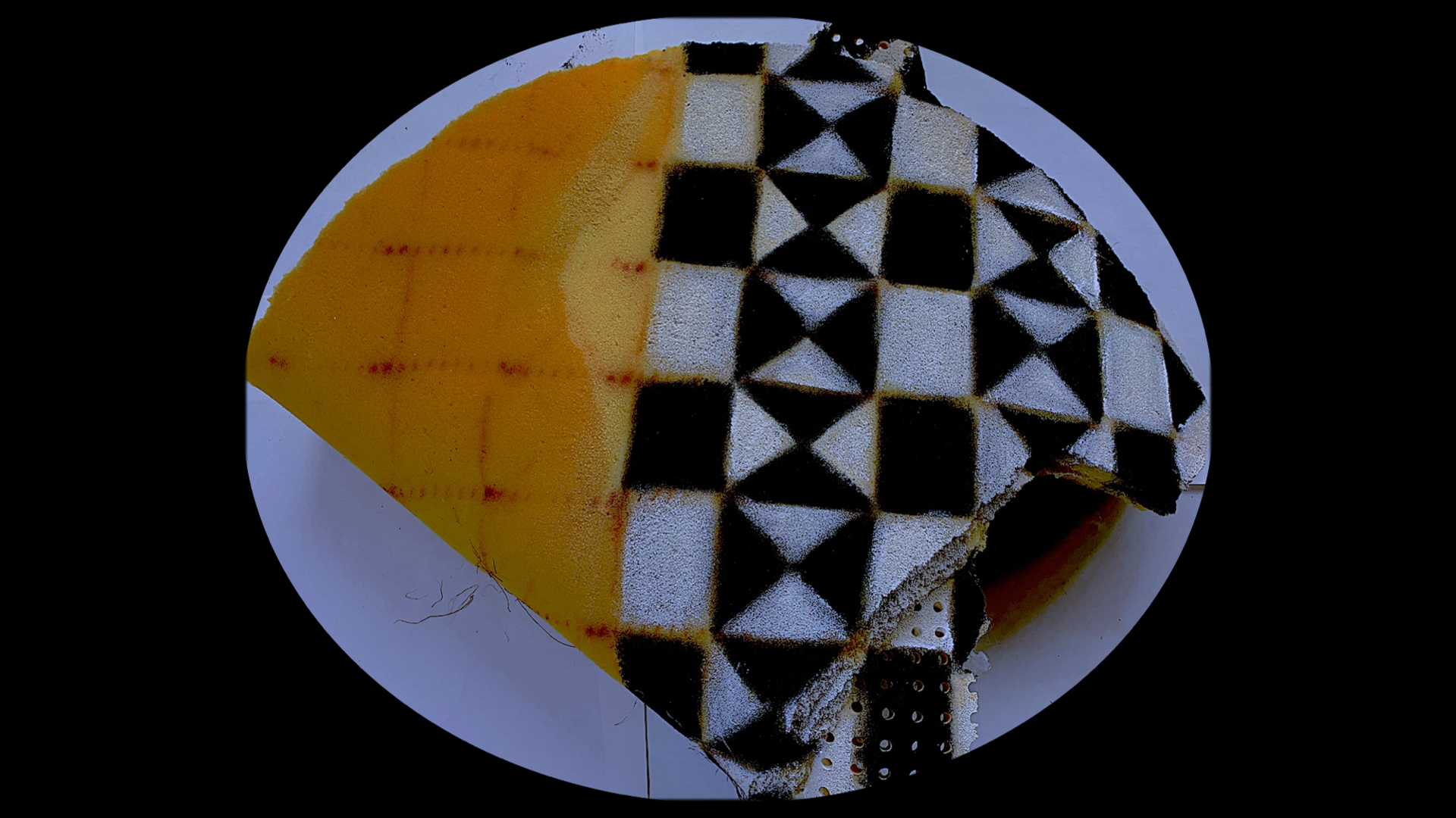
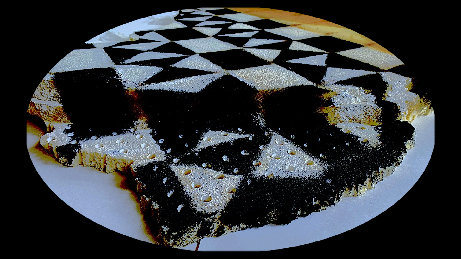
During the interpretation of my selected images in Week 2, I understand that I was not meant to replicate the image. Unfortunately, through obstacles such as a lack of confidence, and a terrible perfectionist streak, I encountered a need to first sketch the whole image in order to remove this from my system. For me, it was a way to gain knowledge of the positive and negative shapes, the detail and the forms within the background, etc. After gaining this initial understanding and certainty of the overall composition, I could relax more. In fact, I enjoyed this deconstruction phase, and gained more confidence to remove, abstract, reduce, enlarge or alter an image. I will continue to improve this skill of automatic mark-making when I use this abstraction process of drawing.
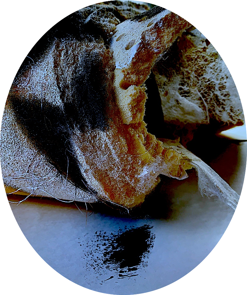
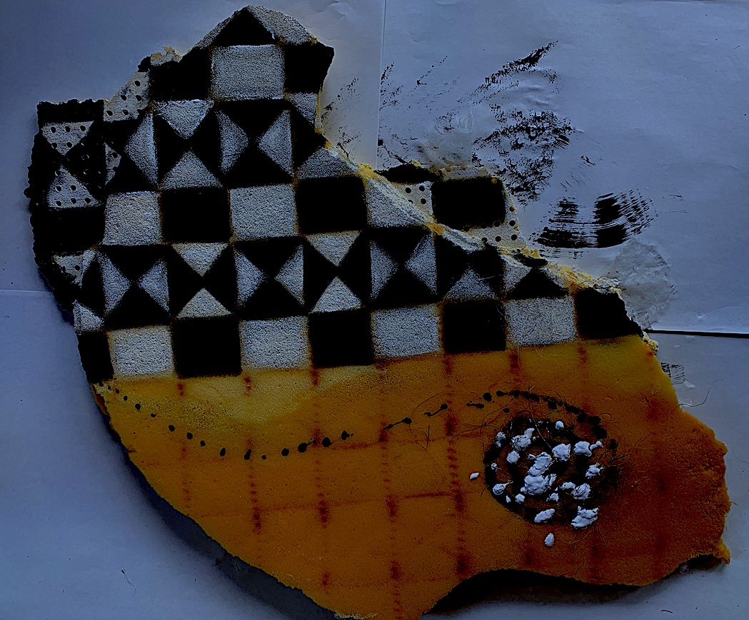
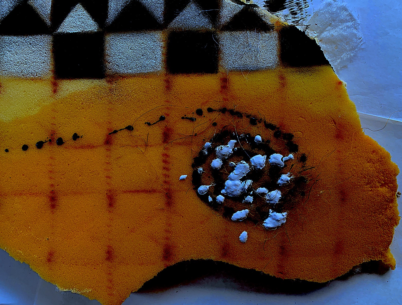
During the last four weeks, I have explored the relationship between my six chosen subject matter images and the brief’s verbs, and then combined them using different processes and media (drawing, painting, video). I have re-established my love of mark-making, and letting the materials (pencil, charcoal, oil stick, pastel, watercolour and acrylic paint on various supports such as cartridge paper, brown envelope paper, cardboard packaging, canvas and foam) do the work. Enthusiastically generating a number of experimental works immediately after each Tuesday’s main online session, provided me with an energised confidence and an engaged independence to further explore and problem-solve with different materials, different images and verbs.
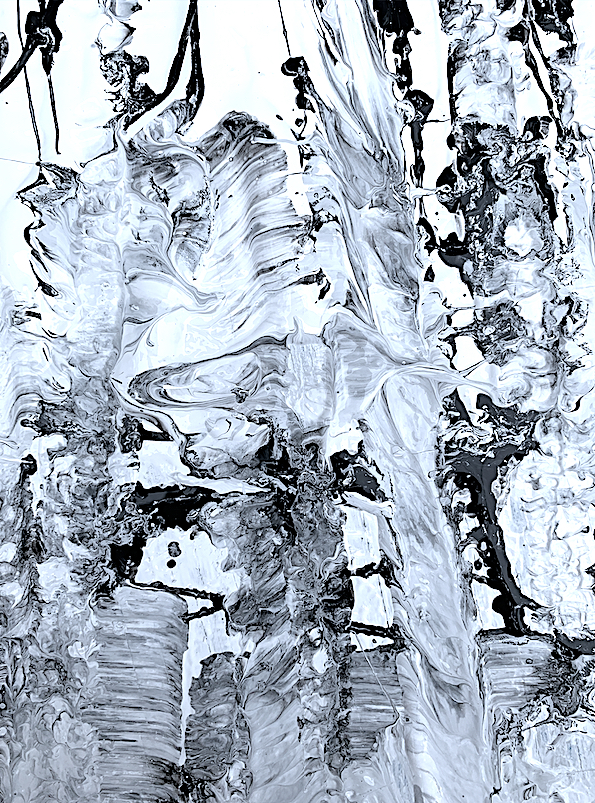
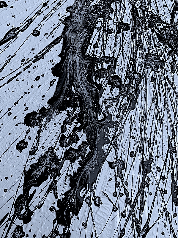
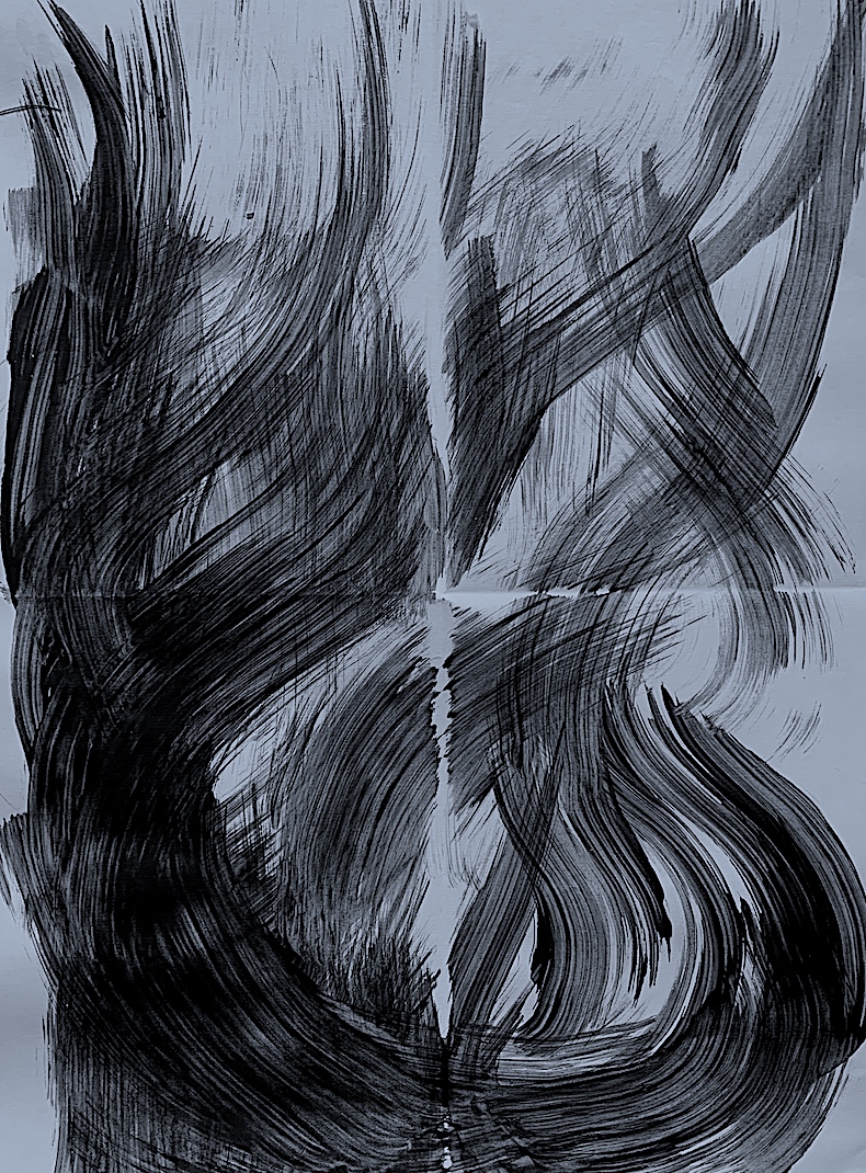
Generating interesting work, such as portions of my black and white paint work in Week 1, a few charcoal and pastel sketches in Week 2, and parts of colour painting marks in Week 4, occurred when I didn’t overthink. Most importantly, I have learnt to speed up my mark-making, allowing the movement of my body to drive and direct me through physical action, this has been a joy. I have learnt to connect to the materials within a limited timeframe. I am continuously in a reflective mode, and often if I labour over a work I can sometimes lose interest. Yet, by working at a quicker pace, (and in this case… remembering my verbs to keep me on track) and not worrying about the outcome, the engagement process was more fulfilling.
Researching and making personal links to as many artists as I could in the timeframe provided me with new concepts and development of my work. In particular, researching Gerhard Richter in Week 1 revealed methods and expressionism that impelled me to experiment and develop my own way of working, such as using a length of wood to shift paint. If I had more time, I would like to develop my experiments by using interesting supports to work on, such as more found objects. I would also like to open up my drawing and painting compositions, by letting the pencil or charcoal marks be on show, instead of hiding them beneath the medium of paint. This would encourage me to loosen up my painting style and process, and thus provide me with a new way of working.
Reading Sources
Rubenstein, R. (2009). Provisional Painting: Part 1. Art in America, Accessed October 14, 2021. https://www.artnews.com/art-in-america/features/provisional-painting-raphael-rubinstein-62792/
My Final Two Painting Selections
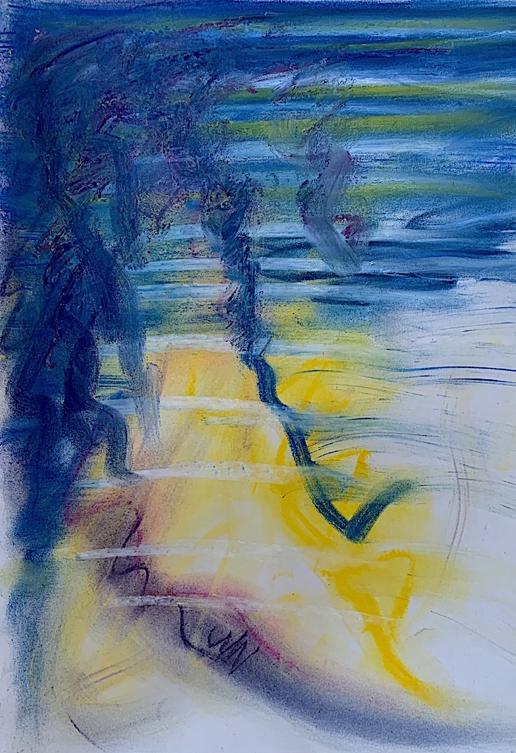
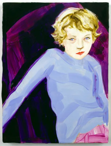
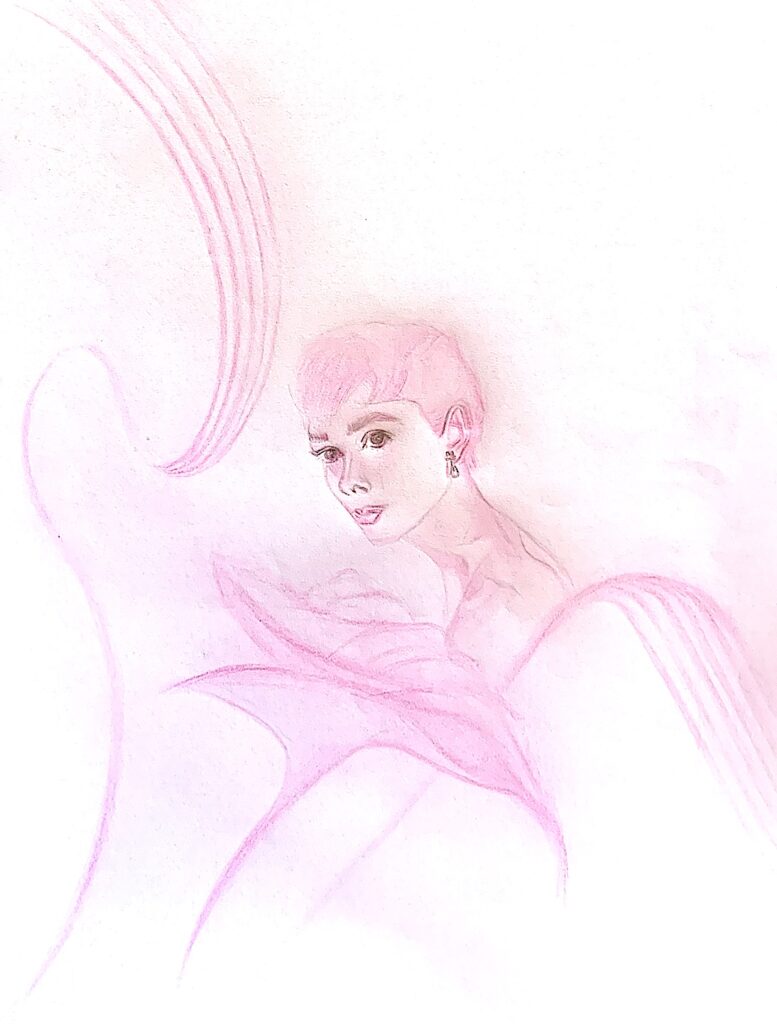
Figure 1. ‘Lily Audrey’ Pencil and Acrylic Paint.
COMBINATION: Combine Verbs & Two Images
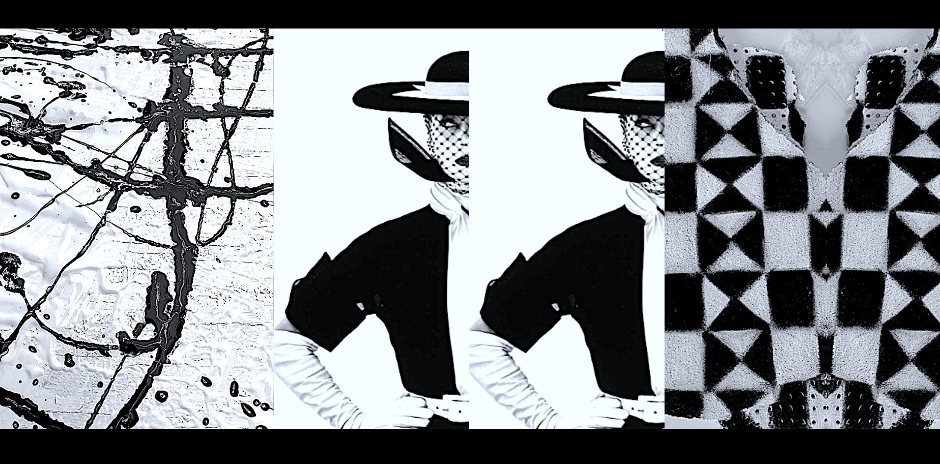
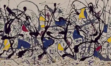
Verbs: Soft, Gentle, Brush, Dab, Stroke, Push, Draw and Paint. 1. Image: Man Ray ‘Arum Lilies’ / 2. Image: Audrey Hepburn ‘Sabrina’ Filmgrab
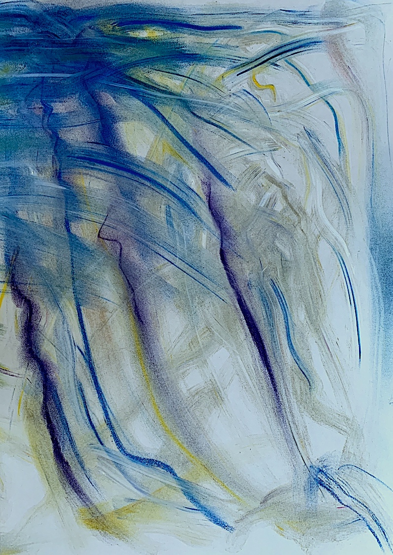
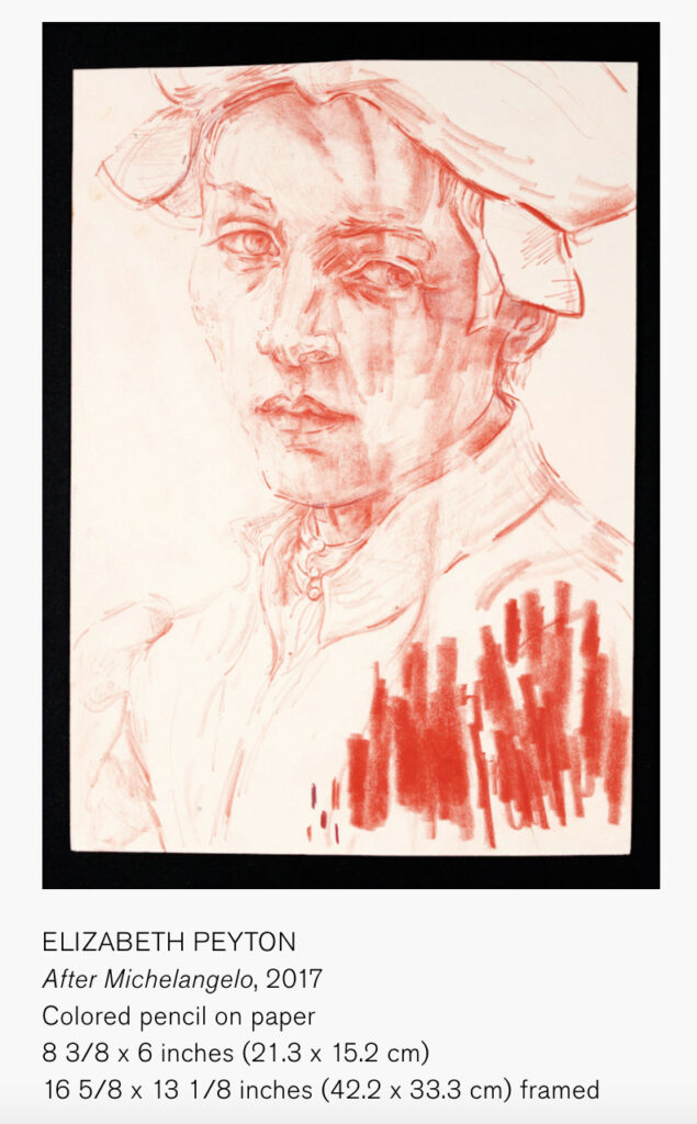
I was inspired to extend my figurative work after a recommendation to view Elizabeth Peyton’s portraiture. In my research (see earlier post) I noticed Peyton’s sensitive, soft rendering of people, and their body position.
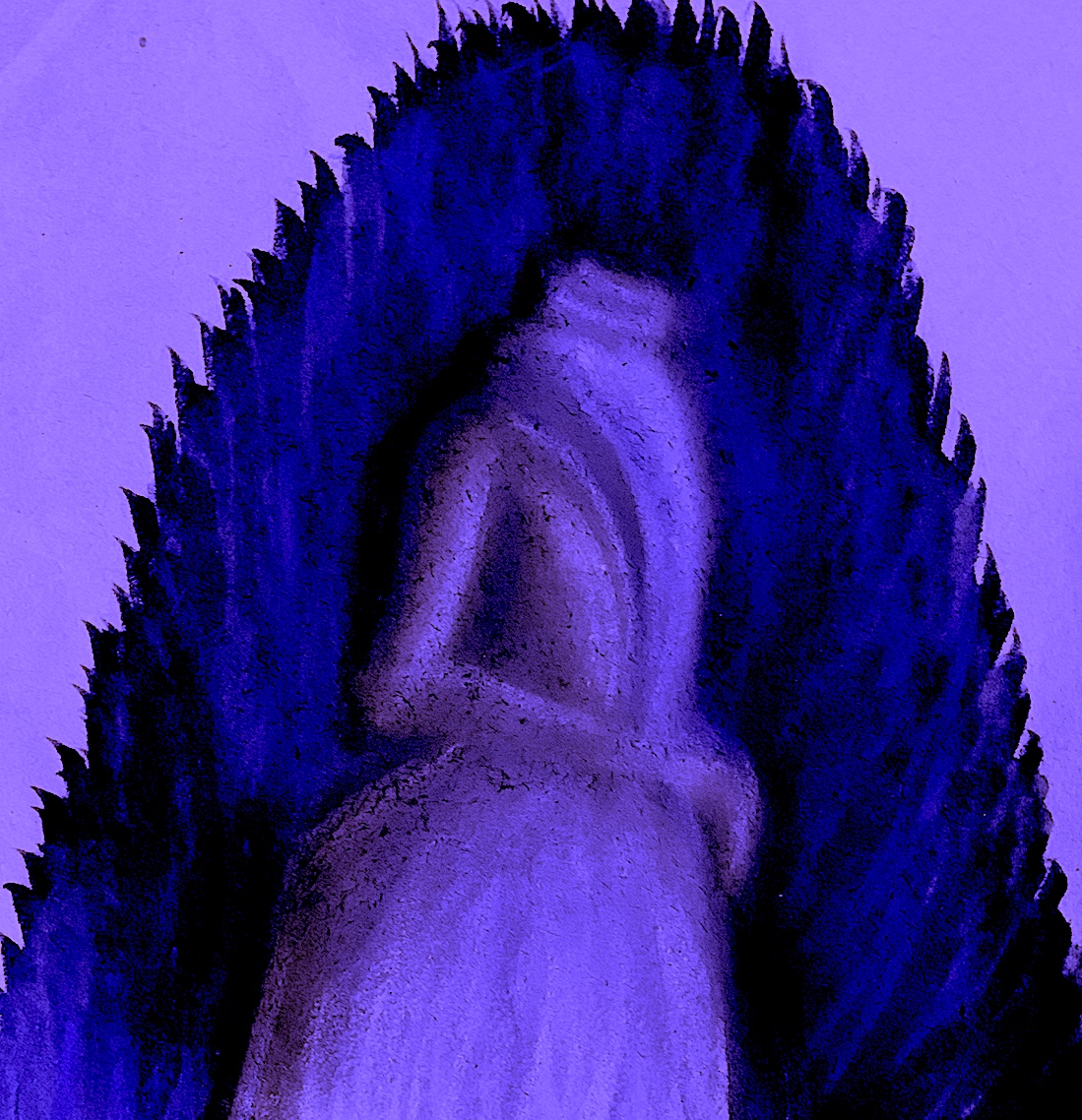
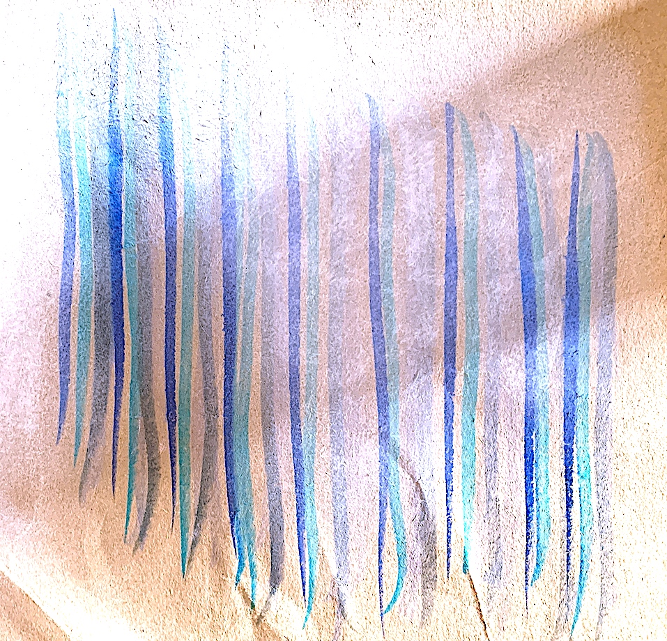
After creating quick sketches of Audrey Hepburn (see earlier post) with charcoal, watercolour, biro and pastel, this time I used pencil by drawing her head and shoulders leaning forward amongst abstract lilies. Peyton often paints the top part of the body, so I painted Hepburn’s portrait delicately with a light wash, leaving out the torso and limbs, and leaving some pencil marks showing! 😁 I have learnt that it is okay to reveal pencil marks, and to have large empty negative spaces across the surface plane, as I have done below. Utilising a combination of verbs, plus drawing and painting, pencil and paint, and two inspirational photograph images of lilies and Audrey Hepburn, I am quite pleased how soft and light my portrait has become. 😊 My next step is to have a figure in a gestural brush stroke background.
COMBINATION: Combine Verbs & Images
Verbs: Soft, Gentle, Brush, Dab, Push. / Image: Man Ray Lilies and Image: Audrey Hepburn ‘Sabrina’ Filmgrab.
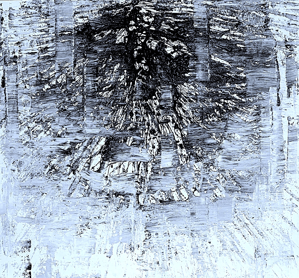
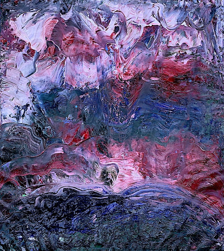
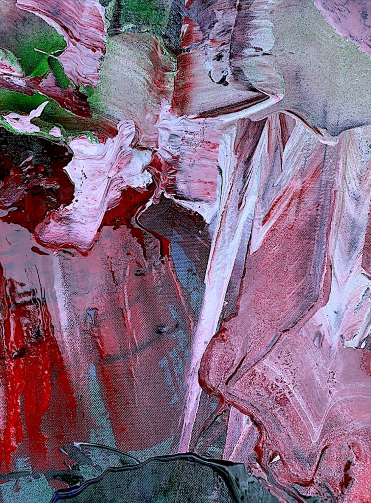
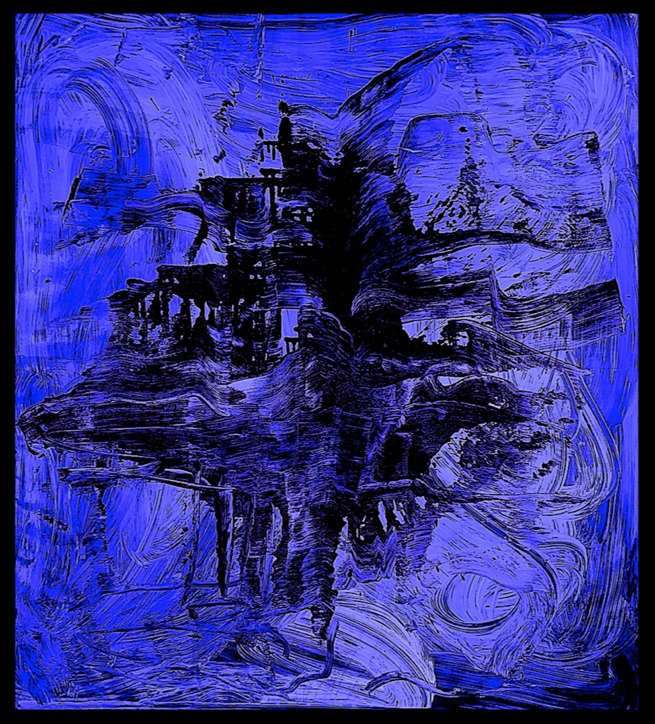
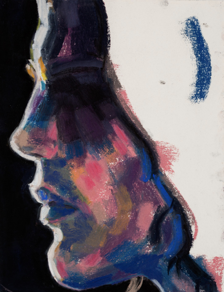
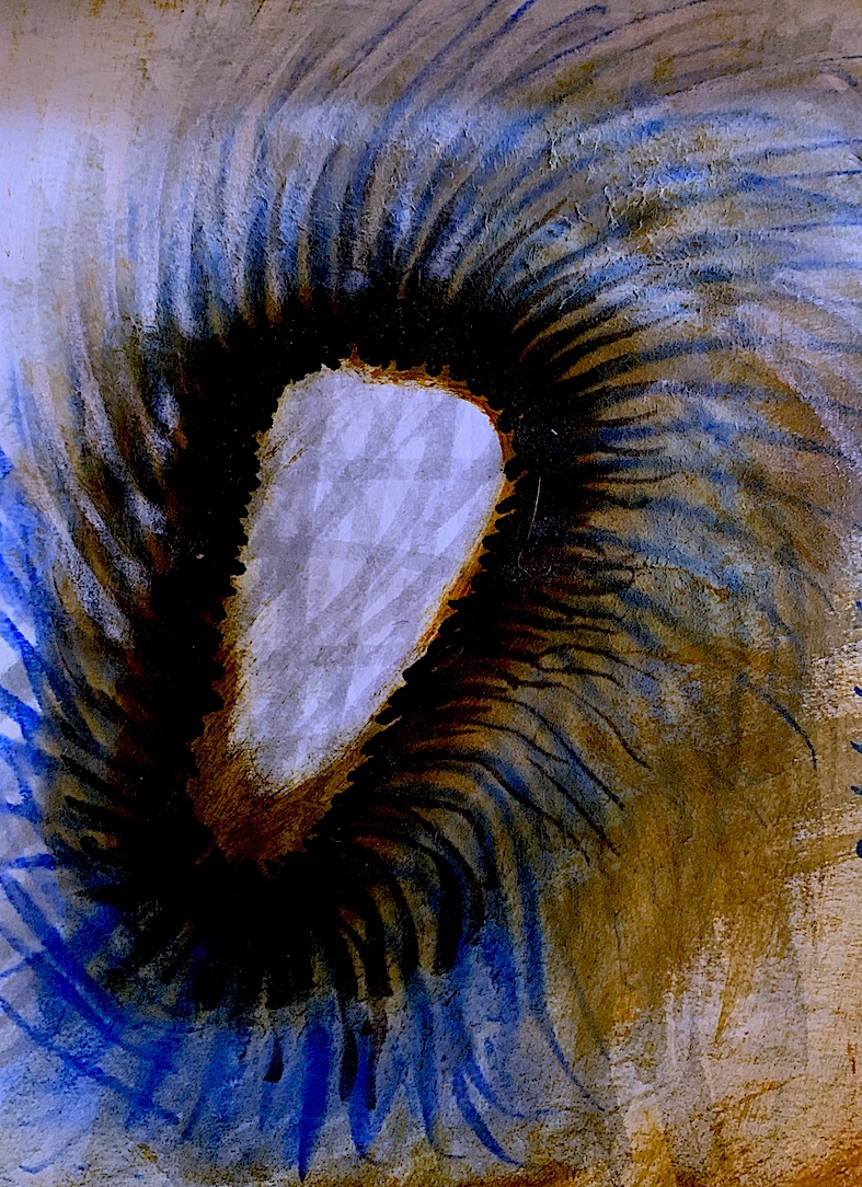
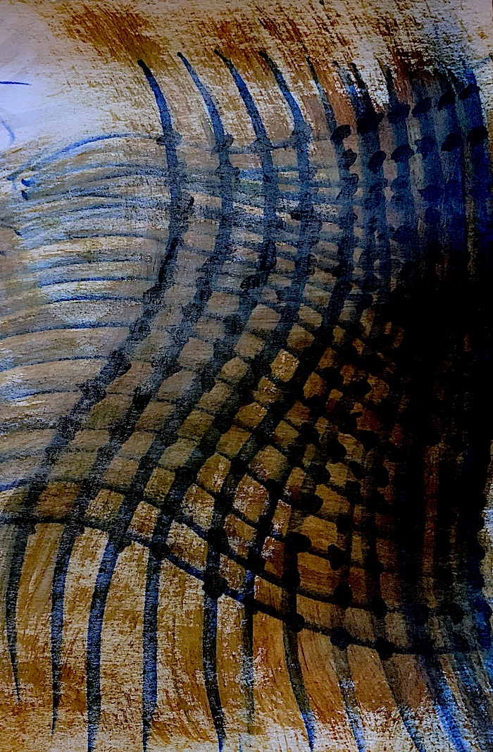
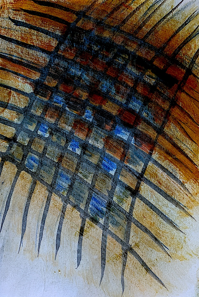
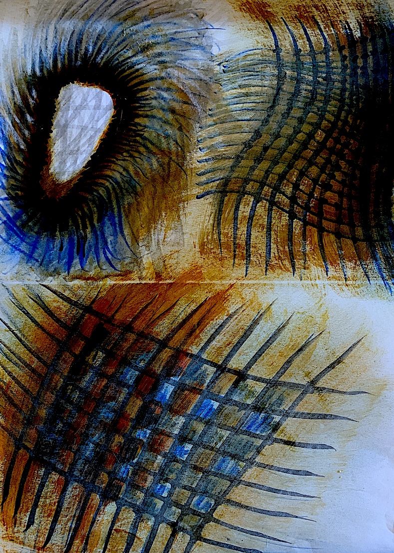
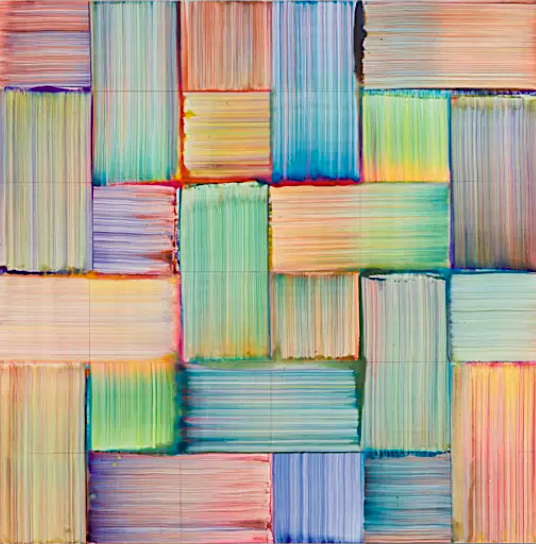
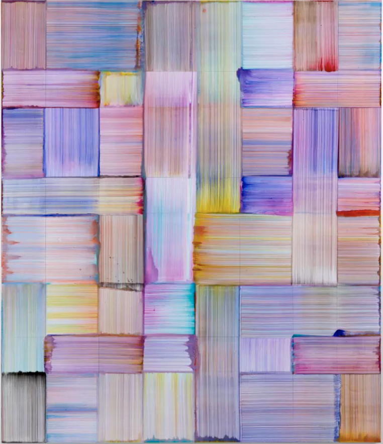
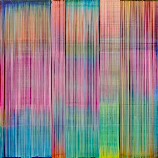
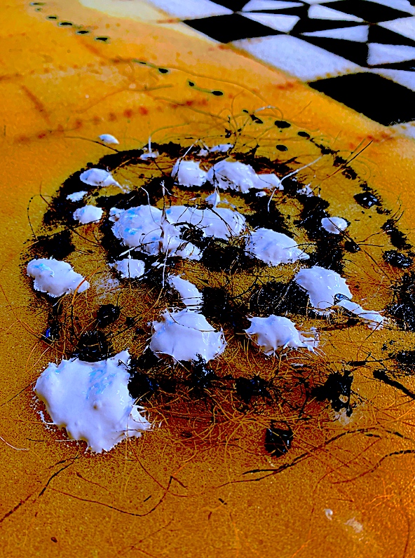
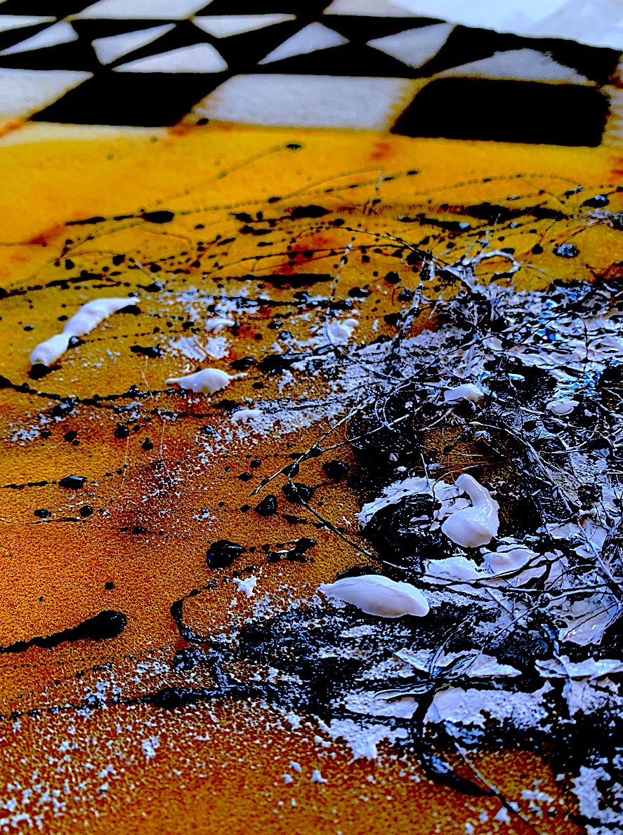
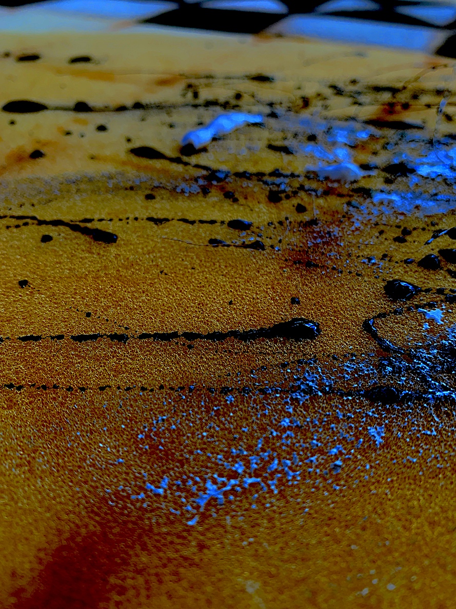
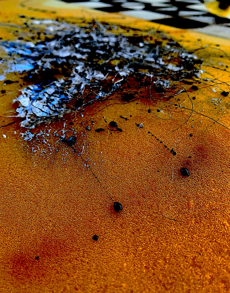
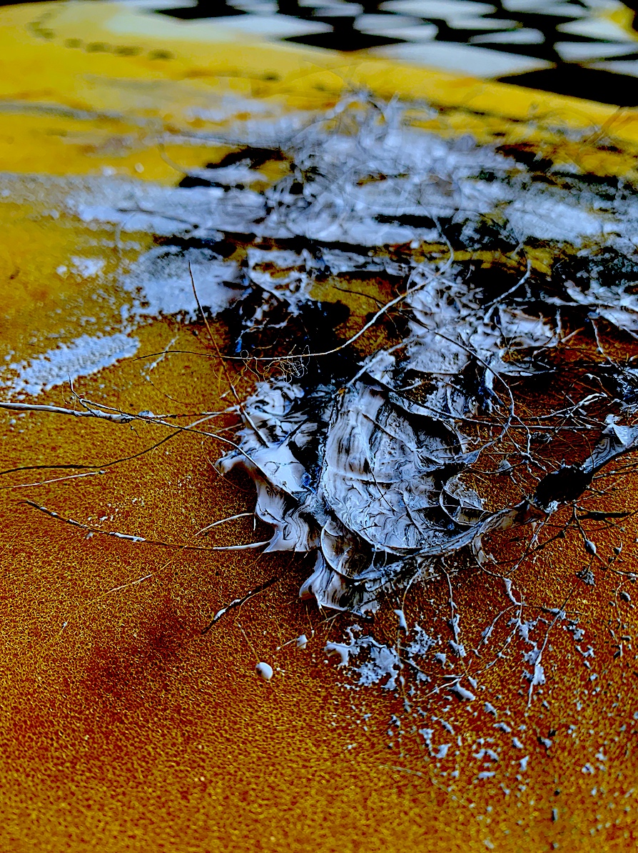
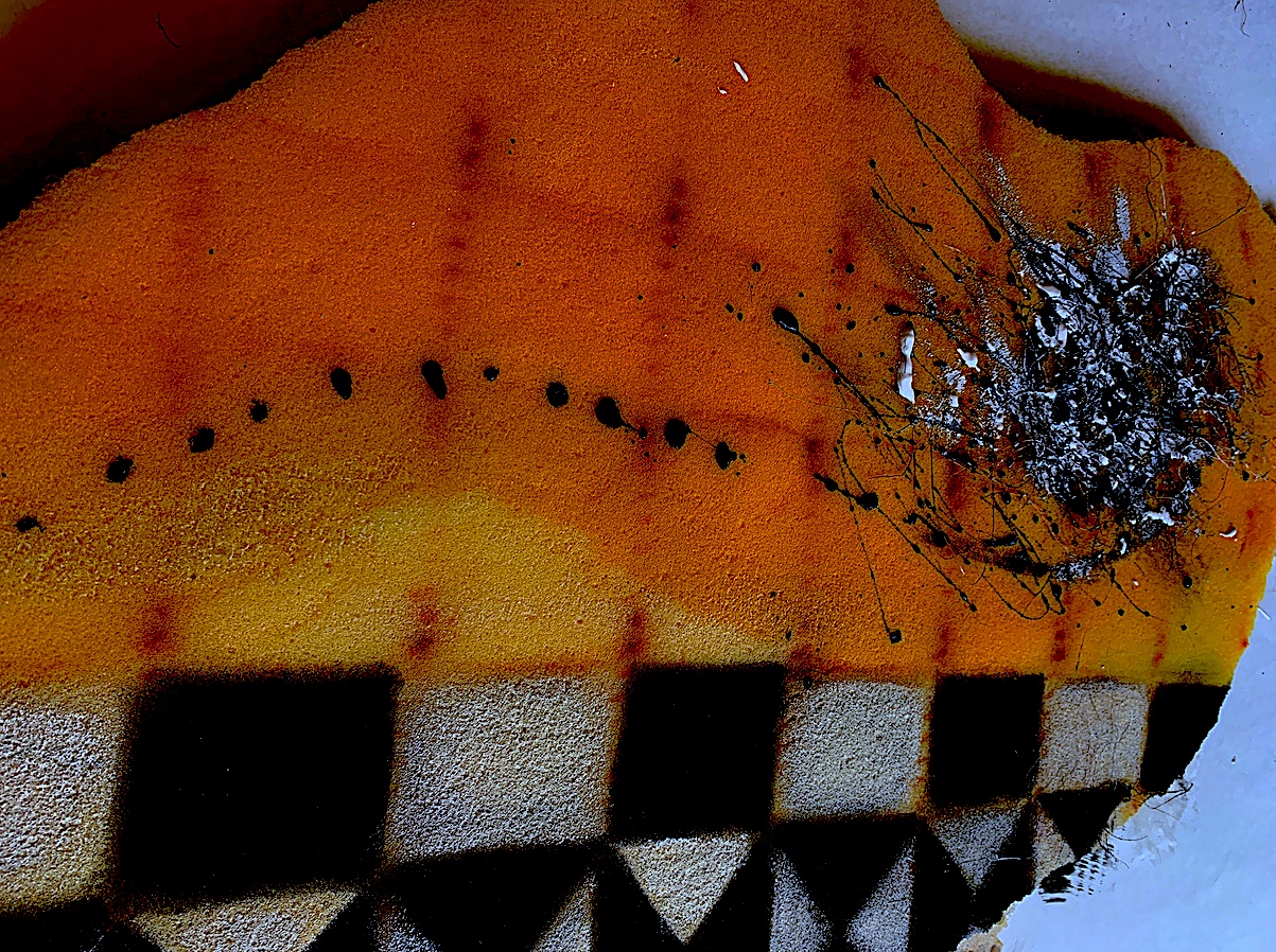
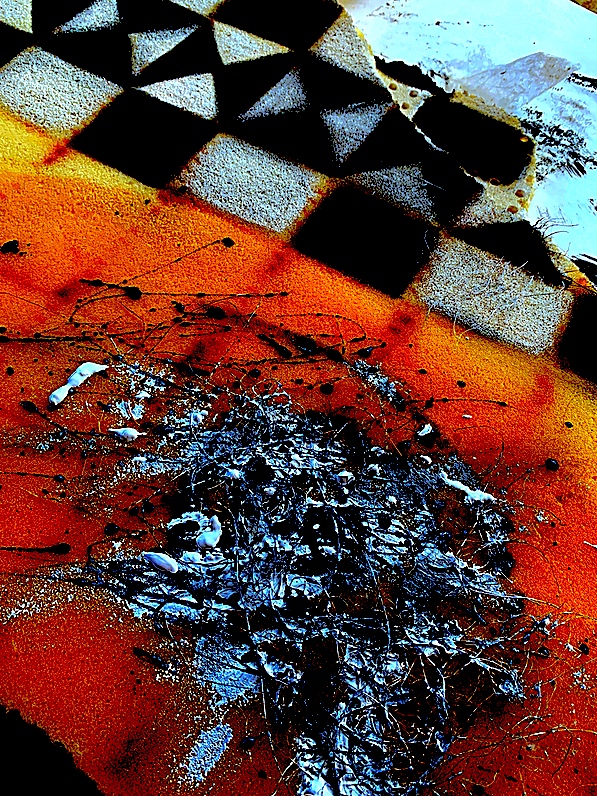
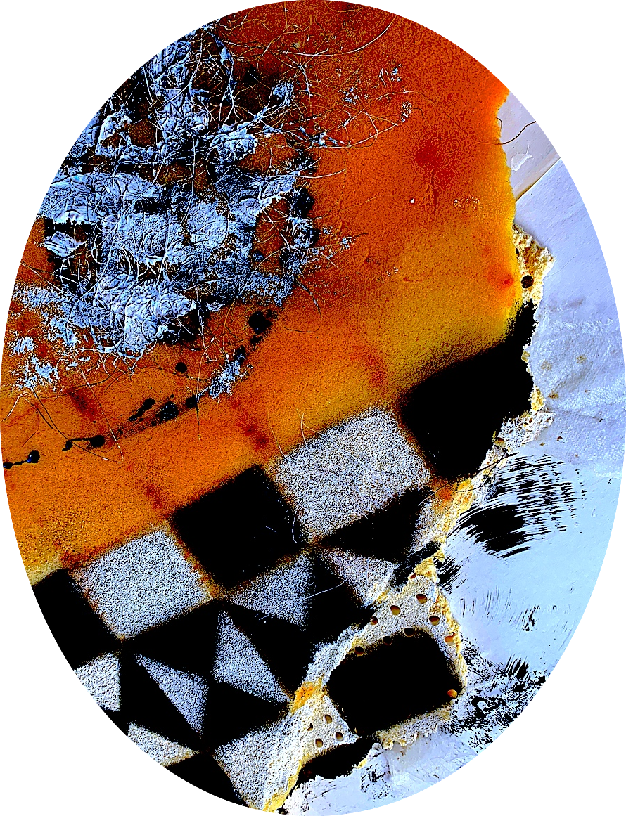
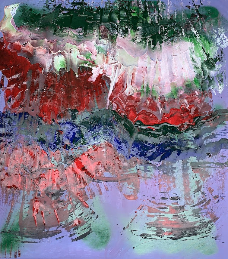
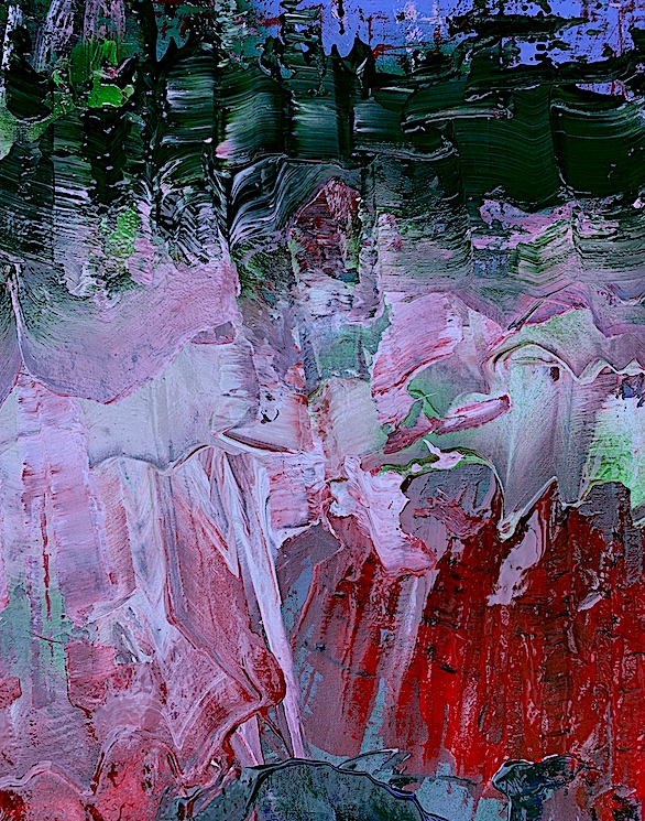
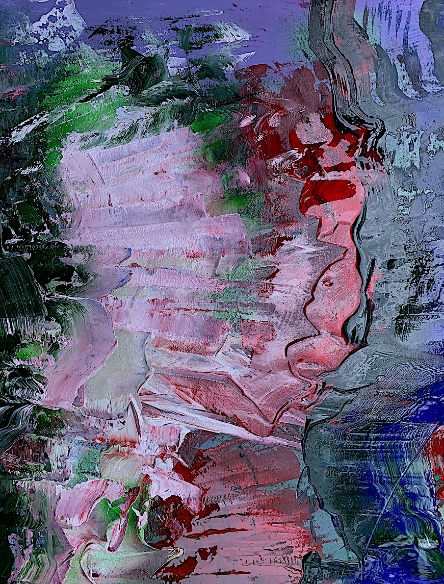
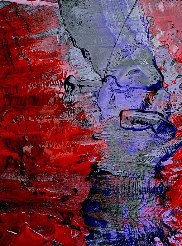
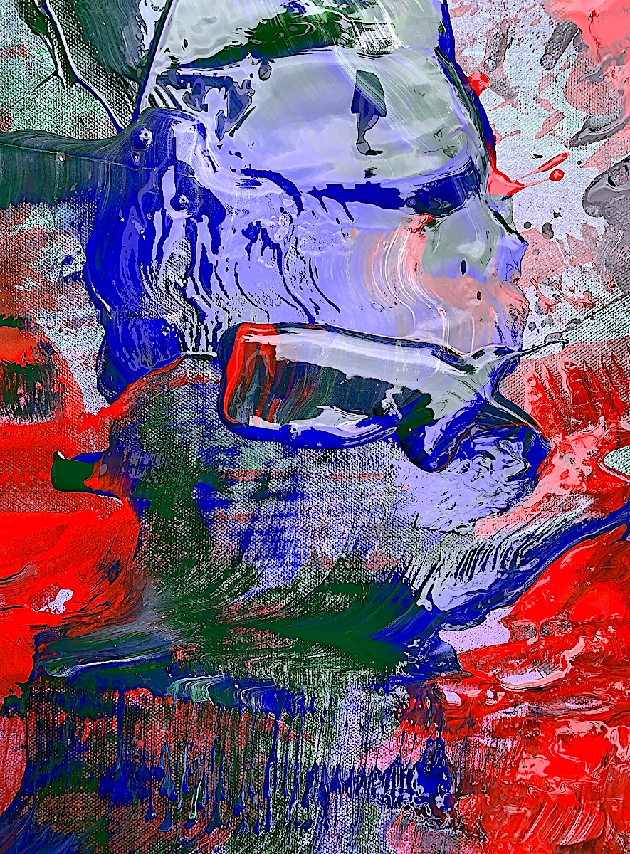
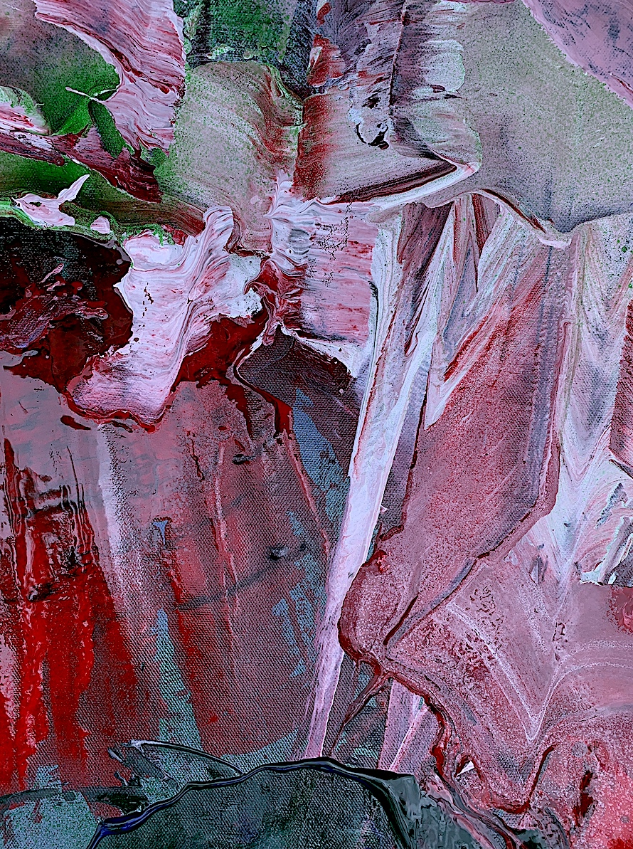
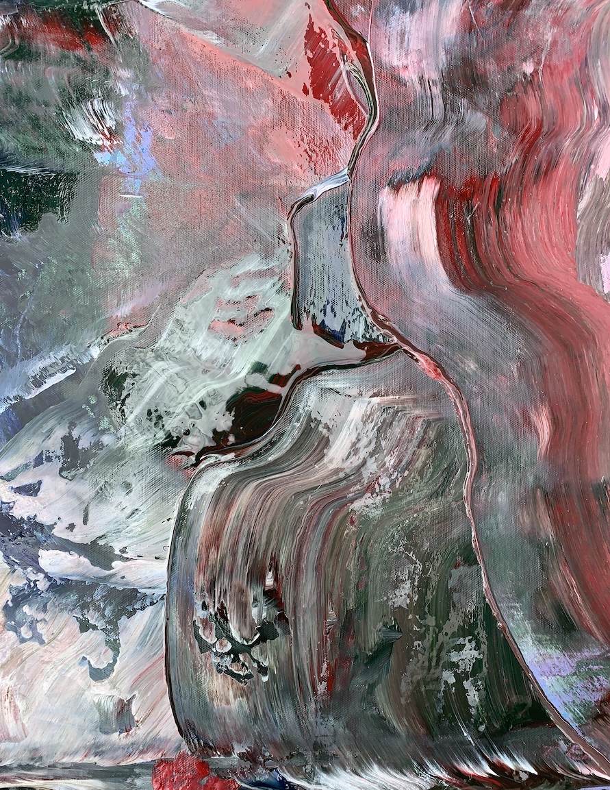
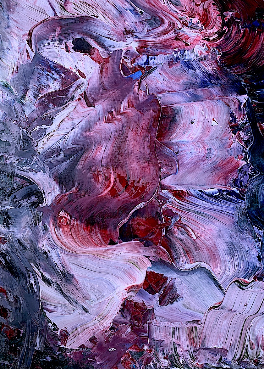
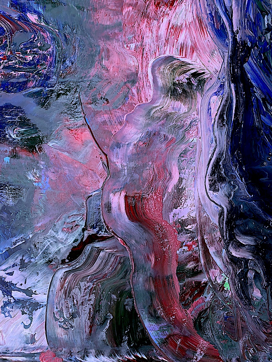
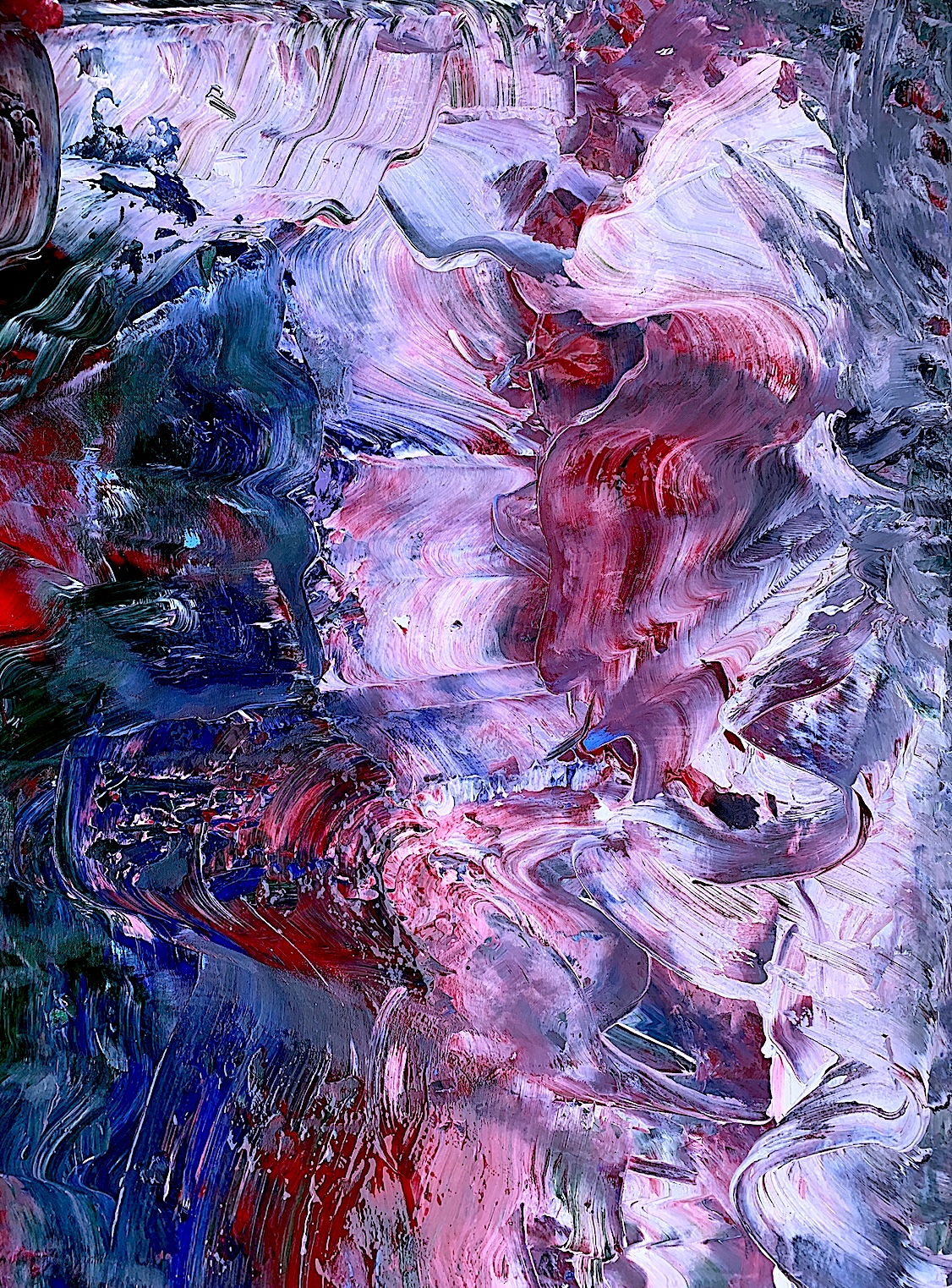
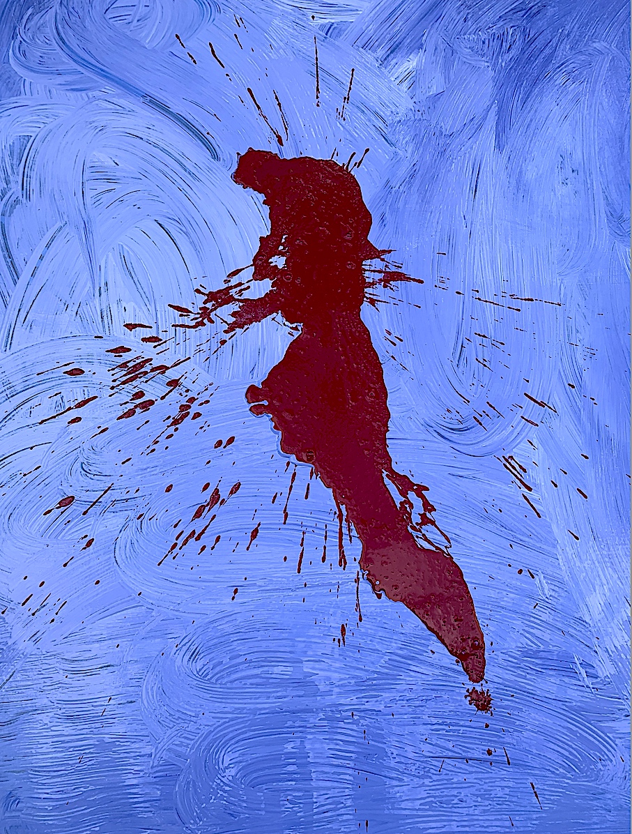
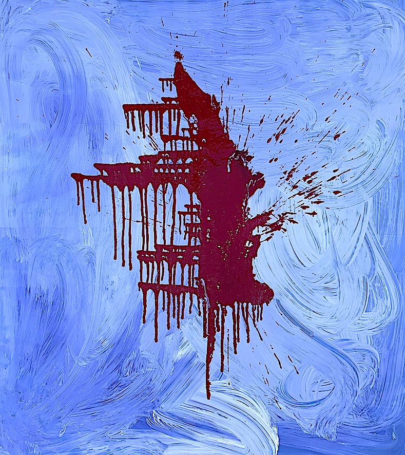
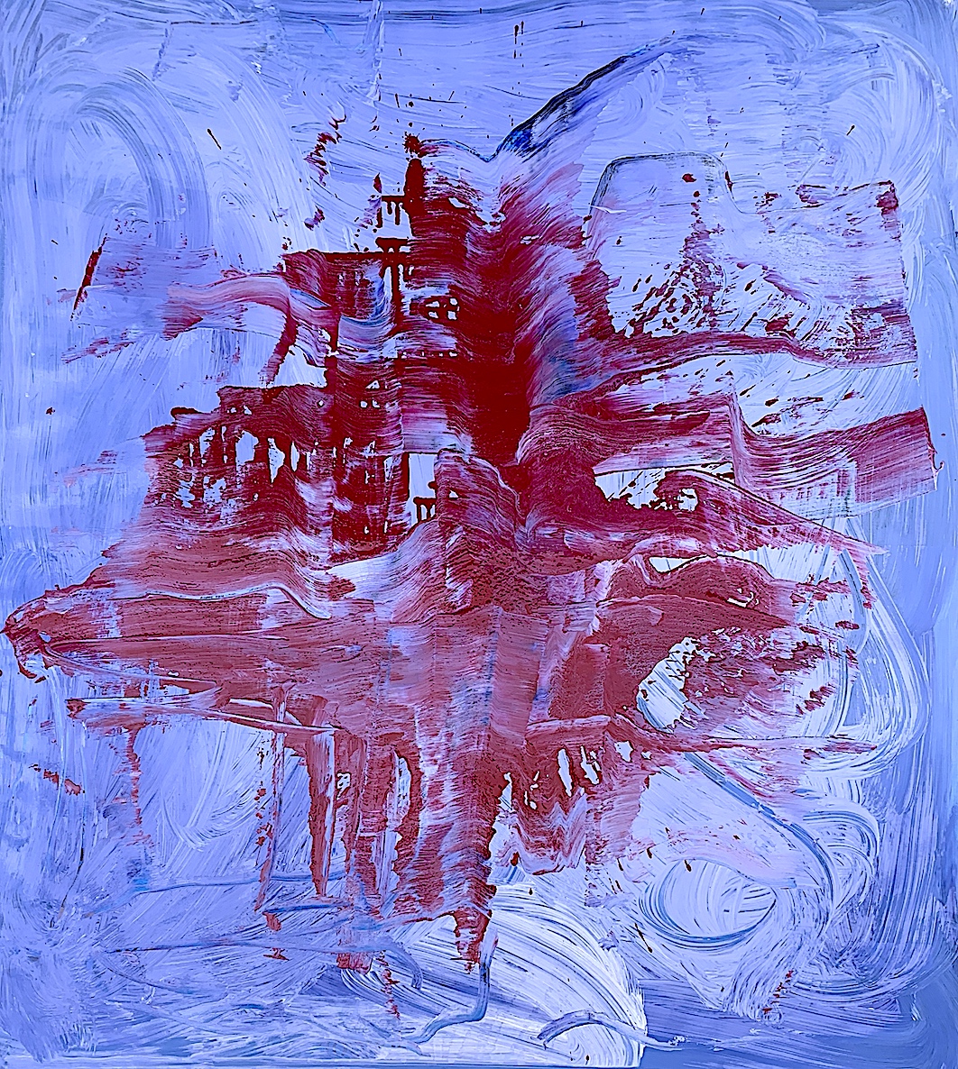
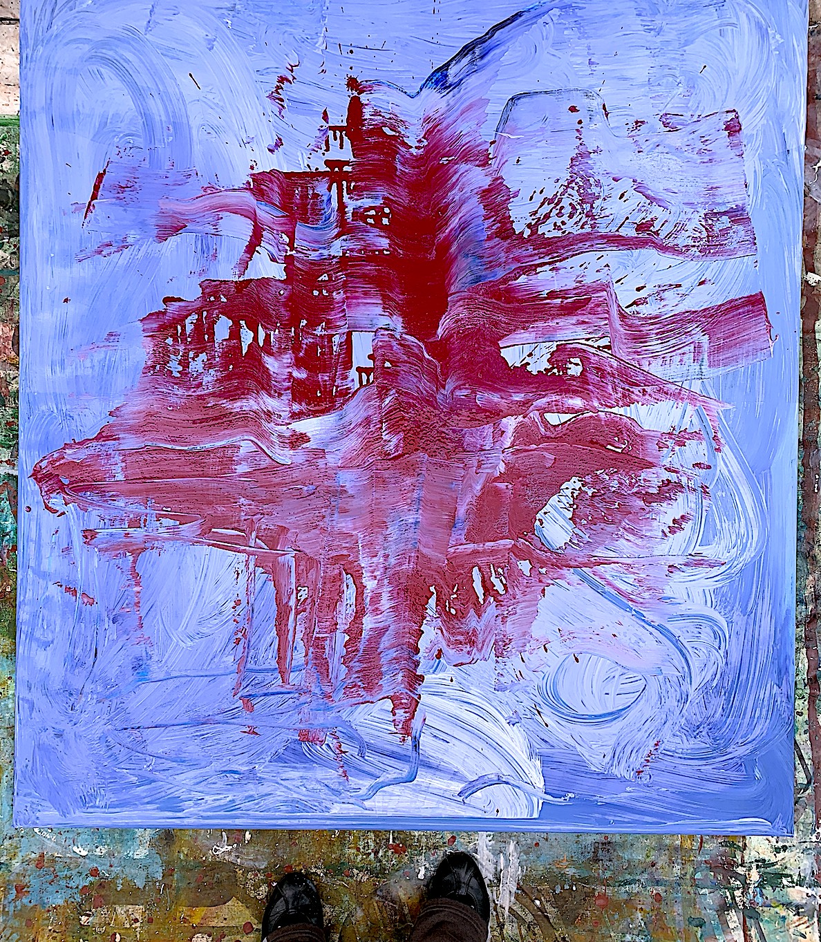
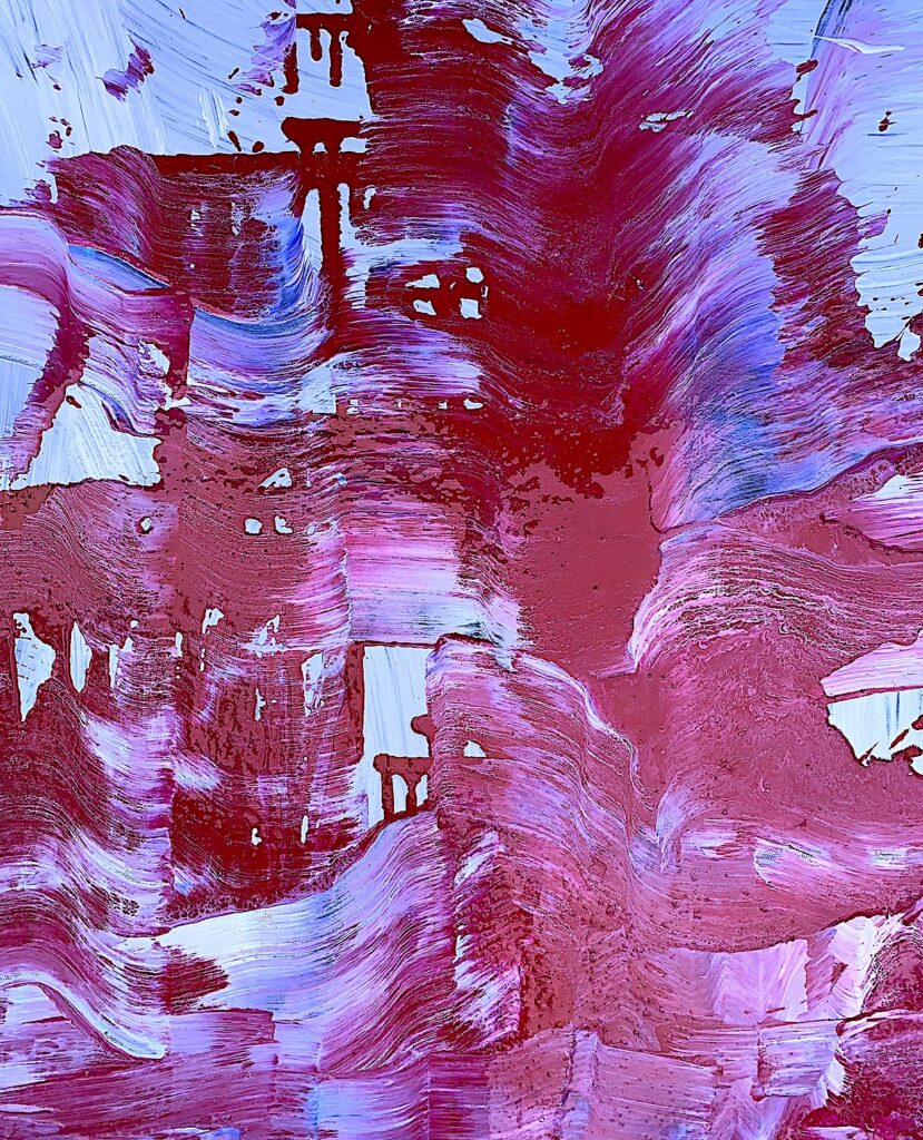
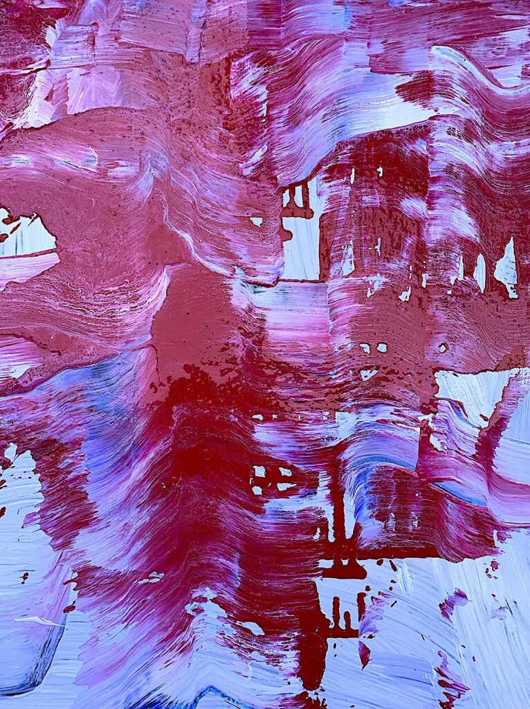
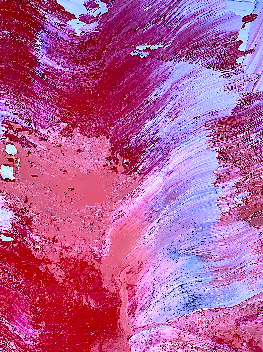
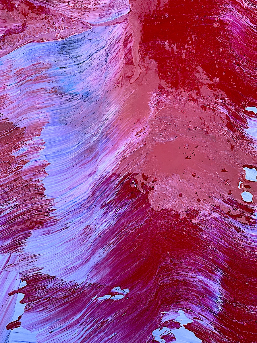
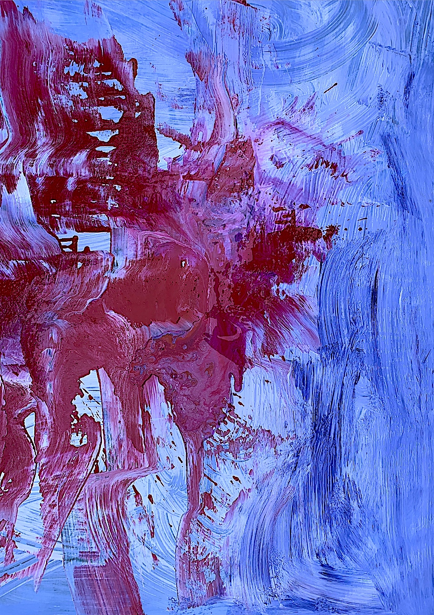
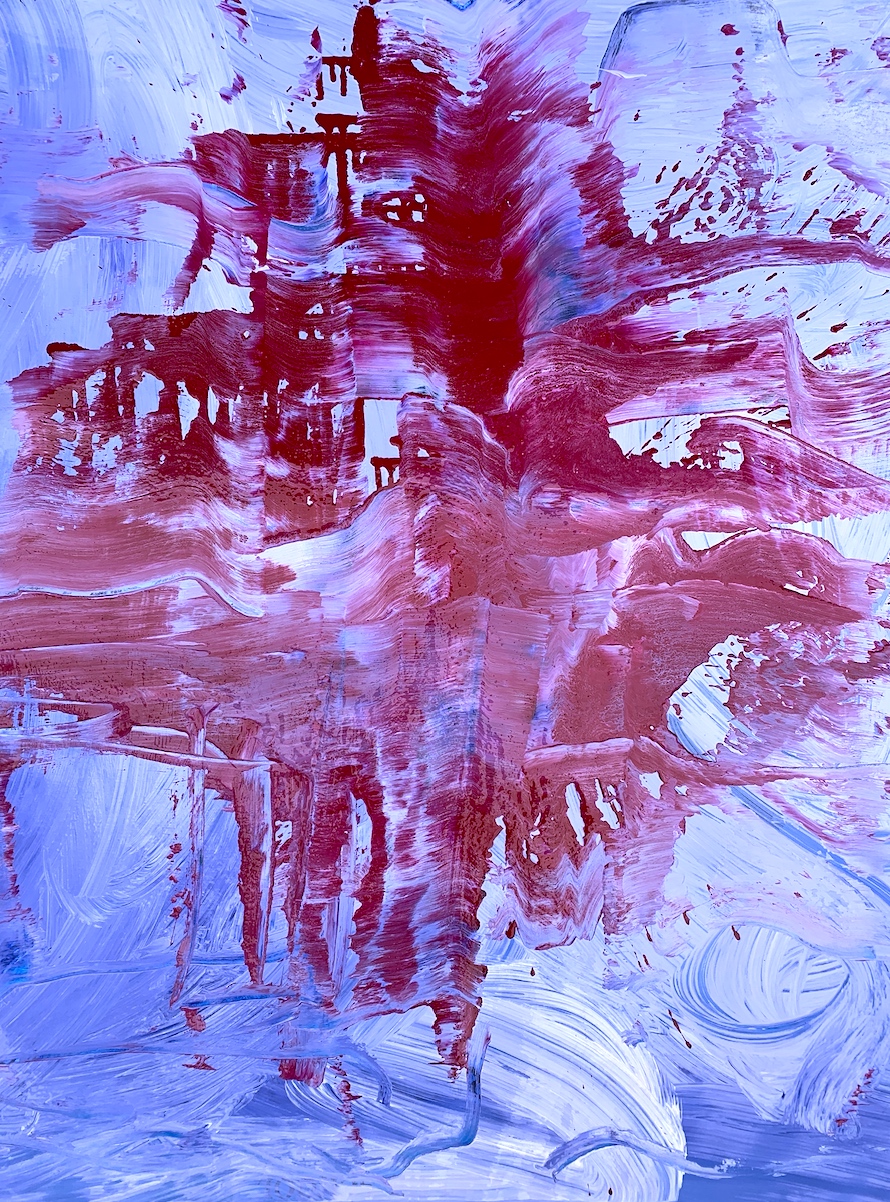
Figure 2. ‘RED RIVER’ This is a favourite portion from the painting titled ‘Red River’ (see previous post), because it showcases my selection of the brief’s VERBS, and displays intriguing forms such as a dark hole, or a reclining armchair. I feel some sense of achievement because I see the movement of a red waterfall, and as an extremely kinaesthetic artist, having motion in a still artwork is significant to me. I see the warm and cool colours MIX and MERGE, the shapes CURL and CURVE, and the scallop seashell forms LIFT and SINK with a beautiful spatial 3D effect on the 2D canvas surface. I have learnt to take risks with the paint material, focus on action words, and reduce the size of my sketches.
The large scale Abstract Expressionist artworks by German artist Gerhard Richter (see Artist Research post: Week 1) are enthralling, and his technique of pushing the paint with a squeegee is influential. Aotearoa artist Judy Millar (see Artist Research post), and Grace Wright are also inspirational for their scale, colour, shape and movement qualities.

VIDEO 1: Development of a Process: VERB MARK-MAKING = BLACK & WHITE
VIDEO 2: Development of a Process: VERB MARK-MAKING = COLOUR