Core Studio Assessment 1. Reflection – Open Studio
A Weight Off Your Mind
Making objects excites me, and the hands-on work in the Sculpture class studio has given me the encouragement to experiment, and the permission to play. Thinking more about the visual language of materials and how to listen to the way each material speaks during the process of manipulation has been the focus of my learning.
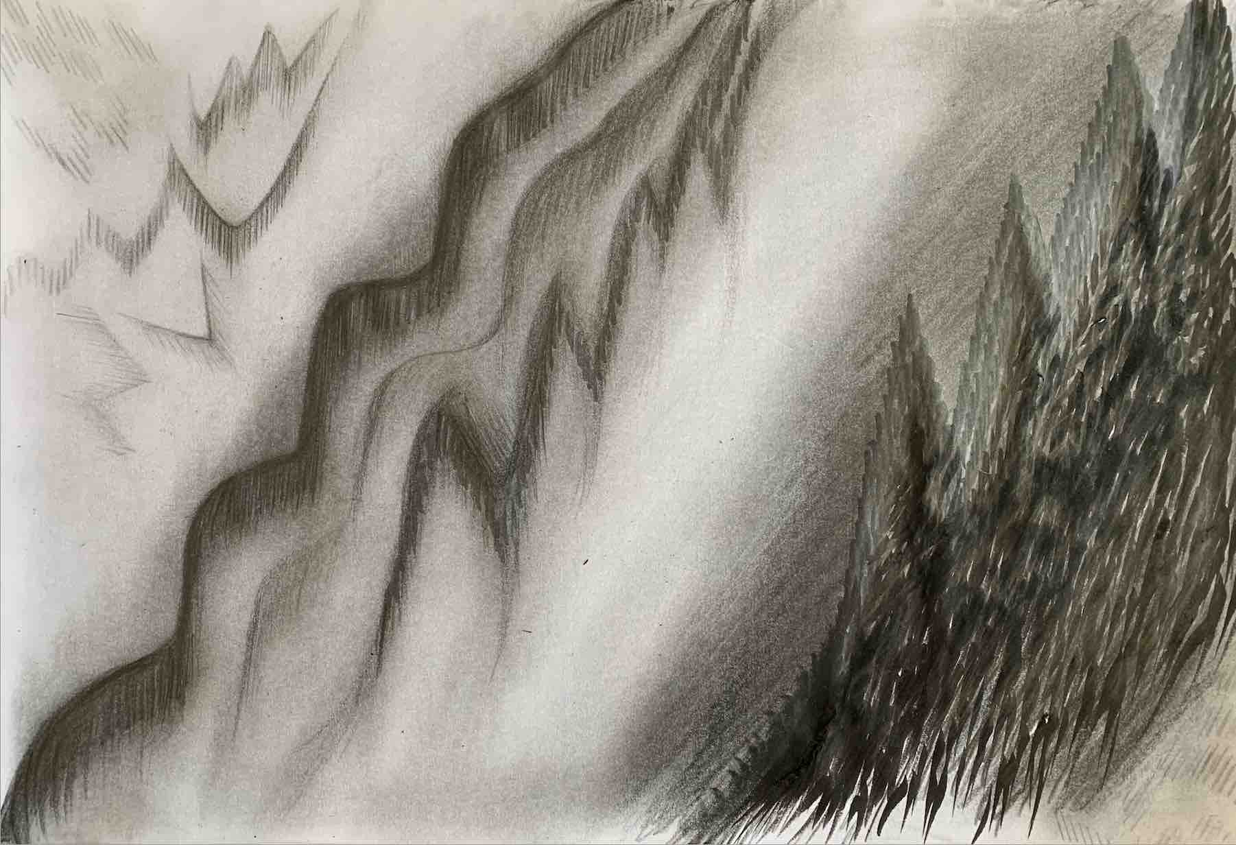
The sculptural brief A Weight Off Your Mind with the focus on weight has been an important element to start with, as often one only sees shape, form, line or colour when viewing an artwork. I fully understand the value of weight within the art discipline of Dance, because dance is pattern making, filling the stage volume void with a mass of touching, close-knit bodies within three-dimensional shapes. As a dancer, I had to control my body movements to appear either heavy or light, and had to display strength and skill effortlessly to lift or be lifted, to balance and to be suspended in the air. Therefore, over the last four weeks, I have learnt to create two-dimensional and three-dimensional objects that focus on weight concepts, that feel light or heavy, that touch soft or rough, that view dark or light, and that show strength or weakness, or gravitational push/pull tensions, etc.
Creating the taste of an object, rather than creating just a visual representation of how it looks, is an ideal goal to consider, and to reach in my art exploration. I prefer light, long-in-length, elegant, graceful and beautiful looking objects, but I seem to have created very heavy, dark, ungraceful, and quite weird and ugly structures.
Instructional Texts
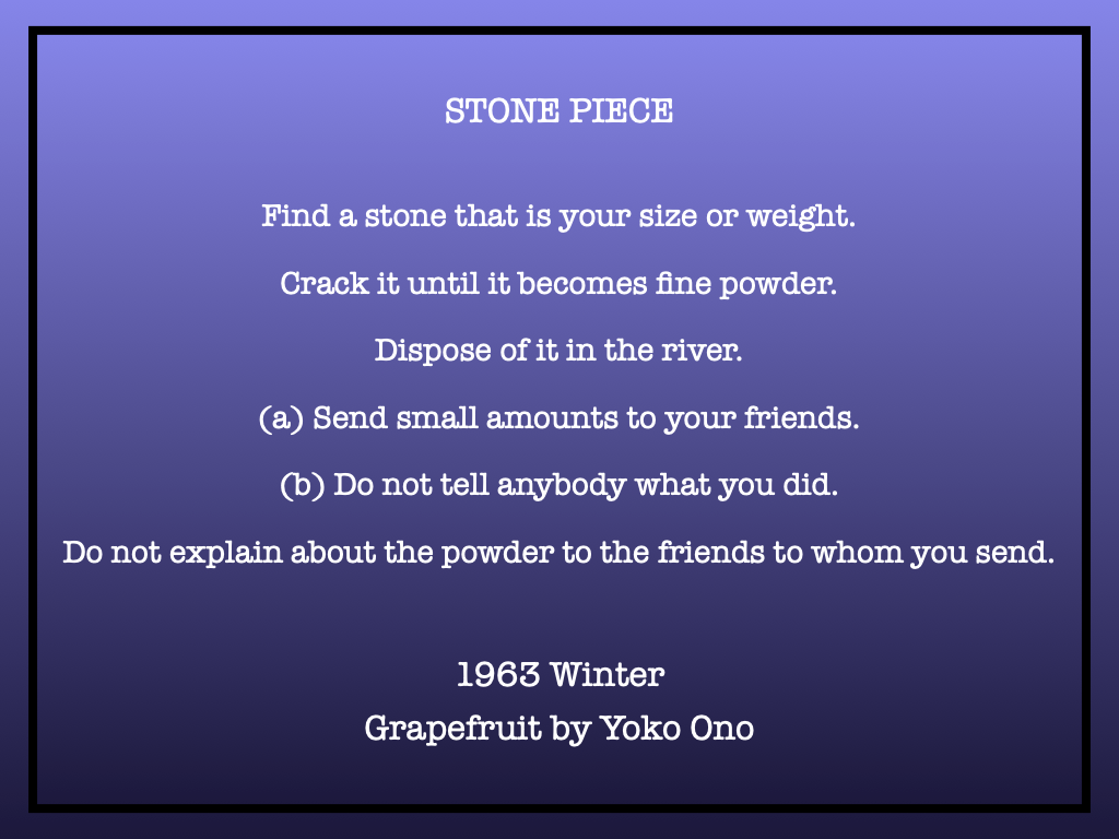
I was fully engaged in the first brief, in the first week, in Covid 19 Lockdown, because interpreting and analysing words with no pictures is interesting to me. Utilising creative writing was a useful starting point to generate ideas. The Tricks: Warm-up Drawings and poetic text Drawing Grapefruit, by Yoko Ono, introduced by John Lennon, was exciting and very inspirational to me, in particular Ono’s sun and moon poems. One idea led to another, and I found contentment being alone in Lockdown, just quietly drawing.
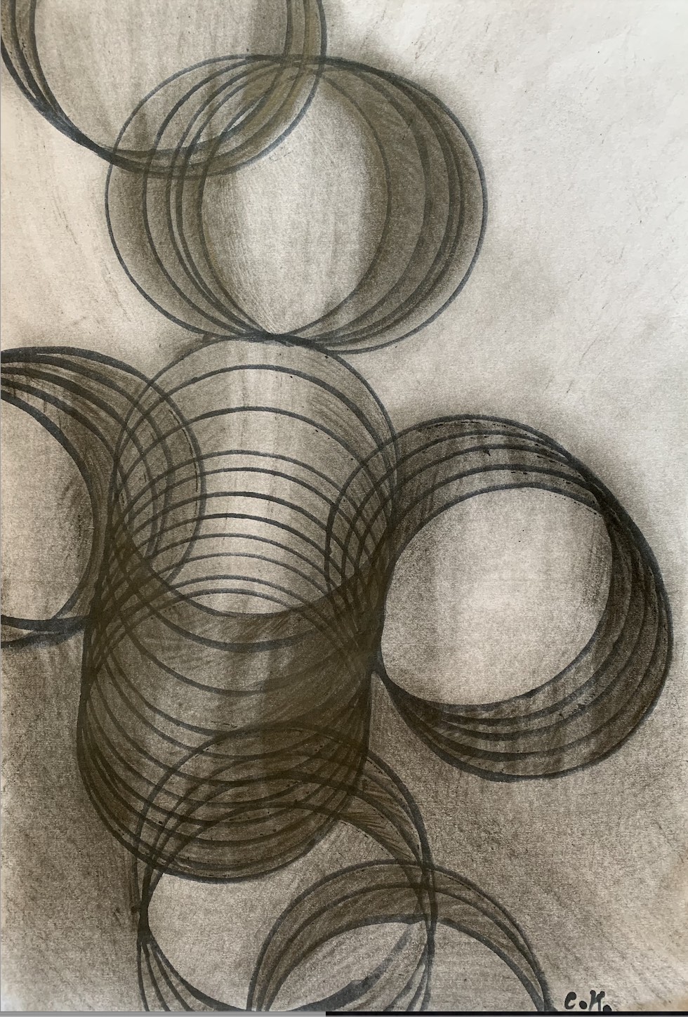
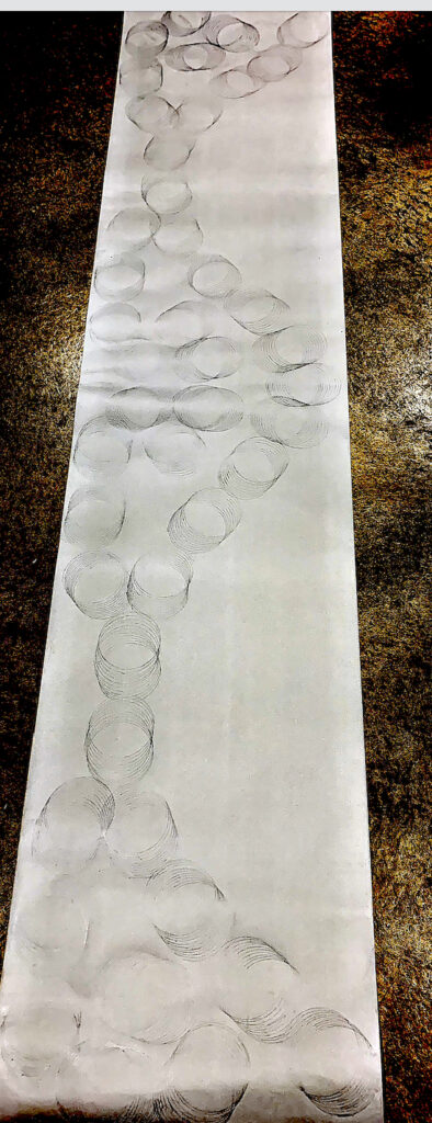
After reading the instructional Tricks – Warm-up Drawings, I focused on making a set of small ink linear dashes for the text: Draw exactly the same line 1000 times. My second drawing expanded on some of this instruction: Draw exactly the same line, by developing a graphite work of connecting circles. Yet, my focus was to not draw 1000 circles, just the same size circle over and over, on top of each other, like a warped spiralling spring Slinky toy. This circular sketch, A3 in size, started linear. It developed into a dark, heavily shaded tonal work of tunnel-like structures like tin cans, but with the linear edges of the circles still defined.
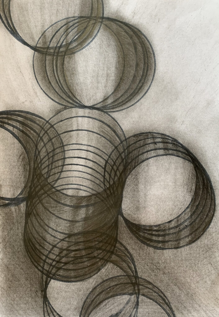
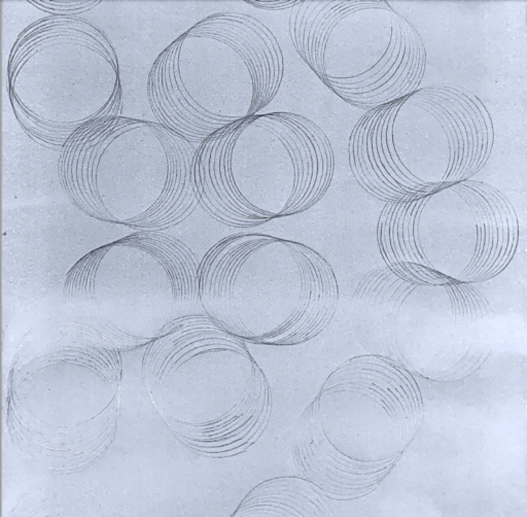
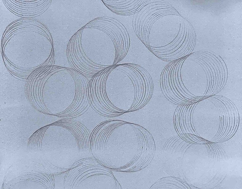
As I enjoyed creating the tin can tunnel effect, I chose next the instructional text: Make the largest drawing possible. I created a 2.8 metre in length second circle drawing with soft, light lines. After reading Ono’s poem: There are one thousand suns arising every day, and the Tuna-fish Sandwich Piece poem’s first line: Imagine one thousand suns in the sky at the same time, my light connected circles become rising suns.
If I had time to develop this third body of work, I would like to show a linear and tonal contrast by adding dark (heavy) tones to some of the interconnected circle suns, leaving some circle suns as soft (light) lines without any tone. Changing the medium of graphite to paint, and introducing colour tonal effects is another developmental idea. A three-dimensional cylinder tin can sculpture is another visualisation to extend my ideas of the text: Imagine One Thousand Suns.
Whilst enjoying mark-making and blending graphite, a light invisible rubbed out space appeared, opening up between two shaded areas without any preconceived manipulation, for my fourth drawing of a chosen text instruction: Make an invisible line that everyone can see.
For my fifth instructional text artwork, I chose a different medium. As I like overlapping and layering materials, I invented a black on white card collage assemblage, and a narrative for Ono’s 1966 text: Shoot 100 Panes Of Glass.
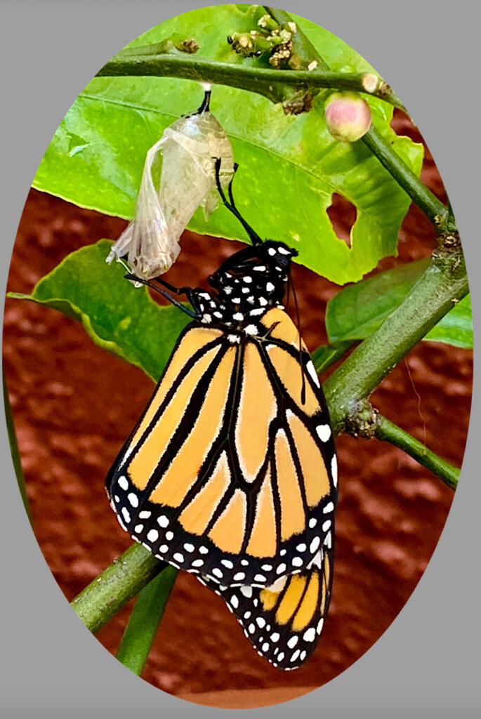
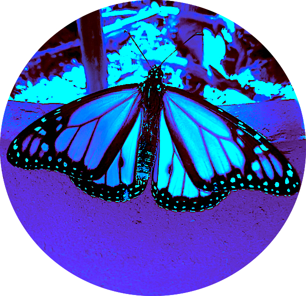
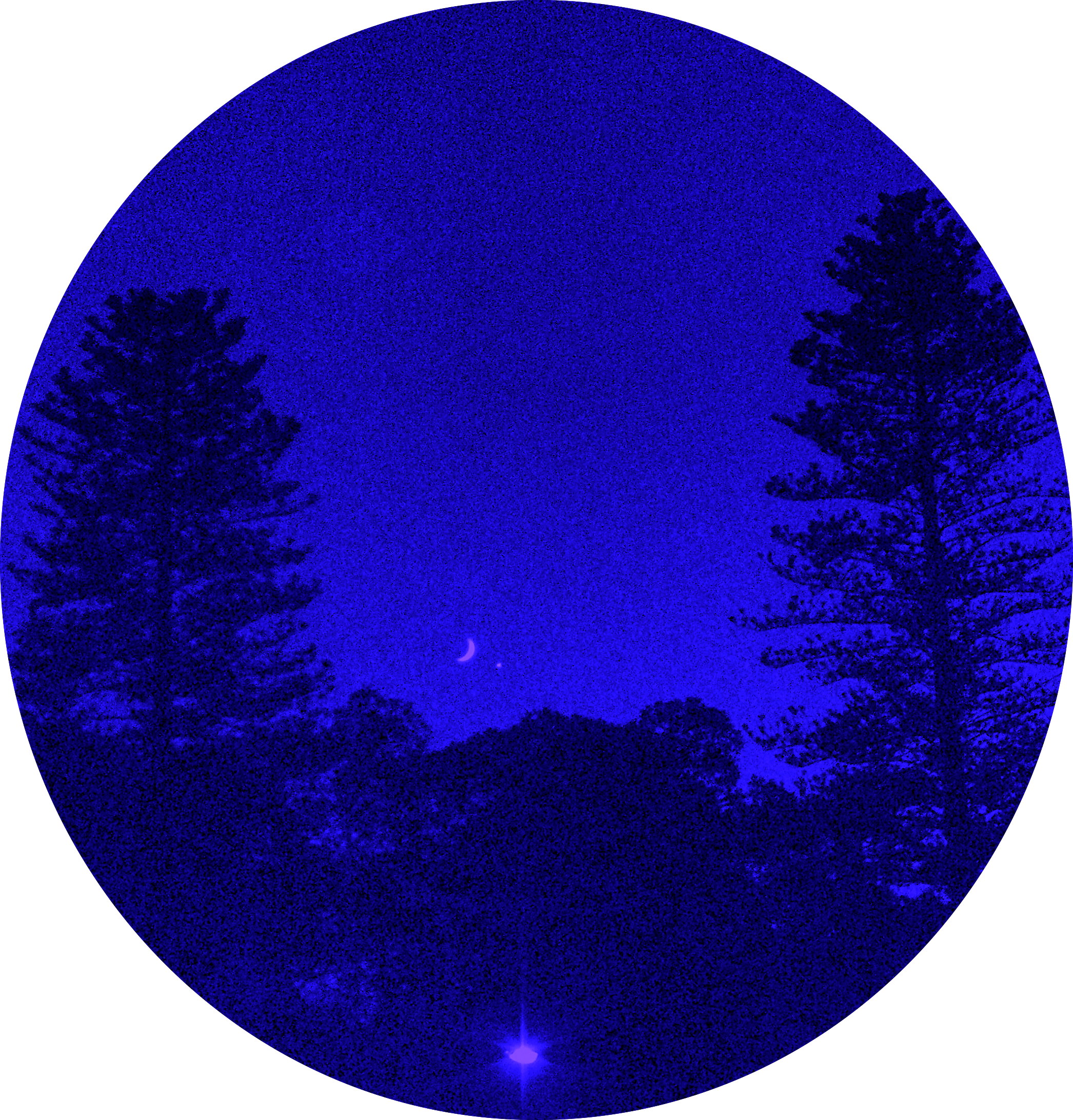
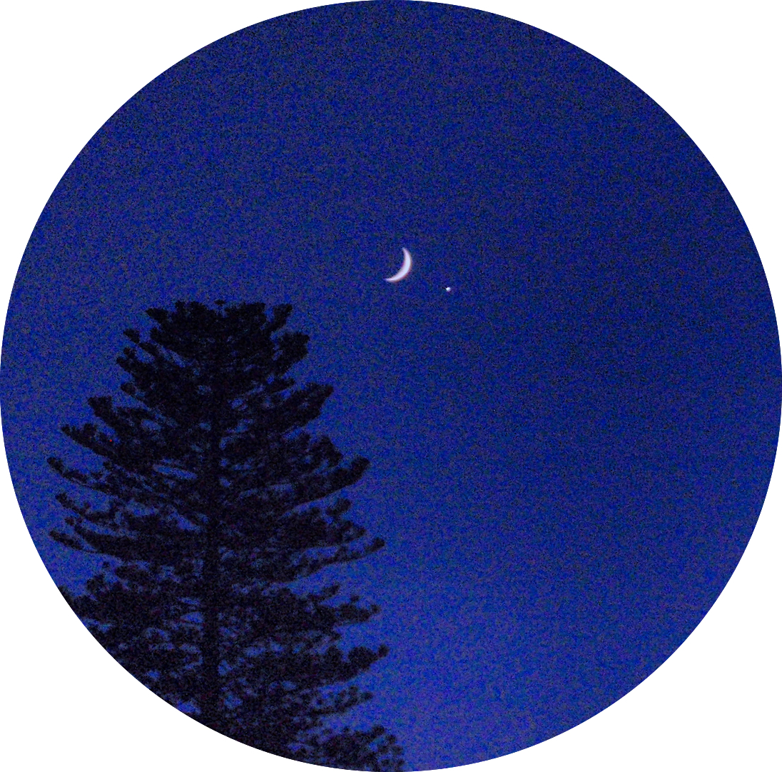
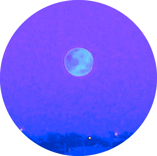
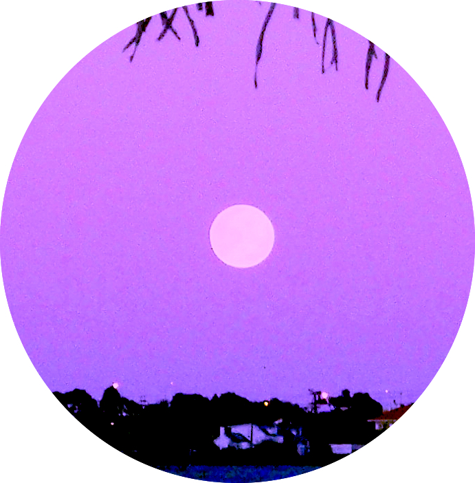
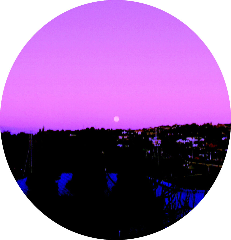
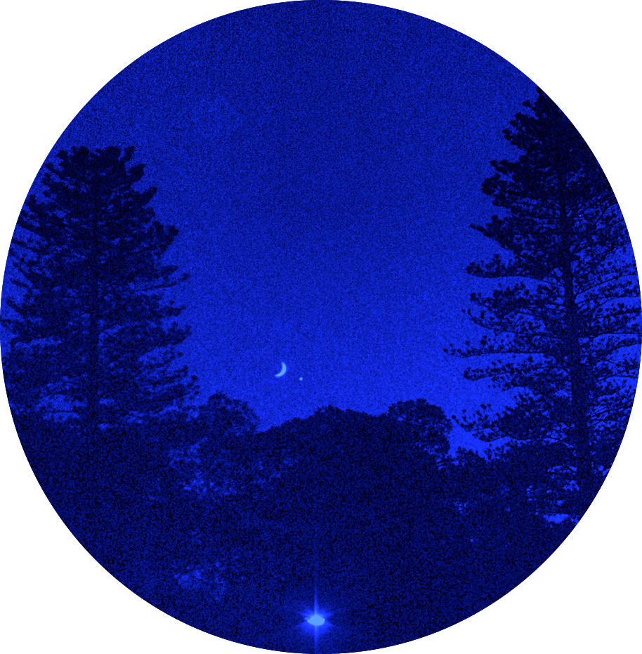
Then further research of Ono’s poetry about our satellite moon provided additional inspiration to interpret her texts in my own way. I photographed the moon at evening and dawn from my house veranda, and observed the heavy sphere mass change shape and change colour. As a crescent, the moon looked light and weightless in the dark, dense volume of sky, and there was no sight of its strong gravitational power and pull. Mixing these moon photographs with some recent chrysalis photographs, I invented a Moon Metamorphosis narrative and video.
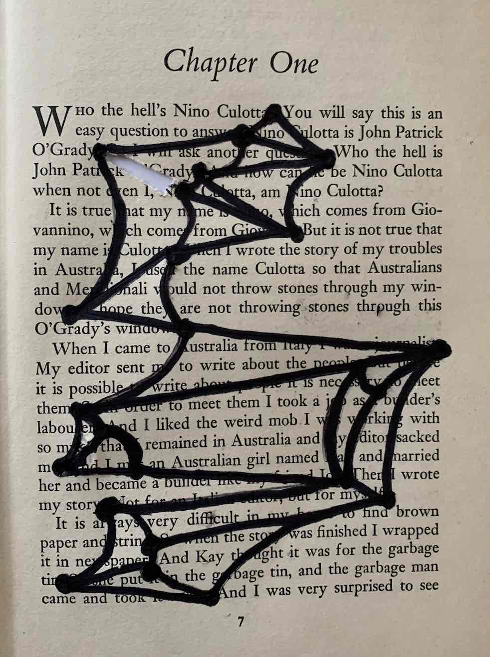
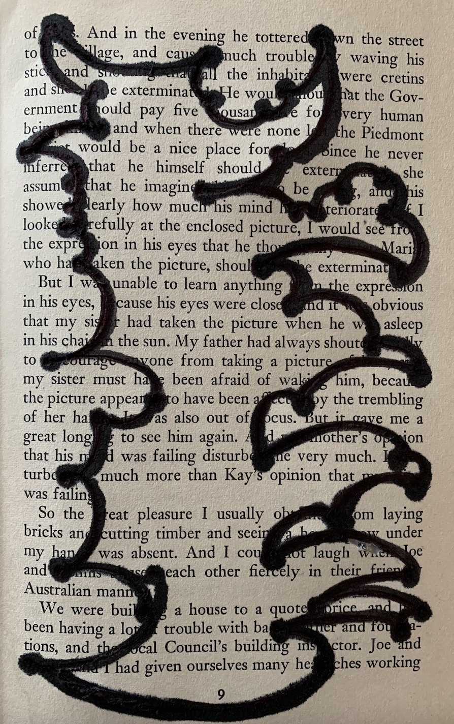
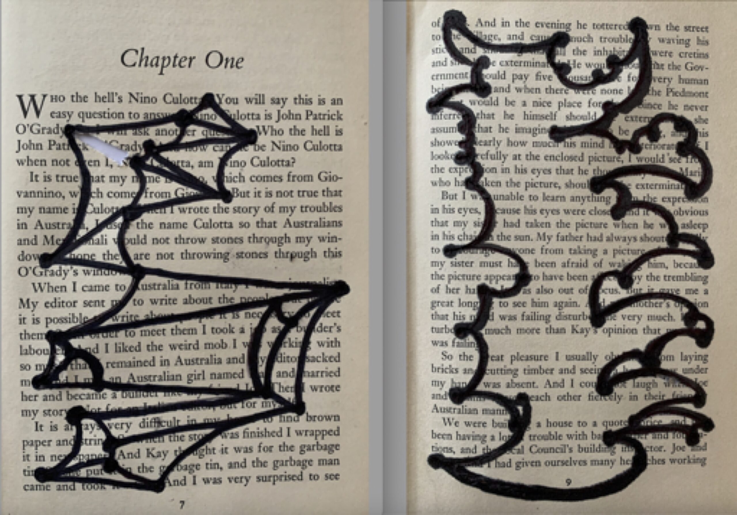
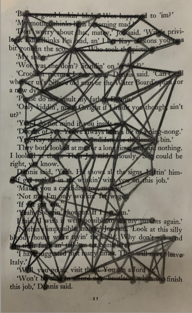
Connecting dot to dot points with lines, on specifically chosen letters in texts such as the Entopic Graphomania exercise, supported me to create original two-dimensional drawings. If time had allowed, I would have liked to continue to explore this concept further, by making an enlarged linear drawing contrasting light, open criss-cross lines with heavy, close-knit criss-cross lines, that shift across the page. Yet, we left Lockdown and started our learning in the studio.
Spatial Sketches
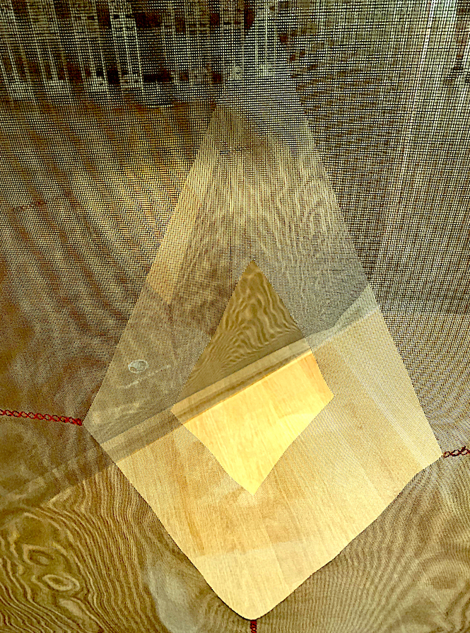
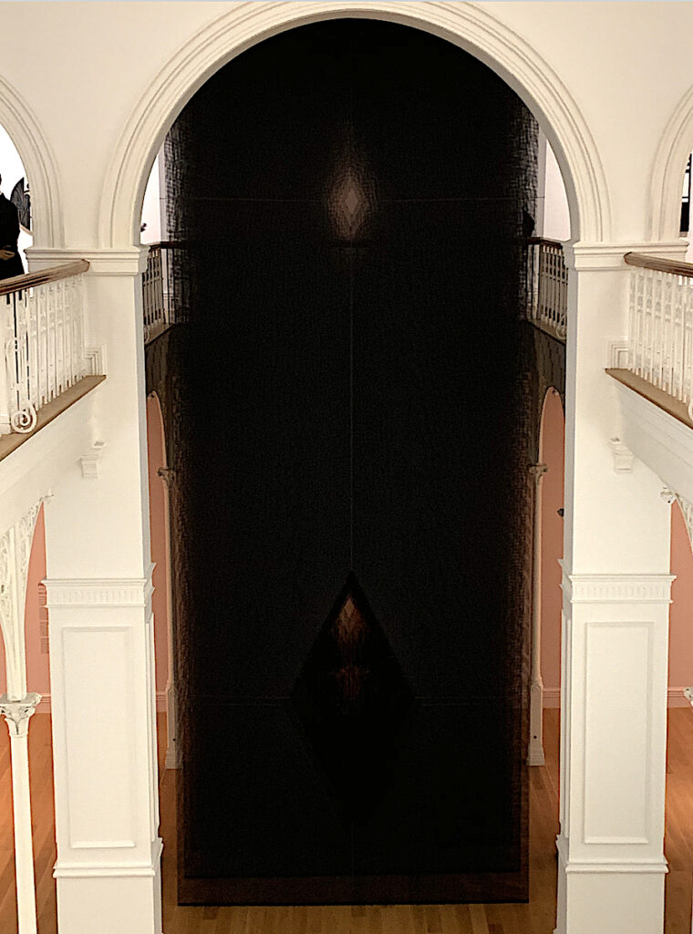
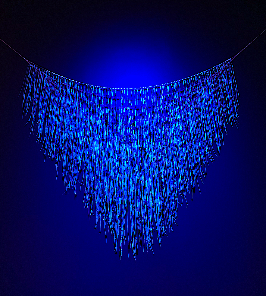
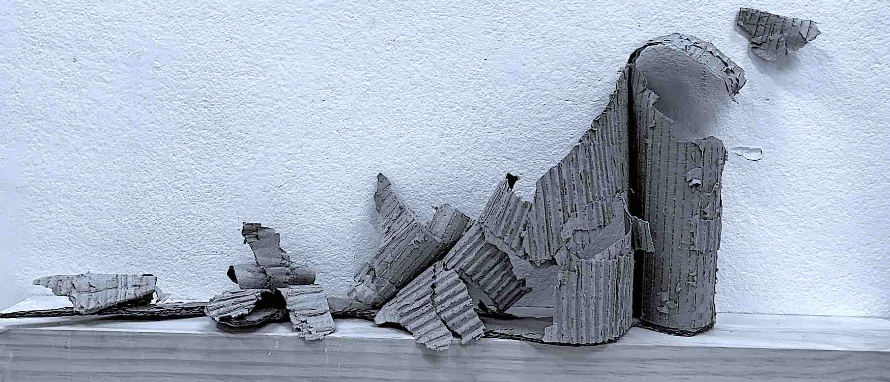
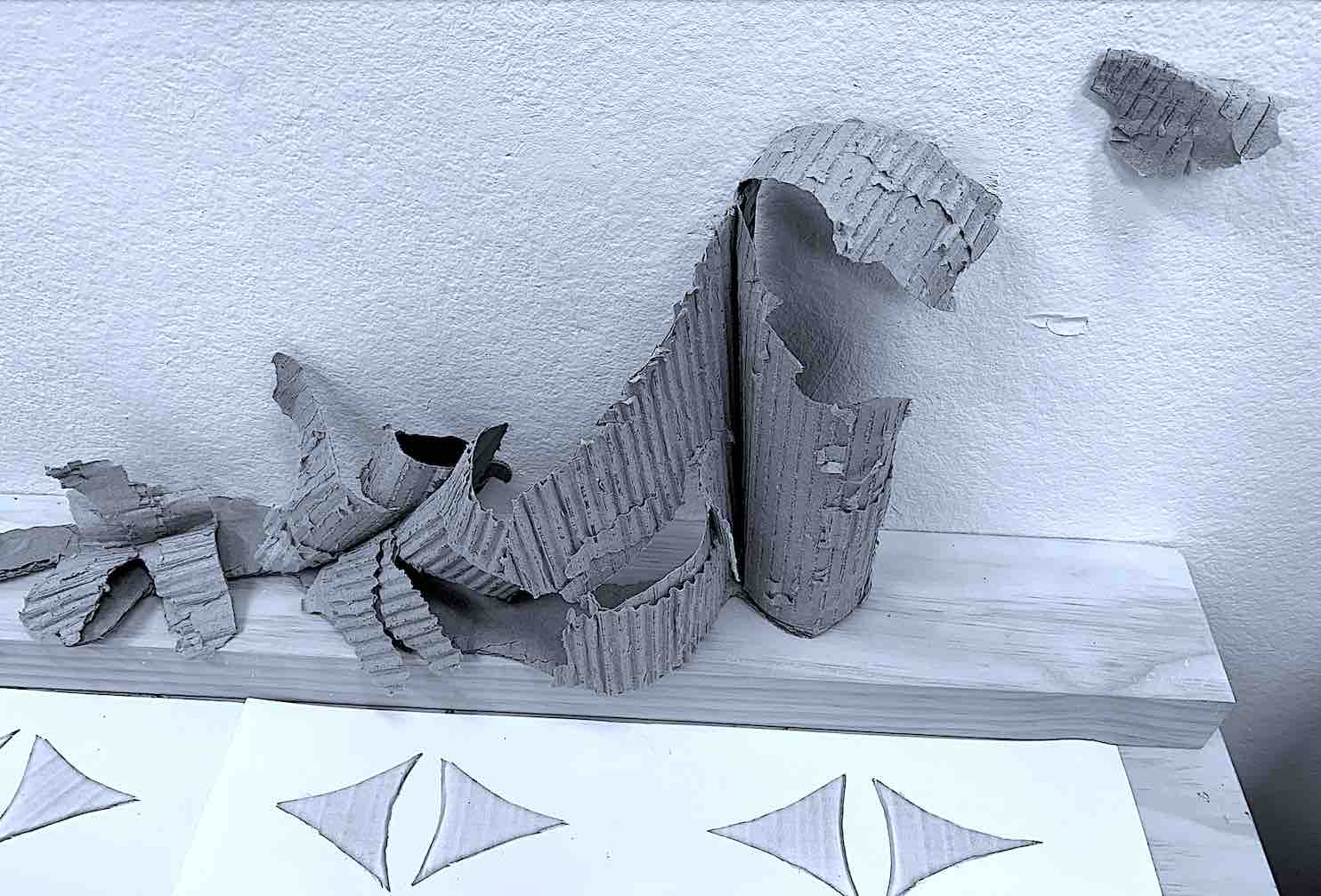
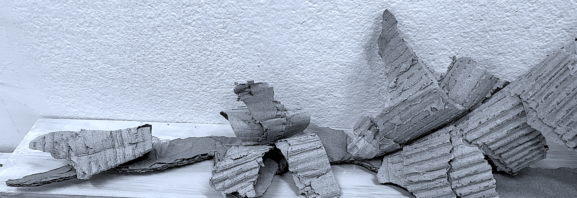
I enjoyed viewing and discussing early 20th century Constructivist sculptors: Naum Gabo and Alexander Calder. Their kinetic and spatial sculptures made of metal, wire, plastic and glass, still look contemporary today, and provided me with examples of weight qualities. Rose Nolan’s use of light cardboard, and Kāryn Taylor’s use of soft luminous lit linear cast acrylic rods within hard-edge box frames, reveal female artists working today and their concepts of weight.
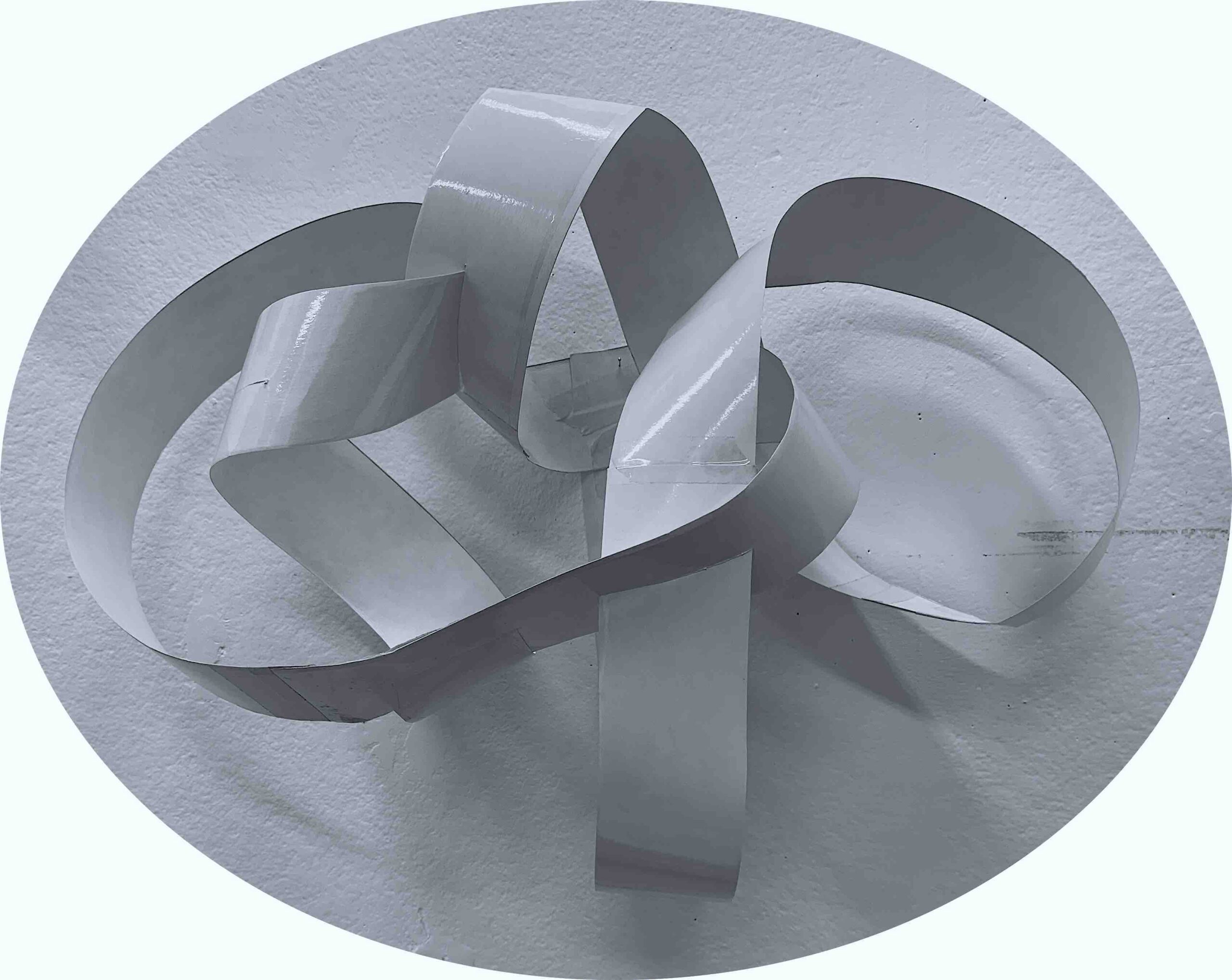
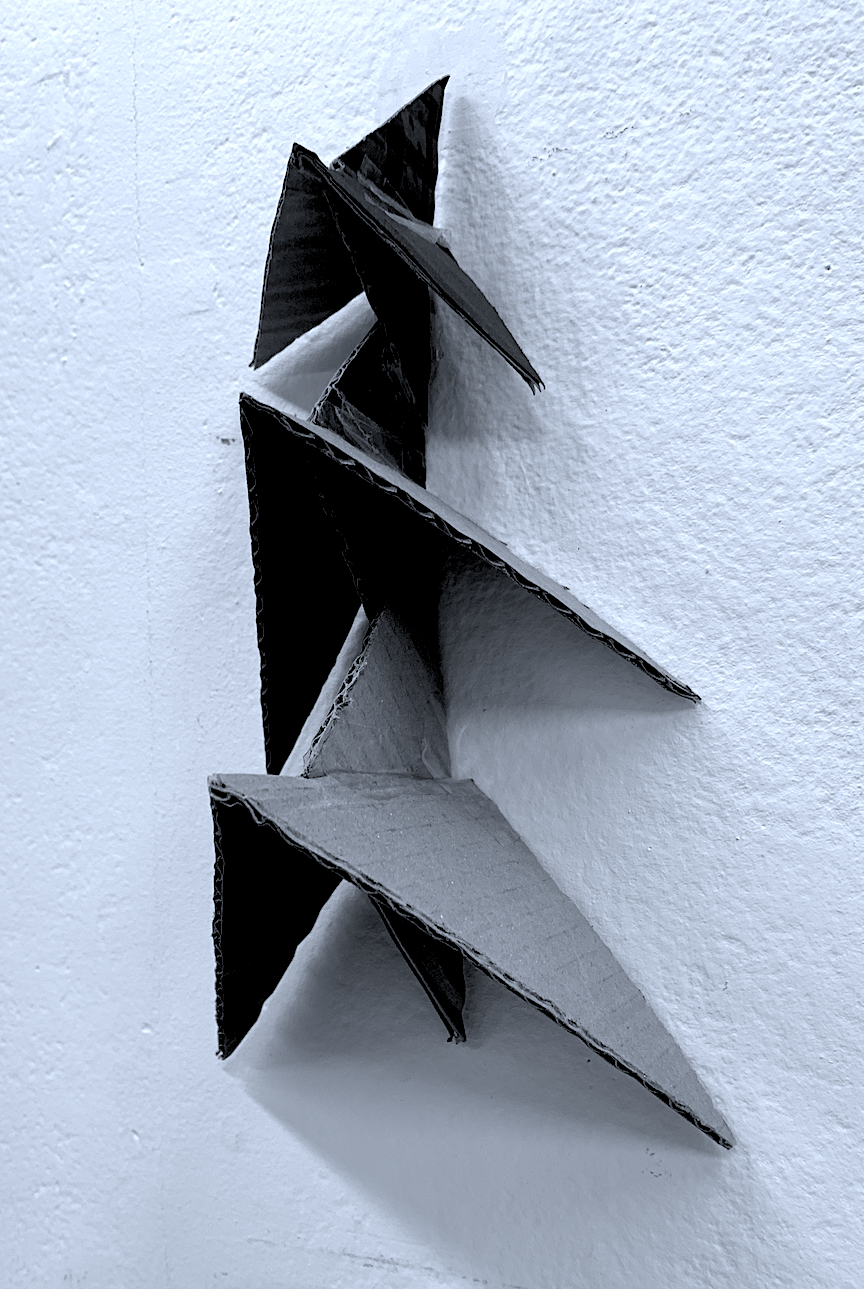
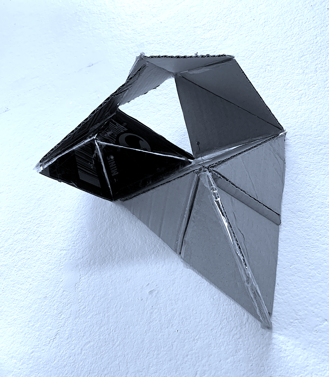
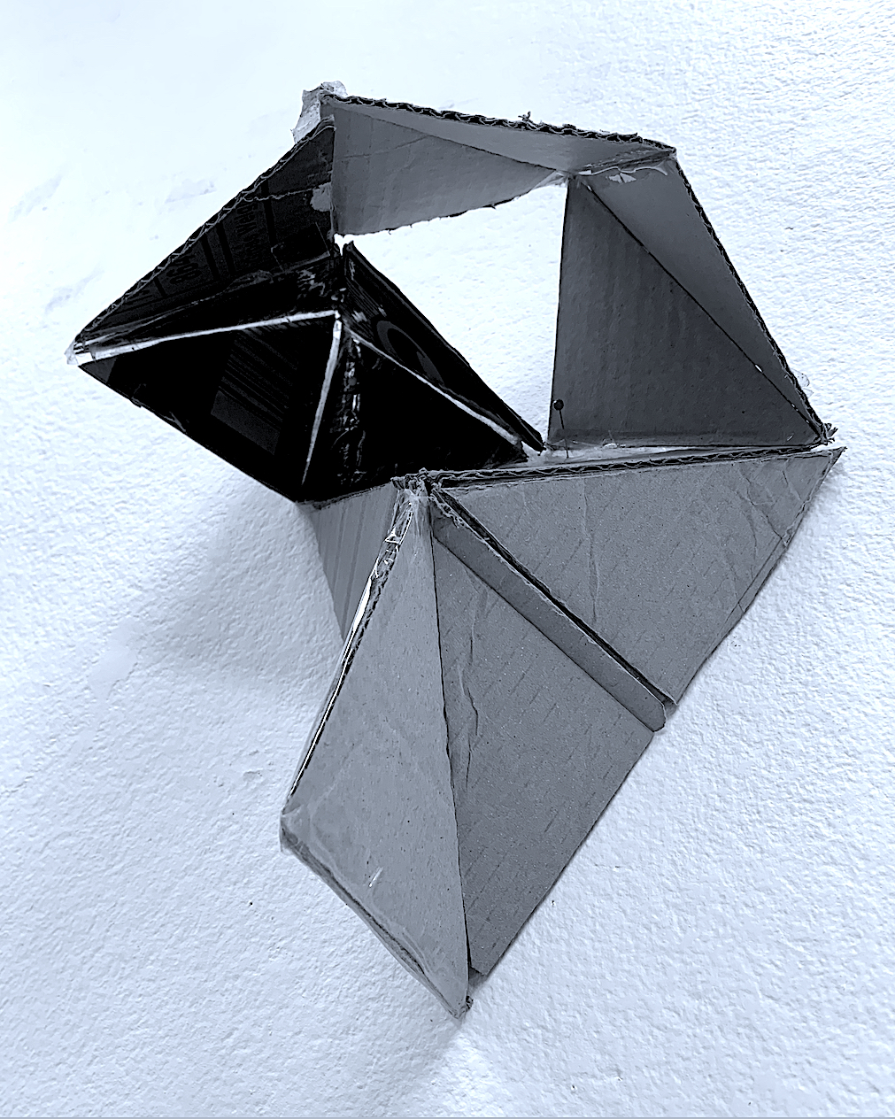
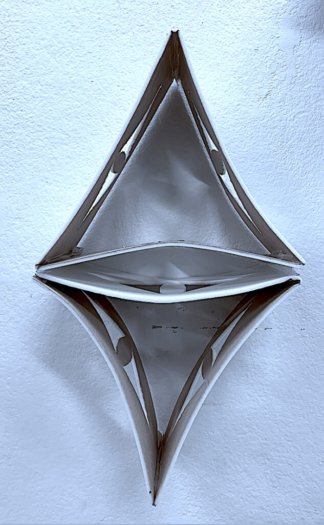
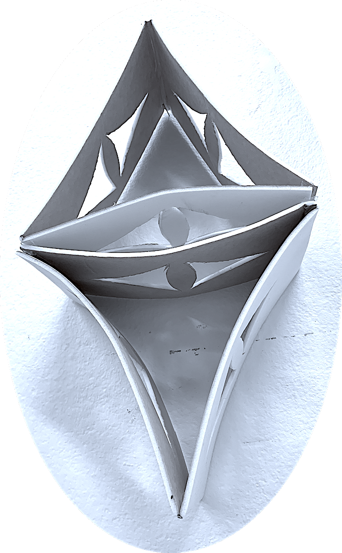
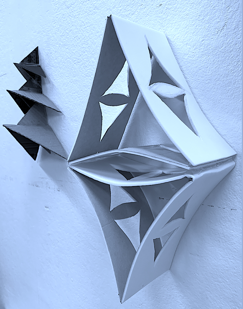
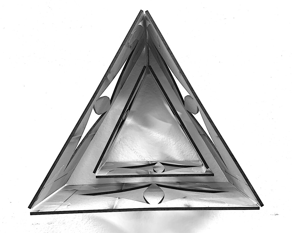
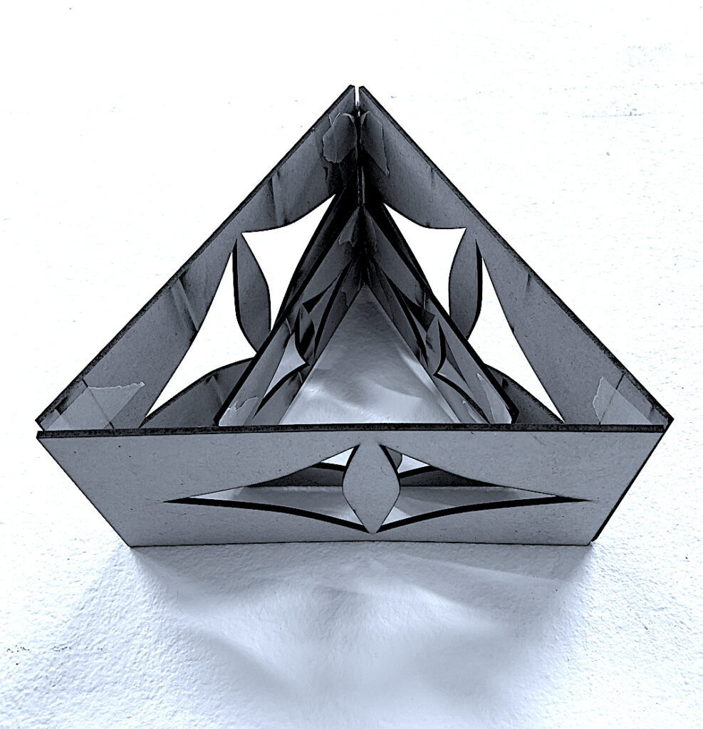
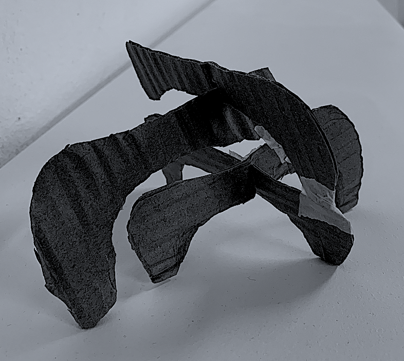
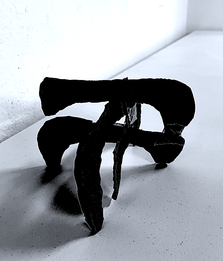
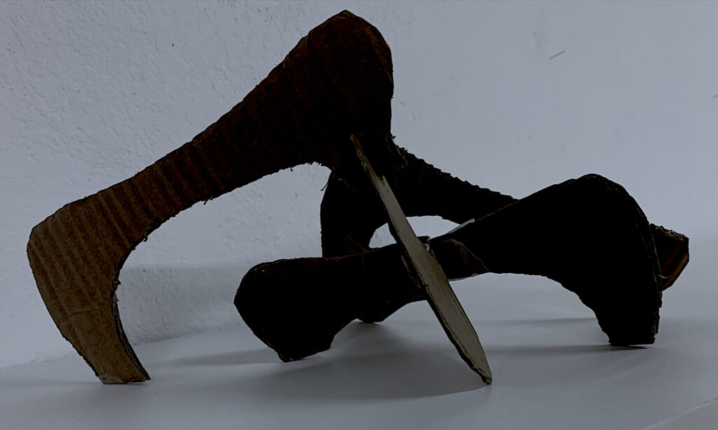
At first, I found drawing 3-dimensional sculptural ideas difficult within my workbook, yet as soon as I started using my hands to play and manipulate the material of cardboard, wire and foam board, ideas flowed. I further extended a foam spatial sculpture by trialling laser-cutting in the workshop.
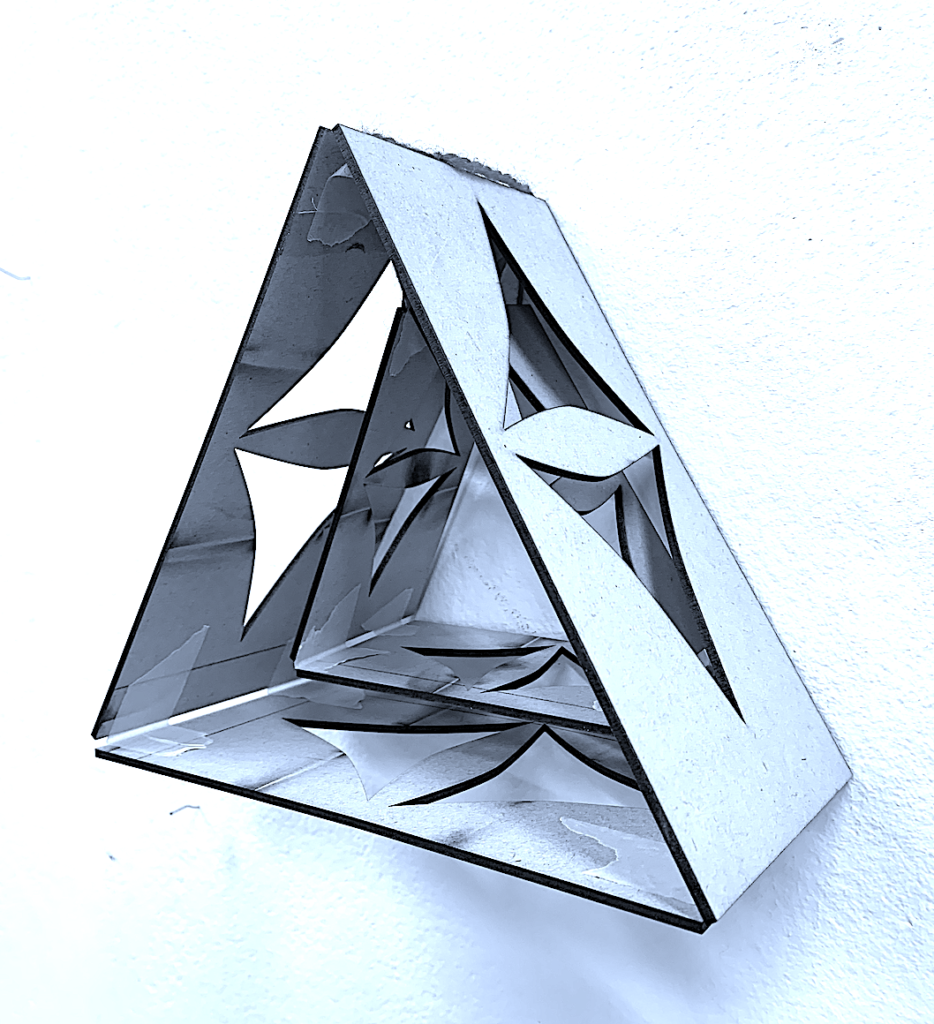
During my first attempt, I questioned how could I represent lightness with a heavier material, and vice versa. I also thought about how the thin, light laminated card could show planes, and linear edges towards the viewer as I folded through, connected and built a collaborative relationship between its long lengths.
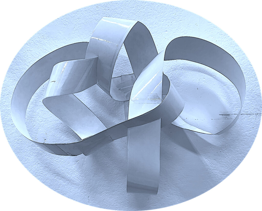
I am aware of my visual, spatial and kinaesthetic abilities, and the qualities that I am attracted to. Colour tones excite me, and I like linear curves, tonal shadows, and movement and mathematical concepts: in, out, over, under, through, around, beside, twist and turn, etc. Geometrical shapes, and repetitive algebraic shape patterns, texture contrasts, dark against light contrasts, larger size objects rather than small, and solid forms rather than thin, are also important to me.
Wood Sculpture
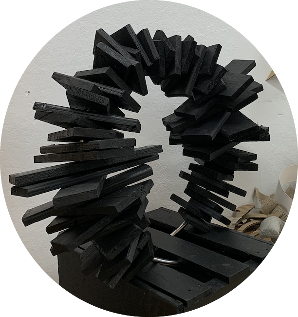
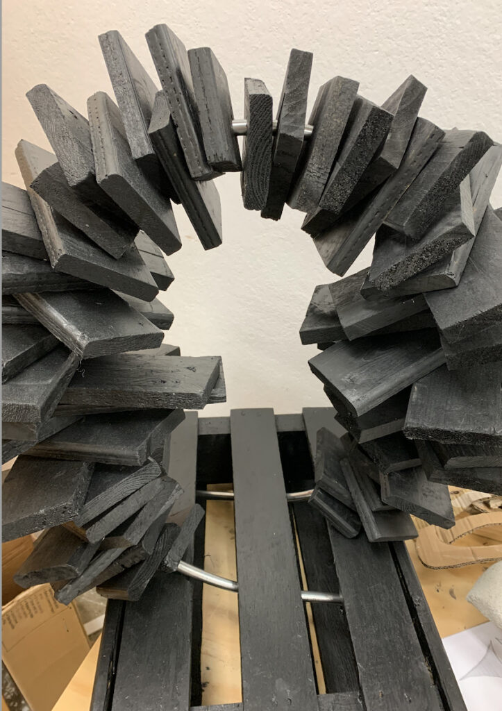
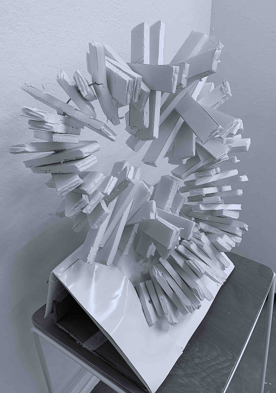
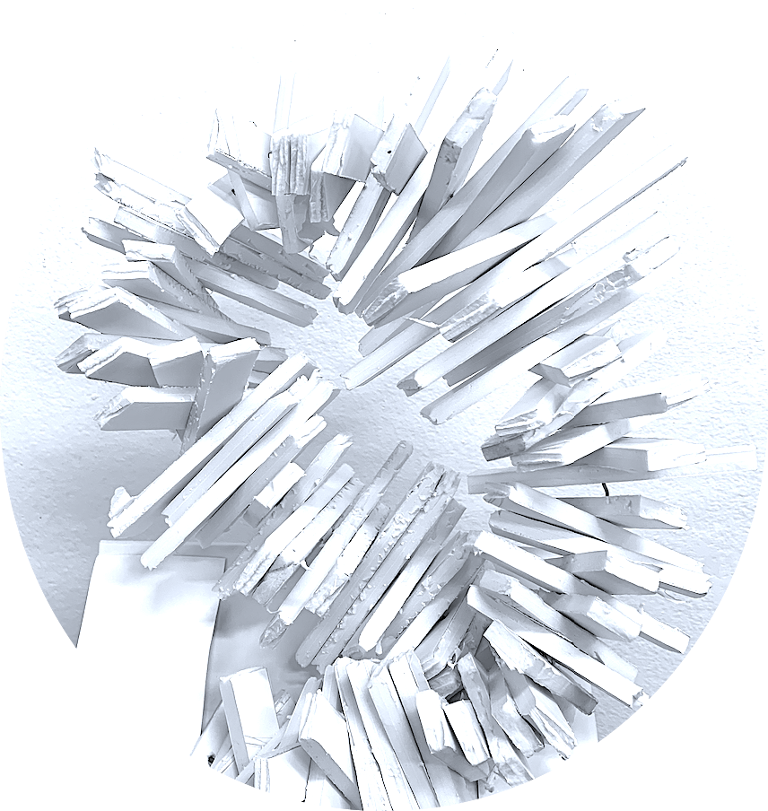
I am inspired by the planar shapes and linear edges of both nature and man-made structures. I started a spatial sketch by visualising an igloo’s straight oblong blocks of ice, layered to build height within a circular or arched ovoid form.
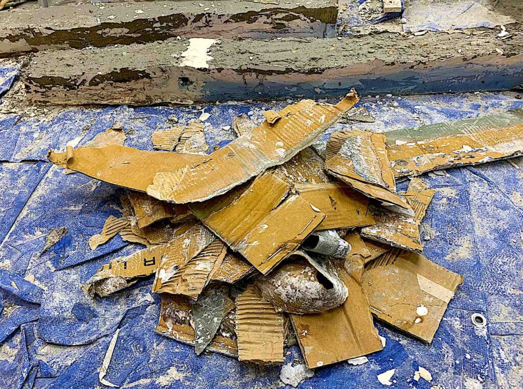
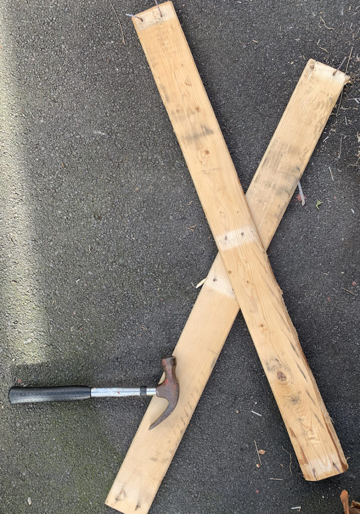
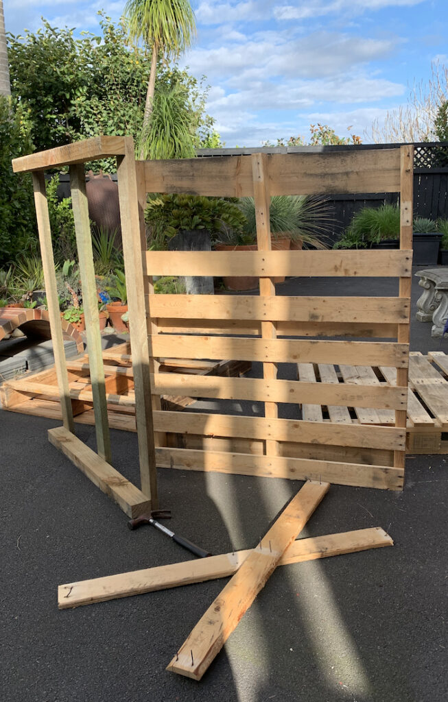
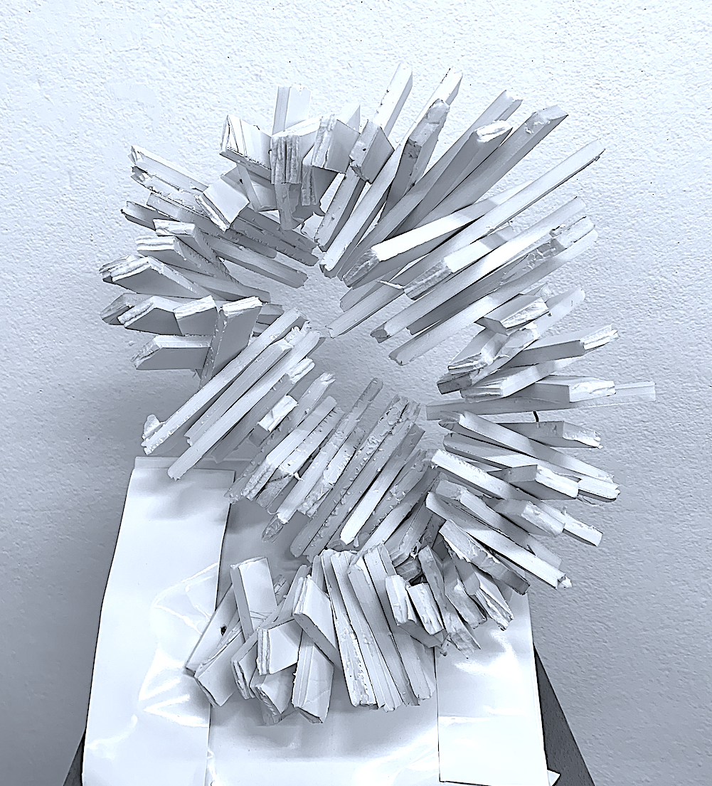
Large sculptures excite me, and it was recommended to upscale a chosen spatial sketch. I imagined a roughly sawn firewood timber pile, re-arranged in layers, yet, this involved too much cost, and weight. Whilst scavenging for reusable materials out of local neighbourhood recycling Skips, I sourced a number of interesting shaped cardboard boxes, polystyrene, plastic and copper piping. Also layered in piles, and free on footpath berms were Shipping Pallets which I was able to lift and put into my car-boot.
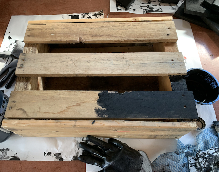
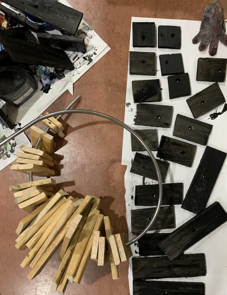
As I had already begun an overly ambitious project of producing a large-scale cast plaster and concrete box sculpture in the studio, I deconstructed these collected pallets at home during the after-hour evenings and in a weekend. After hammering off the pallet timber lengths and cutting with a circular saw into small, medium and larger rectangular pieces, I then drilled holes. I imagined layering them unevenly, and twisting them in and out around a central form such as black grey steel, therefore I changed my igloo idea of white ice to black burnt timber.
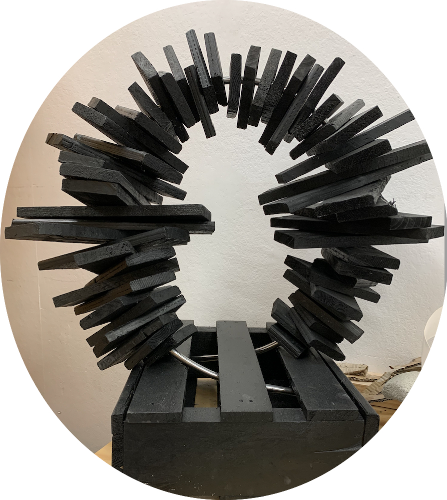
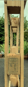
After bending a 1.8 metre steel rod into an oval shape at the studio workshop, I layered my painted black pallet pieces into an algebraic pattern from small to large, through the steel to make a spiky ovoid. Originally, my plan was to make an approximately 2 metre sculpture by welding the two 1.8 steel pieces together that I had purchased from a metal factory. Yet, because this was my first attempt at upscaling and changing one of my spatial sketches, I decided to start on a smaller scale with only 1 piece of steel. Time was also not on my side, and my pallet resources were low.
As I worked with the pallet material, making my spiky ovoid, I noticed by accident a new artwork emerging from within my deconstruction. I was visually inspired by the timber’s gaping holes and shapes, and I wanted to extend this found object with colour and paint. The timber material was leading me into a new sculptural direction. I enjoyed seeing through the continuous reflective shapes (like a picture frame, mirror reflection, or windows within windows) to the vista beyond.
Overall, my original concept remained, one of creating a curved sculpture in a geometric form such as an ovoid. Yet, instead of foam board and wire, I utilised timber to cut the oblong spikes that could be pointed in different directions. I could produce different effects such as shifting and moving each oblong to be angled in, or out, or rearranged by placing on top of each other in an exact alignment.
I also up-scaled the size of the sculpture, and changed the icy white colour to black to represent heaviness. I like the Japanese tradition of Shou Sugi Ban, charring the surface of cedar board wood to clad traditional houses. Therefore, I painted the pallets black to create a dark, heavier burnt feeling, linking also to my original firewood timber idea.
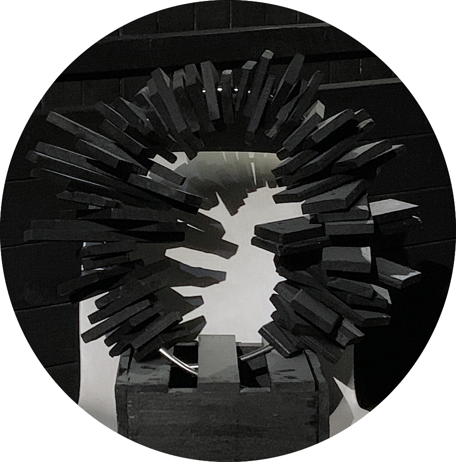
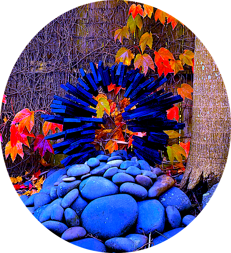
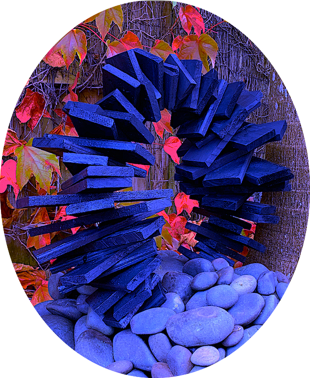
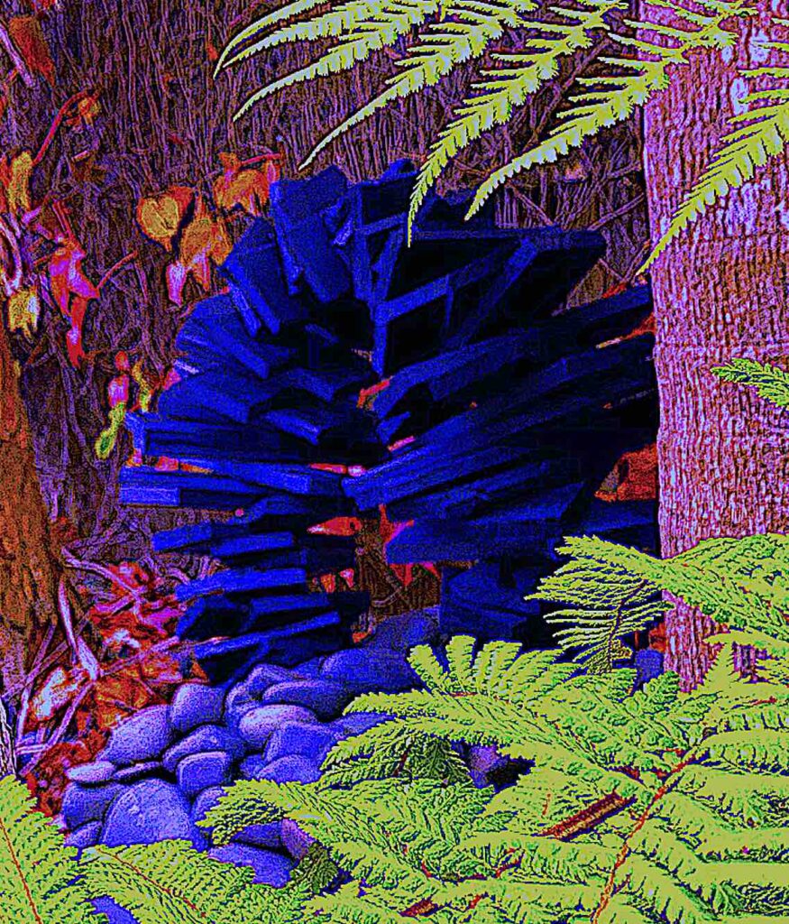
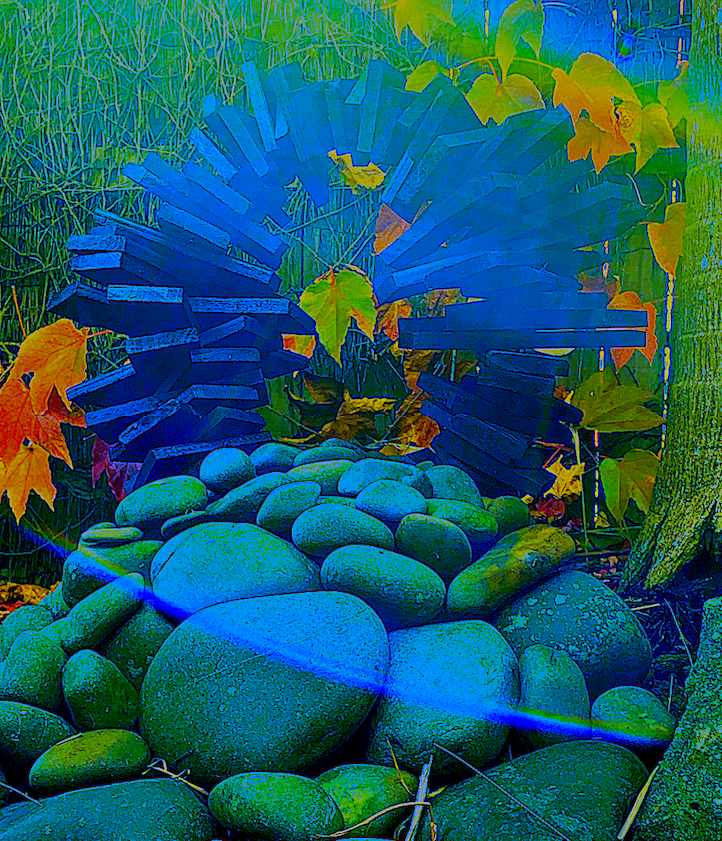
My bent steel ends were not even, therefore I struggled to fit both sides into a base of correctly aligned drilled holes. I overcame this barrier, by cutting a part off a pallet to make a box as a base to just sit the steel frame into. Unfortunately, the finished sculpture silhouette feels slightly manufactured, even though hand-built. Instead, I would have preferred rough timber edges with a burnt texture. Perhaps, I need to make it feel more organic, natural, and raw, by scorching it, or burning it to death by the element of fire… as suggested (i.e., a type of ‘Performance Art’… construct, then deconstruct). Or just leave it outside to disintegrate and age by the weather, algae and insects.
Concrete Sculpture
I seem to have an affinity with concrete, I like the heavy, solid feel. Living in a house made of layers of concrete blocks, smothered with rough textured plaster, reddish brown and golden coloured polished concrete floors, and a concrete flat roof makes me aware of concrete’s qualities. To me, concrete is not cold or brutal, but cool in summer and warm in winter. I like how other materials such as timber boards are now used in architecture to create textured patterns on the wall surfaces of buildings, perhaps to provide interest, and light and shadow upon the dense mass.
English sculptor Rachel Whiteread’s concrete work, titled House, 1993, presented at the start of our Week 3 class, and Substitution, Displacement Brief harnessed my curiosity. I was drawn to her inside, outside concepts, and solid, identifiable cast forms (i.e. domestic objects on a large scale ranging from an inspirational staircase, a room, and a bookcase).
Many houses are constructed utilising concrete frames and inner and outer walls. Yet Whiteread’s idea to show the inside of a house on the outside was quite disorientating, because some interior features like inner window frames were shown, and others like the staircase were not. Before destroying a normal building’s exterior, (and interior), the window and door light pathways were solidified and covered up to pump the house with a heavy mass of concrete. This displacement of the normal interior’s space, and substitution of the exterior, reminded me of a prison cell or underground bunker, where there is no escape. This leads me to question what does a house or building represent, both inside or outside?
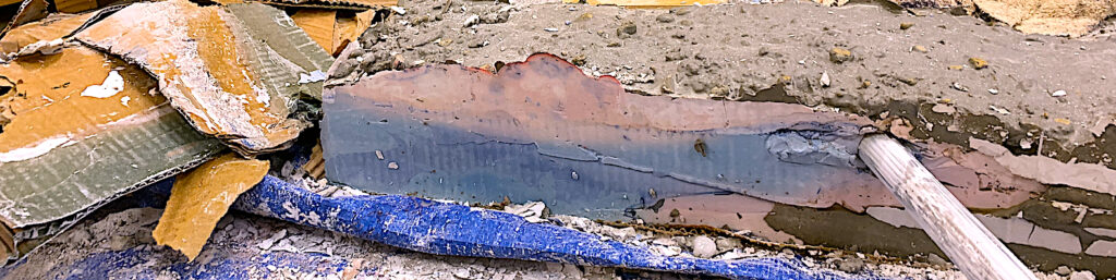
Week 3’s Brief focused upon the mass and surrounding space of heavy materials, such as plaster and cement. I started the process with the bag of cement, rather than the plaster powder. Both mediums looked exciting, after working with lighter materials such as paper and cardboard.
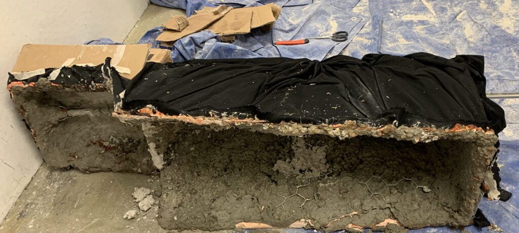
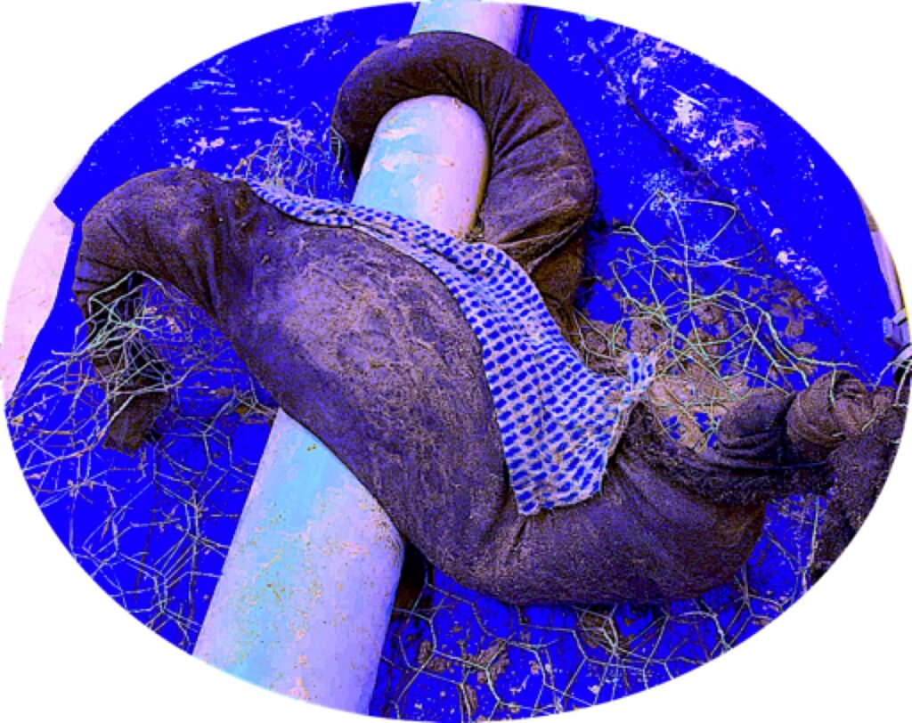
I tried to not purposely visualise a shape to make. Instead, after viewing my fabric scraps, I chose an already ripped up, cut out T-shape of thick material. Instantly, I saw I could fold two parts to make shorter arm-like sleeves, and I hand sewed to each triangular point. The other length I tied into a knot and sewed the outer edges together. It became a strange baggy 3 armed star-type pattern ready to insert my chosen wet material of cement.
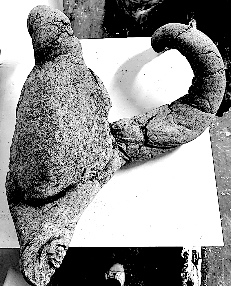
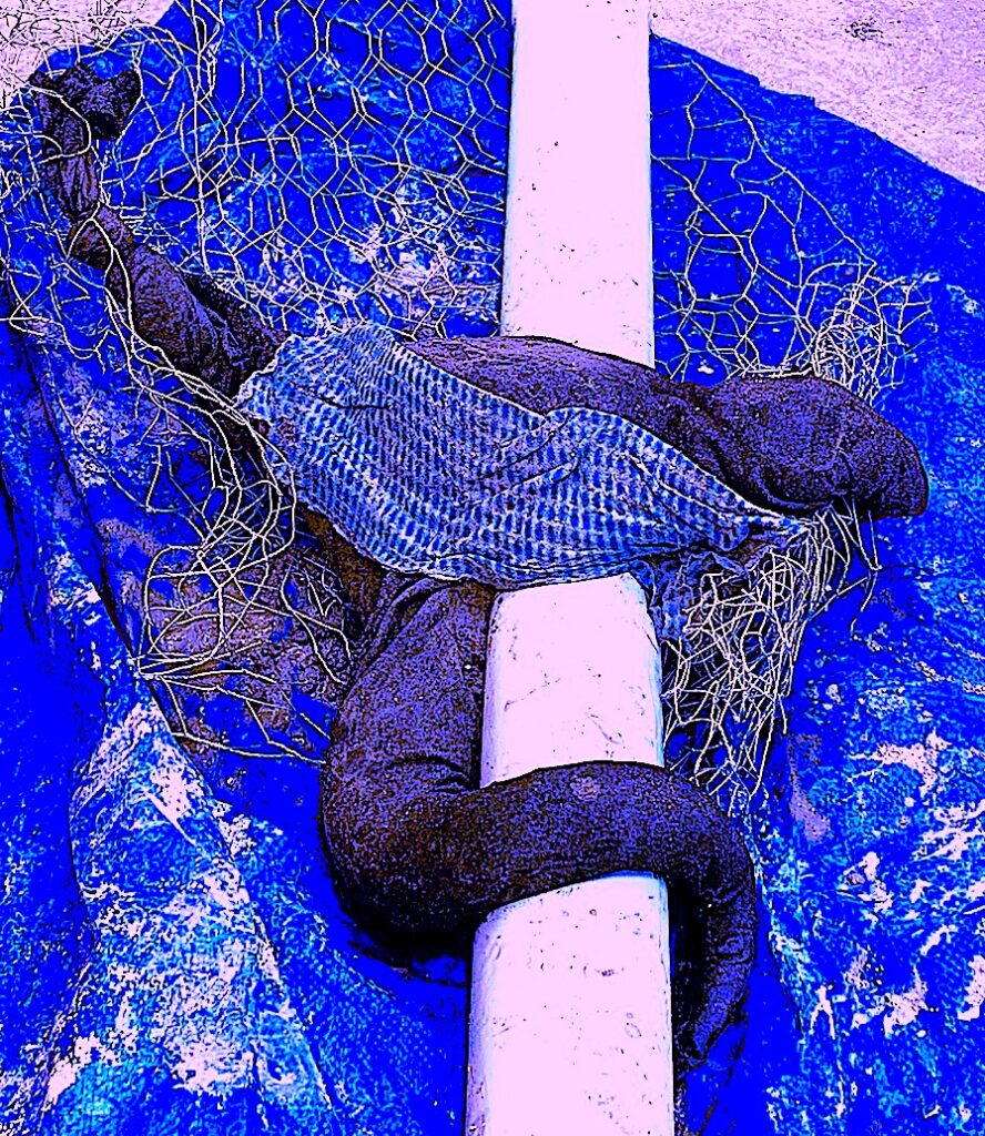
It took awhile for me to mix the concrete and, as I am very tactile, I put my gloved hands in. No wonder I got blisters, raw skin and cuts, as my rubber gloves disintegrated! Inserting the wet mixture through and down towards the three knotted pointed arms and draping it over a large cylinder pipe was the next step. It stretched at least half a metre, becoming quite heavy filled with wet cement.
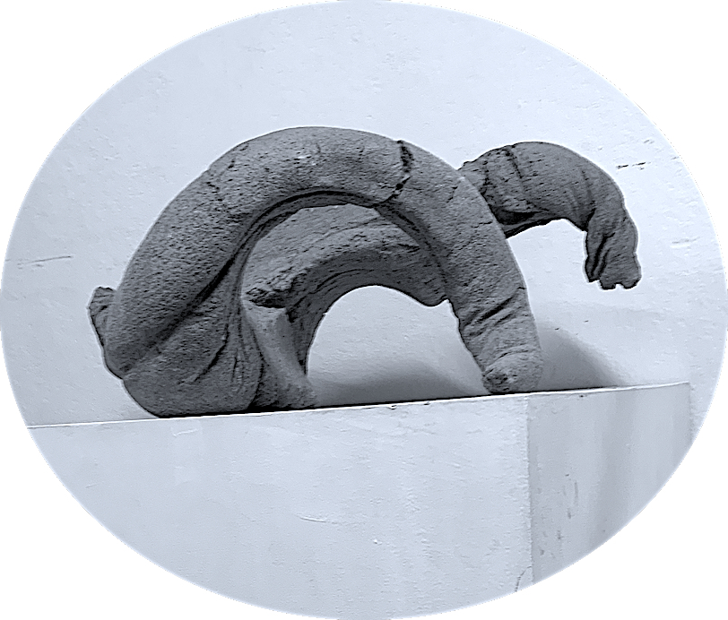
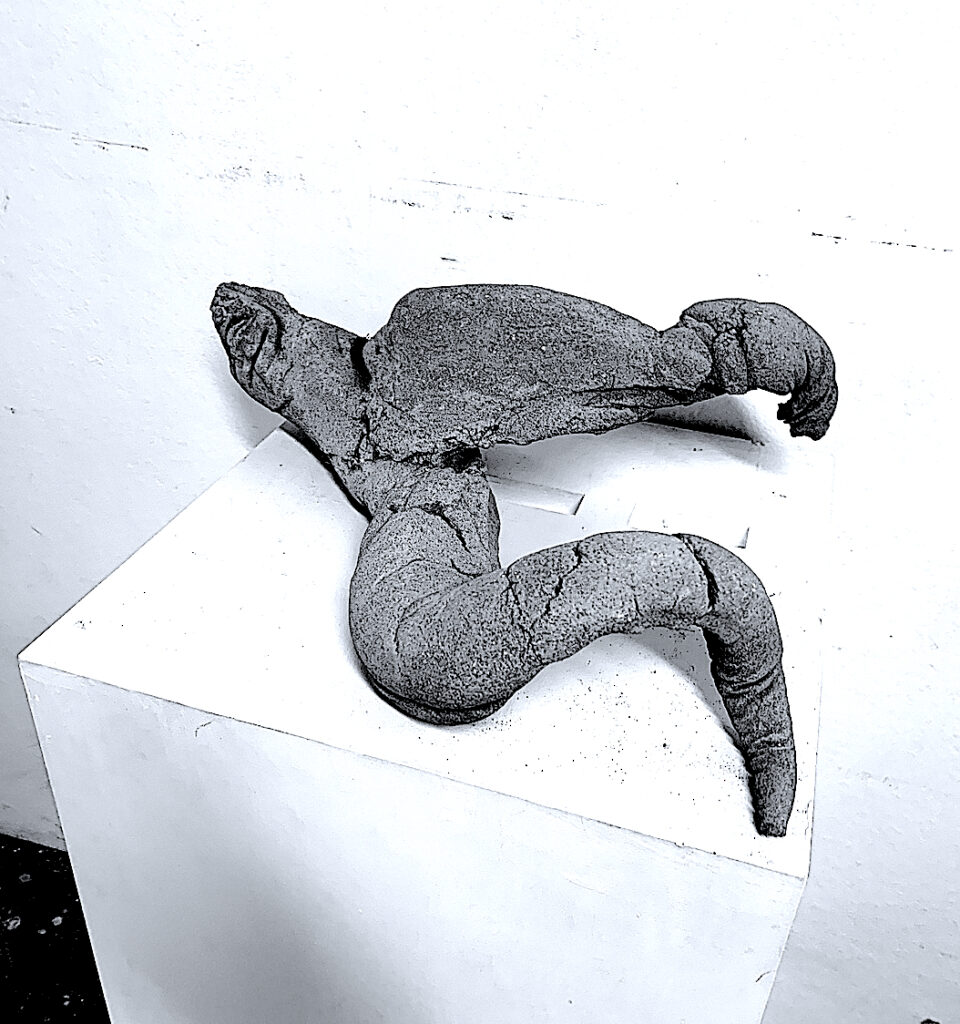
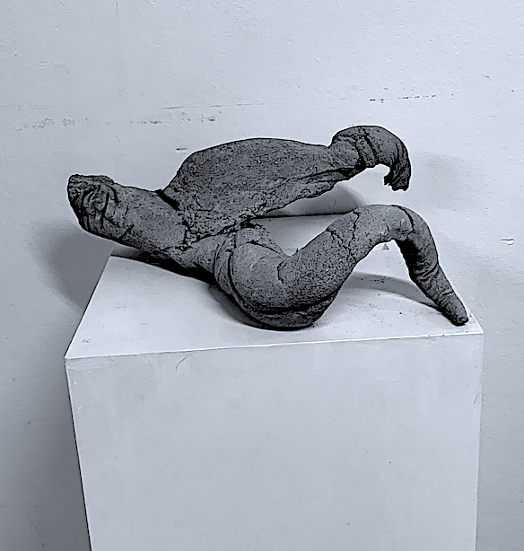
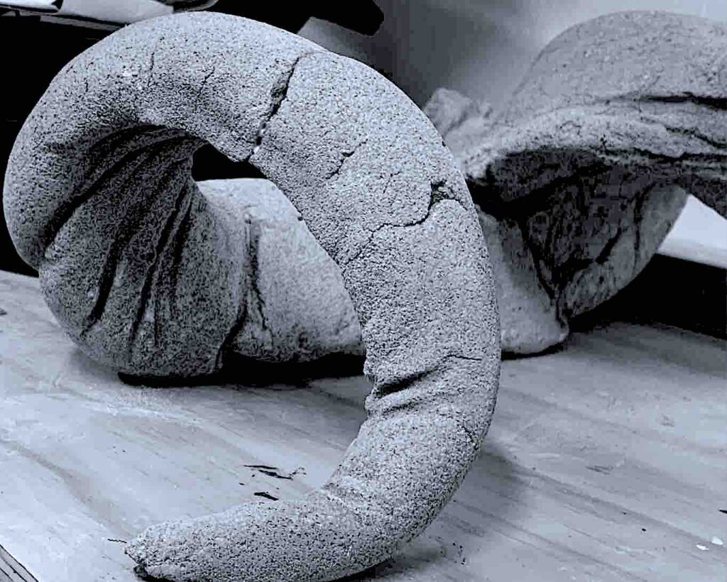
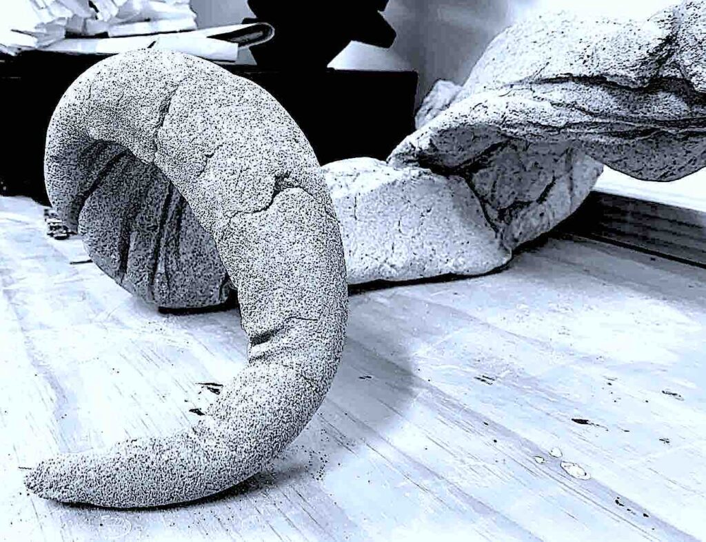
For some reason I am attracted to creating large, not small objects. So it was hard to lift, and settle over the support material, but I enjoyed manipulating the points and body, by curling, twisting and smoothing the wet fabric covered slug into a starfish position.
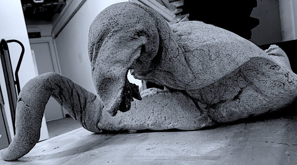
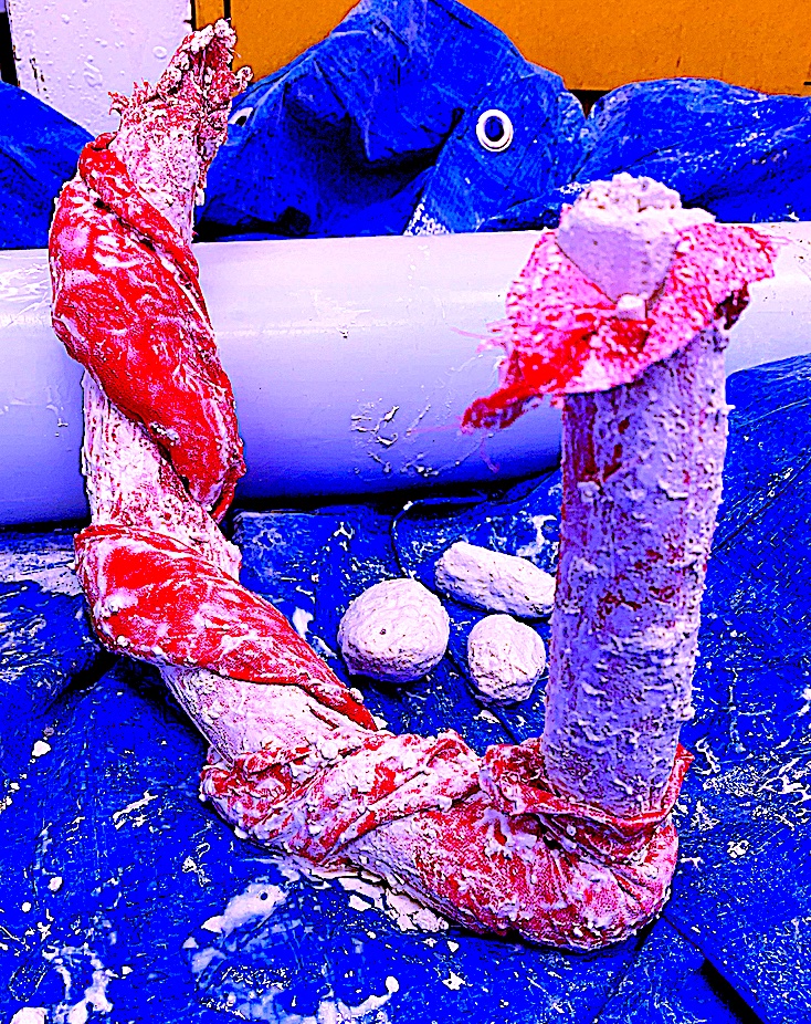
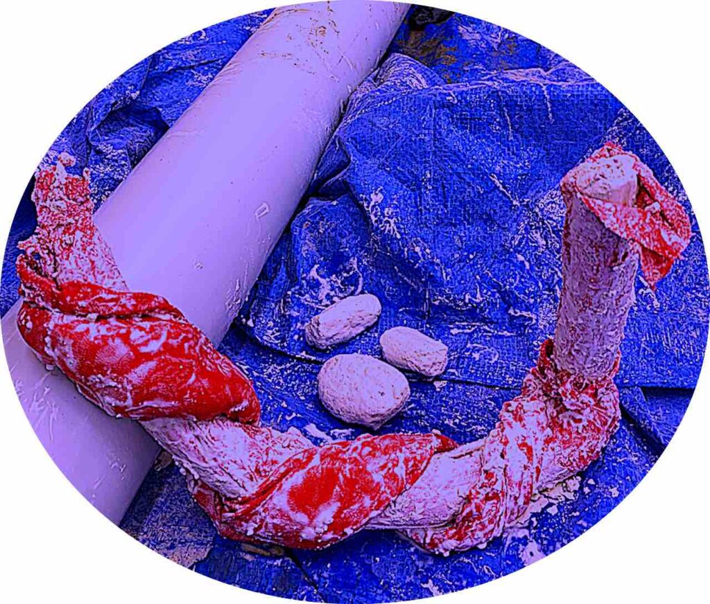
After less than a week, I carefully cut the clothes away from the dried body. Two corners broke as I cut, but was able to reglue the horn shape. Instead of smoothing the concrete with a polishing tool, I decided to just rub the textured sandy surface clean to expose its natural raw look. The soft, light grey colour and thin points made it look lighter, yet the mass was solid, and heavy to pick up. A black fabric growth, like algae, was unbudging, so it was left as a soft, light contrast emerging from a hard crevasse.
Previously, I have only used cement around garden edges, this has been my first attempt at mixing and creating an object using cement. I like how the object has evolved from a pebbly powder to a wet, roughly textured form, then changed again like metamorphosis into a raw, organic, heavy and hard rock formation. I kind of like how it is weird, and ugly. Also, I was surprised to see the sculpture look like an animal fossil bone, with spiral points like horns of a ram. It wouldn’t look out of place slowly weathering and decomposing on a beach landscape. My next step was to trial plaster, then combine plaster and cement with my planar and linear box design.
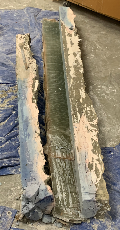
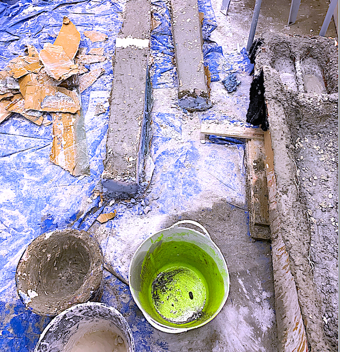
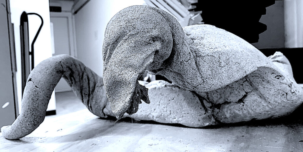
Box, Fabric, Plaster and Concrete Sculpture
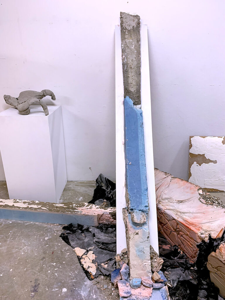
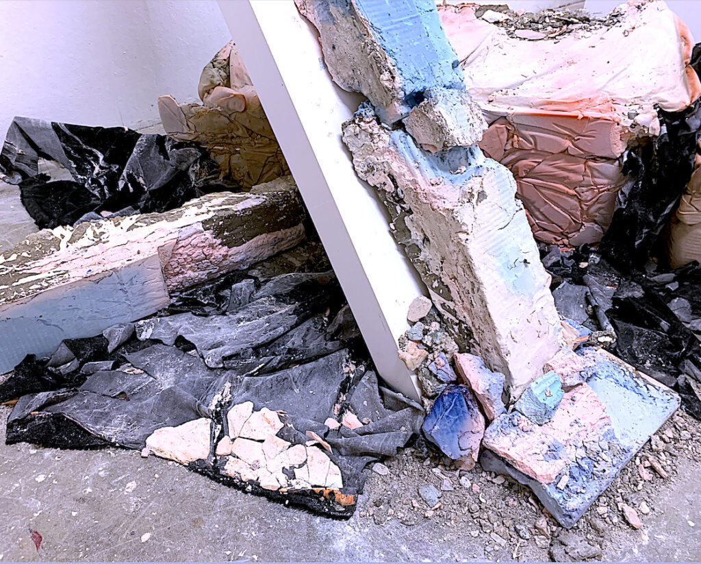
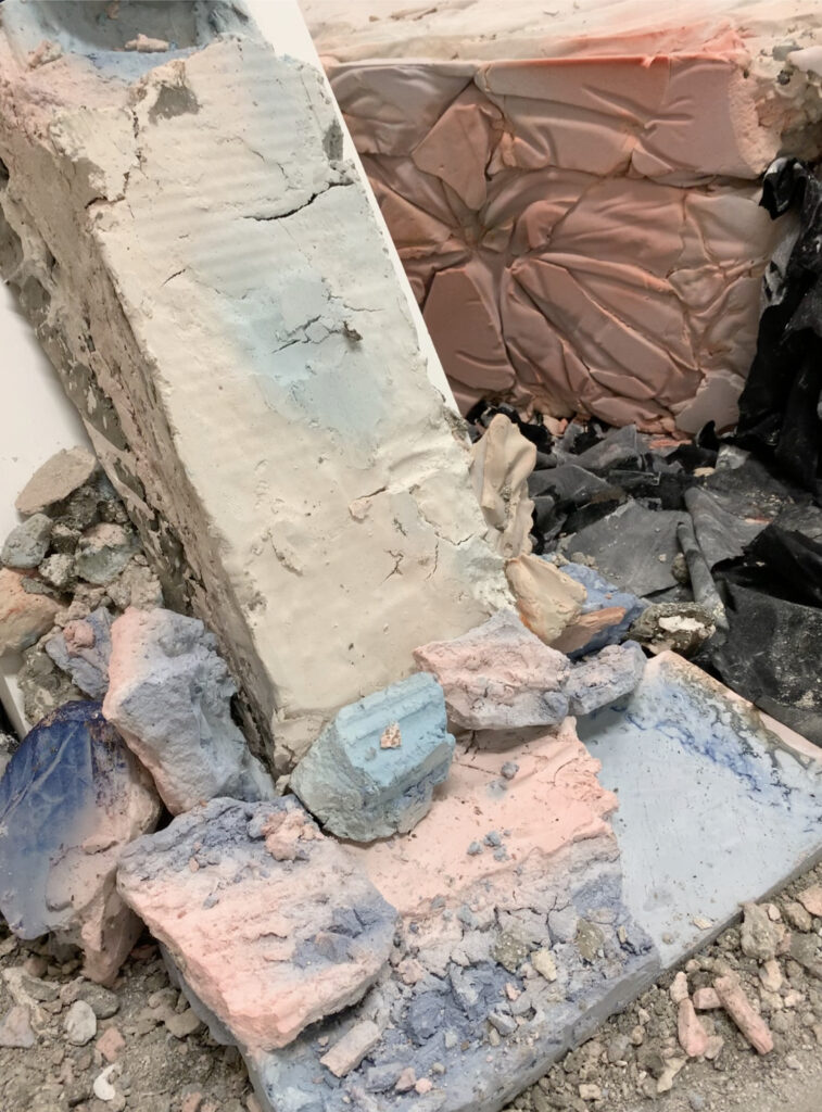
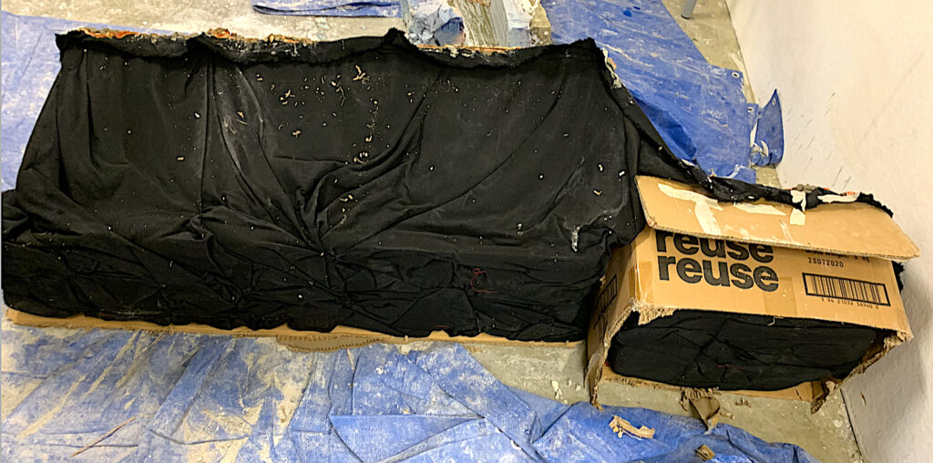
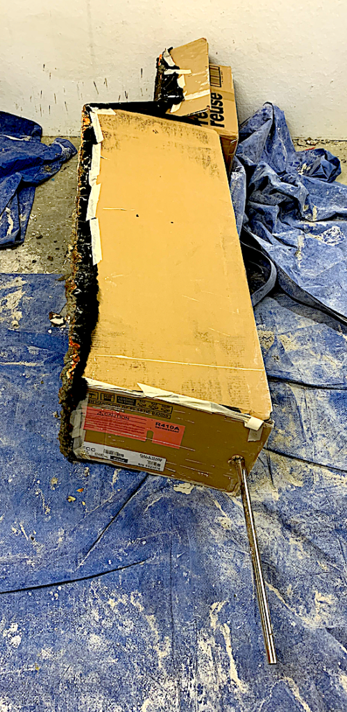
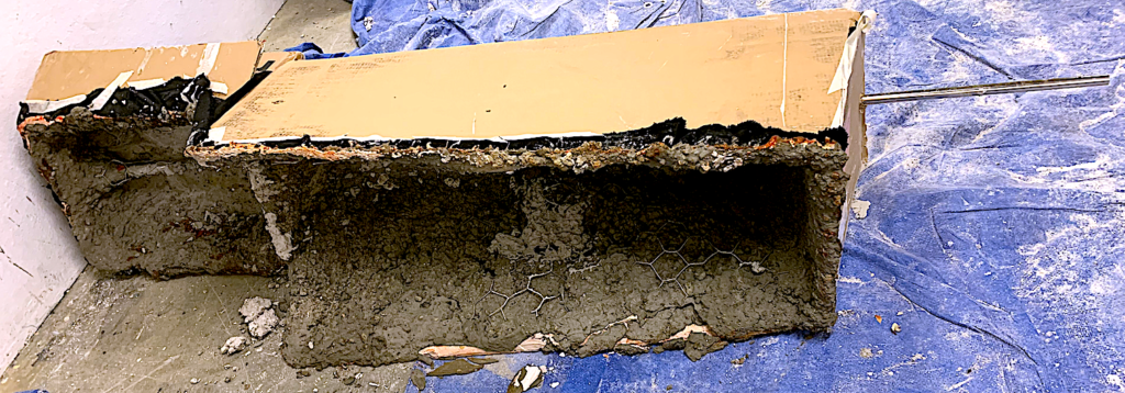
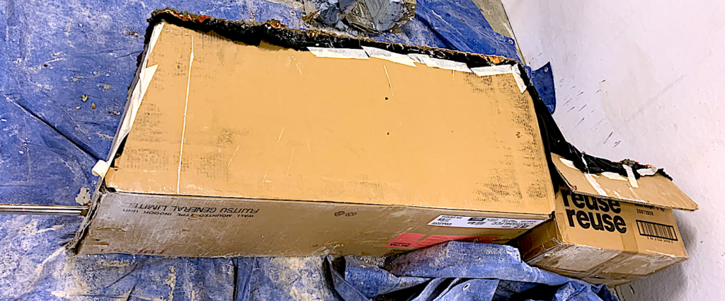
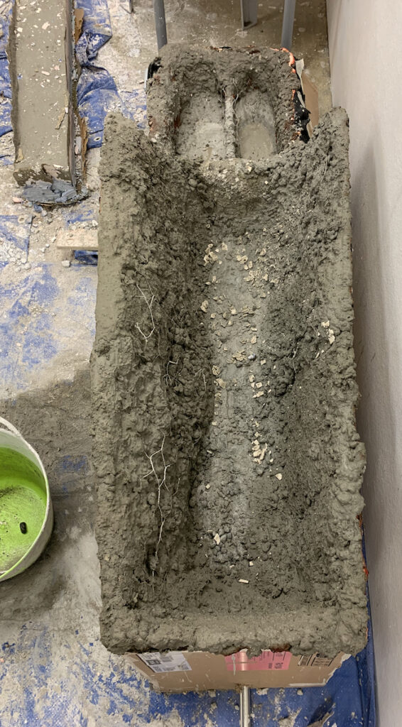
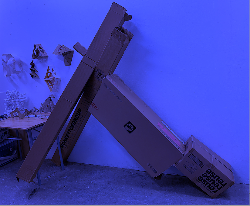
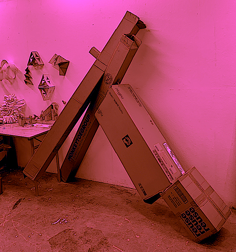
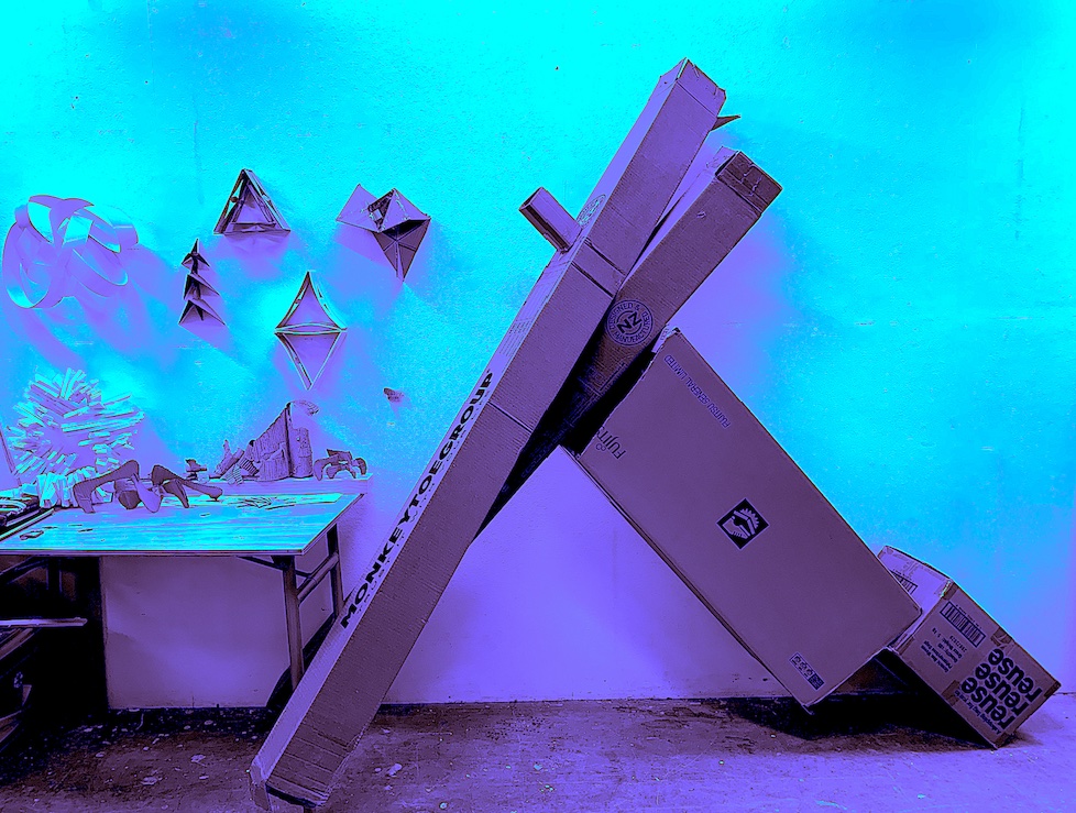
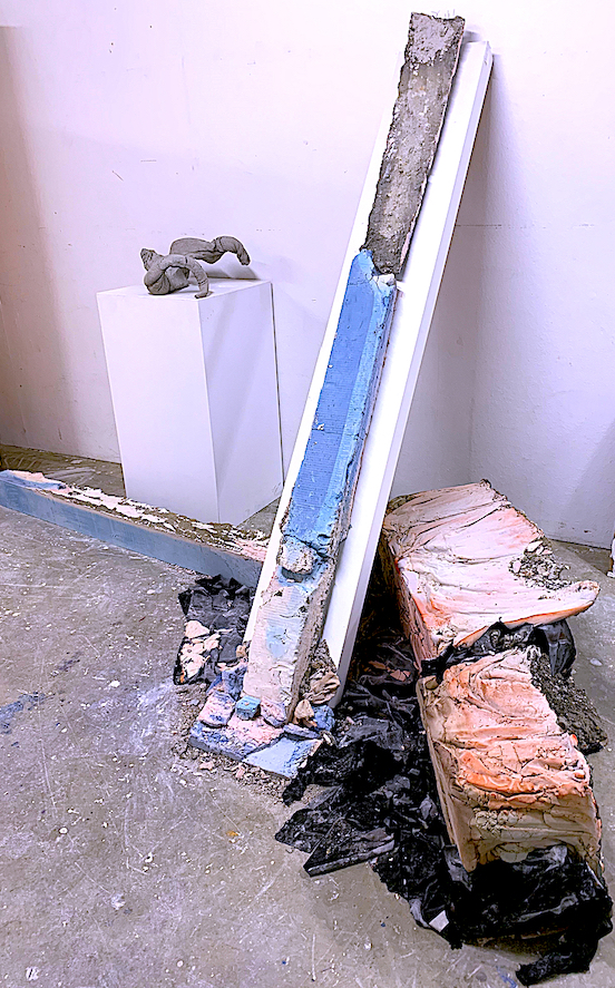
“Whoa!” “What a mess!” It was hard work, fun and a great learning curve creating a large sculpture. It was easier, taking about 20 minutes to push, pull and rearrange my found objects: (cardboard boxes and a metal rod) into a planar and linear form. I inserted the rod on an appropriate diagonal angle, and taped together the four large boxes together before our class started on our 3rd week’s brief: Substitution and Displacement. (See Oblong Box DESIGN below).
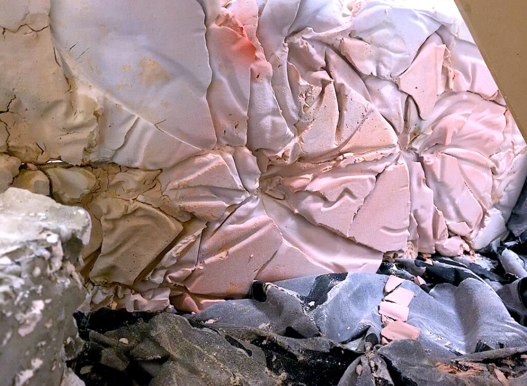
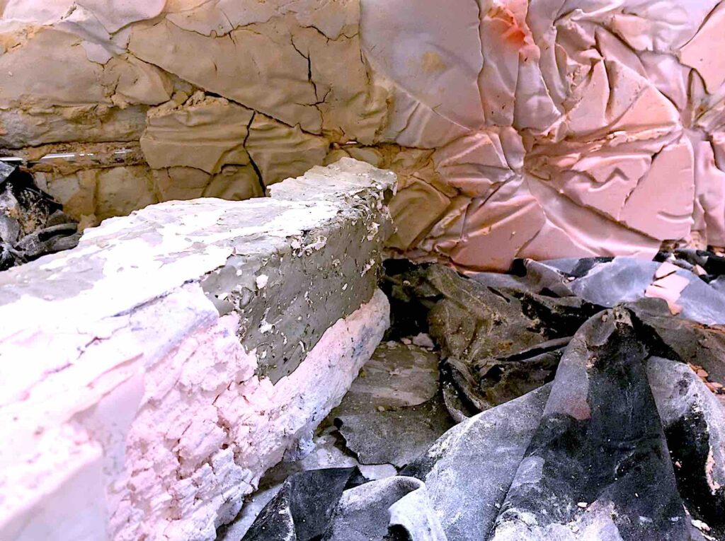
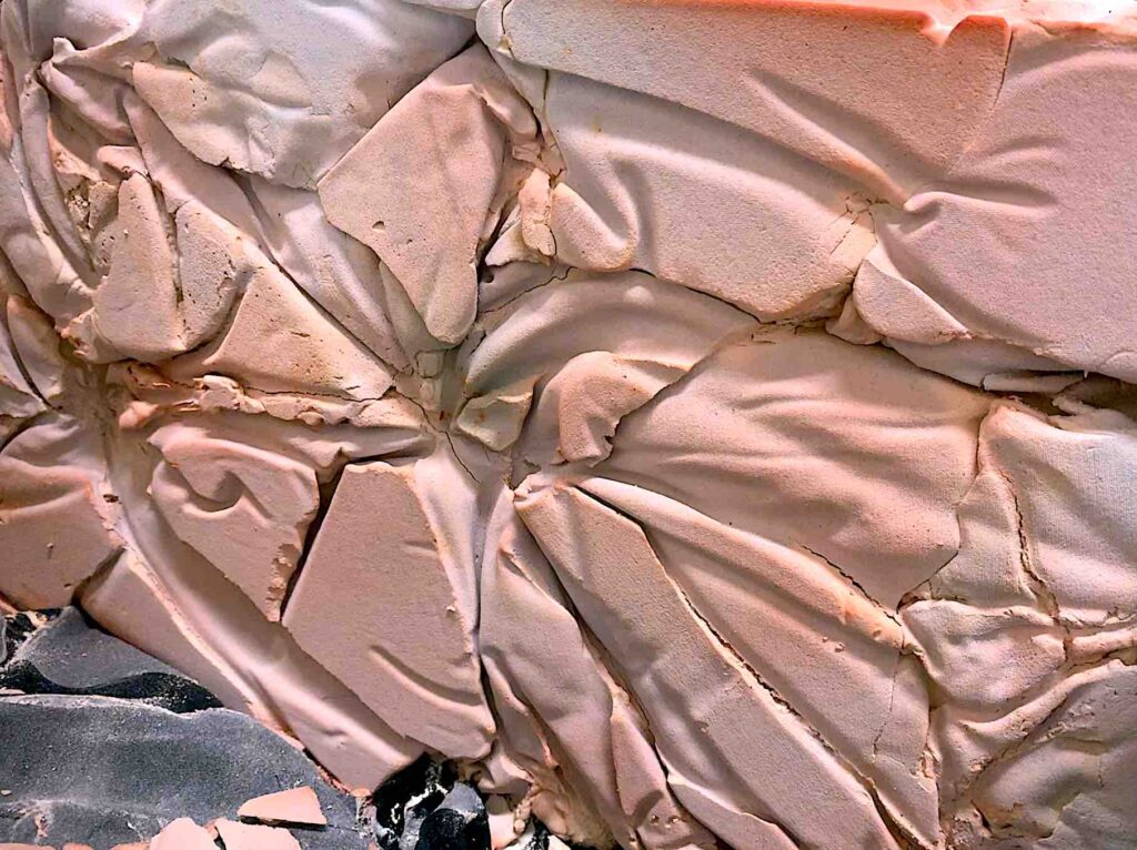
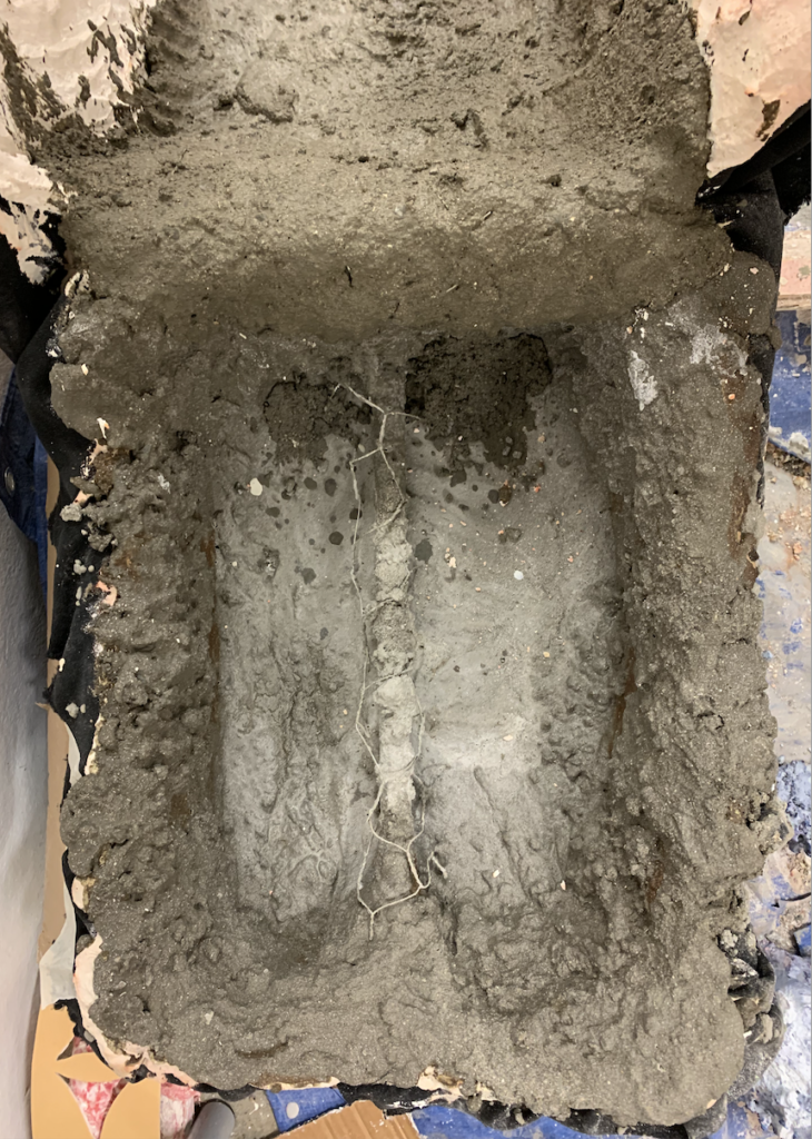
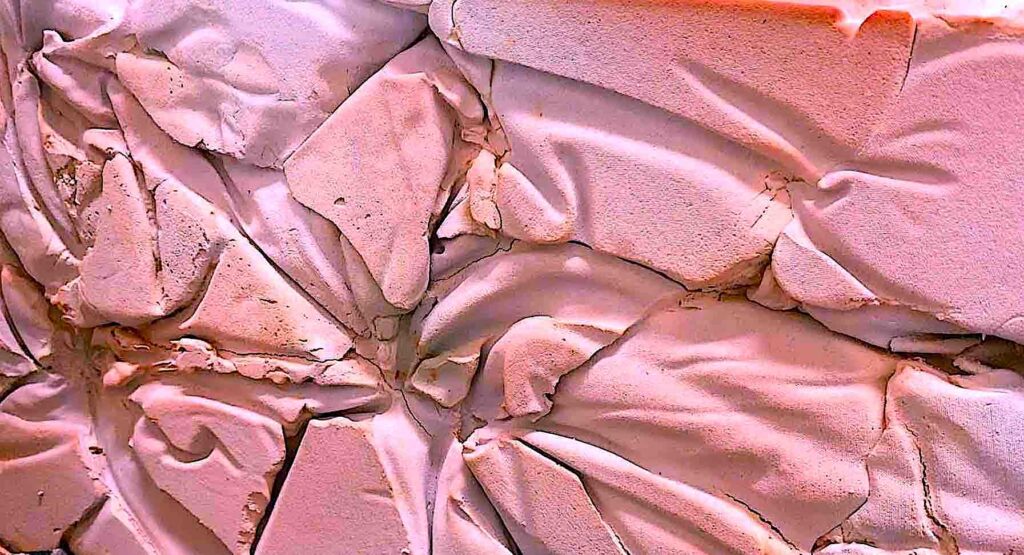
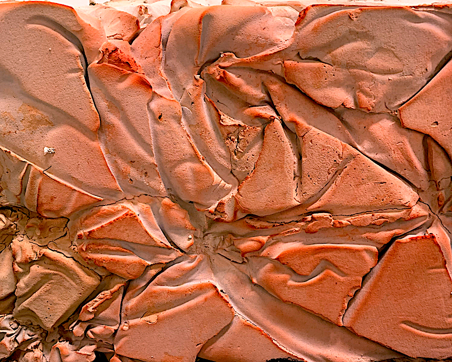
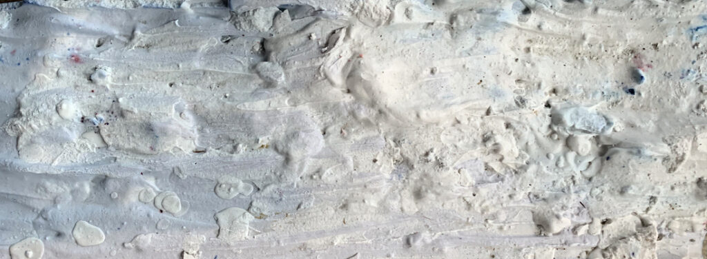
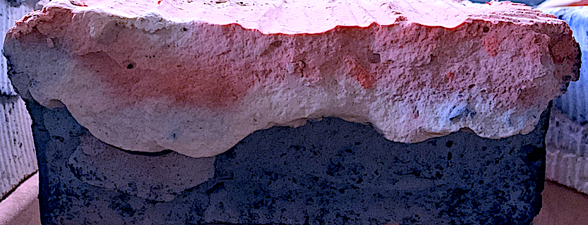
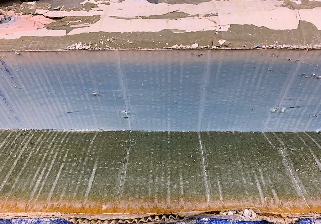
This brief stated we needed to use a light material such as fabric, and hard materials such as plaster and/or cement to further extend our planar and linear designs. Therefore, I added fabric on top of the two large boxes, and draped and gathered folds, sewing rosettes here and there. I then turned my two box project upside down to add volume: (heavy plaster and cement) into the boxes. The plaster and concrete mass pushed down against the fabric to imprint my sewn rosette and folded fabric pattern.
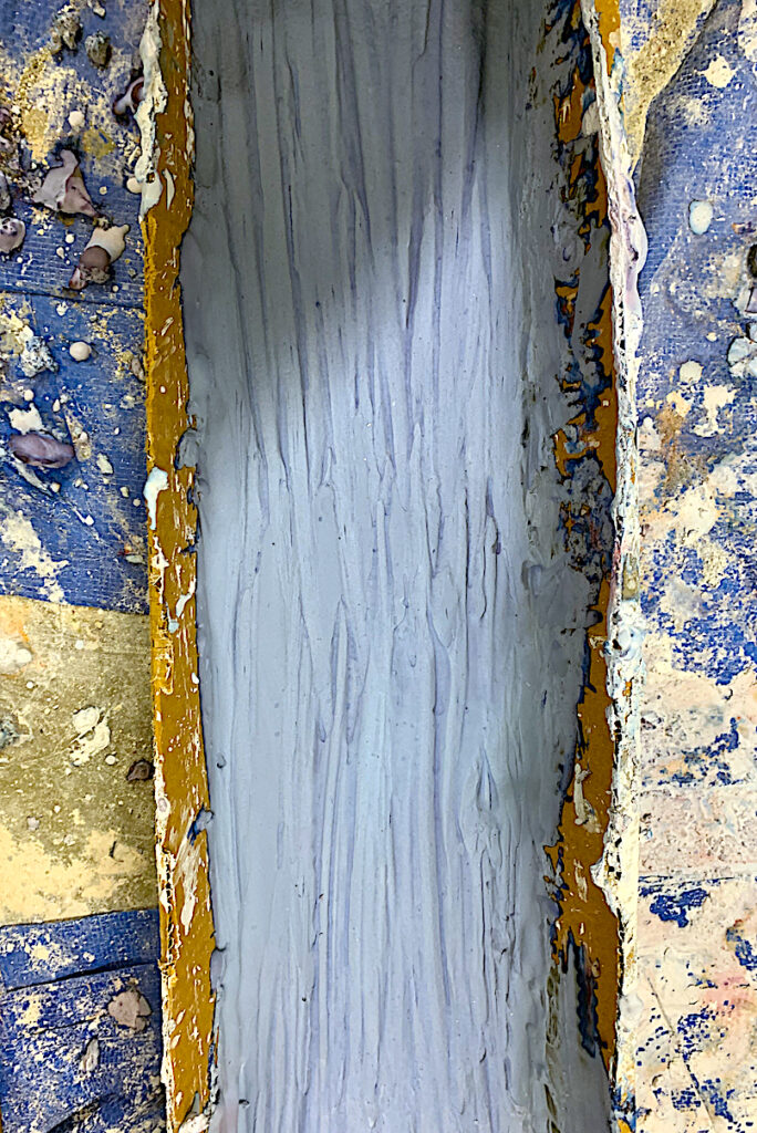
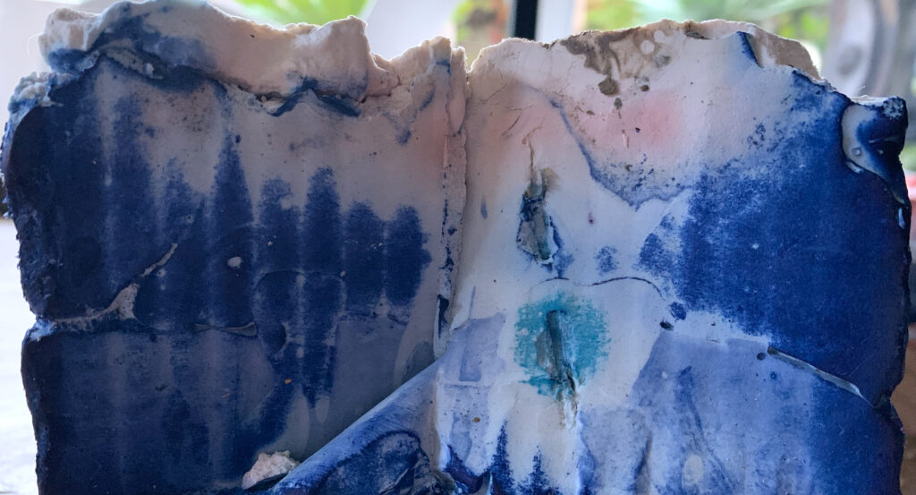
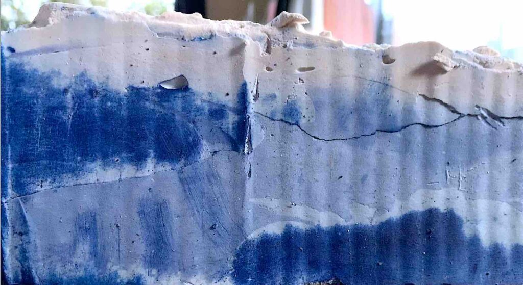
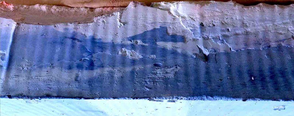
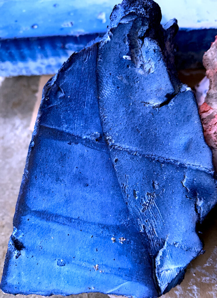
As I am a colourist, I added an extra component of coloured dye to the plaster work. One needs a lot of dye to make a strong colour, therefore I knew my colours may not be particularly strong. After the plaster and cement dried, I was excited to rip off the fabric to reveal the brown dyed plaster had become a faded fawn colour, the vermillion came out orangey salmon, the violet turned icy blue, and the violet mixed with vermillion turned icy pink, like cake icing. My favourite parts of my grungy sculpture are the geological landscapes of fabric plaster folds, and ice shelf plaster oblongs displaying an Antarctica ice white blue cave colour.
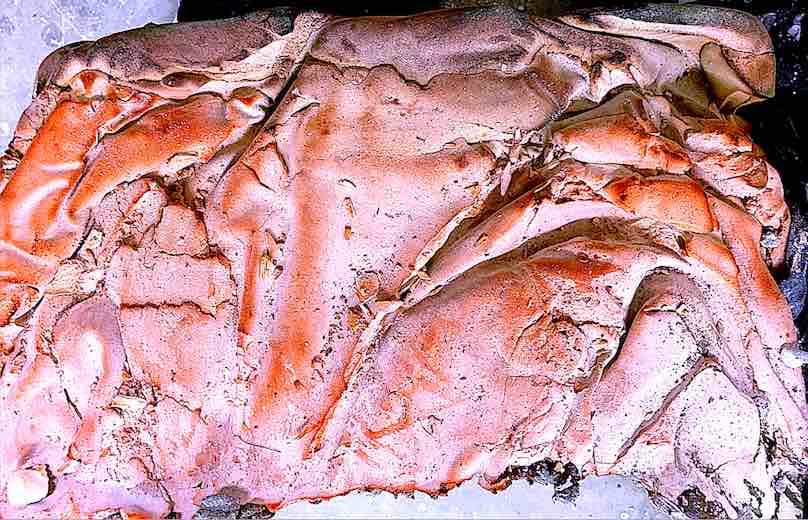
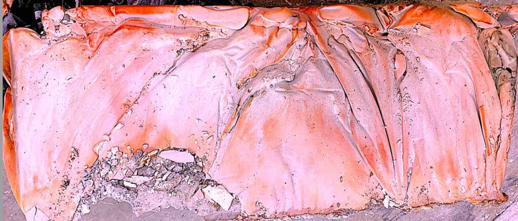
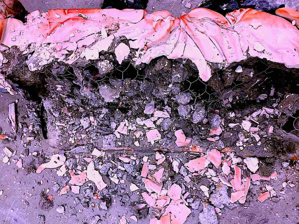
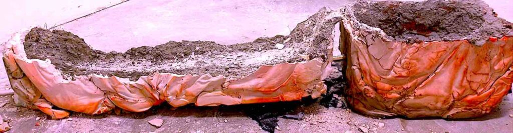
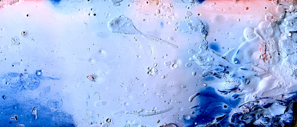
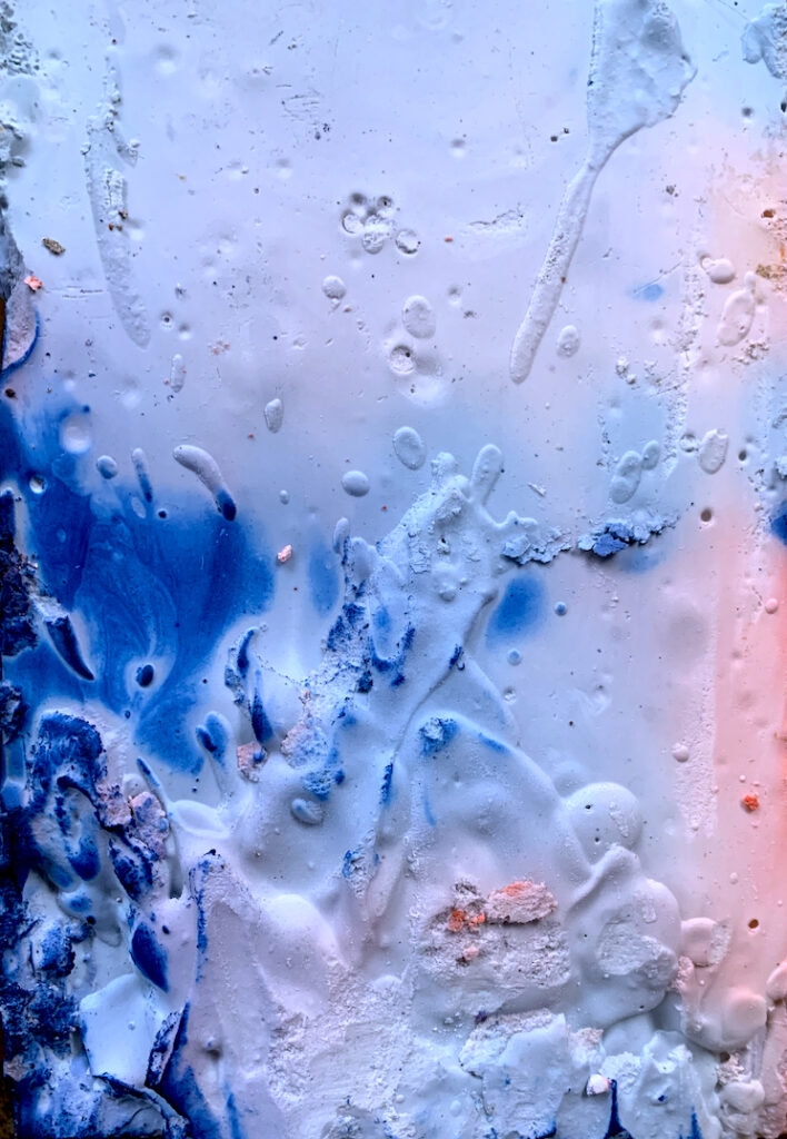
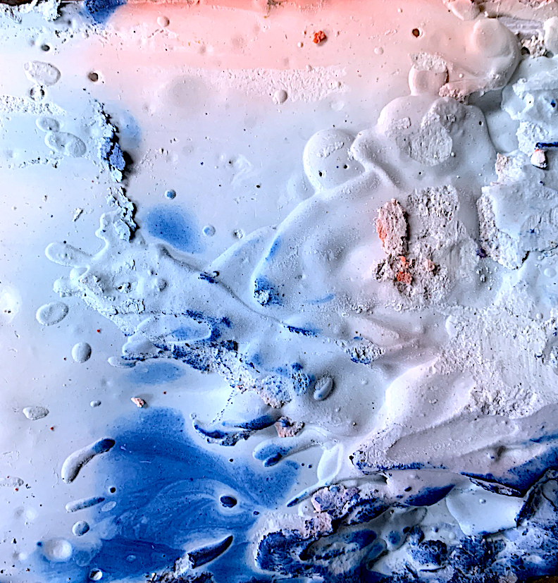
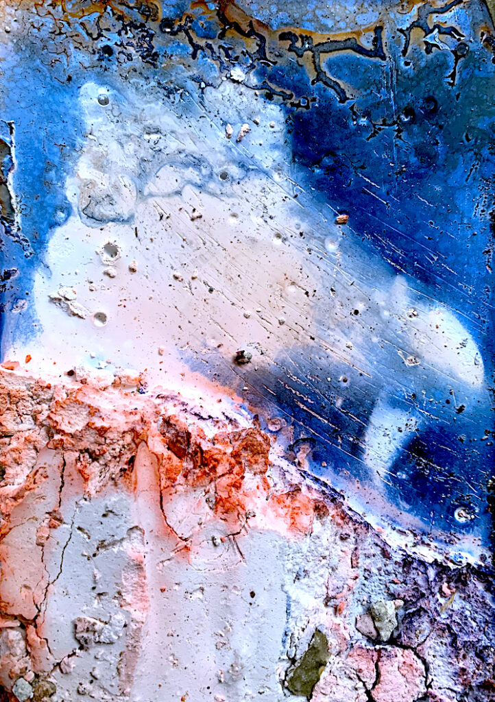
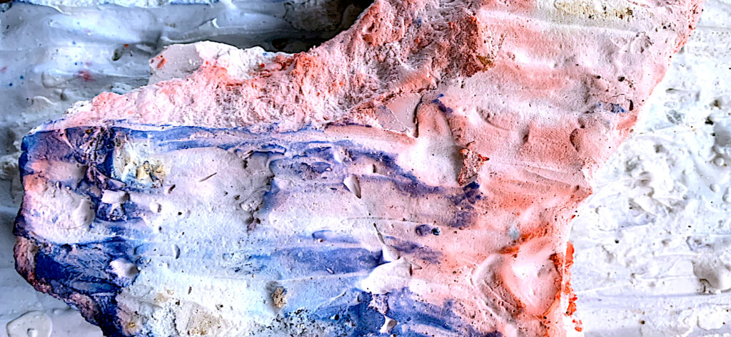
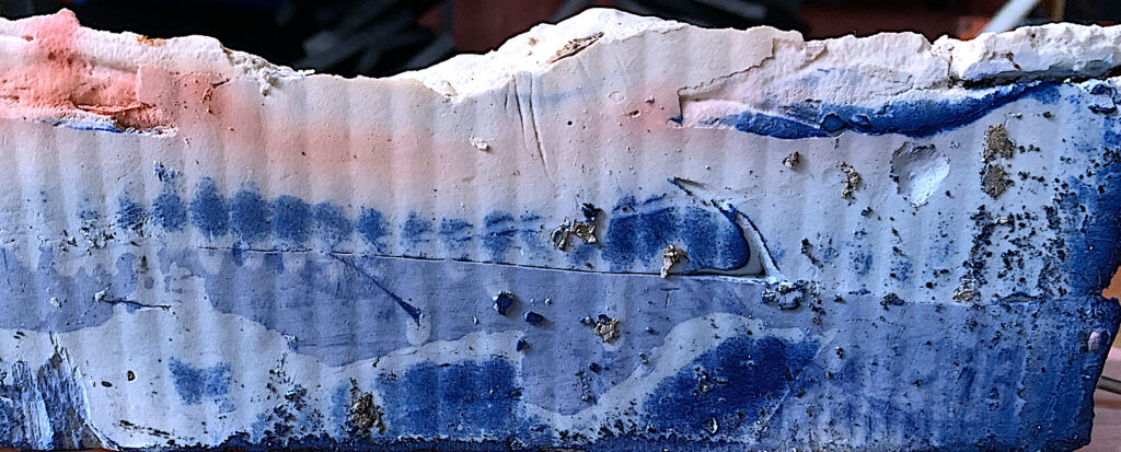
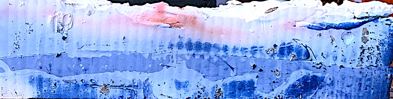
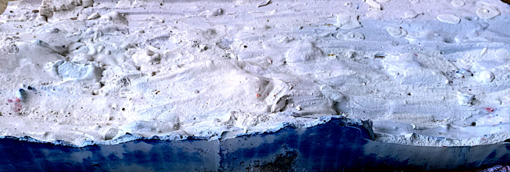
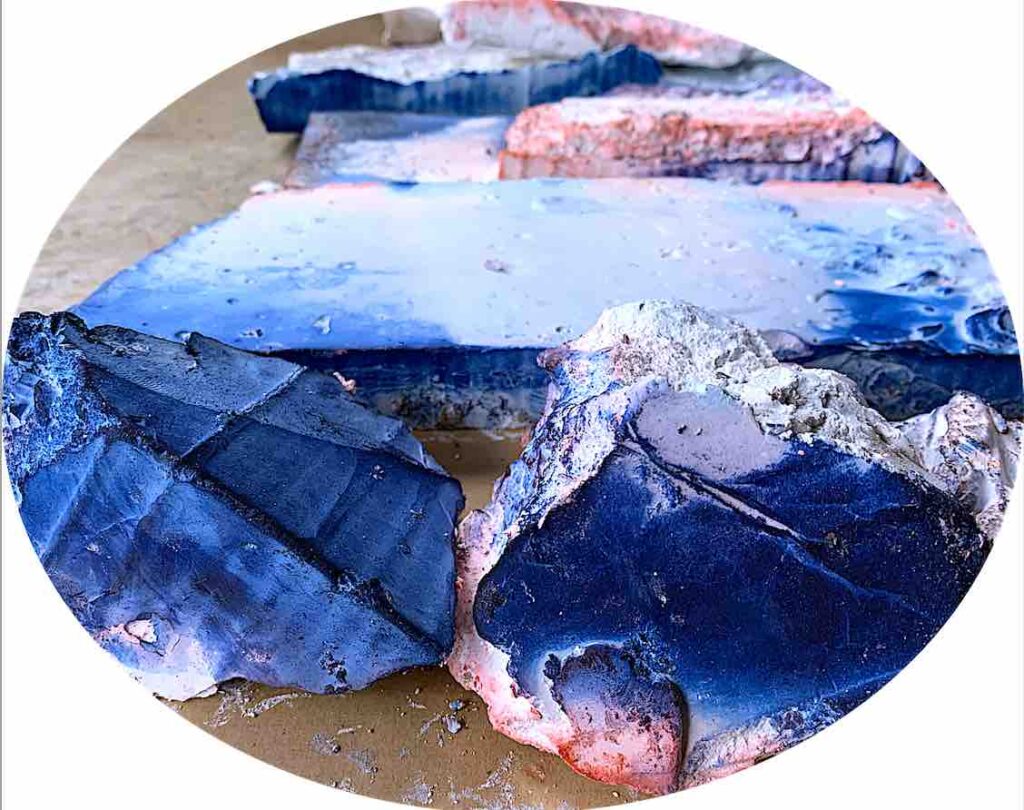
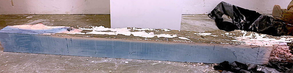
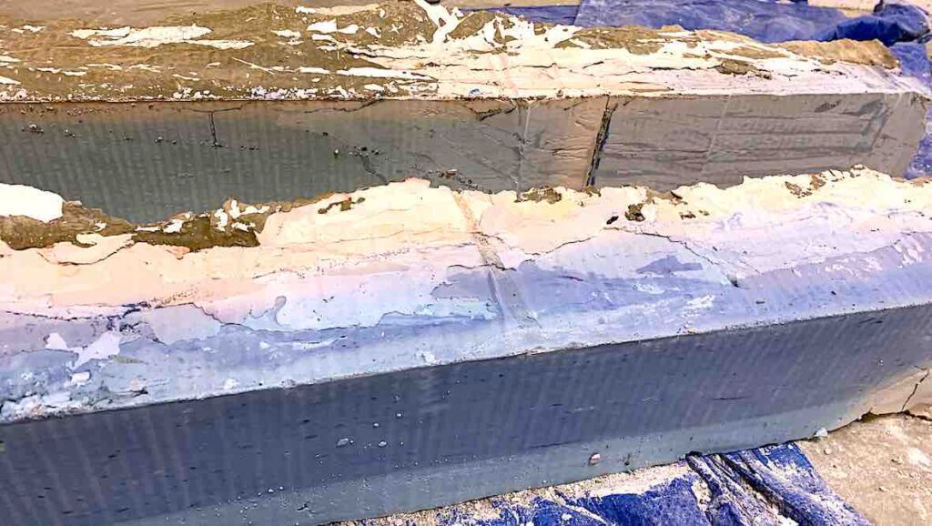
My Box, Fabric, Plaster and Concrete Sculpture was an ambitious, very dusty and messy project! (See below). I completed the sculpture to my best of ability in the timeframe of four and half days (Week 3: Wednesday, Thursday, Friday, Week 4: Tuesday, and half of Wednesday). I do not mind not achieving my original vision: Oblong Box design, because I enjoyed every moment of the making process. I learnt how to manipulate and combine light materials such as fabric, reinforcing wire mesh and cardboard boxes, and then mix materials of mass such as a metal rod, cement and plaster!
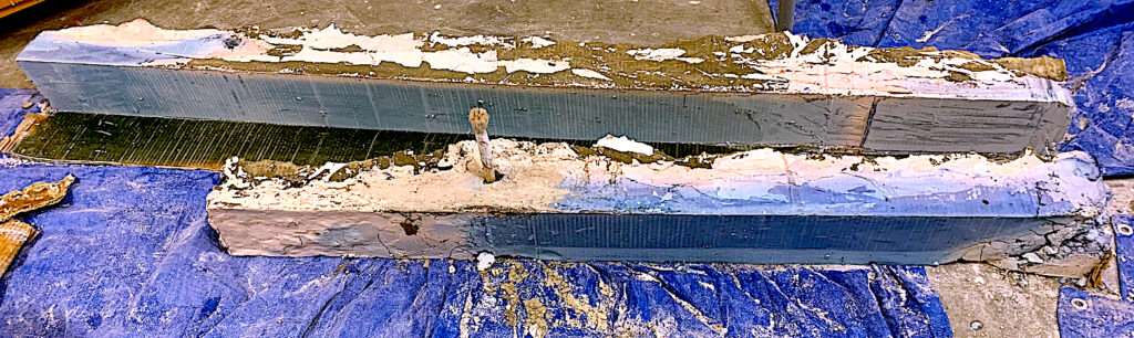
Box, Fabric, Plaster and Concrete Sculpture
(Unfinished as the sculpture pieces were to be connected and placed upright. The two oblongs were to be connected into the metal rod of the long, double-box body, and lifted into position. One oblong was to be cantilevered off the floor.)
Conclusion
In conclusion, I have been extremely dedicated, focused and hard-working in my first Core Studio class of Sculpture. I have kept my blog up-to-date, continuously documented my work, participated and contributed within each class, and worked in the studio for full, whole days, plus many extra hours at home.
In the future, I would like to further extend the Instructional Text art ideas in a variety of mediums, and continue to invent sculptures with both light and heavy qualities. I am interested in materials with mass and volume, such as wood, concrete, plaster, and metals, in particular the alloy bronze. I enjoyed each task, and have gained new understandings of the overall brief: A Weight Off Your Mind. Cathy 27.03.2021