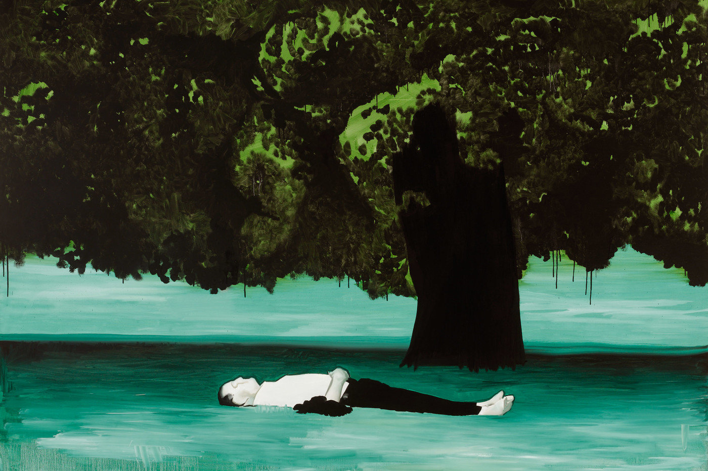
Artist Research: Judy Millar (b 1957, New Zealand).
Judy Millar once discussed with Anthony Byrt (‘How to Paint Backwards’, 2002), that at one point “she was frustrated because her gestures were limited by arm-span, which was limiting the size of the canvas and keeping the forms fairly closed. So there’s always been this desire to get bigger and to be in the work more.”
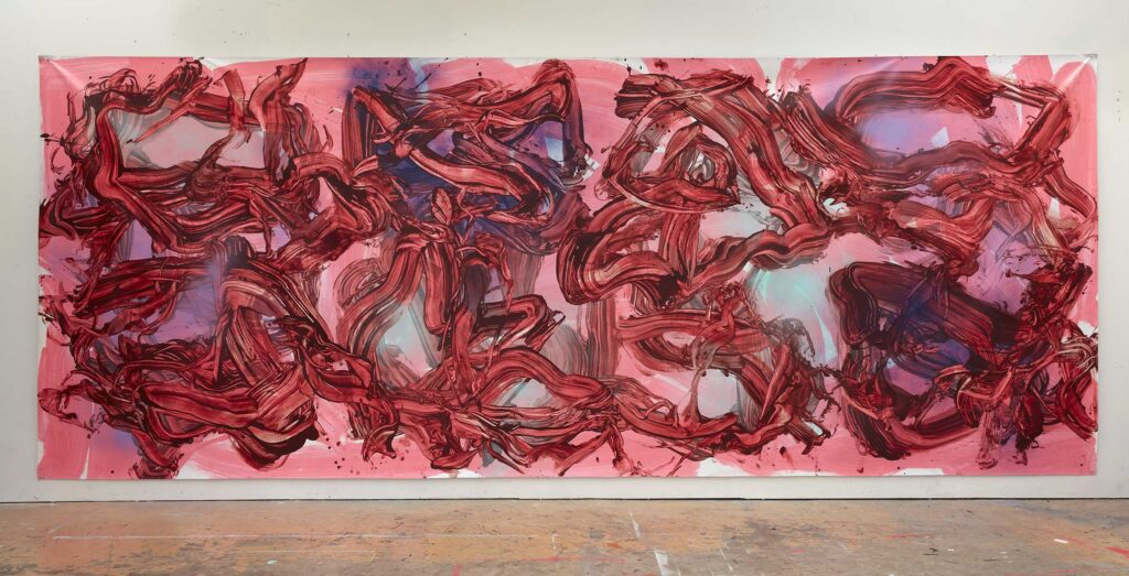
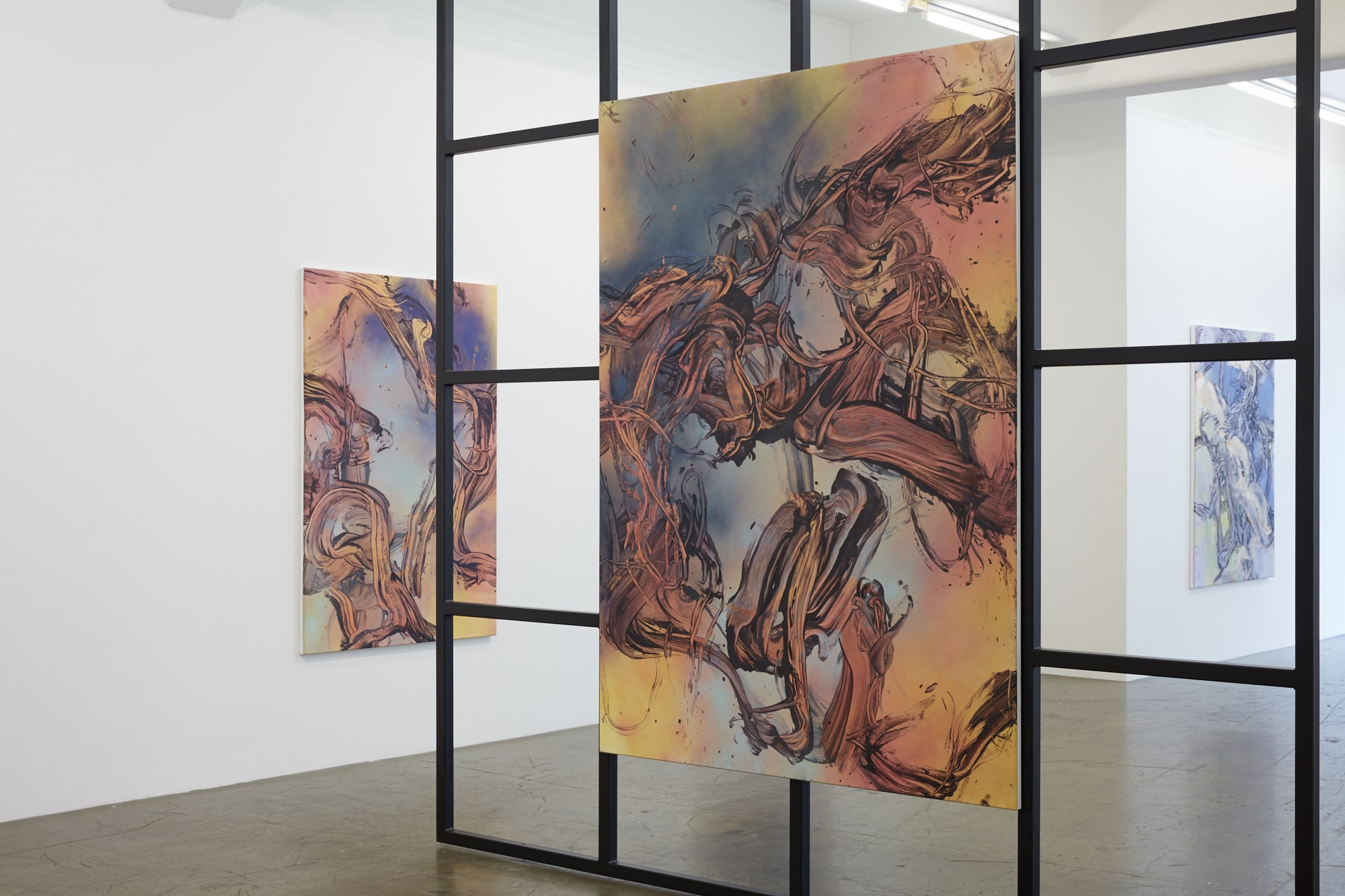
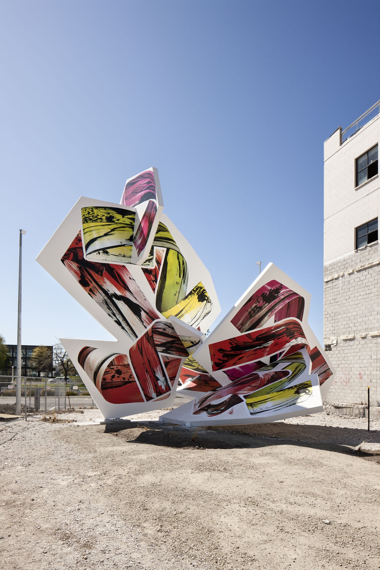
Millar paints in a range of sizes, and on a variety of surfaces, from small paper works framed behind glass to more well-known large abstract paintings on canvas and linen. I enjoy seeing her work computerised, industrially manufactured and enlarged on a massive scale in a sculptural context which is both striking in black and white, and/or colour.
Figure 3. Call me Snake. 2015. Installation. 9m tall. Judy Millar. Commissioned by SCAPE Public Art for Christchurch’s SCAPE 8 New Intimacies. Armagh Street, Christchurch Central, opposite the entrance to New Regent Street. Photography by Simon Devitt. Digital process : PixSolution
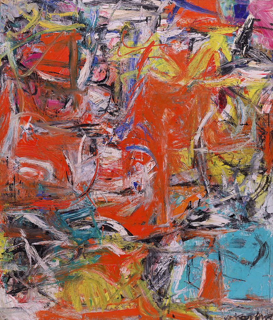
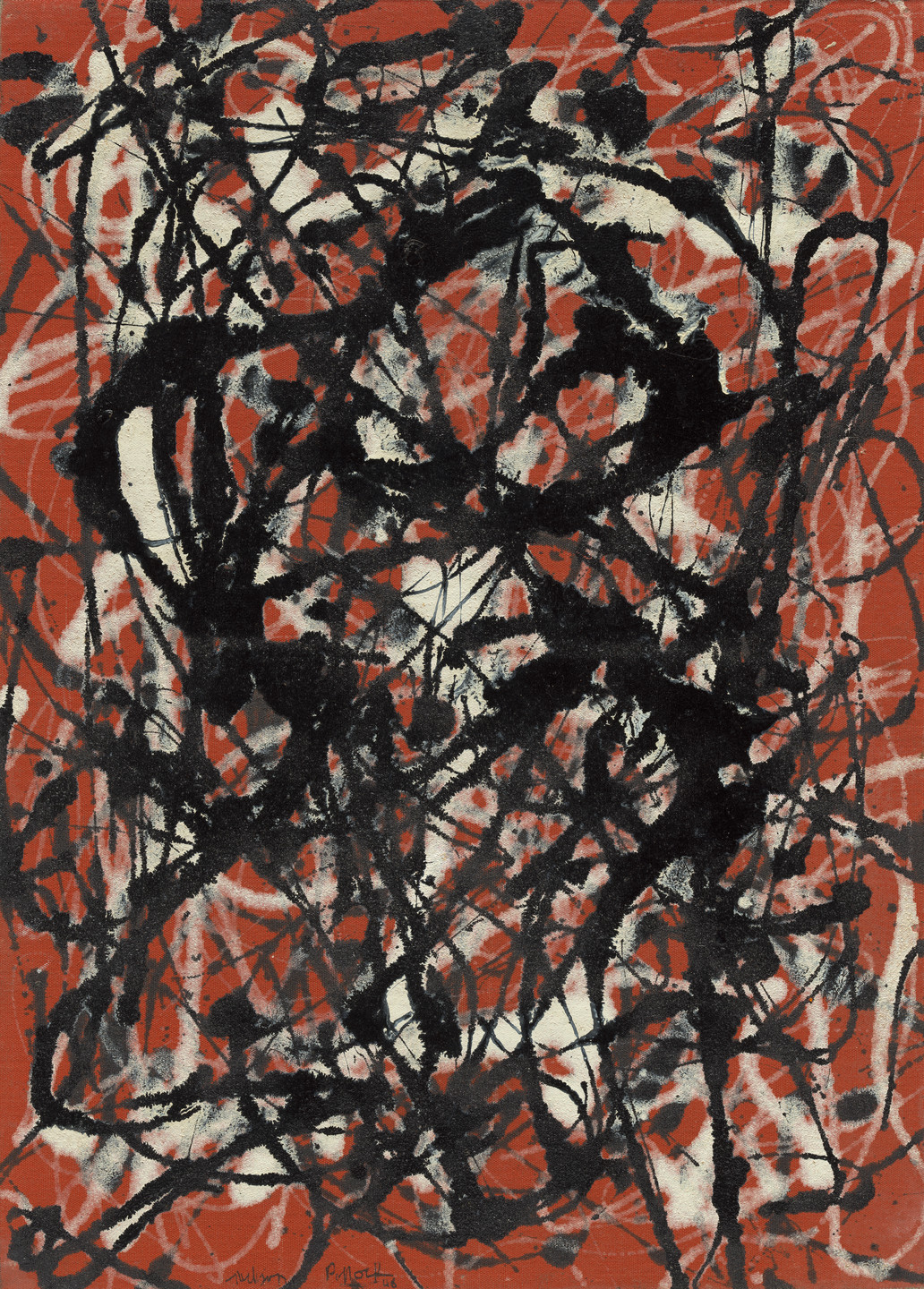
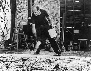
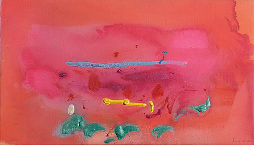
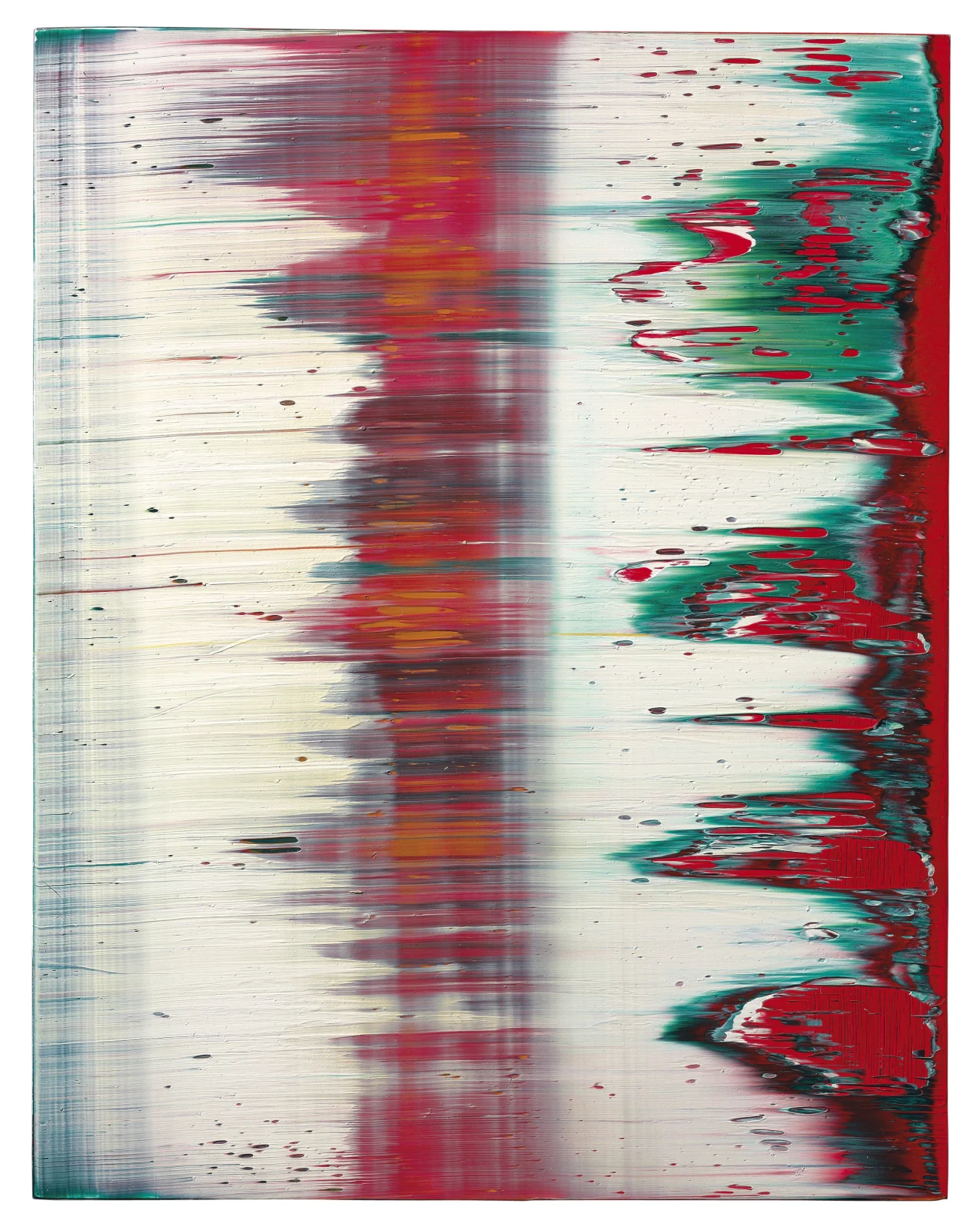
I personally am attracted to large abstract paintings that promote contrasting atmospheres such as warmth and thickness, coolness and thinness. I like a surface to disappear under heavy, sticky, thick gestures and paint such as the works of Willem de Kooning (1904-1987), Jackson Pollock (1912-1956), Helen Frankenthaler (1928-2011), Gerhard Richter (b 1932) and André Hemer (b 1981). Their works of art tempt me to step within their luxurious mud pool soups, and to feel their abundance of shapes, lines and colours.
Figure 10. Big Node #14. 2015. Acrylic and Pigment on Canvas. 1375 x 1025mm. André Hemer.
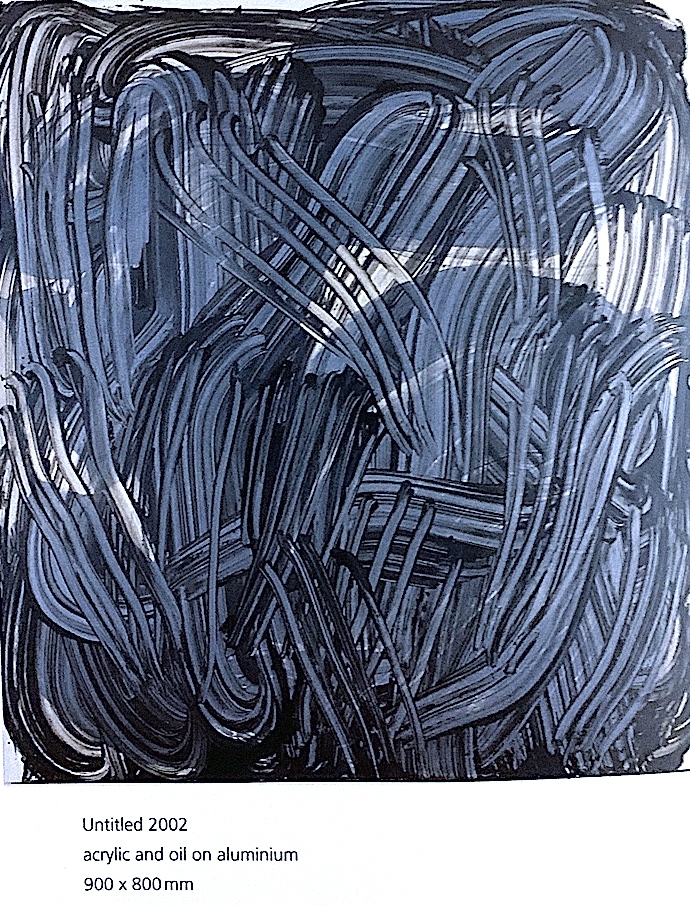
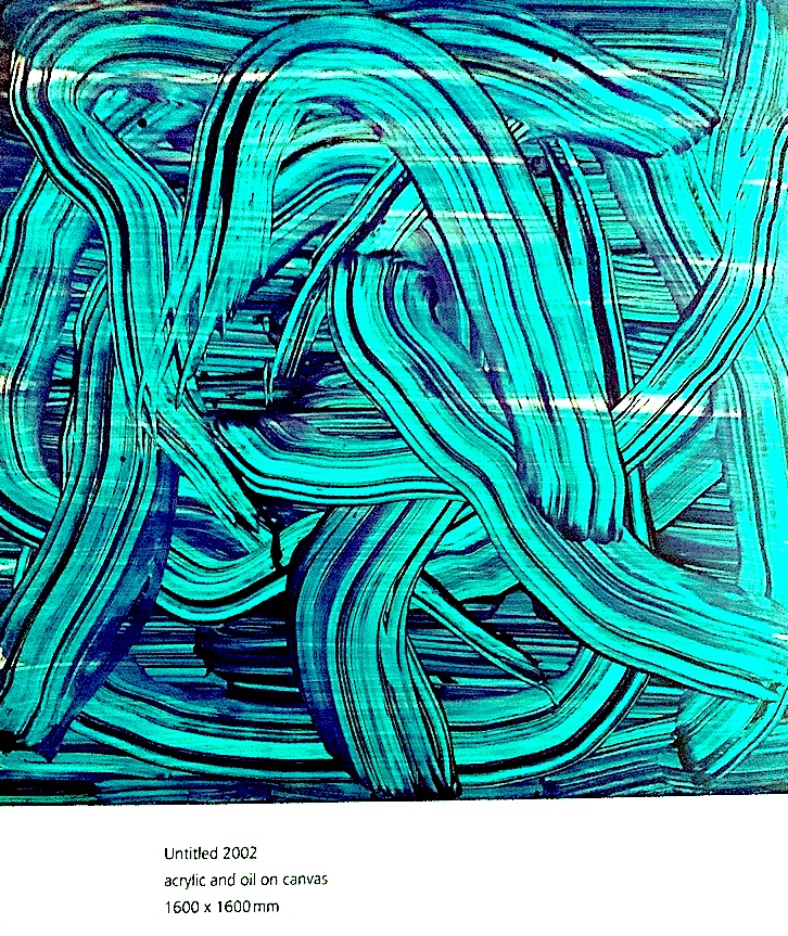
Millar’s work is not oppressively saturated with sticky chunky paint forms. Instead, her translucent, thinly applied works command a different emotion. They reveal a thin cobweb three-dimensionality, and a lightness of being which curls, unfurls and ripples. Yet, I still feel I could penetrate and immerse myself in her watery world works.
Figure 11, 12. Judy Millar. How To Paint Backwards’ Book.
Figure 13, 14 Judy Millar. ‘How To Paint Backwards’ Book.
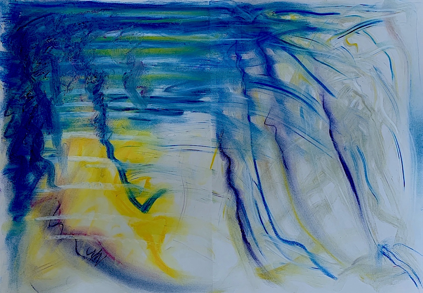
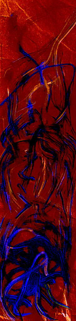
Her Postmodern swirling, swerving gestural marks appeal to me, because they move with fluidity like a dancer. She subtly produces layers of attenuated paint to the surface using tools like a mop, rag or brush, but sometimes she shifts paint with the side of her hand, and recently an air brush has been utilised (Figures 14, 15).
Figure 15. Everything. 2016. Acrylic and oil on Canvas. 1400 x 950. Judy Millar. (Purchased from Gow Langsford Gallery).
Millar carefully considers the construction of the canvas space, spending time preparing and making the surface very smooth with an exact, and perfectly primed, gessoed and waxed finish. The paint pigment via the turps cuts through the wax to grip onto the ground surface. Oils imported from Holland are uncut by other chemicals or filler agents. She executes her paintings quickly (like is recommended for this painting brief), with large bodily gestures. Millar shifts the thin runny mixture of paint and turps, which washes and flows across her painting surfaces.
Figure 16. Untitled. oil on canvas. 2016. Judy Millar. Postcard – courtesy of Gow Langsford Gallery.
PHOTOGRAPH WITHOUT PEOPLE: Artist: MAN RAY – ARUM LILIES: Week 2
Figure 1. ‘Les arums’, 1930 ca solarisation Photographie de Man Ray.
1. Selection of Verb(s) from Week 1. BRUSH, CURVE, MIX, MERGE, STREAK, SMEAR, PULL, SLIDE, STRETCH= layers of verbs.
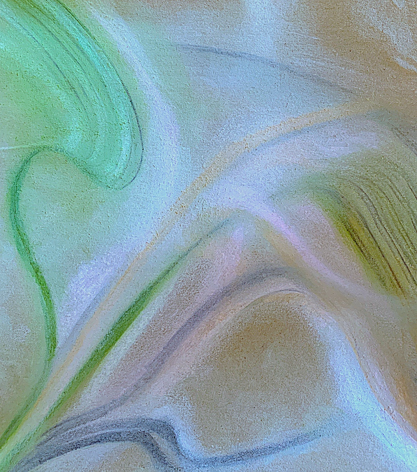
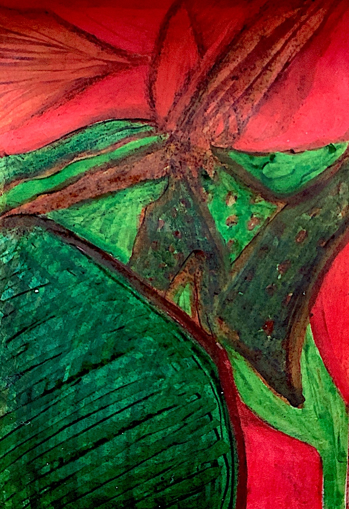
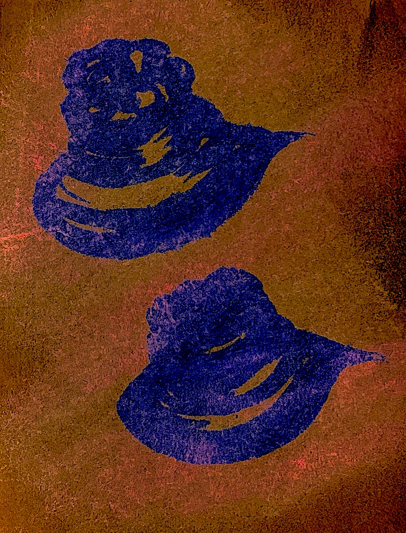
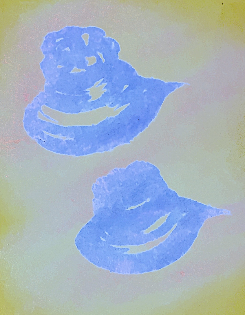
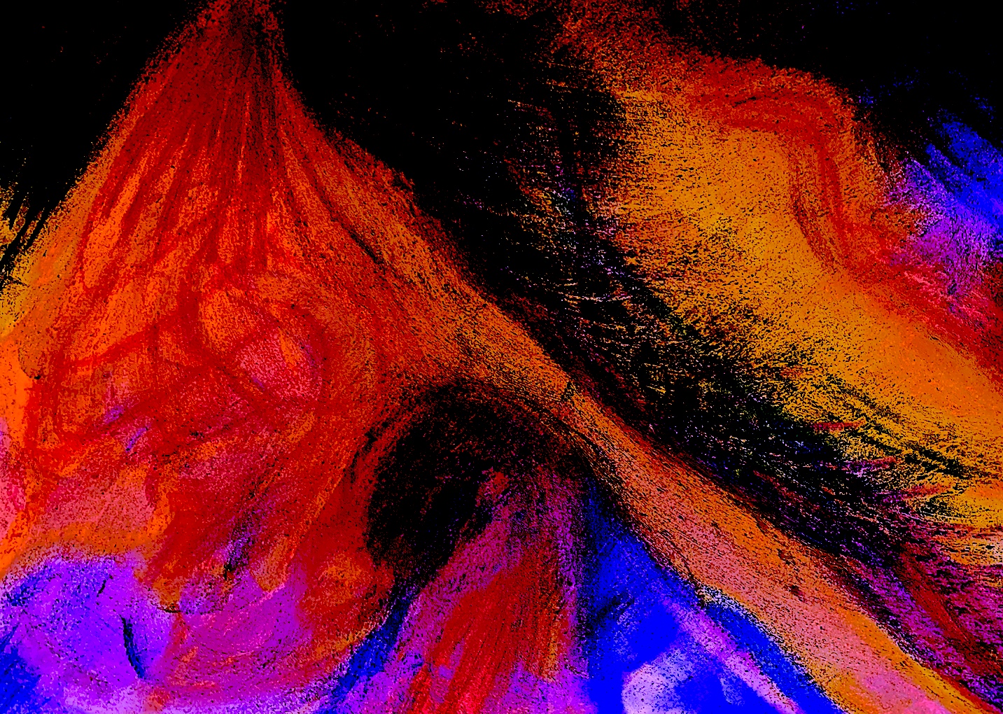
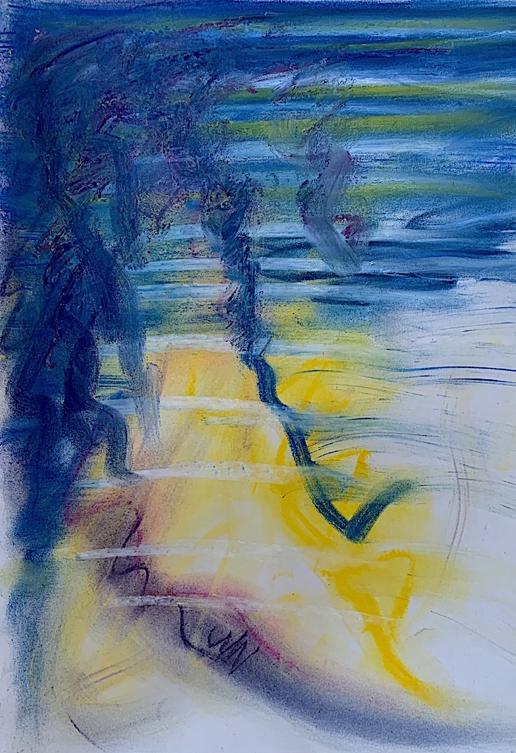
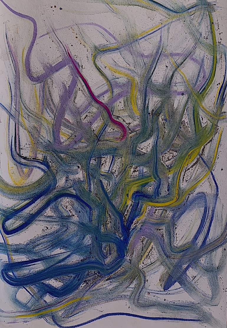
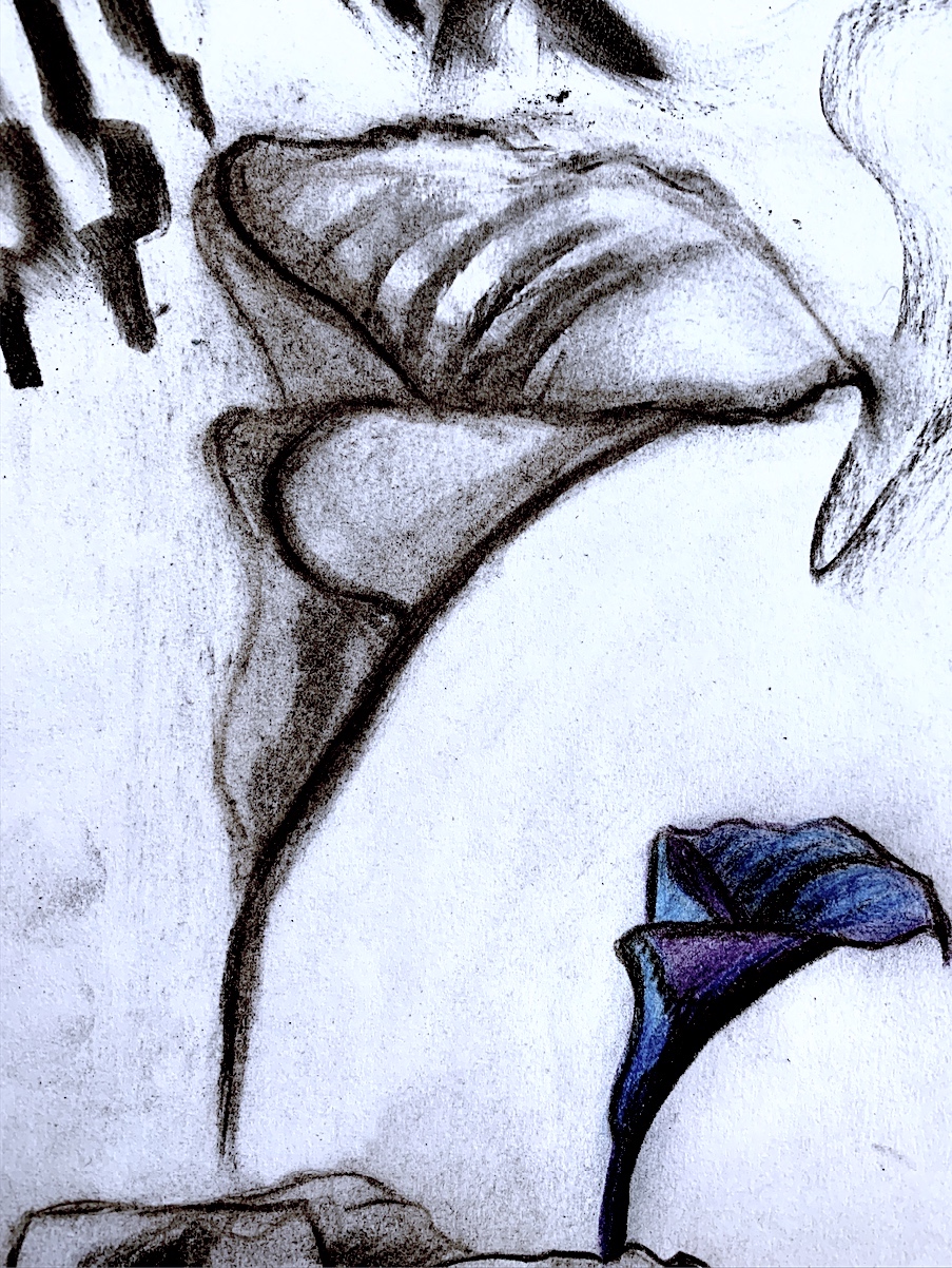
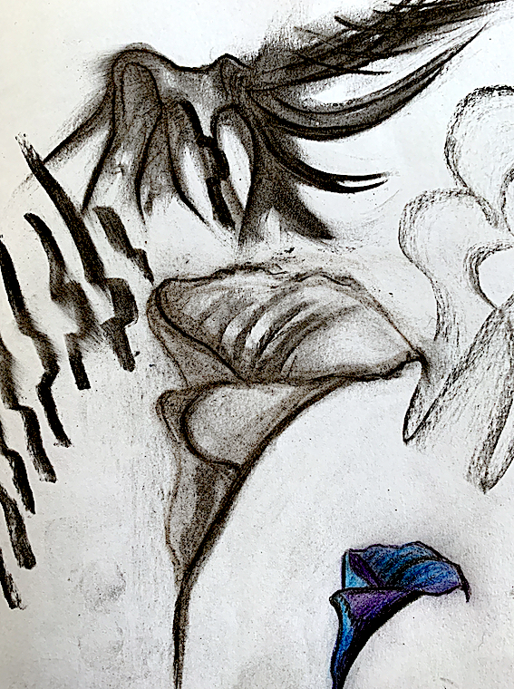
2. Chosen Drawing from Photograph without people Brief: Week 2. Figure 2: ‘Gold Line‘ Arum Lily Abstraction. Drawing: Pastel and Charcoal.
This is one of my favourite images that I have so far produced, because it occurred in a short timeframe, I was totally engaged and it was the first time I had used neutral brown paper. I enjoyed how the pastel sunk into the soft fuzzy texture of the brown paper.
Figure 2 : ‘Gold Line‘ Arum Lily Abstraction. Drawing: Pastel and Charcoal. A4 Brown Paper. Cathy, 2021.
I enjoy painting on canvas, and this is my first canvas activity for this brief. It is my second project of the brief to combine verbs with a selected image. To extend the lily theme, I have chosen my above pastel to paint.
At one point during the painting session I had achieved the correct thin lines and shapes that I had desired. Yet then my lines became thicker and thicker. I started to invent stripes everywhere which I did not fancy. So, I took a break, and will return to alter at another stage.
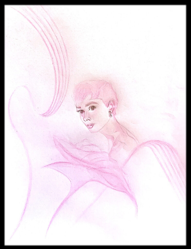
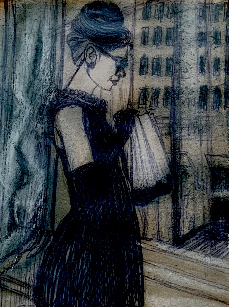
Extending the Lily theme, and continuing on with the brief’s COMBINATION activity, I next selected two of my images to COMBINE. Choosing verbs to connect I chose Audrey Hepburn’s ‘Sabrina’ filmgrab portrait and Man Ray’s Arum Lilies photograph. I took the pale pink idea of my digital liles and used this same rose, baby pink colour to draw and paint Audrey Hepburn. Verbs: Soft, Brush, Gentle, Dab, Push
Figure 4. ‘Lily Audrey’ Pencil and Paint. Combine Verbs & Images: Verbs: Soft, Brush, Gentle, Dab, Push / Images: Man Ray Lilies and Audrey Hepburn ‘Sabrina’ Filmgrab.
Figure 1. Rubbish: Mattress/Base. Original Photograph by Cathy.
1. Selection of Verb(s) from Week 1. BRUSH, CURVE, MIX, MERGE, STREAK, SMEAR, PULL, SLIDE, STRETCH, SOAK, SPREAD, SQUIGGLE, WRIGGLE, DAB, DOT = layers of verbs.
2. Chosen Drawing from Trash/Rubbish Brief: Week 2. Figure 2: ‘LANDSCAPE WITH GREEN SEA’ Ink/Paint.
Week 3’s goal is to combine Weeks 1 and 2 experiments together. Firstly, I selected my favourite drawing (below) from Week 2’s Rubbish/Trash image: (old mattress and bed base).
Figure 2. Landscape with Green Sea. Drawing, Ink, Paint.
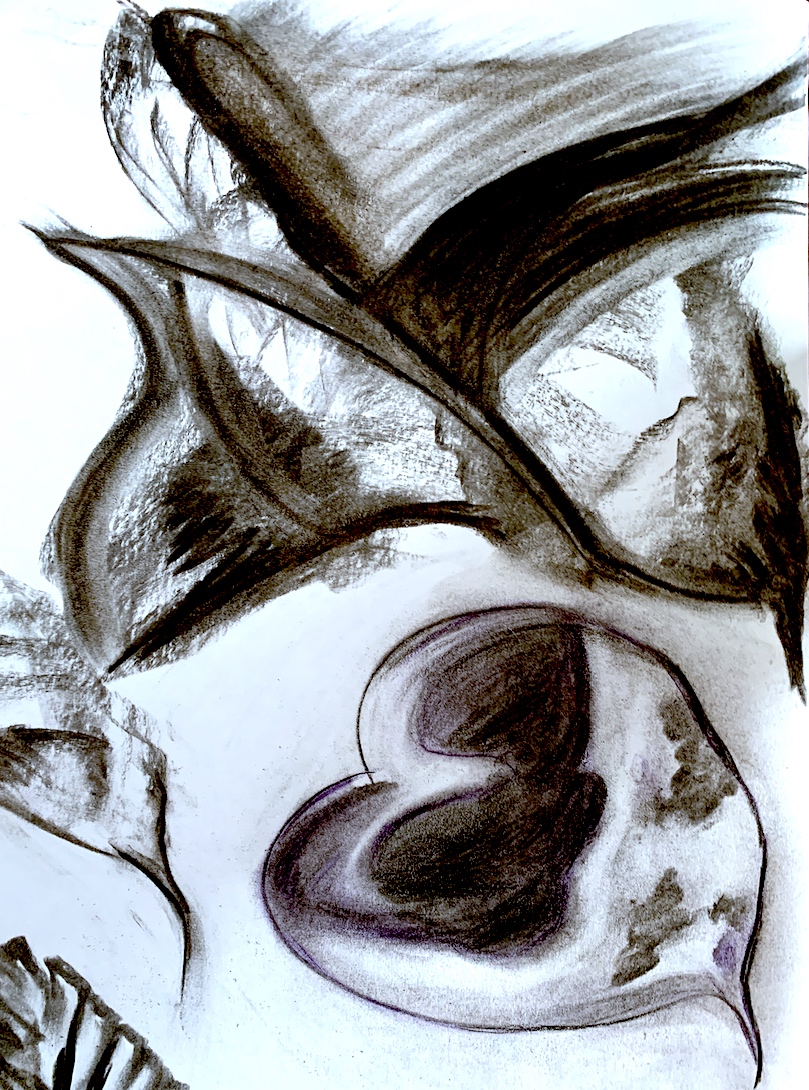
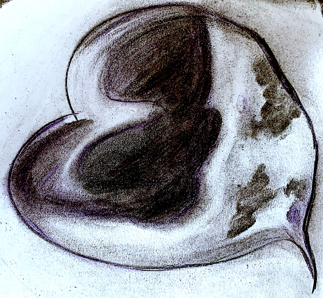
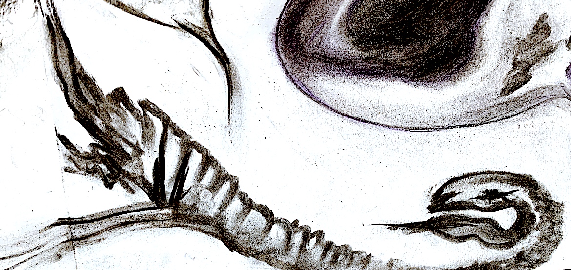
Figure 3. ‘Landscape with Purple Heart’. Painting =Verbs from Week 1. BRUSH, CURVE, MIX, MERGE, STREAK, SMEAR, PULL, SLIDE, STRETCH, SMOOTH = layers of verbs.
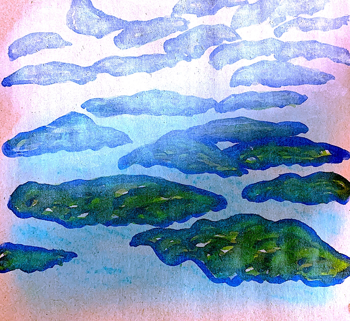
For this painting, which I titled ‘Landscape with Purple Heart’, (I do love to make up titles!😀) I quickly free-hand drew the same lines and shapes from ‘Landscape with Green Sea’: Figure 2 above. I introduced stronger colours.
Figure 3. Landscape with Purple Heart. Drawing, Ink, Paint.
Extending this verb-image process I began by using an ink pen to draw the shapes and lines of the above artwork, yet I simplified by having less lines. Then, using a brush and paint, I used numerous verbs to paint over these lines.
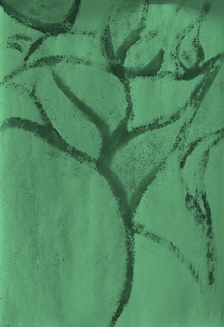
Figure 4. Tree Landscape. Painting.
Unfortunately, I lost a lot of my first squiggly verb lines (especially in the left hand bottom corner above), because I layered numerous thin washes of bluey-green turquoise paint. I watered the paint down to a light consistency, so my acrylic paint was more like watercolour.
After using the verbs: brush, mix and merge, by pulling the brush over the linear ink lines, I used the verbs curve, pull, smear and smooth. The painterly effect I do like is how I created these long vertical lines moving from the top of the painting paper to the bottom using the verb: streak. I streaked and streaked, stretching and pulling lightly the paint down over the whole surface. My desire was to soften the whole surface, and to give the painting an overall seamless effect of lines, like rain.
Next, I cropped the painting by zooming into parts I liked. It was good to see the deconstructed landscape emerging as just a few lines and abstracted shapes.
For my next experiment using the same ‘Landscape with Green Sea’ image as a model, I used addition and subtraction. I added paint to my ink lines and used the verbs again to brush, curve, swirl, mix, merge, streak, smear, pull, slide and stretch over the linear lines, and in between the shapes and spaces. Then I subtracted by using a dry sponge to wipe some of my verbs off to lessen the paint. This revealed the first layers of colours, which gave it a more 3-dimensional quality.
Next, I introduced new verbs such as squiggle and wriggle, dab and dot on the lower left bottom (originally my imagined sea, and harbour entrance) that meets the landscape.
I worked fast with this painting, because I want to quicken my painting pace. It is just another experiment, exploring mark-making and the vocabulary of verbs.
Before starting my outlines I gave a smooth green wash over the whole paper. I introduced some new verbs, adding only small, rough marks with a small brush, instead of creating larger, more obvious lines, or refined lines. I soaked parts of the paper with small amounts of watered down acrylic and gently spread them into place. I dabbed and dotted to continue the lines, and left spaces in between to create a sketchy quick painting.
Figure 8. ‘Tree Landscape’ Painting.
The subject matter of the rubbish trash has developed from a broken mattress bed photograph, to a painting of a landscape with a sea. Then a more simplified linear landscape arrived. My final experiment has resulted in the landscape turning into a sketchy tree, or whatever the viewer wishes to see. 😀
Wilhem Sasnal is a diverse artist with a contemporary edge, borrowing references from the present and the past such as art history (Georges Seurat’s ‘Bathers at Asniéres’), pop culture, film, comic illustrations and his own photography.
Figure 1. Wilhelm Sasnal, Bathers at Asniers, 160 x 120 cm, 2010 |Courtesy of Sadie Coles HQ and Wilhelm Sasnal
He utilises a mix of styles that incorporate gestural abstract expressionist brushstrokes with a representational style. His expressionistic style shows the material of paint been moved around the surface, revealing a physicality that contrasts with an added figurative element.
Figure 2. Wilhelm Sasnal, Shoah (Forest), 45 x 45 cm, 2003 | Courtesy of Sadie Coles HQ and Wilhelm SasnalAccessed October 2, 2021.
Figure 3. Untitled. Wilhem Sasnal. Accessed October 2, 2021.
Figure 4. Untitled. Wilhem Sasnal. Accessed October 2, 2021.
Figure 5. Untitled. Wilhem Sasnal. Accessed October 2, 2021.
Sasnal portrays a playful sense of humour, and his paintings often combine spatial illusion. His images look contemporary with a flat, boldly coloured digital style. Angular positioned figures are placed close to the foreground, or small and away in the distance, similar to comic book style characters.
Figure 6. Wilhelm Sasnal, Portrait of Rodchenko, Lady, 30 x 30 cm, 2002 | Courtesy of Saatchi Gallery and Wilhelm Sasnal Accessed October 2, 2021.
Figure 7. Wilhelm Sasnal, Portrait of Rodchenko, Lady, 30 x 30 cm, 2002 | Courtesy of Saatchi Gallery and Wilhelm Sasnal. Accessed October 2, 2021.
Week 2: PROCESS LED INQUIRY: Drawing from a piece of Trash/Rubbish.
Drawing Processes:
* Select a sixth image or item to draw.
* Analyse the image’s visual properties (figural and abstract).
* Generate multiple drawings.
* Process this image by reducing, confusing, or altering using a range of methods (i.e. charcoal, graphite, provisional paint studies, gouache, or watercolour sketches, alterations using the photocopier, overhead projector, photoshop and other digital imaging software).
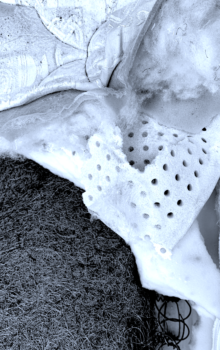
6. Select a piece of trash/rubbish: Shredded Bed Mattress and Base.
There are a number of reasons why I chose this photograph, and this trash. I utilised this disused bed in sculpture during the last brief, and I took many photos, and as I still have most of it in the backyard, I believe it is a great choice for my last selection. I selected this photograph because it shows many of the bed product materials such as steel, hessian , stuffing, foam, cotton, etc. I also like the line creases and contours, the foam holes and the interesting shapes, plus evidence of how I ripped the bed apart.
Figure 1: ‘Landfill Trash – Mattress and Bed‘. 2021. Black and White Photograph by Cathy.
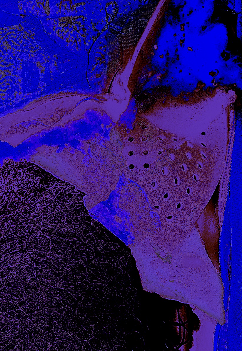
Firstly, I wanted to give my original photograph more energy. Therefore, I altered the colour palette from a monochromatic black, grey and white photograph to vibrant rich reds and blues. I think this creates more interest and emotion to the shapes, forms and details, such as the embroidery stitching.
Figure 2: ‘Pretty Trash’. 2021. Digital Art. Cathy
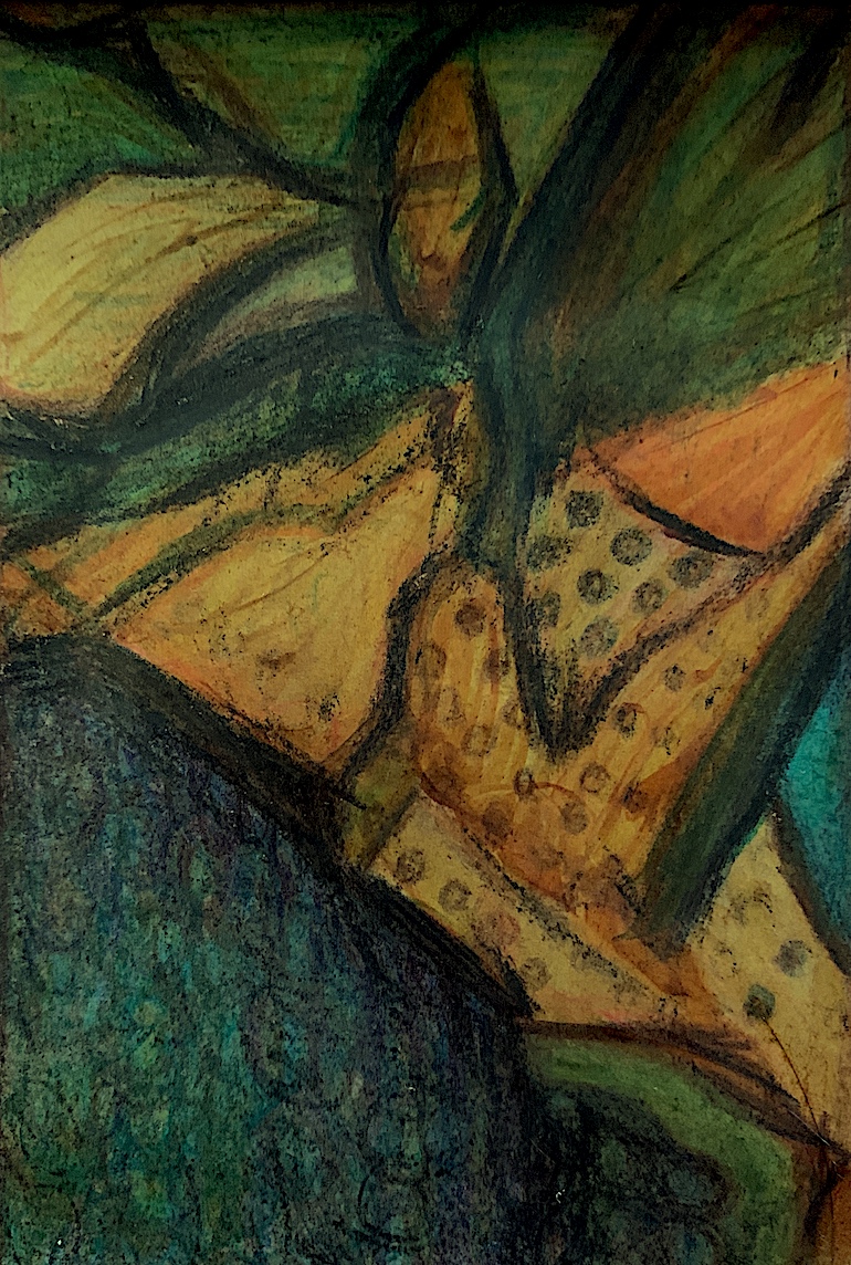
Next, I flattened out the shapes using thickly drawn coloured pencils, and gave them contrasting palettes of green, yellow and orange. I filled up the whole surface space with a landscape of colours, and textural patterns. After drawing the foam holes and curly hessian material, I started to visualise green and yellow mouldy cheese.
I created another landscape as fast as I could, using similar lines and shapes from the original photograph. Yet, this time I used the complementary colours of red and green, a favourite combination. I may focus on using these contrasting colours for the next part of the painting brief.
I accidentally drew the coloured pencils onto the shiny surface of the brown envelope that I was recycling, instead of the dull more absorbent side. I didn’t like the scratchy marks, therefore I painted over the top to give a flatter, fuller and smoother consistency.
Figure 5: ‘Dancing Red Body’. Paint, Ink. 2021. Cathy
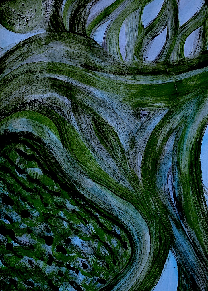
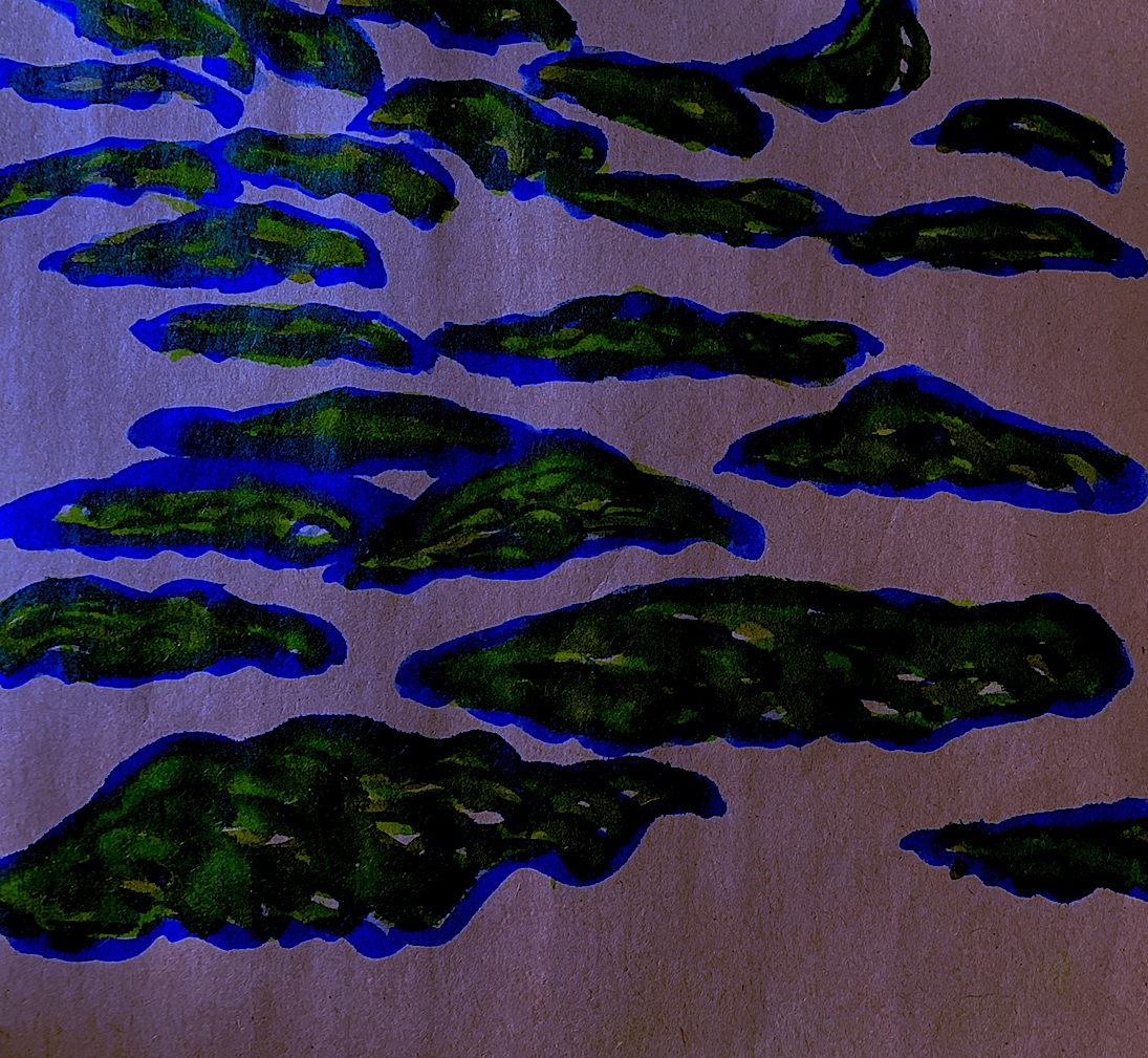
My favourite drawing within this Rubbish/Trash series is the ‘Landscape with Green Sea’ below. I like my green rippling pattern of the sea moving in from the bottom left corner like waves, and the winding pathways. The sky is a soft green and mauve treescape, windswept and branching into curling clouds. The whole drawing reveals a strange perspective with some flat areas, and some angled shapes that almost roll and turn into solid three-dimensional cylinders.
Figure 6: ‘Landscape with Green Sea’. Paint, Ink. 2021. Cathy
Week 2: PROCESS LED INQUIRY: Drawing from a Screengrab from a Film.
Drawing Processes:
* Select a fifth image(s) or item to draw.
* Analyse the image’s visual properties (figural and abstract).
* Generate multiple drawings.
* Process this image by reducing, confusing, or altering using a range of methods (i.e. charcoal, graphite, provisional paint studies, gouache, or watercolour sketches, alterations using the photocopier, overhead projector, photoshop and other digital imaging software).
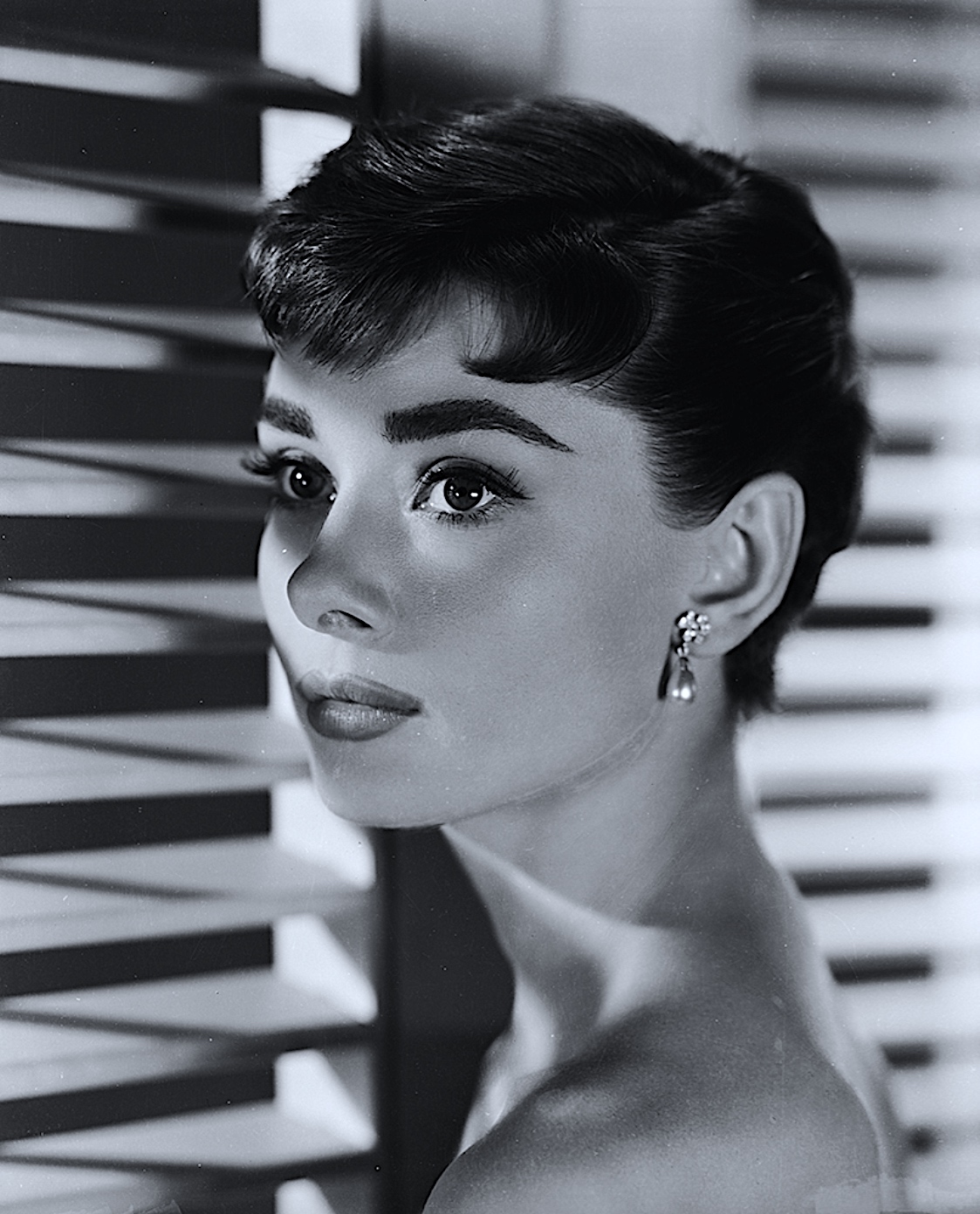
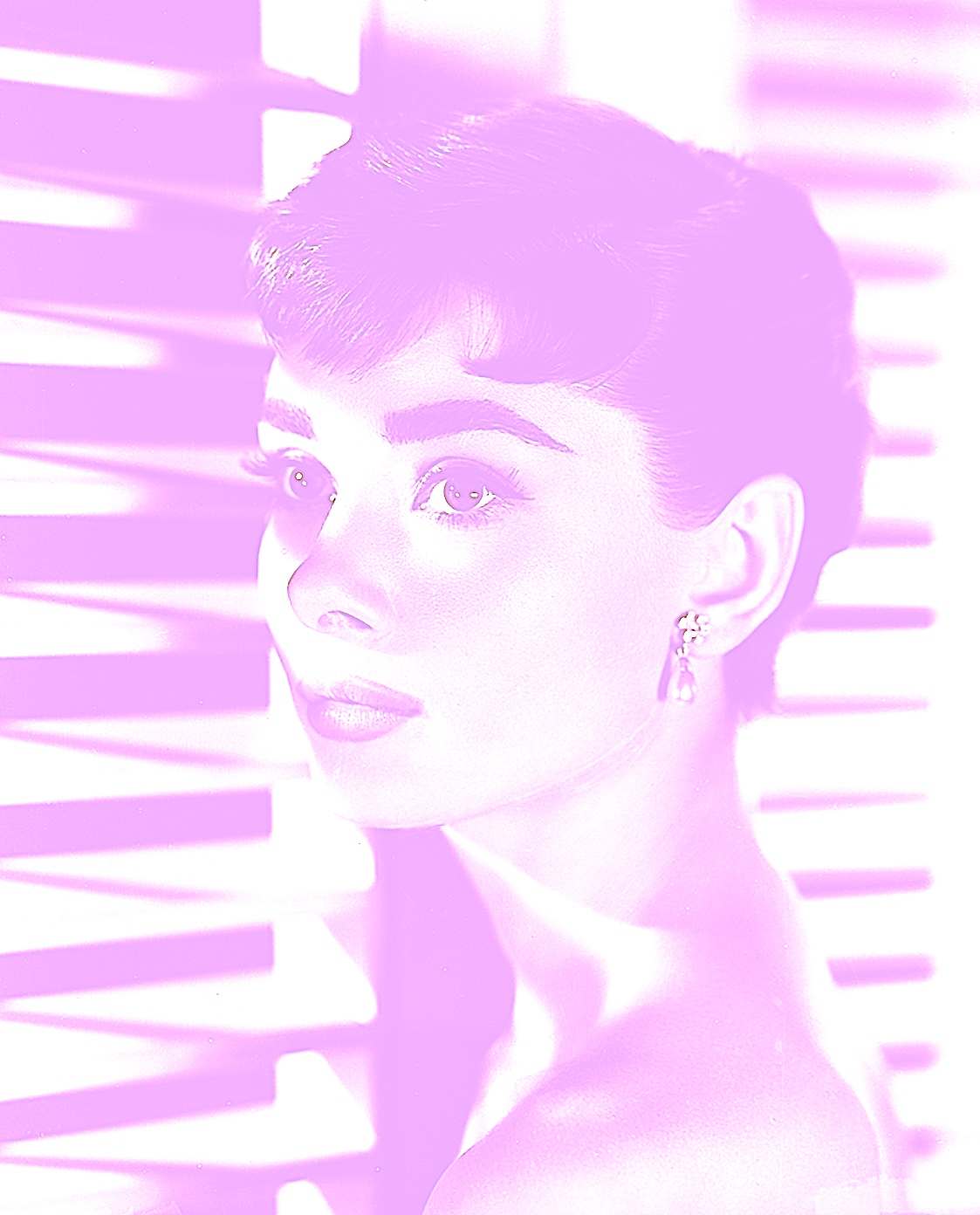
5a. Screengrab from a Film: ‘Sabrina’ (1954 Film). Audrey Hepburn (1929-1993) in ‘Sabrina’ (aka ‘Sabrina Fair’), directed by Billy Wilder. (Photo by John Kobal Foundation/Getty Images). Accessed September 28, 2021. https://gettyimagesgallery.com/images/audrey-hepburn-3/.
I chose this photo because Audrey Hepburn is exquisitely beautiful on the outside and in. There are only a few people who have that really special extra star quality, and she had that in bundles. I also like the contrast between the diagonal shutter blinds that make an interesting frame around her face.
Figure 1.‘Sabrina’ (1954 Film) Audrey Hepburn. Photo by John Kobal Foundation/Getty Images.
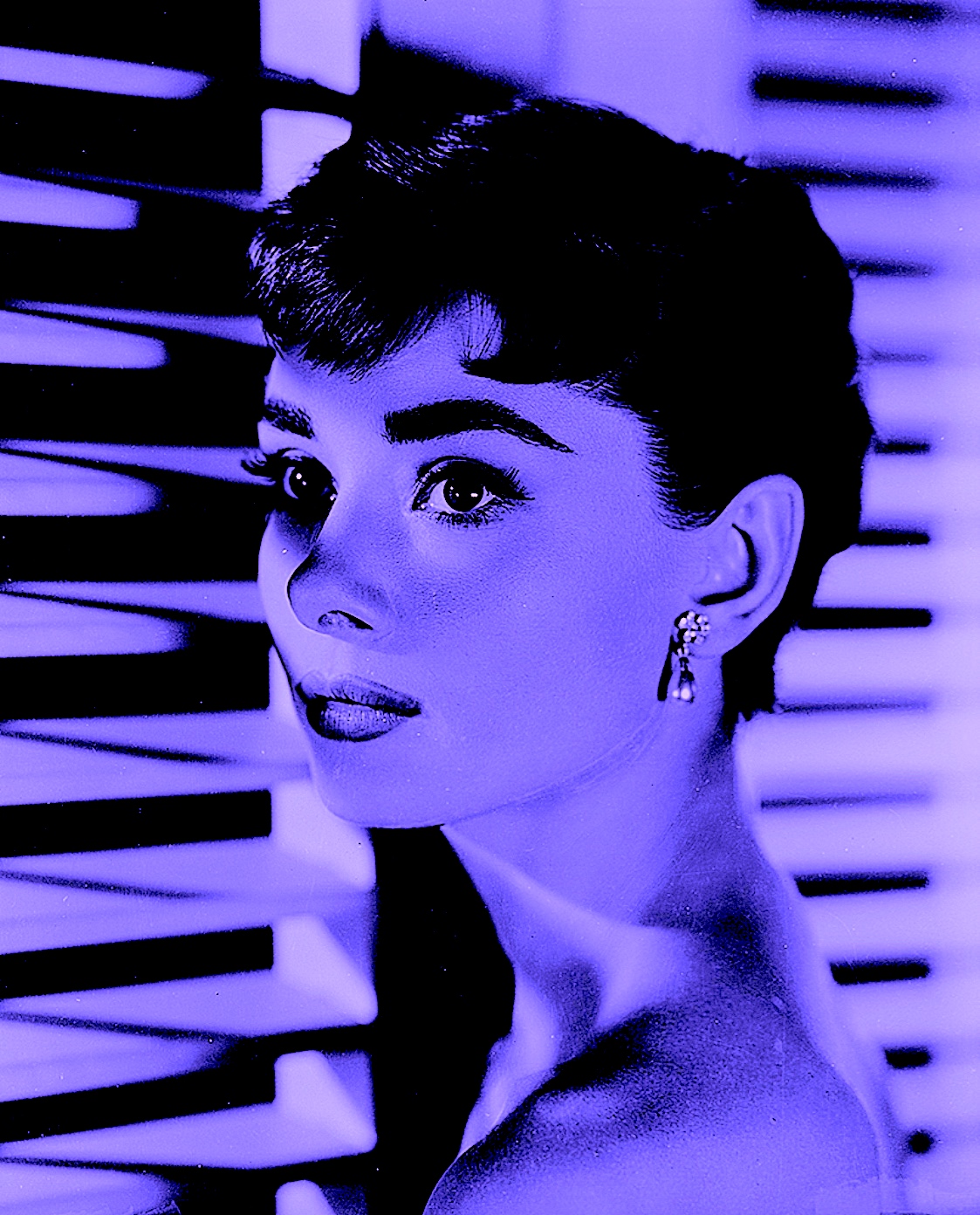
I began altering the image through digital manipulation, shading Audrey and the background in a mauve colour tone to give a feeling of dusk-light mysteriousness,.
Figure 2: ‘Purple Audrey’. 2021. Digital Art by Cathy
Then by projecting a pink hue over the entire picture I portrayed Audrey in a pastel tonal light. This monochromatic colour scheme enhanced her with a different type of beauty, unveiling a very soft, dainty and delicate elegance.
Figure 3: ‘Pink Stripe Audrey’. 2021. Digital Art by Cathy
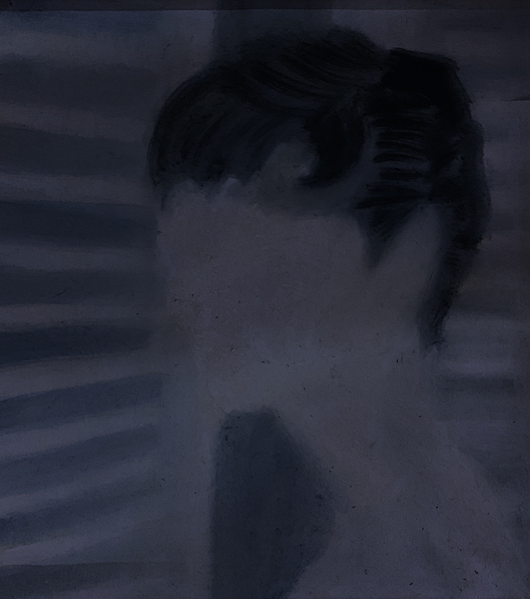
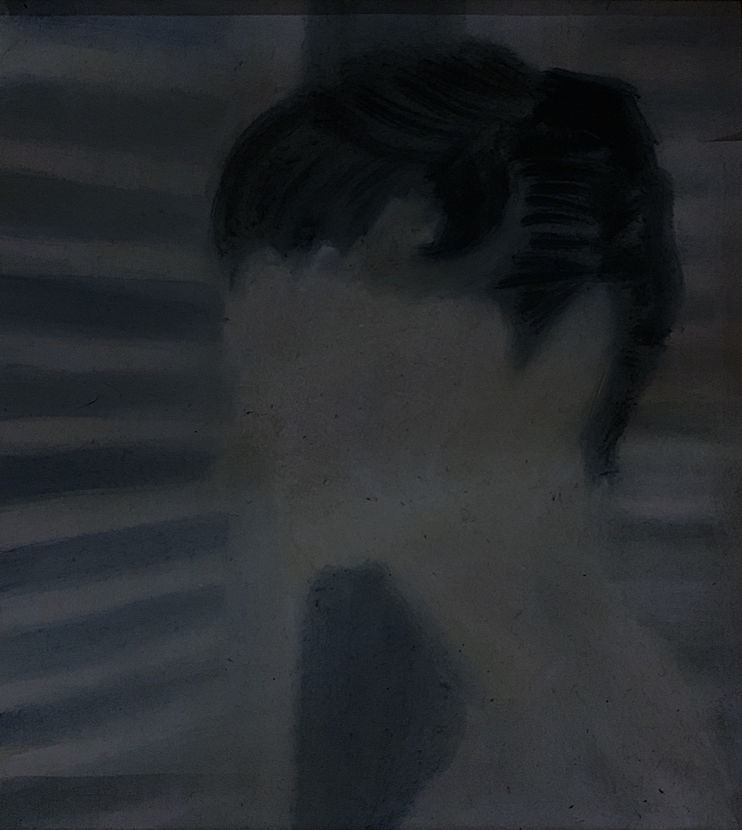
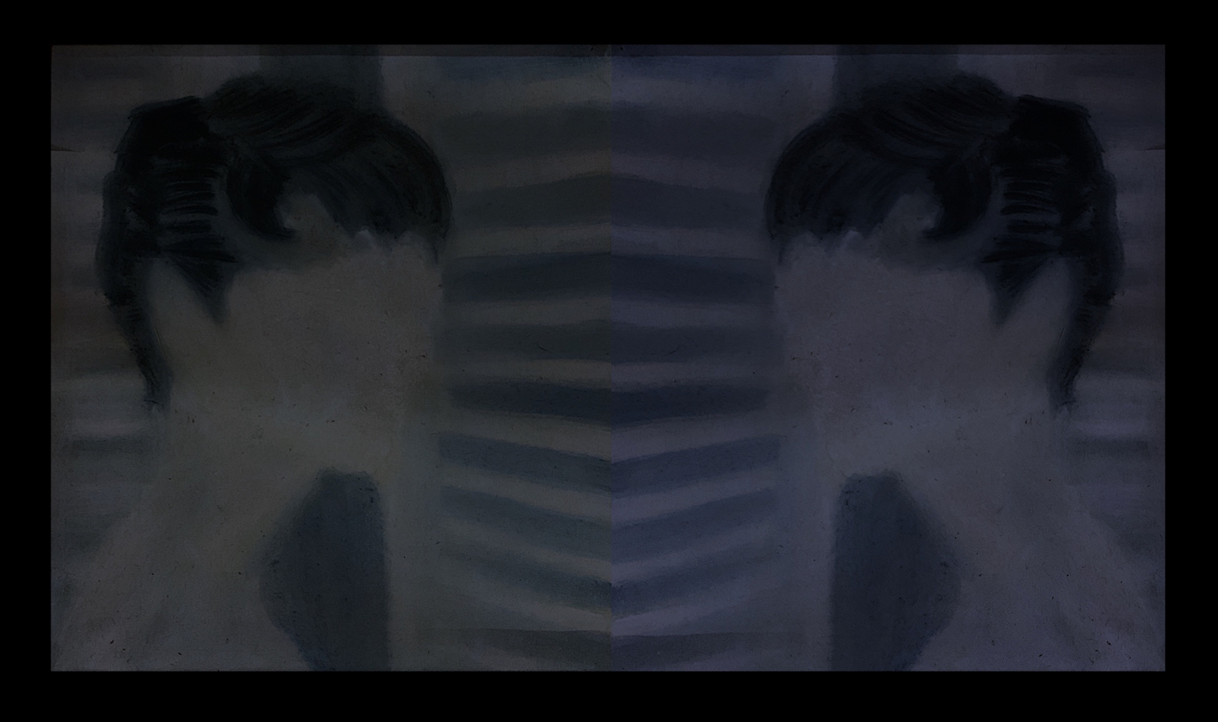
This time I changed mediums, introducing paint. I selected muted tones such as grey, blue, and pink, and made marks by gentle dabs, thin lines and thicker strokes of watercolour. I started by painting Audrey with a very pale pink face with no facial features.
Then I changed the colour scheme digitally (below) to a beige tone for a reflective work.
Figure 5: ‘Beige-Grey Blind’. Pink Watercolour turned Beige on the computer: Digital Art. 2021. Cathy
I created a digital version where I reflected Audrey in a mirror type pose next to the window of shutter blinds. I wanted to produce a subtle quality, with one side (including the head) of the picture in a beige tone, and the other with a pink tone..
Figure 6: ‘Reflective Blind’. Watercolour / Digital Art. 2021. Cathy
I then painted a darker coloured face Audrey, as if it was night-time, but as I used more water consistency her face became a lighter grey-green. I extended her cheekbones, thus exaggerated some portions of her face, I was happy with this colour scheme, as I was trying to evoke a subtle mysterious tone. For both the pink and grey painted portraits I did not feel a need to add her facial features. I just wanted a featureless face.
Next, I zoomed into chosen details from the original photograph. I chose Audrey’s pearl earring and altered the position of this object, thus the focus of it. I painted it dangling from angled blinds, centrally placed in the middle of the picture. In the photograph, Audrey’s eyes are so striking that her pearl earring becomes less obvious or significant, even though it is a symbol of status and wealth. I changed the placement of this object, thus gave it a different life, yet kept the murky darker tones.
Figure 8: ‘Blind Pearl’. Watercolour. 2021. Cathy
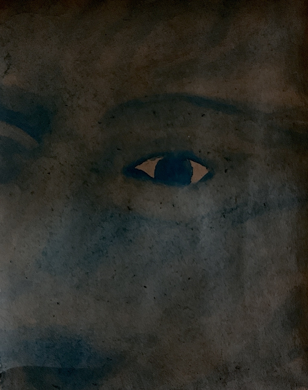
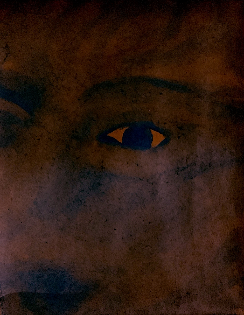
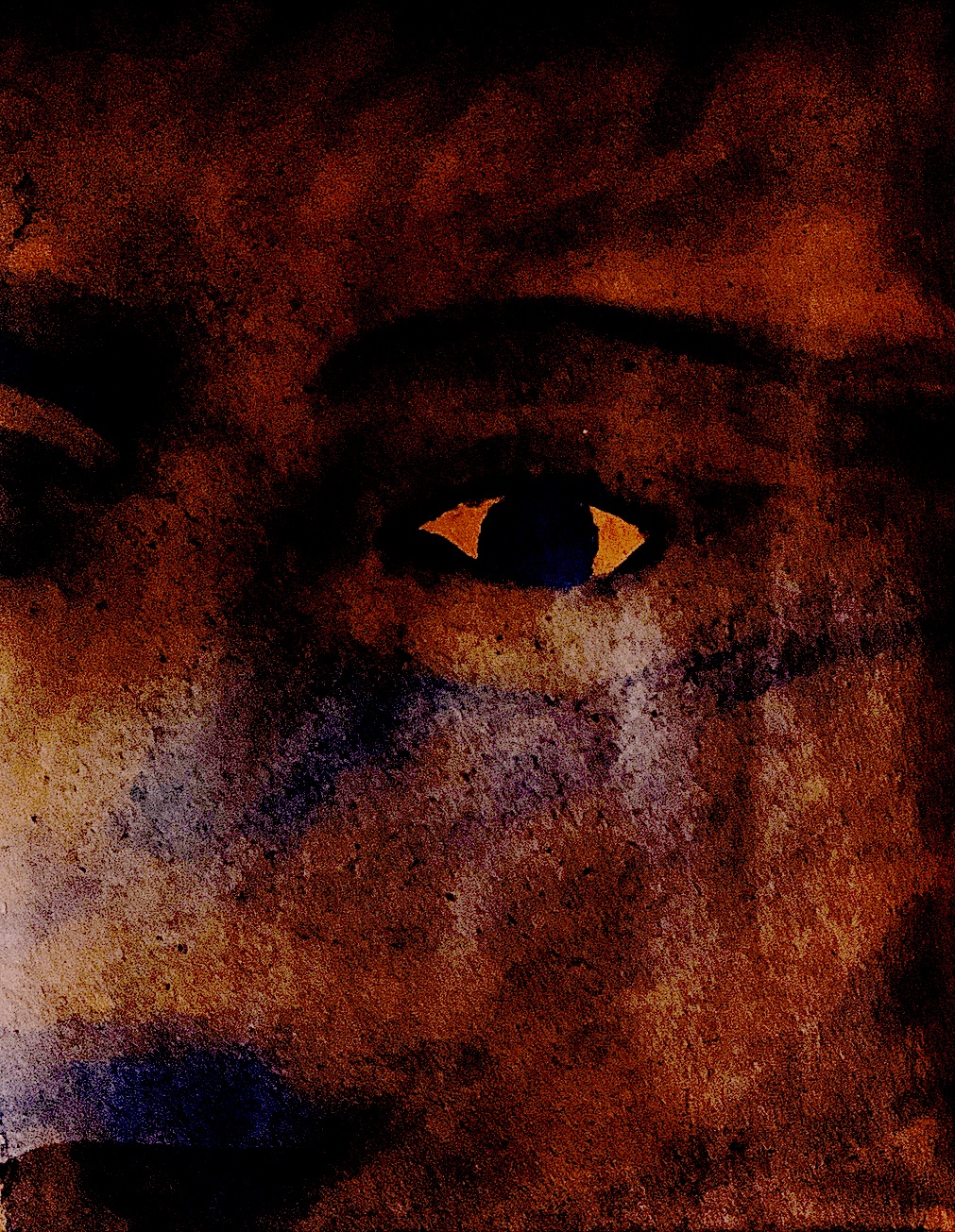
Next, I wanted to create one facial feature, an eye. It does not represent Audrey at all, (I could never do her justice), but instead I was focusing on quickly sketching an abstract eye with paint.
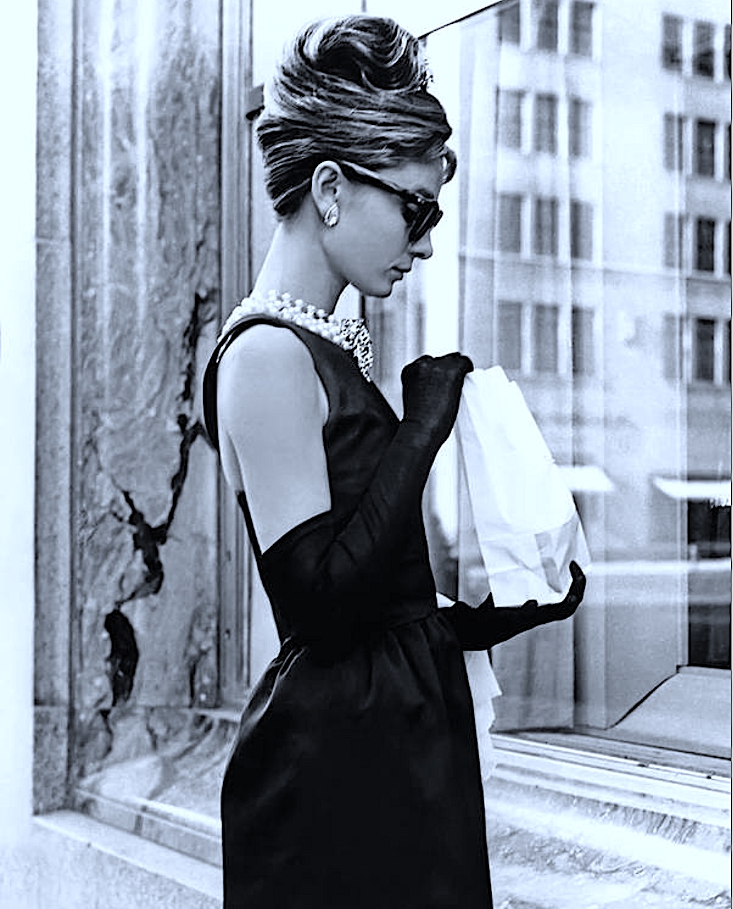
I chose this photograph instead of the famous Breakfast At Tiffany’s film image of a front-on Hepburn looking in a jewellery shop. It is an off-camera shot in a natural stance eating in between film takes, and thus I really like Hepburn’s profile pose. An actress/actor (called the Talent) has to be patient on a film set because one waits around whilst the set/lights, etc are prepared. I like the cracked paint, and vivid wear and tear on the marble(?) window ledge, and the reflective window revealing repeated images of smaller size rectangular window shapes.
Figure 12. ‘Breakfast At Tiffany’s’ Film Set. Audrey Hepburn. 1961.
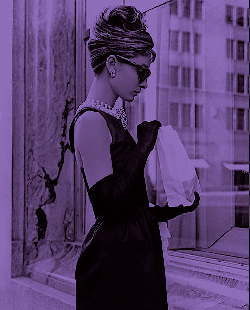
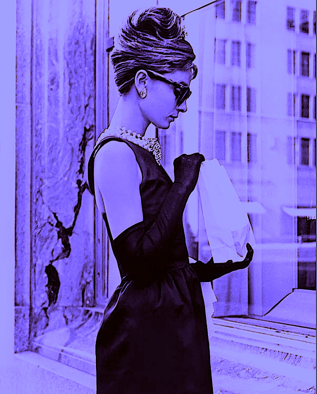
Again I introduced colour to the image via digital means.
Figure 13: ‘Mauve Crack’. 2021. Digital Art by Cathy
Figure 14: ‘Lavender Crack’. 2021. Digital Art by Cathy
Then I drew as fast as I could in biro to figure out the composition and pose shapes.
After, I used pastel to make quick sketches; the crack intrigues me, her hair curled in a massive French Roll reminds me of my ballet days, and the window reflection is interesting. Of course, I cannot forget the main star of the photograph… Hepburn is the most stunning HB creature that ever did live!!!
Figure 16: ‘Crack, French Roll, Sunglasses, Windows’. Pastel. 2021. Cathy
Week 2: PROCESS LED INQUIRY: Drawing from a Painting made before 1900.
Drawing Processes:
* Select a fourth image(s) or item to draw.
* Analyse the image’s visual properties (figural and abstract).
* Generate multiple drawings.
* Process this image by reducing, confusing, or altering using a range of methods (i.e. charcoal, graphite, provisional paint studies, gouache, or watercolour sketches, alterations using the photocopier, overhead projector, photoshop and other digital imaging software).
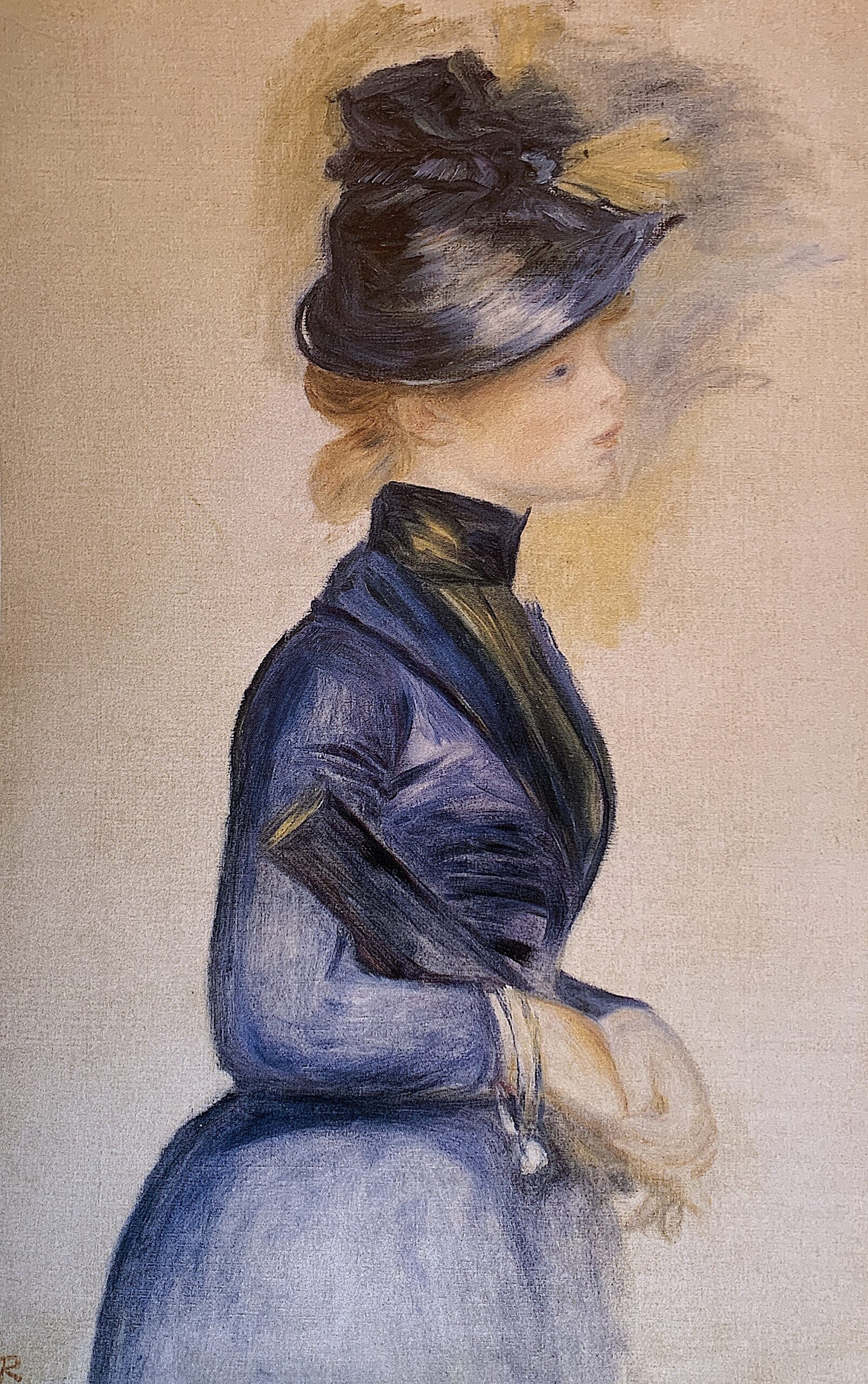
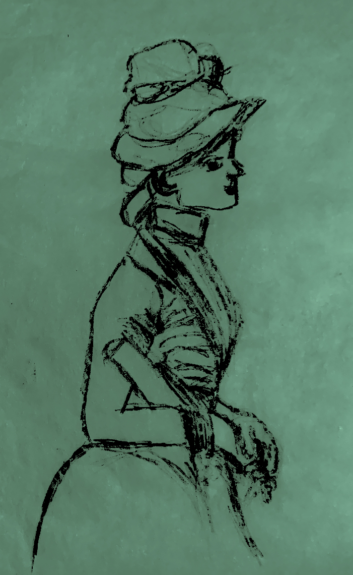
Figure 1. ‘Young Woman in Bright Blue at the Conservatory’. Pierre-Auguste Renoir. 1877. oil, canvas.
Pierre-Auguste Renoir is a beautiful painter; I am fortunate to have seen some of his paintings up close and exhibitions abroad, and here in Aotearoa.
There are a number of reasons why I chose this particular painting. It looks like a preparatory sketch, the female figure is in profile, perhaps poised to move, and I like Renoir’s use of dark navy blue. Not only is navy blue an elegant colour, but the subject matter displays elegance in her stiff late 19th century dress. Her gloved hands and face are a pale creamy white, and they match the bland neutral tone of the background. There are touches of yellowery gold paint squibbled around the hat at the top of the page like sunlight. Gold appears highlighted on the blue dress, the fabric, or feathers on the blue-black hat, and the object she is carrying. Her hair is strawberry blond and her eye is a lovely dark blue dot beneath a golden eyebrow. The female form is in profile, as if viewing a painting, but she could also be walking or taking a stride. The overall silhouette against an empty beige background also appeals, as it looks quite modern with a large empty negative shape arched around her.
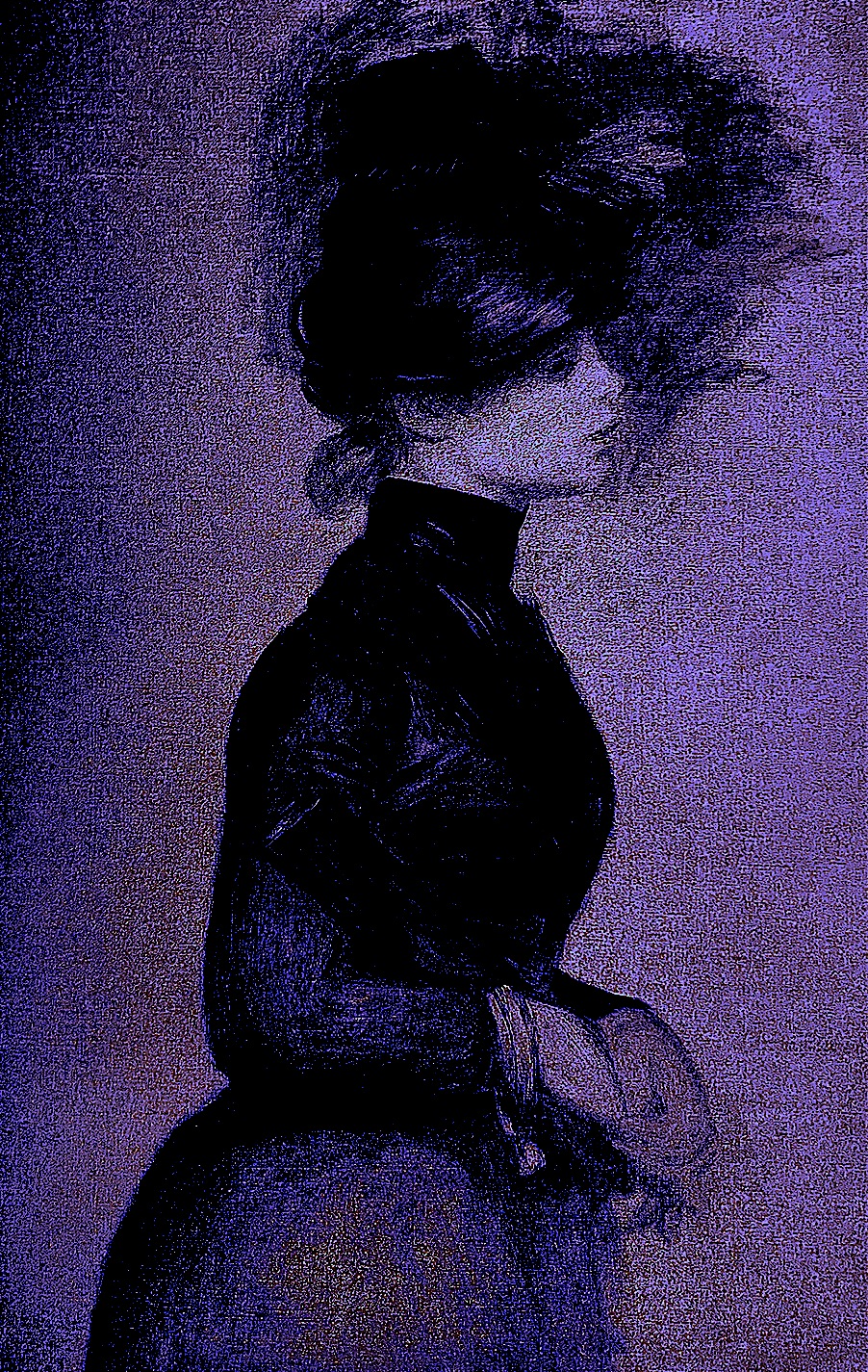
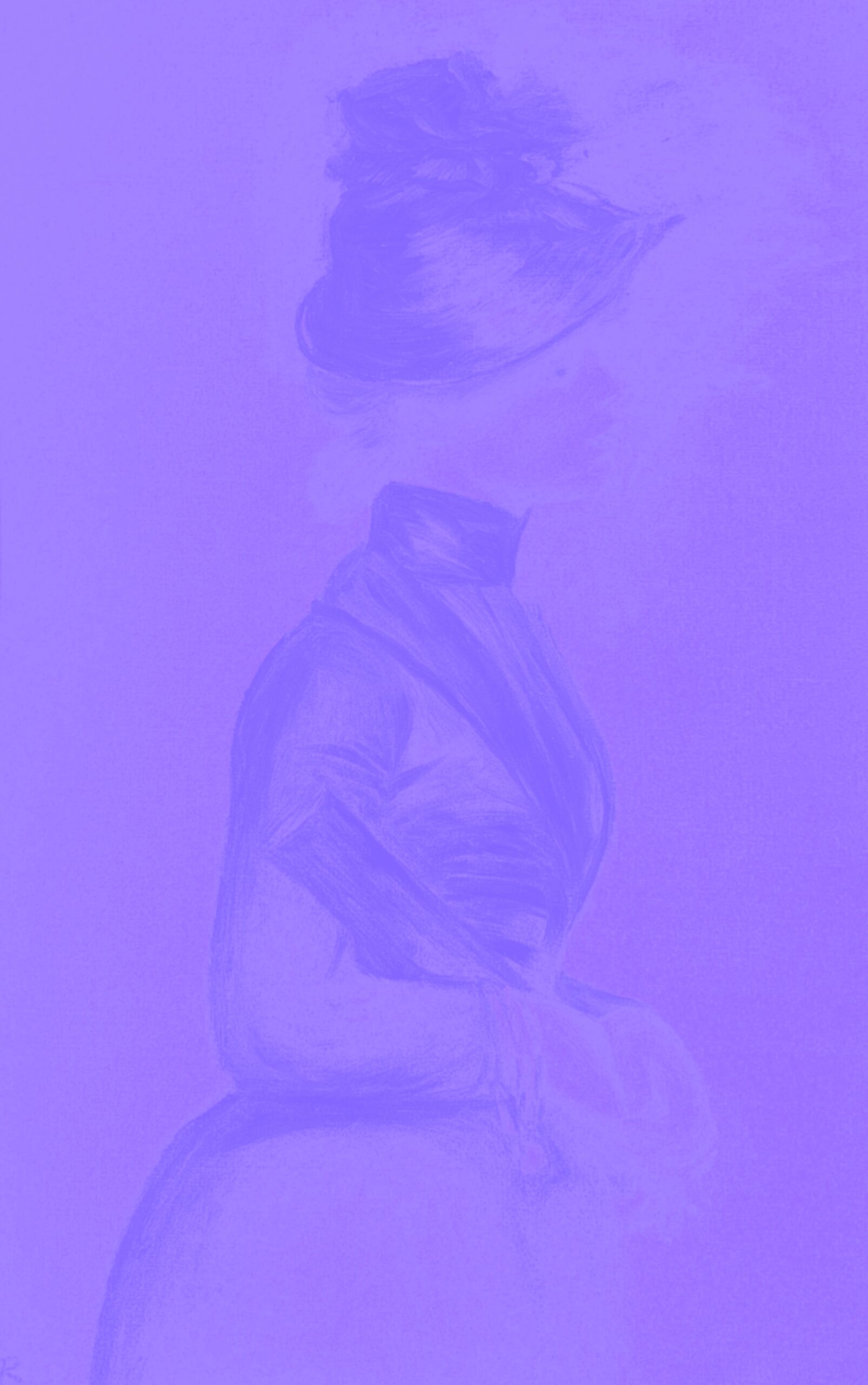
Again, I started my drawings using the computer (see below), not only changing the colour tone, but emphasising the sketchiness around her head. I wanted to create a dark moody atmosphere, like a purple storm of dark thoughts.
Figure 2. ‘Purple Evening, Black Cloud’ 2021. Digital Art by Cathy.
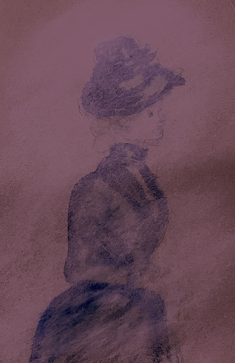
Next, I tried to create an opposite effect (see below). My goal was to make a negative-type photograph by whitening around her hat, head, gloved hands and facial features. The sketchiness around her head has now, very lightly, transformed into a white cloud of thoughts.
Figure 3. ‘Foggy Evening, White Cloud’ 2021. Digital Art by Cathy.
My first sketch was with charcoal on an old scrap of coloured paper (see below). I drew scratchy fast marks. Yet, sometimes as I sketched on certain angles, the thin charcoal stick scraped and dented the paper, but left no mark. I enlarged the eye, and gave my figure a cartoon-like expression. Thus I called her Eager Eye.
Figure 4. ‘Eager Eye’, Charcoal Sketch on green paper. 2021. Cathy.
Next, I used coloured chalk pastels over ink on brown paper. Thinking of the chosen verbs that I utilised in week 1 with paint, I shifted, slid, pushed and smudged the flakey material over the ink. The soft pastel gives both works below a mysterious quality. I then digitally manipulated both figures (5, 6) in order to change the background colour to rose pink and mauve purple.
Figure 5. ‘Rushing 1’, Pastel, Ink. 2021. Cathy.
Figure 6. ‘Rushing 2’, Pastel Ink. 2021. Cathy.
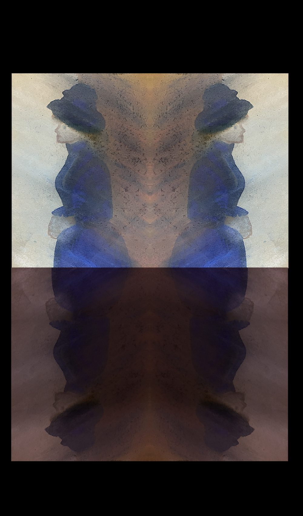
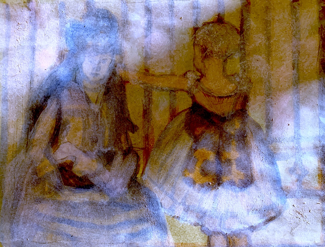
I altered Renoir’s original painting idea of one large figure, by creating 4 figures with a 4-way reflection. I placed the top pair of figures back to back, thus linking them through horizontal reflection, and then repeated the procedure to the bottom half of the picture plane with the upside down pair. By centrally placing a large background shape of brown ink and pastel, I also created another connection to these four figures. I created a darker colour on one side of the each figure to create tension between the figures, in order to evoke movement of the figures walking past or away from each other.
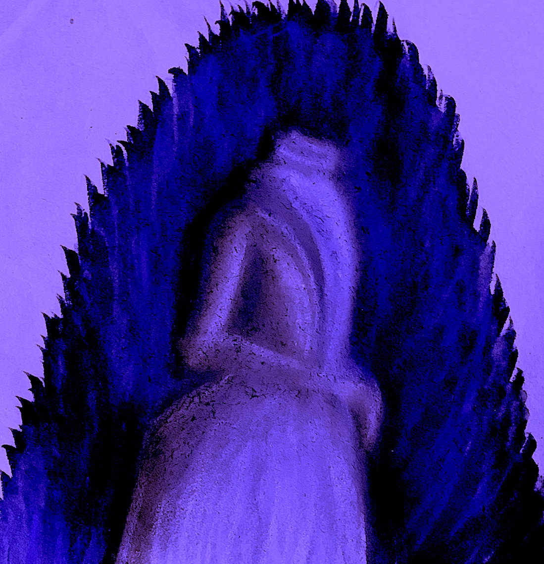
My next alteration was to just have a walking dress, with no hat or head. I lit the brown paper with a pale purple backdrop, and shrouded my dress figure in a dark navy blue feathery forest cape. This is my favourite drawing, because I enjoyed making feathery long marks.
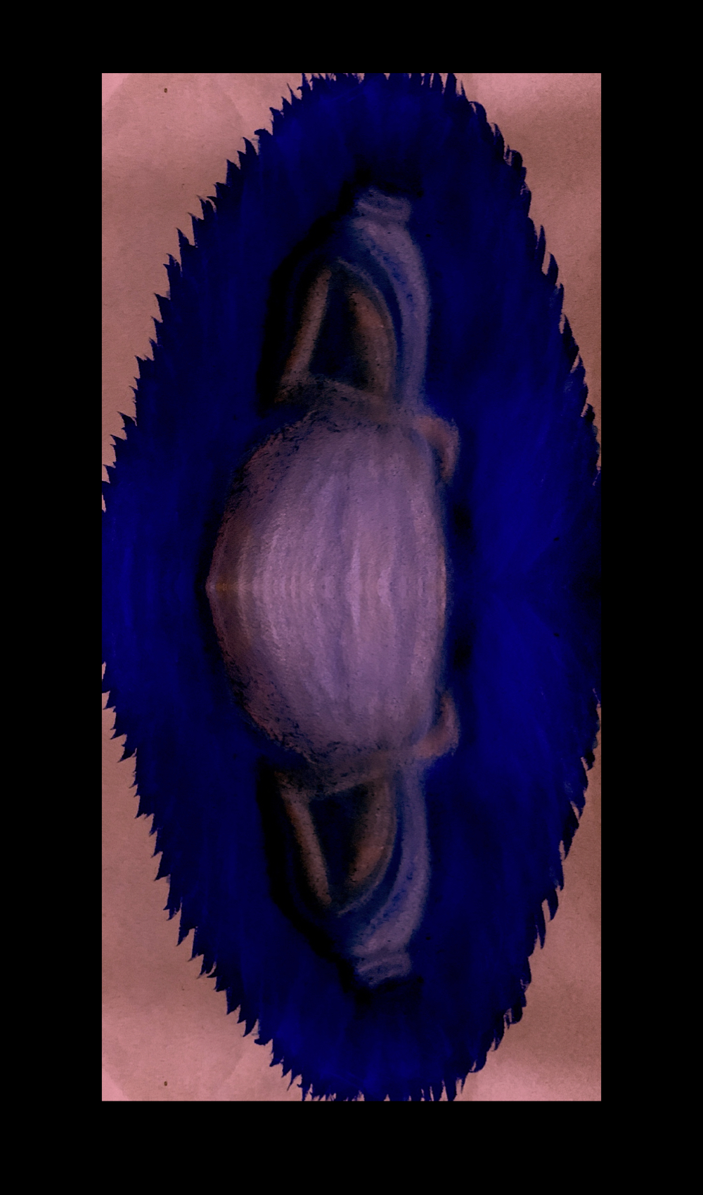
Next, I doubled and reflected my drawing through digital means. This is another process I enjoy, because I like to further enhance and develop some works, such as this work above.
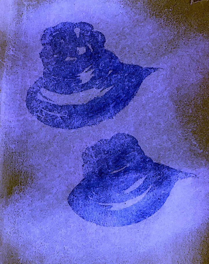
I also enjoy deconstruction. Therefore, I took apart the original image to rework a certain part. Here, I used navy ink to show enlargement and reduction. I first drew quickly a large size hat, then repeated a smaller version. They are not exactly the same because I was working free-hand. I was unconcerned with this, because I was trying to sketch with the chosen medium of ink as quickly as I was able to.
Figure 10. ‘Big Hat, Small Hat in Winter Snow’, Pastel, Ink. 2021. Cathy.
Figure 11. ‘Big Hat, Small Hat in Autumn Glow’, Pastel, Ink. 2021. Cathy.
Figure 12. ‘Big Hat, Small Hat in Springtime Green’, Pastel, Ink. 2021. Cathy.
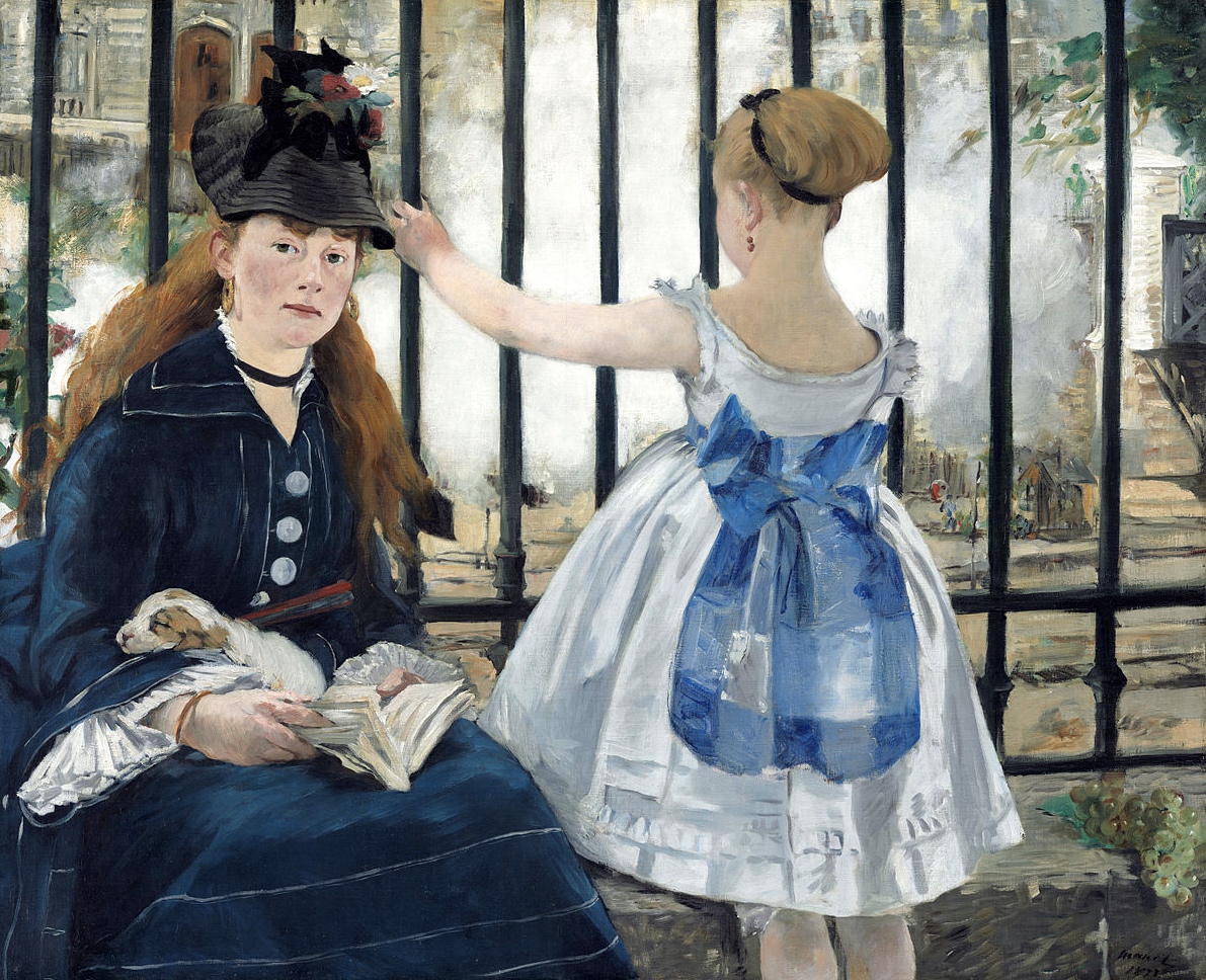
I have always admired Edouard Manet’s work, ‘The Railway’. The composition is interesting with the partitioning fence rails horizontally enclosing and confining the background scene behind the bars from the foreground. The fence structure pushes the figures right up to the front of the picture plane, squishing them. I like the forward, backward stance of the figures, and the way the female on the left stares strongly at the viewer. In particular, this painting appeals to me, because it reminds me of an enjoyable childhood novel: ‘The Railway Children’ (1906) by Edith Nesbit, later transformed into a film, then a television series.
Figure 13. (4b) Edouard Manet, The Railway, 1873, oil on canvas, Gift of Horace Havemeyer in memory of his mother, Louisine W. Havemeyer, 1956.10.1.
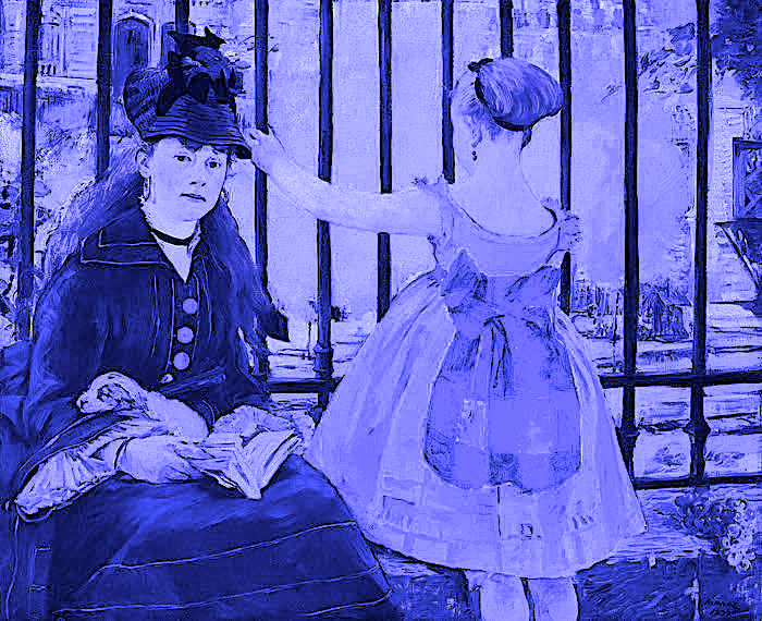
I altered Manet’s painting by changed the colour palette, making it one whole hue of purple. For some reason, I like monochromatic palette schemes.
Figure 14. ‘Indigo Wait’ 2021. Digital Art by Cathy.
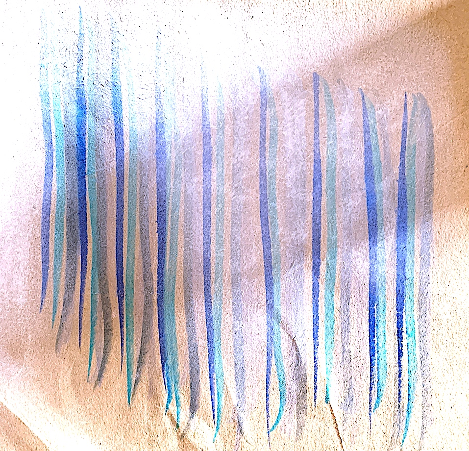
Then, I drew a sketch free-hand with light marks, choosing to use soft fawn and grey ink colours. I made fast marks, as quickly as I could, and my wobbly fence post bars made me laugh. I wanted to give a sense of light, so I subtracted some marks with a rubber to create a large shadow. This overcrosses and highlights the figures, and represents an oncoming train, unlike Manet’s work. I smudged and blended white and pink pastel to symbolise the billowy vapour of the Steam locomotives.
By simplification I abstracted the fence post bars, and drew quickly (and messily) long lengths of vertical lines. Now, I see a repetitive line-up of cool-toned ribbons from dark blue to grey hanging on the washing line. Again to add contrast, and interest, I drew the same size shadow as above, but first this time. I then placed pastel around the edges, and created a negative space before applying the ribbons of colour on top. I like how the neutral brown paper bag shows through.
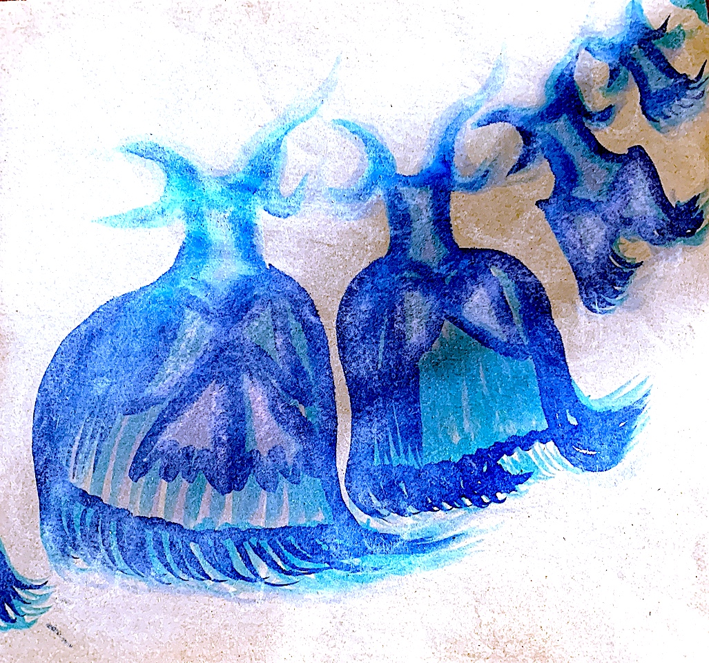
Next, I drew in ink a curving line-up of dancing dresses, (again with no bodies within). Through repetition, and reduction in size, each dress lost a portion of itself. First the bow ribbons drop off, then the bow, and then the tassel frills, etc. as each dress diagonally dances towards the top corner of the picture plane. Again, I first created a diagonal curving shadow (leaving the neutral paper exposed and with no colour) to highlight the shapes moving across the stage space.
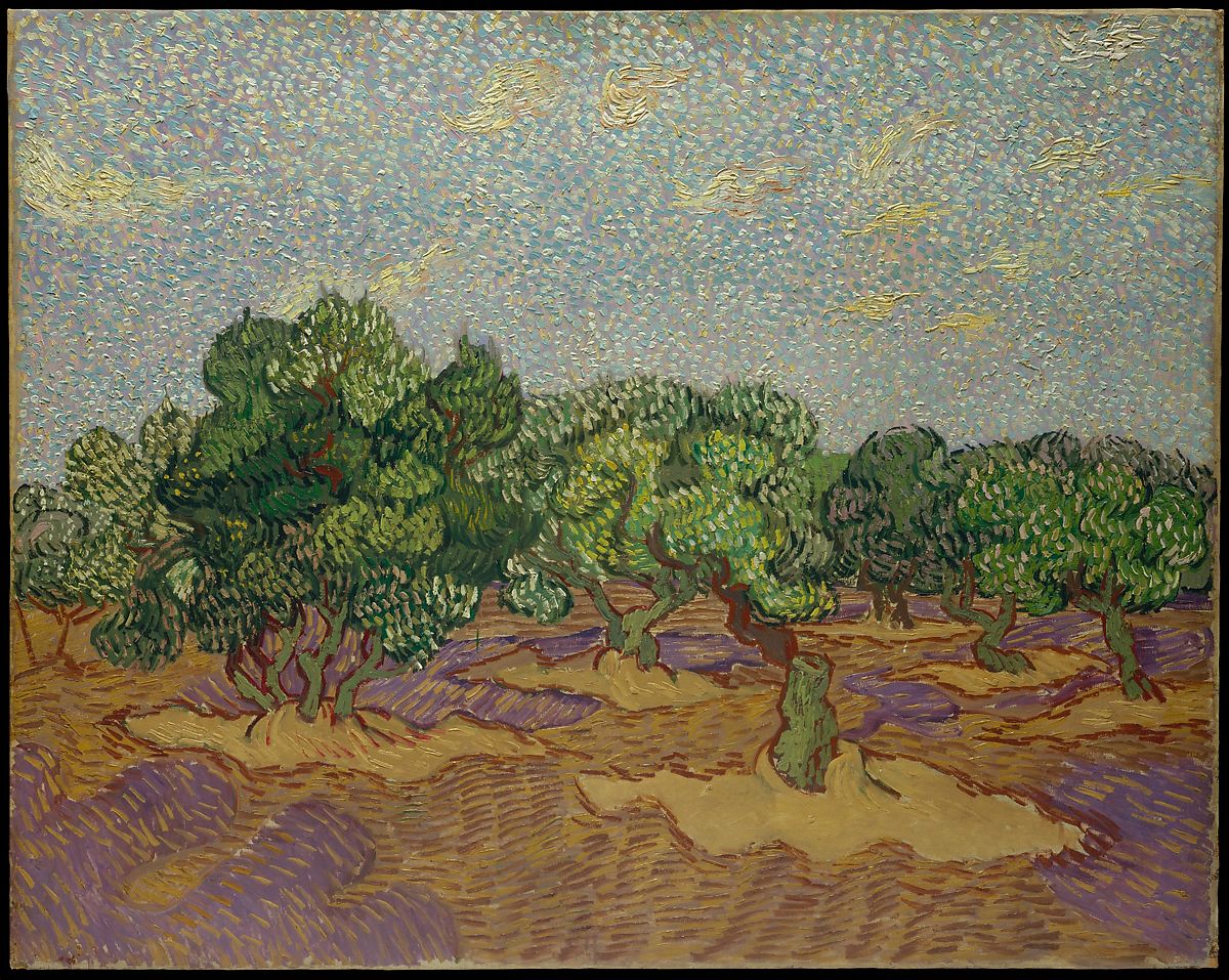
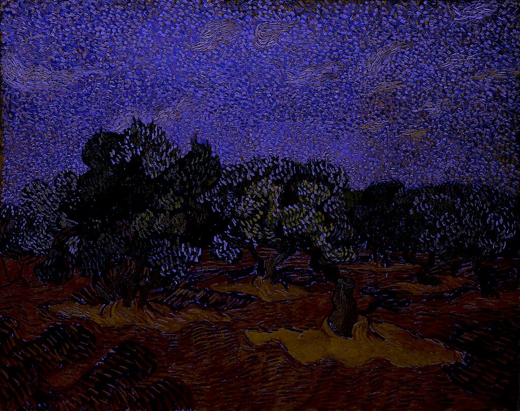
4c. PAINTING made before 1900: ‘Olive Trees’. oil on canvas. 1889. Vincent van Gogh (Dutch, Zundert 1853–1890 Auvers-sur-Oise). Dimensions: 28 5/8 x 36 1/4 in. (72.7 x 92.1 cm). The Metropolitan Museum. Credit Line: The Walter H. and Leonore Annenberg Collection, Gift of Walter H. and Leonore Annenberg, 1998, Bequest of Walter H. Annenberg, 2002. Accessed September 28. 2021. Accession Number: 1998.325.1. https://www.metmuseum.org/art/collection/search/437998.
I chose one of Vincent van Gogh’s ‘Olive Tree’ oil paintings because I admire his series of Olive trees, plus I do love olives, and trees. I own a book with his letters, where he discusses the beautiful French countryside, the Apple tree blossoms and the Olive trees to his brother Theo.
Figure 18. (4c.) ‘Olive Trees’. oil on canvas. 1889. Vincent van Gogh (Dutch, Zundert 1853–1890 Auvers-sur-Oise). Dimensions: 28 5/8 x 36 1/4 in. (72.7 x 92.1 cm).
I altered the colours and made the leaves pop off the trees in purple.
Figure 19. ‘Purple Leaves ‘ 2021. Digital Art by Cathy.
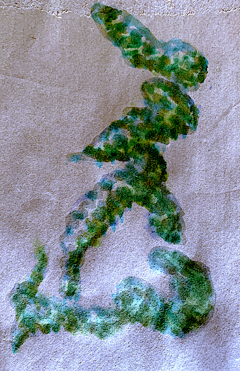
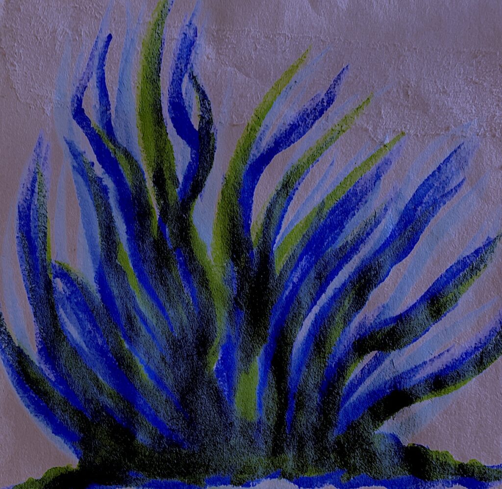
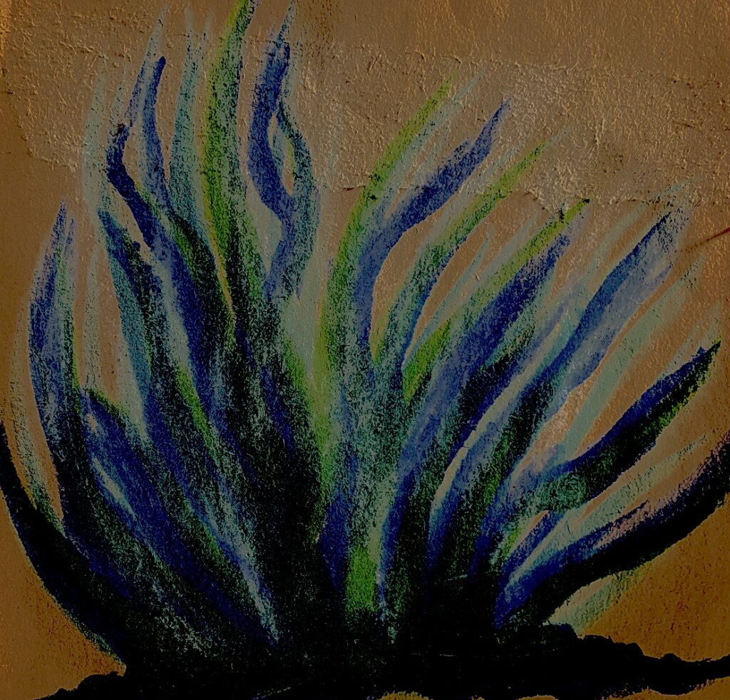
I quickly abstracted shapes from Van Gogh’s painting. I was drawn to the clouds, the shadowy shapes beneath the trees, and the tree trunks.
Instead of drawing a tree trunk with branches, my tree trunks became thin and ribbon-like, stretching upwards and linking at the bottom into clumps. My final drawing transformed into a harakeke plant from Aotearoa, rather than a large, thick set, gnarled Vincent Van Gogh tree trunk.
Week 2: PROCESS LED INQUIRY: Drawing from Printed Fabric.
Drawing Processes:
* Select a third image(s) or item to draw.
* Analyse the image’s visual properties (figural and abstract).
* Generate multiple drawings.
* Process this image by reducing, confusing, or altering using a range of methods (i.e. charcoal, graphite, provisional paint studies, gouache, or watercolour sketches, alterations using the photocopier, overhead projector, photoshop and other digital imaging software).
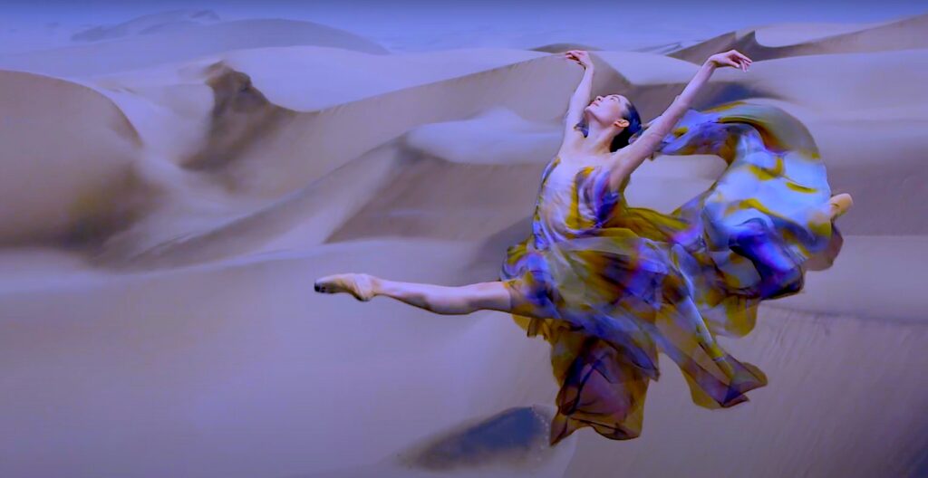
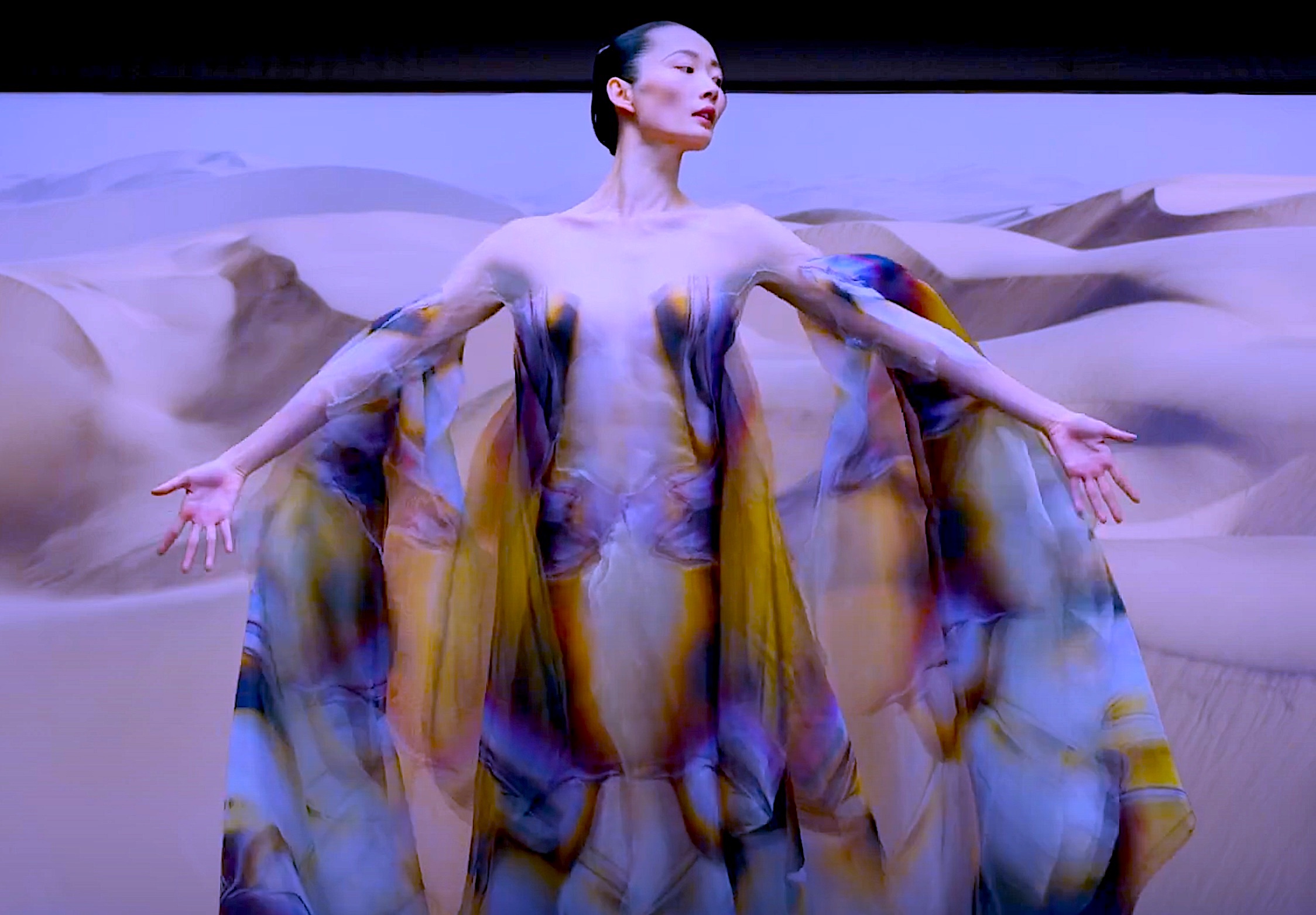
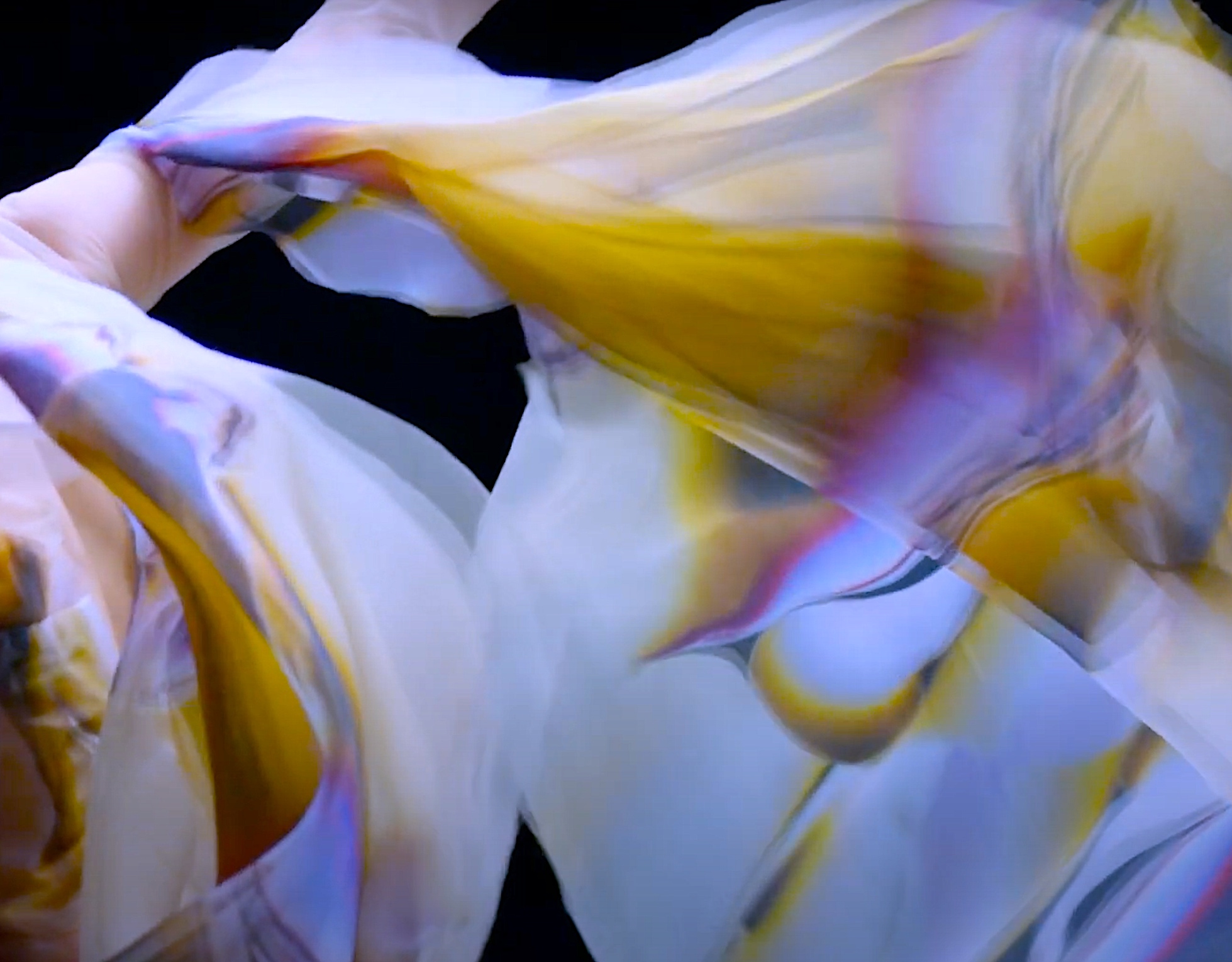
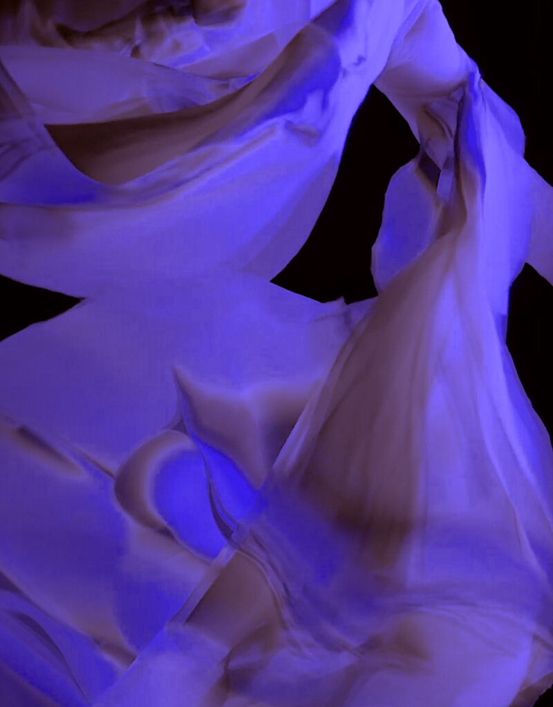
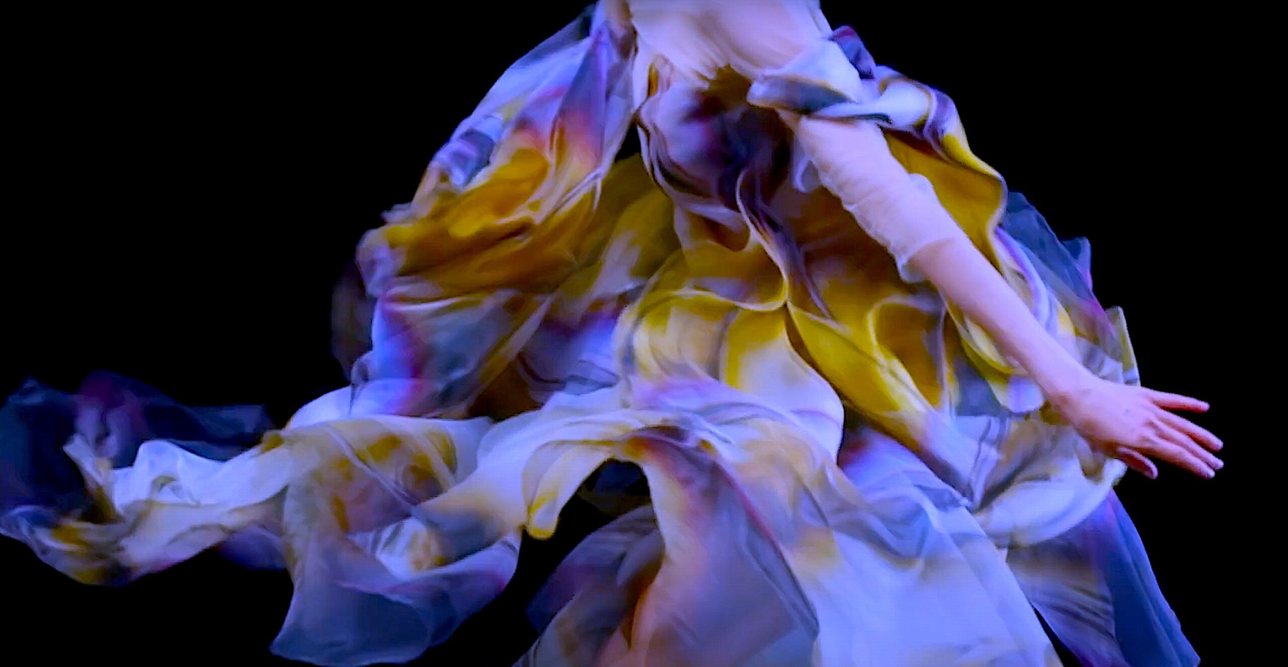
The fabric of this fashion outfit and dance costume is extraordinary. I love how it falls, drapes and moves with the dancer. This was an easy selection, yet quite difficult to draw quickly, because I really enjoyed adding and blending colour. I love the pattern textures, shapes, lines and colours of all the costume fabric in the film, but I chose this fabric because of the paua shell rainbow effect of the gold, blue, pink and purple palette.
Figure 1: Photographic Still (screenshot) by Cathy from Dance Film: ‘Biomimicry’. Haute Couture Fashion Dress / Dance Costume by Designer Iris van Herpen in collaboration with the Dutch National Ballet Company. Figure 2: Photographic Still (screenshot) by Cathy from Dance Film: ‘Biomimicry’. Haute Couture Fashion Dress / Dance Costume by Designer Iris van Herpen in collaboration with the Dutch National Ballet Company. Figure 3: ‘Blue Purple’. 2021. Digital Art by CathyFigure 4: ‘Purple’. 2021. Digital Art by CathyFigure 5. Photographic Still (screenshot) by Cathy from Dance Film: ‘Biomimicry’. Haute Couture Fashion Dress / Dance Costume by Designer Iris van Herpen in collaboration with the Dutch National Ballet Company. Figure 6: ‘Purple Brown’. 2021. Digital Art by CathyFigure 7. Photographic Still (screenshot) by Cathy from Dance Film: ‘Biomimicry’. Haute Couture Fashion Dress / Dance Costume by Designer Iris van Herpen in collaboration with the Dutch National Ballet Company.
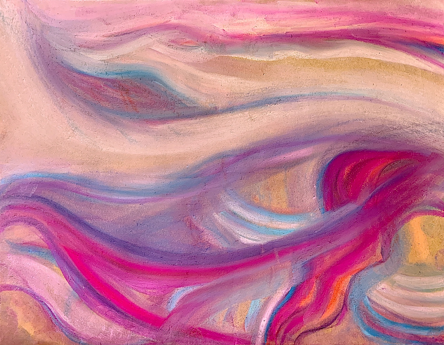
I enjoy mixing and merging colours, and creating smooth and rough textural surfaces with paint and pastel. Pastel is an easy material to manipulate, so I began with this medium, then selected some colours from the fabric (e.g., cerise, cream, golden yellow, blue and purple). I focused on both colour and line simultaneously, with a desire to produce the folds and creases of a fabric portion. I also tried to evoke in my still life drawing the movement quality of the dancing costume fabric.
Figure 8. ‘Movement 1’, Pastel. 2021. Cathy.
Figure 9. ‘Movement 2’, Pastel. 2021. Cathy.
Figure 10. ‘Movement 3’, Pastel – Digital Art 2021. Cathy.
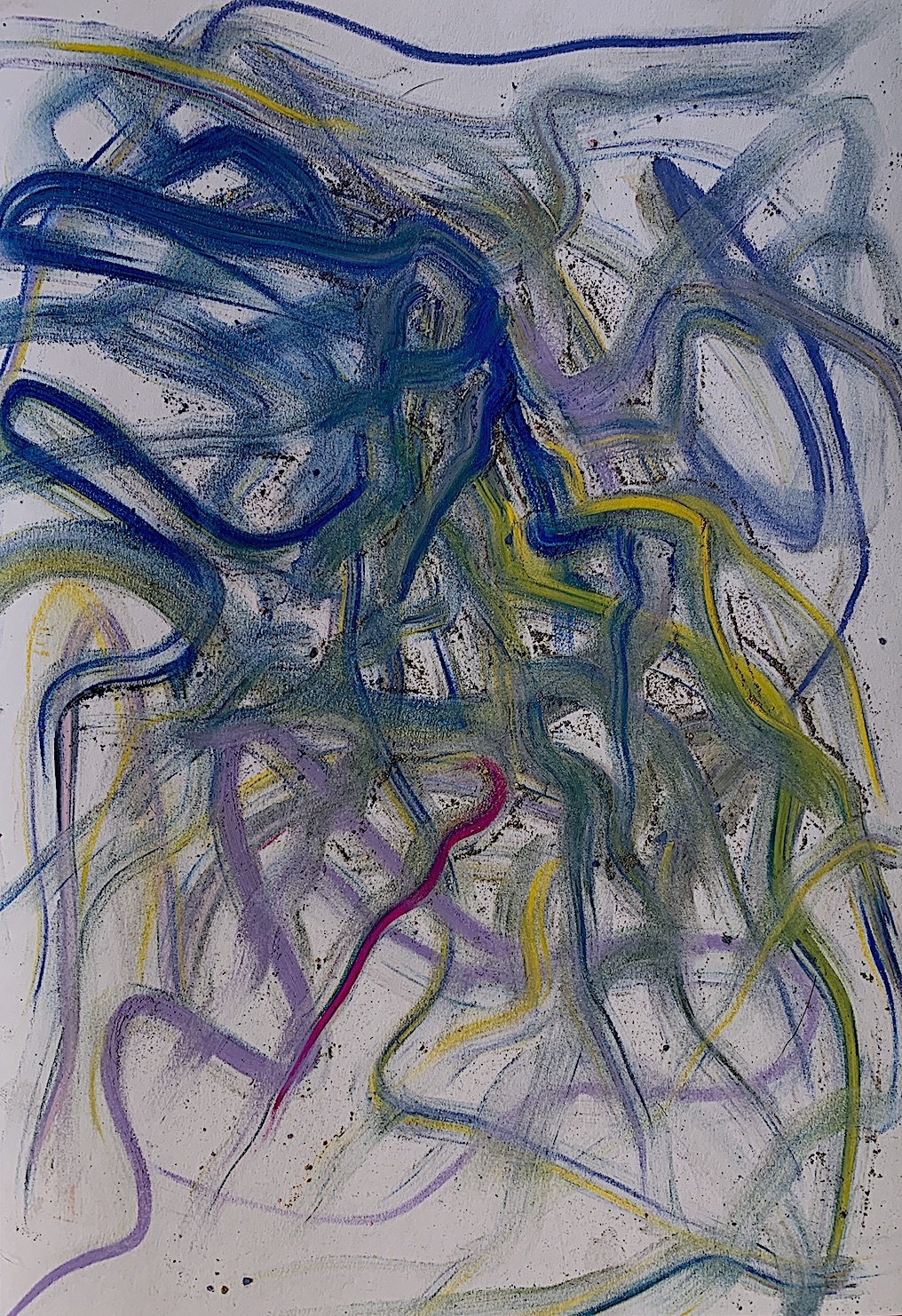
My favourite drawing happen very fast, (below), and began as one of two drawings on a left-hand side of the A3 size paper (below left). Yet, suddenly I flowed across to the other side, and my second drawing (below right) became part of the first, even though I made some different marks.
Across, over and under, appear many soft and delicate marks, set and arranged quickly around the space. I like the colours and lines that have been inspired by the fabric such as the blue, golden yellow, cerise and purple. I worked really hard, not thinking, just doing… with loose gestures, and a gravitational pull.
Figure 20. ‘Abstract Fabric Movement 2’. Pastel. 2021. Cathy.
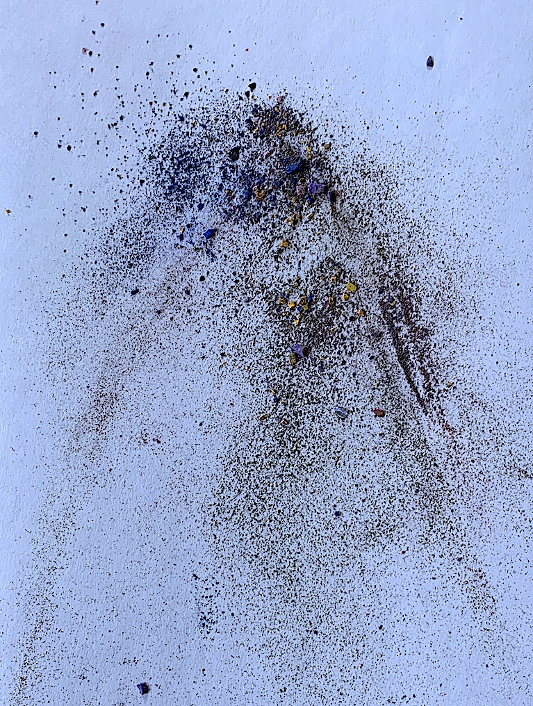
I realised I was making a mess with many flakes breaking from the pastel sticks, therefore I gathered, and let go for gravity and chance to take over. I loved how they dropped, cascaded like a waterfall into the shape of a coned mountain.
Figure 23. Pastel Remnants. 2021. Cathy.
From one drop, I used my fingers and the verbs to pull, smudge, smear, drag, lift, flow, curl and undulate. It was lovely to make thin, snake-like and delicate threads (below) from the hard pastel pigment crumbs and slithers (above).
Figure 25. Pastel Remnants Dance Verbs and Move Up Side Down. 2021. Cathy.
On a thin length of brown paper, I again dropped remnants of my pastel work. Mostly blue and white smears created another design (left: Figure 26). Then, I digitally altered this blue/white work through repetition to make a grey, green and red work.
Left: Figure 26. Pastel Remnants Dance Verbs Lengthways. Pastel, Brown Paper, 2021. Cathy.Right: Figure 27. Pastel Remnants Dance Verbs Lengthways. Pastel, Brown Paper – Digital Art 2021. Cathy.
Left: Figure 28. Pastel Remnants Dance Verbs Lengthways. Pastel, Brown Paper – Digital Art. 2021. Cathy.Right: Figure 29. Pastel Remnants Dance Verbs Lengthways. Pastel, Brown Paper – Digital Art 2021. Cathy.
Week 2: PROCESS LED INQUIRY: Drawing from a Photo without People.
Drawing Processes:
* Select a second image or item to draw.
* Analyse the image’s visual properties (figural and abstract).
* Generate multiple drawings.
* Process this image by reducing, confusing, or altering using a range of methods (i.e. charcoal, graphite, provisional paint studies, gouache, or watercolour sketches, alterations using the photocopier, overhead projector, photoshop and other digital imaging software).
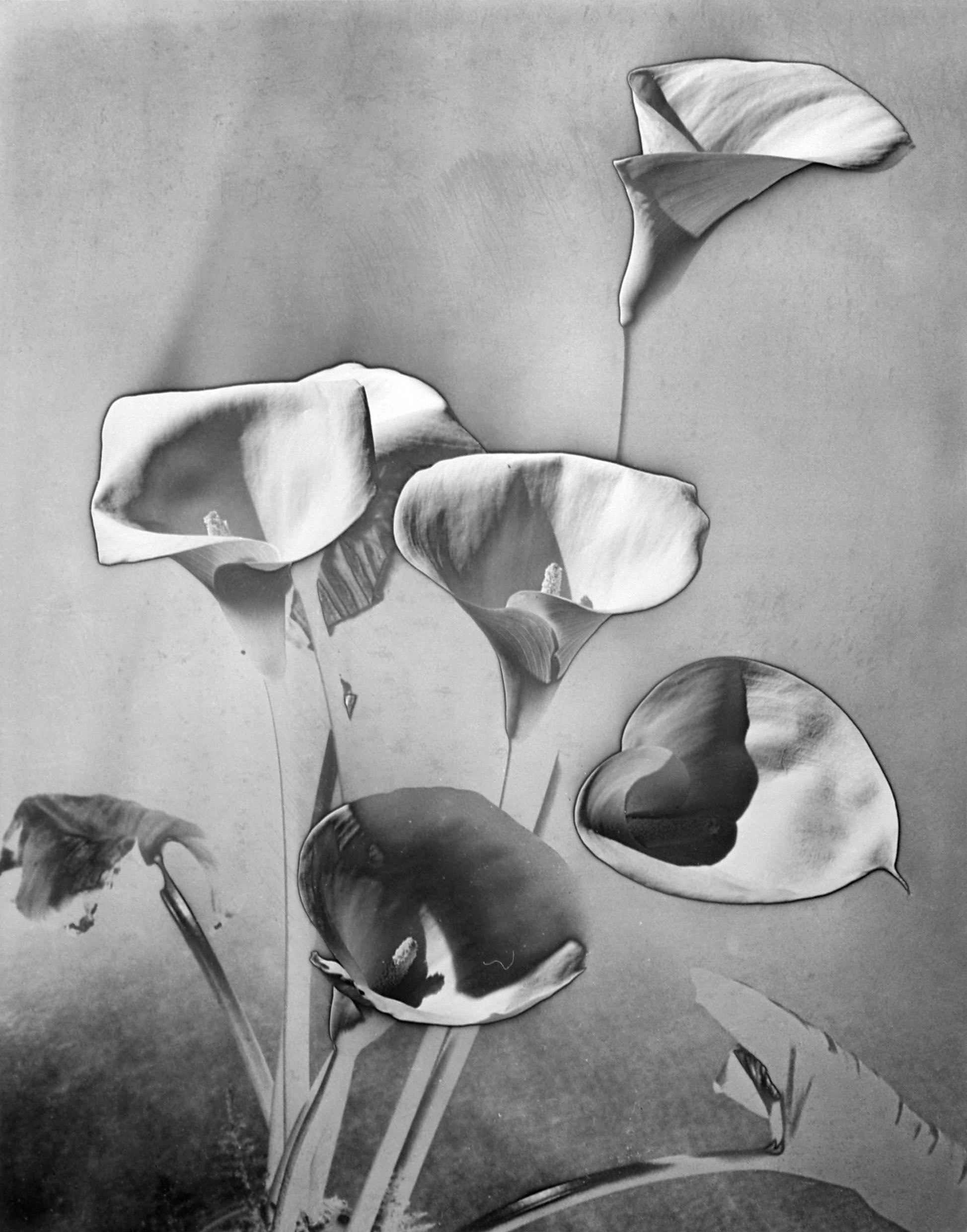
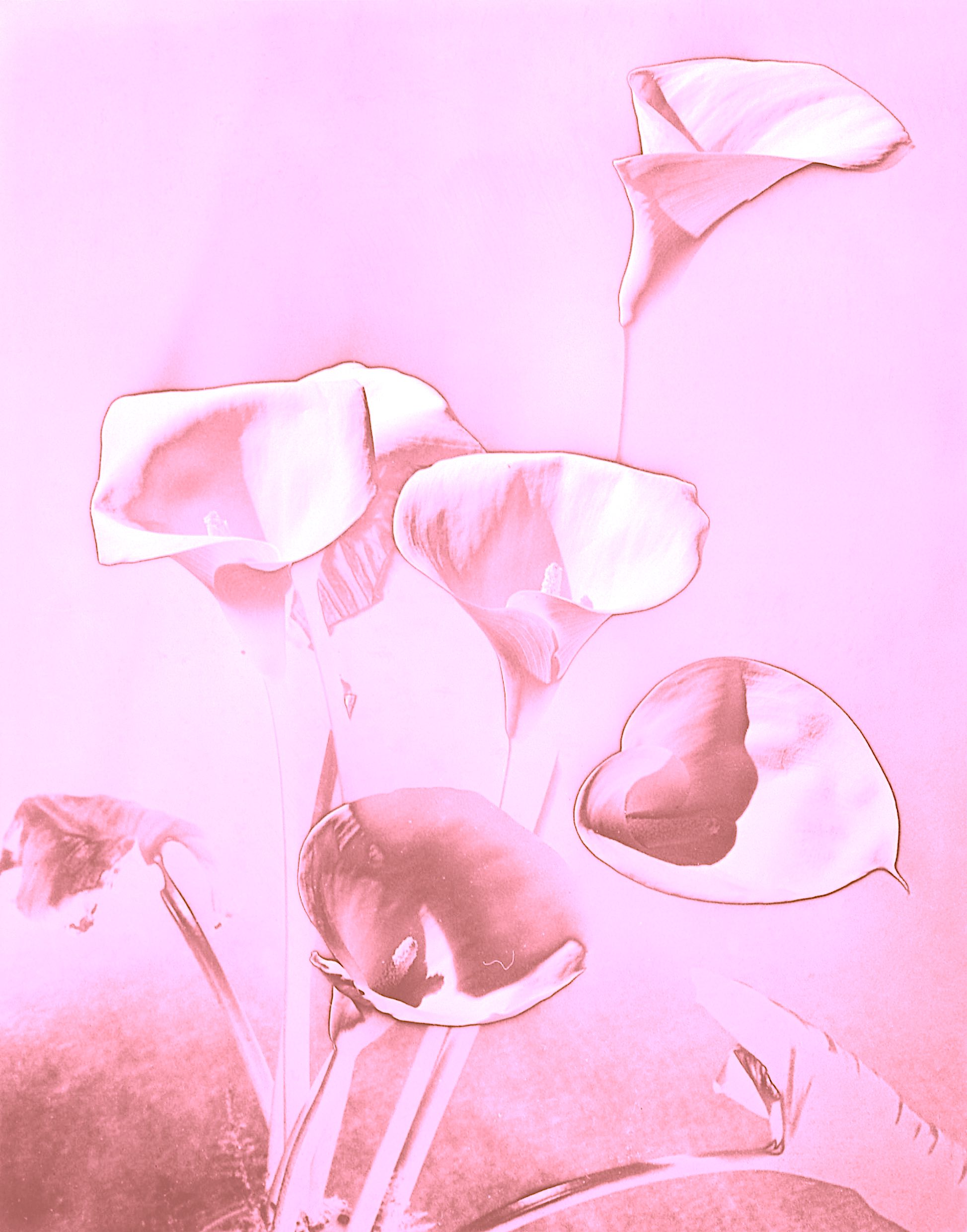
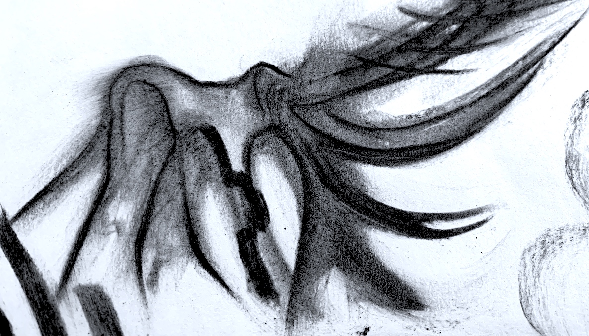
Figure 1. ‘Les arums’, 1930 ca solarisation Photographie de Man Ray.
“It has never been my object to record my dreams, just the determination to realize them.” (1945) Man Ray.
Born Emmanuel Radnitzky, Man Ray (1890-1976) is an inspirational artist to me, creating some extraordinary art in the 20th century. He worked across historical art movements (e.g., Dadaism, Surrealism and Cubism) and explored many mediums such as photography, painting, collage, drawing, sculpture and film.
Man Ray made many photograms, which he called Rayographs (photographs without the aid of a camera). The key elements of his photographic style included working with different media to create Object art and Rayographs. By exposing the light to arranged objects onto the photographic paper, and repeating this process up to three times, he gained compelling works that appear like x-rays and reveal an unusual light. Man Ray experimented and explored the effects of tonal reversal in solarization, where a thin black line may show a distinction between the reversed photographed areas compared to the non-reversed parts of the image.
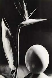
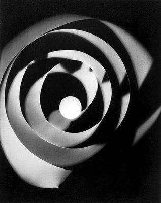
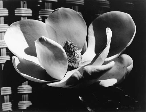
In my search for a photograph with no people I discovered many interesting photographs by Man Ray, such as an egg and Bird of Paradise plant still life, sculptural and architectural formations, and some lovely flowers such as a magnolia.
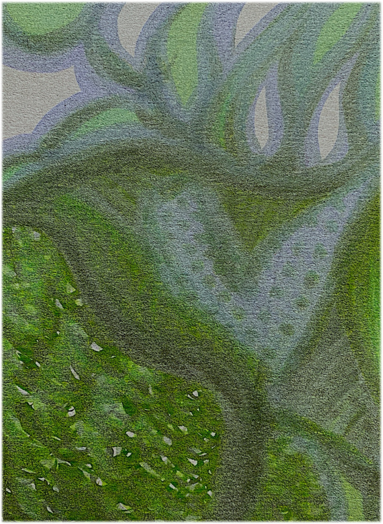
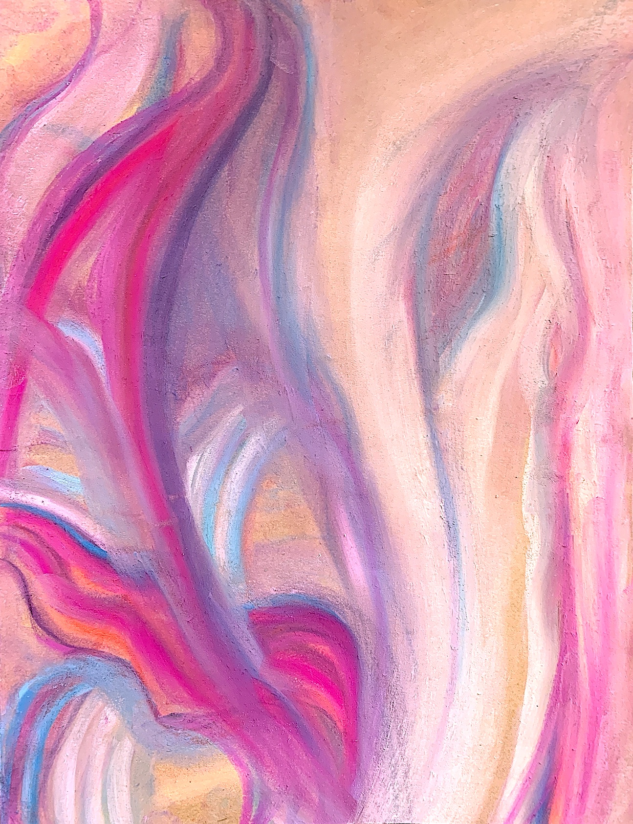
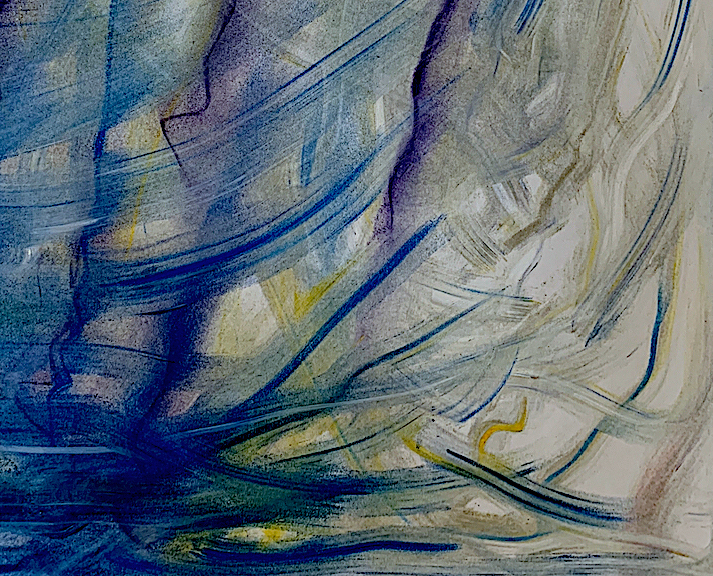
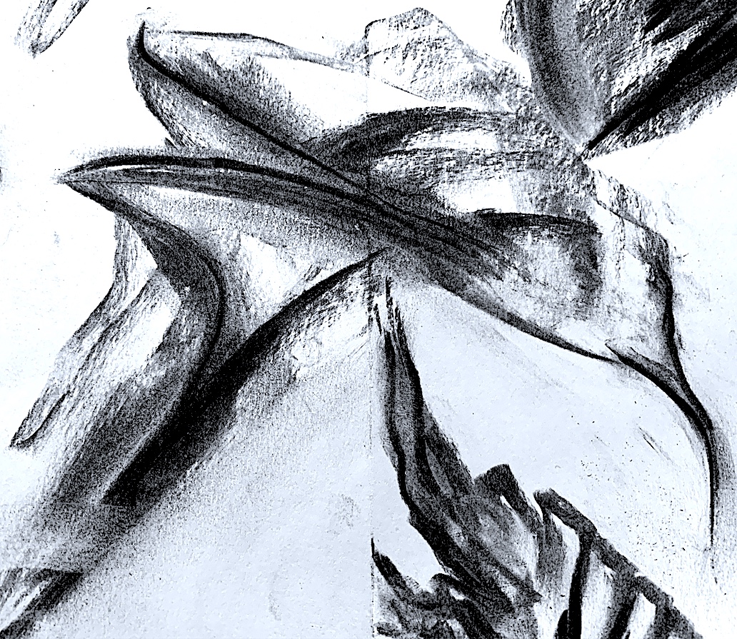
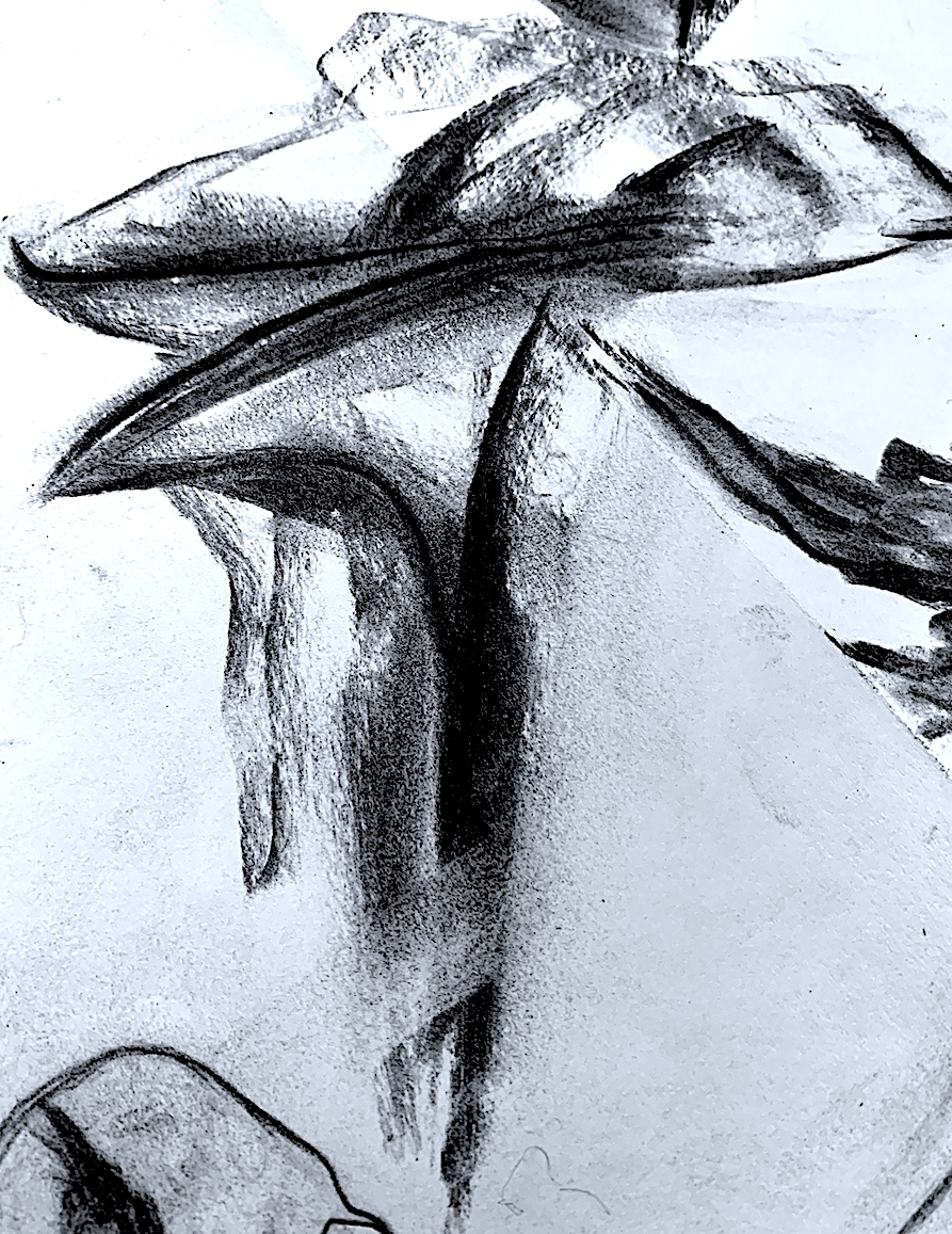
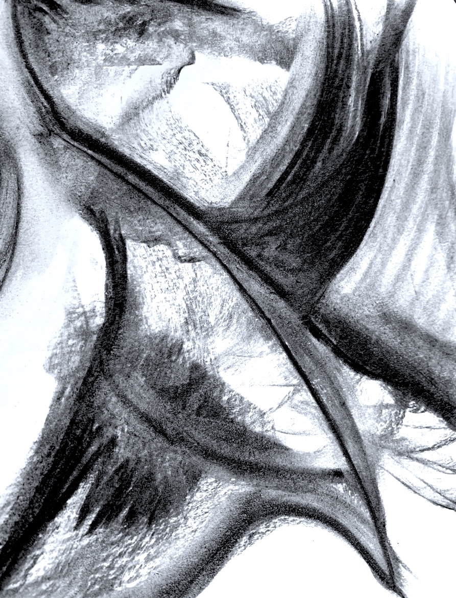
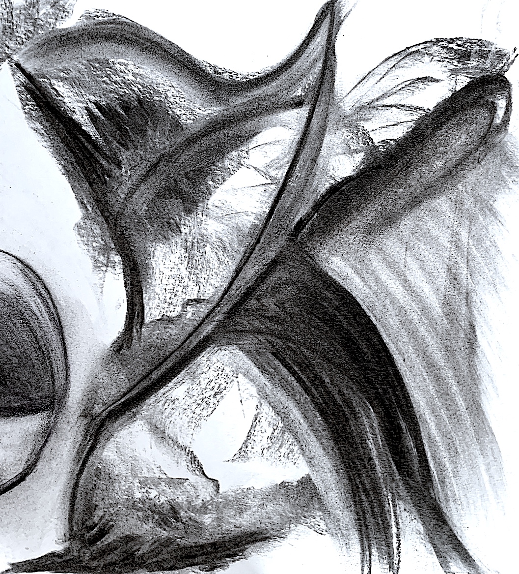
Yet, I chose ‘Les Arums’ (The Arums) because I like lilies, and I like the strange, mysterious silvery-tinted tone covering the black and white work. As I drew my first sketch (Figure 9), I noticed the solarization effect of the thin dark shadowy outline surrounding each flower petal edge. Some flower heads have no connecting stem, and one appears to float, and is not attached. I wonder if Man Ray had knowledge of the fact that every part of the Arum lily (Zantedeschia genus) is poisonous. Whereas, the Calla lilies (Calla genus) growing in my garden and the Arum’s colourful smaller version and same plant family, are not.
I am inspired by flowers, and I began this process again with digital manipulation. The reason is, it is a helpful way to get to know the selected work and Man Ray’s photographic composition. His flowers seem to be very close to the viewer, forced up against the foreground. There is little background space, perhaps a sheet or wall close behind, therefore the flowers were set and arranged in a small space. The plant’s pot base (or a vase?) that the stems propell out of, is not seen in the picture plane.
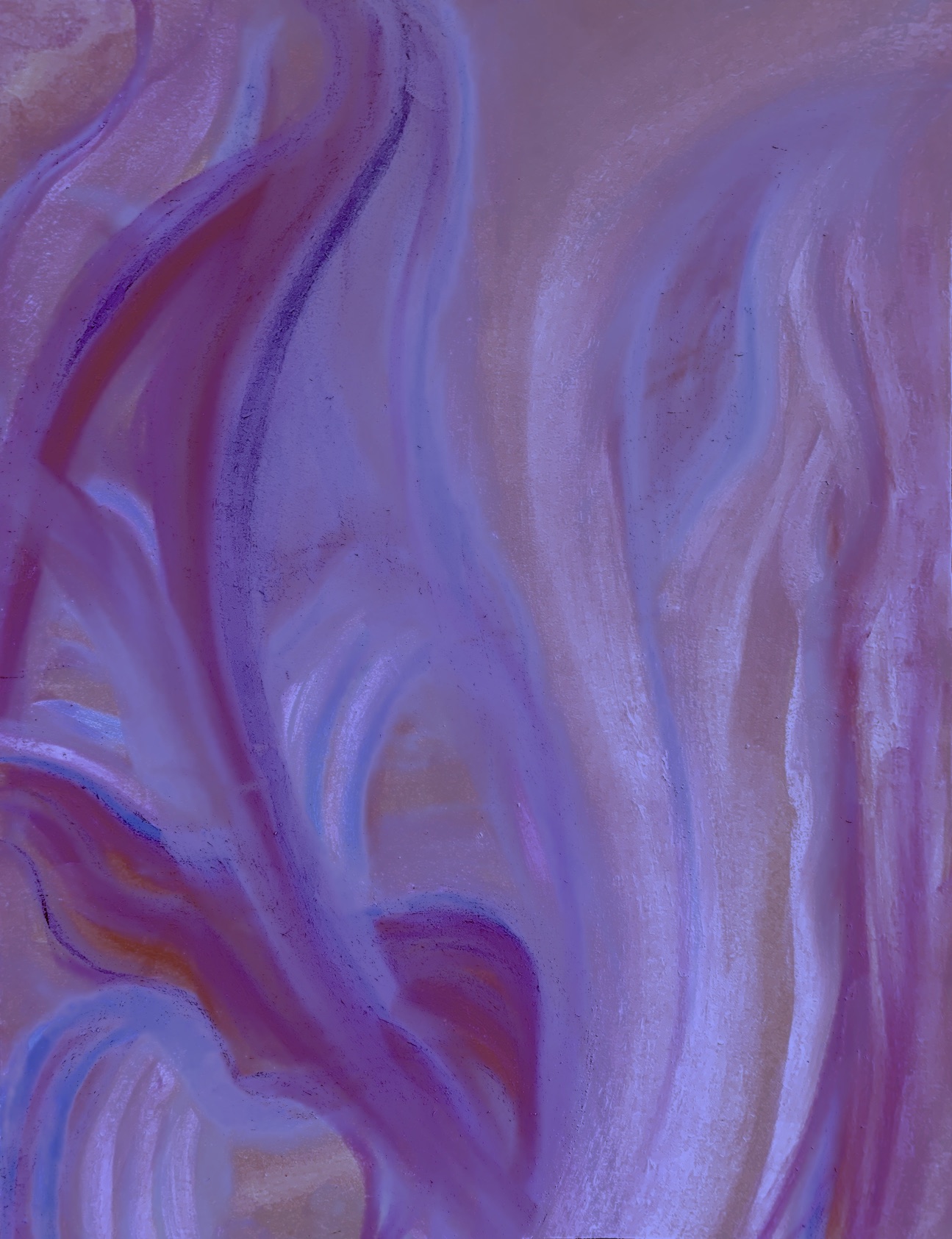
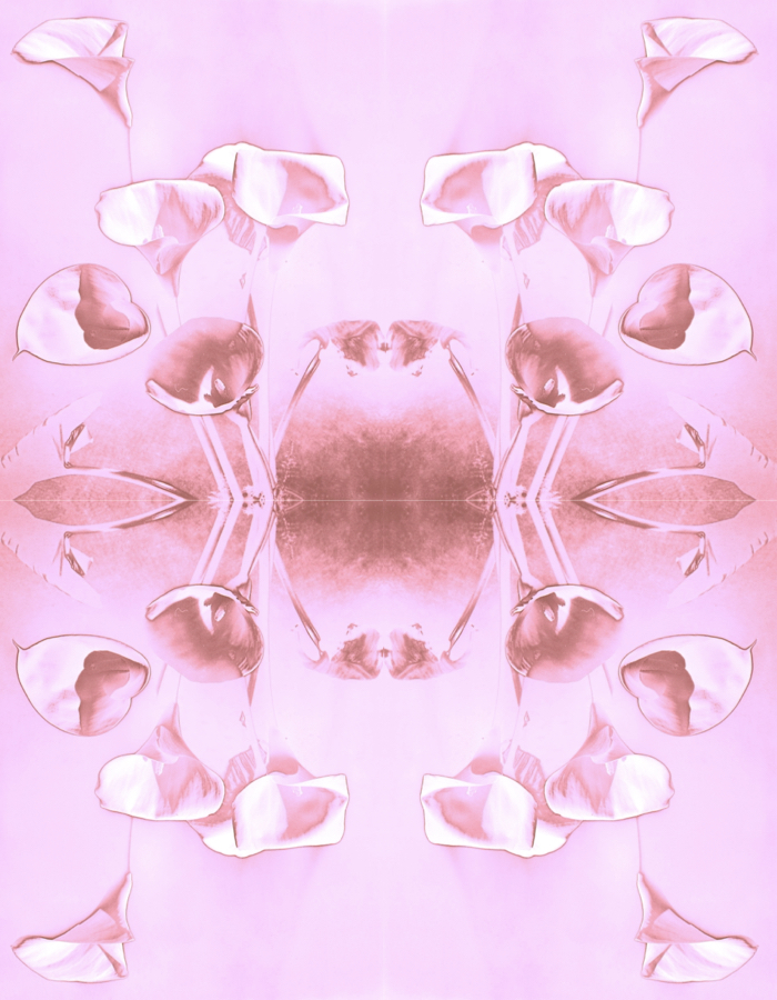
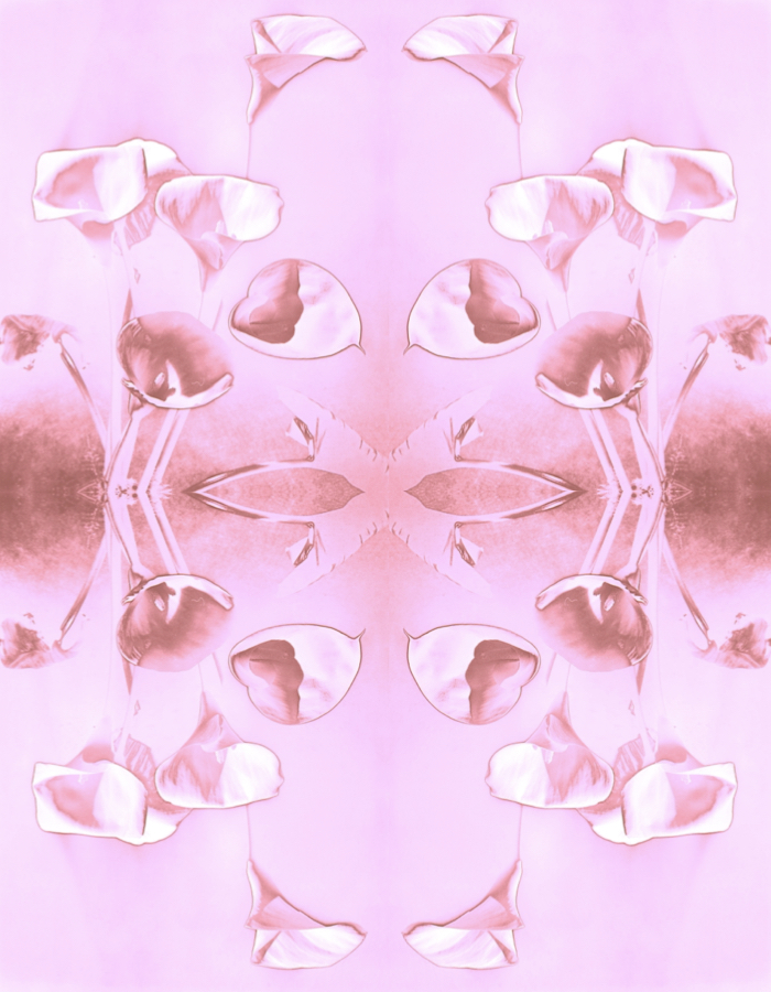
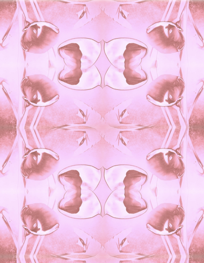
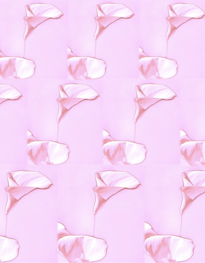
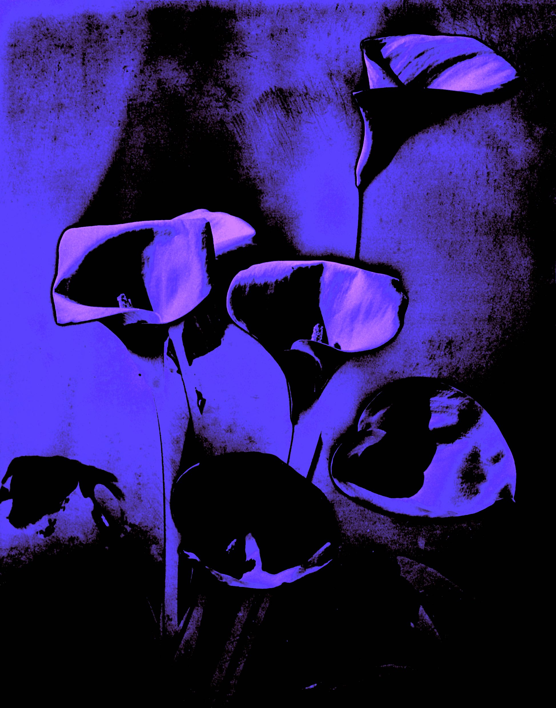
Below are my images that are inspired by the above photograph, and I altered the colour, shapes and forms. I changed my picture plane space, making some float, and repeat across the surface area like a digital quilt. I chose a soft colour, and a series of pale pink patterned works emerged. Some remind me of wallpaper patterns and textile designs.
Figure 2: ‘Pale Pink Arum Lilies’. 2021. Digital Art. Cathy
Figure 3: ‘Merging Mix of Pink Arum Lilies’. 2021. Digital Art. Cathy
Figure 7: ‘Drifting’, Arum Lily Textile. 2021. Digital Art. Cathy
Figure 8 : ‘Midnight Arum Lilies’. 2021. Digital Art. Cathy
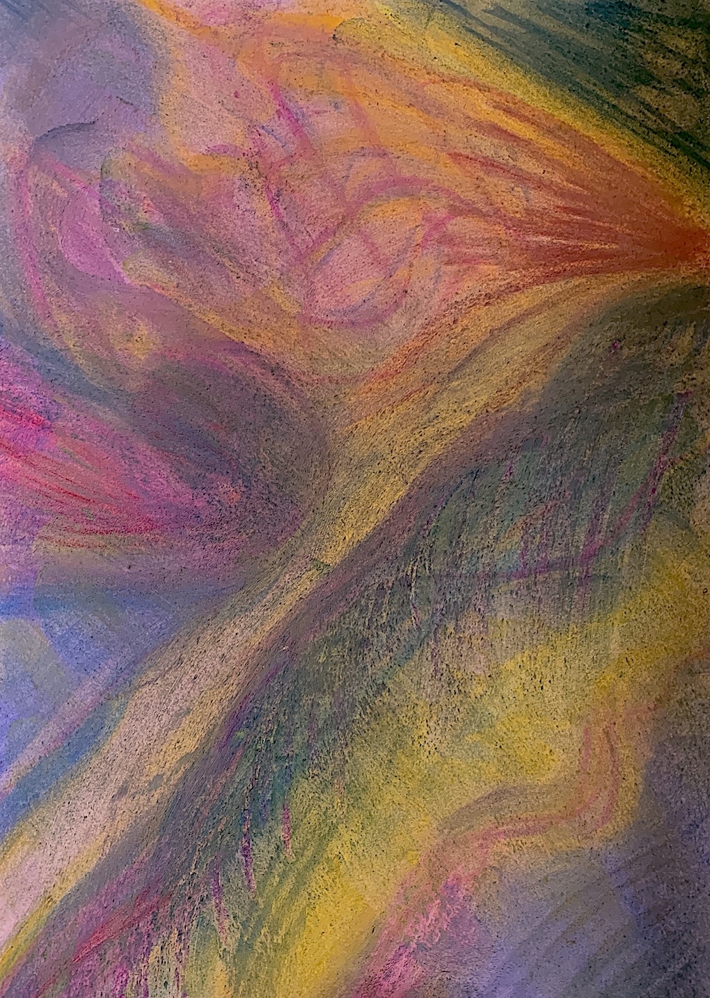
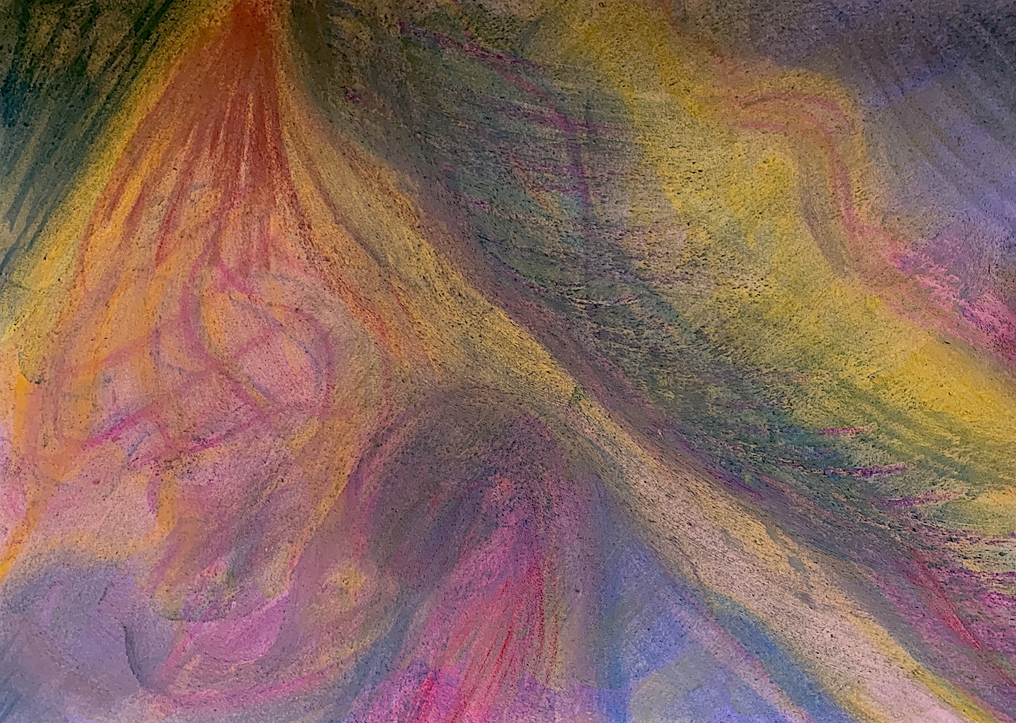
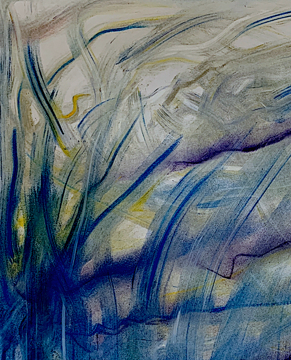
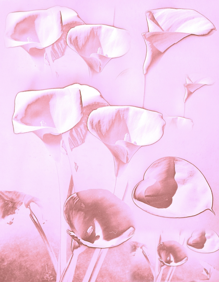
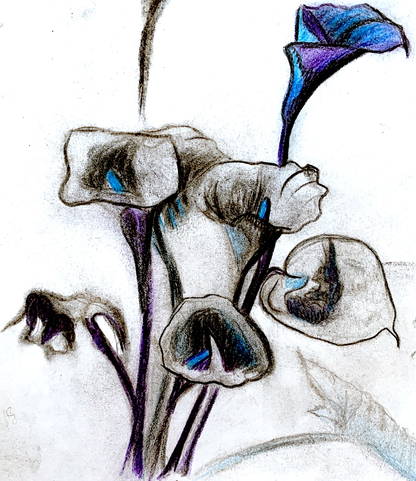
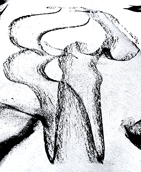
As I found the black charcoal helpful to free up my hand movement on the first selected artwork, I utilised it again. Yet, this time I introduced colour to my drawing sketches via new materials of colour pencils and pastels. The charcoal skidded over the waxy coloured pencil though, and it was difficult to mix and merge the two together smoothly. I gained lots of black charcoal dirty fingers in an effort to blend.
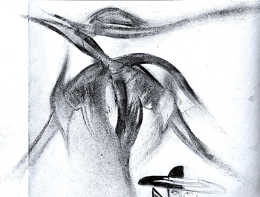
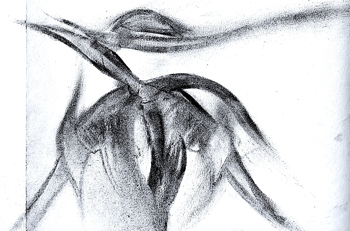
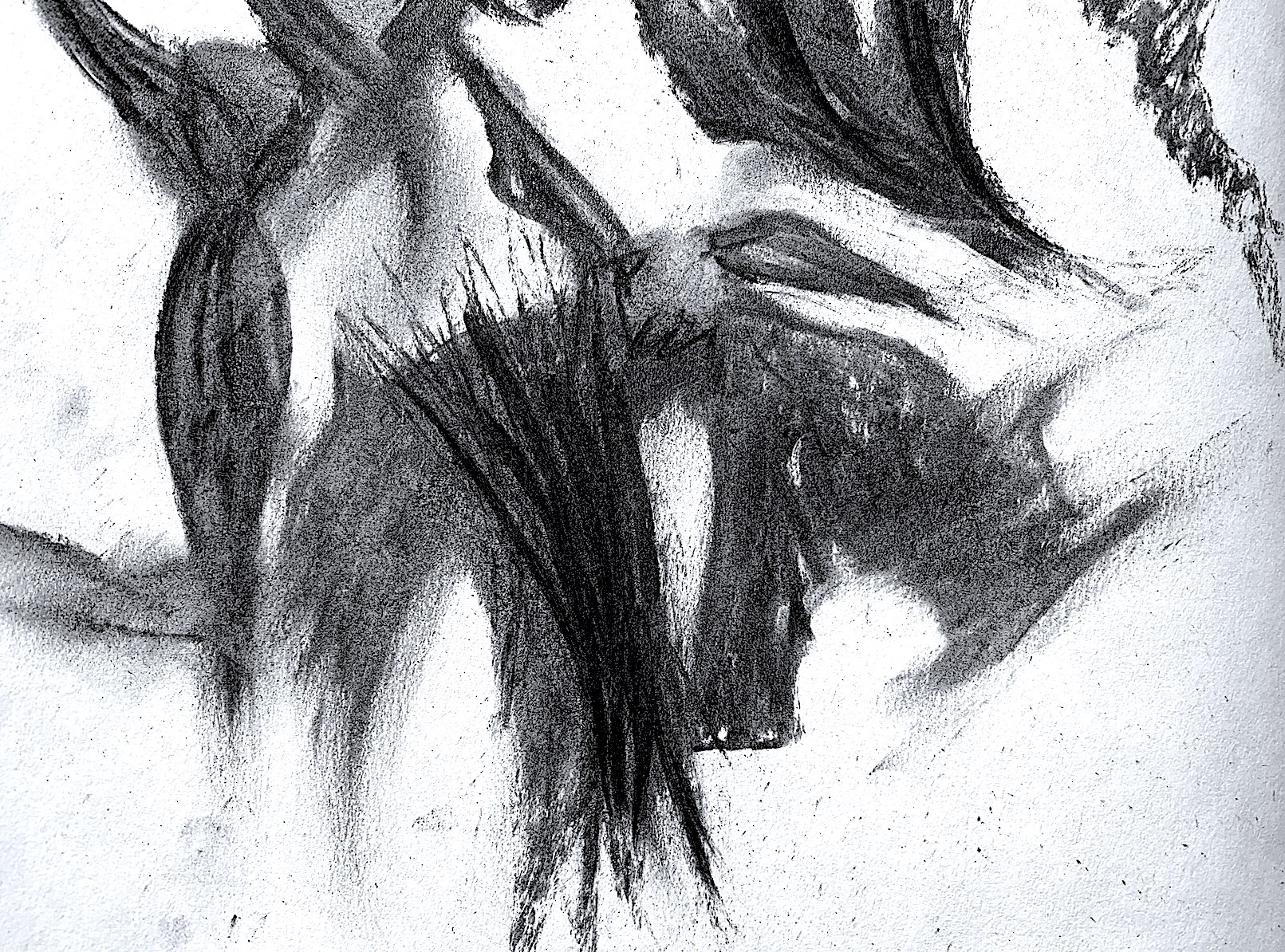
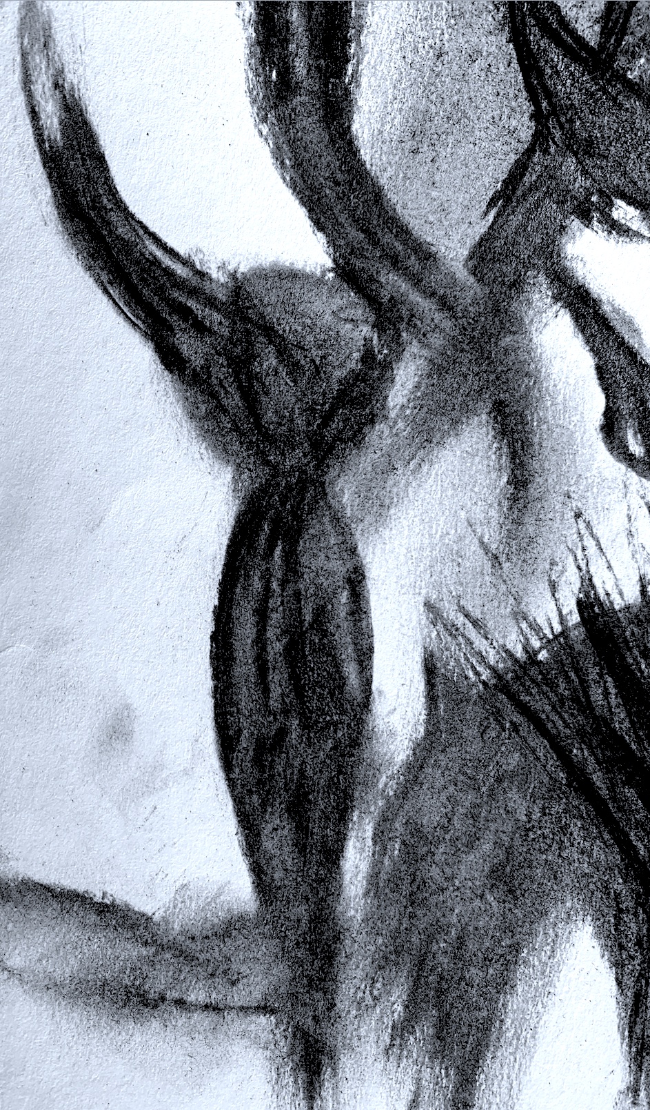
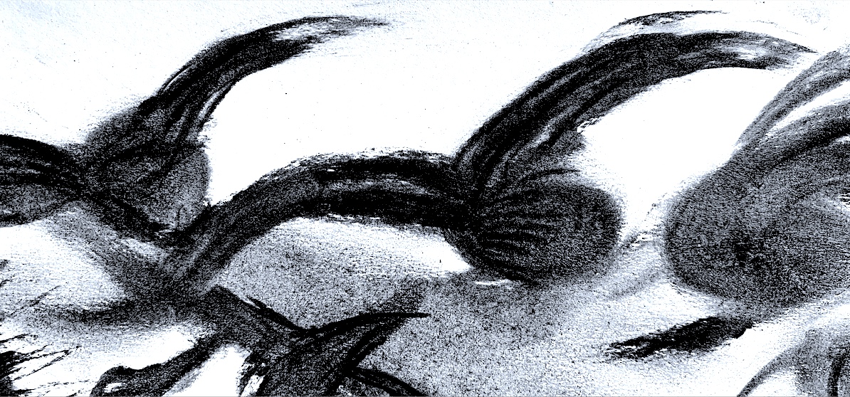
Below are three angles of my fastest sketch, it took 1 second! My hand just raced around the spot in a curving figure of eight type movement, and I was happy with the outcome! Amazing, as I never seem to be satisfied with anything I do. Visually, Figure 11 reminds me of a tooth (with roots) from one angle, because I positioned my body low to photographed it. The other two images (Figures 12 and 13) appear to be lounging, like a figure lying down or reclining.
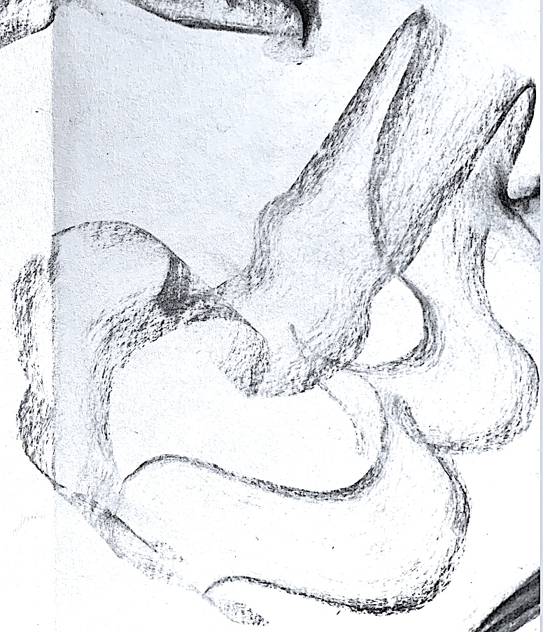
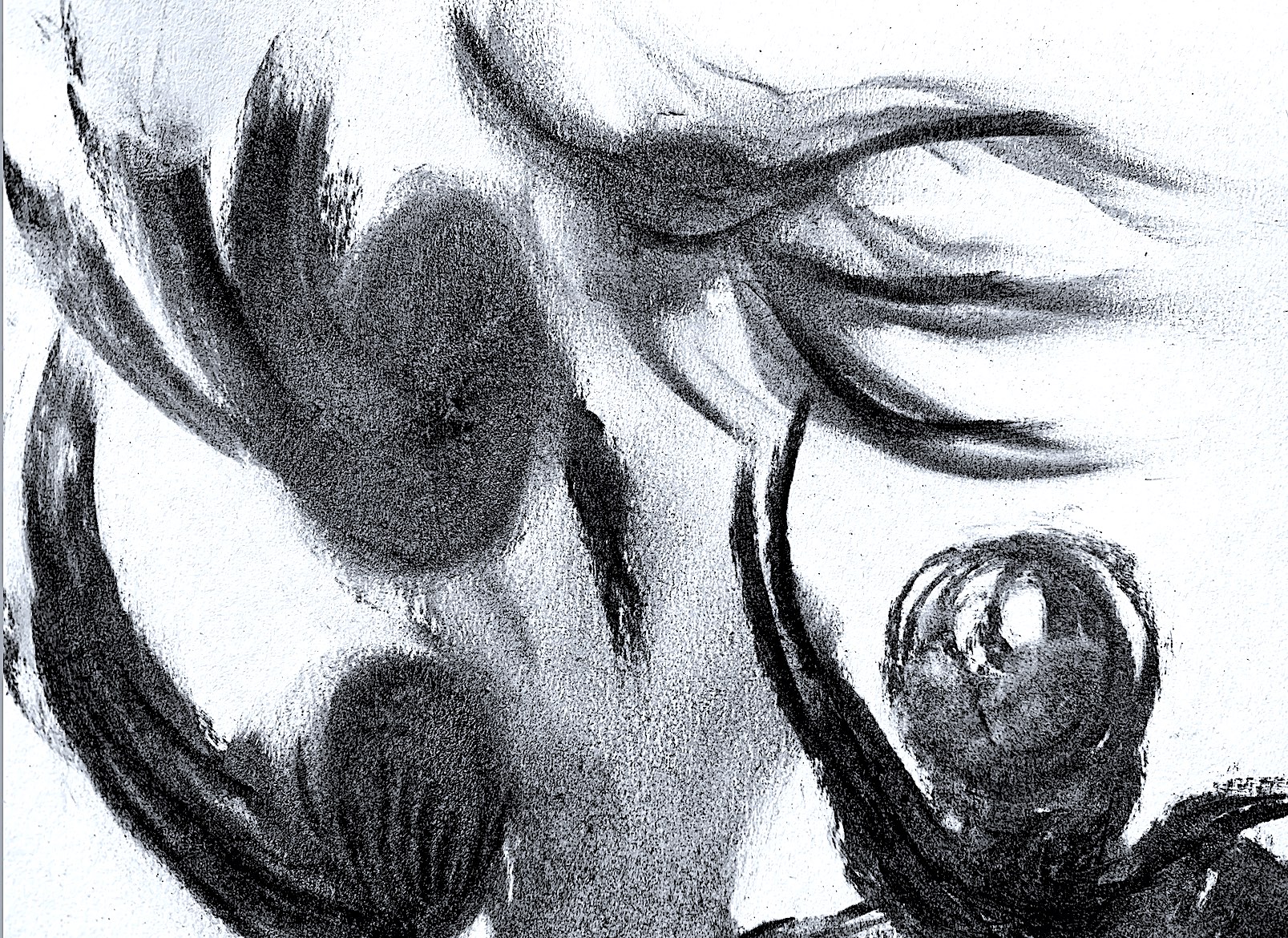
I really like this strange lily, (Figures 16, 17 and 18) at different angles. I could not decide what angle it looks best at, perhaps Figure 17 is my preferred way it should be viewed from. As I drew quickly, it became larger and darker, with more definition, some surface areas portray light-filled patterns of soft charcoal marks, and others have complicated tonal areas with exaggerated feathery protrusions.
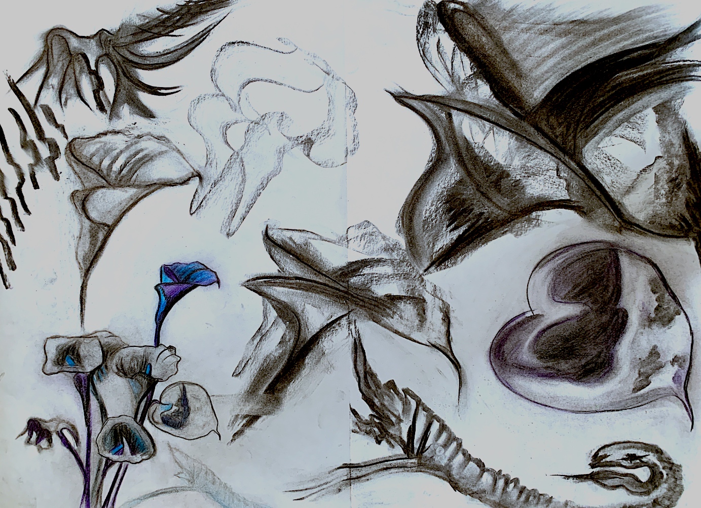
Figure 24 : ‘Arum Lily Sketches’. Charcoal or (Charcoal and Coloured Pencil Mix). Cathy, 2021.
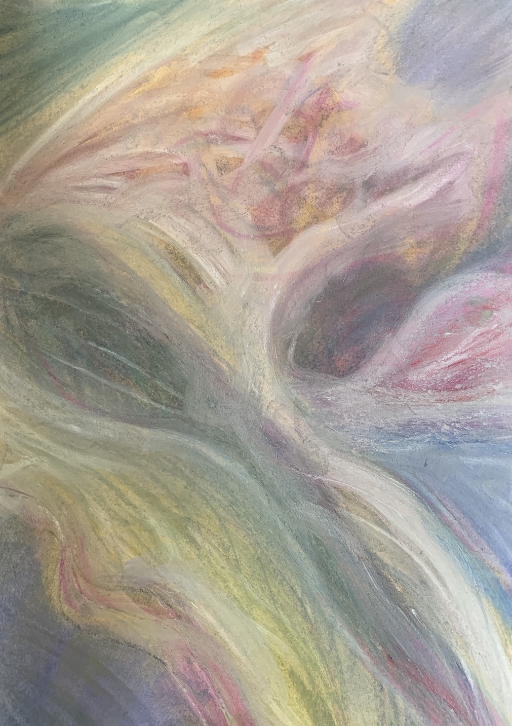
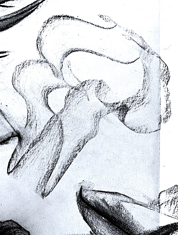
It was recommended to try a neutral toned paper as a base, so after finding some (crinkly) brown paper, I created two abstract linear pastels (Figures 25, 26 below) keeping the soft colour look. My inspiration came from my Pale Pink Digital series above, plus the line work in the above Figure 24.
Figure 25 : ‘ Gold Line‘ Arum Lily Abstraction. Pastel and Charcoal. A4 Brown Paper. Cathy, 2021.
Figure 26 : ‘Pink Line’ Arum Lily Abstraction. Pastel and Charcoal. A4 Brown Paper. Cathy, 2021.
I am quite pleased with these colour sketches, as I tried to just focus on the element of LINE and the element of COLOUR. Interconnecting lines were smudged, blended and layered over each other in cool tones of blue and green. Hints of warm yellow and pink tones were mixed with a cream pastel, rising and crossing over, in and out. I could not resist adding a touch of charcoal, but blending it softly to create shadow lines of grey.
Seeing some of my lines not accurately even or balanced is sort of okay, because time was more important, I was determined to make these sketches quickly. I am pleased how the rough brown paper (with no pastel marks) breaks up the colour scheme. This reminds me how some contemporary artists today leave certain spaces in their composition free and empty of paint. This creates a positive and negative space juxtaposition where painted colours sit on the surface area next to bare, fawn-coloured Belgian linen.
Week 2: PROCESS LED INQUIRY: Drawing from a Photo with People.
Drawing Processes:
* Select the first image to draw.
* Analyse this image’s visual properties (figural and abstract).
* Generate multiple drawings.
* Process this image by reducing, confusing, or altering using a range of methods (i.e. charcoal, graphite, provisional paint studies, gouache, or watercolour sketches, alterations using the photocopier, overhead projector, photoshop and other digital imaging software).
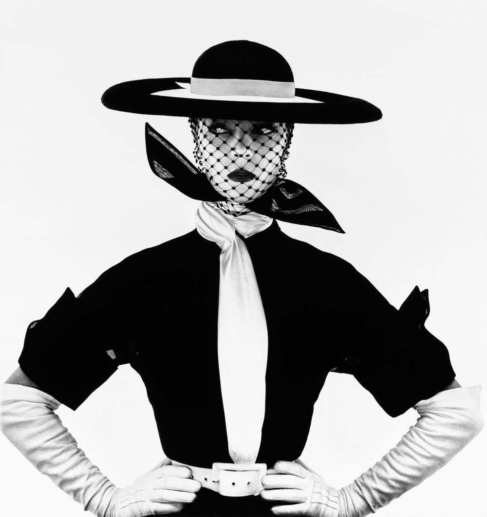
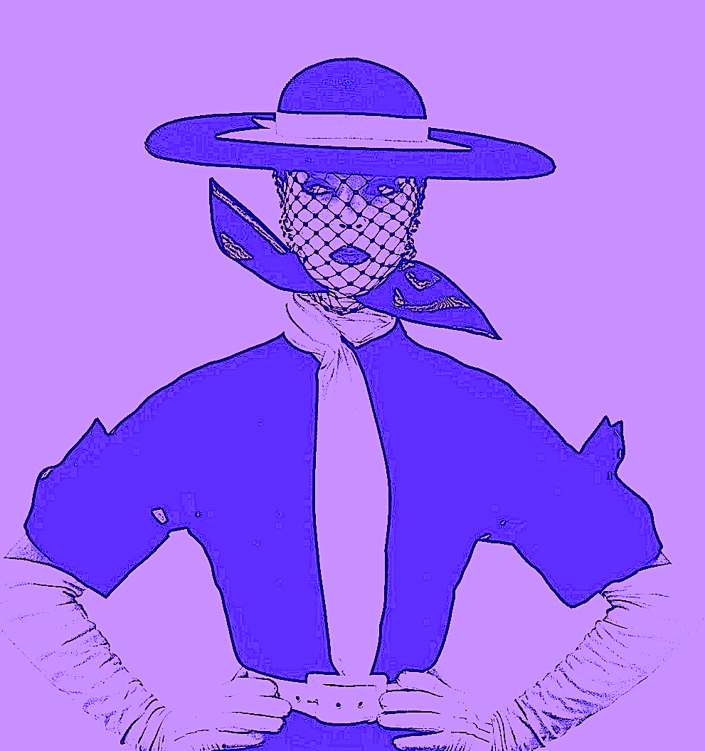
1. PHOTO with people – ‘Black and White Vogue Cover’ (Jean Patchett) by Irving Penn.New York, 1950. Gelatin silver print. Accessed September 28, 2021. https://irvingpenn.org/galleries.
Figure 1. Image Galleries. The Irving Penn Foundation. ‘Black and White Vogue Cover’ (Jean Patchett), New York, 1950. Gelatin silver print. Irving Penn. https://irvingpenn.org/galleries
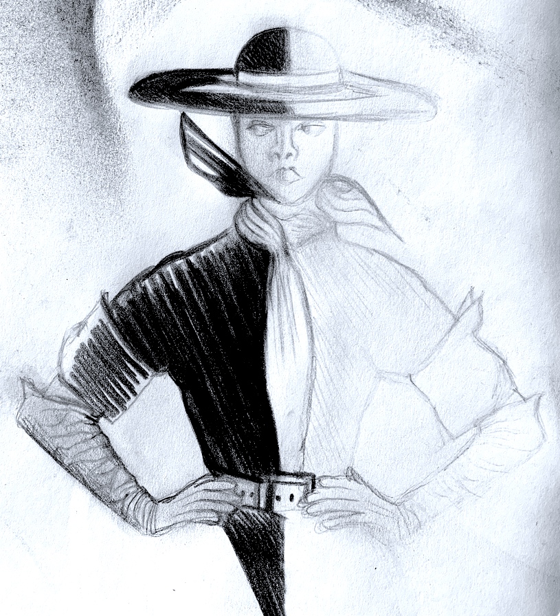
I chose this photograph because the image is powerful in black and white, and it reveals a theatrical quality with a mask of white facial make-up beneath a netted hat. The crisp white shapes (and wrinkly gloves) sit starkly against the black dress, black scarf and hat. The overall silhouette of the female form displays striking defiant outlines that greatly appeals. Not only do I love black and white photography, and film, I have always been a lover of elegant Avant garde fashion with vintage netted hat and glove accessories.
There were many other photographs by Irving Penn that resonated, yet these two images below also appealed because of an elegant and very clever see-through effect (Left) and a graceful movement (even though posed still) effect (Right).
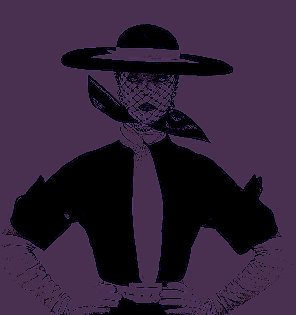
Before I started to physically draw, I processed the image digitally. I introduced the visual art element of colour; choosing pinks, purples and blues.
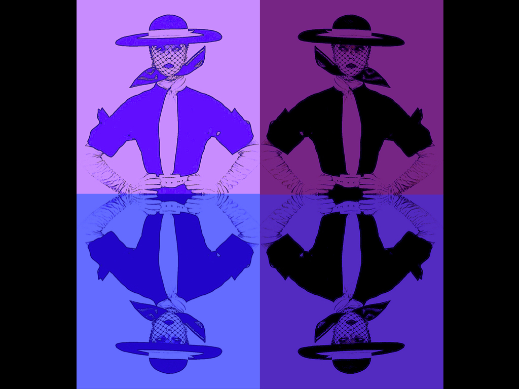
Figure 2. ‘Pink Jean’ Digital Art By Cathy, 2021.
Figure 3. ‘Purple Jean’ Digital Art By Cathy, 2021.
I created repetition additions with reflections, and connected the overall look with a corresponding colour scheme. Like last week’s painting exercise, I utilised VERBS again, by making mathematical transformations of translating, rotating, flipping and reflecting.
Figure 4. ‘Reflective Jeans’ Digital Art By Cathy, 2021.
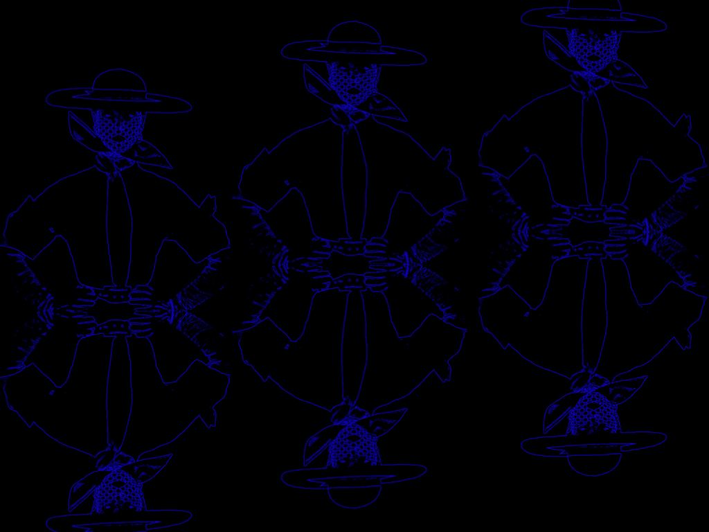
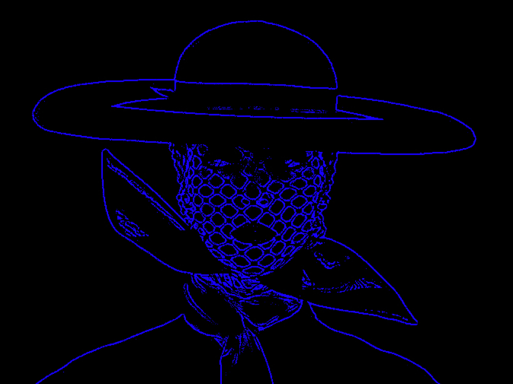
I am pleased with the two digital photographs below titled: 5. ‘Neon Blue Jean’ and 7. ‘Neon Net-Face Jean’, because of their simple outlines. One of the brief’s drawing processes is to REDUCE. By reducing the majority of the female model’s clothes, and inner shape details, I was able to achieve a striking linear blue-lit fluorescent Neon sign effect. The black background turns into a night sky, illuminating a blue-lit outline. I do love electric blue!
Figure 5. ‘Neon Blue Jean’ Digital Art By Cathy, 2021.
Figure 6. ‘Neon Blue Trio’ Digital Art By Cathy, 2021.
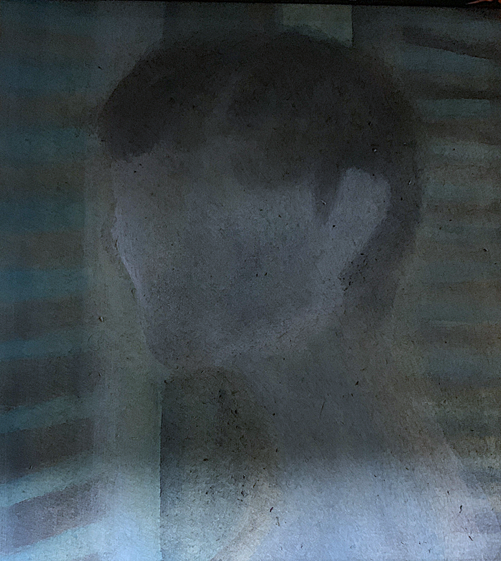
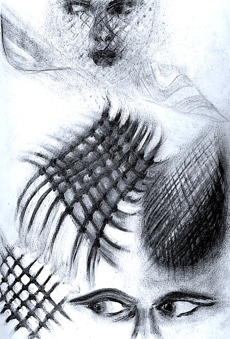
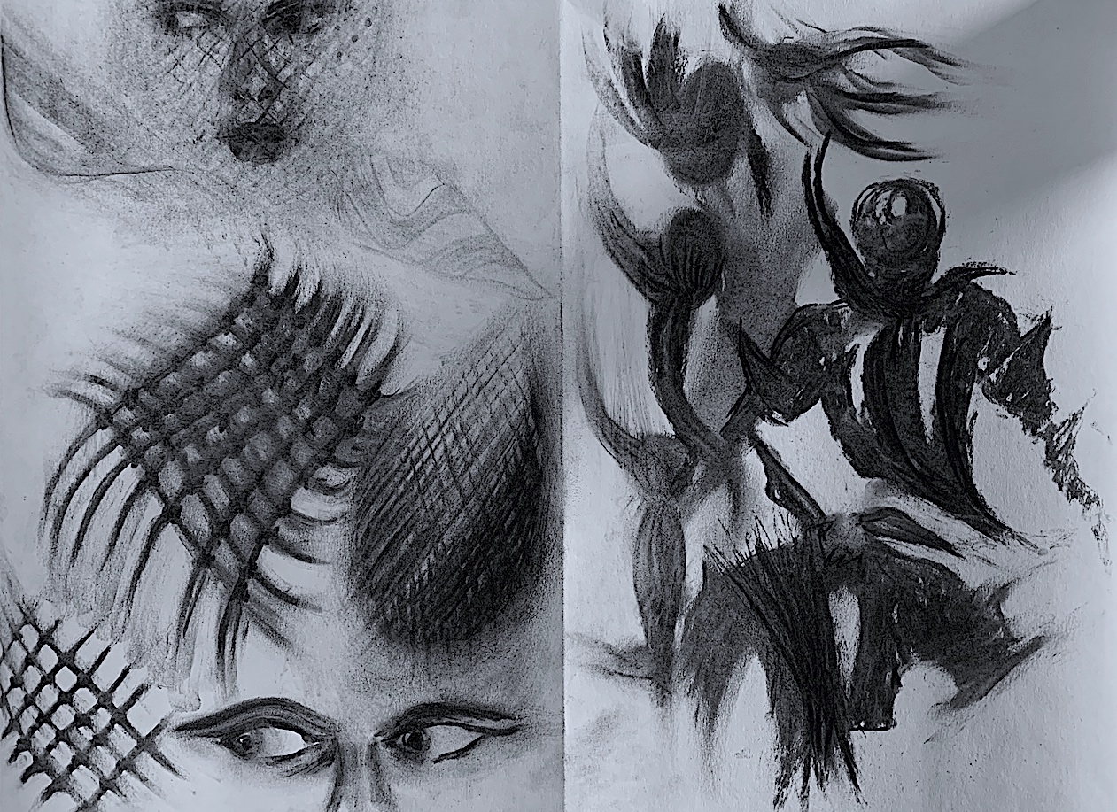
Here below, I have altered the image again via enlargement and reduction. Through cropping I have zoomed in for a close up of the head, neck and shoulders to show the patterned detail on the hat-net feature.
Figure 7. ‘Neon Net-Face Jean’ Digital Art By Cathy, 2021.
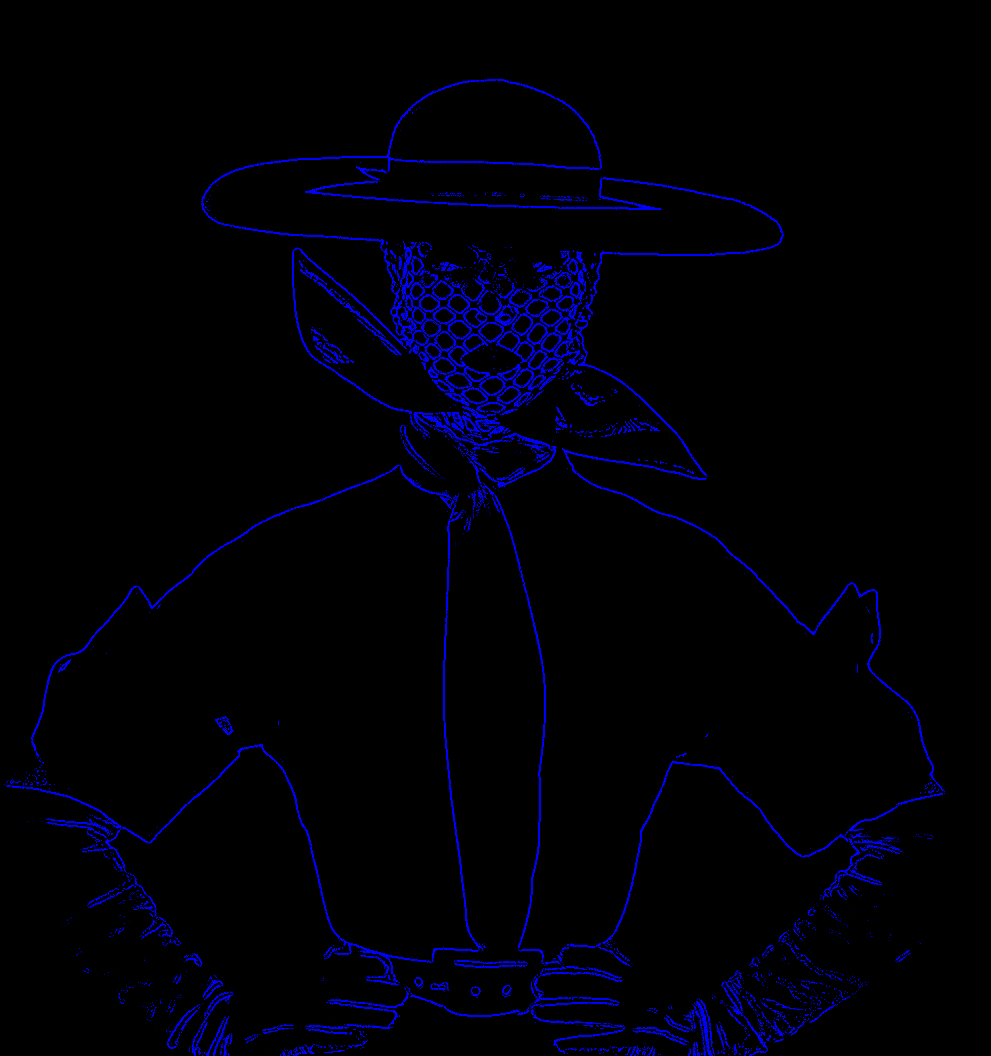
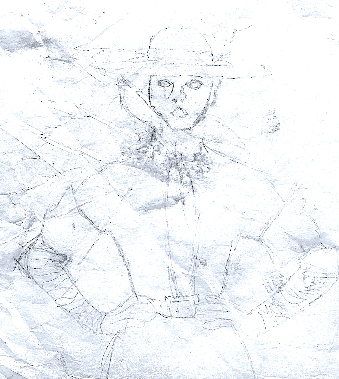
My first physical drawing (Figure 8. ‘No Net Jean’) in graphite was (on purpose) a little slow and tight. The reason for this, was that I wanted to get the feel of the form. I needed to understand the linear quality, and gain knowledge of both the positive shapes and negative space in, out and around the silhouette figure before I commenced the quick sketches.
Figure 8. ‘No Net Jean’ Graphite Drawing, Cathy, 2021.
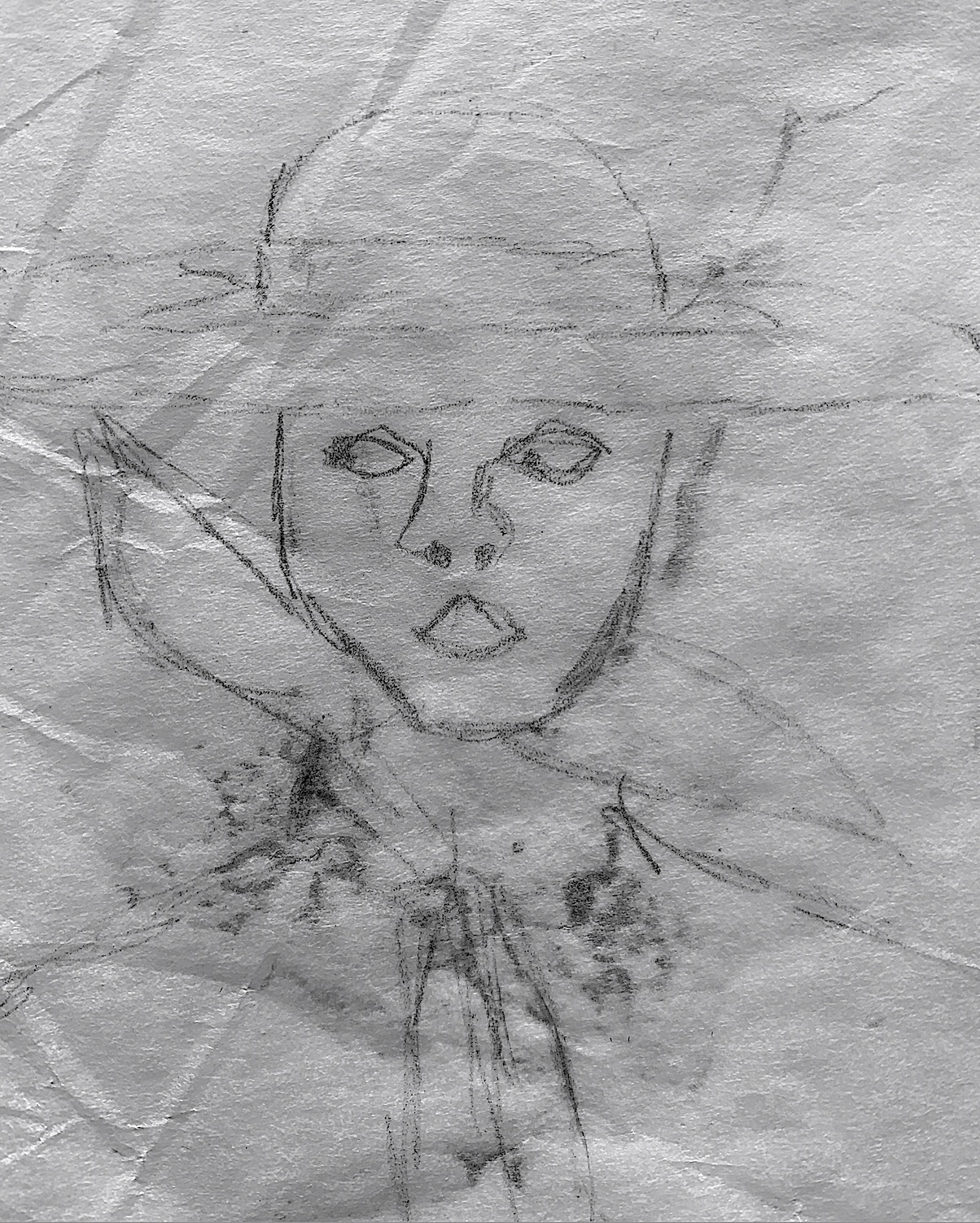
The next drawing was a very quick minute sketch, wobbly, loose and uncontrolled. I accidentally dented it and crumpled the paper at one point. The wonky nose makes me smile.
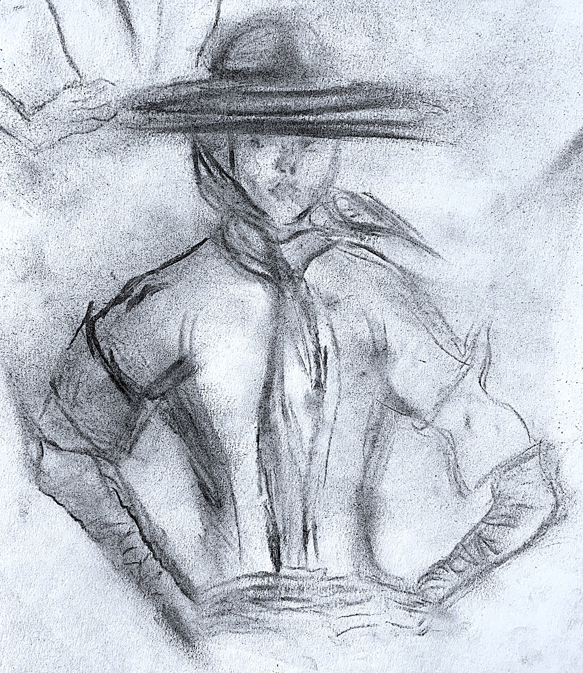
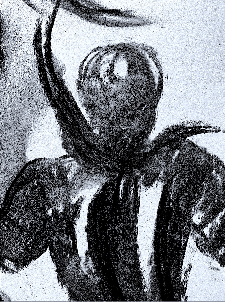
I changed methods and mediums, instead of continuing to use a pencil, a medium size charcoal stick said “Get me out of this box and play with me!” This box of charcoal had been sitting in a cupboard for decades, therefore I felt pretty rusty and unskillful at using these sticks.
Figure 11. ‘Hat on Fire Jean’ Charcoal Sketch, Cathy, 2021.
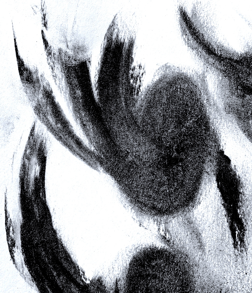
I shouldn’t have worried, because it was lovely to make charcoal marks as quickly as I could, plus it felt freer than using a pencil. The more I did, the more confident and quicker I became. I amused myself making lots of rough sketches with fast dashes, and flowing long lines that curled up at the end. Jean, the Vogue fashion model was turning into a girl guide, then her hat looked like it was catching on fire! Next, Jean became just a tie, then a group of swimming ties, a scribbly shirt, and suddenly she turned into a hat and body with no head (see below), then a head with no hat! My mark-making was definitely loosening up with lots of mistakes and soft smudges.
Figure 12. ‘No Head Jean’ Charcoal Sketch, Cathy, 2021.
Figure 12a. Close-up of ‘No Head Jean’ Charcoal Sketch, Cathy, 2021.
Figure 18. ‘No Hat Jean’ Charcoal Sketch, Cathy, 2021.
Figure 19. Close up of ‘No Hat Jean’ Charcoal Sketch, Cathy, 2021.
Figure 20. Close up of ‘No Hat Jean’s Arm’ Charcoal Sketch, Cathy, 2021.
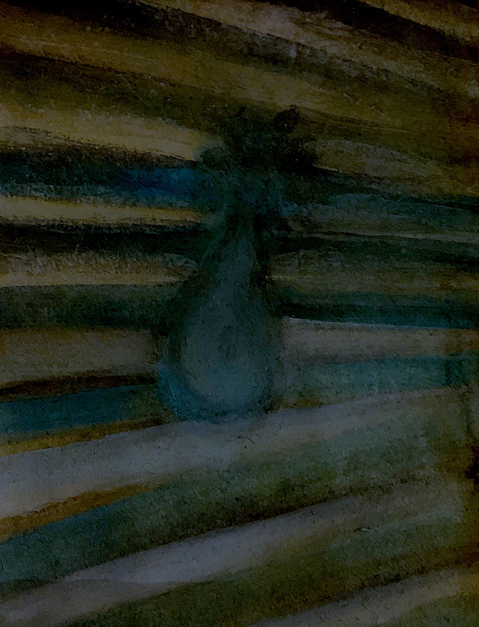
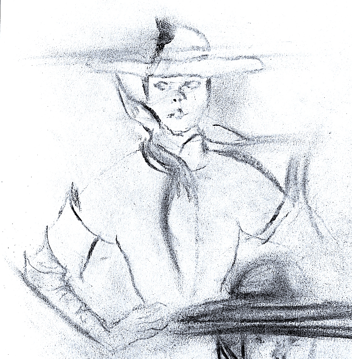
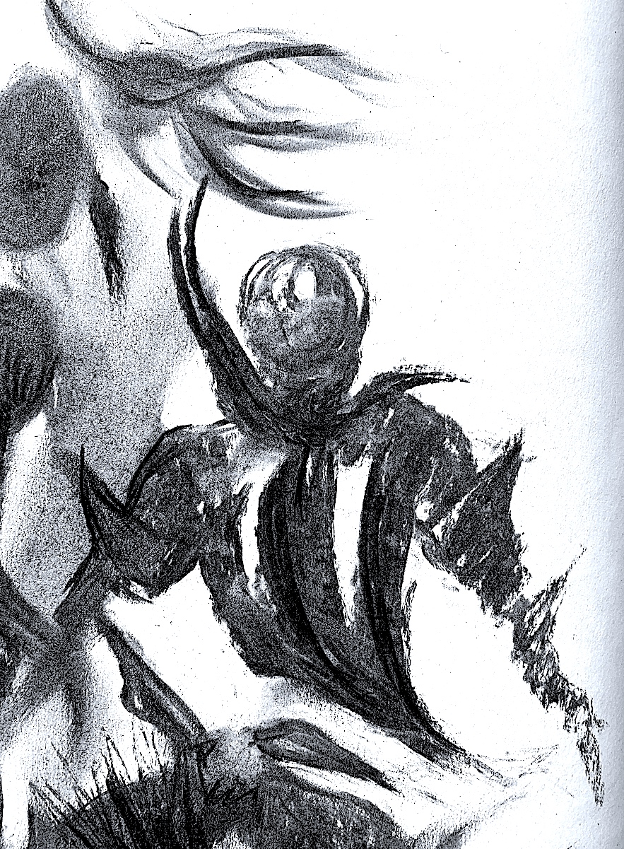
I left the NET Hat feature to last, as this part looked difficult with a thicker-style charcoal stick, compared to using a finer pencil or a black biro pen. The net jumped off Jean’s face after my first attempt below, and transformed into an independent abstracted fishing net structure, and a straight and curving woven grid. It didn’t matter what it was, I was enjoying pushing the charcoal very quickly, criss-crossing and making lots and lots of marks.
Figure 21. ‘Jean’s Hat Net’ Charcoal Sketches, Cathy, 2021.