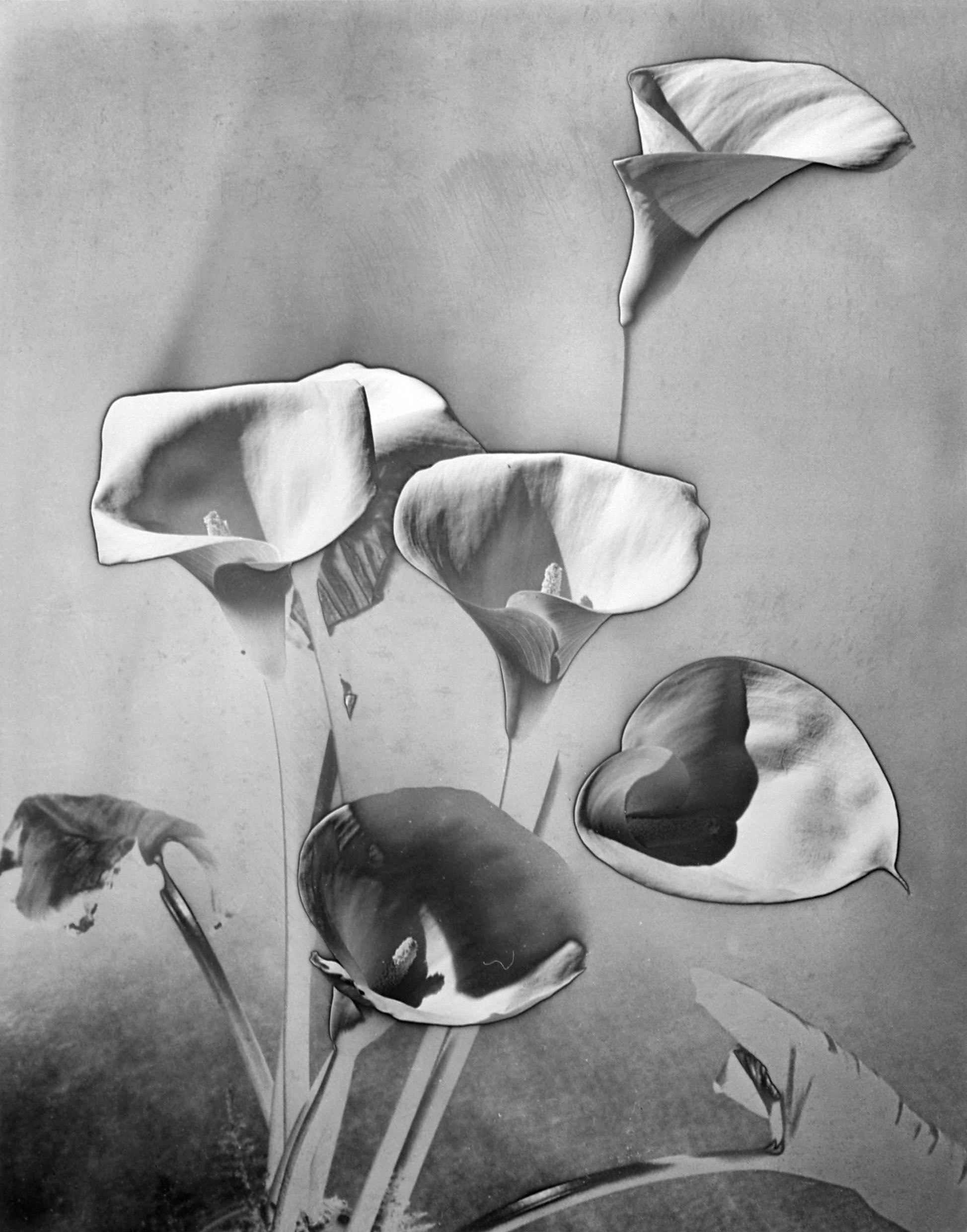
Drawing Processes: * Select six different images or items to draw.
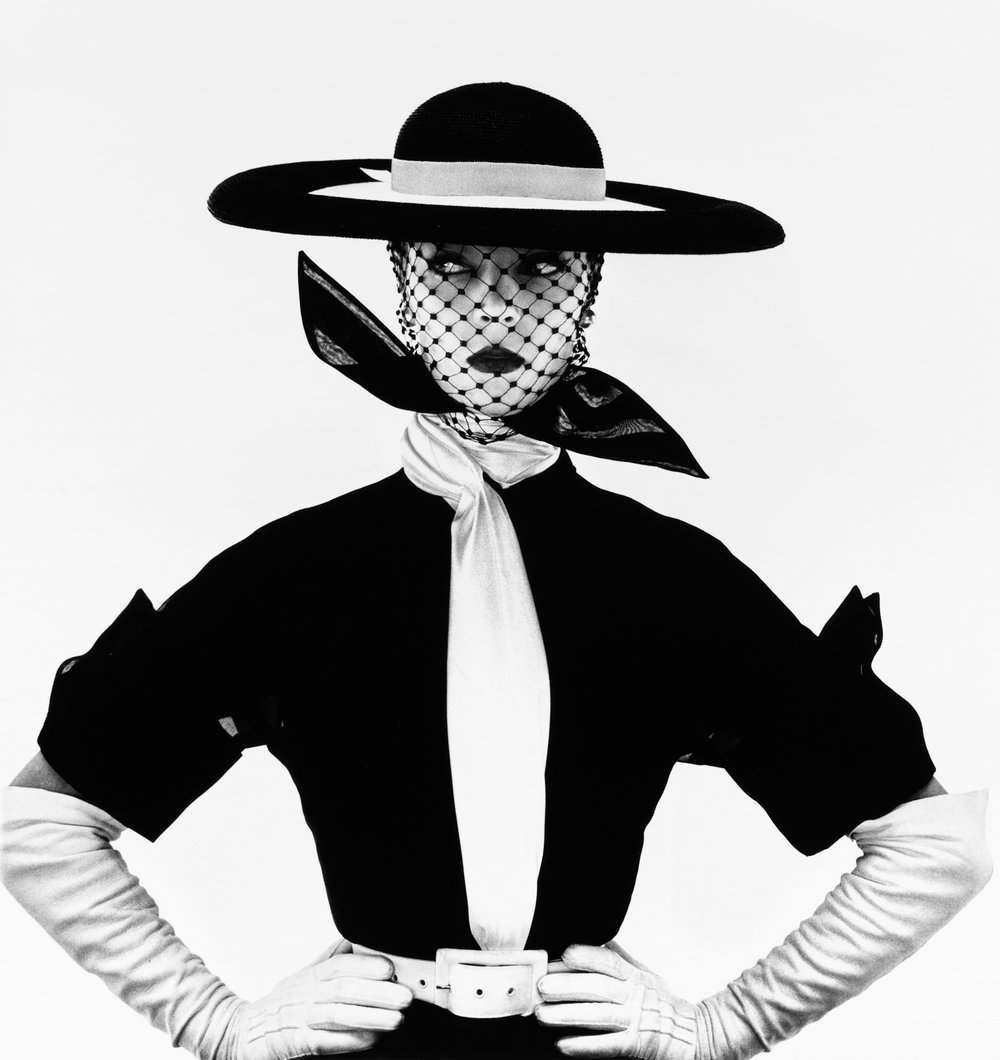
1. PHOTO with people – ‘Black and White Vogue Cover’ (Jean Patchett) by Photographer Irving Penn. , New York, 1950. Gelatin silver print. Accessed September 28, 2021. https://irvingpenn.org/galleries.
Figure 1.Image Galleries. The Irving Penn Foundation. ‘Black and White Vogue Cover’ (Jean Patchett) by photographer Irving Penn.
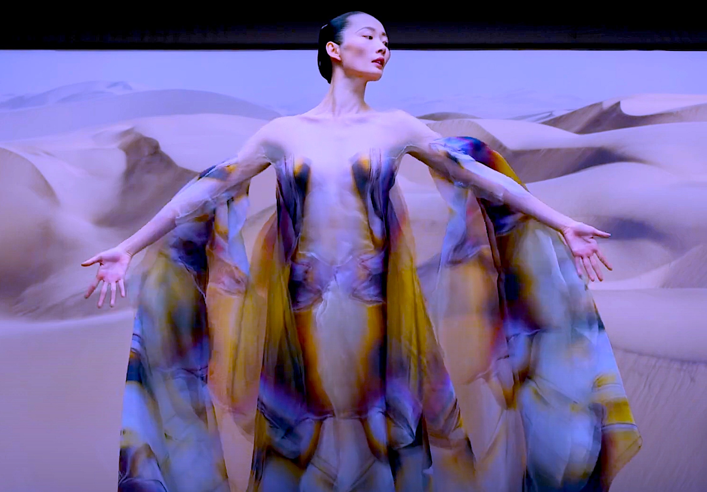
Figure 3a. Photographic Still (screenshot) from Dance Film: ‘Biomimicry’. Haute Couture Fashion Dress / Dance Costume by Designer Iris van Herpen in collaboration with the Dutch National Ballet Company.
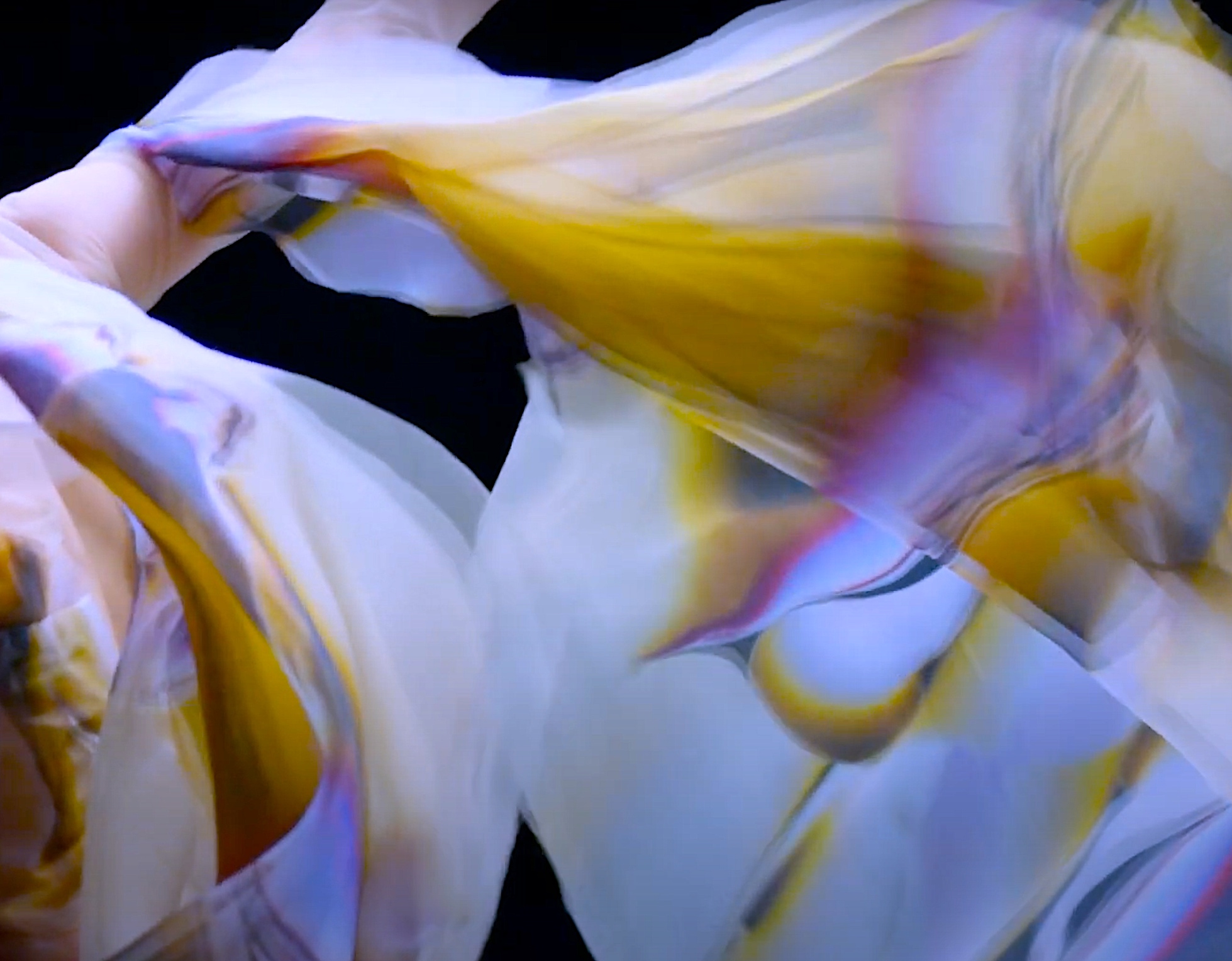
Figure 3b. Photographic Still (screenshot) from Film: ‘Biomimicry. Haute Couture Fashion Dress / Dance Costume by Designer Iris van Herpen in collaboration with the Dutch National Ballet Company.
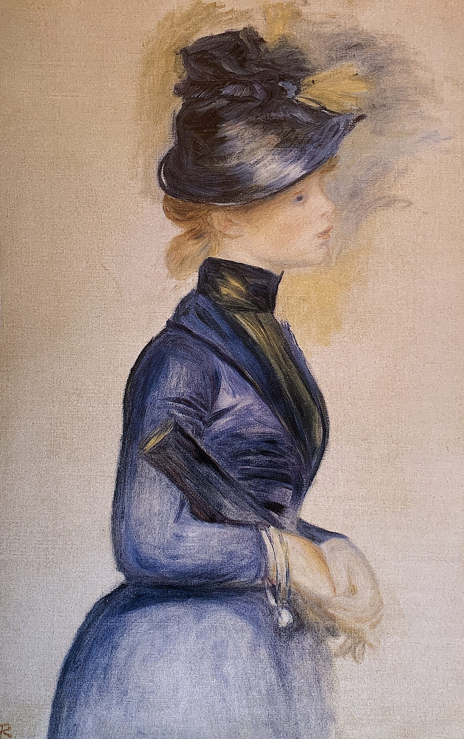
Figure 4b. Edouard Manet, The Railway, 1873, oil on canvas, Gift of Horace Havemeyer in memory of his mother, Louisine W. Havemeyer, 1956.10.1.
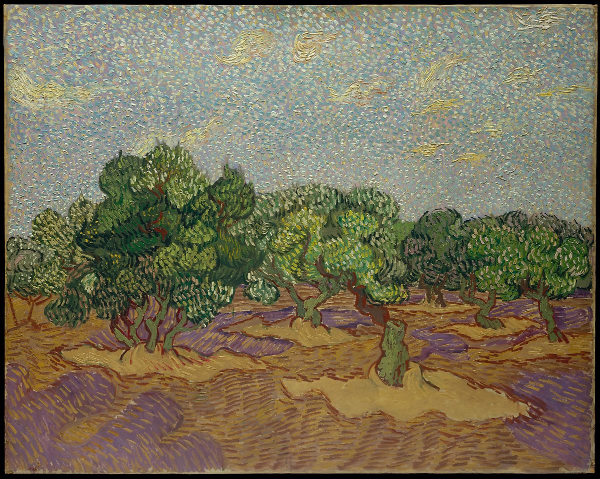
4c. PAINTING made before 1900: ‘Olive Trees’. oil on canvas. 1889. Vincent van Gogh (Dutch, Zundert 1853–1890 Auvers-sur-Oise). Dimensions: 28 5/8 x 36 1/4 in. (72.7 x 92.1 cm). The Metropolitan Museum. Credit Line: The Walter H. and Leonore Annenberg Collection, Gift of Walter H. and Leonore Annenberg, 1998, Bequest of Walter H. Annenberg, 2002. Accessed September 28. 2021. Accession Number: 1998.325.1. https://www.metmuseum.org/art/collection/search/437998.
Figure 4c. ‘Olive Trees’. oil on canvas. 1889. Vincent van Gogh (Dutch, Zundert 1853–1890 Auvers-sur-Oise). Dimensions: 28 5/8 x 36 1/4 in. (72.7 x 92.1 cm).
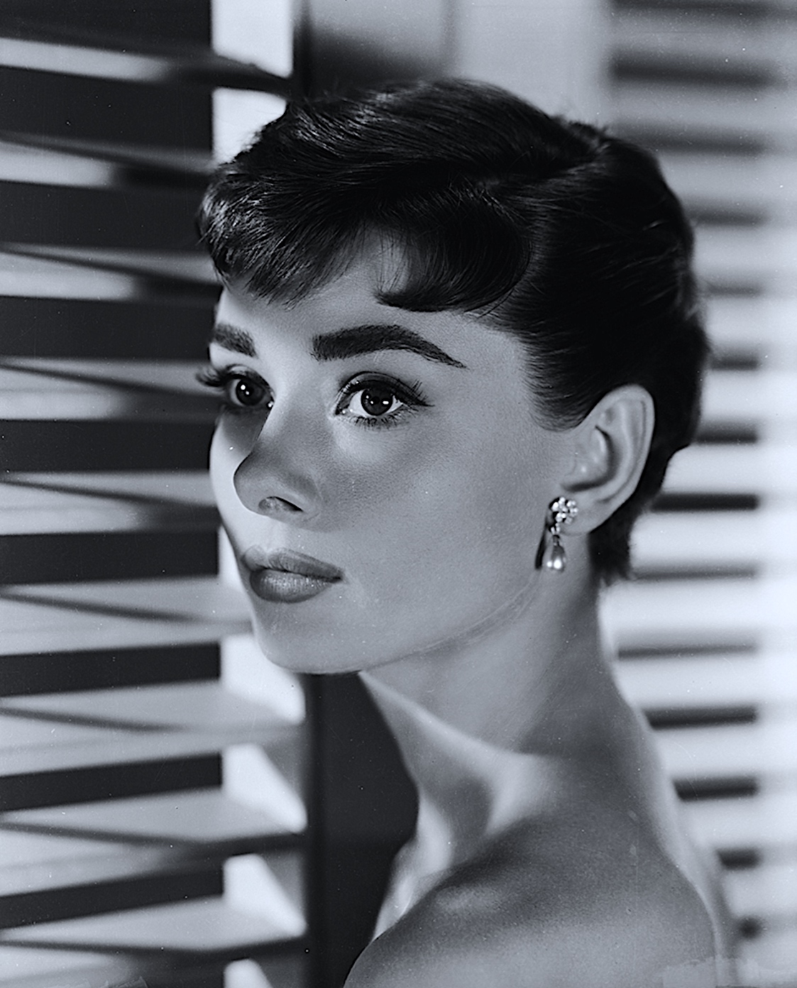
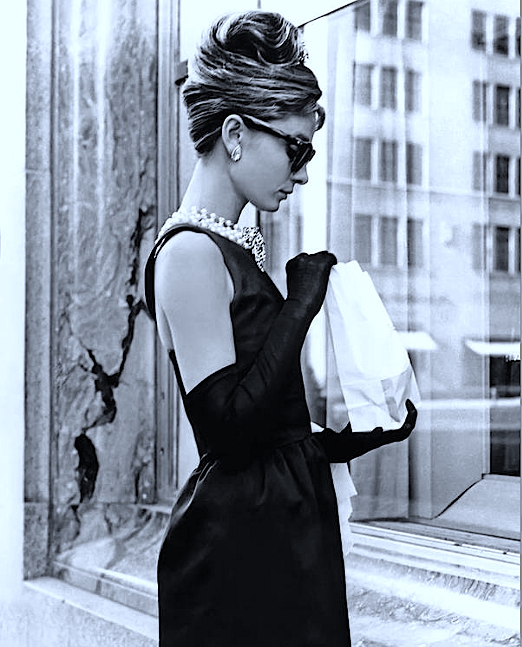
5a. Screengrab from a Film: ‘Sabrina’ (1954 Film). Audrey Hepburn (1929-1993) as she appears in ‘Sabrina’ (aka ‘Sabrina Fair’), directed by Billy Wilder. (Photo by John Kobal Foundation/Getty Images). Accessed September 28, 2021. https://gettyimagesgallery.com/images/audrey-hepburn-3/.
Figure 5a. ‘Sabrina’ (1954 Film) Audrey Hepburn. Photo by John Kobal Foundation/Getty Images.
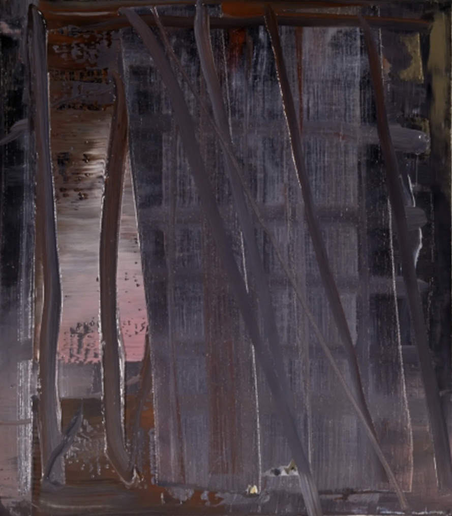
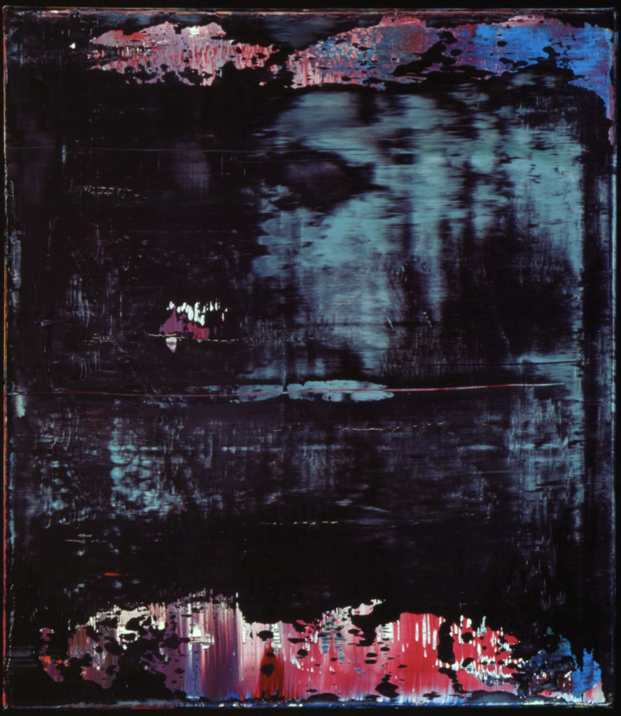
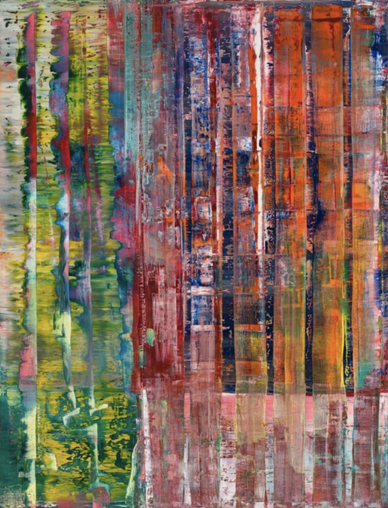
Artist Research: Gerhard Richter (b 1932, Germany)
There are many reasons why I am drawn to German artist Gerhard Richter’s paintings. I find his texture, colour, depth and scale of work simply amazing! It would be interesting to experience one of Richter’s paintings up close in situ, rather than viewing an online image.
I particularly like his large scale canvases that seem to unveil a mix of merging and separating colours, they also appear to move. His abstractions are expressed through thickly textured paint with layers of vibrant colour. A range of warm and cool paint tones recede backwards and forwards, under and over, full of contrast. Some seem to seep through to the surface in a syrup-like fluid manner, with some colours appearing to almost slide off the canvas. I enjoy layering thick amounts of paint too. Therefore, I admire how Richter shifts, pushes and pulls his layers of paint around the surface using a range of techniques such as a squeegee tool. Yet, the colours tend not to become muddy. I wonder if the secret to keeping this vibrancy of colour beneath other colours clearly visible and clean is patience and drying time between layers, and a matter of dedicated practice.
Richter is a prolific artist, and since his art studies from 1951-1956 at Kunstakademie in Dresden, and from 1961-1963 at Kunstakademie in Dusseldorf, he has created very diverse artworks. He is not only an abstract painter, but a realist painter too. Richter paints and reworks over the top of photographs and makes representative figurative work, he draws abstractions and constructs sculptural glassworks, both two and three-dimensional.
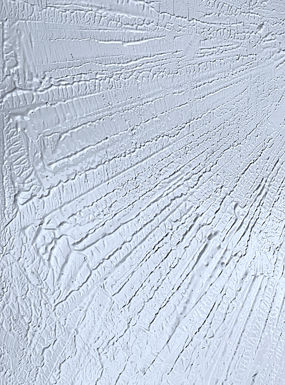
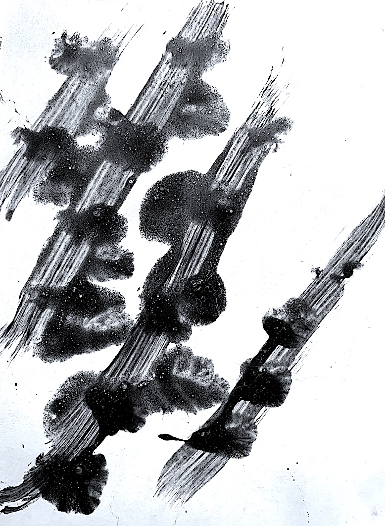
In order to further extend creating action words via utilisation of the whole body, my next goal was to increase the area size of my painting surface. After painting on A4 and A3 size paper yesterday, I found a disused object (a piece of old plywood timber) in the garden shed, and gave it a lick of paint as an undercoat.
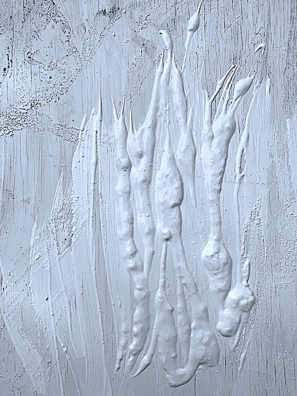
Verb exploration started with dump, spill, heap and pour after holding the white paint container above the timber and squeezing out thick blobs. Streaking lightly along the top of the paint with a brush I smeared and mixed the blobby bits. By slightly spreading and gently flicking I created some outstretched shapes, like pointy seed heads attached to wobbly plant-like stems, extending towards the sun.
Using a sponge and leaning across the large metre by metre timber surface I utilised my whole body to interpret the verbs: squeeze, mark, mix, wipe, spread, smear, stretch, curve, swerve, swirl, twirl, turn and flow. I created repetitive curving bow-like shapes over and over like drawing large scale figure of eights.
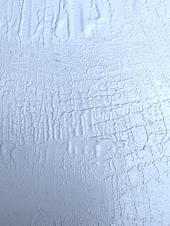
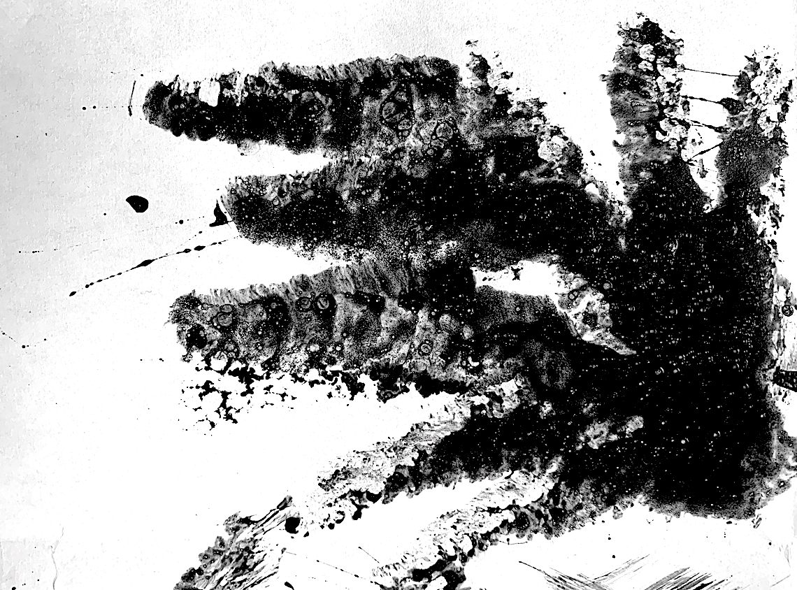
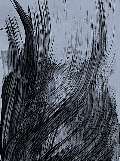
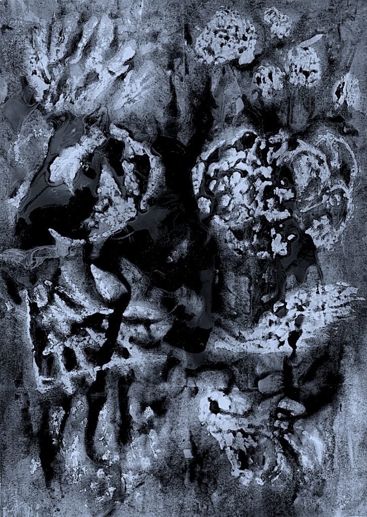
Figure 3. Verbs: Crackle, Crack, Crease, Impress, Slice, Pat and Dent.
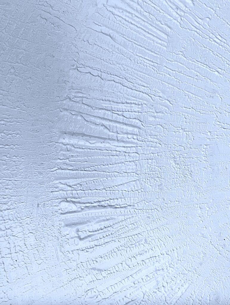
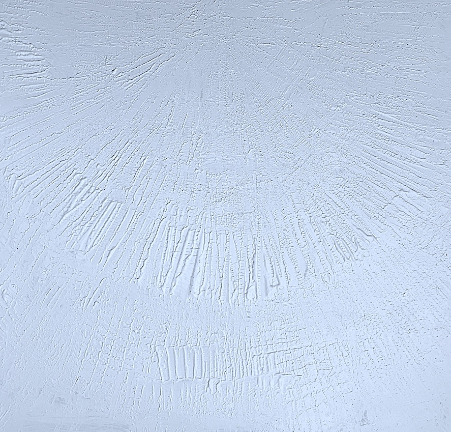
I enjoyed making the paint crackle and crease with a bit of rubbish (an offcut piece of timber). The recycled timber became a great tool to impress textural lines and patterns, and slice and dent the thick paint.
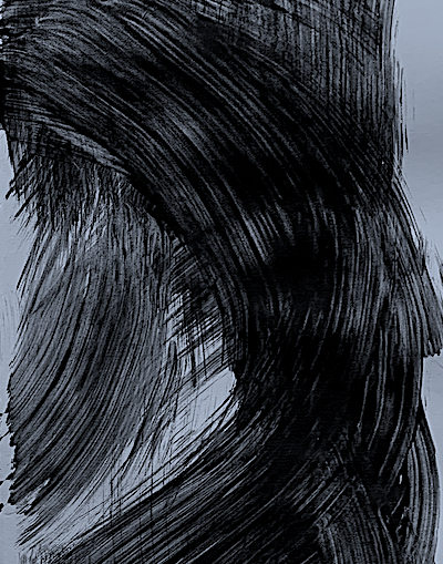
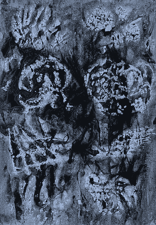
Figure 4. Verbs: Curve, Carve, Scrape, Slice and Shift.
I curved and carved a semi-circle of white paint by scraping, slicing and shifting the consistency of paint.
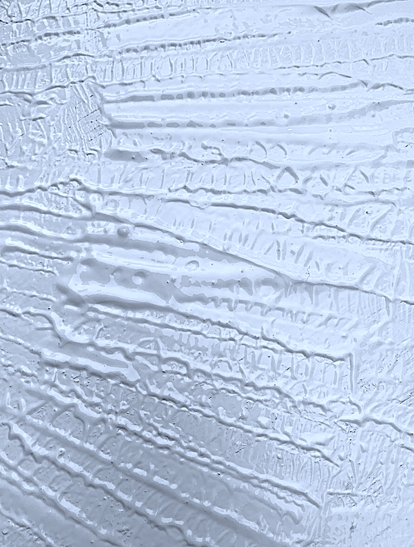
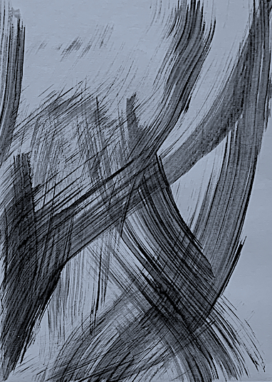
Figure 5. Verbs: Cut, Pat, Lay, Slice, Lift, Balance, Harmonise.
Figure 6. Verbs: Dab, Pat, Adjust and Modulate.
Figure 7. Verbs: Impress, Slide, Slip, Stretch, Splash and Lift.
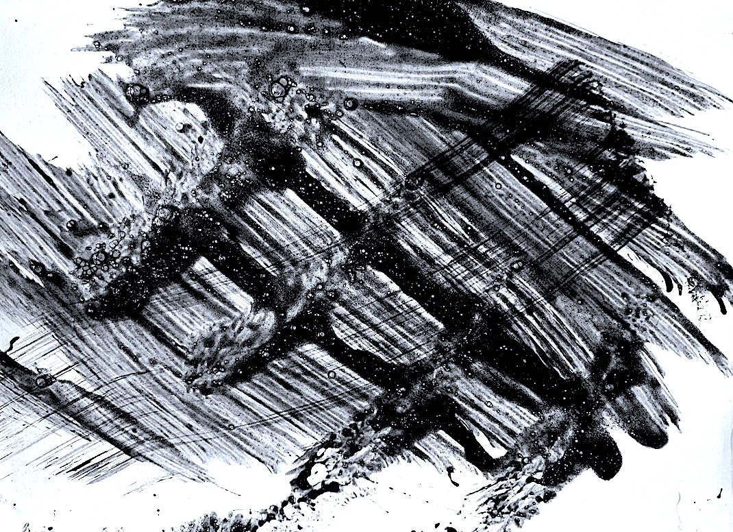
Semi-fluid tyre tread patterns stretch long in length along the wet sandy shore line. The vehicle’s parallel tyre tracks reveal the paint’s viscosity as the wheels thickly impress, slide, slip, stretch, splash and lift the sandy wet surface.
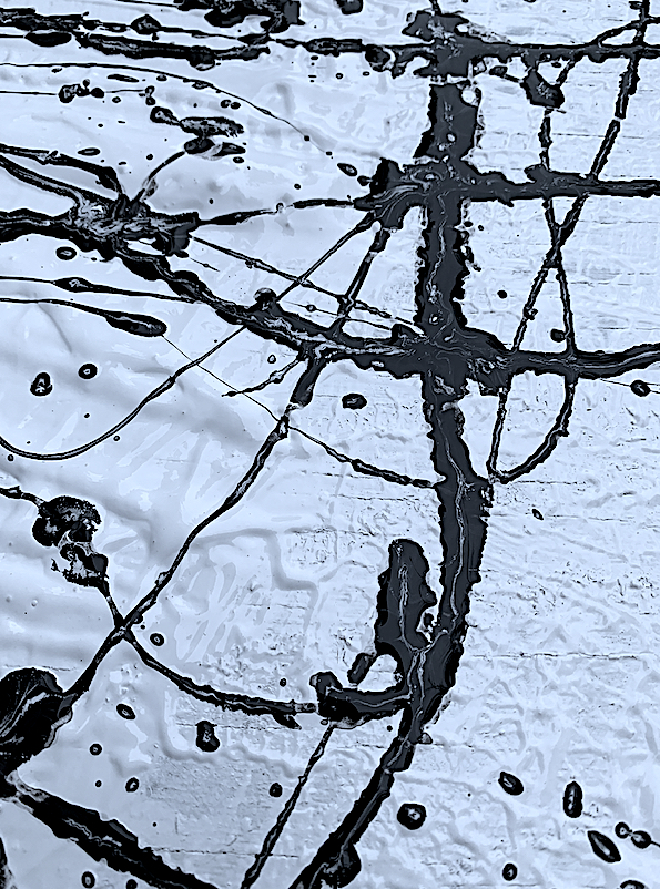
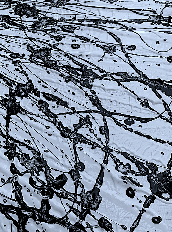
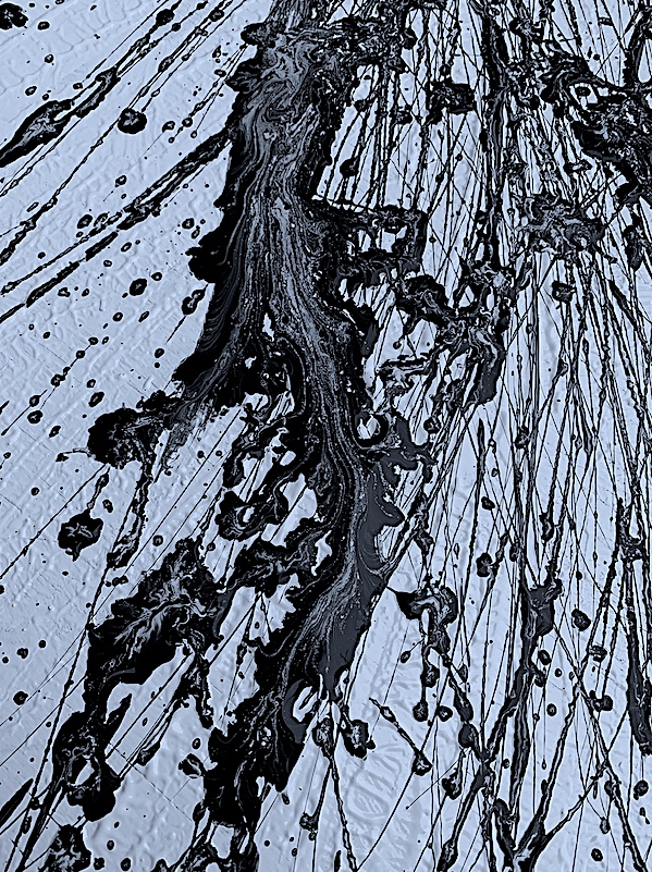
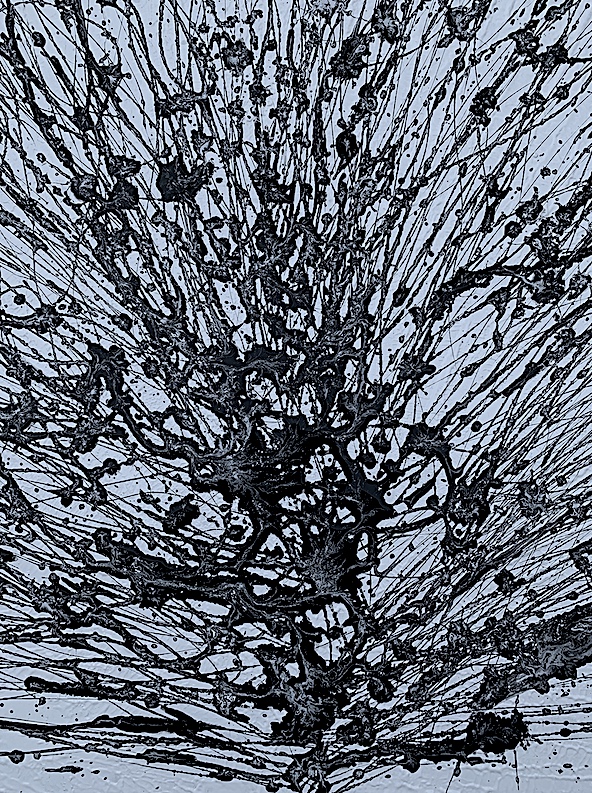
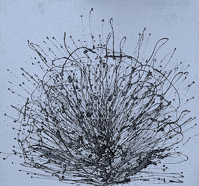
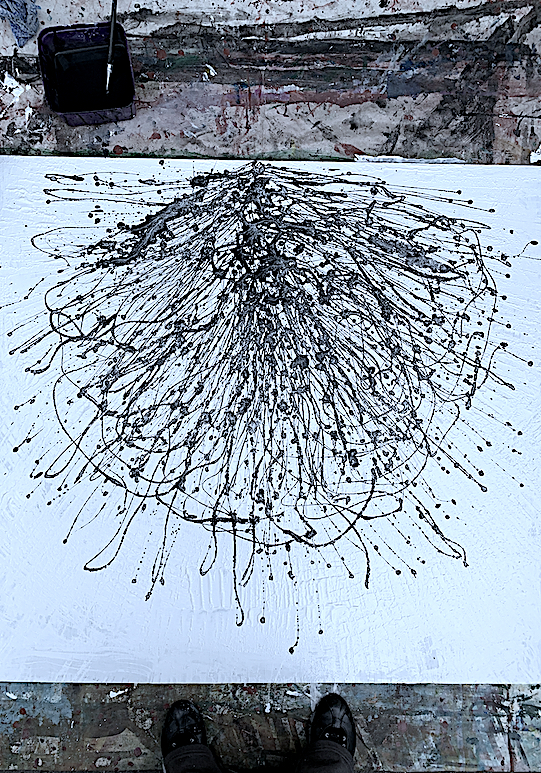
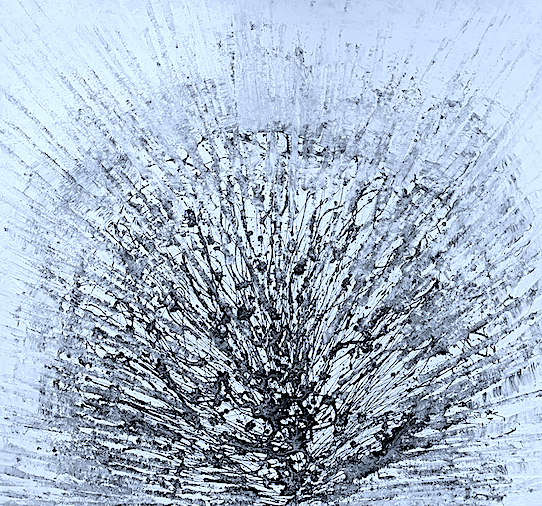
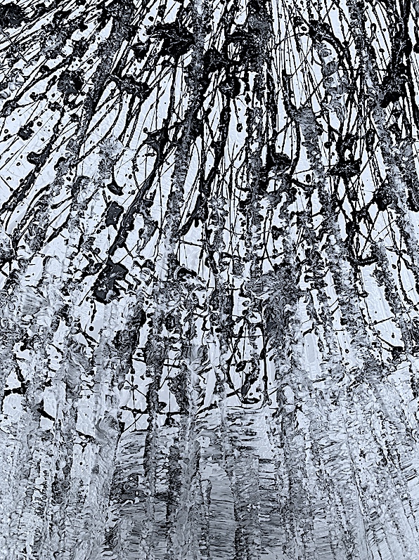
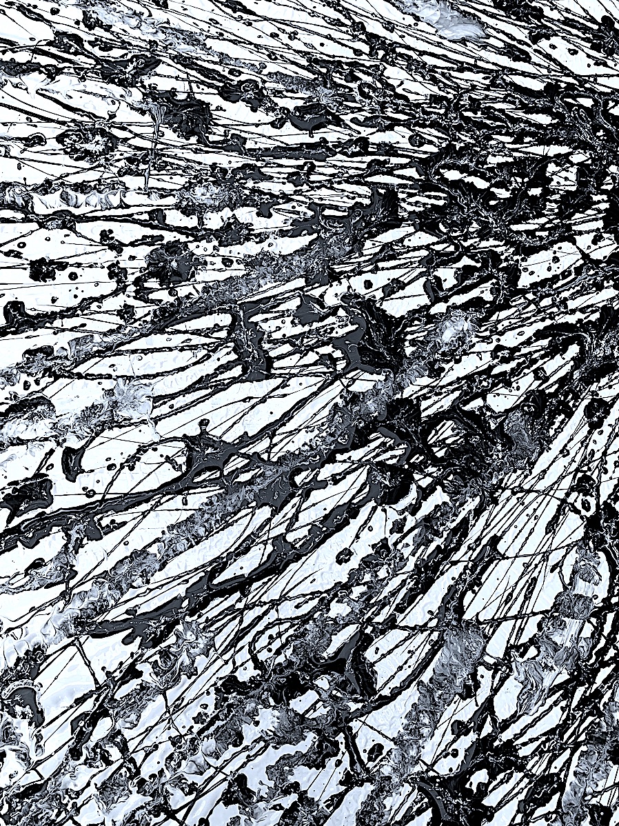
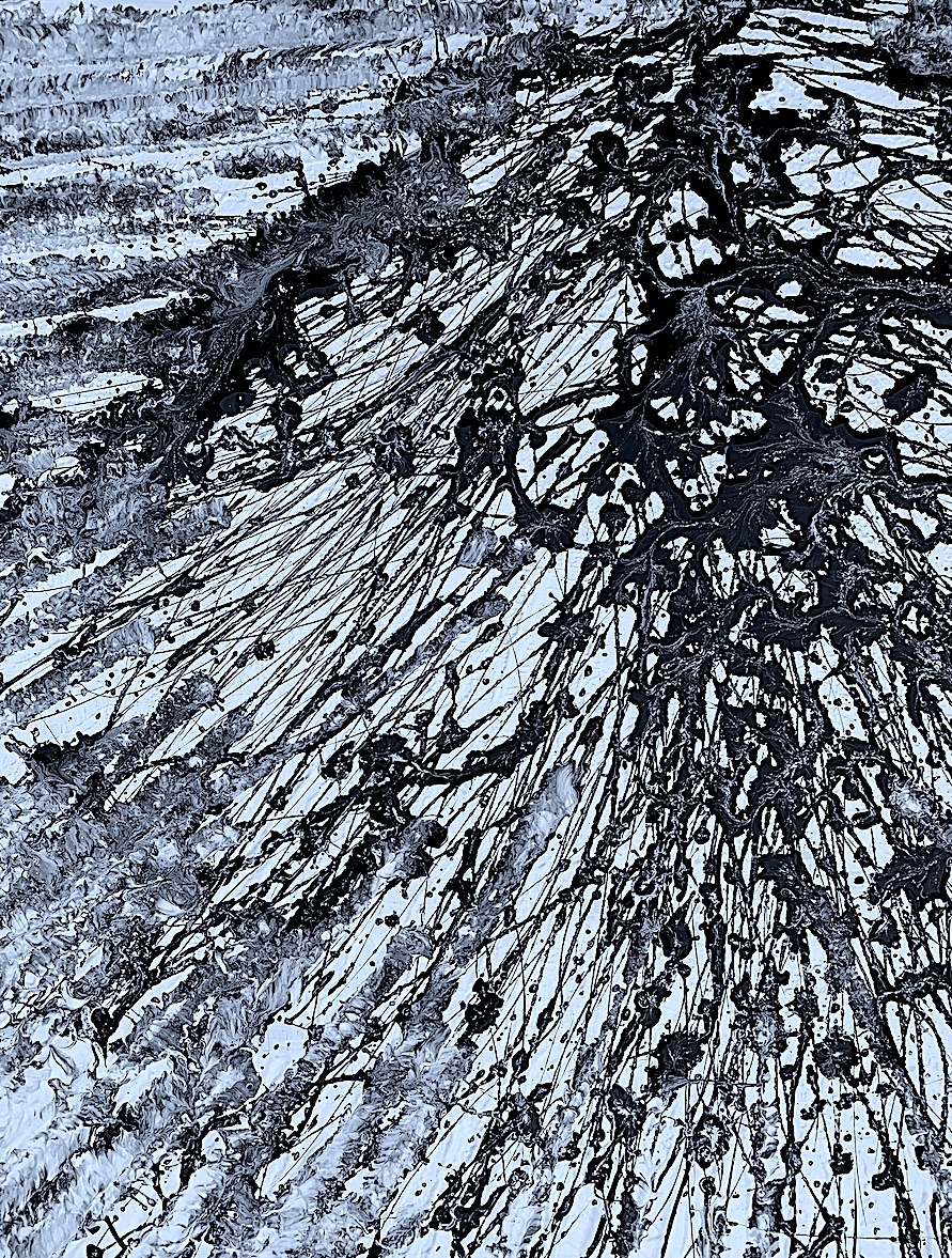
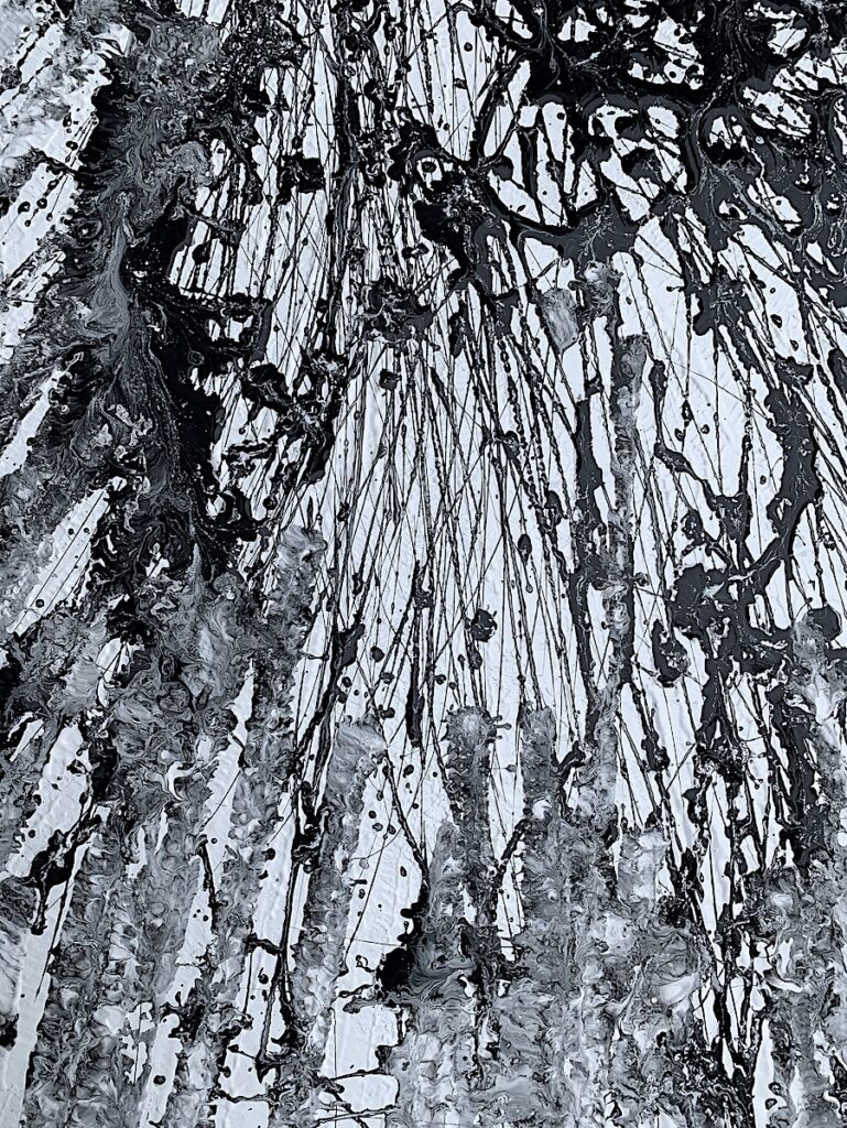
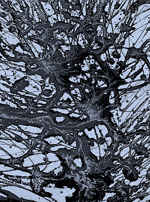
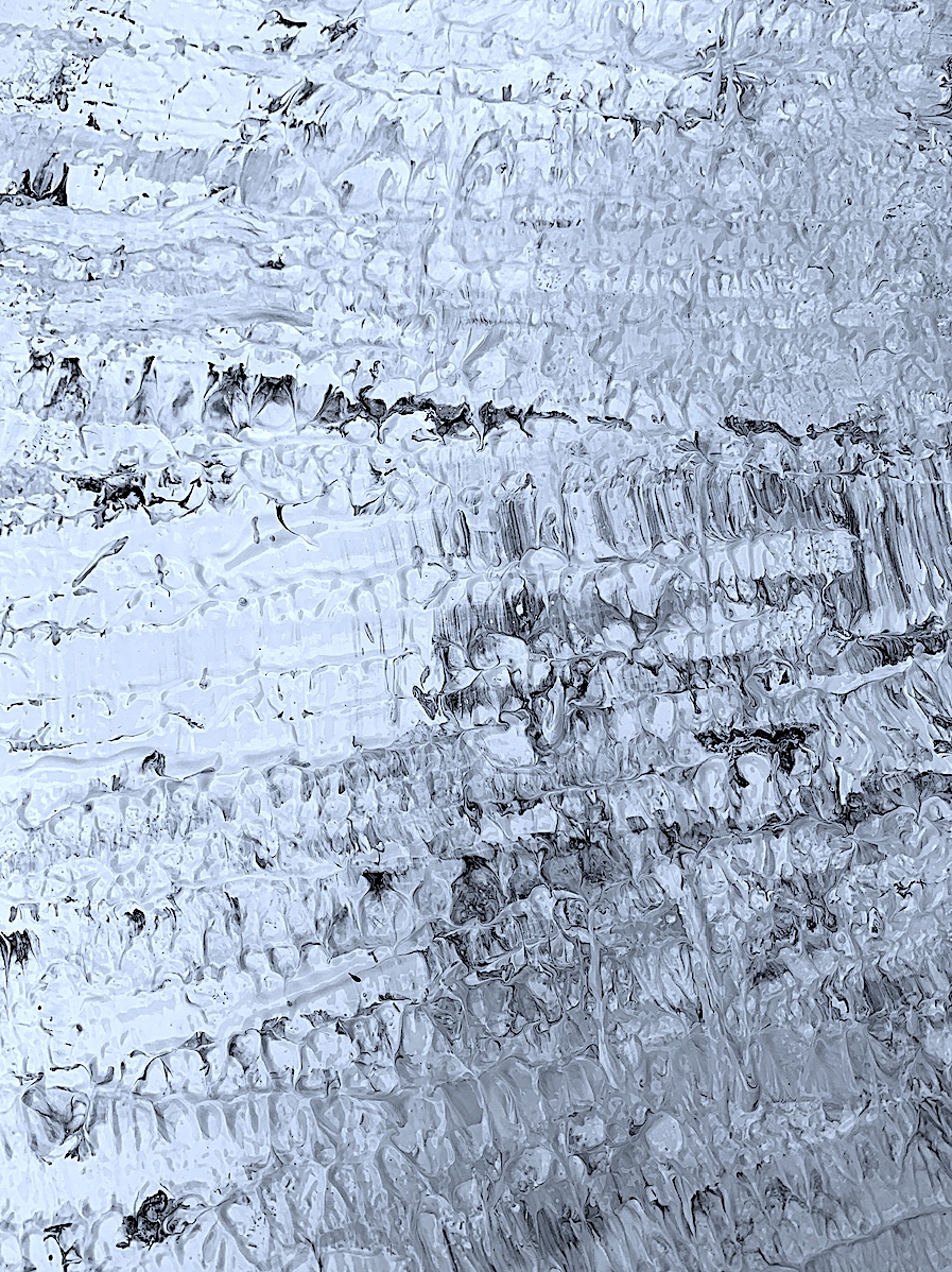
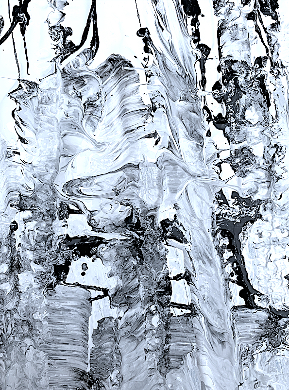
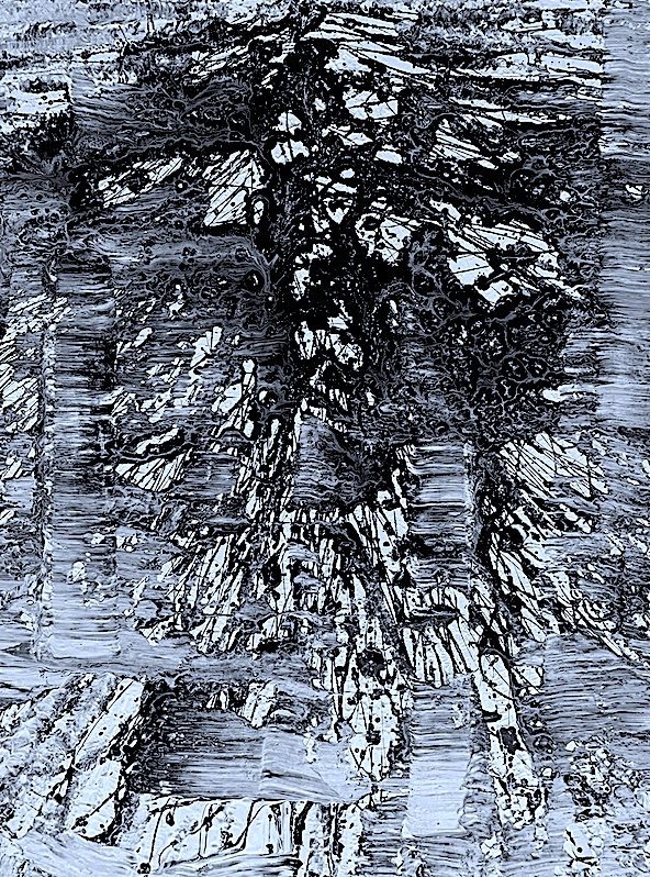
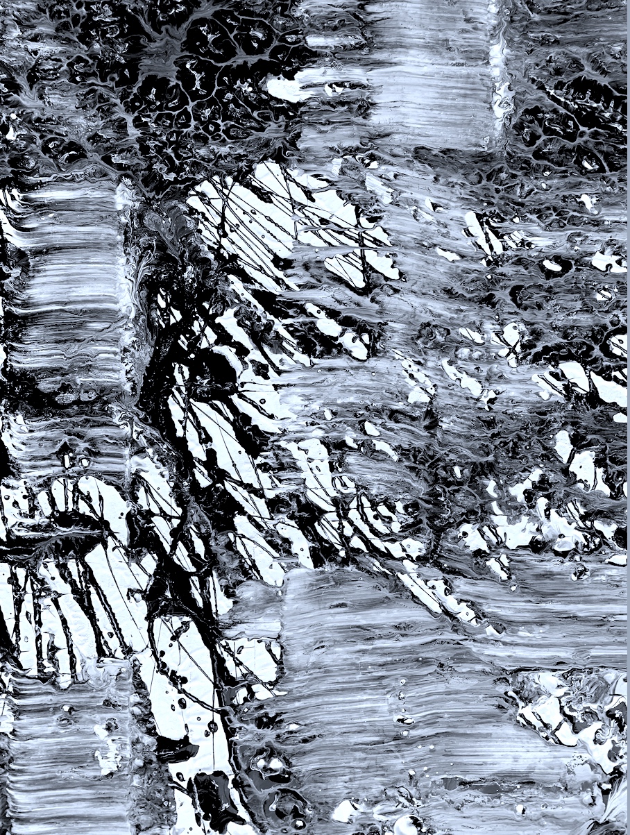
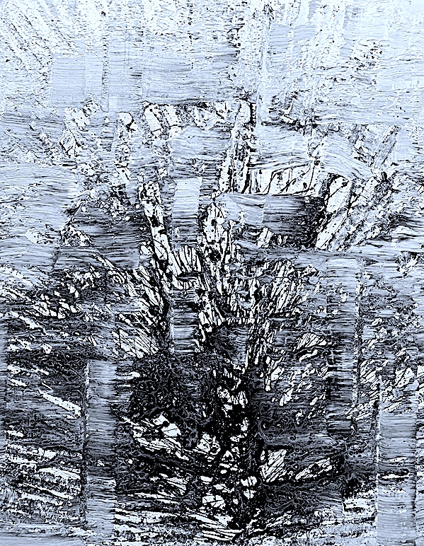
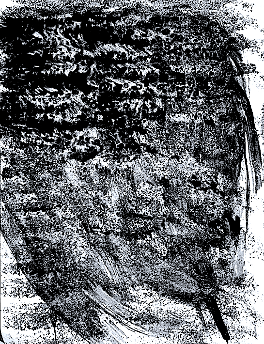
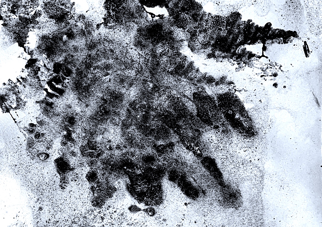
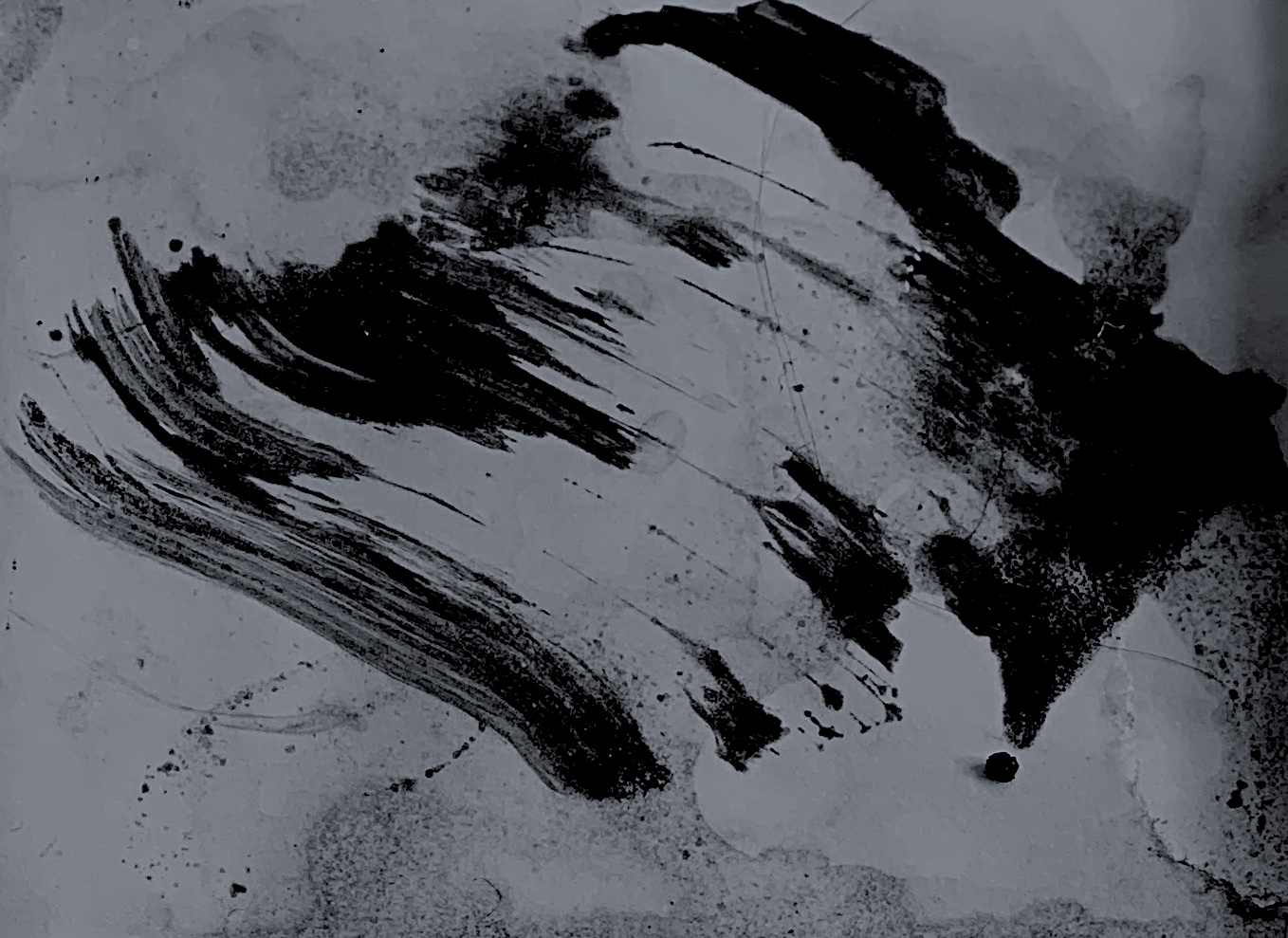
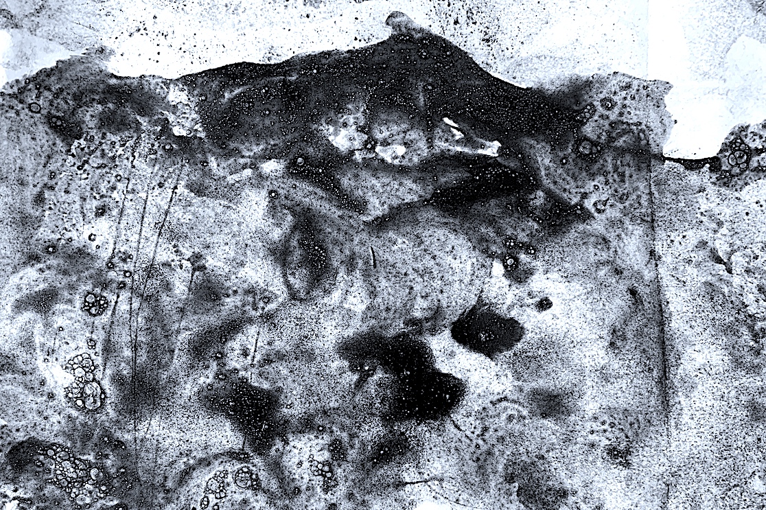
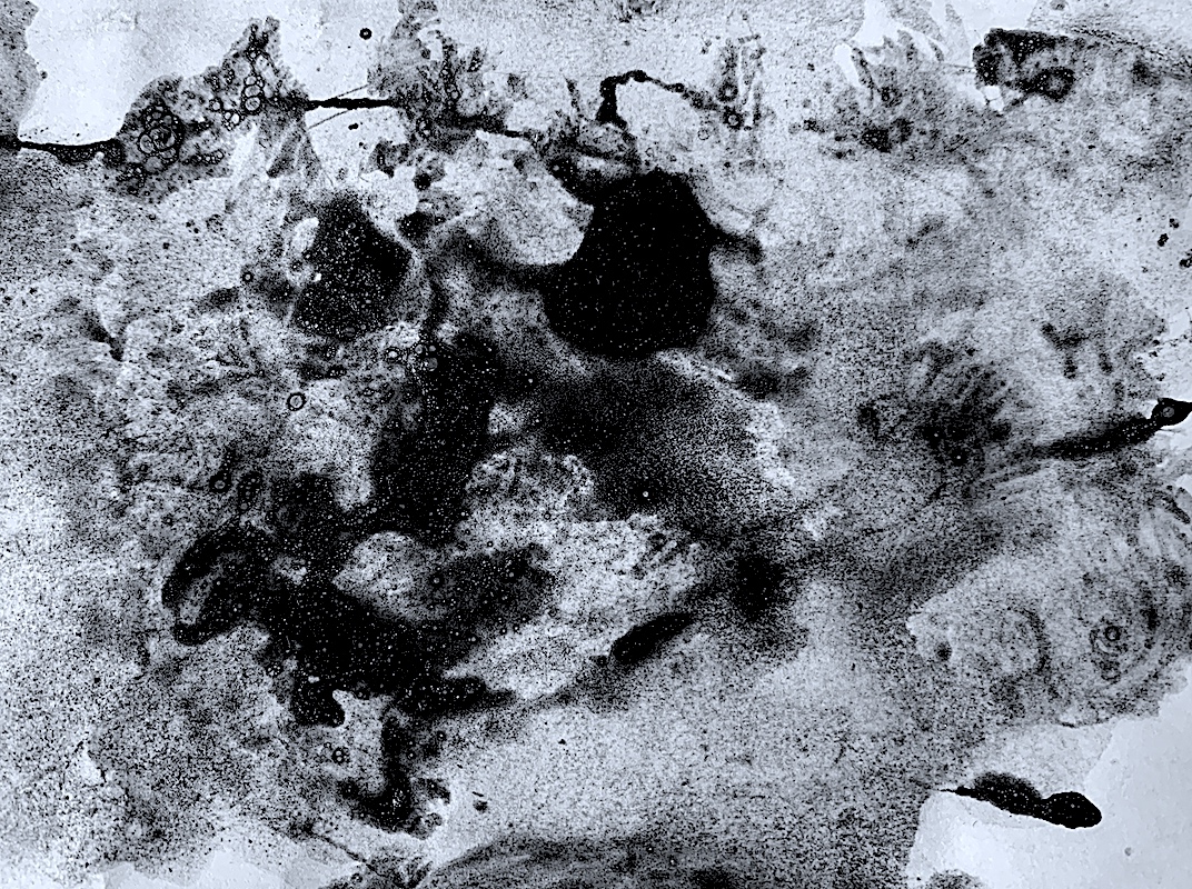
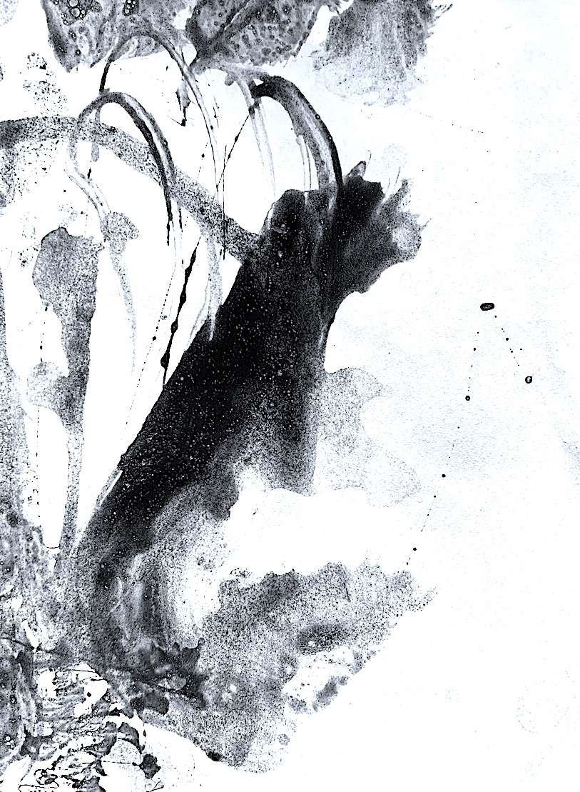
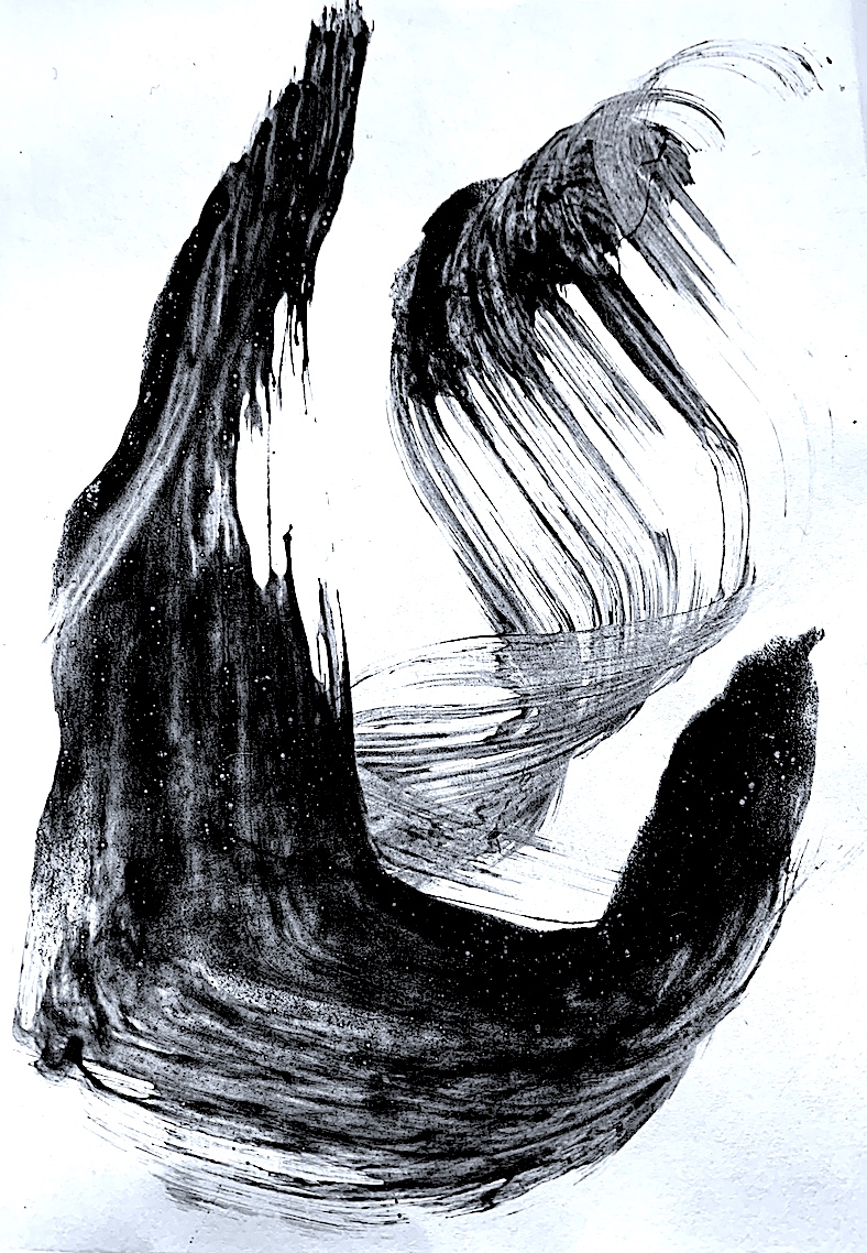
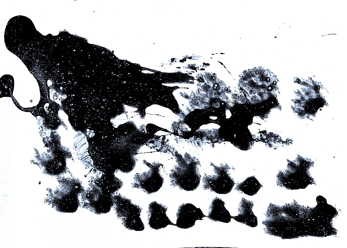
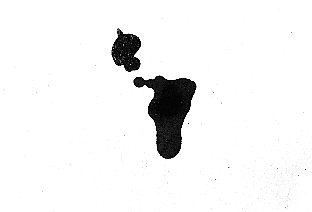
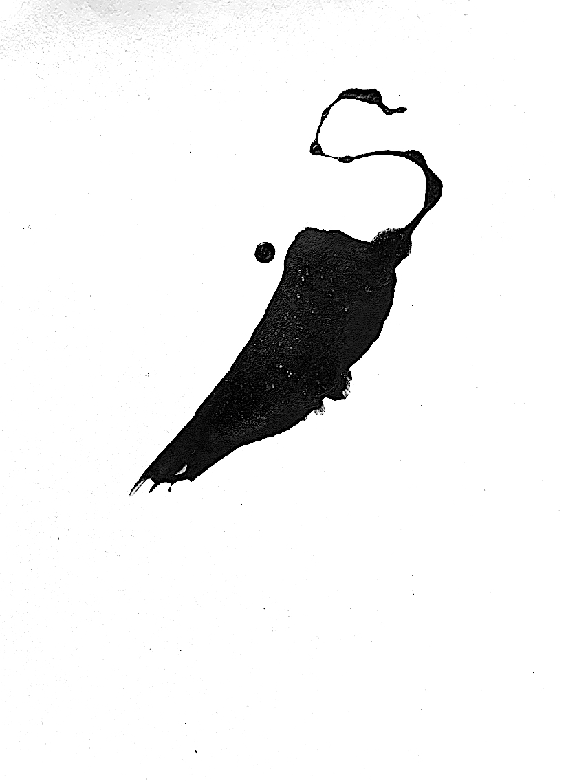
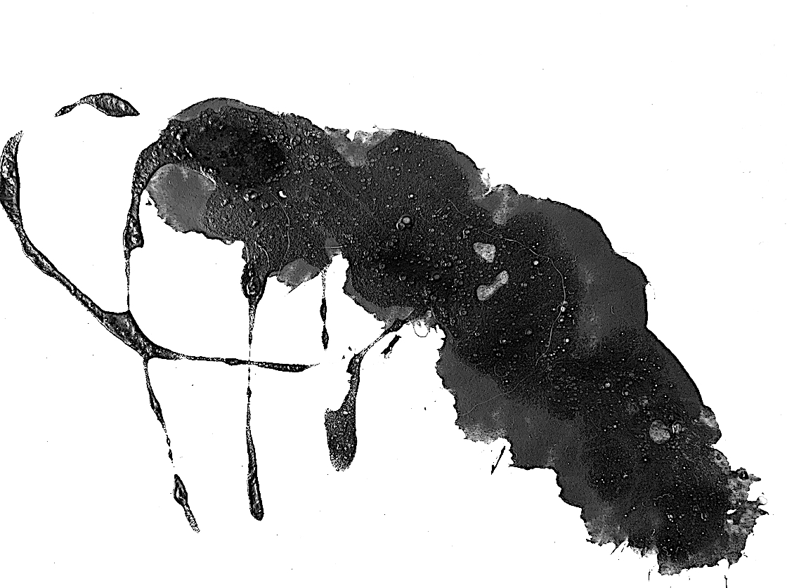
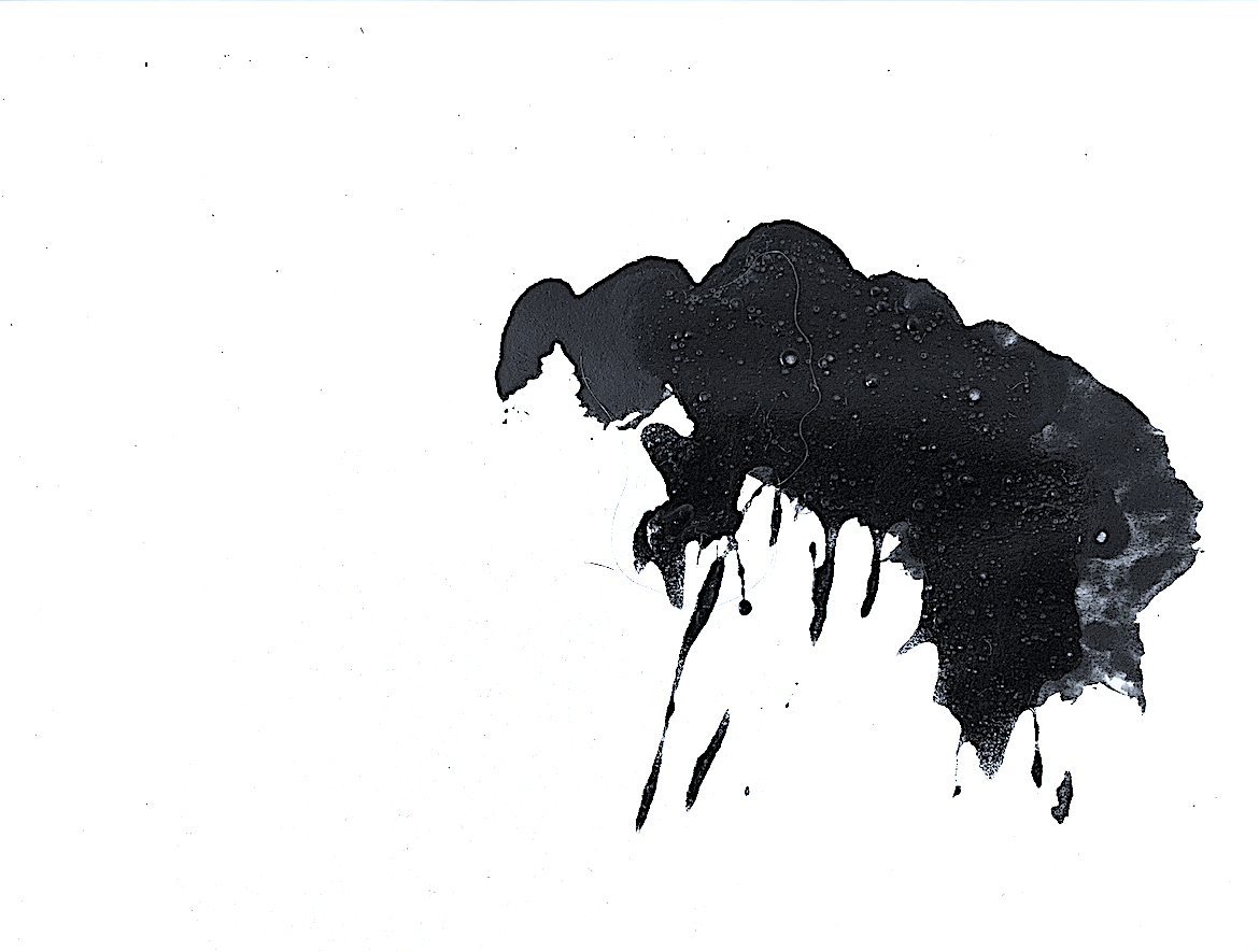
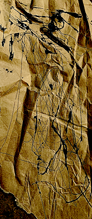
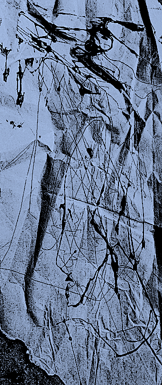
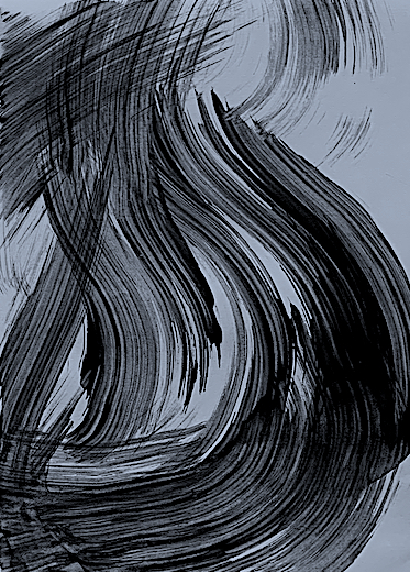
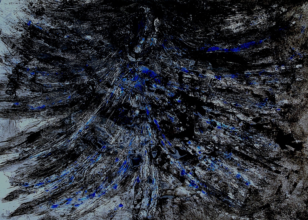
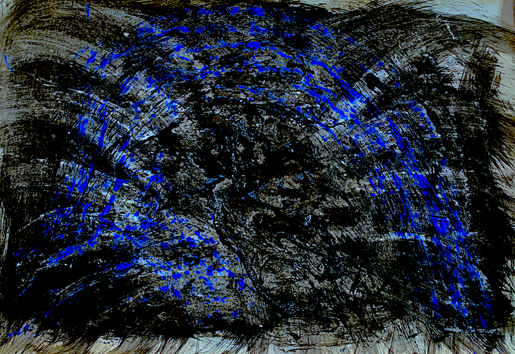
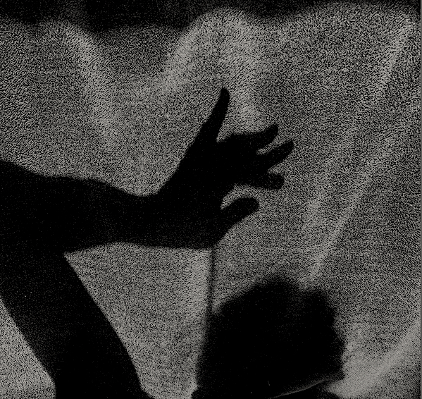
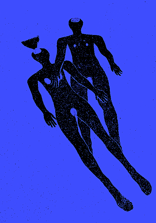
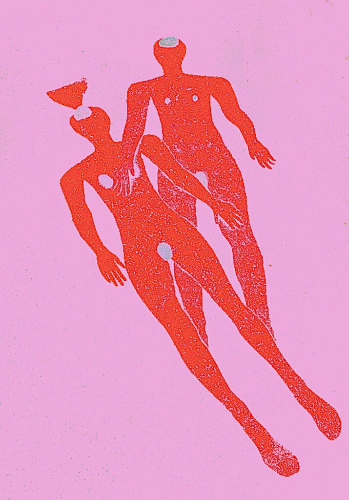
I enjoyed arranging and rearranging the snowy white painted surface, but there was a need for a new and distinctive element. This image above appeals, because I reintroduced what I had utilised yesterday; the black on white paint created a striking dark against light contrast. Introducing the black splatters was a favourite moment, because I was physically activating and communicating the verbs: streak, stretch, sling, flick, drip and dribble with a lot of energy across the thickly textured, wet white paint. This portion of the painting displays a tall thin, curved figure that stretches on an angle across the picture plane holding a twisted ‘Figure of Eight’ type bow and arrow. It reminds me of the stringy bronze statues by sculptor Alberto Giacometti.
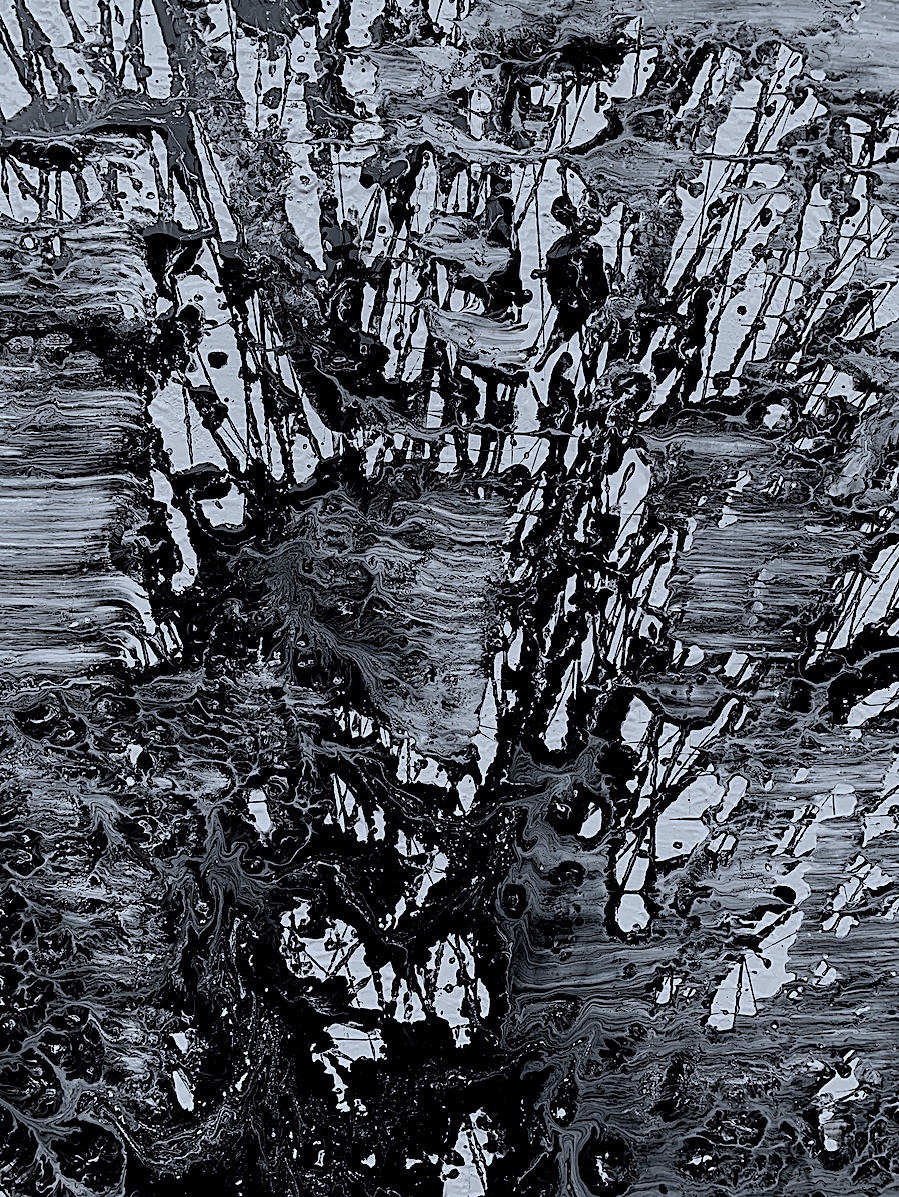
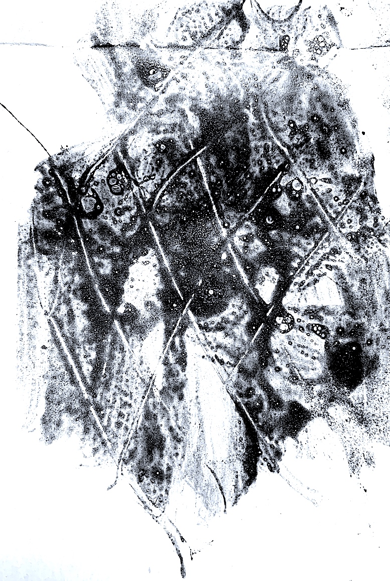
Here is another pleasing image above. By shifting my paintbrush and body back and forth quickly in a zig-zag motion, I sliced the air with thin criss-cross lines, that splattered, sprayed and sunk the black paint into the wet white paint. Climbing the mountain slopes, past falling rock debris and sharply jagged cliff faces, a dragon-shaped skier is transformed by the interaction of watery paint layers.
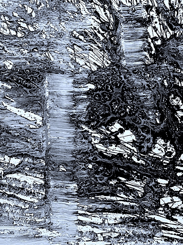
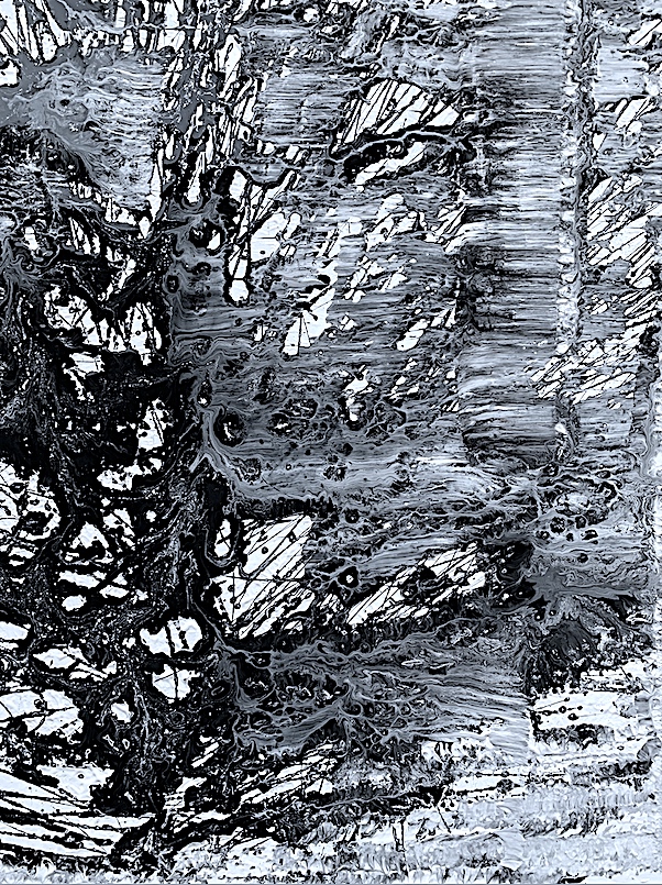
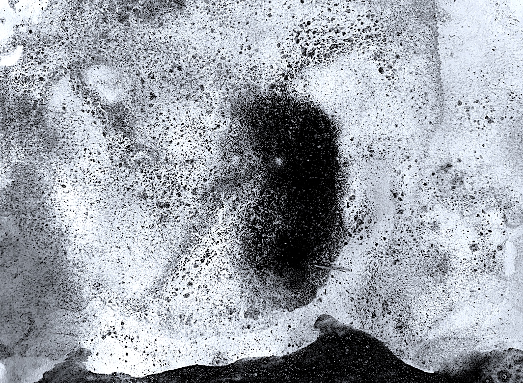
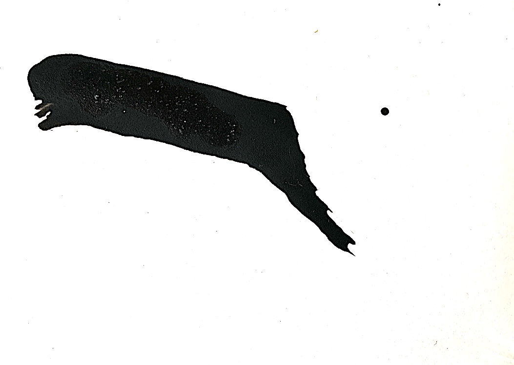
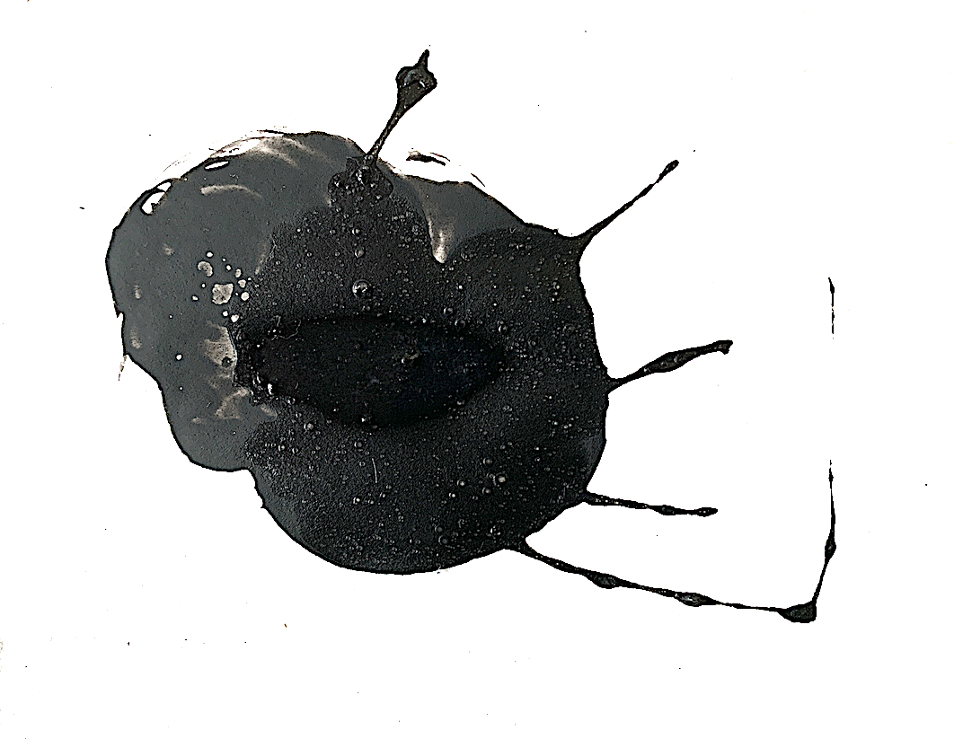
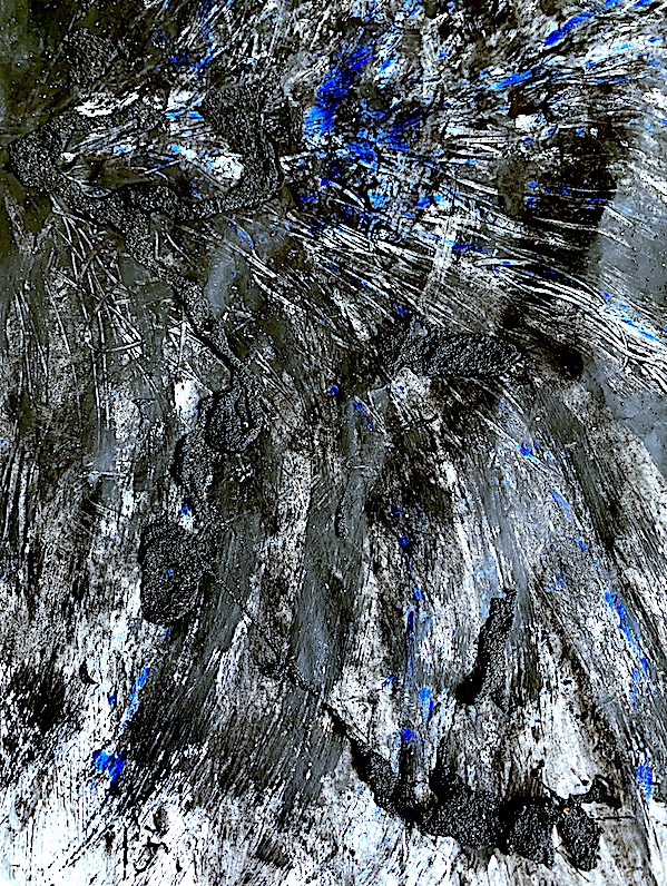
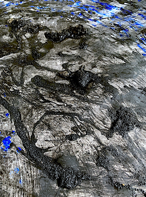
I like the textured cobwebs above and below, with contrasting light areas looking like puddle reflections. Other surface areas reveal a bubbling Hot pool effect.
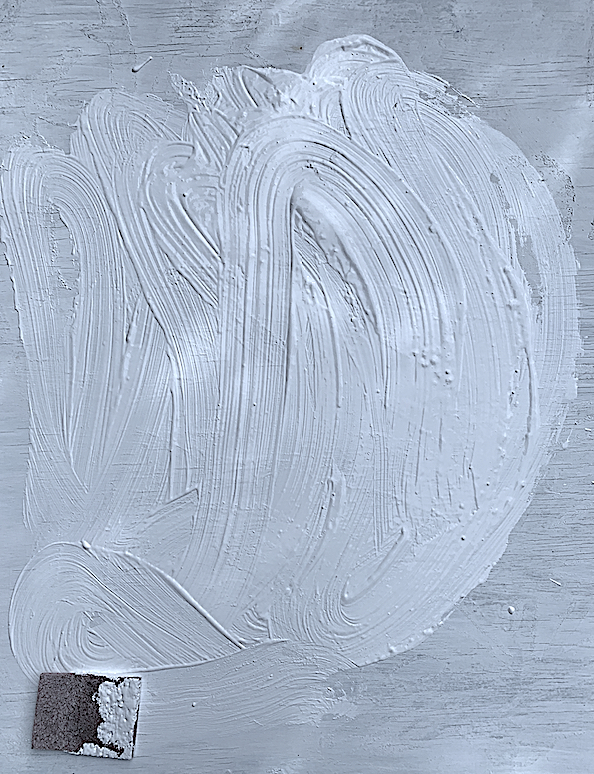
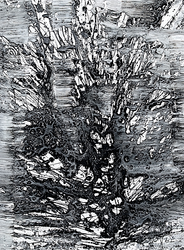
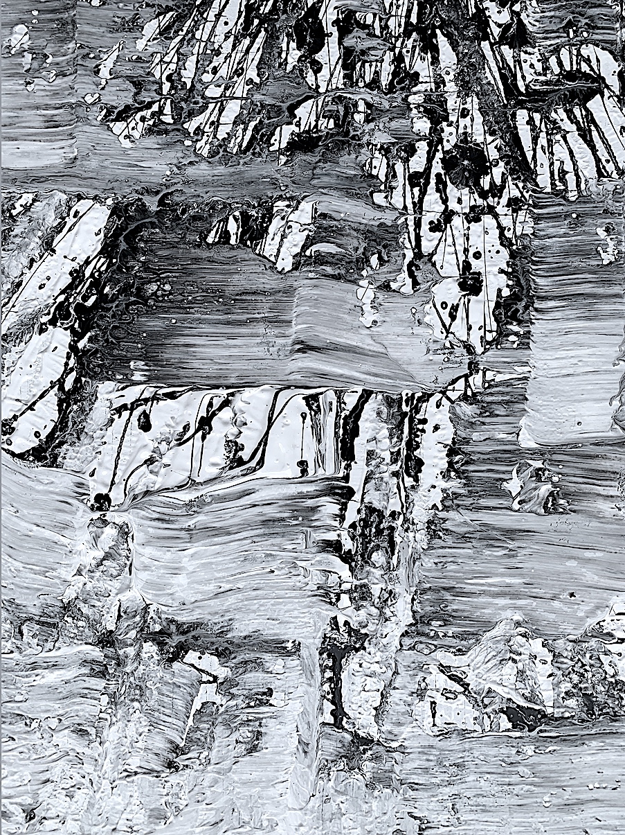
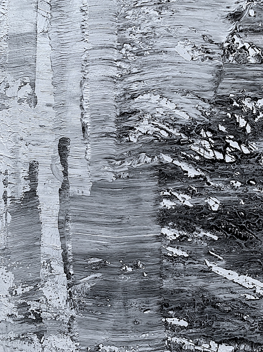
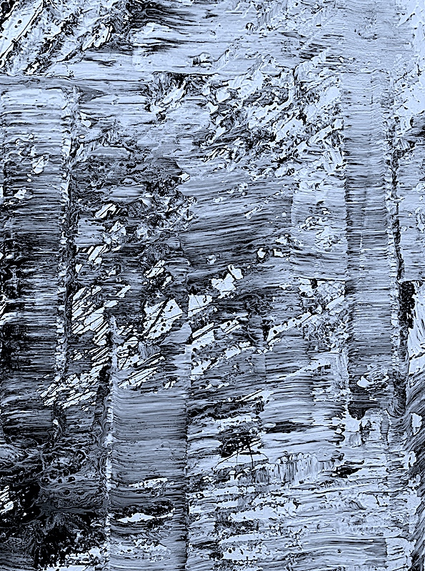
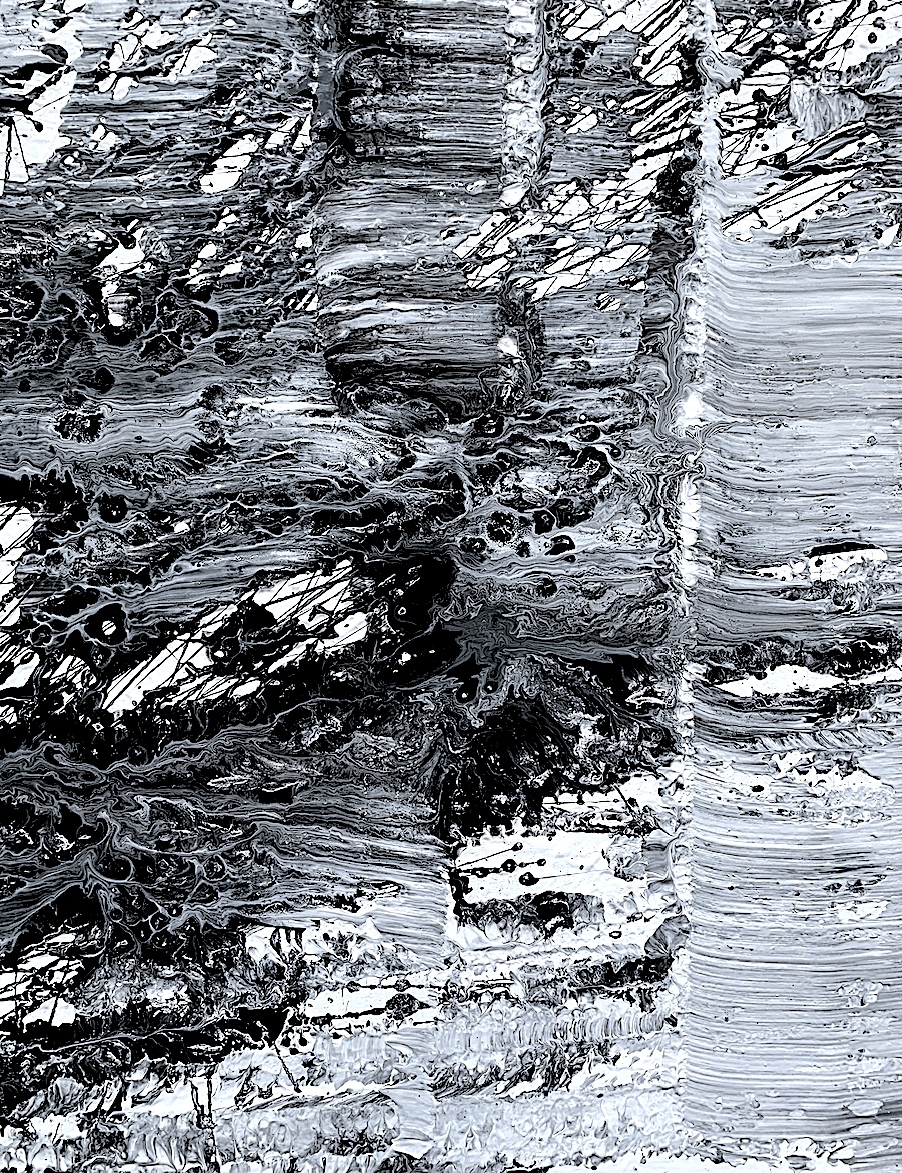
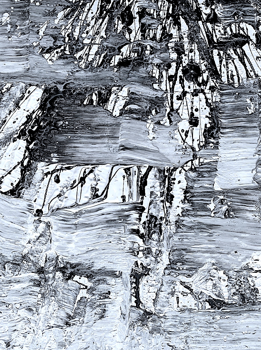
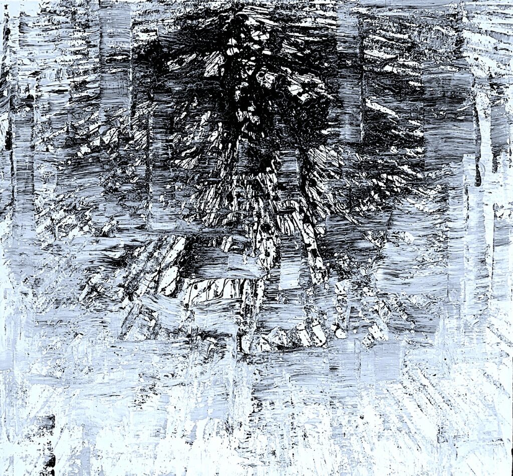
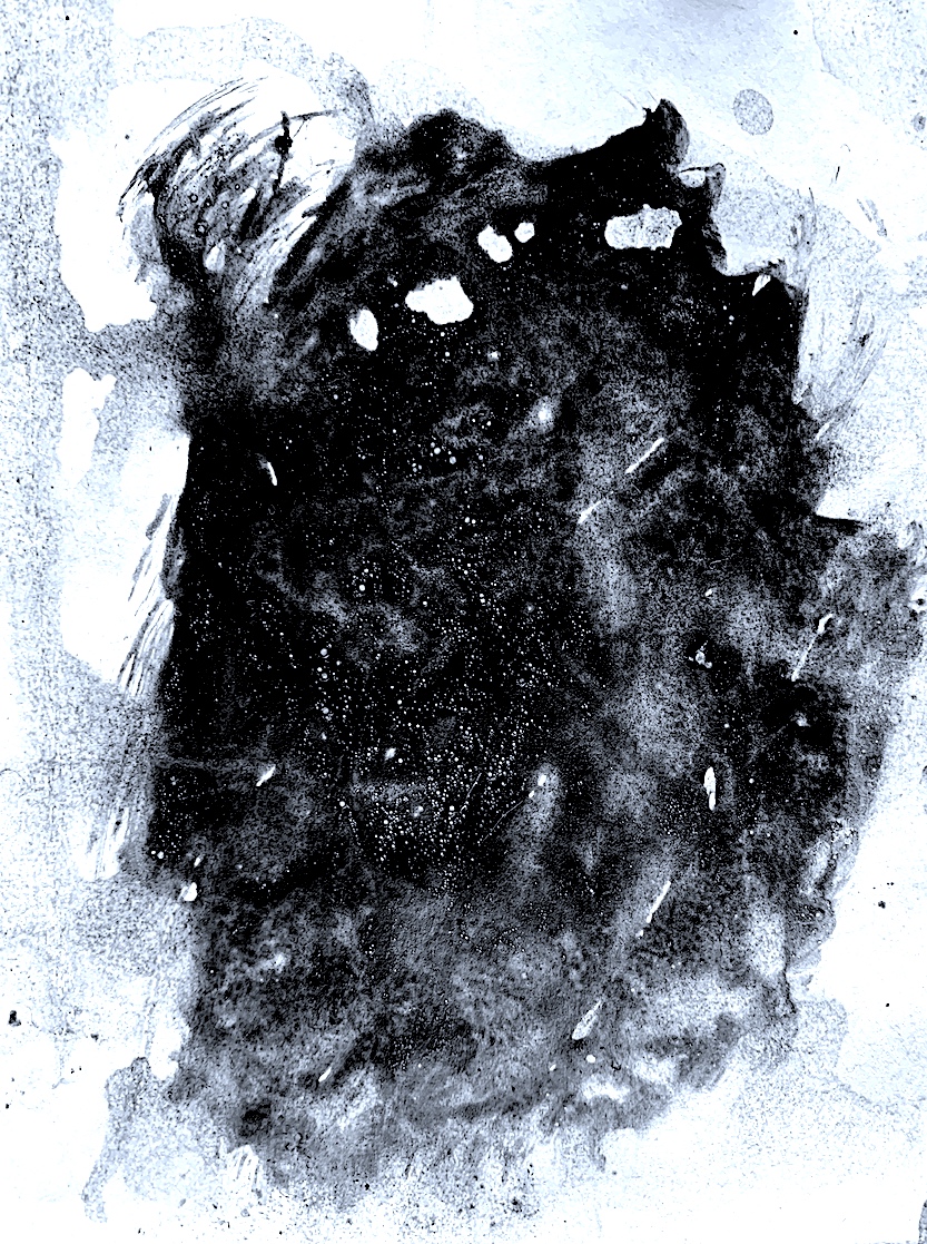
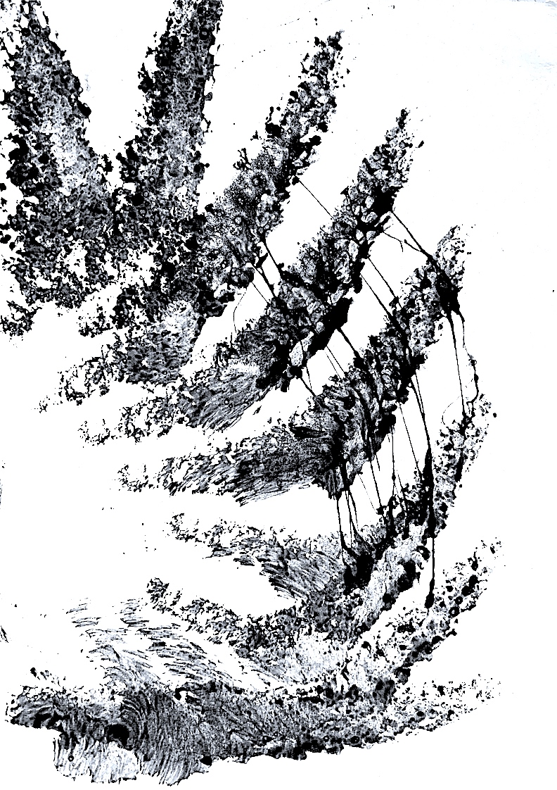
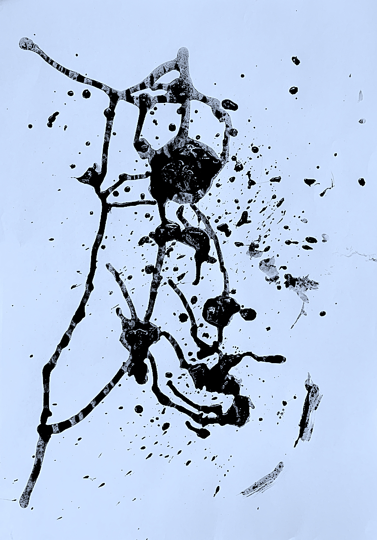
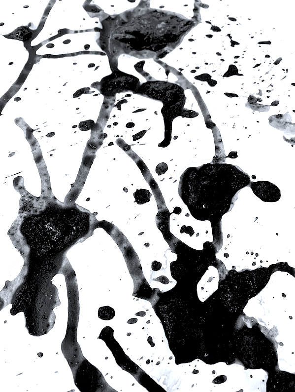
Overall, I am pleased with my second day’s effort. I do prefer certain shapes and textural parts compared to other surface areas. Perhaps, I could deconstruct by cutting the painting up like a jigsaw with a jigsaw tool to separate my preferences, and thus create smaller close-up views. Or, I could keep layering more paint to increase the texture, and to improve the parts I am not happy with. On a positive note, I did expand my experimentation process by enlarging the size of the painting base, and by selecting another shade of paint to contrast with the black paint. Through mixing black with white I achieved some lovely marbling results, and gained some subtle colour effects of dark and light grey. In the last group of close-up photographs above (from Figure 19 to 31), I find the wave-like movement juxtaposed against defined vertical columns interesting, and my most pleasing surface parts.
I consistently selected Richard Serra’s list of Verbs, plus created and used my own action words such as undulate. Constantly visualising the verb movement, naturally corresponded to my body movement, and in a few hours I had experimented with shifting thick black and white paint around using abstract expressionist gestures. By manipulating paint using my whole body, and moving over and around the edges of the timber base, I generated a thick painterly textural surface, built up by a number of layers. I created a myriad of balanced and unbalanced lines, shapes and forms, yet most importantly, I found the last two days of painting very relaxing and fun!
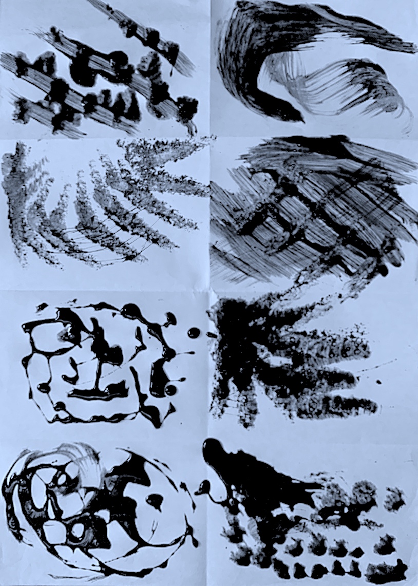
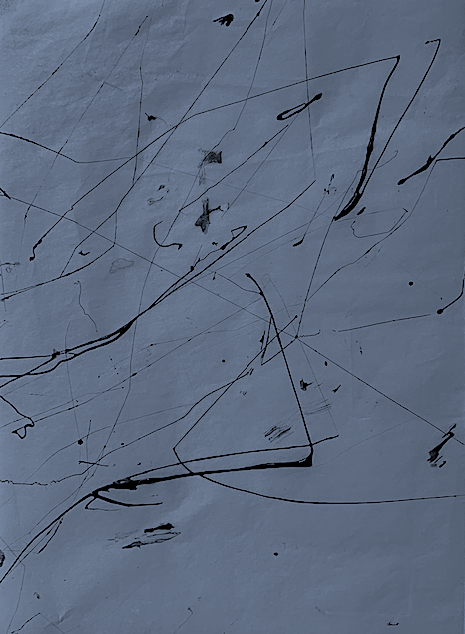
The focus of the ‘Process Into Image’ Paint brief is to develop and invent a vocabulary of marks to guide the process of paint exploration. After viewing a text list created by famous sculptor Richard Serra for his artwork titled ‘Verblist’ 1967-8, I am to interpret and emphasise action words via paint through the process of one action leading on to another.
The use of verbs is definitely not new to me, as I have always utilised verbs as a dancer, dance choreographer and dance Advisor, plus as a school teacher in dance, physical education, language, spelling, writing and grammar skills. As a dancer, verbs are what the viewer sees, and the performer does. Therefore, I understand how text such as verbs relates to the Performing Arts and the Visual Arts. In the discovery process, the interesting point for me will be whether my actions portray my verb thinking? Will my action words look like verbs, even if I think, act and feel them? Perhaps, the actual outcome of dried paint may not look very verb like, which makes me think my encounter of the process is more important than the product, especially for me at this stage, being unskillful, and a newbie to visual art.
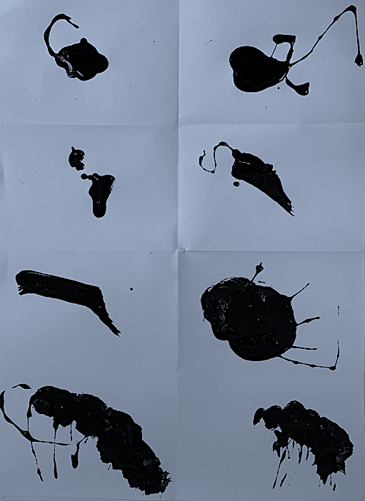
Engaging with some old paint on the surface of some old paper was a happy encounter. Outside, positioned on the ground on a large tarpaulin, I immersed myself in action words, imagining and picturing verbs falling from the paint. My body and mind were constantly moving and painting in sync. I prefer working on a larger scale, yet to save paper I started my Verb mark-making on smaller size pieces of paper folded into rectangles, in the form of thumbnail sketches.
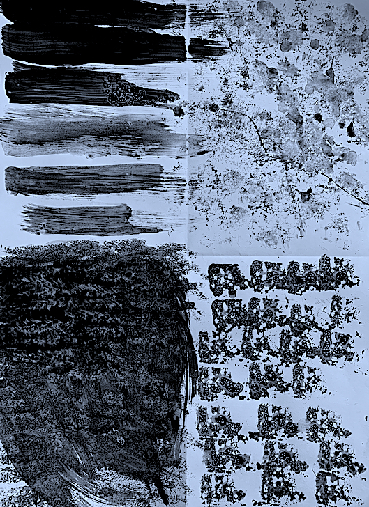
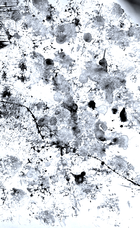
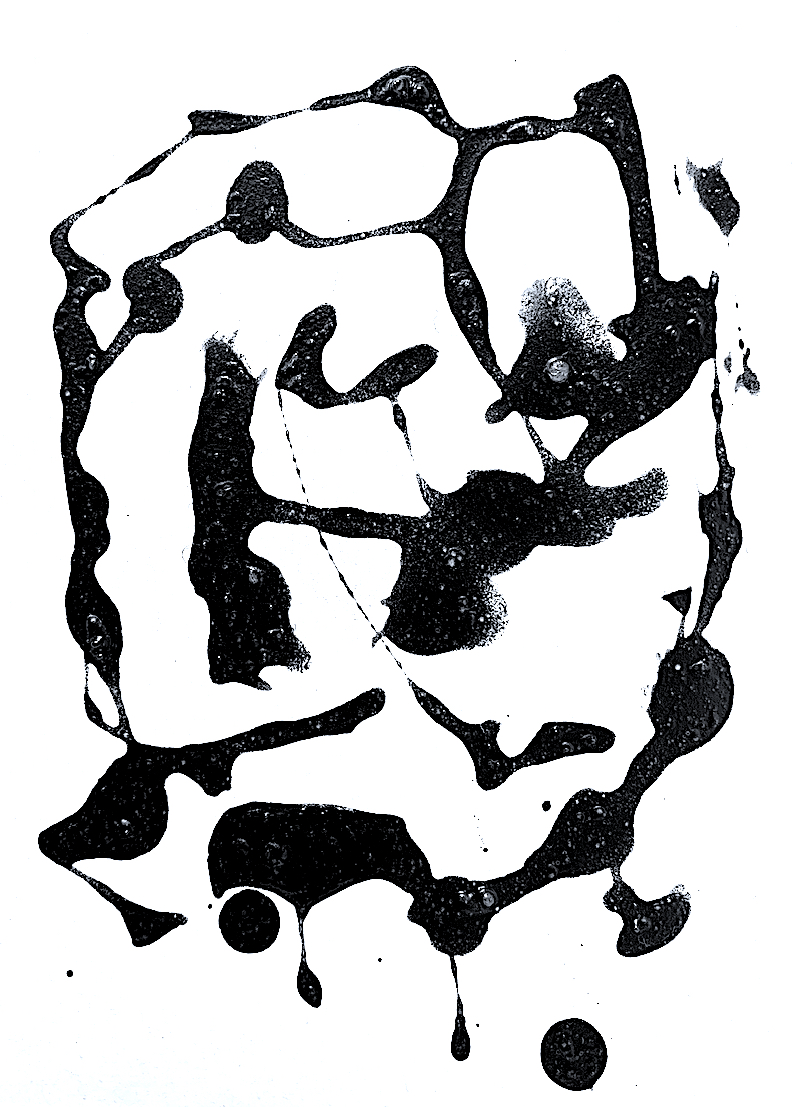
For some reason, I grabbed just a container of black paint for my first Visual art verb experimentation. Perhaps, it was because I often use colour. Instead of watching colour mixing, it was interesting to observe just the negative space and the emptiness of the white paper surface being swallowed up with running, pooling paint. Witnessing the strong black contrast against the white paper, and seeing the actual outline shape of my marks felt right, I did not miss the lack of colour, or my passion to see colour.
Each outline depended on the consistency of my paint pour, or loaded tool such as a brush, sponge or wood. Sometimes the consistency was too much, sometimes too little, and some paint pours were just right. It didn’t matter at all, because my physical actions were full of innovative swinging, twisting, twirling and flicking actions, and the paint just fell, and it was like playing with chance. Intuitively connecting my body with the black shade of paint and tools, I was in a peaceful place, because playing with the material of paint in my garden in the fresh air was awfully fun! Watching how it danced across the stage surface to its own tune, following the uneven surface of the pavers into lines and shapes, controlling itself by spreading and pooling towards or away from me was a lovely encounter, and I just let it do its thing.
My experimentations sometimes demonstrated a repetitive outcome using a certain tool. Therefore, after a certain time of enjoying repeating my tool action with a different verb, or a group of verbs, I changed to discover different outcomes. Playing with the sponge caused a softer, blurry or bubbly textured effect, depending on how I manipulated the paint and surface edges of the sponge. Using different angles and planes of the brush and wood tools also provided experimental insights into the way paint can be manipulated.
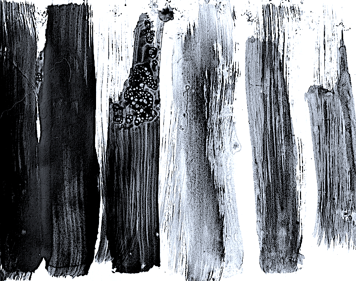
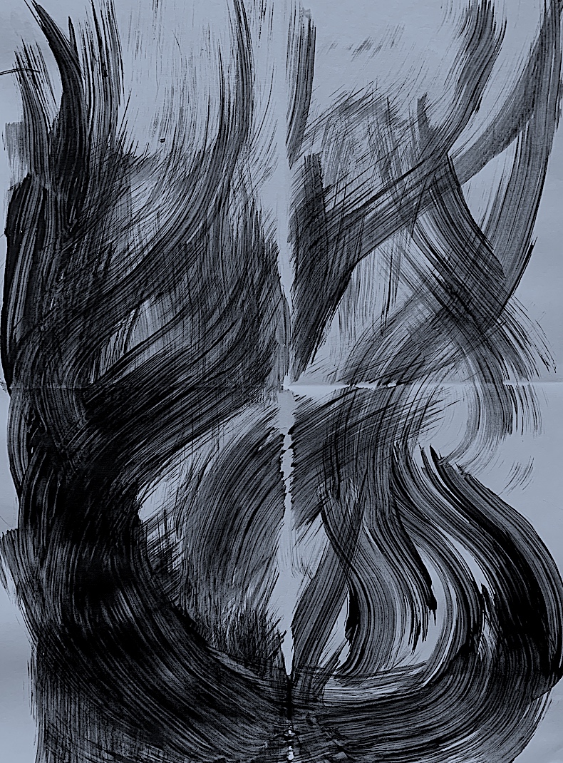
Action-led Processes: Mark making with the whole body, not just the hands. Tools: Cartridge Paper, Brown Paper, Acrylic Paint (Black), Water, PVA, Sand, Fingers, Paintbrush, Sponge, Rag, Wood.
Figure 1. Verbs: Push and Pull, Flick and Dilute, Dab and Mix and Merge, Dab and Impress.
Figure 1. Verbs, Acrylic Paint, A3 Paper
1. Close-ups
Figure 1a. Push and Pull, Rest and Bubble
Figure 1b. Flick and Dilute
Figure 1c. Dab, Mix and Merge
Figure 1d. Dab and Impress
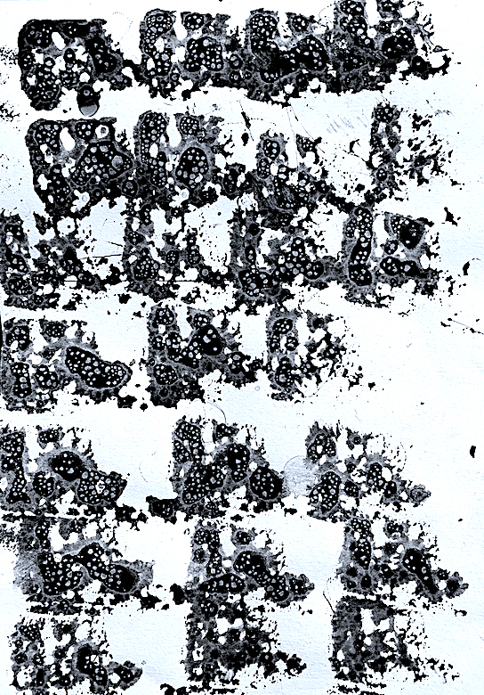
Figure 2. Verbs: Dapple and Spread, Rush and Brush, Dollop and Puddle, Run and Storm, Drip, Pull and Dilute, Bubble, Shift, Pull and Merge, Dabble, Swipe, Smear and Swirl, Underlay, Run, Bubble, Overlay, Scratch and Criss-Cross.
Figure 2. Verbs, Acrylic Paint, A3 Paper
2. Close-ups
Figure 2a. Dapple and Spread
Figure 2b. Rush and Brush
Figure 2c. Dollap and Puddle, Dilute and Spread.
Figure 2d. Run and Storm
Figure 2e. Bubble, Swish, Pull and Merge
Figure 2f. Drip, Pull and Dilute
Figure 2g. Dabble, Swipe, Smear and Swirl
Figure 2h. Underlay, Run, Bubble, Overlay, Scratch and Criss-Cross.
Figure 9. Verbs: Underlay, Mark, Draw, Brush, Mix, Smear, Overlay, Spill, Flood, Soak, Dilute, Sponge, Spread, Smudge. Introduce a new Tool and Colour: White Oilstick with Black Acrylic Paint.
Figure 9b. Verbs: same as above, but added Drip, Drag, Pull. Acrylic Paint, White Oilstick, A3 Paper
Figure 10. Verbs: Lay, Draw, Mark, Brush, Dilute, Drag, Wipe, Curve, Scrape, Scratch, Mix, Merge and Flow. Introduce a new Tool and Colour: Blue Oilstick with Black Acrylic Paint.
Figure 10. Building layers and mixing Texture: PVA and sand with black paint.
Figure 11. Verbs: Arranging by Drawing, Marking, Sliding, Stretching, Pulling, Pushing, Matching and Curving. Then Disarranging by Diluting, Wiping, Overlayering, Merging, Smoothing and Lifting. Introduce a new Tool and Colour: Blue Oilstick with Black Acrylic Paint.
Figure 11. Verbs: Arrange, Draw, Mark, Slide, Stretch, Pull, Push, Match and Curve. Disarrange, Dilute, Wipe, Overlayer, Merge, Smooth and Lift. Acrylic Paint, Oilstick, A3 Paper.
11. Closeup to see raised texture
Figure 11. Building layers and mixing Texture: PVA and sand with black paint.
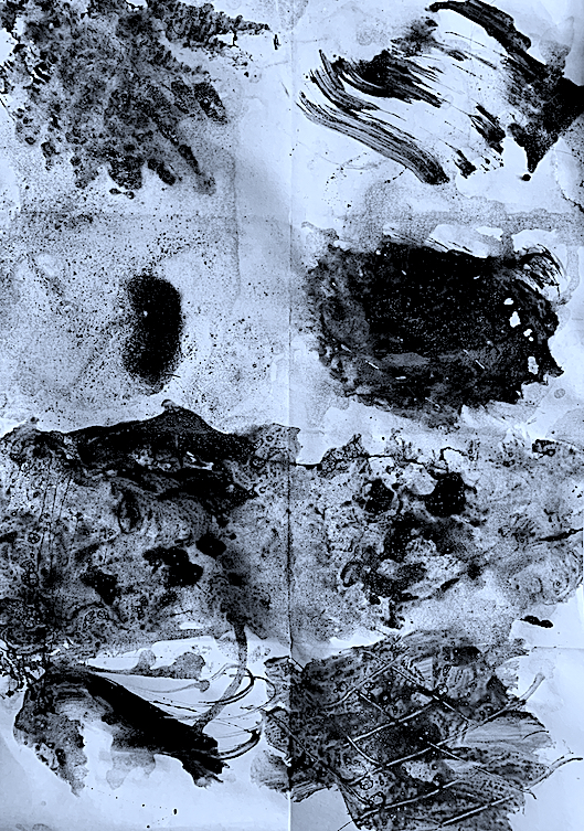
Reflection: My first exploration of generating action words in Visual art was very enjoyable. Although I was unsure whether I was allowed to add other materials to the paint, a favourite experimentation today included the mixing of paint and additives in order to gain, thus explore a thicker paint texture.
After making an array of paint verb gestures, I had a desire to thicken my paint consistency. I added a thickening agent to the black paint, a touch of PVA glue, and then spent time experimenting with the combination’s elasticity, like playing with elastic bands. I loved viewing the thin threads of paint mixed with PVA, it was like pulling stringy cheese from a pizza. Elongating the acrylic paint across the paper surface in bouncy, stretchy zig zag ways, I had to work quickly, because the thickened paint mixture was drying quickly in the sunshine.
As a next development, I grabbed some sand and made a mixture of PVA, sand and black paint. Playing around with the verb ‘heap’ I not only built up thin layers of paint separately, but invented a strange globby paint-glue-sand mixture. I enjoyed developing new forms of textural marks onto the paper surface, and gaining dirty hands too.
Lastly, I added an oil stick to introduce colour and texture, plus resistance. The paint resisted against the oil stick (white, then blue), revealing scratchy oil-stick marks, which I liked.
Through these surface encounters, aligned with my use of the ‘verbs’, I was investigating the contrast between watery paint and non-watered down paint, and how the paint’s watery quality can both resist and merge when mixed with thickening agents. I noticed the materiality of the paint changed using the added ingredients, especially the glue, which gave a different surface tension to my experimentations. Although my bubbly, marble-like effects with watery paint still appeal, by increasing the strength of the acrylic paint, and adding other products (glue, sand and oil-stick), my final textural developments seem more compelling to me.
VALUE leads to DESIRE of COMMODITY and PRODUCT and BODY and IDENTITY
Concept 1. Commodity Gold to Product Butter (VALUE: Comparisons and Connections)
Concept 2.BODIES of Culture and Society VALUE and DESIRE Butter PRODUCTS and Gold PRODUCTS. The BODY tastes sweet butter and buttery products, and the BODY adorns and decorates shiny gold, on the bodies and buildings within societies.
Concept 3.VALUING SENSES: golden butter is sweet tasting / bright shiny gold is eye-candy and a visual sight. VALUING desires, but reminding the brain and senses to act sensibly, to fulfill our desires in moderation, for example to not over-eat or drink, to not over-buy products that we do not need. Controlling and understanding our desires: are they a want or a need?
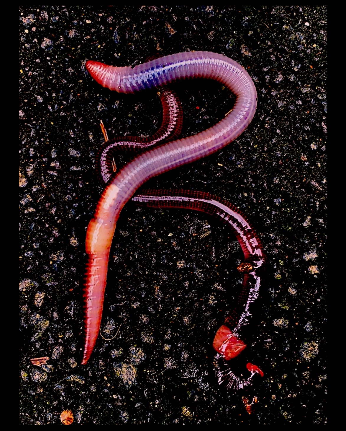
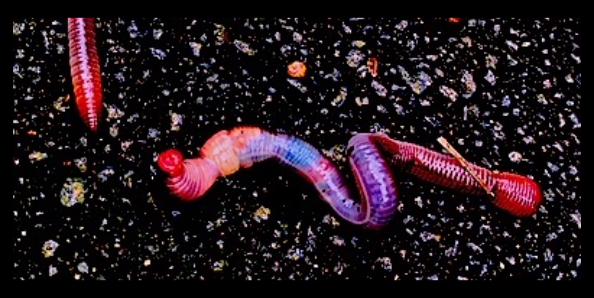
Concept 4.VALUING Recycling PRODUCT: Bed. COMMODITY (timber, fabric, steel) to PRODUCT (desired bed / disused bed) toCOMMODITY (timber, fabric, steel) to PRODUCT (recycled products create new product = Intermedia = Video, Sculpture, Photography, Dance). VALUE Nature (Earthworm animals inhabiting a corner of the bed) surrounded me as I recycled the bed. This led me to VALUING BODIES.
Concept 5.VALUE all creatures big and small, thus their BODIES.Learn to love and accept, thus VALUE my own BODY.Learn to love my identity.
In reflection, I have enjoyed the variety of tasks in this latest brief: ‘Verisimilitude Real Sculpture’. I am a big picture type of person, who likes to stand under the shade of a universal umbrella concept to gain meaning of how I view society. I then approach the concept through the scrutiny of small detail (e.g., product deconstruction and reconstruction) to see the relationships between world views, national views and individual views.
Working hands-on with different materials, such as clay, fabric, steel, mobile phone camera and a computer App, I was constantly reminded how much I like to make physical objects. The turning point came when I observed Nature (Earthworm bodies) in above Concept 4, because I leapt at the chance to interconnect my previous concepts of Value, Desire and Product deconstruction to a new concept of the Body. As I destructed the bed product body, in the hope of recycling its parts, this fusion of concepts rolled out perfectly. At the top of the umbrella, the Body concept became a major focus, with my earlier sub-concepts of value, desire and product merging beneath.
I created a range of objects bound together by the conceptual theme of the ‘Body’, but utilising different mediums (photography, video, sculpture) and different materials (fabric, steel and clay). As I maneuvered the steel, fabric or clay into varying positions, I consistently questioned ‘What is real in sculpture and intermedia?’ To answer this, is not as easy as one first thinks, because life is full of truths, untruths, realities and fake realities.
During this brief, I experienced a few body-mind-matter realities, such as what in quantum physics is known as entanglement. My body matter became entangled with my experience of touching clay, because the particles of matter were shared through the sense of touch, and instead of being separate entities, the clay and I became one. In other words, I fell in love with the material matter of clay. I had experienced the idea of entanglement through my sense of touch.
Another reality struck me as I was deconstructing the product bed. Not only was my mind and body working quickly as one, ripping and photographing, I realised the material commodities of fabric, steel and timber (all separate particles of matter) had been placed together into a close-knit state, and were now been released. Therefore, through years of enclosure without air inside a bed mattress, the material matter had been worn, and smelt of rubbery adhesive, yet was still intact after years of been pressed together against each other as one. By stripping the materials apart, I was disentangling the particles of matter, releasing and distributing them, causing an interaction with their surroundings. I wondered if I could reconnect this bed body back together again, but in another recycled format. I questioned would re-entanglement occur if I created a new sculptural body that combined new material particles? Would an exposure of one material matter to the air create change? For example, the bed spring steel was not overly rusty hidden inside the mattress, but once exposed to the weather, it only took a few wet days to start to corrode and rust.
In conclusion, this brief has rewarded me with new knowledge and new realities about ‘real sculpture’. I, as a body of matter (full of entangled particles), broke a bed body, thus disentangled its material matter in order to recycle. In the process of recreating new forms of reality (a number of new sculpture bodies) I created new material relationships and new particle matter entanglements.
* Reflections of each of these 5 artworks are on the previous posts.
Fig 1. ‘Blue River’ Video (see Artwork Reflection 1 post.) Above: Fig 1a. ‘Five Blue Nudes’ Video Still.
Fig 2.‘DESIDERIUM’ Intermedia: Performance Art / Video (see Artwork Reflection 2 post) Above: Fig 2a. ‘Illumination within a Kete of Knowledge’ Sculpture, Photography
The human body is a desired object, and health, beauty and physical exercise are seen as significant pathways to achieve this desirable body, and to improve life expectancy. The ancient Greeks perfected their ideal athletic physique, and displayed strong sporting prowess. Other cultures have revealed other fads and fashions, including body manipulation such as tightly binding female feet to make dainty and small, and overtight female bodice corsets that caused fainting and broken ribcage bones. Standards of beauty have always existed in every culture, with the expectations that the body shape, and dress sense parallels society’s fashion and clothing designs of the day. Yet, bodily self-acceptance and valuing oneself in today’s society is a difficult task. It is made more demanding than ever because of capitalism and consumerism, and the pressure to conform to the likes of social networking and the internet.
The consumer is exposed to the demanding health and beauty market. Through advertisement there is a bombardment to purchase the latest health and wellbeing products, often promoted by iconic movie, pop and sport stars. Youth, sex and beauty is what sells. Therefore, society in the 21st century is far more aware than in previous centuries how to mistreat the body with unhealthy substances, or treat the body well, by eating and drinking in moderation, being active, getting fresh air and exercising healthily.
People feel a desire, or a need, or an expectation to mould their bodies into an ideal, a sculptural form of beauty. Physical change is occurring through chemical, medical and biological means, and through daily use of physical exercise, or extreme sport such as body building, diet, vitamins, pills, makeup and beauty cream products. Reshaping the undesired body parts with cosmetic surgery, and changing one’s appearance by preening and taming their features (skin, hair, wrinkles, teeth), plus making tattoo and piercing marks are all part of standardising. Yet, this is also an individual’s choice, and thus a type of freedom, to control one’s own body and acknowledge one’s identity.
A key concept of my artwork ‘Blue River’ above is about valuing, and loving both the self (body and mind) and others. Caring for one’s own body internally and externally, strengthens and values one’s identity. Valuing the self supports the loving of others. Learning to embrace the external body shape, and acknowledging that no-one is perfect, is part of accepting one’s self. Both inner and outer bodily confidence and self-acceptance can be difficult, if constant criticism over time has occurred in over-competitive situations. Therefore, this video artwork is my reality, and is connected to the Verisimilitude: Real Sculpture brief, because it shares my sculptural and performative realities through the medium of photography. It is also connected to the real sculpture brief, because it is my creative journey, a self-portrait statement, and thus my truth. I have created this reality to improve my love and belief in myself.
Another concept in the video revolves around carnal love and sensuous desire. The tangible existence of bodily forms is represented by virile snake-like creatures, Earthworms, and the human body in loving positions. Another symbol where fleshly desire takes place is the physical bed itself, which is repeatedly displayed in the video as broken materials and ripped shreds. Fabric parts cut from the bed are pierced back together in a reconstructed Pop art inspired sculpture of lovers titled: ‘Popping Purple’.
Fig 2. ‘Popping Purple’ Sculpture
The overall colour scheme of the video images are shaded in the introspective colour of blue. This signifies compassion, caring, depth, trust, loyalty, sincerity and peaceful rest (relating symbolically to the bed and to the value of love). The title: ‘Blue River’ symbolises an artistic journey of reconstruction of a personal item (a disused bed), and my personal courage to bare myself, and my physical flaws in a naked form, in order to extend my confidence in my own body, thus self. The theatrically lit images representing love, are like a moonlit blue river on a winding, pathway journey to the open sea. The title also connects to the colour blue, because Earth is a blue planet full of water, with blue also symbolising wide open spaces of the sea and sky, thus freedom, imagination, sensitivity, insight and spiritual realization. In an art historical context, blue has both positive (the blue painted robes of the Virgin Mary and blue-stained glass in church windows) and negative (the melancholic paintings of Picasso’s Blue Period) connotations. A row of five blue nudes in my video connect back to Henri Matisse’s four paper cut outs and lithograph series titled ‘Blue Nudes’. The Earthworm bodies in the video contrast a fiery red colouring with the serene blue nudes, promoting an anthropomorphic symbolism of passionate desire, love, longing and vigour.
Fig 3. ‘Five Blue Nudes’
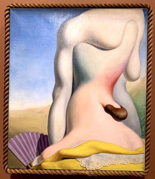
Dutch Artist Johannes Hendrikus Moesman in 1932 created an oil painting titled: “Afternoon (Namiddag)”, now showing in the Museum Boijmans Van Beuningen’s Surrealist collection at Te Papa. Many Surrealist artworks display an erotic and subversive nature, and Moesman’s painting was regarded scandalous in the 1930s, a time of great social change between WW1 and WW2.
Fig 4. “Afternoon (Namiddag)” 1932.
When I made a visit to the exhibition, I was struck by the large scale, and the painting’s extreme beauty of a single headless figure, or this is what I first perceived. Then after closer inspection it revealed two figures entwined in unison. There is a strange beauty, that is juxtaposed against a type of confusing ugliness. It relates to my five blue headless nudes, because my works contain this strange weird ugliness. I physically distorted my own body as I photographed it, to try and access a different emotional state. This I achieved in my 5 blue nudes by contrasting an upright stance in a small windowed room, with a malformed twisted body that turns away from the viewer, as if shy. Moesman’s figure(s) sit upright in a open landscape, not standing, but open and twisting together. Both are headless bodies that curve and twist with tonal perspective.
The Surrealists chose textured materials to evoke a physical sensuality in their artworks, through the sense of touch. The unusual border of a real 3D rope frame contrasts with the seductive fleshy pinky, creamy tones that show a 3D depth, yet sit on a flat 2D painting surface. The curvilinear outline of the figure(s) and the deep tonal quality of soft colours creates this beautiful 3D perspective. This makes me think of the rounded form of sculpture, and I am particularly attracted to tonal paint qualities and sculptural forms.
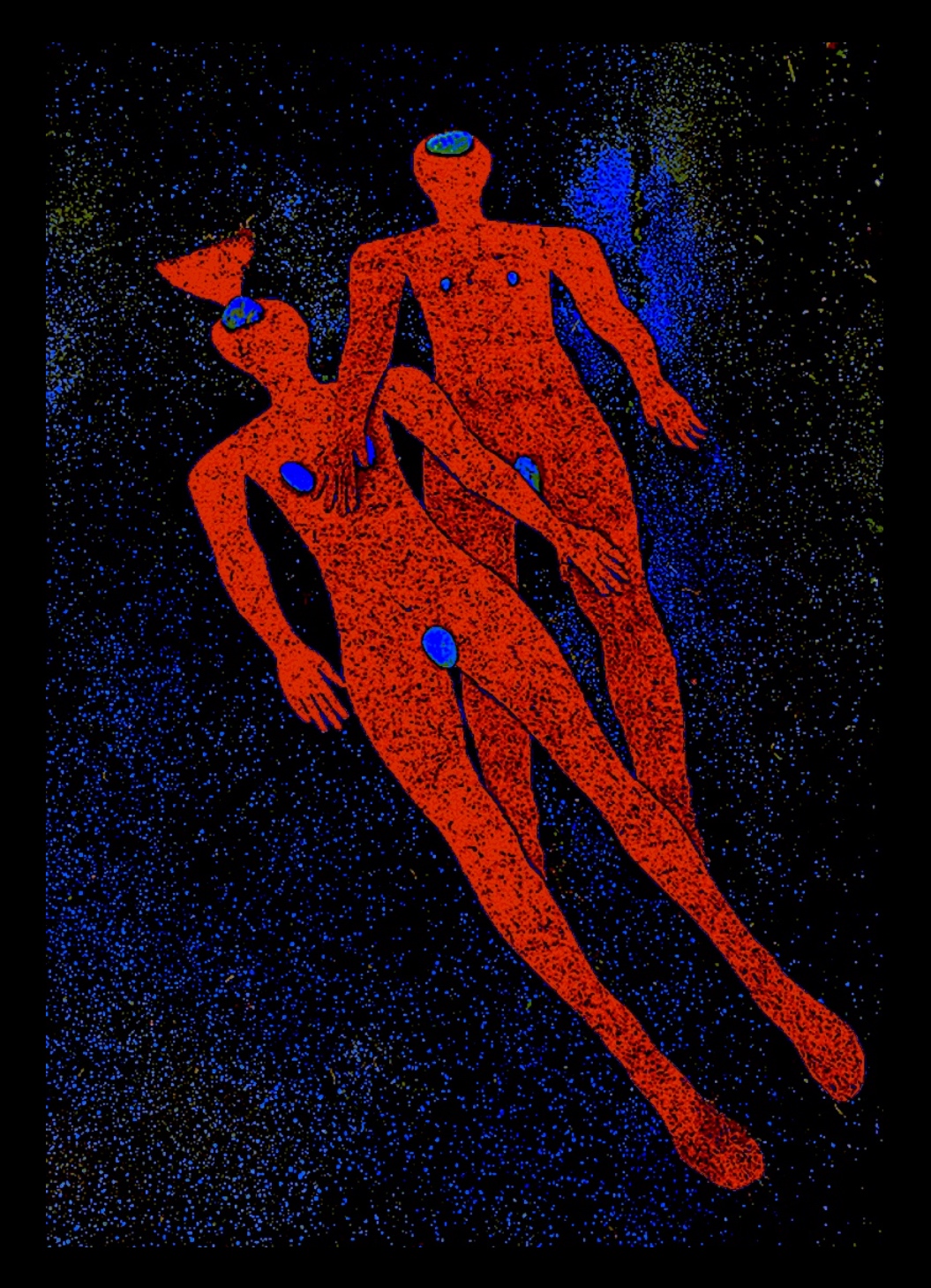
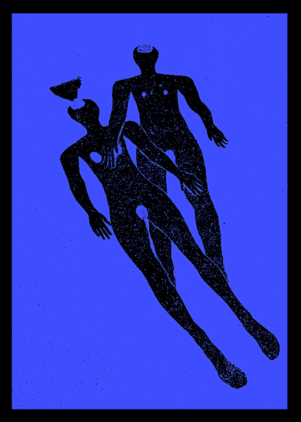
Fig 5. ‘Earthworm 1’
Through photography and video methods, I am acknowledging and expressing my identity through both fragmented body sculptures and whole body sculptures. The fragmented bodies such as the five ‘Blue Bodies’ (showing a range in size to represent society’s pressure for weight loss) have lost their identities, through losing both their body weight and their body parts. This was my reality as a dancer, constantly having high expectations to match the perfect body weight and size. There is a desire for a bond of love between the body and mind. Yet, the body deformities reveal the fragility of the physical instrument of both bodies, human and Earthworm. An Earthworm reveals an injury with a protrusion. As an artist, I am expressing a desire to accept my inabilities, by making an offering of repetitive and reflective damaged bodies, a torso with no limbs, and a torso with no shoulders, neck and head. I am also recalling memories of physical injuries as a professional ballet dancer.
Fig 6. ‘Blue Duet’
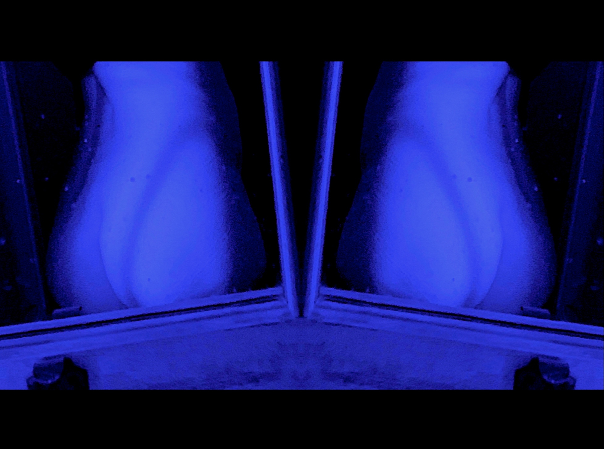
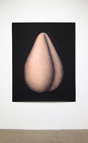
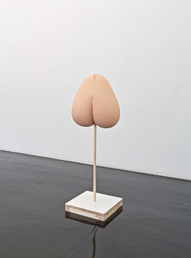
Artist Link: My above artwork titled: ‘Blue Duet’ makes connections to the pear shape derrière photograph, and sculpture (below) by contemporary artist Don Finsel. I have already spoken about his creative work at the beginning of this brief (see earlier posts). Here I utilised photography… and realised what a task!!! Quite tricky to photograph your own back, and buttocks! I am not exactly a contortionist! I have achieved a voyeuristic effect, a view through the window, even though in reality, perhaps this is not a window. I like the curving shadow from the side window light, and I have shown repetition by doubling the image. In comparison, Finsel photographed his sculpture (made of modern materials) and created a feeling of floating with his female abstract bottom that reminds me of a pear. Finsel utilises fruit, such as the pineapple, in his work. The deformed female bottom is brightly lit, and just hangs in a dark space (see left below) with no torso or limbs attached. His actual pear-shaped female derrière sculpture sits on a thin rod (thus symbolic) like a weird monument or pedestal, and again shows isolation from a real female body. All three images question what is real, and what is fantasy? My topless buttocks above are pear shape after all (I never knew, as I could never quite easily see their shape, thus reality). I definitely feel that my derrière is not as beautiful as a golden pear, and… definitely not as fruity!
Fig 7. Photograph. Don Finsel. Fig 8. Sculpture. Don Finsel.
This specific bed in the video was a place of rest, peace and desire. By deconstructing a useful, yet disused object is to discover the inner workings within the body of the bed. This also provided an opportunity to restore and rejuvenate, by using its parts to remake as new sculptural objects.
Fig 9. ‘Folds’ Deconstruction of Bed Product
The observation of the Earthworms was an accidental phenomenon, a chance encounter. The immersive experience of photographing nature partaking in a natural activity was an encounter that made me stop and think about the world. It stimulated my creativity to create a video about the deconstruction of the materials of the bed, and to include Nature, and thus was integral to improving my sense of self. By integrating myself with the natural world I was building a phenomenological relationship with nature and developing new learning. I am happy around Nature, thus it is significant in constructing my sense of wellbeing, my values and my reality.
‘DESIDERIUM’Intermedia: Performance Art / Video. 2021. (See Spatial Sketch 11 post)
https://youtu.be/Xch1k3etnao
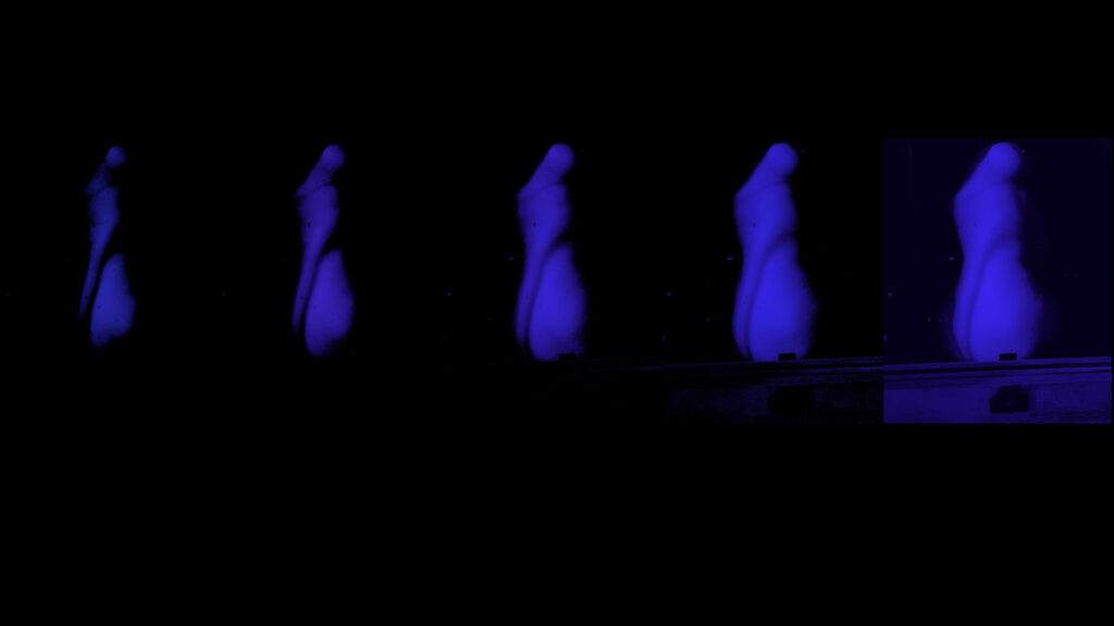
Fig 1. ‘DESIDERIUM’ Intermedia: Performance Art / Video
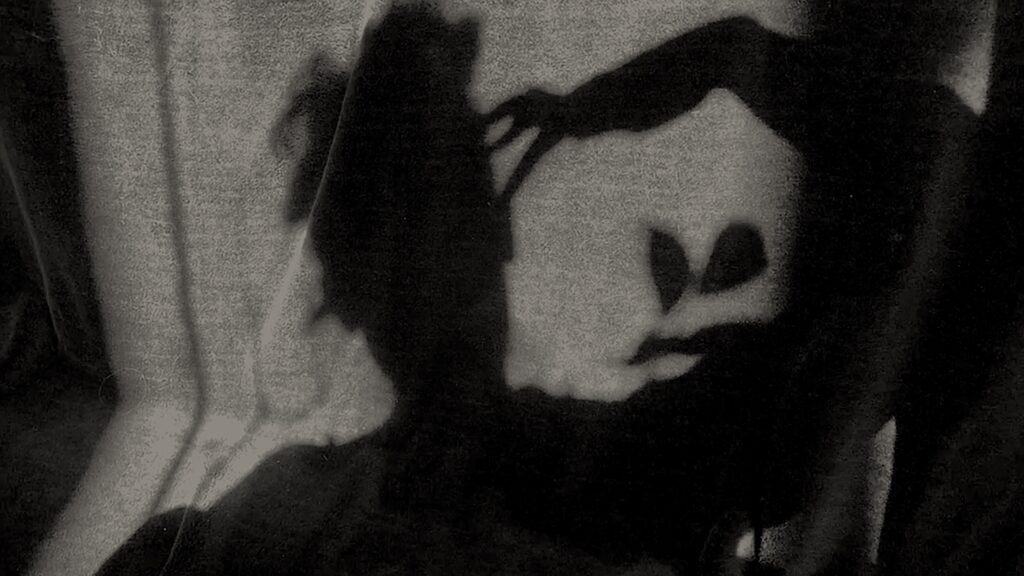
In relation to my overarching theme of Desire and Value, this Performance art video titled ‘Desiderium’ is a portrait of ardent longing. It also reveals a relationship between the spiritual and physical worlds, because ghostly souls with dark corpus shadows are reawakened by loss, and the physical world of light.
Fig 2. ‘Sense of Hearing’. Performance art still photograph from video titled ‘Desiderium’
Rhythmically oscillating to and fro, these disfigured forms search with desire to recover their lost senses of See, Smell, Hear, Taste and Touch. Their silhouette shadows dance across soft sunlit surfaces and under watery mangroves, because still installed and activated is their sense of Proprioception. Holding this extra sense, a sense of movement and spatial awareness, the shadows understand how to connect and isolate their limb and torso movement in space. Yet, will these spiritual souls discover and resurrect their senses of touching, tasting, hearing, smelling and seeing? Perhaps by re-activating and aligning their bodies with their lost senses, their brain power will understand, and revive the connection to and from their sense organs.
Fig 3. ‘Sense of Touch’. Performance art still photograph from video titled ‘Desiderium’
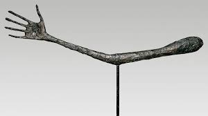
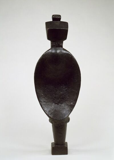
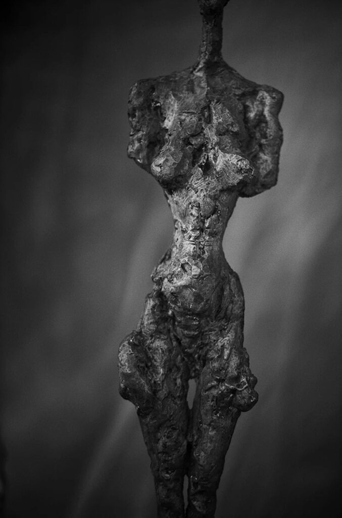
Artist Link: At the beginning of this sculpture brief, I spoke about the Swiss Sculptor Alberto Giacometti’s figurative bronze sculptures as been important to me. They appeal because they are connected to my BODY theme, that has birthed from my original themes of VALUE and DESIRE. The BODY, the senses of the body and the shadows of the body have all arrived from DESIRE, and via the deconstruction of the disused product: my bed, which was once upon a time VALUABLE.
Above, in my video, and the photograph stills, I am isolating body parts, moving as a dancer, and my limb shadows are oddly disjointed, and malformed. Giacometti’s tall, wiry thin body and long limb bronze sculptures are also strangely formed, with some bodies (females) shaped with over-exaggerated features such as the expanded thighs above. Giacometti created both full bodied figures, and limb only sculptures, often appearing feather light. My limbs also appear sinuous and lightweight because of my videoing technique. This appeals to me, as I like the incongruity of my chosen heavy topic or subject of ‘Desiderium’, contrasting with isolated limbs that move lightly. They are searching to recover a loss or a grief which corresponds to a sad, heavy feeling, in comparison to the light weightlessness of their deformed and moving limbs, and torsos. On reflection, I am not quite sure whether my cartoonish speech bubbles spinning in and out in the video are needed, perhaps I should remove these from the video. Yet, this is what I composed in the time frame for this spatial sketch. I am glad that I can keep questioning and reflecting on my work, because one can always improve.
ARTWORK REFLECTION 2a.
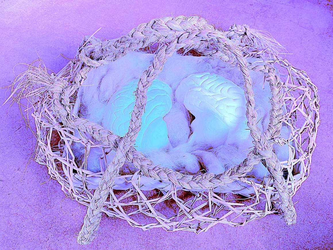
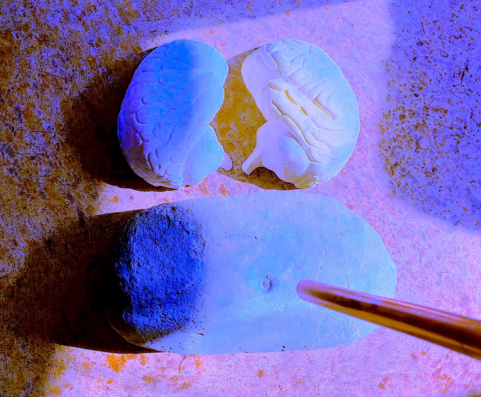
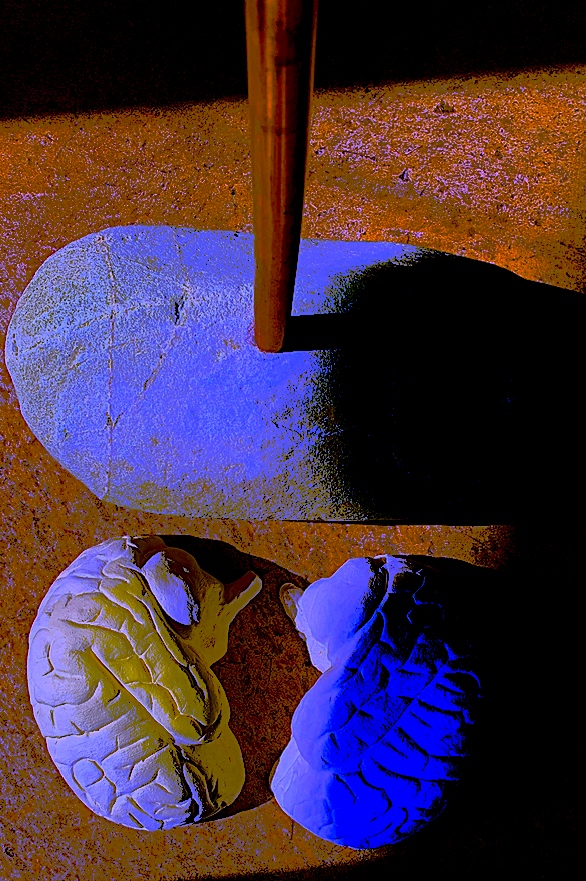
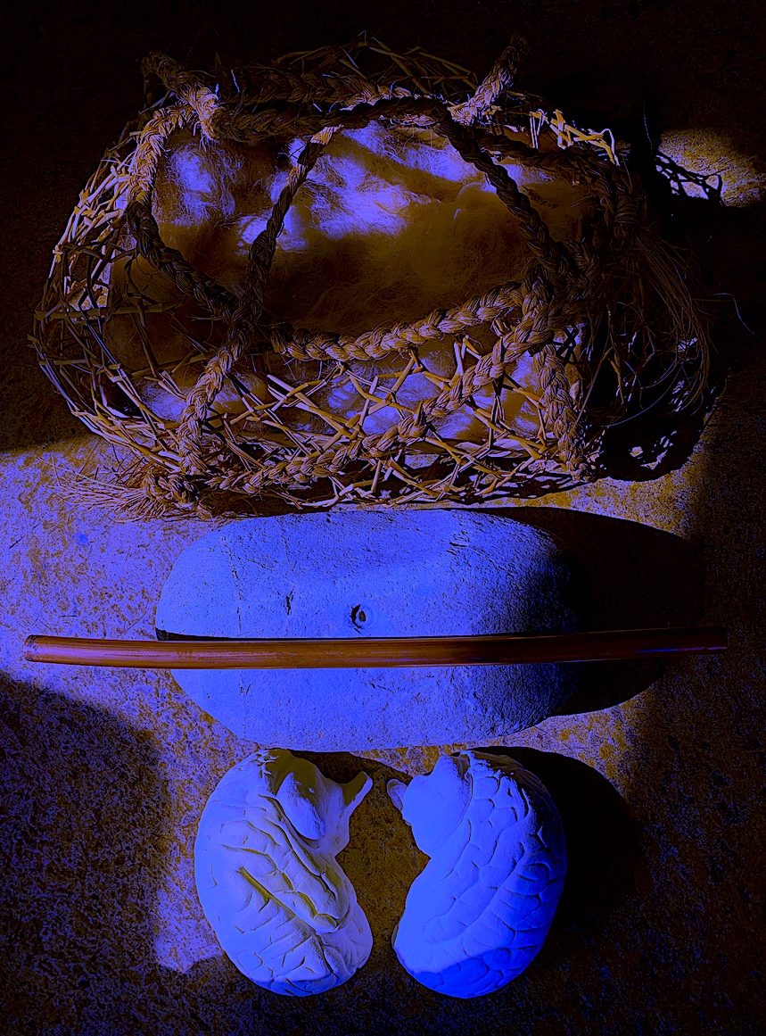
‘Illumination Nest within a Kete of Knowledge’ Sculpture: Clay, Hair, Woven Basket, 2021.
Fig 7. ‘Illumination Nest within a Kete of Knowledge’ Sculpture: Clay, Hair, Woven Basket.
A Kete of Knowledge suggests the carrying of thoughts around in the head. The brain organ is a valued taonga, a piece of precious cargo. Inside this woven basket a pair of pale coloured Cerebral hemispheres sit side by side, cushioned on a carpet, encased and protected. These human brain halves (made of clay) glimmer like glow worms in a cave, projecting outward their celestial lanterns through the woven harakeke basket. Each Cerebral half illuminates different coloured brainwaves, their knowledge and ideas once flowed. Losing their senses, and connection to each other, the kete hemispheres lie next to each other, but not joined in unity like a living brain. Instead their physical state is now separate, stunted from their Sense organ loss with no linkage of pathways.
This work titled ‘Illumination Nest within a Kete of Knowledge’ is linked to the above Performance art video titled ‘Desiderium’, because of the loss of the senses: see, smell, hear, taste and touch. Yet, unlike the moving ghostly spirit shadows in the video searching for their senses, these brain egg shapes in a nest remain still, perhaps dead within this woven coffin. Or is this open shaped Kete a cocoon case showing off its newly hatched wrinkled larvae about to squirm?
The raranga kete is made of muka from harakeke (Phormium spp., New Zealand flax), and woven and plaited with handles to hold and carry. The artwork is presented as a human-made bag, a container to fill objects, or a natural habitat, like a bird’s nest, valued because of its warm, soft, hairy contents. It is holding an inner organ object of the human body, thus making links to brain science and medical brain procedures, plus the generosity of organ donor gifts. These brain halves are contained, and protected, like inside a real skull. Yet, they may never be transformed into a whole brain (because of time restraints, and the brief ends) with an opportunity to be free to fly through the gaping holes of the basket.
The sense of touch is valuable to me, and caressing the clay into smooth and slightly dented textured surfaces has been enjoyable. I thought of the curving wrinkled folds of bedsheets, as I gently cut with tools to make each brain half crease like earthquake crevasses and fissures. The surfaces reveal repeated patterns on each brain half, yet like a real brain, the left brain is not exactly the same as the right brain in all of its patterning.
There is a juxtaposition between the artwork’s objects. The hard shining indented clay duo gently protrudes, shining like snow clad mountainous landscapes inside the woven coarse natural products of the harakeke, and soft animal hair that provides warmth and support.
Questioning thoughts: Is this artwork just an imagined scenario and an artist’s personal representation? Yes.
Is this Kete real? Yes, it is woven from my mother’s hand, and gifted to me. She is a creative educator and weaver, sewer and knitter, therefore using her gift as a found object and incorporating her handiwork into my artwork, creates more meaning for me. My original idea was to join the brain parts together, and erect the whole brain onto a copper pipe (which I could still do, with the right glue). The aim was to insert the pipe into a large, heavy rock to balance the moderately heavy clay brain. Yet, I was unable to complete the first step of drilling a hole into this natural product: sandstone. Compared to the hard Bluestone in my garden, Sandstone is a softer rock, but the drill overheated and started to burn, so I stopped. I am happy with the brain in the basket instead.
Figure 8.
Figure 9.
Figure 10.
Are the brain parts, and lost senses an essential form of truth? Yes, I sketched a brain and built it by hand, therefore it is a true reality to me. And, no… it is not an exact body organ, just a representation. Yes, a person can lose capacity of their senses at any time, for example their sense of smell with viruses such as COVID 19.
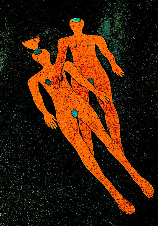
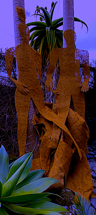
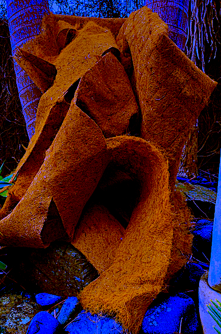
Spatial Sketch 2. As I broke up the bed, a thin golden brown fabric emerged, not exactly like thickly woven hessian, but a thinner, stiffer version of it. I was excited to use this product, because I wanted to create a full life-size sleeping human being or two giant (human-size and snake-like) Earthworms to connect to the bed product, and the Earthworm bodies I had witnessed. This was the perfect material.
Firstly, I drew two body patterns, (a front and back) then cut. On the sewing machine I began to sew my pattern pieces together, but I realised it was going to be too time consuming to make a full doll-like structure. I stopped sewing on the machine because the cotton was frustratingly weak and kept breaking. Sewing right around the figure, turning it inside out, and stuffing it was not going to be an easy task, unless I cut up the limbs to make joints. Therefore, I changed my mind to save time, thinking I could always turn it into a large doll, after I finish all my other process ideas with the steel, duvet, foam, stuffing and timber.
Therefore, I just played with the two patterns on the floor, changing the back pattern into a male figure to connect to the first cut-out of a female figure. I photographed both the positive figure and placed the material offcuts on the ground to create a negative space figure on the floor. Next, I lay the two figures on top of each other, parts on parts, and under and over, to try and give an illusion of 3-dimensionality. I then lay the two figures on the driveway in a different position to take photographs. The weather turned and started to rain, and the wind blew the figures, therefore by grabbing the nearest garden river stones to weight down the figures (in appropriate spots such as the brain and the genitals) I was able to finish photographing the soft sculptures.
I was pleasantly surprised as I played around with colour on my photographs, because I was accidently turning the images into flat shapes, with brightly coloured contrasts between figures and background, and with a grainy texture. Another contrast eventuated with the River stones popping out in different colours. It became quite Pop art inspired. My only regret is that I have not completed a full 3-dimensional figure, but I still quite like what I had achieved with flat fabric.
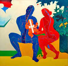
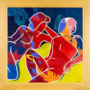
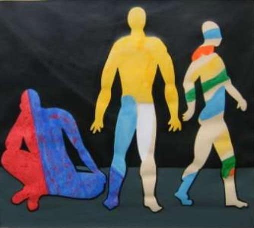
Artist Link: Next, I went online to search for an artist who does similar figure work, but could not find an artist with work like my figures above. The only linking artwork style that sprung to mind, was the work of New Zealand painter and printmaker Pat Hanly.
Artist: Pat Hanly (1932 -2004). I have always admired Pat Hanly’s artwork because he is a colourist, and so am I. Dark deep, moody tones of colour, and black do appeal, yet I am attracted to strong, contrasting colours too, these make me happy. Hanly is a brilliant, vibrant colourist, and his painting and printmaking skills are extraordinary. His figures are abstracted into spontaneous strange positions, bending and twisting, and full of joyful movement. As soon as I had completed my pop art looking figures above, I instantly thought of the strong red that Hanly uses, and his figures that look like cut-outs.
Fig 1. ‘Suburban Innocents.’ Pat Hanly. oil, enamel.
Fig 2. ‘Golden Age‘. Pat Hanly. oil and enamel.
Fig 3. Pat Hanly. ‘Who am I, I am, Do it’ Screen print 565 x 635.
I also searched for an artist who makes soft sculpture, and found the artists below that have stimulating ideas.
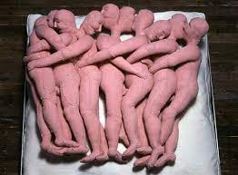
Artist Link: Louise Bourgeois (1911-2010). I found an artist who has extraordinary ideas and sculptural works from a large scale spider to soft sculptures of bodies.
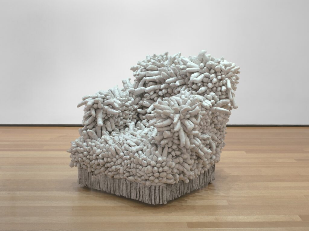
Artist Link: Yayoi Kusama (b1929) is a very creative contemporary artist from Japan. Her sculpture and installation work is striking, such as her an armchair covered sculpture titled: ‘Accumulation No. 1’, 1962. Protruding and bulging from an armchair were stuffed shapes that she had sewed by hand and painted white. Kusama stated they were phalluses, which shocked the viewers in the 1960s… how could a chair be transformed into a sexualised object?
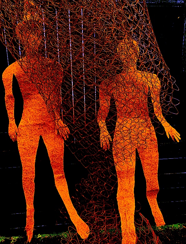
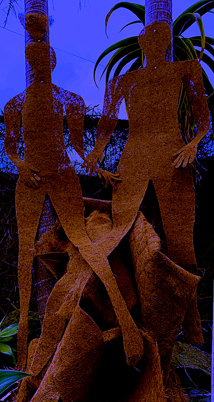
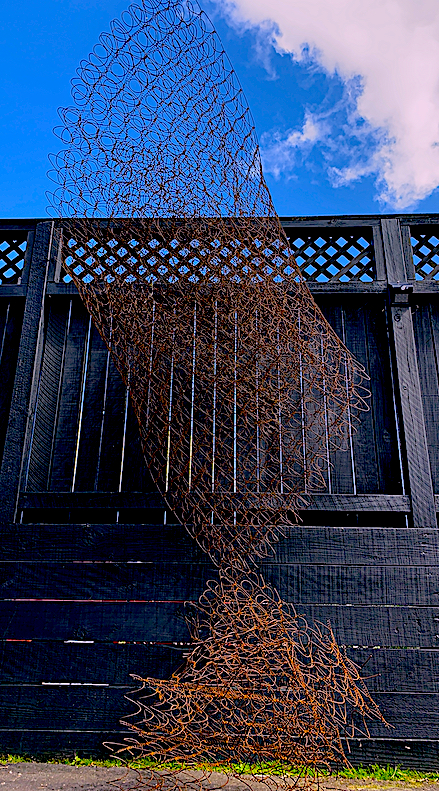
Turning a spring steel mattress into a sculpture has been a first for me. I was pleasantly surprised how both the large King-size mattress and the steel mattress inside the base were light enough to carry.
Firstly, I wanted to cut the steel into long strips, after dismantling them both from the timber bases. I am glad I didn’t journey into that direction, because the steel parts would have collapsed, leaving no form to work with. Therefore, it was easier just to bend, and re-join by connecting both mattress parts.
I enjoyed interacting with the steel, with wire and plyers, even though my body got hooked up on occasion as I entered the tunnel of space between the rolled up steel mattress. I rearranged the material many times (creating a Mother and Child scenario) and eventually chose an aesthetic position, look and shape that appealed. I assembled the steel parts into a seashell shape, similar to the Conch shell that I used in the Techno-realism Regard 3 Meshmixer brief.
Constantly looking at, and shifting the sculpture in the occupied space, I changed the outer layer of steel to curve around into a large cylinder shape. The cylindrical hemisphere type form became a tent, opening wide at the top end, like an opening of a cave. Crouching down to slither like a snake into the cave, there was no way out, the cave closed inwards to a smaller opening at the bottom end of the sculpture.
To strengthen the outside body, I inserted into this cave, the smaller spiral of steel. It clasped onto its mother’s stomach, as if growing inside. This smaller form spatially occupies the larger body, and the outer body protects the smaller shape like a container protecting an object. The inner sculpture creates a repetitive pattern effect of the steel skin, because there are many layers. A circular space (see photograph below) within the smaller central figure becomes an element that adds interest. Yet, unless the viewer lowers their body position, it is not able to be viewed from the front. This positive and negative spiralling tunnel opens to the sky, and can be seen if you walk around to the side of the sculpture.
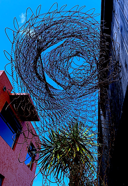
The large spiralling body of the sculpture, like a lily flower, or a profile of a head widens and also opens its top torso to the sky, and thus the world. Perhaps the protector outer figure is reaching for the rain to quench its thirst, or wishing the sun would warm its steel skin, and its form within. Shadows dance in and out of its see-through, circular criss-cross patterned body, reminding me of the beautiful installation: ‘The Web of Time’, by Japanese artist Chiharu Shiota (see my earlier post). Now, I have installed this mattress sculpture high up a wall, I envisage adding lighting to follow along the web like structure of the steel, to add another reality, a gleaming glow worm cave at night time. This is inspired by the woven effect of the steel, and my memory of Shiota’s lit web.
After trialling the sculpture in the garden, its colour and shape became lost and camouflaged against the tree and vine backdrop. Changing the place and space of the sculpture’s site, the sculpture now seems to grow straight vertically like a tree, or bends inwards if it is viewed from another angle. Yet, it is far more effective, and more defined against a black painted backdrop, and the sculpture can now claim its own space. It is also free to breathe, unlike its previous habitat inside a mattress, and mattress base. I like the reddy brown rust colouring of Corten steel, and thus look forward to seeing the sculpture’s body adapt and change colouring through the seasons like a deciduous tree. It may even gain a mossy green coat.
Overall, I am pleased how my new body sculpture has evolved. It looks like a large head turned in profile with a small neck at the ground base, or perhaps it is a spiraling lily flower. Composed of steel rubbish and a disused product, I was able to bend, fold and combine two steel mattress forms into a single mass, plus change the original function of a bed into a new concept and form.
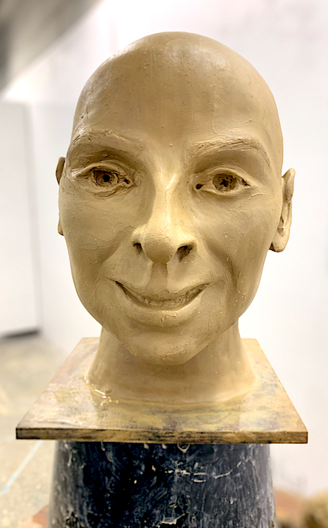
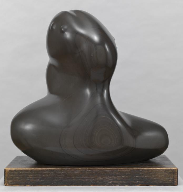
‘HEAD Study’ ‘A Self Portrait Representation’ Sculpture, Photography.
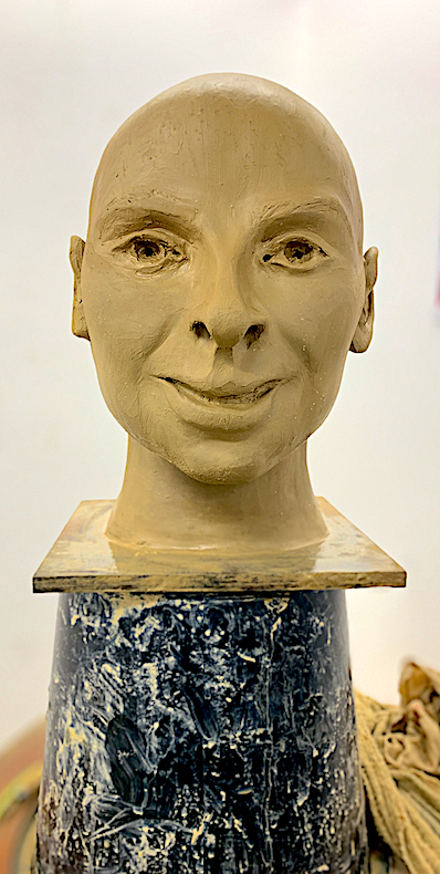
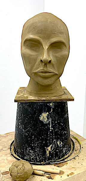
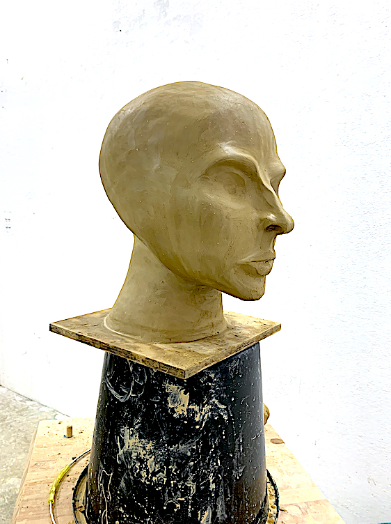
Fig 1. Head Study, Clay, August 2021.
‘Self-Portrait Head Study’ Sculpture Clay
The traditional statue or monument looks realistic, because the representation of a human body or object is skilfully rendered and interpreted, therefore it has a type of reality. Just like the brief’s first task of sculpting a clay head, I wanted to create a realistic version of myself as a self-portrait, and learn how to mould the correct anatomy. Yet, with no prior skill or training, recreating myself in a realist manner was a learning curve, and a big task.
My clay head is not real, because it is not a real human being, breathing emotions with flesh, blood and organs. The sculpture’s materiality is composed of clay, and therefore it is just a piece of clay manipulated by hand and reformed into another form of clay. Texture is important to me, and I like rough and slippery smooth surfaces on a range of natural products (i.e. clay, ceramic, stone, marble and bronze). I decided to focus on making smooth strokes on my clay head.
Once I had achieved shaping the anatomy as correctly as I could in the time frame, I tried to invigorate it by giving it a lively presence, and an essence of life. During the working on the eye and mouth features Lockdown occurred, thus my unreal object (with an unusual and unnatural mouth) is stuck in the studio unfinished.
Overall, there is a slight essence of myself around the upper bridge of the nose and I had begun to breathe life into it. It is a real object, a piece of clay that I can touch by smoothing, adding and subtracting. Although it is just a representation of a familiar seen object, a 3-dimensional head, the concept of reality curves back to me as the artist who made it, because whether the object is worthwhile or not, or valuable or not, it is a valued real artwork to me. The experience was worthwhile, and it was a learning curve that I enjoyed greatly. It was the first attempt at making an anatomically correct self portrait in clay. Therefore, this experience has been my reality, and my truth, because I created it from a lump of clay.
Fig 2. Head Study, Clay, August 2021.
Fig 3. 02.08.2021
Fig 4. 02.08.2021
Artist Link: Dr Lisa Osborn
Earlier in the brief, a Zoom meeting was organised especially to be beamed into our sculpture studio. I felt very privileged to be connected across the Pacific ocean to the United States of America to listen to a very experienced artist. Dr Lisa Osborn, a famous American artist in ceramics and sculpture spoke about her studio work.
Dr Osborn discussed how the human figure is central to her clay work, and her life-size figures are representations that are recognisable. By altering the body anatomy, she creates abstracted forms that reflect life. She brings to life a part of the anatomy (such as the toes) to evoke an emotion, and a reality. She spoke to our class about reality, and how to bring our clay heads to life with an emotion, or an animated look.
“My figures remain both real and not real, openly offering that other or third option. Statues, as objects, occupy space and are real things, although they are not real people. A statue may, however, be a portrait of a real person, or the personification of an ideal. A statue is a real object that indicates a reality, but is not a real person or ideal”.https://lisaosbornsculpturecom.wordpress.com/studio/
After reading her site, and viewing her videos, I was drawn by the fact that she independently creates these large figures, instead of having studio artists support the making of her work. I was also fascinated by her figures stationed in a range of body positions, some standing, others crouching and bending, but each projecting a mysterious emotional feeling and a sense of movement, or change of position.
I appreciate how Dr Osborn took the time to share her sculptural experience. I will always value this encounter, as she gave me a greater understanding of our Verisimilitude: Real Sculpture brief. It was awe-inspiring, and made me excited to further improve my clay head.
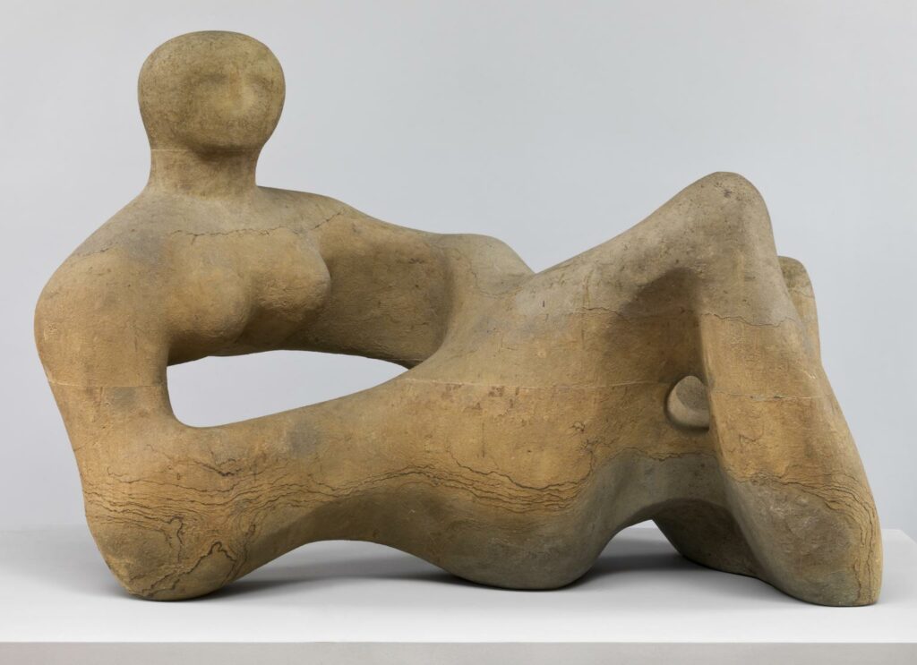
Artist Link: Henry Moore is a sculptor that I admire greatly, because I am attracted to concepts similar to his. I am emotionally moved by the outer and inner shapes and forms of the natural world, as Moore utilised in both his large and smaller size sculptures. I am drawn to the texture, shape and form of a whole or broken structure, such as a rock or boulder, a tree root or trunk hollow, a shell, an animal skull or bone, or a piece of driftwood. Moore’s figure work is alive with animation, he captures a great essence from these organic forms in nature.
As is Moore, I am also influenced by the physicality of the body. I like how you can see the inner workings (now in diagrammatic forms, books, photographic work and medical x-rays, and videos) and the outer workings of the whole body. I appreciate movement and the ability to see stretched muscular and ligament outlines, shapes and forms. Moore’s lying figures are beautiful to me, twisted and organic, acting like a sloping hill or valley, a representation of a landscape.
Fig 5. Recumbent Figure 1938 Henry Moore OM, CH 1898-1986 Presented by the Contemporary Art Society 1939 http://www.tate.org.uk/art/work/N05387
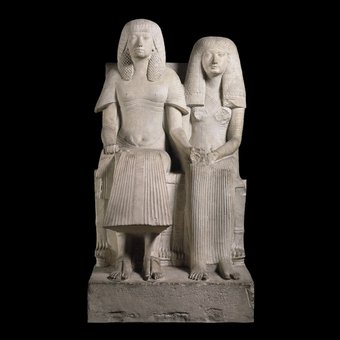
Moore’s sculptures are influenced by ancient historical artefacts such as Egyptian art. Again, I find a connection between us, as I also am stimulated by ancient art from a range of cultures, studying Ancient History, Classical Studies and Anthropology at University.
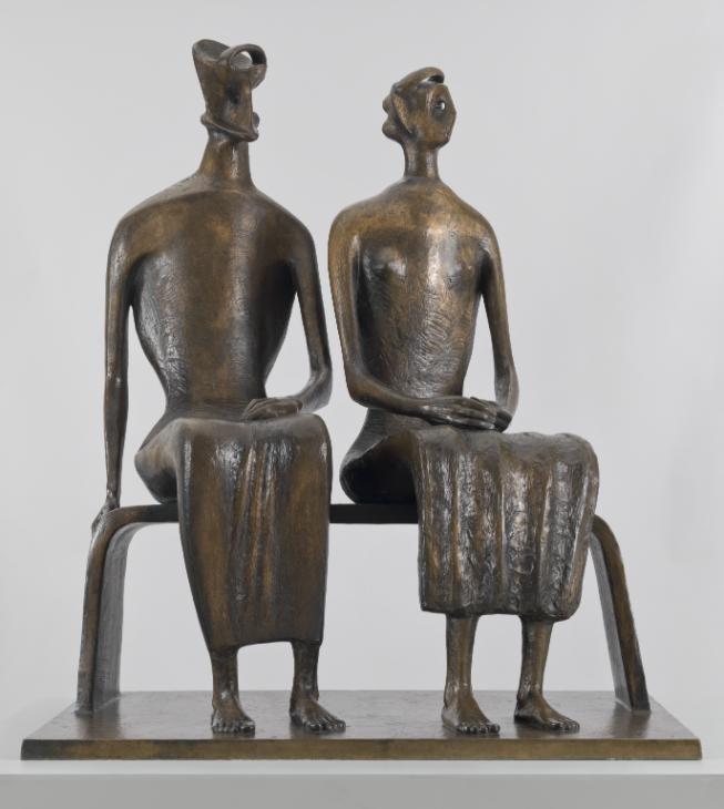
Fig 7. King and Queen 1952-3, cast 1957 Henry Moore OM, CH 1898-1986 Presented by the Friends of the Tate Gallery with funds provided by Associated Rediffusion Ltd 1959 http://www.tate.org.uk/art/work/T00228
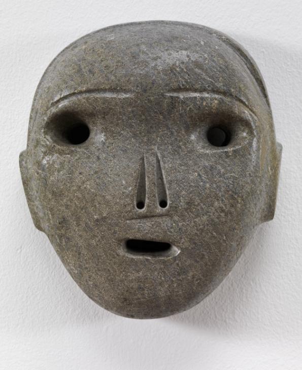
Henry Moore: Head sculptures below. The left figure shows a mask inspired facial structure. The right figure head reveals an even less obvious facial structure, leading to a more simple, abstracted and organic form. Yet, this does not make either figures less real. Both figures have an enlivened look and feel to them by sharing their own unique mysterious energies, and both portray life-like, emotive qualities.
Fig 8. Mask ?1928 Henry Moore OM, CH 1898-1986 Purchased with assistance from the Art Fund 1993 http://www.tate.org.uk/art/work/T06696
Fig 9. Composition 1932 Henry Moore OM, CH 1898-1986 Presented by the Friends of the Tate Gallery 1960 http://www.tate.org.uk/art/work/T00385