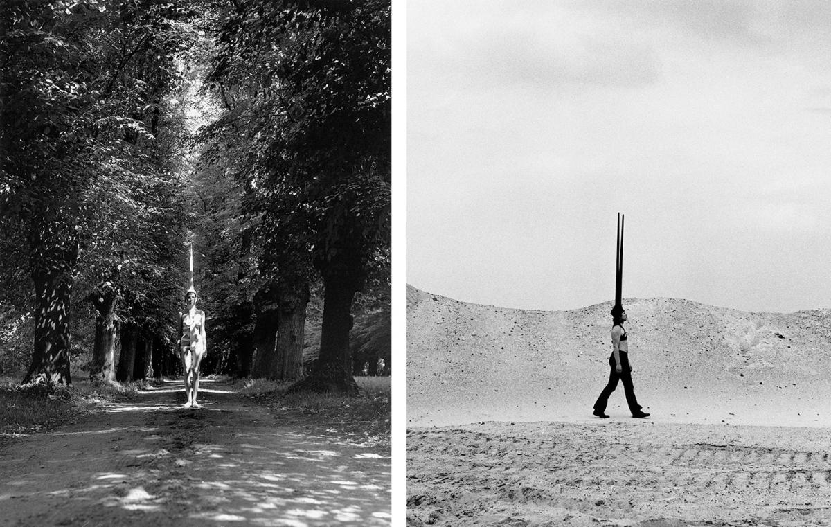
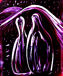
I am inspired by Rebecca Horn’s visual art practice because I can relate to many of her ideas (i.e. choreography, movement, machines, masks, colour, dancers, element of surprise), and methods such as her performance wearable art. I admire her ability to produce a wide variety of beautiful, striking and unusual art creations.
Many of her artworks are associated with the human body, human emotional state and its relationship with the environment and nature, which also appeals to me. I like how she shares her personal experiences within her art, such as been isolated for a long period of time in a sanatorium in order to recover after severe lung poisoning. Horn makes connections in each work by using politics, humour and playfulness in opposition to a darker and more vulnerable emotional side, and this shows her identity. She begins her process by thinking about and making art from within. Then she uses her body, and what past experiences have happened to her, in order to start creating something.
Left: Rebecca Horn, White Body Fan, 1972 Photography, Rebecca Horn Collection, 2019: Rebecca Hom/ProLitteris, Zurich. Right: Rebecca Horn, Zen der Eule, 2010, Rebecca Horn Collection, 2019: Rebecca Hom/ProLitteris, Zurich
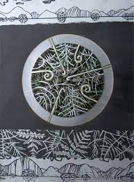
Cockfeather Mask 1973 Rebecca Horn born 1944 http://www.tate.org.uk/art/work/T07849
She uses familiar objects in her mechanical sculptures such as seashells, violins and butterflies, plus she create installations, and also directs films. I like her drawings and paintings for their soft, feathery and delicate touch which gives an appearance of movement.
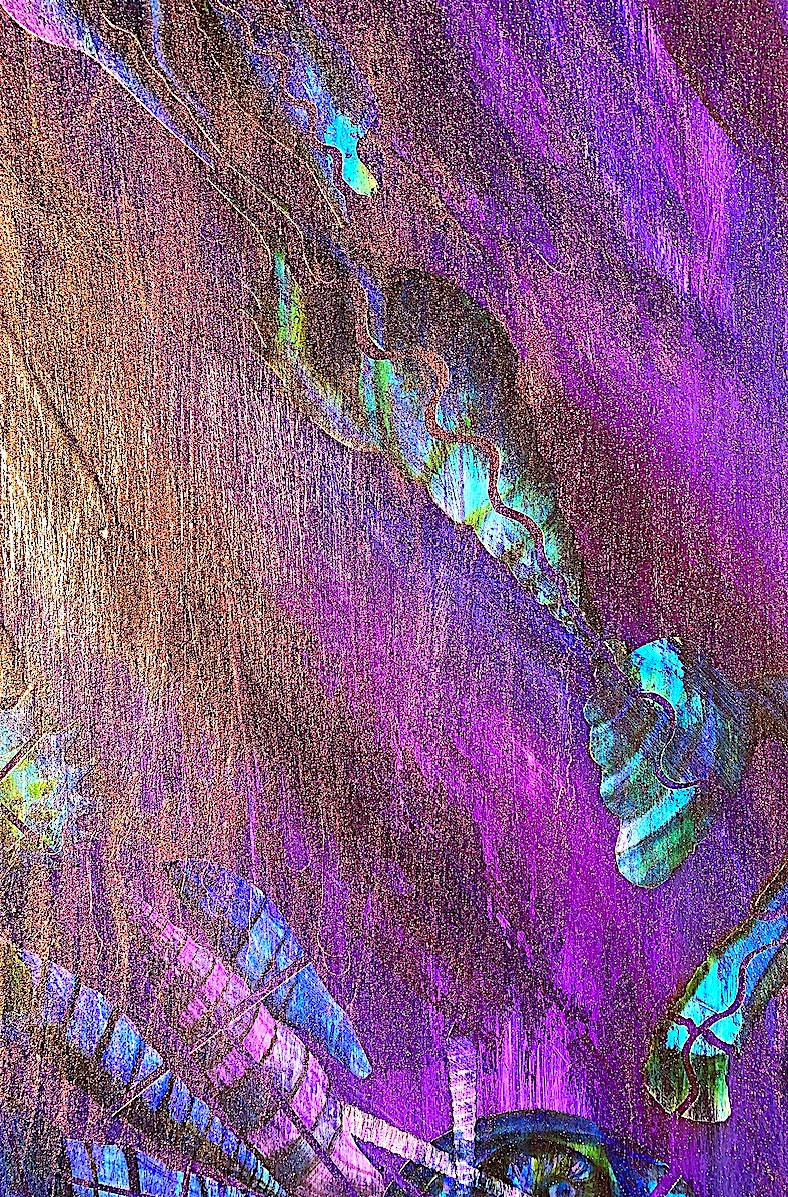
Rebecca Horn. Landkarte des Schreib Feuers, 2014. Gouache on paper, 40 x 30 cm.
Horn is known for her performance art which I greatly admire, because as a past performer I understand one needs to have a steely determination and strong mindfulness, and an extreme body awareness to participate. Her wearable body extension sculptures with protrusions and prosthetics relate to early 20th century sculptors: Jacob Epstein and Louise Bourgeois, and their use of prosthetics in their sculpture.
Jacob Epstein. Rock Drill, 1913. Louise Bourgeois, Henriette (1985).
Horn’s work below (‘Unicorn’ and ‘Pencil Mask’: a head sculpture drawing machine) are fascinating and bizarre because they remind me of animal exoskeletons and corsets.
Rebecca Horn. Pencil Mask. (Drawing Art machine)
Pencil Mask 1972 Rebecca Horn born 1944 Purchased with assistance from Tate Members 2002 http://www.tate.org.uk/art/work/T07847
Artist duo Fischli and Weiss are admirable for utilizing everyday objects in their art machine (see below). I would like to personally create a smaller version of this at home in my own time.
Our Art Machine group were inspired whilst brainstorming to think about how we could use the domino concept. I wanted to create a sequence for our mechanisms to start to swing, push paint, and rotate and boil water to create steam.
On the second day of the Art Drawing Machine Brief construction of our machine began. By inflating gloves to represent hands in a range of small to large sizes, and by attaching these tools via string to the Willow tree (Hula hoop chandelier) we were able to check out whether our marker pens actually worked.
Day 2: Our Drawing Art Machine Prototype is constructed from a Hula hoop, masking tape, string, balloons and gloves, plus the drawing tools.
It was interesting to watch the dangling ink pens bounce around on the string extended from the Hula hoop structure. They bobbed up and down at the end of each glove finger like ducks on a pond, and made soft wobbly marks on the paper below.
1. Balloon Creation / 2. The first drawing by ourArt Machine.
To extend the finger and hand idea, we added balloons to create forearms and upper-arms. Ideas were flowing… such as adding a range of torso skeleton parts. Yet, having just hands and arms dangling with no attached torsos is pretty strange and cool too!
Our Art Machine is progressing with added balloon arms to support the glove hands.
Fingertips can be delicate and we noticed our machine was making soft, delicate ink traces and touches when rotating from an electrical fan’s breeze. Naming an art machine may not be everyone’s cup of tea. Yet, as I like storytelling and making connections, I suggested our machine have a name such as ‘Fingertips’ because of its hanging glove fingers twirling to and fro.
Next, we experimented with boiling water in a kettle to see if the steam could draw. As you can see below, we made two different types of marks: 1. Watermark: a wet, bubbly, soft shade of grey. 2. A burnt black mark.
We really like our HEAT & STEAM idea because it adds another dimension to our PEN/PAINT/INK Willow tree idea.
HEAT and RECEIPT PAPER Experiment – Boil the kettle to see the steam draw marks on the heat sensitive receipt paper.
STEAM HEAT EXPERIMENT: Burnt Heat Sensitive Paper is added to Wall Display – (Group Brainstorm).
After viewing a slideshow presentation of a variety of mark-making machines, and their thought-provoking machine makers, our group of five joined together and started to process our ideas and questions. How could we use each other’s specific skill set and what types of technology would support our art machine invention? Will our machine be created through recycled materials, old or new parts? Could our art machine be a confused or mixed up hybrid of different machines or broken parts? What types of mechanisms are we interested in? What surface textures, and splatter traces or marks will our machine make? Would using 3D printing technology provide a new solution or mechanism within our art-making? What types of art machines and/or artists did we all enjoy watching and thus connect to?
Focused discussion and working collaboratively stimulated each group member’s creativity back and forth. Our art machine brainstorm had expanded outwards across the paper like tree roots. The main inspiration came from seeing an art machine with a domino effect using fire and oil by artists: Peter Fischli and David Weiss. We also all agreed upon centrally placing in our space an abstract version of the Willow tree art machine by artist: Tim Knowles. I imagined a hanging circular structure with long hand and fingernail type extensions, not unlike the movie character: Edward Scissorhands, and inspired by the hand extension art machines attached to the body of performance artist Rebecca Horn.
The gloved finger pens (chosen art-making tools) will vertically hang from wire, string or rope in order to draw (circular or horizontally) across a length of paper. These instruments will be powered by a pushing and swinging MOVEMENT from an electric fan, and/or from an attached rotating motor. Inflated glove fingers holding marker pens, pencils or paint brushes will draw across the paper, and hang like arching, trailing Willow tree branches. Simultaneously a pot of boiling water will produce steam that will rise from beneath the Willow tree. Strung across like a swing-bridge over a hot mud pool the heat sensitive receipt paper will be heated from beneath in order to produce different marks such as bubbly water patterns or burnt patches.
We wondered whether we should have a stop, start machine, or a continuous domino MOVEMENT machine that can create marks via a range of mechanisms and/or moving, falling objects (i.e. timber, balls, ladders, fire, smoke, dry ice, steam, light or shadows, etc.,) and change their position or shape. Yet, then we agreed that the main concept and focus of our art-tree-machine is to actually have it electronically MOVE (perhaps as a robot?) or utilize electricity to make it MOVE without human intervention, unlike Performance art. I personally was quite keen on, and suggested, having some of the group participate as Performance artists. I was able to visualise a body-art-making machine making marks. Showering paint from the hair, and creating interesting spills from bottles of liquid or cups of cold coffee attached to the body as the pot starts to boil on the ground under, and opposite the hanging Willow tree device starting to twirl! Crazy fun!
After a few hours our ideas evolved significantly from a brainstorm to a prototype with diagrams, and then to a list of resources for each to collect. Our creative juices had flowed quite easily into a final design during our first morning session.
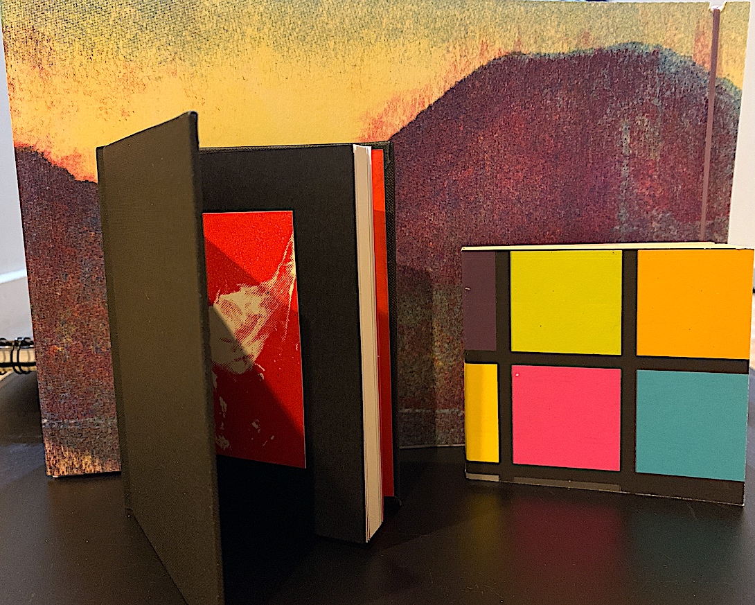
I started my Palimpsest process by making a COLLAGE (A3 in size)below left, and I have finalised this Palimpsest journey by creating another COLLAGE (1190mm x 895mm in size) below right. Yet, the final product is quite different in scale, and concept.
3D Collage
‘Leaky Houses’ Collage
I am proud of myself for not controlling any of my concepts that just popped up along my Palimpsest pathway. Therefore, because of this, I had no knowledge where my Palimpsest exploration would lead me. Instead, during my first attempt (above on the left), at reusing a piece of printed ephemera (found printed matter), I just had enormous fun deconstructing it. I did not overthink my ideas at all. I just played, and I was very much present in the moment, (cutting, gluing, and sticking), and getting sticky fingers!
Actually, I wish to send my apologies to the artist: Katharina Grosse, because I destroyed her artwork. In amongst my Art magazines on a bookshelf, I had kept this old coloured brochure, because it was full of many inspirational artworks and artists that I admire. I chose Grosse’s artwork because it was large, fully covering the A3 newsprint page, and instantly I was attracted to its striking colour (one of her most powerful visual elements). So, I was happy to rip the A3 page out and cut it up.
Yet, I didn’t work against Grosse’s strokes of shaped colour, instead I focused on the visual language of line by working with these strokes, because I carefully cut along her curving lines to remake a new object. I shaped her outlines into ribbon-type curves by cutting plant-like stem strips, then reorganising them by gluing, adding and subtracting different strips back together. I used all the original artwork from the A3 newsprint page, and created my own artwork by repeating, overlayering and revealing different ribbon-type lengths. I wanted a three dimensional, sculptural feel by lifting the curving ribbons outwards towards the viewer, in order to loop under and over, and in and out, and off the cartridge page base. As I finished realtering my first found printed matter, I realised because it was sticking out, that placing it flat on the photocopier machine to print a copy, would be difficult. I did not want to crease or break the three dimensional bending loops. My next strategy was Repetition, and using the visual language element of Colour, therefore printing a photocopy of my collage, was naturally my next step in my Palimpsest process.
When I photocopied this first collage (below on the left), I shifted the tones to create a series from dark to light (see wall display below). The first photocopy that I printed out was in a darker green tone (second from the left). Next, I repeated my strategy by shifting the tone, to create a medium colour tone, and finally I made a light blue colour tone. All photocopies are A3 in size. As my first Palimpsest collage was three dimensional, with some of my cutouts looping off the page, I was surprised that the three printed copies actually displayed this three dimensional depth and perspective too. Therefore, I had succeeded in creating both visual language elements of Colour and Form within my Palimpsest Repetition strategy.
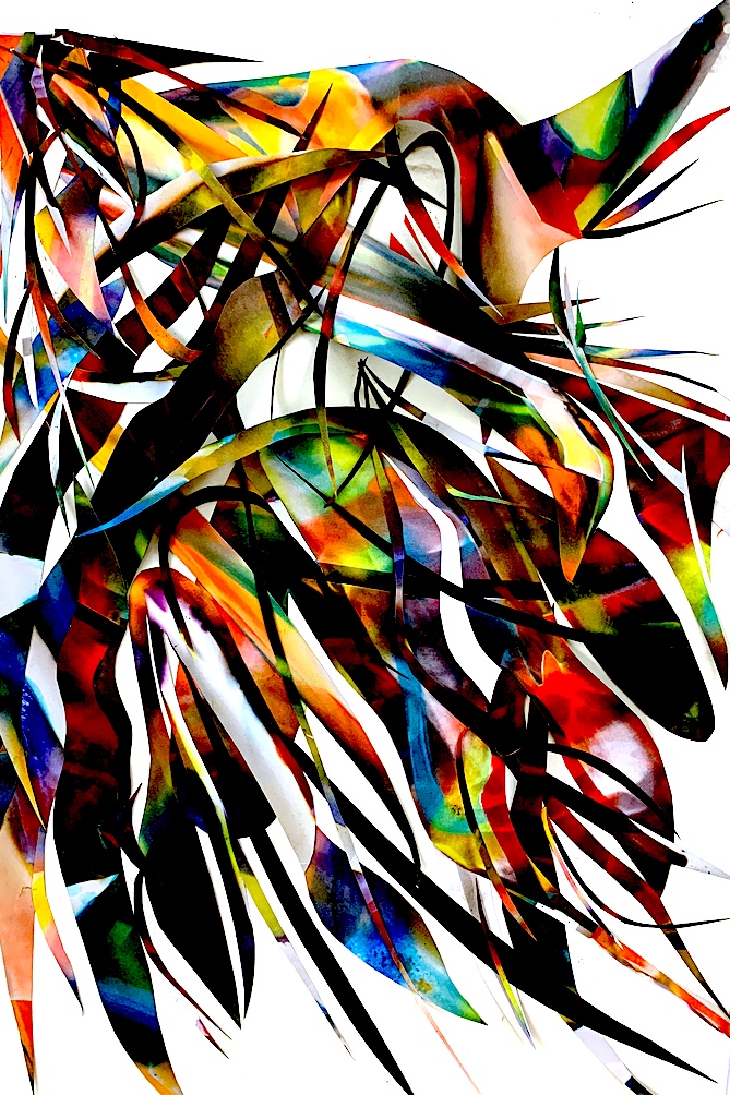
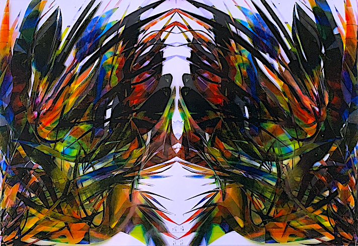
Once I had my collage series up on the wall (above), I immediately thought of my next step: enlarging by Mirroring, another way to show the strategy of Repetition. Even though, I was just focusing on cutting lines of colour and shape, and then rejoining looped lengths to make an abstracted form, I started to see, then imagine my collage as a hanging plant-type structure. Suddenly, I could see a type of figurative subject matter, such as a Bird of Paradise plant within. I wondered how I could respond to this in my process. For example, could I follow this direction, and create a two dimensional art work, but with a three dimensional effect or feeling? Could I build upon my plant-like subject matter by drawing plants, and by making a small part of the plant shape large? Could I extend my falling, and fanning out plant idea? I had rotated the collage around originally after I had completed it, to see which way up it should go. In the end, I preferred the abstract collage to connect to a plant formation that arched over and fell downward, rather than upwards.
Next, I photocopied my original collage. Then, I utilised photography to photograph them, and add them to my computer. I played around and digitally manipulated my visual images on the computer, and created a reflective, mirrored double image for each, and positioned them in different arrangements (see below). After seeing a Bird of Paradise plant, now my imagination went wild, as I was starting to see tigers, goats, frogs, crabs and all sorts of creatures. I wondered why I was visualising biomorphic type plant organisms or animal creatures in my curving and irregular forms. One of my favourite artists, Joan Miró painted colourful and playful, childlike biomorps.
Women and Bird in the Moonlight Artwork 1949
https://www.joan-miro.net/painting-1933.jsp
“Harlequin’s Carnival” 1925
Original Collage: Tiger Cat Face or Goat Head
Dark Double Mirrored Collage: Frog
Medium Double Mirrored Collage: Bird Feathers or Butterfly
Light Double Mirrored Collage: Crab
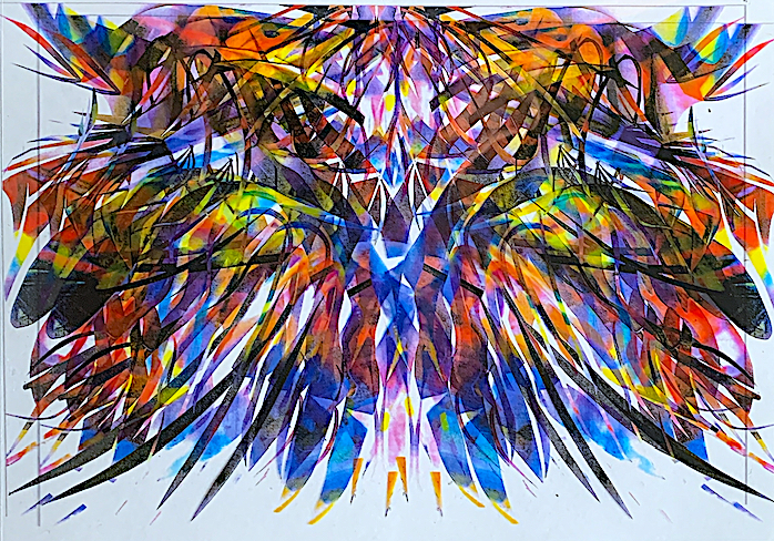
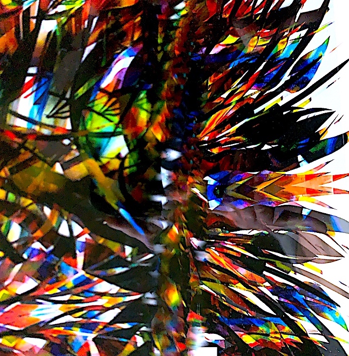
My next step was to MIRROR AGAIN, by doubling my already doubled mirror collage series (above). Therefore, I used the Palimpsest strategies of addition and repetition, by re-photocopying the first A3 coloured printed mirror collages (images above) again to create another A3 size. This time I hand cut, measured and pasted them into mirror images onto an A2 size black card (see below). As I was continuing my palimpsest process of repetition, and having fun doubling my mirroring in an algebraic pattern, I visualised the shapes, and objects of interior wallpaper designs, as many styles have a repeating pattern.
Palimpsest Strategies of Addition and Repetition: A2 Mirror Prints: Hand cut, measured and pasted.
Palimpsest Strategies of Addition and Repetition: A2 Mirror Prints: Hand cut, measured and pasted.
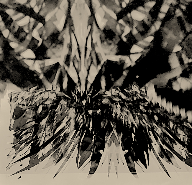
I love colourful images, objects, shapes and forms, and so my next step was to photocopy my above collages onto see-through papers such as tracing paper, and transparent paper. Here, I could shift these prints up or down, and mix and match underneath my photocopies to evoke a type of blurring movement, which revealed new formations and shapes. I really enjoyed playing with and combining these new transparent collages. I had invented a new type of visual language to display numerous new arrangements of my reflective Line, Colour and three-dimensional collage Forms (see examples below).
I am interested in abstract expressionist painting, and here below are my collages abstracted. I used the Palimpsest strategy of re-processing. I have re-processed my collages (above) on the photocopy machine, by shifting the images to blur them. I have recreated a new image (see below) that shows a sense of movement. I have also reprocessed the original collage series to create some of these prints, by shifting my camera lens across the image to create a movement effect.
‘Black Volcano Hits The Sky’, Digital Print.
I thought of organic forms as I experimented with some different materials such as paper dye, paint and negative cutout scraps.
Above: Mixed Media: Glued paper cutouts, paint, dye (and green ink). I took these to the Print Workshop to give them another layer on top = Green Printing ink.
Print Workshop: I do not have much printmaking experience. In the past I have made cardboard prints, and metal etchings. I enjoyed spending my first time in the Print workshop creating a number of Mono drawings and Mono prints. That day, three of my Palimpsest process ideas sprung from my prints: WAVES (see below), and the COLOUR PURPLE & BLUE (see below), and ORGANIC Organisms (see 3 small prints below), once I had viewed them on my wall display.
The black and white WAVE style Mono drawing led me to think about the sea, and how I could further explore organic forms such as seashells, as in the digital work (below).
‘Wave’ Mono Drawing Print
‘Wave’ Mono Drawing Print
ORGANIC Organisms (3 Mono Drawing Prints)
‘Bottle Lovers in a Landscape 1.’ 2021
VISUAL ELEMENT: COLOUR. For my first Monoprint in colour I mixed red and blue to make a pinky purple colour. This led me to combine dark blue for my second coloured Monoprint, which made me want to further use these lovely rich tones in my next Palimpsest process project: my large COLLAGE Painting.
‘Bottle Lovers in a Landscape 2’. 2021.
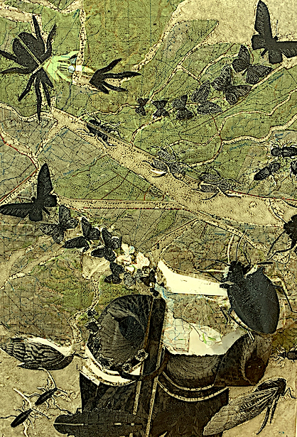
I enjoyed gathering a range of printed matter that I could change, destroy, deconstruct and rearrange into another form. I have kept many old National Geographic magazines, and in my research, I discovered that New Zealand Collage artist Peter Madden also enjoys utilizing these magazines for their photographic content and subject matter. I found many magazine photographs, and maps to use.
In the Printmaking workshop: I took my printed matter, and a finished deconstructed collage (see below). I had constructed this collage by using a NZ map as the base. After imaging an earthquake, I created earthquake breakages by cutting up the map, and relayering and reprocessing it as the base. Then I added animals (insects and a bird) to fly and crawl over the New Zealand cracked and broken landscape map. Why did I add animals? As, I was already visualising animals in the lines, shapes, colours and formations (the visual element language) of my original mirrored collages. Therefore, I continued my figurative theme by cutting out animal bodies to create a new visual language of pattern and texture to my new deconstructed collage (see below).
In the print room, I printed over the original collage twice. Firstly I used a transparent (colourless) printing ink (see left collage below), then I inked over a photocopy of the same image with green (see right collage below). The flatness of the photocopy paper (right) is not as attractive as using good quality paper to print on, or compared to the original thick textured collage. Some of my glued parts came away, and ripped, (such as the owl’s eye, butterflies and the spider’s legs) after rolling my original collage through the printing press. Yet, this was a happy accident, because the ripped approach made it more interesting.
My first Palimpsest Collage (at the top of the page) led me to think about plants. On our first (and only) Print workshop day, I gathered and brought in some Autumn coloured leaves from my Virginia Creeper vine to make an Eco-print (see four below). I learnt that my leaves may have been a bit damp, therefore they soaked up the ink. They are not the most interesting prints, but it was a learning curve, and I am glad I brought the leaves in to trial.
I had a wonderful (9:15am-4:30pm) day in the Print workshop, and learnt many things. One thing for me to remember is that I laid too much ink on my monoprints, so in the future with more practice, I will try to get the right consistency.
I spent from 9:15am to 1:00pm the next time I visited the Printmaking Workshop, and this was not as successful as my first time (see below).
I may fix this Tiger Cat Face by highlighting in and around the ink lines with white paint, or a pen. Again, there was too much ink applied. Yet, I am happy that I spent time trialling this Mono drawing print, because I am always willing to improve, and learn from my experiences.
Again, I was not so hot at my calico Mono print (see below). My tiger cat face is a complicated, busy look with many lines, whereas here below, I was going for a softer blended coloured look. Yet, I still wanted to have a bold palette of medium blue and green, but still show a simple feel with a few marks. My diagonal colours were too dry and did not take on the fabric. The diagonal marks appear like rain splatters. The only positive thing that I see is at least my picture plane edges have improved, because there is no ink beyond the lines.
The Palimpsest brief is helpful, because it provides you with a head start, instead of having an empty (perhaps scary), blank page at the beginning of your artmaking. Horror Vacui (a Latin-derived term) means ‘fear of emptiness’, therefore in art, the artist may fill up the whole page, and composition with detail, because they fear an empty space.
I actually do not fear an empty space, preferring more space, than less, but perhaps, this is me in some ways, because I like to fill up the page. Perhaps, I need to try to be less complicated, and be not afraid to have only a few marks on a page. Henri Matisse is a very inspirational artist to me, because of his extreme talent with colour, cutouts and simple and beautiful line drawings (see below).
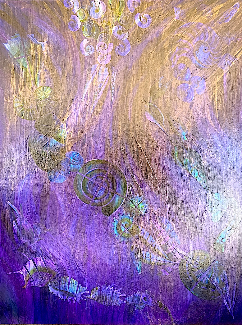
At the start of this brief, I had no idea that I would find or see hanging plant leaves after I finished my first collage. Then I started to see animal figures within my mirroring, and then I thought of the beautiful organic forms of seashells. I enjoyed the many processes, such as making both digital collages, and hand-made collages, and layering over and under my see-through transparent and tracing paper printed collages (see below).
Palimpsest Process: SEASHELL COLLAGE 1
Palimpsest Process: SEASHELL COLLAGE 2.
INSPIRATION: (See my Artist Research posts) I enjoy constructing collages as a method of making artworks. Both Peter Madden and Fred Tomaselli are inspiration collage artists. Therefore, I was keen to expand on my SEASHELL subject matter part of my Palimpsest process, but at a much larger scale like Tomaselli. His collage backgrounds are painted dark colours. Therefore, I was inspired to start a collage using my dark purple/blue Monoprint colours for the painted background.
SUBJECT MATTER: (SEASHELL HOUSES) After seeing many biomorphic plants and creatures in my work, and a wave-looking print, I thought of the sea, and how it rolls in pushing many seashells up on to the beach. Seashells are actual animal homes, beautifully shaped to cater for the underwater animal kingdom. This got me thinking about the broken shells on the beach, and I decided to have a deconstructed, broken and cracked group of seashells as a theme for my next project (MY FINAL COLLAGE).
Photograph 1:Layers of broken SEASHELL homes on shoreline.
Photograph 2:Layers of broken SEASHELL homes washed up on the beach.
I had no idea that my digital and hand-made compositions with seashells (see above) would lead me to my final Collage Painting titled: ‘LEAKY HOUSES’with seashells. Suddenly, my concept enlarged from broken leaking seashells to the major human housing problem of ‘Leaky Houses / Homes’. This issue has recently been in the media (a court case concerning the cladding boards that were used in many leaky homes). This is still affecting many New Zealanders (especially in Auckland). Sadly after decades, many people are suffering healthwise, because their cases and houses have not been resolved.
Therefore, my artwork (below) is titled: ‘Leaky Houses’, and shows two themes. The deconstructed seashell houses are cracked, thus have no seashell animal living within, and many precious ocean dwelling taonga are dying such as coral, sea plants, fish, mammals and shellfish because of human-made pollution in the oceans. My painting is darkly coloured to symbolise the suffering of both the sweeping movement of the sea tide carrying broken seashells in and out, from sea to land, and also represents the suffering of human beings living in leaky, damp and mouldy houses.
Then an idea occurred after I had spent hours cutting out precisely each seashell photocopy image, I then used subtraction (a Palimpsest strategy), because I cut shapes like a S curve, a V line, a cross (to represent death) line, etc., into my seashell houses to show they are broken and leaky, thus uninhabitable.
FINAL PALIMPSEST COLLAGE PAINTING PROCESS:
Whilst experimenting in this Palimpsest brief, I utilised both handmade and digital techniques to communicate a range of visual language images and processes (i.e. printmaking: Mono drawing/Mono prints/Fabric prints/Eco-prints, digital printing, photocopied printing, paintings, collages, pastel drawings, ink drawings, glazes, maps, photography, magazines and illustrations).
To make my final collage, I chose to use accessible materials (such as a warped and old, thus reusable piece of timber). I incorporated all of the main Visual art Elements to display my visual language system, and to communicate my artwork’s concept and perception. To build my composition, I inter-twined two and three-dimensional techniques over a two-dimensional base, and started with a structured set of figures (seashells) and a ground (background) contrast. Yet, after many layers I arrived at a more unified combination of the Visual art Element language (see below), and a more subtle figure/background distinction.
ELEMENTS:
* LINE: I created curved linear rows of collage cut-outs on sea-wave linear brush strokes and planes.
* SHAPE: I precisely shaped and cut illustrative photographs, and arranged in the outline of a large vessel-vase shape to represent seashell houses.
* COLOUR: I painted linear shapes and forms of dark, cool blue-purple tones of colour to signify the sea and suffering from broken seashells and leaky houses.
* FORM: I painted formations that layered under and over the seashell illustration shapes, creating a three-dimensional feeling of depth through, and beneath the waves.
* SPACE: I utilised all of the timber base to create a spatial and balanced composition.
* TEXTURE: I added layers of paint, paper, pastel, gold powder and glazes to build a textural surface.
* PATTERN: I deconstructed by cutting and ripping row-related patterns out of the seashell illustrations, and pasting them into unusual positions to reveal broken and leaky houses.
* PROPORTION &SCALE: In comparison to the amount, and the smaller size and scale of collage cut outs by Tomaselli and Madden, I chose the correct scale and size of each seashell, and chose less of them to create a composition.
* ANGLE & DIRECTION: I connected the direction and angle of the background wave shapes to my original collage cut out which flowed downward from the left. In comparison, I angled the wavelength shapes and seashell rows both from the diagonal top left and the top right. This created downward flows and an outline of a large vessel-vase shape emerging from the matching waves and rows.
* ORIENTATION: I created a mixture of seashell shapes by ink and pastel drawn techniques, and positioned and aligned these figures to the viewer, revealing shaded and tonal forms, thus depth.
* MOTION: I used large gestural paint strokes to represent the movement of the sea waves. I incorporated rows of animated seashells under and over these paint layers to display three dimensional depth, and motion.
Materials: * First Collage – Newsprint paper, Cartridge Base, Glue, Scissors. * Last Collage – Plywood Timber, Acrylic Paint, Pastels, Pens, Glue, Printed Matter – (Photocopied Paper of Image Cutouts), Brush, Powder, Varnish, Glazes.
Final PALIMPSEST COLLAGE completed after many, many layers. Palimpsest sequence includes:
* Gather and select printed matter.
* Photocopy the chosen black and white images.
* Cut out this printed subject matter of shells to symbolise ‘houses’.
* Use tools to measure and cut a rectangular shape out of plywood.
Final PALIMPSESTCOLLAGE Preparation: Measure, and cut with a circular saw a timber base layer.
Final PALIMPSESTCOLLAGE Preparation: Paint layers of colour onto timber base layer.
* Paint two white undercoat layers onto this plywood timber base.
* Paint acrylic paint colour layers: Dark purple, blue, white and green.
* Rub a pastel layer over the dried painted colours on the base.
Final PALIMPSEST COLLAGE Preparation: Trial by arranging, and rearranging the seashell collage cutouts in various formations and patterns onto the dried paint layers on the timber base layer.
* Use coloured pens and pastel on the seashell collage cutouts.
* Deconstruct each row of collage cut shapes, to represent ‘broken’.
* Then arrange in curving rows, and glue each collage cutout.
* Glaze with varnish.
* Paint an underwater effect by layering over the collage cutouts.
* Rub again with pastel to soften and provide a watery effect.
* Brush gold dust over the seashell collage cutouts.
* Glaze another varnish layer over the whole collage painting.
‘Leaky Houses’ Collage Painting, May, 2021
Overall, I am pleased with the visual language processes and elements that my large-size (Tomaselli inspired) collage conveys. Interestingly, it looks different in different lights. It becomes quite dark under artificial light, and lights up to a golden pinkier purple in the natural sunlight.
To summarise, I found this brief a fantastic way to end my first semester at Art school, because I was in my element. To be led by the process and the chosen materials was particularly rewarding, and to have a few workshops (i.e., the Printing and Bookbinding sessions), in between to gain new skills, was a great learning curve and a bonus!
This has been very exciting, as I can see limitless possibilities to continue to explore this Palimpsest brief. Unfortunately, four weeks is a limited time to produce a real quality piece of art. Even though I had many ideas, I could only complete one major art work in the last week. Therefore, I chose to complete a large painted collage, instead of continuing to explore printmaking or making a book. My collage painting idea was fired up after researching the American artist: Fred Tomaselli (see research below). Having already seen in galleries and at art auctions, the collage work of New Zealand artists: Peter Madden, and Gavin Hurley, I was inspired to create my own collage.
Again, it is unfortunate that I ran out of time to start a metal etching of my digital seashell artwork above, as I was all ready to go, with the metal material. Originally I was only going to draw in this brief, and simplify my ideas by completing a series of line drawings, but this did not occur either, but I realise I will have time to pursue this in the Mid-Semester break. I would like to improve my printmaking ability too, because I am interested in learning more about different types of printing.
Every time I made a mark, or placed a collage cutout down onto a piece of paper, card, print base or timber base, I enjoyed focusing on building up the layers. It was fantastic to simply have the time to experiment, and just shift things around, and play with materials. I realised it didn’t matter if I made too many mistakes when layering art materials, as it was part of the learning process. Occasionally, I made a mistake, and that was okay. Sometimes, it was a ‘happy accident’, because it changed my Palimpsest direction where to head next, and sometimes, it became a vast improvement to what I originally was doing anyway.
I could spend the rest of my life playing and creating artworks using this Palimpsest brief, because it is simply about exploration, and letting go. I found it very relaxing and enjoyable, because the ideas just seemed to flow. After responding to one element, I easily continued to follow that idea until another idea crept up, making me move into another direction. I had no trouble visualising possibilities of an idea, or image, or object. Most artworks have some form of layering of materials, and use materials that have already been used. I definitely like layers and textures in artworks.
I am from a generation that had to reuse and recycle objects. I always had the hand-me-down clothes, being a middle child. Therefore, I have found this brief very interesting, and I look forward to creating piles of layers in my new artworks. I have visualised many possibilities using objects with a history. In the break, I may start by fossicking in antique or second-hand shops for found matter that is interesting and cheap, that could be made into a layered artwork. Whenever I get stuck, and am not sure how to start an artwork, I will revisit this brief to get inspiration.
Overall, in the last four weeks, I have tried my very best in every circumstance. I have discovered many new artists that use Palimpsest, and will continue to research more, as perhaps this is the type of artist I feel most aligned with. Why? As, I am very interested in constructing layers, and then deconstructing the layers, which is similar to the Palimpsest strategies. I like texture, and I have usually built up an artwork by being neat, methodically and precisely adding, repeating, joining, and overlaying. Yet, I also like the opposite effect, and how you can see the inside, or the deeper, more vulnerable side, or the messy side of an artwork. I enjoy breaking up an artwork by cutting, subtracting, or hammering to reveal beneath the surface. For example, in our sculpture brief at the beginning of the semester, I created an unfinished ‘train wreck’ of a sculpture. It revealed an empty body turned on its side with a hollow concrete lining back, and the fabric clothing was torn, just ripped away from the front of the body. This body was dead and dismantled like the two train carriages that had derailed, and fallen off the cliff next to it. I not only had fun constructing this sculpture, but also had great fun deconstructing it with a hammer.
Palimpsest is a good way to start making artwork for me, because I can let the process sit in the driver’s seat, and shift and move me into a range of directions, that perhaps I have never adventured into before. I have learnt so much this semester, and will continue to think about and take away many ideas to retrial, and work on. Cathy, 1st June, 2021.
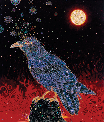
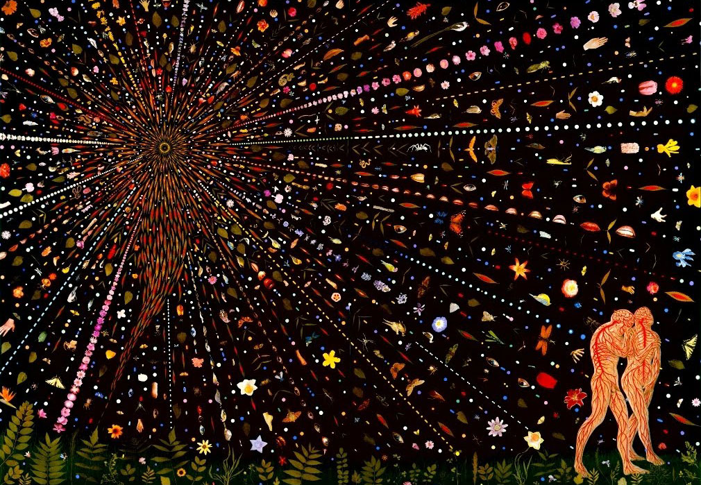
Fred Tomaselli’s photocollage paintings are striking and colourful. During the1980s and 1990s, he became known for his bold visual compositions that used unusual objects such as prescription pills, leaves, real insects and a range of photographs.
Tomaselli’s compositions are built up of layers of glazes, materials such as paint, magazine images, photographs, glue and a variety of varnishes such as resin. His large photo-collage works reveal a darkly painted acrylic background layer, usually in a black or dark blue hue. As your eye travels around the picture plane, this strong underlayer seems to push forward a new layer of small collage cut-outs to the foreground. Cropping and cutting, Tomaselli creates a strange array of precisely ordered patterned objects, often flowering out in rows.
The American artist sources many ideas from art history and popular culture. His subject matter includes animals such as birds and snakes, plants and gardens, eye and hand body parts, and the inside of human bodies such as the circulation of blood vessels seen in the biblical scene of Adam and Eve.
Fred Tomaselli, Avian Flower Serpent, 2006, Leaves, Photo-collage, Acrylic, Gouache and Resin on wood panel, 84 X 72 1/2 inches.
Fred Tomaselli (American, b. 1956). Big Raven, 2008. Acrylic, photo-collage, and resin on wood panel, 84 x 72 in. (213.4 x 182.9 cm). Private collection, courtesy of the artist, White Cube, London, and James Cohan Gallery, New York
Fred Tomaselli (American, b. 1956). Untitled (Expulsion), 2000. Leaves, pills, insects, acrylic, photo-collage, and resin on wood panel, 84 x 120 in. (213.4 x 304.8 cm). Collection of Peter Norton
Fred Tomaselli, ‘After Utah Saint’, Iris print, 46.3×33.7cm, 2000.
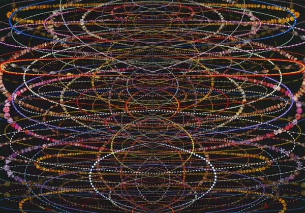
I really like the busy firework-like structure of these paintings below. The patterned necklace type objects are based on catenaries (curves that form by hanging a chain between two points ). The capsule pill objects have been glued into place in a repeated mirror formation. They seem to burst across each other like intricate luminous water fountains.
Fred Tomaselli, Flipper, 2008, Photo-collage
Fred Tomaselli (American, b. 1956). Echo, Wow, and Flutter, 2000. Leaves, pills, photo-collage, acrylic, and resin on wood panel, 84 x 120 in. (213.4 x 304.8 cm). Albright-Knox Art Gallery, Buffalo, New York. James G. Forsyth Fund
Fred Tomaselli,
Often his patterns fan out from a central object and move into infinity, such as this painting’s human brain (below).
Fred Tomaselli, Transpersonal The Brain,
Tomaselli has recently created a different series of work utilising the New York Times as a surface to collage. Choosing newspaper article photographs, text and headlines of interest to reveal his humour and politics, he adds new layers, and constructs concepts with patterns of colour. Here below, he again references Adam and Eve.
Fred Tomaselli, Guilty, 2005, Print, 13 X 13 inches, Edition of 100
Peter Madden (b. 1966). BVA from Auckland Institute of Technology (1992 – 1995) / MFA from Elam School of Fine Arts (2002 – 2004).
I have viewed a number of Madden’s collage and photomontage works. I have seen his artwork in galleries and art auctions, and I admire his incredibly precise cutting ability, and neat-looking arrangements. Many are cut in a miniature size, which would be tricky to complete.
Madden is an artist, known for creating amazing assemblages that are cut from magazines and books, such as the National Geographic. He says these magazines are a favourite resource, and comments, ‘In my work, I’m cutting into a body of knowledge, poetically releasing the images.’
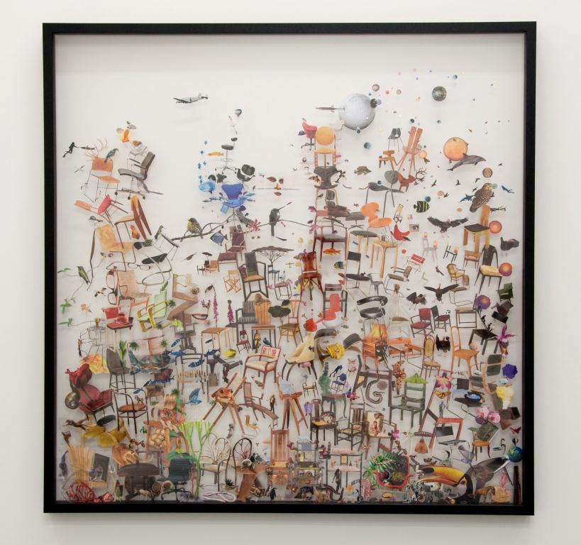
He makes layers of cut out coloured photographs. Some of his collages are humorous, because some objects are juxtaposed up against other objects that have no similarity, and seem to not go together at all. His work is full of objects that are inaccurate in scale (chairs as big as large eagles, and dolphins as big as planes), which is again humorous, yet also disorientating.
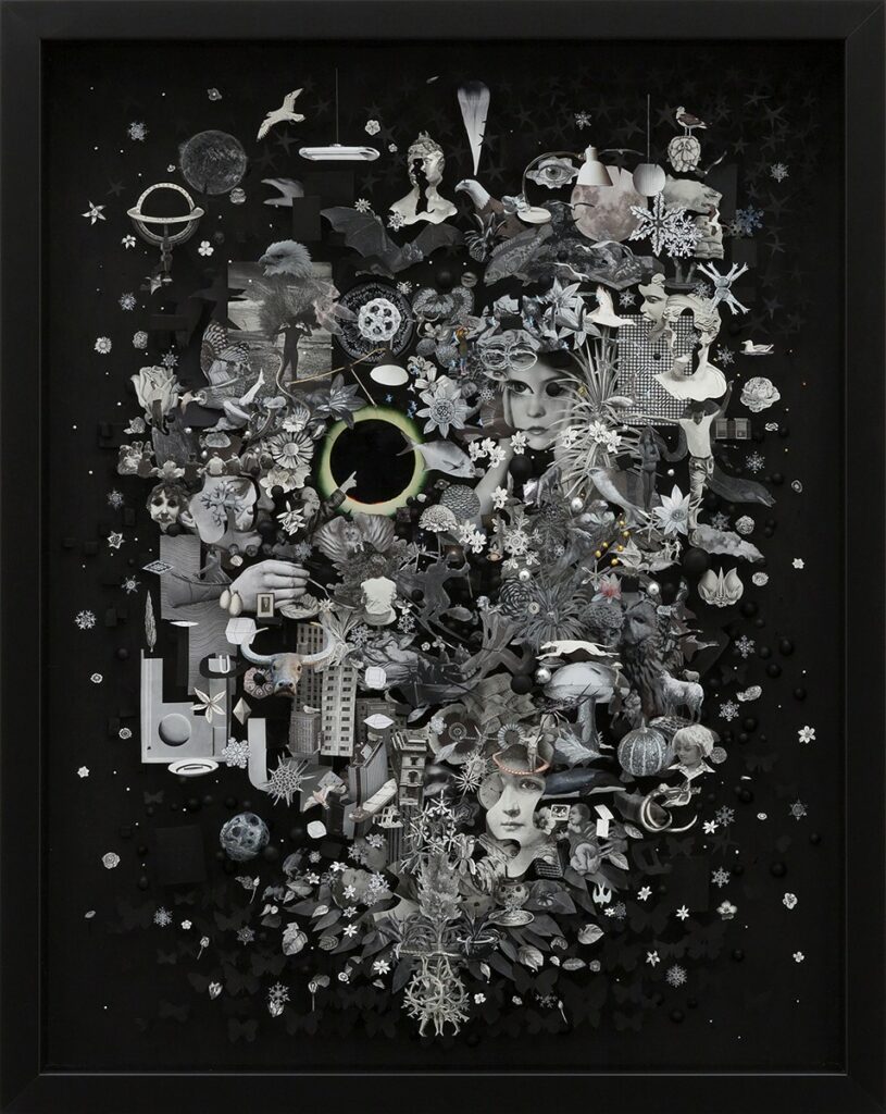
I like his use of perspex within a frame (see below) so there is no background. In fact, the background colour or texture would depend on the wall that it is hung on.
I love Madden’s work, and I find his themes dramatic, humorous and interesting to view. I once saw a sculptural skull collage by him at an auction, and was impressed when viewing his technical skills up close.
Artist Research: Printmaker and Painter Marian Maguire
A New Zealand artist who I greatly admire is Marian Maguire (born: 1962) in Christchurch. She is both a printmaker and a painter, and attended Ilam School of art, University of Canterbury, Christchurch.
Maguire graduated in 1984, and started her career painting and making prints (etchings, lithographs) in a figurative and gestural style. Later in the 1990s she became known for utilising art history imagery. She created etchings that included architectural plans, bridges, gates and archways, and connected the architects of the Italian Renaissance to the art, architects and mathematics of the ancient Greeks.
She has created many print series based on the Classical Greek art of black and red vases, which I studied when I completed an Art History degree.
Marian Maguire, Colonial Encounters, 2011 (A series of 10 Etchings)
I am interested in ancient history, and classical art and architecture, therefore I was keen to view her work at exhibitions. The Maguire exhibitions I have visited include:
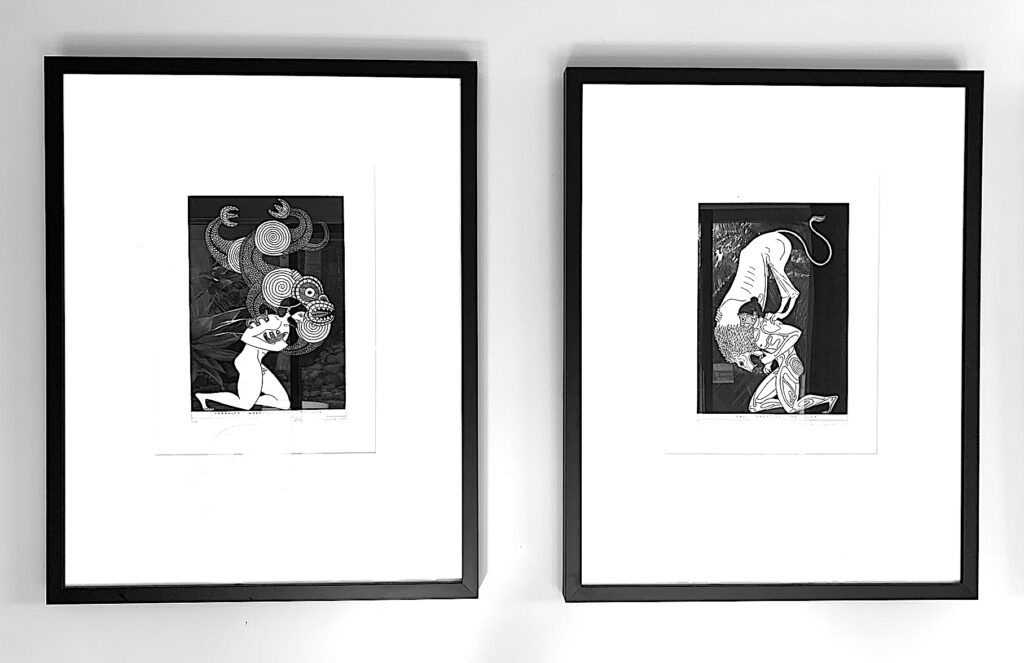
* The Labours of Herakles exhibition, 2008, showed lithographs with mixed narrative unions such as New Zealand colonial figures, Maori mythical figures and the ancient Greeks: (See examples below of my prints: Herakles wrestles a taniwha, instead of a lion or minotaur, and Maui fights a lion, instead of a taniwha).
* The Odyssey of Captain Cook at Lopdell House, Titirangi, 2006. (See my purchased books).
* Southern Myths (Auckland Art Gallery, 2005). The series of nine etchings have a narrative plot that is adapted from the ancient Greek story: The Iliad.
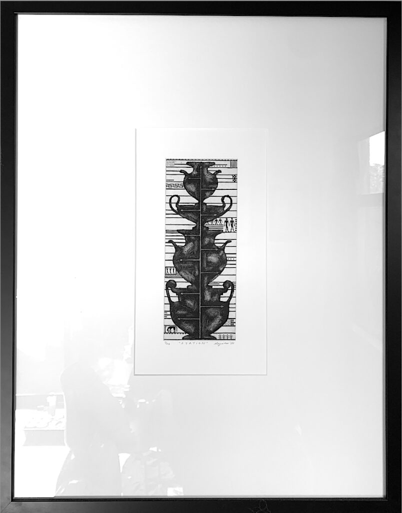
Maguire is known for her exquisite printmaking. I am fortunate to own five etchings. Her work is interesting to me, because her narrative themes often link together different time eras and different mythical narratives. In some of her printmaking work such as the Endeavor series of lithographs and etchings, Maori, Colonial Pakeha and ancient Greeks meet. (See my purchased Maguire etchings below, which displays my interest in printmaking, and Maguire’s subject matter of Maori and Greek mythology, Vases and Plants,).
I am inspired by nature (plants), geometry, ancient art and modern twentieth century artists. After viewing more of Maguire’s work I have since learnt that she is also interested in similar subject matter: (plants, ancient art: vases and myths) and artists: (Gordon Walters, Brigit Riley, Frank Stella, Piet Mondrian). During 2016 to 2018 she created abstract paintings and drawings on paper inspired by plants and these artists: Boogie Woogie with Gordon Walters, 2018 / Paper Garden, 2006 / Forest, 2003.
FOREST – 18 paintings, acrylic on loose canvas. Exhibited: 2003 at Papergraphica, butted together to form an installation. Individual canvas size: 1700 x 850mm. Each work is a stylised form of a tree with a trunk and branches, and some have leaves and roots. Geometric abstractionists such as Frank Stella and Bridget Riley informed this work as did the patterning on Greek and Mycenaean vases.
Left: Marian Maguire, No 1, Forest, 2003. Middle: Marian Maguire, No 3, Forest, 2003. Right: Marian Maguire, No 4, Forest, 2003.
Left: Marian Maguire, No 6, Forest, 2003. Middle: Marian Maguire, No 13, Forest, 2003. Right: Marian Maguire, No 16, Forest, 2003.
Left: Marian Maguire, No 15, Forest, 2003. Middle: Marian Maguire, No 9, Forest, 2003. Right: Marian Maguire, No 8, Forest, 2003.
Left: Marian Maguire. No. 3, Paper Garden Exhibition, 2006. Middle: Marian Maguire. No. 7, Paper Garden Exhibition, 2006. Right: Marian Maguire. No. 15, Paper Garden Exhibition, 2006.
Left: Marian Maguire. No. 16, Paper Garden Exhibition, 2006. Middle: Marian Maguire. No. 14, Paper Garden Exhibition, 2006. Right: Marian Maguire. No. 20, Paper Garden Exhibition, 2006.
BOOGIE WOOGIE WITH GORDON WALTERS Paintings on paper, approximately 1000 x 670mm. Acrylic on handmade sheets of Khadi cotton rag paper 650g. Exhibited at PG gallery, 2018.
‘These are a play between the works of Gordon Walters and those of Piet Mondrian, both of whose work I admire. I have kept to the horizontal lines of Gordon Walters’ koru paintings, with their curvaceous turnarounds and occasional free moving circles, and applied to that Mondrian’s commitment to red, blue, yellow, black, grey and white. While making these works I listened to Bebop jazz, which was coming to the fore when Mondrian painted ‘Broadway Boogie Woogie’. I first started working on this theme in 2016.’ Marian Maguire
Left: Marian Maguire, 2, Boogie Woogie with Gordon Walters, 2018 Middle: Marian Maguire, 11, Boogie Woogie with Gordon Walters, 2018 Right: Marian Maguire, 13, Boogie Woogie with Gordon Walters, 2018
Marilynn Webb, Ngā Puhi (born: 1937, Auckland) now lives in Dunedin, but grew up in the Bay of Plenty, at Opotiki.
Webb was an art teacher, and an art advisor for the Department of Education in Auckland, and Northland, and encouraged contemporary Māori art for the Northern Māori Project. She was also a printmaking senior lecturer at the Dunedin Polytechnic School of Art. For her contribution to art and art education in New Zealand she became an Officer of the NZ Order of Merit in 2000. In 2010, she was awarded an honorary doctorate from Dunedin’s University of Otago.
Webb started exhibiting her print and pastel work in the early 1960s, and is still creating art today.
Left: Marilynn Webb, Mataura Valley Suite No 4, 1995, soft chalk pastel.
The South Island area of Central Otago and Southland is a landscape full of valleys, plains and mountains, and has been Webb’s major subject matter focus during her long printmaking career. The reflective surfaces of lakes and sea water enters her works too. Her works celebrate the unique Central Otago landscape, but also remind the viewer of both the social and environmental issues that involve caring for it and sustaining its natural beauty.
She has the ability to draw the viewer in to her land or seascapes with strong lines that stretch and curve upwards from the foreground. They move towards either the centre, or upper left or right of the picture plane, and may represent a road, or a path, or a waterway. Many of her prints are recognisable for their textured, linear embossment. Protruding outwards from the surface, they often feature prominent cloud formations. (see below).
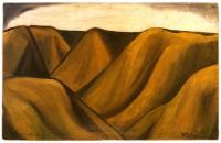
I find Webb’s colour tones to be beautiful and appealing, either pale, soft and moody, or bold, colourful and striking, and both applications reflect the atmosphere of the sky, hills and plains. Warm purples, pinks, oranges and reds merge and contrast against their complimentary colours of yellows, teals, blues, and greens. The creamy and dark brown coloured prints with their simple linear hill shapes are my favourite (see below), and remind me of Colin McCahon’s hilly landscapes. (see below).
Left: Colin McCahon. Otago Peninsula, 1946-49. Dunedin Public Library. Middle: Colin McCahon. Takaka, Night and Day, 1948. Right: Colin McCahon. Nelson Hills, 1948.
I thoroughly enjoyed my first Bookbinding workshop, from 9:15am to 4:15pm. I learnt many new skills working with paper, cardboard, a bone knife, embossing, and machinery skills that will support my ideas during my Bachelor of Visual Arts degree.
Firstly, I created a Flip-pad notebook. I made a Piet Mondrian (one of my favourite artists), style cover for this book (see figure top right).
Next, I made an A4 size French style notebook (see above). A large electrical machine helped me to punch half-holes. The rubber-band holds the double folded pages together inside the front and back cover. It will be functional because I will use it as a sketchbook.
The third book (a hardcover book above left), was more difficult to make, as you had to get your measurements exactly right. I chose black fabric to cover my hardcover book, and two different shades (red and black) for the inside front and back covers. I also created a red and white card and a black and white card. I placed the red and white card on the black front inside cover page, and the black and white card on the red back inside cover.
Artist Research: New Zealand Printmakers (and Painters) I greatly admire include Theo Scoon, Gordon Walters, John Drawbridge, Ralph Hotere, Bill Hammond, Max Gimblett, Marilyn Webb, Stanley Palmer, Dick Frizzell, Vivian Ward, Marian Maguire, Shane Cotton, Michael Tuffery, Sheyne Tuffery.
Theo Scoon (b. 31 July 1915, Java, indonesia – d. 14 July 1985, Randwick, Australia). New Zealand artist, photographer and carver of Dutch descent.
Visually, I like the colours of Theo Scoon’s print below that hangs on my wall, because they remind me of Tane’s forest. There are a number of layers, such as the subtle pinky red colour printed beneath the dark brown organic shapes that represent mud pools, yet appears as a taniwha face to me. A linear criss-cross pattern layer that looks like a fishing net adds interest in green.
Theo Scoon. Rotorua mud B. 4/25. 1965. Screenprint.
In the printmaking workshop I used the Palimpsest addition strategy, by adding a final layer of green printmaking ink over a green and light brown dye and paint experiment (see image below). The scratchy organic quality of my linear layer reminds me slightly of this mud pool print by Theo Schoon.
Gordon Walters (b. 1919 – d. 1995)
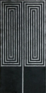
I really love the horizontal and vertical linear shapes below, as they seem strong, yet soft. As I like contrast in colours and shapes, I am drawn to Walter’s work. In particular on the left, I see a type of rippling wave movement within the soft grey-blue row shapes juxtaposed against their grey-white opposites. Kapiti is a special place to me, and my whanau. On the right, my eyes become disorientated by the different sizes of the black and white rectangular columns. They also seem to overlap, and push outward between the soft blue and fawn coloured rectangles.
Left: Figure 1. Gordon Walters, Kapiti, 1984, Medium: serigraph on arches paper, 505 x 382mm, Auckland Art Gallery Toi o Tāmaki, gift of Margaret Orbell, 2002, Accession no2002/6. Right: Figure 2. Gordon walters, Then, 1980, Mediumsilkscreen, 407 x 536 mm, Auckland Art Gallery Toi o Tāmaki, purchased 1982, Accession no 1982/36/1.
John Drawbridge MBE (b. 27 December 1930 – d. 24 July 2005)
These dark and dramatic black and white images are some of my favourite. Drawbridge is an idol, brilliant at painting colour (i.e., murals in the Beehive), and printing mysterious black and white images. Once, I visited his Wellington studio, and loved his interior prints inspired by artists such as Matisse and Vermeer, his landscapes, and his female-mirror and bottle-mirror still lifes.
Figure 1. The Concert (Vermeer) with Matisse. Mezzotint & drypoint etching, 30/100, 1983, 75 x 56 cm.
Figure 2. The Love Letter (Vermeer). Mezzotint & drypoint etching, 30/100, 1983, 75 x 56 cm.
Figure 3. The Music Lesson (Vermeer). Mezzotint & drypoint etching, 30/100, 1983,75 x 56 cm.
Left: Figure 4. John Drawbridge. Dark Pyramid. Medium: Drypoint & Mezzotint. 1998. Right: Figure 5. John Drawbridge.. Woman with Matisse No. I. Mezzotint & drypoint etching, 12/100, 79 x 58 cm.
Left Figure 6: John Drawbridge. Interior with Bottles.mezzotint and drypoint, 5/100. 1986. 550mm x 340mm. Right Figure 7: John Drawbridge. Still Life with Malevich 1. mezzotint. 14/100. 1988. 330mm x 250mm.Figure 8: John Drawbridge. Interior, with Matisse. Mezzotint, 27/50, 65 x 50 cm.
Thus, I thought of Drawbridge’s work in the Print workshop as I created my first coloured mono print: ‘Bottle Lovers in a Landscape’. I wish my next step in printmaking to include trialling etching. In my mind, I can visualise many subject matter concepts that incorporate both text and drawing ideas of inner and outer landscapes: interiors, windows, bottles and trees.
‘Bottle Lovers in a Landscape’ Monoprint.
Ralph Hotere (Hone Papita Raukura) ONZ (b. 11 August 1931 – d. 24 February 2013) Born in Mitimiti, Northland, New Zealand.
I especially like Hotere’s scribbly, rough and expressive drawing ability in both his printmaking and paintings. I like the use of text (usually words from a poem or song), and numerals in his work. I daily view this print below, and always receive enjoyment from reading the flipped text that is interestingly written backwards and forwards. He has combined watercolour painted stripes (like a brightly lit cross) over the black etched ink of an Union Jack flag. The text (THREE / BLUE) and symbols (3 / paint strip of blue) are repeated and rotated in different angles and directions. In the future, I would like to trial the use of text such as a poem, and a range of symbols in printmaking.
Ralph Hotere. Manhire’s Midnight Window at Carey’s Bay ’79. A/P. 1980. etching and watercolour, 520mm x 380mm.
Left: Figure 2. Ralph Hotere. In the Labyrinth, at The Demolishing. Limited edition Screen printed poster, 90/100, 97 x 63 cm. Right: Figure 3. Ralph Hotere. Round Midnight ‘October’. 2000, Lithograph on Fabriano Tiepolo 290g. 560 x 760mm. Drawn at Carey’s Bay and Christchurch, hand printed at Papergraphica. Edition size: 24.
Max Gimblett (Maxwell Harold Gimblett) ONZM, HonD is a New Zealand and American artist. (b. 5 December 1935).
Bill William Hammond (b. 29 August 1947, Christchurch – d. 30 January 2021)
Stanley Palmer (b. 1936)
Right: Stanley Palmer Rakau tapu – harataonga (2010), bamboo engraving & lithograph on paper, edition of 100, paper: 378 x 540mm, printed image: 280 x 412mm
Marilyn Webb, ONZM (b. 11 September 1937) Auckland.
Dick Frizzell (Richard John Frizzell) MNZM (b. 1943)
Vivian Ward (born 1950, Greymouth, NZ)
Right: Vivian Ward. Woman in Interior, 2015, Print etching, 104 x 105mm.
Marian Maguire (b. 15 March 1962)
Shane Cotton (b. 03.10.1964)
Michael Tuffery (MNZM) (b. 1966), Wellington (New Zealand artist of Samoan, Tahitian and Cook Islands descent).
Sheyne Tuffery (b. 9 October, 1970) Wellington, New Zealand.