SEMSESTER TWO REFLECTION

Well, the last semester has not been at all easy for me and a myriad of things have impeded my ability to make art at certain points. However, in terms of the final sculpture, I’m incredibly pleased that I managed to pull it together, not to mention a little proud- it wasn’t something I thought I’d manage to do. But in the end, it was very close to what I had envisioned, and I’m always trying so desperately to replicate the image in my mind’s eye when it comes to any piece of art. I think it feels like an accurate representation of where I’m currently at as an artist, and that isn’t the same artist I was a year ago. That person would’ve hung strings of collaged paper, or glass beads at a push. This entire course has pushed me so much further than I thought it would and hurled me into areas I would’ve been so hesitant to explore. I think I see that in my level of resourcefulness and adaptability more than anything else; being able to create my final sculpture out of the time and materials I had and still feel as content as I do with the outcome.

Are there many things I could change? Of course, the perfectionist in me sees minute details that need tweaking and also a bigger picture; ways I could’ve pushed this work so much further both visually and contextually. I would’ve loved to incorporate sound design and digital audio into the piece, to have a dialogue form between the natural sounds and the manufactured, perfected ones. I would have also loved to pour time into researching different voting systems, highlighting some of their strengths and failings and, conscientiously, mimicking these in a warped way for people to interact with. As much as it’s been very touch-and-go, to present a sculpture which contains even some elements I take pride in is an accomplishment I’m genuinely happy with.
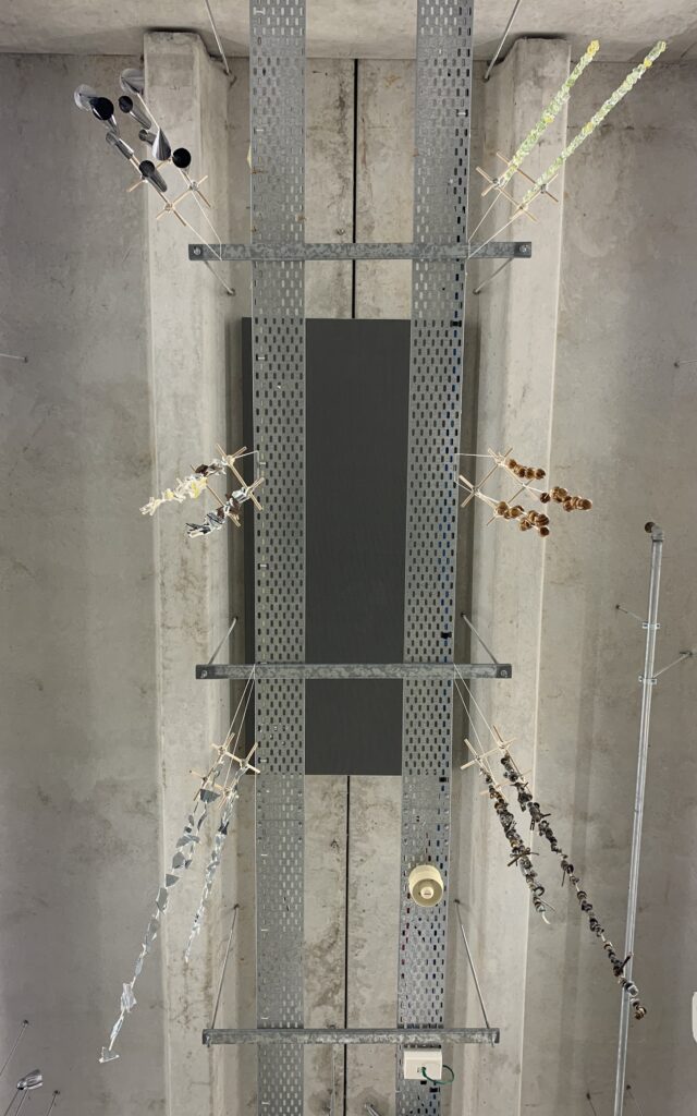
WHAT IS MOVEMENT? : FINAL SCULPTURE

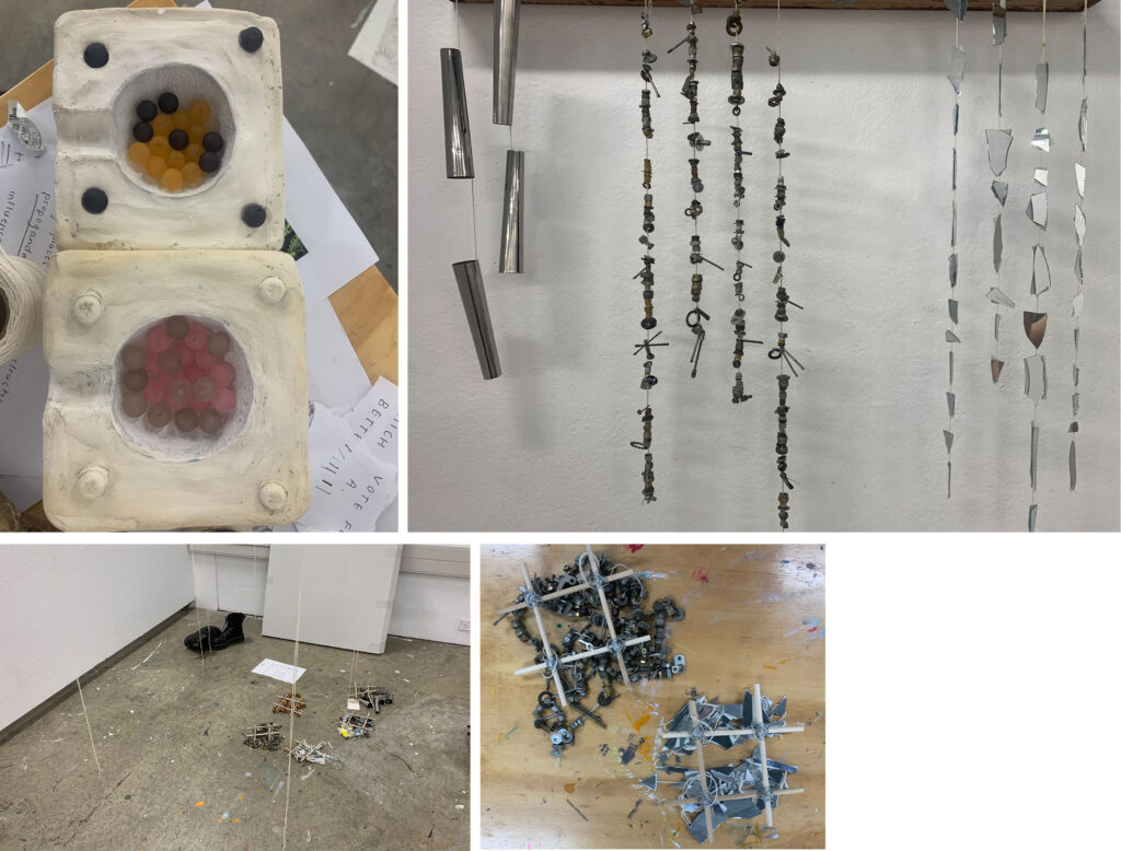
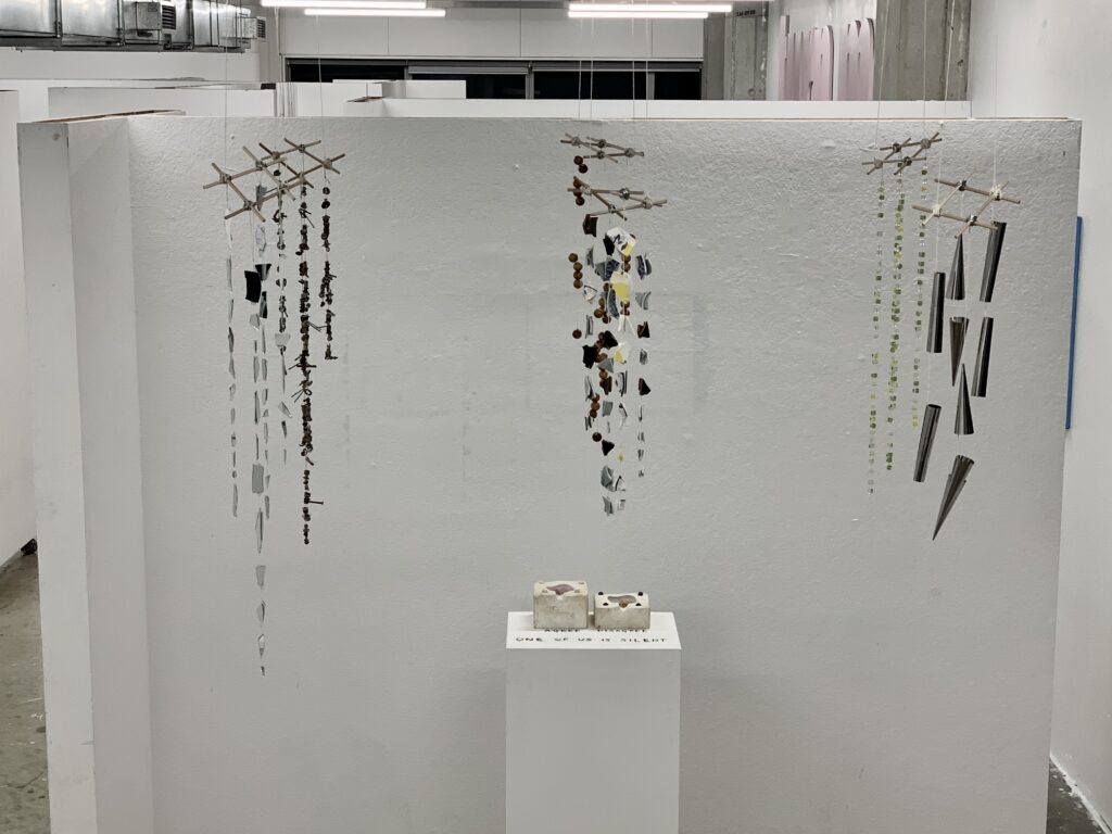
The final sculpture demonstrates a) the ambiguity of instruction and b) the importance of sensory interaction.

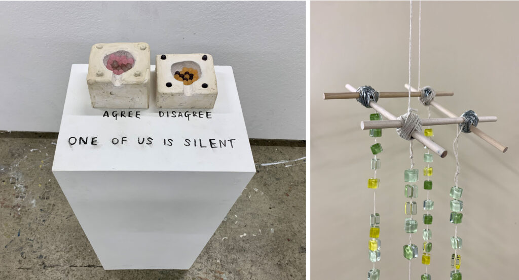
In regards to the first point; what exactly are you voting for? Is that “ONE OF US IS SILENT” referring to the plaster containers or the wind chimes? And if it is referring to the wind chimes is one meant to touch them? In my mind, the answer to both of those questions is yes. Touch the hanging structures, feel the textures and listen to the different materials collide.

And is that simple statement “ONE OF US IS SILENT” a form of propaganda? Because none of the six standing in front of it is, in fact, silent. But those five words make you want to form an opinion, they are there to seduce the viewer into finding out. So it acts as a not-so-subtle form of manipulation and control.

But aside from that, the more pressing question is how does one show whether they are in agreement? Do you take a bead? Has someone already voted and put the beads in? Once the plaster moulds were dry they reminded me of ballot boxes with little slots on the sides. This brings to mind the, so current, low voting rates in local elections, due, yes, to a lack of interest, care or access to education, but also to a lack of clarity. A lack of accessibility for those without a permanent address, without time, without many things, which, in a system which feels worrying out of touch in a digital world, make it impossibly difficult to have your opinion heard.

And as to the second part, the hanging, mobile-like structures are a sculpture which exists to create sound and movement. But this becomes sticky when the plinth poses a question, it casts a shadow of doubt over the piece so that the sound element has the potential to be made redundant. “ONE OF US IS SILENT” is so blatantly a statement and it risks making the viewer think that it’s a guessing game. Is the purpose to visually examine the various materials and decide whether they’d sing out if touched? No. But how would you know.

WHAT IS MOVEMENT? : SITE SPECIFIC

So, for the site-specific intervention side of the brief, I wanted to have people participate in a task or vote which was seemingly random, inconsequential and nonsensical.

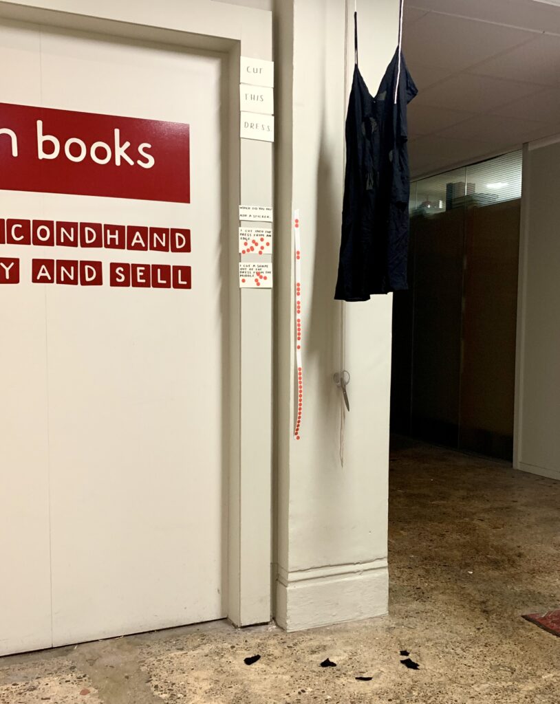
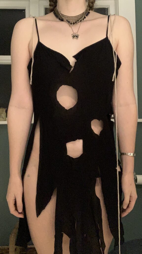
I decided to set up a dress which would hang alongside a pair of scissors in the foyer of my work. This is already something which is placed in an unconventional place given I work in a bookshop. To push this further, I would ask people to cut the dress- something counterintuitive and mundane but odd.

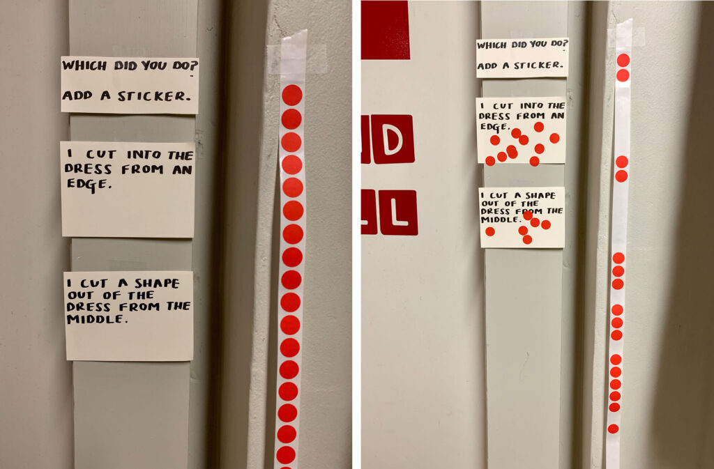
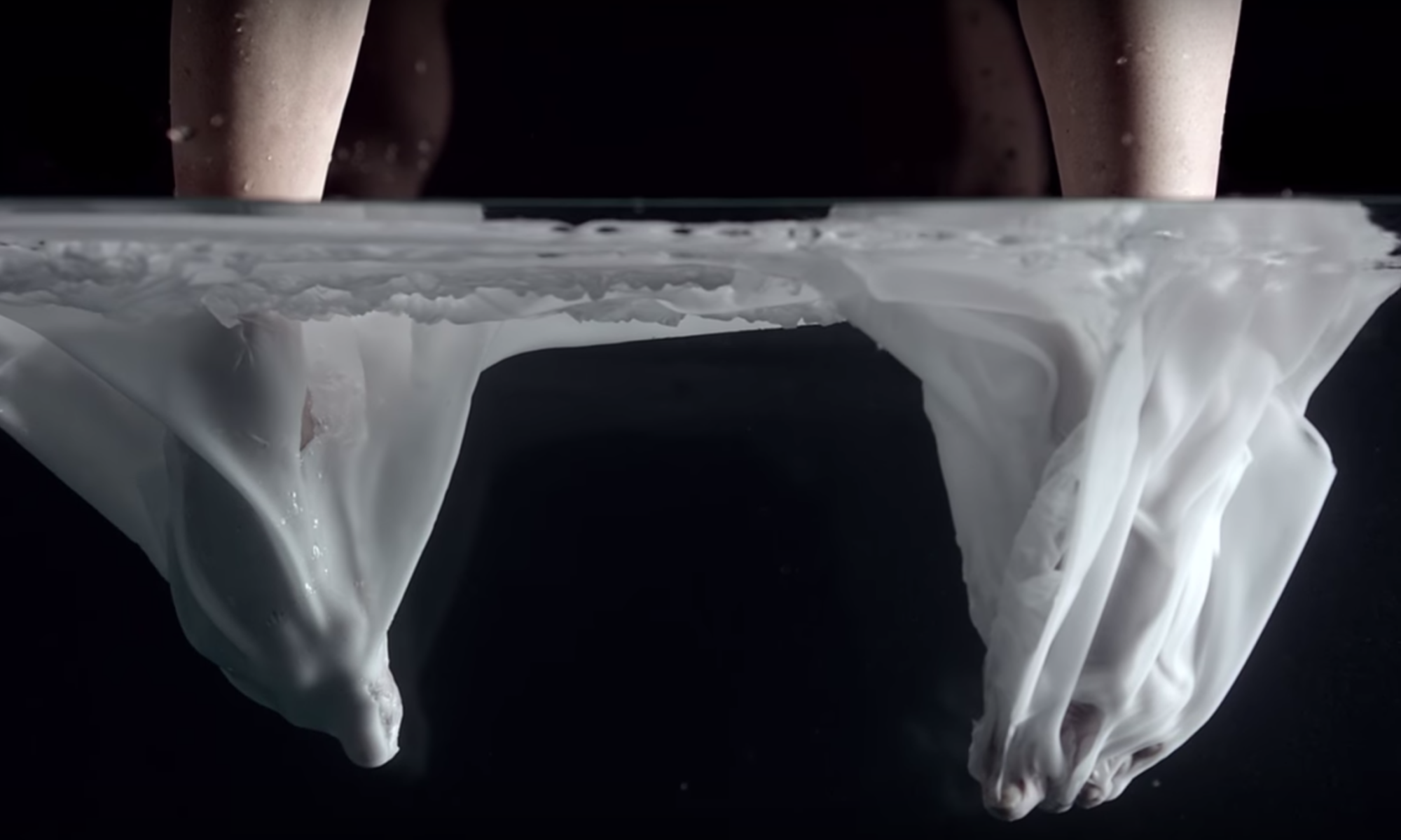
I set up a question next to this which asked what method they used to cut the dress. There were only two options which I can only imagine made people think they had to choose between the two – and everyone did.

voting area at the start and end of the intervention

I can’t know if had the only accompanying instruction read “CUT THIS DRESS” the result would have been different. The necessity to note which method you used I think made people contemplate the point of the task more. Is it some kind of personality test perhaps? Or am I being observed? I did watch casually as people partook and noticed that it was primarily people under about 25 and people in groups who chose to interact with the intervention. I would’ve liked to gather better data by observing this and asking people questions about their lives to see if there were unseen factors which impacted people’s decisions. For example, one method had almost twice as many votes as the other: was this because it was the easier and more intuitive of the two or were latecomers influenced by what the people before them had done?

Ultimately I decided that I should let it play out on its own. So I tried not to appear focused on the people who partook, nor did I answer any questions like, “why is that there?”, “who put it up?”, “what is it for?”, or ‘what’s the correct way to do it?”. But I was fascinated as to why people chose to participate; it’s such a trivial and arbitrary request “CUT THIS DRESS”, and yet if I saw that somewhere I know I’d do it.

the aftermath of the intervention

After the intervention, the dress is almost entirely stripped of its purpose. But how interesting that it’s been cut up without rhyme or reason by 17 strangers just because a sticky note instructed them to do so. With no discussion or collaboration, it retains a part of its functionality; no one cut the straps, no one cut it in half or cut it down, or did anything that would stop others form being able to take part down the line. Nor did anyone stop the dress from essentially being a dress.

WHAT IS MOVEMENT? : EARLY STAGES

Wet Lab:

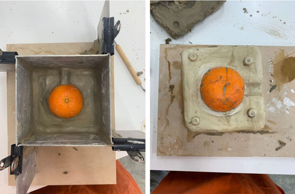
Because of my absences, I spent very little time in the wet lab, however, even in the sessions that I had, I found so much enjoyment in the tactile nature of it. The way it engaged all the senses so dramatically pushed me down a touch-based, sensory path and away from the digital ideas, I began with.

images from the wet lab workshops: process fo casting fruit using clay and plaster

This realisation made the materials an incredibly important part of what I was doing. Naturally, my sculpture would create a visual response of some type, however, I was desperate to create a dialogue between several senses.

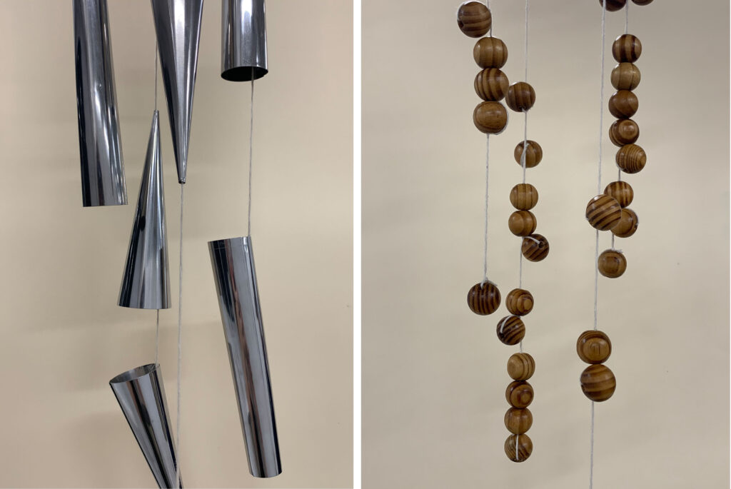
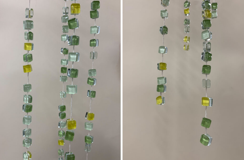
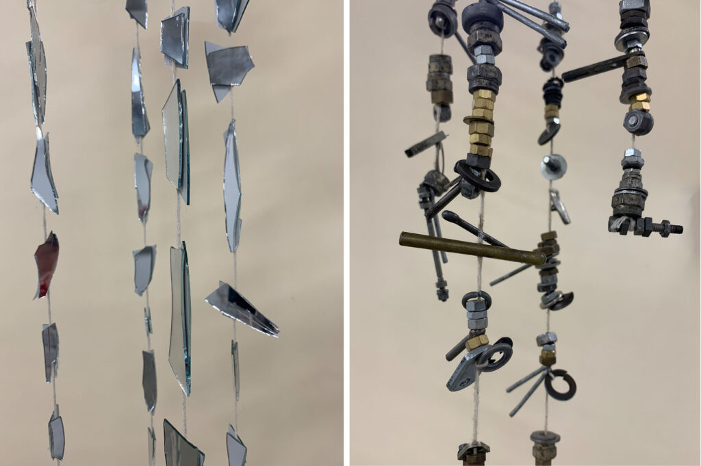
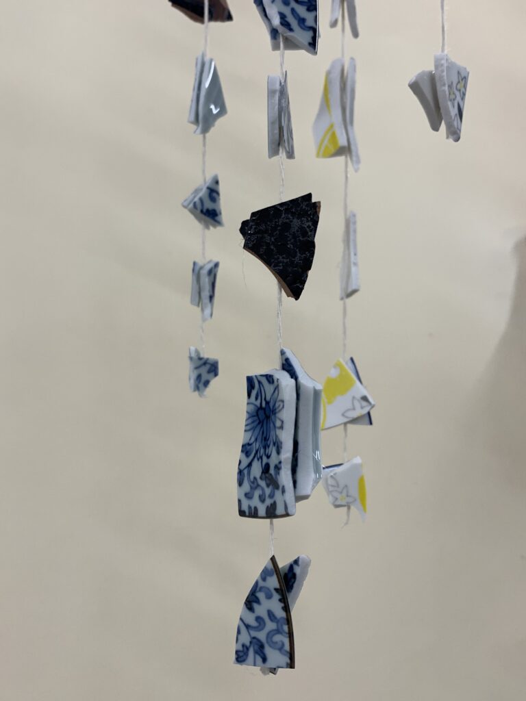
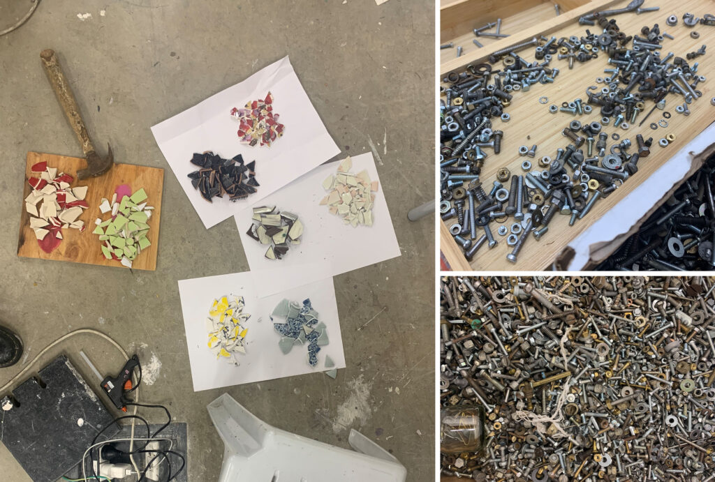
So I decided that touch and sound would also play ambiguous roles in the piece. I wanted to use materials that created a variety of auditory tones; one dull and understated, another jarring and loud, some to chime and tinkle, one that crashes and reverberates, etc. Finding these materials and trying to source a variety of mediums ranging from glass to ceramic to wood and metal was engaging as it forced me to adapt to the different ways these behaved from an auditory and touch-based perspective. For example; smashing op shop plates and cheap mirrors created a wrenching, deafening, crack, but when they were later suspended on wool the colliding pieces merely bounced off one another, dancing and chiming merely; not the character I’d expected them to play in the final sculpture.

broken plates and bolts being sorted based on sound of shape ready to be attached to string to create “wind chime” structures.

I decided early on in my making that I wanted my work to hang as this would likely create an unpredictable but hopefully attractive rippling movement, and allow more readily for the work to create sound. So it was a matter of finding materials that possessed both of these properties/abilities and then slowly problem-solving until I was able to manipulate them into my vision, a mental image which needed to remain fluid; I was trying not to cling too tightly to my control over the mediums.

taken at random points throughout the process of construction

WHAT IS MOVEMENT? : IDEA AND VERBS

What is now a tried and tested springboard for a brief is Richard Serra’s verb list. As I perused it the verbs that jumped out at me could pertain to human interaction; like, to complement, or to impress. This morphed into the phrase “to instruct” and this is the basis of my idea. Other words that bear similarity are:

  • direct, 
  • explain, 
  • dictate, 
  • educate,
  • edict,
  • command,
  • guide.

The lack of direct synonyms captivated me and I tried to pinpoint the difference in these verbs. It got me thinking; a large part of this comes from the emotion evoked, rather than intention or outcome. Some hold kindness, a feeling of collaboration and skill sharing, whereas others denote authority and a hierarchy. 

Critiques and conversations got me thinking about propaganda; the dissimilation of information. The line between manipulation and advertising as opposed to casual information sharing grew blurrier with every passing day. Our minds are so oversaturated with digital information that trying to distinguish between the two seems arbitrary. 

I think this is because there is a certain attitude of surrender when it comes to technology. It is so prevalent in every aspect of our lives that to fight it would b an immense amount of conscious energy; we’d have to rethink every minute detail of our lives. Not only this, but it can also seem counterproductive because, of course, technology is pivotal to societal advances. 

I do think that such an extreme influx of media has created an almost universal numbness towards instruction and propaganda. The ins and outs of data collection and digital footprinting are too tedious and technical for most of us to make sense of. Instead, we remain willingly unaware of the complex manipulation that we fall prey to at the hands of marketing, news, popular media, etc. It’s something that we accept as a base part of living in the 21st century, it is convenient in many ways and it does not project itself to the forefront of our minds often.

So I thought about some of the basic verbs that characterise this subconscious type instruction:

  • entice, 
  • lure, 
  • persuade 
  • seduce, 
  • attract, 
  • invite, 
  • coax, 
  • convince.

Essentially, I want my sculpture to have some element of instruction which is balanced with a certain allure of curiosity. 

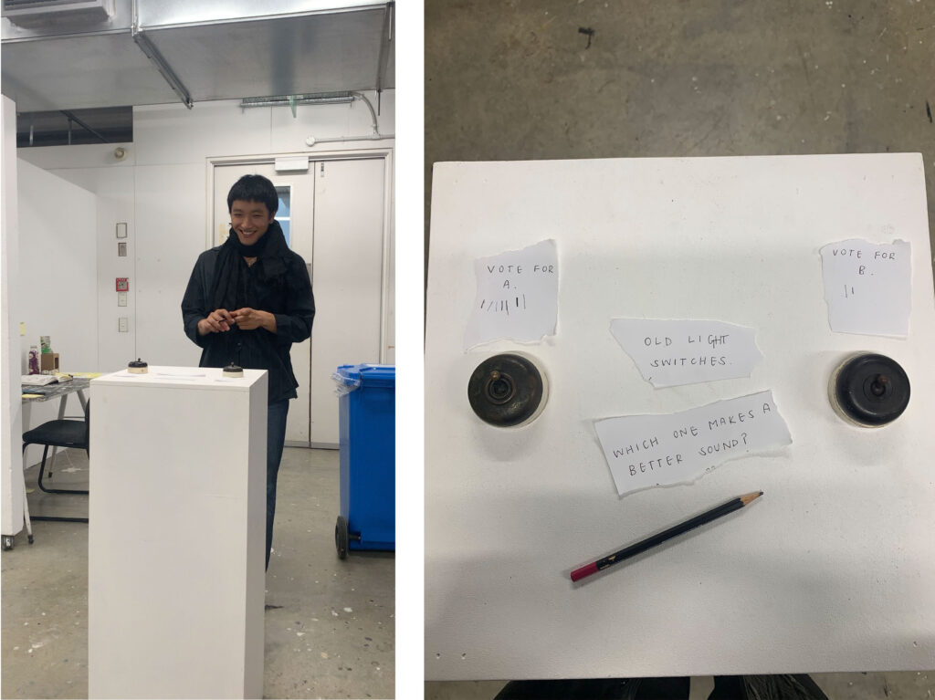
screenshot from and set up of quick video experiment:

The experiment was about quickly and light-heartedly playing with the instruction verbs as well as found objects I want to implement in my design. This brief task has helped me land on an idea that I’m very interested in extending throughout the sculpting process; the idea of voting. In this case, the vote was a simple choice between two options and you denote your choice using a tally mark system.

But the act of voting could be much more complex, it’s also something we come across on a very regular basis: having various or limited options presented to us and making a choice when its ramifications, weight on your life or its general purpose isn’t clear- even if that choice is not to vote at all.

PROCESS INTO IMAGE: A REFLECTION

What I didnt anticipate was how much this brief would push me to try methods and materials I’m not well versed in. More than that; it forced me to set aside several things which have consistently held my work back, one being playing with scale, two being overlooking detail for the benefit of a piece, and three being letting the materials dictate the outcome of an image as much as I do. Though I felt like I let go of the reins, forcing myself to adapt and respond to the unexpected, I should have done so more.

I did find myself at real pressure points throughout as there were periods I missed due to sickness meaning I had to create a burst of work in a short space of time, predictably the works I was happy with were the works I took care and time with. Though interestingly not the ones I agonised over for too long. 

By the end I had a firmer grasp on the elements I enjoyed combining; layers of paint in similar tones with vivid, chaotic marks snaking around or in between said layers. To combine this new technique with my strengths and more conceptual images would have pushed me into a stage I didn’t quite achieve. Come Tuesday, post hanging and cleaning I was pleased with my final selection of works, but I admit this did not extend to some of what I didn’t display.

PROCESS INTO IMAGE: SELECTION AND FINAL WORKS

Selecting the final works was interesting, as I perhaps had a more limited number to choose from due to being away. So there were several which stood out as obvious picks and the others fell into their spots naturally based on predominantly colour but also what I felt I’d achieved that was not yet showcased in the selected works. I found that the pieces I selected were mainly painted towards the end of the process, it did take me a while to gauge what I needed to be doing and then gain the confidence to carry it out, so these, I felt, were much stronger than most of my earlier test pieces. At this point I’d finally got a handle on what materials I enjoyed playing with and combining. 

detail from above image
detail from above
detail from above

PROCESS INTO IMAGE: FURTHER CONTEXTUAL RESEARCH

Towards the end of the brief my idea pool started to dry up and my work became repetitive so I conducted some further research into artists whose work would steer me in the direction I wanted to go in.

JOAN SNYDER:

Joan Snyder’s work is an absolute wealth of inspiration for mark making. Her use of both paint, line, and even lettering is liberal and incredibly varied. Her work’s use: acrylics, oils, spray paint, charcoal, a variety of moulding and sculpting pastes, and pencil, and that may be far from a comprehensive list. As a woman in 1960’s New York she gained traction as well as controversy with her ‘stroke’ paintings, abstract and ablaze with movement and fervour. Her work is such a quintessential example of mark making because, thinking of Richard Serra’s verb list, her paintings have a true physicality. I can see the action, or verb, which was used to create each and every mark. 

It’s this physicality that makes the sheer range of marks and materials so evident and it’s this which makes Snyder’s work so magnetic. I’m drawn to this curious, experimental use of marks as I know it will propel me out of my comfort zone. The outcome is, of course, both beautiful and cohesive. But simultaneously the artworks, quite simply, feel free. They’re not bound by strict composition or technique but they do require an entirely different, and no less valuable, skill; daring. 

JOSIAS SCHARF:

Joseph Scharf’s 2019 series Love Letters proves itself to be a very interesting and unique approach to mark making. The concept is that each mark represents a letter, and so, in theory the piece of art could be read.

There are two things which make this idea so interesting to me; firstly the repetition, the idea that an exact mark is replicated time and time again is something I’d like to experiment. Of course, when working by hand no two marks are identical but a sea of marks created using the same action will have a particular effect. Secondly, creating a written language out of marks removes the randomness, it removes the element of chance. What makes this so interesting in the context of Josias Scharf is that, of all the artists I have looked into, his marks appear to me the most random, so how did he achieve this using such a controlled system?

PROCESS INTO IMAGE: USE OF MATERIALS

After the initial mark making process I reverted back to using predominantly acrylic paints, however, I soon implemented the use of house paint as well as I found that it gave me vibrant, playful colours. The primary reason for doing this however is that given their consistency house paint doesn’t blend and this detail kept me from trying to obtain realistic images it allowed me to make marks freely without erasing them by subsequently overworking the surface or image. 

house paints allowed for flow due to consistency plus vibrant warm tones

Printmaking became a key method for me as I had a bout of sickness which led to me falling rather dramatically behind. I found that monoprinting was an effective way of creating interesting work quickly which I could then use as a ground for further marks and images. Until lifting up the weight blankets and tissue I was in the dark as to what my print looked like, this lack of control is something I struggle with but in the context of printmaking I found it both stimulating and rewarding. This comfort led to further experiments, creating prints on fabric and translucent or transparent plastics. 

pastel on print

Plastic was a material also used alongside paint, the paint behaved entirely differently here, moving as it dried and running in dotted lines across the high gloss surface. I wish I had been more experimental with my use of surface; aside from this I stuck to wood and papers (albeit coloured paper to try and achieve an outcome like that of Howard Tangye). I disregarded the fact that the surface is undeniably a key material and has an inalterable effect on the behaviour of paint.

transparent panels allowed me to layer images a way
which altered the dialogue between the abstract
marks and the representational ones
as the plastic surface has no absorbency the
paint sits on the surface, either chalk-like or
in droplets

The use of dry materials allowed me to inject variation into the pieces I’d created. Pastel was excellent for richening the colours and also provided an interesting texture. Felt pens also played a role as they become translucent when used on top of paint and allowed for layered marks I would otherwise have been unable to achieve.

example of translucent pen marks layered interacting with paint and gloss