In this article, Houdini with a Brush, David Salle discusses the works of artist Charline Von Heyl. In the article he addresses what makes Von Heyl’s artworks stick out and appear as ‘resolved.’ One notable aspect is her use of pattern as Salle writes, “highkey color harmonies, like pale lemon, mauve, taupe, and mint green; or finely calibrated intervals between light and dark colors; repetitions of patterns or the alternation of two or more patterns side by side or overlapping.” I have been using a fairly large variety of patterns in my pieces and I have found it to be something really interesting to experiment with. I think adding different patterns amongst the fluidity of loose paint strokes and washed colours, creates a complimentary balance and visual harmony to my artwork.

Acrylic and oil on canvas, Petzel Gallery, New York.

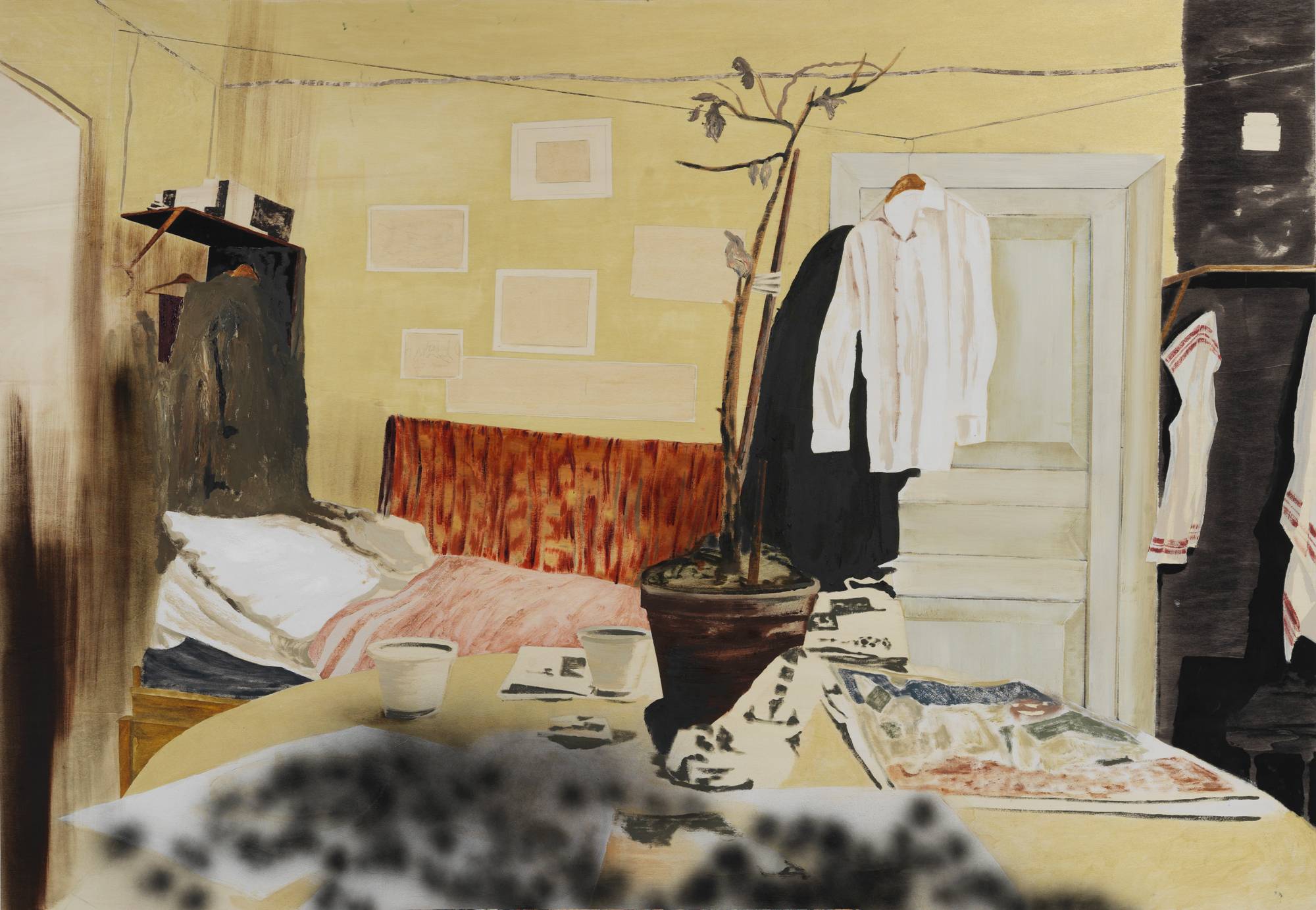
Acrylic and charcoal on linen, Museum Dhondt-Dhaenens, Deurle.
Von Heyl is also unafraid to use black in her works as written by Salle, “Von Heyl is a ferocious shapemaker and a pirate of the color black: black stripes, black smears, hardedged black shapes, black charcoal lines and marks, black cutouts, negative shapes dropped out of black, black stars, arrows, and darts; black shapes like long plumed dresses or the trains of dresses; shapes like tree branches or felled trees, or pooled waters.” In my next blog post I will discuss how I incorporated the colour black into my own works which made artworks I previously felt were incomplete, now appear resolved like Salle describes Von Heyl’s works. Salle also wrote, “Black in painting is like a knife in a rumble: don’t bring it if you’re not prepared to use it.” I have never been afraid of going dark in my works previously, but as I started to move towards more of an abstract style, I found I was beginning to go lighter and brighter with my colours. This article reminded me to be unafraid of using black in my pieces. Once again, I agree with Salle and think that adding black to a piece can really complete and compliment it.

About von Heyl’s Absences Répétées, Salle wrote that the black triangles, “make all of the other elements in the painting—washes, scrapings, spraypaint lines, two vertical columns of letters in red paint that spell out the painting’s title—cohere, and they give the painting its attitude of fearlessness.” This got me thinking about how black solid shapes can be used as a way of enhancing other aspects of my own work which involves a variety of patterns and shapes. Von Heyl was unafraid to use the colour black and harsh lines which is what I think makes her work stand out so much.
David Salle. “Houdini with a Brush.” The New York Review of Books, April 19, 2019. http://www.davidsallestudio.net/’19%20The%20New%20York%20Review%20of%20Books_von%20Heyl_May.pdf