Lana Lopesi, False Divides (Bridget Williams Books: September, 2018), 22-25.
Tamaira, A Marata. “From Full Dusk to Full Tusk: Reimagining the ‘Dusky Maiden’ through the Visual Arts.” The Contemporary Pacific 22, no. 1 (2010): 1–35. http://www.jstor.org/stable/23724720.
This is an artist that got recommended to me by two different people due to their work “poll,” since it was something that worked well with the ideas of my making for this project, but as I explored their works a bit more, I found that there were a few works I was really interested in.
The work “poll” was of particular interest to me because of the concept around the work. I think that the way that the work captures the movement of people is really interesting, especially in consideration with how that movement has and would have changed. I really like the idea of something so simple being used to create such a big impact, and for it to really capture the essence of an “obstacle,” and even through a single image you can see how people have responded to this insertion. I find the consideration of these interactions quite a fun experience.
Poll, 1999
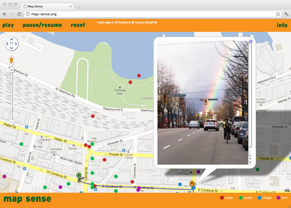
Another work she did was a collaboration work called “map sense,” I think her works really spoke to me while working on this project because I have always struggled to understand artworks like this, that are simply pieced together images, audio, or information, and I’ve never really had any interest in works like these. Now however I think that there is something really special about the way that these works can display meanings through a seemingly standard and non-traditional art form.
map sense (collaboration with Gillian Jerome), 2011
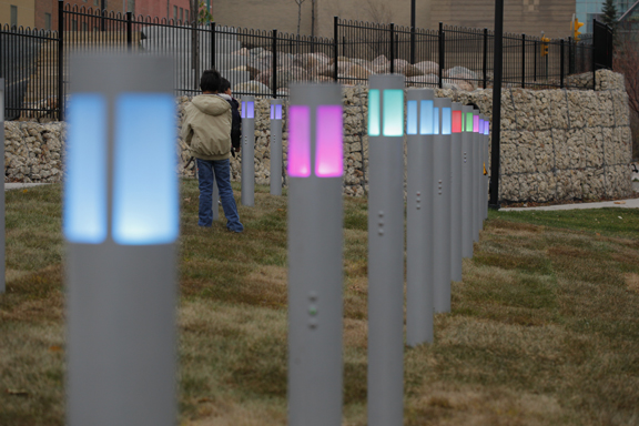
The last work I was excited by was her work “DIY field.” This work I really loved the interaction aspect of, where it was made for the viewers to be able to effect their own experience in the work. I also liked the use of the coloured lights, in a way that they used the colours as symbols, or used them as hidden meanings to change the mood of the area depending on the colours.
DIY Field, 2011
I think that Koh’s works really opened up an interest for a type of art that focuses on observations and interactions, as well as a more simplistic, ready-made style.
‘Horned Wheel,’ Don Driver
This is a work I’ve been extremely interested in at the moment, I love so many things about this piece, but it speaks to me for this topic in terms of the way it uses symbolism and invocations to make the viewer infer things about it. I find it pretty cool how we can look at an object, or hear a sound or something and immedietely know what it means or what its referencing because of how universal and widespread it is as a symbol. Even more interesting is looking at those symbols that aren’t so widely known and viewing how different people respond to them, and at where and to whom they apply to. This work really explores that with many of the different hidden symbols, there to invoke different reactions and feelings from different people, like the symbol of the cow skull and especially the symbol of the wheels on the sculpture, which for me immediately linked the work to movement because what a wheel means to me and how I expect it to work, so I instantly wanted the work to be in motion, but it’s interesting to consider that as intended, not all viewers of this work would have the same feelings.
Horned Wheel, Don Driver, 1986
One of the other things I looked into was some of the symbols and other things surrounding navigation at sea. Earlier methods using the sun and the stars are probably lesser known in terms of immediate recognition. Then there was the creation of compasses with magnets, along with nautical charts, visualised as maps of the sea, mostly sporting the symbols of ‘North,’ ‘East,’ ‘South,’ ‘West.’ We now have many more pieces of technology that we use for that navigation, things like radars and the GPS.
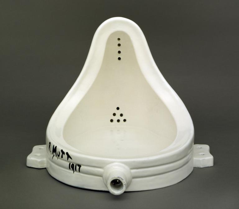
Marcel Duchamp
Marcel was someone who I also found interest in because of the great impact he had on the escaping of the confinements of art, in terms of the ability to call everyday objects ‘art.’ I think this ‘ready-made’ practice really opens up a way to speak through the simple functions of these objects, it allows for a lot more to be said through less.
‘Fountain’, Marcel Duchamp, 1917, replica 1964
Gary Webb
Specifically his work in sound in combining audio and sculpture. I love the way he explores seeing art as a space as a whole, and working with unique aspects of the viewers experience to create more of a mood or a feeling within the space of his work, creating a tangible emotion. I haven’t really explored using anything like sound in my art before, and definitely haven’t used it as one of my main statements so it was something I was interested in looking into and seeing how I could incorporate that into my work.
Sound of the Blue Light, 2002
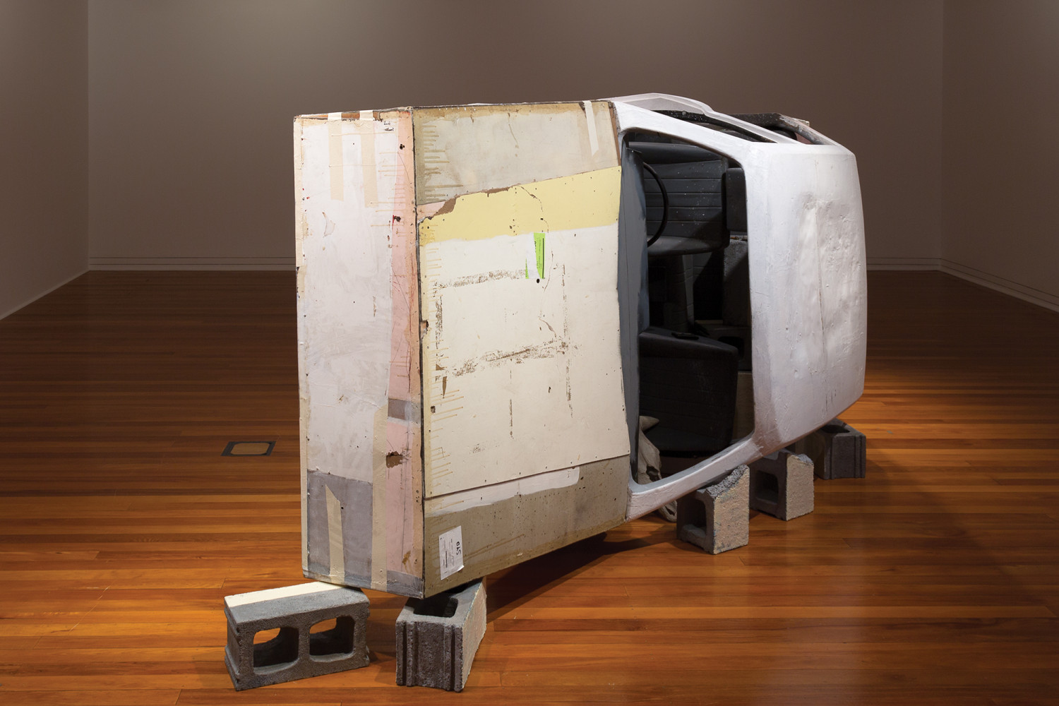
Glen Hayward
I think what drew me most to his works was the way that fragmented pieces of objects were used, for then the way that the space is put together, and all the pieces work with each other to operate and form the work. It showed me that context is very important, and even with only pieces of something people can still draw meaning from those things especially when working together with other things. I love the operation of this concept, and the sort of mystery it exudes without the presence of the other things in the work to link together to form at least some sort of sense.
glen hayward: dendrochronology / 1 sep – 2 dec 2018
Julia Feyrer
The different materials that this artist works with is pretty exciting, I like the way they cast and mould a wide range of things into everyday objects for instillation, it’s cool how these things can be crafted into replicas that are better suited for the sculptures and even the way that you can play around with the different visual aspects of these replicas, making them unnatural and different from the originals.
Julia Feyrer, Propagators, 2019
Tamara Henderson
I was also interested in this artist for similar reasons, the way in which they use different materials to mould and form their sculptures really captures me, especially the way they choose to let the materials shape themselves and speak through abstract forms rather than a ready-made mould of an already existing common object.
Canberran Creatures by Tamara Henderson and Nell Pearson
Movements materialising momentarily Bianca Hester
This work combined a lot of different media within their work, I think what drew me most to this work was actually the writing around it, and hearing about the careful consideration that went into the layout and situating of all of the different aspects of the work within the space, as well as the inner workings of how the works link with each other conceptually and all the information regarding the making of this art.
The first lesson for sculpture I did struggle a bit, though I was excited, when thinking up ideas of movements I wanted to follow I started looking at the materials I might want to use, to be honest I was really keen on the ideas of using things like ice or wax as a medium but most of the concepts I came up with didn’t really align with those, but I might work more on it to see if I can figure out a way to link my concept to the medium I’d like to work with.
In my searching for a movement or a verb to explore I figured some might come from objects like knives or swords or any sort of sharp object, to look into verbs like to cut, to slice, to gouge, or football studs, where I could look into verbs like to mark, or to stamp, and then I was steered into the direction of potentially mapping the marks of peoples movements, in and out of the context of football and my boots. Where I would also insert myself or my own obstacles of some sort to capture the changes of people’s movements due to my intervention, I thought this was a very interesting concept and I would love to look further into it, though I am struggling with ideas outside of performance art or the capturing of it, and finding it hard to figure out a way to put my own personal twist on it that I like.
In the first session of the wet lab, I found it pretty exciting, I think I’m a little used to a bit more wild, less careful making but I enjoyed the process nonetheless, though it didn’t spark any ideas for sculptures I could do within that realm like I was hoping, but I’m expecting to do a lot more research on artists that followed a similar idea in their art making and am I hoping I gain a couple more ideas from that and get a direction of where I want to head.
I am not however, sold on the concept of mapping movements or where that could go quite yet, I’m still willing to explore other options as it definitely doesn’t feel like a solid, formed concept as of now.
Next time we worked in the wet lab we worked on pouring our slip into our moulds, the two attempts I made all broke apart, I think due to the air bubbles and overflow of the slip getting stuck as I tried to pull them apart. I definitely need to figure out more ways to stop that from happening. But talking with Harriet about my ideas for moulding a tactile indicator and making multiples of those, we’ve come up with different ways I can trial the making of those. Some including out in public and others in the wet lab with a singular tactile. I’ll also trial a couple different mould material etc to see what works the best.
On my third attempt at making my carrot I finally succeeded, I think I left it for long enough this time and made sure to fill any holes or air bubbles it could get caught on, so the ones I’ve been made have been left to be put in the kiln to bake. We then started working with pinkysil, this was where I got to start working on moulding the tactile indicators. Harriet had brought me a couple her husband had collected to borrow, so I used those to make two moulds. It was pretty fun and I’d say they were quite successful. The only problem I faced with them was a thin layer left on top that I had to peel and cut away due to the bit of plaster I used to stick it down, which ended up far from perfect, but not deal breaking. I then did one trial with the slip, and produced a copy of the tactile indicators, I think the slip was a little too hardened already and so it didn’t quite shape properly, and there was a few air bubbles, but that’s easily fixable, and I was pretty happy with how it turned out nevertheless.
I think now I might consider using some of the materials I have at home to capture my ideas.
After some more discussion around my main idea I found that there was a lot of ways to capture the shepherding and conductings of humans movements, things like traffic signs and signals, mazes, or even tides and currents in the ocean, or the wind. Some are like the capturing of the practiced choreography of people, others more unpredictable and uncontrollable, and some with open opportunities to intervene, of which ideas I still have to come up with. So starting off today I tried to capture some of those movements. I took videos of different crossings and the movements of people over them, on main busy roads, and smaller less busy ones, ones with crossing lines and without, and ones with and without lights.
I also took some sound recordings of the crossings, and figured that these were sounds that would trigger people’s memories and direct their movements without them knowing it. I think it would also be interesting to consider the concept of sound in this way some more, with other things that trigger us to move in a certain way to a certain direction, like every time I hear a bell or an Uber order in a restaurant, I immediately feel the need to walk over to the sound to do “my job as a waitress” even in another restaurant. It triggers my reflexes of a learned behaviour for me to move a certain direction.
I then explored some ideas of tangible objects or other concepts that could be formed into the sculptural aspect of my idea in places like the wet lab etc… Some ideas I came up with in discussion were the mark making of the presence of some sort of tracks moving in certain directions on a surface of my choice. I also decided that certain objects we associate with the controlling or maintaining of direction could be crafted to display that idea, things like cones, traffic lights, stop signs, lines, a shepherds staff or even sheep and the meanings they signify, as following a direction as a group.
Another thing I need to consider is if I want to constrict my concept to just human movement or if I want to extend it to other things as well, I am quite interested in certain terrariums like ant farms, or potentially using my dog, to intervene and watch how those follow certain directions, especially from learned behaviours.
I also wanted to consider other senses as well, and look more into how people with certain difficulties with those senses get directed, I think Tactile indicators, and the other indentations they use to allow blind people to find their way around is a cool concept I’d also like to explore.
And I suppose of course the classic of the directing movement, arrows, and I suppose roads and paths. A bit boring I think, but something I could potentially find a way to incorporate.
Next we started working with wax, I think the consistency of the material was pretty cool, and something I would’ve been interested in. The problem however is the fact that it will melt in the sun and I can’t figure out a way to utilise that in a way that works with my concept. So unfortunately I don’t think that’s going to be an option for me. Though I do think it would be quite interesting if I did find a way to incorporate it, especially with things like coloured crayons.
I then was introduced to a material that I would definitely like to work with for the production of my tactile indicators. It was called procast, and we coloured it yellow because that’s the colour I was interested in working with, Harriet offered an alternative, of imitating the metal ones with copper processes and such, but I prefer the look of the yellow ones, especially with the irony of the fact that blind people can’t actually see the bright colour, even though they are primarily made for use for blind people. I need to use sandpaper to sand down the rough edges of the ones I made, and I’ll experiment a bit more with the colour to see if that’s what I want the final prototype to be. But I’m quite happy with how they look at the moment.
Some more ideas I came up with, or thought were something I could work on through discussion. I realised steering wheels were a good indication of direction, and is also something that has more individual control with that direction, rather than a signal or symbol that directs you. I’m not sure exactly what I want to do with that but I like the concept. A fun idea was one where I imitate the green walking man symbol, and dress in a green latex suit, walking across crossings or jaywalking. Another idea was the use of caution tape, and I wondered if I wanted to be a bit contradictory and have words on the tape like “go” etc… as a juxtaposition. We also discussed the idea of an item you would stand on, when walking around and immediately know to stop, or it would invoke a certain direction, I can’t think of anything like that at the moment, except for a doormat, but I’m going to keep thinking about it. We also considered the use of stanchions in the same way as cones, using them to direct people’s movement in the studio.
I started sanding down the excess off of my indicators made from procast, it took forever and they’re still not at the ideal height, but I don’t mind them being a little elevated. But my problem at the moment is that I’m waiting to see if the procast is being used, or if I can have it, I’ll get the news tomorrow, so I trialed some more plaster today, this time with colour, but it was quite dull, so tomorrow if I can’t use the procast I’ll trial spray painting them.
I then made a few more moulds of my tactile indicators out of pinkysil. I also got hold of a ship wheel to borrow for my display.
I finished making my tactile indicators today, though I might decide to make more later. We figured out that it would be less time consuming to stop the procast from inflating, so that I wouldn’t have to spend so much time sanding it down. We tried clamping the moulds between wood when the mould was poured, but the clamps didn’t work very well and they weren’t very stable so they leaked everywhere. Instead we just used heavy, brick-like objects we found as weights, on top of the wood which worked quite well and I only ended up having to use a scalpel to take off a little excess. I did have some previous ones that were still way too tall however, but instead of sanding them down by hand I used one of the sanding machines, which was way more efficient but made them a bit uneven. That was ok though. They’re all slightly different; different heights, colours etc, due to the unpredictable nature of what I was working with, and there were a lot of air bubbles, possibly because the procast was quite old and had already been curing for a while, but I still love the way they turned out.
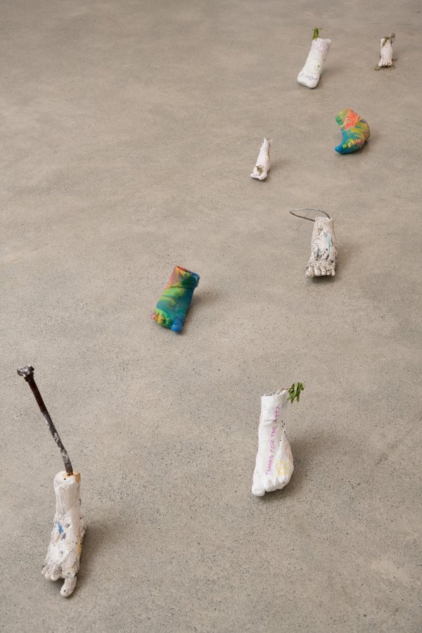
I went out and videoed an obstruction of peoples paths, similar to that of Germaine kohs work polls. I placed 1-2 cones; a classic symbol for stopping or for a detour along the side of a zebra crossing and observed how different people responded to the different set ups. The cones didn’t really make anyone stop, just alter their course slightly and give some weird looks, but when I lay the cones down it did cause a few people to stop and pick them up and move them to the side which I found interesting.
I then went to the city to record my two volunteers in their green and red suits as the classic green and red walking and standing man symbols. I tried capturing a whole lot of different aspects of this concept through the symbol that is to walk using the green man, and the symbol that is to stop that is the red man. I had the green man walking to the green man symbol while the red man was stopped, and the red man walking while the green man symbol played while the green man stayed still as well as an attempt at jaywalking on a random street with the absence of the actual symbols, playing around with the concepts of the symbols we know and challenging people to make the connection of those figures to the symbols, especially within that context and space. It was interesting while I was filming these to hear people make that connection as they were wondering what they were doing, and at what point they realised and started questioning our actions. I also took some still photos of those comparisons and juxtapositions, as well as some shots of the green man in ‘movement’ (on a scooter) and the red man in stasis. to further capture my ideas.
I also took images of random objects that I wrapped in caution tape. I believe the tape and the yellow and black stripes (which is why I used plain yellow and black without the word caution,) to be a symbol for someone seeing it to steer clear of the area, or stay away from whatever it is covering. It is telling you to be cautious whether or not it says the word caution on it. This is why i photographed it on these items, as they’re normal everyday things that have no need to have a warning on them, and yet most people who would see those, would assume that there was something wrong, and would probably steer clear of that area, just because of some yellow and black lines. I wanted to experiment with that a little by finding a public restroom or something and covering one of the doors in the caution tape and just observing if anyone would enter that stall, or if they would heed the warning and steer clear, but unfortunately I wasn’t able to.
With my printed maps I pinned them up on the wall together to make one map. I then found every crossing with lights within the map, and marked them with pins, larger ones for main crossings and smaller ones for the smaller crossings, connecting the viewers of this work to the inner workings of the directings if our city in real time. I also used pins that blend into the map so that you have to go closer to see them, and perhaps even feel them to actually know they’re there, I especially liked the way this linked in to the concept of the tactile indicators, and the idea that not all the signals out there are made for us, and aren’t so easily accessible. It sort of flips the norm on the head where seeing people are also now not able to easily navigate that. I think having the indicators directly next to this really brought this idea together.
For the indicators I ended up deciding to do half on the wall and half on the floor. I was deciding between three different phrases to use “go forward,” “keep going,” and “go ahead,” juxtaposing terms I would write out in Braille using the indicators. The indicators are usually there to tell people to stop or wait, which is why I wanted to contradict that with them and also be telling them the opposite. I ended up going with the term “keep going” as it looked the most visually appealing.
I also made a signpost with four signs pointing in in different directions. One was red, a symbol for stop, one green a symbol for go, one yellow and black striped warning to heed caution and the other purple, a colour with an unknown definition in terms of direction. I wanted to use those obvious symbols to create a sort of feeling towards those certain directions, whether it be hesitance or curiosity and confusion, about the unknown. Unfortunately I felt like the sign was a little poorly executed but I liked the concept so I decided to keep it.
Originally I was also planning on having a sound element to my work, where I would play the sound of the crossing I captured in a loop, but after a lot of bumps in the road surrounding that, I wasn’t able to get the speakers as the place was closed, I’m unsure if they had closed early or just didn’t open that day, but I’d been told before that they would be open then. The other problem would have been where I would set that up. I like the idea of hiding the speakers and laptop in the work, but I didn’t really have anywhere to hide them, so unfortunately I wasn’t able to include that component.
I was also planning to add an element of navigation, or direction in the sea, where I had a ship wheel I was planning on installing, but we realised that we wouldn’t be able to put it up without damaging it, and after some thought, I did feel like it didn’t quite link in with my work enough for me to try and include it. I had also planned on including compass directions in the work and have them jumbled up in the wrong spots, adding further confusion to something that we know as a universal symbol. This didn’t really turn out how I hoped and didn’t look great so I cut it, but I had liked the concept.
Overall I’m quite happy with my concepts and a lot of the videos I took, I also love the tactile indicators and map but I do think I would have liked to have a little more of a finished instillation, I am happy with what I made in the time I had though.
Someone that really interested me in the world of non-digital photography was Martha Madigan. At first, I was captivated just by the visual elements she captured in her works, using the forms of figures to shape other objects within nature she also exhibits. But as I investigated her work more, I found that I was thoroughly interested in a lot of the ways in which she went around her art making. I love the way she draws in ideas from the world around her and the way that it moves and shapes itself, letting the earth almost have its own voice through her pieces.
I also love the way she uses every piece of the world that she experiences that can be made into a work, I think I can be a lot more adventurous with the ways in which I use nature in my art, and Martha has a lot of concepts that I really want to draw some ideas from. I’ve really struggled in my work with how I would incorporate other people, myself or any sort of living, moving thing in the world. I would really like to capture the world the way she does with her lenses, and I think I want to take it down to the basics of the way that she uses shapes and forms to create an obvious connection between what we see in her images, and life.
I think it’s also really interesting the specific way the light captures her work and the way that you can almost see the movements and energy in the still images. She has inspired me to explore more options within the methods of “sun printing” and “heliography” and such, I have enjoyed the methods I have tried so far like pinhole and cyanotype.
Looking further into these methods I found that I was pretty interested in creating some works of a larger scale to capture things like Martha’s work with her figures, I also saw some interesting works in some more practical uses for these prints, where some people were doing cyanotypes on fabric and creating garments with them which is a very cool concept I would like to explore more.
Another artist I enjoyed looking into was Eleanor Cooper and her work “Flora of the Future,” I loved the colourful nature of these works and the contrast of the whites and blues which really made the pieces seem alive and glowing. I really enjoy the way depth was created in these images using these life forms, and the carefully selected objects that she used.
I think it’s really interesting the way in which the light captures the man-made things compared to the living things in her work, the differences really make it seem like the pieces of nature are really alive within the prints. I think I especially like the choice of using objects with sharp, harsh edges to really contrast the intricacies of the plants she used, and I’m really interested in using those contrasting images in my work too.
I also want to take inspiration from her placement of the objects in her work, I like the way she layers and overlaps her things to create a really nice depth that I want to experiment with as well as the way she plays with what objects to bring forward and push back into her work.
Looking at these works I really felt like I wanted to explore the options of some more easily accessible ways of doing similar prints, and maybe exploring easy ways I could experiment with these things at home. Some ways I’ve looked into so far include the use of sugar paper and tape, or other light sensitive inks. I think it might also be interesting to explore the way that light can print shapes onto our bodies, whether that be by a burn or a tan, it may be a more difficult process and I don’t really tan much, but I think it might be an interesting concept to explore over summer, or something to build on.
We started work on pinhole camera photography. I missed the first week and a few more days due to health problems, but when I started I worked on capturing nature in the way that it responded to me in and through the photographs I took.
At first it took a while to get used to the timing of the exposure needed to work these pinhole photos, but after a while I was able to gage pretty well the rough timing needed to expose the photographic paper to the light.
In my workings of capturing parts of nature, I found that it was quite interesting seeing all the man-made structures and instillations popping up in the background. Juxtaposing the free, flowing forms of nature with the harsh, meticulous work of human hands. It seemed that almost every time I tried to capture the essence of the natural world there was always a hint of something unnatural in the background. It was only diving deeper in, and really embedding my camera into these forms of nature that I was actually able to capture the uninterrupted state of life. But as I worked, I became interested in looking into this, trying to pinpoint the traces of human hands in the photos I captured, and exploring ways to try and avoid capturing these interruptions to the environment.
When taking these photos I really tried to get in and amongst the things I was trying to capture, and tried to explore all the different angles and essences of nature, and look into multiple different options I could explore surrounding the environment.
Looking at the first prints I did, I explored the different aspects of the prints that caught my eye, and tried to explore further into those concepts.
I think the relationships between the capturing of light and movement was really interesting in some of these prints, but it didn’t feel like a concept I could make cool finished art pieces from, so it wasn’t a concept I wanted to build on.
When we started on the photograms I had a lot of fun moving around and selecting the objects I chose, it was a lot quicker process and I liked how the prints turned out a lot.
I think this type of photography was one I had a lot of fun with, it felt a little more in my control and it was where I was actually able to start creating what felt like reasonably well-formed pieces of art from the images I was capturing after a lot of experimenting.
I kind of struggled with capturing the objects from further distances, and creating layers by moving them closer and further away from the light source, but I really felt like the way I would move the card covering the printing paper and the objects along with them was a really cool idea that i developed pretty well into some cool prints.
These were some of my favourite prints that I did after exploring all the concepts I could, some I felt were just visually pleasing and others I had strong ideas I wanted to build off, especially the bottom three, I really liked the juxtapositions of the sharp lines of the man made cut offs I did on the photograms and the pop of the manmade building versus the forms of nature I captured.
We then learnt how to work with cyanotypes. Though confusing at first and a reasonably long process, I enjoyed the bright, bold results.
I was also interested in building on some of the images I already had to add on some more ideas in my works. I think a lot of the ideas I had didn’t quite turn out the way I’d hoped, but I enjoyed the way that running liquid through the cyanotype drying process created a pattern I liked. So I plan to explore more with the surface I do my print on. I also enjoyed using the negative spaces of my previous prints to introduce other life forms through these gaps. A lot of the time it gave a sort of insight to what was going on deeper inside the photographs where it seemed like you could see a lot of the inner workings of life forms, though this wasn’t actually the case, I thought it formed quite cool illusions.
I also liked the play on light and dark colours and the contrast it seemed to create between the different objects, this may be something I might look into further.
Then when it came to the lumen prints, I enjoyed the process and the concept and also the colours, but going forward it wasn’t really something I wanted to build on, and I felt like I could take different paths using other methods that would turn out better.
I also tried out some more cyanotype prints, this time trying out a few shapes that I thought worked quite well in expressing the concept I was showing for. Though they were quite plain I was really happy with the first two base shapes.
When putting up some of my A1 prints I felt like I was happy with how they looked but there was a little bit more work I wanted done on them and a few more changes. For one, I had printed them as positives, and therefore there was a lot of light in the images, and I felt as though I would’ve liked to have them printed as the negatives, some I felt like they could be presented in both their negative and positive forms and perhaps the sizes could be changed as well.
Going through my processes I had the thought that I might want to focus on the idea of shapes, and the way that those shapes are perceived in my works, with the contrasts of the harsh, strict lines of manmade objects to the intricate wild forms of the nature in my work. I think it’s a pretty cool thing to explore and to think about in the way that human life exists within nature and the relationship between the two and how I’m able to capture the essence of that within my work.
In the final decision making for the presentation of my work I decided that I wanted to print out another A0 of one of my prints to have a larger scale of the work I liked and separated them a bit, also placing them at slightly different heights to line up with some of the elements. I also trimmed the bottom of the other large print to better connect the two mirrored images. I then selected four of the cyanotypes that I felt linked in well with the concepts I had been exploring of the juxtapositions between man made shapes and the forms of nature and the juxtaposing of the colours, just like in the other works with the lights and darks of the positives compared to the negatives.
I really like the way my work captures the way that I perceive nature while still having it have a way of presenting itself in its form. I think this is something that has really captured my relationship with nature and it’s interesting how I feel like my works are still portraying nature as it it, and it’s speaking with its own voice, but at the same time are a manipulation through my eyes of my capturing of my environment, I think that also definitely shows in the works I chose and felt the most connected with, as they didn’t just feel like I was portraying the moment of the scene, it felt like I was visualising the world through my own eyes.
Working in art school has introduced me to a whole lot of things that I hadn’t tried before, some I struggled with and some I really enjoyed. One of the concepts I loved was the site specific tasks that we were given, it was really cool to immerse myself in those spaces, and use parts of that space to create my art and really consider where I was and what that space meant to me and potentially for others. I also loved the intervention concept, which I found to be something in which I could go crazy with my childish side and make something that me as a kid would have really loved into a piece of art. I think these concepts really allowed me to have the opportunity to make something I really loved, especially the making of all the different sculptures in these works that I did.
One of the processes that I really enjoyed over the semester was when we were working on transferring images, though I wasn’t able to make a finished artwork as I was getting surgery I had time before to try a whole lot of different transferring processes, some of which I ended up using later on. I also enjoyed the printing, woodcutting and bookbinding processes. They were all things that I hadn’t tried before, and it was cool to try things that were more of a controlled art which isn’t something I’m used to, but was fun to get the hang of.
Successful Works
A work that I thought both looked good and was a great concept was one of the just a minute tasks we did. The idea of contrast really interests me especially in terms of colour, so I was really happy when I could create a fun photo that could so clearly display that idea. I also love how people can view it in different ways, as in, are the colours contrasting or are they interchanging, are they separating or are they merging. It was also such a success for me because I felt that visually the colours looked great together and it made for a striking photo.
Another work that I loved the idea for was the pillow fort in the playground for the intervention assignment. Though the visual aspects definitely didn’t come through (I think I’d have to find a playground without spiders so I could actually have the willpower to stay long enough to make it look nice.) But the idea itself was one that I had so much fun with. It was like a clash of two parts of childhood that weren’t supposed to mix, it was the coolest way I think I could have intervened in a site. I think my choosing of the site along with how I was going to intervene was the perfect combination.
I also thought that two of my site specific works were really great. I loved the idea of making something from things in the environment around you, and then leaving the art you’ve created from it where you found it. And although simplistic, I thought the finished product was cute and looked great and in harmony with the environment it was formed from. The other work was the works I did for the kids in the fairy forest, I think what made that one so good was that I made it so that the kids would find it appealing and would think it looked cool, and so that they could interact with it too. And what was so great was that I was there long enough to see some kids do exactly what I’d hoped, and had a lot of fun interacting with my work.
Challenges
I think what I found difficult this semester was simply everything that occurred online. Whether it was figuring out how to find things, or upload them I really struggled to figure it out and had to get a lot of help from lots of people. So when we started the animation brief it was probably my worst nightmare. While I enjoyed the art making I had to have a friend sit me through everything I was doing online as I didn’t have a single clue what I was doing.
I think there were some other processes that I found challenging, things that I hadn’t tried yet, like the wood cutting ad print making. Those were still fun though and I think I’ve mostly got the hang of what we learnt now so they weren’t too bad. I had fun once I knew what I was doing.
One other thing that I struggled with was understanding some of the briefs. I feel like a lot of it was just me overthinking or just blanking out but sometimes it took me a considerable amount of thinking time and questions asked to get on track with doing something.
2 Ways to Improve in S2
I think one thing I need to do next semester is to really try and get away from doing what I want to do and try to expand my art practices. I’ve noticed this semester that while I am trying new things and new ways of doing art, I am still twisting them to suit me more. I think I really need to just jump off the edge and go for something that is on a completely different playing field to what I usually do.
I also think I need to start doing more research around the work that I’m doing. I was a little stuck on this last brief and looking into other artists really helped me, but before that I really didn’t do much on it. So I think I really need to do way more looking into the art that I’m doing at the time.
This artist works in California to create sculptures and instillation art as well as photography. They look at technology and human perception through their art, also focusing on the value of labour through their work.
Their work really speaks to me in the way they use such random and interesting materials in order to create new form with their art. The use of everyday materials being used to bring to life a completely new concept that is completely accessible to accomplish in terms of being able to make things out of materials on hand. I love the movement shown in their images and the use of hanging objects to add to this affect.
Wim Botha
Located in Cape Town they are a South African contemporary artist who works on sculptures that often take up whole spaces.
I love the way this artist uses the shapes of their work to make our brains view these shapes as something we can recognise, it’s cool how they use these simple shapes, intentional or not, to make their art into our own interpretation as viewers of what we are seeing in those shapes. I also enjoy the way they frame this art with more simple shapes that simply are what they are to add some more depth to the art without taking anything away from the other shapes that we recognise from our imaginations and memories.
Jessica Stockholder
Born in Seattle, Washington this artist creates site specific interventions and autonomous floor and wall pieces.
I’m interested in the way that this artist takes a more site specific approach to the others, where they use the site itself as a part of the instillation, which really links the other artists in the ideas with my work. I love the way they create a sort of world in their instillation, with no specific meaning other than it’s placement and connection to the site. I love the complete randomness of the objects used, that somehow work as site specific instillations that look like they belong.
This brief I started out deciding what shapes I wanted my wood to be cut into. Looking at previous work and other artists, I decided to be as spontaneous as possible, but I also wanted to keep the shapes simple in order to have the main focus be the printing I was going to do on top.
In the printing lab I arrived with a few patterns that I was considering using. The first one that I tried I liked, but I also felt as though the gaps in the ink were quite large when printed out, so I tried another pattern, which I also liked, but had way more space that was printed and left hardly any room to see the wood peeking through. In these thoughts I decided that I liked the contrast of the large gaps and small gaps in the different prints, and that together they balanced each other out in terms of size and gaps.
When deciding the colour of my prints, I decided to continue on the idea of contrasting, and wanted to try contrasting colours as well. I considered green and red or yellow and purple, but decided that blue and orange were the perfect combination that I was looking for.
When making my sculptures, I really wanted to continue on with the colours that I’d chosen, as well as incorporating the colour of the wall. For my first sculpture I wanted to extend from the wall using methods of folding . As I kept going I focused on the idea of the layers and tiers of my work, adding more on at different heights and parts of the work for the desired effect. I also formed the sculpture to make it seem like it was surrounding something, particularly the viewer, I wanted it to seem as though it was just a piece of the word shown, that it would continue on in the same way to surround the viewer more.
I enjoyed incorporating aspects of the ideas of Wim Botha, in the way that I wanted the basic shapes of this image to trigger some sort of recognition for the shapes for the viewer, I used the ideas of layering and surrounding to create something seemingly familiar. For me I felt a connection to stadiums I had been in, or the tiered seating we had in school and the concrete steps at a park I used to run up and down on.
I also made some long triangular pieces that I wanted to incorporate at the bottom to create a sense of separateness from the piece while being surrounded by it, they were used as sort of mini barriers, and seem to me like they’re there for safety purposes to keep things in or out.
For my next sculpture I used some bird netting that I felt merged and melted into the wall quite well, I pinned it up with one of my wood cuttings to make it seem as though it had been propelled into the net, which was grounded further out, and was pushing the net into the wall. I thought that the net was an interesting addition to the work as my choice of material, and thought that having a connection of similarities in the pattern of the net, to the pattern printed on my wood was a nice contrasting idea to the visual contrasts of my work.
To add to this work and have more of a visual link with the colours I also wanted to incorporate the ideas of Jacqueline Bell Johnson with the addition of repetitive loops of materials following and attached to the work, I like the way it adds a sort of movement to the work.
With the rest of my wood cuttings I created a shape to go behind the net. I layered the pieces and considered the positions for each of them. I wanted to add something in the background of my work, so not to take too much away from the rest but still have the presence of those shapes in the background, just like I like in Wim Botha’s work. I then added more string that I’d used previously on the net and connected some of the pieces, as well as the net sculpture, to connect the two pieces.
For my next sculpture I used a shoebox to attach and merge it into the wall, so It looked both like an instillation and a part of the wall, almost like shelving, built for the wall. I added different things of the colour scheme in different shapes in and falling out of the box. I was inspired by work of Jessica Stockholder in this work, imitating the way she sort of creates little worlds within her instillations and making them site specific at the same time.
Building on the idea of the shoebox almost becoming a shelf on the wall I decided to use it as one. I found polystyrene shoe insoles to use as bases of the miniature sculptures to put on the “shelf” and attached pieces of my wood cuttings on top. Though very abstract they reminded me of trophies placed atop a high shelf to be displayed.
For my last addition to my work, I had a cone behind my work that I wasn’t using, but had been there for the whole time of my making process and it worked quite well with the colour scheme of my work. When I moved it I felt as though my work looked a little empty without it, and it had actually made a great addition to my work. James gave me a great idea of lying down the cone at the front of my work as if it were pulling down, or holding down the net I was using. After trying a lot of other positions for the cone, I decided that that was the best place for it to go, and it really added to my work.
I love the way she uses monotone, plain colour to create the depth within her works as 3 dimensional images as well as the bold imperfect brush strokes that are a statement part of her piece.
The slow blocky movements of her animations create a character that I enjoy and think works perfectly with her style along with the movement of light within the different frames. It creates a strong feeling of being and depth which is something I would like to somewhat replicate in my own work.
Rangituhia Hollis
The way that he layers animations of very simplistic animated images over real life environments is a very cool contrast that I like. I also enjoy the bright colours that he uses and the slightly realistic linework versus the unrealistic colours of the drawings he does.
I also love the way he puts his drawings in an environment they don’t belong in. Sharks swimming around in the sky. It creates an overall artwork of unrealistic and realistic contrasts that creates a cool animation.
Jill Kennedy
I love the way that she uses text to create more meaning and dimension, placing them strategically and making them relevant to the drawings they are presented with. The line work she does with the pens and other mediums she uses with the range of colours are a cool style that I like. The way that it seems to be animated is pretty cool too, with the different layers being moved and overlapped across other ones.
For the animation project I started pretty late so I decided to try a different sort of style to what I usually do. Generally, I like to have deep meaningful art pieces to me and put a lot of thought into them. This time however, I decided to just go with something a lot simpler. I like my dog, so I animated him. With this I decided to go with what I thought was a cute simplistic style.
I definitely struggled with the digital aspects of this brief, but with a lot of help I managed to get my art onto a screen which I’m pretty happy about.
Animation
In the bindery process for the flip book of our animations I considered a lot of different methods, and first found that I had to redo the size of my canvas for my frames in order to show the whole images in the flip book. After fixing that, I decided to use a stapler to bind my flip book and cover it with a black piece of tape. I experimented with the sizes and placement of the staples and looked through the different tape colours to find the perfect match for my book.
Flipbook
With the A3 printouts I decided to experiment with a few small things. I looked into the impact of words on the paper, to portray the thoughts within the animation of simply, ice cream being good and tomatoes not. I then explored the use of the ice cream, to which I decided to melt it, and use paint drips to mimic the look I was going for. The images focused on licking an ice cream, so I also wanted to change it up a bit and have it be something else. For this I decided to connect the paintings to have them all making a mark of their consumption rather than the consumption of the ice cream.
For my A0 prints I looked more into my relationship with my dog, transforming the images into something else.
I often use food as a way to get my dog to sit still and obey commands so I wanted to try convey that in one of the paintings. I also never had him as a kid, but even now I enjoy dressing him up and something I totally would’ve done as a kid would have been dressing him as a matching fairy, obviously with a bit of convincing with the ice cream.
Another thing is his love for skinks, so we tell him to go find them in our rock garden. So I transformed the eating of ice cream into the capturing of skinks, also including a parallel of text telling my dog to find the skinks and something like a “find the difference” game, just with finding the skinks instead, which I hid around the prints.
A3 and A0 prints
I also looked into a more negative version of the concept of my prints, of which it was instead that we didn’t want my dog to eat the ice cream we had, so I painted on multiple leads holding him in place as to not be able to eat the ice cream, this one wasn’t one of my favourites, I preferred the fun playfulness of my previous explorations.
Another thing I wanted to do to transform the print was something a bit more abstract. I just focused on the movement in the frame and built on that with some contrasting colours which I felt brought across the movement quite well.
Margaret Harrison is a feminist artist who often uses her works to display men in the same way they view women. She uses acrylics mainly with people being the center of her art. Using social strategies by women she reflects social issues within her work. I enjoy the way that her work possibly brings discomfort to some of the men who see her works, and are uncomfortable with the way that she portrays men. It really just puts it into perspective how women are over sexualised and undermined constantly, and how normalised it has become, so I love the idea of juxtaposing the issue by using men as a contrasting factor of which we are not used to seeing portrayed in this way.
Kim Dorland
Kim Dorland uses different textures and strokes of paint in order to create a dimensional image, he explores different memories, and the idea of memories and what those look like to him and others. I think the use of different scales, materials and details works to create aa captivating image of what these memories can look like. The use of not fully formed images, using bold shapes and strokes to create clear but not full images works to get the ideas of memory across quite beautifully.
Valie Export
Valie Export is a feminist, performative artist who subjects her own body to harm by letting other people use her as the canvas for her work. She confronts the sexualization of women and provokes thoughts surrounding the treatment of women through her art. She focuses on the idea that the female body is a construction created by the male gaze and explores the way that women have been and are perceived. I love the execution of how she goes about exploring this idea by using her own body and herself to create a more engaging environment within her art to start a discussion about the issues surrounding the way that women are viewed and how she expects and is viewed while practicing her art.