π•Šπ•”π•¦π•π•‘π•₯𝕦𝕣𝕖 – π•Žπ•–π•–π•œ πŸ™πŸ›: π”½π•šπ•Ÿπ•’π• π•Šπ•¦π•“π•žπ•šπ•€π•€π•šπ• π•Ÿ & ℝ𝕖𝕗𝕝𝕖𝕔π•₯π•šπ• π•Ÿπ•€

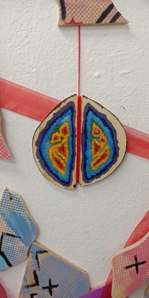
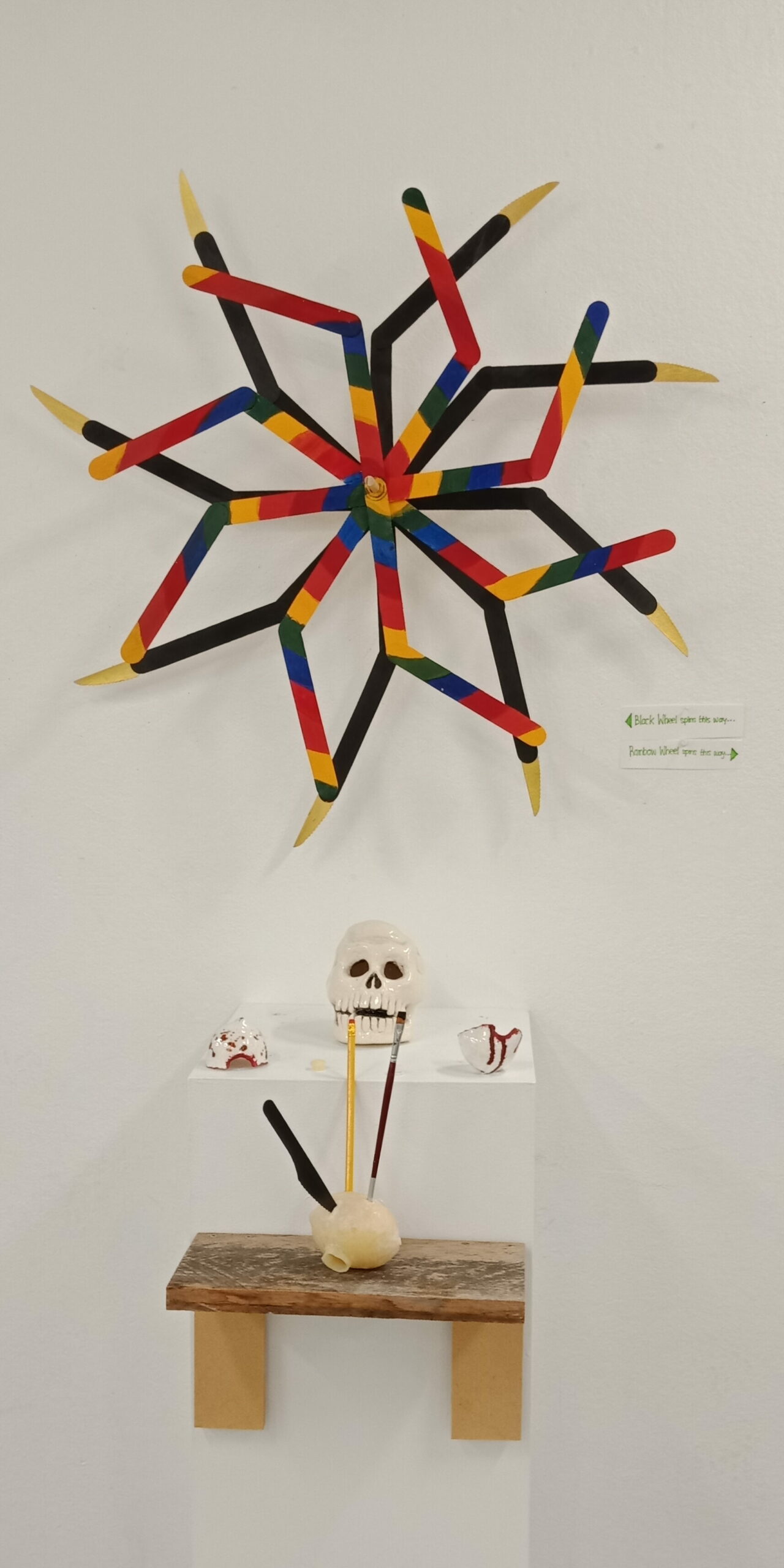
Through this sculpture brief I learnt different ways of art making. Through clay, plaster, pink slip, and wax. Having not done anything sculpture related before, I didn’t really know what I was getting myself into. I unexpectedly really enjoyed it. I enjoyed using clay the most though it is very time consuming to work with.

I am very pleased with the work that I produced. Planning and somehow executing it the way that I wanted it. I like the idea of drawing something and making it real. Turning it into 3D. I am happy to have found other art processes to be good at.

https://youtube.com/shorts/HXY_3qqKZB0?feature=share

Bibliography:

David Roy: https://www.woodthatworks.com/

Francis Upritchard: https://artsandculture.google.com/asset/jealous-saboteurs-francis-upritchard/FwGpAB65Ca4itg

Suzanne Crane: https://suzannecrane.com/process-methods-materials/

Damien Hirst: https://www.interviewmagazine.com/art/damien-hirst https://www.artsy.net/artist/damien-hirst

β€˜Shona Rapira-Davies – There Are No Bees In My Garden’, URL:https://www.aucklandartgallery.com/explore-art-and-ideas/artwork/31359/there-are-no-bees-in-my-garden?q=%2Fexplore-art-and-ideas%2Fartwork%2F31359%2Fthere-are-no-bees-in-my-garden , (Auckland Art Gallery) 

β€˜Shona Rapira-Davies‘, URL:https://www.aucklandartgallery.com/explore-art-and-ideas/artist/879/shona-rapira-davies , (Auckland Art Gallery) 

β€˜Shona Rapira-Davies‘, URL:https://chartwell.org.nz/making/artists/shona-rapira-davies/ , (Chartwell) 

β€˜Bowen Galleries: Shona Rapira-Davies – There are no bees in my garden’, URL:https://tockify.com/artmap/detail/859/1590620400000, (Tockify), Published: 2020  

Lana Lopesi, β€˜False Divides’, Bridget Wiliams Books, September 2018 https://canvas.aut.ac.nz/courses/1099/pages/s1-week-4?module_item_id=50901 

https://www.cbsnews.com/pictures/oscar-honors-animator-hayao-miyazaki/

https://collections.tepapa.govt.nz/object/1130277

https://www.documenta14.de/en/south/25213_treaty_and_protest_john_miller_s_photographs_by_cassandra_barnett_and_jon_bywater_with_an_introduction_by_marina_fokidis

Jackie Mansky. β€œThe True Story of Pocahontas” Smithsonian Magazine, March 23, 2017. https://www.smithsonianmag.com/history/true-story-pocahontas-180962649/

https://www.youtube.com/watch?v=lmJJi1iBdzc  Manu Aluli Meyer on Epistemology 

https://www.youtube.com/watch?v=vFoM9IGyfp0 Ep. 37: Manulani Aluli Meyer – Hawaiian Epistemology 

https://www.britannica.com/topic/epistemology

https://canvas.aut.ac.nz/courses/1099/files/95286?wrap=1

https://hilo.hawaii.edu/wehe/?q=%CA%BBuhane

https://askanydifference.com/difference-between-culture-and-ethnicity/#:~:text=The%20main%20difference%20between%20Culture,%2C%20Culture%2C%20or%20physical%20attributes

https://upjourney.com/what-is-the-difference-between-intelligence-and-wisdom#:~:text=Intelligence%20involves%20how%20you%20gain,one’s%20judgment%20and%20experience%20too

JC Beaglehole (ed.), The journals of Captain James Cook on his voyages of discovery, vol. II: The voyage of the Resolution and Adventure, 1772–1775, Hakluyt Society, London, 1961, p. 131. https://collections.tepapa.govt.nz/object/1130277 

 
Michael E Hoare (ed.), The Resolution journal of Johann Reinhold Forster, 1772–1775, vol. II, Hakluyt Society, London, 1982, p. 269. https://collections.tepapa.govt.nz/object/1130277 

Painting: Artist John Webber, Title of Art: Poedua [Poetua], daughter of Oreo, chief of Ulaietea, one of the Society Isles, Date made: 1785, Te Papa Press, 2018 https://collections.tepapa.govt.nz/object/1130277 

Image: β€˜Kate Sheppard Sent Me placard,’ Leah McFall, 20 January 2017 https://digitalnz.org/records/40784336/kate-sheppard-sent-me-placard

https://collections.tepapa.govt.nz/object/1596953

Kate Sheppard’, URL: https://nzhistory.govt.nz/people/kate-sheppard, (Ministry for Culture and Heritage), Emma Brewerton, updated 21-Apr-2022  

β€˜Kate Sheppard, 1837– 1934′, URL:https://my.christchurchcitylibraries.com/katesheppard/#:~:text=Kate%20Sheppard%20is%20recognised%20as,to%20all%20women%20over%2021, (Christchurch City Council Libraries) 

β€˜Kate Sheppard: Leading the way for women,’ URL:https://www.scholastic.co.nz/media/4561/kate-sheppard_tn.pdf, (Scholastic), Maria Gill, Published: 2018 

β€˜Feminist Wishes for 2022: β€œWe Were Never Ment to Do This Work Alone”, URL:https://msmagazine.com/2021/12/30/new-year-feminist-wishes-2022-reproductive-rights-abortion-racial-equity-health-care-voting-rights/ , (Ms. Magazine), Marty Garbarini and Hannah Beck, Published:12/30/21 

Image: β€˜Plumpity plump’ “Serie ELA 75/K (Go Pout)” Sylvie Fleury at Almine Rech. Contemporary Art Daily (Updated 2010, June 23). URL: http://www.contemporaryartdaily.com/2010/06/sylvie-fleury-at-almine-rech/  

β€˜Sylvie Fleury (Swiss, born 1961),’ Artnet, URL: http://www.artnet.com/artists/sylvie-fleury/  
 
β€˜Sylvie Fleury Biography’ Art Station URL: https://artsation.com/en/artists/sylvie-fleury  
 
β€˜Sylvie Fleury Brings Luxury and Glamour to the Contemporary Art Center of MΓ‘laga.’ Art Daily (2011). http://artdaily.com/news/45844/Sylvie-Fleury-Brings-Luxury-and-Glamour-to-the-Contemporary-Art-Center-of-M-laga-%20-%20.U9MmZJMyaSo#.U93ZeJUU_IU 

β€˜What is Fast Fashion and Why is it so bad?’ Good on you, Solene Rautureir, 1st April 2022, URL:https://goodonyou.eco/what-is-fast-fashion/ 

β€˜The Impact of Fast Fashion on Garment Workers,’ Good on you, Jaclyn McCosker, 19th April 2022, URL: https://goodonyou.eco/impact-fast-fashion-garment-workers/  

β€˜The Human Rights Issues Behind Fashion’s Animal Supply Chains,’ Good on you, Emma Hakansson, 19th July 2022, URL: https://goodonyou.eco/human-rights-animal-supply-chains/ 

β€˜Fast-Fashion: Unethical and Unsustainable,’ The University of Alabama at Birmingham, UAB institute for Human Right Blog, Lindsey Reid, April 26th 2018, URL:https://sites.uab.edu/humanrights/2018/04/26/fast-fashion-unethical-and-unsustainable/ 

β€˜The True Cost,’ True Cost Movie, Andrew Morgan, May 29th 2015 URL:https://truecostmovie.com/watch/the-true-cost  

https://gagosian.com/exhibitions/2012/takashi-murakami-flowers-skulls/ Accessed 22/03/2022 

https://www.theartstory.org/artist/murakami-takashi/ Accessed 22/03/2022 

https://gagosian.com/exhibitions/2012/takashi-murakami-flowers-skulls/ Accessed 22/03/2022

https://www.cbsnews.com/pictures/oscar-honors-animator-hayao-miyazaki/24/ Accessed 22/03/2022 

https://www.cbsnews.com/pictures/oscar-honors-animator-hayao-miyazaki/ Accessed 22/03/2022

https://www.tokyoartbeat.com/en/articles/-/an-extraordinary-mind About – Kim Jung Gi US. Accessed 23/03/2022

https://www.instagram.com/jamesjeanart/ Accessed 25/03/2022

http://en.gallery-kaikaikiki.com/2016/08/bio_james-jean/ Accessed 24/03/2022

https://characterdesignreferences.com/artist-of-the-week-7/katsuya-terada Accessed 24/03/2022

http://en.gallery-kaikaikiki.com/category/artists/katsuya-terada/ Accessed 25/03/2022

https://www.mutualart.com/Artwork/SENZA-TITOLO/330EBC6C5FAA4C44  Accessed 25/03/2022

https://www.kooness.com/artists/art-for-sale-best-artists-luca-alinari  Accessed 25/03/2022

https://artsandculture.google.com/asset/untitled-07-b-0247/SQHpUoFnC0ILmw?hl=en-GB Accessed 25/03/2022

https://artsandculture.google.com/entity/m08r_7z  GΓΌnther FΓΆrg β€” Google Arts & Culture: Accessed 25/03/2022

π•Šπ•”π•¦π•π•‘π•₯𝕦𝕣𝕖 – π”Ήπ•£π•šπ•–π•— 𝟚: π•Žπ•–π•–π•œ πŸ™πŸ˜ – πŸ™πŸš

For this week I decided to make another sculpture inspired by windmills placed in gardens meant to scare off birds. They look like this:

I added wooden knives on each leg of the wind mill. I took into consideration the advice and ideas of my peers and wanted this particular sculpture to look safe and harmless but to be “dangerous”. Deceiving the viewer. Taking inspiration from another movie Squid Game. Looking like Childs play, but actually being pretty gruesome. I kept the rainbow color palette to reinforce the child friendly aesthetic leaving the wind mill propeller behind it painted black and the knives in a sparkly gold color. It was now time for me to decide if I wanted my kinetic sculpture to be moved by the wind or by human interaction. I had chosen human interaction because wanted each wheel to spin in opposite directions. That cannot be achieved if it were by the wind.

Through the idea of making innocent things look like dangerous weapons, I discovered that there is a Filipino Martial Arts called “Eskrima”, “Arnis”, or also known as “Kali” which is all about utilizing everyday objects and your surroundings as weapons if need be at any given time you were attacked. This fits in very well with the John Wick movie because he efficiently uses any object, as ordinary as a pencil to kill his enemies. Similarly Jackie Chan uses ordinary object as weapon trick quite a few times in his movies just less gruesome than John Wick. Using furniture, sleeves of a jacket, anything to dodge the enemies attacks.

https://www.offgridweb.com/preparation/the-art-of-building-effective-makeshift-weapons-2/

Here is the Windmill outdoors:

Here is a video of my kinetic sculpture spinning: https://youtube.com/shorts/HXY_3qqKZB0?feature=share

Also this week I worked on the skull I had previously made and had improved its appearance after adding more clay. It now looks a lot more like a skull than before. I then glazed it afterwards. Here is a before and after:

Artist Research: Kinetic sculpture

David Roy:

Davis Roy makes his kinetic sculptures out of wood. His sculptures are winded up into place and move on their own. When they spin, the geometric designs are mesmerizing to look at.

Inspired by his work, I used popsicle sticks instead of long pieces of wood. My sculpture does not move on its own like his. It requires a person to spin both wheels in opposite directions. I don’t invent things so I was only able to create something that needed assistance in order for it move.

https://www.woodthatworks.com/

Francis Upritchard

She uses hockey sticks and turns them into weapons. Splitting the hockey stick, giving it a mouth and adding some sort of teeth. This plays very well into the theme of turning an object used to play hockey, a game, and reinventing it to become a lethal weapon.

https://artsandculture.google.com/asset/jealous-saboteurs-francis-upritchard/FwGpAB65Ca4itg

π•Šπ•”π•¦π•π•‘π•₯𝕦𝕣𝕖 – π”Ήπ•£π•šπ•–π•— πŸ™: π•Žπ•–π•–π•œ 𝟠 & 𝟑

For this half of the semester I am now doing sculpture. We were told tat we could make a sculpture inspired by anything, so I decided to make my sculpture in reference to the movie John Wick. I thought it would fit in really well with the brief being movement.

My verbs are : To Punch, To Stab, To Peirce, and To Spin.

I chose these verbs because these are the methods John Wick uses to kill his enemies other than the traditional and obvious usage of a gun.

My ideas brainstorm:

A Fan with knives.
Tire with spikes coming out of it.
Pencils coming out of the apple.

My original plan was to do three skulls, with one skull with a punch mark, another stabbed with pencils in the back of the head and the last one with a crack in the skull. Having three skulls would symbolize each of the three John Wick movies. Underneath those skulls I wanted wax to look like it melting off the shelf underneath the skull. And a black windmill in the middle representing the similar likeness to the martial art moves John Wick pulls on his enemies.

I then decided to change my plans to what I believe I could realistically manage to pull off in 5 weeks by suggestion of the people helping in the Wet Labs. Deciding to only make one skull. And using the casted lemons and somehow merging it with my initial ideas.

My research:

John Wick is known to inflict violence on his enemies using objects as ordinary as a pencil. So I decided to stab my lunch. (No fruits were wasted in the making of this research.)

Stabbed a plant (sorry)

My work: Lemons

My first attempt at working with plaster was split in half.
Decided to keep it and had glazed it. They look similar to egg shells.
They deformed in the kilm (is that how you spell it?) and now don’t fit together like puzzle pieces any more. Colored the hole red to look like a gun shot wound.
Creating the lemon out of plaster with mold.
Taking it out from the mold.
Is hollow on the inside.
Another plaster lemon with gold paint.
Painted in gold are some dents.
Also practiced with pink sill by making a mold of a shell.
Lemon made of white wax.
It is hollow on the inside.
I painted ‘veins’ on the inside.
White wax lemon filled with yellow wax. Not hollow.
Stabbed with a wooden knife, a pencil, and a paint brush.
The whole lemons together.

My Work: Skull

Here is a link of me punching the skull: https://www.youtube.com/shorts/ho18vHod4dY

Since we were only given five weeks to complete this brief I had cut down the number of skulls I was going to do (three) down to one. I had spent most of the time getting used to the different types of materials to work with in the wet labs

Artist research:

Suzanne Crane:

Her work consists of ceramics printed with leaves. I particularly like this ceramic pear she has made. She usually makes ceramic bowls and plates but I like how different this was to what she usually makes. Before she bisque’s the pear, she presses leaves into the pear to print its shape.

I took the the concept of fruits into consideration so that my efforts of being introduced to the different mediums weren’t wasted. I then incorporated this into the John Wick concept. https://suzannecrane.com/process-methods-materials/

Damien Hirst:

Damien Hirst created a platinum casted a human skull then had covered it with 8,601 real diamonds.

The John Wick movies have a lot of depictions of death and extravagance. I believe that this contemporary artwork ‘For The Love Of God’ had fit well into the theme of the John Wick movies.

https://www.artsy.net/collection/damien-hirst-skulls

π•Žπ•–π•–π•œ 𝟟 – ℙ𝕣𝕠𝕔𝕖𝕀𝕀 π•₯𝕠 π•€π•žπ•’π•˜π•–: π”½π•šπ•Ÿπ•’π• π•Šπ•¦π•“π•žπ•šπ•€π•€π•šπ• π•Ÿ & ℝ𝕖𝕗𝕝𝕖𝕔π•₯π•šπ• π•Ÿπ•€

I have learnt through this brief is that painting is not about painting pretty pictures. That in order to make a ‘good’ painting that it does not to be realism. What art really is a message from artist to viewer without words, or too much detail in their art work, but with just an understanding. Not having to spell it out for the viewer. Adding and subtracting information on the canvas, a ‘show not tell’ way of art making. Leaving it up to the imagination of the viewer instead of spoon feeding them the information. Perfectionism, and realism are not the only options with painting and how the end result of a painting varies from person to person.

π•Žπ•–π•–π•œ 𝟞 – ℙ𝕣𝕠𝕔𝕖𝕀𝕀 π•₯𝕠 π•€π•žπ•’π•˜π•– (π•Šπ•–π•π•–π•”π•₯π•šπ• π•Ÿ 𝕠𝕗 π•¨π• π•£π•œπ•€)

Artist Research:

Laura Owen:

What I love most about this painting is that we can interpret this painting fairly quickly that it is a bowl of fruits. You can also see the interpretation of the shadows and we just know that the bowl is made of glass. Because of the abstract looking fruits, what fruits are inside the bowl is left to our imagination.

My work:

This week we were to prepare for the following final submission week by selecting works we have done in the past to put up on the wall.

I decided to do another painting this week in reference from one of the first anime’s I have watched as a little kid. I was really excited to paint this because it was an anime that inspired me to get into art, animation, and story telling.

Reference photo

In reference to Laura Owen I followed her style of painting of just using basic shapes. Leaving some flowers more simplistic than others. I also didn’t want to copy each flower from the reference photo onto my painting. So I painted my own flowers to make this painting my own and not just a replica of the reference photo. For some flowers I utilized a palette knife. And for others I added modelling paste to my paint to thicken it. So that when I added it to my painting the flowers would be 3d and stick out from the paper. Having bigger flowers towards the ‘front’ and have smaller flowers in the ‘back’ to create some sort of depth.

The figure’s clothes is painted with dabs of the paint brush instead of long strokes to copy the painting technique of Lee Ufan. I refrained adding detail to the figures face.

With this painting I did my best to use all the mark making techniques I used throughout this brief.

These are the selected artworks. Looking at the end results, I am very proud with what I have made throughout this brief. I have enjoyed and learned a lot about other artists and about my own way of art making.

π•Žπ•–π•–π•œ 𝟝 – ℙ𝕣𝕠𝕔𝕖𝕀𝕀 π•₯𝕠 π•€π•žπ•’π•˜π•–

Artist Research

Jason Martin:

I chose this image because its simplicity really spoke to me. The layers and layers of gold paint overflowing. The blobs of paint create a visually interesting texture even though there is no particular image trying to be created.

My Work:

For this week we continued generating more works. This week I made twelve more works.

For this piece I reverted to being too detailed so I redid this painting. I think it still looks good.

I redid the painting to this. Using simplistic shapes and symbols to recreate the image in a more interpretational way.

I experimented using a palette knife. Placing paint to make a figure and using a paint brush for the background.

Using a palette knife I placed and scraped away the purple paint for the background. I then moved on to placing red paint to add in the figures in the photo.

Using a palette knife I placed and scraped the blue paint.

Painted this image with only a palette knife instead of a paint brush. If you couldn’t tell its the photo of the three women holding foxes.

With a big brush I placed one stroke of blue paint on the paper, then added the details of the boats, sea foam and mountain.

For the art work to the left, I first painted a wave then sliced a piece of white oil pastel and molded it to the painting. Stabbing it the the back of a paint brush I gave it a shape of bubbly sea foam. This helped give the sea foam texture that I wanted.

For this piece on the right, I had fully covered the paper in black oil pastel. I scraped off the oil pastel with a wall pin to create the figure of the image. I molded together in a ball the scrapped off oil pastel and placed it on top of the face of the figure.

In reference to Jason Martin I too also used gold paint. With gold paint and a palette knife I recreated this landscape. For the trees I patted the paint on to the paper to create the texture of leaves. For the water I placed and scraped off the paint. I spread the paint for the mountain.

π•Žπ•–π•–π•œ 𝟚 & πŸ›, 𝟜 – ℙ𝕣𝕠𝕔𝕖𝕀𝕀 π•₯𝕠 π•€π•žπ•’π•˜π•–: π”½π•šπ•˜π•¦π•£π•–

Artist Research:

Lee Ufan

I like this work of his because it looks like a gradient and has a sort of abstract element to it. I also like it because of its simplicity and how he’s not trying to create an image. I like the contrasting colors chosen too. They used a normal size brush. His intention behind these art pieces was for his audience to have a moment of rest and peace. Especially for this current generation where everything is fast paced and that there is a lot of noise always trying to grab our attention.

Pia Fries

I like how her artworks have a lot of texture and pattern to it. There is a lot going on. Nothing with sense. Not trying to make a image or figure. There is a range of shapes and brush strokes going in different directions.

Reference Photos:

We were required to choose 5 images to refer to for the painting brief this week. A scene from a movie, landscape, picture with people, and an old art work.

My work:

For all of my color studies, I used the lighting from the window to trace out the light, mid, and dark tones. Painting in the specific tones for each paper.

I used water color for this work and I believe it turned out really good. I wiped away the water color to make the boat. The parts left blank are meant to be the cherry blossom trees.

I then decided to use oil pastels. I covered the paper in a layer of oil pastel then scratched off the excess to make the outline of the image.

I also used oil pastels to create simple versions of the images I’m referencing from.

π•Žπ•–π•–π•œ πŸ™- ℙ𝕣𝕠𝕔𝕖𝕀𝕀 π•₯𝕠 π•€π•žπ•’π•˜π•–: π•„π•’π•£π•œ π•žπ•’π•œπ•šπ•Ÿπ•˜

Artist research:

Amy Sillman

Amy Sillman, β€˜stuff change,’ 2016, installation view

Using bold colors and random shapes is very prominent in her line of work. Not trying to make a specific picture. Just using a large brush to make big and expressive marks. Just a series of mark making. I like the color palette it is pleasing to the eye. And because the paintings are large you feel as if you are absorbed into the painting.

Ian Devonport

Ian Devonport’s Puddle Paintings

Pouring of paint and letting it spill to the floor is his way of art making. I like how the paint on the floor has some sort of marble effect and layers on top of each other. Even though it is not picture, it is still visually interesting to look at. He uses a syringe and household gloss paint.

My work:

For this week we were told to go back to basics with painting and unlearn what we had done in high school. We started fresh by learning mark making. A practice where you let loose with creativity, not being concerned with the end result. Not making any particular picture. The keywords chose for this brief was drip, drag, swipe, flick, curve, pat, slice, smear, mark, spread, chop, wipe, and dot. We were required to make five art works.

Like Ian Devonport, I tried to use the same method of pouring paint and to copy Amy Sillman by using bold colors and lines.

π•Žπ•–π•–π•œ πŸ™πŸ™ & πŸ™πŸš – ℕ𝕖𝕔𝕖𝕀𝕀𝕒𝕣π•ͺ π”»π•šπ•€π•₯𝕣𝕒𝕔π•₯π•šπ• π•Ÿπ•€

Summative Research:

For this brief, we were required to create wall installations through woodcut and printmaking methods. I had taken inspiration from Catholic church windows and had tried to incorporate that into this artwork. The picture of the girl was taken from the last brief where we did animations.

I had painted the back and inside of the frames of the wood in black. I also had cut off the excess paper.

In this photo you can see that I had hung up different fabrics, ribbons, handmade yarn ropes and a paper fan. I felt it looked odd to have the yarn touch the floor so I had decided to braid it together and pin it to the wall.

To my wood pieces I added black outlines and speech and thought bubbles. I did this because the half tone on my wood pieces reminded me of old retro comics.

I had changed the painting on the wood from a pair of eyes to a painting of a brain scan.

It felt like it was a good decision to have the wood cuts coming out from the wall curling in to connect all the rest of the pieces somehow. I wanted it to flow from the top left corner and out to the right. To have some sort of “motion.”

The process of cutting the inside of the wood was my favorite. This was my first time using power tools and I didn’t expect to like cutting things so much. Cutting the inside of the board was challenging to do at first because it was hard to get things evenly shaped. The shapes I cut out reminds of a Catholic church window with the designs made of stained glass. I feel the cutting of wood was successful especially for it being the first time and so was the wood print. The negative space on the wood print was intentional. This was done by not putting a base color first. Its so that the color of the wood would peek through.
One way I could improve my studio practice for semester 2 is to remember to take pictures of every process for the blogs and secondly don’t plan too much on what the end result should be.

Artist Research:

Imi Knoebel

Like Imi Knoebel, I have stacked my shapes on top of each other. For their installation shown above there is no structure or “organization” and it is all random. Reminds me of math class in primary where you would use colorful popsicle sticks to help you.

Jessica Stockholder

i have taken inspiration from Jessica Stockholder with the designed window frame in this sculpture.

Judy Pfaff

Judy Pfaff’s installations are in a large scale and are vibrant in color. A colorful mess without too much structure. From this installation, I have adopted the concept of including fabrics and knitted material to the wall and it starting out small then expanding outwards. I like how tangled it looks and how it led lights are incorporated.

π•Žπ•–π•–π•œ 𝟠, 𝟑, & πŸ™πŸ˜ – β„‚π•™π•’π•Ÿπ•˜π•– π•šπ•₯ π•Œπ•‘

For this brief we were told to make 2D animations and I was pumped. I had never made a animation before so I felt very nervous. Coming into this without any prior knowledge of using photoshop for animating, I had only ever used it for editing photos and for digital art. Other than animating being really time consuming, I really enjoyed this part of the brief.

My very own animations!

Flipbooks:

The next part to this brief was to create flipbooks. I had struggled a bit with using certain machines to cut my paper precisely where I wanted it, but I pulled through in the end. The one with the rubber band around it kind of “failed” because it wouldn’t flip properly and the last panel was cut too short. My second attempt was much more successful. I believe this was because the paper i used was much more thicker than the one previously and instead of binding it with a rubber band I had assembled it together with BVA glue. I had given away the flipbook with a picture of a frog on the cover to a friend.

Art Wall:

The last and final step was to print out our frames into A3 and A0 pieces of paper and paint over them. My group was in the book binding lab when it explained that we were not supposed to paint over the A0’s too much. But I was told that it was fine, and that mine did not to have a projection.

Artist Research:

Julia Holden

Holden, Julia. The Philosopher. 2012. Digital Video

I found this stop-motion animation very intriguing and captivating. I just thought of how long it must have taken them to paint and repaint the same woman smoking for so many frames. I would have given up on the forth frame to be honest. I’m proud to say this is my favorite.

Sione Faletau

Faletau, Sione. Navigation. 2021. Digital Video

I believe this is the kind of things you might see on the backdrop of a concert, the shapes following the musical instrument playing. The visuals help the viewer appreciate the cultural music even more. This animation creates a great collaboration between culture / tradition and and technology / future.

Hye Rim Lee


Rim Lee, Hye. Obsession/Love Forever. 2007. Digital Video.

I love the combination between 2D and 3D animation styles. with body parts in perfume bottles. They remind me of the GIF stickers that you can send to people through Instagram. Though I can’t make any sense of what’s going on, I find these very visually interesting.