Week 2: Transfer (Piece 3 and 4)

Knowing I had some loose canvas which I was saving, I cut a bit off to test before using the whole thing. Similarly to my other works this week, I did not have a plan at all. For this I mostly stuck to image/paper transfer using pva glue and frottage, sticking to a pink and orange palette. I do like how this one turned out overall but it was a bit tricky to photograph as the details are quite fine.

Piece 3

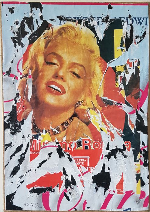
Finally feeling confident to use my large A1 canvas sheet, I began sticking down bits of paper. I didn’t use much image for this work mostly focussing on creating texture and layers through the transfer process. I liked how when sticking paper over other paper with pva and ripping it off, it would create rips in the painting as the glue would pick up paper in the layer below creating an interesting visual effect. As I was doing so, it reminded me of the artist Mimmo Rotella so I decided to focus on that more for this painting. 

Mimmo Rotella was an Italian artist prominent in the post war European art scene. He used the decollage process in his artwork with torn advertising posters. I like how his work not only created a distorted image but also can represent time and degradation through the layers of paper. 

Rotella’s work- Marilyn sorridente

I ran out of time and motivation for this piece as I would have liked to add more layers,  however I am fairly happy with the results and I think this process would be something I would incorporate into other paintings. I am thinking of cropping it but not sure about that yet. Although I was thoroughly confused throughout this brief, it did remind me of the benefits of the trial and error process- often the best revelations can be made through ‘mistakes’ which is especially apparent using these transfer processes.  

Piece 4

References:

Rotella image: https://www.catawiki.com/en/l/16556985-mimmo-rotella-marilyn-sorridente

Rotella information: https://www.tate.org.uk/art/artists/mimmo-rotella-11023

Week 2: Transfer (Pieces 1 and 2)

I found this brief difficult to grasp and struggled quite a bit with it. I found the classification of ‘image’ and ‘transfer’ quite confusing and I don’t think I understood the limitations that this brief provided. Abstract work isn’t really my forte although I do enjoy just playing around with materials. Hopefully as we are given more briefs I will have more clarity as to what they mean for my artmaking.

For my first piece which was done in the studio on Tuesday I didn’t have much direction but just started transferring images and newspaper using glue to a piece of brown paper. I also added some neon pink paint which I always love to use as it adds interest and colour to a painting. It contrasted nicely with the neutral colours of the other images and paper due to its artificial and very man-made look. I struggled with the main photo as it wouldn’t rub away enough to see the people, rather it had a fairly opaque white residue of the paper that would only disappear when wet. I feel as though this made the piece lack depth. I did enjoy the addition of text, especially the large graphic on the right side. This piece was produced after many failed attempts (experiments) with the image transfer process, but I would consider this an experiment also. 

Piece 1

Piece 1 close up

On Wednesday I had an idea to use a square spiral pattern in order to create depth. Although I think it looks cool, it didn’t add the dimension I thought it would, even after some purposeful shading. The image of the girl in the red dress came out well and added an eeriness to the painting, especially as the newspaper would show through the image. Although it was looking below where I wanted it to look, I persevered in an attempt to bring it back to life (I failed). I made several tape transfer attempts incorporating more red into the painting. This was inspired by Mikhael Subotzky’s work and how he uses tape to transfer images which in turn creates the glossy effect of tape on the surface as well as the interesting borders and levels of opaqueness picked up by the tape. Then I created a ‘stamp’ where I put some red paint on a piece of paper and stamped it onto my painting. I found this process incorporated the brief well- instead of just painting directly onto the painting, I used a transfer process which was hard to predict, only seeing the results after lifting the stamp. Although I enjoy certain elements from the painting, overall I don’t find it very visually impactful.

Piece 2
Mikhael Subotzky
Sticky-tape Transfer 37 – Feio (or looking at Blue), 2017
http://www.subotzkystudio.com/works/wye-text/associated-sticky-tape-transfers/