I was only issued a single challenge for my project, which was probably for the best, as just creating the work was a challenge for me! The challenge was to incorporate some outdoor labour, perhaps someone with a high-viz vest, or similar.
While I considered exploring this further, unfortunately, I really couldn’t fit it in with the time constraints of the animation. This is something of a self-inflicted injury really, as the animation approach was one that I chose, after all.
Reflection
I would have to say that I got lost in several stages of this brief along the way. It was an interesting, but also challenging, brief for me personally to engage with. The additional issues surrounding lockdown certainly had an impact as well.
In the end, and looking back upon the work so far, I would like to feel that there is labour reflected in all the work. Perhaps too much?
In regard to the final pieces, I find it somewhat ironic that so much of my labour in creating animations of invisible labour, was, itself, an invisible labour.
Petra Mrša was born in 1985 in Rijeka, Croatia. She is a multimedia artist, and her work, including photography, broadly attempts to explore and question social norms and representation. She has experimented with numerous collaborative projects including a globally collaborative audio piece called “The message”, which I’ve embedded below if anyone is curious!
She has also created several works that directly explore the impact of isolation during lockdown. One of these, The Sensing Shoes, was a way to re-experience a changed world – deserted streets, the absence of crowds, and so on. She felt that walking those empty streets, was a way to intertwine body, mind and vision.
Petra Mrša, The sensing shoes, 2020
Considering our current world, Mrša’s envisioning and exploration of mechanisms of socialisation in the virtual environment seem especially relevant. Exploring our current – and post-covid world is something that very much resonates with me at the moment.
Artist Research #2: Hiroshi Sugimoto
Hiroshi Sugimoto, born in Japan in 1948 may not need much of an introduction. His work in photographic composition, exploring notions of time through his long exposure images, to capture a compression of time into a single image is well recognised around the world, and he has received numerous awards for his work.
Hiroshi Sugimoto, Staircase at Villa Farnese II, 2016
To be honest, I really appreciate the sheer beauty in the images that Sugimoto is able to capture. There is a reason he has received so much recognition, and it shows a real mastery of photographic principles. Even the image above, in the hands of a lesser photographer, might be dull or unengaging, but through Sugimoto’s lens, it becomes something beautiful. Definitely, something to aspire to!
Artist Research #3: Viviane Sassen
Viviane Sassen is an award-winning artist and photographer. She was born in Amsterdam in 1972. Her images tend towards the surreal, including compositions perhaps more usually reserved for sculptural works.
Sassen’s photography tends to work with natural sunlight, shadows and reflections. Her work is spontaneous and shows independent freedom and energy.
While known for her work in a fashion context, Sassen, has a strong social focus, perhaps due to her time spent living in Kenya during her childhood.
Viviane Sassen, Leila, from Venus & Mercury, 2019
Sassen’s use of bold colours, strong lighting and play with shadows creates very interesting compositions that really caught my eye. In the example above, I particularly like the harsh shadows falling on the wall, and how the subject is almost completely obscured. In some of her other works, she engages in abstract images, with strange compositions of human forms. Worth checking out.
Here we have the third, and for now, final animation in this short series. While I have filmed additional footage for a further two animations, the sheer amount of time involved to create these animations, at around 10 hours of work for each, has seen me unable to finish any more before the due date, so hopefully, these three will suffice.
Once again, the animation was created with a bright magenta, but resolved in black for the final piece. I particularly like this one, as, by this point in the process, I was able to work faster and more efficiently. While each frame still took around 10 minutes, I was able to get more detail and refinement into the illustrations and I’m quite pleased with how, for example, the wrinkles move. This animation doesn’t loop, simply because I felt it looked a bit weird, so it’s left as a single sequence, although it does loop anyway in .gif format.
As usual, you can see the animation in higher quality at the YouTube link below.
Bonus image(s)
Two “compression” images for this one, in both black and white. I’m not sure which I like more.
Mini-reflection
This animation was challenging, mostly because it was the third in the sequence, and the process to create these is very time consuming, and it feels very repetitive to create.
I have spent a significant amount of time over the past six days creating these three animations, and it was genuinely exhausting by the end, so this particular piece was challenging due to my exhaustion levels, and just trying to push through and get it finished… but despite that, it has ended up being my favourite of the three.
This is the second animation in this short series. In this case, it’s a short sequence showing a very common type of labour – vacuuming. Once again, it’s designed to repeat to show the repetitive nature of the task. It’s a labour that only gets noticed when it hasn’t been done, right? This animation was different in that the subject makes a more or less constant movement, entering the frame from screen-right moving across to exit on screen-left. I quite like the effect of the repeating here as it almost suggests an endless parade of people vacuuming the floor!
Once again, I started with pink to outline to figure as it was clear to see while drawing. But, I decided to resolve this in another colour.
In this case, I opted to go with black instead of the white colour of the previous animation, as I felt it stood out nicely. What do you think, does the black colour work better than the white? Or is the magenta version the best option? It’s certainly more ‘fun’, while the black lends a more serious tone to the image.
Once again, you can check it out in full quality with the youtube link below.
Bonus image
Once again, I added a “labour in one shot” compression type image. The black outlines make this feel almost oppressive. The background is obscured by the dark form of the labour taking place. I really like this one, personally.
The following posts will showcase the final pieces of work I’ve created for this brief. I’ve been thinking a lot about the visibility of, or lack thereof, of many types of domestic labour.
I wanted to try to visualise this by filming various domestic tasks that usually go unseen, and are frequently unappreciated (if we’re being honest).
After filming, I wanted to create an animation by removing the person undertaking this labour, to make them literally invisible but represented by illustrated outlines.
It was something of a hope that by removing the subject, but illustrating them in this way, that it would draw attention back to the person doing the labour – despite never really seeing them.
They are faceless and indistinct, but the evidence of their labour can be seen clearly.
Animation #1
This was the first piece I worked on (a work in progress of this was shown in class previously). I had created the outlines in a bright magenta, which I had done mainly for reasons of visibility while illustrating the outlines.
It deliberately loops, reflecting the repetitive nature of the labour.
It was pointed out that there could be an interesting implication in respect to traditionally gendered roles. The pink could potentially draw attention to the suggested male form of the figure. What do you think, dear readers? Comment below if you have some thoughts!
While I found the pink/magenta easy to see while working on the animation, I decided that it was a bit distracting and resolved the animation in white.
The above YouTube link is the same animation seen above but in higher quality.
Some thoughts (mini-reflection!)
I’ll discuss this more later, but there’s an interesting aspect of invisible labour reflected in the animations themselves, as the labour to create them is itself quite consuming while utterly hidden from anyone viewing the outcome.
This was the first animation of this type that I created, and it was far more complex and time-consuming than I anticipated – each frame took roughly 10 minutes to create and overall the animation took a whopping 10 hours to create over two days.
Bonus image
Thinking back to a previous concept of labour in a single image, I thought it might be interesting to show a version of the animation with all the individual frames compressed and overlaid into a single image or moment. Personally, I kinda like it – what do we all think?
Cropped image – I like the patterns hereThe full image
Bad weather scuttled my original plans, but I had the thought to refer back to some old zoom sessions of my work and created an overlaid image inspired by the works shown to us of the artist Idris Khan. There are 40 images here captured over a two-hour span of time. With some luck, I’ll be able to return to my original idea, inspired by David Hilliard, later today.
Inspiration was hard to find with this one. I had already shot some prior videos that actually worked well for this concept, so it was tough to come up with ideas in this case.
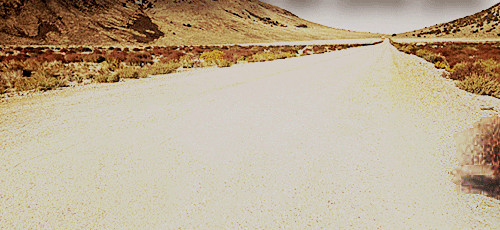
This first video is some labour that takes place daily outside my window (weather depending). It felt somewhat voyeuristic to film, and it was a comparatively quiet day of work. It was interesting to observe that despite the heavy machinery, it’s quite peaceful.
Not a typo, here’s the ‘proper’ second entry – let’s jump back in time a moment, shall we?
Don’t stare at this too long!
Stack, the first
Stacking. We did several stacking exercises, which in my case was using mostly small-scaled objects available to hand. This ranged from Bluray cases through to hand-painted miniatures, and even a cast of my daughter’s pre-braces teeth.
This first stack was reasonably successful and can be seen below.
The next video shows the deconstruction of the same stack – due to some of the objects being fairly fragile in nature, I opted to carefully deconstruct the stack.
Stack, the second
For the second one, we were challenged to start from the smallest object to the largest. This did not go so well, and…. well, take a look.
I felt genuine horror as the stack fell, concerned that so many objects would get broken or damaged. Luckily, most survived intact, but it was a genuinely nerve-wracking experience. I paused just a moment, but went straight to trying again, and made a more simple stack (or double stack?).
Series of screen captures showing my work in progress (literally). The rapid connections being made withthe fast speed and the almost instant repetition are a reasonable reflection on how it feels to actually do this work.
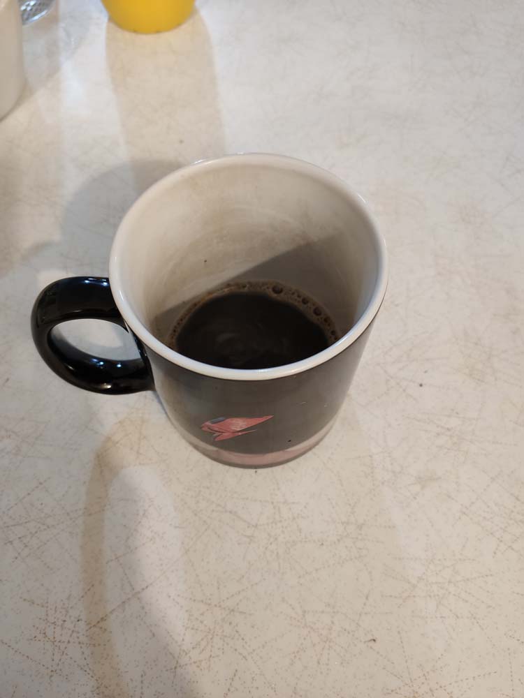
Sequence showing a coffee being made and then consumed (complete with colour changing mug). I never work without it. The mug is old and stained from many coffees over the years, which reflects its age (much like its owner).
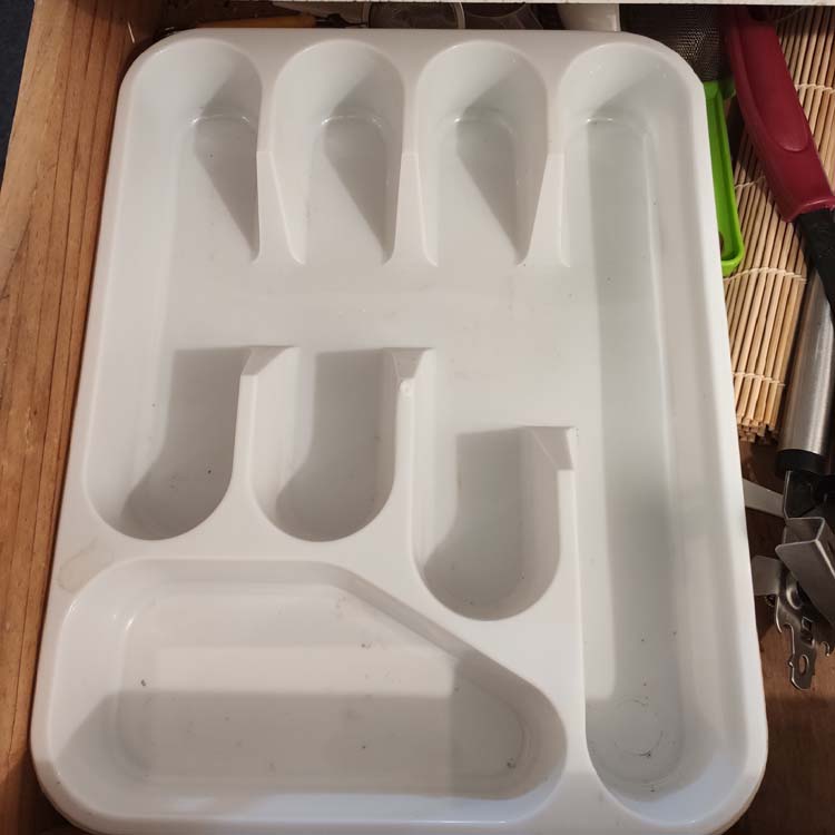
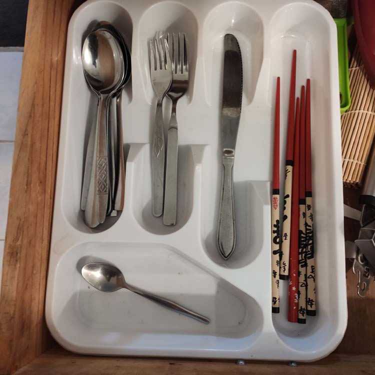
Domestic life (labour) putting away cutlery. Daily jobs that become so ingrained that they almost become automatic and forgotten (except when undertaking exercises like this one).
Image sequences
Seen here are the same images but shown as sequences rather than animated GIFs.