Site Interventions

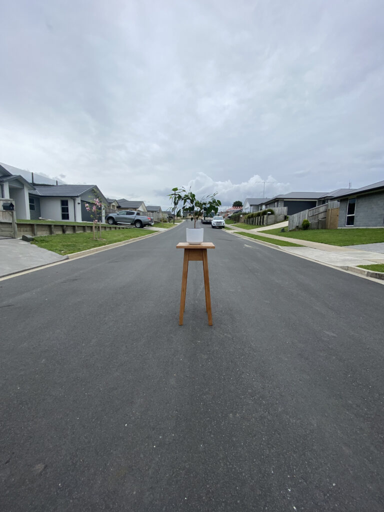
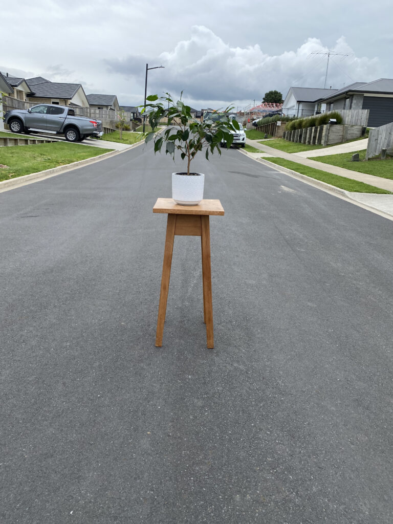
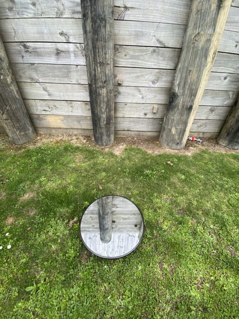
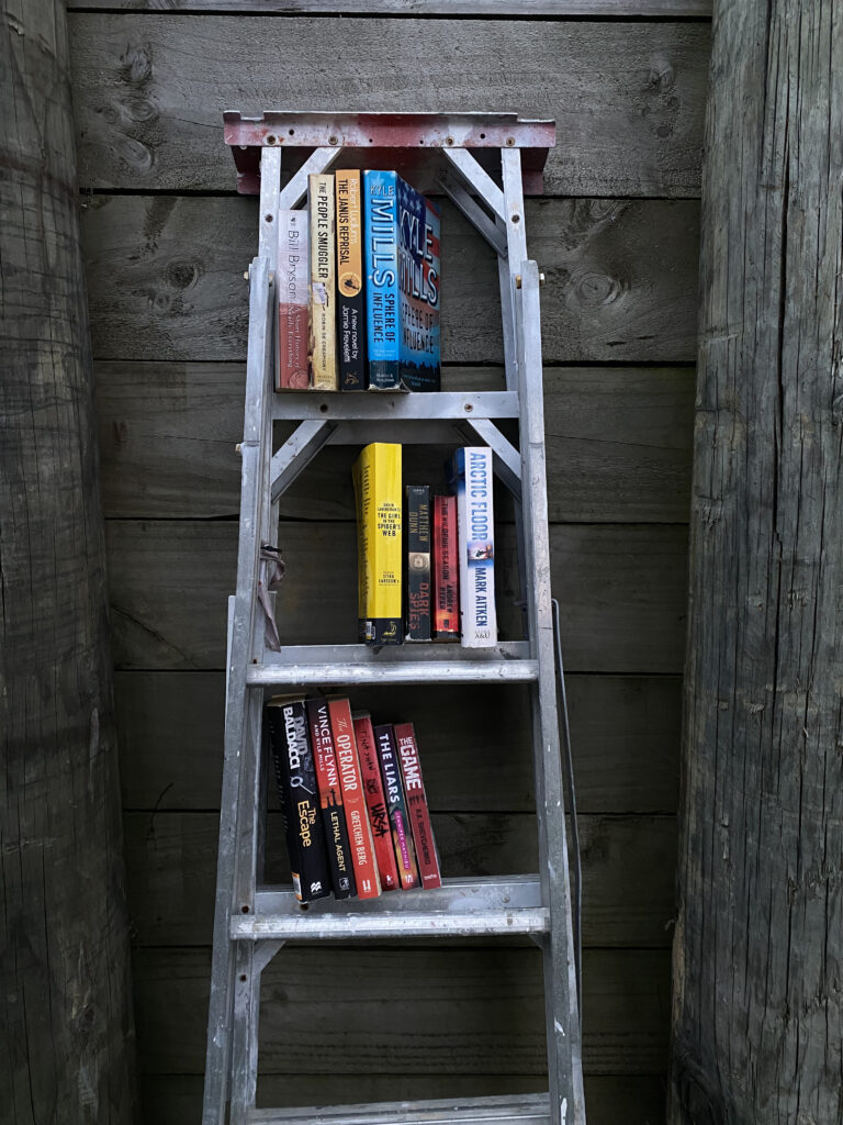
At the start of this task, I had a lot of ideas but when it came to the ‘making’ part I didn’t think that any of the ideas were appropriate to the task brief or were too big for the amount of time we have for the task. While I was looking for items I could use for the site intervention I found a pot plan on a stool, these items usually belong indoors in a living room or bedroom but I wanted to see how they intervene with the outside world. I put these items outside in the middle of the road. The plant almost looks as if it is planted in the middle of the road and the pot and stool have been places around it. My second intervention was taking my mirror and placing it outside on the grass; the mirror allows you to see two images at once as if it is a portal to another world. The fact that the mirror is circular and had a very thin outline makes it looks like it has been digitally edited. I saw ladders in my backyard and I instantly thought how much the rungs divided up the ladder shape and made it look similar to a bookshelf. So I collected books from around my house and placed them on the bookshelf (ladder).

Verisimilitude: Week One Day Two, Real spaces

The space I chose to work with for this brief was my desk (please note I asked my mum if I could take my bed into the lawn, and she said no). The amount of time I spend at my desk is probably unhealthy. But it works for me, I have had this desk for over five years, and my dad and I made it together when I was 14. When looking at this desk area compared to my whole bedroom, it takes up most of the space apart from the bed. The desk creates a room within a room. The desk was obviously not made for a human to sit underneath it, so I found this uncomfortable from the start. The first intervention I made was adding pillows to all the empty spaces under the desk. Despite the lack of space and crowdedness from all the objects, there was a sense of calm and security when I was under the desk. The second intervention was adding the chair back into the original space that I had moved it from; This is where the chair lives and serves its purpose, so I thought it would be interesting to see how it fits around me or how I fit around that chair! Apart from providing an armrest, it was very awkward and unconventional. The last change I made to the space was adding a white sheet over the desk to see the effects of light in this space. This made me feel as if nothing was surrounding me apart from the objects under the desk, the ground, the wall and the desk.

the desk in question
sore neck
sore neck but cosy

squished
sore neck, cosy, squished and blind

Verisimilitude: Day One, Task One

Erwin Wurms One Minute Sculptures are the inspiration for today’s task. I approached the task with an open mind and no plan in place but after having a look at his website and works I had an idea of where to start. the work of Erwin Wurm had me a bit confused when I first looked at them, I was curious about how a human can be a sculpture.

I managed to convince my sister to be the model for these sculptures, as I wanted to have control over the angles and shots that were being taken,

Erwin Wurm, One Minute Sculptures, 2017 - SHU Department of Art Student  Resources
Erwin Wurm

Final Summary

During this brief, I have been mostly making work responding to the image of my friends running down the street (find attached below), I was most drawn to this image because of the freedom and movement that they held. I developed this idea through mark-making in response to what I felt from this image. Though some of these paintings may not look like the reference image; they are all made by responding to the image. 

  1. The first painting I made in the studio.  I made it using my whole arm, swinging it in the same way the girl in the photo was. The freedom and fluidity in the image can be seen in the elongated brush strokes and various lengths the strokes came out in. The use of such a thick brush allowed unity to form within the painting. The white page and black ink allowed the lines to be bold and seen on the page. The use of positive and negative space is seen through the gaps made between the strokes.  
  2.  Similarly, with the second painting, the contrast of black and white allows the silhouette of the people to stand out on the page. At the start of the painting, I planned on making the image a solid colour, a perfect copy. But while I was painting it I preferred the messy and uncontrolled edges, as well as the visible brush strokes. 
  3. The third image was made when I did not have access to a lot of materials at the start of lockdown. This painting was made when I was unsure of how long this lockdown was going to go on for and I was thinking about the idea of horizontal and vertical lines that were in one of the other images I was responding to.  There is something that keeps bringing me back to this painting. I think it might be the formality and unification that this painting has. As for the process that lead me to this painting, it was a process of stamping, similar to the techniques of week 1, and the slight bleeding effect the painting has adds to the freedom and lack of control that  I like.  
The image I am responding to
Painting 1
painting 2
Painting 3

research; Andreas Lie

Andreas Lie is a Norwegian artist who makes art mostly in black on white backgrounds.

“The minimalistic artwork was inspired by his desire to produce something unexpected,” -Andreas Lie

 Out of all of his works, I was most drawn to was an ink artwork in the shape of a human portrait, the painting is almost mesmerising to the viewer as the spiral lines lead you to the centre of the painting.  I like that you can see the brush strokes and the separation that the ink causes that brush to have.

comparison: studio works vs lockdown works

I was surprised to find some Indian ink at my house. I also found the A3 card and one side of it was shiny and the other was matt, I was interested to see the effects of the Indian ink on the shiny surface of the paper. Using a wide brush and the Indian ink I started just making marks with no indeed purpose in mind.  I then thought about the work I had previously made in the studio before lockdown and how similar it was to the paintings. I realised I had pretty much come right back to where I was before lockdown. And funnily enough, they were some of the works I think came out best. I was happy that I found some paper bigger than A4 to work with aswell. The Indian ink on the paper caused some rippling and puddling but ti think it added an interesting effect to the work.

Painting with Potatoes

I am not sure why I like using brown paper to make art. I think it might be because I have always used white paper, but with brown, it gives you a different base to work with, as if the paper starts the work off for you.

I am aware that we are coming to the end of this brief but I am still struggling to work without a final piece in mind; however, I am enjoying just making works and responding to them as I go. 

The idea for using potatoes came when I was thinking about the idea of repetition and copying. I was surprised at how the potato stamp came out, there was a small about of bleeding because the potato held moisture but I didn’t mind the effect it had on the painting. 

The image I am responding to

Artist and ideas 

I was drawn to an artist named Rosie McGuinness. The thing that caught my eye first about her work was the use of brown and off white paper. And also using contrasting and componentry colours. I find her work very pleasing to the eye and inserting to look at. She also bases a lot of her work around textiles and she finds the connection between painting and fabric.

As the image I have chosen to respond to is highly textiles based I feel that this is a good point to go from.  In the image below with the yellow dress, she uses the colour of her surface/paper to fill in the gaps and create the illusion of positive and negative space. 

I want to see if I can try this technique with the fabric the people are wearing in my image to try and achieve a similar outcome. 

Rosie McGuinness 

Images I made using the photo I am responding to 

I traced the outlines of my reference image on my iPad and I want to experiment with using it as a stencil or stamp. I am hoping that this can be a way for me to experiment with a different type of art-making using stamping and stencil rather than painting right onto the surface. This will also allow making multiple copies of works producing them at a faster rate than painting.

This also opens up possibilities for processes like spray paint, splattering, washes, scraping Etc.

I am wanting to make my work on a bigger scale and this is something I have been struggling to do in the past few briefs. I have always stuck to working in mostly A4 and A3. though I don’t have much big paper handy I am still hoping that I will be able to find a way to make works on a larger scale. Whether that be using an old sheet, towel blanket or drop sheet. 

 In terms of colour choices, I have been sticking the main colours I have pulled out of the image I am responding to, I a hoping that I will be able to experiment with the new colours and shades and see what the outcomes are.  

Monday  6th September 

More things I have found 

-house paint 

– house paint rollers and brushes 

-Black paper

Focusing on responding to imagery from the past weeks.

While looking around my house for supplies I found some small chips of wood in my dad’s workshop. I then found some black A4 paper. I dipped the wood chip in white acrylic paint and stamped it onto the paper. I was left with a page covered in lines, differing in shapes and sizes but still mostly uniform. I enjoyed the use of positive and negative space in the painting, and I am hoping that I may be able to do this same technique but on a larger scale. As I don’t have much paper that is bigger than A3 I was thinking about using an old pillowcase, sheet or some fabric. I also found a roll of brown wrapping paper, and it reminded me of the paper we used in studio; I am interested in seeing how the acrylic paint reacts to this paper, as well as the house paint I have.  The effects the paint had on the paper caused warping as it is low quality and not thick.

The lines I made on the page reminded me of cave paintings or marks on a chalkboard.

Artist research 

I found artwork by Nicole miller; this work is an inkblot print and made me think about the black and white painting I did. Some of the shapes in the work looks like human figures and I was thinking about a way to combine the stamp painting, with the image I am responding to from the past week. 

Nicole Miller

Images I am responding to

Most recent paintings

lockdown update!

 So far, I have been all over the place trying so many different ideas. This was good for the time being, but I need to narrow down my ideas; the work of Helen Frankenthaler is fascinating to me. She was inspired by Jackson Pollock and the ‘happened’ quality of his work. She said, “technique determines aesthetic, as much as one’s aesthetic determines a new medium” her work has freedom and fluidity to it; that is what I am most drawn to. I think I can take the technique of Helen Frankenthaler work and use the movement from the original photo and combine the two of them; the original photo I am talking about has two people running down a pathway. I am so fond of this image because of the freedom and movement that the figures have. In last week’s work, I have been focusing too much on the aspects of the photo, e.g., the diagonal and horizontal lines.  I need to look at the movement rather than the photo. Another way I could leave the ‘lines’ alone would be to cut my paper into the shapes that are seen; so that the construction of the paper becomes the construction of the context for the gesture and movement.

Helen Frankenthaler: the triumph of colour — AWARE Archives of Women  Artists, Research and Exhibitions
Helen Frankenthaler
Helen Frankenthaler: the triumph of colour — AWARE Archives of Women  Artists, Research and Exhibitions
https://www.youtube.com/watch?v=3SL4OkdJjOc

My workspace and materials during lockdown

-decent sized desk, as well as access to my dad’s workshop/shed

-range of acrylic paints and limited colours of house paints and brushes of different sizes

-paper of varying sizes and thicknesses (black and white)

-a few canvases, one over two meters long (with a few holes in it)

-range of pens, pencils, markers, crayons

-Indian ink

Work I made on the last day of studio, before lockdown

I like the use of positive and negative space in the biggest painting to the left, this was just an experiment but I was surprised at how it came out. I made the first painting using blues in the background, and the Indian ink on top was just a mistake. I was trying to clean the rest of the ink of my brush and ended up doing work that came out really well. The contrast the Indian ink creates is really fascinating to me, and I want to take this further.