Process into Image (FINAL)

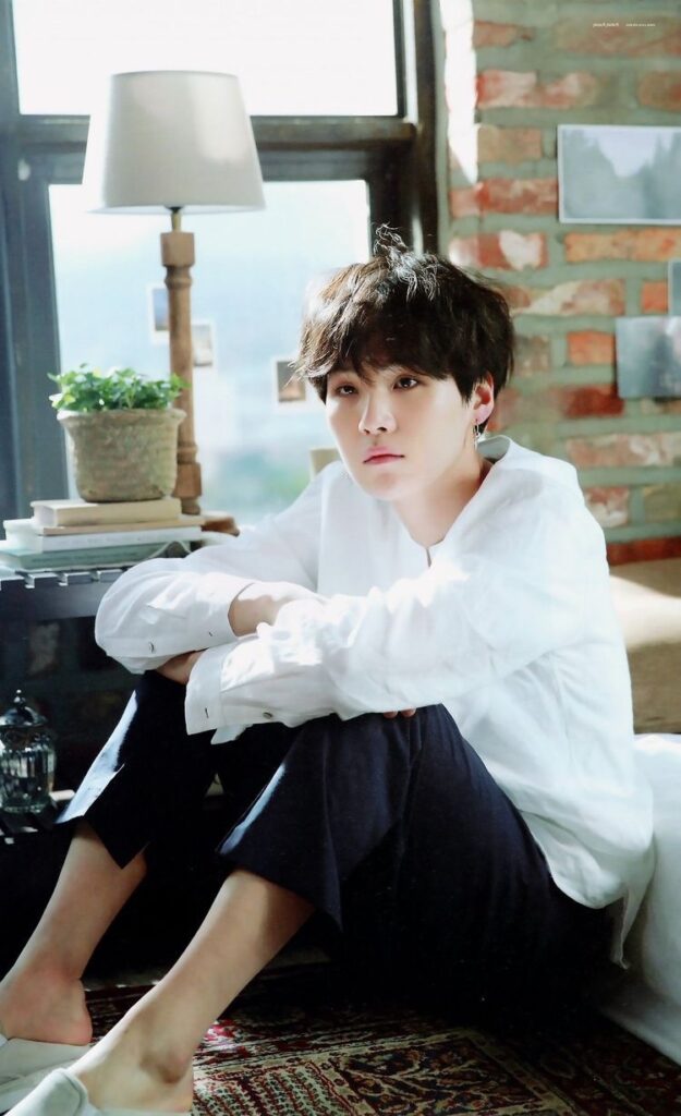
This is the “final” work I have chosen.

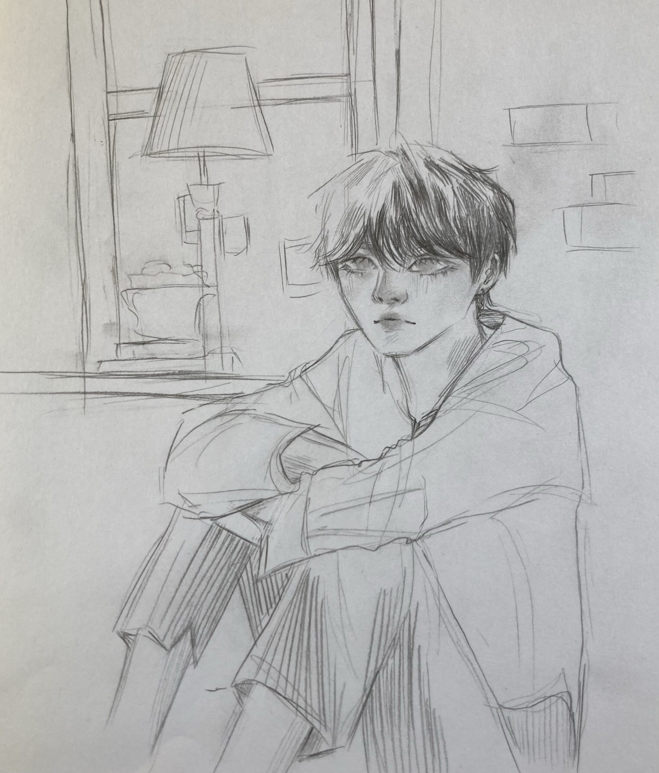
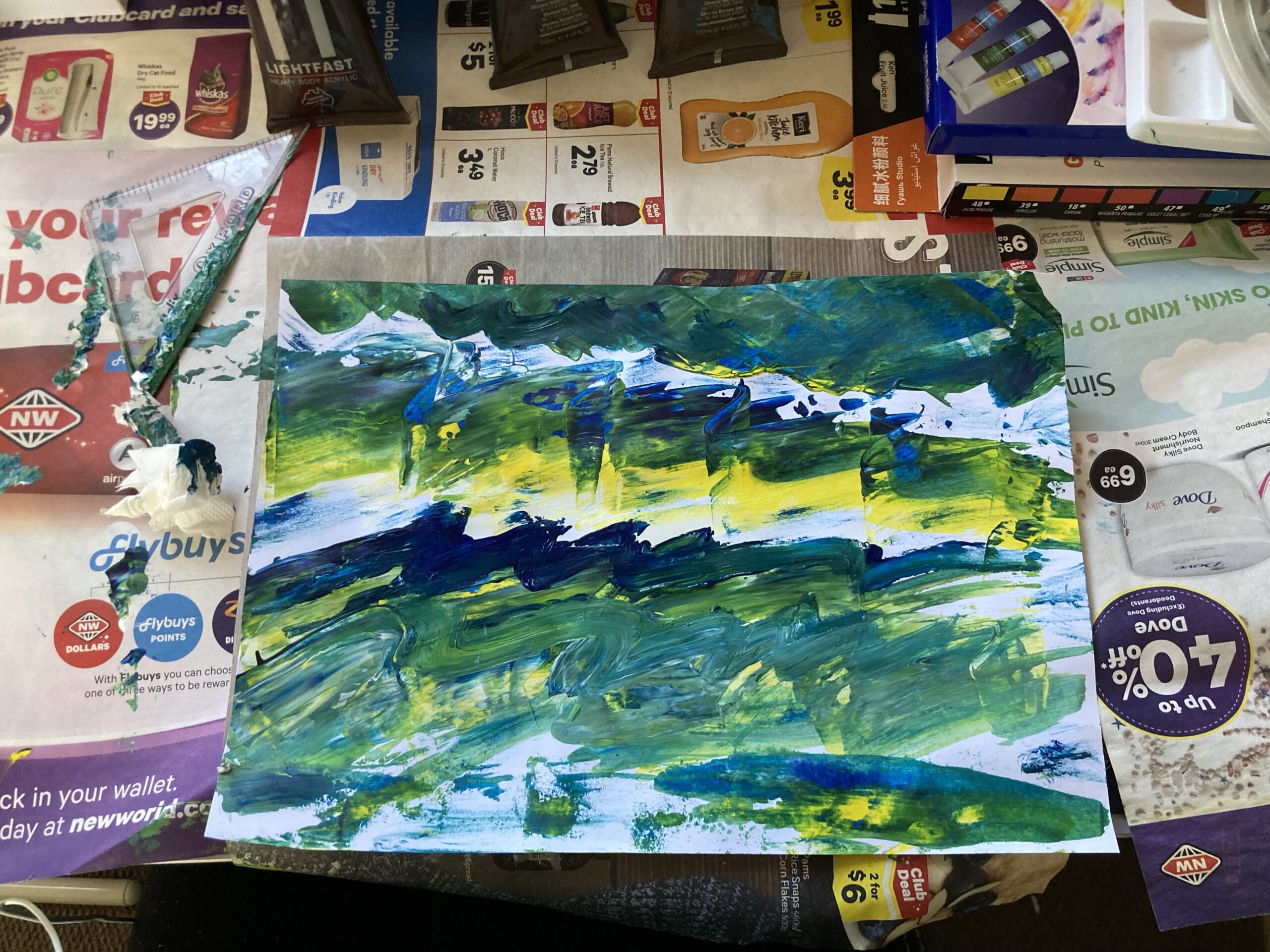
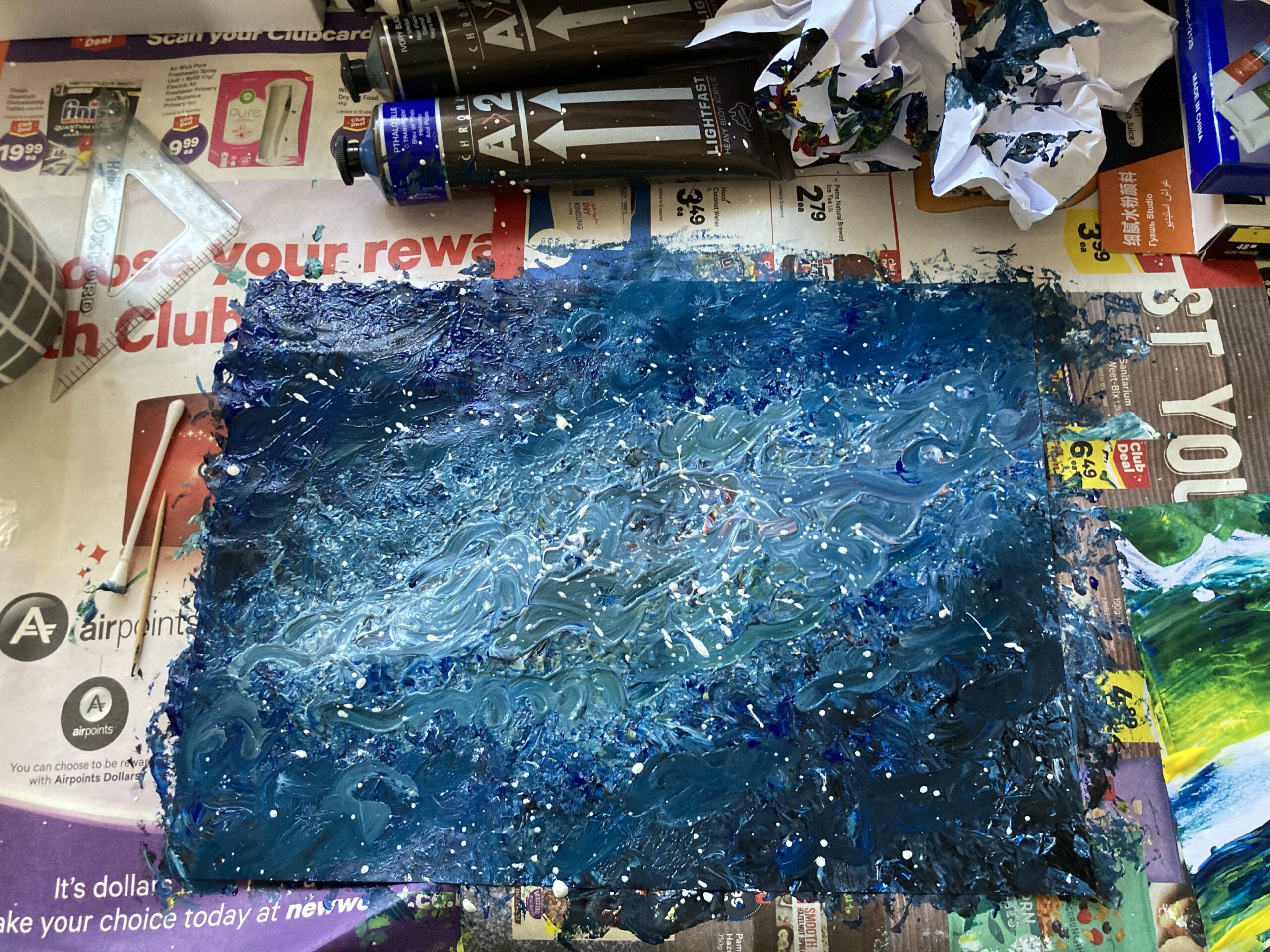
This artwork shows the various new methods and techniques that I’ve learnt through this brief. I would’ve never painted this way before.

For example, the window I painted by swirling paint with a tissue and q-tip. Or the green wall i made using a small ruler to spread/scrape the paint to create an interesting texture. Usually, I’d fret over the small details and work over the clothing wrinkles laboriously, but I was able to paint minimal shading that still shows texture.

This brief helped let loose and let go of perfection. My final painting isn’t accurate to the reference photo, but I still like it. I was able to learn new ways to approach art. Instead of only using a pencil and a paintbrush, I was able to create imagery using objects I never would have tried using before.

Process into Image (6)

I’ve chosen this artwork from week 2 to explore.

Using the vocabulary from week 1, I tried to experiment in making marks in different ways.

I don’t like how any of these turned out, but i was more focused on experimenting, trying to use whatever objects were around me. For example, I folded a piece of paper into a kind of stamp that used on the 3rd work shown.

I’m trying to get the hang of these new and different methods, so I can figure out how use them in harmony.

Process into Image (5)

From this week’s presentation, Rita Ackermann’s works caught my eye. Particularly this style of works she does.

I love her choice of colours and her style of painting. The way she paints is subtle and soft but it contrasts enough to create a captivating work. Her art has really inspired me, and I’d like to implement aspects of her work into my own this week.

Process into Image (4)

For this task, I tried to create art in different ways.

A photo including people
A photo without people
A screengrab from a film

My charcoal works were somewhat inspired by Silvia Bächl, but I wasn’t able to draw as boldly as her.

For most of the works, I was heavily inspired by Elizabeth Peyton. I put detail in certain areas, and subtle suggestions of imagery in others. It was a bit difficult to not draw everything meticulously, but I tried my best to have fun with it.

Process into Image (3)

To gain some inspiration and ideas, I looked through the artists from today’s presentation. These two in particular inspired me the most.

Elizabeth Peyton

This artist stood out to me the most as I primarily make art of human figures. I thought it’d be interesting to try explore her method of painting/drawing. Her art seems both unfinished and finished at the same time. I find the way she suggests at imagery, rather than drawing every little detail, she draws just enough for you to know what it is. I also thought it was interesting that some areas of her work is high detail, while others are flat or subtle. I’d like to try this out to challenge my usual approach.

Silvia Bächli

I found this artist’s art interesting because it really challenged me. This kind of art is honestly not my cup of tea, but that’s why I think I wanna try something along the lines of this. Her art is very loose, free and bold to me, which feels like the opposite of my art.

I’ll experiment and try out these kind of styles in this weeks task.

Process into Image (1)

Today is the first day of this new brief, and our first task was to choose verbs from a list given and interpret them through paint. I made two works using multiple verbs.

Work 1

I used a random ruler thing to drag dollops of paint around. Afterwards i used tissue to wipe/smear the colours around more.

Work 2

For this one, I put a bunch of dollops of paint on the paper. Then, I used a crumpled up paper to dab over everything. I added more paint and rolled the crumpled paper over everything for more, then used a qtip to swirl the paint around. Then finally I flicked white and pink paint on the work.

I enjoyed making both of these, it was refreshing to make something without a specific image in my mind. For once I was able to just enjoy the process.

Down-time (10) FINAL

Out of the many photos I took, my final selection is these two series of photos.

The focus of my final work is on both labour and leisure. These two photo sequences are meant to be direct parallels of each other. The concept of my work is about the way that our labour and leisure overlap and blend into each other. Especially now, in a time where technology is prominent and we’re all stuck in our homes due to Covid-19. Our labour and leisure take place in the same space. For most people, it all mainly takes place within the screens of our devices. We study, work, and communicate through screens. We play games and watch entertainment through those same screens. In my two photo sequences, all the photos are taken from the same place, and I’m sat at the same place – my desk, in front of my laptop.


In the first sequence, I do my labour, sitting facing my laptop. Until there’s no longer light coming from my window, only from my laptop screen.
In the second sequence, I do my leisure, still sitting facing my laptop. I immerse myself in the leisure (I used the light blue light as it represents Sloth, laziness).


Though the two sequences contrast, they’re still similar. I’m stuck in place, the same screen appearing in every single photo, whether its labour or leisure. Even now as I reflect on my work, I’m sitting facing my laptop screen. With this work I wanted to portray the way that our labour and leisure come from the same place. Not only that, but I wanted to show how endless it feels, and how everything blurs together.

Down-time (9)

After getting feedback during class, I realised everything within the images I take will be considered a prop that is there with a purpose. I realised that my posters in the background and the personal objects & trinkets on my desk is a distraction from the main focus of my photos. To fix this issue, I removed everything that appears within frame of my photos, leaving a blank slate. The only objects I allow to appear within the frame are there with a purpose. Like this, the photos become more impersonal and generally more relatable for the viewer. The focus of my images will be more clear this way, and it is easier for people to engage with.

With the space now set up more purposely, I did a reshoot. This time, I arranged everything on my desk purposefully. For example, gradually adding more cups of coffee on my desk, and having my water bottle slowly drain as it gets darker. I used these props this way as another way of showing time passing.

Once it was night, I re-set up my desk space. I removed the coffee cups and replaced my books with my mouse and mousepad. This creates a clear change between labour time and leisure time, while still being in the same place. To show more of a visual portrayal of time passing, I turned on a blue light that started off very dim and gradually got brighter till it became a light blue. All the while gradually taking photos. I chose this colour because apparently light blue represents Sloth (of the 7 deadly sins), which represents laziness. I think the dark blue gradually becoming more bright and light could symbolise going deeper into the leisure over time, becoming more immersed and relaxed.

Down-time (8)

For the next series of photos, I wanted to document daily leisure that most people can relate to. I was a bit inspired by Gerard Garbez’s photography. I liked the way he captured simple moments of daily life.

Gerard Garbez – (unknown title)

I took this series of photos of me just sitting at my desk doing uni work, taking notes while watching a lecture on my laptop. The photos were taken every now and then until it was completely dark in my room. I wanted to use the light from my window to portray time passing as I worked. I took maybe around 100 photos, but I’ll just post a few here.

Once it got dark, I swapped my books with a mouse and mouse pad and started playing a game on my laptop. I took photos from the exact same angle as the previous photos. I did this because I wanted to show a clear contrast between the labour and leisure, but also the similarity as both my labour and leisure were done in the exact same place.

It was a bit hard to portray time passing at night time. I took some videos but it wasn’t any better. I’ll have figure out some way to capture time passing at night…