Last Week of Palimpsest, before the Exhibition

4th May

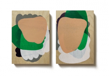
Preparing for presentation of my work, I had think hard about how I wanted to attract people to my work. I needed to make it exhibition worthy compared to the wall I created last week. Noticing the incredible amount of chaos because of how busy my work has become I decided I needed to start with a clean palette. I striped down all my work from the past three weeks and sorted out the pieces I liked or wanted to keep up and the ones that were old or just didn’t work together. I was then able to work out some of the aspects about each one I wanted to create in a new art work for. This lead me to create these two down below.

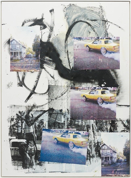
I used the photocopier to copy and in large the left over marks from my mono prints. I used my scraps because I really loved how the fuzzy marks that were left on my page from pressing my hand on the paper and the ink, looked. To me it reminds me of TV static or the feeling of a lost connection. I used the same colour scheme again because I loved how the colours make the work come together while them also giving off a 3D movie effect feel. It makes it almost had for the eyes to understand what is going on in the image which also keeps people interest, almost curious. I also photocopied some of the left over painters tape I had and duplicated it multiple times which I really enjoyed the look of too.

I soon decided on pining up my palimpsest art works that I enjoyed the most but this time separating them to look more like display. By the end of the day I was very content about how my wall turned out.

5th May

I felt very happy with how my wall turned out yesterday and didn’t have much more to add. I decided that I should use better paper and experiment on the quality it has when photocopied. I ended up using thicker and more durable paper compared to the cartridge paper I used from the printer before. I noticed how much clearer and professional it looked.

I also got some advice on how I could make the presentation more exciting. I pulled out some of the pins that was holding up my work and replaced it with the same tape I was using previously. instead of having my art work pressed right up to the wall I pulled them further away this created the same effect I had with my previous collaged works. Coming together I was really happy with my product and ready for the final expedition tomorrow.

Daniel Eatock

Felt-Tip Prints by Daniel Eatock | Office supplies art, Pilot pens, Art

Daniel Eatock is born in Bolton, England in 1975, now located in London.  As graduate of the Royal College of Art, he now works around the work with many galleries and exhibitions. He embraces dilemmas seeking out alignments in ways of using everyday items.

Daniel’s work is very inspiring to me because of his way he constructs his own unique process. He often lets patterns form their own art by just making a contraption and stepping away from it letting it do its own thing. For example he stand up a big numbers of ink pens and places his paper on top. The ink soon sinks into the paper creating colourful abstract dots. Where as another, he uses pressure from a rolling pin to move around layers paint. I wanted to use the same process of finding weird and different ways in creating an abstract piece.

A1 Ref 03 : Daniel Eatock
https://eatock.com/files/gimgs/th-927_RD_76_www.jpg

Book Binding – Palimpsest Week 3 – Term 2

To begin our second workshop into palimpsest, Fleur showed us how to exactly make a simple glue spine flip book. Where we used unwanted scrap paper from other students prints and used pressure and glue to them to bring together a tiny book.

We got a get a quick insight into foil stamping, where Fleur showed us the process coving your paper with a little bit of PVA glue. This could be letters or drawing or just patterns and place the foil onto the glue before using a tight press to stick the foil on. I really liked how it came out and hope to be able to use it myself even if it was on my final works, just for practice or fun.

Due to time I was unable to continue with the full day workshop of book binding. This meant I missed out on producing a sewn spine book, as much as an opportunity it would’ve been I knew I wasn’t so interested in using it in my final exhibition in the next two weeks. This method was enjoyable and good to have for other projects but most likely wont use them for this brief.

28th – 29th April Continuing with Palimpsest

For the rest if the week I did end up falling into a loop hole where I was out of ideas and coming up with new works. It took me a while before I could come up with new ideas, I often looked at artist models and looked for new techniques.

I picked out things that I liked where it was the patterns, textures or the style and from there continued created a sort of collage. I liked using the same colour pallet and the interesting texture that arose during print making the duplicates of the photocopied work.

I used some of my drawing I did before and printed them using the same colours of magenta and cyan and reprinted it over the top again and again. These created a fuzzy look which becomes almost confusing for the eyes. I also ended up rearranging the layout of my wall. I decided I needed a change and need to look at my work in a different way.

Leo Gabin

LEO GABIN

Leo Gabin is part of a trio group of artists, which includes Lieven Deconinck, Gaƫtan Begerem, and Robin De Vooght. Since the year 2000 they have been working together to create a wide range of many different creative technologies in particular video, digital media, drawing, print, painting, and sculpture.

I really enjoyed their prints and paintings and how chaotic and free they became. I noticed the use of printing their own photography or old found images on one huge piece while also using mark making to create textures and layering. Leo Gabin creates work mostly from found-object art by harvesting and recycling digital content into some new work of their own. To me I am very interested in the mark making done by ink, the make these huge squiggles freely with no intention in it being perfect along with the placement scattered images and spray paint. I love their own freedom of abstract.

Leo Gabin | Peres Projects
Gabin Leo | Early Cuffing Season (2014) | MutualArt

Ingrid Calame

Ingrid Calame - 13 Artworks, Bio & Shows on Artsy

Ingrid Calame is an American artist based in Los Angeles. Born in Bronx New York, 1965, she received her BFA from the State University of New York. Calame’s work is included in many collections as permanent pieces in museums, such as Albright-Knox Art Gallery, Indianapolis Museum of Art, and art museums in Huston, New York, Los Angeles and Switzerland. She is also included in many private collections around the world. Ingrid Calame is a contemporary abstract artist who uses her environment as her advantage. She traces stains and marks from floors or walls and layers them in various different bright colours. 

Artist Ingrid Calame on how she draws | Art | The Guardian

Ingrid Calame - 13 Artworks, Bio & Shows on Artsy

To me exploring Ingrid’s works gave me lots of inspiration for my own in the Palimpsest brief. I liked the way she would reuse the same paper over again in another space and how she uses such vibrant colours. From the work I have seen of hers I have noticed her abstract works look almost map like or mark makings. She uses textures like the floors of old warehouses where there is paint and dents imprinted. Her inspiration being the natural destruction by humans because these create unique and beautiful marks. Not all works look the same as each environment she traces holds its own history.

I used some of Ingrid’s ideas and processes in my own artwork, in images and textures repeatedly over on one piece of paper using the photocopier. I left marks I organically didn’t mean to make or want to keep, but after time I realised the imprecations on the work added more character and beauty. 

Printmaking – Palimpsest Week 2 – Term 3

20th April

To begin the second week of palimpsest we got stuck into printmaking, we started off using black ink. I coated the clear plastic sheet with the ink and put paper just over the top. To add to the ink I would use the process of subtraction, using rags and brushes to remove some of it.

My first two images are prints using texture such as plants and rags I rolled the ink roller over them before putting them through the press. This created a very detailed and clear print also with just the black boxy ink on the plastic board. I tried this on a canvas as well to have variety of paper textures. It was an easy way of printing but I didn’t feel so creative with them.

In theses images below I basically turned the process around. Instead on using the plastic sheet to make marks I used my own pressure of a pencil or object to trace or imprint on the paper I set above it.

After lunch we were able to move onto coloured ink where we could mix and layer the colours.

21st April

Today I started the day slow I was had a few ideas on where to go next from my works but came into a problem which caused me to not be able to carry on. The wet ink prints form yesterday we all unfortunately still wet and sticky. This meant I couldn’t use them through the photocopier as they would leave ink all over it.

The class was instructed to walk about and talk about your work also giving advice and criticism. The class was very quiet and everyone was very tired to give to much advice, but they made the comment that they loved the constant theme and colour pallet.

22nd April

After two three days most of my wet ink prints were mostly dry, which meant I was able to finally work both my new and last week works together. From my ideas from yesterday I came up with what images I really liked and try and merge them together. I used carbon paper to recreate the line work from my other prints. Also sticking to the theme of busy euphoric, I used the colour blue, cyan, purple and magenta to make sure they are all constant.

Palimpsest – Week 1 Term 2

13th April

Today we started our first lesson of Palimpsest, we were introduced to what it means to create art through palimpsest. It’s when something is reused or altered but still bearing visible traces of its earlier form. The aim is to find unused prints such as newspaper or books to recreate art. This caught my attention as I am uses to mostly painting with realism where i would always focus on the tiny little details, where as in here we need to be free and let things just happen. The whole day was spend learning about what this topic will be about and after the lesson I went straight home looking for things to use and wrote down some ideas.

I found newspapers, magazines, old papers and an old book with unique drawings. I came up with ideas such as, using old building prints, movie tickets, receipts, different textures of paper, overlaying, collages, flip book

14th April

We got straight into making today as yesterday was just an introduction. I was a little clueless at the beginning because I did really have an idea on where or what to start with. I brought all my things in to class and looked throughout the books and magazines looking for stuff that I like or attracted to. Luca showed us how to use the fax machine and techniques you can use with it, after we also went to the printer where he showed us more ways of printing our images. First I photocopied images from a book about film camera operations moving it around in the machine to make the images look dragged and disoriented. I drew over it with coloured sharpies making weird lines and shapes while also ruffly coping the original prints drawings. I did this another time with one of the smaller drawings and just photocopy it over and over on one page, printing it on a spare coloured paper.

I also tried photocopying other prints from a magazine while using only one colour and printing something else in a different colour on the same piece. With the colours I picked and the way I moved the prints made them have a euphoric mood.

Soon I was able to try out the fax machine. I tried the exact same way Luca show us, it was a fun way to use it when I pulled the image around making weird looking prints. I decided on of need something more so I added a few of my own shapes using a white pen. This also came out really interesting and I would definitely love to uses these techniques later in the topic again.

15th April

Today we worked on our previous art works to try and create something with more depth. With a few examples shown by the lecturer we got stuck in using many different techniques of adding to our prints. I was able to get some feedback from the teacher, he loved my colour pallet and way used the printer to manipulate them. He gave me ideas to expand my process.

I used wet inks to make vivid imprints I moved the paper around to make the ink drip over my thrown away papers. Also using random pieces to create a collage. I added a bit of white paint trying to keep the same movements as my prints. I needed a bit of warming up to creating abstract as I was too worried about making things look good. I needed to loosen up, next week I hope to achieve this further.

Expedition – Discover, Uncover, Recover – Week 4

Moving into week 4 ,finalising our display, I took down my old work to replace it with a composition that related to my recovering topic. I wanted to look deeper into my grandfather’s racing yacht, Touchdown. As the boat is the only way I could connect to my grandfather who passed away a few years ago I realised I didn’t know enough about it than I wanted to, and this was a big opportunity to dig up history I never knew.

I printed one of my images I took a year ago out in massive A2, the image came out in black and white but the image was really dark so I had to edit its exposure on the printer which came out much better. It was going to be one of my centerpieces. I decided I needed to add my own photos using the pinhole camera technique. I walked the distance from AUT to the waterfront carrying this paint tin around I found the perfect spot but unfortunately when it developed it came out almost completely black. This became a big disappointment for me as it took a lot of time to get this image. I reluctantly tried again but this time taking the bus. It came our much better even though the image was a little blurry it was a success for me. I printed it inverted to its original and it looked almost spooky so I had to digitally edit it.

A hurdle I ran into was when I had no way of getting to the boat Touchdown in the amount of time we had, due to the boat being far up north. I was able to get photos from my uncle of when the boat was built and its memorable moments on the sea. It was very emotional to see these images. They looked like they hadn’t been seen for a very long time which added more character to the image. From these images I blew them up into bigger sizes and even found a few newspaper articles relating to his past boat and Touchdown.

To add my own personal connection to the display I took photos of me wearing his shirt and of me touching the water, I also found an image of my grandfather and I sailing together. I put up everything together and wrote down a little bit of a biography for people who didn’t understand what Touchdown was to me and my family.

Even with the limited time I had to complete this brief I felt that I had used the best of my ability to create this mini expedition. I loved watching it grow as I came up with new ideas and gathered an incredible amount of information. If I was given the same opportunity to do this again I would love to involve more of my own photos even though photography isn’t one of my strongest strengths. It was fun to explore the topic expertly when exploring more of Touchdowns legacy.  

Touchdown Research

Launched in 1987, the award winning yacht, Touchdown was originally built by John Richardson out of his love for the sea. From a young age of 12 John grew an attachment for sailing boats and till his death he spent all his time caring for his amazing sailing boats. Along John’s way to glory he won many cups and trophies and sailed against Sir Peter Blake. His favourite races were to the pacific islands, to Australia and racing around New Zealand. I have been connected to Touchdown since I was a child, John Richardson was my Grandfather and taught me and my siblings how to sail her just like he did with his own children. Because of his old age he wasn’t competing in races as often so we would just briefly sail around Auckland Harbour and Auckland’s islands.I remember stories he told from a few of his races on Touchdown. John raced in extreme conditions where waves splashed 10 metres high from the bow of the boat he saw hundreds of flying fish jump into the air and hit them. And many Terrifying times of him and his crew getting lost without their charts having signal. Also when John got so close to the shore at night and a wave flipped the boat. 

PinHole Photography – Week 2-3 Term 1

This week lockdown was lifted and we were able to go into the studio for the first time. We were introduced to Pinhole photography, where we used photographic paper to develop a black and white image. We were given an empty paint tin with a tiny hole and in a dark room we put the paper into the tin. Making sure the tin was sealed so that no sunlight was able to seek through. I found a stop on AUT campus where I had to judge the length of exposure needed to produce a photo judging on the weather outside. My first try came out really dark because I spent 6 minutes of exposure time, but this helped me decide the time for my next two. At an exposure time of 4 minutes my next two came out really detailed and fascinating. We developed them by using the dark room again, dipping my images into three different chemicals before letting it dry.

The text time my group and I were able to use the darkroom again I went around looking for new places to take a photo of. My first came out really light meaning I didn’t let it be exposed to sunlight long enough, so working on that I let my tin sit for a bit longer. After doing this technique I think I was much more comfortable and had a better understanding of exposing and pinhole photography.

Visual art Core Walk 1-2 Week 1

As my first week of AUT Visual Arts , I went for walks around my neighbourhood, took photos and wrote down notes of anything that caught my eye.

Walk one – A walk you frequently undertake. I walked towards the dairy near my house as a walk I comfortably knew, I live around a bush so sometimes there was no pavement to follow. I tried to take photos of things in a discovery kind of way by looking under and around things that many people wouldn’t notice.

Walk two – A walk that occurs based on where you would normally go. Down my street there is a reserve that I’ve never explored because of its secluded placing. I decided to explore this new area, taking photos and writing down notes about what I could see, hear and smell. Taking in the beauty of this almost hidden environment I noticed how nice the reserve was even though the walkway was extremely overgrown.

My notes about what noticed and drawing of textures