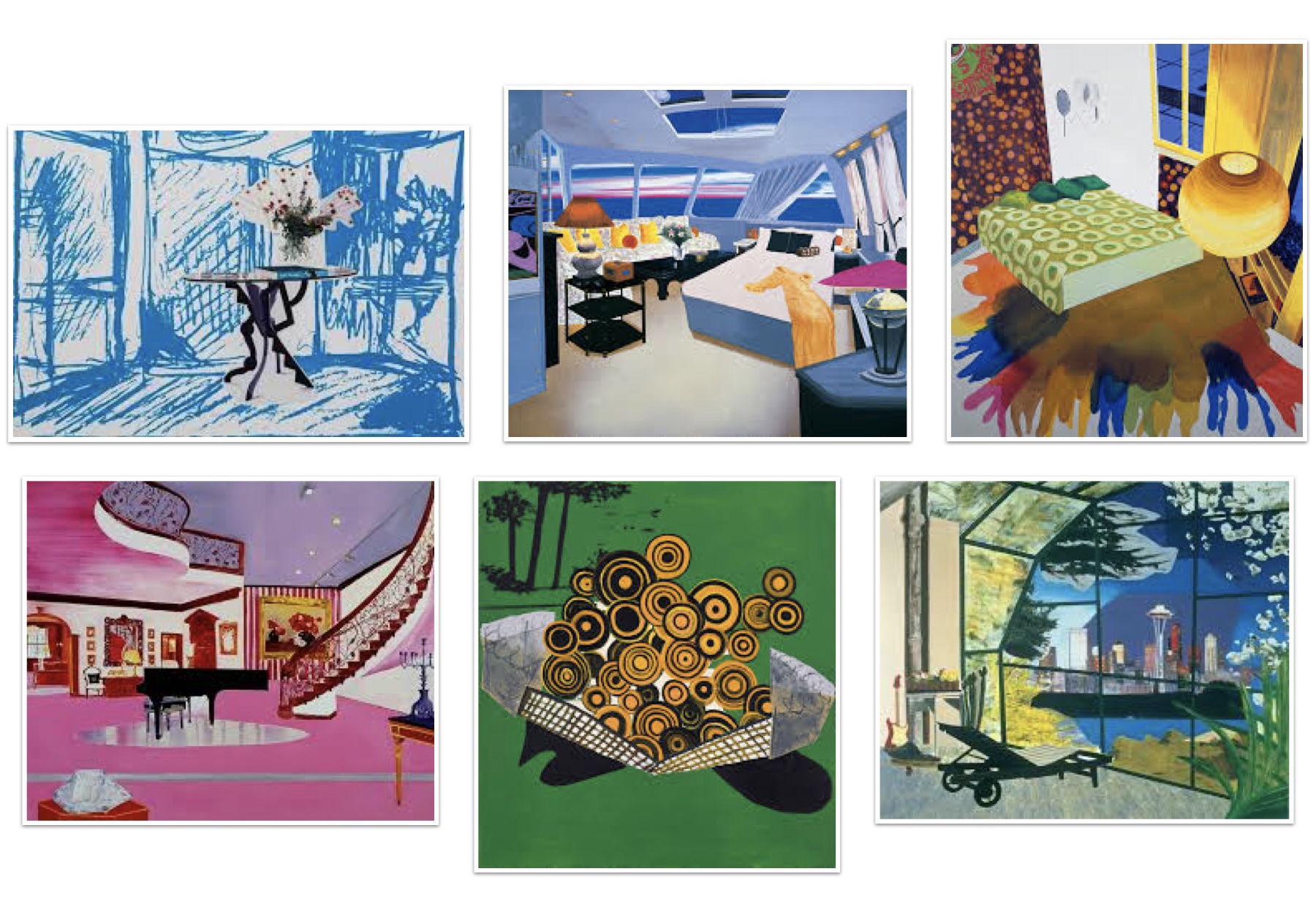
Dexter Dalwood is a British artist whose works presents narratives of pop culture, politics and art history. In the images of Dalwoods works I’ve gathered they are mostly of interiors, feeling slightly distorted, and rather collage like. The use of mixed media in his works are stunning, compiling so many different ideas and techniques in such a cohesive composition.
Kate Smalls works
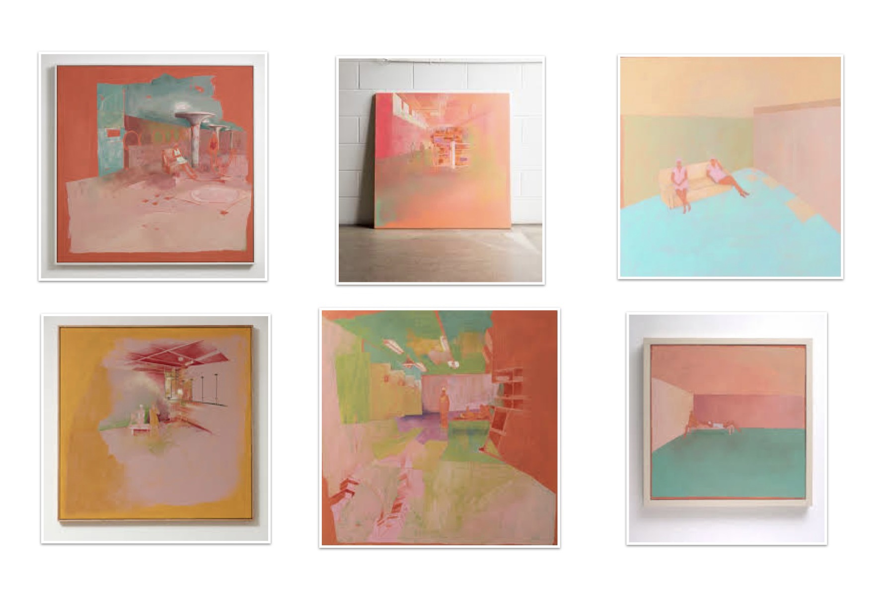
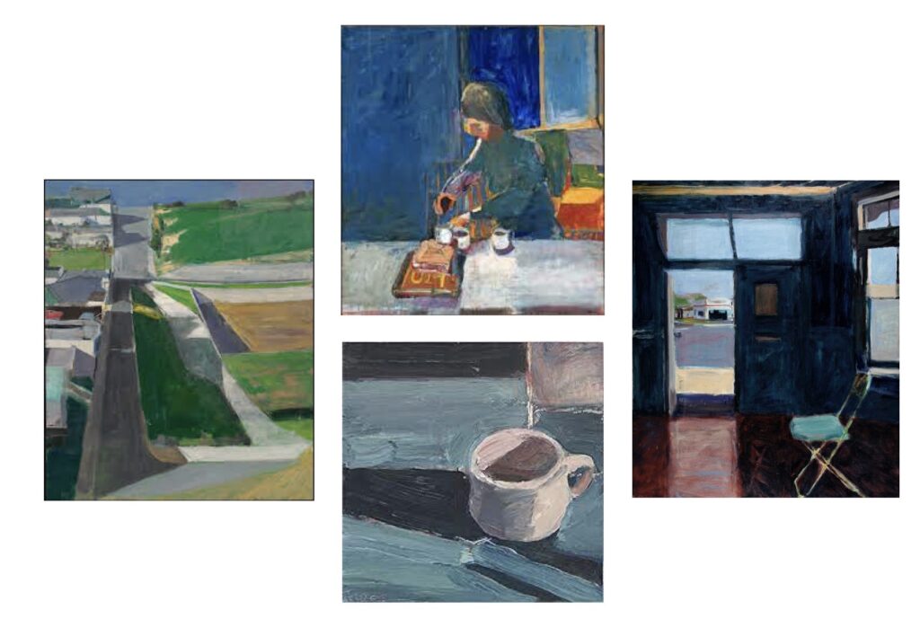
Kate Small is a New Zealand Postwar and Contemporary artist. At an initial glance over her works a common theme that I feel resonates with the style and vibe I’d like to portray amongst my works is her choice of colour palette. Kates use of Pastel colours gives for a soft and cozy vibe, even though the subjects of Kates works tend to be an exposed empty social space that with a different colour palette could appear quite intimidating. Her pieces vary with straight lines and solid colours to then super smooth gradients of colours, presenting us with a very aesthetically pleasing work to admire.
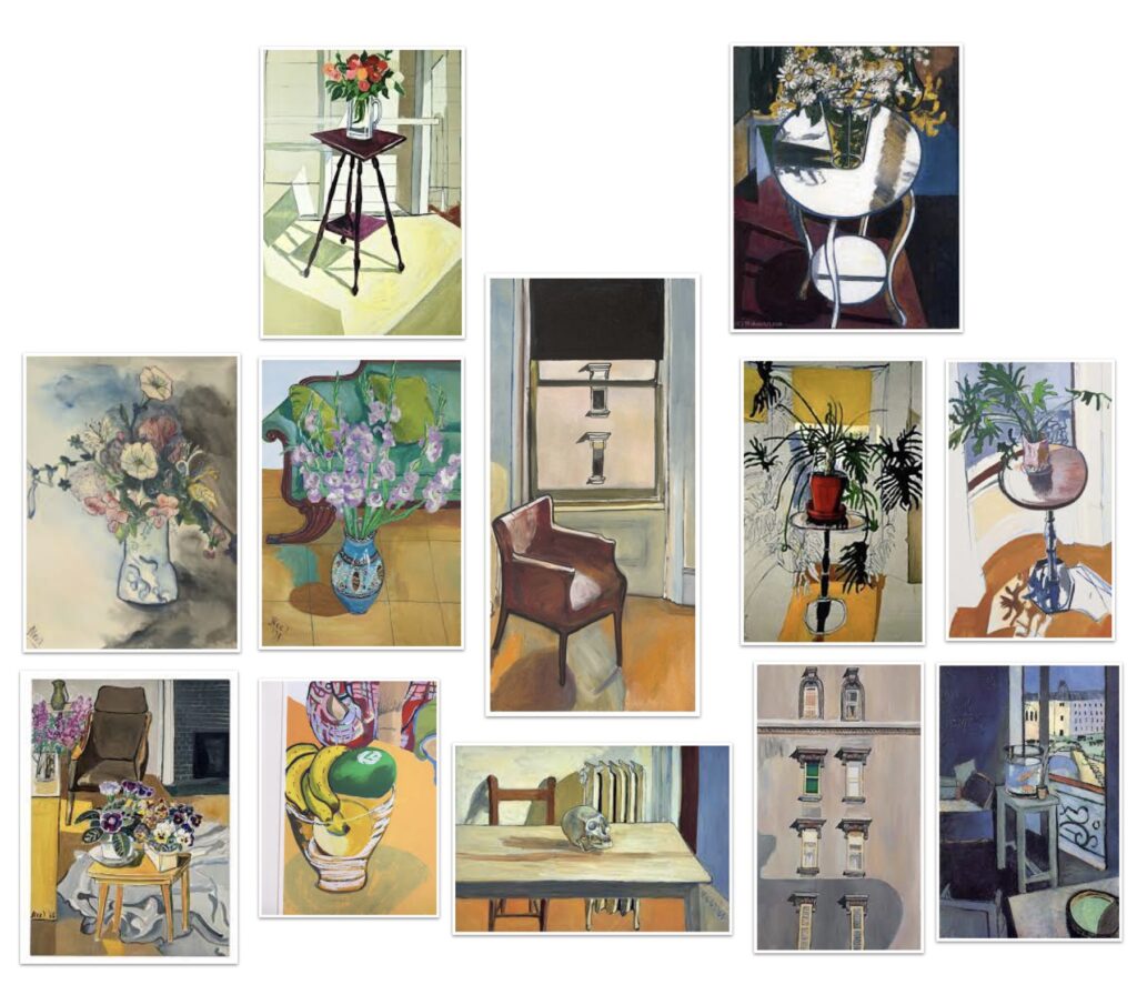
Alice Neel was an American artist whose widely known for her figurative painting portraits depicting anyone from strangers to Whanau and friends an other artists. Neel has a large collection of still life paintings that I admire with inspiration in relation back to my own works for this brief. Neels works that I look at with inspiration mostly include plants. The way Neel has painted the plants and composed them fluidly amongst the rest of the composition was something I wanted to keep in mind for any greenery in my pieces.
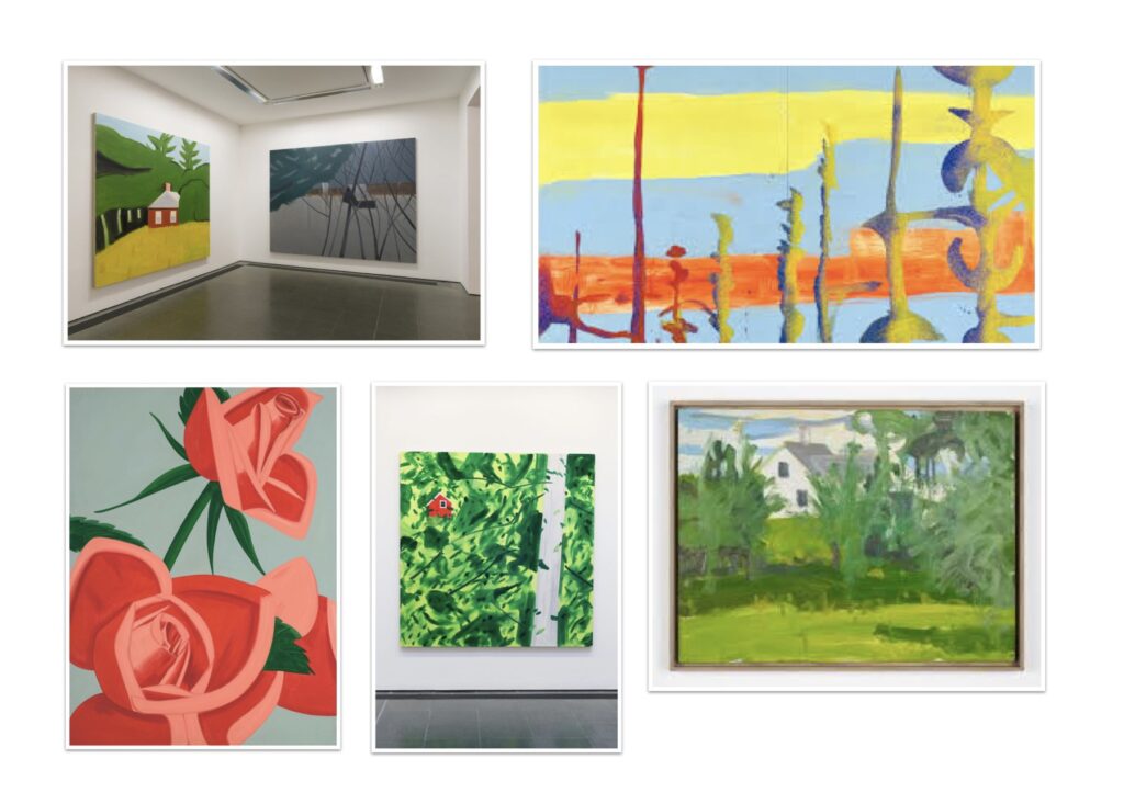
Alex Katz is an American artist widely known for his paintings sculptures and prints primarily working with reference from life. In reflection to the brief I be looking at his well-known paintings depicting the American setting and landscape. Once again a theme of colours throughout a section of works creates for a vibe depicted by the artist. The use of flat vibrant colours reflects pop art culture.
Richard Diebenkorn is an American painter and printmaker. With the use of oil and acrylic paint Richard created layered, gestural paintings that took reference from American landscapes and settings much like Alex Katz but in an entirely different direction where Richards colour on the piece tends to be less saturated with colour and depict loose thick gestural brushstrokes.
Richards art style over time fluctuated between first abstract then figurative and then abstract paintings once again. This being he worked simple and slowly depicted with more detail. In reflection to my work and this brief I am aiming to work simple first and then build on, layering my work.
This week we are expanding pushing on ideas we have generated last week. Working forward with concepts from the pervious work we were to get a flowing momentum of art creating in this cycle. I found struggle with keeping the core focus on the process of medium application and mark making and consistently caught myself drifting my focus to the aesthetics of the piece I was working on. I came out of this week much more confident with how I would continue with this brief as this week challenged my usual thought process when making these works. It was something I quite enjoyed and brought me back to the ease and content fullness of art creating.
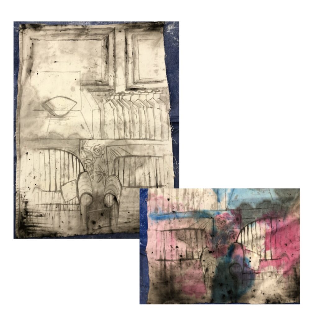
With the above experimentation I want to play with the concept look of watercolour paints but with a curtain as my canvas. The making of the black base layout came from lightly sketching with watered down black paint and then dipping the edges of the curtain into a tub of watered down black paint, this allowed me to create a depth within the black layout. Once the edges were soaked I created the further depth by pushing and pulling the water around the curtain, soaking it into more areas. Once the black had dried I repeated the process of pushing and pulling paint water around with coloured paint, instead of dipping the curtain this time I poured the watered down paint onto an area and proceeded to push and pull paint water again. I loved the outcome I definitely achieved the look of a water colour piece through the processes I used.
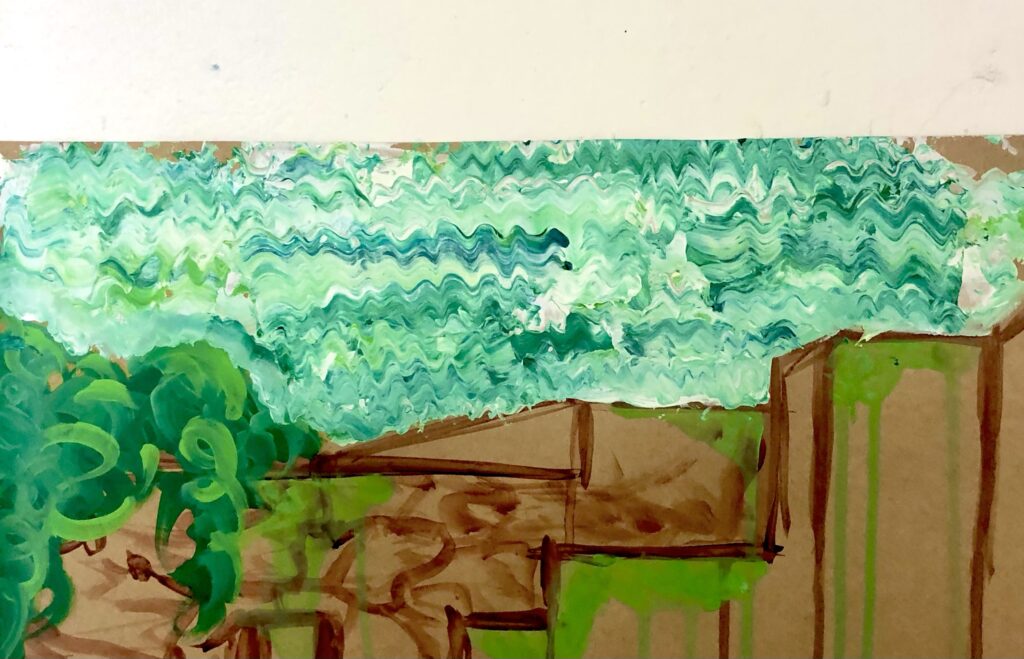
Using my technique from a previous piece of work where I made squiggly lines out of paint I gave this a go again though as a textured more conceptual sky. I liked the look, I will be continuing to use this technique though out my experimentations as it adds for a hybrid of controlled yet randomised paint application.
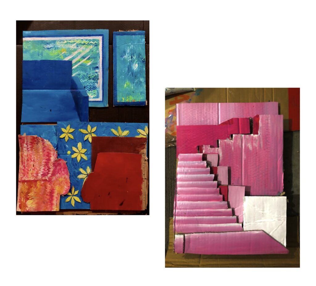
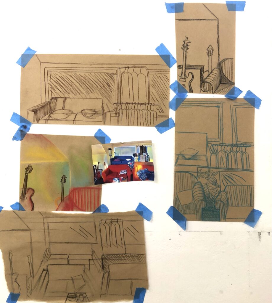
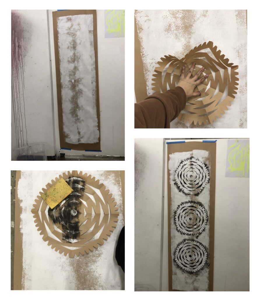
As we adjusted into lockdown the tools I had available were very limited though what I will say is that there is an abundance of cardboard! Rattling my brain I wanted to push my concept further, pondering with how I could use the cardboard to its fullest potential with me. I started this experimentation with the image on the left above. I decided I wanted to make each foreground really dramatic, through cutting out and piecing together the different areas from the reference I was using. Using my technique for the squiggly lines I applied this to one of the couches and the windows. I admire how this tuned out though I felt as if the red and blue didn’t fit right together, appeared as if it was almost clashing I feel as if a change of colour palette would make a significant difference.
The image on the right is my further experimentation of this concept. I find having the foregrounds seperate and layering these creates a nice look such as a pop up book or something similar. I used a different reference image for this new experimentation as I felt it would be best suited to the technique I was using and would achieve the result I’m after. Using a monotone colour palette this time instead of using colours from the reference imaged helped to create a nice refreshing piece, I feel as if it flows and pushes with the concept of dramatic foregrounds I would love to experiment on this further and see where I could take it.
This week the focus was on combing ideas and works from week 1 and 2 and reworking them to create new works. Playing with processes and materials from week one that we thought were successful in relation to our works. A big concept I need to keep in mind moving forward from this week is to concentrate my focus on the process and application of mediums etc rather than trying to have a pretty picture outcome.
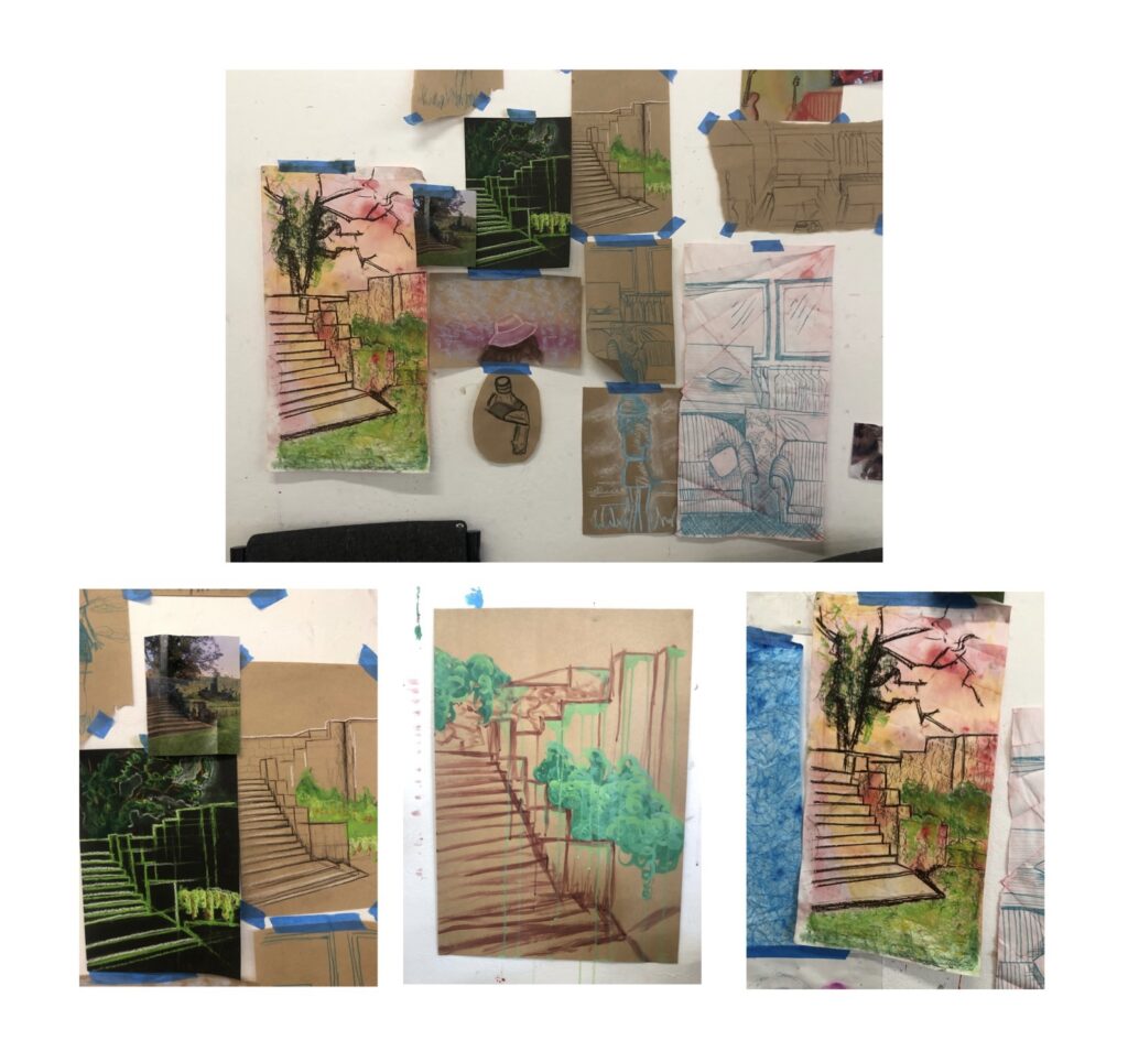
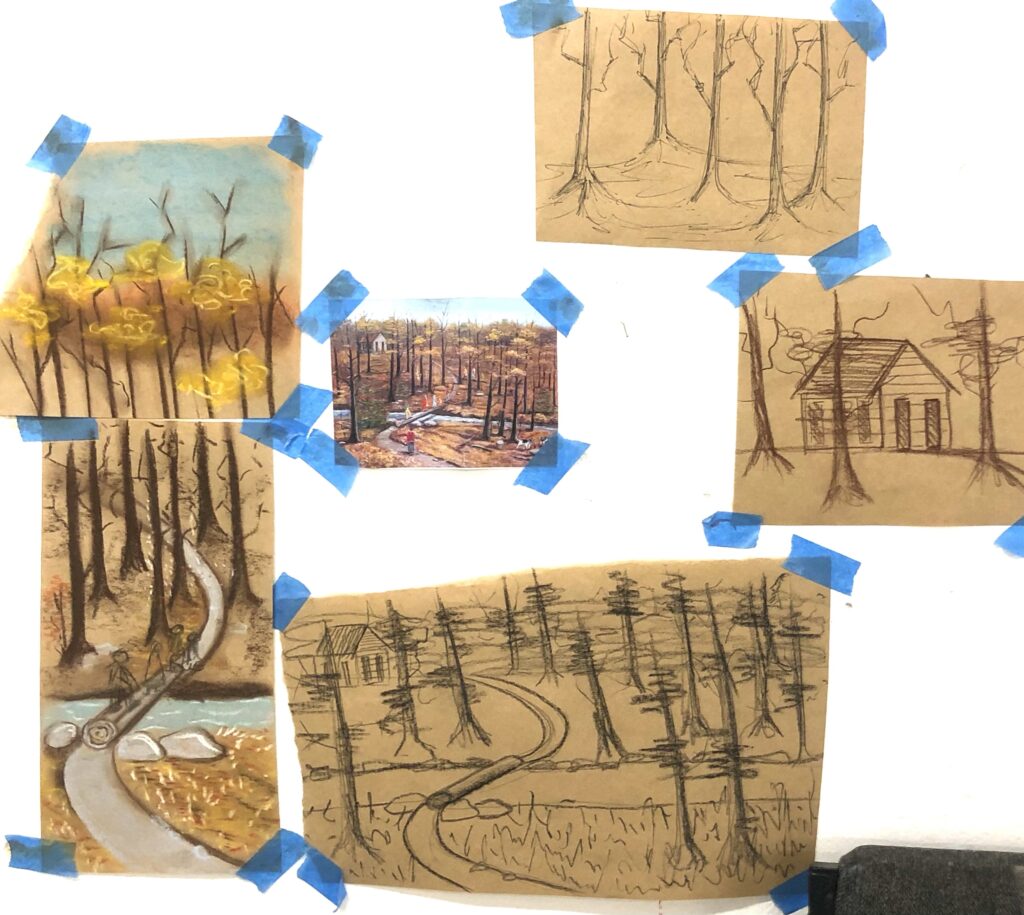
Before diving deep into this weeks new work and brief focus I wanted to expand my bodies of work with a new reference image of an exterior staircase at one tree hill. I wanted a different reference to work from as my others besides the interior with couches wasn’t giving me motivation to create bodies of works from
I loved the new ideas and works that came from this reference. It will definitely be one that I continue with throughout this brief.
The bodies of work from this reference picture of the interior with couches I decided to play with and develop on as I found the image and its contents really fascinating. Many ideas were able to stem from this reference. I liked the idea of add, subtract, rearrange, rotate etc, so by combing bodies of works and doing these processes I was able to place tracing paper on top and result in a base work that I found quite fascinating.
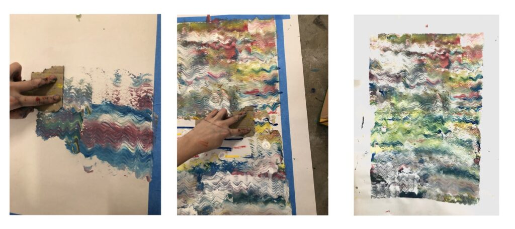
The body of work with the pink couches stems from the first image where a palette knife was used to create the colourful background with the squiggly lines. In attempts to reduce the clear lines depicting the image I wanted to play and push further with just colour and use of a palette knife. From this experiment came the images with pink couches. I thoroughly loved the results of the pink and yellow chair, to achieve a clear depiction of the squiggly lines a lot more paint would be of use as I found my palette knife scraping the cardboard underneath often.
Practicing with more paint and the palette knife I used this process on the sky on a body of work with the exterior stair case. Was very successful! Moving forward anytime I use this process excess paint will be used to be able to execute my visions to reality.
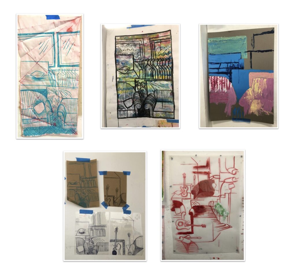
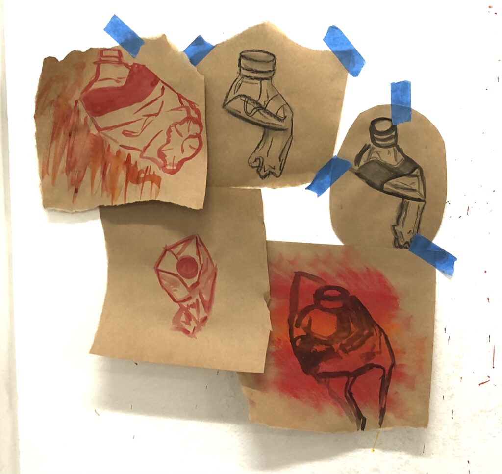
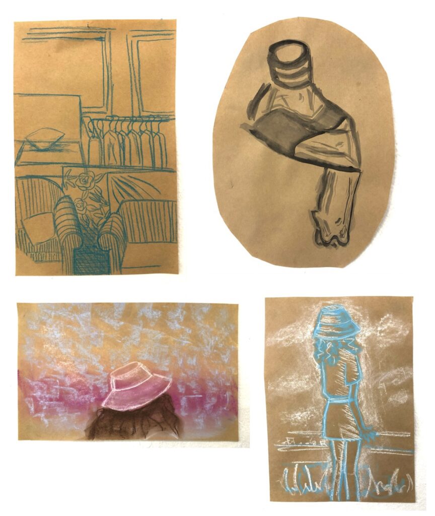
From using my existing knowledge of drawing processes we were tasked to use 6 different images to work from. By reducing, and conceptually breaking them down through drawing processes and experimentations. The idea is to analyse the visual properties, using both a figurative and abstract approach.
The 6 different images we had to work from were, an image with people, an image without people, a painting from prior 1900, screen-grab from a film and a piece of trash.
A photo with peopleA photo without peopleScreengrab from a filmA piece of trash/rubbishA printed fabricA painting from prior 1900’s
I loved experimenting with these drawings and being able to approach making works without the key result being a work that is aesthetically pleasing. It allowed me to shift my perception and immerse myself wholeheartedly into the creating of these quick drawings. I found myself getting caught up in each drawing for a bit too long, so by setting a timer I had a a timeframe I could execute or experiment with the process I was about to do. I was able to make many more works through this process as well as push my thinking a bit further with HOW I would attempt the next drawing or the next or the next.
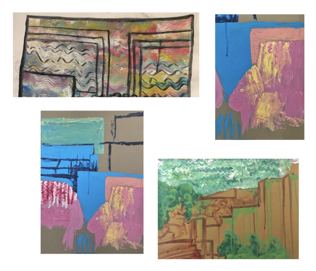
Drawings I found interesting and wanted to expand on
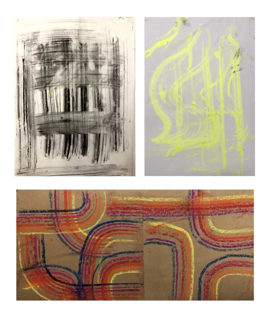
The above 4 images are ones that I found interesting and appealing, the top left image I found the linear vertical lines composed with a portrait paper made for an effective aesthetically pleasing look. The second image Ill take from the techniques, I had a paintbrush that was quite warped which gave the random little lines throughout the bottle, taking away my control yet providing an effective technique. The last two drawings come from the same prompt, and I loved playing with the layering of pastel colours. Moving forward I want to push forward these small things that have created a uniqueness to each piece.
This week we are beginning a brief of our chosen options, mine being paint/print. Our task for this week requires a hefty amount of experimentation and not giving a damn about the aesthetic outcome of the experimentation. Prompts for this were brainstorming different verbs that could apply to the application of paint and other mediums. This process takes away the full control over the experimental works, pushing us to use new and different thought processes when approaching creating art works.
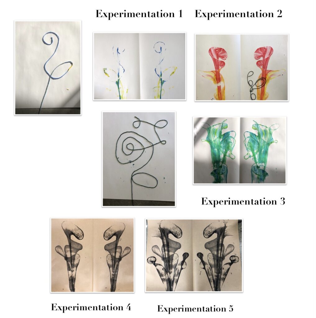
My first experimentations are shown above. Using string coated in paint I layed and twisted the string on a piece of paper, folding the paper in half covering the string entirely I then applied pressure to all the paper and pulled the string out the bottom creating this really cool pattern effect. My first experiment of this didn’t turn out too good as the paint didn’t sit on the paper and just came out with the string. Moving forward I soaked the string in water, allowing for more saturation/application of the paint onto the paper. This worked perfect!
I then moved on playing with different colours and ways to lay the string, the results from this reminded me of abstract lily flowers. So sweet be random! Without intention I resulted in a really cool piece of work. I wanted to push this technique forward so using different paper and blank paint as opposed to coloured I tried this one more time. The result was stunning and reflected to me what an X-ray vision on plants would look like, the brown paper really added to the overall result of this. The 5th experimentation I proceeded to build on top of experimentation 4, I thought it looked gorgeous with the additions of more string paint structures.
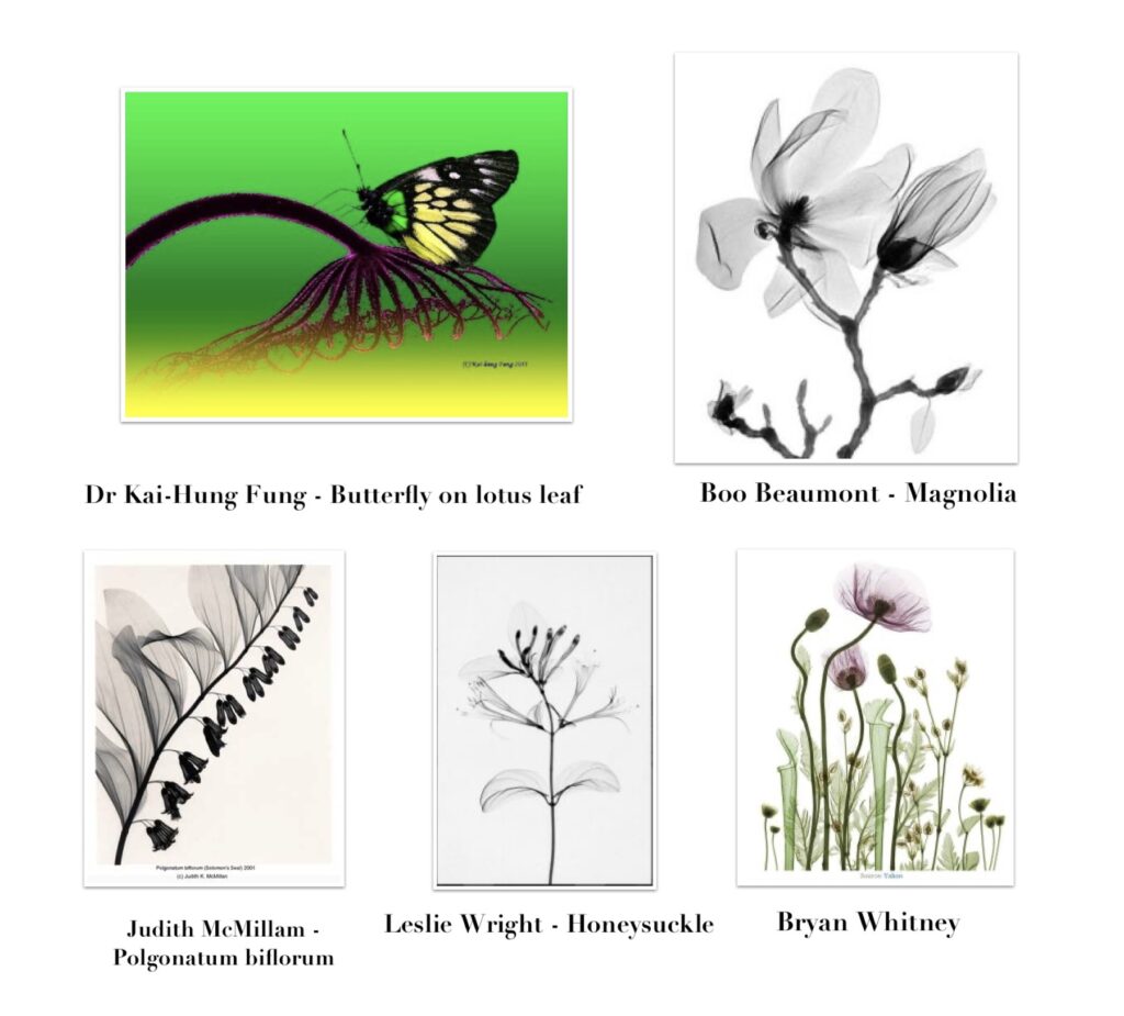
There are a few Artists I have found whose works look at X-rays of flowers and plants, these artists are most commonly photographers. https://xraypics.wordpress.com/history-of-x-ray-art-and-artists/
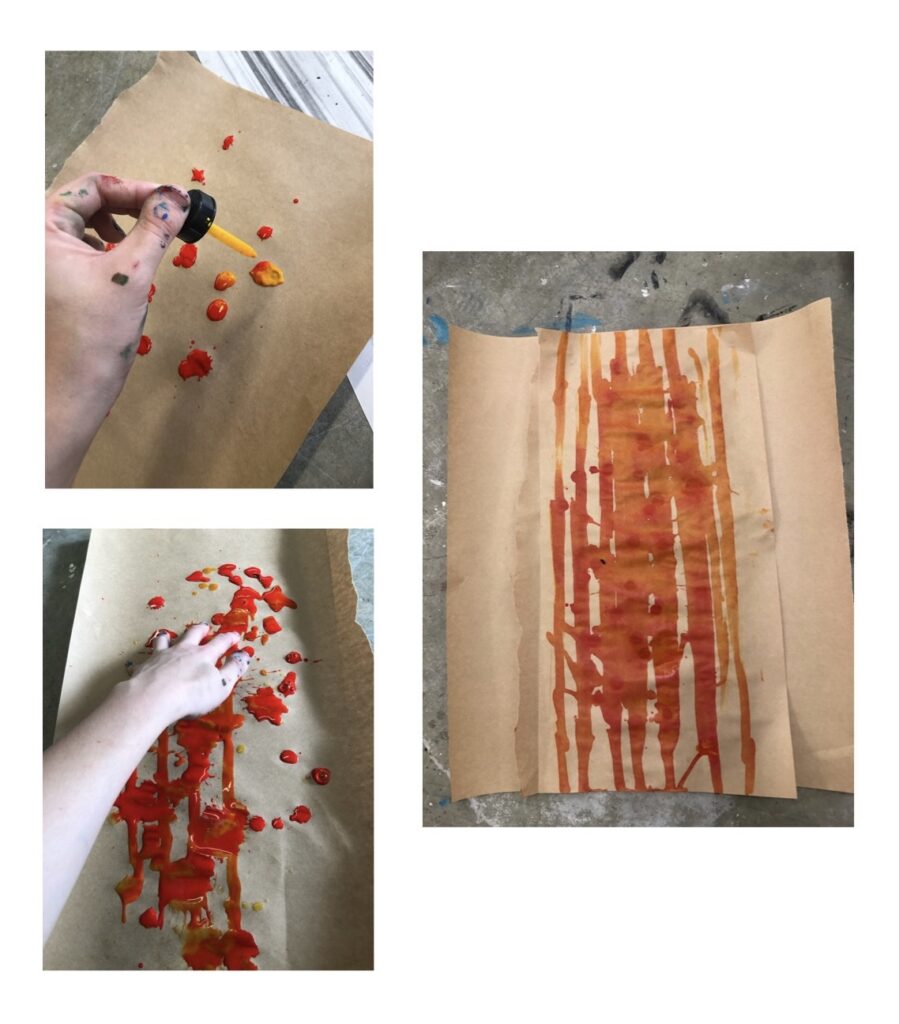
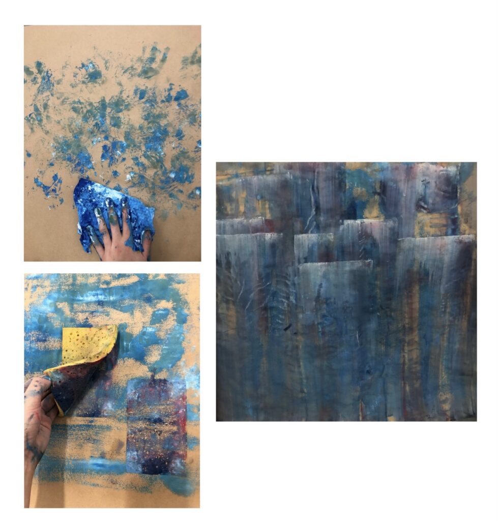
Artists in relation to this experimentation Prompts for this experimentation came from the verbs ‘roll’ ‘soak’ ‘squish’ and ‘cut’.Using a paint roller, I rolled house paint onto a large strip of brown paper. Use of a paint roller allowed for a quick random application, I then cut out a circle with patterns so I had something to “trace” but with paint, using a sponge and soaking it with black paint i could give the black and white paint the same texture once applied to the paper. I have found fabrics such as Doilies that I could use and/or look at for further experimentations, minimising my control on these works a much as possible.Colour! Squiggly lines! For this experimentation I used the verb ‘drag’ as my prompt, randomly dragging different tubes of paint onto the paper I got a nice mixture across the paper. I proceeded to used a piece of cardboard to drag the paint across the paper moving it up and down to create the squiggles. I found it really fascinating because I unintentionally created a texture on the paint from the corrugation in the cardboard I thought that was a cool extra technique I could expand on.Using a different medium as opposed to acrylic paint I used acrylic ink that came in a bottle with a dropper. I was able to drop small amounts of the ink all over the paper and then use my fingers to drag the paint across the page, creating smooth fluid lines across the page. I loved the use of acrylic ink as opposed to acrylic paint as I soaks into the paper much easier. For this experiment my verbs were, ‘soak’, ‘drag’ and ‘dab’. For these small experimentations my verbs were push and pull. The first image is made from crushing charcoal sticks into smaller pieces, randomly putting it on the paper and proceeding to push and pull along with my fingers. This process was also the same as the second image, instead with that I used a different medium which was a highlighter crayon.
I loved the random streaks amongst the first two works so in a third attempt i wanted to add multiple colours. Using pastels I lined them up in rainbow order and once again with the same process I push and pulled the pastels across the page though this was in a more controlled manner. If I was to experiment with this idea again I wouldn’t use as much control and just go for it, allowing the lines to be messy and more random.
In todays class me and Josh decided to improve on my Spinning Fan by creating a cage around it to stop the paint from going everywhere and making my machine more accessible and enjoyable to use. This was an improvement from my first prototype as I was completely covered in paint after the first 2 attempts at my machine, but now it is more friendly and you can stay clean. I also made a wooden plank that replicated the frame sitting on the fan that allows people to attach their own piece of paper to the board and create their own art on my machine during our interactive presentation. (Both Examples Shown Below)
I then ran through an example piece to see if it was successful and I believe it went well and is ready to add into our presentation on Thursday.
Joshs work:
The first two weeks back in studio were an introduction to art machines. The term art machine covers a very wide variety of things depending on your definition of a ‘machine’. For the purpose of the brief an art machine was somewhat defined, as the interaction of an artist and some object or contraption.
Our group did a few individual experiments to get ideas. I wrote down a few ideas but decided to go with building trebuchets, a siege weapon from the medieval era. I wanted to do this because trebuchets are cool, but also using a war machine as a method to create art was an interesting juxtaposition.
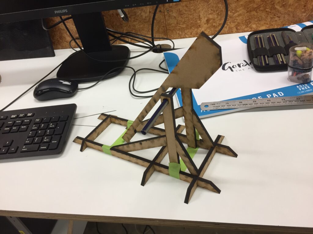
I then got to work designing my trebuchet. I started with a drawing to map out the shape, size and features. After that, I took my design down to the 3d labs to create a file so I could lasercut my trebuchet.
This was the first lasercut of the plan. It was a test to see how it worked and what I needed to change/fix.
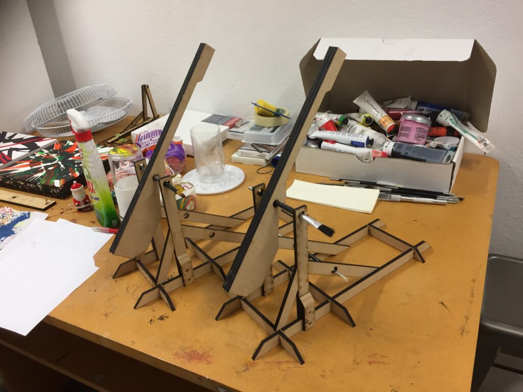
After adding some parts to the plan and tweaking others, they were scaled up and lasercut again.
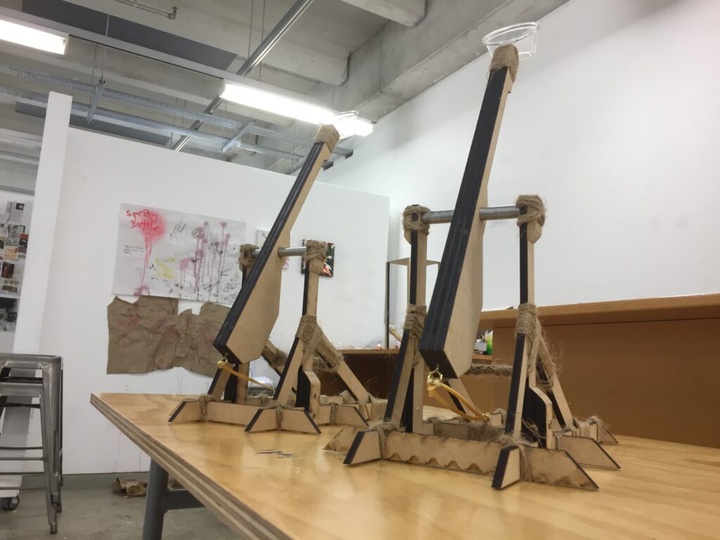
The finished trebuchets.
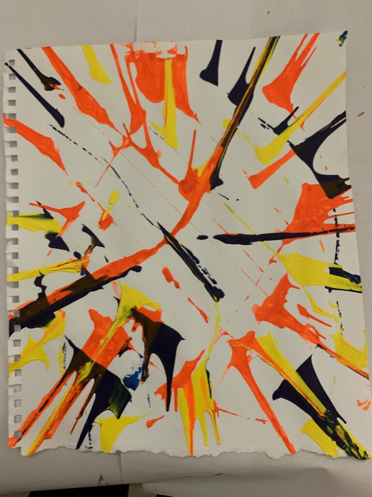
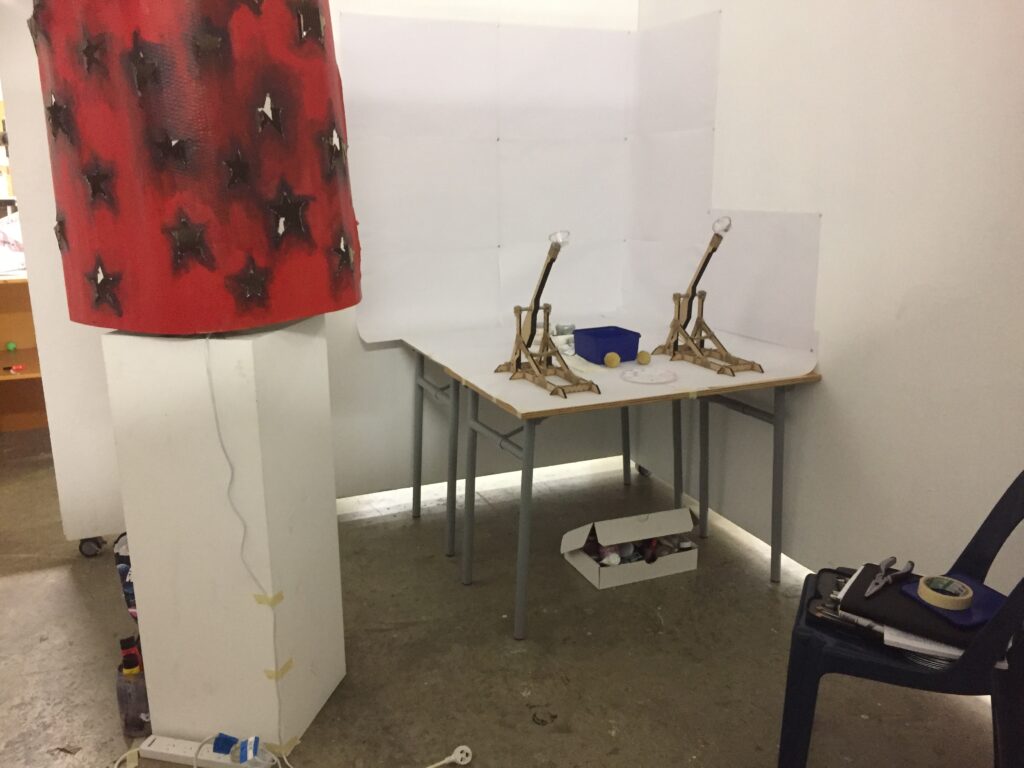
How I set them up to use in our group space. I made some sponge balls so that you could soak them in paint and fling them at paper or a canvas.
In an article from understandinguncertainty.org, The author writes about artists using randomness in their art.
Cage at Kettles Yard
One of the artists, John Cage, speaks about whys he uses randomness in his art: “I use chance operations instead of operating according to my likes and dislikes”
“The Kettles Yard exhibition featured wonderful film of assistants reading computer-generated random numbers off a list which determined which of a row of stones were to be chosen, which brush to use, and the position of the stone on the paper; Cage finally paints around the stone, stands back and announces the results as ‘beautiful’.”
“Gerhard Richter’s “4900 Colours: Version II”. This is based on 196 panels each comprising a 5 x 5 square. A computer program assigned a colour to each square drawn at random from a palette of 25 colours. The 196 panels can be put together to form one huge display, or in the Serpentine exhibition were arranged at random in sets of four to form 49 10x 10 displays.”
It’s interesting how art made using randomness can look so deliberate. We are hoping that we can emulate this experience in our exhibition.
We also found some great quotes In David Kirsh’s paper “The importance of chance and interactivity in creativity” speaking about this subject.
“Chance has a privileged role in creativity. It can be used to thwart bias, overcome the drive to imitate past solutions, and stimulate new ideas”
“Creative thinking, whether in science, art or sensemaking, is not something that occurs solely in the head — the internalist view. In most cases, creativity depends on an interactive cycle of working with artifacts, reacting to interim changes in the environment and then interacting again.”
“Creativity does not happen in a situational vacuum”
“The power of chance lies in its departure from tradition. It releases us from predetermined ideas about the good that constrain our vision of the possible. Too often predictions about what will be a good idea are unreliable”
Reflection
After individually experimenting with our own art machine ideas, we have spent the week talking about how we can collaborate and connect our ideas. We decided on the idea of an art factory, where viewers can try some of our art machines to create their own art.
The main ideas of our exhibition are art processes with unknown outcomes and environments that confront us with new ideas. Our installation is interactive to inspire the viewer to challenge their preconceived ideas about art making and outcomes.
Our goal was to create an experience of thought and experiment. We invite the viewer to let go of rigid ways of art making and let chance decide the outcome. It was important to us that the result of the viewer’s interaction with our work would be mostly random and out of their control, that they relinquish the control we often try have over our art process.
They first enter our art factory to see a dimly lit room illuminated by a large red lantern. It gives off a childish, dreamlike atmosphere. This sets the mood and helps the viewers/participants see the space as a place of play. They are then presented with paper and paints to use on the various machine
Machine 1
Machine 2
Machine 3
The overall experience is supposed to be fun and unexpected, similar to the way a child interacts with art making. Looking at art more childishly can be a great way to generate new ideas.
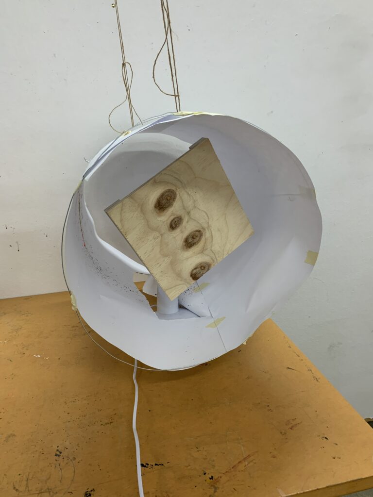
After thorough brainstorming of ideas, materials, and artists I immediately knew I wanted to include light in my machine in some form. As a kid I adored observatories, especially the rooms that were transformed through light and displayed plants, stars, constellations and space I wanted my work to reflect this. Through artist research I found major inspiration from Yayoi Kusama and Cornelia Parker. These two artists also had specific works that thoroughly impacted my ideas and thought processes these being Parker’s ‘Cold Dark Matter: An Exploded View’ 1991 and Kusamas ‘Infinity Mirrored Room’ 2013. Both of these artworks impact the entire surrounding space, illuminating everything in its presence. Kusamas work gives an eery light feel throughout the piece while Parker’s plays with light and dark, manipulating light to create shadows and highlights. Through research of Parker’s piece and coming to the understand that it plays with the ‘light and dark’ concept sparked the idea of yin and yang with lead to the idea of a Chinese lantern.
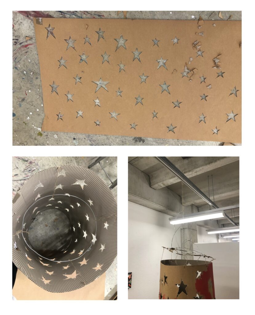
To experiment I used cardboard that was laying around at home, I found this difficult to cut stars out that were crisp and clean. This meant a lovely Gordon Harris trip where I found cardboard that looked much more aesthetically pleasing. Once I started to cut out stars the process was much easier, and I had cleaner cut outs.
Once the stars were cut out I shaped the cardboard into a tube. Using the thickest wire I could find at Gordon Harris I was able to create a make shift mobile which allows the cardboard to spin I found the wire to still be too flimsy so this required a few tries, eventually with input from others in my group we were able to create a functional mobile.
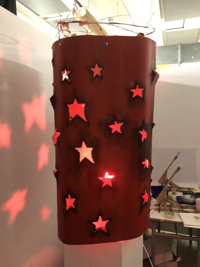
When setting up all the elements together in preparation for open studio I realised there would be another obstacle to overcome, this being the studio lighting negatively impacting the lighting on my machine. We proceeded to make our own secluded space within the studio acting almost as a small room, this allowed us to control the lighting in our space more. This control over the lighting gives the stars more definition and we are provided a more saturated hue from the lamp. Enhancing the mood and energy in our space.
Back in the studio this week! On Tuesday my group came together to discuss ideas, experiments we had created and ways to move forward. We came to the conclusion to create an instillation that relates to the concept of a ‘factory line” this factory line consists of three art machines that will be interactive for the audience alongside my art machine which isn’t interactive but creates a moody energy for the space of the instillation. An interactive instillation allows the audience to create artwork from our instillation that they can take away.
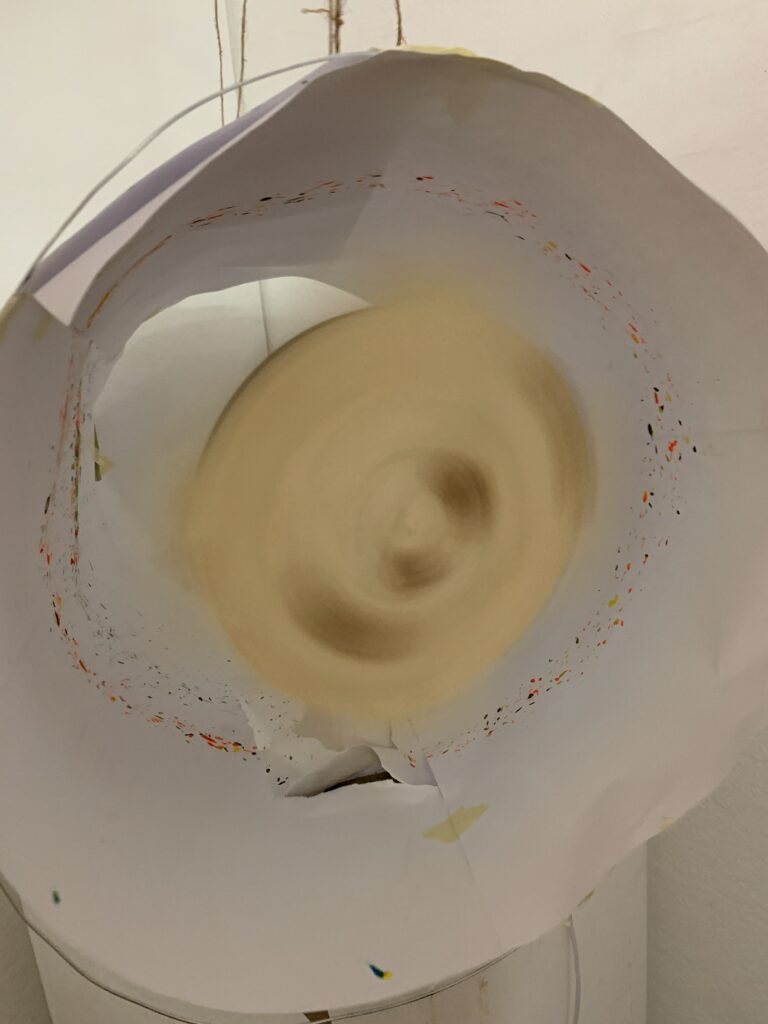
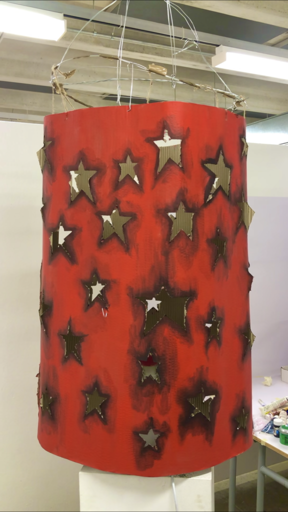
Through elimination of resources and a strict time line, I decided to create a rotating lantern with cut out stars. Inside will be a lamp which projects light through these cut out stars, creating a machine that projects stars on top its surrounding surfaces. I intend to have the lantern spin so that it gives a more life full energy.
To experiment I used cardboard that was laying around at home, I found this difficult to cut stars out that were crisp and clean. This meant a lovely Gordon Harris trip where I found cardboard that looked much more aesthetically pleasing. Once I started to cut out stars the process was much easier, and I had cleaner cut outs. Once the stars were cut out I shaped the cardboard into a tube. Using wire I was able to create a make shift mobile which allows the cardboard to spin.
The first art machine in our factory line is Dices Schrodingers art machine in which the original design of it was to start fires though Dice has altered this to be able to create art as opposed to starting a fire.
The second art machine in our factory line is Bens, Spinning fan machine. He has replaced the fan blades with a canvas which allows the paint to spread out at random to create art pieces.
The third art machine in our factory line is Josh’s trebuchets, they were laser cut from MDF and assembled in the workshop. They fire sponges which can be soaked with paint or ink to create splatter marks.
The fourth art machine in our instillation in my large scaled star lantern which winds up, circulating stars.
I love the idea of an interactive instillation as I find it is the best way for a deeper engagement with your audience and instillation, giving a memorable experience to the audience. Interactive art to me bridges the gap between artists and non-artists, interactive art gives the audience a memory to take away, and in the case of our instillation, a piece of art also.
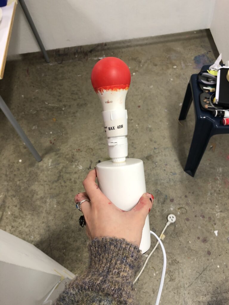
To tie all these ideas together we’ve used colour, this being red. To me the lantern reminds me of a Chinese lantern, use of red enhances this idea. Ive painted the exterior of the lantern red though as I was doing this I had the idea to why not have the lamp illuminate a red glow instead of a soft yellow. Using paint on the bulb I was able to achieve this.
Lamp with painted LED lightbulbMy art machine after paint being appliedLantern installed with light Lantern art machine in motionFinal display