Week 2: Reflection on film images

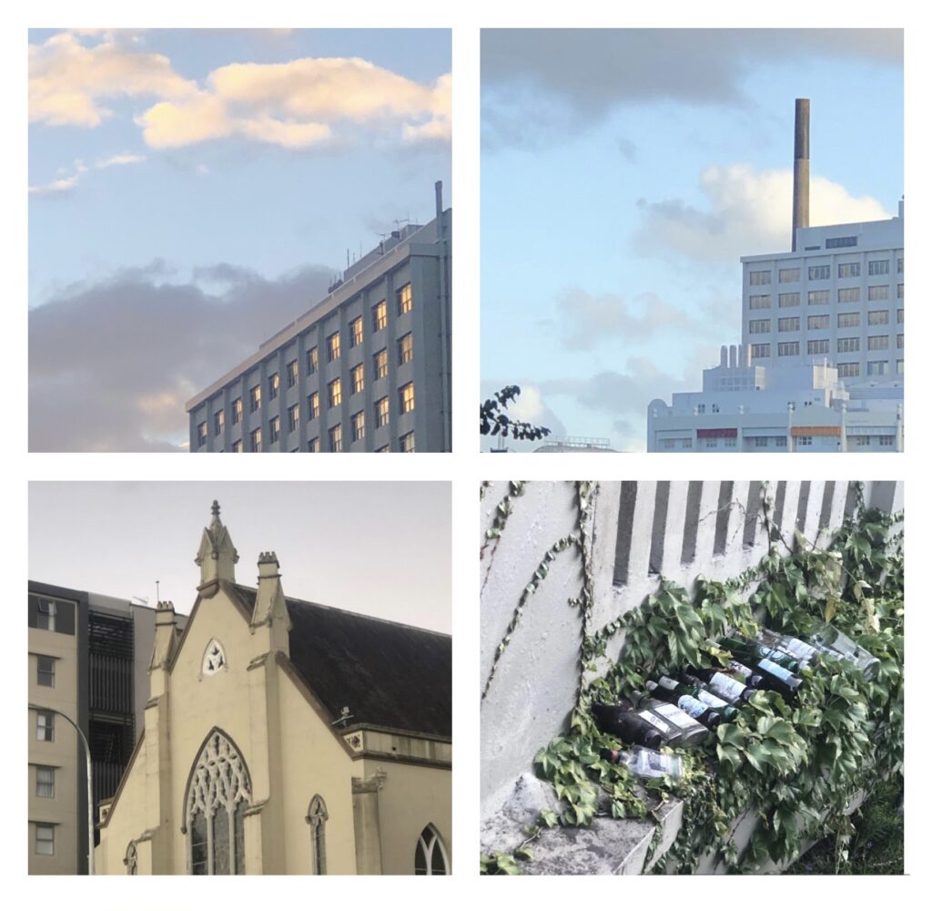
While walking Karangahape Road and taking photos in response to my current works with a film camera. I decided out of curiosity to take the photos on my phone to compare differences in lighting, contrast, exposure and the impact colour has in relation to the energy and emotion in a photograph. After analysing key differences between photos, the interpretation of an image is heavily dependant on aspects such as exposure, colour/ black and white, contrast, saturation, camera angle, foreground etc. These aspects intertwine together when breaking down and analysing photos.

iPhone 8+ in comparison to Film

In this example there are major differences at a first glance, this presents an instant difference between the resources used to capture these images. The first image shows a vibrant green light that shines through stained glass windows of a nearby building, this light then draws your eyes to the door in the very centre of the setting. The door being the darkest area of the image, shows contrast and creates a resting place for the eye on the image. The green lighting and door being the centre ideation of this photo, together gives a less intimidating presence; creating curiosity for what you might enter into. Amongst this image we notice small details, giving a concise energy to the viewer alongside; details such as moss, aged bars on windows, rust and tagging embeds the idea that this area has been neglected. Overall this image is captivating and welcomes curiosity.

The second image has a lower contrast, already changing perspective it gives to the viewer as opposed to the first photo; feeling much softer and less harsh. Using a film camera removes colour and smaller details in the photo, opening the mind to deeper thinking of the few details present. Upon viewing this image your attention is drawn to the lighting in the top centre, looking as if its almost glowing, illuminating another area of Karangahape road. Thoughts around this lighting originate a theme of a lively setting. These analysations lead your thoughts to question ‘what time is this photo taken’? In addition to ‘what is happening in the surroundings’? The open door being a key subject matter in the first photo is perceived in an alternate way in the film version; alongside the lighting above it, gives the idea that this building is occupied, though the open door leads to a dark room, having us question ‘what is beyond the door’? ‘Who is beyond the door’? Why is it so dark’. Green lighting within the first photo softened the intimidating and foreboding sense within the image, whereas the film version has no aspects to soften this idea. Use of a disposable film camera has provided an effective outcome, giving insight to how various resources effect the final result. Having taken away small details we are given a the opportunity to broaden our mindset on how to perceive this image.

iPhone 8+ in comparison to Film

When observing these two photos together, major differences aren’t present, though upon breaking it down there are small details giving seperate narratives and themes to both. The green paint is the first key aspect that is noticed and gives the image a base theme to build on. Combination of clearly aged green paint, tagging and words ‘Artspace Studio’, create a narrative that this image is captured in the setting of a creative area, feeling immensely casual and relaxed. The low contrast and high vibrancy of colour in this image assists in the idea of this photo being casual and relaxed. There isn’t a large amount of foreground, giving use little context to the surroundings, once again, allowing our mind to have more creative freedom when establishing our own personal narrative towards this image.

The first notable difference in the second image is that is it black and white, this takes away the from the aged green paint and the narrative that stemmed from this. The film image in comparison the the colour image has more foreground within the image, we’ve allowed for more of an entrance way. The low contrast softens the feeling of the image, there is no harsh black or white in the image aside from the entrance sign. The solid white on entrance sign emphasises my concepts and themes I’m exploring within this brief, alongside the extra foreground we find this image to focus on the action of entering unlike the other photo, theres less curiosity in discovering what’s beyond the door. The word ,Artspace, and tagging does encourage my previous concept in the colour image, that this photo is taken in a creative setting. The tagging when noticed in detail, has a rough circle around the door knob, pushing our curiosity to what is behind the door. The tagging when noticed in detail, has a rough circle around the door knob, pushing our curiosity and interest to, what is behind the door?

iPhone 8+ in comparison to film

Analysing the first image we notice stairs leading to a door. Two different sections in this image are recognised, the plain concrete wall with the door and the brick wall below. This image appears quite simple, though is cluttered with texture, tagging and rust, giving character and creating a unique feel for the image. Once again it appears to be in a neglected setting and quite run down, we sense there is some history to this setting, we can recognise this through the small details of rust, tagging and the condition of the building.

The film image at a first glance in comparison to the first image, more foreground is apparent, giving more narrative when reflecting back on the image. This image is viewed more on an angle, as if you are standing there yourself, alongside with the car and empty crates the image feels less neglected and empty. The low contrast with the photo taken from further back I find this image to be more interesting and appealing to the eye as there’s more opportunity for context and ideas to be taken from the image. A centre focus on this image in the door at the top of the stairs, the difference in the walls in relation to the door creates this centre focus as there’s no details in the top half of the image. Leading a natural curiosity as to what is to be discovered beyond the door.

There images specifically give a great example as to why I took two versions of each image, there are many aspects that affect a narrative and theme of an image. I found the film image to appear as a development of the colour image, pushing my ideas and concepts further, allowing to for an easier break down and analysation.
Week Two: Experimentation

While walking Karangahape road on my prompt from last week I stumbled upon a Photo Store that was packed with film cameras and more specifically disposable cameras. Throughout Artist research my interest was taken akin to photograms and double exposure photos; I found this could potentially lead towards other experimentations.

ILFORD XP2 Super 400 B&W FILM

I loved experimenting with the various resources in relation to this brief, a new founded interest amongst photography has been discovered as my past experiences with photography have been very restrictive in regards to experimentation and resources.

Experimental film photos taken on Karangahape Road

Week 1: Studio wall current works

Exploring with the juxtaposition of the images I discovered a stronger or weaker narrative could be depicted from the collection of images I currently have. Playing with colour and black & white I found could encourage various ideas and concepts majorly

B & W Images from Karangahape Road walk (city walk, home walk) and Grafton Starship hospital area (Unfamiliar walk)
Colour/ B & W Images from Karangahape Road walk (city walk, home walk) and Grafton Starship hospital area (Unfamiliar walk)

Week One: Discover, Uncover, Recover

Walk, explore and photograph subject matter in an unfamiliar area. The prompt of this exercise made me eager to get onto it as since moving to a new LARGE city, there was so much to explore and take interest in. My walk lead me over the Grafton bridge towards Starship Hospital, I admired the photographs I was able to capture just along a prompt walk without rearranging or putting in excessive effort. This prompt exercise assisted in getting my brain turning over for ideas and concepts I would work with moving forward

Part One: Discover, Uncover,Recover

Discovering is to make something visible. Find something new, to unearth, to determine, learn and explore.

A task was given to go for a walk in the city; and in my interpretation, explore, discover the settings. Therefore this is what I did, exploring through an area I had come to know well since moving to Auckland, K Road. I found this road gives me a sense comfort away from home. These aspects were characteristics such a colour, the liveliness, lighting, the clutter that gives a feeling of this place isn’t going to change and is claimed by the characters that fill the streets, clubs, and shops.

In response to this exercise, it allowed me to open my mind and pay attention to detail and to areas around me the I wouldn’t pay attention towards. I was able to find simple subject mater, that could be interpreted in various perspectives.

Art Whakapapa

My Art Whakapapa stems from a lot of different styles and influences, focusing on the key techniques they use throughout their work alongside the purpose. I have only recently in the past year developed a distinct style of work that I can produce confidently and feel that it resonates with me and what my visions are. Visions to reality. Throughout the past year materialising my goals has been something I have struggled with. Within the last twelve months I have utilised inspiration from art influences to progress upon my envisioned creative pathway.

Self confidence is something I find myself struggling with on a regular basis. I have been heavily impacted by the artists included within my Whakapapa as they have had a positive impact, helping me to embrace my intuition for my works.

Jim Dine

Jim Dine is an American contemporary artist. His art practice includes a broad range of mediums, such as painting, drawing, printmaking, sculpture, graphic art, poetry and photography. Dine was involved in various art movements throughout his creative career and was most recognised and thrived during the Pop art movement.

Key techniques and ideas that have resonated with me that I have reflected in my work include his use of negative space, giving it purpose, allowing it to assist in the subject matter and composition. Dine was able to create a unique correlation between his subject in the piece and the negative space surrounding it. Dine’s past works, more specifically his collection of pieces from “The Tool Box” you were able to see Dines focus on having a strong correlation between negative space and the subject matter; having all areas in his pieces assist and encourage the concepts and themes, intertwining them between one another. 

This is an example of how I’ve translated Jim Dine’s concept of negative space within my piece “Party Frog”. 

Dine, Jim, No title, 1973, Lithograph on paper, Britain, Tate

Dine, Jim, A Beautiful Heart, 1996, Etching, Aquatint and power-tool dry pint in colours,

David Hockney

David Hockney is an English artist that is profoundly known for being associated with the pop art movement. Hockney’s work includes a wide range of mediums from painting and printmaking to photography and draftsman work. Hockney’s work is absorbed with a large array of strong and vibrant colours. Drawing attention and more of an appeal to the eye than traditional works. His subject matter was always clear and concise, being able to instantaneously portray the intended mood and emotion within the piece with ease. Audience dependant, Pop Art can be a controversial topic when expanded within its deeper meanings, as it is often described as a genre of art created as a post war expression.

A majority of my influencers in my Art Whakapapa tie back into the art pop movement from the 1960s onwards. During this time within the community there was a large development in how art was perceived, especially in the perspective of street art having an influence and stance within movements and political issues during this time. Art evolved to have greater purpose and impact on daily lives and communities as this movement expanded. 

The Influence of David Hockney’s style, the way Hockney portrays and provokes in his work is present within my own pieces. Usage of a broad wide setting,

Left photo, personal work inspired by David Hockney; photos on right examples of inspiration

Keith Haring

Keith Haring, an influential American Artist and social activist of the Pop Art Movement, was most recognised early on for his illustrative graffiti drawings in New York’s subways and public spaces during the 1980s. Haring’s work portrayed a distinct style, with fluid, bold lines and vibrant colours, giving a rhythmic energy to the works Haring created. Haring’s work early on was created in subways and public spaces; exploring themes and concepts of contemporary social and political events. Haring’s works were vibrant, inclusive of a catchy quote to easier depict to the public what controversial subject he was trying to bring awareness towards.

 My favourite example of this is the Crack is Wack mural, this brought awareness to the crack coke epidemic and its effects on NYC. Haring made his work accessible to the community of NYC as he was then able to interact and gather interest with a diverse audience; not just those already involved within art communities. 

My appreciation for Keith Haring and his influence on myself comes from his eagerness to engage with a diverse community through his artwork, his pure passion is easily identified throughout his rhythmic works, reflecting him as an Artist and Social Activist. Haring gives clear purpose and has a fluid composition within his works, providing a concise reasoning and background of where each piece originates from. 

Auckland Art Gallery Toi O Tamaki

Atapō – Maureen Lander 2020
Key perspectives of Maureen’s work that brought in new concepts and ideas towards my work moving forward.

When approaching this brief, I found the simplicity of it, difficult. Though through exploring artists in relation quite especially the Atapo piece, I came to comprehend the brief easier and was able to approach ideas with more ease.

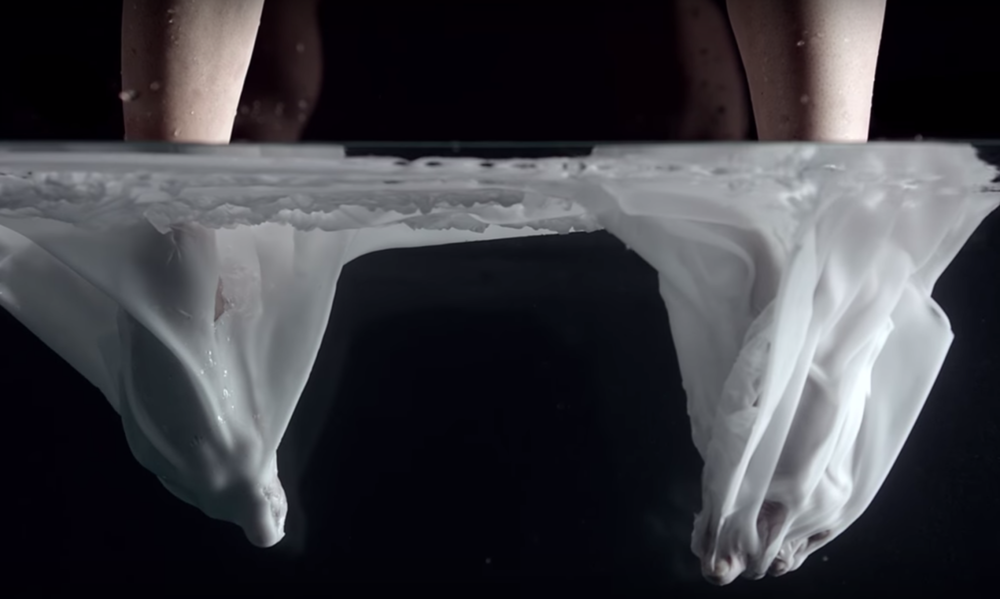
Through breaking down Maureen Lander’s piece “Atapō” I was able to appreciate the different elements that flowed together with ease. Such as the layering of sheets, all similar though each with its own difference Maureen was able to provide different perspectives of her work; dependant on your point of view.

Studio Open day & Reflection

25/03/21 Studio Open day

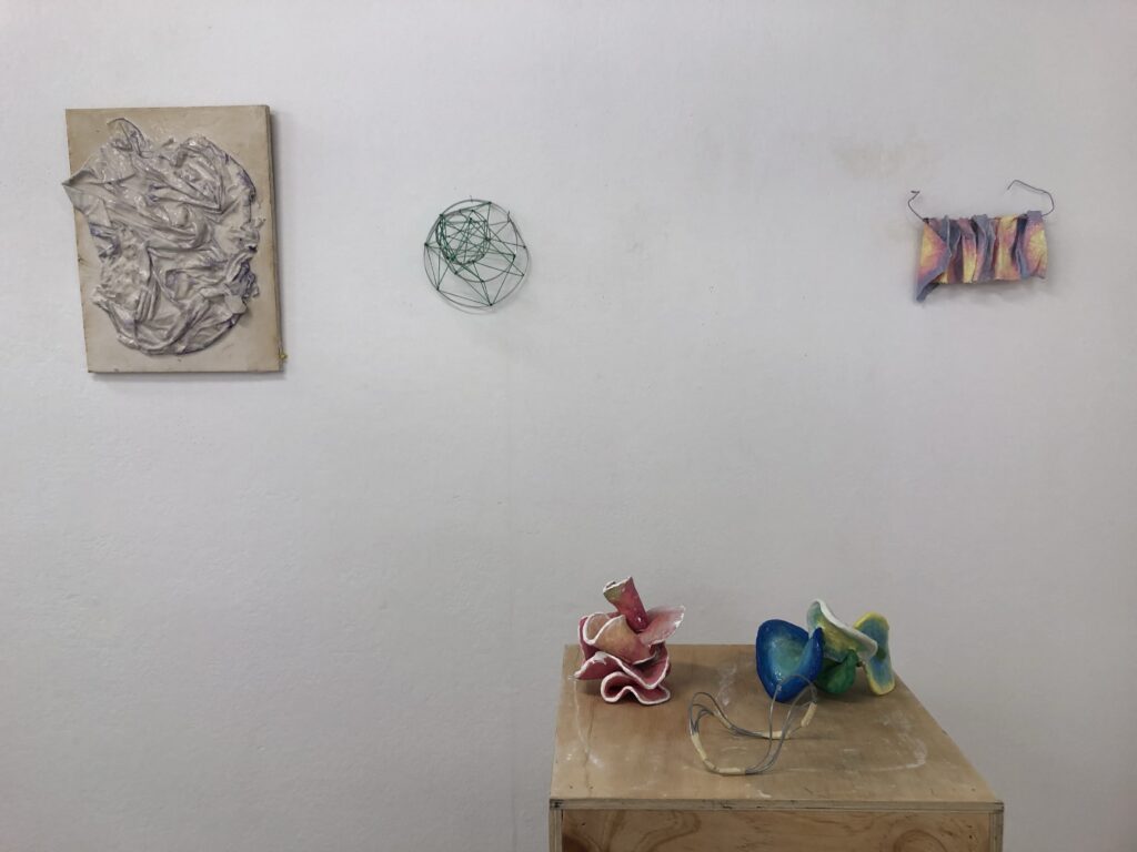
The works I chose to include in the studio open day were pieces that presented core ideas or successful developments that were inclusive of many techniques and focuses.

What aspects of the making processes particularly excited you and why?

Creating work around a brief that is sculpture/ 3D focused was fairly new to me, though forced a new thought processes to occur when creating art work. I was thoroughly excited for the new materials introduced to me such as plaster and wire sculptures alongside the resources available to execute our visions. Keeping in mindfulness of weight, it was fascinating the way each material required to be treated.

How did your work engage with the briefs focus?

My concepts for this brief stemmed from spirituality, more concisely, energies and vibrations. The clay sculptures are a clear presentation of this, using the clay while mouldable to twist and turn and loop together, creating a smooth flow amongst the sculpture, though when dry, is a lot heavier that when wet; this ties into playing with the weight of a sculpture. With use of colour I was able to encourage my concepts and ideas. Through use of colour and clay I was able to manipulate how your mind perceives the weight of each sculpture.

How might have you developed this body of work further if you had more time

If more time was available for this brief I would have scaled up on size, allowing for more intricate work and a larger piece that could depict more concepts and ideas.

What was difficult and how did you overcome this?

It was difficult at first to approach a brief that is 3D as previous planning wasn’t quite necessary, therefore it was always a case of jumping into creating more and more. In overcoming this I ditched the planning and would be continuously making, especially with clay and plaster.

Plaster experimentation & Development

17/03/21 fabric loosely folded, threaded on wire.

Loosely folding the fabric over itself so there are natural folds flowing amongst each other. Threading the fabric onto wire was to give opportunity when developing to create a frame to give main focus onto what is happening to the fabric with the loose folds.

17/03/21 Development with colour,

Thinking of how I could develop and play with the sense of weight in mind, this relates to your senses; touch, sight, and hearing being the mains ones here. I wanted to attempt to give this heavy, weighted down fabric a “light and airy” sense of weight.

By playing with the appearance of the plaster by painting with soft pastel colours and finishing with a coat of mod podge; this piece now brings different senses and energies. It now appears as if it could be mouldable and doesn’t seem as “heavy” as grey plaster.

17/03/21 Fabric covered plaster folded amongst itself

By folding the fabric around and amongst itself I was able to create something that appeared quite elegant; and had a sense of fluidity. Using the previous experimentation piece, I used as the structure of this experimentation. I enjoyed this concept a lot therefore, had many ideas to move forward and develop with.

23/03/21 Development

Taking the above plaster experimentation and developing it started with clay, to give more space between the different layers. By using clay to create the core of this piece I can have more stability when shaping this to have more flow; the excess space between layers brings and extends the “light and airy” concept. Extending the “light and airy”concept even further by painting the clay with lighter shades of pinks and oranges to create a feeling and energy for this idea.

The inclusion of painting a thin white line around all edges is to have an idea of connection, and flow throughout all layers and folds. To incorporate another element of connection, this was achieved by pouring small amounts of plaster between the existing cracks where the clay circles connected.

The idea for this experimental piece was to play with a more solid material as opposed to flimsy card in spatial sketch 2. By doing so with MDF I was able to slot the individual pieces together; this gave off a stillness in the air around it.

Spatial sketch 2, 3 development stages

The concepts for these developmental pieces stem from spatial sketch 2, which had key focuses on connectivity and fluidity between the circles. By again using clay moving forward as my other developments, I was able to achieve a very fluid look with the assistance of the soft edges, circular shapes, and colour.

Focusing more on the colour aspect of the paints rather than the paints themselves being able to depict very specific ideas, I was able to create a visual language for myself.

23/03/21 Plaster experimentation

By loosely twisting and folding the fabric and pouring a thin mixture of plaster I was able to achieve a smooth finish allowing the purple colour of the fabric to fade throughout. Unintentionally but pleased with this outcome it also carried out the colour theory from the above experimentations involving clay. After pouring a layer of glue like sealer finish on the piece and allowing it to set, an aged faded look came to be around the edge of the wood the plaster was layed upon.

Take a Weight of Your Mind – Spatial Sketches

This exercise is to assist in how the “explore how visual language can be used to infer concepts without being representational by making drawings-in-space using planer and linear elements”.

I took on this exercise with an outcome of 8 spatial sketches to develop and take ideas from. The visual language I wanted to give was a concepts of fluidity and connectivity.

Spatial sketch 1

This spatial design uses the string to depict connectivity between the many layers of wire that swirls upwards; creating a sense of fluidity amongst the entire structure of the sketch.

The second photo is taken from a birds eye view, relating back to a previous exercise “Entopic Graphomania” which is a surrealist automatic drawing method in which I practiced this exercise through making a connection of similarity and joining those similarities with a cured or straight line. Taking one of my outcomes from the Entopic Graphomania exercise I created the string to appear present as the connection of dots etc.

Spatial sketch 2

Through the use of multiple circles and slots I created a sketch were everything connected and flowed together without adhesive.

Moving forward with ideas for development I would look into it varying the size, thickness and other aspects to open different perspectives.

Spatial Sketch 3

The concept for this sketch came from the idea of DNA strands and the flowing of energy, concepts and developments I can move further in experimental designs are such as recreating in various mediums.

I loved the playfulness of how the circular shape, bends and also gives a different perspective when viewed at different angles.

Spatial Sketch 4

Adding a second colour of red string brings in brainstorms of how colour could interfere with an effect of weight in sculpture. Moving forward I would approach adding colour in a way that its more soft as opposed to harsh lines.

Spatial Sketch 5

Using cardboard to cut and create a flat spiral I then pulled and angled the spiralled cardboard to create a 3 dimensional spiral while using string again to play with the connection concept I positioned them less tight, giving a softer not such as a sharp line.