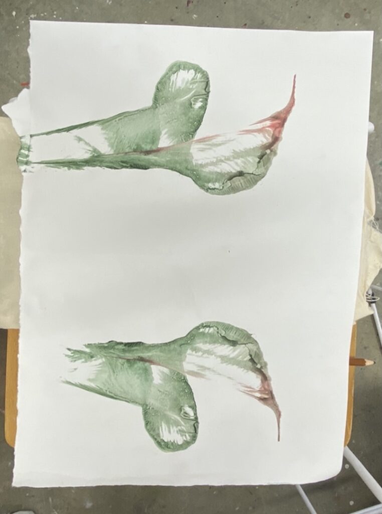
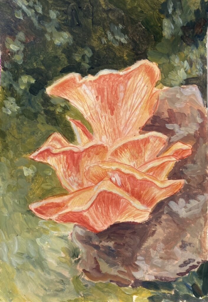
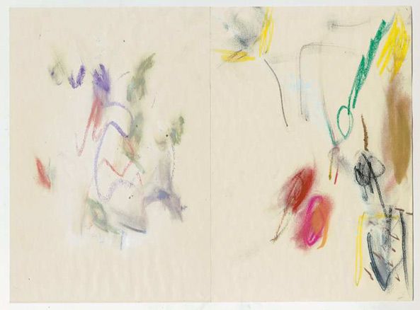
I tried painting the mushroom again, this time focusing on short brushstrokes, and playing with coloured pencils and watercolour.
I first put a layer of watercolour down and then lightly sketched the mushroom and did dome drips for the shadows of the mushroom. I then used thicker paint- acrylic- to paint in the background, once again, I really love being able to see the short brush strokes and the mixing of colours. I was really enjoying how the painting was coming along so I decided to add more watercolour and draw directional lines in the mushrooms.
I think this was really successful in using multiple painting/drawing techniques that contrast each other rather than over power. I really like how I focused the thicker paint around the mushrooms as is does not distract or look out of place. I love the fluidity of movement in the brushstroke and the pencil lines.
I tried to carry on with making new works, continuing with the knowledge and lessons I’ve learned throughout the weeks in studio. I found it really difficult working at home, with limited space and materials. I did not really have the same stamina as I had in the studio and was struggling with artist block.
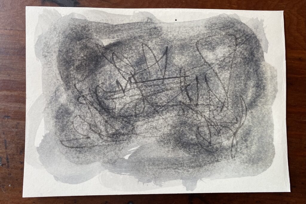
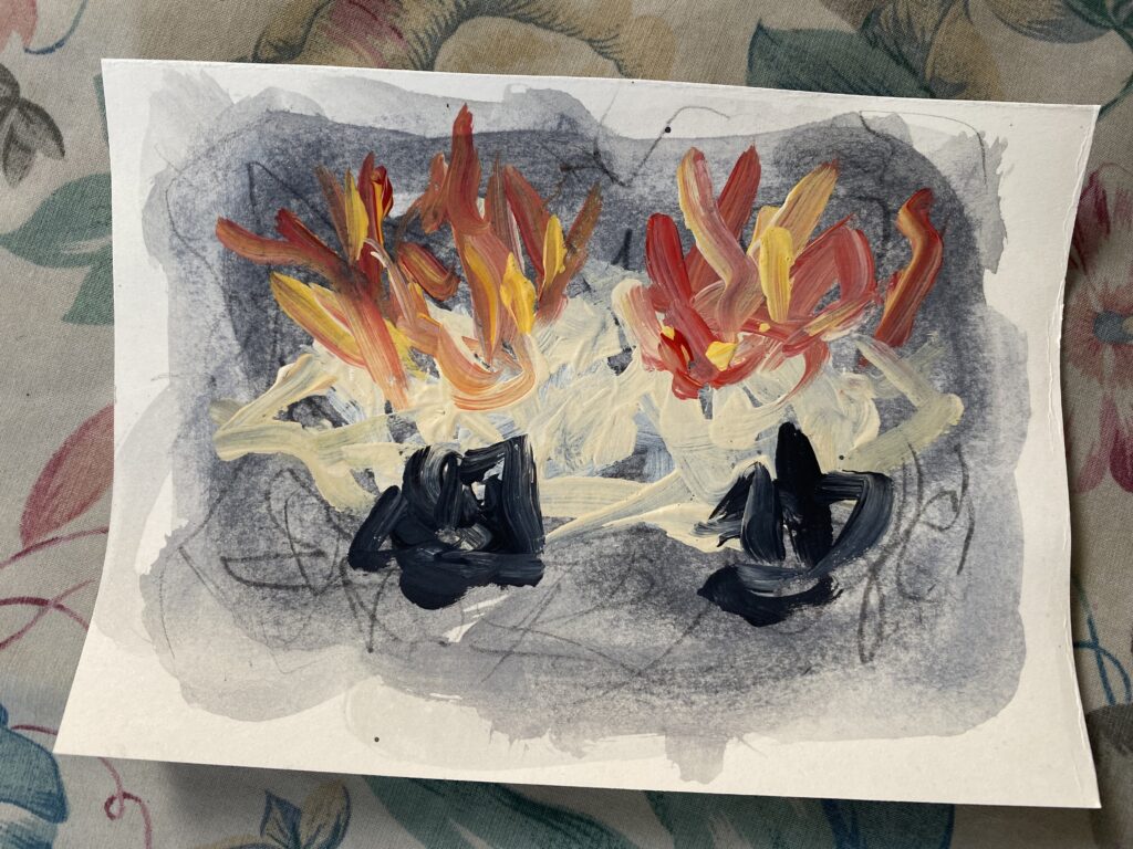
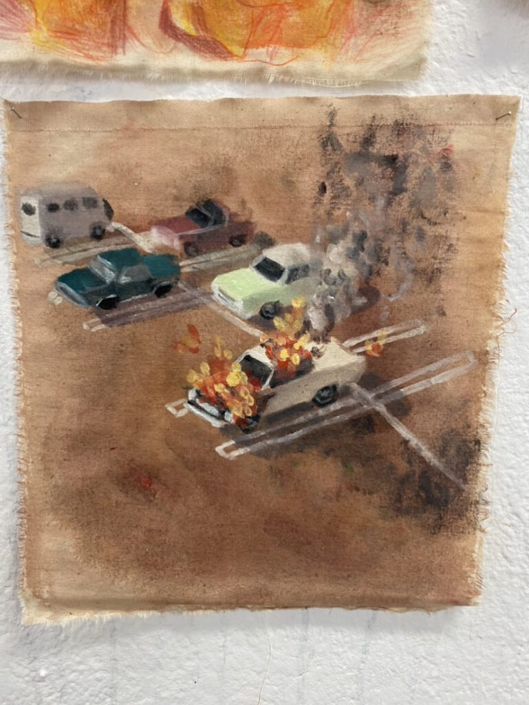
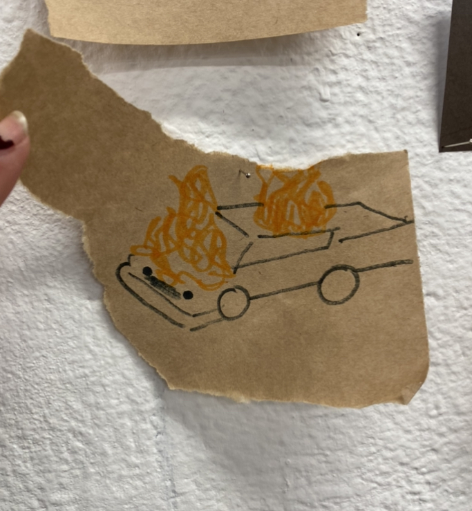
Car flames
For this I washed watercolour and and scribbled a loose sketch of the cars dimensions, and then painted over the top with quick and short brush strokes.
I really love how fun and animated this work is. Being able to see the washes of grey watercolour and the black coloured pencil. The quick and short frantic brush strokes looks like animated movement- like you’d see in a cartoon or a stop motion.
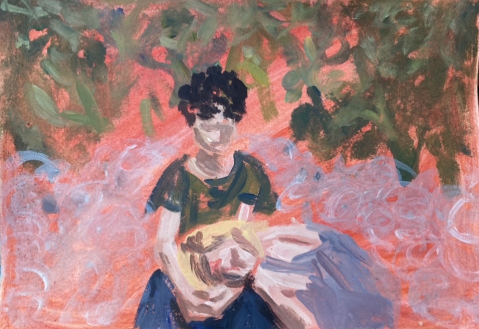
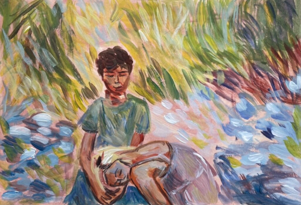
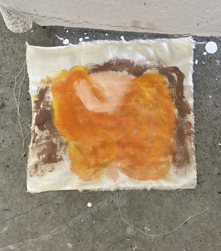
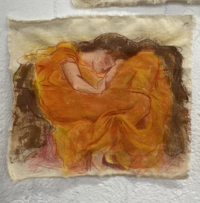
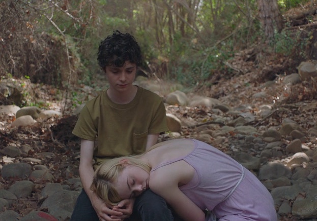
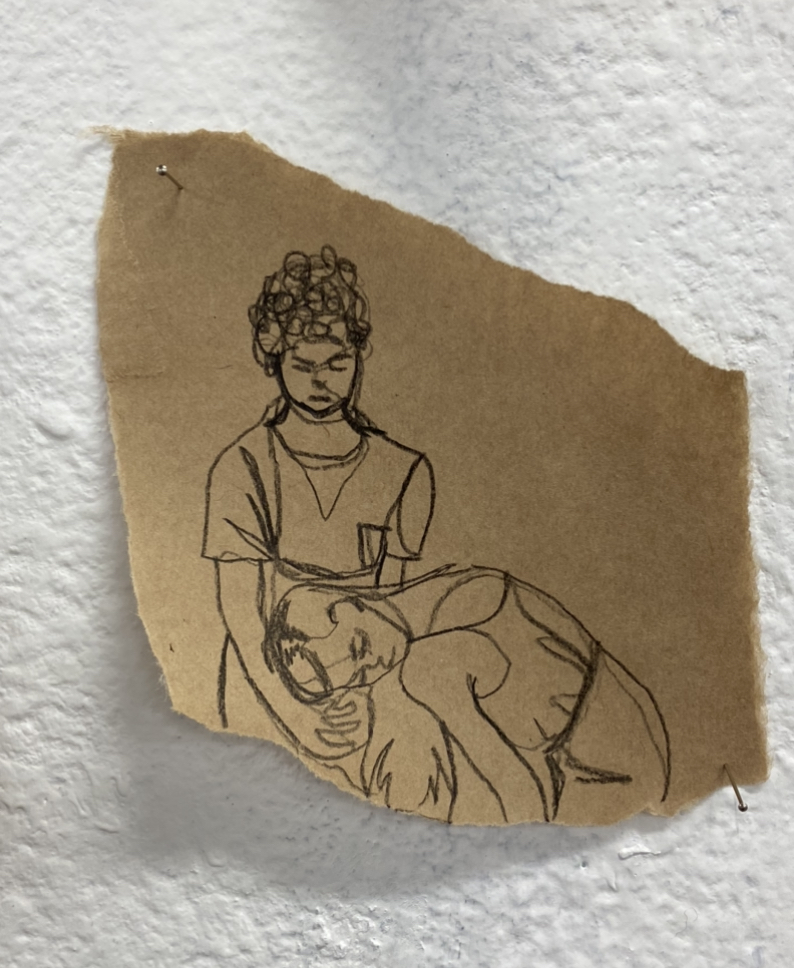
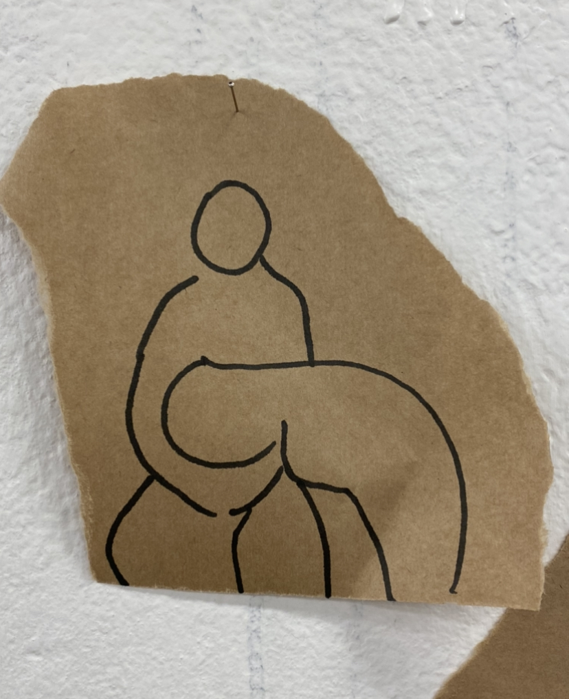
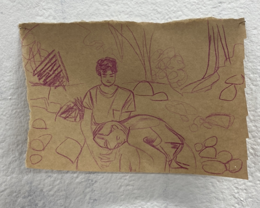
Boy and a girl
Wanting to carry on using thick paint, I painted a quick, minimal image. I found that the quick gestural movement of the paint brush did not quite work in this painting as I didn’t use that much paint on my brush as well as there was nothing to contrast or compliment the bold brushstrokes. But, I do really love being able to see the bright orange/pink underpainting. In my next work I want to use a lot of bright colours and use a thicker paint or use heaps of layers of a thinner paint.
I think this work was very successful is using bright colours and layering brushstrokes. I really like the short brush strokes and is something i would like to continue with.
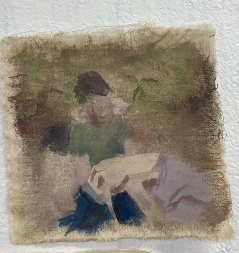
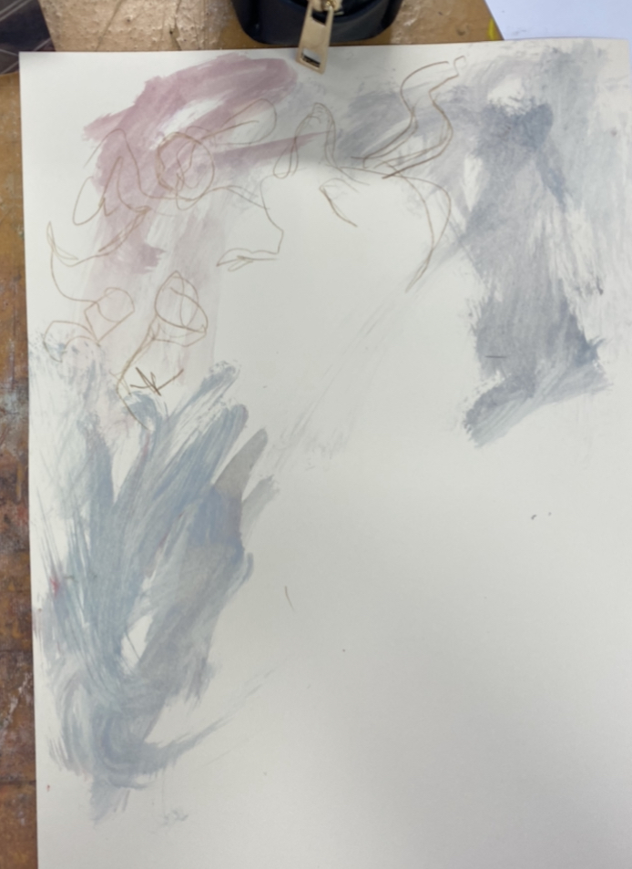
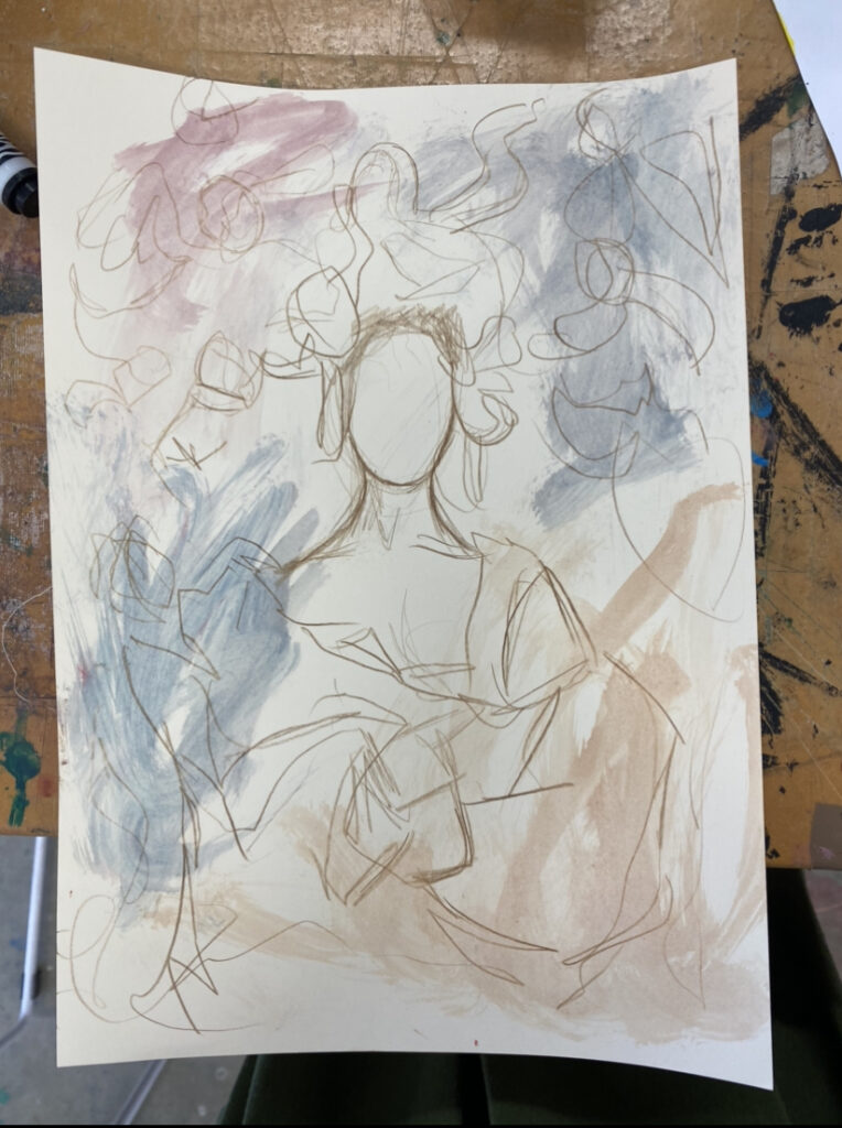
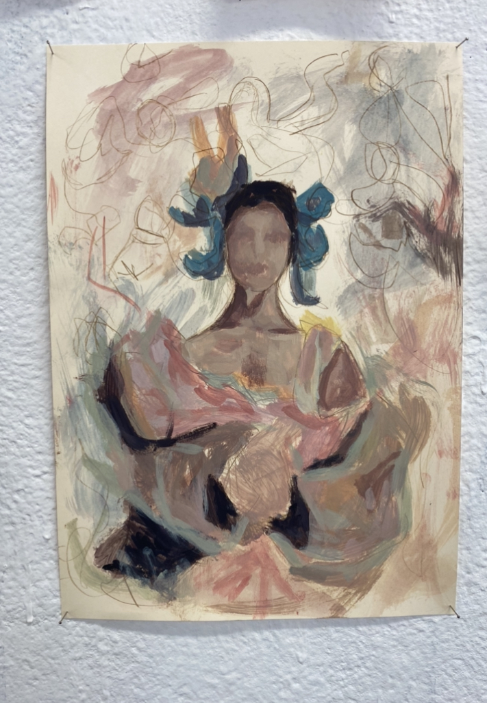
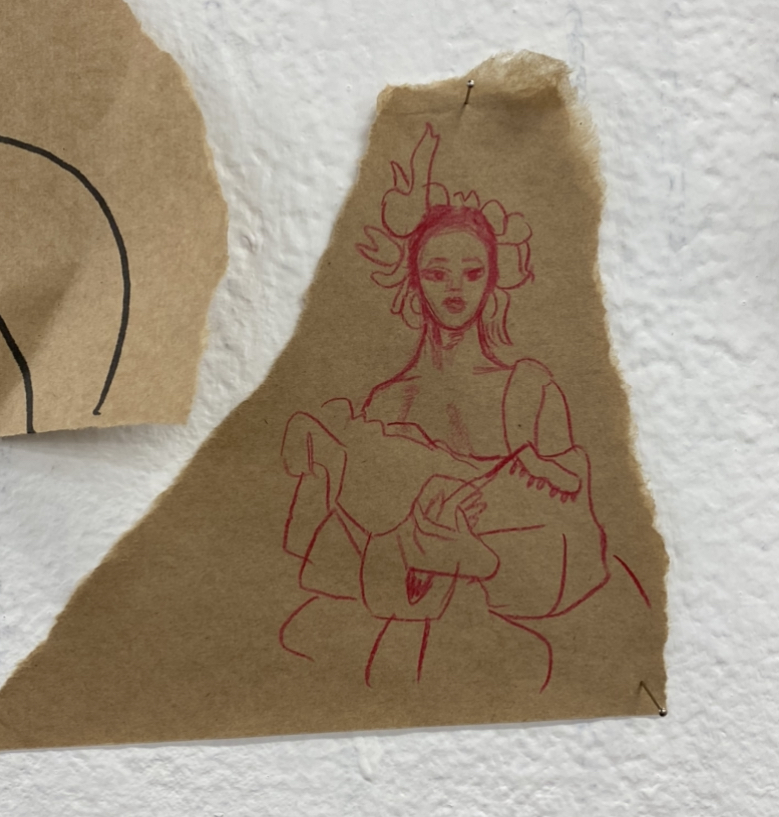
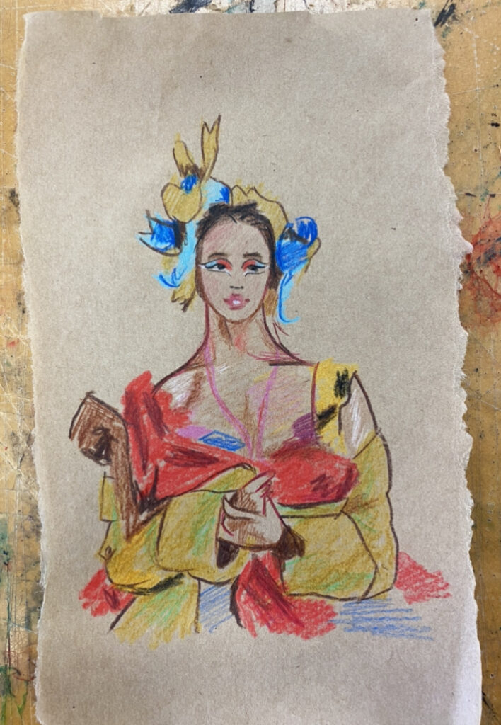
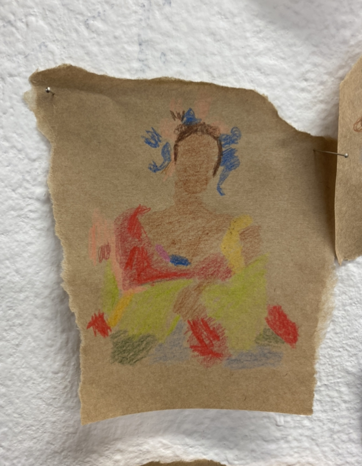
Painting of a woman
I used gestural stokes of thick paint, mixing the paint together as I moved the paint on the paper, rather than preprepared on the paint palette. I really love how I can see where I moved the paint brush and how the paint blended together. Then, I drew a loose sketch and painted over the top with quick brush strokes.
paint brushwork
end result
For the painting of a woman, I liked the work better when there was not much on it- before I painted on top of it. For example. I prefer being able to see the brush work and the mixing of colours of the painting rather than the the end result where I have painted in the lady. I think it’s too distracting- the bold and quick brushstrokes. I feel like I overworked the artwork- trying to do too much and they clashed. So in my next work, I want to see the first layer and the brushstrokes and have the layers compliment and balance each other rather than have the clash.
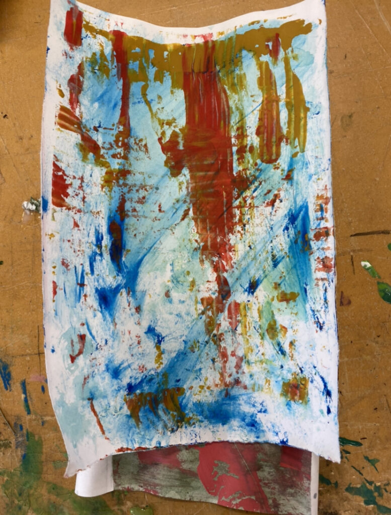
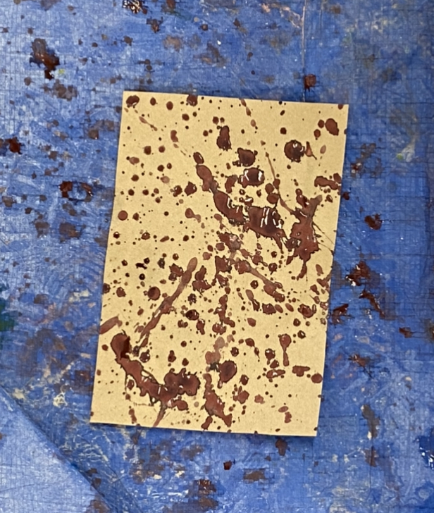
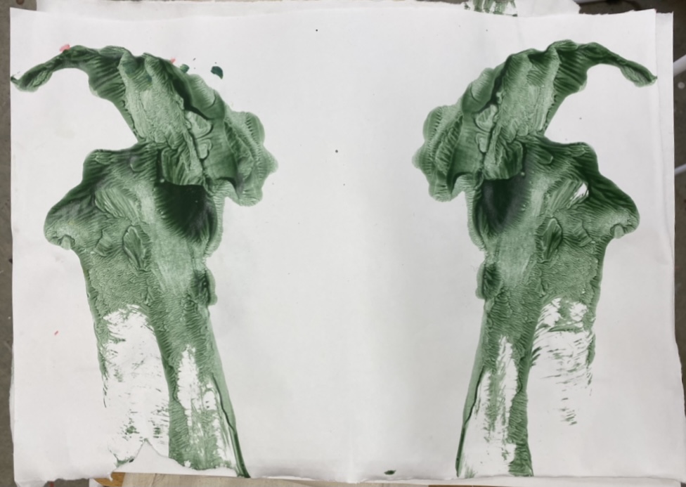
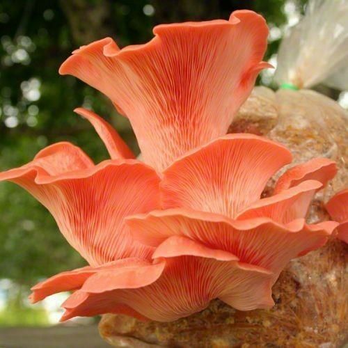
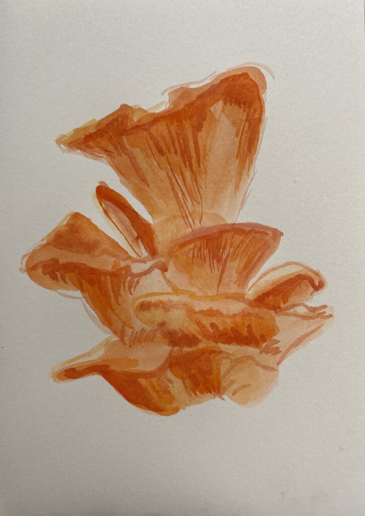
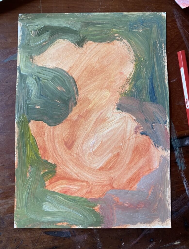
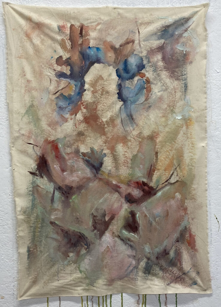
Mushrooms
For this work, I wanted new eyes and perspective on what I was creating, so I thought picking a new reference image would help- especially something that was organic as suppose to a figure or a car.
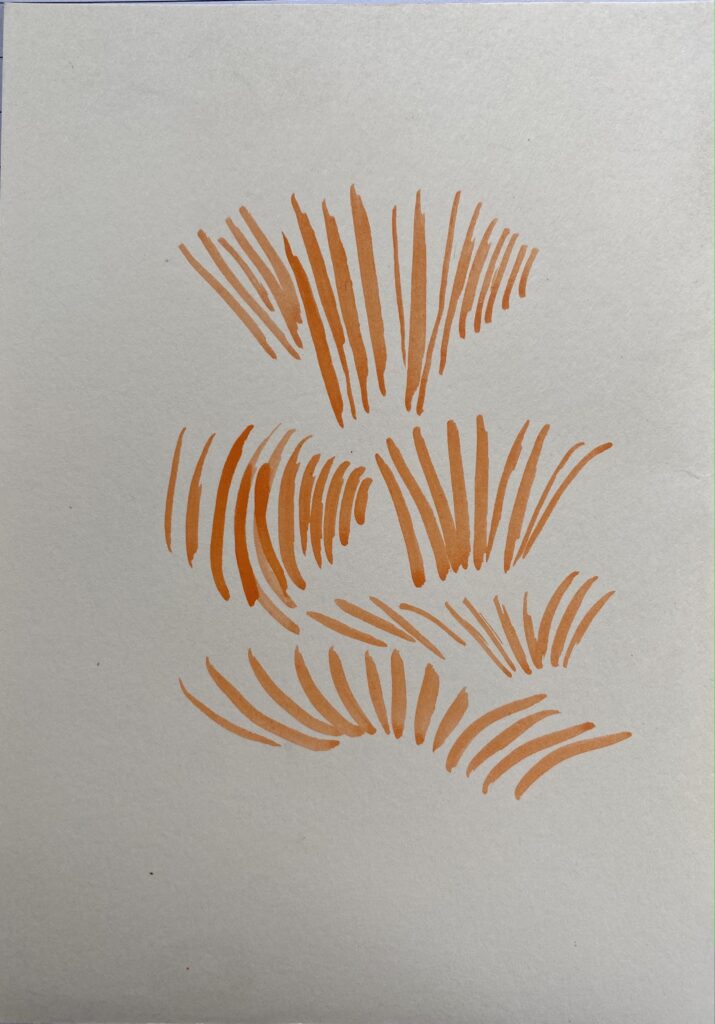
First I did little drawing, trying out different ways to use watercolour and focusing on the flow of the mushrooms (the lines and flow of direction.)
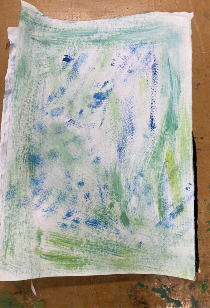
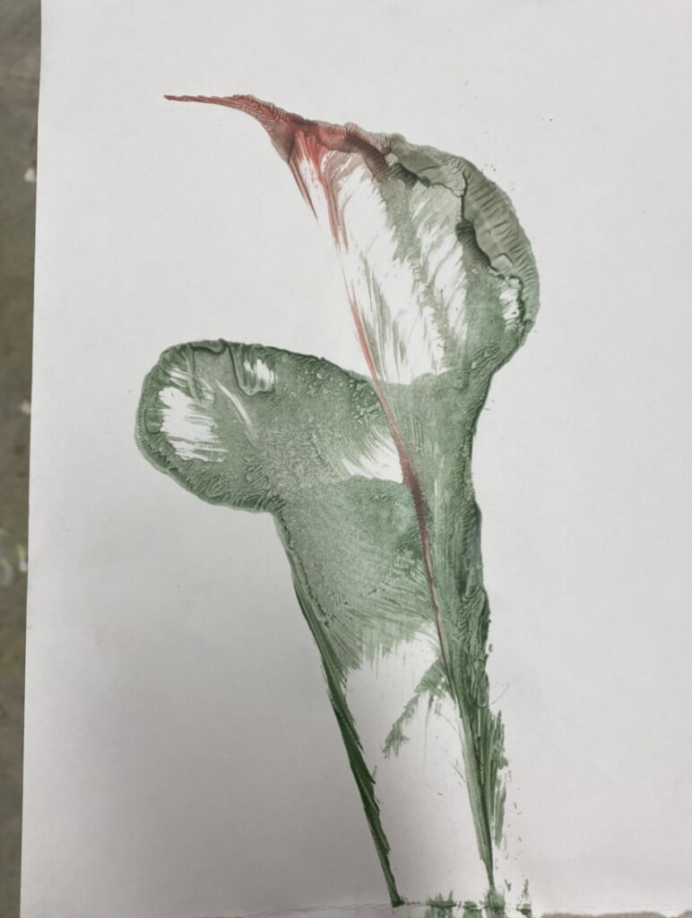
Then I moved onto combining different ways to paint and to draw. As I said previously, I liked seeing the brushworks and seeing how paint mix together while moving the brush around the paper. I discovered a way for the techniques to look harmonious was by have the layers of paint to be of different viscosity
I had the background layer a wash of paint and then built on top of it with a thicker paint.
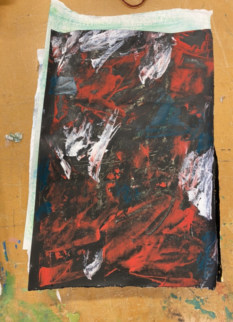
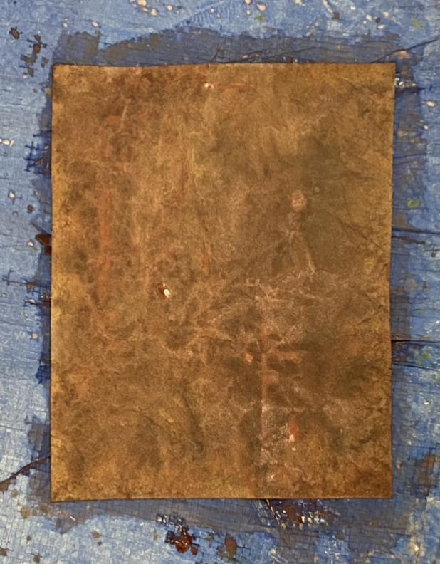
I really love how this came out and how the different brushworks worked so well together. And prefer this work to the end result as I had layered more on the thinned paint and lost the brushwork and movement.
I had wanted to add more to it, I did more brushstrokes in the mushroom. I don’t think this was successful as now the brushstrokes are to similar to the background- so next time I’ll keep the brushstrokes different from the foreground and the background.
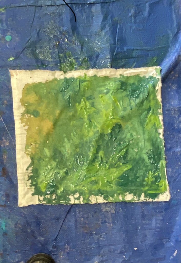
For my first work, I wanted to keep it really simple and combine how I was drawing by blocking out the colours and I wanted to do this with paint onto calico. Although I really enjoy how this turned out and being able to see bold brush strokes, I wanted to try the same method out but add coloured pencil on top.
paint and coloured pencil on calico
I think layering paint and coloured pencil was really successful. I really enjoy how big, bold the brushstrokes are and then contrasting it by having coloured pencil. I also liked how there is a balance of colour pencil where I shaded it to create more depth and just simplistic lines indicated fabric folds.
Paint on calico.
I wanted to rework this watercolour onto fabrics and see how it would come out. I think because I worked on a small scale, I was unable to successfully try out washing colourful paint onto the background to create the colours to harmoniously look brown- it looks to flat and one colour which I don’t really like, you can see the paint being soaked or smeared around the calico. So with this small scale painting, I think I should try again on a bigger scale.
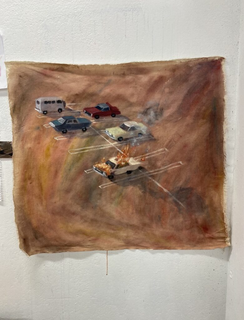
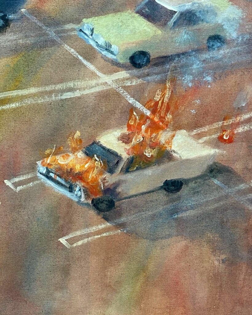
Working on a bigger calico piece was far more successful as I was able to smear, pour and mix different colours onto the canvas while simultaneously making the background to appear as a brown colour. I really love how at first glance it’s brown, but then realise there’s multiple colours showing through, such as blues, reds and greens.
mixing/pouring colours with a paint brush and my hands
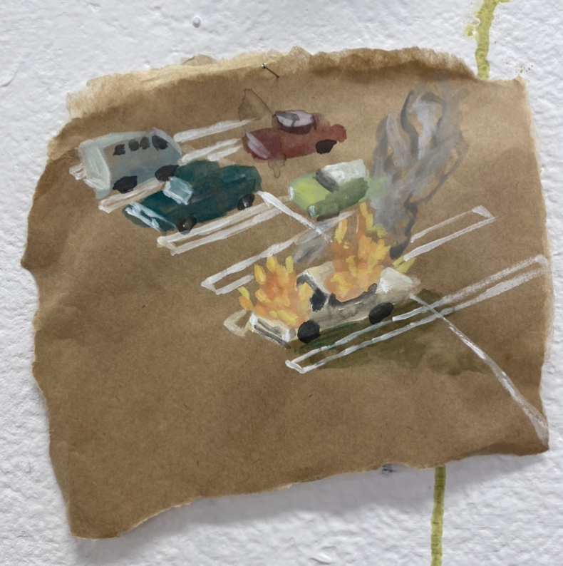
I painted straight onto the painted calico after it was dry, free-handing the painting. I did minimal brush strokes and used blocks of colours to depict the drawing. I’m really happy with how this turned out as usually I tend to want to work for as long as possible to create the most realistic image that I can. I love how simple but detailed the painting is, and if you stood far away it looks like real cars and not just simple lines and blocks of colours. I also really enjoy the imperfect lines of the parking lines as is adds the relaxed blocks of colours of the cars as well as contrasts the free flowing colours of the background.
Paint on Calico
Drawing and painting on paper and calico.
Because I enjoyed how less restricted I felt smearing and painting gesturally in the previous work, I wanted to lean more into it in this work. First I painted washes of colours on the background and loosely drew on top. Then adding another layer, I painted again loosley with thicker paint.
washes of paint
washes of paint and loose drawing
Washes of paint, drawing and thicker paint layers on paper.
. I really loved how this turned out, being able to see each layer put down on the piece of paper and the build up of paint. I also like where I chose to stop adding to the work as I find it hard to restrict myself and knowing when to stop. before I begin to over work my paintings.
Because I really enjoyed this painting I wanted to try it on a bigger scale and onto calico.
I began by loosely drawing lines and a sketch onto the calico, and this put a light layer of paint on.
With thicker, paint, I layered on different colours of paint. Because I used calico, rather than paper, the paint started to bleed together and drip. Although I wanted the paint to be thick and layer upon each other, I don’t mind how the paint bled together
unfortunately, due to lockdown, I could not complete this work. But I really like how it was coming together and think it can still be seen as a ‘completed’ work as no work can ever be fully completed- it’s knowing when to stop working and let something be.
Rita Ackerman is a Hungarian-American artist and based in New York.
In an article Ackerman says that sometimes she paints over old paintings, “…paintings which don’t resurrect from their dead state won’t leave the studio anyway, no matter if there is a deadline. It is hard for me to give up on a painting, simply because I hate to trash layers and layers of labor… I would paint it over and over for years until it comes to life.” I thought this was a really cool way to create layers, by building on top of something old rather than starting again.
In the link and Youtube video above, we see Ackerman working, she is smearing paint with her hands, paint brushes and random objects. She builds layers by drawing onto the canvas and then by adding paint. There is some painting were you we can faintly see a figure and others it is a disarray, there is nothing coherent.
Ackerman said while she works, she doesn’t really think, “When I paint, I’m not thinking — only occasionally do I have a grasp of that that state of ‘not thinking’ and I try to write it down. Writing is more exact for something so elusive to describe. For me, it is difficult to speak about the paintings at all. I don’t like to describe what I paint because I cannot; if I could, I wouldn’t paint it.” I find this really evident in her work, there is nothing overworked or perfected, you can see how she looses herself in her works.
Mama 3, 2019.
Nude 21, 2017.
Mama, Midnight Summer Dream, 2019. Oil, Acrylic and ink on linen.
I love the fluidity of Ackerman’s works and how she uses pencil and paint in her works- these are things that I would like to bring into my own work.
Noah Davis
Noah Davis was an American Painter and painted black figures in his works as he said in Dazed magazine the he painted black people as a way to “show black people in normal scenarios, where drugs and guns are nothing to do with it. You rarely see black people represented independent of the civil rights issues or social problems that go on in the States. I’m looking to move on from that stage, we can’t keep tying our culture to a movement that happened two generations ago.”
In his work, Davis used washes of paint, the drips of the paint is evident, running down the canvas. He also used minimal brushwork to paint his figures, utilising blocks of colour to show depth/shadows. I also really love his use of soft/muted colours. These are attributes that I would like to use in my work.
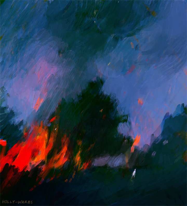
Holly Warburton is an illustrator and contemporary artist based in Bath, England. She often works in digital format as well as paint/paper. In her work, she often layers different colours using sketch-like pencil drawings, using translucent layers to build depth and shadows. Her colourful works are reminiscent of impressionist painters such as Matisse, using a whirl of bright colours in their works.
Warburton says that doing observational sketches really help with her creative process as, “It is also a way of letting go of perfection and embracing the sketchy, imperfect qualities of drawing.”
Her faint and sketchy lines and bright use of colours is something I would like to try out and and experiment with.
Spirit Hold, 2019. digital illustration
Bobby in the morning, 2019. Digital Drawing
Chaos, 2019. Digital Ilistration.
Bibliography
Community, “Rita Ackerman. Turning Air Blue.” ( September 30, 2017)
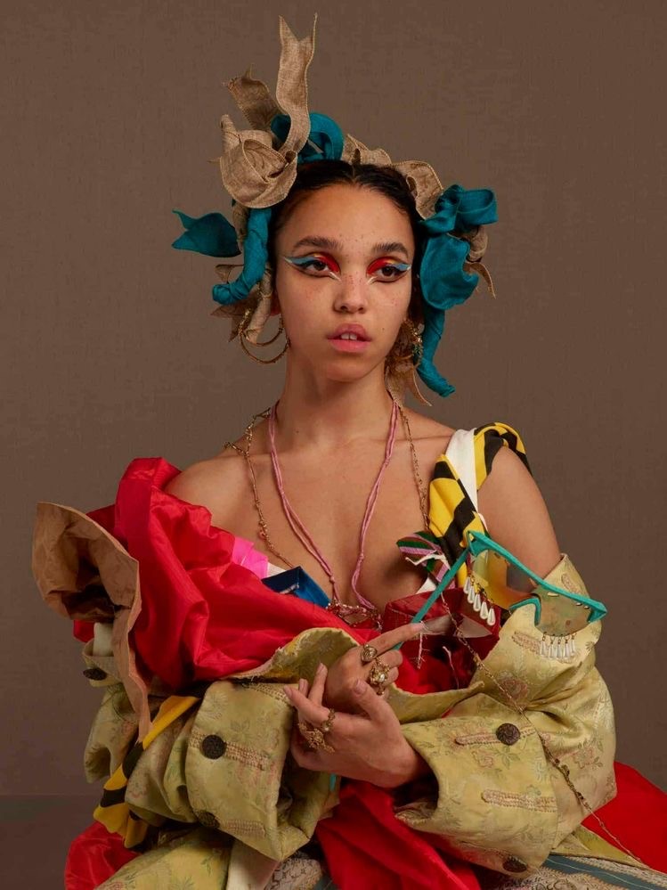
Photo by Matthew Stone of the singer FKA Twigs for her album shoot Magdalene.
I think my strongest drawing is the last one and it’s because of the way that I deconstructed the drawing. There is no clear indication of what it is I’m drawing from but only the marks that I’m making. Whereas for all the previous drawing all relates back to the reference image.
Photo without people
screen still of the film 20 Century Women (2016) dir. Mike Mills
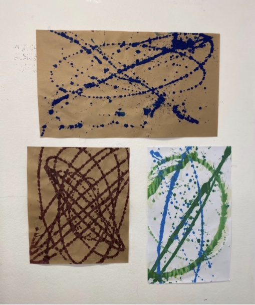
circles
scribble car
watercolour
The drawings that I like the most are the last two. I really enjoy the scribbled car because it’s not too thought out and we can clearly see my coloured pencil scribbled along the paper to create the image. And the only indication that it is the reference picture is by the colour placement and this also applies to the circle drawing. I also really enjoy the watercolour drawing as it’s very simplistic in it’s form and creating an image. There is not much shading besides basic shadows and we can see the leaks of watercolour/water and the strokes of the brush work.
Piece of Fabric
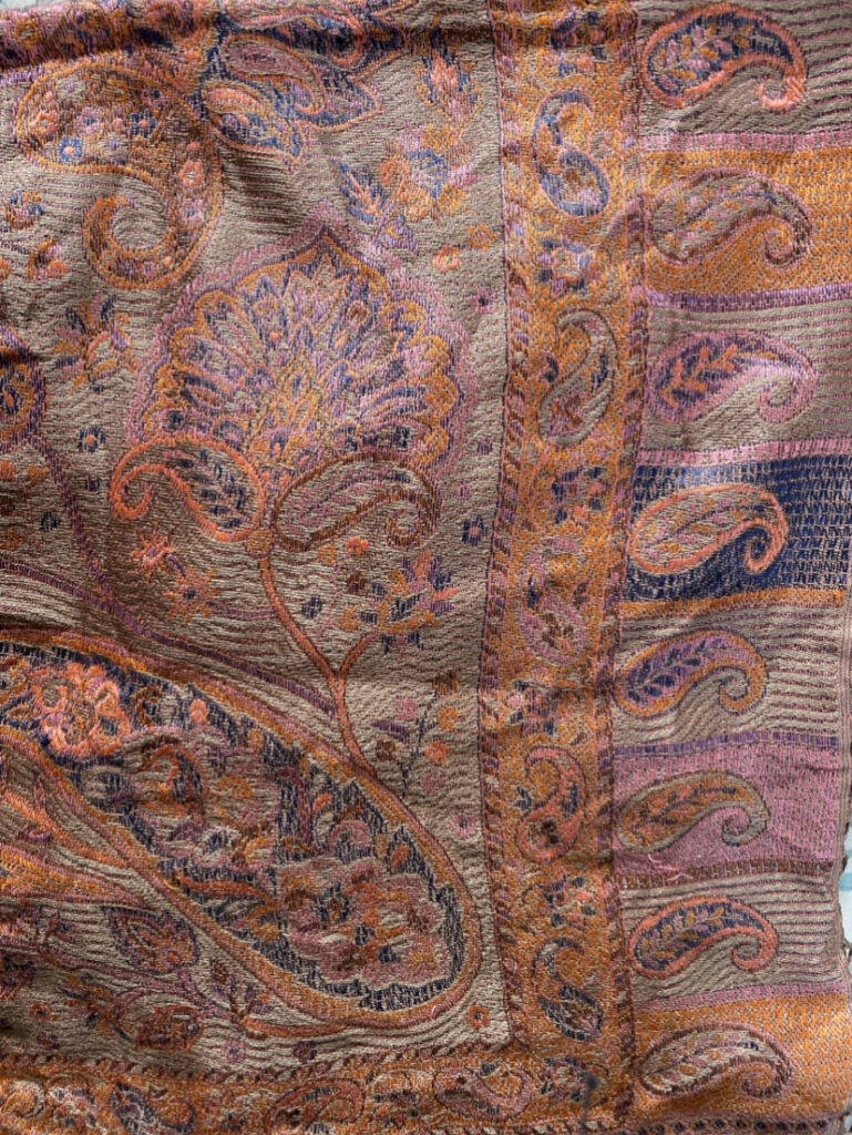
Patterned Scarf
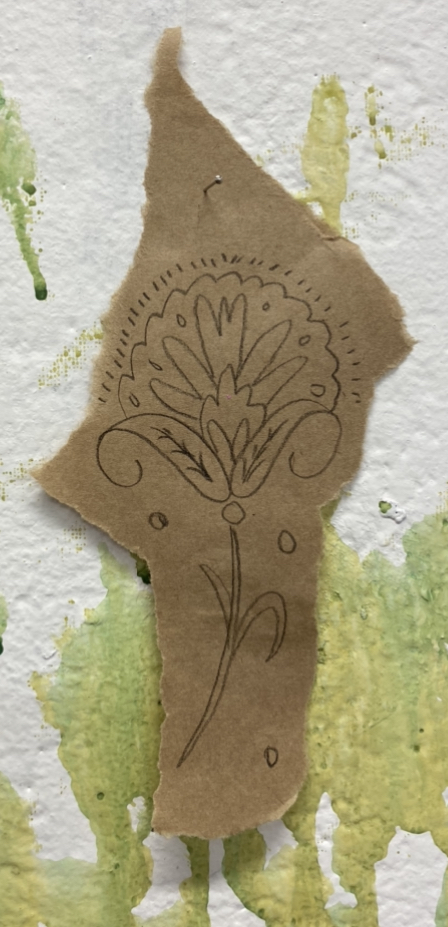
For this, I wanted to do loose pencil drawings, using the side of the pencil and the point of the pencil to create marks as well as smudging the pencil pigment. I really enjoy this free-flowing way of drawing, not trying too hard to create a perfect drawing and focusing on making gestural marks.
Painting made before 1900
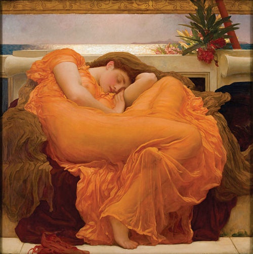
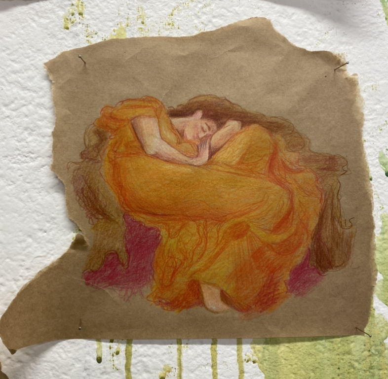
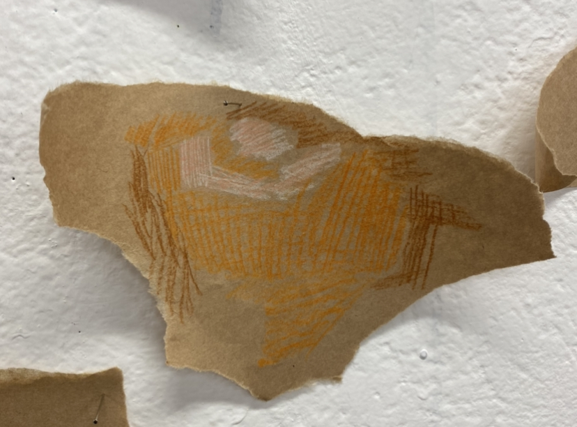
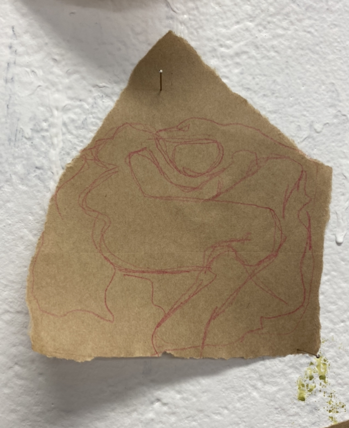
Flaming June by Lord Frederic Leighton, 1895 is painting that I chose to do because it one of my favourite paintings and because of the bright colours.
I chose to slowly break down the colours and figure through shortening the time frame to draw the painting using coloured pencils. I went from from it in 10 minutes, 1 minutes and 10 seconds.
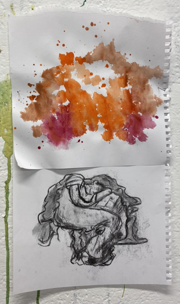
I really loved breaking down the form, so I decided to do it again but only using water colour and charcoal. For the watercolour, I really wanted to focus on the colours used in the painting. And with the charcoal, I wanted to focus on the form rather than the colours. I really love these two works next to each other because they’re very juxtaposing.
Screengrab from a film
Screen still from 20th Century Women (2016) dir. Mike Mills
coloured pencil
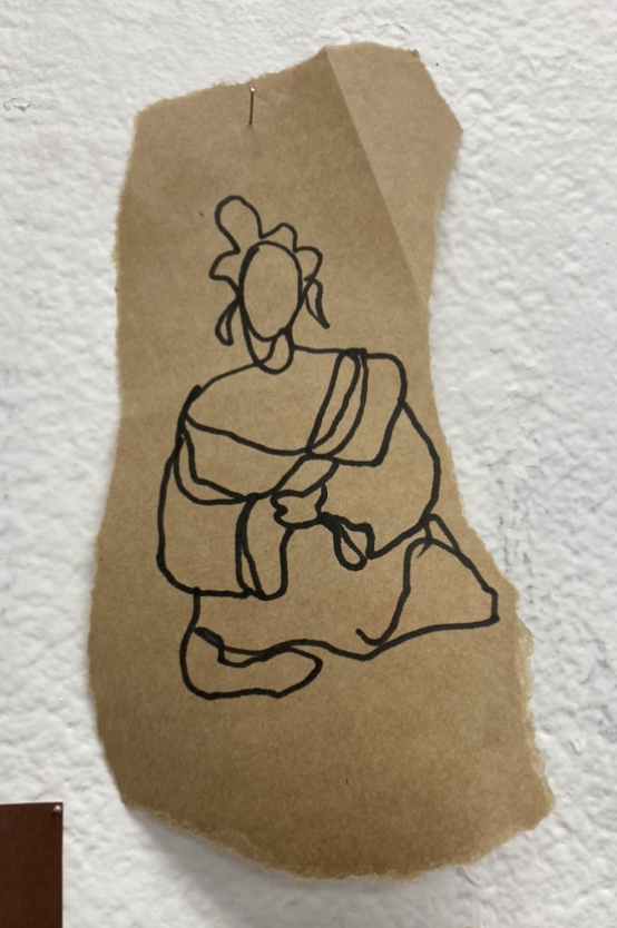
one line drawing
silhouette marker drawing
purple pencil drawing
For this I wanted to focus on different ways of drawing. Obviously, I first drew a picture that closely resembled the reference photo and then from there I broke down my next drawings. I drew a picture without taking the pencil off of the paper and then drew the silhouette of the figures. In my last drawing, I did a really quick sketch, using simple and minimal pencil lines.
Antoni Llena is a Spanish artist who began his career in mid 1960s. Llena started his work SOS Smoke Signals from the Underground in 2005 and it is a series of drawings that he lays out by month and year. In the work, he used gestural and fluid movements, we can see his every move with his tool, his coloured pencil or pastel, as well as the smudging done by presumably moving the pigment with his finger.
S.O.S Smoke Signals from Underground, 2016. Pastel and coloured pencil on paper.
S.O.S Smoke Signals from Underground, 2016. Pastel and coloured pencil on paper.
I really enjoy this abstracted way of drawing and the fluidity of movement and is something that I would like to try out as well as the abstract images he creates.
Elizabeth Peyton
Elizabeth Peyton is an American contemporary artist who works primarily in drawing and paintings. In Peyton’s work, she uses draws figures with soft, delicate line works and for her paintings, uses washes of colours- she does not try to create a naturalistic portrait, she has said that “A painting of a person can be descriptive, but for me it’s all about the things the make up a picture- the feelings, the brushstrokes- more than describing somebody.”
Silver Tony, 2000. Watercolour and glitter on paper.
KURT WRITING (NEWSWEEK), 2002. Coloured pencil on paper.
JOHN KENNEDY JR. MEETS QUEEN ELIZABETH II, 1999. Coloured pencil on paper.
I really enjoy her washes of water colour and simplistic pencil lines to create a drawing. She does not overwork her lines and lets bold strokes of colours tell the story and not try to be too representative- I want to try this is my own works.
Bibliography
ArtNet, “Elizabeth Peyton.” (Accessed September 9, 2021)
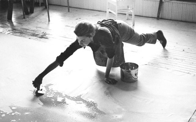
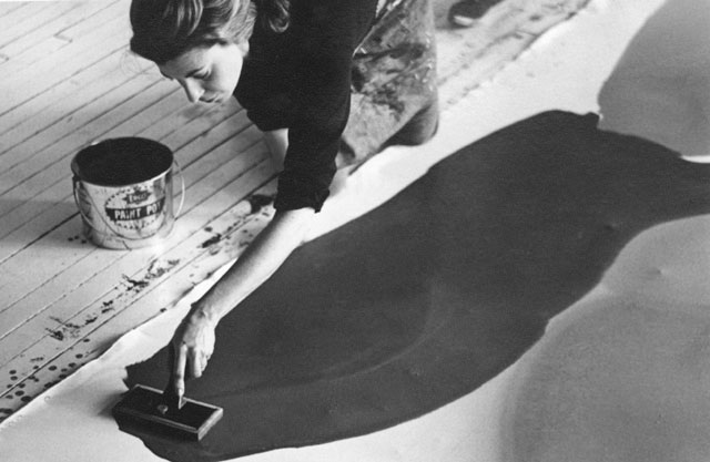
Helene Frankenthaler is an artist that I was interested in because she used her whole body to make paintings, she was very fluid and expressive in her works. She would pour thinned paint on an unprimed canvas and move the paint around this different tools, including her hands. She invented this method in the 50s and it’s called the “soak-stain”.
Frankenthaler photographed in her New York Studio by Australian Photographer/Artist, Ernst Haas, 1969 photos from Thebohmerian.com http://www.thebohmerian.com/2011/12/jewish-american-abstract-expressionist-artist-helen-frankenthaler-dies-at-83/
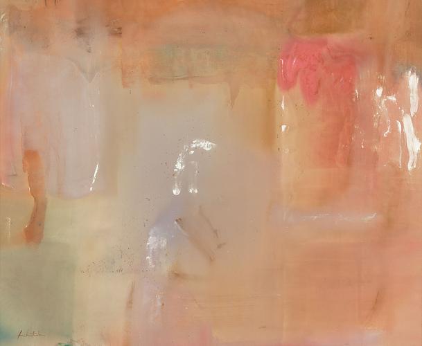
Feather, 1979. Acrylic on Canvas
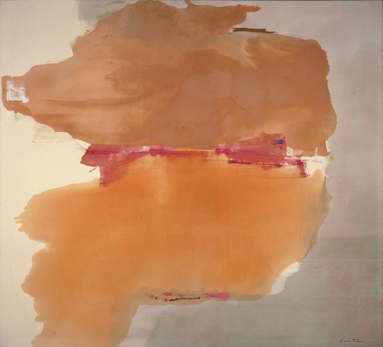
Sphinx, 1976. Acrylic on Canvas
I love how she soaks paint onto canvas, using her whole body to move paint around= I would love to try this out.
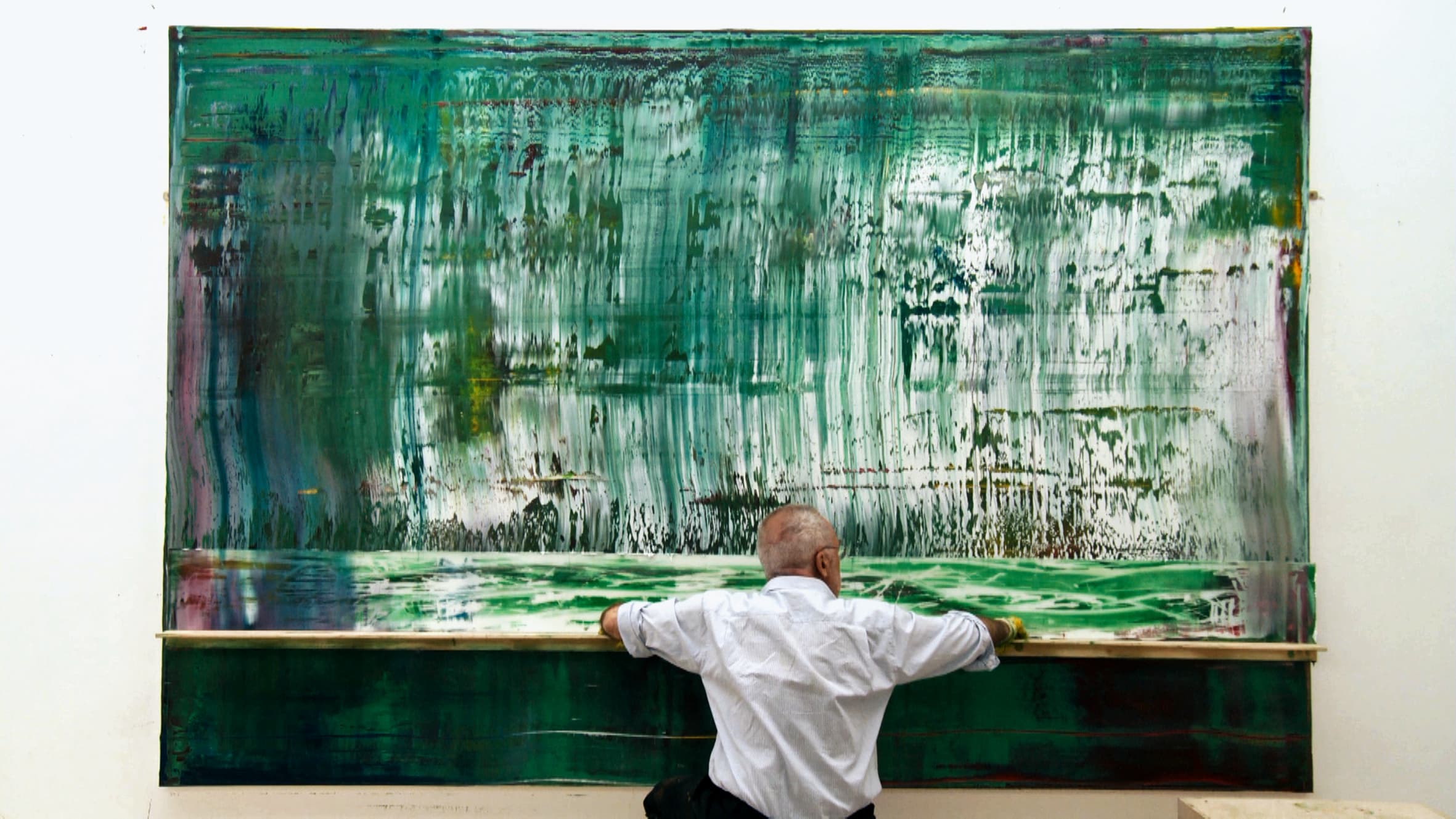
Gerhard Richter
Gerhard Richter is a German contemporary artist, I’m interested in his work because he uses the technique of sliding/moving/scraping paint across a canvas using different tools such as wood/metal poles or squeegee.
In the Youtube video (above), they describe Richeter as “The artist without a paintbrush” and details how he encapsulates movement and energy of the paint with minimals tools.
In the Nowness YouTube Video, we get to see Richter working. We uses his whole body to move paint across the surface, holding tools that are almost the same as him. A tall sheet of plastic is used to remove large surfaces of paint and a smaller hand held to remove smaller areas of paint. He moves in different directions my mainly keeping to methodically vertical and horizontal movements.
In an interview with Richter he said how he was “fascinated by coincidence,” as he believed “almost everything is a coincidence,” and to “,make something of it.” I found this to be very interesting as his work is all about coincidence and letting the paint and tool be in control. I would like to try scarping and gliding paint around, letting the paint be in control.
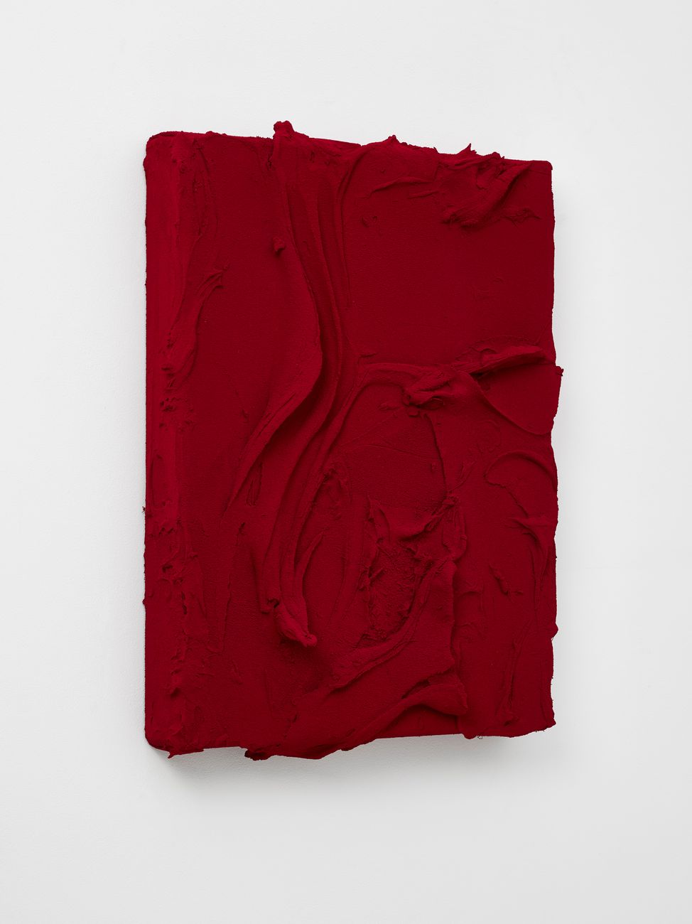
Jason Martin
Jason Martin is a contemporary artist based in London and Portugal. Martin use thick paint to create his works, layering and piling paint onto a canvas. In regard to his work and method, Martin has said, “The most interesting abstraction has a source of figuration…My approach is that there is a warmth of figuration that I try to affect into movements- gestures- that I make [on the canvas].” His movement are clearly evident in his works by use high viscosity paints, such as oils.
Thysia (Quinacridone red/Quinacridone scarlet), 2015. Paintings, mixed media on aluminium.
Ex Fialta, 2017. Paintings, mixed media on polyester sailcloth.
The method of layering thick paint on a canvas to create a texture/pattern is so interesting and is what I would like to try.
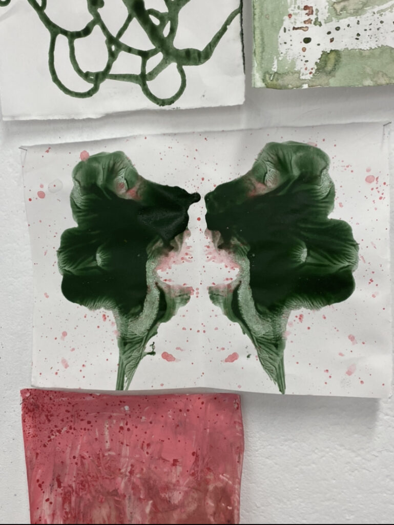
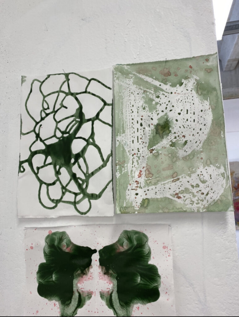
This week was all about creating works with verbs i.e throwing, mixing, tearing.
My first few works I focused on smearing, dragging and brushing.
For the pink and green work, I soaked the paper with liquid green paint, layered pink paint on top and dragging it across the surface with some cardboard. I also then paint the brim of a cup and stamped them multiple times onto the surface.
For the Blue and Orange work, I gesturally brushed paint around multiple time with different paint and then dragged paint across using cardboard.
For the Blue work, I crumpled up the piece of paper, unfolded it, and then dry brushed of the creases. For the Green and Blue work, I painted on top of some tissue paper and then stamped it onto the paper, transferring the textured pattern. Then I also did some dry brush.
For the Black, Red, White and Green work, I smeared down a thick layer of black and then moved paint around using a mixing knife
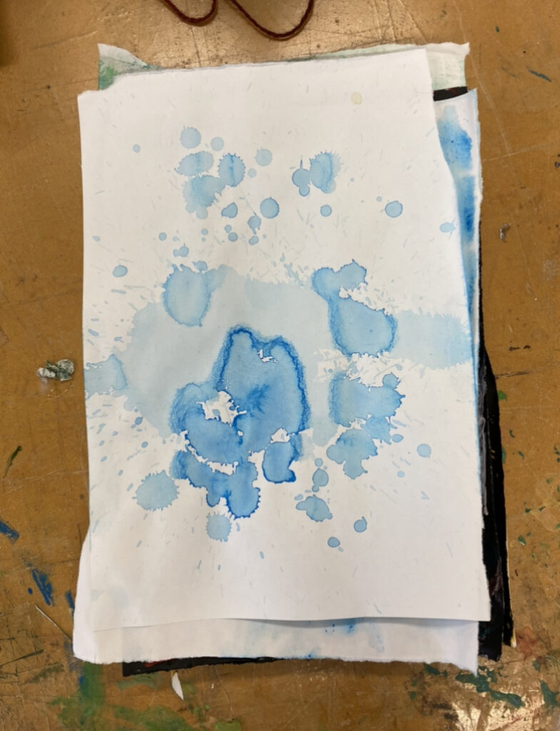
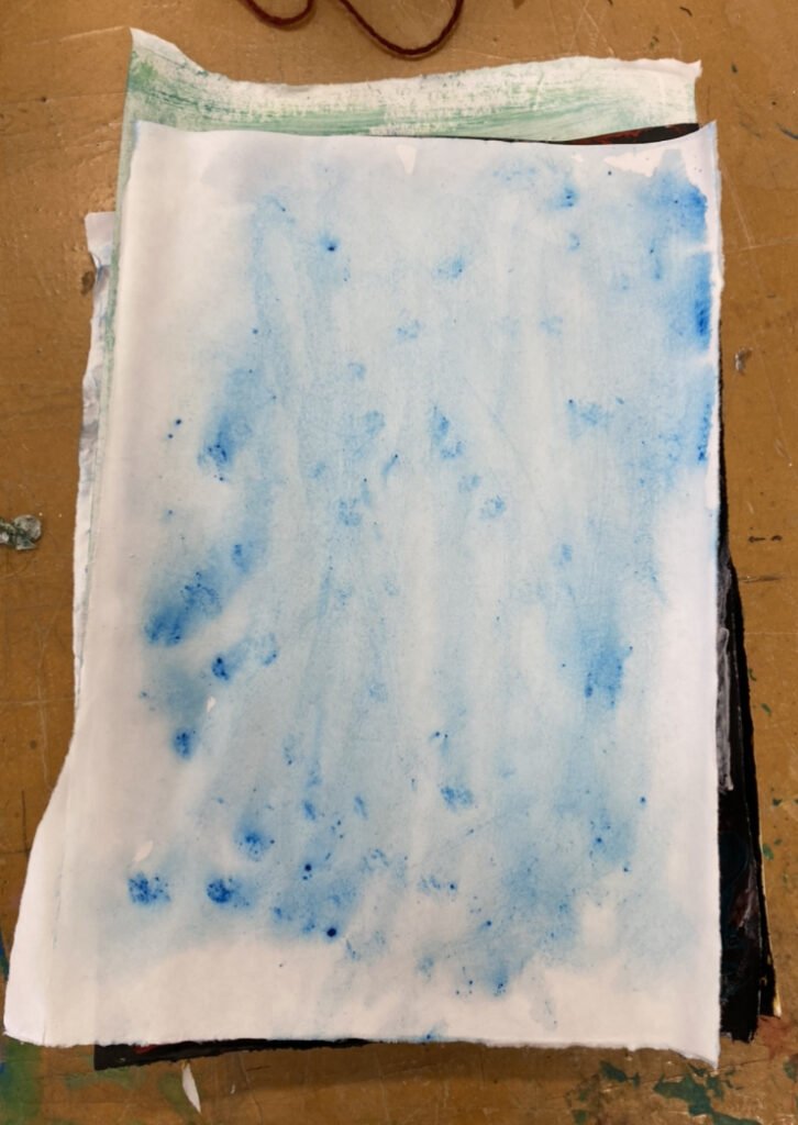
Wanting to explore different techniques, I decided to go in the opposite direction of using thick paint, and to start using thin paint. In the first work I dripped a lot of watered downed paint onto the paper and in the second work I soaked the whole piece of paper with water and dotted paint onto it.
1
2
3
4 & 5
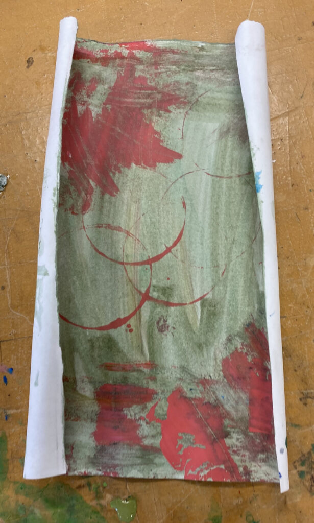
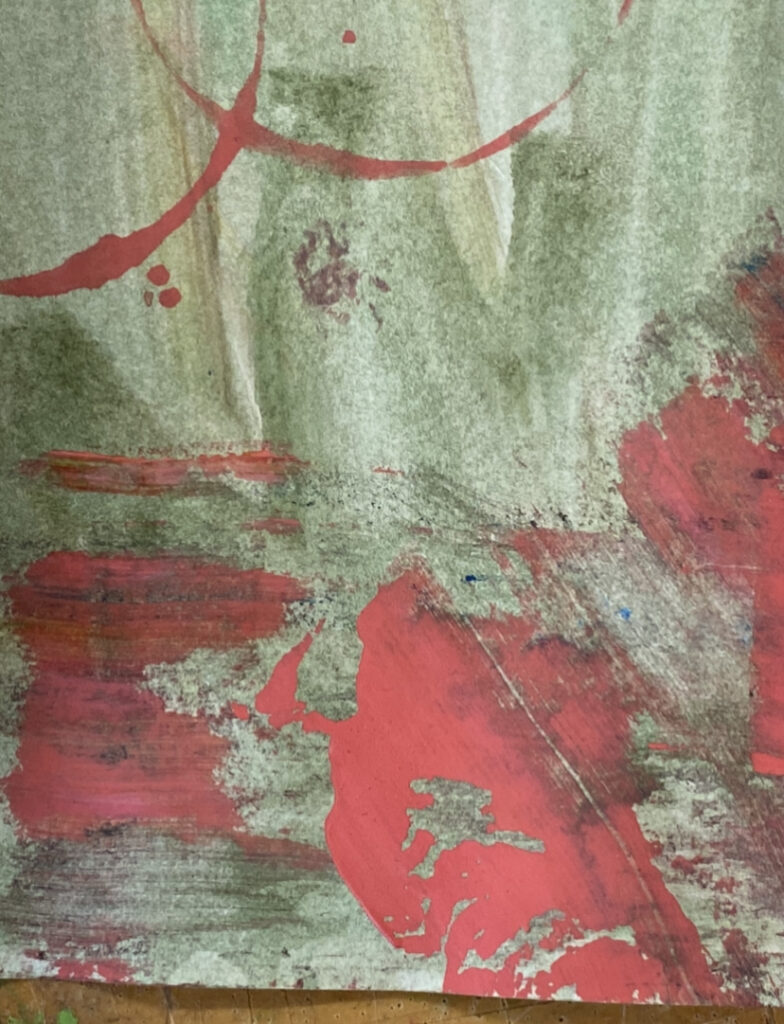
And in the third work, I flicked on some watered down pink paint then poured some thicker green paint, folding the paper in half, transferring the paint. I really liked how this turned out and how theres different textures and amount of paint of the surface- it almost still looks wet.
In the 4th work i poured some thin paint onto the paper and the moved the paint around by tilting and rotating the paper. I really liked how organic this looks, like a spider web.
In the 5th work, I saw emma working with vaseline and like how it came out, so I borrowed the idea and smeared some vaseline on paper so it would resist paint, and poured thin paint onto it and dripped some paint onto it. I think it turned out cool how the vaseline had little drops of paint holding onto it, looking almost wet like a car window, I think this is also a really interesting way to ‘subtract’ paint.
For the pink work, I wanted to see how it would turn out if I combined the techniques I’ve done so far into one work. So, I soaked the paper the thin paint, smearing it around. Then using a piece of cardboard to smear around thick paint at the top forth of the paper. I then messily scribbled of the corner with some paint and then splattered some paint.
I also wanted to test out a different consistency of splattered paint, trying out a thicker paint rather than thin paint that I was doing previously. I like the thicker splatters as you can see it more clearly and had more texture and movement than the thin paint splatter which is much smaller and some what uniform.
I then wanted to ty out different textures or materials. I crumpled up s piece of paper and soaked it in paint. Because of the creases, it created a texture that stood out from the paint. I also soaked a piece of calico and smeared thin out paint over it with my hands, mixing, layering and throwing down paint.
crumpled paper soaked in paint
I liked how in the crumpled paper, textures stood out from the paint, so I wanted to try this with calico. Because I didn’t think creasing the calico would work as well as it did with paper, I decided to tear and use sand paper to remove and scrap off some calico to create texture and then soak the calico with paint.
I also want to mix and layer paint onto calico again- expect this time with thick paint. I layered different colours of green using a palette knife. I really enjoyed how this came out as you can see all the texture of the paint and where I moved the paint with the palette knife.
torn calico and paint.
paint on calico
I also tried the method of soaking a piece of string, placing into an ‘s’ shape on paper, folding it, placing pressure of the surface as I pull the string out from between the folded paper. On my first attempt, I had to much paint on the string, creating this texture.
On the sec attempt, I dry brushed paint onto the string, and this was that outcome. I really enjoy how this creates a lily flower- like image. I also think it’s a very interesting was to create marks with paint, we can see the imprint of the string and how it moves across the paper, smearing paint.
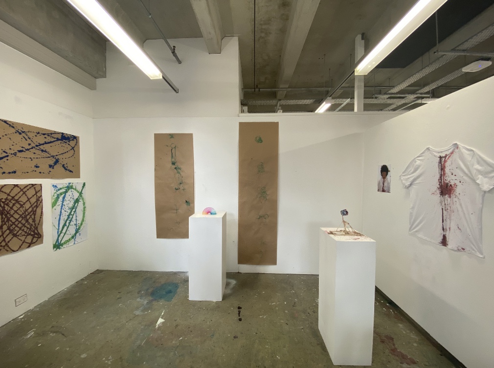
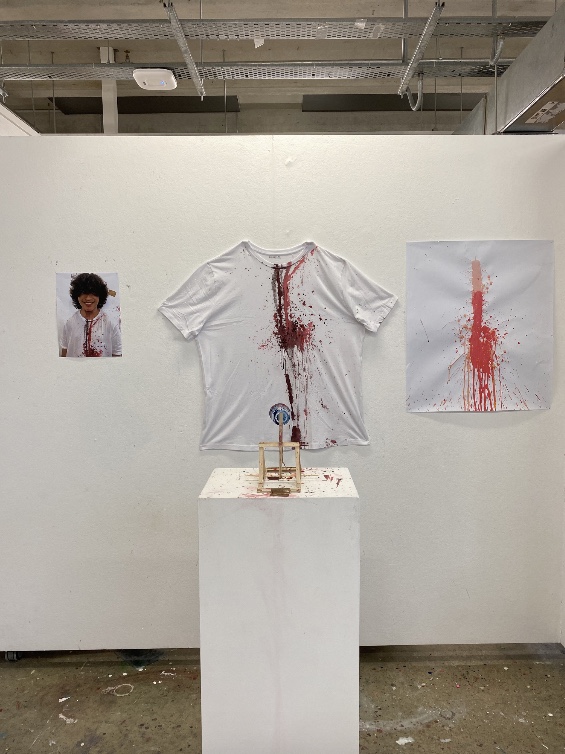
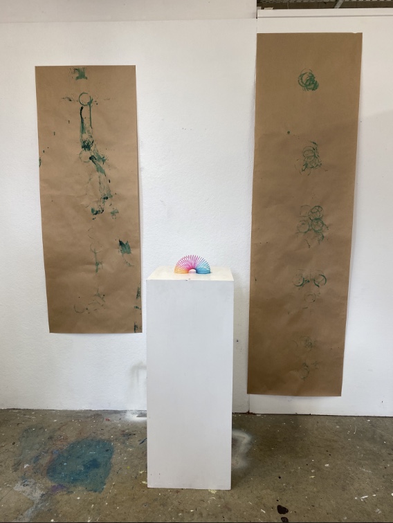
Looking back at our final work, I’m satisfied with the machines we created since I found it quite challenging at first. In the beginning, I though that I had to come up with very intricate machines that no one else has ever done before, then I slowly realised that that wasn’t the idea behind art machine. The point of art machines are to explore how humans interact with the world and putting the machines in control. It also taught me the lesson that art making can be silly and not the traditional hand to paintbrush, it could also be a performance, like using a catapult to throw paint onto yourself or playing with things around you, such as a slinky.
For or Final Display we showed our results from the catapult on the shirt/paper as well as had the catapult placed in front of the shirt and a picture of Kurt after using the catapult. We also showed the slinky markings and had the slinky placed between them and finally had the results made from the pendulums.
I really liked how a machines explores movement, time/rhythm and the way humans interact with the world around them.
What I would do differently for next time is to go bigger and to maybe venture out in making mechanical machines or even doing machines that directly worked with the environment such as Meg Rodgers or Margie Livingston.
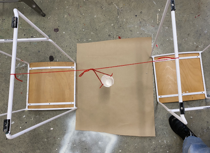
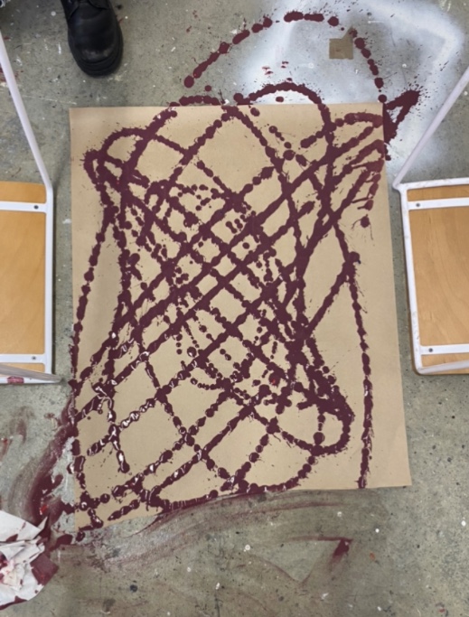
With using the resources around us, we made a pendulum out of two chairs, a cup and string. It took a few tries to figure out what paint consistently we wanted and found it worked best when it was super liquid-y.
the pendulum made out of chairs, string and a cup.
result
I was actually surprised that the marking were almost dots as I was expecting more of a streamline marking. I almost like this dotting better as it looks more organic, like Meg Rodgers wind drawings rather than the clean and very precise lines of the drawing apparatus by robert howsare. Because we all loved how the marking came out we did some more using different colours, and uses different angles of the pendulum. Here are the results.
I think this machine successfully captured movement from an organic source and creating a geometric markings. The one thing I would do differently is to make a pendulum of a bigger scale and on bigger paper so we could achieve bigger markings.


.jpg)