Using the pinhole camera was quite the nostalgic trip for me, as we used this technique a lot in high school.
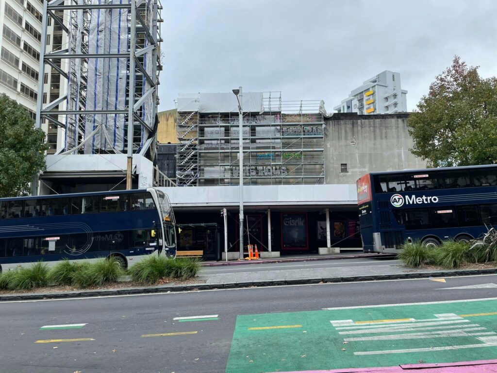
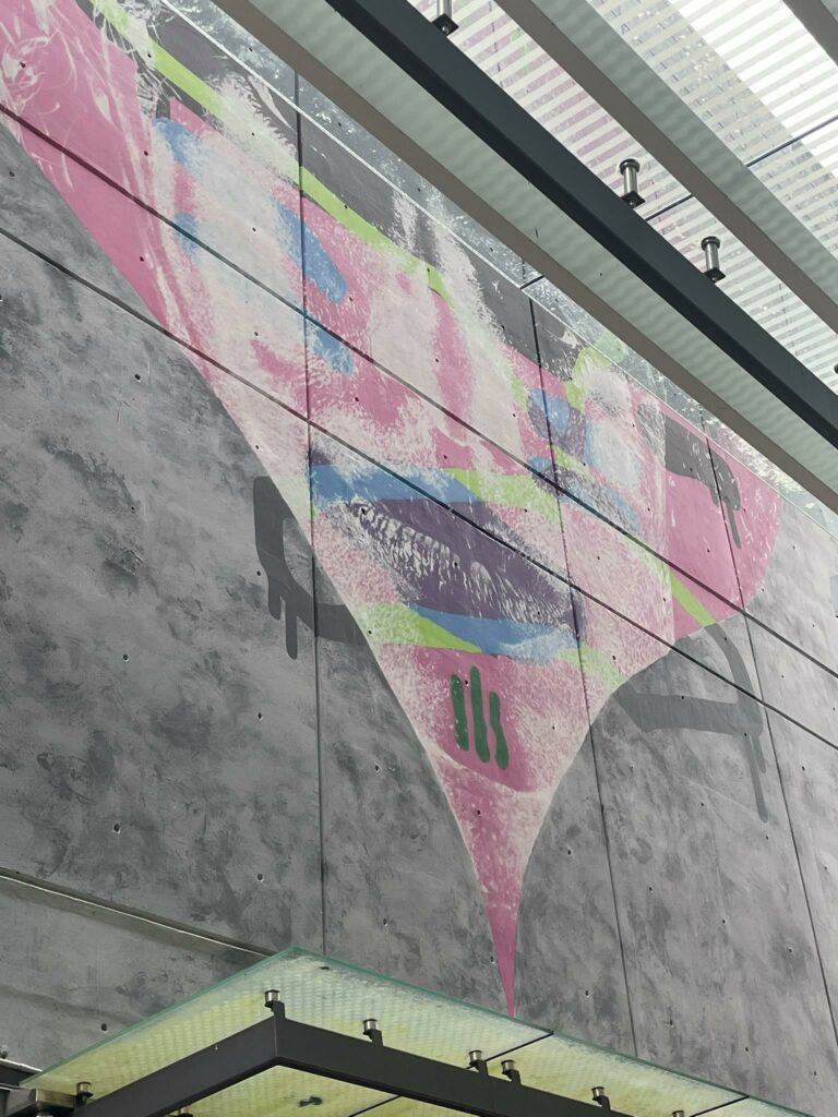
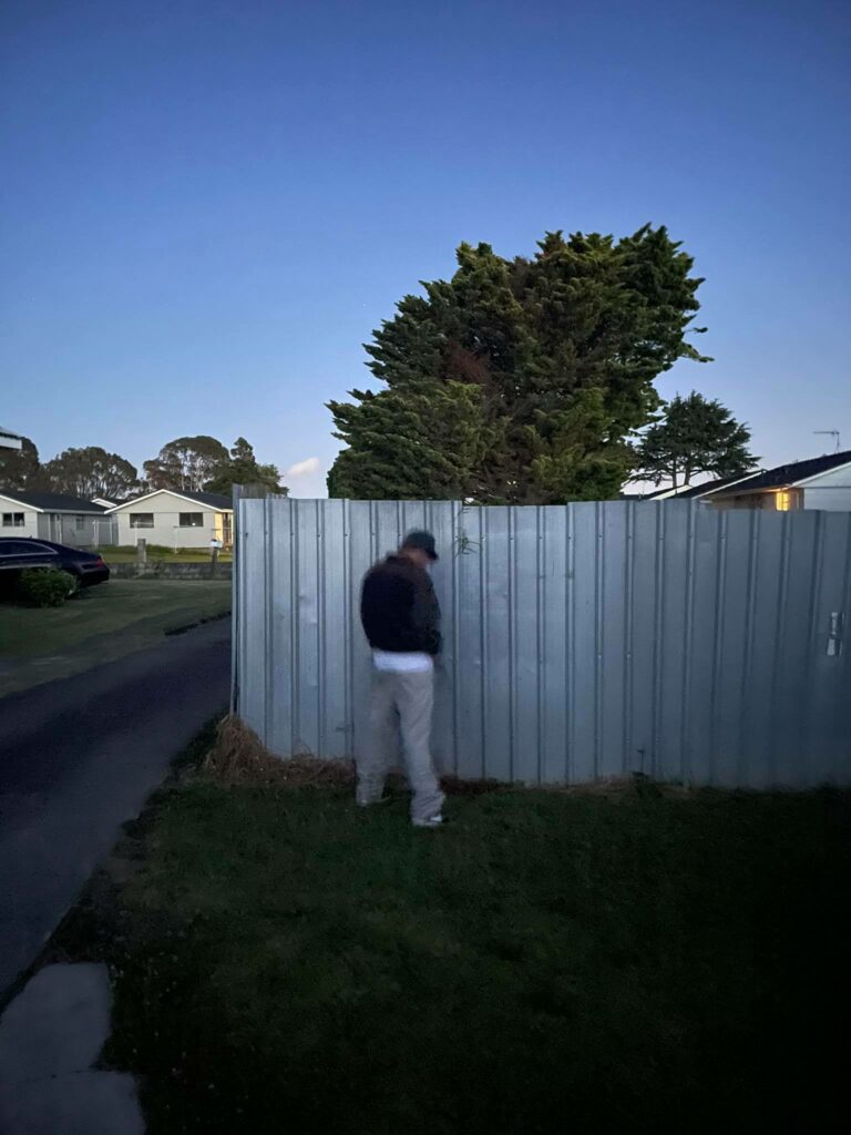
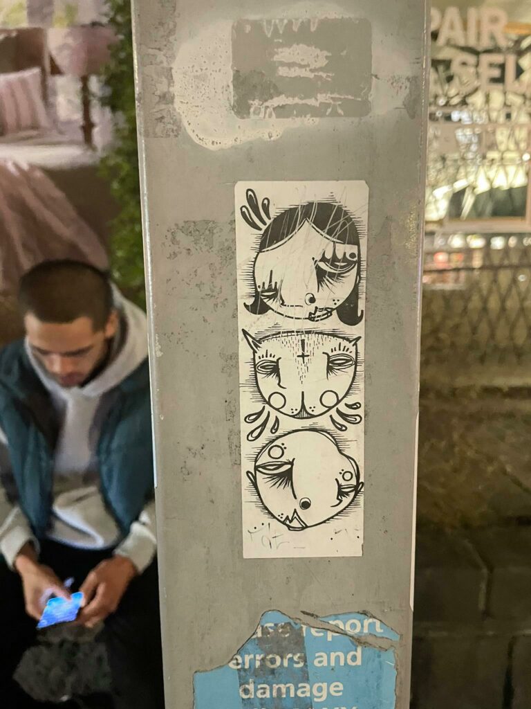
These photos were taken around campus in various locations. I tried to find places that would be clustered and busy but not straying too far from the University. Finding the right exposure times for the different locations was probably the hardest task throughout this whole process. It took a lot, and I mean a lot of trial and errors.
I quite like the images as negatives but I’m also quite curious to see what they’d look like as positives. This process has slowly persuaded me to try and expand my photography to black and white, but I’m not too sure how to manipulate a black and white image to its fullest potential.
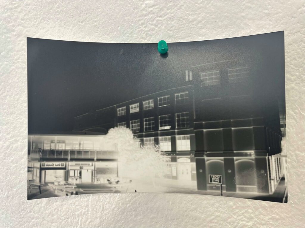
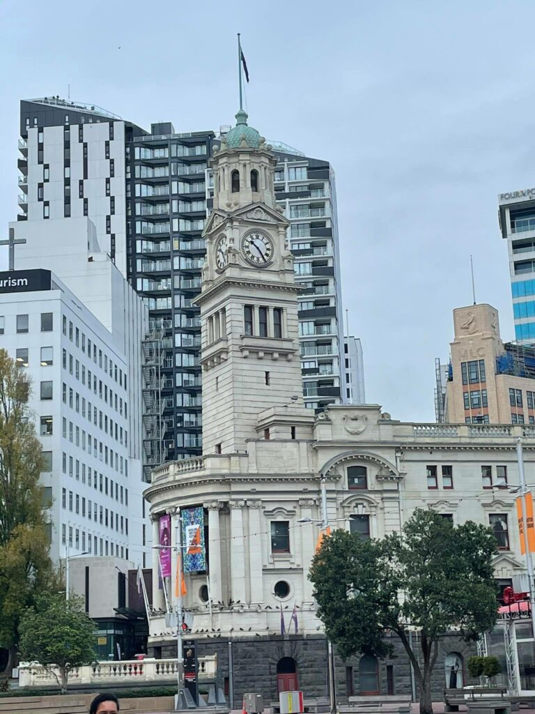
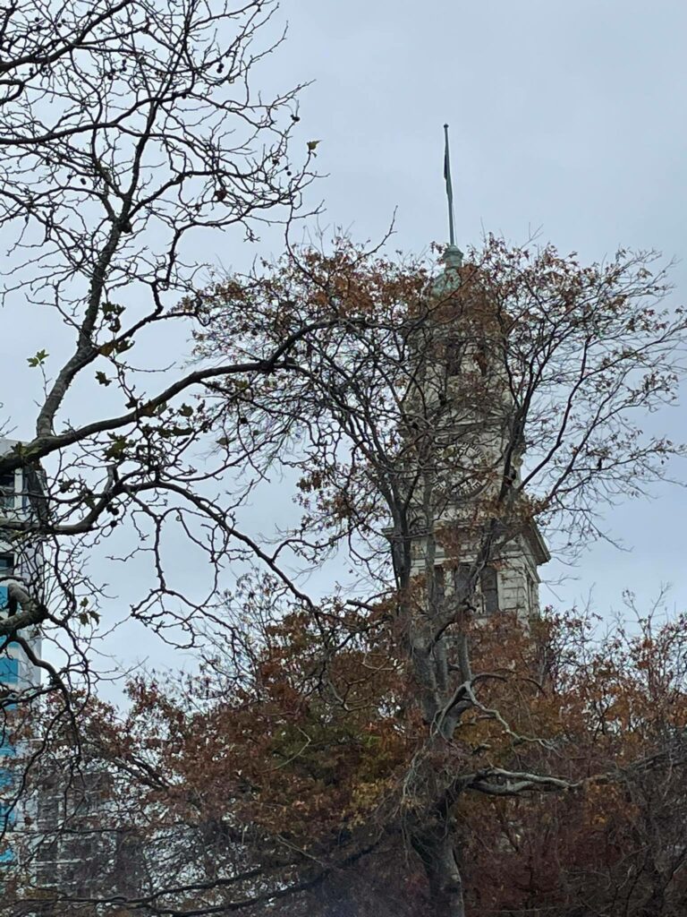
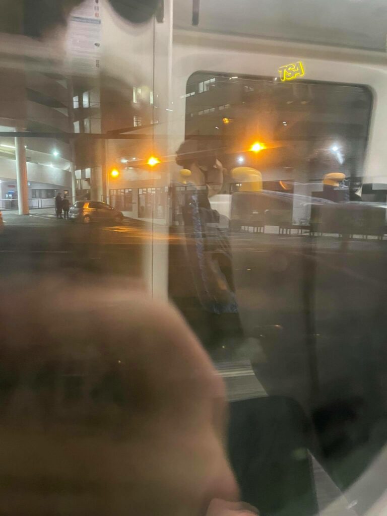
Exposure (30 sec) 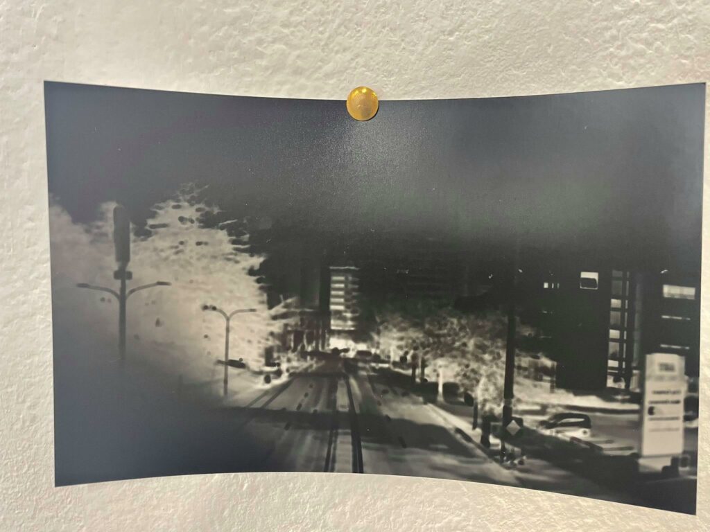
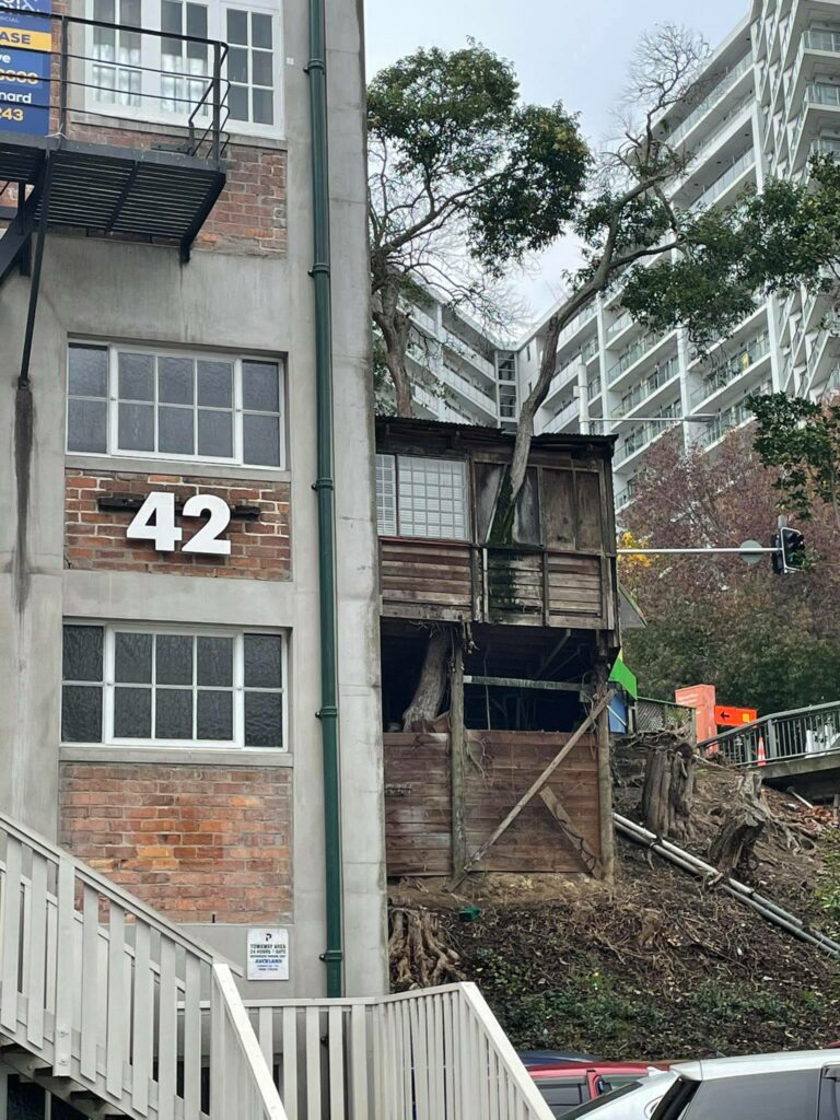
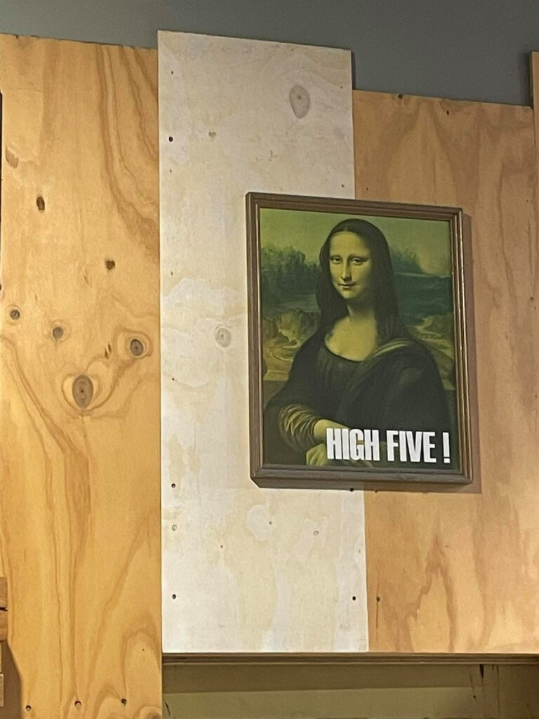
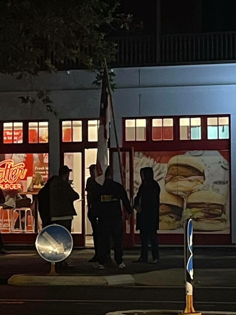
Exposure (15 sec) 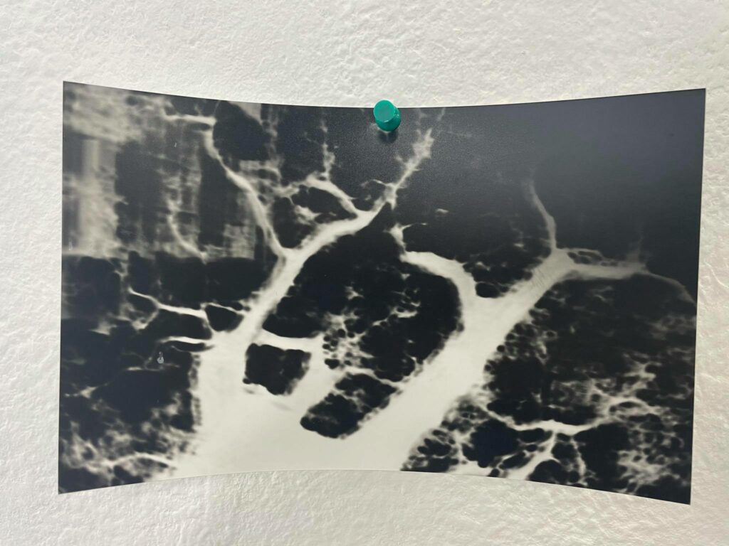
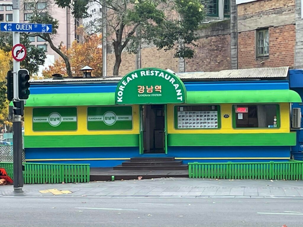
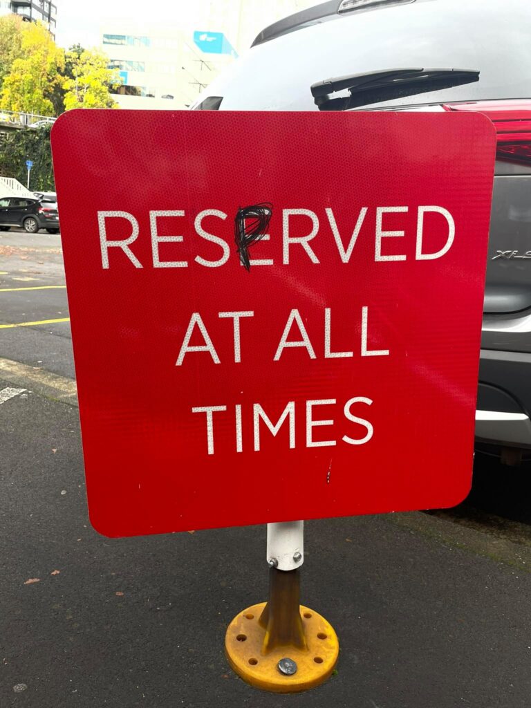
Exposure (15 sec) 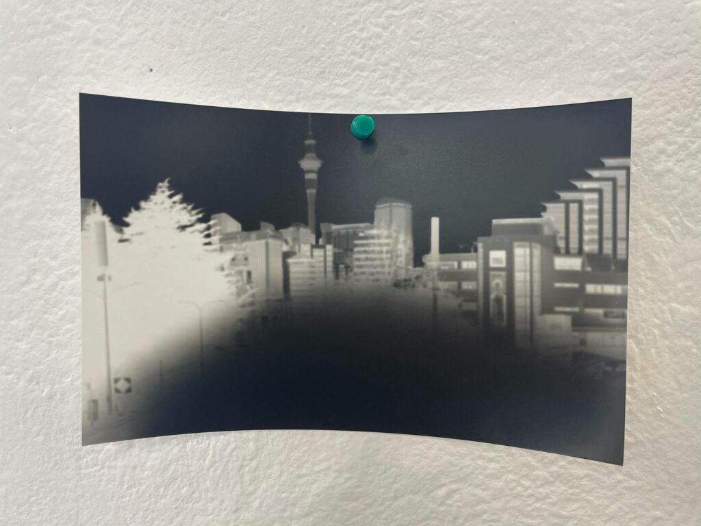
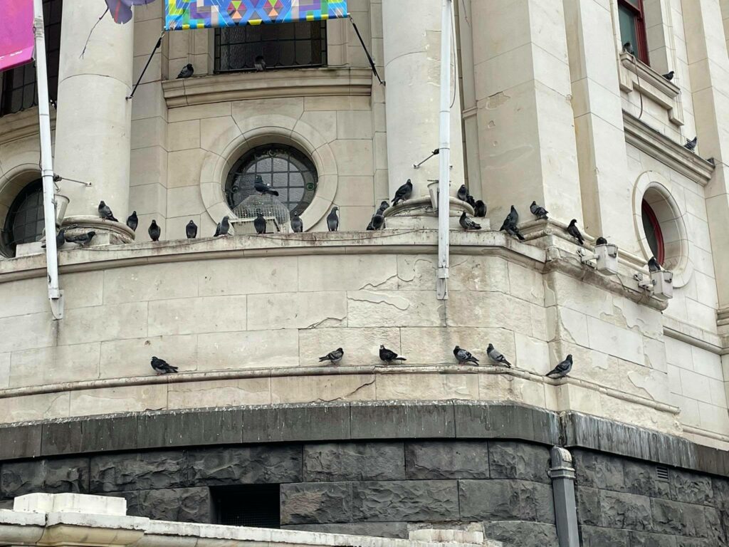
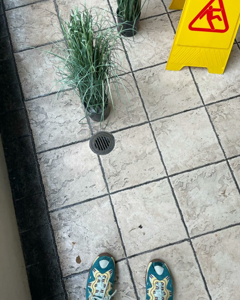
Exposure (7 sec)