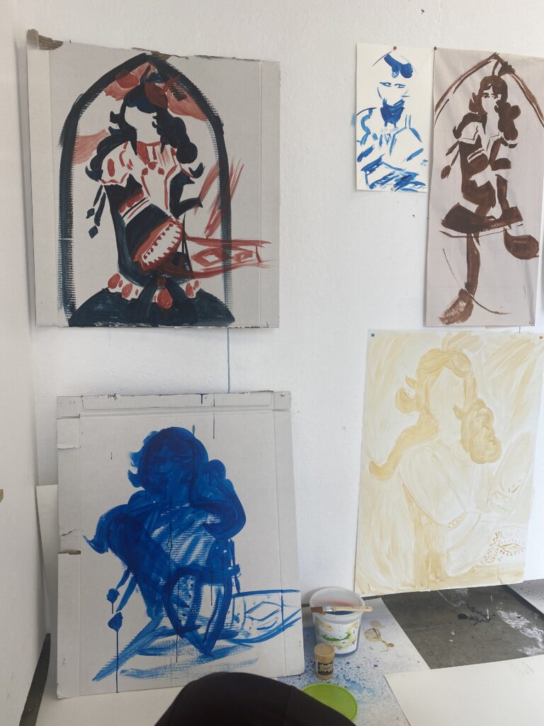
Week five was us starting to finish our last pieces, maybe making new ones or just adding. I started to use a new photo to use as my image reference. I had done two, one with detailed texture and another using black as its main and white to add the small lines of detail, to reduce the information. I enjoyed this as it’s not my usual but still played around with my artmaking techniques and possibilities. I had done one where I timed myself for 5-minutes and another for as long as I wanted to. It felt nice to do art in the style I’m more comfortable with, even tho I limited myself it’s nice to do some detailing after a long time.
After we had our class discussions and I wanted to restart my way of painting the images so I kept the idea of reducing the image while also distorting it and keeping it looking similar while also different.
12
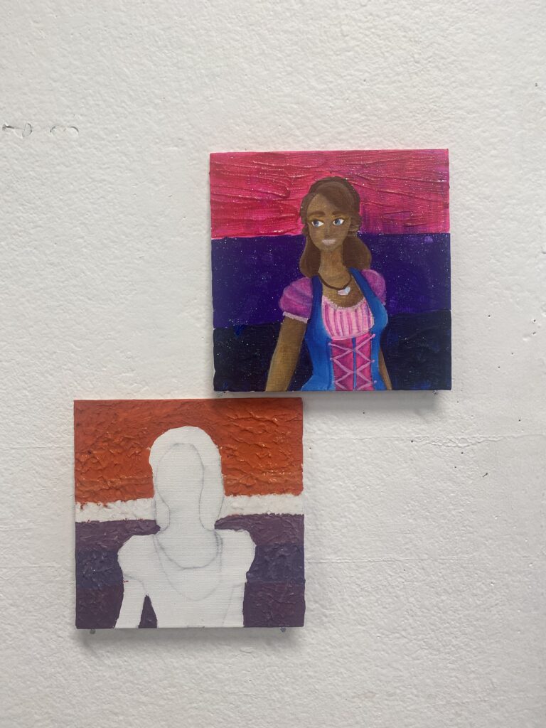
For 1 I wanted to reduce while also bringing colour and shape. For 2 I wanted one to be more detailed and have a very readable image while 2 (haven’t finished) have a reduced and little information look. It’s definitely something different but will be fun to explore later.
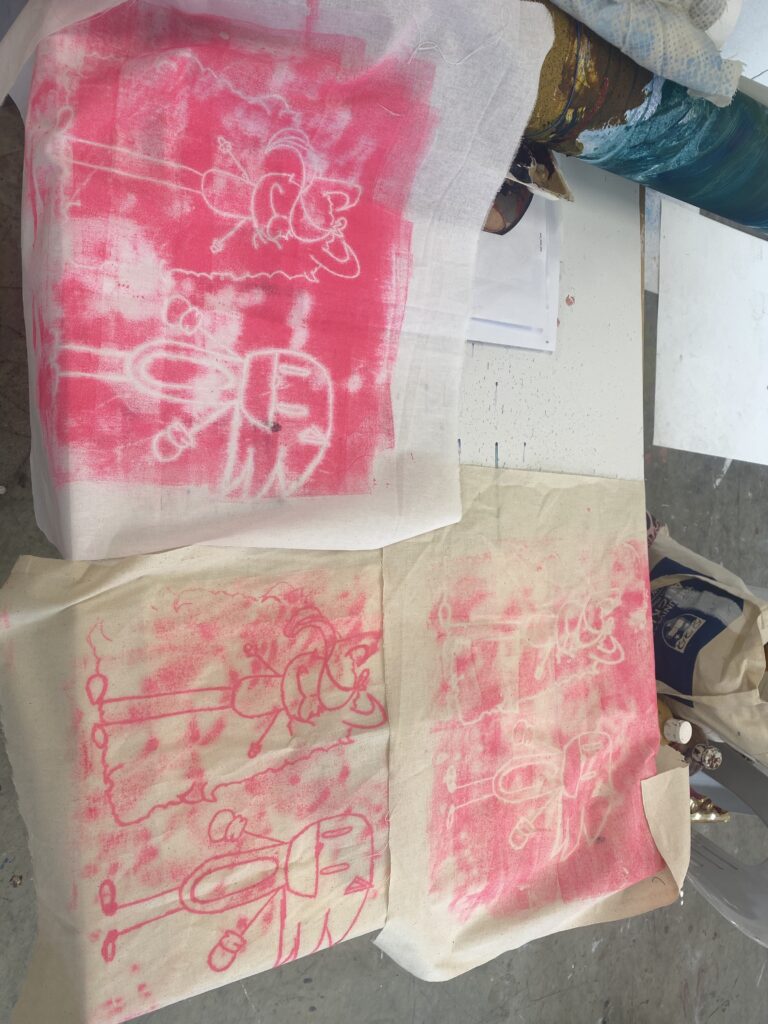
We had kept up with the idea of pushing the image information as far as possible but did something different for the workshop. We had still kept up with printing but this time we had used big rollers that print from a small piece of plastic or roll the counter then put the paper/fabric on top and applying our image onto it that way. I had just wanted to play around with the characters drawn and their looks, characters being sonic the hedgehog and my OC Lilli. It was something similar I’ve done in high school with etching but was definitely different and very enjoyable.
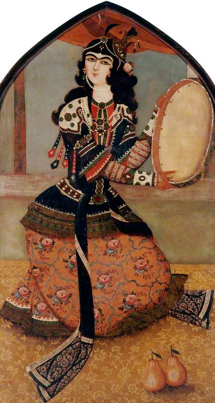
Iranian (Qajar dynasty); Woman Playing a Drum; Asian Collection; http://www.artuk.org/artworks/woman-playing-a-drum-30248
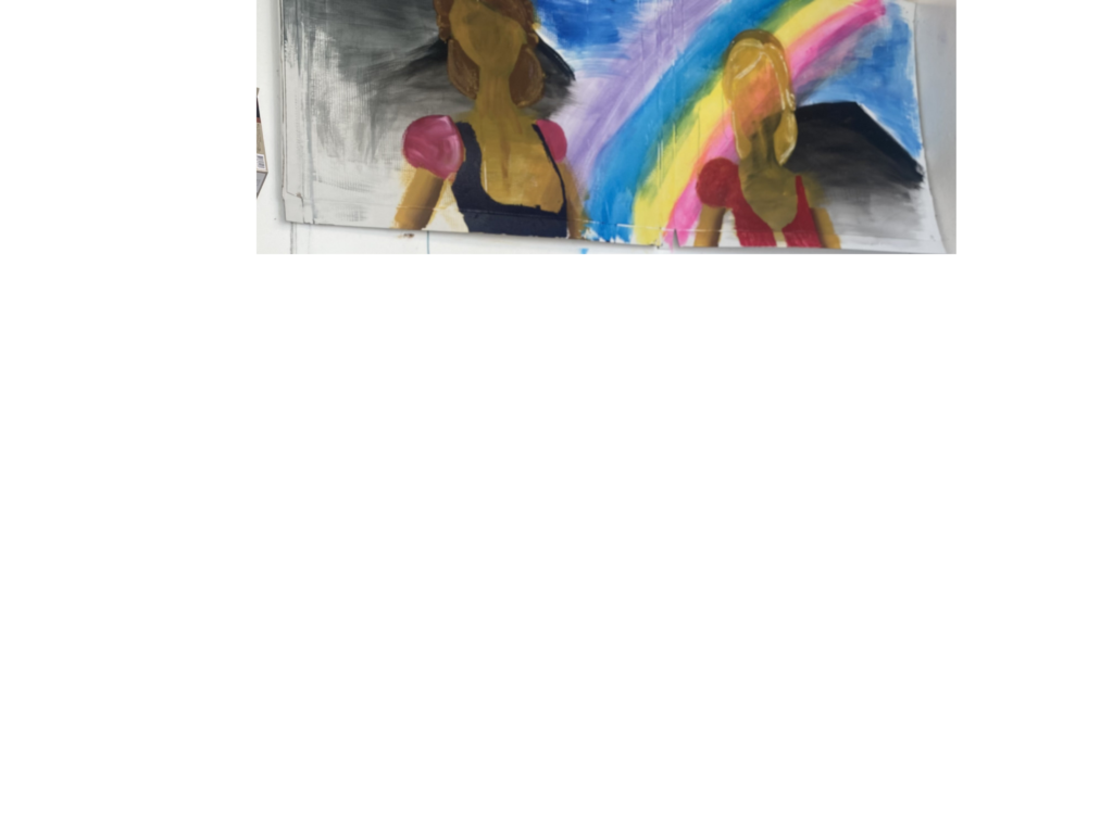
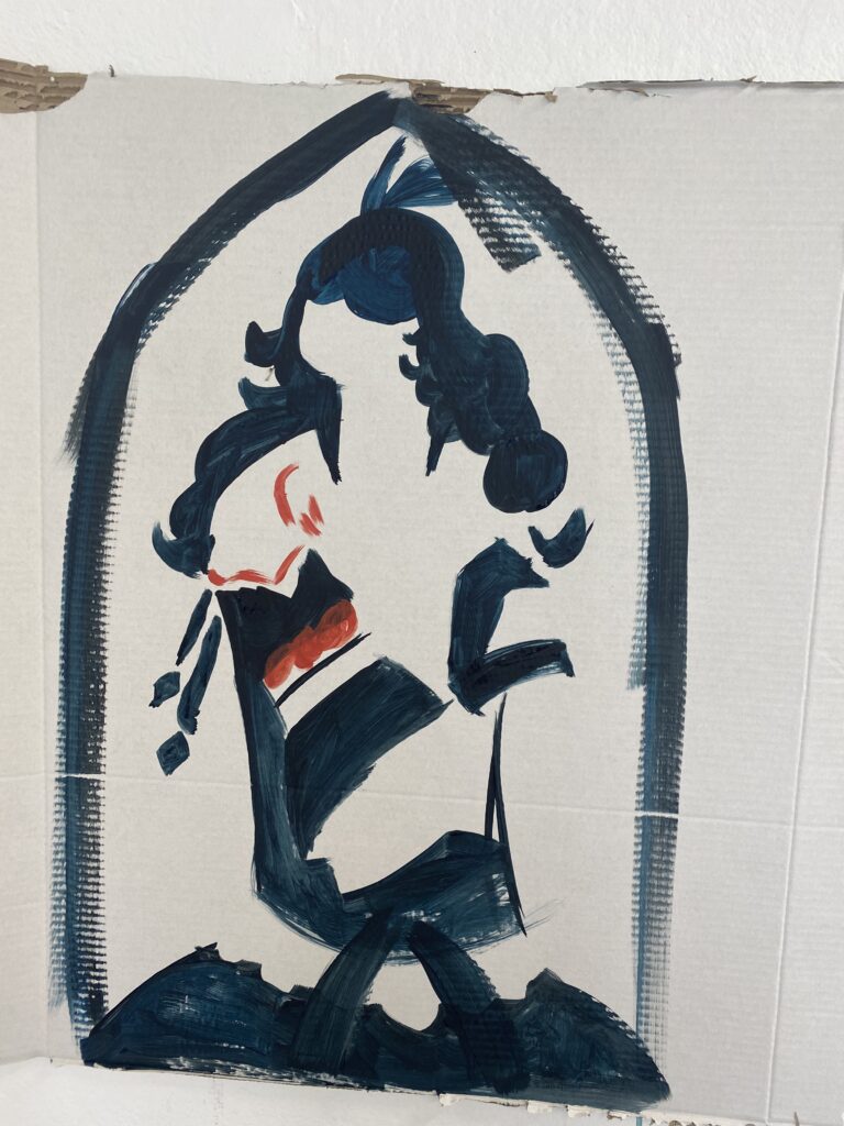
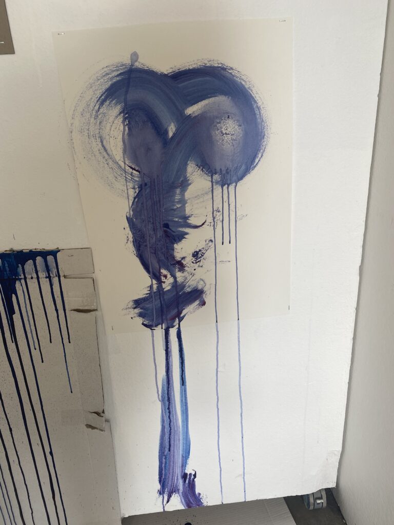
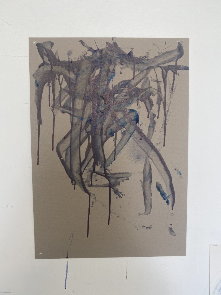
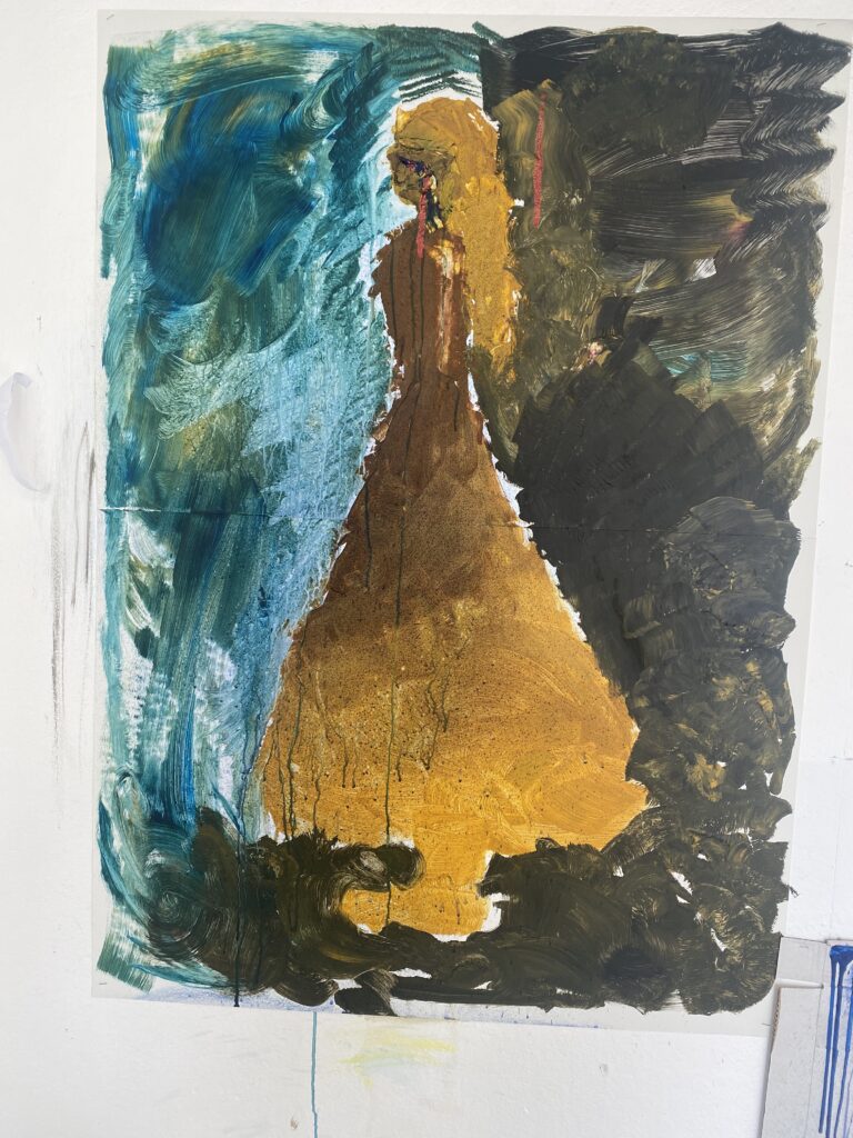
We had been told to bring four images (the fourth is kept for family sake lmao) and been told to expose the image to the point where we could see the darker parts pushed down and the whites made white as white, in doing this we reduce the image to where we see the information without it being completely in-formless. In doing this we try to reproduce this multiple times to learn its shape till we remove the image and reproduce the image we see. We had also gone into the print studio to learn new ways of printing, by drawing onto a blank screen an image with water-based crayons and printing it with a translucent print. leaving behind the drawn image. It was a fun new process as we could decide the image’s looks and style. (images pending lmao) It was fun to push the boundary of the image’s information and when it was/wasn’t enough. Also printing in this new technique was fun as we can decide not only on the image but also the background and little details. Definitely would do it again.
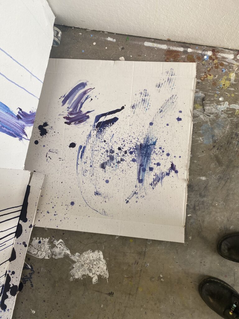
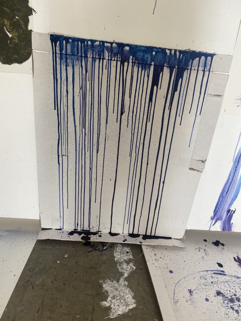
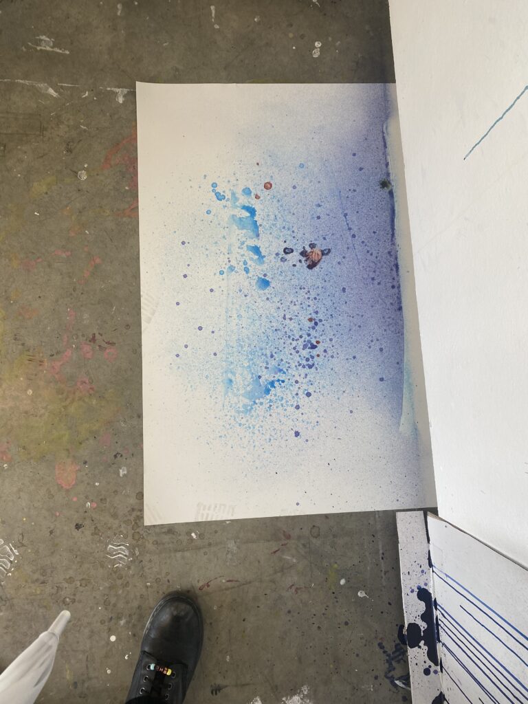
For the first week, we learned to generate words related to art making e.g, such as to splash, scrape, apply, push..etc. We used multiple materials such as heavy gel, thinner, pallet knives, thinned water, spray bottles, and gesso to make our art applied in different ways.
It’s fun to take off restrictions when applying different art materials and just letting go. It was definitely hard as I still wanted to have an image portrayed in my art but letting go of it was quite enjoyable and is great for texture. I would probably use this as texture for a subject or as a background landscape.
I’ve never done any type of animation or used photoshop or anything than design so this was a shocking experience. When we were taught the different ways to use photoshop and other applications to make animations it felt hectic and confusing, but I did ask around and slowly figure out how to use and find these tools.
For the animation I wanted to do something silly, that’s just for laughs and just goofy. I never really like doing art that has deep harsh meanings as I always just want something that can either make people laugh or just find pretty/enjoyable. The animation I did was just my OC dancing around and being embarrassed they were caught and left.
for the bigger prints, I had wanted each print to use a different color, and the background to be different shapes that sportively correlate with how we see the color. Because my animation background is pink which is normally seen as happiness and love, kindness, and femininity. painting these different colors may change how we see the character. I had even the delight of creating a flipbook and working with fleur (so sorry if that’s wrong!) It was d something I’ve always seen people do online but never knew if I would have the chance to enjoy it so I’m very glad I got to experience this in my life. It was fun to learn new machines and money different styles and processes on how to make a flipbook.
My process with this was just to enjoy it, not to stress about every tiny detail. That’s what I want to bring into next semester with me. This semester I kept trying to make it feel like college, where everything was on this very tight standard line where creative freedom was quite limited, but I’ve been slowly learning how I can push myself into my own style and limits. This semester was a fun new learning curve, with different materials, equipment, and just overall thought that went into the work. It was definitely scary for me to be taking myself out of what I know and into something completely different, but it’s not like life isn’t always going to be comfortable so this was fun pushing me into new grounds. I’m ready to see next semester and what new things I might create and what silly or maybe serious ideas I come up with.
Week 9 for me was continuing printing on my woodblocks and slowly assembling it together. I didn’t have an idea on where to start or what to put where first so I had just cut a side off a cardboard box and propped it up and stuck it down. when doing so I had already had an idea of where it could be heading.
Trying hard to keep the cardboard up.The progress made throughout the week and the following week Tuesday(17/05)
When seeing the cardboard position I had thought of a traditional fruit/food stand and wanted to play into the hunger and greed it delivers. Using the shapes I had, the ones that had eyes were hung up through them, as a way to symbolize the death is not just the sea through the Patrick look-alike, but also the greed we as humans have and consuming everything this world and the world after and stealing from there and continuing to take and take. For me I wanted to show how we continue as a society to take so much from what is offered to us, to the point of no return, to piece back together with a life before the destruction and heat destroy us. The buy and sell market becoming too big for us to the point of no return, too big for anyone to even try buying or looking. With the materials I had and can afford, I tried to overwhelm it as much as I could to push the idea of just taking and taking so much from the world around us.
We started the week by learning about both the 3d and print labs. The 3d labs were a new experience as I had never used any of the machines before. This was a fun but scary experience as there was a possibility of hurting myself and fun as I got to cut out my own personal shapes and push out these cuts with my abilities. Before cutting, I had no idea how complicated it would be to cut shapes out so when we had our tutorials and some practice with spare wood, I had to change some of my ideas as I knew it would be too complicated and difficult for me. During this time I found out how to use multiple tools to aid my goal, even with me reluctantly doing so. I had forgotten to record my woodcutting progress as I was very scared of all the cutting and focused on my own safety more.
My woodcut choice
The print lab was similar to things I’ve done in college but still fun as we got to choose our own images, and colors, and print them out ourselves. It was a fun experience as we first had to decide on 3-5 images that would show texture. I had chosen three of my own images that I’ve used for previous briefs and had to put them in photoshop to prep them for the labs. Halftones was a learning curb as I had never used it in photoshop, but in following the instructions given I had proceeded appropriately and chosen to use one that had the most lots of bigger squares as I wanted to show texture. The print lab was a fun place to mix the styles of other friends’ stencils into our own work while keeping it original.
Would have used the barkwould have used the label textureThe one used
In the end, I had used the painted one as there were different shapes so it can’t be understood when in black and white and when halftoned. It turned out the way I wanted as you can only recognize the image if you squint at it enough.
They weren’t fully cut in this image cut this was the progress after cutting and printing.
(this is what I have written for it, it has not been published in the newspaper as of this post but still putting up the work in the meantime.)
Maintain
I had this character that I had designed years ago and wanted to interact with my everyday life. She was just made with a card and a toothpick I had in the house. I had used the materials I was given at home as I didn’t want to complicate the process and keep it simple. This shows the growth between the imagination of my character and the growth of nature and how each lives. I had used her as a way to show my important places and where I go every day, one happening to be my family garden. I spend most afternoons helping in the garden by watering and sometimes planting vegetables. It’s important in keeping my mental health in check as I don’t usually go out, so bringing my character to my safe place feels like I’m bringing two calming things together.
For just a minute I wanted to keep up the theme of places close to me so my main area of focus was my garden. I had used the basics of interventions but only used what we had in the house with us.
(no I did not let peanut [the bunny] eat the cereal)
I had wanted to use this as a wacky fine dining and living experience. My backyard has lots of vegetation and could be used as a dining area so I thought, why not eat breakfast there. I do have the video of me actually eating outside but my computer won’t let me upload it for some reason, but will be uploading that asap. I had also thought of using my bunny as a ‘Consumer’ like us, so what’s the difference between the two. (!again I did not let her eat human food!) The mix between plants and our everyday mixup was also something I had wanted to show, without food and clothes walking right into the lives of animals and nature.
The new transformation was a bit confusing to me as there was a certain way it could go before it started to look too repetitive. I did struggle with this as it isn’t something I’m used to and is not my type of art. I did still have fun with this, but think I could do better than this and definitely do more.