Week one: experimenting

When given the brief I was so excited to explore and experiment with different verbs and materials.

the verbs I choose were

-To flood

-To repair

-To bind

-To rearrange

I had an idea in my head, I thought of an Object broken and rearranging the pieces to creating a completely different thing. I decided to try it on paper first, after that I felt more confident in developing that idea further.

Workshops:

I really enjoyed learning my way around the workshops, I wasn’t there when they made the moulds for the fruit but I was given a spare mould. It was a mandarin, which was surprising. analysing all the characteristics that the clay brought out got me excited for possible projects for the future.

My thought process:

More experimenting:

Developing my idea further, using materials that would “fix” or ”repair” the item. Obviously the materials i used wouldn’t fix or hold anything but I wanted to use that as a concept.

As I was doing this I thought of binding or sewing glass with mental wire but I didn’t know how to do that. Instead I decided to keep glass as a material but use it in a different way, although I would love to revisit that idea in the future.

Artist Research:

Suji Parks:

For our theory class we visited the Auckland Art Gallery, to look at the exhibition ”walls to live beside, rooms to own.” When walking through the exhibition I saw multiple colour containers stacked on top of each other. They in cased different objects and created little environments inside of each box. I wanted to take this concept and incorporate it into my sculptures. (Chartwell,2022)

Exploring with glass.

When I decided to work with glass, I had so many ideas and was getting a bit ahead of my self. I realised I needed to be realistic and think about how I could execute my idea appropriately with the materials and knowledge I have currently. To be frank, keeping everything simply was the best way to go.

Thinking of glass jars and what they hold. a message in a bottle was an idea I had then that made me think of the ocean and how glass is made. Glass is made out of sand. ”a sea of glass” is what repeated in my mind. So I tried to emulate “a sea of glass”, also the boats that people make in a bottle fit perfectly into this concept.

Pushing that idea further,

I wanted to take that concept to another level but still keep the simplicity. I used tape to bind all the pieces together and quickly realised that was a bad idea. So I changed to hot glue and it worked better!. I used the lid from the jar as a starting foundation for the stand, then used the remaining glass to elevate it. as a finishing touch I thought it would only be fitting to place a boat on top.

Repairing something that is broken, this made me think of the Japanese art practice, Kintsugi. Kintsugi is the art of embracing damage(Nerdwriter1. 2014.) In the Japanese culture when a plate or cup brakes instead of throwing it out they glue it back together. After they glue it together they brush the glue with gold dust or gold leaf to accentuate it’s flaws. Repair and reuse this broken object gets praised more because it has been broken, now the object is even more beautiful than before.

Yeesookyung:

yeesookyung is a beautiful example of this practice, she pushes it to the extremes which I love. Taking a broken object and creating a new and outlandish entity. Her work looks alive to me, like its pulsating or breathing. She brings back the life that the object had once lost.(Yeesookyung,2002)

More ideas

Using more materials

I started to incorporate metal into my work to tie in with the jar lids.

Concept 2:tree

I wanted to include pops of colour throughout my work, so I brought coloured jars and smashed them into different sized pieces. I felt keeping my colour option small was the best decision so I didn’t overwhelmed the viewer.

Also refrancing back to Suji Parks, how she is able to create environments in a confound space, inspired this ”tree” looking piece.

I find it funny to think of a tree growing in a jar, like thinking of how it would survive?, can it breathe in there?

Concept 3:

carrying on the items in a bottle/jar theme, I was still thinking of the ocean, so I created a fish from the glass. It might sound a bit cliche but we all know climate change is a big problem and humans are a key reason why our ocean and environment are suffering. So I kind of wanted to acknowledge that.

With this piece I thought of organs in jars and how people preserve them, I also wanted to use water to see how it would change the object. I really like how bubbles started to form around the glass and wire. I kind of wished that the wire started to rust just to give it another element to it.

Concept 4:

Before starting this piece I had one word in mind, slide. so random I know. but that word wouldn’t leave my head, so I tried to create a slide out of glass, which I could on image how fun that would be sliding down. I like this piece because it creates a sense of movement even though its stagnant. This piece was the most difficult one yet, because of its size and there was absolutely no support underneath the structure. So every once an a while it would start to break and cave in on its self. To combat this problem I had to make a good foundation for it, in which I did. Dispite the difficulty this piece brought I really like the end result.

Developing the tree idea:

Instead of having the jar upside down I turned it right side up. I felt the jar was lacking so I added lights to it, I thought it would be too much but I think it was exactly what it needed. also to hide all the electrical work I placed another lid on top. Again I felt it was a bit bare on top so I added a little jar and put a light underneath to make it feel like one completed piece.

Final Instalment:

when thinking of how I was going to exhibit my work I wanted to keep it simply but but exciting to look at, I kind of wanted it to feel nostolgic in some type of way. I knew I wanted there to be different levels and depths to it. when setting up and trying different compositions one of the pillars had no bottom to it and was holo inside. instead of covering it up i wanted to use this to my advantage and I rearranged the pillars and white boards to create a hidden space for one of my art works. In a weird way these pieces remind me of souvenirs my grandmother had in her glass cabinet that were from all over the world and we were not aloud to touch them just look, I would sit in front of that cabinet imagining where they had been and who had touched them, making all sorts of stories in my head. Tea parties with fairies, princess favourite china set, ect. I just hope I captured that same magical feeling in the way I presented my work.

Reflection: overall I am surprisingly happy with everything I have made. If I’m being honest when i was creating i really had no idea what i was doing, I was unconsciously creating with no result in mind. This was a little stressful for me and there were times where i wanted to give up but i really had to trust the process and I’m glad i did. I feel like going with the flow can be good but also i think i need to plan out what I’m doing just to keep my self from stressing too much. Ive learnt so many thing during this brief, not to be afraid of trial and error, trust the process like really trust it, if something isn’t working out just carry on and anything can become a ”material”. I am so proud of my work and my self for what i have created. I am especially happy I ended the year on a good note, can’t wait to see what next year brings.

Bibliography

Chartwell. 2022. “Suji Park.” The Chartwell Project. 2022. https://chartwell.org.nz/making/artists/suji-park/.

Nerdwriter1. 2014. “Kintsugi: The Art of Embracing Damage.” YouTube Video. YouTube. https://www.youtube.com/watch?v=lT55_u8URU0.

Yeesookyung. 2002. “Translated Vase.” Yeesookyung. 2002. https://www.yeesookyung.com/translated-vase-.
Week 1: Painting-mark making

Pouring medium

For our first week of painting, we looked at Richard Serra’s verb list. We had to choose a verb and create different types of mark making with those verbs. We also used with different techniques and medians. The verbs I choose were spread, pour, scrape, drip, smear and to drag. I found this process very therapeutic, not really thinking about what I was painting in particular kind of letting each mark determine the next. The end result was never in mind only focusing on the process. I mostly used acrylic paint but mixed it with modelling paste and pouring medium to see how it would change the paint. With the modelling paste I really liked the textures it gave off, especially on different types of paper, I also liked how it made my brush strokes come off the page. On the other hand using the pouring medium was completely different. I found I had less control over it, it was interesting because I would deliberately place a mark on the paper with a vision in mind of what I wanted. Although because of the consistency of the medium it would change and move. I kind of liked the spontaneity of this process, learning to accept and adapt to the changes instead of starting again.

Artist research: Ian Davenport

I liked this artist because of how satisfying the outcome is, such a simple but well executed piece. When I researched about Ian his method he pours paint from the top of the canvas and lets it drip down and when it gets to the end it makes unpredictable movements. He also talked about how you have to adapt to the changes of the paint and not to go agaist the grin but with it, I used his method on cardboard and loved the result.

Week 2: photos

For the second week we were told to choose 5 photos

photo including people
-photo without people- landscape, still-life
-a piece of printed fabric (shirt, scarf, tablecloth, etc.)
-printed image of a painting made before 1900
-printed screengrab from a film

Queens gambit -(Still watching Netflix, 2020)

This week for me was kind of difficult, we had to analyse the visual properties and to not make a exact replica of the image. This was hard for me to wrap my head around. Not being able to spend too much time on the paintings was so foreign to me, because I am a person who needs everything to be perfect and precise. It was hard to know when the painting was considered finished, although I knew these few paintings were only studies I still wanted to add more. Even though it was difficult I persevered. My favourite image that I choose was the picture of my parents. I found I enjoyed painting more if I knew the people I was painting or if it was a photo I took myself. I liked creating multiply copies of the image but changing the medium. Seeing them placed next to each other was crazy and how one image can have so many different out comes depending on what mediums, brushes, and colours you use. I felt weirdly more connected to what I was painting.

Week 3: bringing mark making and image together

Using what we learnt from week one and two then bringing them together was interesting. I looked back at week ones work and selected the mint green piece. I decided to paint over that paper, I actually felt I over did it a little bit with the face and I felt I didn’t bring the image and the mark making together. It just looks very separate from each other and the image looks out of place. When I started painting my parents I really hated what I created, I thought the colour choice was ugly and the brushstrokes were too harsh. Instead of throwing it away I just set it aside and worked on something else. While I was creating I felt stuck and didn’t know what to paint or should I say how I should paint it. To remedy this problem I did Some artist research in hopes I could find some inspiration.

Artist reaserch: Rita Ackermann

I came across Ritas artwork while researching and as soon as I seen it I was immediately captivated. I admired how she could create such complex compositions with little to no detail. Her use of colour was another reason why I gravitate to her work, I also love the subject matter because i love painting figures. I wanted to try an emulate her pieces throughout my new art works i was going to create. After my research I carried on with my parents painting and just kept working it and slowly it started to grow on me.

Week 4-6: continuing to generate art work

Final instalment:

Reflection:

This painting brief was really challenging for me. It was difficult because I have such high standards that I want to meet and felt I didn’t do as well as I expected I would. Although I didn’t meet those standards I learnt a lot of things I didn’t know before. Like griding the page before painting, framing, doing a light wash for you background and restoring the walls back to its original state. I Especially learnt alot from my pares, seeing their take on this brief was refreshing. Anytime I would get stuck it was nice to talk to my classmates about how they were going, or just looking at what they were creating. looking back on the first week I really enjoyed the mark making process, it was really freeing, not having to worry about what it would look like or if it would be acceptable. I know in the future I will use more mark making techniques. This brief really encouraged me to paint more from life and to paint my loved ones in order for me to enjoy what i am creating. Overall Im quite happy with what I have created. I know that if I keep challenging my self I can only get better.

Bibliography

Alicja Zelazko. 2017. “Girl with a Pearl Earring | History & Facts.” In Encyclopædia Britannica. https://www.britannica.com/topic/Girl-with-a-Pearl-Earring-by-Vermeer.

Davenport, Ian. 2022. “Crazy | 18 February 2022 – 8 January 2023 – Overview.” Ian Davenport. February 18, 2022. https://www.iandavenportstudio.com/exhibitions/36/overview/.

Hauser&Wirth. 2018. “Rita Ackermann Turning Air Blue – Hauser & Wirth.” Www.hauserwirth.com. January 1, 2018. https://www.hauserwirth.com/hauser-wirth-exhibitions/6093-rita-ackermann-turning-air-blue/.

Still Watching Netflix. 2020. “Beth’s Downward Spiral – the Queen’s Gambit – Full Scene | Netflix.” Www.youtube.com. November 1, 2020. https://youtu.be/pSEnzwTOktU.‌

Week 12-Summative Reflection

I really enjoyed the transfer brief. I had always been interested in transferring ever since I seen my class mate at school use it for her NCEA art board. Im so glad that i have added that technique to my skill set. I feel like this has been my most successful piece because everything flows very well. The composition ,colour and concept are things that i am very proud and satisfied with.

The brief I had the most fun with was the Necessary Distractions brief. I really enjoyed going into the different labs and becoming familiar with those spaces. It was also the only brief I felt the most creative free and felt I could just let loose. Although I was not happy with the result I am thankful for the processes that i went through. —On a more positive note another brief I enjoyed was, the Just a minute brief. I have always had a love for photos and photography, I was always so fascinated with how someone could capture feeling in a single image and make you feel that emotion when you look at that image. So when given this opportunity I happily took it. Running around my home like a crazy person capturing moments of my family was so fun. showing my family the results and seeing their faces was probably the most rewarding thing ever. I loved incorporating my whanau into my work especially my transformation piece. I enjoyed seeing how i could change and transform my photo into something completely different and see how that change the meaning of the artwork.

This corse has challenged me in so many different ways, The first thing I noticed how I cling to mediums that I am comfortable with like paint,pencils,pens etc. I know that this has hindered my creative process, there is nothing wrong with these mediums but restricting myself to only these things is bad. I also found that when I create I don’t really think about why I’m creating or the meaning behind what I am creating. I know you don’t always have to have a deep meaning behind your art but I’ve learnt it helps. Also working on something other than a board format has been quite hard to transition into. Being so used to working in a 2D mindset then being chucked into a preferably 3D setting was a little difficult. This habit is slowly disappearing the more I work in the studio. Speaking of, working in the studio is a little intimidating, I am not use to people seeing my creative process and looking at my work especially if its not done and I’m in the experimenting phase. I know i have to get over this ”fear” especially before i go into semester two. I know as I continue working in the studio I will get more and more comfortable with people seeing my work and as an artist thats kind of what you sign up for.— Going into semester two I have to become more confident in using the labs and talking to the technicians, but I always seem to shy away from that even though I know they are there to help us I get scared. They’re probably the best people to talk to especially if you have a project you’re working on. Also I need to use different materials like metal and glass. Overall I’m quite happy with this semester and hope to be able to get out of my comfort zone and keep pushing my limits, in hopes that I learn and grow as an artist.

Necessary Distractions-Final Instalment.

I don’t really know how to feel about my final piece, theres parts that i love but on there own. I don’t enjoy looking at it all together, I think it’s not cohesive enough and looks messy, I also feel like I went overboard and wish I kept it more simple. I will say that this brief pushed me to think out of my comfort zone and to use materials that I would not usually use. It also cause me to think about how I was going to push the plywood away from the wall and making it seem like it was floating. also hanging things from the celling was something I had never thought of doing before but will for sure continue doing in my future works. I really enjoyed the process of this brief but no so in love with the result but I think thats okay. I have always shyed away from any types of abstract art because I didn’t really understand it but this brief has grown a desire in me to learn more, I surprisingly like abstract art now. Being push out of my comfort zone is scary but i know it will benefit me in the future.

Week 11-Necessary distractions: printing lab

Starting this brief we were told to make use of the printing lab. This got me excited because I was kind of familiar with this practice from school. I used an image that was meant to make it into the ‘Just a minuet’ brief and half toned it on photoshop. After that I created my screen, washed and dried it then started experimenting. At first i was a little overwhelmed because there were so many things I wanted to do but didn’t know where to start. I grabbed an A4 screen with no patten to purely experiment with colour. Instead of starting straight on my plywood I decided to use the paper that was provided in the lab. When I was shown the coloured ink I got really excided because there was so many different colours. I became even more excited when I got told we were aloud to mix our own colours. I leap at the opportunity and started mixing all different types of colours together. At first I felt a little weird because I had more than ten containers of ink on my station and everyone else had two of three, never the less I continued creating. After my first swipe I was surprised with the results and became more confident with creating. I love the the pink and orange combination and feel like they compliment each other perfectly. I was trying to emulate mark Williams work but in my own little way. We were also told that if the you see a container that you like and it didn’t have it name on it you can use it, in saying that I found a container with multiple colours that hadn’t fully mixed in yet and i used it. I used that ink on my screen that I created and I really love how it turned out. I also printed on fabric but unfortunately had no photos of them. The one thing I wish I made use of more was the transparent inks, I know if I get this opportunity again I will for sure experiment more with them.

Artist Research:

Mark Williams was my leading inspiration during my printing process. I referred back to his work a lot whenever I felt I was going of track, especially when I felt like I didn’t know what I was doing. I love his use of colour, although he using a lot of different colour they all seem to work so well with together. I also found none of them over shone each other they were all completely cohesive. This piece screams harmony, pretty ironic because there so much going on but the way the colours overlap each other is so satisfying, this creates a 3D look on a 2D surface which is what I tried to keep in mind while printing.

Jessica stockholder:

Jean arp:

Jessica and jean inspired me though-out my assembling process, with Jessica her use of miscellanies materials inspired me to do the same. I looked at her work a lot when I was deciding how I wanted to compose my work, I knew that I struggle in that department so referring back to her work really helped me a lot. Jessica used different fabrics and colours that clashed with each other, this relaxed me into not overthinking about if the colours and fabric matched and let me know that that was okay. I really enjoyed jean arp’s work, his work was like a breath of fresh air that cleared my mind. The simplicity that he carry’s though-out his work is really effective and I wish I emulated his work more.

3D lab:

I was in the group who had to cut their shapes out before printing on the plywood. At first I was a bit confused of how that was going to work but now that I look back I’m actually grateful that I cut my shapes out before printing because it made it easier to print. When deciding what shapes I wanted, I honestly had no idea. I didnt draw on my plywood because I really didn’t know what I wanted so I just started cutting, I personally think that was a good choice to make because it made my shapes more interesting. I started with 4 rectangles and as I continued I realised I wanted more organic looking shapes. Before I keep talking about my shapes I want to talk about the machines in the lab. I actually really enjoyed learning how to operate different machines and how they worked. I felt really safe and the people who ran the workshop made me feel confident in myself to be able to do my work efficiently. Anyway although I wanted organic shapes it was quite difficult to get really tight rounded off edges but in saying that I am still happy with my shapes. Now that kind of know my way around the 3D lab Im probably going to be back there in the future.

Printing on plywood:

While printing I just went with the flow and tried not to think about it. I think this mind set really helped me enjoy the process and I found myself actually having fun. I tried different mixtures of colours from pastels to brown,white, and pink. Although trying different mixtures was cool, washing my screen 20 times was not, but it was all worth it when I saw the result. After I washed my screen I had to wait for it to dry, instead of waiting around doing nothing I used another screen that was A4 size with no patten on it. while one was drying i would use the other one and switched between the two. There was a moment where I put too much ink on the screen and it seeped through, this cause the shape to stick to the screen. When I pulled it off it created a rippled texture, I thought this was interesting so I decided to keep it. I got sick of cleaning my screen so I put the ink straight on the plywood to see what it would looked like, I think it looked pretty cool. Overall I really enjoyed this process and i know i will be using this lab more often.

Experimenting:

When assembling my piece I tried so many different compositions and looking back I kind of wished I keep it that way, but oh well. I was just trying to get a feel of what I thought looked interesting.

Developing my composition:

Before I even put something on the wall James talked to me and said ” don’t pre plan anything, Just do it” this advice replayed in my mind the whole time I was developing my piece. I think I change my composition nearly 4-5 times, I would strew something on the wall, step back, stare at it, then take it down and repeat. Having this ”its about the journey not the destination” mindset set me free from procrastinating. Going with the flow most of my materials were found on a whim which I kinda like. The fabric were off cuts from the fashion department and the plastic bag was the bag that held the fabric. I kind of wanted to use materials that I could up cycle and reuse, the only thing I brought from the shop was the wool and styrofoam balls. I just hoped that everything that I gathered would work well together. There was a time where I got stuck so I tried string art in hopes it would creatively wake my mind up, and it did. The string art looked like broken flowers tied together, this inspired me to use tissues and tie them together. going with the tieing theme I decided to tie the fabric as well, too tie it all together.

Francis McWhannell reading:

Reading McWhannell’s reading brought me some comfort and confidence in my work he talks about how the mode production empasiers the status of painting as a process, not merely a result. Francis also goes on to say to allow people to witness that process. reading this reassured me that its not all about the result and allowing people to see your creative process is a good thing. Also looking at the different artist and how they interpreted the brief was interesting. They showed me that painting it more than paint to paper.

Change it up

First animation: butterfly animation.

Second Animation: Sunset animation.

This week we got given a brief to create 1-3 animations of a topic of our choice. I was excited but nervous, excited to try a new form of art but nervous because I didn’t know how I was going to execute it.

I knew I wanted to incorporate the human body into my animations so I choose hands as my subject matter for my first animation. While creating this animation I found it hard to find reference photos for my animation so I used my own has as a reference. By doing that I started to enjoy the process and found it easier to create. The butterfly that is in the animation represents our environment and the hand represent humans\ mankind. I think the environment is beautiful but fragile like a butterfly hence why i chose a butterfly. In the animation the butterfly makes contact with the hand but the hand is careless with it and ends up killing it, the hand relises what it has done and regrets hurting it. Although the hand wants to help the butterfly its too late, the damage is already done. We can relate this to how careless we as humans are to the environment. our planet is dying and we are bearly doing anything to help and soon enough it will be too late to do anything.

My second animation is more light hearted and fun. I wanted to play around with colour and movement. I choose a sunset scene because a sunset has so many different colours that bounce off the water and clouds, so i wanted to try and emulate that through this animation.

Although this was a time consuming task i really enjoy it and hope to impove my animation skills in the future.

A3 reworking of animation frames:

These a3 pieces are frames I took from my first animation that I painted over. I wanted to explore different ways of how i could show movement. I wanted to use bright and bold colours and use big brush strokes to show emotion but also try to keep the essence of the original animation look and not paint over it too much. By experimenting with these pages it gave me a better sense of what i wanted my a0 pieces to look like.

Experimenting with instillation

Final installation:

This is my final installation. Once the image was blown up to this size you could really see brush strokes you couldn’t see before, it became very pixelated but i liked it. Also while painting I was keeping in mind the meaning behind the animation and tried to build off that meaning. I thought of the phase ”caught red handed” and tried to incorporate all the ideas that go into that saying, Hopefully it shows. overall I am quite happy with the results.

Transformation Brief

My idea for these pieces was to implement my pepeha though out them. I transferred book pages on to a A3 paper and while I was tearing the pages I placed the papers down not really knowing what was going to come of it. Then I noticed it resembled a mountain. So I used the negative space to create the outline of my maunga and awa. By doing this it related to my printed matters brief perfectly because my photo is about my family and where i come from. I took a photo of my pepeha piece and used photoshop to edit the photo into it creating my final product.

Final product

Experimenting:

  1. My first experiment piece: with this piece i really didn’t know how to go about this brief. So I just to see what i could come up with. I imported my image into procreate and used brushes to deface the subjects faces. Then I took the written article that came from the printed matters brief and placed it over the image.

2. Colour experimentation.

3. My verb i choose for my image was to reflect, because it was reflect i thought of a mirror and what happens when two mirrors reflect off each other. With that concept in mind i created this piece. It shows the infinite effect two mirrors have and also supports the meaning behind the image.

Artist research: Uta Barth

Uta Barth has after some three decades of artistic practice come to occupy a truly singular position in contemporary photography.  Having made visual perception, itself the subject of her work, her images are known to appear empty as they, with blurred backgrounds and cropped frames capture only the most minimal and ephemeral information. She has said of her work: “The question for me always is, how can I make you aware of your own activity of looking, instead of losing your attention to thoughts about what it is that you are looking at.”

By deconstructing the conventions of visual representation, she draws attention to the periphery and to the differences between human and camera vision.(Barth 2021b)

Uta’s art style is how I wanted to present my work, i find her work quite fasinating and her concept ”drawing with light” is especially interesting to me. I tried to incorpporate some of her techniques thoughout my works. By using the negitive space in my piece, also layering and using silhouettes in my image.

Bibliography

Barth, Uta. 2021a. “Uta Barth – in the Light and Shadow of Morandi | 10 June – 24 July 2021.” Andréhn-Schiptjenko. 2021. https://www.andrehn-schiptjenko.com/exhibitions/73-uta-barth-in-the-light-and-shadow-paris/.

2021. “Uta Barth | in the Light and Shadow of Morandi.” Utabarth.net. 2021. https://utabarth.net/work/in-the-light-and-shadow-of-morandi/.

Tacita Dean

Tacita uses a transentional state between negitive and postitive, this concept developed a very large and striking image, she also presents this image in the same scale as the subject. Tacita uses colouring pencils to tranform the image creating such a unworldly piece of art(Dean 2021). I wanted to use her concept in using the state between negtive and postive to give my my piece a simillar look.

Bibliography

Dean, Tacita. 2021. “The Dante Project · One Hundred and Fifty Years of Painting · Pan Amicus · Significant Form · Monet Hates Me.” Https://Www.mariangoodman.com/. 2021. https://www.mariangoodman.com/exhibitions/459-tacita-dean-the-dante-project-one-hundred-and-fifty/.‌

Newspaper Piece:

This the image i used for the newspaper brief and the verb I used was to reflect.

Reflect.

How do we reflect? Reflect on our past, reflect on our present, reflect on our future.  With this image, I wanted to capture the light reflecting off my sister’s eye but while I was taking the photo, my father stepped into the frame and as a result created this image. My father is placed in the background out of focus, leaving my sister in the foreground focus suggesting she is a reflection of him. He represents the past and she represents the future, she can not move forward without acknowledging the past. We learn from the past and from the past mistakes our tupuna made, hoping we won’t make those same mistakes. “Our families, communities, and relations have framed our lens of story, dialogue, and relationality to place and people. We recognize them as our first teachers.”(Tecun(David Hernandez) et al. 2018).  As a Maori descendant, whakapapa is a significant aspect of my culture, which is why we hold onto our genealogy to stay connected. 

“Inā kei te mohio koe ko wai koe, i anga mai koe i hea, kei te mohio koe, kei te anga atu ki hea.” 

“If you know who you are and where you are from, then you will know where you are going.”

Just a minute brief:

For this brief I chose the verbs, reflect,louge,light,grasp, extend,ponder,stretch,climb and to hold. When i was given this brief I was a little nervous about how i was going to approach it. I was very overwhelmed with all the different verbs and didn’t know what to choose because i wanted to do all of them. I was also afraid I wouldn’t execute it the way I wanted. I had never really done photography before and only had my iPhone to take my photos, but despite all of the doubt I had, I started and was pleasantly surprised with the results. With the verbs I chose I didn’t wanted to take to obvious option first, because I tend to do that a lot with my work. So I tried really hard to think about why i was taking the photos and not to take a photo because it was pretty. I hope that shows in my images. I found I preferred to focus on the features of the body more than the full body itself. I felt being up close where you can clearly see everything causes the viewer to feel the emotions that the subject was feeling. Overall I really enjoyed this brief and hope to improve my photography skills and implement it into future artworks.

To reflect:

To lounge

To light

To Grasp:

To Extend:

To ponder:

To stretch

To climb

To hold

Week 4. On-site/off site-Interventions:

1-Cheetah Piece :

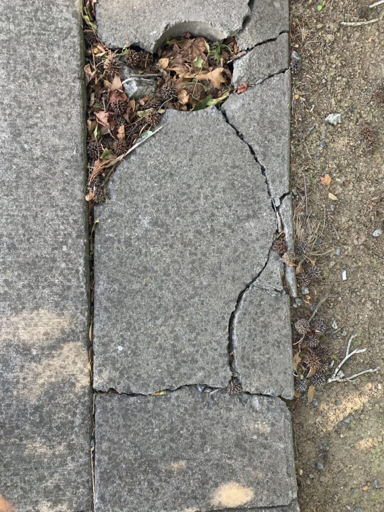
When I got given this brief I straight away thought of using chalk in one of my pieces. So I brought some chalk and walked around my neighbourhood. Before I crossed the road I looked down and saw that one of the tiles were broken. I took a closer look at the tile had small black speckles in it, which reminded me of a cheetah. I used chalk to colour the cheetah and charcoal for the black details. It’s not the best drawing I’ve made but I think its acceptable and gets the point across.

2-Nature prevails:

With these Pieces I wanted to show that even though we are in a ‘concrete jungle’ nature can and will prevail one day. I came across these cracks while I was walking through the park. So I drew a tree, then I used paper and watercolours to create the flowers.

(Experimenting) Hallway:

3-Red lamppost:

I was a little afraid to post this piece because it involves my culture and I didn’t want it to come off offensive. I painted a bottle with the Maori flag colours because i feel there is a big alcohol and addiction problem in my culture. I had this concept in my head but didn’t know the right place to put the bottle until i seen the red lamppost and gate. The colour red reminds me of the word ‘urgency’ and it fit my concept perfectly.

4-Fountain:

I found this fountain very interesting because of the engravings and the tap. I placed the bottle under the tap and these are the results.

5-Fireplace:

I decided to walk down alleyways I had never been down before and I saw this humongous fireplace. I decided to place my ukulele I painted on top of it and I like the way it turned out.

(Experimenting) ukulele:

6-Second Fountain:

While i was walking through the mall, I saw this fountain and i thought it was so beautiful. I placed the bottle under the tap, these are the results.

Reflection:

These last few briefs have been quite challenging. Even though it was hard, it pushed me out of my comfort zone and caused me to think outside the box. It made me actually think about what I was creating and how that would affect me, the audience and even the environment. I love that I’ve been experimenting with new techniques and doing things I would have never willingly done on my own. I really enjoyed walking around and analysing sites to insert my art.  At the start I was very shy and was afraid of what people would think. By feeling and thinking this way I avoided sites that could have inspired me to create more. I realised I was stopping my creative flow so pushed myself and as I continued I grew more confident and started to enjoy it. I hope that if I continue to experiment with new techniques and push myself out of my comfort zone I will grow as an artist.

Artist research: Sione Manu.

Sione has been experimented with floral pattens for six years, his work is inspired by Nimamea’s Tuikakala, the Tongan fine art of flowering design.

He uses intervention though-out his work, walking around with clouds in his pockets, making them out of artificial flowers and beads, then placing and photographing them in different environments to show how it effects that environment. The way he incorporates his culture, his art and the environment to all work together in harmony is so inspiring to me.

Layne Waerea

Waerea is an artist who studied at AUT, she specialises in public performance art. Her work consists of her ‘chasing the fog’, she photographs herself in 6.00am ‘chasing the fog’. In doing this her body becomes the intervention. This way of intervention was interesting to me, to think of a concept like ’chasing fog’ opened my mind to a whole new way of creating art.