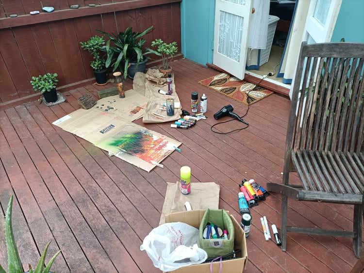
Process into Image: Final Post and Reflection

18th October

The two works that I chose for my final submission are two of my favourite pieces that I have created over this brief. I also feel that they combine all the weeks works and relate to the brief nicely. They use the processing methods from the first week, drawings from the second and refined methods of layering and painting from the third and fourth.

Colourful Spray, 2021

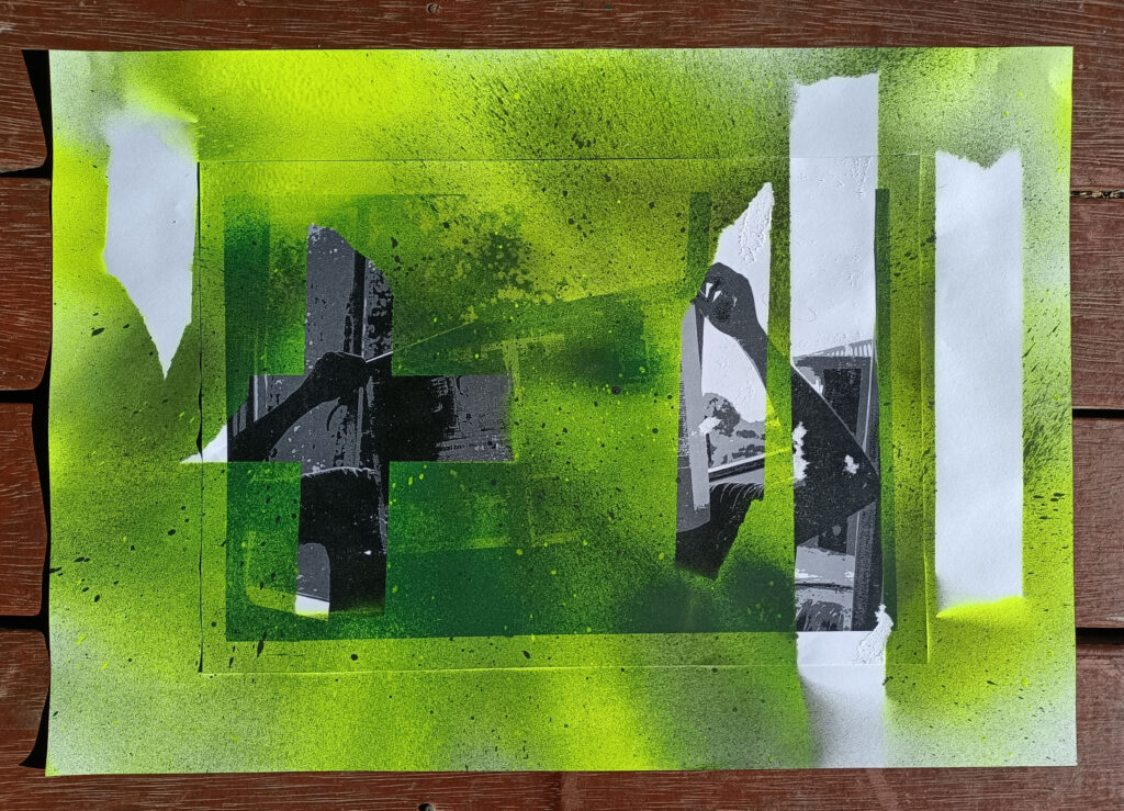
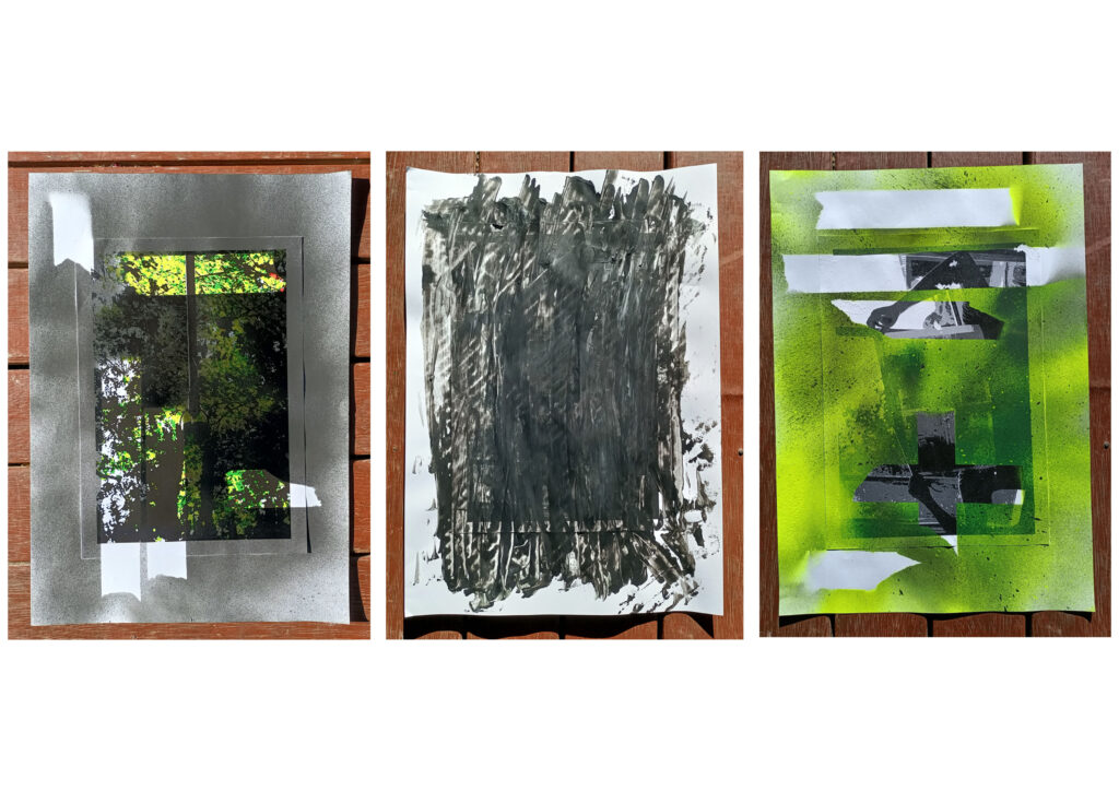
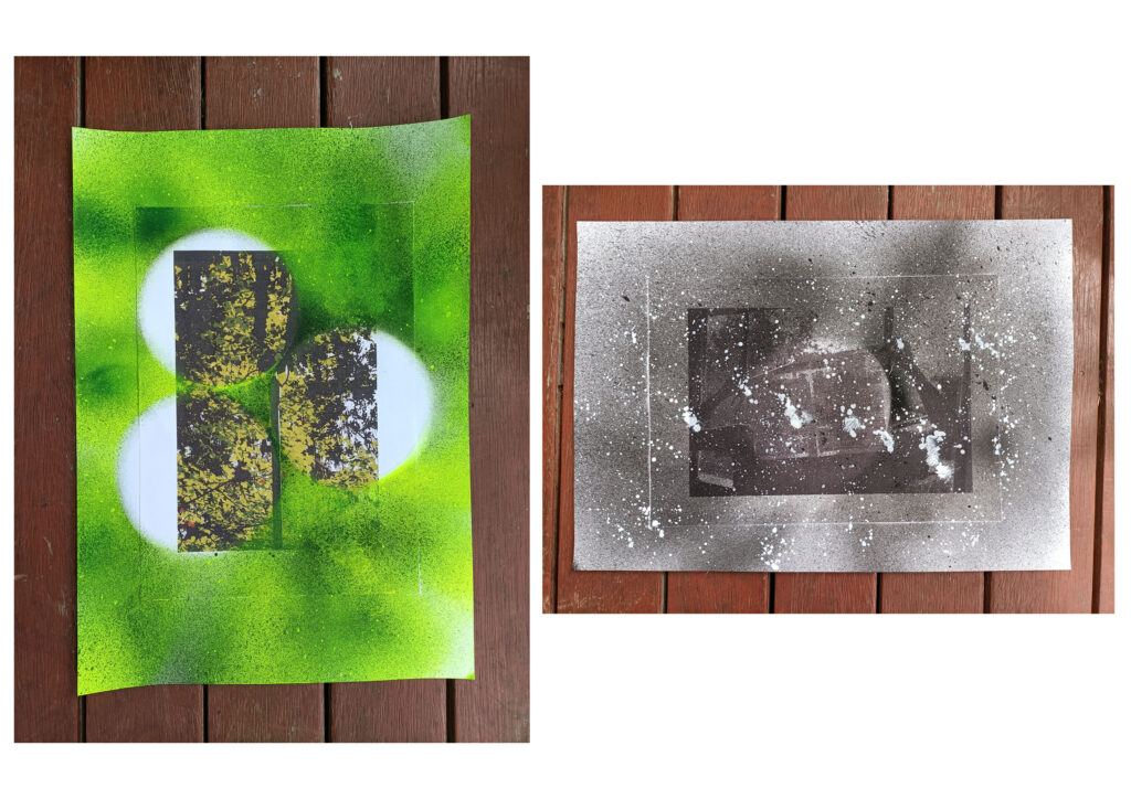
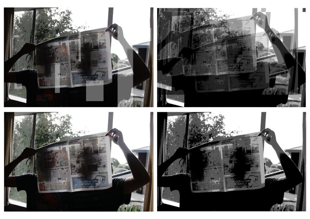
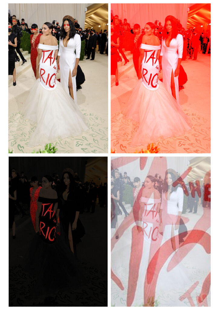
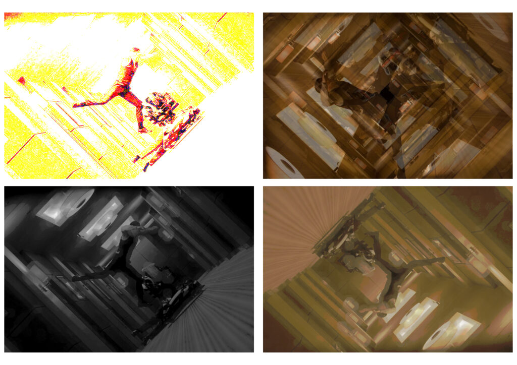
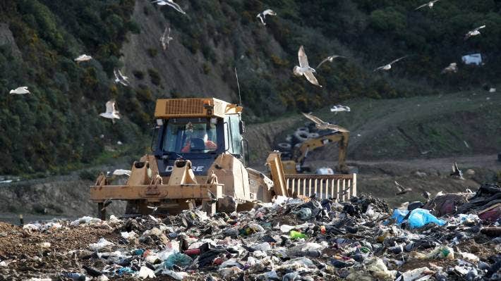
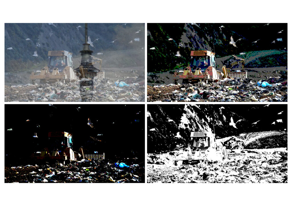
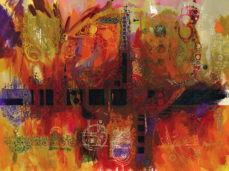
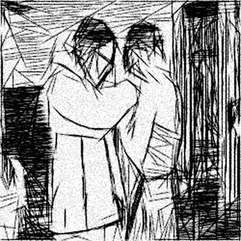
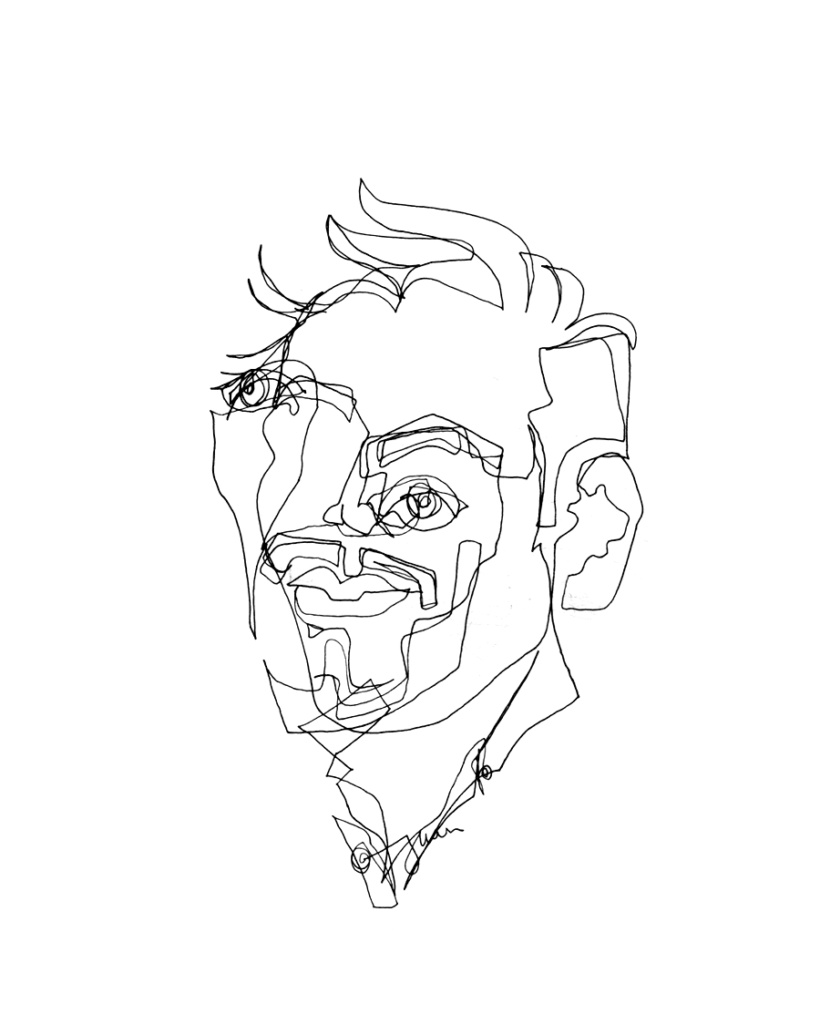
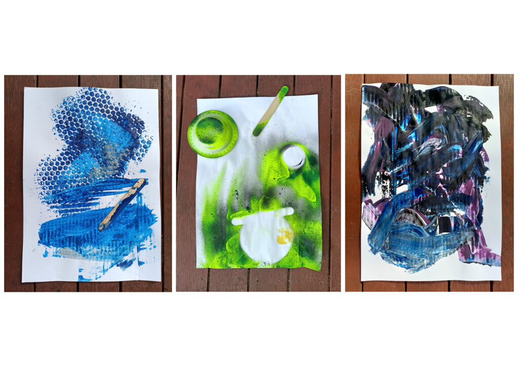
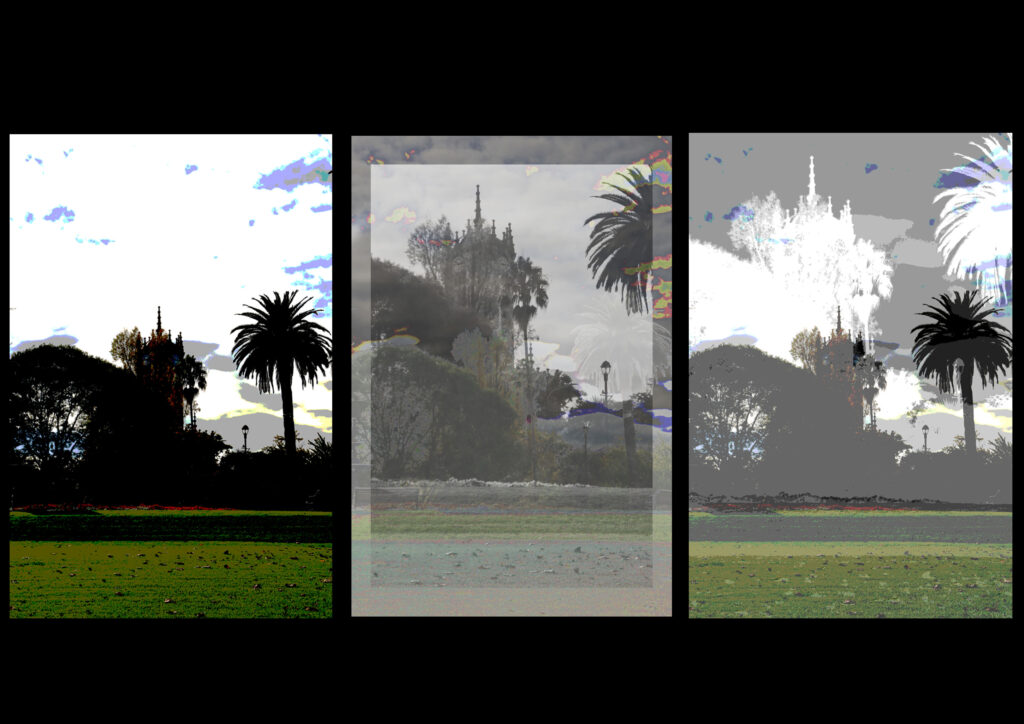
This work I took one of my images that I felt reflected the drawing brief from week 2. This image reflects a heavy black and white way of sketching however I decided to complete this task on photoshop and challenge and further my skills this way. Interpreting the brief differently. I then took this work after printing it out a sticking it to a larger piece of paper to give myself more room to work. I added the spraying and flicking from the first week and refined this skill. I decided to to do a coloured spray, flick and hiding part of the image form the spray to emphasise the layering, contrast and depth in the work and to be able to see this method of working clearly.

Abstract Bubbles, 2021

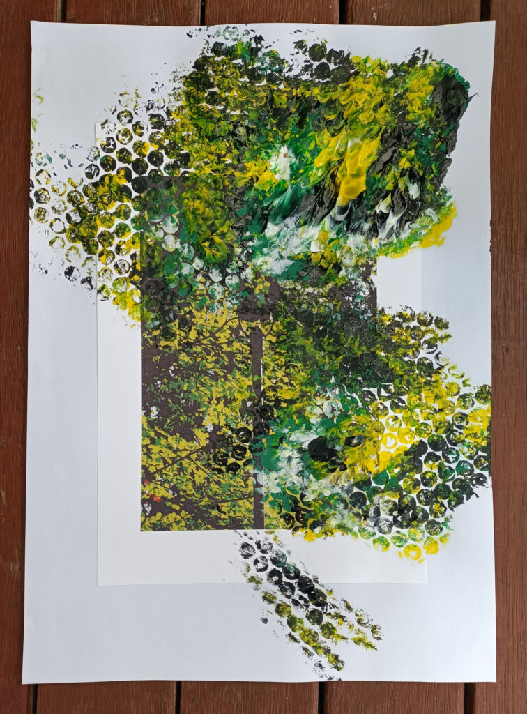
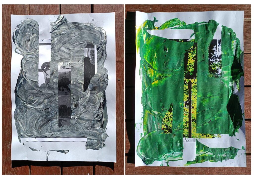
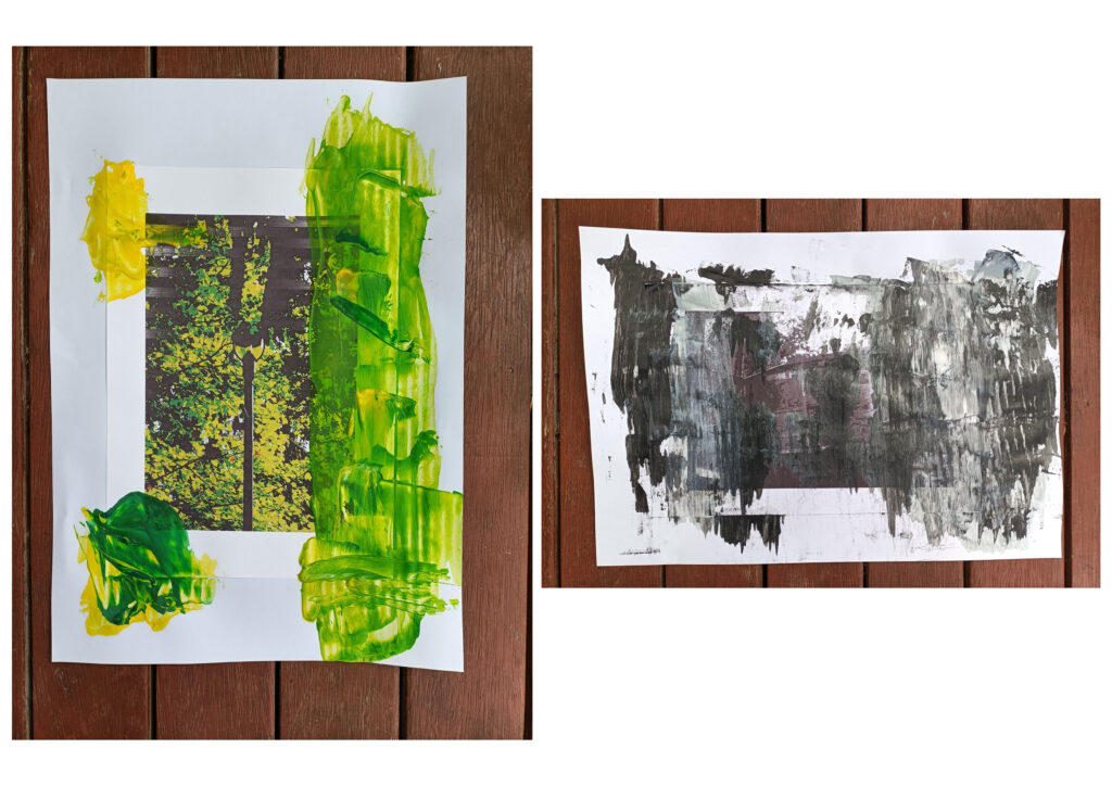
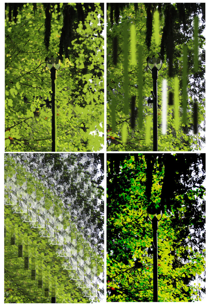
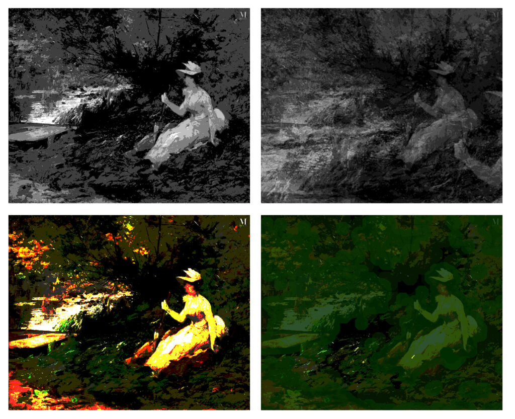
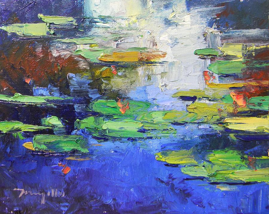
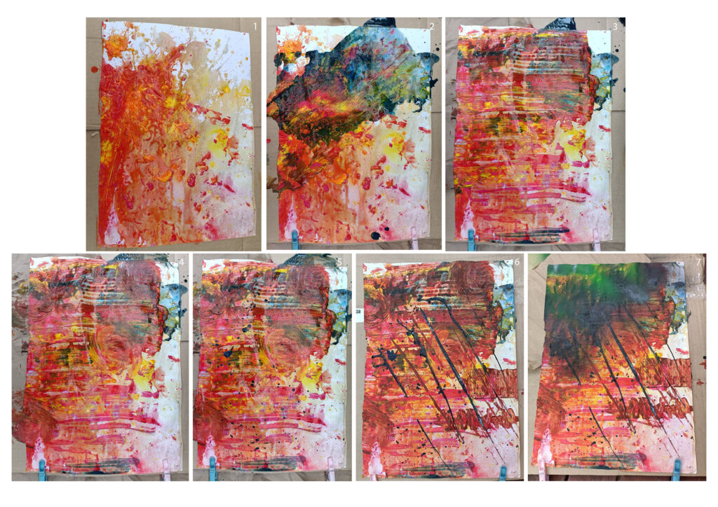
I selected this image which I had drawn out the bleak colours in the image to be vibrant and then printed and added it to a larger piece of paper to give me more room to work. I layered up a piece of bubble wrap with acrylic paint colours that were in the image and placed it carefully on the image a few times. The first time I lifted the bubble wrap away it left a-lot of paint sitting in a group. However, instead to scraping it away I decided to leave it as it gave the work texture and depth. This work doesn’t use some traditional ways of working a interpretation but I am pleased with the out come as I have found my works don’t often reflect traditional ways of working.

Overall I found this brief challenging and gave me the opportunity to work and challenge myself in a different way. Even though I used some familiar tools I used them in a different way to expand my knowledge and fit the brief.

Process into Image: Artist Research 2

18th October

Sigmar Polke

Alice in Wonderland, 1971

Sigmar Polke is a German artist that uses both paint and photographs to create layered works. Their work often reflects their environment and political environment. I was draw to their work as I saw reflections of their work in my own. The layering, colours and blotting out portions of the image. Their work is challenging and pleasing to the eye.

http://www.artnet.com/artists/sigmar-polke/

Tomma Abts

Samke, 2019

Tomma Abts is another German artist who’s works are driven by an evolving set of personal parameters. Working towards complex final works that are pleasing to both look at and dissect. I was drawn to their work as I felt their creative process reflected the brief nicely.

https://www.davidzwirner.com/artists/tomma-abts

Process into Image: Week 3&4, Combining Works

5th – 18th October

Task: Combine works from the first, second and third weeks to create a more conclusive body of work.

This week I continued to develop my works. Combining refined techniques from previous weeks. Lots of my works reflect layering and colour which is why I was drawn to using thick amounts of coloured paint and spray paint.

Spray, Scrape and Cover
Layer and Cover

Process into Image: Week 3&4, Combining Works

5th – 18th October

Task: Combine works from the first and second weeks.

I decided to print out 2 of my works 3 times each and use techniques reflecting those used in the image and in the first week. Such as using acrylic paint, spray paint, bowls, paint brushes, popsicle sticks and water.

Spray and Splatter
Layer and Scrape
Layer and Mix

Process into Image: Week 2, 24 Processed Images

27th – 30th September

Task: Take 6 Images and use your existing knowledge of drawing processes and the experiences you accumulated during the Palimpsest brief to process these images/items to reduce, confuse or otherwise alter them 4 times for each image.

A photo including people – Original Image – The Boyz – 2020
A photo including people – The Boyz – 2021
A photo without people – Original Image – Lamp – 2021
A photo without people – Lamp – 2021
A piece of fabric – Original Image – Alexandria Ocasio-Cortez, Met Gala – 2021
A piece of fabric – Tax the rich Edit – 2021
A painting made before 1900 – Original Image – Emma Löwstädt-Chadwick – Elegant at the Edge of the River – Date Unknown
A painting made before 1900 – Elegant at the edge of the river Edit – 2021
A screenshot from a film – Original Image – Inception – 2010
A screenshot from a film – Inception Edit – 2021
A piece of rubbish – Original Image – Auckland Landfill – 2021
A piece of rubbish – Auckland Landfill Edit – 2021

This task was intimidating at first until I figured out a way of drawing in my own style, digitally. I had made a few attempts hand drawing images however, I wasn’t pleased by the results and decided to push myself out of my comfort zone digitally. Editing in new ways that reflected on some of the artists I have researched and more that I have found through completing this task.

Process into Image: Artist Research

20th – 30th September

Yisa Akinbolaji

Alignment of Space Windows – Date UnKnown

Yisa Akinbolaji is a native Nigerian artist that focuses on ‘Art techniques that emphasise the character of my visual narrative, my journey, my experience and my imagination in a personal and unique way’. I was drawn to this artist due to the way that they use the paint not only as a medium of conveying image but also as a tool to reveal story and context.

https://yisagallery.com/index.html

Jose Trujillo

Waterlilies at Early Light – 27/04/2018

Jose Trujillo I a coloured focused artist and reflection of some of the old artists. They state that ‘I was drawn to the Impressionist’s “blurry” view of the world.’ and use this to fuel a lot of their works. This is what also drew me to this artist, not focusing solely on the image but also the colours and after thought the paintings leave the viewer with.

http://www.josetrujilloart.com/

Jonathan Harnisch

Outsider Art Abstract Impressionism – 09/08/2014

Jonathan Harnisch is a modern charcoal artist that uses his work to discuss the topic of mental illness. As they suffer from both Schizophrenia, Tourettes and other mental health battles. Their work is modern and thought provoking capturing the viewers eye and holding it. I was drawn to their work as it is filled with detail while still being anonymous and distant. Their work perfectly displays what the artist is trying to portray.

https://fineartamerica.com/profiles/jonathan-harnisch

Allison Kunath

Blind Contour Portraits – 2016

Allison Kunath is another modern artist that works with multiple mediums. However, her ‘Blind Contour Portraits’ series drew me to this artist. Their work is complicated yet simple. It conveys the glimpse into another world/line of sight giving the viewer of the finished artwork a different perspective. It is simple yet holds value different from any other.

http://www.allisonkunath.com/about

Process into Image: Week 1, Paint and Verbs – Further Works

27th September

Task: Create further works based of previous task

Paint Verbs – Further Works

This time I attempted making multiple works focusing on each technique. The first focusing on lifting and scraping. I used bubble wrap covered in paint that was then laid onto the paper and taken away. This left a satisfactory imprint from the bubble wrap and gave the image texture. I used a popsicles stick to scrape away some of the paint leaving a contrast between the textured and the smooth.

The second I focused on spraying and covering. I used found items to cover parts of the page before spraying the page. This left interesting results on the page and the items sprayed.

The third looks at layering. Listening to the paint being mixed and spread. For this one it does remind me of a picture someone would make in kindy. However, parts of it are interesting with the the reactions between the colours and working with darker paints. Overall an interesting and pleasing task with varying results.

Process into Image: Week 1, Paint and Verbs

21st – 22nd September

Task: Use active verbs to guide the painting process focusing on them rather than the creation of an image.

Paint Verbs

Please note the white numbers in the top right hand corner of each image referring to each technique.

1: Dilute, Splash and Throw – In my water jar I added a bunch of paints to the water and without stirring them up, throwing the contents onto a blank piece of paper.

2: Roll – In my water jar I got fresh water and added darker toned colours such as dark blues, greens, purples and black. Then I dipped an old red bull can into the mixed up coloured mixture and rolled the paint covered can across the page.

3: Scrape – Using a fresh popsicle stick I scraped the wet paint towards me.

4: Swirl – Using brown paper from the supply package I received, I scrunched it up and swirled it a couple of times on the wet painted page to create a pattern

5: Splatter and Flick – Using the left over watered down dark paint mixture, I gathered some of the paint that had settled on the bottom on one popsicle stick and hit the two sticks together to get the splatter effect. However, this is barely visible through the photograph.

6: Drag – I used the same popsicle sticks from the flicking trail and the scraping trial as they still had some useable paint on them. I dragged them diagonally through the painting.

7: Spray – I used different spray cans that were found laying around to try and create a light dusting on the painting however it ended up with a heavier layer that originally intended

On reflection I thoroughly enjoyed this task once I had gotten into the rhythm of trying different methods and messing around. I didn’t find it necessary to create more than one work as it was mainly for trial and error and given the circumstances I am pleased with the outcome.

Painting Setup

Final Work: Reflection

15th September

In Praise of Laziness

Laziness or Rest?, 2021

In today’s society and economy, it is so hard to be lazy because we have been instilled with this notion that we need to constantly be working towards our next goal and if we aren’t we should feel guilty about that. These are 3 individual pieces of work. I was trying to show different aspects of perspective on laziness which I believe I achieved.

The first image intends to portray perspective. The image is distorted and vibrant in some areas whilst other times dark and grim. It shows that people don’t always have the same reasons for rest. Sometimes they just need a break, other times you get so dragged into it it’s hard to start work again. Maybe due to regret, dread or depression.

The second talks about being stuck in routine barely ever breaking out of that cycle. To be frank I strongly dislike the word lazy or laziness as often they are used by people who scrutinize every move others make. Instead, I use the term rest as it is a kinder term to those who have had people use laziness as a weapon against them. This is relevant to the images and being in a routine/cycle as when we get in that cycle rest is often the first thing to be thrown out the window. The image talks about this as life is very dreary without it but it is always needed, we just need to break off that cycle to get to it.

The third image shows the workload and expectations looming over us. As I said before in today’s society we are expected to constantly be working. A park is a place that a lot of people go to relax however, there is the ghost of the clock tower in the background to display the passing of time that could be spent working

If I was to install this back in the studio I would print out the A2 or A1 size. It would be a matte print and I would consider having a black background. Maybe a piece of cloth draped over the whole wall.

Something that I would consider doing differently would be to create more images to give a clearer view of different perspectives on rest/laziness.

When I moved from film to digital halfway through I still wanted to work in the same kind of developing process. Pasteurising the image, inverting, adjusting the curves, layer a copy of the background on top and turning the opacity back so that you could still see some of the detail of the image whilst getting the effects of the development.

The pasteurising of the image happened by chance, a miss-click of the hand however I decided to follow through with developing the image the way I did to other film clips before. I was satisfied with the results of a few other pieces of film and when I had to switch over to digital I brought those developing techniques with me. The results were different in some areas as the digital camera was able to pick up details that the film was not. However, I liked the results of these processed images even more and decided to continue developing and testing the digital images in different ways until I arrived at my final body of work

I think the way these images were processed adds something other than colour to the image such as the work that was endured to get to those final results. The work that was required to allow me to rest. The work that was expected of me.

Labour and Time: Artist Model Research

15th September

David Hilliard

This is an artist that I am familiar with as I studied their works in high school. They went to Yale University School of Art and Massachusetts College of Art in 1994 and 1992. There they gained a BFA and MFA. There work with triptychs is what they are known most well for and it is an aspect that I would like to use in my work for this brief as well.

http://www.davidhilliard.com/

Lucy Coin, 1995

Eugene Atget 

This is the artist that started me on this brief as their work using film and architectural photography in the early stages of Paris development fascinated me. He was a french artist that live from 1957 to 1927 and started of supplying photos to the middle working class.

https://www.icp.org/browse/archive/constituents/eug%C3%A8ne-atget?all/all/all/all/0

Cannes, 1922

John Dugdale

It has recently come to my attention that my recent works have a lot of similarities to the practice of daguerreotype. An early photograph development technique. On further exploration I found this artist, John Dugdale. Sadly he lost much of his sight to HIV however, he still continues to develop works. I was drawn to this artist not only because of the process used that relate to my works. In the future I may look further into this process.

https://www.mutualart.com/Artist/John-Dugdale/F8D8A68859AA04C4

Young Men with English Oak, 1998