Final Installation

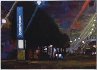
At the beginning of this brief, I found it quite stressful to produce artworks where I didn’t care about the final outcome but more about the marks that are within the painting. Previously I had never considered the marks that I was making and what impact they had on the final painting. Using Acrylics was also out of my comfort zone, I usually feel more comfortable working with oil paints due to the ease in which they can blend together. But the obviously big flaw with working with oil paints is the drying time. So throughout this brief I attempted working with acrylics and getting more comfortable with the medium.

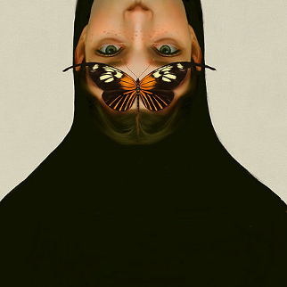
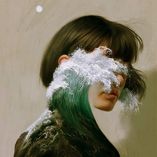
While painting these pieces I became really intrigued by colour and how colours work together to create light and dark shadows and highlights. Throughout this process, I became quite attached to the subject matter of eyes and the close-up of faces. I played around with colour combinations and different expressions. I find it so interesting how so much emotion can be expressed through someone’s eyes. I did drift away from eyes at one point where I wanted to try painting a realistic still life of a pomegranate.

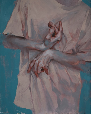
Overall I’m very happy with how these paintings turned out and how there is a sense of cohesiveness throughout all of them with the colour palette and subject matter. I had an interesting time trying out acrylics and adapting my style of painting to a different medium and seeing the results of this.

Reflection

Looking back on this year and seeing how far my art has come is quite interesting. My understanding of art has completely changed and how I read an installation or an artwork. I found this year to be filled with lots of struggles but I’m proud of how I adapted to change and the different ways that I think about my work, not just what it’s going to look like at the end but more the process of how I got there. I still have a lot of things that I struggle with but I can’t wait to experiment and expand my skills and knowledge of my art and see where I turn out.

Bibliography

(Throughout the Year)

https://www.tate.org.uk/art/artists/pierre-bonnard-781

https://whitecube.com/artists/artist/franz_ackermann

https://www.janecallister.com/

https://www.nathalieobadia.com/artists/35-carole-benzaken/overview/

https://www.aykworks.com/?lightbox=dataItem-jn1qo0l9

https://worldoffineart.com/

https://www.princetonbrush.com/about/featured-artists/johan-barrios/#:~:text=Johan%20Barrios%20is%20a%20contemporary,human%20subjects%20and%20inanimate%20objects.

https://www.katerinapopova.com/

https://www.sari.studio/about

https://publicdelivery.org/antony-gormley-field/

https://boingboing.net/2014/09/04/wall-tiled-with-worn-keyboard.html

https://installationmag.com/sarah-frost-technological-particles/

https://www.thomaszhuang.com/bio

https://www.creativeboom.com/inspiration/michael-wolfs-tokyo-compression-shows-an-undignified-way-to-travel-in-japan/

http://www.lisacahill.com/flow/mdruh4ccuxun7d2wpjmt97srbtr5um

https://bydanlam.com/pages/about

http://www.artnet.com/artists/amy-sillman/ https://www.youtube.com/watch?v=CGzKnyhYDQI https://www.eventfinda.co.nz/2020/walking-about-in-fog/auckland/titirangi https://www.circuit.org.nz/artist/layne-waerea https://www.tate.org.uk/kids/explore/kids-view/why-tate-britain-covered-lights

http://chuckclose.com/

http://www.artnet.com/artists/wayne-thiebaud/

https://en.wikipedia.org/wiki/Albert_Park,_Auckland

https://heartofthecity.co.nz/attractions/parks/albert-park

https://teara.govt.nz/en/photograph/20560/albert-park-auckland

https://www.aucklandcouncil.govt.nz/parks-recreation/Pages/park-details.aspx?Location=169

https://www.britannica.com/topic/epistemology

https://www.merriam-webster.com/dictionary/epistemic

https://plato.stanford.edu/entries/epistemology/

https://en.wikipedia.org/wiki/Universality_(philosophy)

https://www.britannica.com/biography/John-Murray-English-minister-and-theologian

https://www.vocabulary.com/dictionary/hermeneutics

https://www.oxfordbibliographies.com/view/document/obo-9780195396577/obo-9780195396577-0054.xml#:~:text=Although%20its%20origins%20are%20somewhat,oriented%20and%20discursively%20based%20theory.

https://www.veryshortintroductions.com/view/10.1093/actrade/9780199685356.001.0001/actrade-9780199685356-chapter-2

  • (Published in print: 22 October 2015
  • Published online: 22 October 2015

https://www.merriam-webster.com/dictionary/empirical#:~:text=Empirical%20Has%20Roots%20in%20Latin%20and%20Greek,-When%20empirical%20first&text=The%20name%20empiric%20derives%20from,attempt%2C%20trial%2C%20test.%22

https://onlinelibrary.wiley.com/doi/full/10.1002/pne2.12037#:~:text=Empirical%20knowing%20is%20the%20science,of%20activities%20supported%20by%20theory.

https://onlinelibrary.wiley.com/doi/abs/10.1002/9780470670590.wbeog082#:~:text=The%20word%20colonization%20is%20derived,It%20is%20a%20political%20phenomenon.

https://www.merriam-webster.com/dictionary/assimilation#:~:text=Something%20similar%20occurred%20before%20assimilate,with%20the%20s%20of%20similis.

https://www.theexhibitionist.org/#main

https://www.atlasobscura.com/articles/return-stolen-artifacts

https://www.forbes.com/sites/carlieporterfield/2021/10/27/europes-museums-collectors-are-returning-artifacts-to-countries-of-origin-amid-fresh-scrutiny/?sh=10a76e34675b

https://www.nytimes.com/2020/10/16/learning/should-museums-return-looted-artifacts-to-their-countries-of-origin.html

https://www.nationalgeographic.com/history/article/kenya-wants-its-stolen-treasures-back-replicas-could-spur-their-return

https://www.frontiersin.org/articles/10.3389/fpsyg.2016.00956/full

https://www.medicalnewstoday.com/articles/232363

https://librarysearch.aut.ac.nz/vufind/EdsRecord/sih,153280629

https://www.weforum.org/agenda/2019/03/beat-gender-stereotypes-learn-speak-up-and-react/

https://www.investopedia.com/terms/m/marxism.asp#:~:text=Marx%20and%20Engels’%20ideas%20laid,(rather%20than%20privately)%20owned. (The Investopedia team, October 29, 2021)

https://www.brookings.edu/opinions/capitalism-is-failing-people-want-a-job-with-a-decent-wage-why-is-that-so-hard/ ( Richard V. Reeves, April 29th 2019)

https://www.theguardian.com/books/2014/jul/22/24-7-late-capitalism-ends-sleep-jonathan-crary-review ( review on Johnathan Crarys’ book 24/7, written by Nicholas Lezard July 2014)

https://www.teenvogue.com/story/what-capitalism-is

(Kim Kelly, August 25 2020)

https://www.aucklandartgallery.com/explore-art-and-ideas/artist/879/shona-rapira-davies?q=%2Fexplore-art-and-ideas%2Fartist%2F879%2Fshona-rapira-davies

https://www.aucklandartgallery.com/explore-art-and-ideas/artwork/31359/there-are-no-bees-in-my-garden?q=%2Fexplore-art-and-ideas%2Fartwork%2F31359%2Fthere-are-no-bees-in-my-garden

https://chartwell.org.nz/seeing/collection/there-are-no-bees-in-my-garden/

https://m.facebook.com/story.php?story_fbid=967225370375077&id=1447425328842506&eav=AfaJuGVnIElKsSnPp3bcDWLWllfQrLD2AyKvumtsqQvLw10zDMYT-HVO87x_Di-CiHE&paipv=0&_rdr (11th June 2020 Published on Facebook by CubaDupa, Interview by Pip Adams.)

https://www.eventfinda.co.nz/2022/walls-to-live-beside-rooms-to-own-the-chartwell-show/auckland ( Auckland Art Gallery Exhibition description)

https://chartwell.org.nz/seeing/exhibitions/walls-to-live-beside-rooms-to-own-the-chartwell-show/

https://en.wikipedia.org/wiki/Shona_Rapira_Davies

https://ourauckland.aucklandcouncil.govt.nz/events/2022/09/walls-to-live-beside-rooms-to-own-the-chartwell-show/

https://architecturenow.co.nz/articles/walls-to-live-beside-rooms-to-own/

More Experiments with mark-making and colour combos

I found that I enjoy painting eyes and showcasing emotions through them. While working towards the end of this brief I found myself constantly coming back to the subject matter of eyes. I wanted to stay in my comfort zone of using oil paint but soon realised that the time limit might be a struggle to meet if my paintings take so long to dry. I hesitantly moved onto acrylic paint and found multiple struggles with blending but over time I adapted my painting style to the paint’s drying time.

I wanted to experiment with mark-making and how it can be used in my painting style and technique.

I started experimenting with ‘Drip’ and what would happen if I watered down my paint and layered it on top of my painting to give the effect that the painting is melting.

I started practising with contrasting colour washes to start my paintings, and I’ve found this to be an extremely useful step that helps me understand what colour I’m placing and the contrast it will have in the final painting. I also found it quite interesting when the contrasting colour seeps through the overlaying colours.

Seraphine Pick

(Parallel Lives)

This piece by Seraphine Pick symbolises the effects of virtual reality and the effects that it has on us. The figures in this painting have what looks to be virtual headsets obscuring their faces thus suggesting the blocking of their visions towards their surroundings. This invites us to consider whether this is showcasing an advanced form of escapism.

While observing deeper into Seraphine Pick’s ‘Parallel lives’ painting I noticed many different mark-making techniques that she uses and how much impact they have towards the final piece. Immediately when first laying my eyes on this painting I was attracted to her ability to use colour contrast so well. The combination of lime green and light pink makes for an eye-catching combination. I’m intrigued by the usage of marks and how the less important factors of the painting are less detailed with fewer marks and the more important parts of the painting are defined with more intricate marks.

I believe that this could be a good thing to consider when I’m working on my pieces because I spend too much time on unimportant parts of a painting, thus wasting my time I could be painting a different painting. I also want to take into consideration Her colour combos of pink and green and I want to implement this into my work, I also think that purple and orange could be an interesting combination.

Pierre Bonnard

Pierre Bonnard’s painting  ‘The open window’ radiates a cosy and warm and homely feeling and this can be because Bonnard paints from memory which probably is why his work has this dream-like quality to it. I love how he uses paint and the technique he used to paint this piece, for example how he layers his paint and creates texture for the trees. 

The exaggeration of the colours and their contrast against each other allows for this piece to give off certain emotions towards its viewers.

I want to use this technique in my pieces, the use of different colours and how they work together to represent different emotions.

Painting, exploring the layering of mark making.

I have been working on thinking more about my mark-making and how they contribute to my final piece. I found it quite interesting when I played around with rough and harsh marks against more soft and contrasted marks. Reflecting on the paintings that I have produced over the past weeks I have had a good time getting out of my comfort zone, and starting to think about the marks that make up a painting and how they all work together.

Warm-toned colours with a cool light blue base.
cool-toned blues and purples mixed with neutrals

Cool-toned blue and green
warm-toned red, orange, yellow

I wanted to start using a medium that I am more comfortable with, so I moved into oil paints. I am very interested in vibrant colours and the interesting colour combos that can come out of them. In these oil paint studies above I focused on the contrast of the colours and how they showcased the lights and the darks on=f the picture. I realised that I make the eye the subject and disregard the rest of the details in the picture. So when painting my other pieces I want to try to focus on the whole painting rather than just they eye so I don’t have any unnecessary white space.

Painting week 3

Experimenting with colour and mark making.

This week we continued to expand on our knowledge of mark making and adapted it to our perception of colour. We used cold, warm and neutral tones to create these pieces. I decided to use oil pastels for this exercise because they allow for vibrant colour with efficiency. I liked using oil pastels and want to expand my knowledge with them.

I started to experiment with the combination of different marks and the effects they have together. I found it quite interesting when you put rough and smooth next to each other and how that can manipulate a viewer to perceive your piece in a specific way. through this process of combining marks I found that I enjoy layering different medias onto of each other. I established that water colour has a nice flow and looseness to it so its perfect for the background or base of a painting.

Artist Research

Franz Ackermann

Franz Ackermann’s art practice focuses on the themes of travel, tourism, globalisation and urbanism. I found Franz Ackermann’s art series ‘Mental Map’ eye-catching, and I love how I was able to feel his emotion and passion through the pieces. I find that when bright colours are used in artwork it becomes immediately more visually appealing.

Franz Ackermann’s Mental Maps series showcases the combination of traditional street maps and factual precision using his interpretation of the local environment and his perception of the great cities of Asia, South America and Australia.

https://whitecube.com/artists/artist/franz_ackermann

Jane Callister

I find Jane Callister’s artwork to be quite surrealistic and unusual. What I like most about her paintings is the sense of the moment that is shown from the splatters and drips that she uses in the pieces. Jane Callister uses colour very well and the contrast of the different colours allows her pieces to stand out and pack more of a punch for viewers.

“The Other Side of Reality” is a new series of intermedia works that explore the surreal experience of the half-awake state when you know you are still dreaming but occupy a liminal space where reality and unreality coexist. When we daydream, for example (of either the past or the future) we are essentially inventing another mind-space. Mentally we are somewhere else. An alternate place where the mind is free from the concrete present. Images and feelings float around us, sometimes converging and at other times incongruously clashing. Like night dreams they offer opportunities to contemplate important cultural issues, as well as our own lives, from a different vantage point.”

https://www.janecallister.com/

Carol Benzaken

I came across Carol Benzaken’s artwork which challenge my sense of perception. I love how all the marks Benzaken created made an impact, this being the layering, dragging, overlapping, dripping and scraping etc.

https://www.nathalieobadia.com/artists/35-carole-benzaken/overview/

Lisa Yuskavage

Lisa Yuskavage’s work is very unique and intriguing to view. Her pieces showcase bold, eccentric, exhibitionist, and intro playful and harmonious, and at other times rueful and conflicted characters. The usage of colour in Lisa Yuskavage’s work allows her to convey emotions through her work and to the audience, I find this a difficult thing to achieve and admire how well she can showcase this effect.

Masaya Chiba            

Masaya Chiba’s work is quite different to what I’m usually attracted to, but I wanted to look out of my comfort zone and in the end, I’m glad I did. He extracts images from his surroundings and previous life events and reconstructs them on canvas while utilizing his handmade motifs. I find his work to be really interesting because he extracts and recombines objects to create beautifully detailed paintings.

(Week 2 of painting brief)

This week we focused on painting with more dept and focus on movement and marks. I brought in 10 photos to work with and created a line drawing from those photos. I found this quite difficult to do, but when I loosened d up and didn’t think about the final result I was able to produce a good amount of drawings that concentrated on the shapes, sizes and proportions. After doing line drawings I moved on to wet media. I tried to keep my marks loose and too not focus on them too much. I quite liked working with acrylic paint, even though I’m not too well versed in this medium.

While keeping in mind shapes, we worked with warm, cold and neutral colours to produce a load of different variations of one of our line drawings. I originally chose quite a simplistic drawing which resulted in me not being able to have much definitive contrast in my final paintings. So I switched to a different photo that had a higher level of contrast compared to my old one. I still found it quite difficult to isolate the shadows and lights, but with some practice, I was able to eventually get the hang of it.

The first week of Painting brief

This week we focused on the creation of making. We were tasked with painting verbs with thick and thin paint. I found it really interesting how the liquified acrylic paint affected the different surfaces I placed it on.  I originally found it really difficult to work with a more liquified medium of paint, but I found that it was easier to try not to control the paint but to let it do what it wants to do. In the future I want to experiment more with different colours, I can clearly see that I have a comfort zone with pastel colours so I would really like to push myself and try different colour combos and play around with contrast a bit more.

I really enjoyed the process of making in this exercise, rather than focusing on the end result I focused on my movement and the flow of my paintbrush.


Artist models (Painters)

Aykut Aydogdu

I love the surrealistic aspect of Aykut Aydogdu’s works, and how they twist and contort your mind. I’ve always loved painting interesting pieces that affect the viewer like this, and I believe Aykut Aydogdu has accomplished this effect.

His pieces focus mainly on portraiture but include the theme of nature as seen in these pieces. I love the realistic painting style of the women but also the added surrealistic aspect of the animals and waves. He has various works on commercial illustrations, magazine covers, and movie posters.

https://www.aykworks.com/?lightbox=dataItem-jn1qo0l9

Nicolai Ganichev

I always come across Nicolai Ganichev’s work, his painting style is very unique and always catches my attention. I love how he can transfer emotions through his paintings onto the viewer. As seen in the paintings I chose Ganichev focuses on hands and the body, this inspiration stemmed from a disease that he developed called psoriatic arthritis. What stands out to me in his artworks is the choice of colours and his ability to use nice contrasting red and blue tones in his works.

Johan Barrios

 I’ve always loved Johan Barrios’ paintings and sketches, the uncomfortable interactions between the human subject and inanimate objects are eye-catching.

I love how each of his paintings presents a sculptural sensation that actual

Figures are used as inanimate objects coupled unconsciously by their weight. I feel as though Barrios’ colour palette is a continuation of this theme, due to the almost bleak colour choices with bits of scattered colour.

https://www.princetonbrush.com/about/featured-artists/johan-barrios/#:~:text=Johan%20Barrios%20is%20a%20contemporary,human%20subjects%20and%20inanimate%20objects

Ekaterina Popova

Immediately when looking at Ekaterina Popova’s’ painting I became entranced by the colours and how the painting radiates a calming and homely feeling. Her impressionistic style lends itself to the lived-in feeling of her paintings, for example, a quilt hangs off the edge of a mattress.

She states that the interest in her work started as a way to reflect on her upbringing in Russian but more recently progressed into exploring the overall idea of home and what it means to her now.

“My paintings include messy rooms, intimate items, and objects that refer to human presence without including the figure. I pick up on the subtle tones, lighting, and mood of each location to capture the emotion I associate with the space and then exaggerate the colour to create a dream-like image.”

https://www.katerinapopova.com/

Sari Shryack 

I love the uniqueness and vibrancy of Sari Shyack’s artworks. Her disco ball series is what originally piqued my interest, I personally really love bright colours and interesting contrast combinations.

https://www.sari.studio/about

Sculpture (Invade)

I was very mentally challenged throughout this sculpture brief. At the beginning of this project, I had many different ideas and directions I wanted to go with. I rounded it down to these peculiar balls of clay. The idea of ‘invade’ influenced me to create multiple of these clay faces. I found that the more I created the more creepy and unsettling they all looked together. 

To ‘Invade’:

“(an armed force) enter(a country or region) to subjugate or occupy it.”

To get the desired effect of ‘invading’ I needed enough sculptures so that they can all form together for the desired effect even though they are all separate pieces.  I found this process exhausting and extremely repetitive. I found the process of boredom very interesting, and how my emotions affected the outcome of the sculptures. When looking back on this work I found that the process of it was more important than the outcome for me.  I find the process of repetition quite interesting and personally making hundreds of these sculptures slowly decreased my interest. But when observing the results I’m glad that I endured this project. I believe it to be similar somewhat to a marathon, being confident at the beginning but slowly starting to realise that it’s harder than you imagined.

When setting up my sculptures I arranged them In multiple different ways. these being in little and big clusters, and groups and changed the spacing between each ball. In the end, I decided to go with the positioning of them invading a chair, sort of in an insect-like manner (Ant). I wanted the overall effect of them being their own community, I did this by facing them towards each other, almost initiating that they are speaking to one another.

Overall I am very happy with the outcome of this sculpture brief and I had a great time figuring my way around the wet lab. Even though I struggled with the making of these pieces I’m glad that I was able to push through it all and see it to the end.