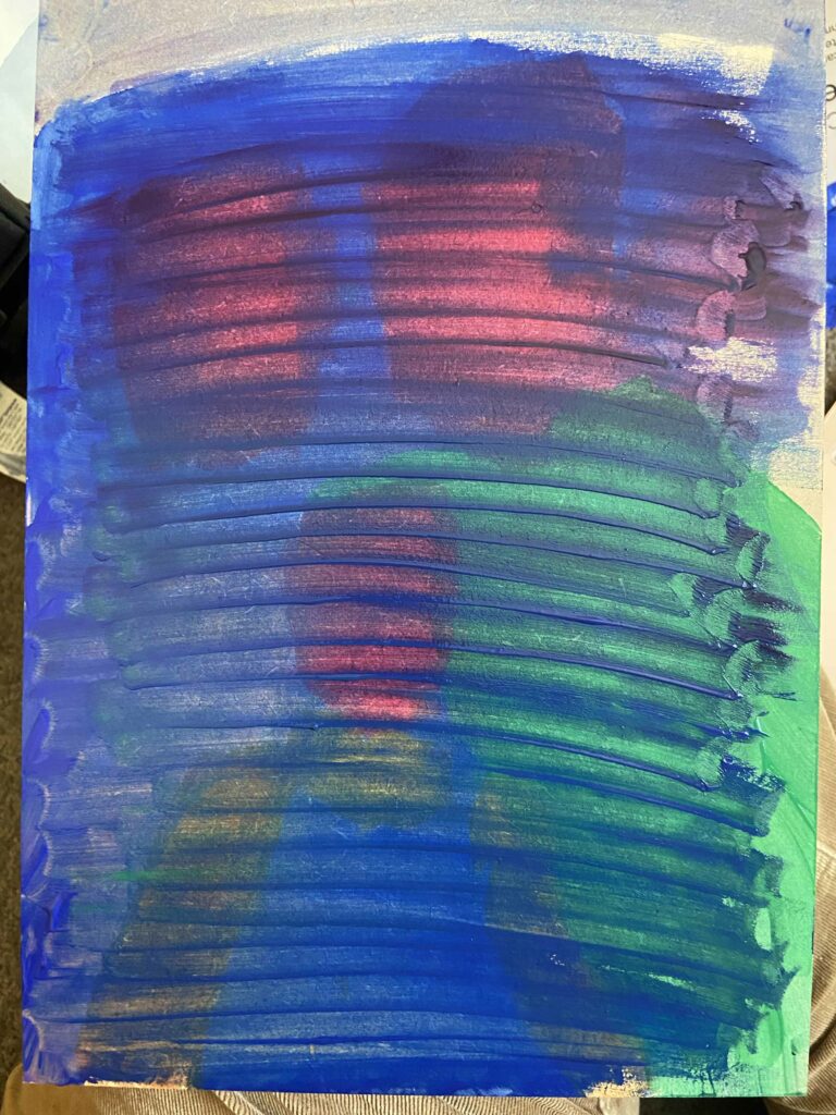
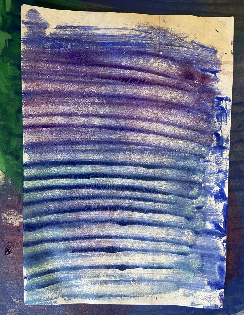
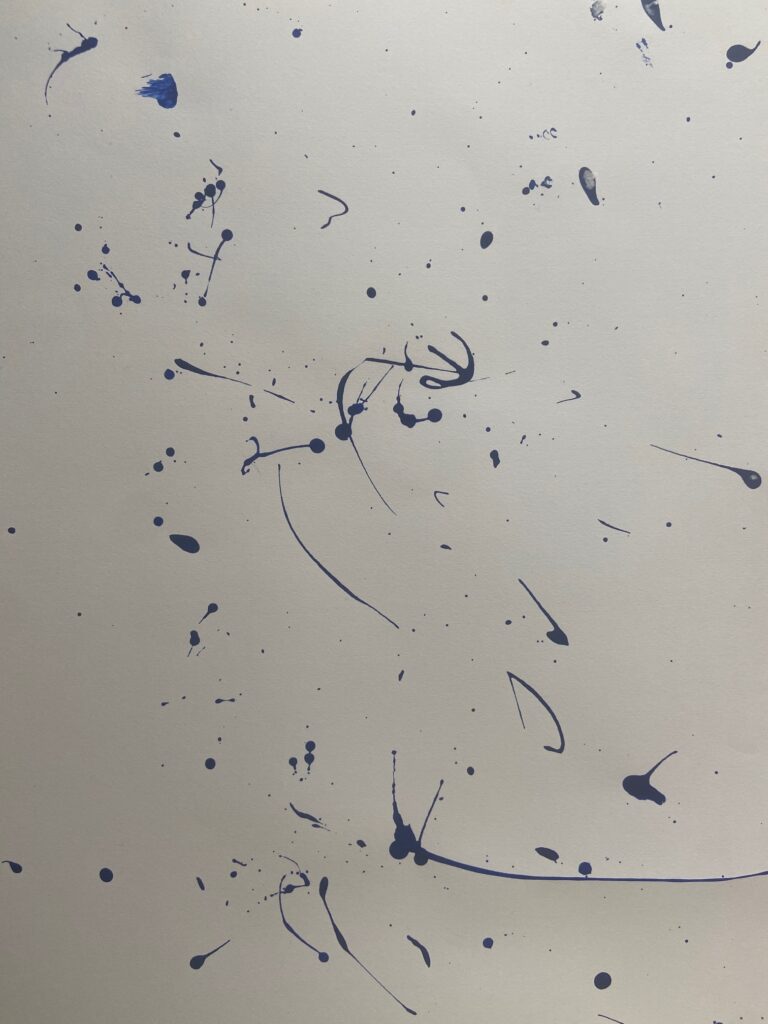
Through this painting course I have really learnt about abstract art and the different ways it manifest. It had opened me to a new style of painting that I never really took seriously, now I kind of love it. I think abstract art is a lot more fun to create and I have found new ways to make the process of painting more interesting than the outcome. There are many different processes I never really thought or have tried with paint that are rewarding, even painting on different surfaces and breaking out of the traditional way of painting.
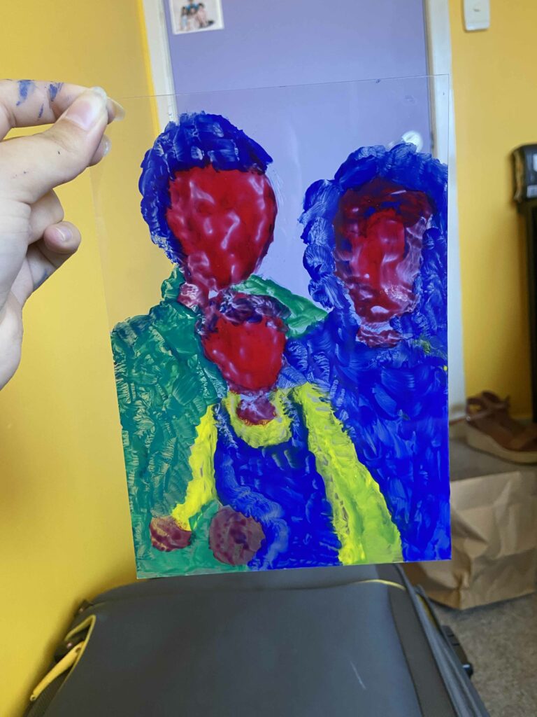
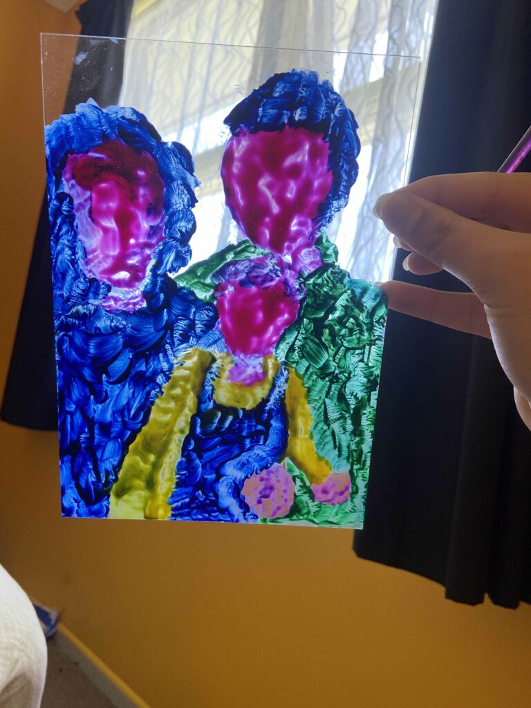
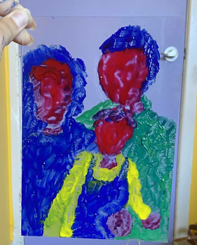
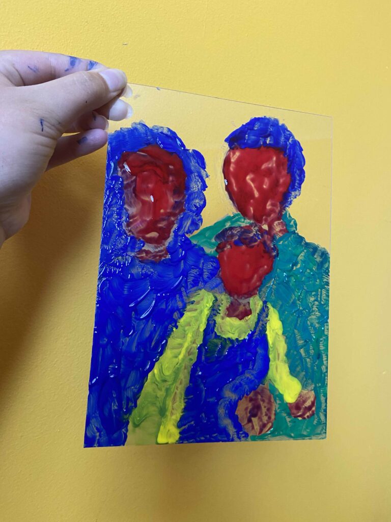
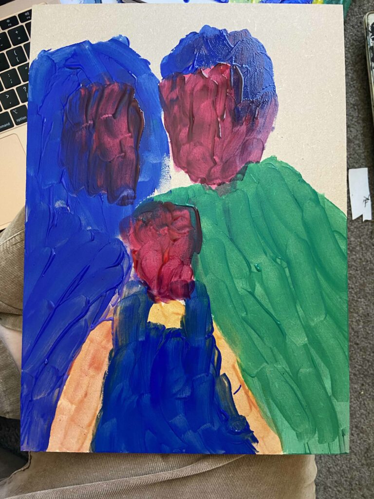
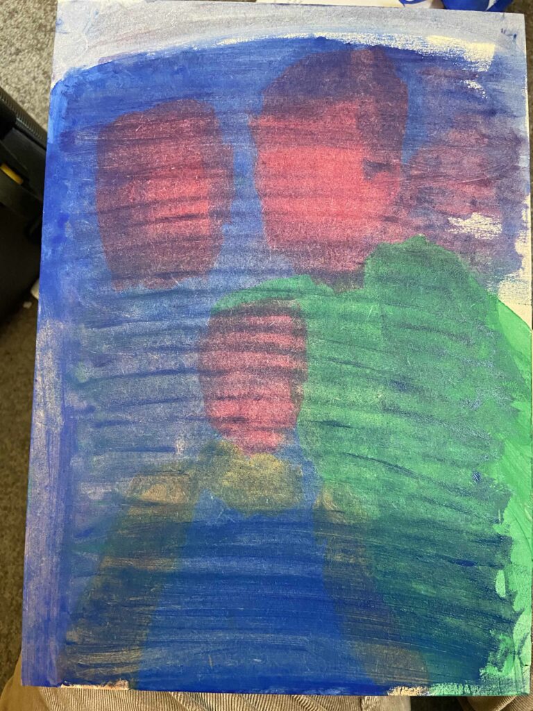
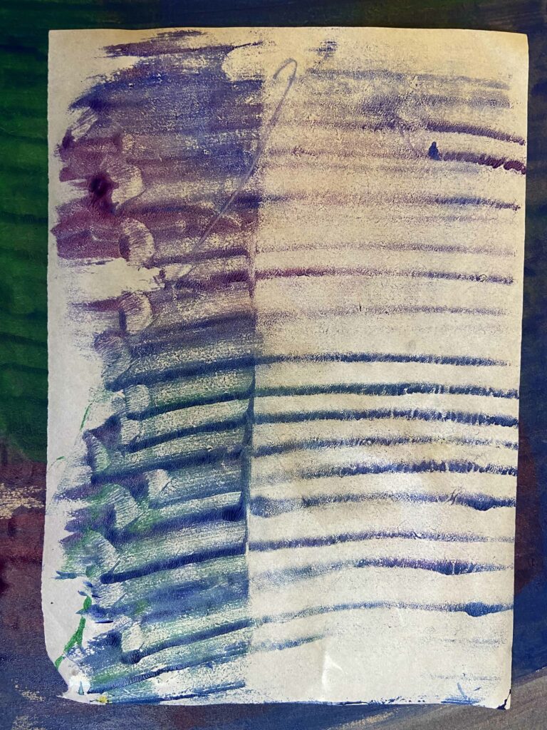
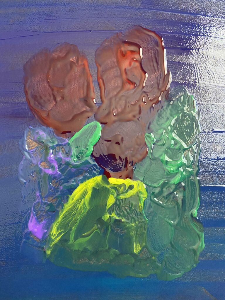
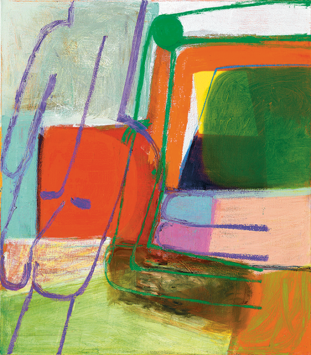
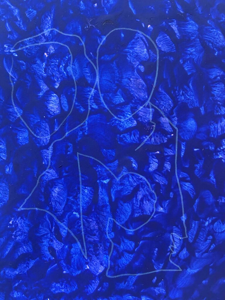
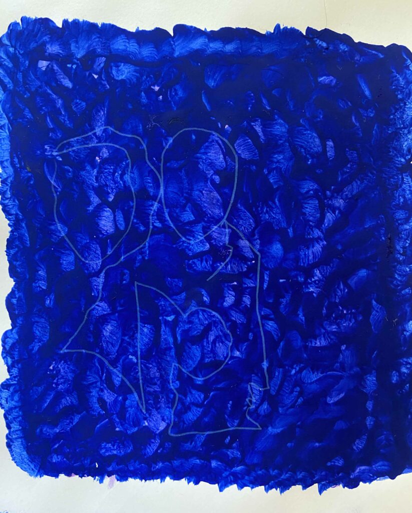
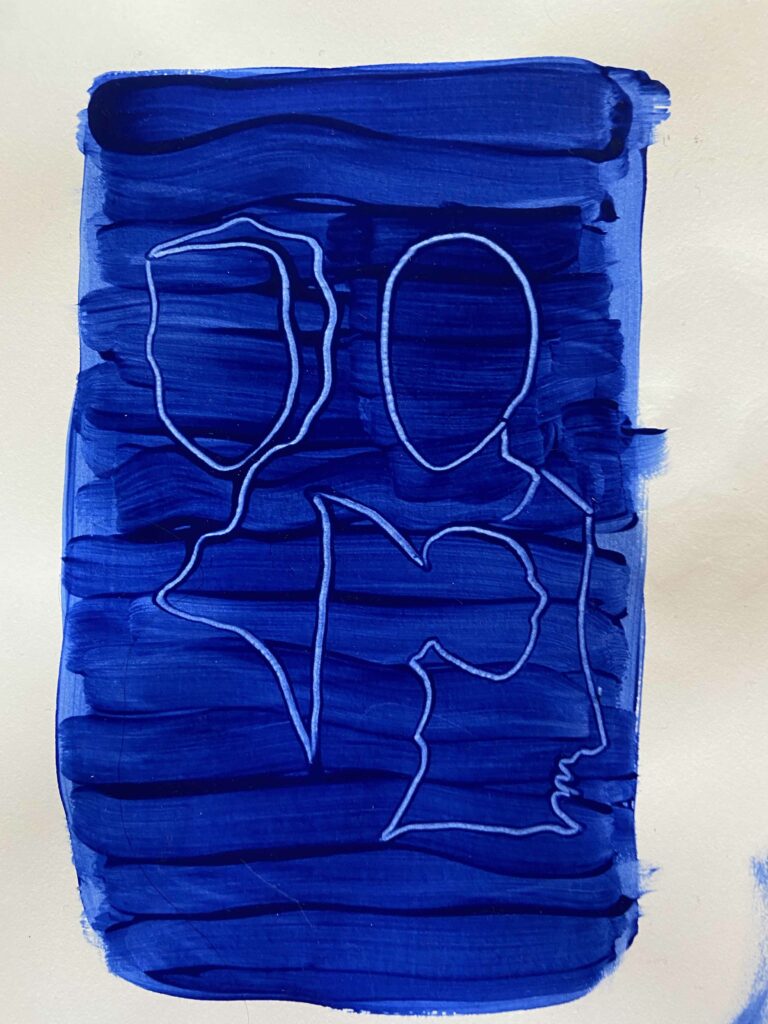
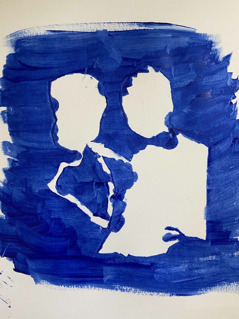
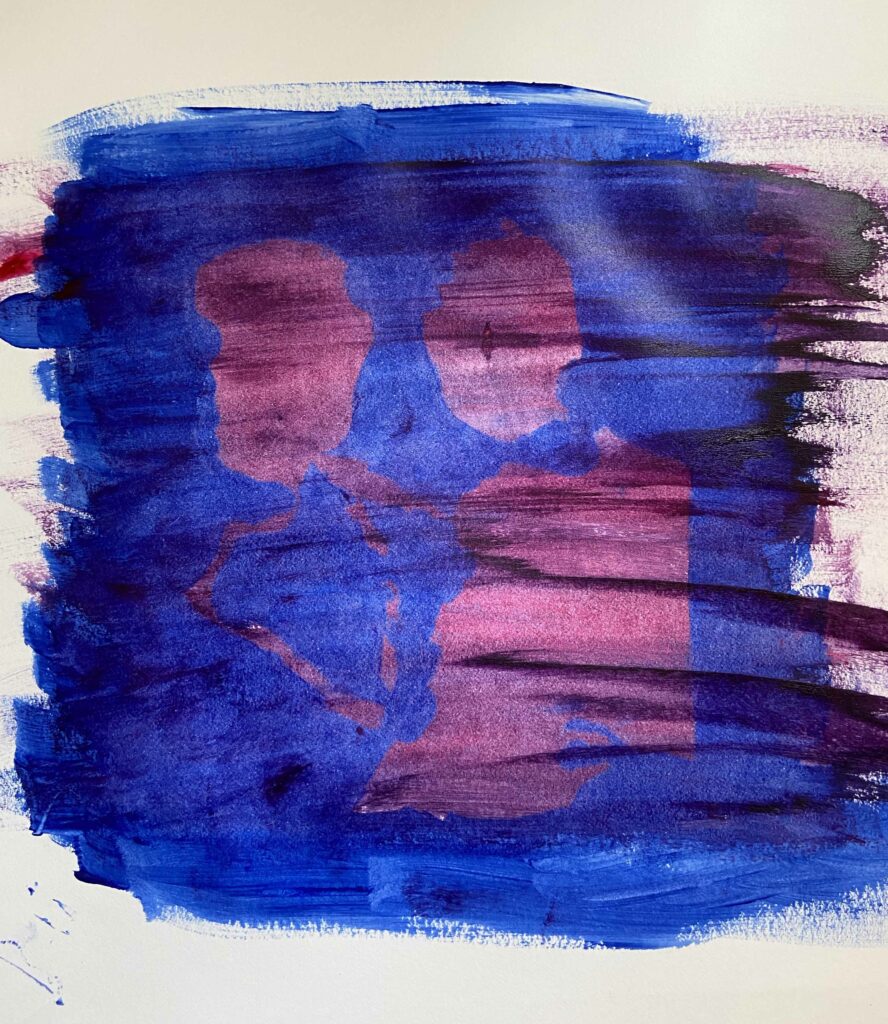
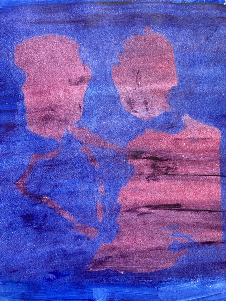
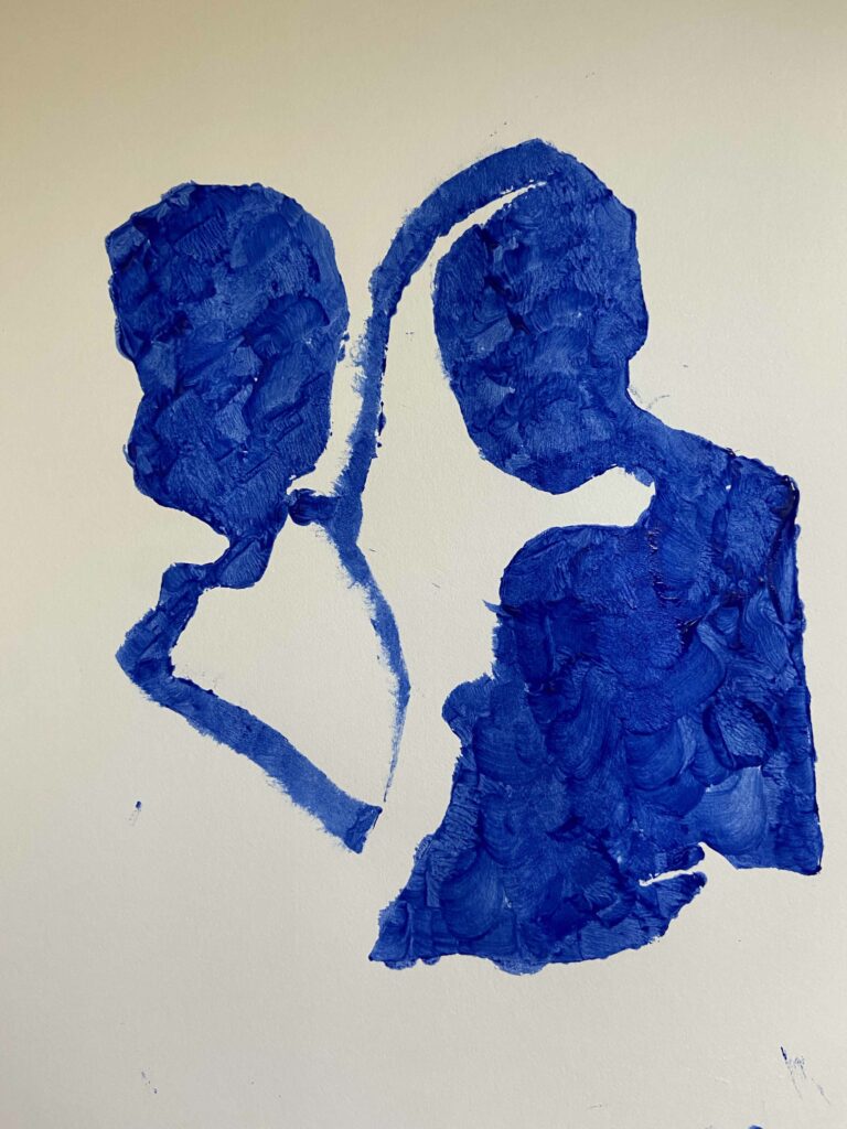
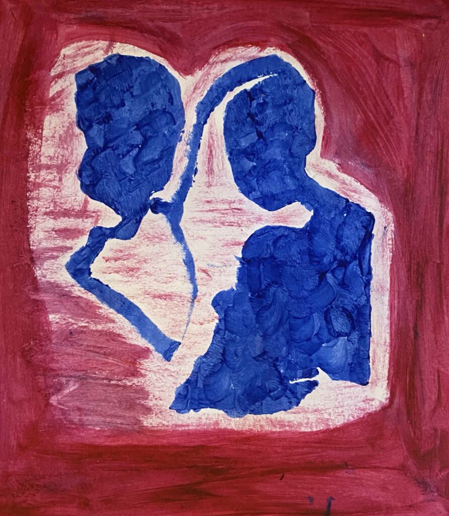
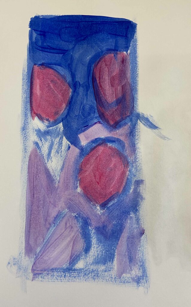
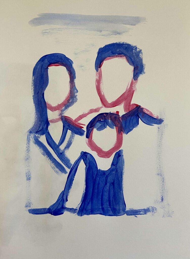
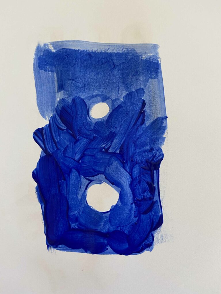
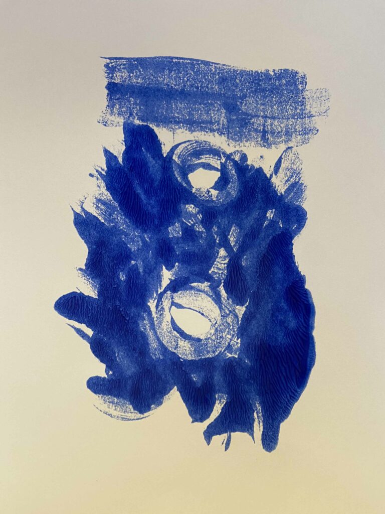
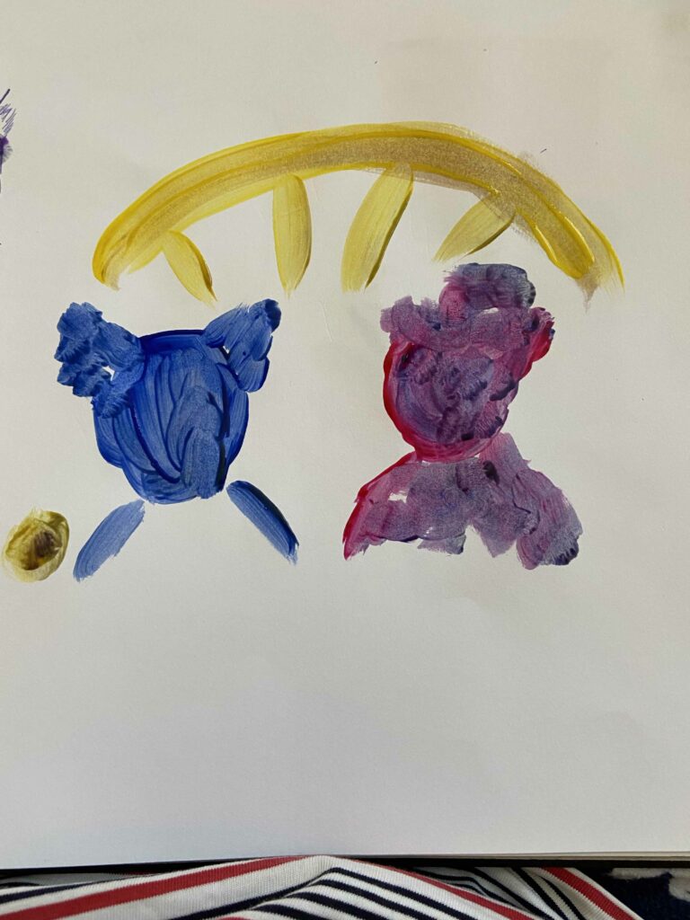
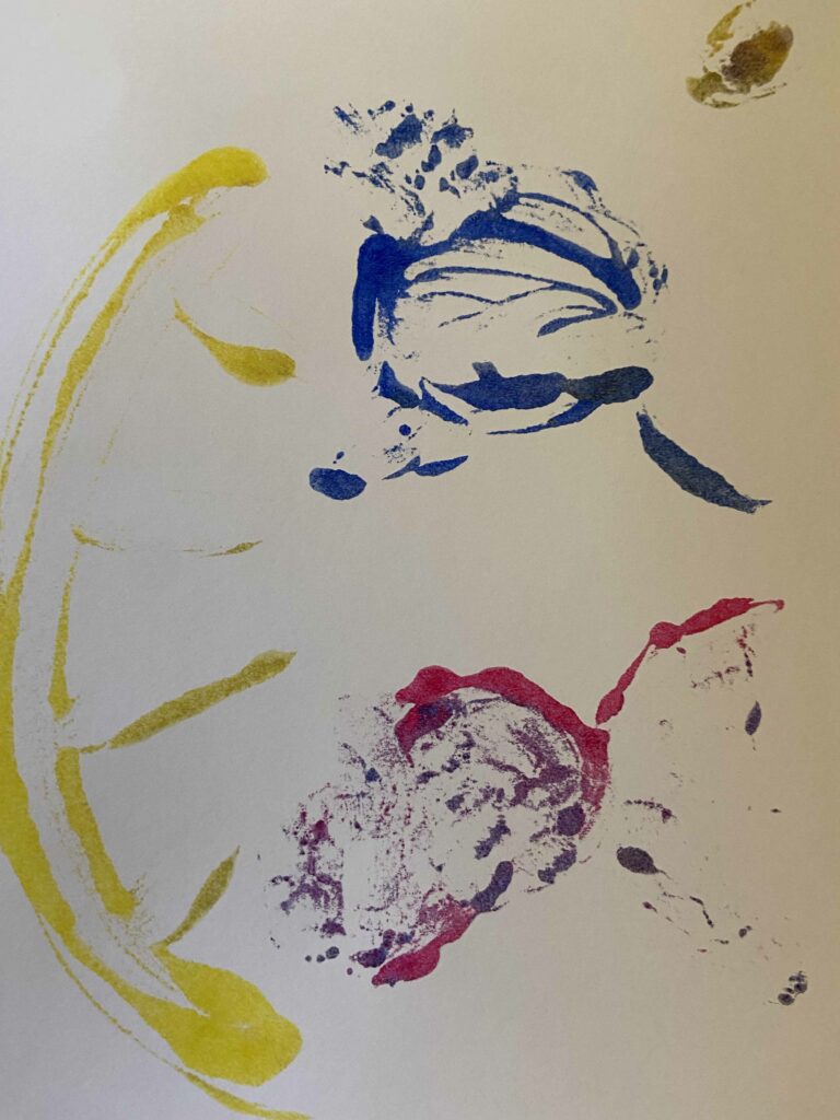
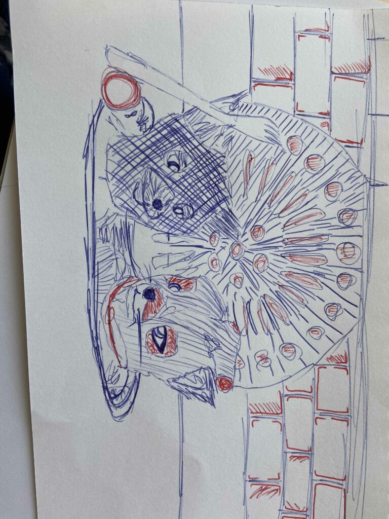
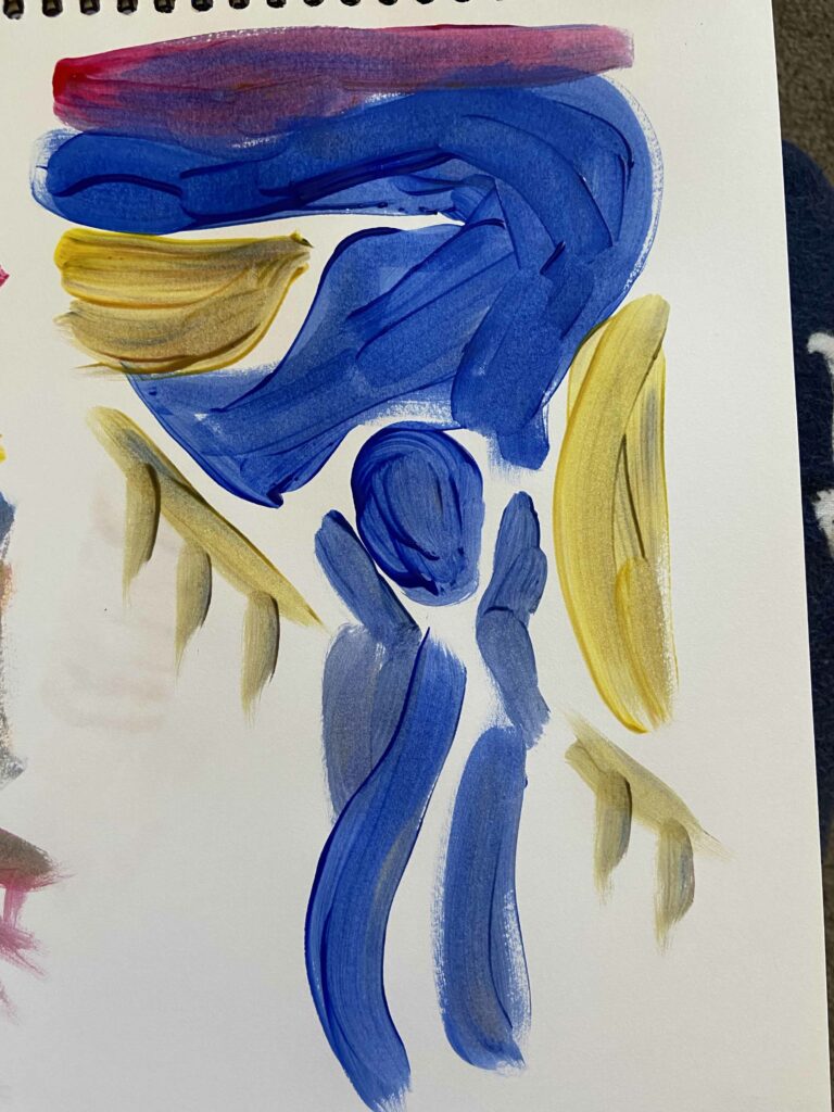
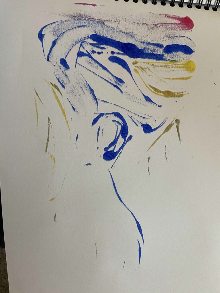
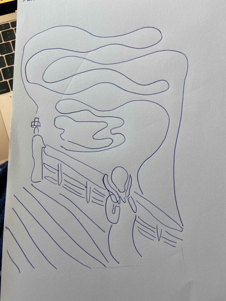
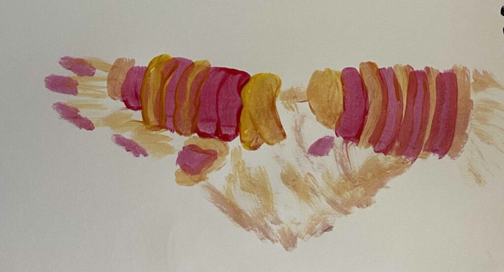
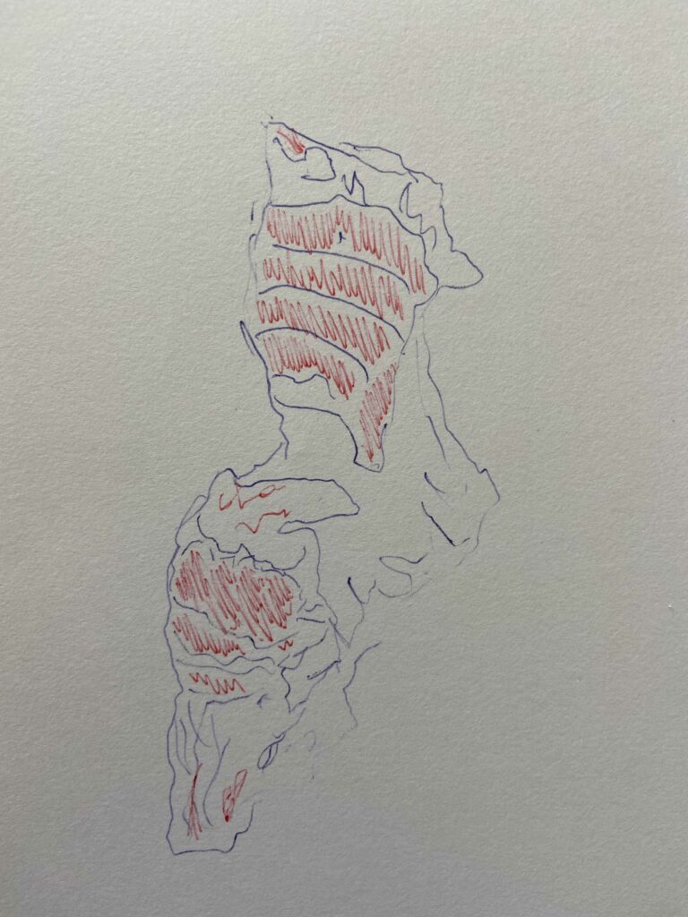
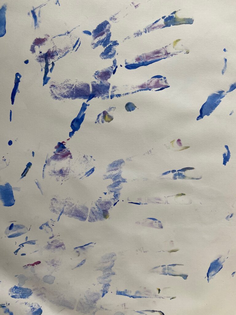
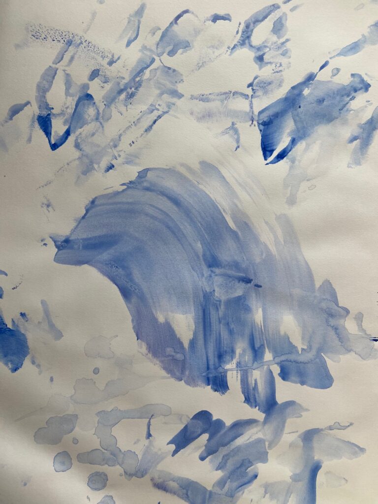
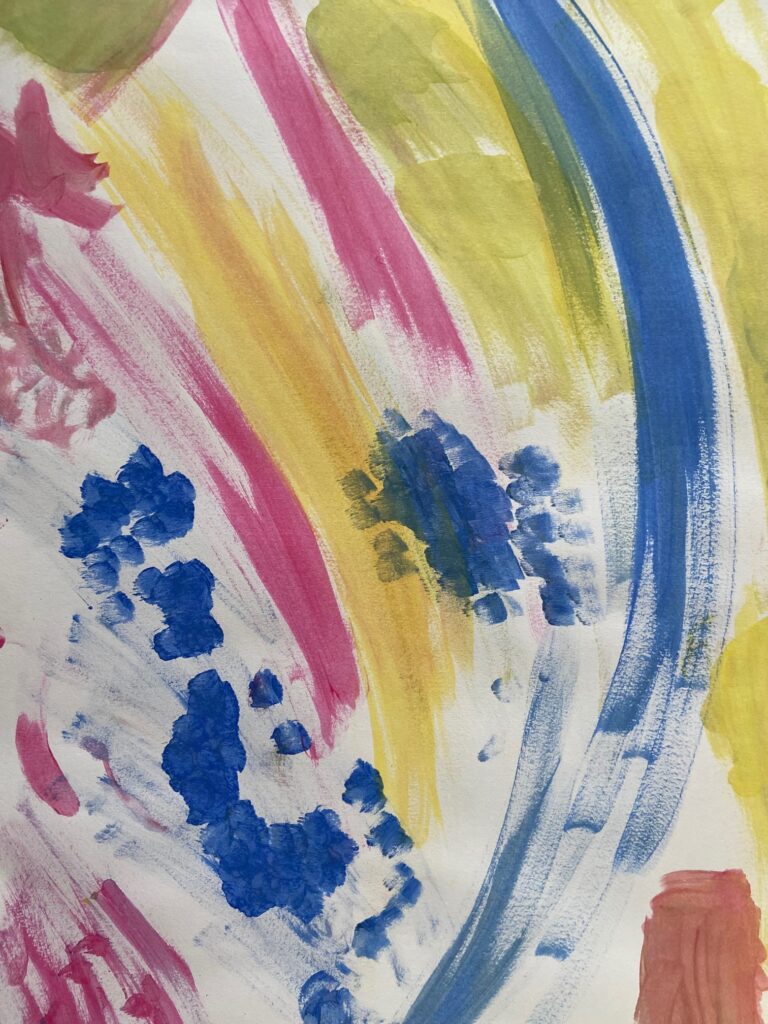
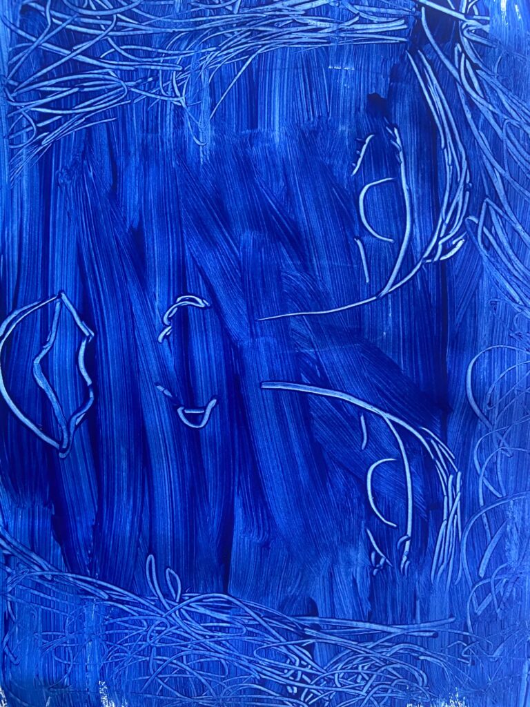
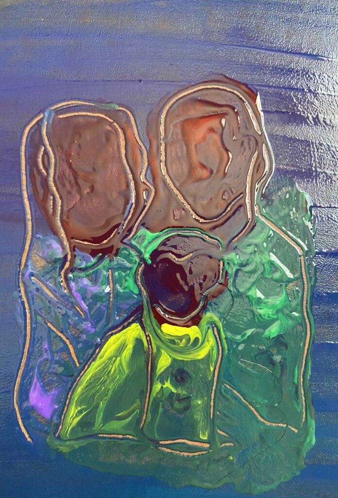
I think these two images are my most successful. I wouldn’t say they’re as extreme as some of the abstract artist I looked at but I did get inspiration from them. The one on the left is from week4 while the other is from week 3. I think you can see from these two images how I took the line drawing aspect and build up of paint process from the previous weeks 1 and 2. I feel like you can see the development between the two. Week 3s painting is very straight forward, using only blue in a build up of a shape where the line drawing is conformed to. Week 4s painting is expanded on, there’s more colour and they have purpose, for example the red is meant to represent their faces and the green, yellow and purple is their clothing. The paint is messily blobbed on and I feel like the lines, that are subtracted paint, clean the painting up a little but don’t restrict the painting or fully tells you what it is.
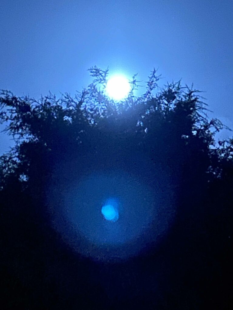
Sunday nights 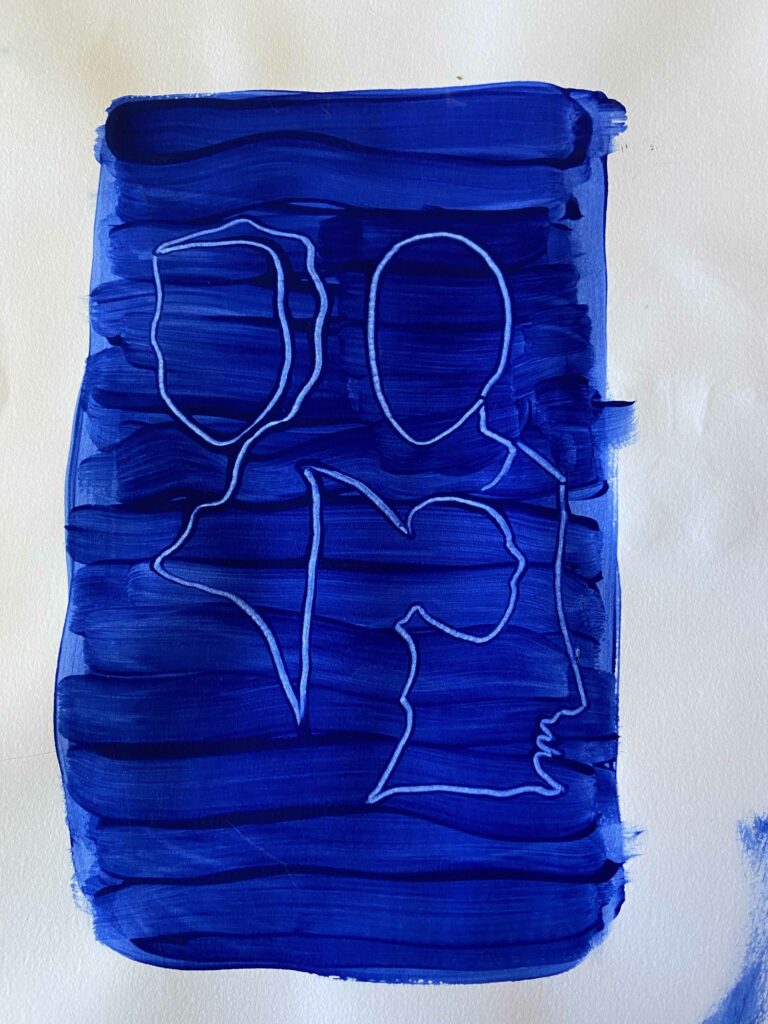
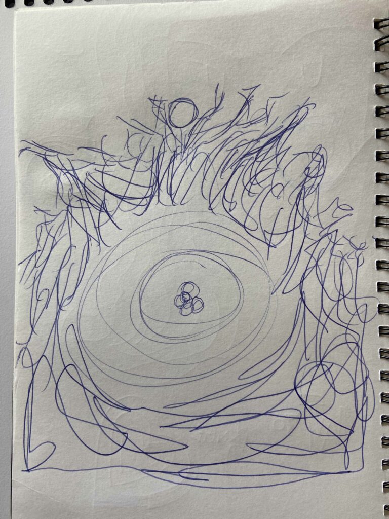
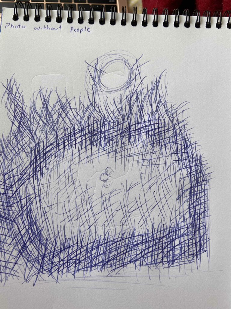
Monday mornings