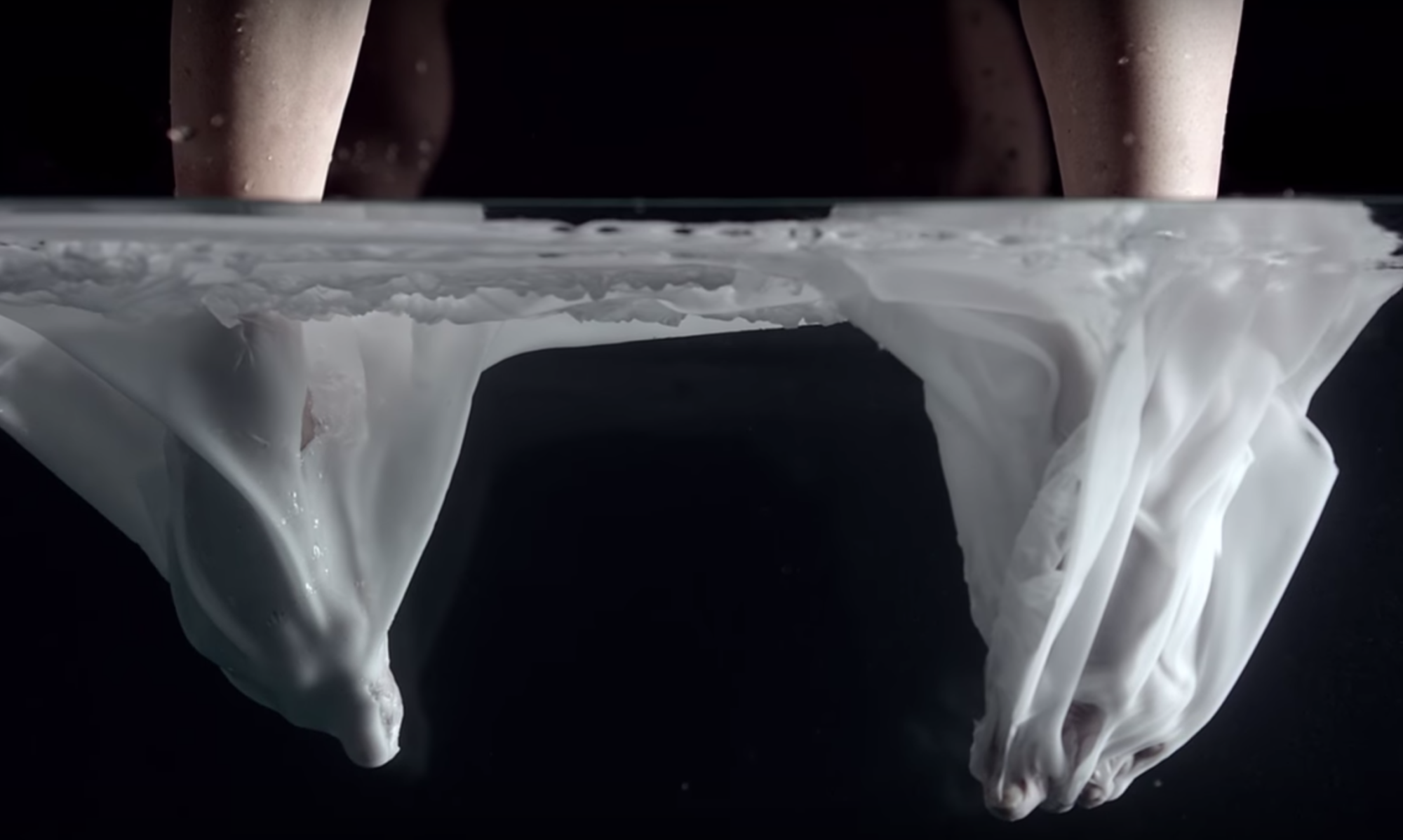
Semester 1 Week 1
Collaboration – group project


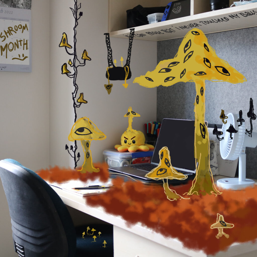

Later our group decided to make a collaborative project by taking photos of our current workspaces and editing images afterwards in our style to get to know each other. Later Mia is going to make a collage of all of our works combined together. Working with personal spaces shows our connection with each other and how different/similar our art is.
Iterative making – repetition & multiplicity
All of the current ideas I’ve got before taking action
Cutting up a bunch of small white blank stickers. Pen sketching my friend on it a 100 times. Going to the city and sticking them up on traffic lights. Anytime I come across them I get reminded of him.Taking an A4/A3 piece of paper and drawing the same object (a shoe) over itself on the same paper as much as I can.Everytime I went to maccas and wait until my order is ready I make a paperplane out a check. Unfortunately I throw them away every time.Draw as many cats as I canSame object over a period of time
1st Body of Work – Cats on one Page


I chose to draw cats as much as I can to cover a whole sheet of paper. It really pushed me to go out of the comfort zone and find new ways, otherwise I wouldve given up on the 5th cat.
2nd Body of Work – Shoe Reproduction
At first, I was going to paint pair of shoes a bunch of times on one page to cover the whole sheet. But the acrylics weren't drying fast enough and it was annoying so I put a blank paper on top to wipe the extra paint off. It left the marks of the silhouette. Which is how I decided to do this project. I repainted different colours on the original paper, wiping off paint onto new.


3rd Body of Work – Portrait Repetition
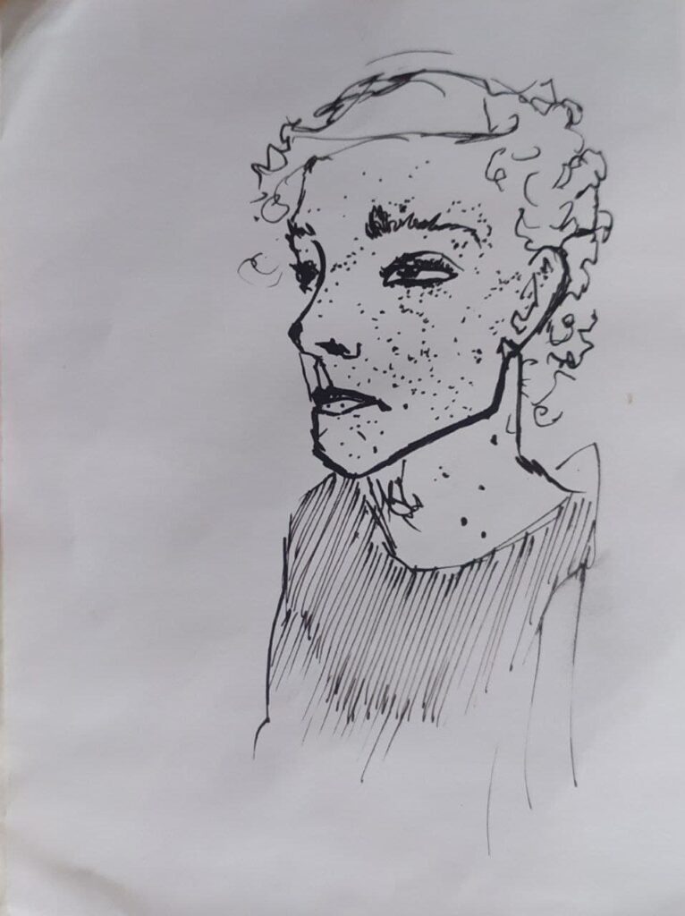
Sticker notes with the same portrait of my friend. It's challenging. I'm planning to stick it on a bunch of traffic lights after I finish.




Iterative making – research
Ayesha Green
Ayesha Green is discipled in visual arts as a painter and based in Auckland. In her work Green often touches on procceses of reproduction.
Green's attention is focused on the new initiatives that advocate for Māori agency. Her work is occupied with histories of representation, imagines and language in the systems of power. She combines it as well as her personal to revise the authenticity of symbolic objects and their power. Much of Green's work revolves around colonisation of Aotearoa.

Jean-Michel Basquiat
Jean-Michel Basquiat was an American artist in the 70-80s who was popularised as part of graffity duo SAMO, writing epigrams in Lower Manhattan. By early 80s his exhibited in galleries interationally. Basquat focused on ideas such as wealth vs. poverty, integration vs. segregation, refelced his position as a working-class person of colour withing celebrity art world. He used poetry, painting, drawing, text and image, abstraction, contemprorary critique of historical information. He used them as a tool to comment on power structers and systems of racism as well as his own experience in the Black community.

Reference
- https://www.thearts.co.nz/artists/ayesha-green
- https://ocula.com/artists/ayesha-green/
- https://jhanamillers.com/artists/ayesha_green_bio.html
- https://www.theartstory.org/artist/basquiat-jean-michel/
- https://en.wikipedia.org/wiki/Jean-Michel_Basquiat
Semester 1 Week 2
EXPLORATION OF SITE – phase 1 The Image (where is painting?)
Today on campus we have exploded creating "space beneath the surface" of the image. By using any kind of transfer processes we tried and tested building up the depth behind the picture.


It was quite interesting to see which techniques suck and which ones I can pass on my next works. The ghost effect was quite hard to achieve as the glossy journals don't transfer onto plastic paper.


I played around with different ways of transferring. On the bottom right, for example, I put some paint on the bottom of my shoe and jumped a bunch of times on the paper. I used a pen pressure to get the text copy on paper. I didn't like how most of the picture came off at once leaving stripes.


EXPLORATION OF SITE – phase 2 The Surface (where is painting?)


I made huge mushrooms made out of cardboard cutouts and painted with PVA glue mixed with paint. It’s hard to see on the screen but they have a bumpy rough texture.


This body of work is a recreation of my actual house and the view from my bed into my parents’ bedroom and the window. The surface is touchable. The floor is made out of cut-up jeans to recreate carpet texture. The bed is made out of a box with [that thing you put the rings in to make it soft] with velvet on top for a blanket.


A clay face with cracks and pimples.


I was trying to merge the paper with the wall. The idea can appear after a dialogue with James where he mentioned a painting being affected by its environment and what comes from it. I am not so pleased with the result as I was using crayons leaning into blue grey colours whereas the wall was more of a warm grey. I did not intend of finishing this whole A3 paper.
Semester 1 Week 3
EXPLORATION OF SITE – phase 3 The Situation (where is painting?)

I used chalk to decorate a part of my road and the garage door. I have been meaning to get out of the house and work on my house’s space. It took about 1.5 hours in total. At first, I was planning to draw the shadow of leaves and trees but it has been raining for the last couple of days so I just went for my go-to signature swirl design.
EXPLORATION OF SITE – research
Invisible Street Art by Cayetano Ferrer
Cayetano Ferrer project "City of Chicago" involves camouflaging street signs and cardboard to mimic the surroundings. He creates this by taking high-quality photos of chosen environment printed onto stickers and placing them around the city. The resulting images create illusion making the viewer question their eyes.

Pataialii grabbed my attention by her use of ordinary house paint and large format of her paintings. She is not afraid of going outside the edges, painting with black. She breaks the boundaries of where the art stops or begins and I would want to take that into considiration when creating my own pieces.

Reference
- https://www.designboom.com/art/invisible-street-art-by-cayetano-ferrer/
- https://tetuhi.art/exhibition/christina-pataialii-solid-gold/
Semester 1 Week 4
21 of march 2022 theory

EXPLORATION OF SITE – STAGE 2 Phase 1 March 22-23 – SITE SEEING

Model: Mia; Photographer: Margo
Obedience of rules. The photo that has been made exists in a specific location (of a sign no smoking) in a way that indicates the meaning would be significantly changed if the location was different.

Photographer: Mia; Artist: Margo
My idea for this illustration came from observing people on the street, how different lives they’re living and how they’re all connected. This is what I imagine when I walk on the street. This is behind my eyes when I look at people.
EXPLORATION OF SITE – STAGE 2 Phase 2 March 24-29 – INTERVENTIONS


I have chosen 3 sites that I am most familiar with – my room, the city, and the park.
The idea behind this work (1) came from reviewing Christina Pataialii’s work and her approach to expanding artwork beyond the frames of a canvas. I already had some floral sketches going on on canvas so I stretched it out onto the door frame. The idea came from staring at my walls too much and overanalysing my art. The original idea for the (2) site was to place stickers onto traffic lights I come across in the city. But I realised I feel uncomfortable doing so. I found a place I come across every day I’m in the city and chose that location. It does not look out of place because there are some ad posters on the other side of the wall. The last (3) chosen site was a park staircase which I go through every day. I wanted to implicate my personal design in it. It is a comfort place for me and I wanted to have a personal reminder to keep going every time I go up these stairs each morning.
Semester 1 Week 5; 2 OF APRIL
EXPLORATION OF SITE – STAGE 2 Phase 3 March 30 – April 4 – JUST A MINUTE!
- To split the burning candle
- To cover smoke
- To hole a balloon
- To support a knife – requires 2 people to create. Otherwise, the object would have fallen / not been a piece of artwork but just silverware lying around. Also, I have chosen the knife on purpose to show one person might be hurt/struggle to hold support.
- To rotate the artist – giving control to an action (spinning). The body is used as a sculpture to make the painting.
- To (give up) control – I am letting a friend take control and paint through my hands. Therefore he is an artist whereas I am becoming a sculpture.
- To store books – these are all the books that I own personally. I am comparing my height to the height of all of the books that I’ve read and all of the knowledge that takes up space.
- Of dimension out of the painting – transferring a 2D painting canvas into 3D but using the same instruments.
This week’s brief was an interesting way to push me out of my comfort. Usually, I work on a flat surface, rendering my ideas around it, however, this brief took a new approach of involving me as a part of an artwork. I am not super fascinated by what I have come up with, however, there are some ideas I have not given any action towards yet and some that were really good. I believe the verbs “to support (4)” and “to control(6)” were my strongest (perhaps because I used my body as a sculpture in a literal way). It’s challenging for me because this brief is a performative art, whereas painting for me happens in a closeted room by myself with no timer or eyes looking at me.
One of the best ideas I think I’ve had for this brief is public art. I would stand still and give the public a range of different art materials to draw on me with. Giving them the power of choice and my body would be the sculpture.
EXPLORATION OF SITE – research
Mark Harvey

His work intrigued me for a reason that he used his body as a tool. Waitakere Drag is about kauri logging. This is a performance of transportation of kauri logs, raising awareness of the loss of kauri. What I can take from this performance into my own practice is that he purposefully lets go of his control, allowing the ground to do its own thing. The only thing he is in charge of is pushing a rope that’s attached to the kauri log and choosing the direction where to go.
5 of April semester 1 week 6
Phase 1 – RETURN TO THE IMAGE: PRINTED MATTERS

I put my hand and my friend’s hand against each other in a way to hold up a knife. The site in this work is the relationship between these two hands and how the knife is located. It’s a weird position to hold a knife. It’s not aggressive but at the same time, it’s clear it hurts the right hand to some degree. The audience has no idea how long it’s been held up and how much pain has been caused because of that. Also, if the person on the left is pushing, it is causing a sharp end to press into the right hand. My motivation behind this work was to show the duality of relationships. Nevertheless, the viewer must interpret it however they want it to be.
- Margo: Ok, so the point is to like, to hold it with pressure.
- Ethan: Yeah. This is how all of the holding things goes.
- Margo: Go a little bit d-down, down. And to my side. No [sighs] no, up. No, we- we have to- we have to hold it still.
- Ethan: God.
- Margo: Yeah, like that.
- Ethan: Stop moving your hand!
- Margo: I’m not!
- Ethan: Go straight.
- Margo: What are you doing? Like that?
- Ethan: Yeah, it’s gonna make it like…
- Margo: Ok, hold it for a minute. For like 60 se-
- Ethan: Girl, my hands have been busy all day.
- Margo: I’m sorry.
- Ethan: Can you stop- stop moving your hand. I just need to match you. Stop. Moving. Your hand.
Transcribe from the act.
10 of April semester 1 week 6
Phase 2 – RETURN TO THE IMAGE: HERE WE GO AGAIN
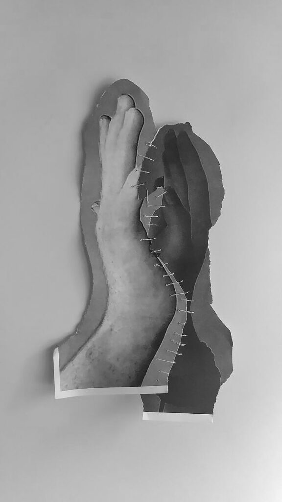
https://youtube.com/shorts/yYQ5mazgAoQ?feature=share
Link leading to a process of how I created this piece. I used the same knife to cut up the picture from the original photo. The transformation process includes removing the knife from the picture and linking to hands together by sewing them. The verb I used, in the beginning, was “To Support”. Now, these hands are forever connected by thread and closer together than they were before. After talking with James, I also have to note that by sewing it together, I was also making sharp holes with a needle, which is considered a dangerous object in inaccurate use that can bring pain. It left permanent holes.
13 of April semester 1 week 7
Phase 2 – RETURN TO THE IMAGE: HERE WE GO AGAIN (extend)


I used the same idea of 2 people having an interaction and capturing a relationship between them. This time, however, the person on the left is seen with spiky objects all over their hand. The meaning I was going for was to show what stands behind one person, their personality. And how it affects the people they are interacting with. I don’t like the result of it, to be honest. Kind of cheeky. Spikes were really hard to glue to the glove plus the gloves were elastic. I could not pierce them in any way.
RETURN TO THE IMAGE – research
Marina Abramovic
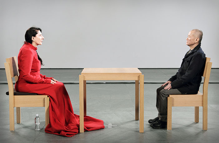
Performance art is somehow very provocative to the public and very intense. I kind of see a similarity between our work. Two isolated figures facing each other separated by an object. However, in Abramovic’s performance, she removed all possible belongings of people, asking them to leave them out of the room. “There is not any work. It’s just me. And the public is my live material,” she explained in an interview with the BBC. “It is the most radical, the purest I can do.” It’s interesting to notice small details she found valuing including. Like a water bottle for herself only, a softer seat, brighter colour palette of clothing. What made me choose this model, is the clear connection between people facing each other. The intimacy without words, their relationship. I want to implicate that in my work by simplicity and clear message.
Semester 1 Week 8; 3 of may


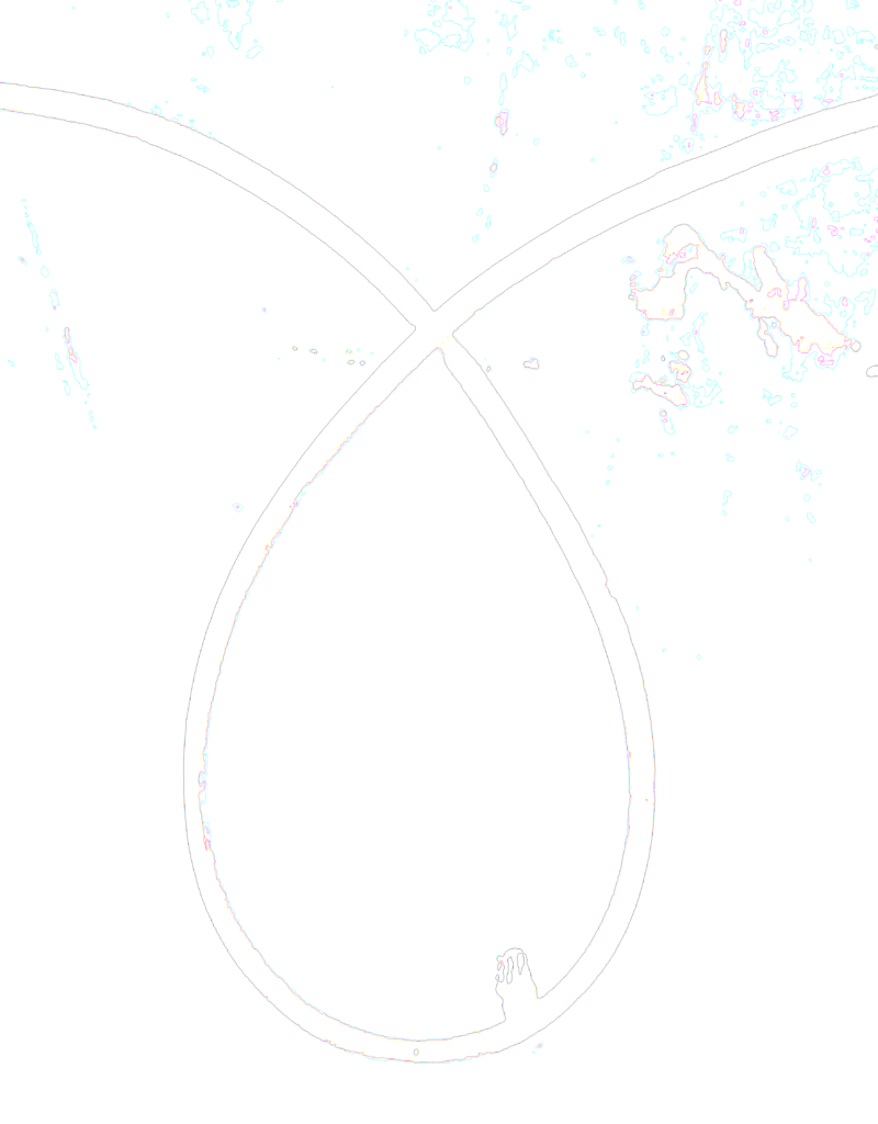


By the second day of work, I had concluded that I definitely enjoyed woodwork over printmaking. I hope I can do more wood projects rather than working with prints. Also, I have chosen really dumb grey pictures therefore they did not work as I thought they would.
Necessary Distractions – Artist research

The idea of going out of the borders of a painting and drawing on the walls is intriguing to me. Where does the art stop then? Is this considered painting. Kang’s strokes are sharp and controlled. The placement of the painting slowly spaces out into the white wall, whereas on the left side some parts are completely black. I want to incorporate this idea of going outside into my own current work.

Shayna Klee has been inspiring me for years. She creates weird installations using glue, shells, and sand with paint. Things that interest me in Klee’s work: are shapes, scales, and vivid patterns. She creates multimedia pieces that quickly grab viewer’s attention and let them explore more. Her work has been described as “childish”, although I disagree. It brings out surrealism, feminism, satire, etc. Children would not understand such art, even though it is appealing to their eyes. I believe there is so much more to explore in Klee’s work.
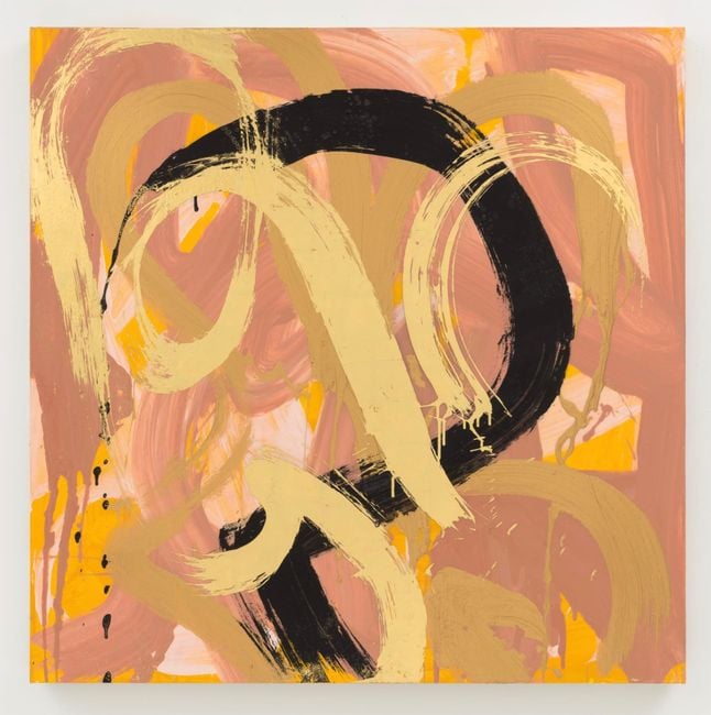
Mirror, Mirror on the Wall, 2020
Semester 1 Week 9; 15 of may; Necessary distractions


Starting off I created this long wood piece into a shelf. Which I liked personally, but not my teachers. It was materialistic and served a purpose. But it was a dead-end, I had no ideas to explore around from there. I felt annoyed having to put it on the ground, but things started to grow from there.


I put this “tower” on the ground. Just like I intended in the beginning. The whole construction of this thing pissed me off. I hated this.

I rolled the brown paper with print down the wall on the floor. By accident on the first print, there appeared a rabbit-ant kind of creature. “Rant”. So I went from there and made a huge wooden yellow version of this thing. The diagonal placement of the tower was intentional.
These triangles on the left were something I experimented with, that I hated in the end and torn apart. Good thing that I made them.

On this next thing, I tried not to overthink as much and just let my hands do whatever they wanted to and stop before my brain started making decisions. After some discussions, this chair became part of the work too, with tracing paper with lines relating to the cloth on the floor, a wood stick sitting on the wood of the chair, and an orange marker looping back to my colour theme.

Them it’s been transferred onto the ceiling. The same chair with things, but a cloth underneath with outlined feet. Also, I added this miniature “reference” picture to be put in the front. I didn’t like how to set up this idea.

So I moved it to this tiny walk-through space where everybody walks on. So naturally, everyone avoided stepping on this, considering it as a piece of work. This didn’t seem to work for me, trying to explain to people that it was my intention for them to step through it. So it put it back where I started.


These few different combinations I played around with. Spilled coffee on it, and let it drip. I did not understand my own intention behind this paper and cloth hanging on by this red string, so I took it all off.


And created this teacup. The yellow dripping paint was on purpose, to be directly above the spilled coffee. The colours and the simplicity satisfied me. The yellow and red box paint with the used stick are a part of it.

Semester 1 Week 10; 17 of may; Necessary distractions
Necessary Distractions – Artist research

This work got my attention by contrast. I clearly know that ladders stay upwards but here I am seeing it positioned diagonally. It created a lot of questions like, why, first of all. How did Overton find a perfect place to fit the ladder diagonally or did she manoeuvred the height of the ladder. The contrast of the arc in the background with straight parallel lines of the ladder and walls. The ladder is supported by itself but I am sure if I walk on it, it will stay up. To manifest the learning from this artist, I have thought about taking into consideration the space that I’m working in.

This artwork is even more contrasting and clear than the previous. Not only the contrast of colour but also shapes. The white piece seems to remind me of A4 paper, though I’m sure the proportions of this artwork are way bigger. From my point of view, it seemed like the black blob was literally consuming the white one, but not fully. This work relates to my practice by pushing the edge of where painting ends and sculpture starts.

I am very indecisive about whether I’m going to leave this piece on the wall or not. The black line on the leaf transitions into the square. They are visually connected as well as physically, by holes.
23 of may semester 1 week 11
All photos and drawings are made by me.
Copyright music:
Jak3 / Trashman. “Finger on the trigger.” Records DK, 3:10. 2018. https://open.spotify.com/track/2omEXAitlQ79vTj5o3Khrm.
Copyright Tiktok sound (taken from a Tiktok video):
Pewiyard. (2021, April 29). Yes. [Video]. Tiktok. https://www.tiktok.com/@pewiyard/video/6956305391013661957?is_from_webapp=1&sender_device=pc&web_id=7099981571730130433.
https://www.tiktok.com/music/sonido-original-6952261936868330245?is_from_webapp=1&sender_device=pc
25 of may semester 1 week 11

Printing out frames before the bookbinding workshop.
All videos and drawings are made by me.
Copyright music:
Lyrics.com, STANDS4 LLC, 2022. “Exactly What You Run from You End Up Chasing Lyrics.” Accessed May 24, 2022. https://www.lyrics.com/lyric/36210096/Tyler%2C+the+Creator/Exactly+What+You+Run+from+You+End+Up+Chasing.
4 of June semester 1 week 12 – all recent work

A final finished flipbook. I decided to have a stitch of hearts and make a cover see-through with holes. The whole thing took about 2.5 hours to complete.


I was playing around with figuring out a layout for this first piece. On the left picture with my face I tried to make a bunch of layers (going outside of the wall, by hanging them on a stick) but it turned out awful so I sketched this idea.

A hanger for drawings kind of thing. So I had to make a wooden stick and attach it to the wall without it falling under its weight.

So this is what I’ve got so far. My face, tv with a stick and an eye. It did feel like a dead-end but I sat with these ideas for a while.

Now, there are a couple of drawings hanging from the stick and a drawing covering half of my face, making a connection. After a talk with my classmate, they suggested an idea to hang it up somewhere in the upper left corner to fit the open space that felt blank.
I also had this idea of a clock for the bottom picture of the eye. I started with cardboard but cardboard sucks and never works for me so I just went to make laser-cut wooden numbers. I had some leftovers so it made sense to leave them on the floor as a part of the work.


The next day on a Friday, I completely scratched the idea, took off all drawings and left the hangers blank. I painted my face to look like a monster with a lot going on in its head. For Monday I am planning to print out a lot of frames and sew them together and hang them from the ceiling.
I also made put a string around numbers. It stopped looking like a clock, unfortunately. More like a web.

I was playing around and trying some new ideas that were coming to my head and this was one of them. I just wanted to document this and show not all ideas come out amazing as this is really corny and hideous. So I took it down and started again.
7 of June – all recent work


Today I added some red frames from my animation and hung them from the ceiling. They are connected to the top A0 by being inside the TV in the animation. There is also a connection between the wooden numbers in the plastic bag and the numbers on the floor.


I put these particular pieces on a stand. The utensils (created out of wood) placed in a cross position show dissatisfaction after finishing a meal. The meal here was my flipbook I made out of my animation. Though I like it, I am aware of the room for improvement.
SUMMATIVE REFLECTION
Note processes and concepts that you enjoyed
Absolutely it is woodwork – I loved it and I am looking forward to working with it on future projects.
Identify works that you feel were most successful and discuss visual and conceptual aspects of them that worked especially well. Explain why.
I am most proud of the little red-green-yellow wooden box cup with paint I created in Necessary Distractions. Its visual simplicity really connects with me for some reason. I’ve come through like six stages of that work to come to the idea of creating that box cup. So by spending so much time and through into it, I cut and added the exact amount of what I needed. I like it. It works together. The red string talks to the red paint on the floor. The yellow dripping paint talks to the yellow paint on the floor with a stick. It is dripping directly into spilled coffee stains. Nothing too much, nothing too little.
Comment on an aspect of the course that you found the most challenging.
Definitely overcoming my perfectionism and the strive for making things make sense and giving them a purpose. It is physically hard for me to let the work breathe and leave it undone. In other words, stop myself from overworking a project.
Identify 2 ways you could improve your studio practice in semester 2.
First, to help with the issue said above, I do not need to set a “final idea goal” in stone. But rather go step by step and ask myself questions like, “what would I not do right now working on the current piece” and then do that. I wonder where it’s going to lead me. However, it will be challenging for me, because I trust my intuition and my taste collected over the years.
Second, I really want to have conversations with people about their work and discuss it. I was kind of in my shell this first semester. However, I feel like expanding my boundaries will help improve my art.
SEMESTER 2 PHASE 1 SCULPTURE
18-22 July (clay and plaster)


Starting off, we were taught how to prepare a ball of clay before working with it. Using our hands to crumble the clay we got rid of any potential bubbles and got the clay ready. I used a knife as a prop and cut some lines going inside. The next step was to make walls for said clay. As the shape I chose was positive I made sure to put some “clay walls” around it and then metal ones. After ensuring that, we learned how to mix and pour plaster. Leaving it for about 20-30 minutes it sets down and hardens, afterwards we pull apart all walls and reveal the final shape.


On 20th July Harriet taught me how to apply latex to a surface which then later becomes a shown thing above. Two days later (today) I had to peel it off. This form could be used in any type of way – anything could be poured into it. I find it interesting that it transfers the surface really well. However, the smell of this is horrendous and I don’t think I am going to work with this material in the future.


The second type of approach we were taught is how to use plane wood walls to create a square. The same process was used as described before, however, while it was handed I used some tools to play around with the surface and created this beautiful texture to touch. It feels amazing.


“Pot” kind of thing I made to burn it in the stove, instead of pouring plaster in to see what the inside would look like. The next day I took it back to my studio and started carving some shapes into it. I have to keep the pot in plastic in between the phases otherwise It will harden completely.


On July 20, our class was taught how to make 2 or 3-piece moulds. The process is initially the same as described above, however, the main element is to add an object to make the mould of. My chosen subject is a small bottle. This explains why it took me 3 pieces to make this cast – for the sides and the bottom. It is shown in the drying cabinet, later we are going to pour whatever liquids into these casts.
Ideas brainstorm sketches
The image to the right shows sketches for the idea of the verb “grow”

Creating verbs with my body: to hang, to cut through; using my body as a model

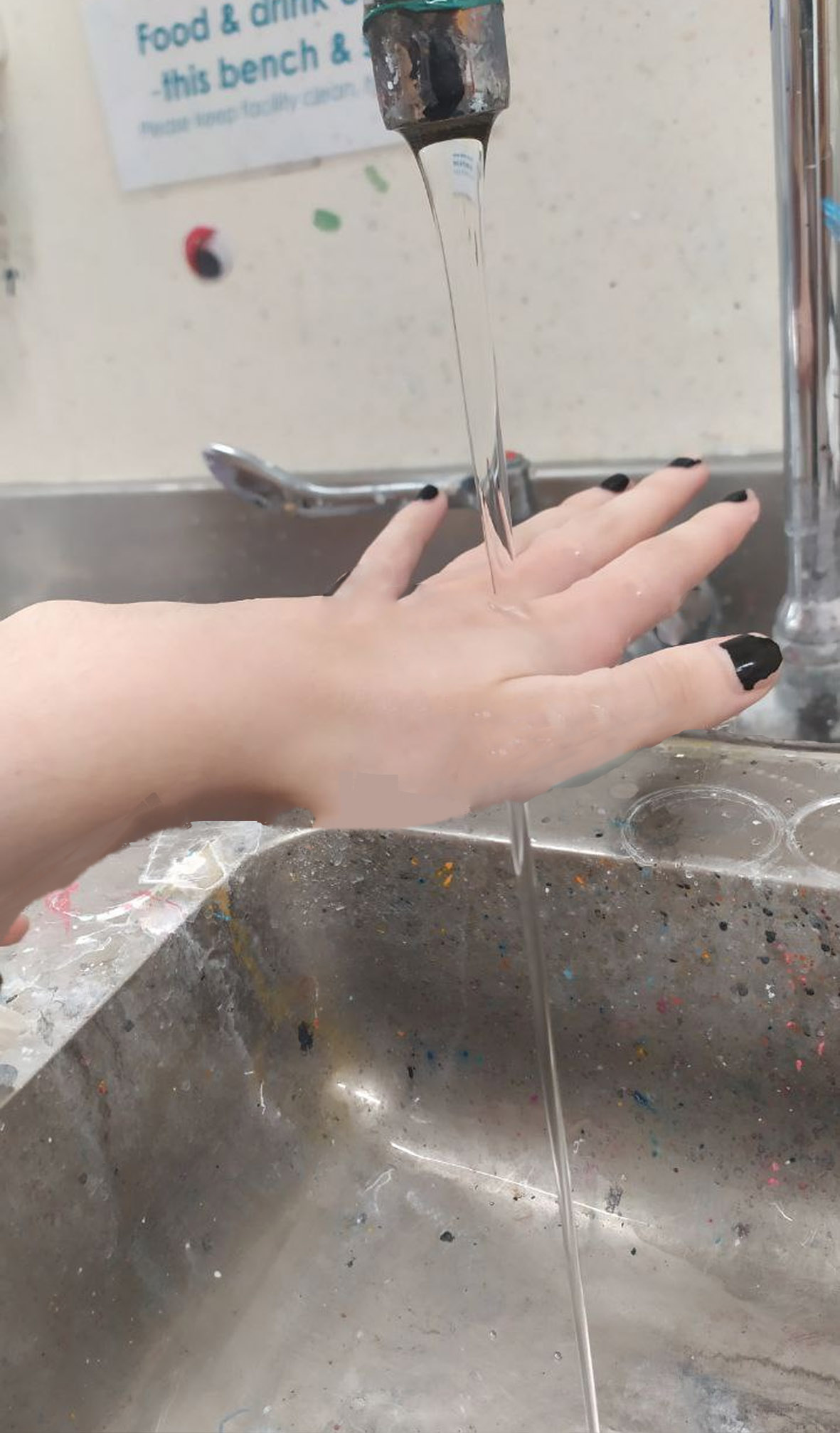

These are the prototypes of the idea of the verb “growing”. I decided to experiment with real dirt. I have 3 different types of clay that will dry out differently. Another 3 are of the same types, but I mixed dirt into them while preparing the clay. I left it over the weekend to see results on the 25th of July. The initial doodle idea is drawn above in brainstorm sketches.
25-28 July


To map out some of the ideas I had I decided to make prototype ideas of sculptures that I have been sketching out. I didn’t like how chunky the cloth looked so I switched it out for crunched tape to get the texture I want. I am planning to build it out of clay and implement dirt later on. On the right, I have something for the verb “hang”. The cloth material is just a prototype, I am going to consider other ways of sculpting and hanging this piece.
I took this photo at Pak’n’save. It’s just a cable hanging down from the ceiling with a knot in the middle and an end piece at the bottom. I found this surreal. It was an odd placement, right in the middle of an empty space where people were walking. It was like an installation. This cable does serve a purpose (the reason it’s there) but it did nothing at the moment but hang. I want to implement the same feeling I got from this into my own work.


This 3-piece mould from last week finally dried up and today (26th July) we got to pour slip liquid into it. To get to it we had to learn the whole process of pouring, dripping it out, leaving it to drip and taking it out. I decided to make 2 layers for this exact piece and I’m going to carve it out tomorrow.

Plaster pour with texture on the top layer. Made to incorporate into later sculptures.
Notes after the conversation with John (27 of July):
I have gotten some more ideas for the development of current prototype sculptures. Instead of hanging it up on the wall, I could put the whole thing (the verb “grow”) on the floor. I could collect moss (from different sites) and/or tag it. I could make a limit for myself (e.i use only organic materials, only 1 colour scheme). I can progress by making myself think out of those boundaries. What if I put a block of dried plaster into a natural environment (ground)? What if I make 25 of the “same” dried block plasters? What if I make more of the hanging installations for the word “hang”? What if I put the hanging installation on a tree, in the natural environment? Do I make it seem natural to fit it or leave it a beige colour?
(29 of July)

Today I created a lightbox prototype to test the material and how the process of making it will affect the result. I didn’t like how sticking walls was problematic, so I might make another shape of this thing.


Dried and glazed objects that were shown before in “in progress”.

The prototype of the sculpture “growth”. I moved it to the floor. This sculpture is big and clay dried pretty fast. I think I’m going to put it on a platform and keep plastic bags to prevent drying. I am also considering playing around with moss and dirt. I am only going to use natural elements to create this sculpture.
4 – 17 Aug


The sculpture for the word “growth”. It was made out of clay, moss, dirt, sticks, cut wooden plates, ants, plaster plates, aluminium, etc. It’s a sequence of things carefully supporting each other and having a flow-through space on the ground. It has a beginning, a middle and an end, just like all organic things in life which never last forever.


So these are some tryouts I did with natural fruits. I carved out the insides, dried them and poured plaster into them. Later after it dried, I peeled the skin off to reveal what the inside of the fruit looked like. I found the long-sliced banana the most interesting. I could later multiply them and attach them to the wall. I did find the inspiration vaguely behind the artwork of the Banana attached to the wall.

Nast, Condé, and @gqmagazine. “This Banana Was Duct-Taped to a Wall. It Sold for $120,000. | GQ.” GQ. www.gq.com, December 7, 2019. https://www.gq.com/story/suddenly-the-koons-is-this-100k-banana.


A video I created of this performance piece. Throwing bananas one by one at this wooden block. I am interested in this concept of power and ruin. The product I created from scratch I destroyed and got rid of. This idea that ‘nothing lasts forever’ intrigued me and I decided to make my own interpretation of it. After the project is complete, I could recycle used plaster and bring it back to its initial form.


Over the last 10 days, I created (and started) a series of sculptures. I started working with new bananas. I am going to play around with the definition of the word “hang”. I love the fact that the natural skin of the banana rots and decays with time, however, the (plaster) inside stays the same. It’s a play between nature and human-made materials.


Workbook sketches

These are the drawings I created to showcase my potential work outside of the studio. I am not planning to work in the outside environment therefore I wanted to see what it would look like if I did.


A collection of workbook pages I worked on for brainstorming sculpture ideas. It includes small idea sketches (glimpses of work), developments of ideas, structures and support systems, development processes and finalised ideas.


This is an idea of a tree with eyes for the word ‘look’. It started nicely. However, I didn’t have a wall to work with. The more clay I added, it started overweighting itself. I didn’t plan the support system enough. However, I kept two big pieces and I am planning to put them on display.


Bisqued and glazed works installed from the previously failed idea. I tried around a bunch of ways how I could potentially arrange these two pieces. I brought some more wood pieces to stack on top of each other, on the floor, diagonally, vertically and leaning on wood. However, ‘arrangement 2’ satisfied me the most. I used wood planks as a support beam to relate to the idea of the initial sculpture representing a tree.
Working with natural fruits is interesting to me. I’m going to cut this pineapple in half, scoop the fruit out, pour plaster inside, and hang the top part while leaving the bottom on a stand.


(26 Aug)


Sculpture – Artist Research
Rebecca Horn
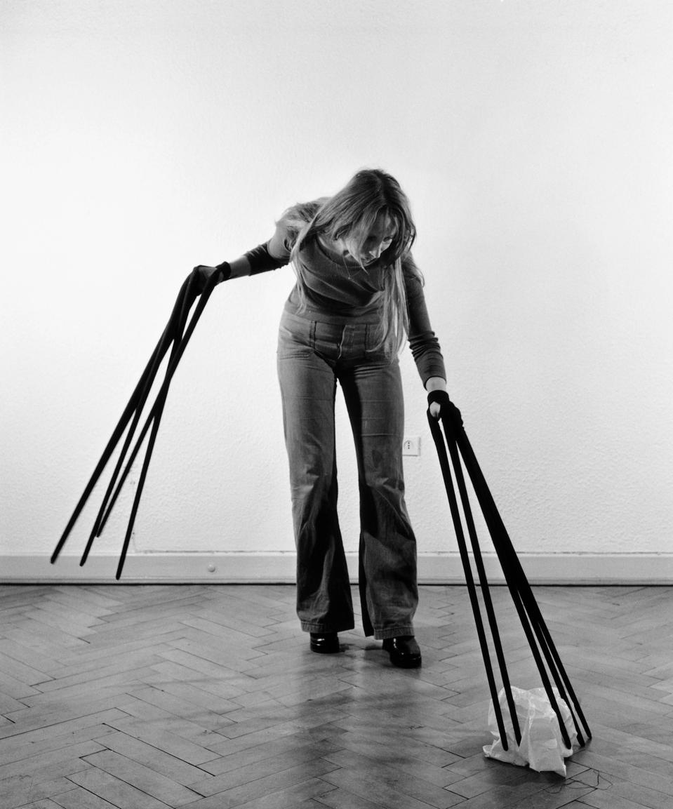
This person intrigued me by using her body as a tool to create her pieces. Horn is known for making art performances that include ‘extensions’ of her body. “As such, these sculptures serve to help viewers understand difficult emotions and have a therapeutic impact.” I would like to try to implement this into my practice, by allowing my emotions to express through the use of my body.
“Rebecca Horn Artist Overview and Analysis”. 2022. TheArtStory.org
Content compiled and written by Claire Hope.
Edited and revised, with Summary and Accomplishments added by Rebecca Baillie.
Available from: https://www.theartstory.org/artist/horn-rebecca/
First published on 16 Sep 2018. Updated and modified regularly.
Andy Goldsworthy
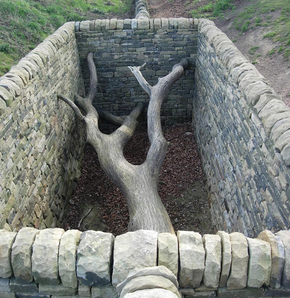
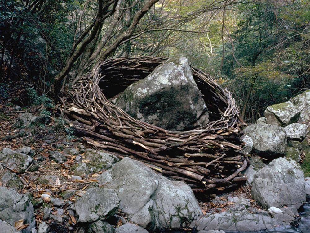
Goldsworthy gave me such a great inspiration to work on my nature-based piece. He is known for his works based on outdoors nature materials. Goldsworthy’s goal to understand nature is to participate in it. His works are elegant and not particularly ‘invasive’. In my opinion, he finds beauty in nature and works with it to embrace its beauty. Andy Goldsworthy showcases how different and unique nature can be if we spend enough time with it and observe it. What are the borders of his work and where does it exactly start and end? Could I consider that his art blends with nature?
Creation Stories, an exhibition by Karamia Müller and Simon Denny

The work created by Denny and Müller visualises creation stories covering the relationship between the Pacific and Europe. Their sculpture consists of electrical wires used to power vehicles. This material was used to resemble family trees connected between those 2 regions, intertwining histories and narratives. For my work, I would love to explore the same type of mechanism (like wiring) to represent the connection.
https://www.scoop.co.nz/stories/CU2206/S00184/creation-stories.htm
https://www.auckland.ac.nz/en/news/2022/08/18/Exhibition-captures-lesser-known-histories.html
https://gusfishergallery.auckland.ac.nz/creation-stories/
Kate Newby


Newby’s practice revolves around collecting materials. She is interested more in the unfinished objects that contain memory. In my own interpretation, Kate Newby’s collection represents a time-space vacuum storage which holds a specific meaning for her. I would not be able to understand the whole context behind her pieces of work, however, I understand the concept those works were made under. And I could apply the same concept to my own practice.
https://artviewer.org/kate-newby-at-feuilleton/
https://www.tique.art/exhibitions/kate-newby-loved-like-a-sunbeam/
SUMMATIVE REFLECTION
Note processes and concepts that you enjoyed
I think my favourite process to learn and create this semester was the work with clay. It involves my hands, strength and dedication to prepare the clay and sculpt something out of it. I enjoyed spending my time working with it.
Identify works that you feel were most successful and discuss visual and conceptual aspects of them that worked especially well. Explain why.
In my opinion, the ‘growth’ sculpture is the most effective work out of all I have created this semester. Considering visual components, everything in that piece works together. Every element I included serves a specific purpose. The composition the well-balanced. I’m proud of it. If I knew how it turned out before I started it, I would have probably made the scale even bigger, transferred the location onto the wall, and separated the work, so it is seen as a progression in different stages. But, it is one of my successful works either way.
Comment on an aspect of the course that you found the most challenging.
I didn’t think through one of my ideas long enough to make sure it is carefully supported so it fell apart. I did not have any wall to put support on. So I could not properly place it so the proportions of the sculpture don’t overweight each other. It was a good practice and a good lesson for me.
Identify 2 ways you could improve your practice
Identify at least a couple of research artists before starting any further idea concepts. This would help me develop a broader understanding of my initial ideas. I would seek if any ideas or concepts have already been done before and learn from those artists.
More trial and error – be less afraid of making mistakes and more excited about them. I’m a very final-detail-oriented person so if I already have an idea in mind, I will make it how I imagine it. However, it makes my work dull without further improvement. I need to learn to let go of perfectionism and make thousands of small ‘bad’ works, making my skills sharper.
SEMESTER 2 PHASE 2 PHOTOGRAPHY
20 september (nature drawing itself)


Auckland city greenery capture.

Today we covered the beginnings of photography and an analogue emphasis of this half of the semester. I’m going to explore photography concepts such as ‘first-hand ownership’ of the image, proving existence by capturing an image or ‘claiming’ it.
My main focus is nature. As it is already a form of art on itself. I will consider light/black interplay, reflection and texture to be present in my photos.
Idea-Brainstorm of sketches on a large sheet of paper
I decided to capture all of my ideas coming through in the studio on this sheet of paper and later analyze and evolve them.
22 sep notes
What kind of relationship can photo processes have in our world?
Lies, delusion, photoshop; exchange of information; exchange of ideas.
How can we let nature draw itself?
Through a microscopic view;

26 sep (additional research)
"Nature is reproduced in pictures not only with truth, but also with art." Paul Delaroche.
"The photograph could: document reality, be an artistic form of self expression." B&H Photo Video. “Art Movements Through Photography.” Youtube Video, 1:49:27. https://youtu.be/r-Bx5krtLZY
"I'm just trying to remember what I'm seeing in certain situations... Photography inevitably holds up a mirror to myself and who I was at that time." Louisiana Channel. “Photography lacks intentionality.” Paul Graham was interviewed by Marc-Christoph Wagner at his home in New York City in March 2022. Youtube video, 27:38. https://youtu.be/H7H5LP_u81Y
ARTISTS


Paul Graham Archive. “End of an Age.” 1996-98. https://www.paulgrahamarchive.com/endofanage.html
Here Graham captures people just doing their own thing at the clubs. I liked this take, it shows raw emotion through photography captured in time; raw feelings that the person had at the time. Graham stated he photographed some portraits in a dim shady light, the person facing away from the camera. They’re living in their own moment in peace not disturbed. And sometimes, he turned the lights on, revealing all of the details and parts that used to be hidden. All wrinkles, folds, eye bags, dirt, everything was captured in light. And later he went back again to shooting in the darkness. His use of light is interesting to me. The way he uses photography in general to tell stories is intriguing to me.

What made me take interest in this photo specifically is the layers of the photo – background, middle ground and foreground. The photographer in the front and people getting ready for a photo together creates this third-person view outside the photograph that’s about to be taken. It tells me information about the world during the fragment of taking that picture. This is a really interesting concept to explore.
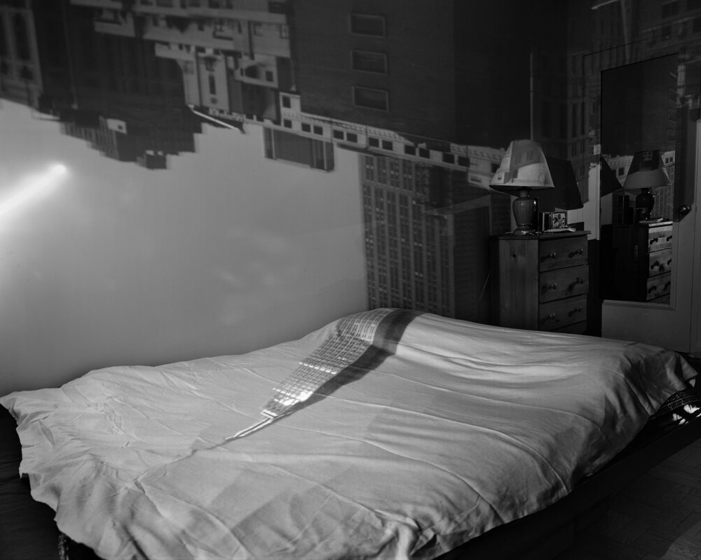
My close friend showed me this artist which instantly took my interest. She explained the way Morell used windows as a pinhole camera to create these room-sized photos of the cities he lived in over the years, since 1991 to 2022. It’s fascinating. He covered all windows in black plastic to exclude all light. This allowed him to transfer the outside view onto the room setting. “Typically then I focused my large-format camera on the incoming image on the wall then make a camera exposure on film.” (The Visual Delights of the Camera Obscura (video), CBS News, January 2017) It’s just weird and unusual to see inside and outside in one place. However, that’s what makes it interesting.

12 x 16 in. (30.5 x 40.6 cm.)
This particular photo by Tillmans interested me in its ‘rawness’. We [as an audience] only get to see the twisted left side of the body taking up 80% of the image. It’s just flesh, bed space and a peek of clothes, nothing more; yet it shows so much. I realise what kind of person it might be – a man in his 20s-30s, a bedroom space, he is not fully relaxed on the surface as there is space between the body and the bed. Perhaps he is stretching? I love the idea of the cropped image, making the audience figure out what’s happening by little details in the background and close foreground. The body consists of a character being shown in the image.

Wolfgang Tillmans, Mond im Erdlicht, 1980,
44 x 34 cm. (17.3 x 13.4 in.)
I find this photo of the moon quite interesting. Unlike the previous image by Tillmans focusing on a human figure, this photo shows a dull moon. There is an evident solid white which enlarges and fades out into the space. I can see the outline of the object, however, there is not much variation in the greys. This image pulls me in by the use of this soft glowing light; where on the top side of the moon, it flows into the space, and on the bottom side of the moon, it sharply ends with contrast to the other side of the moon.
I could explore the same lighting [contrast] aspects of the image regarding plants and flowers.

A series of works by Calle, showing a cycle of sleep – captured every hour. This resonates with my idea of time capture. The picture shown above shows Garison sleeping at 7 in the morning. He is vulnerable and asleep. The shot reveals the bed setting and a single hang coming out of the covers. This is the only indication there is a person underneath. Garison is unaware of being photographed, his body is exposed, unprotected. This is the feeling – atmosphere I get from reading this photograph. It inspires me to create shots in a similar spirit.

What captured me about this photo is a distinct emotion surrounded by the greenery of nature. This is how one feels inside nature. The emotion of the person in the frame becomes first, I believe here. The position of the body supports and describes a story. An audience is not aware of any factors that might cause the person to react in such way, apart from being surrounded by nature. I like the idea of play between emotions and nature and their correlation with each other.

Stork Legs, Kuldiga, Latvia, 2011
My first thoughts go towards the idea of the relationship between humans and nature. In the photo shown above a person perfectly ‘fits in’ the hole in the tree filling the space in with their body. Like legos, humans and nature sometimes fill in each other and help each other. [Apart from climate change and people killing the planet]. Anyway, I like the shapes this picture draws attention to, by bringing humans and nature together.
29 sep (all recent works)


A series of close-ups of plants on body. I explored the tactile relationship between the skin and plants. I brought some attention to the shadows and the overlay. Some details can be seen if looked closer: scratch marks, pimples, and editing of the back (left).

The same shot was captured from a different angle. The raw feeling, skin exposure and environment supported by covered plants created this interesting perspective. Polaroid camera gave an old distressed look, which connected so good to the idea I wanted to pass through. I wanted to explore my personal relationship with nature and the way it was always supporting and covered me since childhood. I hope the above series shows vulnerability.
*After a conversation with Dieneke*
She brought up to my attention such ideas as this (particularly) masculine person being truly vulnerable with their back turned to the camera. The scene is set on an unmade bed. The greenery on the back (are they tattoos, skin defections, plants?). The idea of that clover leaves are only seen outside, but the scene is in a house environment.


Pinhole photography results: using a pinhole camera I created and tested a sequence of work. The first couple of works show good balance in light/shadows. I figured that 6-7 minutes in gloomy weather is perfect timing for my camera. The contrast is prominent, there are some fully black lines (places) which create a great variance. In one of the photos, my upper body was moving quite a lot, so it only pictured my legs, which I thought was an interesting concept to explore. The timing affects the process of creating a single picture so any moving objects become blurred. I thought it was quite unnatural for humans to stand hard still for minutes without training. This, however, reminds me of the Daguerreotype designed by Louis Daguerre in 1839.
Some of the photographs turned out completely black, because of overexposure.

Plant exposure measurements:
- 5-second light; 11 exposure;
- 7-second light;
- 6-second light;
- 3.8-second light; mid exposure;
- 5.5-second light; 16 exposure;
Plant Light Exposure results: I achieved these results using a light-box machine in the photography room. They turned out amazing. These are some of the first attempts to get the print leaves on photographic paper. I love how sharp the details of these prints are. I’m interested in the way the overlaying of the plants resulted in brighter areas, creating beautiful contrast; the transparency of the leaves; the holes created by bugs which make a design much more interesting than a ‘healthy’ leaf; visible little hairs on the stalks. Some of the prints ended up with washed-out marks, which (in real life) adds a little bit of vogue colour. Some timing numbers and the level of exposure didn’t turn out as good, creating a really dull dark print. However, it was a part of my practice and attempts. For future reference, I could play around with the proportions of the leaf, paper, or composition. Maybe cut out some prints and put them back in a different pattern.


I had this really cool idea to attempt to print Van Dyke on the leaves (not on paper). So I followed the printing process again: prepared the leaves, applied van dyke, dried them in the darkroom for an hour, printed out the text on some transparent paper, and printed using the machine. However, during the last step of washing out the prints in the bath, they completely washed out. Everything washed out. I didn’t realise that the leaves contained a wax layer (cuticle) which protected them. Some parts of the prints stayed visible, however, it’s unpresentable. This technique was a mistake. However, it was a good experience and gave me ideas to explore further.


These are the same envelopes used in different techniques. I painted van dyke over them and placed real leaves on top. It was my first time trying and you can see my mistakes here. The bottom 3 are leaked and smudged, it looks like dust because I placed them faced up in the water. A lot of small details were lost.
I adore the old dusty antique look to it though. It doesn’t relate to any previous works, so I’m going to create something new and take all the best things from this technique.


I took some moss pictures and photoshopped myself into it. Using editing, I created a more old look to these pictures. I wanted to use photography and photoshop as a tool to show my personal connection to nature and how my feelings are constantly interconnected with it. My house, my environment, and my town are surrounded by greenery. It’s a space safe for me to go in. As the pictures show, the moss is very soft and fluffy as I rest on it.


These are some of the attempts at photoshop that I created. The left photo of the real bamboo is oversaturated with the back environment dimmed. I focused on the irony of the picture – the mural of bamboo in the background and the saturation of the real plant. I did the opposite in the middle picture.
29 sep – 3 oct (recent works)

- 6-second light; 11 exposure;
- 5.5-second light; 16 exposure;
- 5-second light; 11 exposure;
- 5-second light; 11 exposure;
- blank
- 6-second light; 11 exposure
These are some of the new prints I experimented with. I added more flowers and plants (not just the clover leaf) and I love it and I love the compositions I ended up with. I am really interested in the tiniest details being in contrast to black and white. Something about the sharp shadows clearly telling an object really speaks to me. I love the variation of dim-transparent prints and very extreme black and white prints. I decided to still work with this format of long strips.

- 5-second light; 22 exposure
- 6-second light;
These designs are created on some bigger paper. This allowed me to add some text to this print which was an interesting concept.
The text also plays with the concept of leaf shutters.
6 oct


Here is a series of pictures of the routine that I go through each day. I wanted to use photography processes to create a memory of these moments. After some period of time, most of them will change and my mind will never correctly recall how it actually was right now. Each photograph pictures what kind of activity I am going through at the time. I am going to intertwine the writing (words of my interpretation) of each photograph. This series is too vulnerable.
This series relates to the brief by displaying the ideas of memory of fleeting moments (and loss over time).

To this series of prints, I added a couple of transparent boxes I had laying around. I achieved this form of containment of nature, something that humans are still trying to do for centuries. To the third box, I added a cigarette and a bottle cap as well as some wild plants so it creates this mix of personhood with nature in a single space.

Here are some other ones, I played around with different ideas regarding each one. For the first one, I changed the position of the prop and exposed the paper a couple of times, which didn’t turn out at all. It just went black. The second print has the previous two boxes, but I also put my lino print on the transparent paper underneath so there is some change. I looks messy, I don’t think it goes together quite well. The 3rd one has a couple of those spiky balls from the trees, I loved their shape. However, they didn’t bring out any details. I think the 4th one would be my favourite. I put some red beans from a plant into a pill container. I would’ve loved to explore this idea of ‘containing’ nature if I had more time. But these are some of the first developments for it.
Some of the prints have colour distortions made by accident.
7 – 13 oct

I’ve worked with a range of approaches and materials presented here:
- van dyke and cyanotype on leaves
- canon digital photography
- polaroid
- pinhole photography
- light exposure
- etc
display of work


I was playing with the arrangement of the work relating to clovers and vulnerability. My initial idea was to create a linear path of photographs and plants, from small to huge. However, I decided to install a range of works created by different approaches.
They are placed in groupings divided by the approaches they’re made from. I like the fact that ALL works work together to create an understanding of what’s behind these images. They support a single idea. I also added three wood pieces of the No. 3, symbolising the three pieces of the clover, three original clover leaves used in the shootings, the van dyke print, the original polaroid, and blown-out copies.


I chose the most successful and related images and divided them into 4 A3 parts, creating huge blown-out versions of them. I love the pixilated details created by the expanded size of the images. Also, my choice of paper was baking and transparent paper. This allowed me to have more interesting textures to play around with. Using transparency I added the grainy texture of the wall to the images. This is the placement I’m the most satisfied with. The images are kind of sliding down from the ceiling onto the floor. It gives each one space to breathe and flow.

Hung up series on the strings and paperclips. I ended up hanging these pictures away from the wall so they’re constantly shaking by any slight wind of anyone walking by. They’re fragile. My choice of materials to support the artwork was intentional. I used paper clips and Mullins as they’re the fundamentation of my childhood materials [for art] and my routines.

Van Dyke print on the leaf hung on the wooden “frame” that barely holds. Something about the simplicity and space contrast is rich. It brings my attention right to it. I intended for all holes, paint, and imperfections on the frame to relate to the leaf and reflect it. It is the only piece of work on the wall. The raw frame supports the rawness of the leaf and the print on it. They work together to create this simple rich installation.

I took off this whole piece. After some time it was just not working for me in connection with my other work and space. In replacement, I achieved some good results with Van Dyke.


I turned the original pinhole photograph into a Van Dyke print. It’s a sequence of 4 A4s taped at the back to create a single image. Van Dyke added this rustic old feeling to this image, which I found interest in. I love the texture it resulted in, the paper was quite light so by the time it dried it scrunched up leaving heavy wrinkles. All details remained and with an even bigger scale, they are more prominent. The image itself is quite odd. No face recognition can be seen in the upper body, just legs, shoes and some background. The person is unrecognisable unless it’s people who closely know the individual’s habits of clothing and figure.


Meanwhile, I tried to recreate the same picture on wallpaper material. As presented, it did not turn out as great. The fabric kind of ‘ate’ all tiny details no longer present in the image (apart from the shoe which had the most contrast). I’m kind of disappointed the fabric was too heavy but it was a good experiment to see what worked and what did not.
SUMMATIVE REFLECTION
Note processes and concepts that you enjoyed
I think the two core concepts that brought me joy in this brief overall were creating storytelling via photography and Van Dyke print of images. Using photo processes I showed my experienced and feelings with nature and [people]. It allowed me to show a glimpse of what was going on in my head.
Van dyke generally is a very slow-paced, thoughtful process and I enjoyed dedicating my time and energy to developing photo images using this method.
Identify works that you feel were most successful and discuss visual and conceptual aspects of them that worked especially well. Explain why.
My choice stands in between the two – van dyke on the leaf and the pinhole photo of my legs and shoes. I believe they’re one of my strongest and most radiant pieces of work. The simplicity of the leaf and complexity [on the other end] of the pinhole photo opposite each other. Despite that, they’re both heavy on ‘fulfilling the matter’ in a photograph. What I’m trying to say is they are not empty. Both carry some sort of message.
Comment on an aspect of the course that you found the most challenging.
I think an entire 2D aspect of photography kind of puts a boundary on my making. I tend to materialise my ideas in a more sculptural 3D way, going away from the flat walls. I tried creating a more ‘hanging’ installation but it just didn’t work for me and 5-week time was not enough to develop that installation further. Creating a 2D boundary was a good challenge for me though. It made me figure out ways how I can put my practice within these boundaries whilst still creating good results.
Identify 2 ways you could improve your practice
Not having general anxiety to discuss my work with other people would be nice.
A boundary: of finding at least 7 artists to take inspiration from and learn from BEFORE starting any work.
ALL YEAR BIBLIOGRAPHY
Theory Semester 1:
ALEH, Daniella . “Blue Ram.” WALLACE ARTS TRUST . September 23, 2016.
https://collection.wallaceartstrust.org.nz/objects/8810/blue-ram
Aleksic, Adam “TO PLAY WITH ILLUSION.” The Etymology Nerd. Etymology Blog –
THE ETYMOLOGY NERD
Condo, George. “George Condo: The Way I Think.” Interview by Kasper Bech
Dyg. September, 2017. Video. 39:02. https://youtu.be/BhRdlVcQnjk.
Douglas, Harper. “Etymology of Land.” Online Etymology Dictionary, accessed May
10, 2022, https://www.etymonline.com/word/Land.
Etymologeek. “Culture Etymology.” Culture etymology in English | Etymologeek.com
Pappas, Stephanie, McKelvie, Callum. “What is culture?” Live Science. Published
December 15, 2021. https://www.livescience.com/21478-what-is-culture-definition-of-
culture.html.
Etymologeek. “Illusion Etymology.” Illusion etymology in English | Etymologeek.com
New World Encyclopedia contributors. “Spirit.” New World Encyclopedia, accessed
May 10, 2022.
https://www.newworldencyclopedia.org/p/index.php?title=Spirit&oldid=1044466.
Evans, Dawn. My Roots, My Place, My Albany. Am Publishing New Zealand, 2012.
Homebrew TubeDinoz. “Lucas Creek Albany – Waterfall.” YouTube video, 0:49.
August 2, 2020.
Klee, Shayna. “It’s all about the energy.” Interview by Claudia Luque. Metal,
March 26, 2020. https://metalmagazine.eu/en/post/interview/shayna-klee.
Lopesi, Lana, False Divides, (New Zealand, Wellington, Bridget Williams Books,
2018), 22, 23.
Magnat, Virginie. “Can Research Become Ceremony?: Performance
Ethnography and Indigenous Epistemologies.” Canadian Theatre Review 151
(2012): 30-36. doi:10.1353/ctr.2012.0058.
McArthur-Tomes, Niki. “Self Portrait.” Art Station (blog). August 28, 2021.
https://www.artstation.com/cactusburner
McWhannell, Francis. “Encounter and exhange, Considering Painting: a
transitive space.” Francismcwhannell. October 3, 2016.
https://francismcwhannell.com/?p=587#_ftn7.
Meyer, Manulani Aluli. “Indigenous and Authentic: Hawaiian Epistemology and
the Triangulation of Meaning.” Handbook of Critical & Indigenous
Methodologies. Eds. Norman K. Denzin, Yvonna S. Lincoln, and Linda Tuhiwai
Smith. Thousand Oaks: Sage, 2008.
New World Encyclopedia contributors. “Spirit.” New World Encyclopedia, accessed
May 10, 2022.
https://www.newworldencyclopedia.org/p/index.php?title=Spirit&oldid=1044466.
O’Keeffe, John. Omai, Or A Trip Round The World. 1785.
Pappas, Stephanie, McKelvie, Callum. “What is culture?” Live Science. Published
December 15, 2021. https://www.livescience.com/21478-what-is-culture-definition-of-
culture.html.
Robertson, Jean and Craig McDaniel. “CHAPTER SIX: Place.” In Themes of
contemporary art: visual art after 1980, 194. New York: Oxford University
Press Inc, 2009.
Robinson, Peter. “Peter Robinson’s Biography.” The Arts Foundation Te Tumu Toi. April 19,
2021. https://www.thearts.co.nz/artists/peter-robinson
Theory Semester 2:
Bernstien, Jaela. “When It’s Time to Give Back.” Maclean’s 134, no. 6 (July 2021): 48–51.
https://search-ebscohost-com.ezproxy.aut.ac.nz/login.aspx?direct=true&db=bth&AN=15065
8002&site=ehost-live&scope=site.
Bloch, Stefano. “Broken Windows Ideology and the (Mis)Reading of Graffiti.” Critical
Criminology 28, no. 4 (December 1, 2020): 703–20. https://search-ebscohost-
com.ezproxy.aut.ac.nz/login.aspx?direct=true&db=edshol&AN=edshol.hein.journals.ctlcrm2
8.57&site=eds-live.
Boden, Sharon, Simon J. Williams, Clive Seale, Pam Lowe, and Deborah Lynn Steinberg. “The
Social Construction of Sleep and Work in the British Print News Media.” Sociology 42, no. 3
(2008): 541–58. http://www.jstor.org/stable/42857149.
Davis, Lindsey. 2018. “The privatization of street art and the preservation paradox.” Visual
Inquiry, Volume 7, no. 1 (March 2018): pp. 29-43(15). https://doi-
org.ezproxy.aut.ac.nz/10.1386/vi.7.1.29_1
Frame Workshop. “Levi Hawken.” Accessed September 19, 2022.
https://frameworkshop.co.nz/collections/levi-hawken.
Gompertz, Will. “How UK Museums Are Responding to Black Lives Matter.” BBC News. BBC,
June 29, 2020. https://www.bbc.com/news/entertainment-arts-53219869.
Hancox, Dan. “Why We Are All Losing Sleep.” New Statesman 148, no. 5496 (November 8,
2019): 48–51.
https://search-ebscohost-com.ezproxy.aut.ac.nz/login.aspx?direct=true&db=bth&AN=13957
7926&site=ehost-live&scope=site.
Khurshudyan, Isabelle, and Robyn Dixon. “Report Implicates Kremlin in Poisoning of Navalny.”
Washington Post, The, Summer 2020, 12AD.
https://search-ebscohost-com.ezproxy.aut.ac.nz/login.aspx?direct=true&db=anh&AN=wapo.
26e5fcf2-3e1f-11eb-8bc0-ae155bee4aff&site=eds-live.
Kukshinov, Eugene. “Discourse of Non-Participation in Russian Political Culture: Analyzing
Multiple Sites of Hegemony Production.” Discourse & Communication 15, no. 2 (April 2021):
163–83. https://doi.org/10.1177/1750481320982092.
Limn Gallery. “Levi Hawken.” Accessed September 19, 2022.
https://www.limngallery.co.nz/collections/levi-hawken.
Lombard, Kara-Jane. “From Subways to Product Labels: The Commercial Incorporation of
Hip Hop Graffiti.” Visual Communication Quarterly 20, no. 2 (April 2013): 91–103.
doi:10.1080/15551393.2013.801277.
Mathew, Paul. 2019. “Co-Option of Graffiti and the Persona of the Artist in the Neoliberal
Age.” J Pop Cult, 52: 1141-1162. https://doi-org.ezproxy.aut.ac.nz/10.1111/jpcu.12843
Mayo, Peter. 2008. “Antonio Gramsci and his relevance for the education of adults.”
Educational Philosophy and Theory, 40(3), 418–435.
Mayo, Peter. 2020. “Gramsci: Power, Culture & Education”. ACTIO NOVA: Revista De Teoría
De La Literatura Y Literatura Comparada, no. 4 (December):23-45.
https://doi.org/10.15366/actionova2020.4.002.
McGuigan, Cathleen, Andrew Murr, and Barbie Nadeau. “Whose Art Is It?” Newsweek 149,
no. 11 (March 12, 2007): 54–57.
https://search-ebscohost-com.ezproxy.aut.ac.nz/login.aspx?direct=true&db=bth&AN=24243
469&site=ehost-live&scope=site.
Michalos, Christina (2007), ‘Murdering art: Destruction of art works and artists’ moral
rights’, in Daniel McClean (ed.), The Trials of Art, London: Ridinghouse, pp. 173–93.
Paul, Christopher, and Miriam Matthews. “Defending against Russian Propaganda.” In The
SAGE Handbook of Propaganda, edited by Paul Baines, Nicholas O’Shaughnessy, and Nancy
Snow. Sage UK, 2020.
https://networkservices.aut.ac.nz/ezproxy.cgi?url=https://search.credoreference.com/conte
nt/entry/sageukvgik/defending_against_russian_propaganda/0?institutionId=5349
Rogers, E.L. “Beyond eight hours rest: sleep, capitalism, and the biological body.” Dialect
Anthropol 40, (2016): 305–318.
https://doi-org.ezproxy.aut.ac.nz/10.1007/s10624-016-9433-6.
Sadar, John Stanislav. “24/7: Late Capitalism and the Ends of Sleep.” Architectural Theory
Review. (2015): 287-290. DOI: 10.1080/13264826.2016.1178207
Sliwa, Martyna, and George Cairns. “Exploring Narratives and Antenarratives of Graffiti
Artists: Beyond Dichotomies of Commitment and Detachment.” Culture & Organization 13,
no. 1 (March 2007): 73–82. doi:10.1080/14759550601167321.
Vogel, Birte, Catherine Arthur, Eric Lepp, Dylan O’Driscoll, and Billy Tusker Haworth.
“Reading Socio-Political and Spatial Dynamics through Graffiti in Conflict-Affected Societies.”
Third World Quarterly 41, no. 12 (December 2020): 2148–68.
doi:10.1080/01436597.2020.1810009.
Wakefield, Nik. “Sleep, Laziness and Making.” Performance Research. (2016): 126-131.
DOI: 10.1080/13528165.2016.1138783.
Studio [Links]:
https://www.thearts.co.nz/artists/ayesha-green
https://ocula.com/artists/ayesha-green/
https://jhanamillers.com/artists/ayesha_green_bio.html
https://www.theartstory.org/artist/basquiat-jean-michel/
https://en.wikipedia.org/wiki/Jean-Michel_Basquiat
https://tetuhi.art/exhibition/christina-pataialii-solid-gold/
https://www.gq.com/story/suddenly-the-koons-is-this-100k-banana.
http://www.goldsworthy.cc.gla.ac.uk/
https://www.scoop.co.nz/stories/CU2206/S00184/creation-stories.html
https://www.auckland.ac.nz/en/news/2022/08/18/Exhibition-captures-lesser-known-histories.html
https://www.tique.art/exhibitions/kate-newby-loved-like-a-sunbeam/
Studio [Artists]:
Abelardo Morell, The Empire State Building in Bedroom, Camera Obscura, 1994.
Arno Rafael Minkkinen, Stork Legs, Kuldiga, Latvia, 2011.
Imi Knoebel, Bild, December 2, 2014. Acrylic on aluminium.
Jae Kang Waves of Your Breath, 2017.
Kate Newby, As far as you can, 2020, exhibition view, Feuilleton, Los Angeles.
Kate Newby, Loved like a sunbeam, Galeria Madragoa, Lisbon. Images by Images Bruno Lopes.
Katy Grannan, Nicole, Potrero Hill, 2006.
Lee Friedlander, Canadian Rockies, Canada, 1974, gelatin silver print, 11 x 14 inches (sheet).
Marina Abramović, The Artist Is Present (2010), Museum of Modern Art, New York. Abramović’s former partner Ulay joins her during her performance at her career retrospective.
Max Gimblett, Mirror, Mirror on the Wall, 2020.
Nast, Condé, and @gqmagazine. “This Banana Was Duct-Taped to a Wall. It Sold for $120,000. | GQ.” GQ. www.gq.com, December 7, 2019.
Paul Graham Archive. “End of an Age.” 1996-98.
Rebecca Horn, Finger Gloves, 1972. Photography. Rebecca Horn Collection.
Simon Denny and Karamia Müller, Creation Story Cable Harness 3, 2022. Courtesy of the artists and Michael Lett. Installation view. Photo: Sam Hartnett.
Sophie Calle, The Sleepers (Bob Garison, Third Sleeper), 1979.
The Visual Delights of the Camera Obscura (video), CBS News, January 2017.
Virginia Overton, Untitled (Ladder), 2009, ladder. Installation view, SculptureCenter, New York.
Wolfgang Tillmans, Mond im Erdlicht, 1980.
Wolfgang Tillmans, Utoquai 14, 2012.
