Bibliography

Browne, Mathew. Avenior, vinyal tempera and oil on linen

—. Mal de Cou Cou, vinyal tempera and oil on linen

—. Lutalica, vinyal tempera and oil on linen

Christopher, Florentino. A Perpetual Compulsive Repetition of Words, Paint 16 March 2018

FRKO, Piccaso’s Ear Cover Art, N.D, Atlanta

Gallagher, Ellen. Double Natural, 2002

Martin, Leigh. ‘Loaded’, 2007, resin pour, Christchurch.

Nandemofoto, Koinobori. Carp Streamers. 3 May 2003, photograph, Hokkaido, Japan

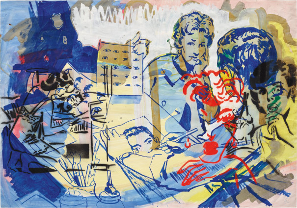
Polke, Sigmar .Untitled, 1979, gouache, spray paint and pencil on paper, Germany

Reedy, Brian. Shin Godzilla, 2017, linocut, Miami

Riwai-Couch, Jared. The Marsden Korowai. 17 November 2017, New Zealand

Sanchez Santamaria. Sergio, Tattoo parlour, 2015, linocut, Mexico City

Subotzky, Mikhael. Looking at Blue, 2017, sticky-tape transfer

—. Schliemann II, 2020, sticky-tape transfer

Vea, John. Concrete is as Concrete Doesn’t, 2017, Auckland

Warlich, Cristian. The Devil Head, N.D, water colour on paper, Hamburg
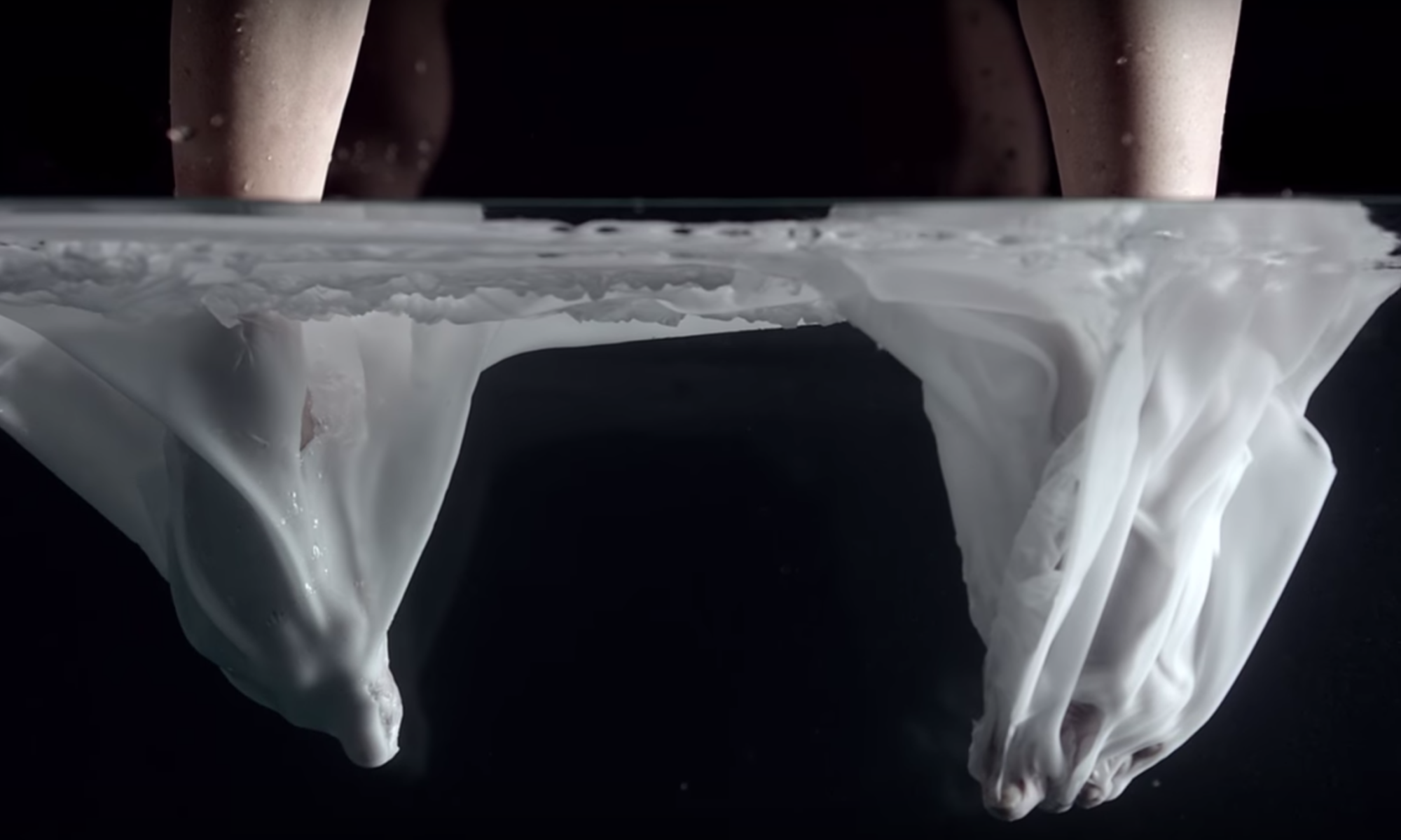
sculpture

this brief and sculpture in general was pretty challenging for me especially because I was sick for 2 of the 5 weeks, however I did what I could. My chosen verb changed several times over the course of the brief but I ended up using “to overlap”. My sculpture took inspiration from several different places such as Japanese koi kites, Korowai and south American beading. to display my work I wanted to have it hanging like a banner with a small gap between the work and the wall in order for the work to still move freely as the shells were attached in a way where the fabrics movement was not effected. for the most part this was successful however the work ended up being too heavy to be moved without being touched anyways.


nandemofoto, Koinobori – Carp Streamers, 3/May/2003, photograph, Hokkaido, Japan
Scales on artwork were inspired by Japanese Koi Kites

Artist research: Sigmar Polke

Sigmar Polke - 20th Century & Contempor... Lot 10 June 2017 | Phillips
Sigmar Polke, untitled, 1979gouache, spray paint and pencil on paper, Germany

sigmar polke’s works often look like line drawings or graphic illustrations done on top of other line drawings to create a collage effect. his works are always colorful and energetic and he uses a mix of cool colors and warm colors to make certain areas of his works pop to further push the feeling of layers. I was Inspired by his works to paint a portrait over the top of a watercolor painting I wasn’t happy with. the original painting consisted of cool colors which naturally didn’t stand out much so painting over with red ensured that the portrait of the face was where the eye was drawn to.

Painting reflection.

paint has always been a medium that I have wanted to familiarize myself with however I always found myself getting frustrated and discouraged as I worked, until I went back to the basics of mark making for this brief. The first two weeks of this brief was me getting comfortable with different mediums I have never used before such as water color paints, liquid acrylics and modeling paste. once I was feeling comfortable with paint I began working from my first printed photograph which was a portrait.

portrait painted using acrylic paints and modeling paste

although I was happy with how this portrait turned out, I only used verbs from the brief to make marks on the crown. For my next portraits I wanted to use as many different marks as possible.

These three portraits were done using liquid acrylics, acrylic paints and watercolor paints. when I paint my goal is always to make my painting look close to the source image so painting like this for me was strange. I found that working from my first portrait instead of from the printed image helped me to loosen up and get a little braver with my mark making.

After looking at my classmates works I found that bigger works tended to feel more impactful so after working only on A3 paper I decided to make a larger work. This painting was done using liquid acrylics and acrylic paints on an A2 sheet of paper that I was using as a drop sheet. I really enjoyed working on a larger scale, especially for expressive mark making.

This was my last painting working from the same printed reference. For this painting I feel like I simplified and stylized it to the point where there is almost no resemblance to the reference photo.

For my next series I wanted to move away from portraits and I wanted to somehow bring patterns into the work. To start this series I used liquid acrylics on wet paper to create blurry effects. I then went over with the liquid acrylics once the paper had dried to give it more shape with sharper and more defines lines. finally I went over the image again with a brush tip marker to add even finer marks. I believe that If I had tried to add more to this painting I would have lose all resemblance to the reference photo.

these were some more liquid acrylic paintings using differing amounts of water. I did not like these two works as much as the first one because of the lack of different colors. also because all of the marks made on these paintings were on wet paper the lines are extremely blurred .

.To summaries I was extremely happy with how most of my works turned out however In the future I would like to move away from liquid acrylics and move towards either oil paints or acrylic paints mixed with a thickening agent. also I want to have prepared backgrounds instead of working straight onto blank watercolor paper. I believe this could add some depth to my paintings, especially for my last series working from the cactus as I felt these works felt somewhat empty.

Semester 1 Reflection

one of my favorite works that I have created this semester was from our iteration brief. this brief was one of my favorites because it bought me back to the idea that “practice makes prefect”. throughout highschool I did a lot of sketching and created lots of works that I was extremely proud of, however after hanging sketches up on the wall and taking a step back I realized that the sketches loose there impact from afar. I knew that to fix this I would need to Ink over the works But I had no confidence in my inking ability. By choosing to use brush pens for this iteration brief I became more comfortable with inking after repeating the same drawing over and over again. although I am happy with my work produced in this brief, I am even more happy with this new method of practice I have found.

the most challenging aspect of this course for me was bringing materials into the studio. this wasn’t a problem for most of the briefs however this led me to struggle a lot with the Necessary Distractions brief.

to improve my studio practice for next semester I want to organize a locker or space were I can store materials I may need for future briefs. this will save me from forgetting supplies and then needing to spend more money on materials I already have this will also allow me to spend more time working in the studio.

Another way I could improve my studio practice is by familiarizing myself with supply shops around the campus. this first semester I spent a lot of time traveling to and from the campus to buy materials. to maximize my studio time I want to get familiar with the city and places that might be helpful to my studio practice.

Janet Lilo

Janet Lilo’s animation “Political Broadcast 2017” used background images, videos and audio taken from nature. in my opinion this is a way to express emotion and create a sense of tension in the animation despite the characters emotionless face. her use of imagery combined with the green envelope also suggests that she values the sustainability of the natural world. I think that this animation worked well because she was able to create her work and deliver her message without directly telling people who to vote for. From this work I noticed the impact audio can give an animation and I will try to find a way to bring this into my work.

Change it up animations

This has been one of my favorite briefs so far, I really enjoyed learning how to use photoshop in more depth and I am excited with its potential. learning how to use photoshop was a lot of trial and error and it took me around 3 sessions in the computer lab to even begin to understand what I was doing. My first animation was extremely simple but a lot of fun to make. despite its simplicity I was extremely happy with how it turned out.

in the making of my second animation I became more confident with managing and merging layers which led me to a more detailed and coloured animation however in doing this I think I lost a lot of movement and flow that was present in my first animation. Unfortunately I was sick towards the final days of this brief and so I wasn’t able to get introduced to the book binding lab to make flip books for either one of my animations.

Necessary distractions

this brief was pretty rough for me as I struggled to get my hands on materials, and when i did get materials I would have to carry them on a 45 minute buss ride into the city. However I really enjoyed getting to use both the print lab and the 3D lab.

Shapes used in this brief were inspired by this collection of bones which were used in a previous work, I wanted my shapes to look organic, this meant no straight lines or right angles. looking back, this step is probably what led me to making a work had the form of an animal. I wonder If i had used more random shapes, my work would have turned out more figurative.
This was my first set of shapes. the screen printing of my image didn’t work great and eventually on my second set of shapes I ditched trying to print the image all together and ended up printing solid colour. although this wasn’t plan A, I did like the contrast between the curves of the shapes and the sharp lines and corners of colour.

Assembly of the shapes was fun and I really enjoyed arranging and re-arranging the shapes to see the different directions I could go. However after some playing around I ran into my first problem which was size. looking around the studio I noticed that the bigger artworks really stood out to me however my work felt flat and underwhelming to me. this led to me finding ways to make my work take up as much space as possible in the easiest way possible without even knowing it. It wasn’t until our last day of working that I realised what I was doing and so I decided to take a step back and remove all the aspects of my work that I had just thrown on for the sake of making my work bigger and instead made a new work entirely. my work still wasn’t as big as I would have liked it to be, however did the best I would with what I had and overall I was happy with it. another thing I realised while working on this brief was that all of my work has had some sort of recognisable features, this new work was no different however I did begin moving away from this when I removed the fabric “T shirt” and made a second work instead that didn’t have any anatomical looking features.
This was my halftoned image. this was my first time using photoshop and it was tricky at first but I saw lots of cool features that could be useful in the future. in hind sight I should have chosen an image with more contrast. As well as this I should have set the halftone to a lower setting on photoshop to get a clearer image. On the final work the image itself is barely visible however this isn’t too much of a problem as the image didn’t add any additional meaning to the work.

Mathew Browne

Mathew Browne, avenior, vinyal tempera and oil on linen
Mathwe Browne, Lutalica, vinyal tempera and oil on linen

Mathew Browne, Mal de Cou Cou, vinyal tempera and oil on linen

the above paintings consist of several irregular shapes and lines of blocked out colour painted on a sheet of linen. the solid colour of the shapes provides a nice contrast from the textured linen underneath. Browne also uses both transparent and opaque colours in his work. areas where these overlap create duller colours in his sometimes vibrant artworks.

Week 8

For me screen printing on paper was slightly more successful than printing onto plywood, however I think the biggest problem was a combination of the chosen image along with the way it was halftoned. If I were to do this process again I would halftone in a way where the dots where more spaced, giving the printed image more texture. Using machinery to cut out the shaped was a little bit tricky because of holes and sharp curves however they turned out fine.