Final Works-Process into Image

“boxed in”
“silhouettes”

Reflection

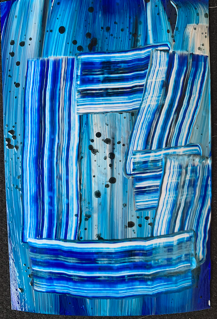
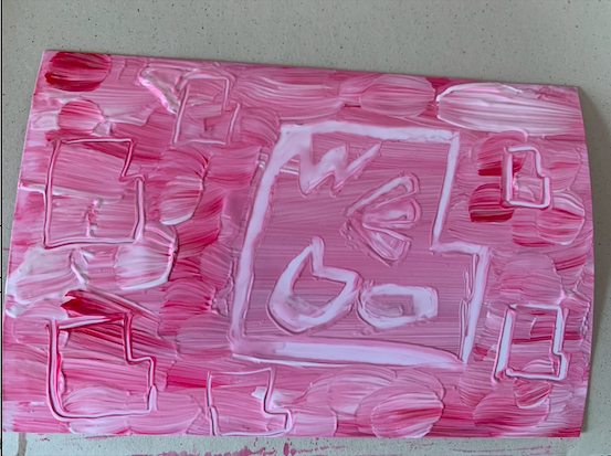
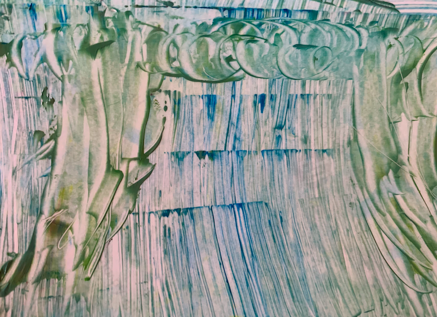
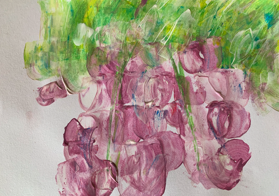
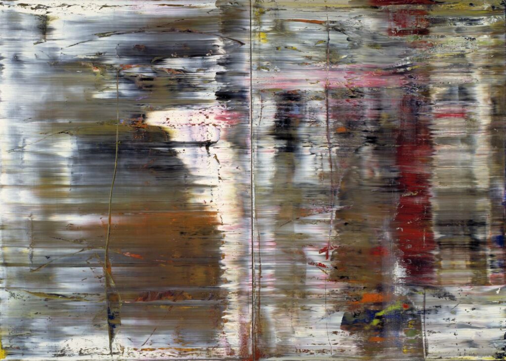
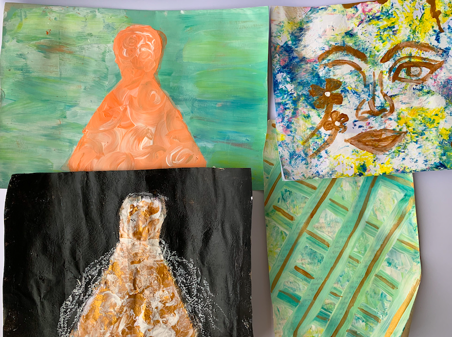
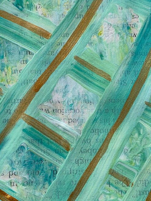
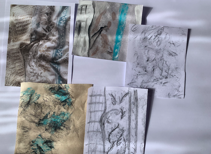
This brief was one that I didn’t think I was going to enjoy, I didn’t think I was going to be able to produce work that I was fascinated with but I was wrong. The brief challenged me definitely but I learnt so much about not focusing on the final outcome of the work but thinking about the process that went into the work. I picked these two works to be my final images as I believe they really convey my progress over the last four weeks. Right at the beginning of the brief, I found myself interested in the fluidness of paint. In my first-week verb works, I really played with different concentrates of paint because I was interested in how the paint looked. Focusing on the look and feel of the paint helped me to take my mind off making my images look perfect. This is why I picked the image “Boxed in” it helped me look at the process “Silhouettes” had the same effect. Overall this brief has helped me to find a style of art that im very interested in and a style that I would like to transfer over to different mediums (photography).
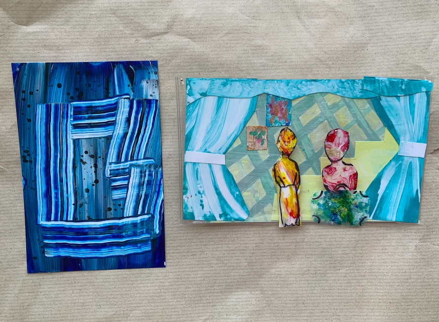
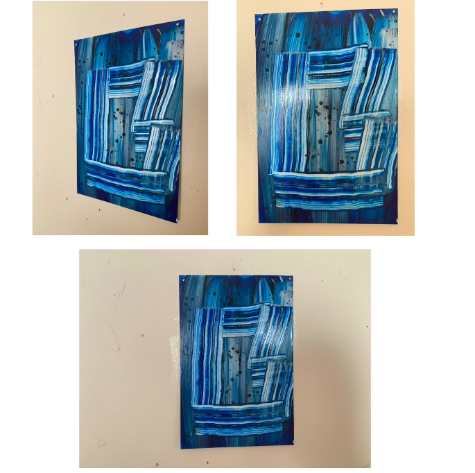
“Boxed in”

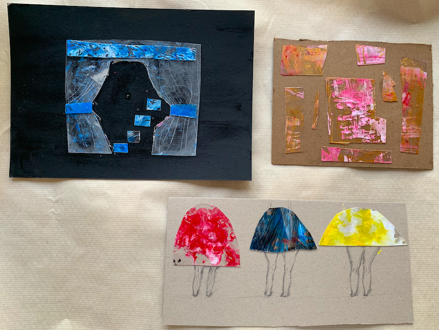
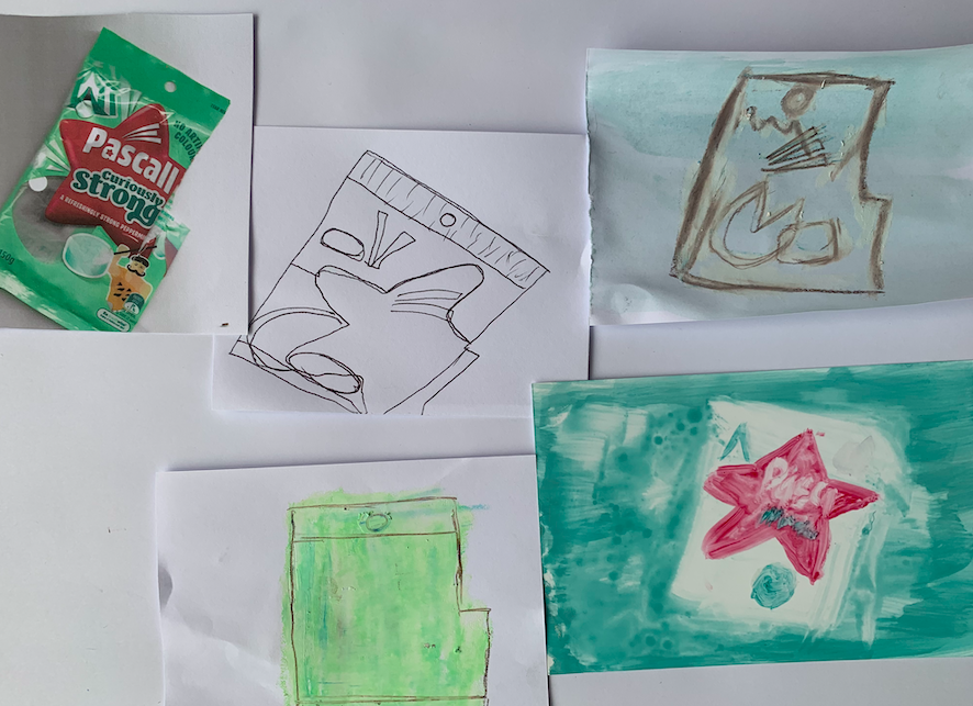
“Boxed in” came from a shape I used in week two reference images. It came from the piece of rubbish reference. When responding to the ref images I decided to block out the shape of the rubbish which was a bag of mints. The bag had a tear in it which made for an interesting geometric shape. When combing images in week three I was still drawn to this shape so I decided to mix it with the verbs from week one. This resulted in the image seen. The colour and texture of this work well. The idea of the smearing verb works from week one really help in providing that thick look. This piece is simple but its simplicity to me is what made this image successful. Another feature of this work that is successful is the change of directions the shape goes against the grain of the image which creates contrast without needing a range of colours. If I was to develop this image again I would look at different materials maybe like wood or glass I think it would be interesting to see what images the different material would create.
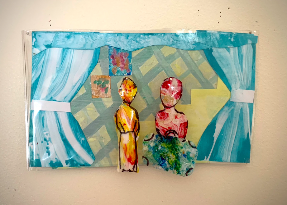
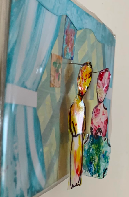
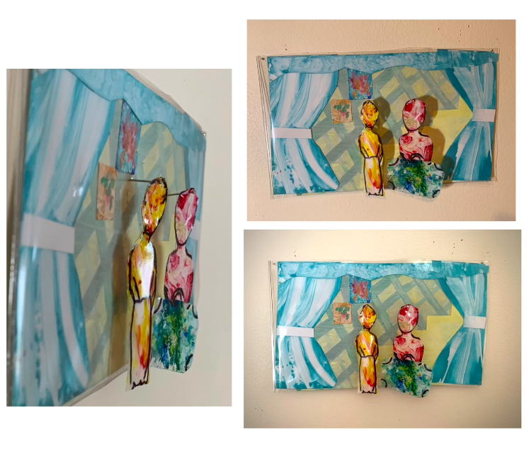
“Silhouettes”

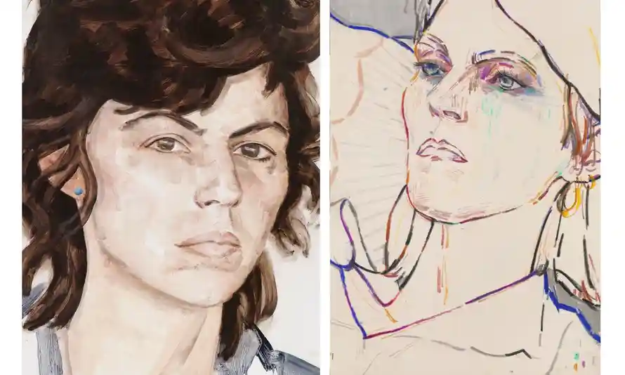
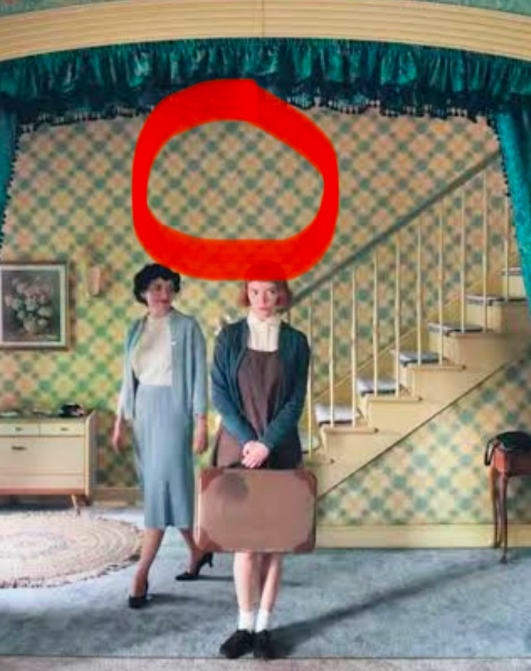
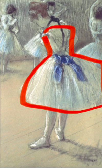
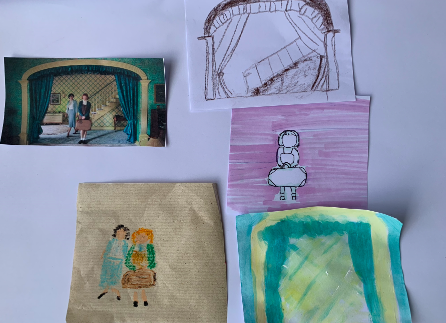
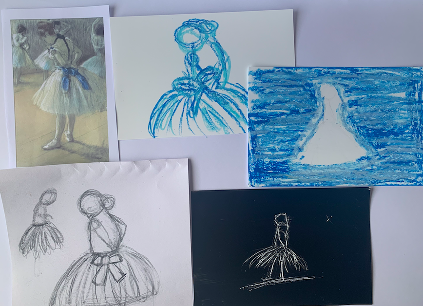
“Silhouettes” is my most recent work and most developed. This was one of the reasons I picked it as a final image. Another reason I picked it was my genuine interest in the style I picked. After looking and researching Mamma Anderson I really felt this way of working was what I was most interested in. In this image, I took the image from week two of my reference image which was a scene from the show Queens Gambit. When processing this image I focused on the background and figures separately but for this final image, I wanted to include both subject matters. The figures/silhouettes are filled with the more abstract splatter-spread look this came from the week one verbs work. The background also holds more techniques I found while doing the verb works. For example the curtain, I used the idea of swiping to give it depth. I put the figures on longer pins to space them away from the wall. This meant when a light was shined onto them they create a nice shadow which I really thought was successful. I find the layering in this work to be most successful but if I was to do this work again I would look at maybe make all the separate layers stand off the wall like my figures. I think this would add a sculpture element that would be an interesting continuation.

Developments

For this work, I wanted to really focus on what aspects of the last couple of weeks that has excited me. I found I really was fascinated with the idea of layering this crossed over into this work. This image is a development from my experiments using different materials images. in that image I used perspex and I splattered paint on it, this splatter pattern was my link to week one and the image I used was the link to week two. For my developed image, I wanted to take those same ideas but develop them into more of a cohesive work. I took inspiration from Mamma Anderssons tribute girl. In this work, the artist creates scenes using layers upon layers. This layered idea worked well with my reference images from week two.

In this work, I wanted to convey my learnings from week one. In week one I focused on the verb “splatter” and “Spread” so I wanted to bring those ideas over to this work. I did this by making the figures at the front have an abstract splattered pattern to them. This image was more successful as it portrayed the works from the first and second weeks.

I found that in this work I was using many of the techniques, in previous weeks to create the background. For example for the curtains, I used a swiping method that I experimented with in week one. This really showed me how helpful those experiments were and how when mark making the verb ideas come naturally.

Artist research

Mamma Anderson

Mamma Anderson is a contemporary Swedish painter whose works usually depict domestic senses within a house but she also likes to create landscapes. She often draws inspiration from early films. Anderson studied at the Royal Institute of Art in Stockholm. Holding her first exhibition in 2010 at the Aspen Art Museum. Anderson’s images have a real craft to them they aren’t just painting but are like scenes. Her use of layering Is very clear in her works. It’s that layering that gives her works this depth and complexity.

While developing my own images I have found myself taking inspiration from this artist. Ive found that im drawn to the way she composes these images. How they are so detailed yet at the same time in parts have simple line work. A quote from Anderson that seems to sum up her art-making and look out on the world is “In a painting, there is no beginning or end, a moment is frozen.”. This really does relate to her work her scenes are frozen there is so much life in her image yet it’s a painting. This ability to portray a feeling of liveliness is impressive.

Artist Research

Elizabeth Peyton

Elizabeth Peyton is an artist who works with portraits. She mostly creates images of her friends, historical figures and famous people. In her, work Elizabeth focuses on one part of the figure if that usually being the features of the face. Peyton tends to use bold brushwork but even with her bold lines, her work remains soft and somewhat elegant. Her work has been displayed all around the world in a range of gallery one being the museum of modern art.

I like how her work can have different detail levels I think it’s very interesting that she follows the part of the image that most excites her. This interest in one certain part of the image is very evident in her work, you can see where she uses suggestive lines and where she uses a more detailed approach. Ive found this idea has been helpful in my own work. I get bored quickly in some works so being able to focus on the parts of the image that interests me has helped to keep me engaged. I think ill continue to use Peyton’s conventions.

Exploration of materials

These are some of my developments from today. I decide to keep working with my reference images taking the curtains, the rubbish and the ballerina skirt. I wanted to move away from paper so I moved to a perspex material. I still wanted my images to have that same smudged abstract pattern from the first week. Last week I started to look at scraping my image into paper so this idea of etching images into perspexs seems to be a natural continuation. Developing this again I want to hang pieces of perspexs in front of a background to create an image. Overall im happy with these images I think that they are more interesting to me than my other images. The image that does stand out to me is the curtain image. I like how you can see the marks I have made on the perspex.

More combination images.

These are some of my combination experiments from this week. The brief was to combine the first and second weeks ideas to create a combo image. For the first image here I picked the piece of rubbish reference from week two and the push and pull work from the first week. The outcome Is a simplified image of the shape. In the first image, I used the smearing method to make this shape. I ended up liking how this turned out I the two types of spreading makes think image successful. The second image is the same except I have added more detail to it and instead of smearing and spreading the paint like the first image I wiped it away.

In the last image, I combined the curtains from my first week with the scarping. I need really liking the outcome of this image. I like how the shape of the figure is only a suggestion. With this image like the others, I used photo paper to create a shiny slick look. These experiments have shown me how ive been enjoying using the use of etching this interest has led me to wonder if I could explore etching more and if I could expand my ideas into making possibly making prints.

Artist Research

Gerhard Richter

Gerhard Richter is a pinter who works in the abstract field but he also works in photorealism. It’s said that Gerhard is one of the most important contemporary German artists. He is one of the most famous painters to emerge out of post-war Germany. His works have sold for extremely high prices the highest being £30.4 million in 2015. Gerhard’s images include vests amounts of layering and combine many different mediums. His use of spreading produces this almost blurred effected. It’s as if you look close enough you can see an image underneath the smeared colours. This is what the painter wanted, Gerhard works are often influenced by photographs.

I really like the way the work looks blurred I think its very successful. Gerhard uses a wooden ruler with a rubber edge to form these smeared works. I want to take this idea and included it in my own work. I did work with smearing paint but I want to look more into Gerhard practice as his method produces such successful images.

Week 3 – process into image

For this week we were to combine our works from the last two weeks. For today’s images, I decided to try a range of ideas and combinations. The first image is the silhouette seen in my ballerina reference. Over the weeks I’ve been looking at positive and negative space so I wanted to carry this idea over with these images. In my verb works I looked at pushing and pulling paint I would lay a thick layer of paint on and pull and push to create think lines. I tried to recreate this on the outside of the ballerina image. On the inside of this image, I used another verb on the inside swirling that I had also used in the first week.

I did the same for the other ballerina dress except I used a solid background and used the verb smear on the inside. This smearing word came from a week one work. With this one, I also added pastel. I did this to add detail. with the wallpaper image, I used a technique that I found work in the first week. I took paint and smeared it onto a plastic surface then I would place the paper into it. This caused an interesting pattern after I did this I painted the wallpaper pattern over the top so that if you look in the centre of the diamonds you see this texture from the verb.

Overall I felt like for these images I used a lot of paint and going further I should maybe expand to use different mediums. I also want to add in different materials.

More processed images- Week 2

Screen shot from a film
A piece of rubbish

With these processed images I wanted to add more detail to them. With the screenshot images, I did one image that responded to the colours only then another with more detail. In my other processed images, I had been looking at highlighting the figure by playing with negative and positive space I tried to expand this here. Instead of just using the positive-negative space I added simple details. I think the addition of the detail somewhat takes away from the use of positive space does. I think the pastel on brown paper is successful it doesn’t have detail but still communicates the image which I like.

With the second image, I tried to explore more materials. For example, I used photo paper for the bottom image. The use of the paper meant that the paint didn’t soak into the paper so I was able to move the paint around. Overall I like the effect the photo paper gives. I think it would be interesting to experiment with materials that absorb paint and those that don’t.

Week 2- Process into Image

Reference: Painting made before 1900
Reference: Apiece of printed fabric

With these processed images I wanted to go away from just replicating the reference image as I felt I was doing that in my last two images. I have also explored different materials and ideas. Like in my ballerina image I focused on one silhouette that was in this case the shape of the dancer. I used pastel to play with the negative and positive space and changed them to get an almost opposite image. I focused on the colour blue in these images as there is blue seen on her bow and I was drawn to it so I emphasised it. In the fabric image, I struggles to come up with processed images so I decided to focus on the texture of the fabric. Again this blue drew me in so I reused it. I feel like my images are becoming more suited to the brief. I just need to continue to not focus on what it looks like.