Reference Images

Reference: A photo without people
Reference: A photo with people in it

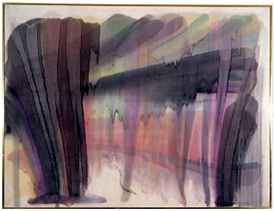
For this activity, we were given the brief to find 6 reference images and respond to them visually. For These my first two references I chose A photo with people and a photo without. I made sure that these images worked quickly and didn’t stay on one drawing for too long. I find that I always mess with my art until I feel like I have gone too far and that I like it before I carried on adding.

Another reason for working fast is the whole brief for these works references analysing the visual features of the original images. In the first image, I picked up on the combination of colours instead of focusing on the details of the flower I looked the how the colours interacted together. This also happen in the face picture I was more focused on the main features of the photo (eyes, nose and flowers) that the other details slowly worked out of the image. This visually responding deeply to one part reminds me of the artist Elisabeth Peyton. I did try using more detail in my pencil drawing but I think for the brief the more sketch-like ones work better. I also experimented with every medium I could find in my house.

In my next reference drawing, I want to change the perspectives more and change the scale I am working at. With these images, I find myself working small and on the same scale from work to work I did try and “zoom in” on one of my flower images but I feel with the face drawings I could have focused on different features.

Artist Research

Morris Louis

Morris Louis is an American artist from the 1950s. He graduated from The Maryland Institute of Art in 1932. Louis art is very abstract he uses a range of techniques to create these colourful images. I like his use of this dripping effect I think it creates a visually pleasing appeal. His works have been displayed in many exhibitions including The National Gallery of Art in Washington Dc. It was common for Morris to leave large amounts of negative space by doing this he really drew attention to the crisp vivid colours in his works. He went against the typical works seen in this era. Morris actually poured thinned acrylic paint onto unprimed canvases this is what causes those iconic drips and paint movement. After researching this artist I want to try his convention of staining the canvas I think his technique is quite interesting.

New works

I find I always forget to capture the process involved with making these works. I made sure this time to document it. I started off this work by soaking the paper in water then adding the paint onto that than I used a piece of old card to scarp the pigment around.

This is the result of that idea. I really like how it turned out I really tried to ignore how it looked and focus on the verb. For all of these works, I focused on one verb scrape to experiment with diluting the paint and different techniques. I like how with this one the circular marks made by the paint tubes are still visible it adds contrast between the linear lines.

With this work, I was still looking again at the verb scrape but instead of wetting the paper, I left it dry. I like the effect that this has given the work. I also wanted to explore working in different directions. Instead of working and scaping in one direction, I turned the paper with each scrape. Another idea I wanted to try was not spending too much time on work. Before this, I found I would keep adding to the work until I felt it looked more like an artwork which is not the idea of this activity so I changed it up and limited the time I spent on it.

With this work, I diluted a yellow colour for the background and scaped paint on top of it. It interests me how the scaping motion in my mind resulted in a straight line I could have scaped in circles but at the moment the verb scaping felt like this. It’s only now looking at the works together do I see this similarity.

In this work, I soaked the page in water and added the paint on top. Then I scaped trying to get all the pigment off the page. This resulted in a faded image. The evidence of my scaping is apparent by the rips and folds in the paper I like how the verb is really conveyed in this work compare to the others.

overview of all my verb works

More Verb Works

Today I was working with more verbs. Like yesterday I wanted to explore a wide range of different verbs. I found today I was more interested in diluting more than any other verb. This is evident in the more watery soft colours. One new I addition was my “clean up paper” I had been using this piece of paper to soak up the leftover water I noticed that one of the verbs was clean. So I added it to my collection of works. I actually like how this work turned out it has a fair amount of texture for what it is. Another reason I like this piece is that it has no real thought behind it it’s simply an accident. Wherewith my other works ive had some creative thought put into them.

This activity is not to focus on how the work looks but the process which is harder than it sounds. Art is such a visual activity that it’s difficult to look more into the process and material than the final image. I found this task did help stop looking into how it looked but made me focus more on how I was implementing the verbs. I found that these verbs were easily interpreted differently I have seen myself come up with vastly different images while having the same verb. For my next set of verbs, I want to document the process. All the time I find myself getting distracted in making I forget to document it. I’m going to work on this tomorrow.

Process into Image Week One

Today was the first day of the new brief process to an image. We were given the task of using verbs to create an image. I took the approach of using a range of verbs in multiple images. Each of my works has 4 verbs each of which was a coincidence. I tried hard to use different verbs but there were some that I seemed to be drawn to more than the others. For example, the verb spread comes up a few times. I think this is because I was enjoying experimenting with the textures that the different verbs made. I found spreading was an action that was an addition, so it added more texture than some of the other verbs which I liked. The last two images are part of my process in creating these works.

I used a clear plastic folder as a sort of makeshift palette. Spreading my paint onto it and added water. I did an experiment with how much water I used and how this affected the images. This activity was enjoyable I liked how it was an abstract way of thinking and a new way of thinking about mark-making.

Final images- Downtime

Make do studio wall

This brief has been very interesting, it has provoked some interesting notions around our society. In this brief, we covered a range of ideas from labour and leisure to time and how they all interrelate. I was personally drawn to the ideas of leisure and its impact on time. This brief has really shown me what kind of images I want and love to produce. I learnt how when I can back my work up with a historical event or idea I seem to generate more ideas and be more confident in my work. This has been happening since I started taking photos but I haven’t noticed it till now. 

At the start of this brief, I was quite confused about how I was supposed to develop my ideas. The first week of this brief I had an idea that I felt was an already developed idea. This idea was my idea of making an unconventional clock. I was set that this image would be my final image. Once I had created my “knitting clock” (a time-telling device that used a knitting loom as a way of timekeeping) I saw that I could take the Thundamentals behind it and make more works that complimented my original idea. This led me to the idea of making other “leisure clocks” (clocks that combined leisure activities with time-telling ) This is where the first image in my final photos has come from the “book clock”. I purposely took these images on a bed not only because it added a needed depth but because it complimented my ideas around leisure as leisure promotes rest and a bed is the literal vision of that.

The candle idea came from an old way of telling time where the candle would have a nail put at a certain point when the candle would burn the nail would drop onto a metal base and act like an old version of an alarm clock. This alarm clock was used at the start of the industrial revolution where people had to be woken for their factory jobs. The candles were a symbol of labour and the taking away of leisure. I liked how these images aren’t literal and without the history, the images lose their meanings. I also like how these candle images convey a vintage feel without the need for heavy editing. This is where the phone clock comes in. It acts as a contrast from the older time telling ways it conveys a newer way of timekeeping and leisure.

Overall I really enjoyed this brief. It was challenging with the lockdown but it was actually interesting to see myself naturally adapt my ideas to suit the new way of life. If we hadn’t been in lockdown I really wanted to display my work on the fabric. I thought it would be a nice connection to my work.  If I were to continue developing these works I would have really liked to look at how I could have possibly made a working leisure clock that could continuously run without the input from a human.  This brief has really piqued my interest in the history of time. I found myself researching it for my own knowledge and enjoyment which was one of the reasons I enjoyed this brief so much I was genuinely interested in it.

New additions

In our meeting this morning it was mentioned that my photos had a vintage feel to them and work with older items. To contrast this I was advised to try using more modern types of time telling eg phone. I really like these photos I think they indeed do contrast my other images. I also think they communicate with the brief and with my ideas. phones are considered to be a leisure and are also a time-telling device. This means that in itself a phone is a leisure clock without the addition of anything which I find interesting. If had more time with this brief I think I would want to look at expanding this idea of technology. Another idea I would have wanted to execute was I would have liked to use a much longer shutter speed so the phone was completely white. Overall these photos to me are successful as they relate to my ideas and the brief and visually they are interesting.

Leisure clocks

After looking and reviewing all of my newly developed idea I was able to plan out where I want to take this brief. I really have enjoyed working and exploring this idea of recording time and how leisure and labour fits into that. One of my first ideas was this knitting clock but I saw that this work could be bought back and paired with other “clocks” to form a collected series. 

The first image is of a book clock this idea combines the leisure of reading with the telling of time. I couldn’t decide how to present these works either in a series or in one image but using double exposure. So my main idea is to see the effect of time on leisure. For this idea, I think the second image is best suited as it shows how quick time is the double exposure makes it look rushed.

I want to expand on these ideas and add more clocks that combine leisure activities. For my next clock, I want to look at an older way of telling time called a polar clock. 

The Idea of Time and Leisure

Since the start of this brief, I’ve had this idea stuck in my head. I wanted to play around with the idea of different time telling ways. I’ve always been interested in the way before alarm clocks people would use candles. They would put a nail at the time they wanted to wake up and they could tell what the times were because candles always burn at the same rate. When the candle burnt to this time the nail would drop on a metal base hopefully waking the person up. The reason I thought this way of time telling was relevant to this brief is that it was done to wake the labourers of the time up. 

The first video began as an image but I felt it would be more interesting if the clock actually moved. In the video, there are two images that pop up one is of books and paints and the other is someone in bed. I put these here to show how as time moves there will always be a time for leisure even if it’s such a small split second. I really wanted to have a person’s face in this work as time is such a human construct that to just have a clock would not be so impactful. 

The next photo is of a candle burning this was to represent the olden day alarm clock. On the other side is someone sleeping. I wanted to show how as the candle gets shorter (closer to the time of work) the effect on our rest. When the candle is the longest, rest is assured but as the candle melts the more it becomes unsettled. The act of the moving blanket is to show the pulling towards work to labour the further away from leisure. In this photo, I wanted to show the changing of time so I changed the lighting and colour balance to depict this. Overall I like this photo but it wasn’t really how I had imagined it. I thought it might be the colours on the right side that made the photo too much so I changed that side to black and white and I love the result. It makes it more simple and the transition of the blanket moving is more visible. (Candle symbolizes the passing of time beginning and end of rest/ blanket moving pulling away, comfort being taken) 

The last image is a development from my exploration of the artist Darren Almond. Darren photos that I looked at were durations photos where he would take a photo of the same scene over and over again to record the change. Originally I did this with a sunset but I wanted to relate it more with the ideas around time telling. So as a development, I used to take a duration photo of a candle burning. This relates back to the historical alarm clocks. The way this image came out surprised me. I actually like it. The only issue I have with it is that it’s quite hard to see the nail I put in the candle. I could probably have edited them better so the nail was more clear or changed the image. The scale behind the candle is to track time, to see how far the candle has burnt. 

Artist reseach- Darren Almond

Darren Almond work “Tuesday 1440 minutes”
My take on Darrens duration images.
Darrens long shutter speed photo
My take on Darrens shutter-speed images

Darren Almond is an English artist who was shown to us on one of the slideshows for this brief. The way Darren takes duration images really drew me to his work. I really liked the way this convention looked. Darren does a range of these collection styled images, the other work of his that stood out to me was his stacked clock works. Most of Darren’s other images also have themes of time in them but he uses a range of different techniques. He uses techniques from long shutter speeds to duration sequences. At first, I didn’t see this theme of time running through his works but when researching him further I found that not only were his images that included clocks and numbers about time but his landscape image also showed the progression of time. They used a long shutter speed so instead of a progression photo like the one above the passing of time was evident in the subtle movement of the waves.

I really wanted to try his idea of photographing so I decided I would try and capture a sunset. I found out just how patient Darren must be for doing this on such a large scale. My photos were taken over the period of 40 minutes and overall like the outcome but would have liked to have more photos from before the sunset to have more colour shift/ contrast. I also wanted to try the shutter speed idea so I took this image of a burning candle. I would have liked to experiment with a landscape using this technique as I think I would have been able to capture more time in a single image. Wheres with the candle I was only able to capture a few moments.