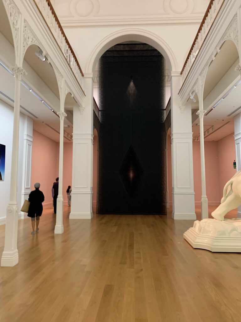
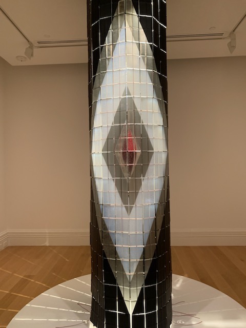
Upon first glance at this piece, I was amazed at the size and volume of this piece. I felt Maureen Lander successfully played with the fundamentals of weight and light. it portrayed light and dark in a different, unique way. The light centre seems to pull your eye in, drawing the viewer towards the light and away from the darkness. it reminded me of the saying “there’s always a light at the end of the tunnel”. As humans, we feel light brings safety as dark is seen to be scarier, almost ominous. I feel the use of the light gives the artwork an almost eerie look but is also settling In the fact that the light is shining through the darkness. The light almost gives the artwork a sense of floating but the density of the layers of material makes it look heavy, although made from a thin light material. I was curious how Lander was able to create a sense of weight out of such a thin material. When viewing Atapō from the side it unravelled the mechanics behind this work. The 12 sheets of material work together to create a range of densities around the main diamond cut out.
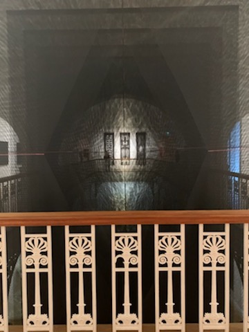
-Atapō- view from the second floor.-Whenua by Kore-Robert Jahnke This was one artwork that challenged me. It’s meaning almost aligned with Atapō, as it represents space and time as well as dark vs light. the almost hypnotic look of this piece drew me to it but it also took me a while to figure out what this work might be trying to convey. -Eunoia by Te Rongo Kirkwood This piece much like Atapō uses a diamond shape as well as light and dark. I really like the smallest red diamond, it reminded me of a heart in the centre. This work also challenged me in the fact that it’s meaning was unclear to me. at first, but once reading about this work I came to find it was alike atapō. it uses similar techniques to convey the contrast between light day/ night day.
This sketch was my first I focused mostly on creating hard sharp lines with the shadows. I feel like I succeed in doing this as the triangular composition causes shadows throughout the piece creating those desired lines. I feel like I could have added more aspects to this piece like rips or other matter like wire.When looking at the examples I really was drawn to the curves and circular ones. Figuring out a way to curve the cardboard was a challenge but in the end, I think the result was successful. Like with my first piece I really wanted more shadows because it creates a nice depth on the work. In addition to the main curve and square, I added an arch this I feel made a nice shadow and added to this work. I enjoyed working with the curved piece more than my first one. I want to further use curves in more concepts. This was my first concept which worked with wire. I found I really enjoyed using the wire. It gave this piece an angled look which I feel worked with the shape of the cardboard. I feel like I could have added more wire to this work, making it more complex. Wire is one material that I want to explore and work with more as I like the way it adds a new texture and a new shape.I again found I liked the contrast between the two materials but with this one, I wanted to try a different composition. Until this point, I had used mostly upright design. this was my experiment to see if a more horizontal configuration would work. I ended up liking this design. with this piece, I had no plan in mind. This can be seen by the two holes at the end of the rectangle cardboard. I was more letting the shapes and wire form themselves. This was one of my favourite sketches. I liked how the folds in the cardboard created a nice shadow as well as the added contrast from the wire. This sketch portrayed both aspects of these sculptures that I was drawn to (shadows and contrast).
The prompt for this piece of work was the sound of a stone ageing. I interpreted this prompt, as when a stone ages it will become smooth from erosion. This idea led me to the thinking of stones being used for jewellery, greenstone was a stone that came to mind. this idea of greenstone also worked as greenstone represents a bond between people which is eternal which ages. In this piece, I like the composition but felt I could have added colour or more shading to add more depth.
The prompt for this work was the weight of a daisy is a drop of your mothers tears. With this piece, I took it literally. I like the way the tear forms a part of the daisy but I feel like I could have used this prompt in different ways. if I was to do this prompt again I would try to use a less literal maybe I could have been more creative in my response. The prompt for this work was bottle a smell of a room. again I took this literally. I ended up liking how it turned out. I feel the house could have been better proportioned and more thought out. if I were to do this again I think I might try to use a different art medium like photography, as I feel I could experiment with different variants of this prompt.
With these Entopic graphomanias, I tried two different styles. For the second on (right), I used a ballpoint pen and tried a messy look instead of a more structured look. With the first one (left), I used a calligraphy pen to create a bolder line which gives the work a simple look. I prefer the messier look with the w piece as it has more depth.
– make a hole in the paper and climb through it. I took this prompt literally. When reflecting I could have been more creative with how I interpreted this. I do like the way the shadows are produced by the rips in the paper I feel it adds depth.