The painting was fun, especially Mono printing or printing. even though we only had a small amount of time I really enjoyed it. it also helped me to choose what major I’m going to do for next year.
however, there were some things that didn’t like about this semester. I felt rushed like I felt like I was rushed to create my work and turn everything in. I didn’t have time to do my art slowly with time.
It was a struggle to find the right one to present because I had so many favourites but unfortunately i can not do all of them. however, i managed to pick some out and here are the final piece that i am going to display for my finals.
for painting we did a lot of practises on different materials but with the same image. I had fun with it but as I kept on painting I notice that I was slowly missing some part of the images and just stared painting on the one part of the image. it was weird because I didn’t even notice it until I look at my paintings and I saw that many art of the image is are missing. It was fun to work with only 3 colours Neutral, warm and cool colours.
on woodp1p2p3p4creating surfaces on wood
Oil Paint.
Oil paint was the easiest to work with, because you can always go back to it and it would still be wet. Oil helped to try techniques to work with my verbs and the image. the verb i used on the first painting is drag. i used the sponge to drag on the image which creates beautiful marks on the painting. this was my favourite out of all the paintings i did so far.
Indian Ink on Mono printing.
Honestly I really thought this was going to be a bad idea combining ink and mono printing but I was curious so I tried it anyway. i used a pattern of my shirt and draw it with ink on the papers that i have done my mono printing on. the results were quite interesting but i really love it.
Mono printing is my favourite, I really love how everything prints with the colour of the paints that I have used was also inspired by artists like Peter Doig, Marlene Dumas and ay Silliman. i really love the combinations of colours paints that these artist used in their painting, which inspired me to used the same colour but used it in printing. it’s interesting how the colours really worked together to bring out the image and verbs i used to created my surfaces. the verbs i used are to drag, to print, to mark, to wipe and to curve.
I have learned that I’m really good with printing and I should carry on doing this for next year.
mono on printmono on paintmono on paintmono on paintmono on paintpaint on monomono on paintmono on paintmono on paintmono on paintmono on paintmono printingmono printingmono printing
The second week i was introduce to printing with different materials to used. Crayons, painting, charcoal and mono printing.
I really enjoyed trying sort of printing. I tried everything and then try to combined some painting and crayons which turns out good. I mixed charcoal with pain and I thought the results will be messy but it turns out to print very well. my favourite part of is mono printing. I love mixing weird surfaces and patterns. I really enjoyed when I mixed mono printing and printing. however I got distracted which leads me into doing a lots of printing and i forgot about the brief and other things I needed to do.
Next time in the future when I do printing I now know what to do and not to do. to do is never limited or underestimate my ability in printing and just try everything with Mono printing. Stay focus on everything and follow the brief. the thing I shouldn’t do next time is getting distracted and post my blogs last munities, even if I don’t have pictures.
Printing with paint.
my images.printing double side of the paper.paint on crayonspaint on crayons.
Paint printing but with different patterns images.
The first pattern is not traditional but the flower in the middle is traditional. The flower is called Te Meria and it’s used to make the traditional headpiece called Tebau. People who wear this Tebau (made from this flower) are guests (travels), important people and people wear it on special occasions. It represents us, it shows kindness, and acceptance and welcomes foreigners.
The Flower is representing the I-Kiribati people and the circles represent earth/ our island. The triangle shapes connecting to both flower and circle represent the idea of a connection between both patterns. Lastly the curve with two dots on the ends. This represents the idea of the wind. It shows that the flower and the ocean breaths the same air. The idea of the first pattern represents how I-Kiribati connects with their land and that is what made them who they are.
The second pattern is also not traditional, but the idea of water and the pattern of water identify us (I-Kiribati). The Kiribati flag has a water pattern. Kiribati is the ring of all islands and to explain more Kiribati is the only island in the world to be suited in all four cardinal hemispheres.
List your Artist(s)/Designer(s) precedent:
William Kentridge
List some animation precedent (other than done by the artist above):
List the animation technique/ style you will explore:
The technique that I will be exploring is Erasure animation.
Write a timeline of action between now and submission:
This is a list of what you need to place in your timeline:
This artwork is one of my favourites. The story that he presents in his animation was detailed and well presented to understand the idea of what the animation is trying to display. The characters of his anime present pain amazing. It is so amazing how many people can relate to his artwork. the background music that he used was incredible. It made me feel like I’m the one in the drawing. The sound made me feel more connected to the art itself and feel the character’s pain.
What I learn to avoid in this video is talking too much about my animation. I want people to understand my animation just by watching. I want them to feel it and understand the message the video presentation.
I really love this one, the background sound really suits the anime. The sound of guns and explosions sounds really bring the animation to reality. The characters of this video were dead because of the explosions. I really love how the sound makes it so dramatic and scary. The background sound and the animation really worked together, and they made the artwork more intense, interesting and have emotions.
Practice Animation.
Stop motion/ Erasure animation.
flower
First stop motion/ erasure animation. I enjoyed making this video although it’s short i really love it. The thing i don’t like about making this , is that forever to finish with the drawing. next time when I’m doing my final animation i know what to avoid and some tricks to make my drawings.
Peter Doig is a brilliant and talented painter. He used figuratively in his artwork which I find interesting. Out of all his exhibitions/ artworks, there is one that caught my attention and it is “Swamped”. The first thing I notice about this painting is the boat. many questions came to mind such as ‘why is there a boat in the middle of the painting/ lake? why is the boat painted in white? and why is the painting so dark?”. these were my first thoughts about the painting. As I keep spending time looking at his painting throughout the book I notice some parts of the painting instead of focusing on the white boat. I notice a house’s reflection on the painting’s left side. the second thing I noticed was the red painting on the lake. it is interesting how red is used and it’s combined with the other colour. the colour really works together to make the painting stand out.
when I look at this painting, it gives me a lonely feeling, because of how the boat is placed and the colours that have been used in this artwork.
Peter was one of the artists i had to choose to dig more about them and their art or style of making art. i had collected 2 books from the AUT library and searched for more information.
Swamped 1990
Henri de toulouse-lautrec
i really love Henri’s style of painting. If you focus on the painting you can see that the painting is really old and vintage. it is quite interesting how most of his art is based on people with an expressive style of painting. my favorite painting is Le Lit. I really love this painting, by just looking at this painting i could feel safe, comfortable, sleepy, and tired. It also made me think about the past when i was a child. The quality of the painting can shows that it was made long time ago.
i really find this work outstanding, it is the type of style i want to do but I’m really bad with oil painting or even painting really people.
Le Lit (In Bed)
Piet Mondrian
Gray Tree 1911
This was one of the most beautiful paintings I have ever set my eyes on. the moment in the painting and the texture were so incredible. I was mesmerized by how Mondrian used his paintbrush to create these movements. what is even crazier is how i thought the tree was moving but was just the way Mondrian painted it, which makes you see movements. i can clearly see the tree movement to the left side of the painting. Although the colour was just black and white, you still can see the movement and the text or form that this piece of artwork has created. His painting reminds me of my dreams when I sleep. like i had never seen colours in my dream only black and white, which is weird. and the tree is like my dream wondering in around in many different of scenarios.
i was so mesmerised and inspired by the artwork and so I decided to try to paint one as well.
Diego Rivera
Diego was of the artist I find their work admirable. His painting is just beyond or extremely meaningful. When i was researching him i find his work powerful with powerful, meanings. The artwork that called my eyes the most was “Flower Carrier”. this painting/ artwork reminds me of what my ancestors have gone through and also the history of colonization. when i first look at the painting the first words that came to mind were ‘ slaves, colonized, forced, hard-working and tired’.
i really love his artwork, it very powerful for brown people and also to the next generations to understand what sort of pain that their ancestors went through just by looking at the artwork.
flower carrier
Michael Raedecker
What incredible work paint. i really love the style/ technique of this painting. i love how the river/ pond is realistic with the clothes and then the rest are just pencil drawings. when I look at it i thought it was the desert but then the desert does not have water. it is quite interesting because up until today I’m still trying to figure it out without looking st the title of the painting or the meaning of it. My favourite part of this painting is the realistic water and cloud.
spot 1998
Artist from PowerPoint.
Wilhelm Sasnal
Exploring the Image Through Painting
i really love this artwork even though Sasnal has more paintings that are better than this, this was my favourite. the green in the background is really nice. it is the same as what I’m doing for my brief. i really like how the artist draws people as well it is quite nice to use for my brief. i really love how you can see the verb/ movement of the painting at the background.
Dexter Dalwood
Lux, 2019
looking through Dexter’s paintings this one was the one i find quite disturbing, the small dots gives me a weird feeling on my toes. i thought it was worming when i first look at it, which made me feel yucky inside. however, i quite like the idea of the painting. i would definitely try and do this but maybe when i have more time.
Luc Tuymans
Gas Chamber,
Luc’s art is beyond my imagination. his art piece was so amazing I struggled to pick one i loved, but still managed to pick this fine art ‘ gas Chamber’. this painting artwork really inspired me to believe myself i can do this type of style of painting, which i know i can not do. the painting looks so easy but hard to make at the same time which draws me more into it. i thought this art piece was a house but when i look at the title it is a gas chamber. he inspired me to used the same colours as he used.
Marlene Dumas
Martha – Sigmund’s Wife
This painting gives me creep whenever i look at i, although i find it weirdly amazing it still gives me creep. the thing i find olddly good about this were the combination of the colours, they work together to create this creepy, old and dark feeling whenever you look at the painting itself. the second thing i find olddly good is the eyes. i know that is the scariest part of the painting but i quite like it. it’s a standout of all the colours which attracts you more into it which makes you feel some sort of feeling. overall the good i really love the combination of the colours.
May Sillman
Dog
This was also weird, even though you can not figure out the image of the painting you still can see the movement of the brush on the canvas, which makes the artwork pretty interesting. my favourite part of this painting is the background. the way the brush print curves and creates those marks makes the images stand out and more people can recognise that there are some images. the techniques that Sillman used to create verbs, is quite impressive. however, even though the painting is amazing i still have something that i did not like which was the images. it took hours to figure out what was the images.
what i learned not to do and to do if i ever used this type of brief, i wouldn’t use too much painting on my canvas because it will create other confusing images and will make people confused about my artwork.
Today in class we did something interesting, something I thought wasn’t possible to do. It might sound dramatic, but I never knew you could express verbs in painting. Today I learned to express verbs in painting.
to wipe, to dragto mark, to Transfer to pullto pull, to copy, to foldto curveto spread, match, spill and markto spill, to dripto mark and to drag
Who would thought I would enjoy standing for 2 hours straight just putting prime onto the materials I’m going to use for painting….. yeah not even me, matter of fact I’m known as a Koala’s cousin in my family. Sad but it’s true, anyways I really enjoyed priming even though it looks boring. I had more than 10 materials that I primed and I will be showing them down here after this sentence. 🙂
Materials Material2 2
And for no one ask to see but who cares I’m still going to post it. It’s just me happily applying my gesso/prime. 🙂
Yaay Yaay!! I finally can sleep in. Jokes on me I’m still here writing on my blogs early in the morning. Anyways let’s get on the real talk now, shall we?
At the beginning of Semester 2, it was fun, exciting and great to be back in uni again. I was excited to learn about sculpture as it is my first option to do. Everything was going pretty well, even though I was lost and have no clue what I was supposed to do or make. for me, it was like an escape room. a place to discover or explore until I found my final mission. I thought i was going to have the same feeling of excitement to do this but somehow I was getting tired of it. I think because i have to wake up early in the morning just to be in class or I’m just tired of standing. However, I still enjoyed coming to class, because I can get away from washing the dishes (hehehehe). Even though i was tired i quite enjoy this Semester. Like Rihanna said in one of her interviews “Fake it till you make it” and that’s exactly what i didn’t do. i was too lazy to fake it.
I can not wait for what Semester 2 session 2 brings to me.
Final work response.
i was interested in making things that related to a blind person’s perspective. however, i didn’t do it because i thought it was a weak idea. So i decided to focus on my island problem and how is this problem created. I start looking into climate change and what is happening and who is affected by it. The second thing I looked at was what will the results of pollution to our ocean and people on small islands.
Polluted ocean
Creating more Plastics, cans and bottles can cause our environment to be polluted, but most importantly our ocean. pollution can kill fish, damage our land and kill our birds. when the ocean is polluted many fishes will die, and this could cause people on the island to struggle to find food. as it is their only place to find food. This piece represents the idea of pollution in ocean.
Sinking Kiribati
Displaying Kiribati’s traditional headpiece as a representative of the Kiribati people. The green with Water in it represents the ocean. Big countries don’t realise that generating power, Manufacturing goods and Consuming too much can cause climate change. It causes the rising of sea level which cause Kiribati to slowly sink into the ocean. not just Kiribati that is affected by this but Fiji, Tonga, Samoa, Hawaii and so on.
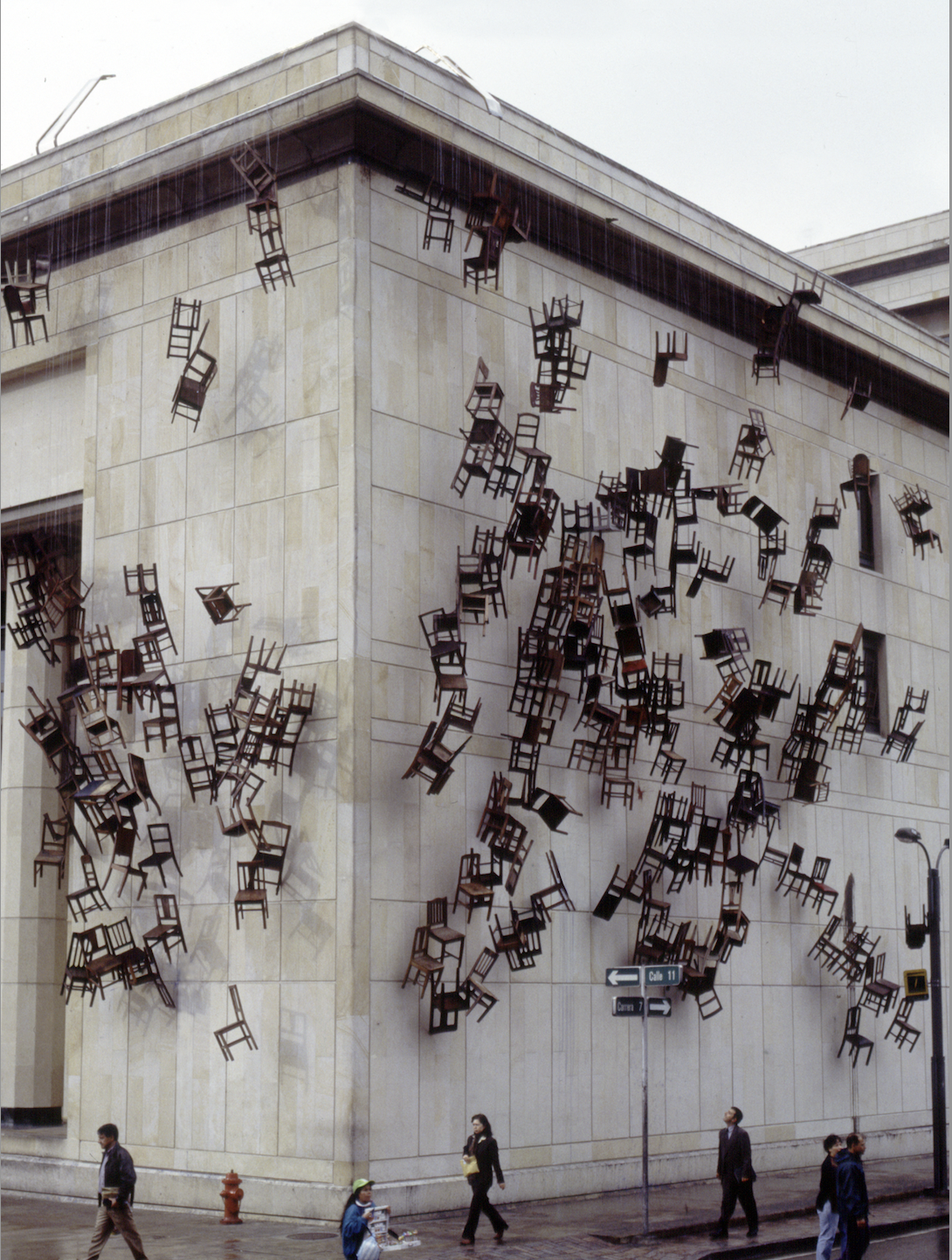
Doris has a very weird but interesting way of displaying her sculptures. what interests me the most about her work (Chair Installation) is how weird and creative she hangs the chairs on the building out in public. The first thing that came to my mind when I first saw her work was “what the heck, why would chairs be hanging there like that? I thought chairs were supposed to be used for sitting.” it’s weird to see it but somehow it is very interesting how they are hanging there and people just casually walking under it. I really love how she uses chairs to display them in many different ways. She used simint, and alleyways (public), hangs them and make them out of simint and lay them out. I was inspired to use chairs in my sculpture work. chairs could be meaning to anything, the way I see it is ownership. that chair is like you owning something like your place in your house, your area and things you own. it would be cool to use it but it will not portray my verbs.
One minute Sculpture
the minute sculpture by Erwin Wurm was interesting it could be something I could try. I found his work interesting because I’ve never seen this before or been introduced to this kind of artwork as sculptures. it’s interesting because to me I thought sculptures were all about work that is made out of clays and will stay in one space but clearly it can be done by humans and filmed for 1 minute.
1 minute sculpture
I tried to do this but obviously, I failed miserably so I decided to stay with clays and old objects to use.