
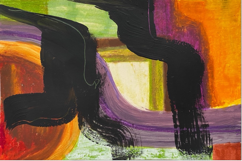
This piece (Figure 1), used to be a piece in one of my previous posts that I felt was incomplete. However after reading Houdini with a Brush, I was inspired to unapologetically use black in my works. In doing so, I finally felt satisfied with the final piece. The black strokes compliment the bright colours, the contrast making them pop even more than they did on their own. Rita Ackermann is another painter who I researched earlier in the brief who uses gestural black strokes to create movement in her work. I think that this piece does have a sense of movement and fluidity. The colours draw you across the piece horizontally and the black strokes bring you across and down the page.
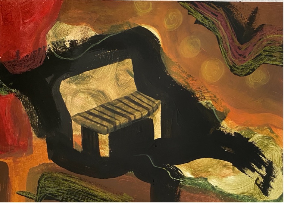
For this piece (figure 2), I used black to define the shape of a chair. By doing the background and then adding the black over the top really shows my decision making visually and that I have started to think beyond the figurative. I did not plan on having a chair there, but when I decided to later add the black, I was able to incorporate it into my work by working back to front. I think overall the piece has a balance of patterns, shapes, colours and brushwork.
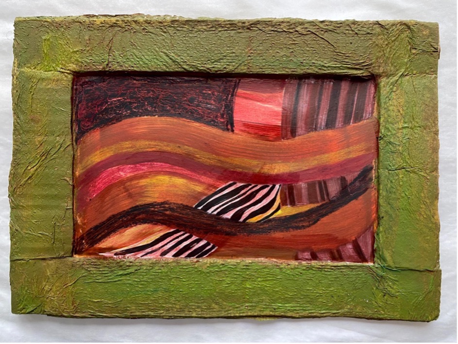
For this piece (figure 3), I used the cardboard and paper towel technique I discovered earlier in the brief to frame my work. For the centre I decided to stick with a monotoned theme of red. However to add interest, I used black to create line work and depth to the piece. Once again I think using black helped make the colours pop even more. I think that the contrast of the red with the green frame makes the piece easy to look at. The solid frame juxtaposes with the disorderliness of the centre image, drawing the eye inwards. However, the texture in the frame is highlighted by the similar waviness of the lines in the centre creating a visual relationship between the frame and the centre.