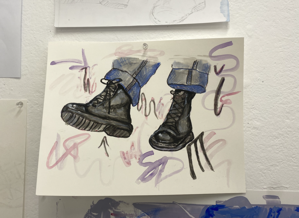
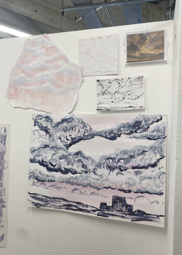
in this work I minimised the background of the original image, making marks of just the graffiti with watercolour. i then did the foreground of the shoes with watercolour and guache, a slightly thicker consistency.using a background I made during the original mark-making phase of the brief, I did a more abstract interpretation of the image, I purposely left the second shoe with less detail and ‘unfinished’ I liked the contest between the two and how it added something more interesting than just painting both the same.
Reflection:
I think this brief was a little out of my comfort zone in terms of my specialties in art. I prefer taking photos and painting is something that usually frustrates me. Although it was challenging I enjoyed choosing some photos I had taken and interpreting them into a different style and area of the arts. I liked using different consistencies of paint and experimenting with different materials and mixed media. Despite this, I’m still excited for next year when I can put down a paintbrush and pick up a camera again.
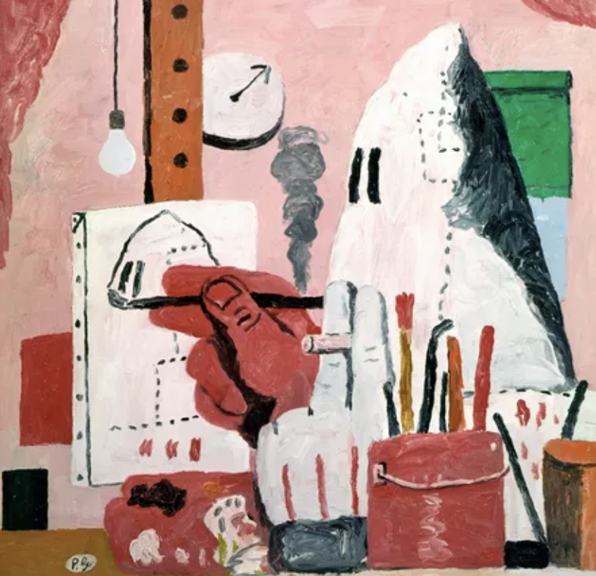
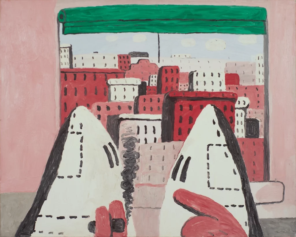
i love Phillip Guston’s cartoonish paintings and sketches. there’s something playful about them, with the bright colours he chooses and the little ‘ghost’ people that feature in his work. the topics and ideas behind his work range from Political satires and ordinary events and normally have a lot more detail to them in the setting and little things in the paintings you wouldn’t always notice at first glance. I love that they seem like fun little doodles but can actually have a deeper meaning behind them.
Wilhelm Sasnal:
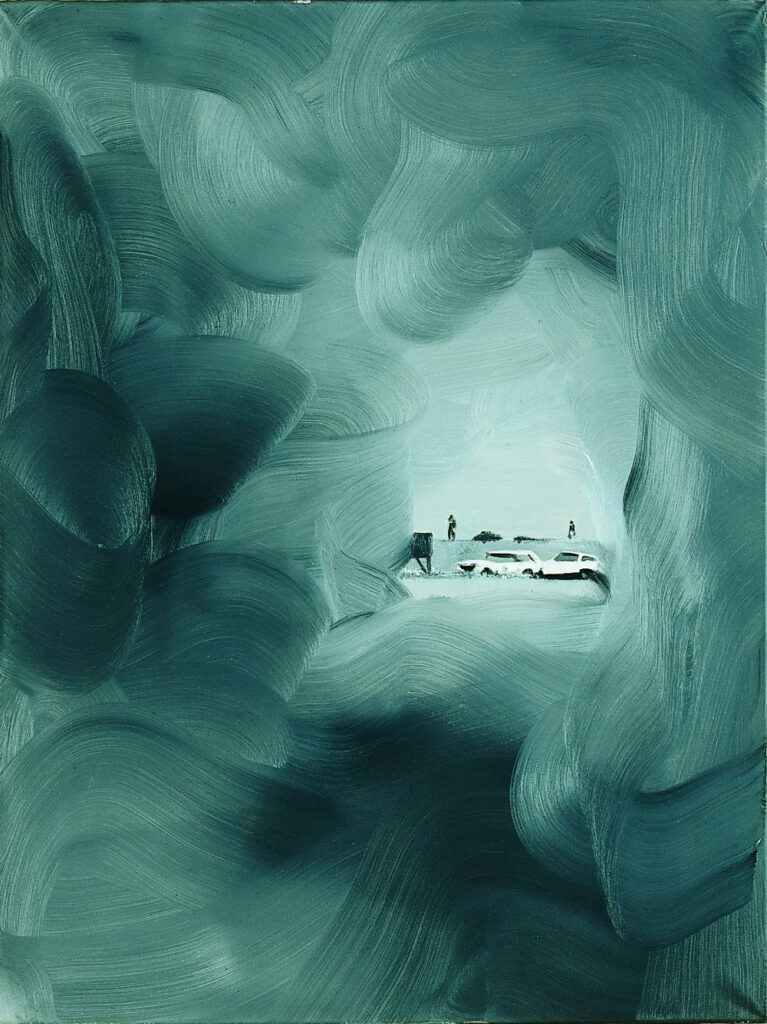
The thing that stands out to me about Wilhelm Sasnal’s work is the beautiful colours and patterns he makes. Having the fluid and soft mark of the background alongside the small and detailed scenes he paints within them complement each other so well, and make a fascinating composition. You can see very clearly the layers of marks he’s made within the painting, and also clear lines of the brushes he’s used, some having more lines and detail with others being softer like he’s used a sponge or another materiel.
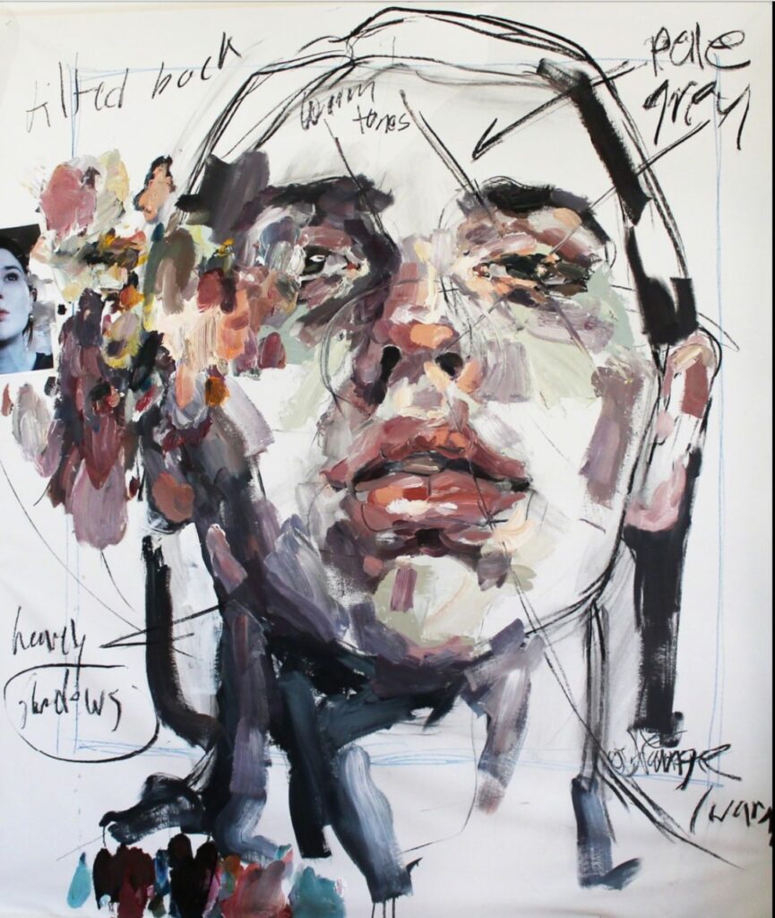
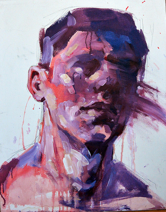
Elly Smallwood:
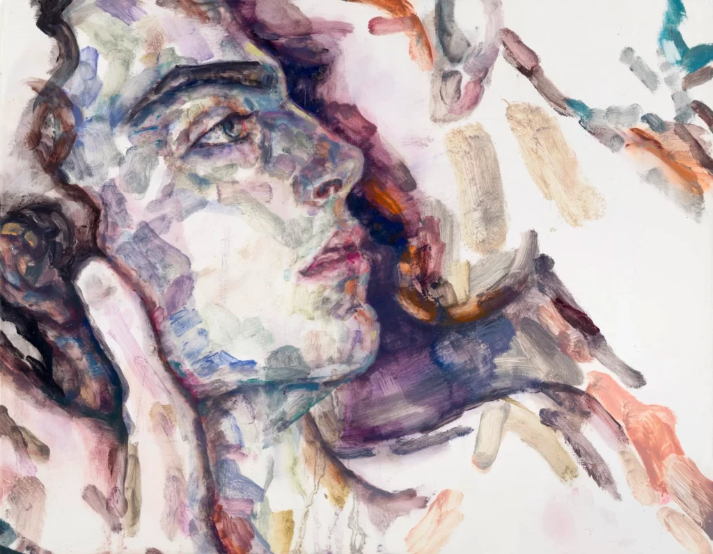
what I like about this work is you can see the whole process on the canvas. it contains all the mark making shes made during it, with the words and background lines of her planning the work and its composition, to the top layers of the subject and the more detailed painting. I think its a really interesting way to work and also includes a different type of mark-making with words and the before stages of painting.
the colours that Elly Smallwood used within this painting are just so beautiful together, the sunset warm palette compliments the cooler purple tone perfectly, and the thinner paint dripping down as well as the thicker paint that sits as the last layer show the marks she made at each stage. it’s realistic and detailed yet abstract and minimalist at the same time, like the artwork before you can see the pencil lines and sketch behind the paint.
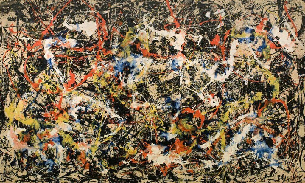
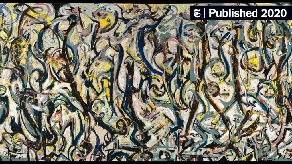
the thing I love the most about Jackson pollock’s work is his choice of colours. he almost always uses at least 4 colours, and also almost always uses black and white with them. the contrast between the bright and the harsh colours adds more dimension to the work and shows the layers more clearly and how they have been blended together.
I also like his process for making his art. the mark-making of the dripping and pouring means he has less control over how the artwork will turn out and adds to the abstractness of his work.
Calum Innes:
I love how simple yet effective Calum Innes’s artwork is, it’s so minimalist to the naked eye, but the process in which he makes marks on the canvases is so interesting. also, the marks it leaves behind, not just on the work itself but the space and the walls he’s working against have this trace left behind on them.
His Exposed Paintings series, which is created by piling pigments onto the canvas and then erasing the oil paint with washes of turpentine, is what he is best known for. the act of painting and then unpainting is a technique I haven’t seen before and would be excited to try it in my own work.
Elisabeth Peyton:
I love this style of painting where it’s not too detailed and realistic but the brush strokes create the image perfectly while staying simple. Elisabeth Peyton’s colour palettes she uses complement each other so well, with a lot of neutrals mixed with bright colours and creating the perfect contrast. I also think there’s something intimate about how she paints people, whether its that she has a connection to the subjects or if her paintings are just good at beautifully showing emotion.
to scrape/dragto swirl/mixto pour/dripto stroke/ dragto stamp/hit/repeat
it was interesting playing around with different colours and consistently of paint, how some could be layered or covered, scraped away or dripped down.
with mark making it creates a background or a first layer to paint atop, or we can use mark-making as an art process to create each layer of an image.
I installed these images so they were mirroring each other as well as turned the other way up. I think this adds to the contrast between the positive and the negative in an interesting way.I thought that these 2 pieces of fabric looked nice together as one piece, what I loved about installing them was the fabric wasn’t flat, and the shadows they create on the wall adds to the feeling it gives.With this piece I was carrying on the same idea I had with the images mirroring each other. although they are the same images and both positives, the different mixes of cyanotypes make them appear slightly different and contrasting to each other.
the pinhole photos I chose for my first cyanotypesfirst cyanotypes
I really liked the concept I used of having two images on a page, the nature and the building photo with me in it showed the connection and contrast I was attempting to make between nature and man-made structures/humans. the relationship between them was present in displaying them together and showed we are all a part of nature. I decided to focus on this idea of having multiple images further with a more collage effect.
I recycled some fabric that was sewn into pants from the printmaking lab, cutting this open left an interesting canvas for prints with the seams still sewn in. The recycling aspect also played into the ideas of the brief.
I was really happy with how this work turned out, and thought the composition of the 4 photos was cool in the middle of the abstractness I made with the cyanotype ink.
Artist inspiration: Trinity Kai
one artist I looked into after I has success with cyanotype on fabric was Trinity Kai. I found her body of work “Shifting in Time” specifically beautiful because of the cyanotypes featured in it.
In her statement about the exhibit, she said: “My work analyzes the body as our perspective in the world and as a symbol of absence and presence”
This idea of our bodies and where we are in the world for me is useful when looking at the brief. we are one with nature and our bodies are a very important aspect of how we connect with the world and our environments.
I also liked how her pieces were not flat when they were displayed, the crinkles in the fabric and the shadows they create is something I’m going to consider when installing my work.
experiments were carried out on specific sites in glacial ecosystems. Large-scale photograms were made t to investigate how the fieldwork methodology may be visually explored through photographs. Haupapa-Tasman and Te Moeka o Tuawe-Fox glaciers were surveyed as part of the artwork. The work reveals the relationship between environmental factors such as light ice and water and the structure of glaciers and light-sensitive material.
Jonathan kays works relate to the brief as they are site-specific. He is looking at natural elements within a specific area, but intervening with his photogram which captures the natural elements. This is a similar practice to what we are doing with our pinhole cameras. Placing them and intervening with ourselves or moving around the setting to create a composition we are happy with. However, I believe we have more power over how the image comes out. His way of practice is fascinating in the fact the environment has more control than he does
Man ray:
Man Ray used the phrase “rayographs,” in which he combined the words “photograph” and his name to represent his unique method of creating photograms. This method is a way of placing objects where they have a relationship with each other. This idea inspired my work when creating photograms. I used aspects of nature I found, and pieces of metal washers and bolts. These contrasting materials show a relationship between the natural world and the man-made world.
when completing my photograms, I wanted to show objects that had relationships with each other. I used aspects of nature I found in Albert park, where I took a lot of my pinhole photos. I recycled some old bolts and nuts I found on the ground, and placed or wound them through the plants.
I thought this contrast between something delicate and something metal was interesting, and reminded me of nature in the city, creeping into buildings and man-made structures. The two worlds are different but exist together.
I used the technique of layering to get different opacities with different objects and also used a plastic bag to add a blur effect and make some of the photos more abstract.
playing around with some proper photogram scans
I like how the negative and positives could contrast together as one artwork and will continue to use this for my assessment.
Dareen glass is very experimental when it comes to his work, and what he is using to take his images.
From big cameras that he lugs around with him, to making a camera out of a Frisbie which captures a moving moment in time. I like how some of his pinhold photos are very beautiful landscapes with detail, but some are blurs of light that look quite abstract. I feel like I relate to this personally with my artmaking. I like taking images of detail and what’s there with the eye. But abstract images where you might not know what’s happening are also interesting in the lack of detail.
Dareen glass said in relation to his work: “like early photographers who transported giant glass negatives in wagon-darkrooms in pursuit of obtaining extreme resolution, I have made cameras that are large, difficult to carry, and often intended for the depiction of remote pictorial sites. I like to think that the work of experimental camera design, begun by 19th-century pioneers of photography, is still in its infancy.”
Abelardo Morell:
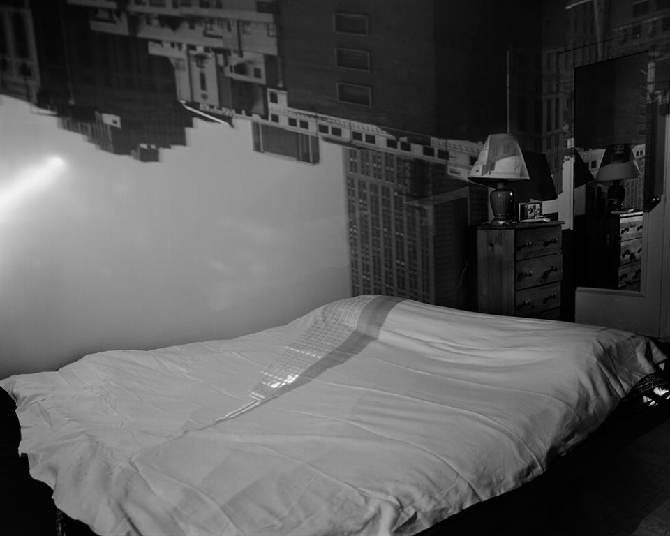
Abelardo Morell’s work explores the use of pinhole cameras on a wider scale, using whole rooms to project and take images.
One of his earliest photographs taken in New York with this bigger-scale pinhole camera technique was taken inside an apartment next to the Empire State Building. He used the eight hours it took to expose the photo by doing everyday activities like eating lunch and seeing a movie. He had secured the space and built a makeshift tunnel out using many layers of black plastic, and returned once the photo was finished.
“As opposed to being in New York and shooting five rolls of pictures, I had one 4×5 negative in my bag on the train back to Boston,” he said “It was an interesting new take on how photography looked to me and a very different way of making pictures.”
I find this work interesting as its using a contrast of 2 spaces that aren’t often seen together, the inside and the outside. The layering of the two worlds creates this connection between them, and gives a feel like the outside is creeping into this otherwise private space. the scale of this work and just the effort it takes to produce a pinhole camera this large and keep light out is impressive and adds to just how amazing his photographs are.
William henry fox talbot:
Willian henry fox talbot was a scientist, inventor, and photographic pioneer. He invented the photographic process of salted paper and calotype and is important in the development of different photo practices. He is named the father of negative-positive processes.
During his early experiments, while he noted his thoughts he wrote: “how charming it would be if it were possible to cause these natural images to imprint themselves durably, and remain fixed upon the paper.” “And why should it not be possible?”
Although his work is very experimental in figuring out the science and chemicals, the images he produced are beautiful and contain a lot of detail. It shows that some of the best work can come out during experimentation.