
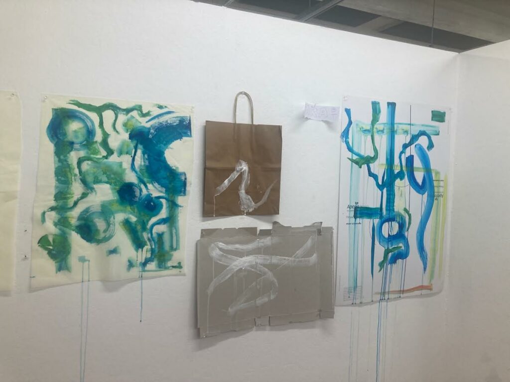
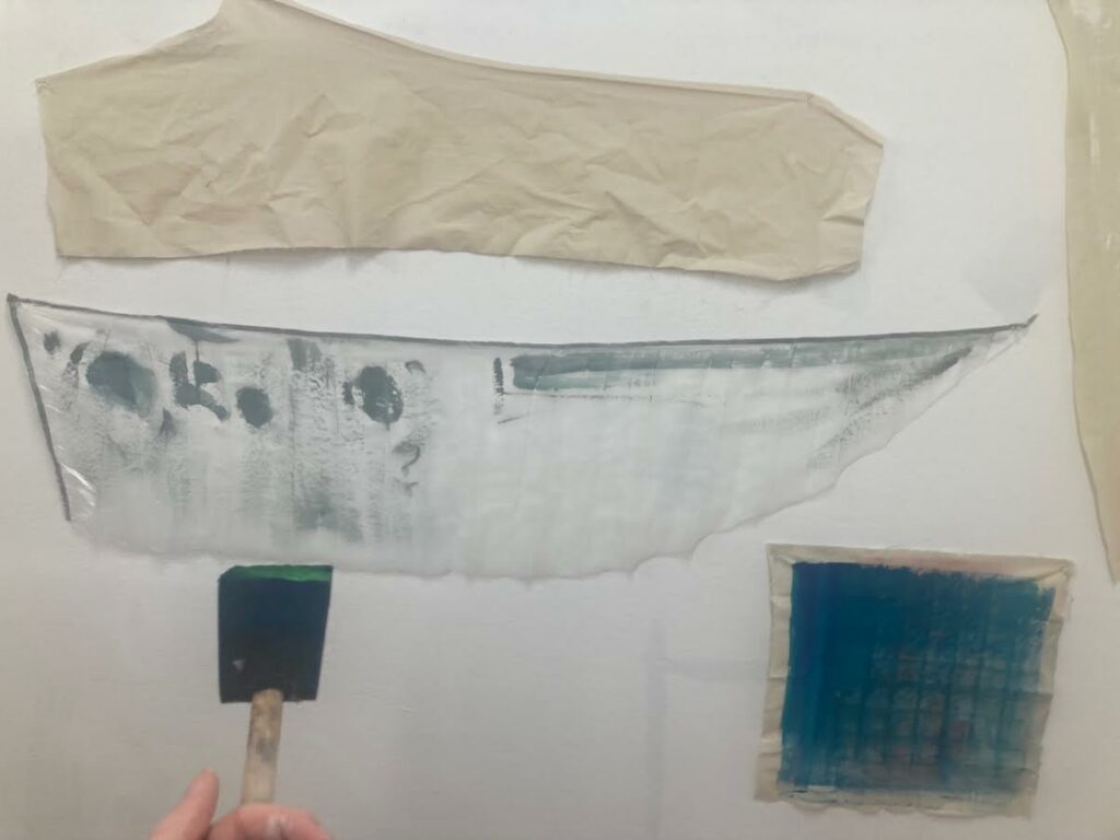
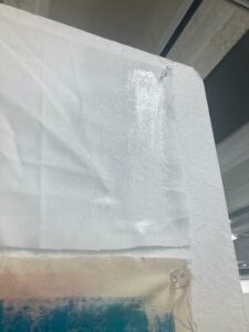
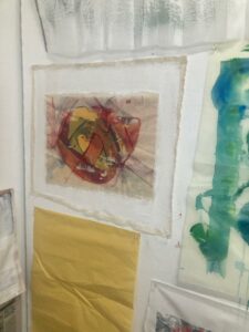
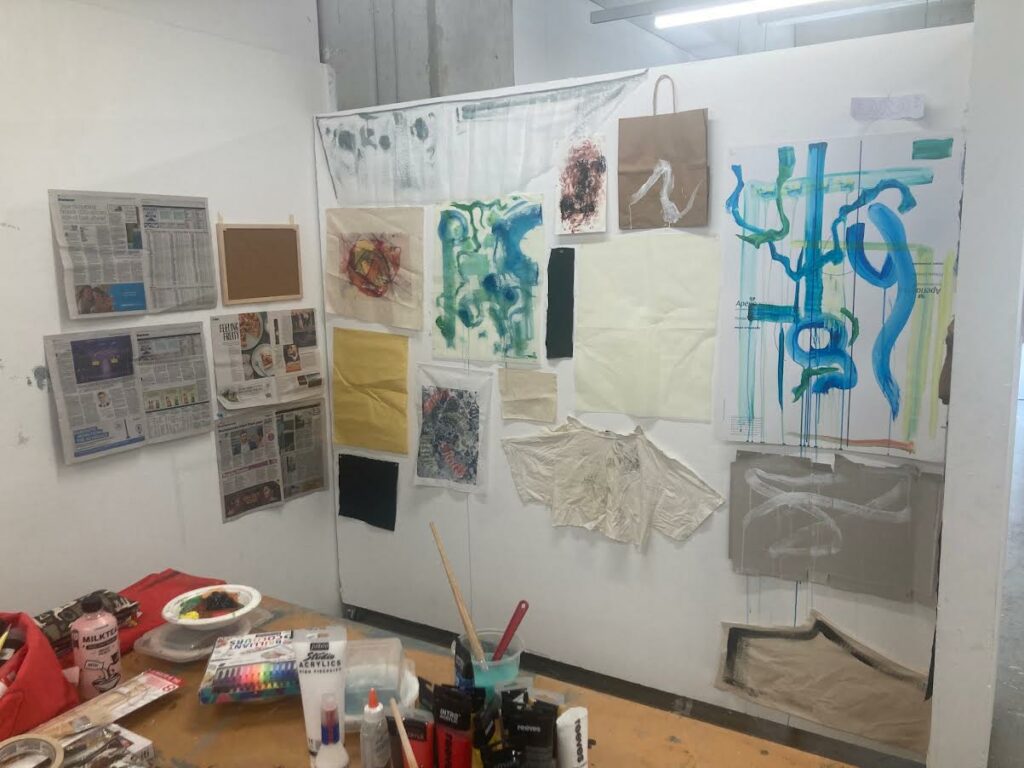
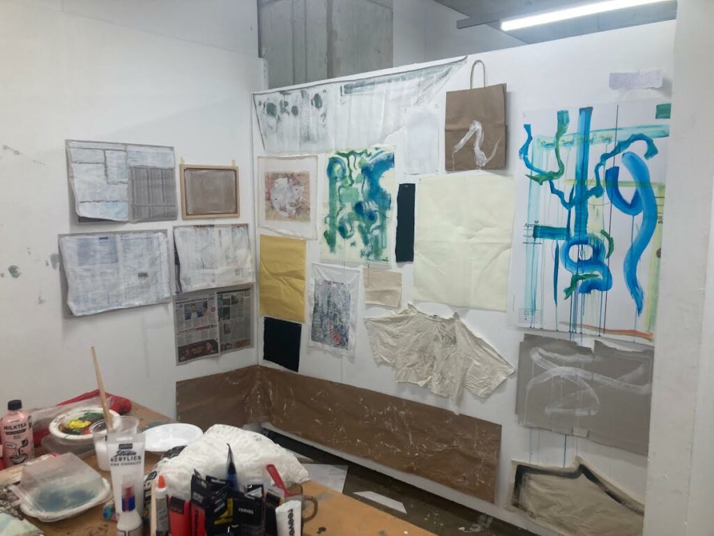
Above is my progress for the first week of this brief. Other than prepping various surfaces with white paint, I used the verbs drip, weave, dilute, encircle, twist, flow, and layer to start my ‘vocabulary of marks’. This was done through the use of Richard Serra’s Verblist (1967). I worked with mostly white paint to create these marks but also used tones of yellow, green, teal and blue. I enjoyed letting go of the need to create a ‘finished’ piece, allowing me to be freer with my mark making and yielding more organic results.
Artist Research
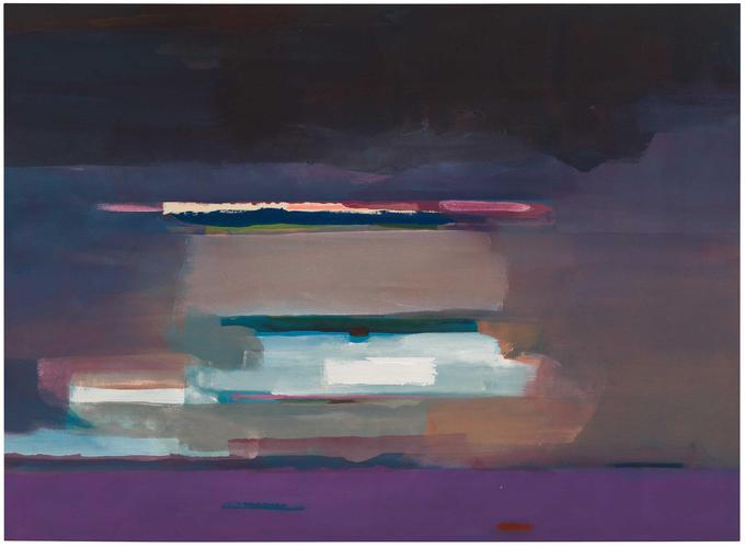
I enjoy the simplistic nature of Viewpoint 1, and am interested in how Helen Frankenthaler communicates a scene through such conscise marks. Grey Fireworks interests me in the clear layers upon layers of paint used by Frankenthaler, and how the subtle shifts in hue of the background are emphasized by the marks in the foreground.
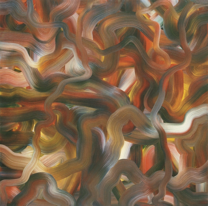
These pieces by Gerhard Richter are fascinatingly beautiful to me. The scraping of paint across the surface almost looks like dragged marks on glass, and portray a stunning amount of depth in a 2D space. Red-Blue-Yellow [330] in particular catches my eye through its organic lines and use of color.
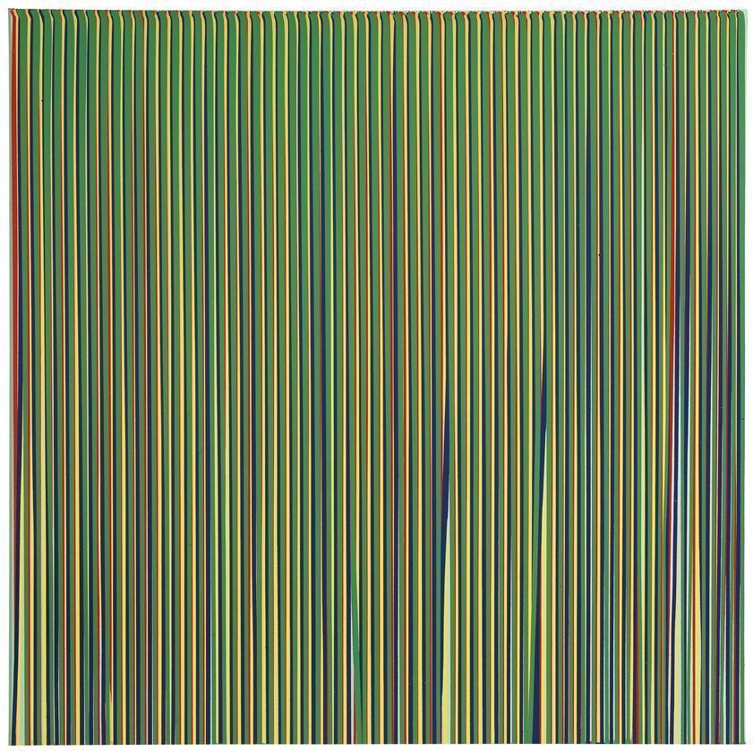
The change in line weight in Ian Davenport’s Electric Fan Painting, No. 7 compliments the jagged-ness of its marks. Appearing almost like lightning, the simplicity of white on charcoal here has helped me to place less emphasis on always having a ‘finished’ result. Poured Lines: Light Green, Red, Yellow, Blue and Green has only five colors like the title suggests, but the repeating lines of the piece create a sort of spectrum when viewed from afar.
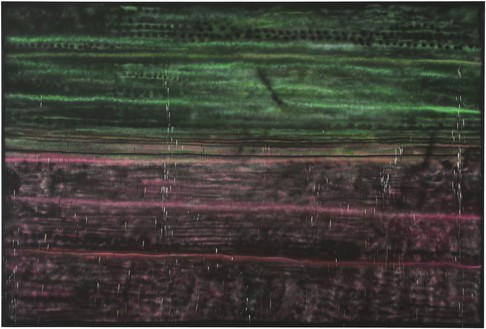
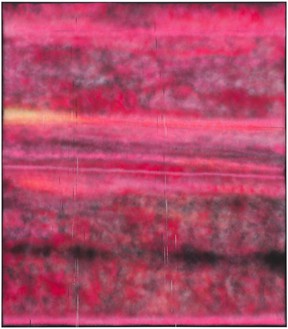
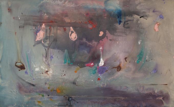
The distorted horizons of Sterling Ruby’s SP series have both interested and unsettled me. Both SP137 and SP228 have a blurred mix of mottled hues working to create an almost-recognizable landscape, but the unnatural colors and dark tones throw off the mind. The scratched marks into the surfaces of these paintings are not to be overlooked either, as these somehow create a sense of great depth while giving the painting a range of texture.
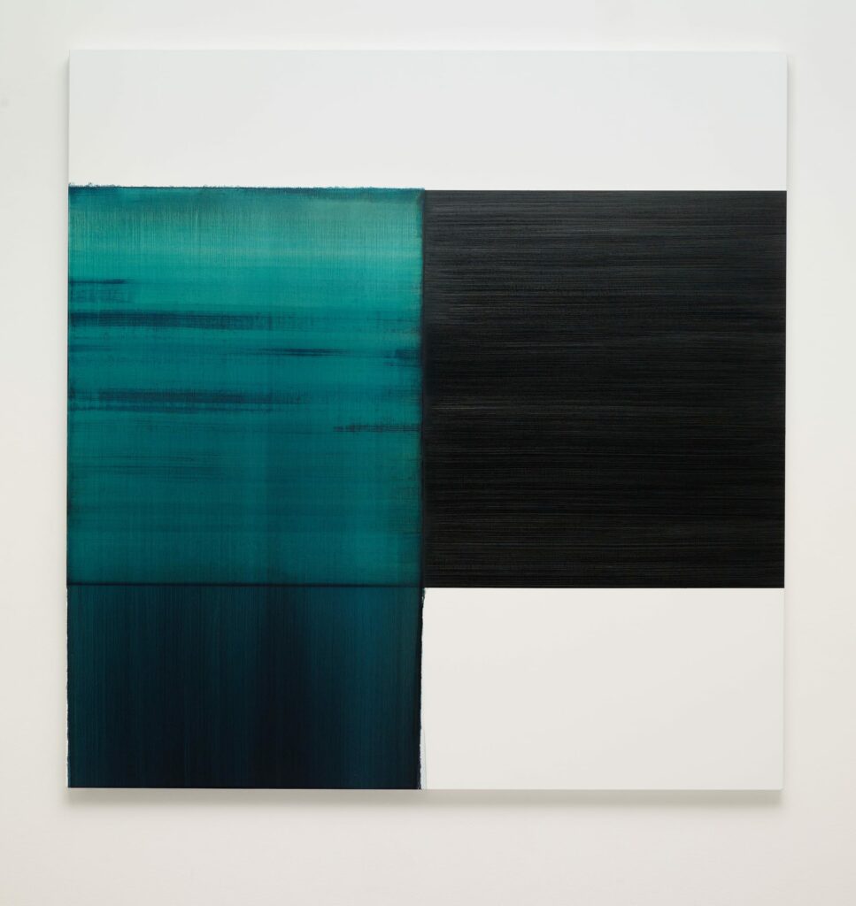
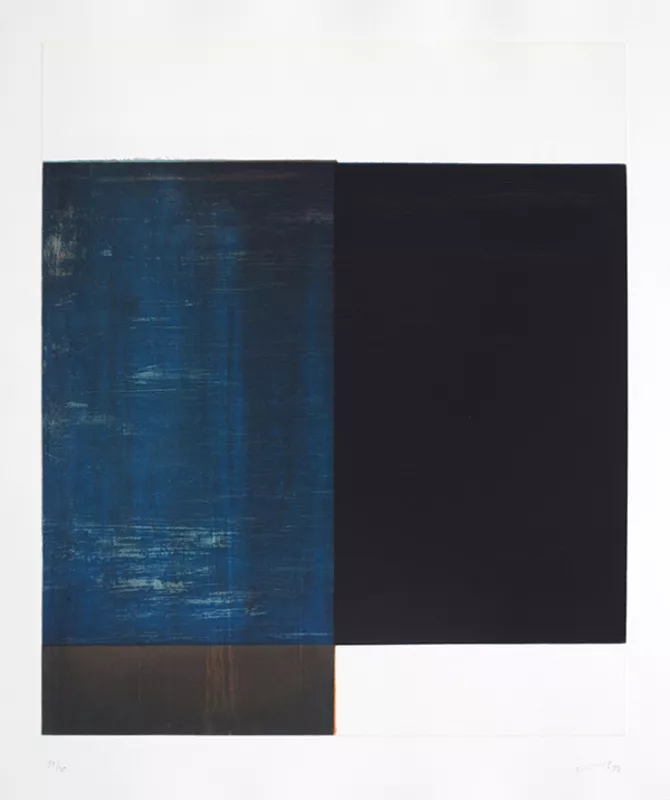
The blue washes of these pieces by Callum Innes are nothing complex, but absolutely striking in their vibrance. Exposed Painting Carribean Turquoise manages to portray water simply, through what I assume is a layering of watered down paint over the canvas. The marks from the bottom left rectangle spread up in to the top left square, unifying the piece together in a way that I will let inspire my own work. The flat black in LBT reassures me that simple flat colors can be highly effective when utilized right.