Bibliography

Abu Hamdan, Lawrence. “Saydnaya (the missing 19db).” 2017. http://lawrenceabuhamdan.com/saydnaya

Aluli Meyer, Manulani. “Indigenous and Authentic: Hawaiian Epistemology and the Triangulation of Meaning.” In Handbook of Critical and Indigenous Methodologies, 13-14.  SAGE Publications Inc., 2008.

Amnesty International. “Explore Saydnaya.” 2017. https://saydnaya.amnesty.org/

ArchitectureNow Editorial Desk. “Walls to Live Beside, Rooms to Own.” September 2, 2022. Accessed September 28, 2022. https://architecturenow.co.nz/articles/walls-to-live-beside-rooms-to-own/

Atomic Heritage Foundation. “Marshall Islands.” 2019. Accessed May 6, 2022. https://www.atomicheritage.org/location/marshall-islands.

Auckland Art Gallery Toi o Tāmaki employee, interview by author, Auckland, September 30, 2022.

Auckland Art Gallery Toi o Tāmaki. “Walls to Live Beside, Rooms to Own.” September 2022. Accessed September 28, 2022. https://www.aucklandartgallery.com/whats-on/exhibition/walls-to-live-beside-rooms-to-own-the-chartwell-show?q=%2Fwhats-on%2Fexhibition%2Fwalls-to-live-beside-rooms-to-own-the-chartwell-show

Auckland Art Gallery Toi o Tāmaki. “Life at home and housing in Aotearoa: A new Chartwell exhibition explores ‘home’.” August 11, 2022. Accessed September 28, 2022. https://cdn.aucklandunlimited.com/artgallery/assets/media/aag-chartwell-pressrelease-2022-08-11.pdf

Bailey, Peter. “Breaking the sound barrier: A historian listens to noise.” Body & Society 2, 2 (June 1996): 49-66. https://journals.sagepub.com/doi/abs/10.1177/1357034X96002002003

Beattie, Craig M., “Some bird in Central Park”. Photograph. New York. 2002. Accessed April 25, 2020.

Beattie, J., & Gibson, E. “Ralph and Rene Beattie Story: A Married Worker Couple” (2001). Accessed March 11, 2022. https://www.tellingthetruth.info/history_pioneering/beatties.php

Beattie, Sara K., “History”. Photograph. Hard to Find Books. 2022. Accessed March 17, 2022.

Bennett, Lucinda. “On Natasha Matila-Smith’s art of obsession, intimacy, and longing.” March 1, 2021. Accessed September 26, 2022. https://artnow.nz/essays/bedroom-diaries

Bertram, Geoff. “Story: South Pacific economic relations.” March 11, 2010. Accessed May 6, 2022. https://teara.govt.nz/en/photograph/24245/banaba-before-and-after-mining#:~:text=The%20small%20and%20beautiful%20island,to%20extract%20the%20phosphate%20rock

Bourdieu, Pierre. The Logic of Practice. Cambridge, UK: Polity Press, 1990.

Chumko, Andre. ”Seeing the universe in a grain of sand.” November 21, 2020. Accessed September 29, 2022. https://eds-p-ebscohost-com.ezproxy.aut.ac.nz/eds/detail/detail?vid=0&sid=bce06bc9-ad2e-4be6-8b99-082dd38f57d5%40redis&bdata=JnNpdGU9ZWRzLWxpdmU%3d#AN=DOM201121A0121153549545-BZ&db=anh 

City Gallery Wellington. “More than Human: Panel Discussion.” February 4, 2021. Accessed September 30, 2022. https://citygallery.org.nz/events/more-than-human-panel-discussion/

City Gallery Wellington. “Zac Langdon-Pole: Containing Multitudes.” November 2020. Accessed September 30, 2022. https://citygallery.org.nz/exhibitions/containing-multitudes/

Cook, Roger. “Andy Warhol, Capitalism, Culture, and Camp.” Space & Culture 6, 1 (February 2003): 66-76. https://journals-sagepub-com.ezproxy.aut.ac.nz/doi/pdf/10.1177/1206331202238963

Corse, Lisa M. “The Art of Kintsugi.” June 1, 2021. Accessed September 29, 2022. https://eds-s-ebscohost-com.ezproxy.aut.ac.nz/eds/detail/detail?vid=0&sid=833b43d0-5fe2-4ffc-8cfd-7264ed806697%40redis&bdata=JnNpdGU9ZWRzLWxpdmU%3d#AN=150273331&db=anh

Dibbell, Julian. “How to Handcraft an Achingly Self-Referential Virtual Commodity Fetish Object (For Fun and Profit!).” Art & Science, 11 (2012): 159-177. https://link-springer-com.ezproxy.aut.ac.nz/content/pdf/10.1007/978-94-007-2082-4.pdf

Dictionary.com. “Thesaurus.com.” 1999-. Accessed May 13, 2022. https://www.thesaurus.com/

Drozdova, Polina, Roeland van Hout and Odette Scharenborg. “Talker-familiarity benefit in non-native recognition memory and word identification: The role of listening conditions and profiency.” Attention, Perception & Psychophysics 81, 5 (July 2019): 1675-1697. https://link-springer-com.ezproxy.aut.ac.nz/article/10.3758/s13414-018-01657-5 

Harper, Douglas. “Online Etymology Dictionary.” 2001-. Accessed May 13, 2022. https://www.etymonline.com/

Hund, Wulf D. It Must Come from Europe: The Racisms of Immanuel Kant. LIT Verlag Munster, 2011. https://books.google.co.nz/books?id=pkBH3LlRYeUC&pg=PA77&lpg=PA77&dq=systematically+interwoven:+%E2%80%9CProgress%E2%80%9D+has+a+skin+colour.+It+is+seen+as+an+expression+of+the+cultural+abilities+of+the+white+race&source=bl&ots=oV0i8fhJDU&sig=ACfU3U15qHnEDQT32rwyYBn-_b28ah5EBA&hl=en&sa=X&ved=2ahUKEwj36N2K6qT5AhU5SGwGHZytClsQ6AF6BAgCEAM#v=onepage&q=systematically%20interwoven%3A%20%E2%80%9CProgress%E2%80%9D%20has%20a%20skin%20colour.%20It%20is%20seen%20as%20an%20expression%20of%20the%20cultural%20abilities%20of%20the%20white%20race&f=false

Ibrahim, Ronia. “All That Glitters is Gone.” November 22, 2021. Accessed September 26, 2022. https://www.pantograph-punch.com/posts/all-that-glitters-is-gone

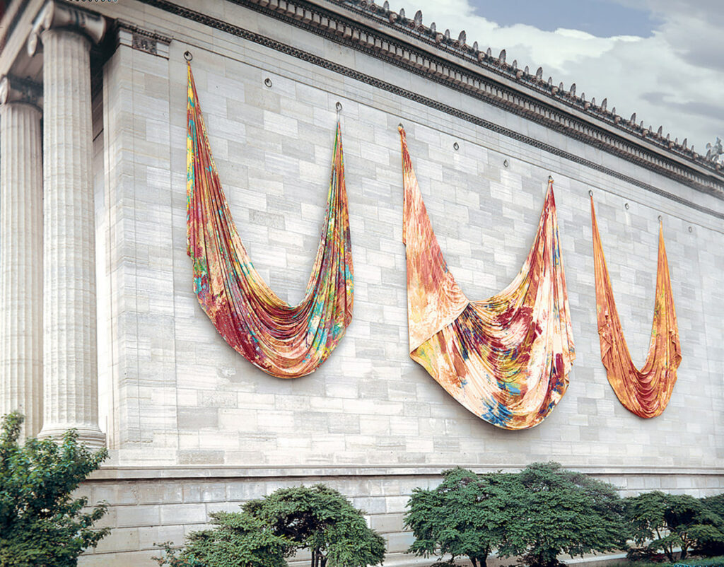
Lacy, Kirsten. Walls to Live Beside, Rooms to Own. Auckland: Auckland Art Gallery Toi o Tāmaki, 2022. Published following the exhibition Walls to Live Beside, Rooms to Own at the Auckland Art Gallery Toi o Tāmaki, Auckland.

Leonard, Robert. “Zac Langdon-Pole: Containing Multitudes: Publication Essay.” November 2020. Accessed September 30, 2022. https://citygallery.org.nz/documents/zac-langdon-pole-containing-multitudes-publication-essay/

Leonard, R., T. Corballis, J. Randerson, E. Case, and O. Gasser. “More than Human.” February 4, 2022. Accessed September 30, 2022. https://citygallery.org.nz/blog/more-than-human/

Letherby, Gayle, John Scott, and Malcom Williams. Objectivity and Subjectivity in Social Research. SAGE Publications Inc., 2013. https://web-p-ebscohost-com.ezproxy.aut.ac.nz/ehost/detail?sid=a5bec52b-ea16-419b-90f4-ffe8c2b73b65%40redis&vid=0&format=EB#AN=1099403&db=nlebk

Lopesi, Lana. “Te Moana-Nui-A-Kiwa, The Great Continent.” In False Divides, 22-33. BWB Texts, 2018.

Lopesi, Lana. “Te Moana-Nui-A-Kiwa, The Great Continent.” In False Divides, 27. BWB Texts, 2018.

Marx, Karl. Capital: A Critique of Political Economy. Germany: Verlag von Otto Meisner, 1867.

Vande Viere, Frank. “The Fetish Character of the Work of Art and Its Secret.” Art & Science, 11 (2012): 93-100. https://link-springer-com.ezproxy.aut.ac.nz/content/pdf/10.1007/978-94-007-2082-4.pdf 

Muller, Jurgen. “The sound of history and acoustic memory: Where psychology and history converge.” Culture & Psychology 18, 4 (December 2012): 443-464. https://journals-sagepub-com.ezproxy.aut.ac.nz/doi/pdf/10.1177/1354067X12456716

Otto, Michael, “Famous Bookshop next to St. Ben’s”, July 23, 2018. Accessed March 17, 2022.

Outram, Dorinda. The Enlightenment. Cambridge University Press, 1995. https://www.tau.ac.il/~corry/teaching/histint/download/Outram%20-%20Enlightenment.pdf

Rao, Shakuntala, and Herman Wasserman. Global Media Ethics Revisited: A Postcolonial Critique. SAGE Publications Ltd., 2007. https://journals-sagepub-com.ezproxy.aut.ac.nz/doi/pdf/10.1177/1742766507074358

Russell Lawrence, David. “The Naturalist and his ‘Beautiful Islands’: Charles Morris Woodford in the Western Pacific.” 2014. Accessed May 6, 2022. https://www.jstor.org/stable/j.ctt13wwvg4.10?seq=6.

Seah, Naomii. “Steel the show: How Yona Lee’s new exhibition is breaking boundaries.” May 15, 2022. Accessed September 26, 2022. https://thespinoff.co.nz/society/15-05-2022/steel-the-show-how-yona-lees-new-exhibition-is-breaking-boundaries

Totua, Taualofa. “You Need to See Āhua Today.” February 9, 2022. Accessed September 26, 2022.  https://www.pantograph-punch.com/posts/see-ahua-today

Warhol, Andy. POPism: The Warhol Sixties. New York: Harcourt Brace Jovanovich, 1980.

Wasasala, Jahra. “Seeing and Feeling the Essence of Lisa Reihana.” September 11, 2022. Accessed September 26, 2022. https://www.pantograph-punch.com/posts/seeing-and-feeling-the-essence-of-lisa-reihana

Wigger, Iris, and Spencer Hadley. Angelo Soliman: Desecrated Bodies and the Spectre of Enlightenment Racism. SAGE Publications Ltd., 2020. https://journals-sagepub-com.ezproxy.aut.ac.nz/doi/10.1177/0306396820942470

week_13 – Process Into Image Reflection

I anticipated a brief like this all year, and what a perfect one for me to end on. Working from images is something I do often, but processing images in this format was new to me. I enjoyed the process much more than I thought I would, as at the beginning of this brief I believed it would be hard for me to depart too far from the original images. Looking at my final pieces, I didn’t abstract them too far as this isn’t how I create work.

Creating work for this brief was therapeutic for me, and I’m quite proud of how these five short weeks have changed the way I view painting in regards to the marks made, the consistencies of medium used, and exactly what I choose to paint and why. Surprising myself, none of my third-stage “resolved” pieces work with watercolor, as this is the medium I tend to use. This is partially due to the materials I chose to paint on, as none of them would have taken watercolor the way I wished. The surfaces I chose to paint on were all new to me this year or this brief, as in high school and before uni I was very much an on-paper artist. When watching the first block of painting I was excited to use wood, and I’m happy that my pieces using it turned out how I planned.

Initially I believed the first stage of this brief to be not too useful in the long run, but I quickly realized that abstract marks can influence my usually subject-based works in interesting and explorative ways. This brief was all about exploring and strengthening my painting practice, and I am excited to continue this next year through my major and minor classes.

week_13 – Process Into Image Installation

I quite enjoyed the process of hanging works to exhibit for this brief. Something about carefully measuring the gaps between pieces, finding the exact centre of each piece, and hanging my work carefully felt like a beautifully calm way to end this brief and this year. There is quite a bit of supporting work as I left essentially everything I made leading up to the final pieces, but I feel the majority of it helps to explain how I got to the exhibited result.

week_11-12 – Process Into Image Phase 3 pt.2

I’m combining two weeks into one post, as I was working on the same part of the brief for these weeks.

For this painting I really embraced working with a ground and integrating it into the piece. I liked the idea of only “colouring in” certain areas of the image/study, and used a mixture of both my colour study and line drawing to reach the final result. I hadn’t worked on this waxy paper before this painting, but I quite enjoyed how it helped the paint to just glide on.

I adore the scraping effect of this piece. It came about as more of an accident, with the intention being to rub off the newly-applied red paint. The subtle depth in the final painting is its strength in my opinion, and again I enjoyed working on wood for this piece.

This piece started from one of the line drawings for the original image, where I drew a circle guideline before starting the face. I wanted to explore the circular/spiral motion through the background of this piece, along with the transparency and how the paint seeped through the surface the portrait was painted on. The second piece was more of a mistake, as I intended the yellow paper with the gold spirals to be part of the first piece, but I didn’t like the result of this so instead paired in with the residue left behind by the original portrait.

Artist Research

Bernard Frize’s flowing almost-symmetrical abstract works inspired the “background” portions of my works these two weeks as well as the way I made marks. While I have not worked with resin, the way that both Mellegers (& Van de Elaskor) and Spitz have the blurring effect inspires me to achieve a cohesive collection when exhibiting next week.

Jacqueline Humphries’ Note to Self and Untitled are both vibrant and display Humphries’ excellent knowledge of colour. I work with similar colours myself, often using an analogous set of colours in my work. Note to Self in particular bears resemblance to the tones in my second piece, and Untitled helped inform my colour choices for the other two pieces through the almost-opposites mixing of pink-blue and yellow-blue.

Lee Ufan works with neutral tones and no clear subject matter unlike my works this week. The fading strokes of From Line contrasts with the rough short marks of From Winds to create two very separate but very effective works. I often struggle to create a wide range of marks while painting, but Ufan’s success in creating both rougher and smoother marks on almost exactly the same ground encouraged me to explore a wider range of strokes this week.

While I didn’t work on canvas this week, Sam Gilliam’s abstract marks on draping canvas use both thinner and thicker acrylic paint to create abstract surfaces that informed my making these weeks. Like I said for Lee Ufan, using a range of marks is a struggle for me, and this extends to consistencies of paint. Creating a contrast between rough and smooth marks has been a bit of a focus for me these past two weeks, seen best in the second and third pieces above. Both Rondo and Seahorses interested me when I first saw them, and when planning pieces this week I saw ways to integrate what Gilliam’s work told me.

Like mentioned in last weeks post, Gemma Smith’s work was highly influential to my work these past two weeks. Using a mixture of fluid medium and sheer tones, Fix (Reverse Shadow Painting) and Dusk Couplet again interested and inspired me. I spoke more on Smith’s work in last week’s post, but due to the influence her work had on me I thought it was worth mentioning again in this post.

week_10 – Process Into Image Phase 3 pt.1

Working with a wider range of surfaces than just paper has been a great joy for me this week. Painting on wood is something I’ve never really done, but I enjoyed the outcome of the first one I did (the triangular piece) so much that I processed my color studies on to wood twice more this week. Watering down paint and washing over the wood is an effect I find fascinating, especially with how it becomes more opaque as it flows down the surface. I believe the gold wash in the fabric study wood piece displays this the best, while the paper (my usual medium) is nowhere near as successful. Obviously different marks were a huge influence for all the paintings above, but none display this better than the two beach image paintings where I swirled the paint around to resemble rocks. I used the same mark making processes on both pieces, but the difference in how they came out due to the surfaces is something I was interested in exploring.

Artist Research

Noah Davis’ dripping marks mixed with clear figures and muted tones truly embody this phase of the brief for me. The subjects of my paintings tend to be people, but I was unsure of how to combine the easy-to-“mess up” image of the human form and the abstractness of mark making. Both Leni Riefenstahl and Untitled merge marks and subject in a way that really aided in my making this week.

Wilhelm Sasnal’s work has captured me. This brief has truly warmed me up to the idea of not just creating exact replicas of images when using them as a starting point, and Shoah in it’s simple, flowing, intentional lines opened my eyes even wider to this idea. I first thought Untitled was a photograph, as the range of depth achieved by just black on fabric did its job to trick my eye. I am working with acrylic paint rather than oil like Sasnal, so I would have to work harder to change the consistency of my material to create marks like this.

Rita Ackermann’s paintings, to me, have no subject matter. The titles suggest otherwise, which intrigues me. I’ve only really started to embrace and ‘get’ abstract art this year, but I have always been fascinated when the titles of abstract paintings imply that there is a subject matter being portrayed. Mama, Boy with Yamaka and Mama, For Nadia are of course included in this genre. The use of colour and flow of the lines are what drew me in to these pieces, and the knowledge that there are many many layers underneath what I can see on the surface. Layers covering others used to not make much sense to me, but work like Ackermann’s encourages me to make art while making art, if that makes sense.

I am completely obsessed with Gemma Smith’s work, particularly the pieces following the format of Move. The at-first simple idea that this is one swirl on abstract color is quickly interrupted by the layers and overlapping you can see when looking just a bit closer. I’ve been captured by the optical illusion of Move, and the layering and pure pigments in Flex. I put Gemma Smith in this week’s post even though I looked at her work after I created the above pieces because I hope to let her art influence my continued making.

Whitney Bedford’s interpretation of falling ships in Untitled (Crowded/Memory) and Ship (Turning the Rainbow) take something so tragically beautiful and dials it up to 100. Ship reassures me that linework can be just as effective and valid in ‘finished’ pieces as it is in sketches, and the decisive brush strokes of both pieces in Bedford’s portrayal of the ocean only becomes more effective in the eleven-year difference between Untitled and Ship. The use of marks like this to portray movement is something I’d like to improve on in my work.

week_9 – Process Into Image Phase 2

I really enjoyed this week. Rather than just line drawing studies I challenged myself to be more creative, working with negative space, one line drawings, reducing pictures to strips etc. I was looking forward to working with watercolor to create color studies, and I tried (and mostly succeeded) to not stress about making them ‘perfect’. The line drawings were much more enjoyable than I thought they would be, as I just let myself go and had fun with them.

Artist Research

Mark Flood’s works interested me in their use of the space around the subject, such as the blue in Deer and the interior of the ‘frame’ in Respite. I made negative space the focus of a few of my line drawings, and surprisingly really enjoyed the result. I think exploring this in the next few weeks will lead to some really interesting paintings.

Bartek Materka’s gestural lines and reduction of subjects into two shapes like in Untitled is more inspiration for the following weeks rather than this week. Reducing a subject into such harsh light and shadow isn’t really something I’ve tried before as I more often create a range of shades, but I’d like to try emulate that of Materka’s work.

Lucas Arruda’s sky studies are a masterful use of gesture and will continue to be a constant point of reference in my mind from now on. The rough brush strokes of both Untitled (from the Deserto-Modelo series) and SEM TITULO work wonderfully to blend in a way I didn’t register was possible, and I hope to create a larger range of marks like these.

Joseph Grigely’s collages may be read to some as words rather than line drawings, but the way in which these pieces work together is right up my alley. I have always been interested in this kind of doodle-style making although I never really see it considered as “real art”, but Grigely’s work has helped to validate this idea and I hope to integrate more of this style into future pieces.

Silke Schatz’s architectural studies are mathematical, methodical, and visually striking. Abstract gestural art seems to be what is favored right now, and I think Schatz’s work is wonderfully abstract in it’s own way. Working with rulers and ‘perfect’ly straight lines isn’t something I considered would be smiled upon when creating line drawings/studies, but I am glad to see art like that which helps me to believe the opposite.

week_8 – Process Into Image Phase 1

Above is my progress for the first week of this brief. Other than prepping various surfaces with white paint, I used the verbs drip, weave, dilute, encircle, twist, flow, and layer to start my ‘vocabulary of marks’. This was done through the use of Richard Serra’s Verblist (1967). I worked with mostly white paint to create these marks but also used tones of yellow, green, teal and blue. I enjoyed letting go of the need to create a ‘finished’ piece, allowing me to be freer with my mark making and yielding more organic results.

Artist Research

I enjoy the simplistic nature of Viewpoint 1, and am interested in how Helen Frankenthaler communicates a scene through such conscise marks. Grey Fireworks interests me in the clear layers upon layers of paint used by Frankenthaler, and how the subtle shifts in hue of the background are emphasized by the marks in the foreground.

These pieces by Gerhard Richter are fascinatingly beautiful to me. The scraping of paint across the surface almost looks like dragged marks on glass, and portray a stunning amount of depth in a 2D space. Red-Blue-Yellow [330] in particular catches my eye through its organic lines and use of color.

The change in line weight in Ian Davenport’s Electric Fan Painting, No. 7 compliments the jagged-ness of its marks. Appearing almost like lightning, the simplicity of white on charcoal here has helped me to place less emphasis on always having a ‘finished’ result. Poured Lines: Light Green, Red, Yellow, Blue and Green has only five colors like the title suggests, but the repeating lines of the piece create a sort of spectrum when viewed from afar.

The distorted horizons of Sterling Ruby’s SP series have both interested and unsettled me. Both SP137 and SP228 have a blurred mix of mottled hues working to create an almost-recognizable landscape, but the unnatural colors and dark tones throw off the mind. The scratched marks into the surfaces of these paintings are not to be overlooked either, as these somehow create a sense of great depth while giving the painting a range of texture.

The blue washes of these pieces by Callum Innes are nothing complex, but absolutely striking in their vibrance. Exposed Painting Carribean Turquoise manages to portray water simply, through what I assume is a layering of watered down paint over the canvas. The marks from the bottom left rectangle spread up in to the top left square, unifying the piece together in a way that I will let inspire my own work. The flat black in LBT reassures me that simple flat colors can be highly effective when utilized right.

week_7 – Movement Reflection

Sculpture in its many forms is not my typical area of making, so I was hesitant but interested in creating works for this brief. I have learned a lot, almost every WetLab process learned was new to me, but I’ve not been as engaged as I perhaps should have been. The WetLab and the workshops they provided were fantastic, and I am grateful to have yet another area available to aid my making now. I tended to look for the most ‘painterly’ way of approaching things, which led my work to stay more 2D than 3D. I feel this does sculpture an injustice, and is a shame for me. Despite this, I am still pleased with the work I have created, but I believe that I could have done better. I think my issue with sculpture is that I wish to be instantly good at it, while ignoring the obvious fact that I haven’t done it very much. As this brief yet again shows, Richard Serra is a never-ending well of inspiration. Creating works initially based off the Verblist was extremely helpful, and I know that the work I created (I’m thinking of the wall piece) and the materials I used (cardboard) will be something I’ll reach to for guidance in my future practice. These surfaces are imperfectly perfect, wonderous in their mixture of organic material and linear orientation, and very distinctly right to me. Thank goodness for this, as I’d hate to come out of this brief hating everything I made. I’ve definitely learned from what I like and dislike about my results, but I feel that it is a shame this brief was not longer as I would have extended my thinking further (although I suppose that’s what choosing a major is for).

week_7 – Movement Installation

My supporting works are more the results of the WetLab workshops rather than supporting pieces to my installation. I decided to name my installation ‘boxing out’, as the comparison between the wall piece ans a map has been made to me. This idea has stuck in my mind, and along with the work reaching outwards, I thought of ‘mapping out’. This didn’t feel right, so I went with ‘boxing out’. This is half-literal, as the cardboard is all from boxes, but also through the breaking out of being ‘boxed in’.

While I focused on the verb ‘layering’ for the majority of my work, this piece was an exception I had to keep in. This piece was easy to create, simply made by ‘twisting’ clay, firing it, and glazing it black, but it still has its own impact on me. It makes me think of what my installation would have looked like if I had focused on a different verb, although I am very pleased with the work created around layering.

I owe a lot to this piece, as it inspired every single subsequent piece. It would be interesting to keep this work ever-growing, getting to the point when I am pinning boxes over boxes, merging together into one large thing that has grown too large for it’s own self. The color and texture of cardboard has been something I really enjoyed working with, as the range of colors and finishes it offers up leads to depth of tones without me having to do much.

Working with plaster was new to me before this brief, and although it is relatively simple I do find myself frustrated with how imperfect these pieces came out. This is my own fault, but in hindsight I wish the lines were straighter, more uniform, more structured, but this experience has been one of trail and error. The subtle flecks in the plaster of the larger piece are beautiful, and the flatness seen in the second piece catches my eye. When creating these pieces, I enjoyed the first layer by itself more than the end results, but there is not much I could think of to do with a flat slab of plaster. All this being said, I am pleased I ended up with these on the floor. Along with the concrete, they are rather industrial, an aesthetic I believe has its own clean beauty.

Out of situ, the box sculpture doesn’t lose as much impact as I thought it would. Like the plaster pieces, I give some credit to the concrete floor. The backdrop it creates compliments the vivid orange wonderfully, drawing the comparison between the floor and the concrete surfaces the sculpture often rested on in the accompanying images. This sculpture was a lovely surprise, as I didn’t believe I would enjoy it as much as I do. I give partial credit to the sun, as this piece looks its best when shining outside.

week_6 – Movement Phase 3 pt.2

I couldn’t have asked for lovelier weather and lighting when photographing this sculpture in situ. I was a bit nervous that the deep orange-red of the sculpture wouldn’t match the stairs how I wanted, but it matches wonderfully. The sun played with the shadows in the piece emphasising the layers involved, an effect that I couldn’t have achieved through artificial light in this wonderful way. Like the mapped out piece on the studio wall, this piece has developed its own personality in my mind. Oddly, I find the sculpture rather cute.