
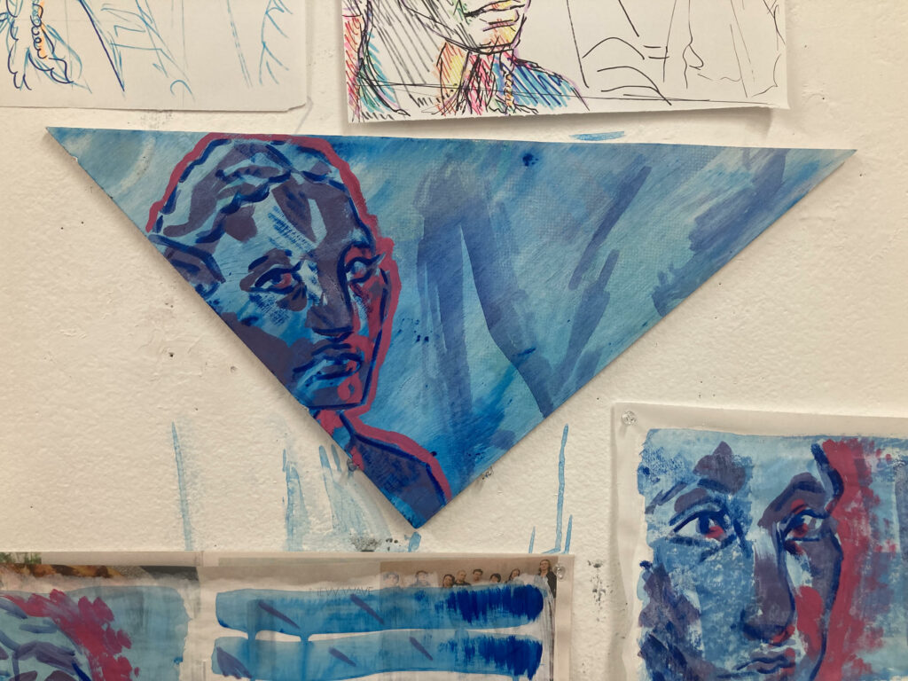
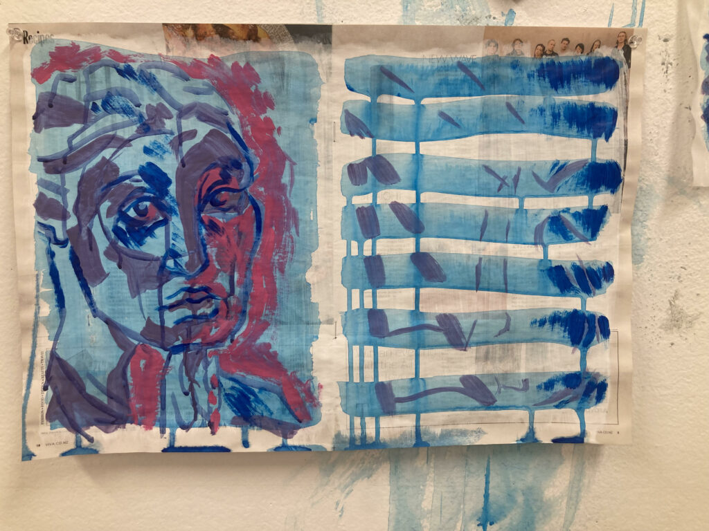
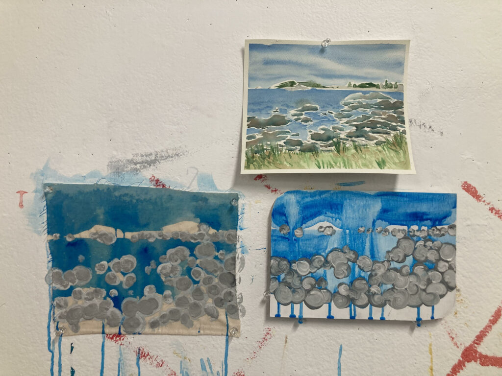
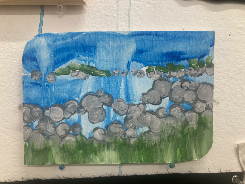
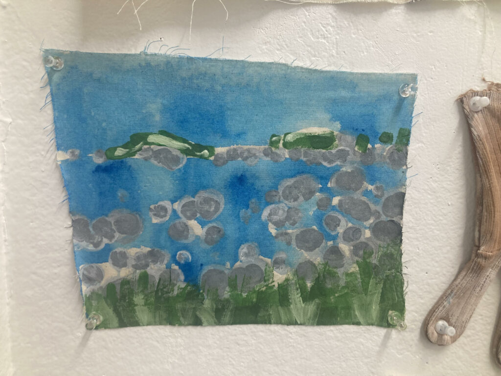
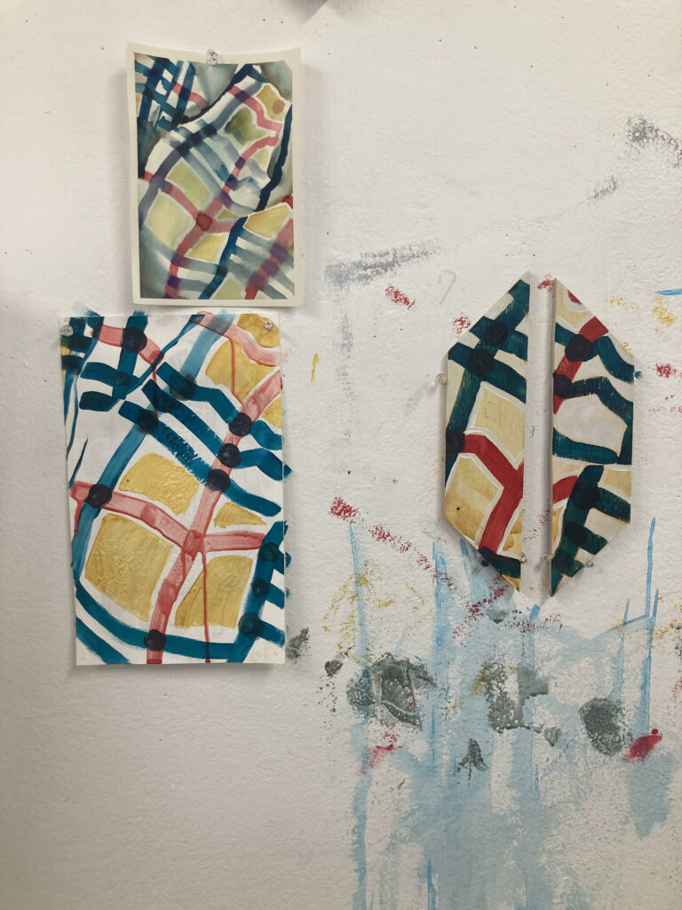
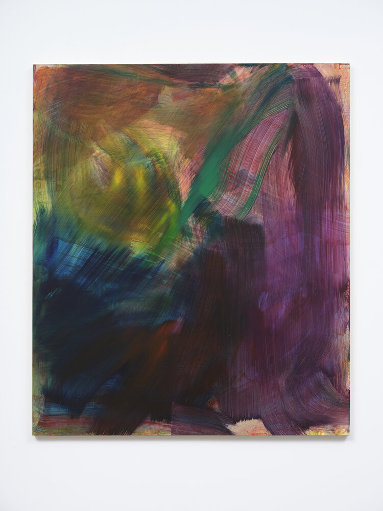
Working with a wider range of surfaces than just paper has been a great joy for me this week. Painting on wood is something I’ve never really done, but I enjoyed the outcome of the first one I did (the triangular piece) so much that I processed my color studies on to wood twice more this week. Watering down paint and washing over the wood is an effect I find fascinating, especially with how it becomes more opaque as it flows down the surface. I believe the gold wash in the fabric study wood piece displays this the best, while the paper (my usual medium) is nowhere near as successful. Obviously different marks were a huge influence for all the paintings above, but none display this better than the two beach image paintings where I swirled the paint around to resemble rocks. I used the same mark making processes on both pieces, but the difference in how they came out due to the surfaces is something I was interested in exploring.
Artist Research
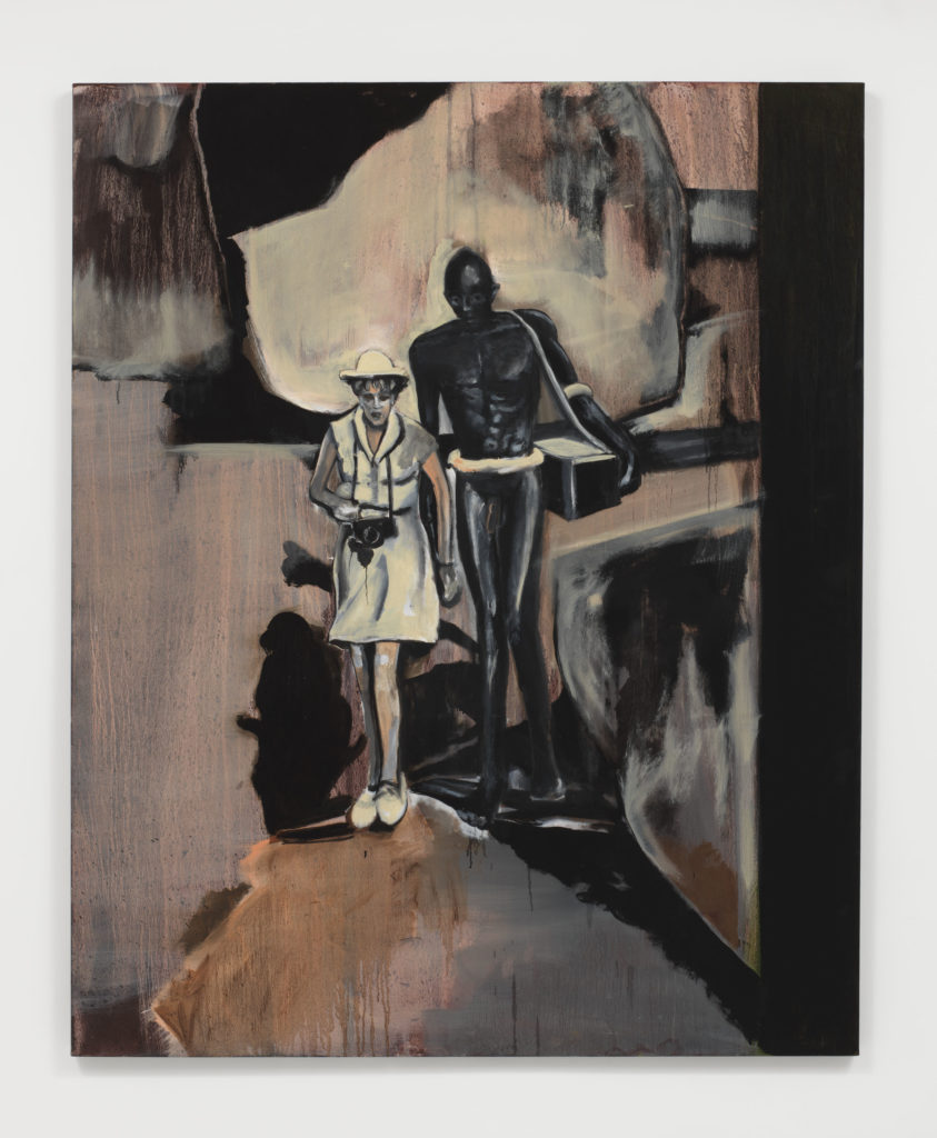
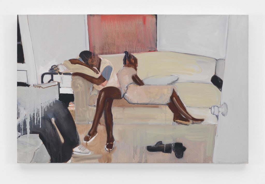
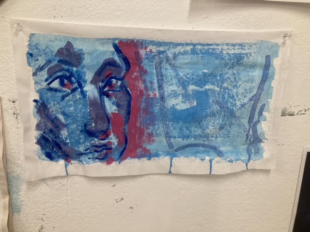
Noah Davis’ dripping marks mixed with clear figures and muted tones truly embody this phase of the brief for me. The subjects of my paintings tend to be people, but I was unsure of how to combine the easy-to-“mess up” image of the human form and the abstractness of mark making. Both Leni Riefenstahl and Untitled merge marks and subject in a way that really aided in my making this week.
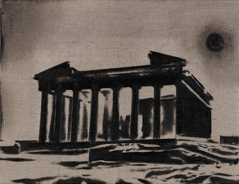
Wilhelm Sasnal’s work has captured me. This brief has truly warmed me up to the idea of not just creating exact replicas of images when using them as a starting point, and Shoah in it’s simple, flowing, intentional lines opened my eyes even wider to this idea. I first thought Untitled was a photograph, as the range of depth achieved by just black on fabric did its job to trick my eye. I am working with acrylic paint rather than oil like Sasnal, so I would have to work harder to change the consistency of my material to create marks like this.
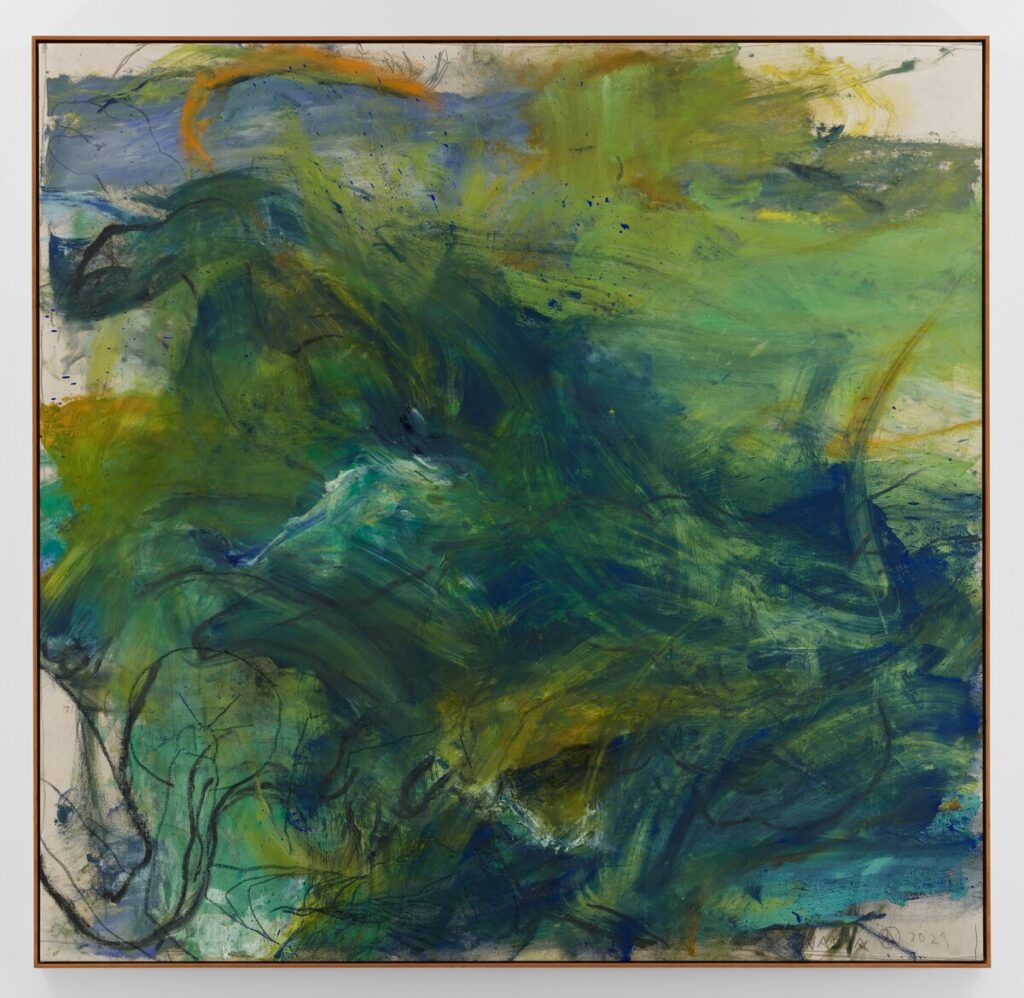
Rita Ackermann’s paintings, to me, have no subject matter. The titles suggest otherwise, which intrigues me. I’ve only really started to embrace and ‘get’ abstract art this year, but I have always been fascinated when the titles of abstract paintings imply that there is a subject matter being portrayed. Mama, Boy with Yamaka and Mama, For Nadia are of course included in this genre. The use of colour and flow of the lines are what drew me in to these pieces, and the knowledge that there are many many layers underneath what I can see on the surface. Layers covering others used to not make much sense to me, but work like Ackermann’s encourages me to make art while making art, if that makes sense.
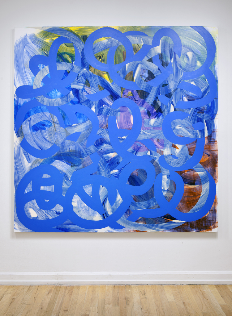
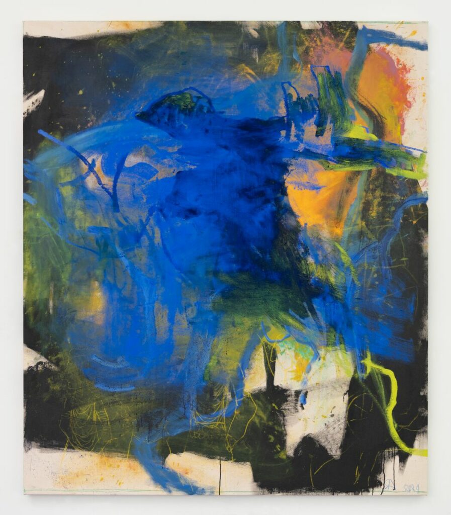
I am completely obsessed with Gemma Smith’s work, particularly the pieces following the format of Move. The at-first simple idea that this is one swirl on abstract color is quickly interrupted by the layers and overlapping you can see when looking just a bit closer. I’ve been captured by the optical illusion of Move, and the layering and pure pigments in Flex. I put Gemma Smith in this week’s post even though I looked at her work after I created the above pieces because I hope to let her art influence my continued making.

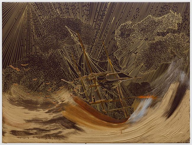
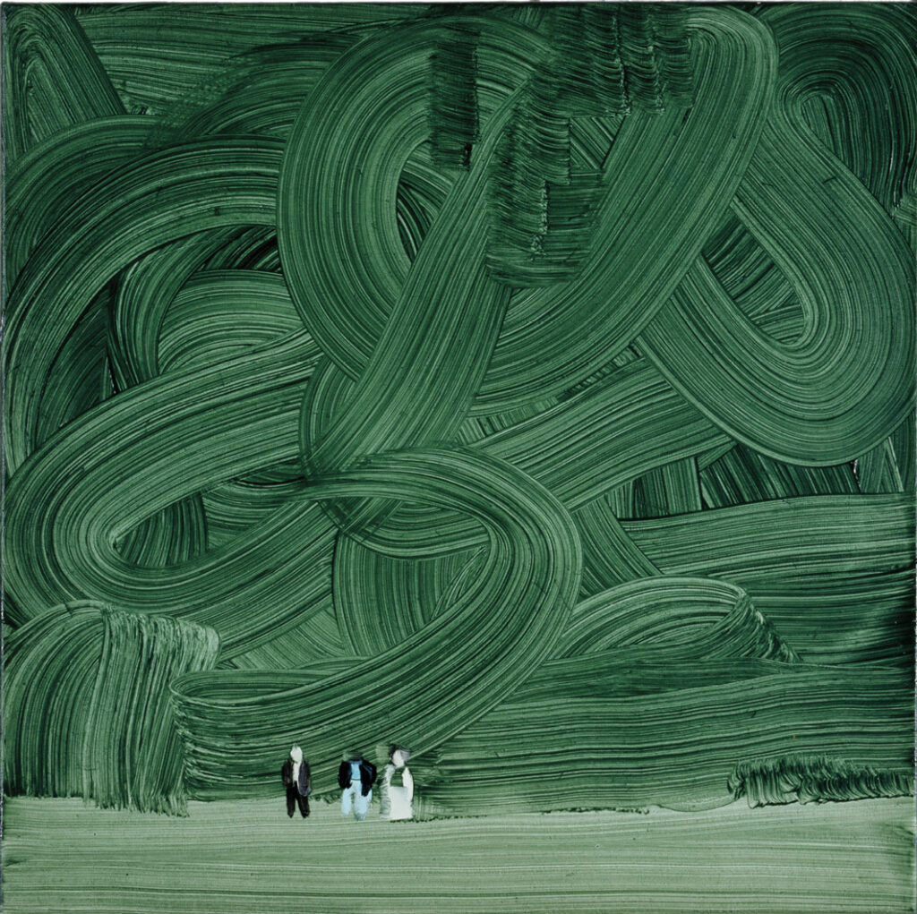
Whitney Bedford’s interpretation of falling ships in Untitled (Crowded/Memory) and Ship (Turning the Rainbow) take something so tragically beautiful and dials it up to 100. Ship reassures me that linework can be just as effective and valid in ‘finished’ pieces as it is in sketches, and the decisive brush strokes of both pieces in Bedford’s portrayal of the ocean only becomes more effective in the eleven-year difference between Untitled and Ship. The use of marks like this to portray movement is something I’d like to improve on in my work.