
I’m combining two weeks into one post, as I was working on the same part of the brief for these weeks.
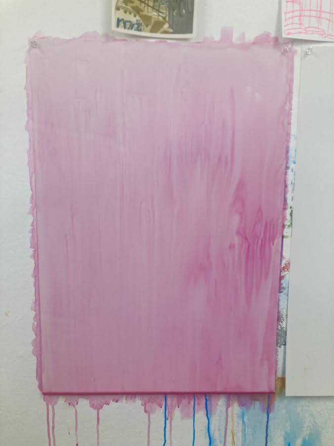
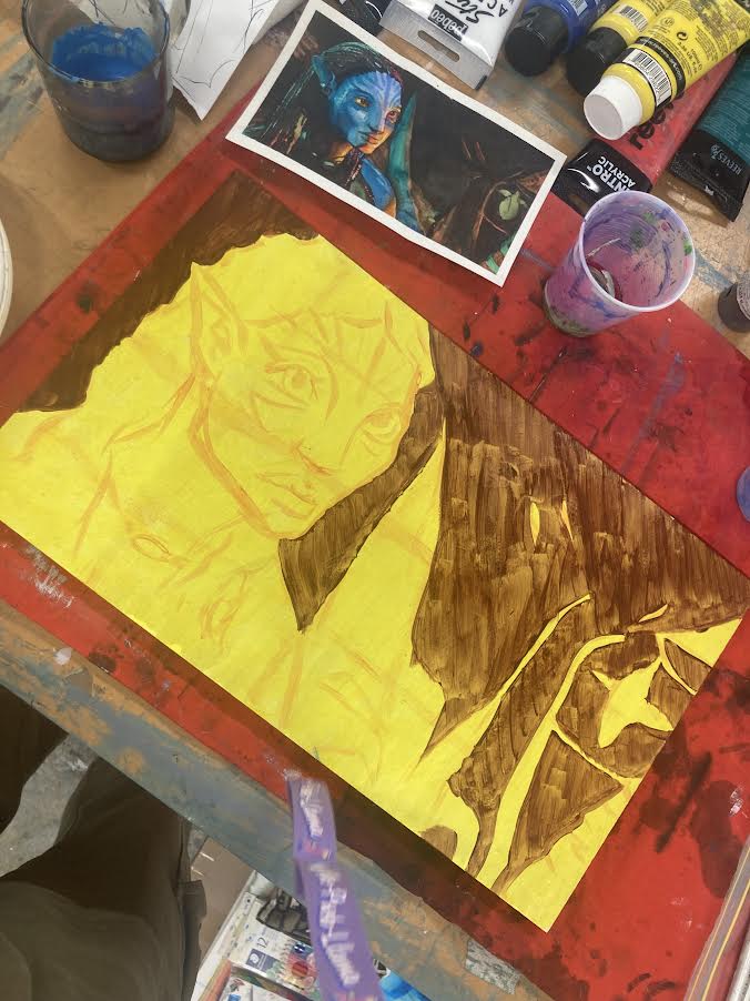
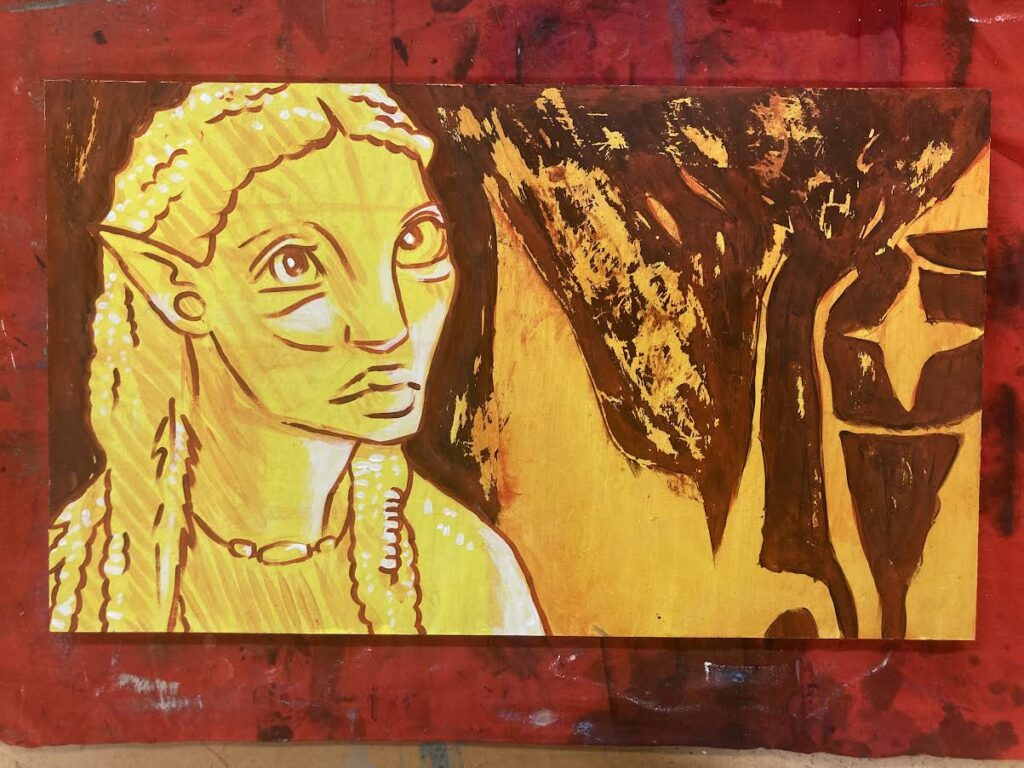
For this painting I really embraced working with a ground and integrating it into the piece. I liked the idea of only “colouring in” certain areas of the image/study, and used a mixture of both my colour study and line drawing to reach the final result. I hadn’t worked on this waxy paper before this painting, but I quite enjoyed how it helped the paint to just glide on.
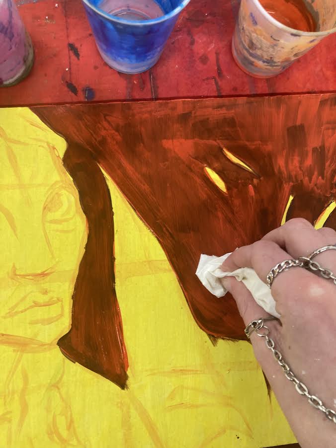
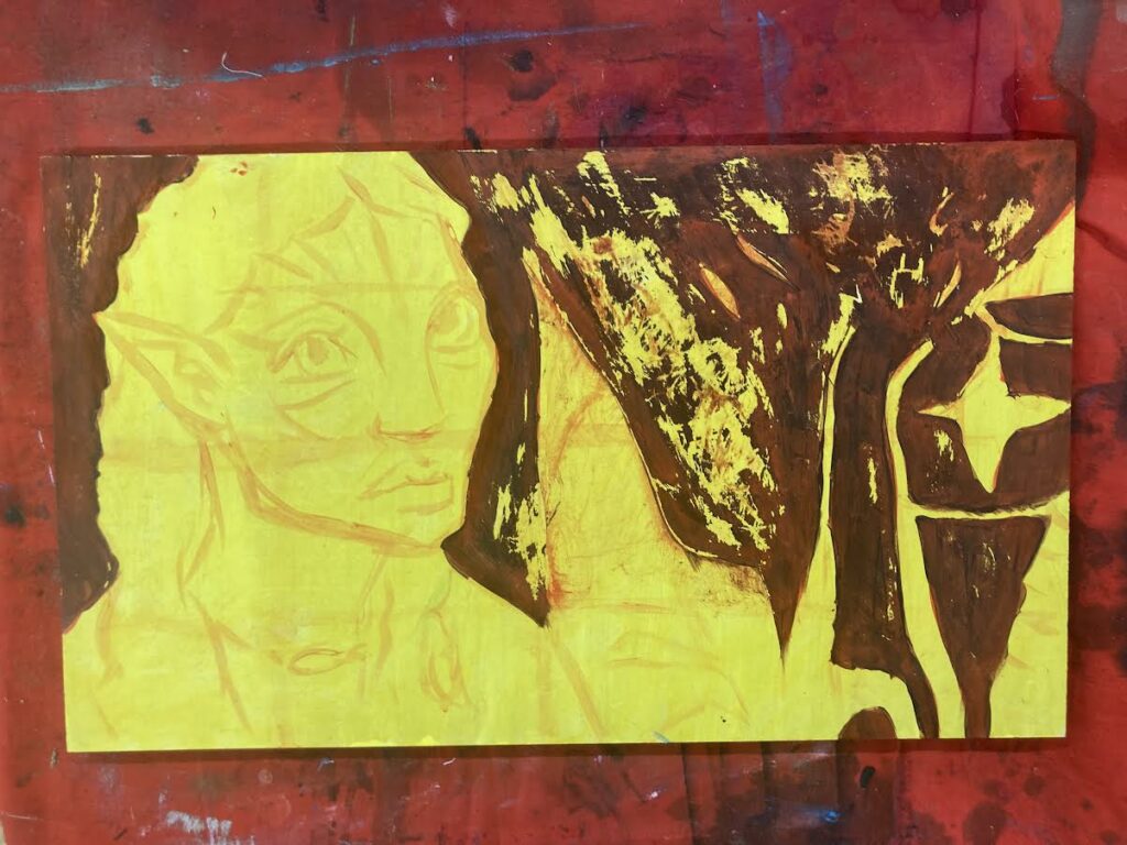
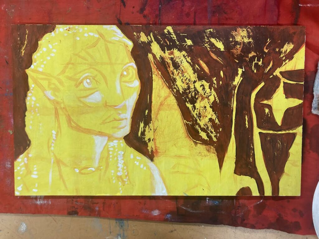
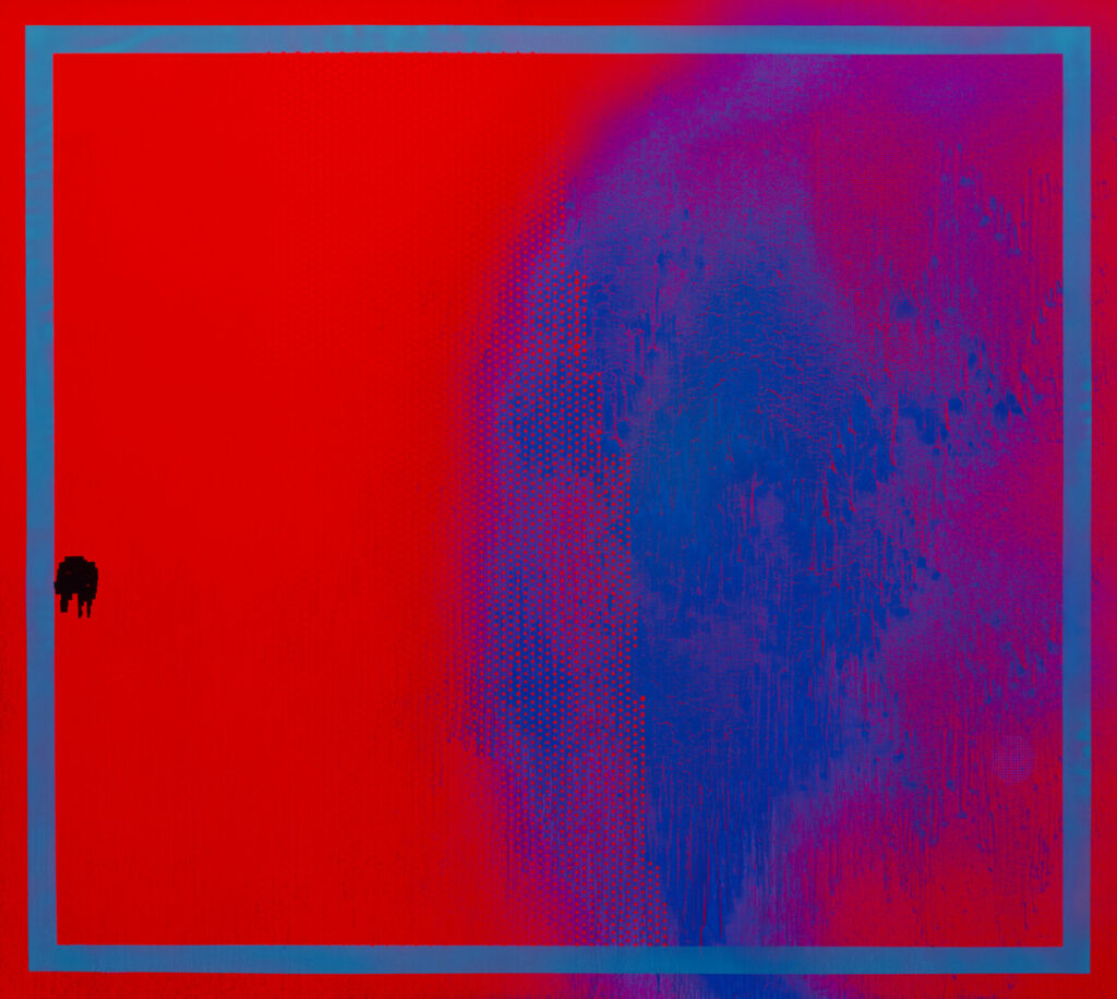
I adore the scraping effect of this piece. It came about as more of an accident, with the intention being to rub off the newly-applied red paint. The subtle depth in the final painting is its strength in my opinion, and again I enjoyed working on wood for this piece.
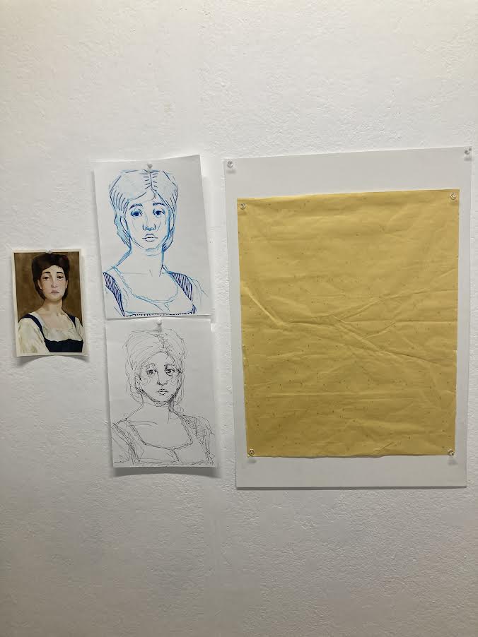
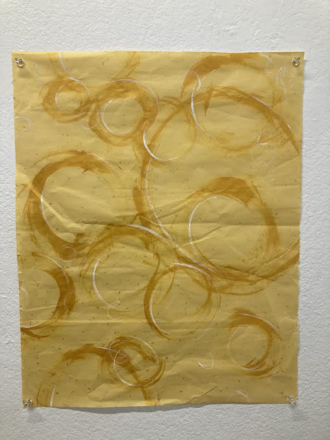
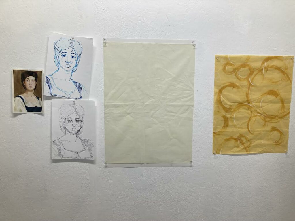
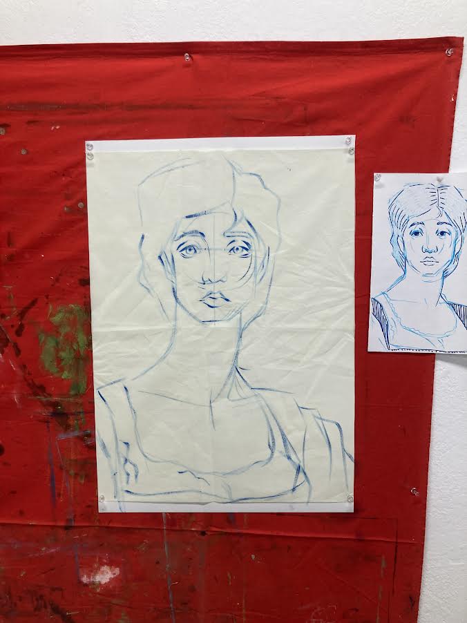
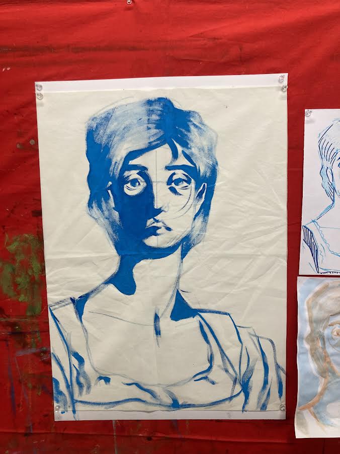
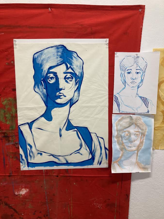
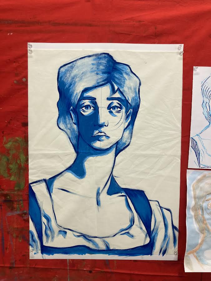
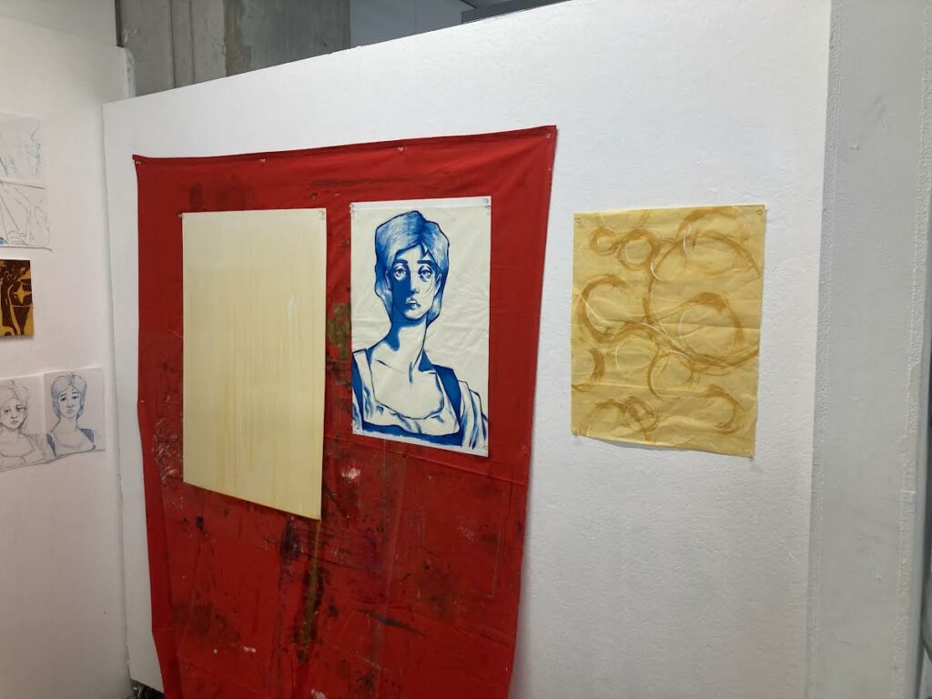
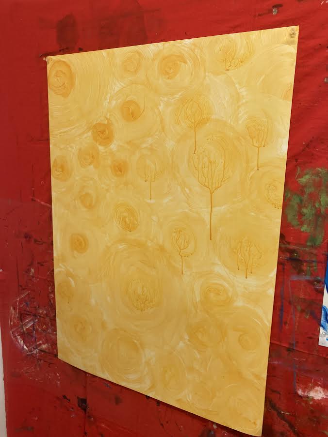
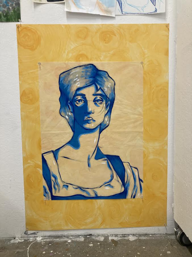
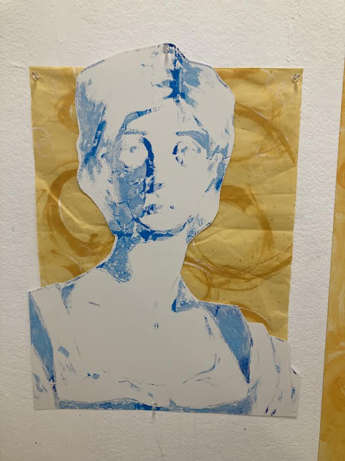
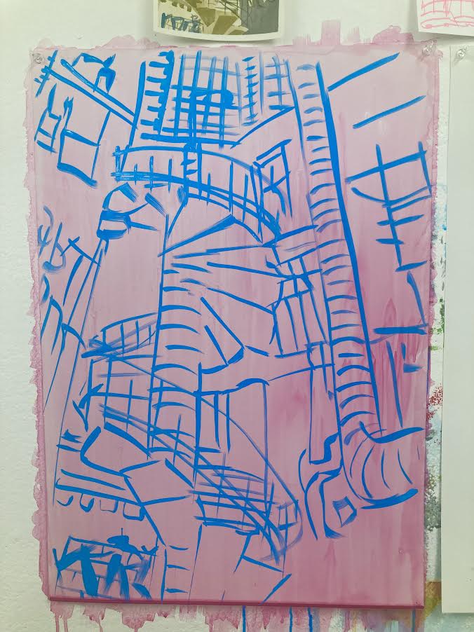
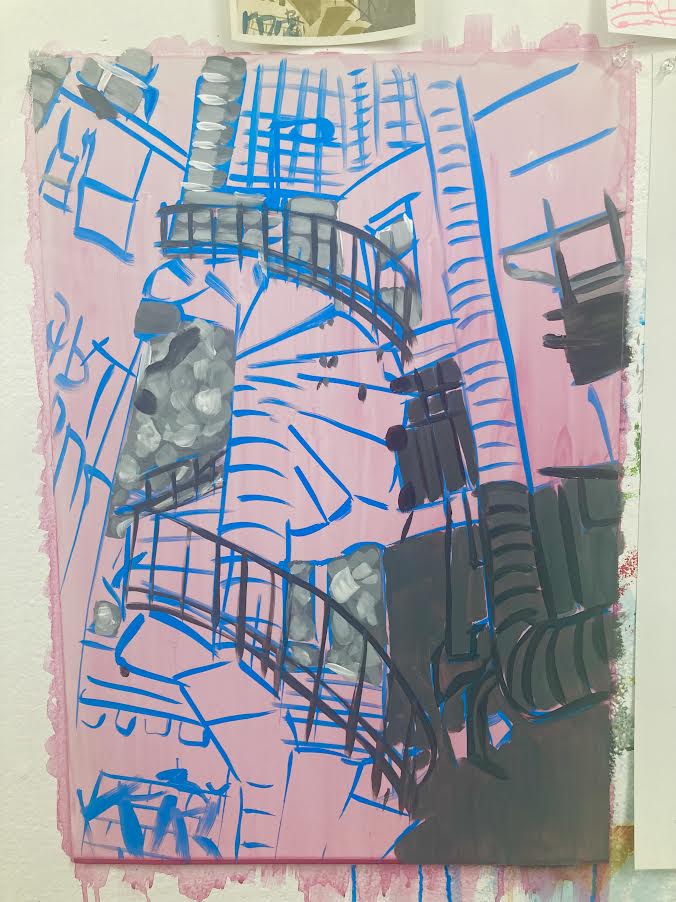
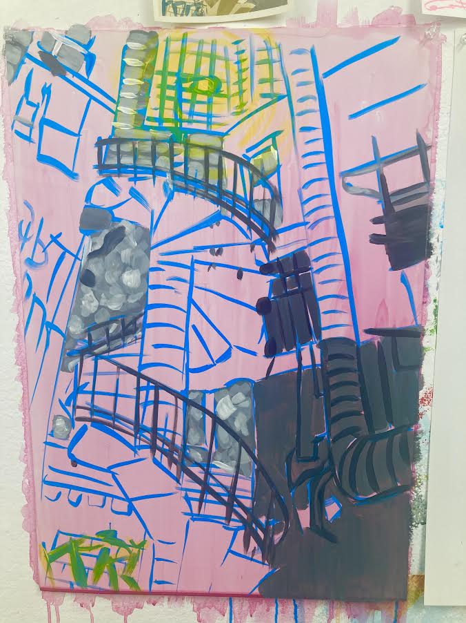
This piece started from one of the line drawings for the original image, where I drew a circle guideline before starting the face. I wanted to explore the circular/spiral motion through the background of this piece, along with the transparency and how the paint seeped through the surface the portrait was painted on. The second piece was more of a mistake, as I intended the yellow paper with the gold spirals to be part of the first piece, but I didn’t like the result of this so instead paired in with the residue left behind by the original portrait.
Artist Research
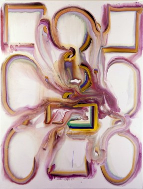
Bernard Frize’s flowing almost-symmetrical abstract works inspired the “background” portions of my works these two weeks as well as the way I made marks. While I have not worked with resin, the way that both Mellegers (& Van de Elaskor) and Spitz have the blurring effect inspires me to achieve a cohesive collection when exhibiting next week.
Jacqueline Humphries’ Note to Self and Untitled are both vibrant and display Humphries’ excellent knowledge of colour. I work with similar colours myself, often using an analogous set of colours in my work. Note to Self in particular bears resemblance to the tones in my second piece, and Untitled helped inform my colour choices for the other two pieces through the almost-opposites mixing of pink-blue and yellow-blue.
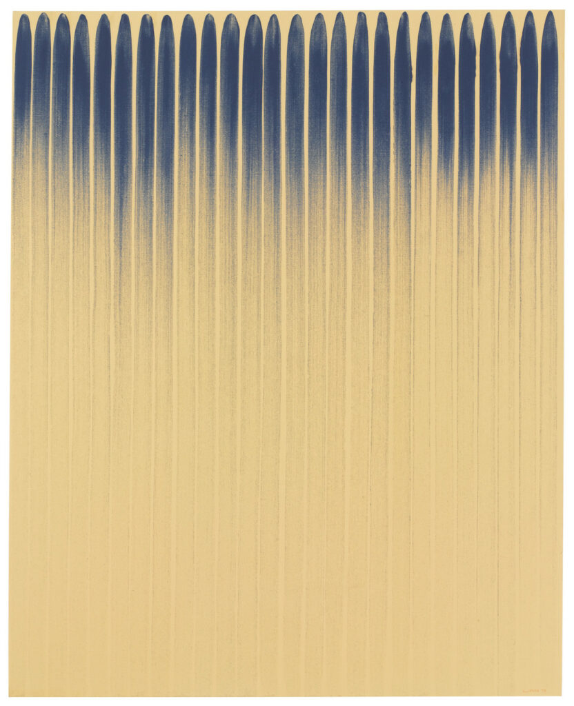
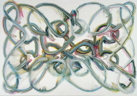
Lee Ufan works with neutral tones and no clear subject matter unlike my works this week. The fading strokes of From Line contrasts with the rough short marks of From Winds to create two very separate but very effective works. I often struggle to create a wide range of marks while painting, but Ufan’s success in creating both rougher and smoother marks on almost exactly the same ground encouraged me to explore a wider range of strokes this week.
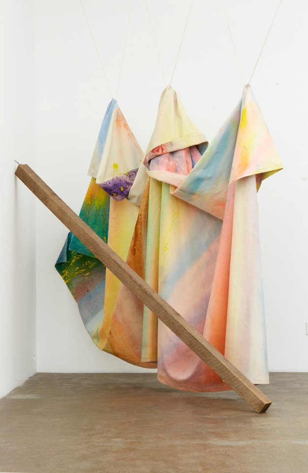
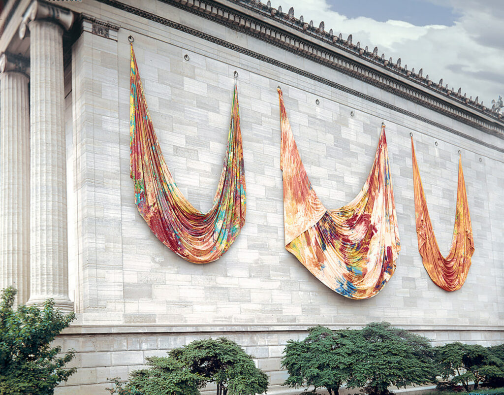
While I didn’t work on canvas this week, Sam Gilliam’s abstract marks on draping canvas use both thinner and thicker acrylic paint to create abstract surfaces that informed my making these weeks. Like I said for Lee Ufan, using a range of marks is a struggle for me, and this extends to consistencies of paint. Creating a contrast between rough and smooth marks has been a bit of a focus for me these past two weeks, seen best in the second and third pieces above. Both Rondo and Seahorses interested me when I first saw them, and when planning pieces this week I saw ways to integrate what Gilliam’s work told me.
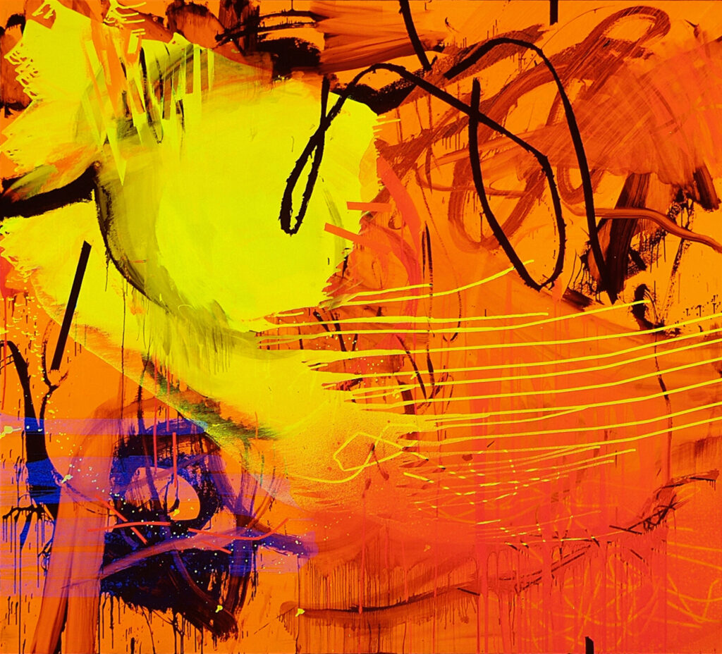
Like mentioned in last weeks post, Gemma Smith’s work was highly influential to my work these past two weeks. Using a mixture of fluid medium and sheer tones, Fix (Reverse Shadow Painting) and Dusk Couplet again interested and inspired me. I spoke more on Smith’s work in last week’s post, but due to the influence her work had on me I thought it was worth mentioning again in this post.