I felt that my plaster layering piece needed a companion, or rather I wanted to test the process again, so here we are. Up until the last layer of plaster, this process was much smoother than the last piece (most likely due to practice), but I messed up the plaster:water ratio and it dried much too fast. Through the careful use of a craft knife I managed to shave the resulting piece down enough to suit my vision. I enjoy the process of creating these plaster works, as their perfect imperfection leads my mind to further inspiration.
Rachel Whiteread’s Untitled (eight shelves) eased me into the idea that the clay stained my work, and that this wasn’t something to fuss about. Whiteread’s work has incredible dimension, and the shadows and light tangle together to create a effect I hope to emulate in my own plaster pieces. Untitled by Joel Shapiro is much more ‘perfect’ than my piece, but the most interesting thing about this piece is that it lies on the floor. I had been intending to place my sculptures on a table, but I may experiment with the floor positioning when arranging my installation.
To figure out how I wanted to go about responding to my site, I created these research drawings on photoshop. I enjoy the effect of the second one, as the cardboard texture shines through to somehow compliment the site image perfectly. I think the colors in the site and how these could work with cardboard are something I should keep in the front of my mind while creating work in relation to the site.
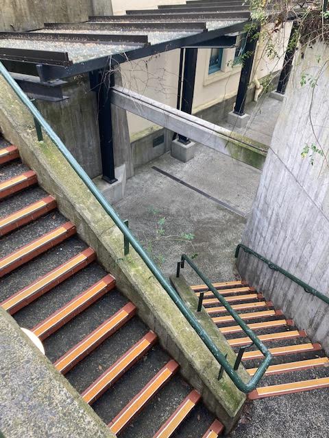
To create a work that had a relationship with both my site of the Symonds Street underpass and my existing work, I decided to create a box-on-box piece. I intend to take this work and photograph it back in the site it was inspired by. The treads of the stairs are orange, so I used paint to recreate a similar color on the cardboard pieces covering the base. Finding a way to attach the cardboard to the base was difficult, as none of the glue I had wanted to stick. Luckily, I scavenged some pins from my wall piece. This works in my favor, as it creates a sense of cohesion with my other work.
Artist Research
Don Driver – Royal Mail, 2004Olafur Eliasson – Half-a-minute mirror, 2010
Don Driver’s Royal Mail is collaged from found materials, partially held up by pins, so you can see how this work is similar to my own. I found this artist after my own work was created, but I find the differences and similarities between each piece very interesting considering I had never seen Driver’s work before. Half-a-minute mirror by Olafur Eliasson is simply beautiful, and works excellently as a site intervention without taking away from the space it occupies. Aside from the reflection itself, the shadow and light created by the mirror is something I’d like to keep in mind. I also wonder how on earth the mirror stayed up.
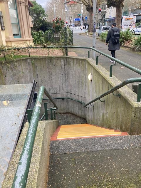
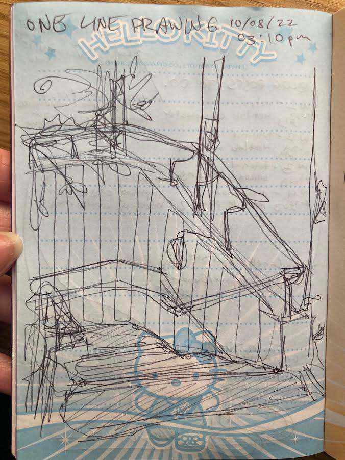
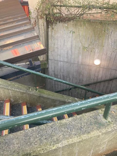
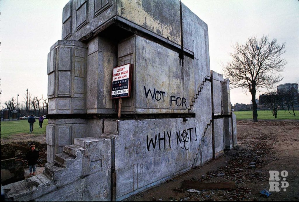
To begin phase 2 of the Movement brief, I chose the steps down to the Symonds Street underpass as a site I would investigate, interfere in, observe, and interact with. I took a notebook with me, and wrote down my thoughts along with a one-line drawing of my view from where I stood.
WEDNESDAY 3:03PM
lots of uni students. im assuming UOA, as they it is 3 and classes are ending. (just saw a porschex2) a few uni staff.
LINES IN THE CONCRETE
DISCOLORED ORANGE STEPS
MOSS ON THE GROUND
CREEPING VINES/GREEN RAILINGS
LIGHT THROUGH THE GLASS ROOF
i wonder why they still have the underpass as there are so many crossings on symonds st? i am glad it is still here.
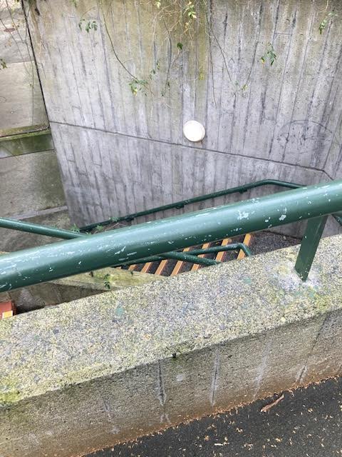
4:49pm, friday
I didn’t stop to write this time as I was making my way home from the train, but I snapped a quick picture as I noticed the lights were on.
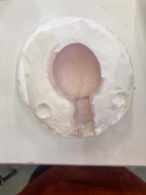
My experiment from last week dried over the weekend, and now I have left it to soak in order to dissolve the clay inside it. The results aren’t as clean as I hoped they would be, but I suppose that is how the first attempt usually goes. The wave-like texture in the clay was not intentional, but I find myself drawn to the soft shadows created by the troughs and bows of the plaster.
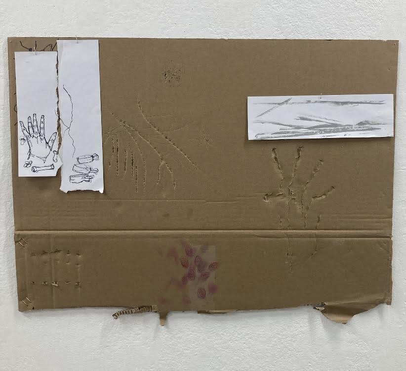
This piece has been slowly developing over the last few weeks, and I feel I have little control over it’s growth. I am constantly collecting boxes to expand the cardboard map extending itself on the wall, with the piece taking on an almost viral feeling. I plan on eventually overlapping different boxes as they are all currently separate, but I believe this piece will only be “finished” when I move on to the next brief. Watching this piece grow through my own eyes and the photos I take of it are exciting, I almost feel like some sort of crazed scientist creating something I don’t yet understand the implications of. The shadows cast by the cardboard interest me, and I would love to get in some spotlights to emphasise this effect. The colors of the cardboard also reflect on to the wall, leading me to wonder what this piece would look like reversed or made with colored card.
Artist Research
James Turell – Green Mountain Falls Skyspace, 2022Olafur Eliasson – The Weather Project, 2003
Working with light has seemed to be the direction my works are heading in, and the works of both James Turell with Green Mountain Falls Skyspace and Olafur Eliasson’s The Weather Project have caught my eye. The lighting is not in any complex shape, rather gives a natural color and creates a beautiful atmosphere. Bring the light of the sun in, in Eliasson’s case, creates a surreally gorgeous piece that I cannot for the life of me get off my mind. Turell’s Skyspaces are simple in hue, but effective in execution. I hope that with the natural colors of my work so far that I can create the desired effect with lighting such as these pieces.
I found myself very excited to glaze my WetLab experiments when the time came. The two trays on the left were more experiments to see how the glaze behaved when one color or layered, and I find both results equally beneficial. The obvious brushmarks of the larger piece show further emphasise that it is handmade, which I find quite charming. In the right photo are the two slip cast eggs, the white of which got stuck to the plaster mold as I was pulling it out. This created a bump in it, but along with the stained colors from the mold on it I think this result is something I quite like. The black glazed piece is twisted slay, which I’m not too sure on. I like the idea of twisting the clay, but I believe more experiments are needed if I wish to achieve the results I want.
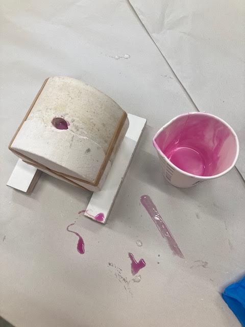
Heading back to the WetLab and working with Harriet to brainstorm, I created a thin plaster slab. At first I stared at it for a while, quite unsure of what to do, but after speaking with Harriet I created these channels for plaster to fill in, with the intent of layering another lot of plaster perpendicular to the first. It’s currently drying, so pictures to come! I am not sure how this will turn out, but I am thinking I will make about three of these pieces, with slight variations to each.
Artist Research
Ben Nicholson – 1934 (relief), 1934Isabel Quaresma – I Paint therefore to Weave #1, 2019
When speaking with John about my leaning towards paint and linear patterns, he encouraged me to use sculpture AS paint. This idea, along with my ideas to layer more cardboard on the wall, has inspired me greatly. Ben Nicholson’s 1934 (relief), is simple yet effective. I appreciate the single color, or lack thereof, and the subtle shadows created by overlapping card. I often lean towards quite illustrative works, but something about this abstract piece makes me know I will look to it as a constant reference when moving forward with this brief. I Paint therefore to Weave #1 by Isabel Quaresma appears as a painting, but is labelled as a sculpture by the artist. The linear overlapping of the canvas and the natural tones has inspired my creation in studio, and keeps me on the thoughts of ‘sculpture as paint’.
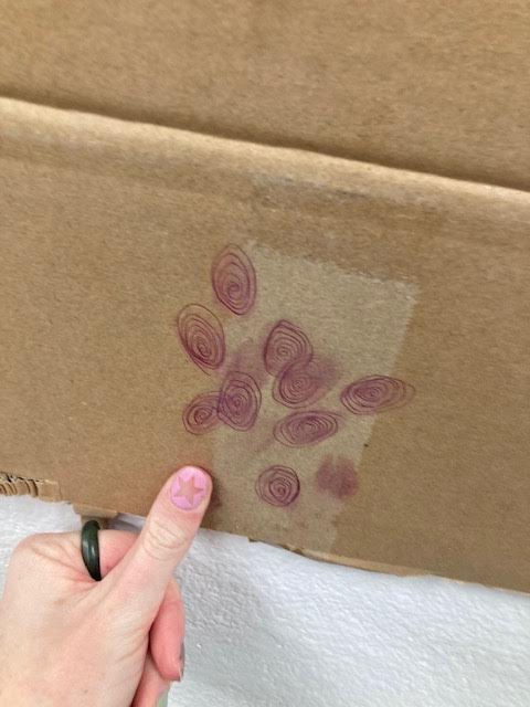
I decided to let my brain go and use this spare piece of cardboard to create with my verbs in mind. I ended up covering quite a lot of this up, but I did enjoy creating with no pressure to have a ‘piece’ by the end. “Impress” and “force” led to my favorite parts of this creative dump, with the scratching of my fingernails into the cardboard fascinating me. Cardboard itself is interesting to me, so I wonder how I can implement the material further in my work.
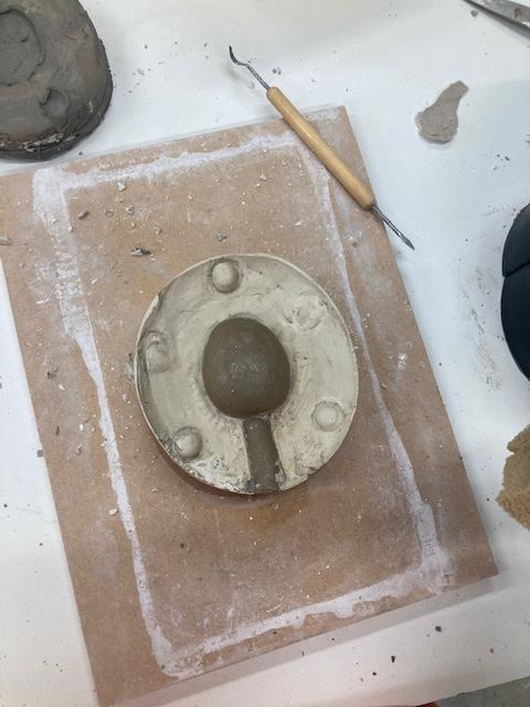
For the workshops this week we used the two-part molds created previously, and cast a range of materials into them. My slip casts dried too quickly, so are currently drying out in order to be bisque fired. The pinkysil created a bouncy egg for me to play with, but I believe I’d enjoy using it as a mold making material or mold itself rather than a cast object.
Of Symmetry /equilibrium/harmony/rhythm/similarity/balance
To Impress /mark/carve/dent/emboss/engrave
To Knot /screw/tangle/band/bunch/contort
To Force /cause/charge/compel/impose/coerce
Of Layering /covering/overlapping/laminating/paneling/folding
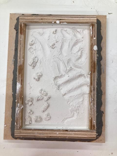
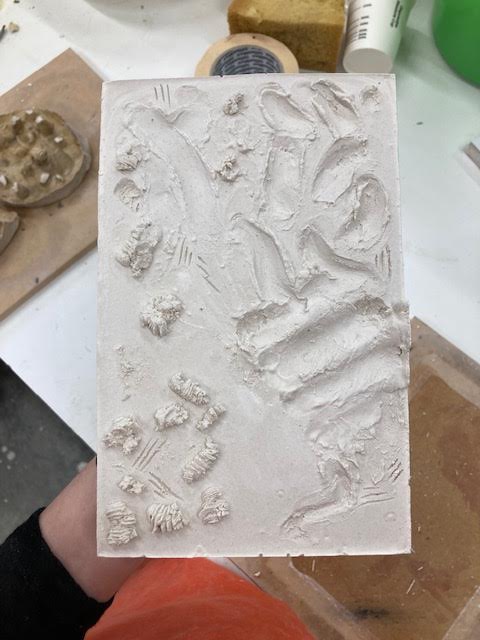
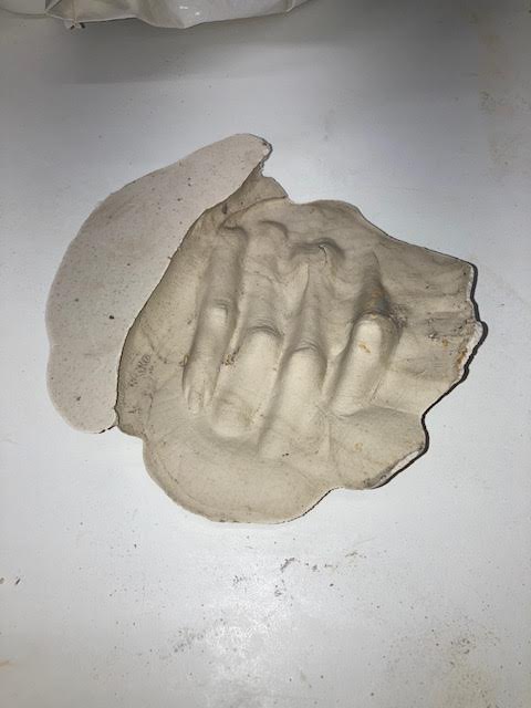
The first of the WetLab workshops we completed to start off the Movement brief was focused on clay and plaster. I created two pieces during this workshop, a plaster slab that I let dry a wee bit too long, and an imprint of my own hand which I cast with plaster. Working with different manipulations of surface was the focus for the slab, and I used tools and my own hands to create different grooves in the material. One of the tools left shavings after the plaster was taken away, and I enjoyed the layered appearance of these. The cast piece has really intrigued me, the way that the impressions seem almost skeletal and inhuman is something I might play with in the future.
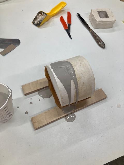
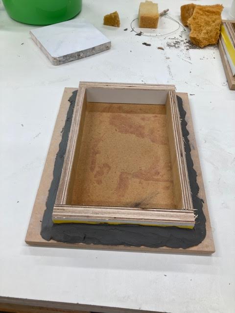
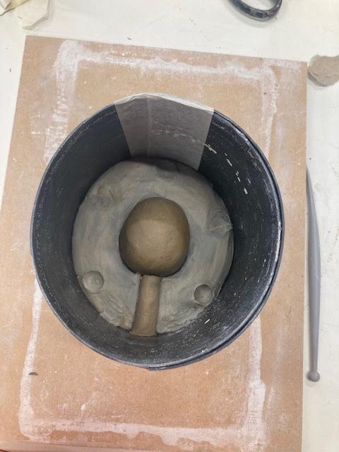
To continue the workshops, we created two-part molds on Wednesday. This was an extensive process, and not one I am sure I enjoyed. The process was very interesting, as I have always wondered how things like this are done, but like any beginner I made some mistakes that made this mold a wee bit difficult to work with later on. I had no specific shape in mind, so decided to make an egg-like shape that reminds me of a backpack. We didn’t have time to cast our shapes, so I am excited to see what we create with the molds as the workshops continue.
Artist Research
Rachel Whiteread – House, 1993Carl Andre – Equivalent VIII, 1966
Rachel Whiteread’s House immediately caught my eye. Her work with casting the inside of things, what is unseen, is incredibly interesting to me. House was as controversial as it was outstanding, and I enjoy just how in-your-face it is. I like the medium of concrete in it’s simplicity but resilience, and the stains of the house being transferred onto the sculpture gives you a story within a story. Visually, I reach for linear lines and orientations, with often clear perspective lines and geometry, and there is something so angular about House that has inspired me. Continuing on with clear shapes and lines, Carl Andre’s Equivalent VIII is a direct challenge to the forever disputed question of ‘What is Art?’ Andre’s work, sitting on the floor, daring you to walk around something so “inconvenient”, has got me thinking on the strain of material and simplicity. Equivalent VIII is pure repetition, but I have grown to respect it, and I want to know more.
I really enjoyed the Necessary Distractions brief. When creating work for Change It Up I kept looking over to the other side of the room and got quite excited for when we swapped over. Screenprinting has been of interest to me for a while now, so I was eager to use the print lab to create work for Necessary Distractions. Being introduced to all the different labs was something I was excited for when coming back to in person learning, so any small opportunity we had to attend a lab I was there. I’m not a fan of “messy” processes, so The Image brief in particular was difficult. Before Uni I never reached for texture as a part of my art making, but after all the work I have done I find myself looking to how I can naturally implement some texture into my art.
The Surface – an early favorite that I can’t forgetSite Seeing – the back of St. PaulsSite Seeing – again. I really enjoy the pictures from St. PaulsIntervention – my (quite cute) tiny church. now sits on a shelf in the flatTransformation – my ‘punk’posterNecessary Distractions – playing with fabric and texture. fun!
One of the first works I created this semester was during The Surface. The back-of-canvas painting, an early experimentation that I keep mentally coming back to. I absolutely adore this work, and would love to find art that is similar and learn from it. The color, texture, and surface of this work have all captured me. Must revisit!! — Site Seeing saw me almost trespass onto church ground. I loved the idea of looking behind the beautiful bricked façade of a church in the middle of the city and seeing ‘regular’ stuff, with a concrete addition that only people looking to take a shortcut ever see. — The tiny church that I created for Intervention was photographed in front of St. Pauls, made out of what I think was a pork bun box ordered by very tired Uni students at one in the morning. This miniature way of making is something else I wish to revisit, with thoughts of making tiny buildings and putting them next to their (substantially larger) inspirations. — The accidentally punk-ish poster I created during Transformation stays another highlight, with the accidental nature of it being one of it’s largest successes for me. I enjoyed using scanned images for this piece, and had a rewarding time figuring out how to slot them all together (I have horded a lot of scraps from this). — Necessary Distractions is a lot more fresh in the mind, but I loved playing with screenprinting and working with found objects. The picture above started the color scheme and continued to inspire my work for the entire brief, and I ended up using the scrap that was originally intended to be just a test in my final work.
Moving from high school, NCEA art to University art was a big jump for me. I really enjoyed Level 3 art and had found myself quite comfortable in the artboard format by the time I graduated. That being said, it was hard for me to stray away from the process of creating a series of 2D works that would come together at the end of a brief. Working week by week with short briefs helped me to very quickly let go of this idea, though I do hope that I’ll get to create a larger series of work with more time in the future. After all the work I have done this semester, I’m sure that the personal work I create in the future will stray away from the 2D plane.
I often find myself very confined to the 2D space. This is what is familiar, what I have created my entire life, but it is something I know now more than ever that can and should be challenged. There is no issue with creating artwork that is 2D, but restricting myself to the classic rectangle of an A5, A4, etc. has dampened my creative process more than once. After this semester I have learned ways that I can change this, so I look forward to applying this in the future. Another way I feel I could improve moving into Studio 1 is by making the most of the facilities available to me. I recognize that with the first half of this semester being online that this was nigh on impossible, but now that all the labs are open I know I should make the most of them. Nerves often get the best of me when thinking of emailing a technician, but I know they experience an influx of new students every year who are eager to utilize the Art and Design labs whenever they can.
I really enjoy how the starting element of this work – the corkboard – has expanded beyond its form and influenced every addition after it. The juxtaposition between the cardboard and plastic in this piece was a constant reference point. There is no statement I was trying to make, but I think that wooden pieces in plastic bags lead to some thought and possibly interesting discussion. I well and truly used both the print and 3D labs more for this piece, and despite my efforts to use as few screws as possible, I’m sure there will be quite a few holes in the wall when I take it down. Work like this is entirely unfamiliar to my art practice, but I really enjoyed this brief and all the exploration it led me to. I like the out-of-the-box to out-of-the-frame motif in this piece, and I wonder how I can take this idea and develop it further in a way that challenges me more.
I’m not sure whether I enjoy the cohesive materials of the first piece or this piece’s jumbled assembly of found objects more. I got quite crafty with this work, using flipped cereal boxes, bracelets, and necklaces to work together and create a result. Although I was tempted, I didn’t go overboard with the plywood for this piece. Hanging things off the wall and connecting them was always where my mind went when wondering what to do next, and I really like how everything drapes. I also enjoy the difference between the manufactured metal elements and the natural tones of the paper, and how the structured paper is such an integral part of this piece. This piece is full of texture, which I usually shy away from. I enjoy how this work has challenged me, and hope that my enjoyment of this brief leads me to create more out of my comfort zone in the future.
Here I yet again display my inability to take progress photos for this brief. The work on the right has been alllllmost finished, as I look at the pictures of it now I see a few misplaced wooden pieces and the need for just a tiny bit more metal. I didn’t add anything major to it as I was pretty happy before I got started adjusting it this time. One of the more valuable additions to this piece was the white paint on the brown paper, highlighting the peaks and troughs of the material and tying it in with the work a bit more. The screenprinted plywood was added right before I left the studio, which for some reason I felt I should slot in. I’m going to move it when I head back, perhaps to the left with the other wood, as the addition feels forced.
I began and almost entirely finished the work on the left. I chose to incorporate the plywood right from the beginning of this piece, making it an integral element rather than something added at the end for the sake of it. By screwing a cardboard box to the wall, I created an invisible almost-floor which led me to think of how this work would change if it was doubled in size and the box was on the ground. This isn’t something I will seek to do, but I think the concept of enlarging into a comical scale would be interesting for this piece in particular. I originally arranged the plastic sheet on the left over the entire work to try and ‘wrap it up’, but this covered the work too much. Instead, I enjoyed thinking of the (often overused) phrase to “think outside of the box” while – coincidentally – arranging the plastic to come out of the box.