Process into Images – Final Summary

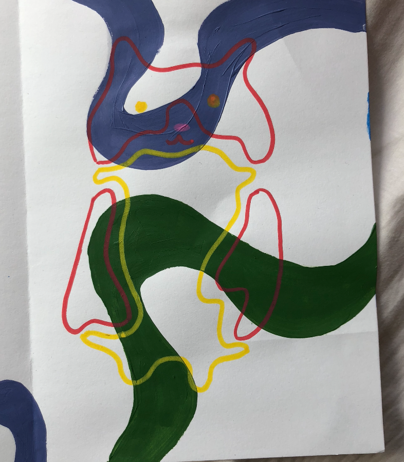
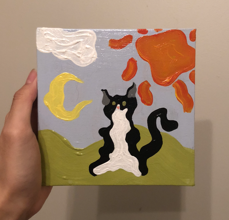
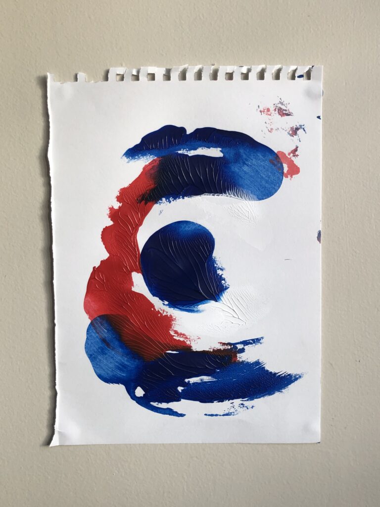
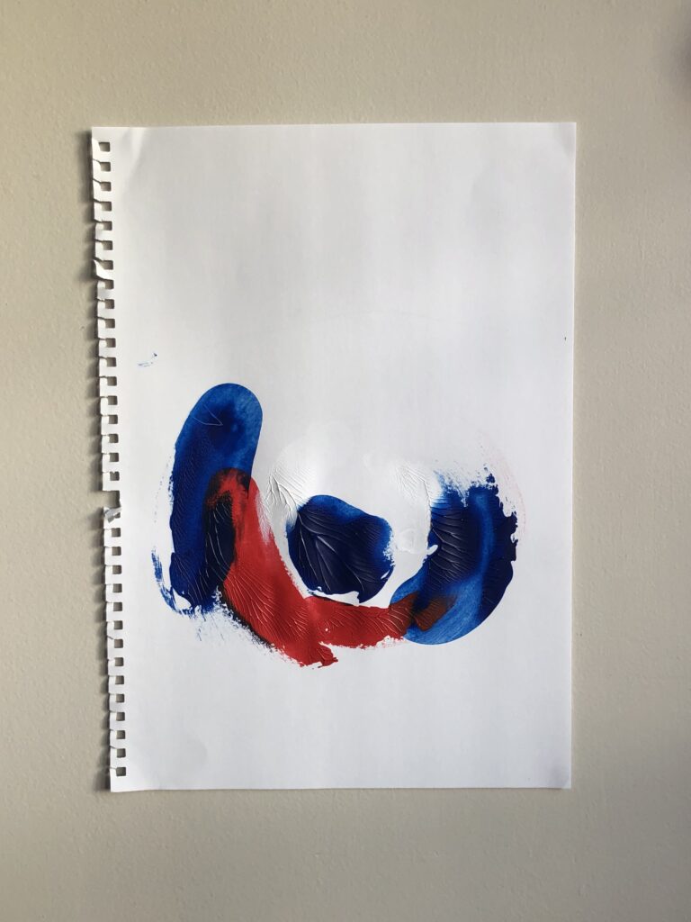
The two artworks I chose for this summary are “friends” and “empty cat”. I think these artworks are both my personal favourite pieces. I like “empty cat” since I think it’s the best artwork from when I combined the things we did from week one and two. Although it is not as good as I want it to be, I do like the brush strokes that you can see from the shapes, and the transparency of the cat. However, I do wish the cat was more centered, as it did bother me quite a bit when I looked at it after I finished. My second piece “friends” is an artwork I do like. First for biased reasons, as these two cats are living with me. But I also like how simple it is. It doesn’t have a lot of detail, but I do like how everything is very solid looking. The cat on the right (Mei) didn’t end up looking good on the painting, but other than that, I think it turned out ok. If I had more time within this brief, I would have liked to try new techniques, and to improve my skills overall, and to get more comfortable with painting. If I did so, I know that I would’ve thought of more creative ways to turn the images into paintings. 

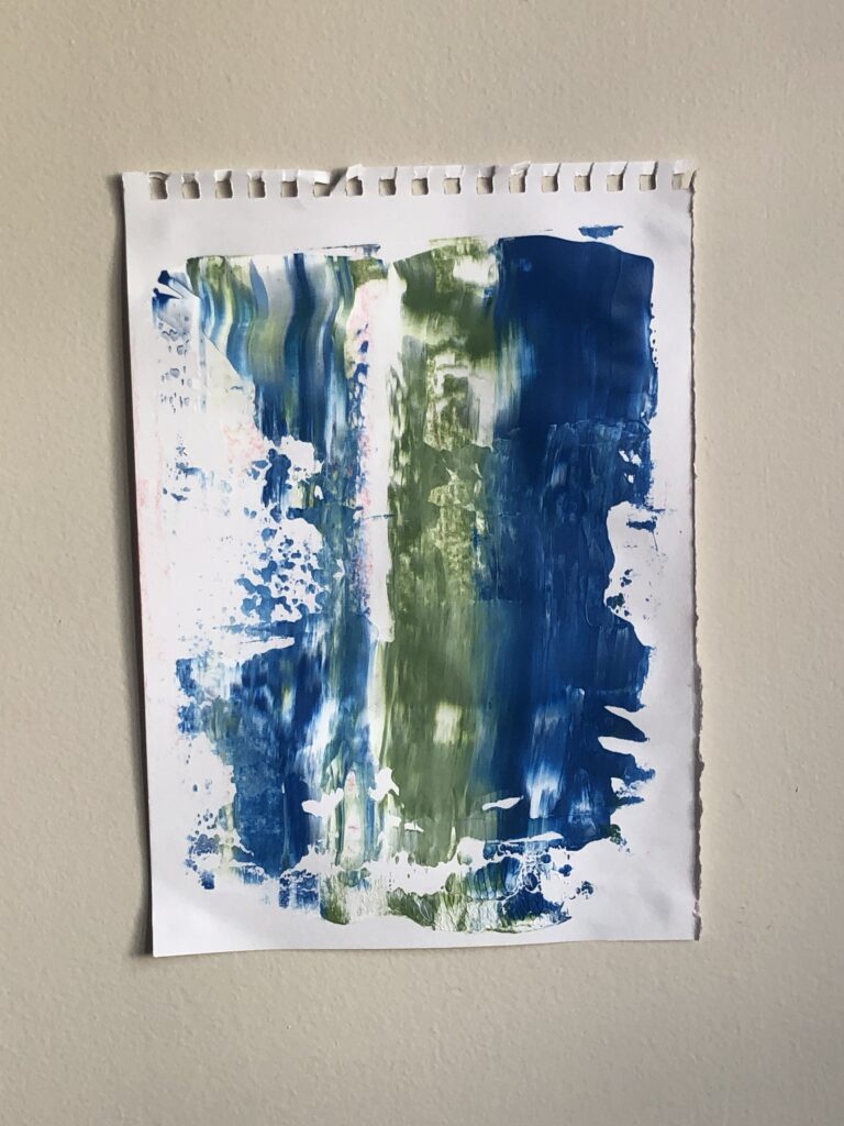
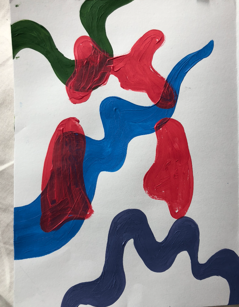
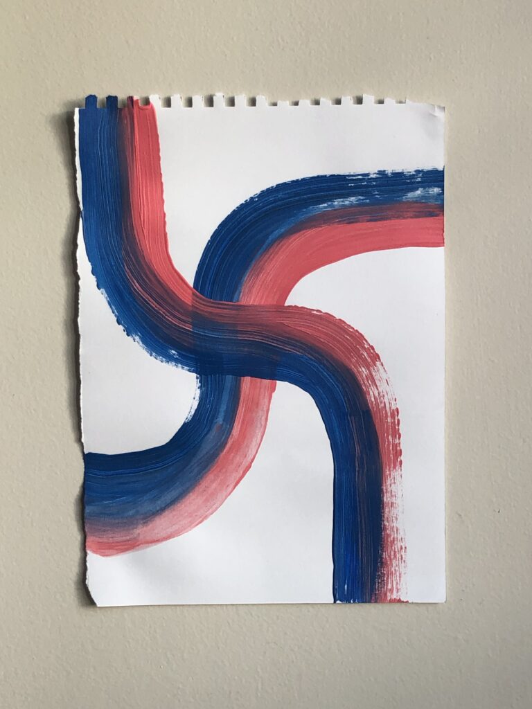
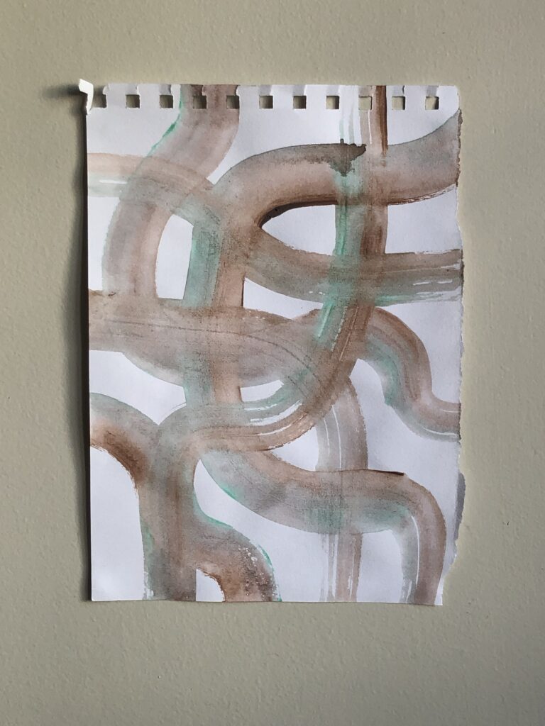
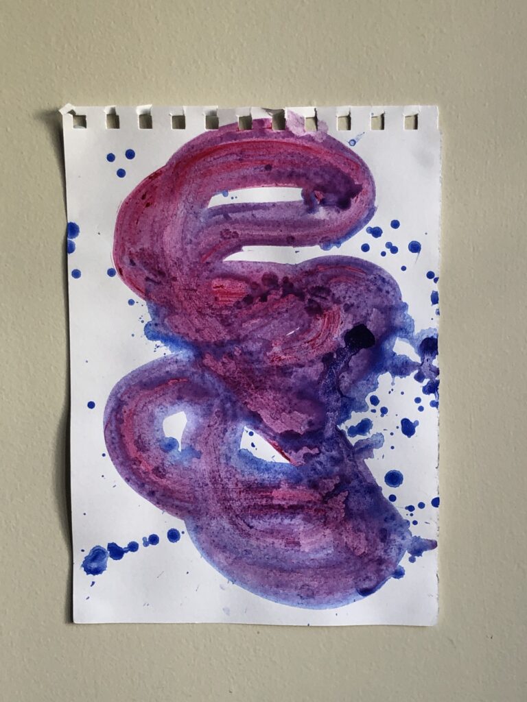
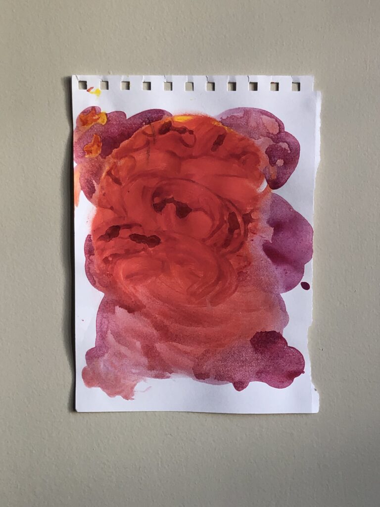
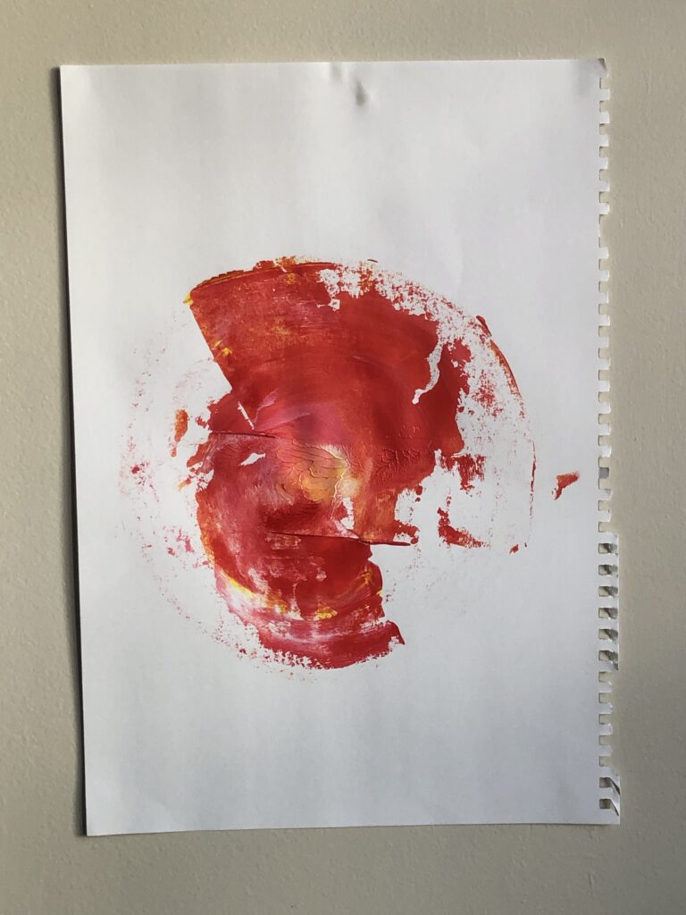
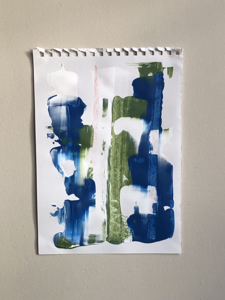
Overall, I would say that I struggled a bit with this brief. I’m obviously not the most skilled painter, so I was quite critical towards my work. With that being said, there were still some enjoyable parts within the past few weeks. I really liked the first weeks brief, since I was able to just do what I wanted to do. I think what made it so fun was that there was no reference images to compare it to, and that it didn’t look like an object. It was just whatever and was a good feeling to not have something to compare it to.

Process into images – Artist Research

The three artists that influenced my work are: Gerhard Richter, Wilhem Sasnal, and Li Shan Chong.

Gerhard Richter

Gerhard Richter is a German artist born on 9 February 1932, and began painting in 1962. He’s very well known for being one of the most important figures in the contemporary arts world. Many of his works have set record breaking prices at art auctions ($27.6M USD). His artworks are very large-scaled abstract paintings which mainly shows his movement that he was making while he was working on his artworks. Richter’s work often includes the “swipe” and “spray” aspect to his work. Along with dull coloured oil paint giving it more texture and dimension. His work influenced my first weeks artworks, especially the artworks I created with the “swipe” motion

Wilhem Sasnal

Wilhelm Sasnal is a Polish painter, born on 29 December 1972. The work that drew me into his art style was his Shoah (Forest) painting, made in 2003. I really liked how his swirl had a lot of texture and you can get a grasp of what he did to get that look. Green is my favourite colour, so it was natural for me to enjoy this specific painting. This influenced me as I also stuck to the theme of having swirls in some of my work. Obviously, they are not the same, as mine aren’t thick, washed out paint swirls. Mine were more solid looking (as I used acrylic paint with many coats) and they had different widths, as I aimed for a more wavy feel to my artworks.

Shoah (Forest), 2003

Li Shan Chong

Li Shan Chong was born in 1985 in Singapore. Unlike the first two artists I mentioned, she’s more of a modern artist, rather than a well established contemporary artist. Her work is often minimalistic and two dimensional. What I really like about her art style is how calm it makes me feel. I like how she has a simple yet complimentary colour palette. There isn’t a crazy amount of detail in her work, so it is really easy to digest the art pieces and appreciate it. Her work also consists of a girl crying a river, which is most often the main subject matter of her paintings.  Her work influenced my canvas paintings. I also used a very minimalistic colour palette on the painting on the left, which she also did. I adopted her two dimensional style, as it was more convenient for me since I lack the skill to do detailed pieces of art, clearly.

Week 4 – Process into images

For the final week, I wanted to experiment painting things on different materials/objects. I first started off with a canvas, as i’ve never used one for this brief. I also found an empty jar in the kitchen so i thought it would be cool if I did those swirls around it. I also had some left over clay sitting in my room so I made a mini cat bowl sculpture thing too.

The canvas paintings were influenced by Li Shan Chong. I really like how her work are very abstract. She doesn’t have a lot of detailing in her work, giving it a more flat and minimalistic feel, which I really like.

Week 3 – Process into images

For week 3, I believe we had to combine what we did in the first and second week.

I wanted to explore and experiment with lots of vibrant colours, and not restrict myself with a colour palette. This work reminds me of what I did during the palimpsest brief, as I worked a lot with cats and swirly shapes. I used a lot of the “slide” technique from the first week. I did that motion a lot to create the outline of the cat, along with the little “swirls” in the background. I also tried out different ways to create the cat. For some I just painted the white (or black) patterns, outlining, and by using dry brushes.

Week 2 – Process into image

For the second week of this brief, we were asked to respond to 6 images and create 4 artworks from it. The images below are the ones i chose. I don’t have a photo of a piece of trash because I forgot to take a picture of it before I threw it in the trash. After making these, I quickly realised why I stopped taking painting after year 10.

Piece of fabric

Screenshot from film

Painting made before 1900

Photo without people

Photo with people

Piece of trash

Process into Image – Week 1

For the first week, we were instructed to “generate vocabulary of marks through action led processes.” You basically just had to create some paintings through body movement such as: Swipe, swirl, drip etc. Since we are in lockdown, I worked with the normal paper ripped off of my sketchpad.

Slide

I first started off by creating these work by pouring a small amount of different paint on different parts of my ruler. After that, I decided to slide the ruler from one side of the paper to the other. I like the texture that these works have, especially the work on the right.

I did more of these sliding paintings, but this time in a zig-zag motion. I think the idea was fun, but however the execution wasn’t very successful. I do like the work on the left. Next time, I should try this zig-zag motion by using a different object.

Swipe and Smear

After using my ruler for a bit, I got bored. So I moved on to a different object to create work. I used a paint brush. I created these work by swiping my brush in curvy directions. The first two work (right and centre) are my favourites since they remind me of maps. I like how one brush stroke goes on top of another, and how it goes off the edge past the paper. The Work on the left was created by drenching my brush in diluted paint. The excess watery paint left a dripped mark on the paper.

The next word I wanted to work on was “smear.” I basically just poured paint on my hands and smeared it around. I also did the same thing again, but with a ruler.

Dollop

Moving on, I dolloped some paint on different parts of the paper, and then slid my ruler from one side of the paper, to the next. I like the one on the right, since you can tell where the original dollop of paint was placed.

And finally, for this I once again dolloped some paint onto the paper. But this time, I placed another piece of paper over it and dragged it in a circular motion. I like how they are similar, but also different.

Others:

Summary Post

For this brief, I decided to focus on the intersection of the two options that we had, “Care and good work” and “In praise of laziness.” I went into this with the intention of exploring the middle ground of labour and leisure. The main intention that I had within my body of work was conveying the message of how physical leisure can also intertwine with emotional labour. Two polar opposites existing at the same time. 

For me, I have definitely become overly reliant on my devices. I would often find myself going on my phone when I am bored for no reason at all. I don’t do anything productive on it. I’ve looked through my entire camera roll about countless times, just because I felt the need to be on my phone. This is something that is supposed to be a leisure activity, and yes it definitely is.

But in contrast, it becomes extremely emotionally labouring. Whenever I’m on a device for a long time (especially for days in a row), I just grow to become sick of this lifestyle. I feel unproductive. I’m wasting my youth scrolling aimlessly on instagram looking at celebrities who don’t even know about my existence. But what else can I do? I can’t go outside and make memories with my friends since we’re on level 4 lockdown. I don’t have the motivation to do anything other than being in the comfort of my bed, spending ¾ of the time I’m awake looking at a screen. I’ve gotten so accustomed to this life of living more through the internet, more than actually living life. These thoughts that I have embody the work that I’ve created. The Following works are my final photographs and animations for this brief.

Brief explanation: For the image on the left, I wanted to show the feeling of getting sucked into your phone. And for the image on the right, I used double exposure to convey the emotions that I feel emotionally internally as I continue to scroll aimlessly.

Brief explanation: The idea of this photo was how the dark figure that you can see very subtly (on the left side of the frame) is the physical embodiment of the urge to go on your phone at night, when you are trying to fall asleep.

Work 3 – untitled

Brief explanation: This image has the same concept as the work above.

Work 4 – “Take a break” (animation)

Brief explanation: This animation went with the concept of the emotional labour of over-consuming of the news. As you

Work 5 – “2 minds” (animation)

Brief explanation: I explored the idea of the guilt that we feel deep down as we spend too much time in bed looking at our phone. I really like how this video shows that the emotional expression on the outside, doesn’t always match with how we feel inside.

Conclusion

Overall I am quite happy with my outcome. I know that I did the best I could in the situation that I am in! This brief was really enjoyable and it was nice to get creative with the idea of labour and leisure. I’ve never done any kind of animation in the past, and I actually really enjoyed it! I think I’d like to keep doing this occasionally in my free time. This is not a major thing, but it would have been nice if I had a better skill towards photoshop.

Animation – “2 minds”

As we come to an end for this brief, I wanted to create one more animation. This video title “2 minds” explores the idea of being guilty of constantly being on your phone everyday. For me, I spend almost all day being on my phone or laptop. Although I feel guilty about wasting my youth by only watching shows, I also don’t know what else to do. 

Unlike my past animations, I put classical piano music over the video. I think this was a really successful decision that I made, as it accentuates the feeling of being relaxed, comfortable, and being calm in a space. The contrasting loud noise and the moody B&W animation that interrupts the video was suppose to be a symbol of how the model feels inside. On the outside, she looks relaxed and calm, but in her head, it’s the complete opposite. And I think that is what puts everything together. It really depicts how the two opposite emotions that exist (leisure and guilt) co-exists in the same space at the same time. 

Artist Research

Man Ray

Man Ray (born August 27, 1890), was an American artist who was based in Paris for most of his career. His photos were said to have carried him to the “centre of the emergent Surrealist movement in Paris.” Ray’s images were black and white images with a surrealist and dreamy feel. He is well known for his “Rayographs”, the technique of creating photographic prints without using a camera. 

One of his works that influenced my own photographs are Marquise Casati, 1922. I was really drawn into the overall mood that this image contains. The darkness, eeriness, and the minimalism that this image carries. As someone who also takes a minimalistic approach to their work, I really appreciated his photographs. This work also had the creepy and moody energy that I wanted to give off within my images as well. I really like the graininess this image contains and this double exposure shot he used, which made the model look like they had 4 eyes. 

Marquise Casati, 1922.

You can really see how I adopted his technique that he used. All of my photographs with a black background contrasting with the model who’s being illuminated was something that was heavily influenced by his work.  I really like this technique as there are no distractions in the background. So the viewers don’t have to wander their eyes, as they look at my photos. I like the idea of having a core subject matter, where they stand out with nothing in the frame competing against them.

Zdzisław Beksiński

Although I have done a blog about him before, I want to talk about his photographs for this one. Beksiński was well known for his dystopian, gothic surrealist artworks. When I was looking for inspiration for this brief, I was looking for artists who had a dark lit portraiture, with a surrealist feeling. And he had exactly what I was looking for. Before becoming a draughtsman, graphic artist, and painter, he started out as a photographer. What I really admire about his work are his haunting surrealism approach to his work. I think that the way he uses the contrast between light and shadow really accentuates the kind of mood he is going for. 

Zdzisław Beksiński, title unknown.

Beksiński’s work was my main influence in including my arms in my images. Both painting and photographs that he’s created have arms with a body language that conveys a deeper meaning in his images, and I definitely emulated his style within my photographs.

“Temptation” development

These days, turning your phone off to go to bed early is more difficult than it should be. Like labour, going on my phone was a routine thing that was deep imbedded in my lifestyle. And to attempt to break this cycle of always being on your device until 3am is even more labour; As you have to fight the urge and temptations to scroll through your phone while you have trouble falling asleep. As I did for my last shoot, I went with the concept of your phone tempting you to go on it, just for another 10 minutes.

For the Image above, I decided to go with a long shutter speed to depict the movement of resisting from the arm trying to get her to go on her device.