
Experimenting with cool colours, warm colours, neutral colours:


Experimenting with cool colours, warm colours, neutral colours:
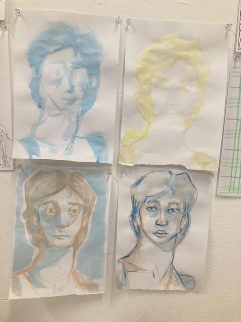
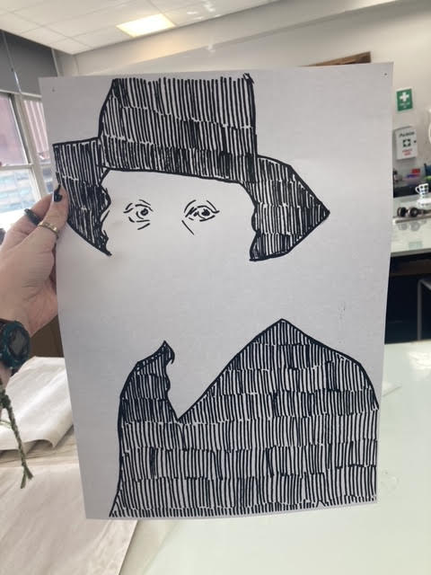
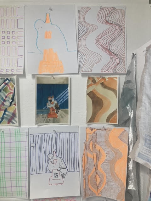
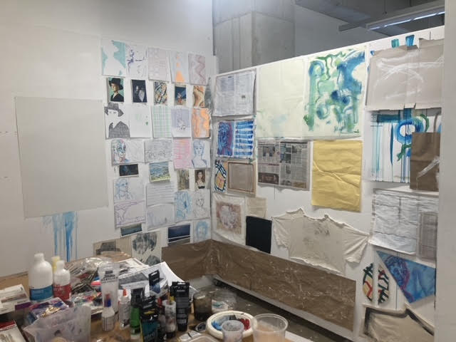
I really enjoyed this week. Rather than just line drawing studies I challenged myself to be more creative, working with negative space, one line drawings, reducing pictures to strips etc. I was looking forward to working with watercolor to create color studies, and I tried (and mostly succeeded) to not stress about making them ‘perfect’. The line drawings were much more enjoyable than I thought they would be, as I just let myself go and had fun with them.
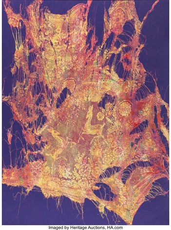
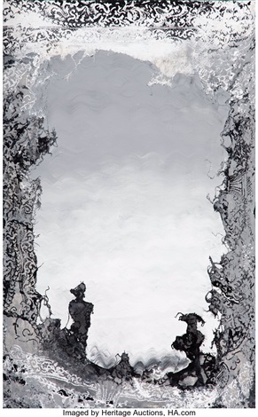
Mark Flood’s works interested me in their use of the space around the subject, such as the blue in Deer and the interior of the ‘frame’ in Respite. I made negative space the focus of a few of my line drawings, and surprisingly really enjoyed the result. I think exploring this in the next few weeks will lead to some really interesting paintings.
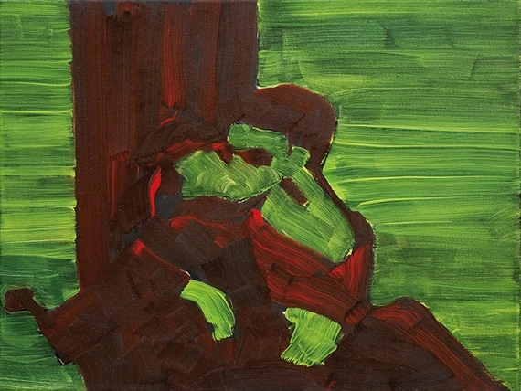
Bartek Materka’s gestural lines and reduction of subjects into two shapes like in Untitled is more inspiration for the following weeks rather than this week. Reducing a subject into such harsh light and shadow isn’t really something I’ve tried before as I more often create a range of shades, but I’d like to try emulate that of Materka’s work.
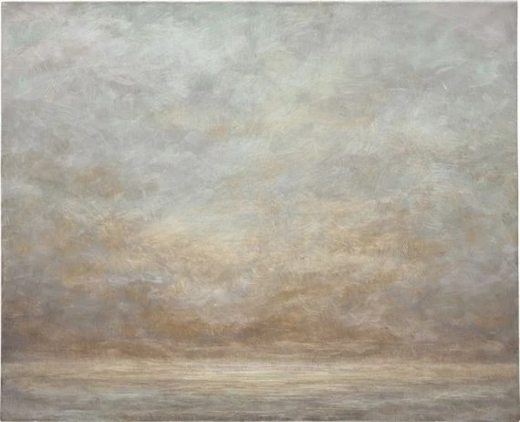
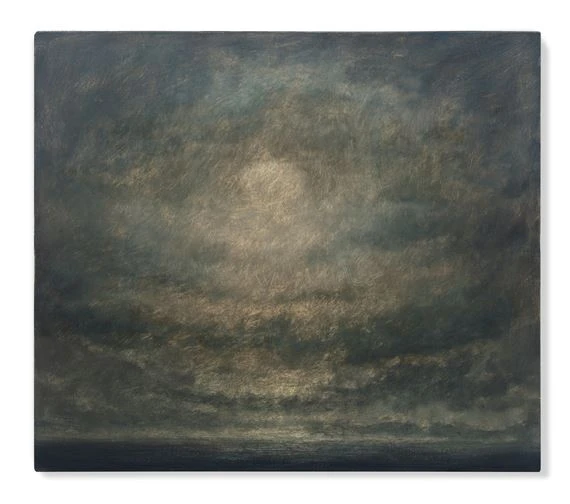
Lucas Arruda’s sky studies are a masterful use of gesture and will continue to be a constant point of reference in my mind from now on. The rough brush strokes of both Untitled (from the Deserto-Modelo series) and SEM TITULO work wonderfully to blend in a way I didn’t register was possible, and I hope to create a larger range of marks like these.
Joseph Grigely’s collages may be read to some as words rather than line drawings, but the way in which these pieces work together is right up my alley. I have always been interested in this kind of doodle-style making although I never really see it considered as “real art”, but Grigely’s work has helped to validate this idea and I hope to integrate more of this style into future pieces.
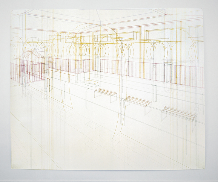
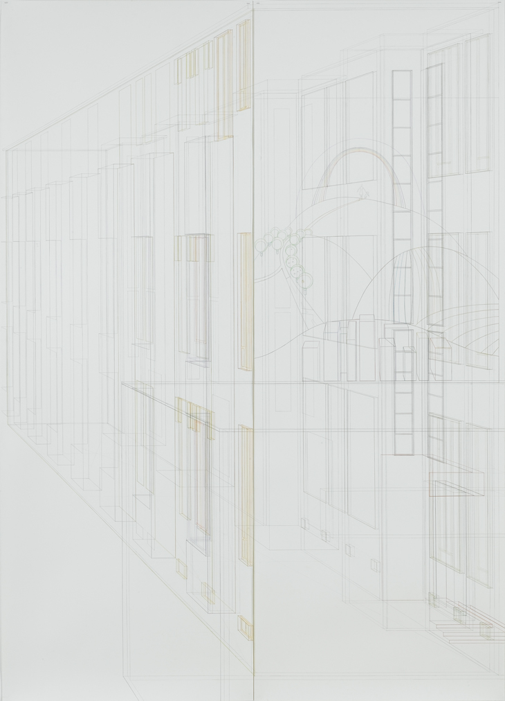
Silke Schatz’s architectural studies are mathematical, methodical, and visually striking. Abstract gestural art seems to be what is favored right now, and I think Schatz’s work is wonderfully abstract in it’s own way. Working with rulers and ‘perfect’ly straight lines isn’t something I considered would be smiled upon when creating line drawings/studies, but I am glad to see art like that which helps me to believe the opposite.
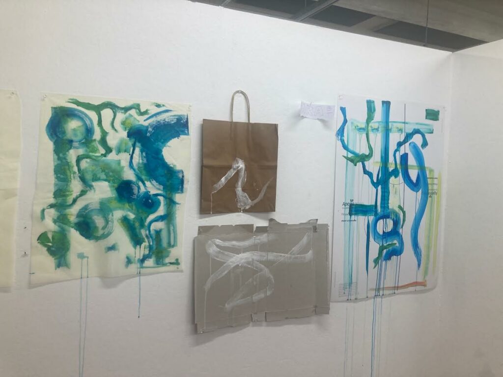
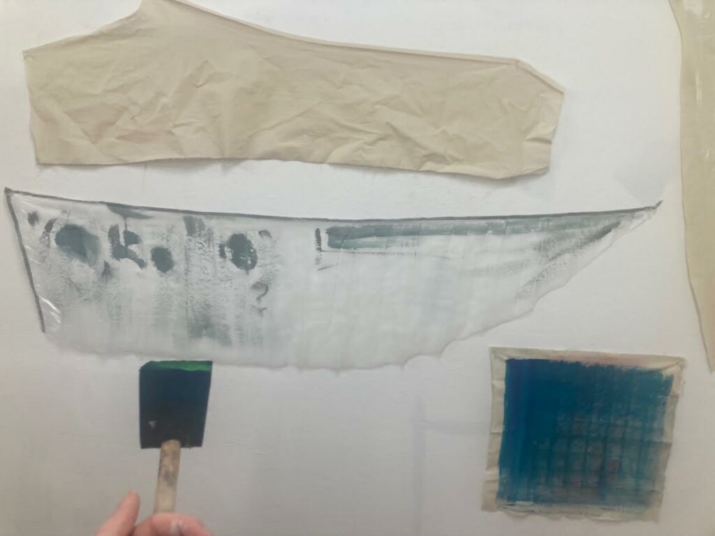
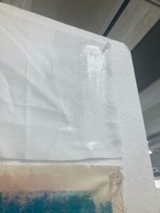
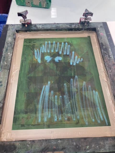
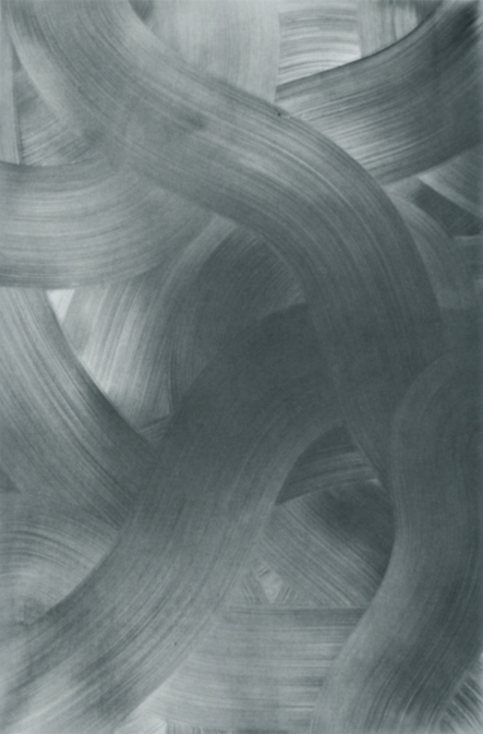
Above is my progress for the first week of this brief. Other than prepping various surfaces with white paint, I used the verbs drip, weave, dilute, encircle, twist, flow, and layer to start my ‘vocabulary of marks’. This was done through the use of Richard Serra’s Verblist (1967). I worked with mostly white paint to create these marks but also used tones of yellow, green, teal and blue. I enjoyed letting go of the need to create a ‘finished’ piece, allowing me to be freer with my mark making and yielding more organic results.
I enjoy the simplistic nature of Viewpoint 1, and am interested in how Helen Frankenthaler communicates a scene through such conscise marks. Grey Fireworks interests me in the clear layers upon layers of paint used by Frankenthaler, and how the subtle shifts in hue of the background are emphasized by the marks in the foreground.
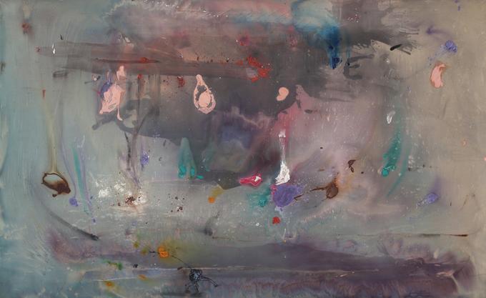
These pieces by Gerhard Richter are fascinatingly beautiful to me. The scraping of paint across the surface almost looks like dragged marks on glass, and portray a stunning amount of depth in a 2D space. Red-Blue-Yellow [330] in particular catches my eye through its organic lines and use of color.
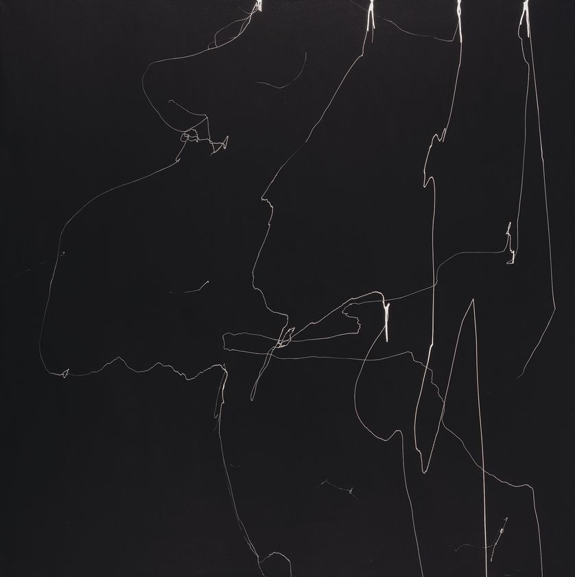
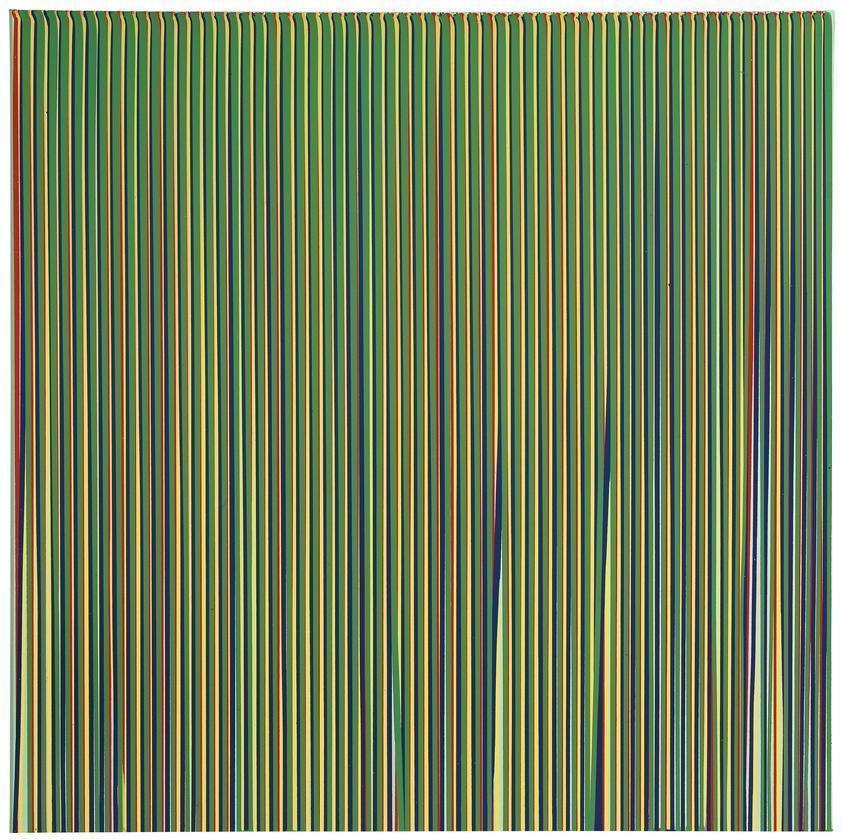
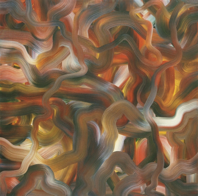
The change in line weight in Ian Davenport’s Electric Fan Painting, No. 7 compliments the jagged-ness of its marks. Appearing almost like lightning, the simplicity of white on charcoal here has helped me to place less emphasis on always having a ‘finished’ result. Poured Lines: Light Green, Red, Yellow, Blue and Green has only five colors like the title suggests, but the repeating lines of the piece create a sort of spectrum when viewed from afar.
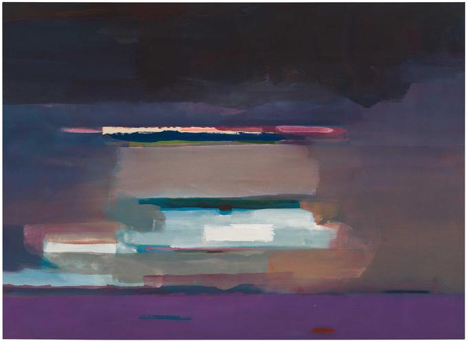
The distorted horizons of Sterling Ruby’s SP series have both interested and unsettled me. Both SP137 and SP228 have a blurred mix of mottled hues working to create an almost-recognizable landscape, but the unnatural colors and dark tones throw off the mind. The scratched marks into the surfaces of these paintings are not to be overlooked either, as these somehow create a sense of great depth while giving the painting a range of texture.
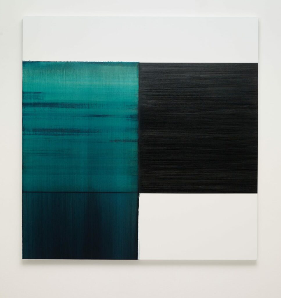
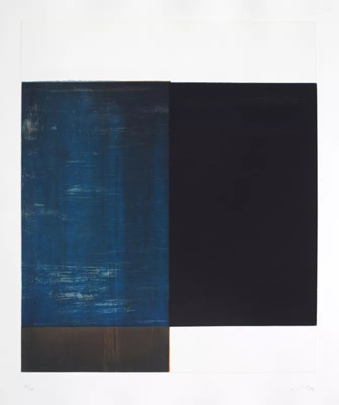
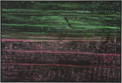
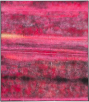
The blue washes of these pieces by Callum Innes are nothing complex, but absolutely striking in their vibrance. Exposed Painting Carribean Turquoise manages to portray water simply, through what I assume is a layering of watered down paint over the canvas. The marks from the bottom left rectangle spread up in to the top left square, unifying the piece together in a way that I will let inspire my own work. The flat black in LBT reassures me that simple flat colors can be highly effective when utilized right.
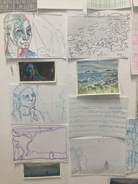
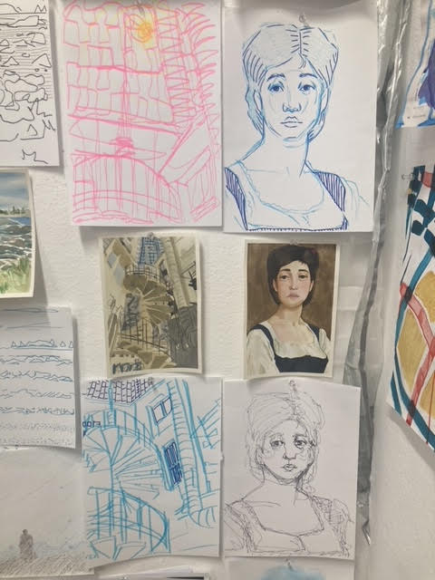
Chosen Photos: photo incl people, photo w/ people (landscape, still life), painting pre-1900s, film screengrab.


References – left to right: personal 2022, personal 2022, John Atkinson Grimshaw 1885, Johan Christian Dahl 1839, personal, 2022 personal 2022, Harry Potter and the Half-Blood Prince 2009, Fight Club 1999, Beautiful Boy 2018.


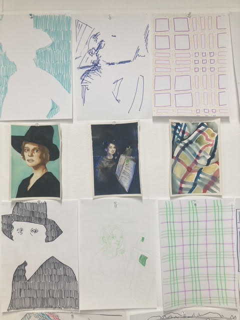
* like, ** like more, *** like most
Charline Von Heyl *


Cy Twombly **


Gerhard Ritcher ***


Jacqueline Humphries ***


Pat Steir **


Rita Ackermann ***


Terry Urban ***


Painting through verbs: spill, dilute, smear, pour, flick, scrape, drip, drag, splash, flood, erase, drop, spread, pull, soak, smooth, dollop.
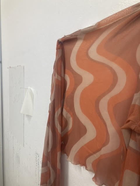
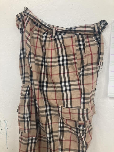
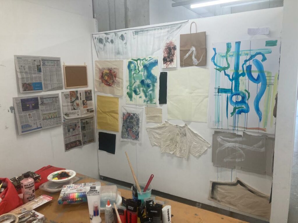
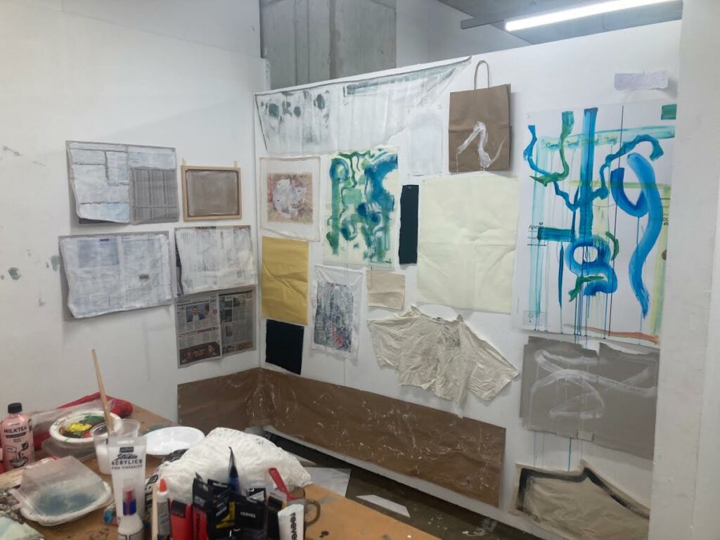
Surfaces: paper x3, wood x2, scarf fabric x2, misc fabric x2, mdf x1, denim x1.
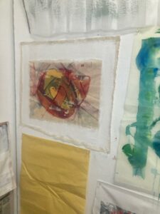
Medium: diluted red acrylic in water, black and white acrylic with gesso.


The past 6 weeks have been thoroughly enjoyable for me. From learning new art-making and photography processes to looking into artists to discovering new mediums I love, I think that my practice has really developed recently. I have always loved photography, yet had never been given the opportunity to try out something different than digital photography with a phone or camera. Learning about and trying out pinhole photography has opened up a new path for me to go down in the future whenever practising photography, and I also now know that I love making cyanotypes. I think that I produced some interesting works that capture the theme of nature drawing itself, for example, my pinhole photo of the tree next to the electrical box.


Sculpture in its many forms is not my typical area of making, so I was hesitant but interested in creating works for this brief. I have learned a lot, almost every WetLab process learned was new to me, but I’ve not been as engaged as I perhaps should have been. The WetLab and the workshops they provided were fantastic, and I am grateful to have yet another area available to aid my making now. I tended to look for the most ‘painterly’ way of approaching things, which led my work to stay more 2D than 3D. I feel this does sculpture an injustice, and is a shame for me. Despite this, I am still pleased with the work I have created, but I believe that I could have done better. I think my issue with sculpture is that I wish to be instantly good at it, while ignoring the obvious fact that I haven’t done it very much. As this brief yet again shows, Richard Serra is a never-ending well of inspiration. Creating works initially based off the Verblist was extremely helpful, and I know that the work I created (I’m thinking of the wall piece) and the materials I used (cardboard) will be something I’ll reach to for guidance in my future practice. These surfaces are imperfectly perfect, wonderous in their mixture of organic material and linear orientation, and very distinctly right to me. Thank goodness for this, as I’d hate to come out of this brief hating everything I made. I’ve definitely learned from what I like and dislike about my results, but I feel that it is a shame this brief was not longer as I would have extended my thinking further (although I suppose that’s what choosing a major is for).
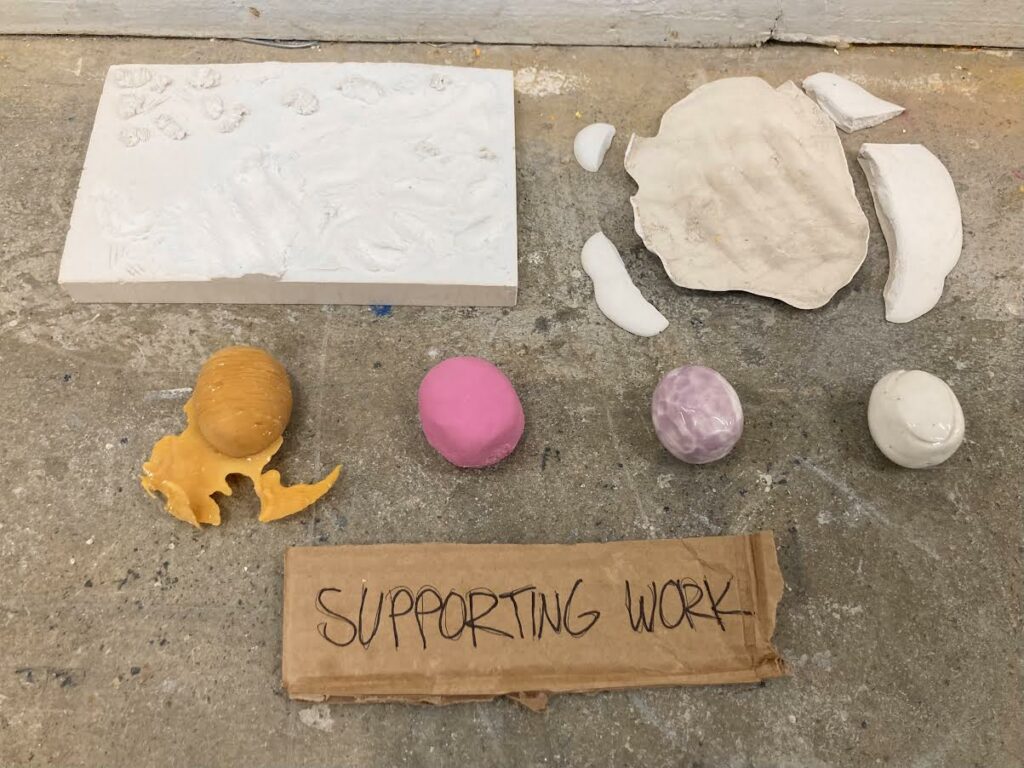

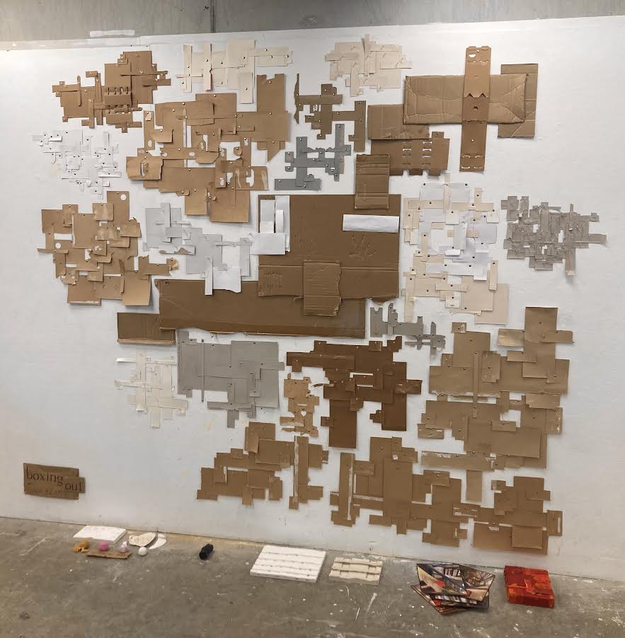
My supporting works are more the results of the WetLab workshops rather than supporting pieces to my installation. I decided to name my installation ‘boxing out’, as the comparison between the wall piece ans a map has been made to me. This idea has stuck in my mind, and along with the work reaching outwards, I thought of ‘mapping out’. This didn’t feel right, so I went with ‘boxing out’. This is half-literal, as the cardboard is all from boxes, but also through the breaking out of being ‘boxed in’.
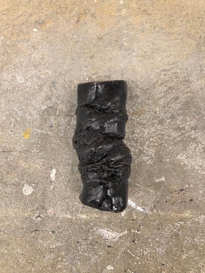
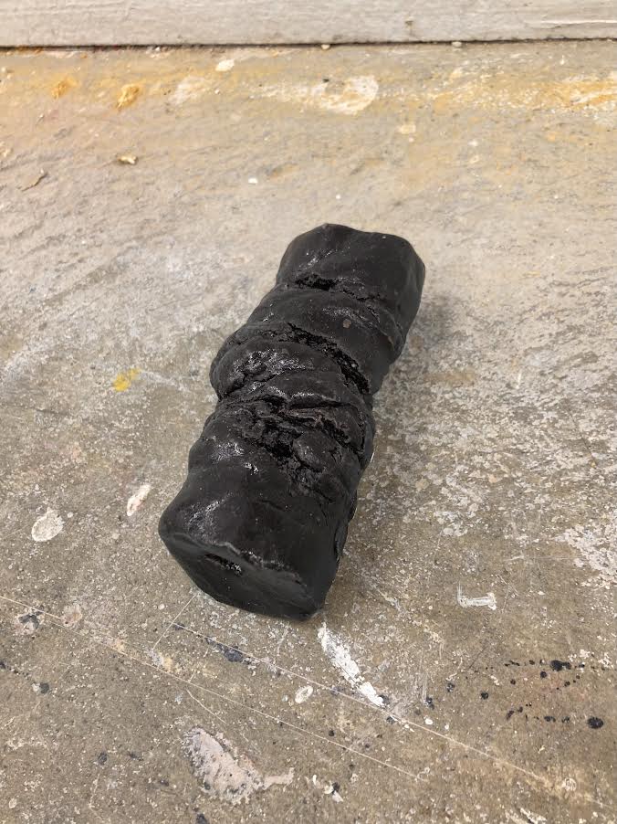
While I focused on the verb ‘layering’ for the majority of my work, this piece was an exception I had to keep in. This piece was easy to create, simply made by ‘twisting’ clay, firing it, and glazing it black, but it still has its own impact on me. It makes me think of what my installation would have looked like if I had focused on a different verb, although I am very pleased with the work created around layering.
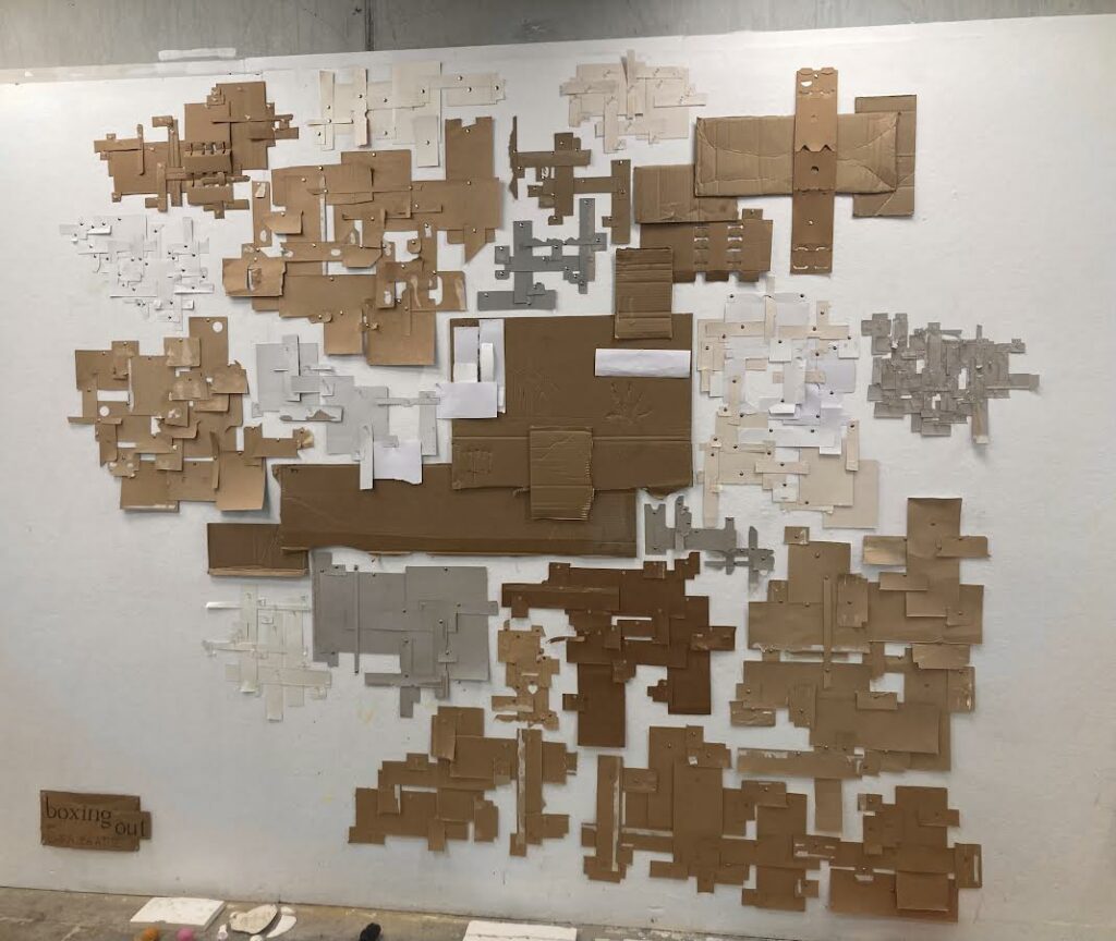
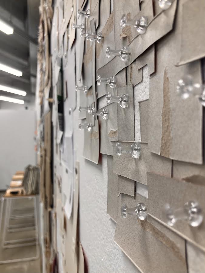
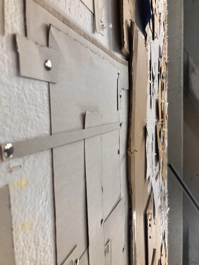
I owe a lot to this piece, as it inspired every single subsequent piece. It would be interesting to keep this work ever-growing, getting to the point when I am pinning boxes over boxes, merging together into one large thing that has grown too large for it’s own self. The color and texture of cardboard has been something I really enjoyed working with, as the range of colors and finishes it offers up leads to depth of tones without me having to do much.
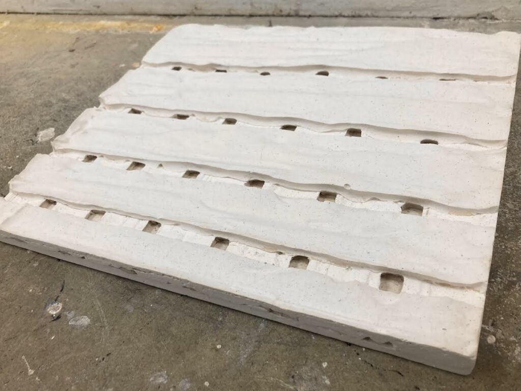
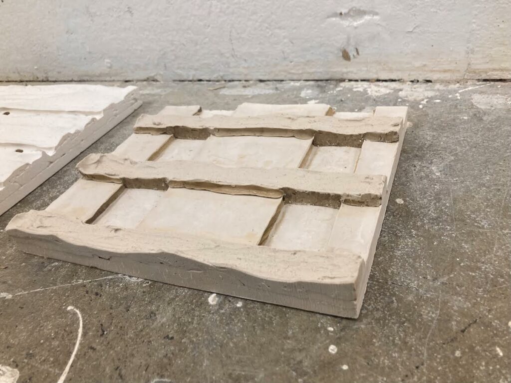
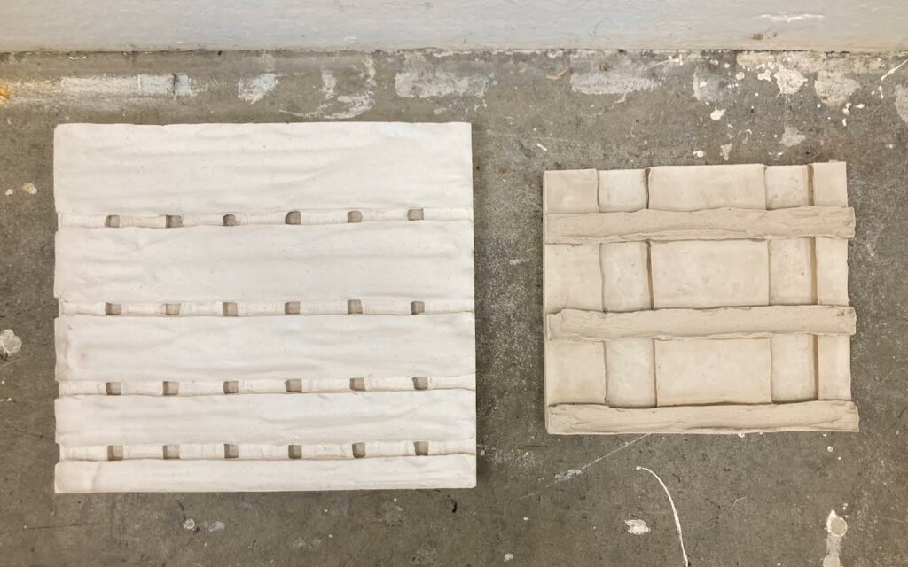
Working with plaster was new to me before this brief, and although it is relatively simple I do find myself frustrated with how imperfect these pieces came out. This is my own fault, but in hindsight I wish the lines were straighter, more uniform, more structured, but this experience has been one of trail and error. The subtle flecks in the plaster of the larger piece are beautiful, and the flatness seen in the second piece catches my eye. When creating these pieces, I enjoyed the first layer by itself more than the end results, but there is not much I could think of to do with a flat slab of plaster. All this being said, I am pleased I ended up with these on the floor. Along with the concrete, they are rather industrial, an aesthetic I believe has its own clean beauty.
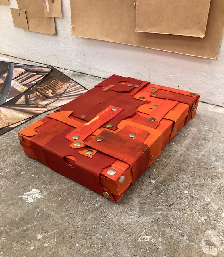
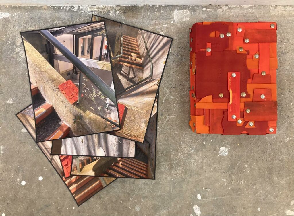
Out of situ, the box sculpture doesn’t lose as much impact as I thought it would. Like the plaster pieces, I give some credit to the concrete floor. The backdrop it creates compliments the vivid orange wonderfully, drawing the comparison between the floor and the concrete surfaces the sculpture often rested on in the accompanying images. This sculpture was a lovely surprise, as I didn’t believe I would enjoy it as much as I do. I give partial credit to the sun, as this piece looks its best when shining outside.
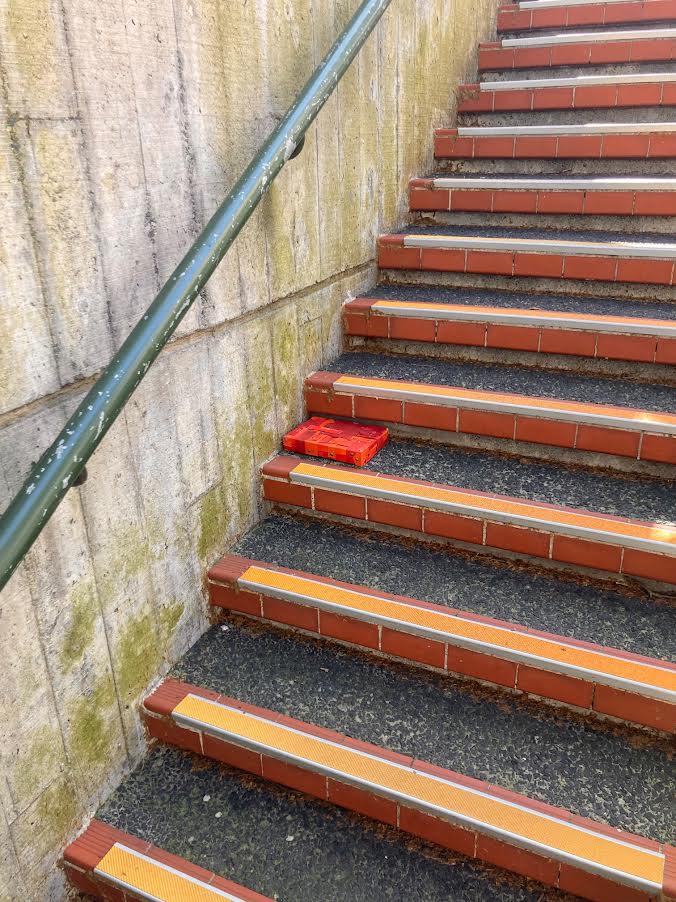
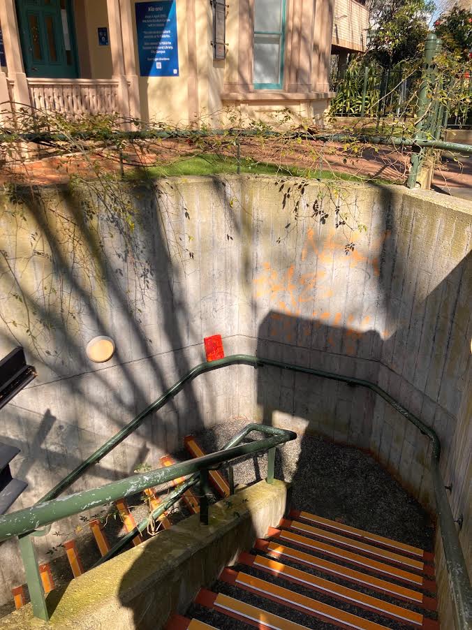
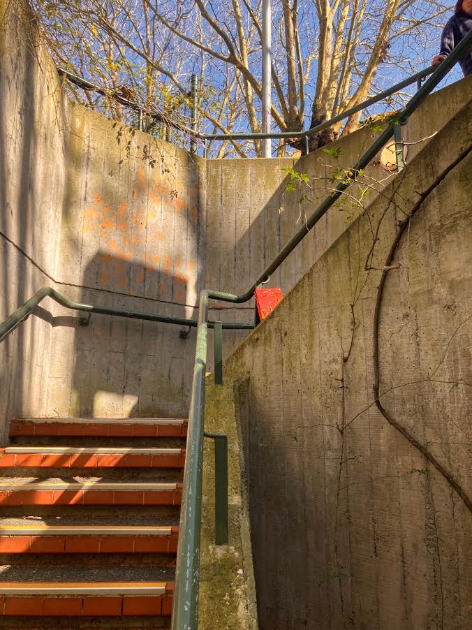
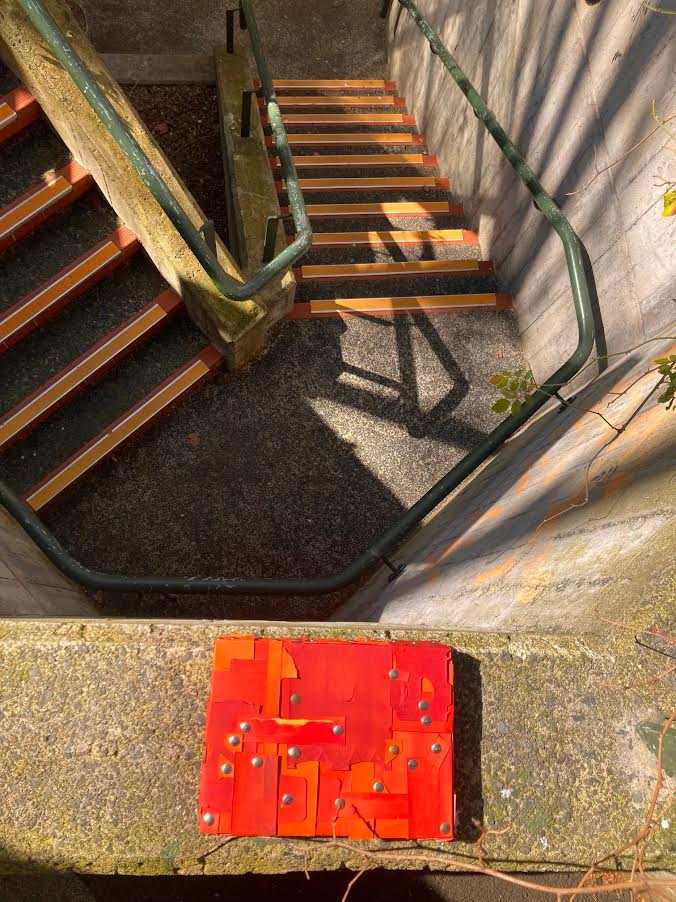
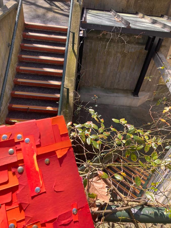
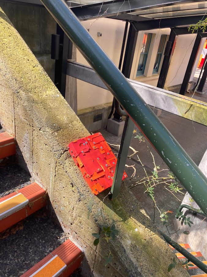
I couldn’t have asked for lovelier weather and lighting when photographing this sculpture in situ. I was a bit nervous that the deep orange-red of the sculpture wouldn’t match the stairs how I wanted, but it matches wonderfully. The sun played with the shadows in the piece emphasising the layers involved, an effect that I couldn’t have achieved through artificial light in this wonderful way. Like the mapped out piece on the studio wall, this piece has developed its own personality in my mind. Oddly, I find the sculpture rather cute.