PHOTOGRAPHY BRIEF Final Installs

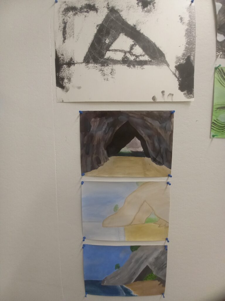
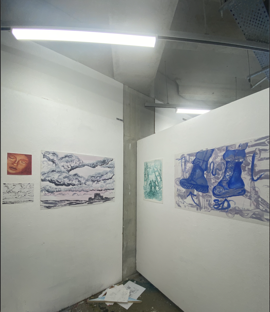
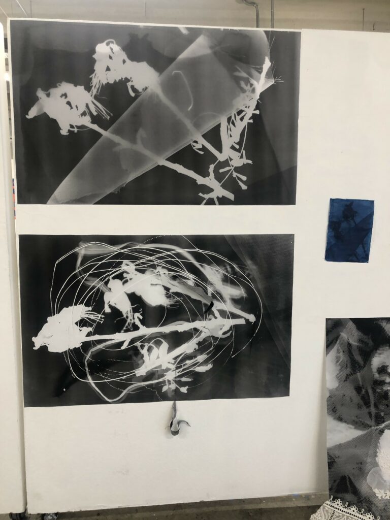
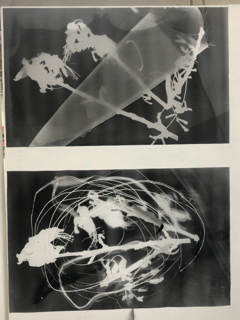
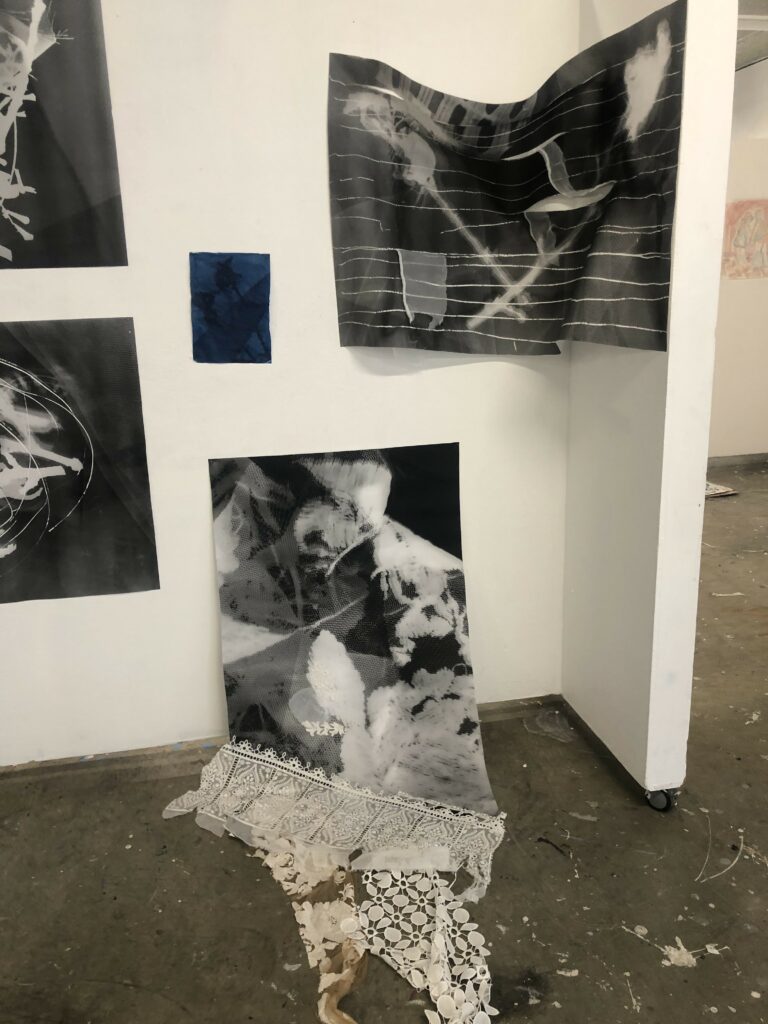
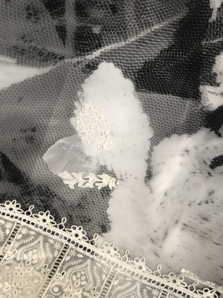
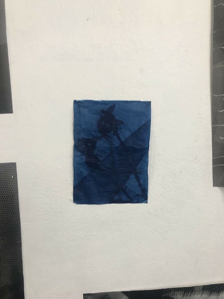
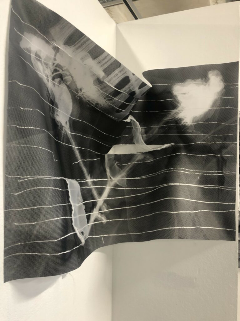
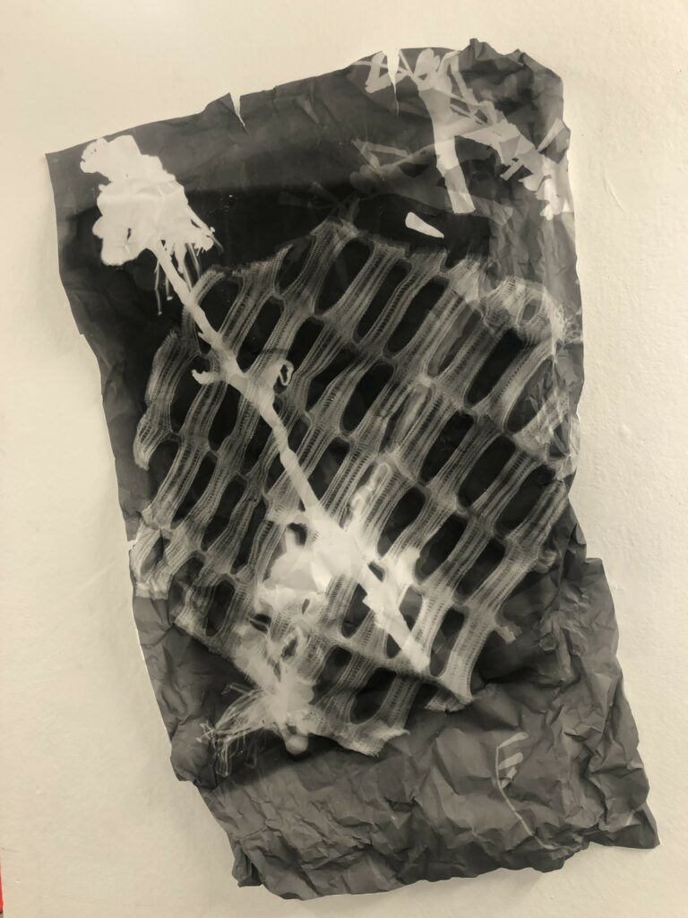
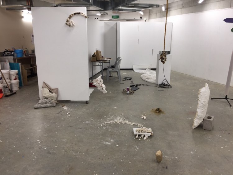
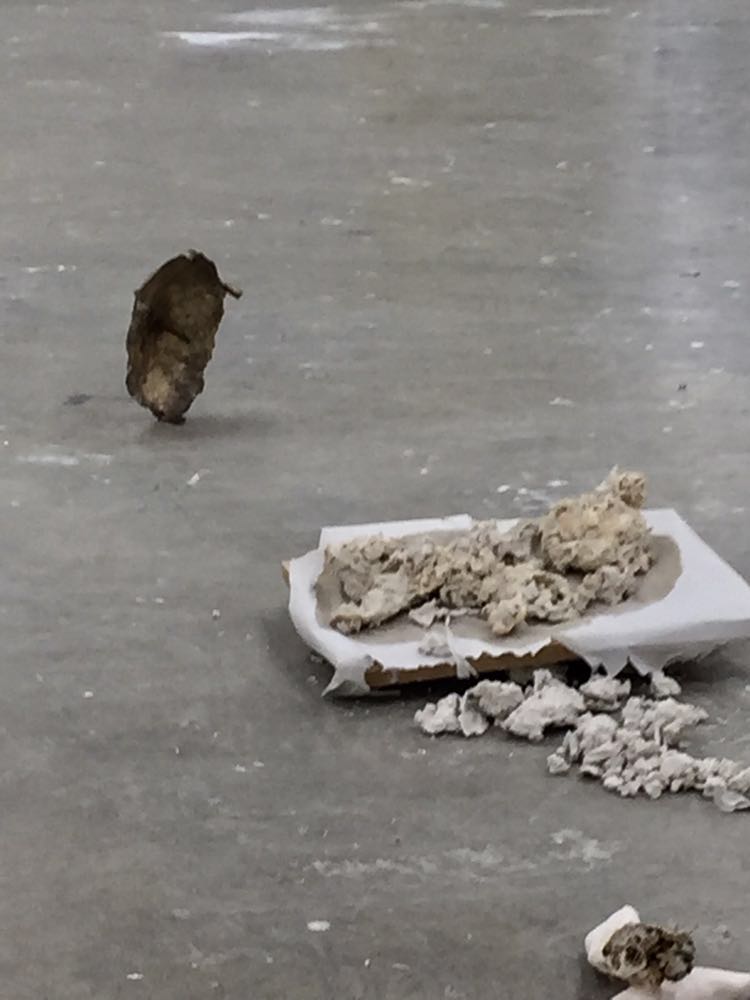
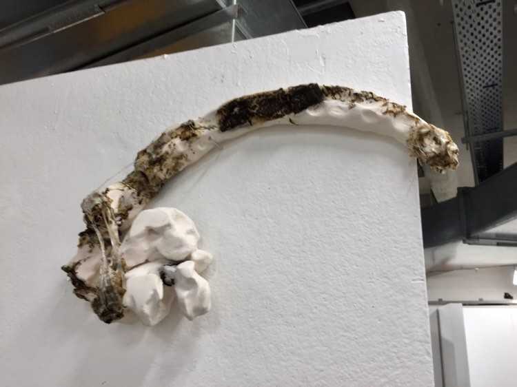
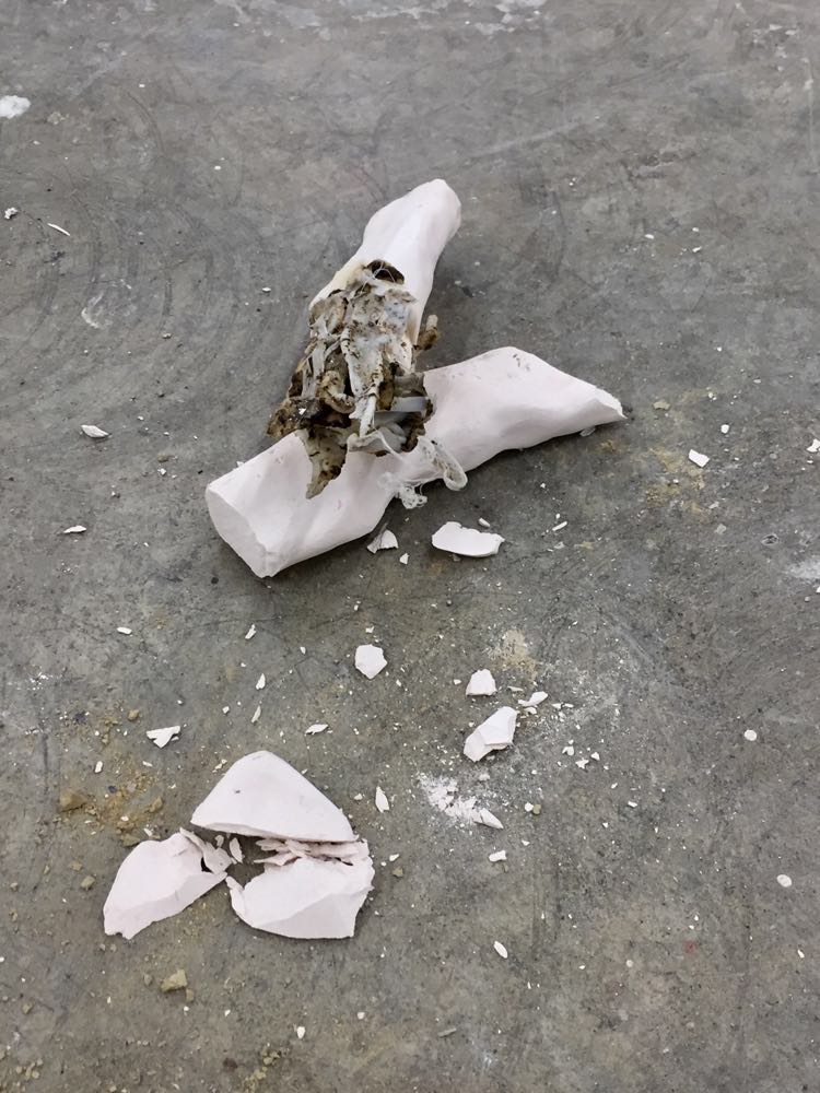
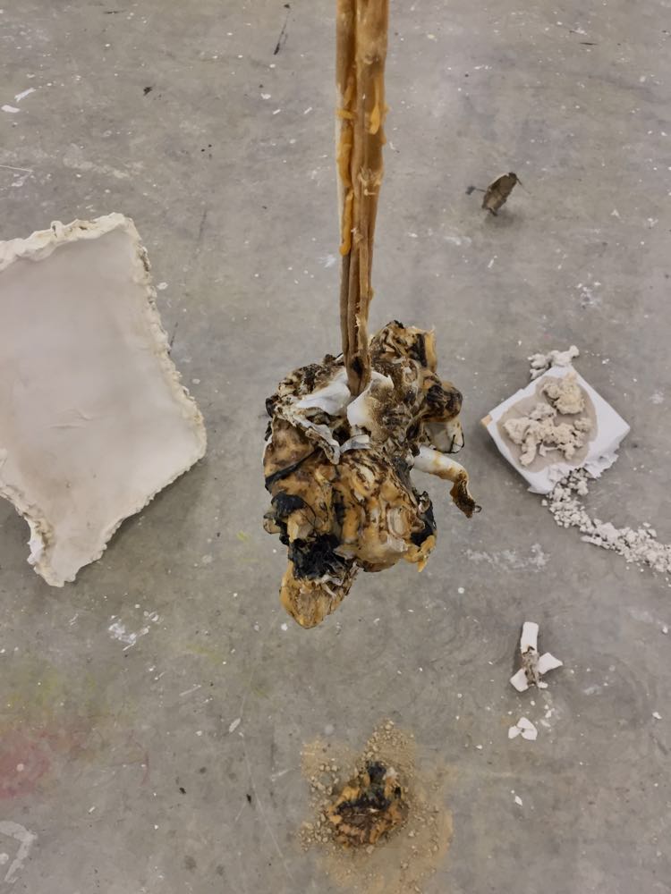
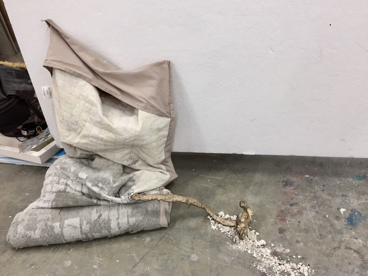
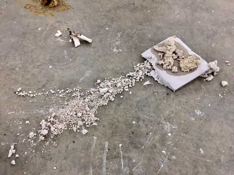
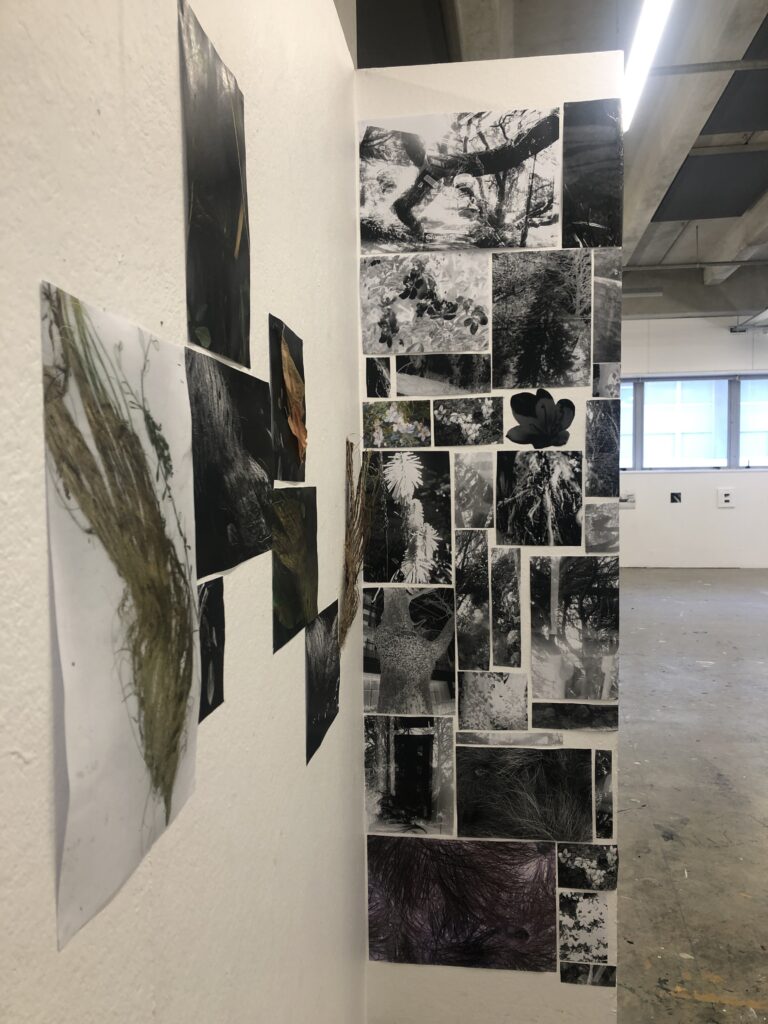
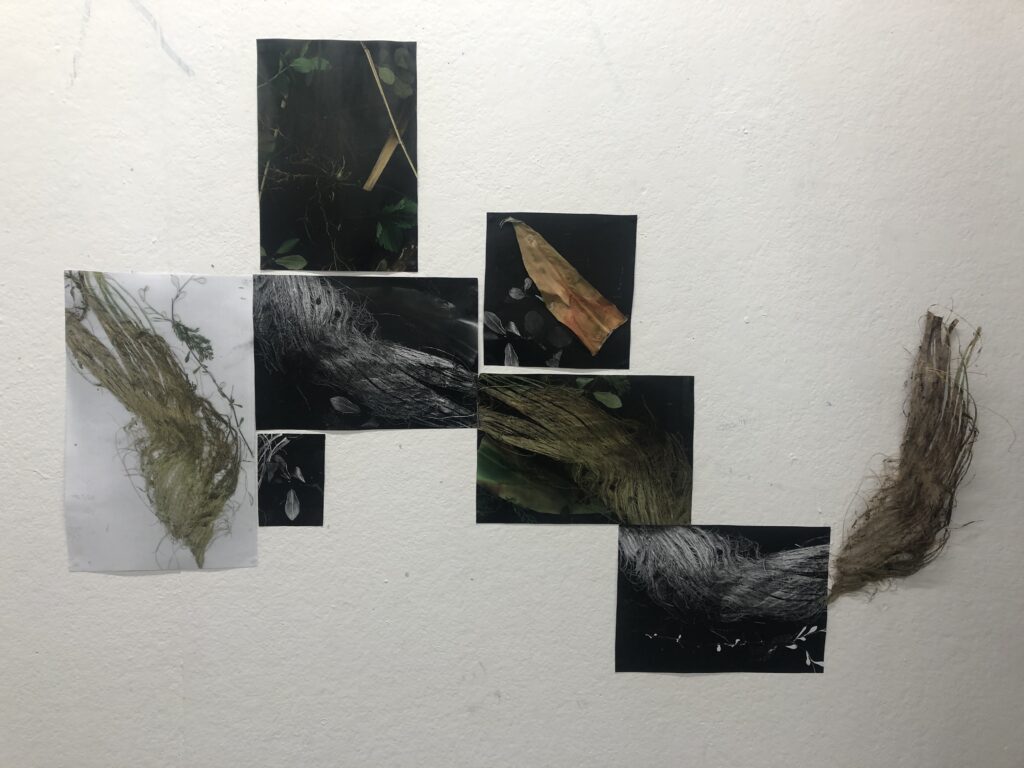
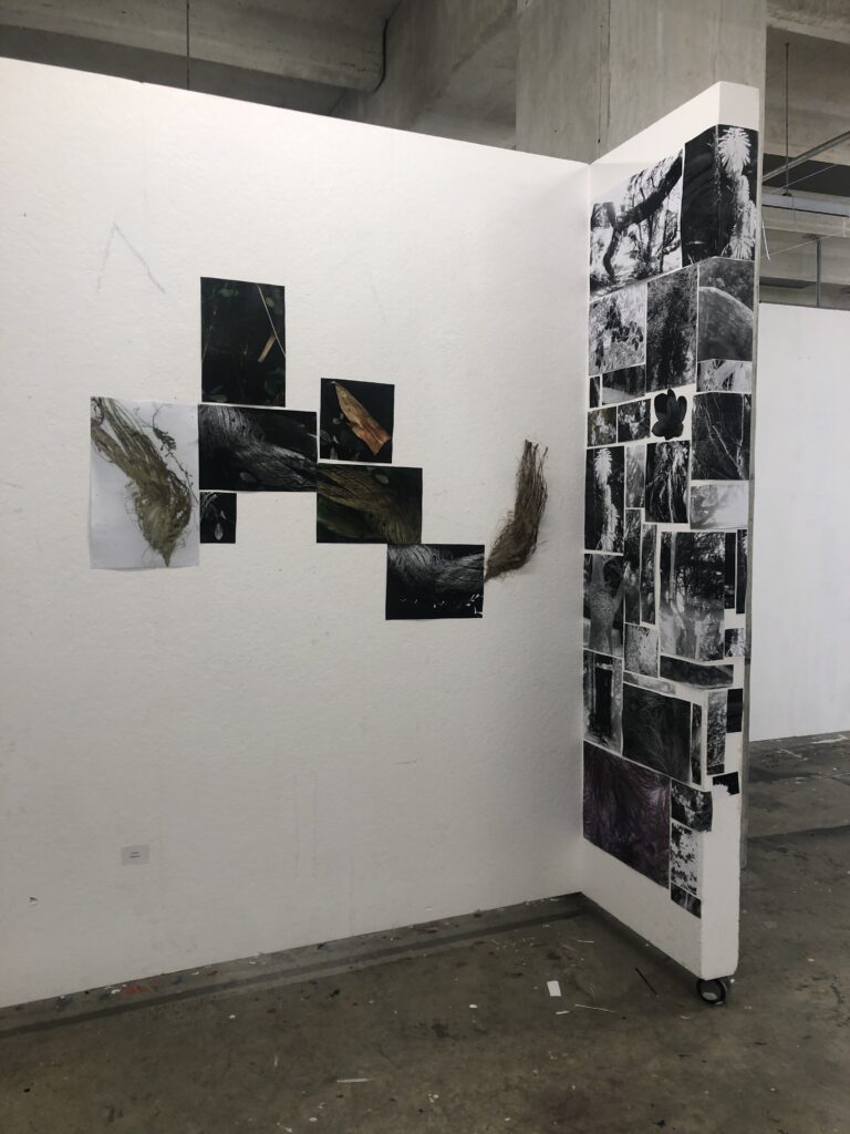
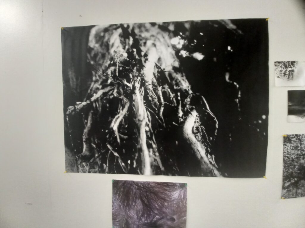
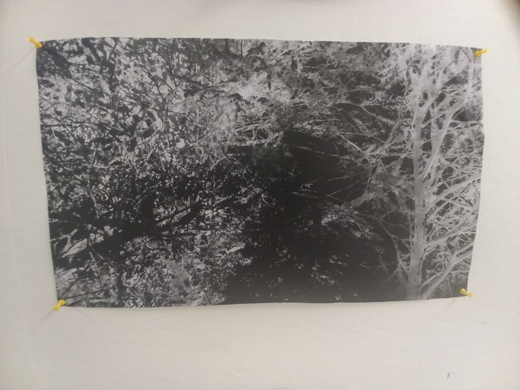
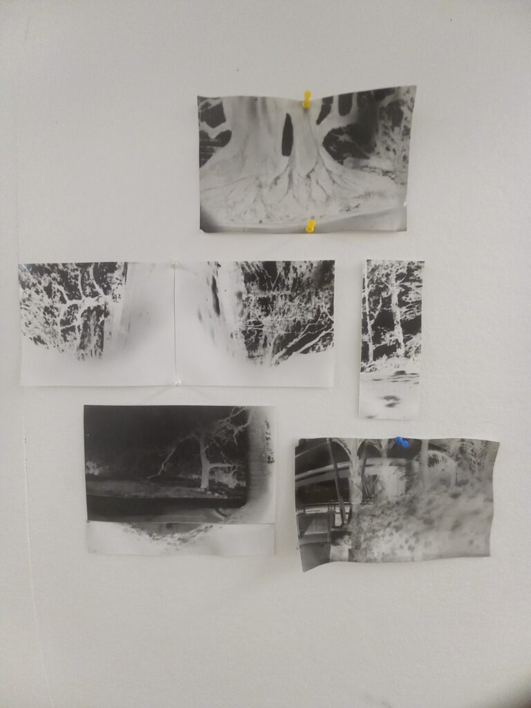
I genuinely loved this brief even with not being able to full force jump into it. I used to do pin hole photography back in high school where I got just about all of my photographs the perfect exposure this time I got them great I only got 1 that was to over exposed but i still liked it. If I were to do that again I would like to explore different areas include people and bring the things I love into it or bring in the medical things that nature brings in with healing the human body. My final photography installment is in the photos and I also did a collage wall which was very fun to do by figuring out where to place everything. I used the photo copier to make some prints too and I added real life dead plants into my installment which I really liked. This brief would have been this easy without the help of my class mates doing the photography brief giving me ideas, talking to me, and helping me carry things/developing my pinholes for me.

Cathedral Cove Paint/Print

I have alway had a thing for drawing and painting landscapes especially cathedral cove the shape, the different colours of the cave depending on the weather is very interesting the looking through the cave and seeing other images or seeing rocks and mountains in the distance. I started this print in the 3d lab using print ink and a roller I put the paper onto the ink and just drew the image which came out a bit pixally and some parts are darker black than others but Im happy with it.

The second painting I made by making different marks and using different paint colours I made it a darker theme to show that its a wet snd cloudy day you can see the sky through the cave looking grey

I did a acrylic water based paint which i didnt like much by its self I was genuinely thinking about not puting it up but when I put it up together it came together and looked like it fit in there and i just kept it there

the last painting is definitely my favourite it is the most realisim painting but with random paint strokes done in it too

Overall these painting were definitely my favourite out of all the art i have produced this brief painting wise i feel like its the best Ive shown my painting skills.

Extra paintings/final exhibition :

in this work I minimised the background of the original image, making marks of just the graffiti with watercolour. i then did the foreground of the shoes with watercolour and guache, a slightly thicker consistency.
using a background I made during the original mark-making phase of the brief, I did a more abstract interpretation of the image, I purposely left the second shoe with less detail and ‘unfinished’ I liked the contest between the two and how it added something more interesting than just painting both the same.

Reflection:

I think this brief was a little out of my comfort zone in terms of my specialties in art. I prefer taking photos and painting is something that usually frustrates me. Although it was challenging I enjoyed choosing some photos I had taken and interpreting them into a different style and area of the arts. I liked using different consistencies of paint and experimenting with different materials and mixed media. Despite this, I’m still excited for next year when I can put down a paintbrush and pick up a camera again.

Artist research 4-7:

Phillip Guston:

i love Phillip Guston’s cartoonish paintings and sketches. there’s something playful about them, with the bright colours he chooses and the little ‘ghost’ people that feature in his work. the topics and ideas behind his work range from Political satires and ordinary events and normally have a lot more detail to them in the setting and little things in the paintings you wouldn’t always notice at first glance. I love that they seem like fun little doodles but can actually have a deeper meaning behind them.

Wilhelm Sasnal:

The thing that stands out to me about Wilhelm Sasnal’s work is the beautiful colours and patterns he makes. Having the fluid and soft mark of the background alongside the small and detailed scenes he paints within them complement each other so well, and make a fascinating composition. You can see very clearly the layers of marks he’s made within the painting, and also clear lines of the brushes he’s used, some having more lines and detail with others being softer like he’s used a sponge or another materiel.

Elly Smallwood:

what I like about this work is you can see the whole process on the canvas. it contains all the mark making shes made during it, with the words and background lines of her planning the work and its composition, to the top layers of the subject and the more detailed painting. I think its a really interesting way to work and also includes a different type of mark-making with words and the before stages of painting.

the colours that Elly Smallwood used within this painting are just so beautiful together, the sunset warm palette compliments the cooler purple tone perfectly, and the thinner paint dripping down as well as the thicker paint that sits as the last layer show the marks she made at each stage. it’s realistic and detailed yet abstract and minimalist at the same time, like the artwork before you can see the pencil lines and sketch behind the paint.

Artist research 1-3:

Jackson Pollock:

the thing I love the most about Jackson pollock’s work is his choice of colours. he almost always uses at least 4 colours, and also almost always uses black and white with them. the contrast between the bright and the harsh colours adds more dimension to the work and shows the layers more clearly and how they have been blended together.

I also like his process for making his art. the mark-making of the dripping and pouring means he has less control over how the artwork will turn out and adds to the abstractness of his work.

Calum Innes:

I love how simple yet effective Calum Innes’s artwork is, it’s so minimalist to the naked eye, but the process in which he makes marks on the canvases is so interesting. also, the marks it leaves behind, not just on the work itself but the space and the walls he’s working against have this trace left behind on them.

His Exposed Paintings series, which is created by piling pigments onto the canvas and then erasing the oil paint with washes of turpentine, is what he is best known for. the act of painting and then unpainting is a technique I haven’t seen before and would be excited to try it in my own work.

Elisabeth Peyton:

I love this style of painting where it’s not too detailed and realistic but the brush strokes create the image perfectly while staying simple. Elisabeth Peyton’s colour palettes she uses complement each other so well, with a lot of neutrals mixed with bright colours and creating the perfect contrast. I also think there’s something intimate about how she paints people, whether its that she has a connection to the subjects or if her paintings are just good at beautifully showing emotion.

Bibliography

(likely not all sources used, gathered most)

Remove ( ) in the 1st link when copying and searching up, as it is unable to be pasted in original format on this site

  1. (https://www.artnews.com)/art-news/artists/the-shape-shifter-how-lynda-benglis-left-the-bayou-and-messed-with-the-establishment-5897/
  2. https://www.nga.gov/collection/artist-info.6935.html
  3. https://art21.org/artist/lynda-benglis/
  4. https://artreview.com/lynda-benglis-the-erotics-of-artmaking/

https://www.luhringaugustine.com/artists/rachel-whiteread#tab:thumbnails
https://gagosian.com/artists/rachel-whiteread/
https://www.tate.org.uk/kids/explore/who-is/who-rachel-whiteread#:~:text=Whiteread%20has%20been%20inspired%20by,living%20room%2C%20kitchen%20or%20bedroom.
https://hammer.ucla.edu/exhibitions/2010/rachel-whiteread-drawings

https://www.theguardian.com/artanddesign/2017/mar/05/tony-cragg-sculpture-interview-rare-category-objects

Carleton Watkins. (2022, August 27). In Wikipedia. https://en.wikipedia.org/wiki/Carleton_WatkinsCopy
SAAM Carleton Watkins – https://americanart.si.edu/artist/carleton-e-watkins-5251
Mammoth plate. (2022, May 8). In Wikipedia. https://en.wikipedia.org/wiki/Mammoth_plate

1Auckland Art Gallery’s Senior Curator of Global Contemporary Art, Natasha Conland.   https://architecturenow.co.nz/articles/walls-to-live-beside-rooms-to-own/

2. Gallery Catalogue –

‘ Fiona Connor Walls #1-6 and #8 (Featuring Rob Gardiner), 2022’

3.“Fiona Connor – 6 Artworks, Bio & Shows on Artsy.” n.d. Www.artsy.net. https://www.artsy.net/artist/fiona-connor.

  1. https://www.smartinsights.com/social-media-marketing/social-media-strategy/new-global-social-media-research/ 
  2. https://www.forbes.com/sites/forbesagencycouncil/2021/05/17/gen-z-and-the-rise-of-social-commerce/?sh=3f728fc4251d 
  3. https://morningconsult.com/2021/07/08/gen-z-critical-race-theory-polling/ 
  4. https://www.pewresearch.org/social-trends/2019/01/17/generation-z-looks-a-lot-like-millennials-on-key-social-and-political-issues/ 
  5. https://www.theguardian.com/fashion/2021/oct/06/out-of-style-will-gen-z-ever-give-up-its-dangerous-love-of-fast-fashion 
  6. https://publications.parliament.uk/pa/cm201719/cmselect/cmenvaud/1952/report-summary.html 
  7. https://journals.sagepub.com/doi/full/10.1177/01634437211053766 
  1. https://watchargo.com/what-is-the-female-gaze-in-film/ 
  2. https://www.theatlantic.com/entertainment/archive/2018/08/female-gaze-lincoln-center-series-women-cinematographers/566612/ 
  3. https://www.oxfordstudent.com/2021/03/11/aesthetics-in-film-the-female-gaze/ 
  4. https://bearingnews.org/334433/opinion/the-female-gaze-counteracts-existing-standards-in-cinema/ 
  5. https://www.theatlantic.com/entertainment/archive/2011/06/transformers-3-sour-sexist-and-salivary/241305/ 
  1. https://www.britannica.com/topic/epistemology
  2. https://www.techtarget.com/whatis/definition/empiricism 
  3. https://www.skylinehawaii.com/blog/the-meaning-of-aloha 
  4. https://www.thesaurus.com/browse/aloha  
  5. https://www.verywellmind.com/what-is-triangulation-in-psychology-5120617#:~:text=Triangulation%2C%20a%20form%20of%20manipulation,be%20the%20most%20well%2Dknown
  6. https://www.sheffield.ac.uk/philosophy/research/themes/epistemology#:~:text=Epistemology%20is%20the%20theory%20of,when%20do%20we%20know%20things%3F 
  7. https://www.britannica.com/topic/epistemology 
  8. https://www.robertshawaii.com/blog/spirit-behind-aloha/#:~:text=The%20term%20aloha%20derives%20from,’ 
  9. https://www.sciencedirect.com/topics/social-sciences/triangulation#:~:text=Triangulation%20is%20a%20term%20that,a%20location%20on%20a%20map
  10. https://www.healthline.com/health/narcissistic-triangulation 
  11. https://www.merriam-webster.com/dictionary/indigenous#:~:text=Indigenous%20derives%20from%20the%20Latin,meaning%20%22to%20beget%22). 
https://www.etymonline.com/word/consciousness

P44: Sculpture, Final Layout & Reflection

Overall I have enjoyed taking Photography. At first, I was unsure about it, as I was having trouble starting with the pinhole cameras. But as I kept on testing and experimenting with my camera good results finally started showing and it went up from there. Halfway through photography, I made a brainstorm about areas I wanted to explore, one of them being digital photography as I have my own camera.

However, during this class, I became so immersed in analog photography I just didn’t have time and was too busy exploring many new processes. Taking Photography has taught me many new techniques and photography practices, which I am very grateful for. R

eflecting on my initial thoughts about the course, I didn’t expect it to be so analog-heavy, however, I like that it was that way because I knew nothing about analog photography before going into this class. Being able to have the flexibility to stretch the concept of photography into whatever definition I desire was so fun and ended up leading me towards fabric, which I’d never normally get into! If I did photography again, I’d probably do everything the same… but maybe print my prints a bit smaller…unsure.

Till next time,

SR

Dee Sands

Dee Sands | Saatchi Art
Down Town New York

Since I’ve begun experimenting with aluminum foil, I’ve taken the time to look at some of Dee Sands’s work. I think especially with Sands’s work, the act of crunching a hard material puts so much energy into the objects. It has completely transformed from a blank flat surface (I assume) into something filled with motion.

Reflection


Through this process of construction/deconstruction I was interested in the ways the boundaries of the bodies could be explored both fragmentedly and structurally. Objects were manipulated, with or without control as I wanted to express the flexibilities within the materiality but also the lines and structures it holds in our breath, body, rooms, spaces, cities and concepts. Unlike in a liminal space, the push pull relationship between positive and negative space is a conversation, and I wanted to show the undulating feelings/movement between these polarizations.

A direct response of this was Mark Quinns casts, as he often plays with this inside/outside ideas within his sculptures and I found it strongly directed me as I leaned on it when I was installing the works.

While I feel successful in the ways I was able to construct this, there is definitely more opportunities to explore the idea of positive/neg through the materiality of the objects. This was attempted by using plaster with latex, pumice, paper, cement, and I felt like I was on to something molding these on thin wire, and melting bio-plastic to describe fascia on wet clay. Perhaps the molding of these/melted bio-plastic held the structures themselves rather than wire or mesh; maybe the inside/outside could be constructed further than the plaster mold as the object itself. Using remnants of the construction to define borders of the objects, I feel like this could be further explored my latexing, charcoal rubbing paths, walls etc.